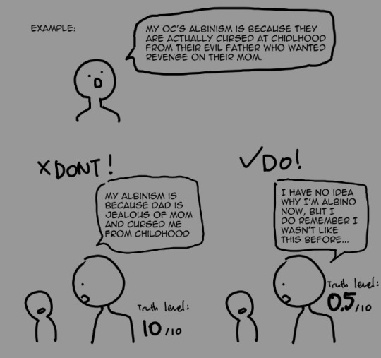
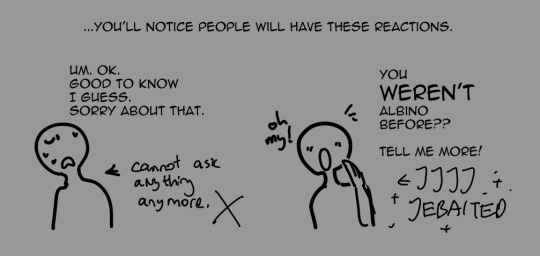
#i think i'll change how i shade depending on the feeling of the image
Explore tagged Tumblr posts
Visit Tumblr Blog
Explore Tumblr blogs with no restrictions, modern design and the best experience.
Last Seen Tumblr Blogs


Fun Fact
Tumblr Inc. is funded by 13 investors.
Text

Sleep well, Axl
[ bluesky ]
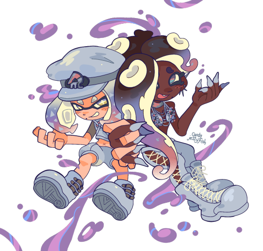
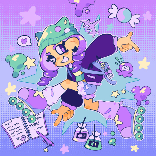
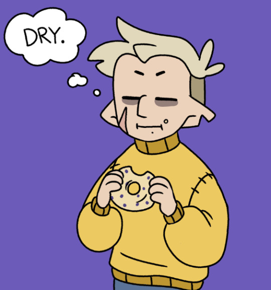
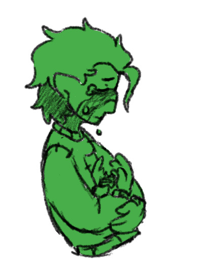
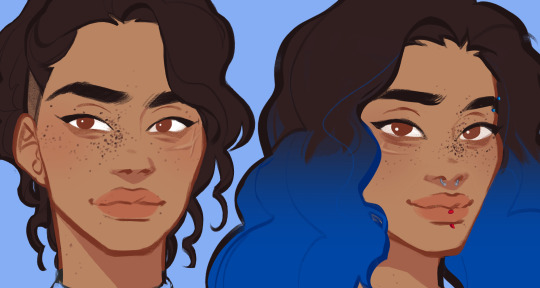
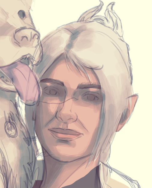
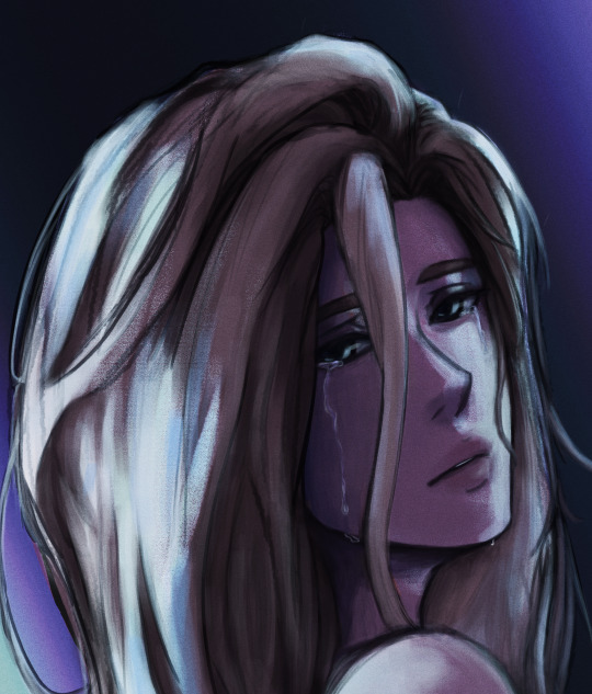
#mmx#megaman x#mega man x#ロックマンx#my art#art#fanart#mmx axl#i had a lot of fun with this one (even if csp really did not like me for it)#love the idea that Red stepped up to be Axl's dad of sorts while also training him in maverick hunting#trying to mix cell shading and painting-esc shading#not sure how good it looks#i think i'll change how i shade depending on the feeling of the image#this one is more soft sooooo painty-esc
222 notes
·
View notes
Text
ty! \(^_^)/ feelin good so ill try answer in detail for ya!!!!
most of the time i just do basic cell shading. here ill explain my rendering process after i choose my base colours, ill try keep it short & sweet!! nvm warning buckle up its really super long.
flat colours -> fully shaded!!


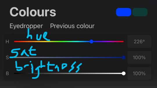
⭐️Picking shading colours!
usually it's just the base colour with +saturation OR a hue shift! i dont really lower brightness.
This is what i mean by HSB, i never use the colour wheel i prefer the sliders!!!
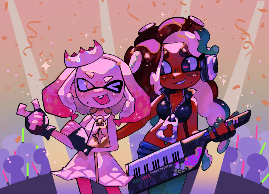
i like my art to look super colourful so i do things like shading pink with blue instead of with a darker pink or red, as shown in the above callie piece.
examples ft lumity:
skin: i always keep it very simple & cartoony! over the nose, below the eyes, the neck & sometimes the tips of the ears is where i'll put shading
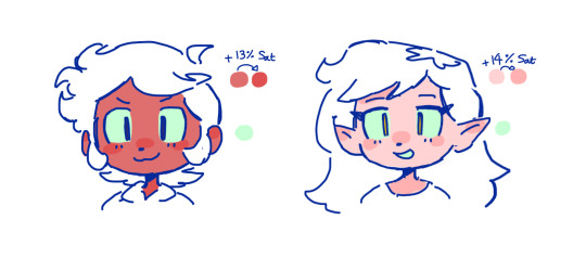
hair: as u can See, it's not darker than the base colour at all!! for dark hair like luz's, i brighten & saturate the colour, and for light hair like amity's i just shift the hue a little!
⭐️more kewl tips:
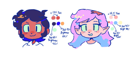
colourpick from yourself!!!! instead of making a new colour for everything, try using a colour u already have down!!!! like below: by limiting my colour palette, it looks more harmonious
really messy image but i hope u get what i mean. also the "off white / black" thing is a separate choosing base colours thing!! i can expand on that if anyone's interested 😙

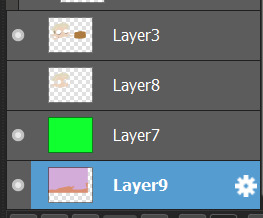
shove halftones in wherever they fit. here are the 2 pngs i use!! there a rlly good alt to gradients, i used a LOT of them in that callie piece!!! clipping mask over where u want it & alpha lock to change colour.

⭐️here's a WHERE i put the shading:
look st the environment ur guy is in!! pick where your light source is coming from & look where that light will hit and where it is blocked by something.
bounce light: the sun's light is also shining on the grass! so powerful the green reflects right back!
this is kinda more realistic lighting now.
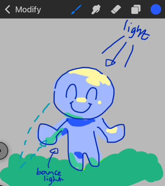
i kinda just put a circle wherever theres a corner!
and i put that Beautiful Shape a lot wherever. i change it a little depending on the character, sometimes its triangular or squarey but thats the base shape! i dont even know what its called but i love it.
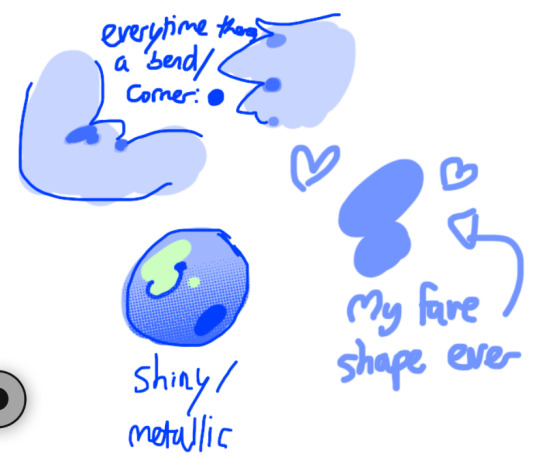
look at this hello weird shape guy!!!
actually, my grandfest art are probably some of the most detailed art i have! u can see urself where i put shading & stuff - they do have more desaturated colour palettes though:

& here are some additional examples ^_^ flat colour -> shaded -> multiply layer -> lighting


in this one u can see the hand & leg at the back are completely in shadow too :)

anyway i think that's kinda it? i dont really know how to explain it, i just do what feels & looks right to me??? remember that im Not an expert & this is just how i do things :)
i will always repeat my no1 tips tho: keep drawing!!! and copy ur fave artists!!!!!! it really will hell u find what u like!!!!!!!!!!!!
i hope this post helps a little & answers ur question😇 never be shy to ask me anything cuz i love answering & chattin w u guys!!!!
EDIT: just saying these arent set rules or anything!!!! u can see just how many times i Dont follow my own advice LOL. my artstyle is super inconsistent, i rarely draw things the same every time
198 notes
·
View notes
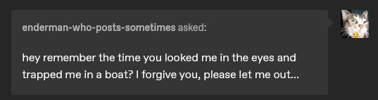
Note
(Heya! Ooc related: I’ve actually been thinking of starting a Minecraft ask blog myself. Do you have any advice on how to get your foot in the water? Are there any communities I can join to connect with people more easily?)
/ooc HAHAHA- Oh man.
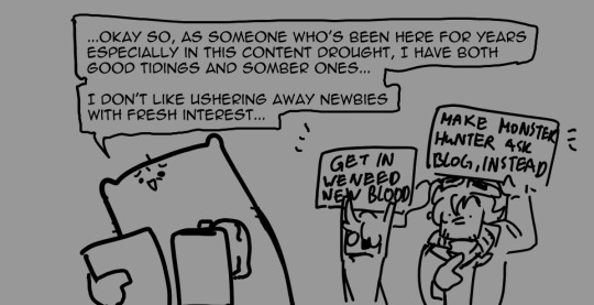
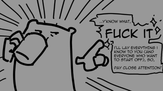
To start off, do note that: This is entirely MY perspective and MY experience. I'm gonna tell you ALL I know, so the good and bad will be included. Always take advice with a grain of salt.
IT'S GONNA BE SUPER LONG, FAM, SO IF YOU AINT INTO READING ESSAYS IN SOME NICHE HOBBY just scroll all the way down 👍
Also, I've been an outlier in this community for prioritizing askblog and storywriting (than jobhunting. DO NOT BE LIKE ME.), so, please don't use me as an example and find what's the best askblogging style for you.
▦ Note: edited at 26/03/25 for better readability and extra elaboration on some parts.
1. Know the scene. (Currently? p bad lmao)
Here's the first bad news: You kind of entered at the timeframe of Highest Difficulty (tm) at the moment. I'll be real with you right now, the community is very inactive atm. I can't blame them. A lot of people I know have real life priorities to do. I myself am only here because I'm doing askblog mid commissions and jobhunting.
With that said, you CAN still open an askblog, you just have to realize that the following will occur:
↪ Lack of the interactions/asks you hope to have. ↪ Lack of notes/validation. ↪ Lack of people who would plan with you or join events. ↪ Lack of interest.
And this WILL suck. It'll get to you. It got to me, obviously. But I'm still going because, again, I am an outlier, and TECHNICALLY I also have a goal I always look forward to to keep creating, which ties to...
. .
2. Your type of Askblog. (Neutral. This depends on you.)
Note first that you CAN always experiment and change styles midway if you don't feel for it. I only find mine because I've been here since 2013, LMAO, so don't be too pressed as a beginner.
But knowing the type of person you are, how you create, and your limits in creating is important. Knowing where you also want to steer your blog is important. Your skills are also important.
So your askblog MUST depend on what kind of content you want to do.
↪ Do you want to do askblog just for fun? Then limit the amount of effort you put into it, else you burnout when you don't get the validation you want. ↪ Do you do it to practice art or writing? Then put your SOUL into it. Just know it'll be slow and slow = also slow engagement. ↪ Do you do it to tell a story only? Not really an artist? Might want to commission someone for RP emotion icons and flex off your writing chops. Do know ppl prefer images rather than text.
This will be the core basis of your motivation for the blog. If you lose sight of this, you will burnout/quit faster.
I suggest if you don't know what to do: Do it for fun first. Do it blind. Notes will start very small, mostly 0 and max at 3... but if you have no expectation, you will take it less painfully. This is important, especially when you start off. And overtime when you start to solidify what you actually wanna do with the blog, you may switch gears. People will follow it if they're interested! So just keep trying.
. .
3. How to Run an Askblog (The hard part lmfao)
Bro I cannot stress ENOUGH that I cannot read people and especially you. I cannot tell you how to run your askblog. Your vision of your OC and story is purely yours, so only you can unlock the secret of what makes your blog 'you'.
But I can tell you what USUALLY works in nabbing people's attention and want to interact with your OCs:
↪ Endermen OCs. (e.g. askendy) They are super popular. No shade to Endermen blogs, it's just what works + the endermen community is the largest rn. ↪ Great artist and replies with images. (E.g. Askzub) Sorry to all the text only askblogs / those who answer with too much text... but if you wonder why people engage less, it's probably that. ↪ Great event hosts, aka blogs who knows how to rally up the masses in a collaborative effort to spice up the community. (e.g. rnotsleeping, 'Monstrosity of the Night' event) ↪ A continuous story featuring duo/trios with engaging storyline. (e.g. hexavexen and ask-vulcan-and-toby) ↪ A gimmick that is simple but interesting. Keep it to one sentence, e.g. mine: 'Retired herobrine with one eye.' (this caught the attention of a LOT of people surprisingly.) ↪ Characters that copies canon minecraft design concept to a T, but has some kind of story people wanna see. (e.g. Enderbro.) ↪ HUMOROUS/SOFTCORE blogs. Ironic, slice of life, or funny. We need more humor tbh. (e.g. hiiamramy (i love this cute blog lmao))
Again, these may or may not work for you. This is the trend that I just frequently see. You can make whatever you want, but know that these are what I see usually climb up to the top.
MEANWHILE, here's the parts that I think DEFINITELY make blogs stand out:
↪ Utilizing your asks in a smart way. (More at #4) ↪ Askblogs with APPROACHABLE quality. Askblog is about interaction.You may want to make space for people to include their OCs (TO A DEGREE) with you and also experience your stories with you. ↪ Characters who don't annoy the viewers/other askbloggers through asks. I cannot stress enough how merely annoying people can get you so much flak. ↪ Characters who tries to interact a lot with other blogs, but isn't intrusive about it. Keep it cool when you try to interact with bigger blogs! They're all riddled with anxiety just like the rest of us.
But also, here's the deal: If you want to break the market, you got to put in some effort. Basically, the same as marketing every products and yourself. You gotta post often, draw often, and send asks (THAT WORKS for both you and your target blog) often. Sometimes you hit the jackpot, most times people ignore you.
It's par for the course. If you think something isn't working, though, always ask for criticism. Just... know that most ppl are too nice to tell you where you went wrong, so, uh... Idk? Ask someone who you trust and is willing to be upfront with you, I suppose.
. .
4. Utilizing ASKS holy shit this is so important to me
You know how in 2013 everyone spams asks so much that you have like 80 asks per blog in a week? And that 'if you spam me or send asks that is unfitting to the blog, I'll delete it uwu' mindset?
Don't.
Let me let you in into my secret. Asks are RARE these days. Baiting for them is even harder. Only your friends will send you asks, and overtime they'll run out of things to ask. If someone sent you a humor ask and you want to throw it away... well... What if I tell you not to?
Here's what you can do:
When you get an ask that feels too humorous or OOC or trolling, weigh how much you can twist it to fit YOUR narrative. For example, this is the ask I got.
Imagine getting this 1 year ago at the peak of Steven getting stuck in the Nether at a break apart state. Your first reaction would be: 'Man, this makes no sense. I should delete it.'
Nope. Weigh it first.
Can you utilize this somehow? Usually, id either answer it in character and then end it with some kind of lore reveal. (e.g. your character sees this and goes 'no! I never did this! ...or did I...' -flashback about an enderman friend they've forgotten-) so you still answer accordingly BUT also reveal something about your character!
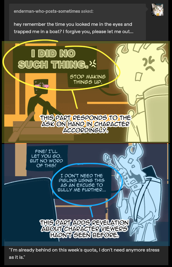
See? This engages viewer's interest while also accommodates the ask. Everyone's happy.
Do note some asks can't work like this no matter what you do. You can bank these for future happenings.
...and if the asks are highly uncomfortable, or clearly a troll you can't utilize, or just 'hi.'? Probably just delete those, yeah.
. .
4. pt2, Baiting asks.
Baiting asks is like fishing. You gotta know when to reel and when to hold. Lemme explain.
The basic on this is: don't make your ocs TOO mysterious, but also not TOO open. TOO MUCH OR TOO LITTLE INFO ABOUT YOUR OCS WILL NOT HELP EITHER PARTY! Especially when we are in a drought like this! So yap, reveal, hide ONLY the most important secrets they have, and then reveal it slowly through asks and flashbacks.
Make askers feel that they unlock your ocs more (satisfaction on their end) and you get to infodump on them who your OCs are in a slow pace (satisfaction on your end.)
"But Doe, I can't do this if I don't even get asks."
I grab you gently.
Then drop lore posts.
I notice a lot of askbloggers refuse to post ANYTHING unless they got asks. DON'T. DO THIS. Realize that people usually don't ask because they have NOTHING to ask about. GIVE them something to ask about!
And remember! Do it in a trickle. BOTH in your standalone and answer posts.
So reveal in a consistent, slow trickle way. Give people things to ask about, while also not be too protective of your secrets and reveals.
.
.
4. pt 3, throwing asks.
I BEG OF YOU. SEND ASKS.
You send asks in return to getting asks. That's why non-anon asks is IMPORTANT. It lets people know WHO you are! SO THEY CAN SEND ASKS BACK AT YOU.
Here's my formula:
↪ Read the blog about 20 posts back and figure out something you can ask about. ↪ Ask 2 asks IN CHARACTER, PROPERLY. (format: "your ask here" > Line break > @.yourblogurlhere) This allows you to extend an olive branch for interaction (and future character relationship (friendship, enemies, rivalry, etc)) with the character, while staying in character. [E.g. "Hey, man! I noticed the sweet ride you have outside the house. Is that yours? Because I got a lot to talk about if you like cars!" - @.software-bugs-b-gon] ↪ THEN SEND 2+ MORE ASKS IN ANON with differing styles and personalities to give them MORE FOOD to continue their blog. This allows you to be slightly mean or out of character and gives YOU more ooc leeway to pry the character open further.
Now you just askbombed a blog with 4 asks! That's 4 POSTS OF CONTENT! You're happy, they're happy. YIPPEE!
AND IF YOU ARE ONE OF THOSE PEOPLE WHO GOT AN ASKBOMB, please either return it or spread it to other blogs. Please.
P l e a s e. . .
5. Keeping it fresh.
Like a comic, people gotta come up with new story ideas else the blog stagnates.
If you aren't a story driven blog, letting people do M!As or just do silly 'scenes' and 'situations' work. Think of it like a slice of life or a sitcom.
Shit happens, and your OC is put into it. Let people ask things that help drive them around!
If it's story related, breaking it into arcs and story events will also help you introduce something new per arc and thus, not stagnate!
. .
6. I am tired of askblogging, and I want to take a break. How do i come back from that?
By, uhh... By just coming back?
There's not really a secret sauce to this, I feel like. Do note I am one of the more well-known askblogs out there, so I can just come back anytime and still have people waiting for me. I know that much. But still, not EVERYONE waits for me, y'know? So I just treat it like I'm starting over. No expectation, no grumpy because people aren't waiting for me. I just write for myself and to entertain, and those who like will come back and those who don't can leave and this is okay. This is normal! Don't lose hope.
It's kind of depressing to say 'just don't expect too much,' but it is actually the mindset you need. Do it for YOU, mainly.
And if you somehow deep, deep down know what you have isn't working out?
It's fine to quit! Or restart. Whatever works for you.
But also, quit with honor! Keep these in mind:
↪ DON'T JUST POOF. Believe me. You may be surprised how many people will be sad you're leaving, and what's worse is leaving things open ended will bite you in the ass. I've seen it happen. THRICE NOW actually. None of them ever ends pretty... I'd suggest just taking a hiatus before breaking the news. ↪ Take note of everyone you plan with, and contact them. Tell them you are quitting, and open up a conversation on what they can do in your absence to not break their story midway. Just- just keep open communications going? It'll suck then but it'll cover your bases. ↪ Tell your followers. Obviously LMAO. ↪ If you have the balls, ask them to anon message you on what you can do better for next askblog. People will be more upfront when they are hidden in anon, so you will get some nasty comments. If you want to pursue better writing/art/askblog and you can take the heat, try it out. If you CANNOT take the heat, DO NOT DO THIS. Especially when you quit for mental health reasons. ↪ This is just me to you, don't delete your blog, man. Just close your asks and let it up for good time's sake. I can't tell you what to do with your blog, though, but I prefer archived blogs over deleted ones.
. .
7. Last one I promise: HAVE. FUN.
Askblogging isn't a full time job. You do it because it's probably like a lite-comic for you. (me.) Or maybe it's a place to showcase your OCs. (me.) Or maybe it's because you are insane and you just want to yap about stories and humanity and touch that SOUL in everyone and understand complex emotions in niche situations that wrench your guts (also me.)
No matter the answer, have fun. The blog is for you to LARP as your character and interact with others. Find your community, find the people you belong with,
and most importantly: FIND THAT SWEET SPOT OF WHY YOU CREATE IN THE FIRST PLACE.
Just have fun. It's your blog, your rules. I am just an old man who likes to see more blogs show up, so whatever your decision is:
Make your own damn fun, okay?
.
.
ALRIGHT THATS MY YAP HERES THE TLDR:
The scene is currently dead, but make one anyway. Just don't expect much from it atm. You will start on Highest Difficulty, and I don't blame you if you can't garner interest no matter what you do.
Decide on your type of askblog. This will be your core, so if you lose motivation you still have the core to fall back onto. Why do YOU want to make an askblog? What is it for you?
Askblog isn't easy to run. You have to keep your eye on trends, other blogs' stories (you are invested in) and events. Some things work and some don't. But most importantly: Post a lot, include pictures if can, send asks and interact a lot with others!
Know how to utilize your asks. They are SCARCE. Don't just throw away asks that 'makes no sense' and try to twist it your needs. b. Additionally, learn how to bait asks by feeding your viewers bits and pieces that makes up a big secret/character of your OC. Give them something WORTH asking. c. ADDITIONALLY throw a lot of asks. Send some in character and a LOT in anon. Make some askblog happy. We need asks, after all.
Keep it fresh. Don't let the blog stagnate.
If you don't think it works out, it's ok to Quit or Restart. But please do it with other people in mind. Quit with dignity.
Finally, HAVE FUN. Do what it takes to keep the fun fresh for YOU.
. . .
For communities, I suggest LiLaira's MC discord community just to find people you can vibe with. You can then do your own smaller discord community to yap MCaskblog with, preferably those you are chill with and can rotate ideas with.
Joining here also will give you access to the Tumblr MCaskblog community, which helps with your MCaskblog feed.
(both are currently low activity though, just a heads up.)
I'm sure there are more communities out there that I don't know of. Just research who are behind them and be careful with what you choose!
I myself is in the above MC discord. If you wanna yap OCs with me, I am the kind of bastard who camps in the oc discuss channel, sooo... I guess I'll be waiting! :D
#mcaskblog#ooc#askblog#just askblogging in general#listen.#this is one of the weird niche hobbies i have in my life#i am a weird outlier with no life#please dont use me as your bible#i will however help you the best I can#good luck in your endeavors!
42 notes
·
View notes
Note
How do you color in your art?? I can never make mine look right, i’m still relatively new to procreate and I just wish I could instantly know how to use it because AGEGGS
I don't use Procreate and I'm not sure what you're personally having problems with, so I'll just go through my process using some of my old drawings and try to give some general advice that might help
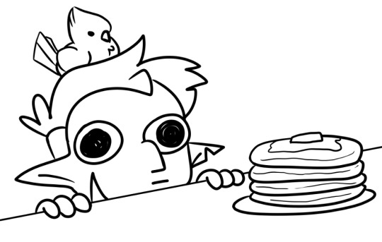
So I have the line work of "Hunter wants pancakes" here. I usually copy images from screenshots of the show and paste them onto the canvas so that I can eyedrop the colors, but I probably had it on a different canvas there.
Sometimes I'll change the colors a little bit for clothes to make them a bit brighter or less saturated (depends on what I think looks better), but really for fan art of characters that already have a color scheme, I just copy the colors.
But your line work is going to be your topmost layer the majority of the time. All the coloring stuff should be underneath the line work so that if you do color into the lines, the linework isn't impeded
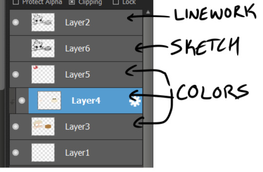
I typically put all my colors on the same layer, but feel free to use layers in whatever way is more convenient for you. (When I'm doing lineless, I'll typically make a new layer for each color so that I can shade them individually later on. Idk if that's at all smart or convenient but it's just a thought)
As for the actual act of coloring, I pick a large, textureless brush. You could use whatever you want depending on what kind of look you're going for, but for my finished pieces I usually like the coloring job to look cartoonishly clean. Like you can see that the second brush changes opacity as it reaches the end of the stroke (or with lighter pressure, since I use a pen), which I don't want, since I prefer the colors to be uniform in shade and texture. So I use the first one instead. Also less texture helps keep the color in the lines from my experience.
I don't use the paint bucket tool very often because it typically won't fill in all the white space, especially when your work is more detailed (which would lead you to have to go back and go over all of the edges again with a brush anyway), so I color most everything manually now. But for "Hunter wants pancakes" I think I did use a paint bucket and then probably went back to fill in some of the gaps since there are clean white gaps where the line work would be.
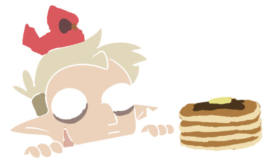
That is to say you should color with your line work visible (I don't know who wouldn't but I'm trying to cover all the bases here). You made yourself a coloring page, now you get to enjoy it. Without the lines it can look pretty silly and very messy, but it doesn't really matter if it's going to be covered up by your line work anyway.
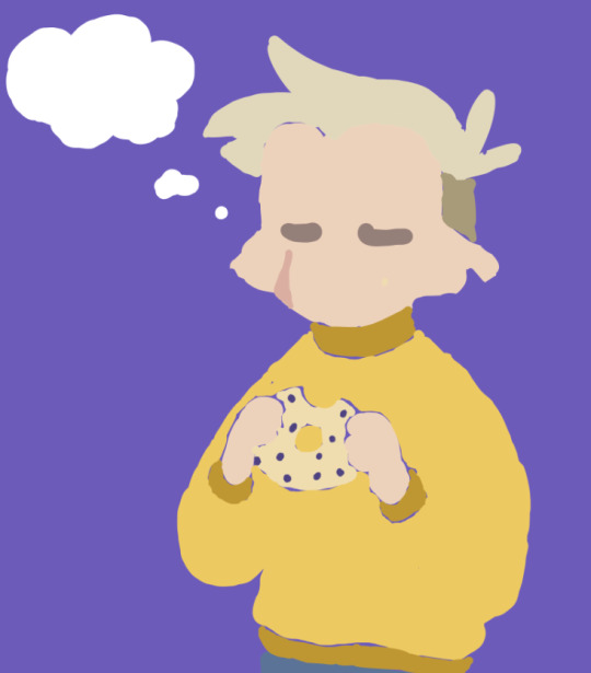
Sometimes when you're coloring with lighter shades on a light background, it's hard to tell if you're missing a spot. I like to use a really REALLY saturated color like neon green or red to see any gaps in the color. Put the layer of neon green under the color layer and it will become very obvious where you missed haha. Sometimes I'll look at the neon color for too long and will need to change it to refresh my eyes
This colored sketch isn't very clean but it shows that you can also make a clipping or masking layer (if you don't know what that is the Internet could honestly probably explain it better than I could), color over the whole thing with a different color, and lower the opacity to give it a cool-looking tint
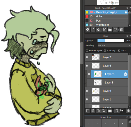
I don't know what your specific issue was but hopefully I was able to clear at least something up for you
19 notes
·
View notes
Note
Hello Anna <3 I hope you are doing well 🌻
Can you answer questions for the artist game 2, 7, 9, 10, 11, 12, 13, 16, 29 :)
I like your art and I want to you talk more about your art. 🥐🥐🥐
Oh, hello-hello!
Thank you so much for these kind words and for your interest! And, haha, I see that you've read the previous post, too 🥐🥐🥐
2 most popular piece?
It's ironic how one of the most popular pieces is the one I don't like :D But this is it!
Another popular one, is this one, but in this case, I still love this art (sometimes I wonder if I'll be able to create something like this ever again...)

7 easiest thing for you to draw?
It's a very interesting question! Let's say, on the stage of the rendering, it's, how ironically it wouldn't sound, but backgrounds! I know that usually it's considered like the least thing you would name as "easiest", but somehow, it works for me...
9 whats something you always come back to when drawing?
Hm, very good question. I think, it's this simple thought that everything, in reality, doesn't have an end: drawing, no matter how good you are, is about constant studying, and this is also the beauty in it. I always try to keep it in mind, but when I start drawing, every single time I recall this idea, and, at some point, to be honest, it's also reassuring.
10 how do you deal with artblock?
You know, I must tell you that I have never had an art block. Demotivation and discouragement? Yes, and not because I can't draw what I imagined, but primarily because of the reach since I wish my arts would be seen more, but other than that - even if I had some small moments when I felt like something wasn't going the way I would like to - I felt upset and sometimes disappointed, but never to the point of artblock. So, in my case, the answer will be a bit different: when I have such moments, I just step away from it and let these feelings not interfere into my art process. Drawing or writing with such low emotions which whisper to you how "you're failing to match your imagination" (which, in fact, are nothing but lies) is a huge emotional turmoil and also, some kind of torture, so instead of forcing myself into it, I just let these emotions live and die as quickly as they appear. During this time while I'm away from drawing/writing, I try to distract myself with something usual like reading, for example. So, yes, that's it!
11 do you listen to anything while drawing?
Yes! I usually listen to lectures/discussions, this kind of content, or to the music - when it comes to it, I try to find the matching pieces of songs to the vibe of the drawing, so it also helps me to set the mood :3
For example, for this art, I was listening on repeat Eric Satie, and I hope it gave the mood to this art the one I hoped to achieve
12 describe your process while drawing
Thank you for this question! It all starts with the idea itself, usually it just pops up out of nowhere, or some official art happens, and the image of what to draw strikes me very clearly. Sometimes, I can have some ideas, and they float around, until the moment I realize how I want the art to look like. After that, I gather some pose references, and start sketching. How much the sketching stage takes, it depends on the art itself: sometimes, I can sketch it for 20 minutes, sometimes - for hours. When the sketch is ready, I do the flat colours: just basic shades to understand the palette, and after that - the general colorization of the art (the group with different layers such as Brightness/Contrast, Gradients, Solid Colours, Hue/Saturation etc), which changes through the process. And then, rendering! Now, I have the scheme: firstly, skin rendering + hair, in between - background, step by step; clothes; additional details; the general work with lightning; shades/volumes; final touches, and here we are!
13 talk about a wip you like!
Currently, I'm working on JeanPiku and AruAni double date, and while I think it's quite good piece, there are two WIPs I'll be working on after that, and I must tell you that this solo question made me *wheezing* because I'm both excited and a bit scared to work on them :D One of this WIPs is related to Ancient Greece mythology (sorry for not sharing details, since I want to keep it as a small surprise), and another one based on this official Annie art from brave order with pipa, and, off course, Armin too :3 I really hope I'll do justice to these ideas, and you'll like them!
16 how do you motivate yourself to draw?
AruAni (and JeanPiku) motivate me to draw! :D
But on more serious note (my first answer is still serious), it's as simple as it is - I can't simply not to draw. The drawing itself motivates me because it allows to tell the stories, to live through so many emotions and many scenarios. And, honestly, for me, it's more than enough.
29 do you use a lot of references while drawing?
I use reference for the poses - that's yes, my must have, since I try to make it quite "humanly fluid", and even if I study anatomy, I prefer to have references to always double check. As for composition and colour palette- no, it's always my free flight of imagination :D So, basically, I use references for characters and for some specific details, like furniture or flowers, for example.
Thank you a lot for all these questions! It was really interesting to answer, and it helped me to distract myself from everything, thank you so much, and have a good one :3
9 notes
·
View notes
Note
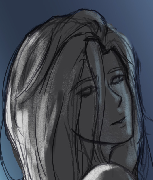
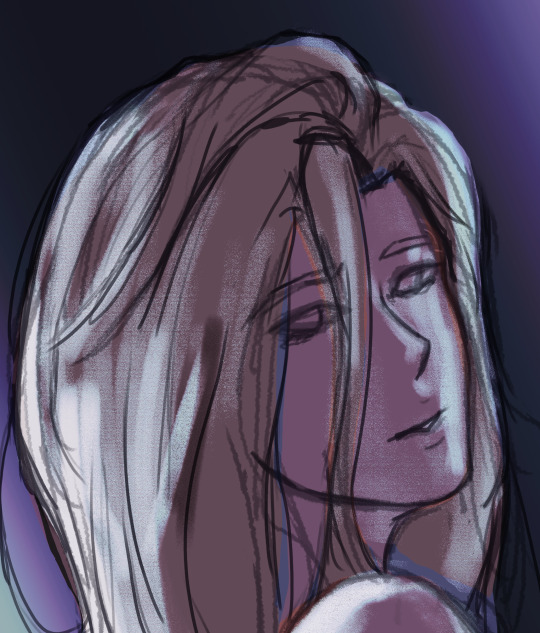
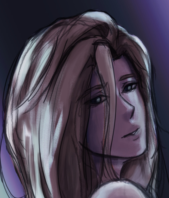
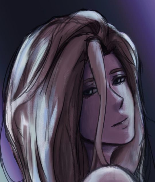
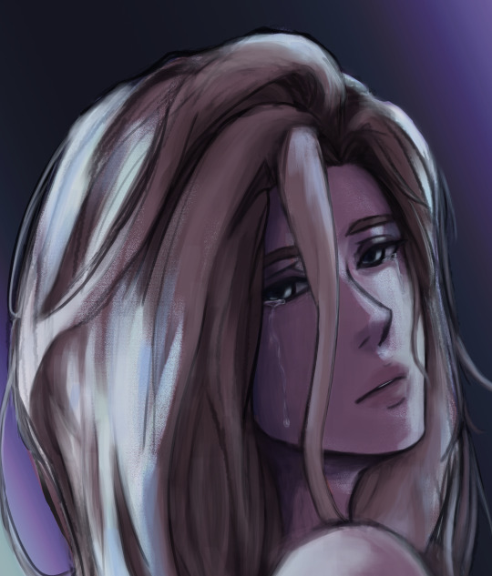
Less about OCs, but I'm interested to know what your process is like when creating a piece as detailed as that one you posted for Valentine's Day. How do you go about it? And do you happen to do time-lapse videos?
hmm can't say I can give an explanation that's terribly interesting or satisfying lol... I'm almost entirely self-taught, so "process" is a very loose and nebulous concept for me, and it changes from piece to piece. the one common thread among my works is that they all involve obscene amounts of trial and error. I don't have any recent time-lapses because I never think to record them, but if I did you would definitely see how often I feel the need to adjust and redo every little thing.
for the Valentine's Day piece, because it was a "remake" I had the benefit of a much more solid foundation than usual to start out with. however you can still see where I ended up deviating from the sketch phase - most obvious being her pose, the design of her hair, and the details of her sandals. (there were also meant to be candles on the dresser, but I forgot and didn't feel like adding them back in later and so I decided a vague suggestion of candlelight was enough lmao)
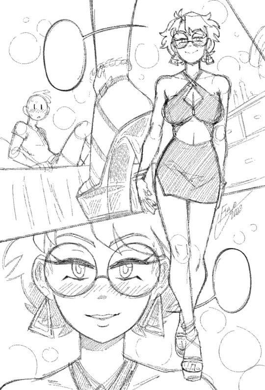
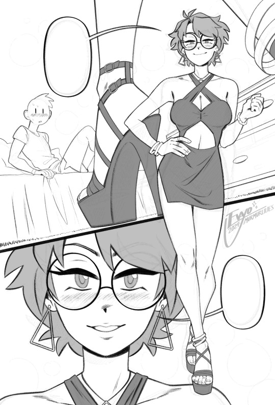
anyways, compared to everything else, sketching and linework are fairly straightforward and come most easily to me. there really isn't much to say, just scribble some messy lines and then whittle away at and draw over them till they magically become less messy!
when it comes to coloring and shading, things get a lot weirder and more complicated. this is where my process tends to vary the most, because it really depends on the mood of the piece. for this one I wanted something dark and seductive, so I covered the whole image in a layer of burgundy red, then painted the "lighting" on top across several Overlay layers. additional shadow details were brushed in on Multiply layers using deep purple instead of straight black, but ultimately I didn't want them to be too dark, as that initial layer of red was meant to serve as the primary "shadow" of the piece.
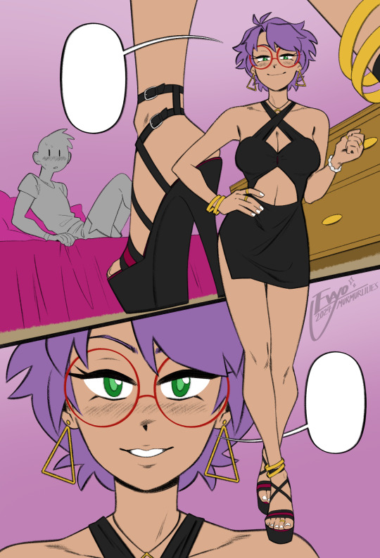
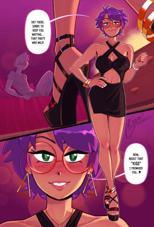
this is also usually where I decide which lines I want to "color" with clipping masks, which can either make certain elements pop or feel softer. it sorta brings the whole image together, giving it a much more painterly look overall. from there all that's left is to keep making adjustments and adding little details - the glittery effect on her dress was one of the last things I added, I thought it looked really nice!
...ok now take everything I just said and throw it all in a blender. because even though it might sound fairly orderly, the truth is I'm constantly making changes to all stages of my works, even the earliest ones, all the way to the end. I'll still be making adjustments to the linework and such after I've already put so much effort into the lights and shading! it's not the most efficient way of doing things... but again, trial and error. my perfectionism gets the better of me...
anyways I apologize if NONE of this made any sense, like I said I never had any formal training in art, so I'm not very good at teaching or explaining it!! at the end of the day my process is less about what makes logical sense and more about finding what feels right in a given moment. at the very least I hope it was a fun read lmao 🥳
#evayo asks#evayo art#glassborn#ocs#fun fact: i had no idea what to put in those dialogue bubbles till like an hour before upload LMAO... she could've been saying anything 🙊#art
42 notes
·
View notes
Text
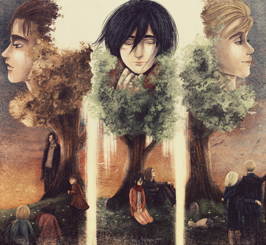
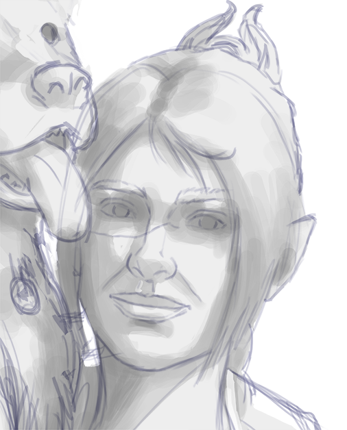
Mr. Victor Shade, SWORD's leading expert on AI, aka The Vision's mundane alias.
More concept work for my comic plans, where after Westview Vision is found by Monica, Darcy, and Jimmy who help him build a life and remember who he is. Monica offers him a job at SWORD with Hayward out of the way, to reform it and return it to her mother's vision (pardon the pun). Vision helps out with this process, because who better to be watching and ensuring there is ethical treatement of AI and other 'sentient weapons' than the most advanced synthetic being on Earth? It will also give him an opportunity to explore who he is, and how he ended up being turned into Hayward's weapon in WandaVision.
(I have no affiliation with Marvel/the MCU - this is purely a fan project, and I know if we get Vision Quest as a series it will likely go in a very different direction. That's the joy of the Multiverse though - anything is possible, and I love telling *my* Vision's story through art and my stories.)
Breakdown of my process below the cut, as this was painted as a quick demo for a friend asking about how I do things and I enjoyed it enough to finish it:
My process has changed a little over the years but remains roughly the same. The level of depth and detail just means more hours refining the painting down more and more with additional layers and passes of light, shadow, and texture.
Before I start a piece, even just sketches to unwind, I gather reference. Sometimes I'll just see a photo I like of Paul/Lizzie, or sometimes an unrelated image where the pose or lighting or ambience speaks to me. I also use my collection for reference - my statues and Hot Toy figuresm to get the right lighting and angles, especially for Vision and all his robot lines (though admittedly these days I don't always use a reference and just go from memory...I think I draw this silly robot too much).
Once I've got a concept and some references gathered I set up my canvas. Currently I use CSP and I love it, and I have a variety of texture files I've purchased that mimic different types of paper. I like working on these as it feels more natural with the pencil, ink, and marker brushes I use. Once I have my references set up in the file I'll do a rough sketch, blocking out proportions and basic shapes. I'll set a mid-tone grey background as well, and I almost always sketch in color. I like choosing a color that represents the character for me - bright blue for Vizh, red for Wanda. I have a Loki sketch I need to finish for my sister and I used green for him. It helps me capture the 'energy' of the character, and this sketch remains a part of the finished painting even as I refine.
Once I've got a rough sketch down I'll start working on more detail. Sometimes this will be inks, sometimes just another pass with pencil. Depends on the piece and what I'm going for. This step can happen multiple times for complicated paintings, and usually I'll cycle through steps 2-6 multiple times for a large piece.
Once I have the lines down I'll paint flats. Most of the time I'm using a big brush that emulates a marker, because I like the texture it gives, especially when layered. I'm very mess and use an eraser brush to clean up the lines, and sometimes I'll go back and tweak the line art until I like the look. During this phase I'll also lay down some details - freckles, scars, details like eyes, tattoos, jewelry as well. When painting Vizh I like getting the texture in his robotic eyes done early on, and usually refine them again towards the end.
The real fun starts here - I'll block in my lighting, usually just going with whaveter I'm feeling in the moment. I like playing with gradients and layering them in different ways to create a more dynamic image, and then I start blocking in shadows with soft brushes.
More lighting. I start adding top layers to further stretch the dynamic. I like overlays, and adding a sort of dreamlike/surreal filter through the color. I'll also start adding in highlights to contrast the shadows and work in small sections to render the details. I always start big and decrease my brush sizes for detail and work in layers and stages, checking the reference as well as the painting's lighting (which is not always the same as my reference) as I go.
Texture texture texture. I like texture. This step sometimes happens earlier, but once I'm happy with my actual *painting* of my subject(s) I'll start figuring out background elements and textures for visual appeal.
#the vision#white vision#wandavision#paul bettany#wandavision fanart#marvel fan art#mcu fanart#digital art#art process#my art
19 notes
·
View notes
Note
Hi! Hope you're doing well!
I'm trying to learn how to properly draw people. I'm fairly decent at drawing objects, but people? Nope, that's out of question. So, do you have any tips for a beginner? Like what should I focus on, any YT channels, etc.?
(If you see this ask on other pages as well, it's because I'm sending this to my favorite artists on this site <3)
Hyello!
I don't know if I'm exactly the person you should asking, seeing as I'm still fairly new to art so I'll point you in the direction of a few of my personal favorite artists as well! I do have a few tips and exercises for you that I've found to be quite helpful (if not fun) that have been passed down to me by other artists and teachers, though.
1. You should really learn your anatomy before you try to find your specific style. Without knowing the basics first, you'll probably jump around and have no consistency when drawing the same character. Knowing the body is very, very important.
Exercise 1: Using reference photos (I recommend dancing and sports photos for more dynamic shapes, beauty influencers and photographery for what is typically "attractive," and lots of different body types and skin tones for a diverse and more realistic character) and trying to figure out the line of action, then make a gesture drawing to get the basic feel of the body's movements, then the shapes of the body, etc.
Exercise 2: (The fun version) Draw a random shape. Yes, a random one - it can be pointed or round or wavy. It just has to connect. Then, try to make a character that fits in the bounds of that shape. This will push you to try to figure out what is necessary to make a human look, well, human, and also limit the clutter of your characters' accessories and clothing. It also helps you create a unique silhouette (which is always great when making a good, recognizable character)
-
2. Colors! I'm sure you know basic color theory from when you learned how to draw objects, but if not, you should definitely get on that. It's best to know what colors work best with specific skin tones or whatever you're putting on your character. There are a lot of color theory videos on YT which I think you should check out!
Exercise 1: Limit yourself to 1 color - you may only use variations of that color for your entire character. Yes, this includes skintone and hair. This exercise helps you with values and gets you connected to what places need darker or lighter colors. It's also just really, really fun.
Exercise 2: (Variation of 1) Find a color pallette and stick to those colors exclusively. Try to use the 60-30-10 rule if possible (meaning 60% of the character is one color, 30% is a different color, and 10% is another color). Not everyone adheres to this rule since character design is fluid, and you can do whatever the heck you want, but I personally think that it helps to push your knowledge of color.
Exercise 3: The internet is your best friend. Find a very colorful image online of a model that you really like, or a person that's sitting in some nice lighting, or even an animated character that had some funky colors. Try to imitate the rendering. Shading is pretty important when learning how to draw because it can really change how the muscle looks without it. (Depending on your style, shading can look very, very different.)
-
3. (Extension of Color) Once again, shading is very important! Depending on the project, however, the way you should shade can be very different. For animations, shading is typically minimal so that they can focus on the movement and not slave over their computer for days on end shading and shading and shading. Keep that in mind! For cartoon or anime art styles, it's often blocky and not blended. For real-life proportions and art styles, it's often blended and rendered (and normally without line-art if that's the route you wanna go 👍).
Exercise 1: Try out and study all sorts of art styles and shading types! It's really helpful in the future if you want to know what you like best! If you want to study a specific artists' art, it's best to ask them beforehand, however. Get their OK before starting. If they say no, then don't. (By the way, no art style is original, no matter what anyone says.)
-
4. There are lots of online courses or resources you can use! Utilize them. Some of my favorites/things I've heard good things about are...
Artstation - Courses
IAMAG - Courses
Senshi stock - References
Croquis Cafe- References
Rad how to school - Courses
Life of action.com - References
Quickposes.com - References
Proko - Courses
Posemaniacs - References
Warrior Art Camp - Courses
Pexels.com - References
Marshall Vandruff - Courses
Cactus Art Academy - Courses
Sketchdaily - References
Bodyvisualizer.com - Body types
Figurosity - References
Pinterest - EVERYTHING
-
5. Youtubers and Content Creators !!! There are a lot that I watch and a lot that other artists have recommended to me, so I'll tell you them. Also, find your favorite artists on your favorite social media sites and mentally study their art when you see it! Trust, it helps. (Warning: Long List)
Drawfee Show - They're very funny + watching how they quickly build their characters and settings can really help you figure out what is most important in character design.
Hanacue - Their shading is to DIE for <3
Marikyuun - Very good with a cutsie art style!
Kooleen - Funny, sarcastic + amazing tips
Marc Brunet - Anatomy at its finest
At Lojart - I just find them really cool
Jaiden Animations - Silly + watching her animations can help with your animations
GinjaNinjaOwO - They're funny + their character design makes me want to scream /pos
LavenderTowne - Very sweet + great tips + cute art!!
Pixiv - Wondeful tutorials
TheOdd1sOut - Same as JaidenAnimations, really
Sinix Design - <333333 so many great tips for shapes and painting !!!!
Marco Bucci - Color Theory!!
Mmmmonexx - I don't know much about them but my friend swears by him
Naoki Saito illust Channel - Putting stories/feeling into your art made easier
HxxG - More attractive art <3
Coax Illust - Fun! Semi-realism (I could never)
-
6. Lastly, learning art takes a long, long time. You can't just wake up one day and know how to draw. You have to keep trying and keep learning and never, ever give up. It's all part of the journey, even the pieces that you don't like. Practice doesn't make perfect. It makes permanent. <3
My favorite artists (and my moots <3): @gl4ssfan , @aiyumiyeou , @coffeeisfortheresponsible , @foxlow , @roselock22 @alicecraftgirl @twigs-sprigs @greenflowerceo @spoopy-sloth @laziilizard @enavstars @miyuliart
Hope this long post didn't bore you! Plus, I hope this helps. Have a wonderful day <33
#queue#ask august#august's art#august's opinion#august's real life#august's moot#my art#art tips#art tutorial#artists on tumblr#art
40 notes
·
View notes
Text
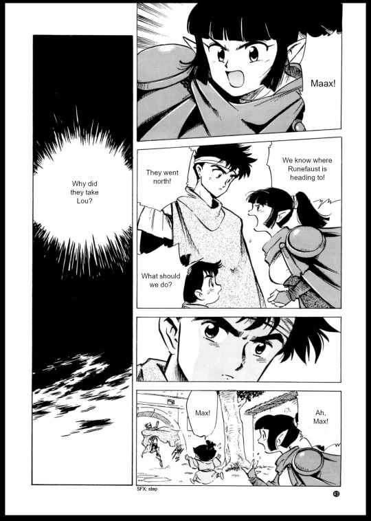
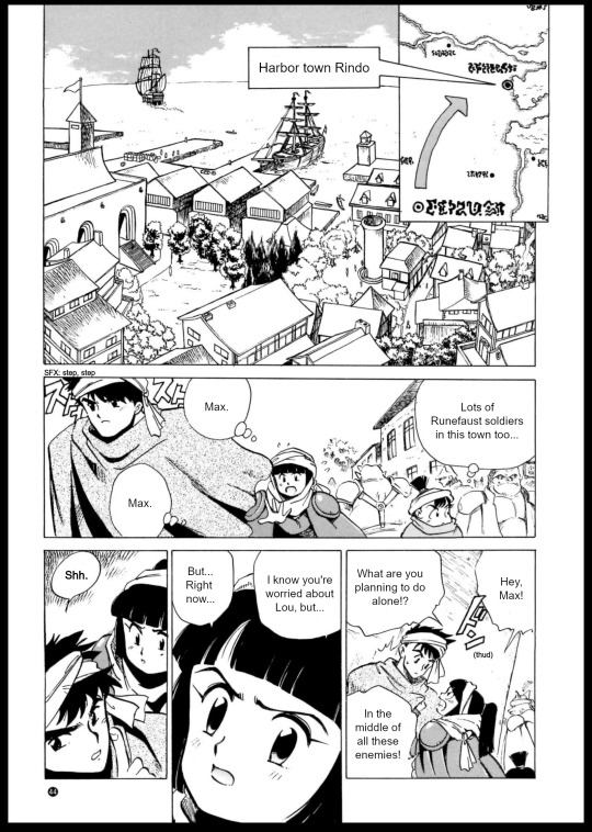
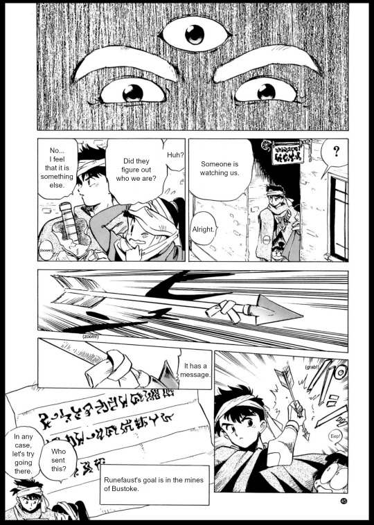
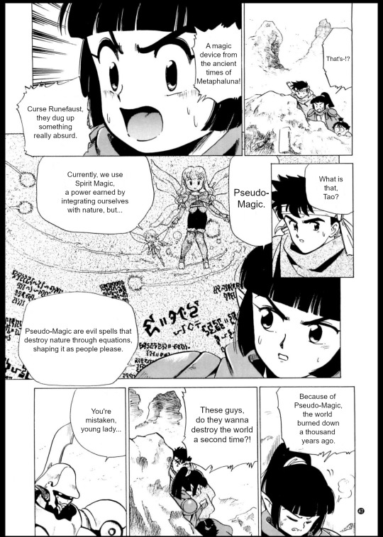
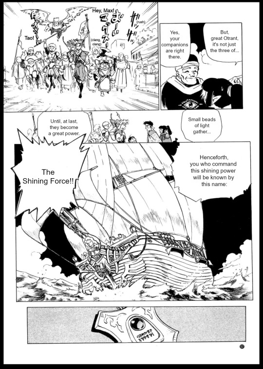
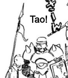
Authentic Story of the Shining Force - Saint Fencer Max - Chapter 3


Translation notes:
So, uh. Elliot's name is rendered with two t's in the og game, but a single one in the GBA version. I had never paid attention to that at all until I had already edited all these pages, and I don't care enough to change it.
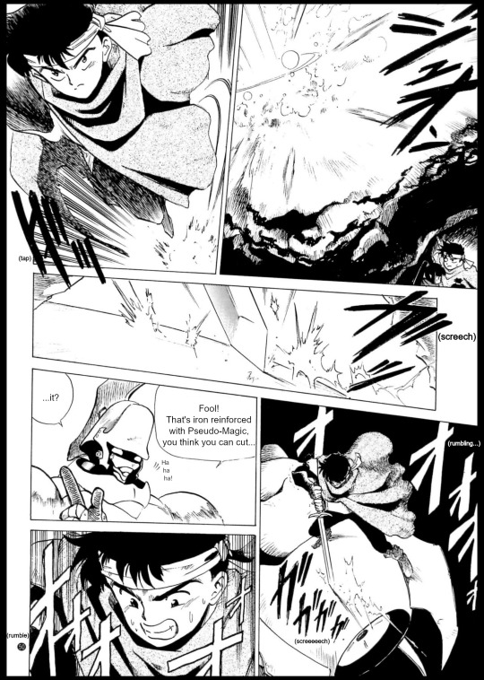
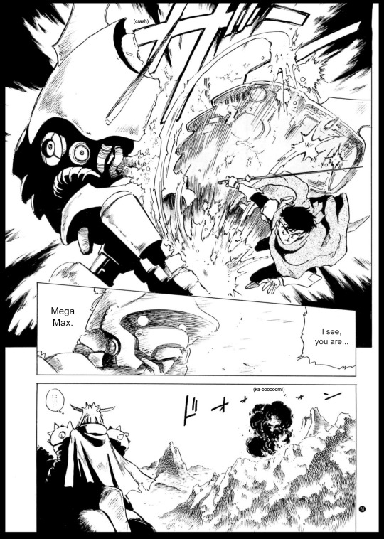
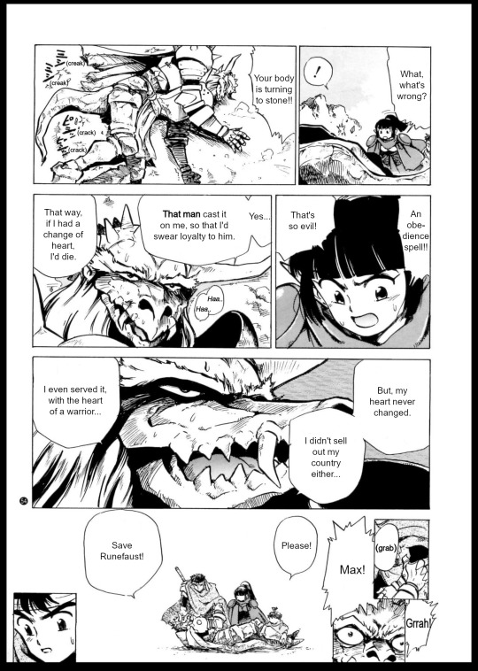
Cain's sword causes an explosion here. In the game, it is indeed capable of summoning flames.

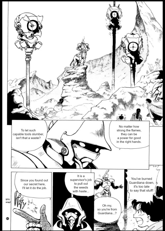
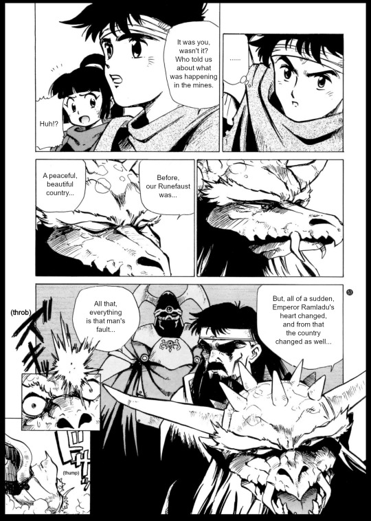
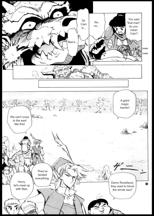
This is a perfect illustration of how I feel about these names, but I do wonder what the actual intention was, since Cain is supposed to be already gone. The original image is even cut off weirdly in the middle of the text, and i don't think it's a problem with the scan, since every scanned page has a black border showing that the paper itself doesn't cut there. I wonder about the production of this thing, but i'll wait until i translate the author's comments before saying more.
The map in the previous chapter was very accurate to the beta map of the game. The smaller map here showing Rindo however looks off, the coast is different, and there seems to be a river directly to the north of Rindo, as opposed to the path to Shade Abbey. Perhaps fitting since Shade is skipped here.
Metaphaluna, huh? Needlessly to say, the country of the gods/Ancients is called only Metapha in the final game. Also, in this panel, it pops up as an alternate reading for 前世紀 (ancient times), not the name of a country specifically. I chose to romanize the last part as "luna" for three reasons. One is that the continent of Rune is actually rendered as Lune in at least two guides. I take romanizations from JP guides with a grain of salt since they sometimes look bad/unnatural, or are inconsistent (Pelle's name for example has been romanized as both Peil or Payle depending on the book). I checked though, and town names however are consistent in both the books I've seen romanizing things. The second reason is that the beta map used at this point has a fairly noticeable crescent moon shaped island right in the middle. In the final game, we can't know exactly where Metapha is, because you only teleport there. But I wonder if this island had something to do with it at some point. The third reason is simply I saw no better reason. Metaphalna and Metapharuna would be just as valid, but don't have any meaning to them. Update: I didn't know back when I translated this, but it turns out the names "Metaphaluna" and "pseudo-magic" are also mentioned in Doom Blade, a spinoff manga done by Yoshitaka Tamaki himself (character design and one writer of the original game). This implies that these terms were really created by the game's staff, even if they are not mentioned in the actual game.
The biggest equation next to Tao as she explains the magic types is very clearly a E=mc². Look close.
I've retranslated Elliot's scenes from the game thinking it would be relevant to these notes. Now I feel it really isn't, but you get more content so you should be happy.
My main point with that is that Elliot does not say anything about Cain in the game. In the GBA version, Balbazak does try revealing Max, Cain and Darksol's identities before dying, but that's not a thing in the og. So yeah I really translated a bunch of stuff for nothing this time! Except not because Darksol is awesome in that scene and everyone should get to see it.
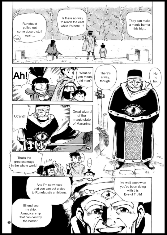
Now let's talk about Otrant. I have mentioned before that Otrant's gender is never explicitly said, and they speak in a mostly gender neutral way (I feel like there's a few masculine patterns in some lines, but I'm not confident enough to say for certain). What I hadn't noticed is that they also use lipstick in the games, which is probably what sparked these observations to begin with, but i'm uh, occasionally not smart. In any case, if any of these aspects were done at this point in development the artist here sure ignored them, and drew a regular old man who gets called an old man. They hate to see an androgynous boss winning.
I don't recall Otrant's third eye being called "Eye of Truth" anywhere else, but the manual of the game does say it can see the past and the future.
Otrant's naming of the Shining Force is a bit more elaborate here, but the wording is very similar to the actual game.
Finally, let's play spot the cameo!
We've got Gong, Zylo, one of the birds, and probably Anri. Easy.
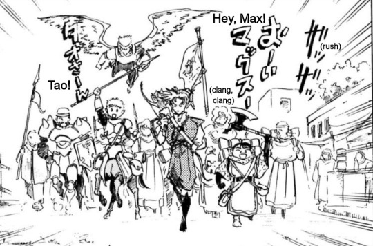
Here, besides the obvious three who were actually introduced in the story, we again have a bird, Anri between Ken and Hans, Gong to the right, and Mae and Gort behind Luke. If you read the pre-release page you know that Gort was meant to be Mae's servant at some point, so this might be why they're together, or it's just coincidence because they still join around the same time in the final game. More importantly, to Ken's left we have...
Some guys. Who are these. They could be made up by the artist (there will be another case of this), but I find it curious that the artist had to do that when there are so many character to pick from, and he clearly wanted to depict official characters here. For one, there's evidence that Earnest was already designed at that point in development. However, that link also shows that Vankar didn't have a portrait by that time at least, and Vankar would have already joined by this point in the story. So could the bald centaur here be a beta Vankar, or the artist's interpretation of Vankar via unfinished art? Maybe, but just a guess in the end. Mostly I'm just fascinated by how detailed this guy is compared to even Mae and Gort's cameos. The other guy isn't so i don't think about them nearly as much.
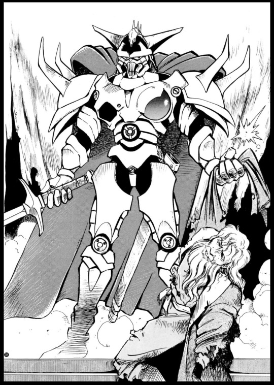
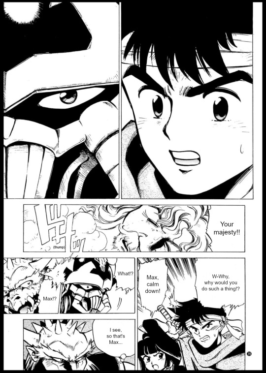
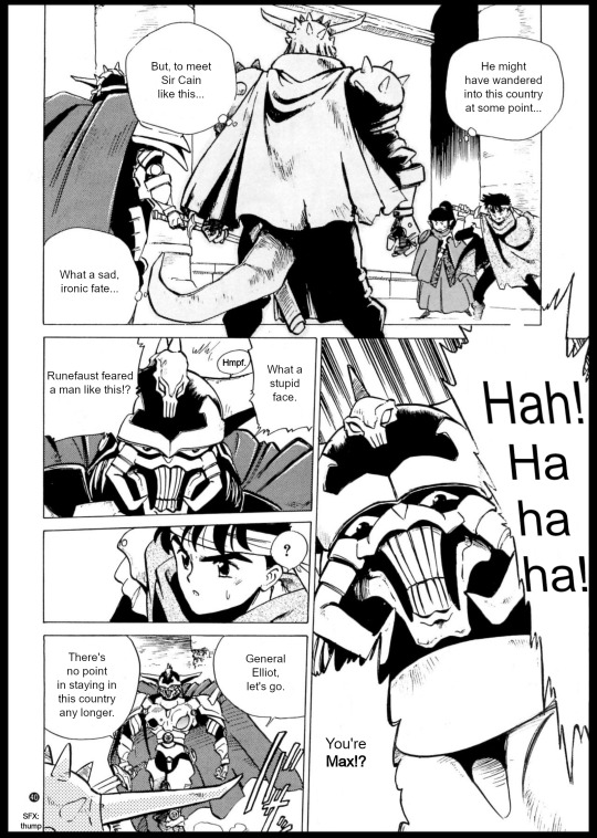
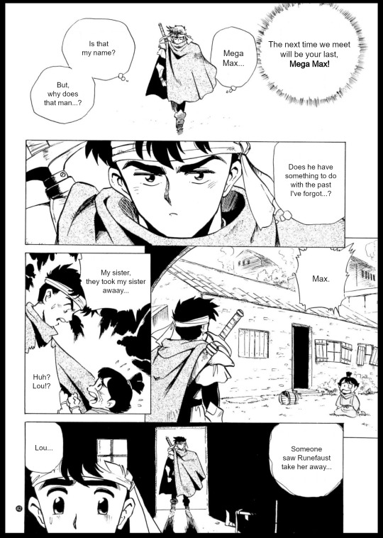
#shining series#shining force#saint fencer max#saint fencer max translation#sf cain#sorry i mean 'giga cain'. lmao#this is what i meant when i said i was hysterical about the chapter names btw. how are these real names#also. 'what a stupid face' lol. definitely do not share any genes with this guy or whatever#he is coping#sfm max#god the battle scene is. so bad. now you get what i meant by this thing not engaging the premise right. zero group battle#he's just doing random shonen shit. fellas he's a swordsman not sonic the hedgehog. why is he dodging lasers#sfm tao cantal#in a good manga a villain telling the fire mage 'no matter how strong the flames they can be a force for good'#would be some sort of character moment#don't expect anything of it here though#also the magic thing is infuriating because it's so close to my headcanons but fails the landing into some bizarre anti-science bullshit??#mages are said to be studious everywhere else so to put a line about equations there is just wack. also manarina literally has machines#just make the point about actual environment destruction you dumbass#i wonder how masaki wachi felt on this because the spells in the GBA version often show machines (and blaze 4 is a laser)#but torasu does spout some anti-tech stuff in his HQ lines#still less bad than here tho#sf elliot#you lose something of his character by not showing the fight#but the talk is far more interesting than the game#if you removed his mentions of darksol in pao and used this after the battle i think it would be the best portrayal of him#i think about him a lot. there's the shape of a good character but it never nails the landing to me in any version#though perhaps this is more due to the characters' full acceptance of him than he himself#which is why final conflict again wins by having his own son condemn him#...and then loses again by having lynx be the worst version ever of 'villain is okay because he has Honor' in this series
3 notes
·
View notes
Text
Calmly explaining my thought process with lighting & shading colors !! (Note that I am not a professional. I'm still a beginner artist (in my opinion,.,. If not beginner maybe amateur,, since. Mostly self taught)
So. Color theory is a weird fucking thing! But I like to try using complementary colors,, or whatever fits the mood I'm going for. Maybe even both!! Listen I know little to nothing about color theory other than complementary colors & how different colors evoke different feelings sometimes!!

For example, sometimes I go with things like these pairs!! A very light yellow, & a darker navy blue-ish color.
They admittedly clash a bit in tone, but for me, they evoke the feelings listed in the image. I'll shade & lower the opacity for both, which makes the blue stand out a little more. I'm not sure how it is with others, but it gives off a warm yet lonely feeling.
Depending on the character or situation, I'll pick from different colors a lot!! Admittedly I don't put much thought into it and just pick what I think fits, but I like to think about the possible reasoning after I draw something. It's fun to reflect!!
But yeah– colors can change a lot depending on the mood and/or area said character or object you're drawing is in. Blue colors tend to represent more sadder things, yet it can also represent calmness, stability, and wisdom. Yellow tends to represent happiness, caution, friendship, and/or betrayal. (Good example are Six & Mono from LN2 with their respective colors!! :])
Red tends to represent anger, & danger if I remember correctly!! I don't fully remember everything so those were just some examples. :]
Anyways I'm done yapping LOL I just wanted to talk about this rq :3
3 notes
·
View notes
Note
Very random and out of pocket but!! A few weeks ago I followed some classes on designing book covers based on themes and what you want possible readers to feel when seeing the book for the first time.
So it's been a while since I did that, and I got to thinking, what if I make some little cover sketches for otwd to practise? After some thinking and rereading some of the earlier chapters, I put down a little concept;

The most important part, for me, was showing one of two main things that really jumped out to me when reading; the ocean/freedom and betrayal. So, I jotted down some things for either idea.
For the ocean/freedom, I decided to go with a bit more of a traditional cover, very balanced, very light, as Nuffink's story isn't dark from the very start. I'd combine it with lighter shades of blue (to connect it to Nuff's main colours as well) with the colours darkening in ITPN and book three (see the colour palette in the top! Would also help the cold of itpn stand out)
In the first option, I also thought it would be really cool if the ocean was parting slightly as a way to invite nuffink to its waters, real "child of the ocean" vibes (and also to keep the image more balanced). The mist in the background would be a nod back to HTTYD and RTTE, where the mists to both the Dragon Island and into the Great Beyond was a symbol for mystery and adventure. And that's what Nuff's doing! He's going on an adventure that's gonna scar him for life! I'm still contemplating if the Chicken should be drifting on the ocean in the bg, but I think it would be a very good nod to Nuffink being invited onto the open waters. This cover would be leaning towards a light blue!
The second cover I based on the theme of betrayal and, more literally translated into the image, backstabbing. This would be much darker and colder immediately, which I'm not certain is the best decision considering the first chapters of otwd aren't outright dark, but it would display the idea of betrayal very well! As for colours, again, it would be darker, but still keeping the idea of blue to connect it back to Nuff and his ocean. The knife would be hanging just above his back (which would also be pretty significant as for the most part in otwd, he's not actively being betrayed, it's more hanging above his head and hits him at the end and thus it hanging above his back instead of already being in his back would make this more clear)
Anyways, that was a bit of my thought process behind these cover ideas! I'm not entirely certain if I'll work them out (it really depends on time lmao) but just in case I won't, here are the sketches and the ideas!
Again, this might be very out of pocket but I just love thinking about these kind of things haha
That class sounds really cool omg. I love these ideas! I've brainstormed otwd covers in the past but very generic ideas like just a picture of the kids flying on their dragons lol not so much theme based like a real book cover.
The composition of the first idea reminds me of the painting Wanderer above the Sea of Fog which is soo fitting! I like the idea of ocean/freedom/betrayal as the fundamental themes for the first one and it's interesting to think how the themes would change over time through itpn and totg. Do you know the book series Red Queen? They're sitting on my shelf rn and the covers have a similar shade of blue and each book is darker as the story becomes darker, I love the effect.
My dream would be to eventually commission a set of matching covers like these (maybe after I finish all 3 fics or at least start posting totg) and also make my own set of covers. If I ever make my own set I'd probably give each character their own cover- maybe Nuffink for otwd, Baldur for the downed dragon, Bjorn for itpn, Eret for the dancing and the dreaming, and Zephyr for totg? Gustav's prequel would be tricky lol
8 notes
·
View notes
Note
Hello, orokay!! I've adored your art for years now and I was wondering if you have any tips on how to draw and paint/render scars? I can never seem to get them to look right, any help is appreciated! Hope you're having a good year!
Hi anon, thank you so much!
Sorry this took a minute to reply to, I've been trying to figure out how I wanted to respond. For me, a lot of questions about how I do certain things are kind of tricky bc generally the answer is 'idk I just try things and tweak it until it feels right' and I don't really feel qualified to give art advice bc most of the time I'm just making stuff up as I go, but I know that's not really a helpful answer 😭
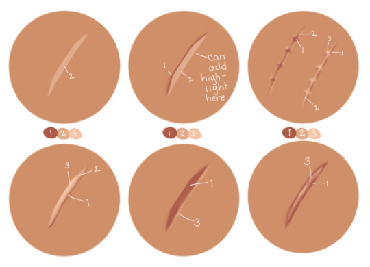
My art style tends to lean towards simple and stylized, so for scars I try to limit them to three colors at most, less if I feel like I can get away with it. It also depends a lot on the scar since there are different types of scars. Usually how I pick the colors I use is: one color darker than than the skin tone (shading), one slightly lighter than the skin tone for the injured flesh and occasionally an even lighter color for highlights. I'll include some examples under the cut. But please please please keep in mind wrt scars 99.9% of the time I'm just winging it and going off of what I think looks cool, I don't know anything about the science behind how people scar so please do your own research if you want to be accurate.
I'd say when approaching/researching scars you need to consider a few things:
Skin color of the person- Scars look different on different skin colors and different people scar differently. I think this is one of the biggest things to remember! Color pick for the scar based off of the character's skin tone and shade. The color you use for scar tissue on a person w/ light skin is going to look unrealistic and out of place on person with dark skin, doubly so if the undertone of their skin is different (ie. warm vs neutral vs cool undertones). It's so important to look up references because everyone scars differently and skin type can make a huge difference on how a person scars.
Color of the person's blood- same vibe as with blushing/lip color/etc. if your character has blue blood, the scar likely isn't going to be pink. This probably isn't something you're going to have to keep in mind a lot, but just in case. This also kind of ties into the first one because if a character has a non-human skin tone, like blue, and red blood then the scar is probably going to be more of a purple tone, for example.
Type of scar- think about the injury and what kind of scar would result from it. I'm not a doctor so idk how scarring works and generally go off of vibes, but if you want to make it as accurate as possible, I'd suggest looking up images of scars from whatever type of injury you want your character to have. I used to work with dogs and I scar easily so I have a lot of bite/scratch scars. Some of them are lighter than my skin and raised while others that were less deep are darker and on the surface of the skin (aka no texture). My brother has a very deep dog bite scar that's left a dent in his skin and light, pink and shiny scar tissue. Basically, if you know you have the stomach for it, I 100% suggest looking up examples of the type of injury you're thinking of so you can see how that injury tends to scar. Is it hypertrophic? Atrophic? Keloid?
How was it treated and how old is the scar?- is it a burn scar that received skin grafts? is it a surgical scar? stitches? did it heal well or was there infection? All of these things can change how a wound heals and scars. New scars are going to be much more stark, especially if they're still healing, and most scars fade over time. Examples under the cut...
Some examples from my drawings over the years:
OC w/ healed burn w/ skin graft stylized and very simplified // really simple, sketchy scars on Narci:
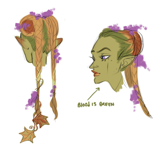
This iteration of Blue's blood is green so the scar on her cheek is green (we're going to ignore her lips and the flush on her ears lol):
raised scars on nikora and blair's cheeks:
#answered asks#i cannot stress enough i go off of vibes 99.9% of the time im not an expert anything i get right is purely by accident#pleaaaaaaaaaase do research#if anyone else has actual medical knowledge and wants to give tips/point anon towards resources please feel free to add on#i'd like to learn more too ^^
17 notes
·
View notes
Text
Episode 2!
Damn, Shinichi's first thoughts when he wakes up... imagine thinking you're dead. Thinking no one will really know what happened to you, you never really got to live your life, your dreams, confess to the girl you will spend the next 1000 episodes lying and gaslighting too (sorry I'll stop shading about that eventually).
Also the boy must have a concussion after that hit. Though that has magically disappeared now that he's running home. Continunitiy!
Ran, maybe you should do what your mom did and run out instead of tidying up after a drunk all the time, I know you don't notice it now but that shit fucks you up in later life, you're a kid, not a caretaker. Gotta love Gosho also telling us how bad Shinichi's parents are in the next breath though! Also Ran, if you're so worried, why didn't you chase him in the first place? Because he told you not too? You're an independent women! You don't need to listen to a man! Trust your instincts girl! Because the one you love will make you doubt yourself continously (I said eventually).
...how does Shinichi know about the mole and Agasa's butt.
And Agasa starts the lying! Ahhh, this is the plot we know and hate.
Shinichi you're such a nerd I love you.
RAN TRUST YOUR INSTINCTS.
Ran why are you asking that a child? Also he's not going to be dependable for long-
You know what would be interesting, Ran herself says she's excited to have a little brother and then Conan lives with them for so long he definitely is in her eyes, so I'd love exploring the concept that the image clashes with the romantic feelings she has but I know Gosho would never give that to us.
It was cute that the moment Shinichi learned something Ran never meant to tell him (or well like that) that he was going to tell her the truth, he really didn't like lying at first (how that changes).
Shinichi and dogs. He should be allowed a dog. Give him a dog Gosho. A big dog that can be his steed as he rides into battle like he does this episode.
See, Shinichi, this is why Ran should know. She can kick ass when Gosho let's her. Also Ran looks so pretty in the older style, it's a shame they let the hair horn just grow and grow.
5 notes
·
View notes
Note
Hiii can u pls do a face tut pls I’m begging you
heya! sorry this took some time, i just moved and it's been really hectic @@
and thank you for the question! i'll use stuff for bela and shadowheart as an example for ya for the two styles i usually do
warning, i am not a teacher and i'm still experimenting and learning so uhh some of this might be scuffed but is how i do it :>
also noting that i use csp or photoshop depending on my mood and what brushes i want to use but the same technique works for either and i use 2 brushes for the main bits and additional brushes if i want to add texture
--
1 - so after i have the sketch roughed, i usually put it on a multiply layer and add a background layer under it (i leave it white or almost white if i'm just doing a doodle or sketch) and i start to figure out the lighting and shading under the outline layer
the lighting is usually pretty rough and i'll start to understand what i'm going for as it starts to shape up but i try not to reduce the brush size too much so i don't get too muddled
(at this point i'm going thru my mantra of "trust the process" and breathing into a paper bag and kicking and screaming about how i want to quit)
--
2 - once i have the lighting somewhat how i want it, i start tweaking the color and i do it by using adjustment layers and manually painting. this part is kinda like cooking and tasting as you go, if i feel i want the image to feel colder/warmer i'll adjust accordingly but i will tell you how i did it for both examples below:
for bela, i actually painting above the shading/lighting layer and used "soft light" and "hard light" blending modes for the hair and skin to fit more with how i wanted it to look. i used color balance and curves for the background to get it to more of a purple/blue and darker
for shadowheart, i actually put the color below the shading/lighting layer and left the color as is and swapped the blending mode for the shading/lighting layer to "multiply" and then did adjustments using curves and gradient maps using "hard light" and "soft light" too and i think i had a "color burn" just for fun
this is my fav part of the process bc i just experiment and mess around with different layers. i usually have a vision for how i want the color and lighting to look but there's always room for new ideas! so i just mess around for a while here till i'm happy!
--
3 - rendering time! um i don't really have much advice here except i just start going in and rendering in closer detail. and remember references are your friend!!!
bela render progression:
shadowheart render progression:


i sometimes end up changing the drawing quite a bit during rendering but that's okay bc as you go into detail, you will notice discrepancies from the pre-render stages
for the style i used with shadowheart i just paint over the outline pretty much with some bits of it left it and i blend more to smooth it out more. for the style i used with bela, i add back in any outlines i painted over that i wanted to keep
--
and at the end of the day it's your art and how you express it is what's always gonna be the best so trust your gut (and references) but also it's okay to take creative liberties and go with the "cool rule" :3
and keep practicing!!!! i def feel i've gotten better with drawing faces compared to a year ago
i hope this helps and if it didn't ":3 i hope you had fun reading
#i hope this makes sense#i had to go back into my files and disable layers to get these screenshots Dx and i have a LOT of layers but for you anon i did it#i didn't know if u just wanted a broad tut of how i draw the face or if you wanted smth specific but i hope this helps anyways#i didn't promise this would help#pretty long post#asks#anonymous#my art
5 notes
·
View notes
Note
hi! i feel like you must have been asked this beofre but how do you do your gradient gifsets with the color palates? like your yennefer of vengerberg in dark2light gifset? because whenever I try to emulate it in some sort of way mine just looks like blotchs of color that dont really shine together. like everyhting is dark and yours is so bright? I've used your coloring tutorial and its part of my basis for coloring my images but can you just explain how you blend the gifs of different colors together?
doing a blending two different coloured gifs together tutorial is something i've been thinking about lately, unfortunately i really do not have the time at this moment (lots of irl deadlines are happening currently) so it's not something i can put together right now, but please know it's on my to-do list whenever i can find the time!
generally my gradient gifsets do follow similar rules to my colouring tutorial, but one thing majorly changes which may be impacting you: i put my coloured layers at the top of all other changes (rather than at the bottom like in the tutorial). this is because i want those exact shades of the gradient chosen to shine through, so i place them on top of all other basic colouring layers. i may then use selective colours to help enhance these shades depending on how it looks, but on the whole, i stick to using a painted layer to get that exact shade. i'm not sure if this is what is impacting yours appearing darker, but it may be a possibility. i don't know if you've seen my blending tutorial too, but there's several tips in that which i carry forward for using multiple colours: step five which discusses having 'dark spaces' and 'lighter spaces of colour' is really important when dealing with blending different colours because you need to have darker and lighter patches on each gif you're blending to allow the different colours you're using to shine through. this can help create your 'gradient', because on one side you can have purple shining through and on another an orangey shade (for example).
i'm sorry i can't help more at this time, this week is ridiculously busy for me (i'm then away for several weeks, which is why i have so much to do currently) so i just wanted to get something for you to follow so you don't think i'm ignoring you. when i have some free time i hope i'll be able to put together a better guide!
4 notes
·
View notes
Text
Thank you for writing such a detailed explanation! I really appreciate you taking the time to explain your thoughts in such great detail complete with images and all.
I do agree that a deeper crimson red would fit Takato better, when taking into account the things you mentioned, but as I said I based the colors primarily on those of their digimon partners (at child level, except for the Gammamon situation I explained before), and Guilmon just happens to be a lighter red. It worked in my favor too since I wanted the different shades of red to be distinct, and if you wanna base it on personality, well... I could say a lighter red fits Takato better given his more introverted personality as well as his younger age.
The issue with basing the colors on their personalities is that a lot of it comes down to personal opinion. You even said it yourself, those are the right colors in your opinion. Different people will have different views on the characters and the colors that represent them (and for example, I don't understand why you would give light blue to Michael and teal to Daisuke, I feel like thematically it makes more sense the other way around). Not to mention color psychology and symbolism is something that varies across cultures and is very dependent on what we see certain colors be associated with as we grow up. So it's all very subjective, and I wanted to avoid that subjectivity as much as possible with these, which is why I ultimately went with the partner digimon's colors, as even official sources vary when it comes to the color-coding of the characters.
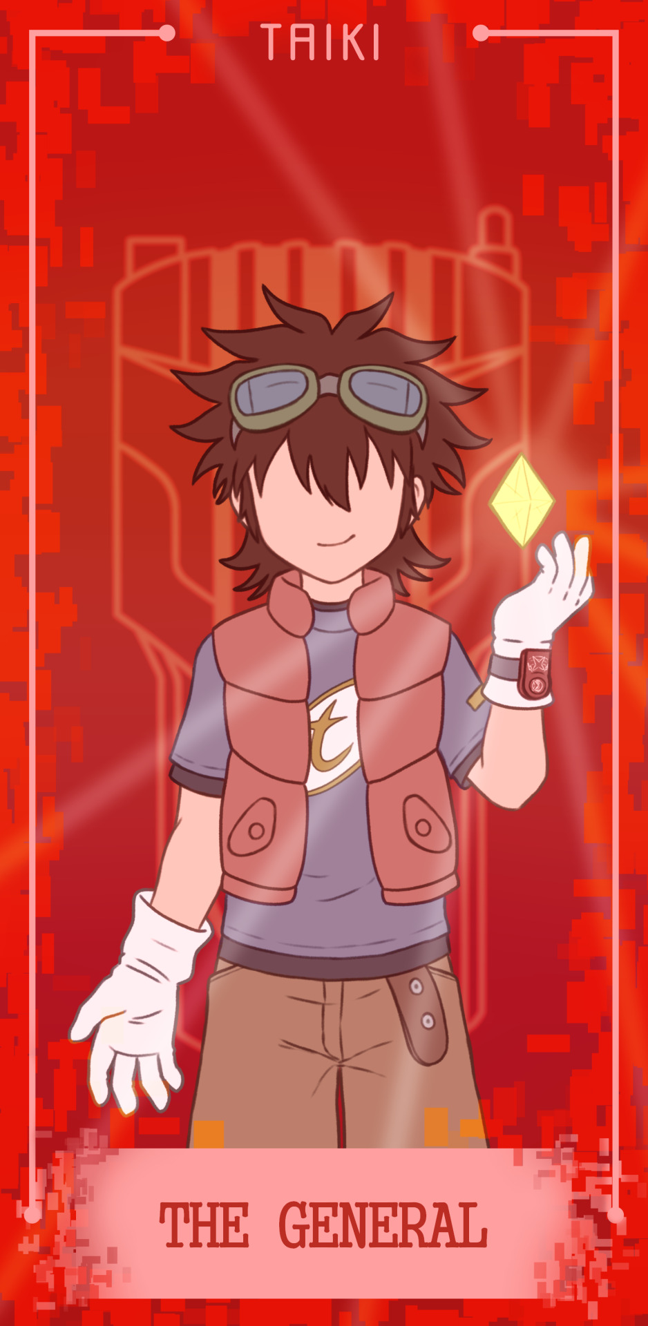
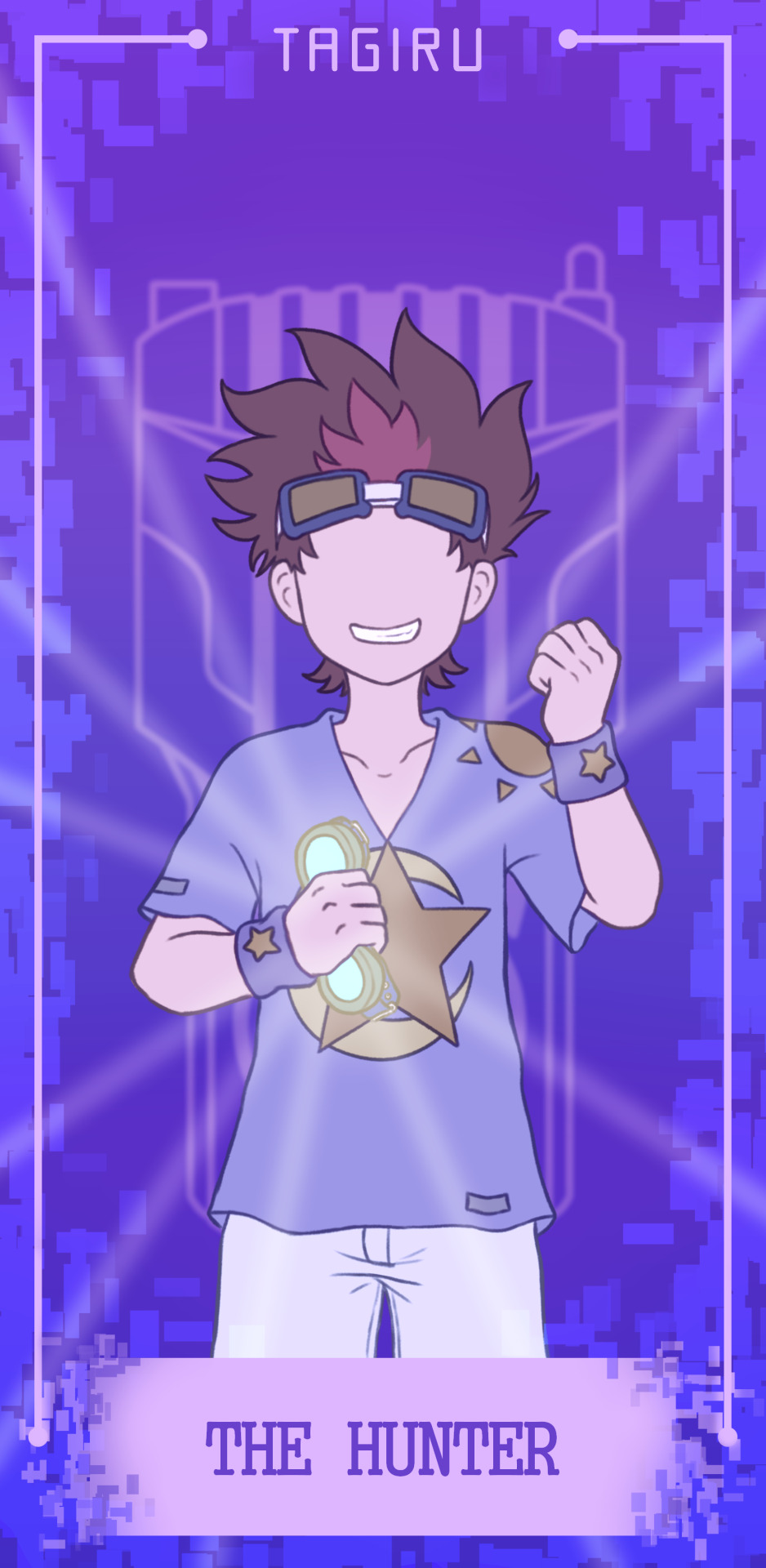
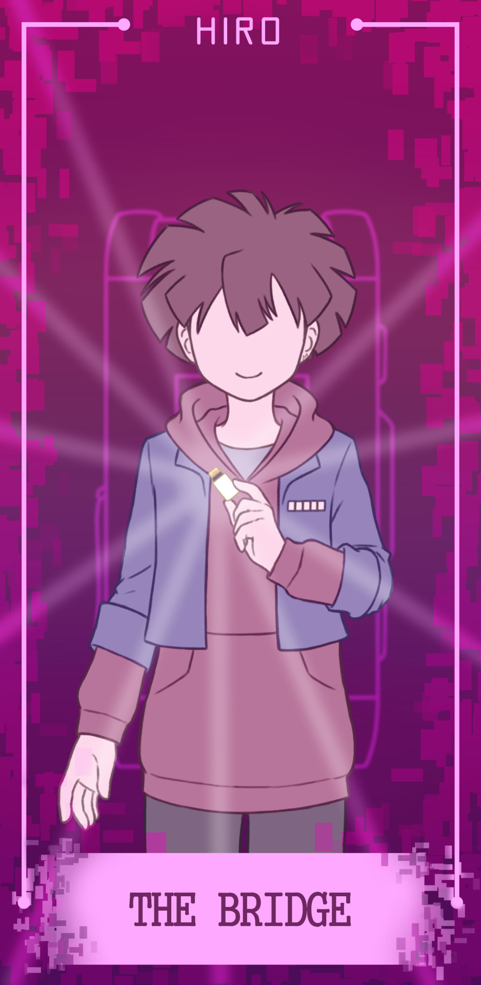
I do wanna point out something in regards to Haru though. First of all like I said, I took the red from Gatchmon. But I do believe that red is Haru's theme color and this is non-negotiable to me, because I think red being his color is very symbolic for his character. Red is a color that is associated with heroes and often given to the protagonist. This is a notorious thing in tokusatsu shows for example. And it happens in Digimon too. Even if some of them are also associated with other colors, almost all the protagonists in the series are red-coded to some extent. Now, you're not wrong in thinking that Haru's and Yuujin's colors should be swapped, because... that's what it feels like, right? If you asked this to Haru himself, he'd surely agree with you. And that's precisely the thing. Haru doesn't see himself as the protagonist, he's not the type of character you expect to see in that role. Yuujin feels a lot more like a protagonist than Haru does, or at least that's how Haru perceives it. But as the story progresses Haru grows into that protagonist role. The red color represents this. In this context, the red represents the hero's role. That's exactly the point. And I think this symbolism works perfectly here. I can't see Haru being represented by any other color, in all honesty.
Anyway... hopefully that makes sense. I have a lot of thoughts but I'm not very good at putting them into words. English is not my first language so it's a little hard for me to speak my mind clearly, but I hope I got my point across! In regards to the colors being too bright... they don't look too bright to me? But this might have to do with differences in color perception or even just our screens. To be fair I do like working with bright vibrant colors (so much so that I had trouble with reducing the saturation on the protagonists' colors to incorporate them into the designs, they looked too weird to me haha). I can tell you they look nice in printed format though! In any case, I can't go back and change them now but I'll try taking that into account when I eventually make the matching digimon set I have in mind! I appreciate the feedback, truly.
Once again thank you for taking the time to write all that down, it was an interesting read and I always enjoy seeing how people interpret certain things differently, hopefully you can understand my reasoning a little better too! Color-coding in Digimon is a pretty complicated subject since it's often so inconsistent so I guess at the end of the day there are many different routes you can take.
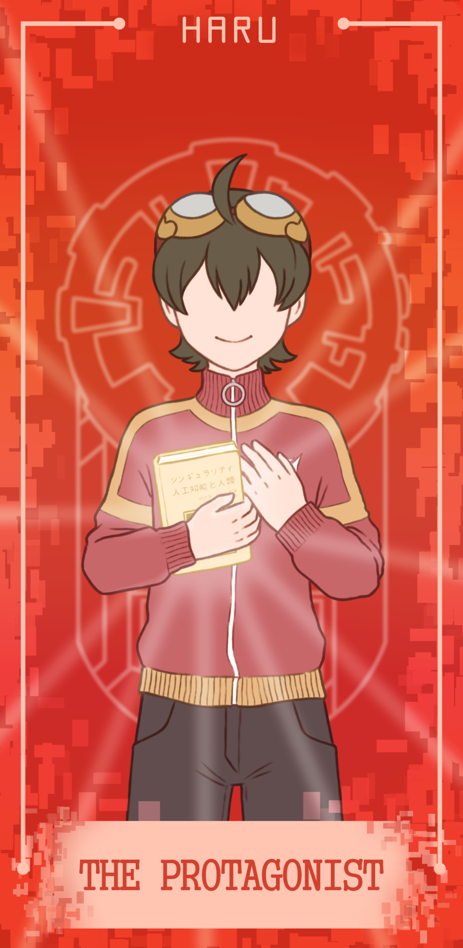
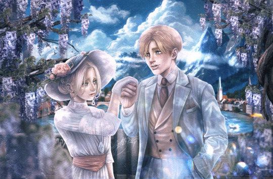
And now for a big one!! Here's something I made for last year's Odaiba Memorial. I had been planning it since the previous year and it took me a while to complete but I'm so proud of myself for having finished it in time :')
Digimon has been a huge part of my life since I was very little and I grew alongside the various seasons of the anime so I wanted to pay a little homage to it by drawing all the main protagonists so far! If you check the individual posts on my Instagram you can read a little about my experiences and memories with each season~
627 notes
·
View notes