#i think i made a more recent redesign
Explore tagged Tumblr posts
Text
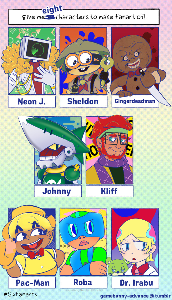
1000 Followers Celebration - Six Eight Fanarts
Neon J. (No Straight Roads) - @ocularose
Sheldon (Splatoon 2) - @pelman
Gingerdead Man (Full Moon Universe) - @gingerweed-man
Johnny (Sonic Rush Adventure) - anonymous
Kliff (No Straight Roads) - @teeny-tiny-mousey
Pac-Man (My human?AU) - @ninjastar107
Roba (The Problem Soverz) - @bigfatnerdycrocodile
Dr. Irabu (Welcome to Irabu's Office/Trapeze) - anonymous
---------------------------
Thank you to everyone that participated in our final follower's celebration, and thank you to everyone that's followed me up till now~ It's been a wild ride with some highs and lows, but nonetheless it's pretty cool that I've made it this far basically by being cringe~
I hope that y'all consider sticking around to see where we go from here~
(Timelapse)
#gbunny draws#six fanarts#followers celebration#no straight roads#neon j.#kliff#sheldon#splatoon#splatoon 2#gingerdead man#full moon universe#johnny#sonic the hedgehog#sonic rush adventure#pac man#pac-man#roba#the problem solverz#dr. irabu#welcome to irabu's office#trapeze#these are roughly in the order that they got requested#except roba and johnny who i swapped so johnny would have more room to not crash into anybody#man... it's nice that he got requested#but it's been so long since i've actually drawn my human Pac that I kinda forgot what he looked like ^^;#i think i made a more recent redesign#but this is the one i remember so i hope that's alright >_<;
85 notes
·
View notes
Text
When my interest shifts from one to another I don’t start disliking/hating the old one
It just slips into being dormant until something inevitably triggers monkey brain about it again
#for instance! I am likely going to be annoying as shit once professor layton nwos comes out!#I do have old PL ocs to dig out to redesign#two of them survived past my PL interest! (cateyes and Naro)#but the rest faded into obscurity#namely Abigail and Cosmo#I kinda dodged getting SUPER back into lmk when the last season came out#but that’s because I caught covid 0.2 seconds after I watched it JGSHFKFH#I’m trying to think of more recent ones#trolls!! is one of them! I DO still love those movies#but I have a huge dislike towards my own ocs for them so?? bramble is likely dead unless I give him a major redesign#(where he would not be a troll anymore)#uh… psychonauts! I have exactly one (1) psychonauts oc and it’s a sona#I would likely only get back into that if I decided to replay the games or they made a 3rd game#currently ace attorney owns my brain! and I am!!! struggling with making fan art for that JGSHFJJD#I feel like I’m not allowed because I’ve only ever played up to the second game#I don’t know who apollo justice or trucy wright is#I only have knowledge of phoenix’s disbarment via osmosis#who the fuck is godot. why does he throw coffee at phoenix.#i dont know
9 notes
·
View notes
Text

I was thinking about my old CDDWTD ocs I made ages ago and decided to kill off a twink while I was at it( old design under cut)

#my art#cddwtd#cddwtd rhys wicks#dw hes still very gay and easy to fluster#i just made him a little more dense#huggable :)#im also gonna redesign mugcake soon#bc I've been seeing a lot of cuphead content recently and its made me think
6 notes
·
View notes
Text
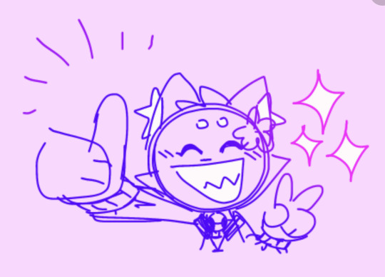
me after editing the aau prologue for the bajillionth time
#First chapter I changed the opening bc I always thought it felt off/abrupt and wanted to have it be prince pov from the start#I wanna get in his head more ok sue me#Beyond that tho it was just some wording edits#Specifically with the internal dialogue moments I helped them flow more/feel more like thoughts#Also mj gets a bit more of their usual edge/pessimism bc the prologue they always felt a bit too “ówò sad poor smol bean” or whatever#That’s it tho chapter 4 I didn’t change bc it’s peak#Did add some teases to later things tho like snatch senses mjs soul at the end of his chap but doesn’t realize it#Or like I added the Not Now running thing in the earlier chapters bc it was more of a chapter 4 thing so I wanted 2 set it up more so boom#I think that’s all the notable edits ig like I said just description additions the only actual new thing is the opener for chap 1 👍#Also also I got to include a hc that I have that I neglected to do before but I hc a!prince used plural internal dialogue#Because lol we love dramatic irony in this house#Grace post#this reminds me tho one of these days I should look through heart strings chapter one to look for editing things#Bc I think I did that recently but I don’t remember it much tho#Mostly just when the Hat stuff starts that was the parts I never directly rewrote I just edited them so they feel out of place in my brain#Also I’d wanna edit her dialogue bc it *was* in character (after rereading her diary’s to confirm) but I wanna have her be a bit more snark#Hat is Hard bc i Need the balance of cute little kid and also smug little shit (affectionate) like she is a pain to write man cries#This is just me rambling lol ignore it I just wanted to spam aau thoughts#In other news I made shapes redesigns but I’m on the fence on posting them bc idk if I wanna spoil or not hhhhhhhhh#Nowadays I’m more chill w spoiling things than I used to be#But there are a handful of things I’ve kept shut about (ex being princes name or mjs species stuff etc)#So I’m not sure if this thing with shapes i should keep secret or just post bc I used to spoil it but idk now#Shrugs#maybe I’ll do a poll later I dunno#Ok yapping over byeeeeee
9 notes
·
View notes
Text
it's soooo funny when you get compliments on a stylistic choice you started doing out of laziness lmao
#if you look way back in my art tag you will see that i used to do almost exclusively pen and ink drawings with lots of crosshatch shading#then i started doing digital art and experimenting with color#and i quickly realized i did not like doing cell shading or blended shading in color so i did flat colors only#but it made my characters look kind of dead (i should go back and fix the one drawing of mal in a purple checked suit... he PALLID)#so i started adding in a lot of blush on the skin#(also i am a naturally flushed ruddy person to the point it looks like an allergic reaction sometimes so i know where it lays)#and also at one point i was drawing candi reclining and thought it would be fun if his tummy was lighter bc of spending so much time outsid#which a lot of my characters do because they work at a theme park and even using sunscreen they get a tan in the summer#and then i got a couple compliments on evie's tanlines and i was like ...oh people like that? nice. i have a signature feature#i also just like drawing people with more texture. since i'm not trying to boil designs down for comics there's more room for it#like i only relatively recently started drawing mal's five o'clock shadow and i think it makes him look cuter#i never posted my slight stevie redesign but they have a lot of moles and that's also very cute#and i've been trying to add in candi's acne scars
3 notes
·
View notes
Text
youtube
Academic History YouTuber Premodernist released video recently on "State Flag" discourse, and flag discourse more wildly, that I thought was pretty good! I agreed with 50% of it. For those who don't know, there is a longstanding movement in the vexillology community to push for more simplified flag designs, and they hate the state flags of the US as their antithesis; a movement that catapulted into the internet mainstream when YouTuber CGPGrey released a video riffing on that debate and grading all the state flag designs.
That video is great by the way (it's hilarious, CGP Grey is just very talented as a performer), and the biggest thing Premodernist is wrong about is that the state flags do suck. But what he gets right is that the so-called "principles" briefly referred to in the video are themselves pretty weak; some are fine but others do not hold up to much scrutiny. The state flags largely suck for the boring reason that they just suck; they are shitty designs and often repeat each other in a domain where "standing out" is the point. Like what the fuck Montana:
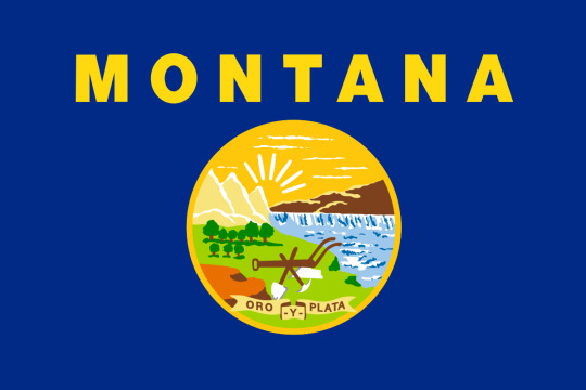
This is something a 5th grader whips up in PowerPoint for a class presentation. Helvetica Bold?? "Mandated by law in 1985" yeah I didn't need Wikipedia tell me this decision dates to the 80's.
But that is boring and subjective, right? You can't just say they suck. So you had to make a theory about it - and I won't go into too much detail but it generally boils down to:
Make it simple, "something a child could draw"
Make it "distinct at a distance", since it is a flag you are supposed to see it at a distance
Three colors or fewer
No words on flags
Which I think you can get the philosophy for. These principles, which CGP Grey outlines, actually come from the work of Ted Kaye, who is a big figure in the aforementioned flag reform movement and the focus of most of the video. As part of the original CGP Grey video I just rolled with that, but I did remember him showing Utah's newly designed flag at the end which embodied these principles, and uh:
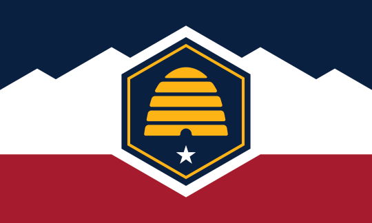
This is kind of mid? Like it doesn't suck, but it looks like a corporate redesign of a hockey team logo or something. A bit of a red flag (hah) if your front-and-center case is weak.
Anyway this is what Premodernist digs into in the video. The stuff I agreed with the most are the parts where he just ???? at some of these rules. "No finicky bits", a "child must draw it", "distinct at a distance"? None of these actually track for say this one:

A child drawing the US flag does not draw 50 stars and 13 stripes unless they are a budding librarian; you absolutely cannot tell if this flag has 50 stars on it from a distance, and that level of detail is clearly some kind of finicky. Of course your response is "okay sure but still, I can tell what the flag is from a distance, I can't count the 50 stars but I get the gist". But that is true for almost all flags!
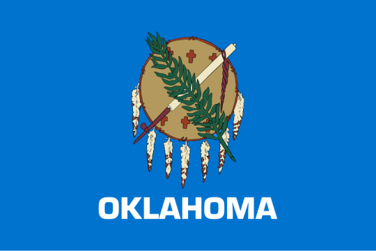
It's a fern and a peace pipe and a brown thing and the word "Oklahoma" below it, you absolutely, 100%, will be able to tell what this flag is at a distance. You don't need to count the leaves to get the general shape, and when you think about it, it is actually kind of silly anyone would claim otherwise. There just isn't any need to appreciate the tiny details on a flag to understand whose flag it is. (the only valid critique here is that everything should be bigger - too much dead space)
Not to mention the "see from a distance" thing even being a metric. That isn't how you encounter flags most often today? Maybe in the 19th century on a battlefield that was (and even then you had battle standards), but it isn't now. You see it in textbooks, on your computer screen, as an icon for a football game team, right next to you in a government office. Why privilege distance? You just made that up as a value. 99% of "flag consumption" is not seeing it at a distance.
The "only use ~3 colors thing" is the funniest, you can just argue this with...no? No you don't. You don't. What? No. You can...you can just use more colors? Here is an example from the "manual" Ted Kaye wrote on the subject:

And the 5 bands on the chinese flag are fine! They are not "hard to look at" or whatever. Also, I am screenshotting a tiny corner of a youtube video, this image is like 240p, and I can tell its a dragon - and that isn't even the color point it is trying to make, dude just deviates off into another critique. Meanwhile the Amsterdam flag looks like a traffic warning sign. Chinese flag needs to not have the white stripe connect into the white seal background, that is an error, but otherwise I prefer it.
It is annoying how many of the state flags are a blue banners with a round seal in the middle. That does make them hard to distinguish from each other. But that isn't a problem with seal-on-blue, that is just a collective action problem! Flag-reform-favourite the tricolor can run into this too - here are the flags of the Netherlands and Luxembourg:
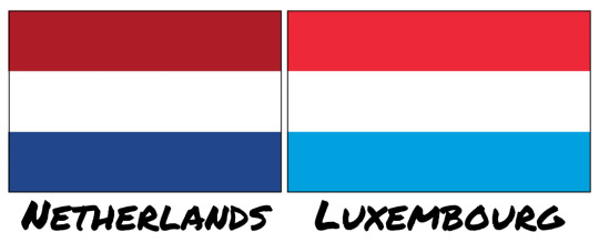
Like one of your needs to go home and change, that is ridiculous. Though if you had a complex seal in the middle that might avoid this problem! Funny that.
Even the "no words on a flag" argument, which I am more sympathetic to, doesn't hold up too well because too often you find yourself going "unless it is good" which just isn't a rule. The Iranian flag is the stand-out he mentions:
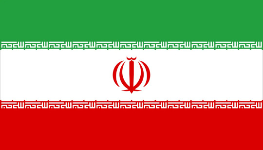
The middle crest is a stylized rendition of the name Allah, and the cursive lining on the tricolor bands are text as well - God Is Great, 22 times, marking the anniversary date of the Islamic Revolution. Stylistically beautiful, also words on a flag. The state flags just didn't try to do anything artistic.
I think the best point Premodernism mentions is a sort of stylistic unity Kaye & Co are pursuing above all else - everything sacrificed for corporate minimalism. Kaye's book will say it respects history and symbols should be meaningful, but then hates any symbols that require complexity. He singles out Turkmenistan as an ugly flag for example:

And as I said I only 50% disagree sometimes, I do think there is a complexity limit, and this flag goes over it, that is too detailed. Though the main reason this flag is bad is the weird choice to not put the banner at the edge, and have the crescent just...float off center? If it was this:

Two seconds in paint, already better, you can play with it. But anyway, you can say the symbols are too complex, but if you also say you care about historical meaning? Turkmenistan is a nation of traditional semi-nomadic tribes, who populated the Silk Road and made textiles as their ultimate expression of art. These carpet guls are traditional symbols used in those carpets that represent the five major tribes that compose the country. You can't just invent new symbols that have equal meaning to these, right? Like you can try if you want, sure, new symbols become meaningful all the time. But a rule that says "all art from before 1950 is tossed in the dumpster because it wouldn't pass muster as a Pepsi logo" is a weird rule to adopt if you say you value historical meaning. Turkmenistan does not have to look like France, and it is weird to want every national symbol to be aesthetically coherent to each other. Let 100 flags bloom! It is certainly "distinct at a distance" lol.
Anyway that is enough summarizing of a YouTube video - as I mentioned, he actually likes the state flags, I don't, I do think you have to balance a lot of this with just "general design principles". Never have your name on a flag in Helvetica Bold, amazing I had to write that one down for you. But a lot of these flag-specific rules derived from Kaye's work I often see bandied about are silly, and I was glad to see someone point that out.
465 notes
·
View notes
Note
Heyyyyyyy could you maybe just maybe draw Finn I need him NOW
𝓘 𝓪𝓶 𝓼𝓸 𝓼𝓸𝓻𝓻𝔂. I DIDNT CHECK MY INBOX PROPERLY THIS MORNING AND SKIMMED OVER WHAT I GOT ASKED. You never got your finn NOW. Like hours ago i think.! BUT.

I did redesign finn recently because i had the enough courage to draw his life vest. He still keeps the hawaiian shirt though the shirt stays on. I figured i could just show this Hehe... hes based off of those gummy shark candies because my Lovely Friends made a joke over it
and heres shrimpbowl below because my LOVELY FRIEND (number 1) asked me to draw it. So um. More extra food...?if you fw it....?

#dandys world#dandy's world#dandys world shrimpo#dandys world finn#shrimpo x finn#finn x shrimpo#shrimpbowl#bugsnakes art :3#bugsnakes answers
472 notes
·
View notes
Text
More Redesigned Smiling Critters!

With these redesigns I also changed their scents and these are my reasons:
Catnap (Lavender)- He’s still the same, as lavender is a calming scent meant to help people fall asleep.
Dogday (Oranges)- Nothing about Dogday’s original design screams vanilla. And it’s a boring scent for a character who has quite a strong personality, and no scent is stronger to me than the smell of oranges! Also, he literally has a sun pendent, and with my redesign I did away with those and gave him a sun on his face. I usually think of summer vibes, and associate a drink I usually get during the summer which is orange flavored.
BubbaBubbaphant (Bubblegum)- Besides bubble sounding fun to say with Bubba, there’s a reason I chose bubblegum. I remember when I was younger and in school having to take tests all day, and what did they give us to concentrate, bubblegum. I believe there have been studies done to show that chewing gum can help you concentrate, but don’t quote me on that.
HoppyHopscotch (Pepper Mint)- I kept her scent the same as well. From what I’ve read, pepper mint is actually an energizing scent used in aromatherapy.
KickinChicken (Roasted Peppers)- I hear the name Kickin and think of spicy, however, if you roast peppers (I was specifically thinking of bell peppers), they’re actually quite sweet, and smell amazing. And yes, I made him look more like a rooster.
BobbyBearhug (Rose)- Kept her the same as well. Her design SCREAM Valentines Day to me.
PickyPiggy (Maple)-…breakfast
CraftyCorn (Birthday Cake)- Honestly, it’s the rainbow horn I gave her, making me think of confetti cake! And I hate the smell of jasmine…
I still need to design their full body designs based on my recent poll!
#smiling critters#poppy playtime#poppy playtime chapter 3#poppy playtime smiling critters#catnap#dogday#bubba bubbaphant#hoppy hopscotch#kickinchicken#bobby bearhug#picky piggy#craftycorn#poppy playtime catnap#poppy playtime dogday#poppy playtime bubba bubbaphant#poppy playtime hoppy#poppy playtime kickinchicken#poppy playtime bobby bearhug#poppy playtime picky piggy#poppy playtime craftycorn#redesign#redesigns#au#au idea
372 notes
·
View notes
Text
The sims 4 is not a lost cause, it just needs some love.
SO i recently came back to playing sims 4 after a long hiatus and i have to say i'm surprised. I'm no EA apologist, they are indeed cashgrabby. But to see that lots of new features were integrated over the last few years that facilitated different styles of gameplay actually surprised me.
It seems tho that a pattern has been set, were they will release the most lackluster pack (whatever it is) and keep fixing it over the next few years. Pack reworks became a thing and thank god for it, since the releases don't seem to be stoping in order to give us better results.
It's a bittersweet feeling for sure. The game has more than 70 packs released and somehow it can still feel dead when it comes to live mode. And that's what this post is about: how could they bring the love the other games had for live mode in a base game that's so purposefully made for cas and build/buy?
Part 1: Nostalgia driven gameplay

Seeing the UI from the sims 1, 2 and 3 brings me back a lot of memories. It was a staple to this series that was lost due to a cleaner redesign. Not only that, but a core mechanic was also changed: the wants and fears system.
I believe that what makes me so nostalgic is TO KNOW that this worked so perfectly and hardly needed any refreshes.
Your sims now have emotions and yet, they rarely feel like something integrated to a goal or something you can truly affect while in gameplay.
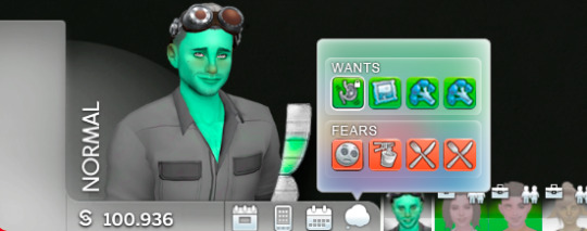
Bringing back the wants and fears system would not only make our decisions during gameplay more impactful to our sims emotions, but also help to choose the direction any story could go.
An aspiration meter that's connected to the rewards shop would make decisions much more impactful (rather than getting them just by working through what is currently known as the "tutorial aspirations").
Your sims moods should be important, and so what makes them feel that way.
Part 2: World overload
With the amount of packs released, the world selection menu quickly became a problem. When seeing that screen, it all just feels like a blur of information that's been set in a certain way for convenience.
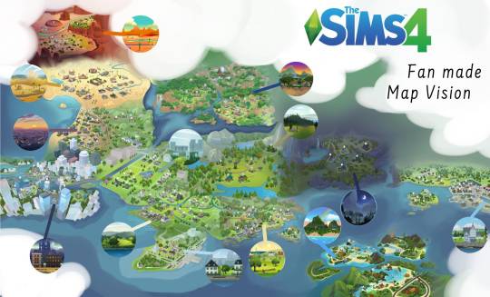
Maps such as these became popular in the community for a reason. The experience of playing needs to be inviting from the get go. It's clear tho that the reason behind not giving us something like this is no long term planning and pack exclusive experiences.
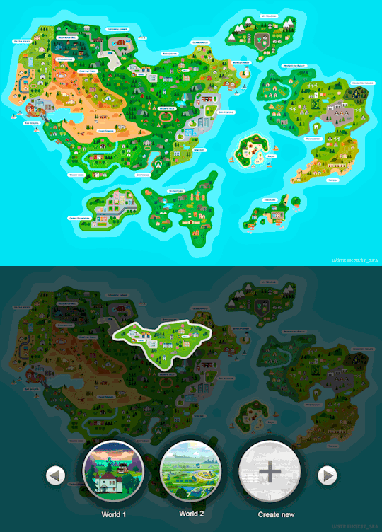
So what if it just became a larger sims world? A concept were you wouldn't select the city at frist, but the entire region were it is located in order to acess the one you prefer.
That would also make this refresh friendly to a future create a world tool (whenever that may come).
Part 3: Pack refreshes are the bread and butter of the future
Let's face it: we're stuck with this game for another 10 years at least. So other than dwell on the fact that we don't have open worlds or things of that nature, we should look at what can reasily be solved, and that's pack refreshes.
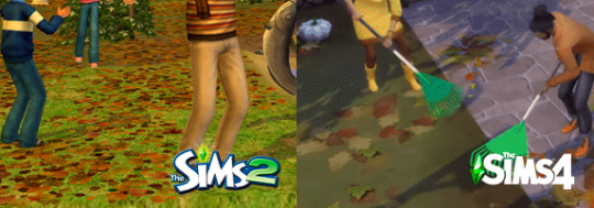
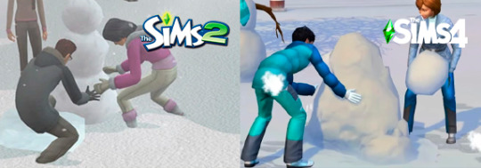
From seasons coming out without properly made textures and snow depth to functions that will simply not work as they should, I like to believe we do have a voice in this community. I made this post several years ago and now, looking back at it, I see so much improvement over things that we were desperately asking for.
Don't get me wrong, by that I don't mean that EA developers are searching through my page or yours to find what we think and expect for The Sims 4. But talking about these things openly as a community is what makes the difference.
Part 4: Simmers Unite
In conclusion: uniting our voices to ask for these things to come as refreshes and revamped features are crucial for the next few years. Let's, together, avoid a "my first snowdepth pack" or similar things that could yet come our way.
I created a blog called @sims4-communitywishes to reblog rants and wishes such as these. Our blogs and separate voices may be small, but a repository of it is much more impactful.
So thank you for reading this all the way through and in case you want to share your wishes for the future of The Sims 4, tag it as #s4comunitywishes
329 notes
·
View notes
Note
recently found your blog and I really love your writings about Dr. Ratio 💖 I was wondering if i could req a headcanon or a scenario where him and the reader were engaged or arranged marriage, and the reader feels a lil left out in their home bcz he seem to not GAF 😮💨 I'd love to see how he'd open up to the reader, feel free to ignore this req or decline it, and of course take your time, thank you! ♡♡♡
Aaaa thankuu so much for supporting mee !, tbh Ratio is the only character that I want to write rn ahahahaʅ(◞‿◟)ʃ
Fluff & Angst | Angst w comfort because I refuse to write angst without comfort !!!

It’s not a secret anymore, your engagement with Veritas is widely spread throughout the Intelegensia Guild, even the Genius Society heard about the news, how can it not spread ?. You’re both highly respected scholars although both have different approaches to teaching you both still excel in your respective fields. However, no one knows that this arrangement of yours is out of convenience, but you and he agreed that it’ll be mutually beneficial if you both marry
“Let’s marry, I know well that this proposal lacks romance since I’m not marrying for love it’s just I’m quite tired of people pestering about my personal life and it seems you too are tired of people pursuing you, even if it is a loveless marriage I would take care of you and be loyal to you till the end of my breath, so please do think about my proposal because to be frank I can’t seem to imagine spending the rest of my life with someone else,”
That was what he said while you were in the middle of discussing a project with him, the sudden proposal shocked you of course but after mulling it for a week you decided to agree with his proposal, you weren’t expecting a ring but he did give you one, surprisingly it first your ring finger perfectly
You know very well that love is out of the equation in this future marriage of yours, Veritas never seemed to be interested in pursuing love and you respected that but now it seems like you’ve been craving more than you signed up for, it’s started when he first asks you to live with him, it was shocking of course but you’re going to be his wife anyways so why not start early to assimilate to the new environment and dynamic
Things start to go downhill from there since he does these little things. For example, all of the cutlery, knives, plates, and spices were high up on the shelves when you first moved in. He noticed that you struggled grabbing simple things from the shelves, hence he redesigned his whole kitchen to make things more accessible to you
Well the other thing that made you develop feelings for him is your sleeping arrangements, he made you a room inside of his house fully furnished with your favourite books and even your own office inside, the room is hand painted beautifully with your favourite colour when you ask who decorated the room he bashfully replied that all of the things inside your room is fully constructed and decorated by him, is this a loveless marriage you keep pondering over and over as you lay your restless body on the couch
Veritas promised you that he would come home early today to help you with your dissertation, but it seems he’ll be late again. You can’t help but wonder if he has someone out there, but it can’t be he told you himself he would be loyal to you, but you can’t seem to dismiss such a thought
You knew what you signed up for but you still can’t help but fall for him, how naive. Your eyes crystallised as you tried to conceal your feelings, the warmth of your cardigan couldn’t help to warm the loneliness you’ve been feeling, if Veritas was here he would laugh at you, you thought to yourself
You fell asleep on the couch, tired from the stress of your upcoming dissertation. It seems that when you’re already blissfully unaware of the real dimension Veritas comes home. He calls your name to no avail only to see you sleeping soundly on the couch, your cheeks wet from the tears you shed, it tugs a string on his chest as he examines you curled up all by yourself to produce some kind of warmth
Without much thought he quickly took off his coat and put his briefcase on the coffee table in front of you, he sat beside your head before slowly lifting it and resting it upon his thighs. He had always hated to admit his feelings towards you, he thought it was a weakness for him to have, but he has always liked you
He finds it hard to express himself and find it harder to acknowledge that he wants more than this loveless marriage, he was too afraid that you’re not keen towards the idea of loving someone with his track record, and he certainly does not have the best qualities to possess as a husband, yet he would try to become better to make you happy
But it seems he fails to do so, he silently gazes upon your expression, his thumb wipes away the tear stain of your soft skin, he can’t help but question himself, if you wake up would you hate him for this ?
He quietly sighs as he drags his coat and covers your body with it, his hand brushes through your hair softly while grabbing your dissertation off the table, he feels worse than before seeing that you prepared a hot drink and snacks for him before you accidentally fell asleep
So the least that he could do is to let you rest while he reads the contents of your dissertation, your hair feels soft so soft that he can’t seem to focus on your dissertation without petting it
Reading your dissertation is like reading what’s inside of your captivating mind he loves so much, he can’t help but feel lucky that you’ll have his last name soon, that he could flaunt you as a partner as someone equal in future events because he truly thinks that you are his other half
You both have disagreements on certain things yet somehow complement each other so beautifully that he can’t help but feel like he was made to be yours, feeling your skin against his palm as he cups your cheek further proves his hypothesis that his hands are made to hold you, love you, worship you
But his foolish ego seems to restrict him from such necessities, his inability to profess his love verbally would cost him you sooner or later, he just hopes that you could feel how he cares
He never explicitly told you about his adoration for you, yet he’s willing to show you instead hoping one day you’ll see how badly he has fallen for you
He kept lightly tracing your cheeks as he continued to read your dissertation, that’s when you flutter your eyes open, feeling ticklish from the light touch, “Veritas ?,
“Yes dearest ?,” once your eyes meet with his, he knows very well that’s the moment the walls he built and the ego he has dissipate into thin air
#honkai star rail#honkai star rail x reader#dr ratio#dr ratio x reader#dr ratio hsr#dr ratio fluff#dr. ratio#dr. ratio x reader#dr. ratio fluff
985 notes
·
View notes
Text

“Aw, geez, Mitzi, I… I just don’t know. I mean… do ya think people will notice it too much…?”
“So what if they do? They look super cute! ‘Sides, if you wanna keep em painted, then we can match!”
(More under the cut!)
————————
Sorry, Looneyposting again. I swear I notice something different about him every time I’m in this fandom. Like… I never noticed he has an actual bump on his head until this time around, I thought it was just implied. (Also just tonight I noticed he has every color of the rainbow PLUS some on him). Just recently I also realized, on his NRAE redesign, he has red/pink talons like they’re painted. and it made me extremely happy.
This started as just a cutesy headcanon doodle, but today I watched that advent calendar promotional video… where Aaron makes Billy Bob say a word that nobody likes. …. So now this is just revenge. This is a rebellion drawing. LMAO. Lots of people in this fandom at one point believed looney bird was a girl/ a lesbian. Which has resulted in a widely accepted gender-fluid looney hc, that I myself partake in greatly. So instead of whatever the hell aaron is doing, take this gender affirming doodle instead.
#rock afire explosion#rockafire explosion#animatronics#looney bird#looney bird rock afire explosion#rae#mitzi mozzarella
189 notes
·
View notes
Text
Bring back LAES!
I'm steadily making progress on catching up on sun and moon show along with foxy and monty etc etc but it's pretty difficult when one of the main key plot lines is gone. I know a few spoilers thanks to fanfiction but I want to see the drama in person.
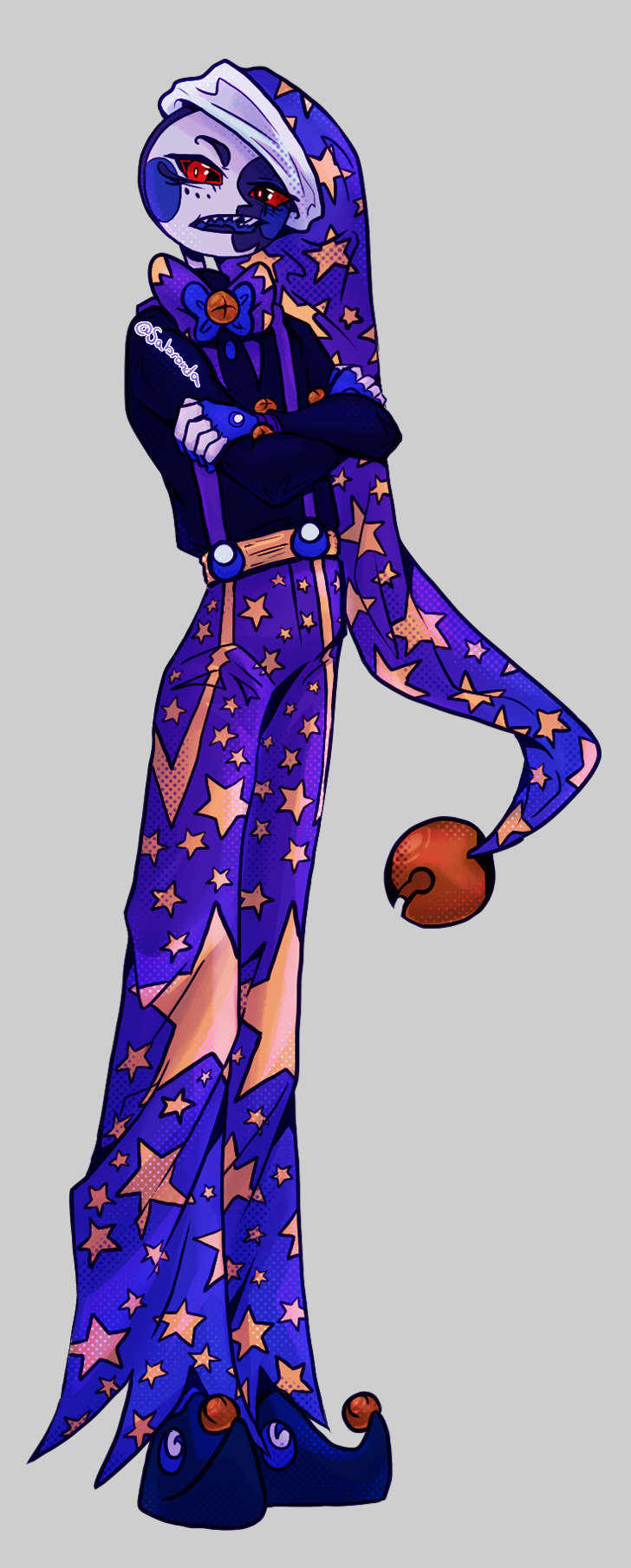
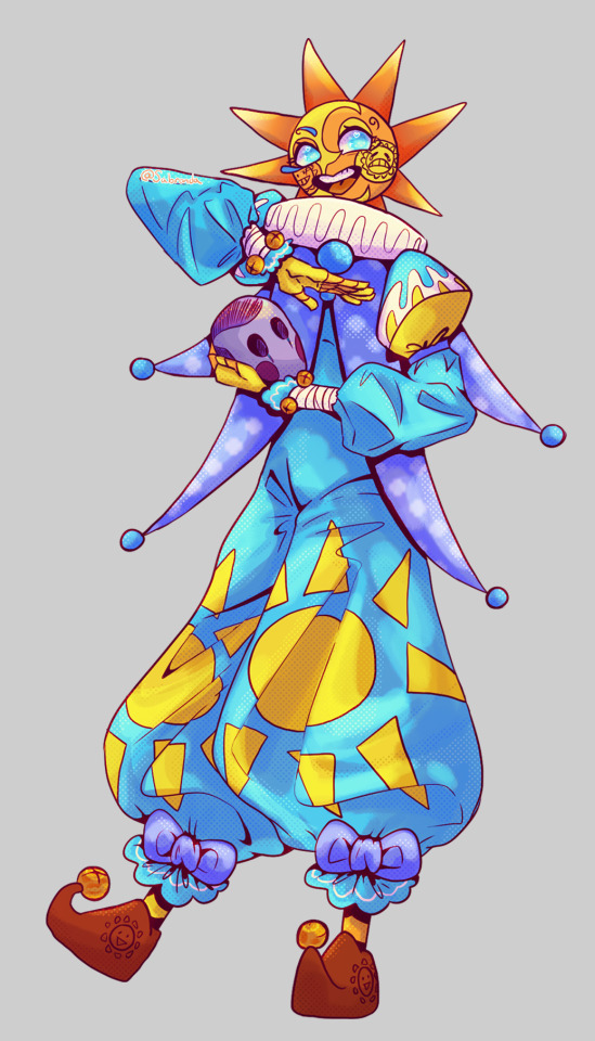
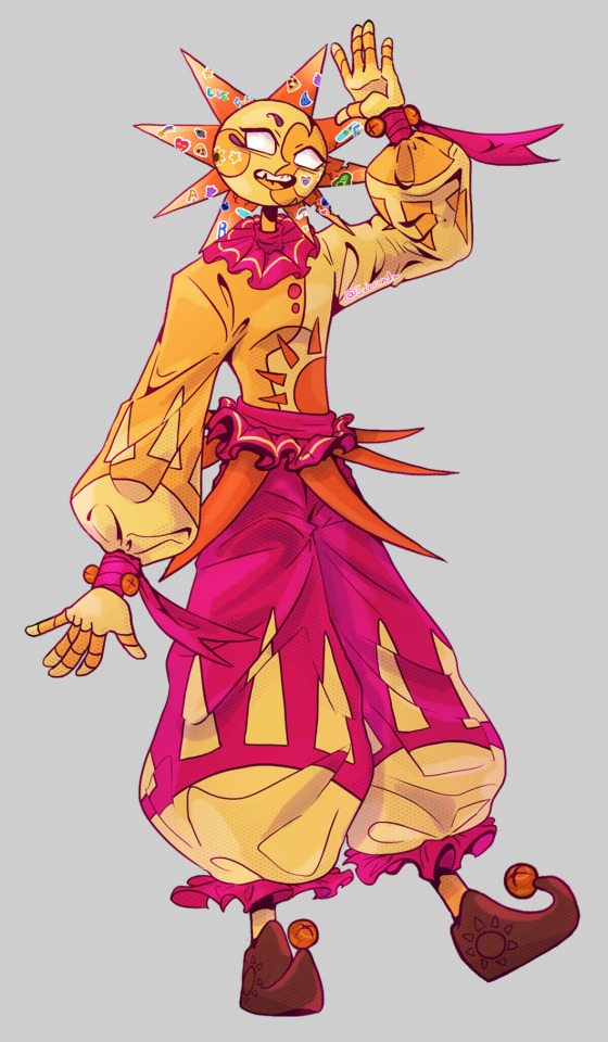
Here's some outfit ideas for tsams cause I'm a sucker for fashion and redesigns!

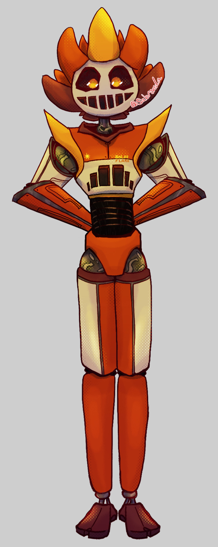
Order is, SolarFlare - Lunar - NewMoon - Old Moon - Sunny (Solar's dimension) - Sun
closeups and more brainrot under the cut!
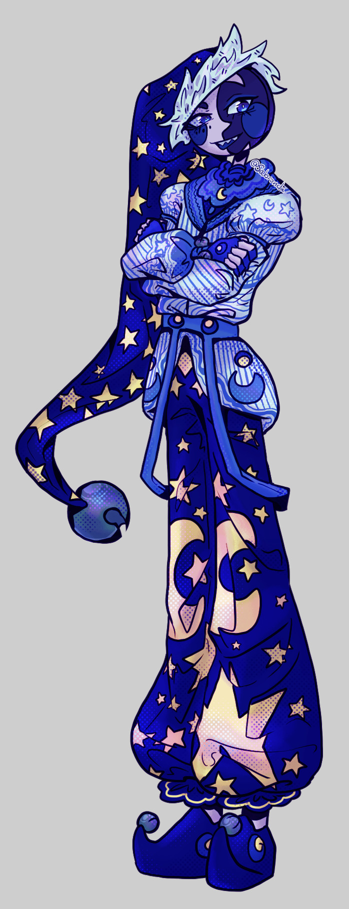
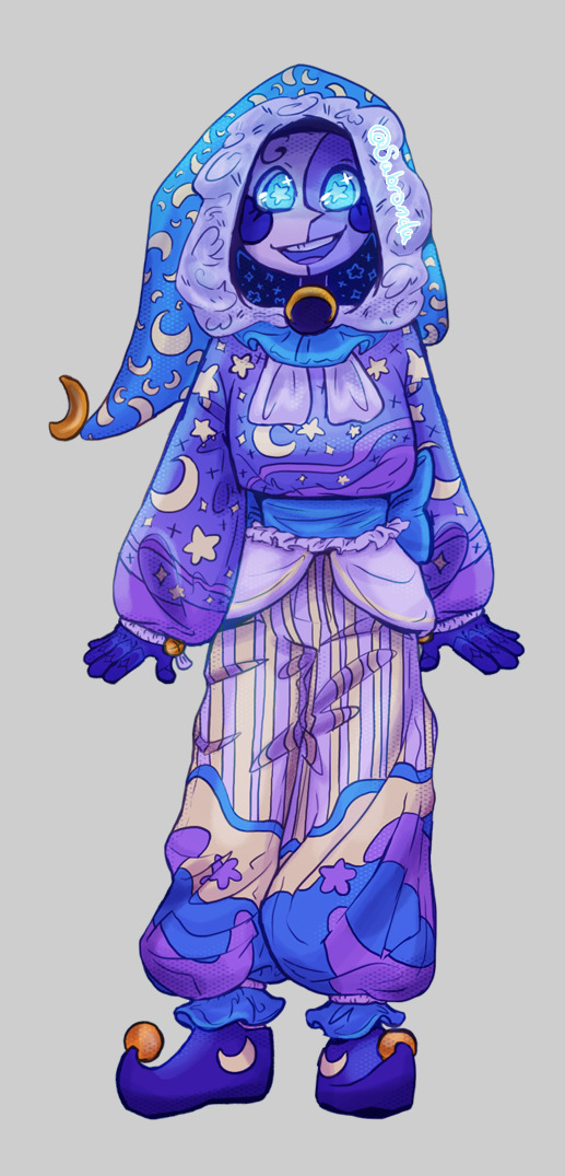
Explaining my redesigns! Lunar - he's not really a redesign and more so an overdesign. I love adding tons of little details to him to really hammer home his star-ness. He's such an interesting little guy, like yes he acts childish but I can see he's really growing (SAD I CANT WATCH MORE CAUSE THE SHOW IS GONE). I saw the ep he killed Eclipse and homeboy revived. The entire time I was like "Waaahh Lunar??? Waaahhh???" but I love the drama ngl.
SolarFlare - Same as Lunar, not really a redesign I just drew him with no dirt. I really love his base design it's so neat it makes me think of like sci-fi concepts from the 80's. Something from fallout really. I think it's kind of funny Eclipse's aesthetics for SolarFlare when you compare him next to say Jack who Solar designed.
OldMoon - I just wanted to give him a sleek mad scientist cool guy suave vibe. I saw the more recent thumbnails of him with a turtle neck and idk that's just peak character design for me. I'm a simple woman put the dumb-dumb in a dark turtleneck. I want him to kind of look like the BadGuy TM (he's not actually) so he gets all edgy and hard edges and stuff.
NewMoon - I wanted to do a similar color scheme but instead he has lighter colors like more white incorporated into his fit. To give him the whole 'reborn' aesthetic. He's all like "old moon wore black well I wear white now I'm nothing like him so hah!" kinda thinking. I gave his cap a fur texture cause of that one ep he turned into a furry. I drew rounder stuff on him cause he's a big ol' softy sweety pie.
Sunny - Sunny is my headcanon of Sun from Solar's dimension. I think it's really interesting his default with no personality was theater performance and not say...doing daycare stuff? I feel like honoring the FNAF books with this design by leaning heavily into the theater performer look. I like to think in Solar's dimension Sun and Moon were originally made for theater. (so far in the show I've noticed Creator says 'they needed a daycare attendant' something like that so it comes off more like they were intended for the daycare from the start VS. Solar's dimension where Sunny's core seems to be more so for the performing arts.) I also wanted to make Sunny look different from Sun for the extra angst potential of "They're similar but not the same" so I leaned more into a blue palette for him.
Sun - I just wanted to give him big puffy everything. I took away the tutu. nothing against the tutu I just hate drawing the damn thing. I like to think Sun in main has white eyes because he's so burnt out from within. *badum tish* (eyes are the window to the soul-) I also covered him in stickers because he totally would just be covered in stickers from the kids. I also decided to give some of his rays cracks because I think he's extremely sentimental and even in a newly upgraded body (after using star power to defeat Eclipse the first time) he'd keep rays from his original body? I also put the cracks ones on the side of his face where Old Moon hit him. Why? Because it just seems like something Sun would do. I love him so.
Ok just some brainrot stuff, look away to avoid spoilers .
RUIN DESTROYED HOW MANY DIMENSIONS?? SOLARS DEAD. LUNAR KILLED ECLIPSE. DARK SUN IS PLOTTING??? MOON BE CRYING??? Also Francine just had a birthday! ONE OF THE BLOODMOON BOYS ARE DEAD AND SAME WITH ONE OF THE STITCHY BOYS??? HELLO?!?
I love the drama.
Also, I love how every single kid vibe checks Sun and he passes every time. Francine? She loves Sun and learns from him. FC? He ONLY feels safe with Sun for a bit. Barry? He hugged Sun after gonad checking him (a right of passage for the bunny kid). Jack? I'm pretty sure he literally is just one room away from Sun at all times (he also calls Sun's cats his master???). I have yet to see Dazzle, but Dazzle 10000% loves Sun (I've seen the edits).
ALSO? When Lunar was first brought into the family the first person he hugged was Sun and then later on when Earth was in danger he ran into SUN's arms for safety/comfort. They're family your honor.
Sobbing and Crying laying on the floor over Solar's death but I think he'll be back.
Also the molten thing with Ruin? I'm excited to see more.
I don't have a youtube account to post about saving LAES but if anyone wants me to draw more LAES just to help the community please let me know. I'm planning to draw my idea of Earth next.
#brainrot#fanart#laes lunar#laes#sams lunar#lunar and earth show#save laes#save lunar and earth show#bring back laes#the sun and moon show#tsams#tsams art#laes art#tsams sun#tsams sunny#tsams old moon#tsams new moon#tsams lunar#tsams solar flare#character lineup#fnaf sb#fnaf sun#fnaf moon#fnaf fanart#Sunrise#moondrop#sun is an anxiety king#sun needs a hug#give my boy son love#I really am just hyperfixating on robot clowns
313 notes
·
View notes
Text

I was thinking about my old CDDWTD ocs I made ages ago and decided to kill off a twink while I was at it( old design under cut)

#my art#cddwtd#cddwtd rhys wicks#dw hes still very gay and easy to fluster#i just made him a little more dense#huggable :)#im also gonna redesign mugcake soon#bc I've been seeing a lot of cuphead content recently and its made me think
2 notes
·
View notes
Text
Hey guys, I would really appreciate it if you stopped sending me messages about Lizzie's appearance. I get that most of you are just happy and/or think it's a compliment, but I've literally never had so many weird comments on a woman's body before, and it's getting really uncomfortable.
While I know I'm not always as good about it for men, as a character artist and as I hope is made clear in the design sheet I did for all the hermit and empire girls, I have always and will always draw all sorts of body types. That includes not just fat people, but fat people with different distributions and shape language- different everything. Lizzie and Cleo and Stress may all be fat and round but I like to think I did a very good job of making them all distinct in shape from each other in a way that converys their character.
I redesigned my Lizzie recently because I was wanting to draw her more, and I wanted her to allign better with my mental idea of her. She hadn't before because 1) I started off drawing her as the ocean queen and mayor who are very unlike her base self and monstrous, because she's cool like that. And 2) I never sat down and made a design sheet for her, so I constantly drew her differently and mixed her up with my Gem design. (which, go firgure, as a fan of sister characters, when I finally worked it out that mental idea ended up having a body type similar to my own little sister. Which makes it extra uncomfortable on a personal level.)
The fact is, when I draw women people casually comment on their body a LOT more, which is already a bit uncomfortable- and baffling, given that most of my sexualized pictures are of men. I get similar comments about how tall Pearl is, I've probably gotten more comments about how tall Pearl is than I have about how tall Jimmy is, and I draw him multiple times a week. But those comments are often at least done with a bit of amusement and not just straight up ogling her.
Every single time I've drawn Lizzie recently, though, I got an absolute flood of comments specifically talking about her body and nothing else. How fat she is, how attractive she is because she's fat, cat calls, and other more unsavoury language. Even backhanded compliments. I certainly didn't try to make her ugly, but I've not drawn her in pinups. She's doing the exact same things as every other character I draw, including herself before my redesign. And given that timing and VERY pointed nature of the comments, it's not exact rocket science.
Most of the comments haven't been too gross, thankfully. I'll chalk that up to a lot of the messages being people projecting onto her, which- that's a whole different can of discomfort worms. But it is constant and it is in place of literally anything else. I draw a whole comic about a funny moment with multiple people, and art I'm pretty happy with, and the only thing a dozen asks have to say is "Lizzie's fat!!🤤" which stands in quite the contrast to all the comparatively few comments about Jimmy being about how I drew his banana costume.
Anyways, what I'm asking is to please just be a bit more normal about women's bodies. I get that it's rarer, and it makes some people happy when they see characters like them, but focusing on how beautiful an unconventional woman is is still objectifying and making that woman's beauty her worth.
190 notes
·
View notes
Text

Drawing meme featuring (some of) my favorite TMNT girlies!
Bonus insight into my faves:
Current Favorite - Rise Casey Jones, my beloved. I've drawn her an innumerable amount of times. Thinking about her lore is so Fun *is crying*
Comfort Character - 03 Angel, the character that you are (I've redesigned her and made up most of her lore). I've been drawing her since I was a teen because she's besties (now girlfriends) with an OC of mine!
By Design - LITA!!! Precious child, I love her So MUCH she's soooo CUTE!
By Plot - Jennika Jennika JENNIKA! I think her character development throughout IDW is so intriguing and deep and cool and OGHHHH her recent development makes me want to chew through STEEL
Guilty Favorite - Starlee from Fast Forward! Less guilty in the usual sense and more guilty in that I feel bad for liking her a lot but never making any content for her, lol!
All-Time Favorite - 03 Mikey, we all know this. My childhood bestie who has my whole damn heart!
#tmnt#rottmnt#casey jones#cassandra jones#don't call her cass/cassie#tmnt 2003#tmnt angel#tmnt idw#tmnt lita#tmnt jennika#tmnt starlee#tmnt mikey#character meme#my art#image description in alt#yes Mikey counts as a TMNT girlie#genderfluid queen things#I got so sidetracked doing this I gotta get back to my actual wips lmao
84 notes
·
View notes
Text
Alastor Redesign
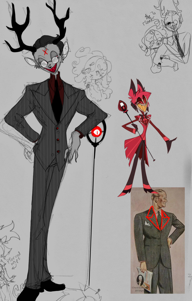
Omg there’s like over 70 people following me – guys I'm o///O flattered and flabbergasted.
Anyway, onto today’s main event, Alastor. I hate Alastor’s og design, I hate his twig waist and his shoulder pads and the way you can’t see his antlers next to his ears, and his bow tie ugh viv please and his HAIR what even is that??? Not even mentioning that nothing about his design is really like a focal point. There’s no one thing that’s particularly interesting. At least before this he had that cathedral window looking cross on his undershirt that I found interesting. Nothing about his says he’s from the 1930’s other than dialogue.
I wanted him to be in greyscale because that’s the coolest aesthetic, and colored photos weren’t a thing until way after the 30s. Recently I saw jjk, and Jogo’s teeth threw me because at some points I thought he was just straight up toothless. But then when I started this design, that colored tooth look spoke to me. Initially his teeth were yellow to look gross like he never brushes them, but then I was like ‘ayo wait, he’s literally a cannibal’, thus his vibrant red teeth to really pop against his greyscale. Initially his undershirt was white, but I feel like that was too much contrast and white is typically innocence, so by instead having a deep red it shows he’s just straight up bloodthirsty underneath his formal appearance. I also considered it being black, but then he looked like a pastor, and I wasn’t too much of a fan of it. The idea of the red on his design is that it leads your eye down his design to take it all in, with his face being the focus. I gave him glasses because I like the way it obscures his eyes a bit and I imagine they do the anime thing where they glow and hide his eyes. I liked Viv’s idea of sinners having marks where they died, and I slicked his hair back to show it off very prominently. His antlers are larger, I gave him cute lil deer ears. Also, under his suit he is lowkey buff. I feel like a serial killer should at least look physically capable of taking someone down not whatever the fuck viv’s nasty twig men can do. Like, in that comic with the cute sheep girl, when Alastor goes demon mode his body looks so snappable I just wanna like grab his waist in my hands and break it like a twig. I also tried to keep his design simple as if this were for animation, I know pinstripes are complicated and so are antlers but other than that I tried to keep his design basic.
If I were to rewrite him based solely on the pilot, I honestly wouldn’t change a thing. Alastor is a decent character, his voice actor gives him life, the radio filter is cool, and nothing he did made me want to break my screen (ANGELDUST). The only thing I'd change would be his position in hell. Like, viv’s hell is so wack and I hate it, she’s got the princes, then the goetia and the overlords and then sinners and blah blah, it’s a lot to keep track of, not even mentioning the rings and circles thing. I think Alastor should have had dealings with hell as a human, maybe he routinely did sacrifices or something, and he made a deal with the archdemon Alastor and when he died like... uuhhhhhhh. Maybe through connections he’s gained more power? Idk, I just know I hate the idea of his dying and then having like the bestest most powerful demon powers despite not being hellborn. It’s got this mary sue stench. I’ll figure it out, maybe, who knows.
I’m not gonna start rewriting since there’s nothing to go off of and alter yet, so that’s gonna have to wait until the show actually drops before anything concrete happens lol.
Also the sheep girl is a sinner that reoccurs in the show now so sorry I don’t make the rules, you can’t give me a cute sheep girl and try to take her away, I’m gonna redesign her and shove her into the plot as someone looking for redemption at the hotel
#anti vivziepop#vivziepop critical#hazbin hotel redesign#hazbin hotel critical#hazbin hotel criticism#alastor the radio demon
630 notes
·
View notes