#i think i have some better sketch to lineart examples. because sometimes my sketch is so detailed that it's sometimes a waste of time for m
Explore tagged Tumblr posts
Note
Heya! As a baby artist I was just wondering how long it typically takes you to draw a character? And if you have any tips for getting the lines to look so clean :-) I love your art sm it always makes me smile
Hi! Ah, I'm so glad my art makes you smile! :')
I have...several possible answers for you, lol. First of all, the time it takes for me to draw a character varies. Something I’m working on to speed up my process is learning anatomy. Most of my time is spent trying to get the anatomy of a drawing down, and the more you know it, the quicker it can go.
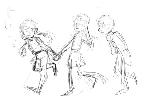
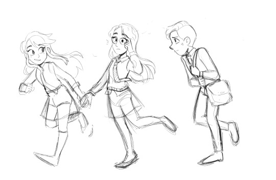
But as for lineart, the number 1 way I've found for having clean lines is having a detailed sketch.
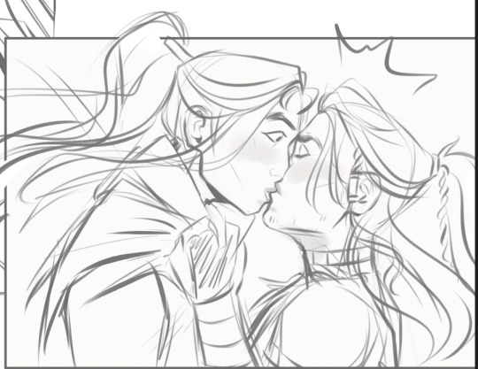

While the sketch was messy, around the face especially, all the lines were "in place." I wasn't having to resize things or change the shape. This makes lineart completely mindless for me, and that means I don't have to do as many corrections while drawing, keeping my lines clean.
However, when I first started out, it was hard to get here. If you're starting out, your art may look like this, with a bunch of short strokes:

There are two ways I've found to combat this (and it's honestly something I'm still working on...) Short strokes like this tend to happen when you're unsure of what you're drawing, which happens a lot when you're starting out. Planning out a drawing in your head and knowing where you're going to end each line when you start is helpful. (I.E. "I know the side of the face needs to go down enough to reach where a chin should be, so I'm going to try to do it in one stroke instead of seven). Proko has a good video about this here.
You can also practice drawing longer strokes just on their own. Lots of drawing books will tell you to start by practicing ellipses and lines from different directions to help you get used to longer motions. Becoming more confident in drawing full lines will help!
But, as you're learning, tools can help. I draw with a tapered pressure sensitive pen, which allows me to have some shorter strokes while hiding the results of it. (Although it's still good to practice avoiding this, because it'll help your drawing even with a brush that hides it a bit better.)

i hope this was helpful!
#asks#my tutorials#i still have a problem with this tbh which is why i love my brush but i'm trying to grow out of it lmao.#lineart#sometimes drawing a character takes fifteen minutes and bam it's done and sometimes i wrestle with a simple pose for days. it is how it is.#i think i have some better sketch to lineart examples. because sometimes my sketch is so detailed that it's sometimes a waste of time for m#to do lineart because it's almost redundant#by lineart's my favorite thing so i always do it anyway#except for the second turtle duck comic lol. some of those i didn't line and i just cleaned up the sketch so i probably should have used th#that as an example but i think this illustrates my point
73 notes
·
View notes
Note
Oh uh forgot to ask in the previous ask (the one with the digital piece of candy and scurrying and stuff)
How do you draw art so good
Like
Is there a method you use or is that just the style you've gotten over time?
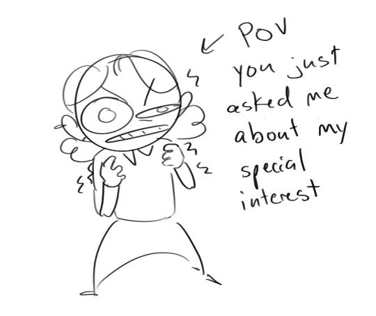
you've activated my trap card
I'm just gonna preface that this tutorial is from someone who was not professionally trained and didn't have a lot of free time for art, so a lot of the tips I have is short cuts I use to get the best results quickly
If you genuinely want to get better at art then please look at references and practice that is always the best
However if you are like me and only really do art for fun but want to go faster then these are for you pfppt
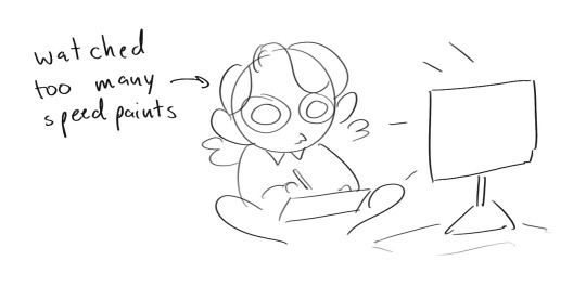
Overall I'd say my style is influenced by speedpaints I would watch when I was younger, I like analyzing how people do things and what makes something look "good" to me
I always recommend watching them because they will often have techniques you've never seen before or do things a certain way that you can try out yourself
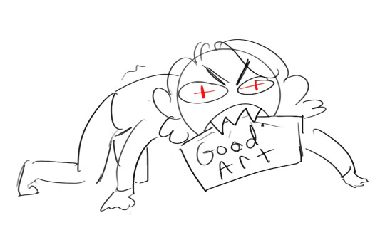
I consume good art, it feeds me
but seriously it can be super helpful when developing your own methodology, or just generally trying something new
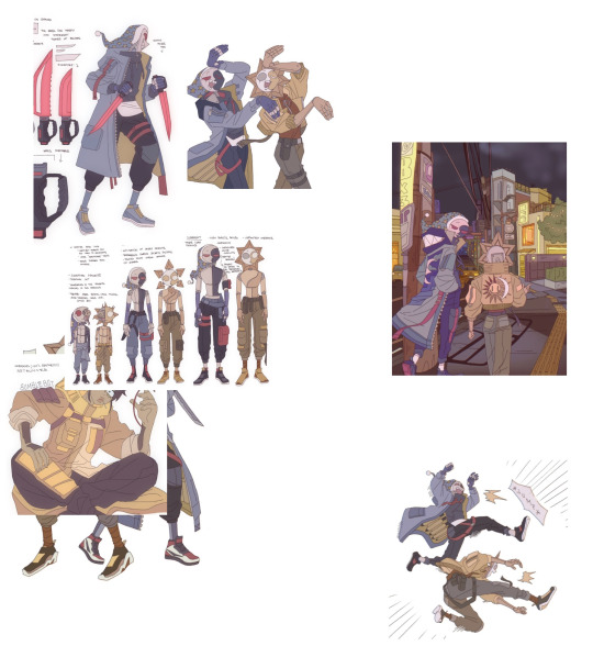
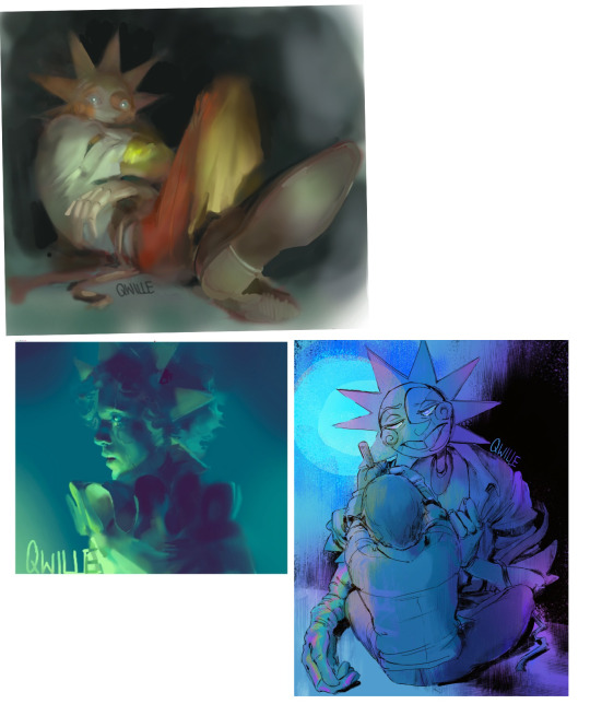
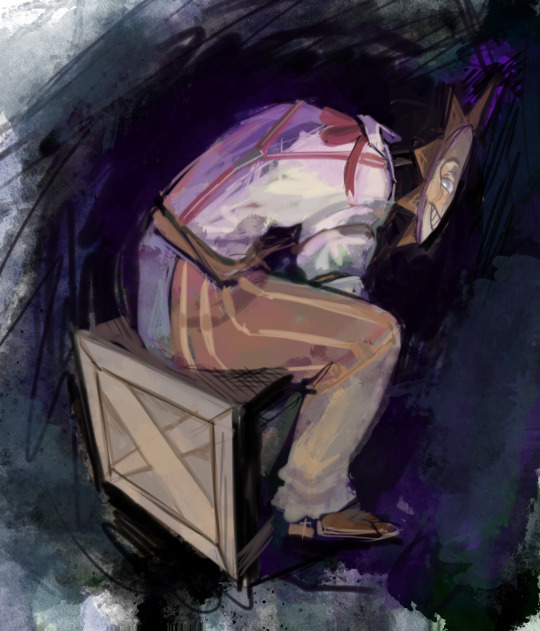
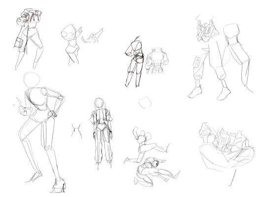
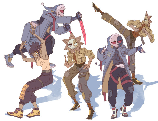
Usually it starts with me pulling some references from artists I really admire and sort of sketching out how they do the things I like
For example 8um8le has like super good anatomy and poses so I focused on trying to replicate how they do that
venemous-qwille is super good at color and pulling focus so that's what I focused on in my study of them
In general I'd say my process is sketch -> silhouette -> color -> shading -> render
I really don't like doing lineart lol

I'd say for the sketch the most important part is using references and just kind of fudging it until it looks correct anatomically/physically
General rule of thumb is spend time on areas of interest, and keep non important areas light (like the stitching on his pants)
I don't do lineart because I think its unnecessary for most paintings I do
I naturally tend to put more time and focus on areas of interest (like hands and feet) and if you use a brush with opacity for the sketch, those areas are naturally going to be darker in the final sketch
Of course this is gonna be different for everyone but it's what works for me
Sometimes I do a really really sketchy layer underneath my sketch/lineart, just so I know where everything is going
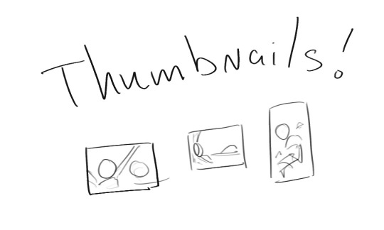
Use thumbnails! They are great to help figure out the general layout of things and what pose I wanna do
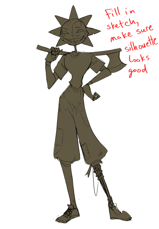
Next is what I call the "silhouette" layer
This is super important for me cause it helps me refine the figure and make sure the pose/anatomy looks correct, also depending on what color I choose for the silhouette helps guide what colors I'm going to use on top
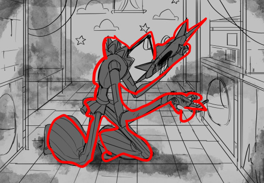
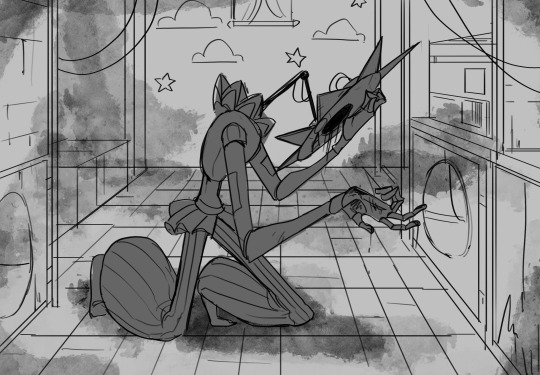
This piece is a good example of how it works. The silhouette shows me how the figure interacts with the background, how the pose looks and if its any good
The silhouette layer doesn't have to be super clean, as long as it follows the sketch decently well and shows where the figure is then its fine
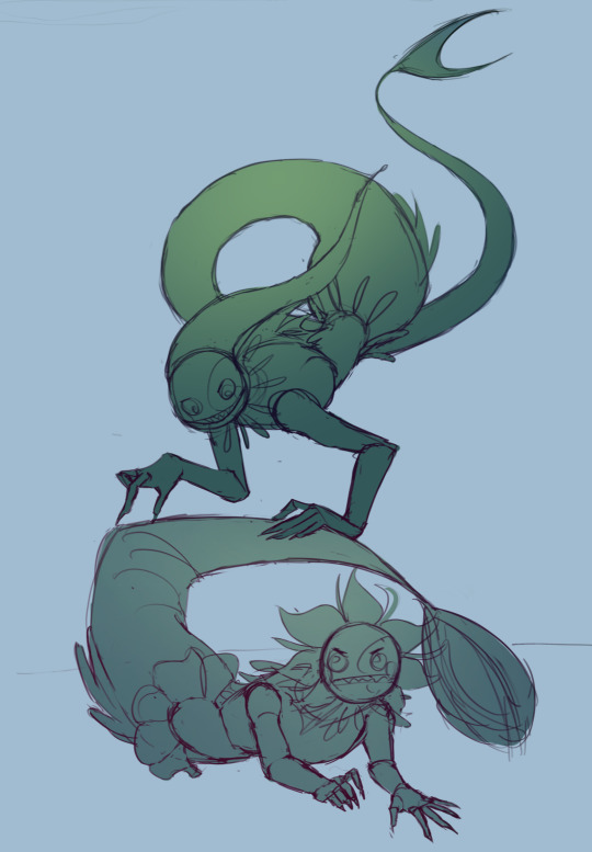
I also sometimes make the silhouette layer multiple colors to help guide shading and vibe
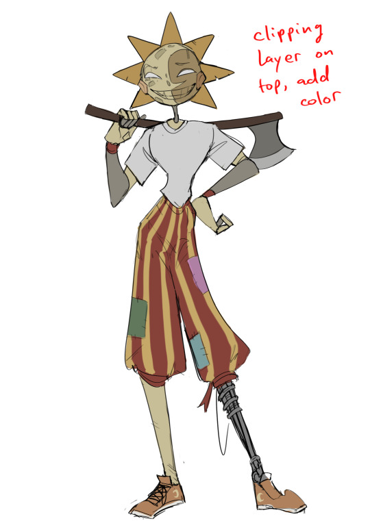
Next is the coloring layer. I usually make this a clipping layer on top of the silhouette layer, or I change the silhouette layer to alpha lock, either way it saves me time on coloring everything in

Sometimes I am super rough with the coloring too, using like an airbrush or my fav watercolor brush just to generically block in color where I want it
Works out cause most objects have like a bounce light to them from surrounding objects, so this is sort of a cheat I use to get that effect without all the work lol
Also don't be afraid to have the lower silhouette layer shining through, having multiple colors sort of subtly shining through the piece helps lots
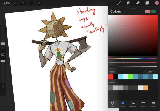
Next is the shading layer, this is usually another clipping layer, usually set to "multiply"
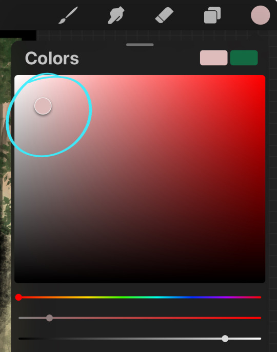
The colors I pick here is usually within this range, any color works, just depends on the piece and vibes.
Since this piece is set in a sunset forest I choose a more desaturated orange for the shading layer
I know there's a whole thing about multiply layer being a crutch (and it kind of it) but it is a useful tool when you just want some darker values across the piece but don't want to go through the process of color picking every single darker shade
Also in my opinion it looks better than picking a darker color and setting it to a lower opacity, idk I just think the color has more "depth"
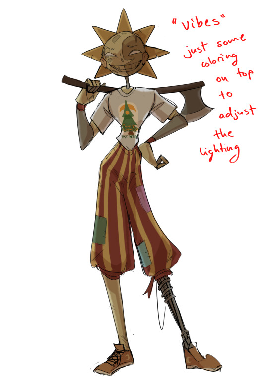
Next is the hardest to explain, sort of the vibes layer
Usually its just a layer of more concentrated color on top of the normal color and I fudge with the settings and values until I get a result I like
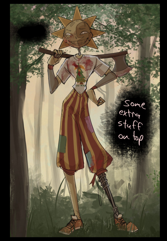
Next is the longest step, is the "extra" or the render stage.
Usually I add a background before this step so that if I need to merge the figure better with the background I can
If I render with a white background but he's supposed to be in a dark forest, its going to mess with the lighting severely
Also this is when I add more "vibe" layers on top to get the figure to match the background better
Backgrounds in general I recommend checking out @/derekdomnicdsouza on instagram he's got lots of great tutorials for breaking down backgrounds simply

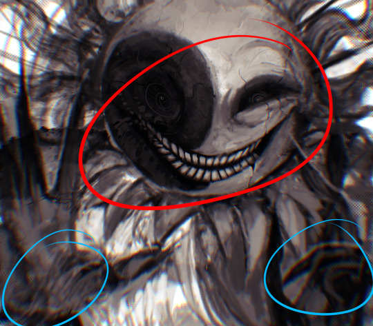
I'd say general rule for the rendering layer is to focus on the areas of interest and spend less time on areas you don't care about
I even blur stuff out on the edges I don't want people to see, partially to save time on fixing mistakes in areas I dont care about (oop), but mainly to help draw the eye to the areas I do want people to focus on

Theoretically parts of the background should like mesh with the characters, parrallel lines are a no no unless they are directing a viewer to look somewhere, things that are perpendicular help bring things together
tbh I'm still not the best at layout and probably need more practice, but overall this is what I like doing
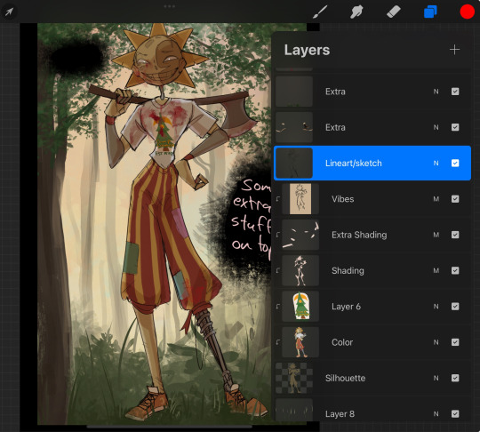
Overall this is what my layer set up ends up being
Sort of a sandwich with the lineart/sketch as the "meat" lol
Color and basic shading below the sketch, clean-up and rendering on top
I like this method cause it's super flexible if I ever want to try something different or try to replicate someone's style
I can make each step less or more messy depending on the end result and can add a lineart layer if need be. Also if there's a part that is straight up not working or needs to be removed its super easy to do cause I can just paint over it on the "extras" layer, color picking from the surrounding area to get the same vibe
Generally rule of thumb for my style is: get the initial layout of colors, form and shading to look good, then the rendering should be smooth sailing
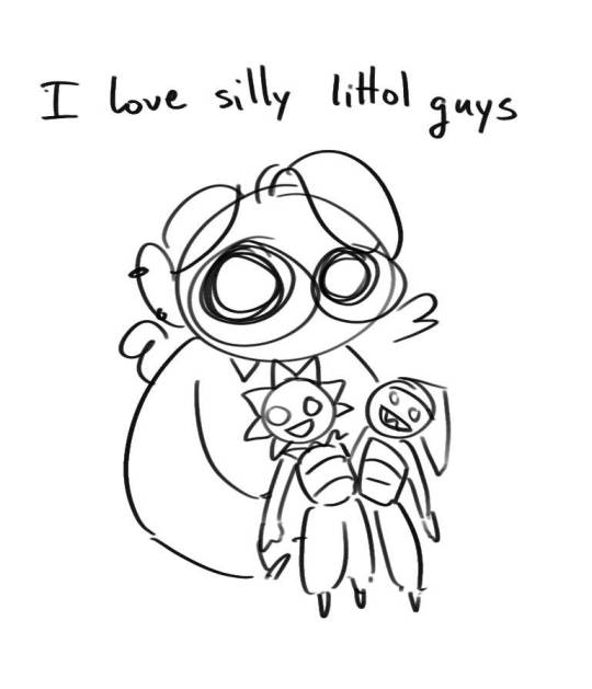
Really the best advice I can give to get better at art is to enjoy what you're doing and become very very obsessed with drawing a silly little guy
You'll eventually get very good at drawing them pfptpf
#sundrop#moondrop#long post#art tutorial#fnaf sun#fnaf moon#I draw them way too much holy guac#ask#this is for you asker#idk if anyone else is interested in this kind of stuff#i apologize for ranting lol#also me struggling to spell silhouette like 15 times
116 notes
·
View notes
Text
Someone asked me how I draw faces a couple months ago and I never had a good example to show so here‘s a little snippet and some text about how I think while drawing:
I always make a copy of my first sketch in case i mess up. Sometimes I try to do a clean up on a new layer, and it doesn‘t always work out. Not because the lines or anatomy is bad, but because i lost focus and with that I lost the gesture/energy and emotion of the original sketch.
Don‘t try to fix what‘s not broken. When that happens I go back to my original sketch and start again, often I draw straight on that same sketch layer, trying to carefully clean it up, staying zoomed out to stay focused on gesture and emotion instead of zooming in and only seeing individual lines. There‘s no need to completely redraw something on a new lineart layer if the original sketch looks already good.
Other factors can play in too (first drawing of the day, not warmed up, tired after long day) So don‘t force yourself into thinking your first attempt has to work out.

Bonus:
Learning when to stop and start over is not just good for faces, it‘s something that helped me improve at drawing in general, be able to draw faster and more efficiently. I started to adapt this years ago when I drew a lot of short comics.
This is especially useful if you tend to get stuck on specific parts on drawings e.g. one part of a face looks wrong and then you erase,re-draw,erase, re-draw -> repeat for an hour and get frustrated. (i think we‘ve all been there)
This is where you have to learn to STOP and START OVER. Recognizing the frustration cycle before it can happen. Re-Drawing the whole face/thing from scratch instead will often get you better results than trying to „fix“ a single sketch for hours. The longer you spend trying to fix a sketch the less likely you will want to start over because you already put so much time into it.
People often ask me how I draw a lot/fast and this is a big part of how☝️ Learn to stop early and start over if something doesn’t work instead of getting hyperattached to every single line you draw.
217 notes
·
View notes
Note
Hello! I hope you have a nice day, I love your art a lot and I wanted to know if you have maybe anything about your process to do you drawings?
Heya! I am having a good day ty :DD I hope you are too^^ and thanks this is really nice dshgjds TvT
I will be really honest but I don't have a lot of time to draw in general so my process is more 'this is between cosmic entities, the 30minutes I have and me, I draw whatever the fck happens in my head' rather than having really complex steps :'))
I have some speedpaints! (I record them a lot it helps me for some details)
I think this one is the most representative of how I work
I doodle a lot of stuff on the same file and I often go to one drawing to another because I can't draw more than 30min/1hour on a drawing most of the time ://
When doing bigger illustrations I do sometimes just really quick doodles to have the idea, doodle or some notes on my phone notepad (and I wrote a lot on it too, here is a chaotic example of a stuff I never finished that makes me laugh so hard)
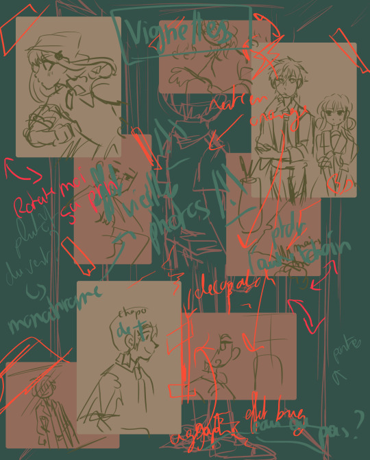
I don't do lineart too, and mostly just 'clean' my sketches/doodles, and I do a sketch for colors too (to test stuff) before doing the 'clean colors' on bigger pieces.
I use one layer for the sketch, one for the basic background and one layer for the colors, then merge everything to paint over it. (I use some effects on layers for colors then merge them)
Here is the layers on my last sketch (I am happy I saved the steps ahah)
the sketch

the colors
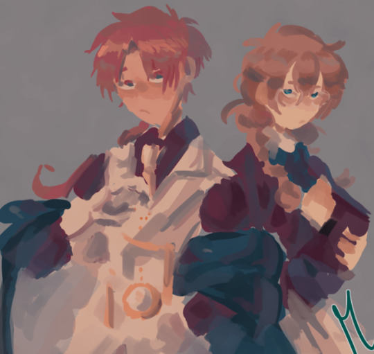
and the merged one where I painted a lil bit over
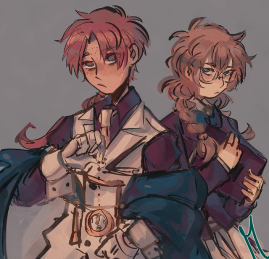
I have a really doodling/sketchy style (and no time) so it works for me but tbh it really depends on what you want for your artstyle too. If you like flat colors I think colored lines look better than just sketch but this is my preference ^^
Idk if this is what you mean but I hope it helps ^^ thank you for your ask!
#toilet bound hanako kun#asks#aoi akane#shijima mei#yashiro nene#this is chaotic af help#speedpaints always made me realized how messy I draw dhskjds#I hope to spend more time on drawings tbh! I always rush stuff but I wanna do bigger pieces dsghds#tbhk#tbhk fanart#step by step#ig??#I will be honest don't learn how to draw like I do :')) I learned according to the free time I have which isn't a lot dshjds#So I adapted in a 'gotta go fast' style :'))#which also mean I ''improve' ar a really slow pace because I rarely go out of my comfort zone#I wanna try that too! :DD#my art
73 notes
·
View notes
Note
How do you art, and where do you art?
hi my name is moe! i've doing digital 2d art since about 2017 and here's a big post about the how and where of it!
the program i use for my 2d art is firealpaca! the version i use is free to download with the exception of a popup ad that shows up when you start up the program! it's a great, very consistent, program that has updated a lot and improved since i started and i don't think i can vouch for it more. everything i include in this post applies to firealpaca specifically though you can probably do similar things in other programs im a college student on a budget and im very comfortable working with this program.
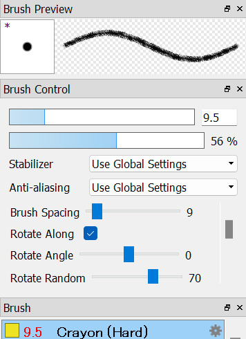


the three main brushes i use i got off firealpaca's brush marketplace! they're all free crayon brushes the first one hard one being the one i use for lineart, the second sort brush i use for sketching, and the third hard one i use for coloring. i think this might be the reason why i get some stuff about people associating my art with childhood/ children's illustrations, im a big fan of using texture where i can and these help to add a lot of visual interest.

seawatt jumpscare
you may see that my finish pieces don't have a lot of flat colors if you zoom all the way in. that's because i use a lot of noise to make the colors look less flat. it sort of reminds me of construction paper, gives a little bit of a fuzziness to it.


i have it set to color at usually around 50. i turn it down sometimes if im working on something smaller. my canvas sizes usually are about 1500 x 1500 just to keep a more consistent square shape across most of my drawings.
another thing i do to make my art pop is i duplicate my lineart layer, use protect alpha to color the duplicated layer another color that's usually brigther than the original layer, put some gaussian blur on it and add multiply or add to the blending on that layer.
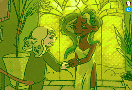
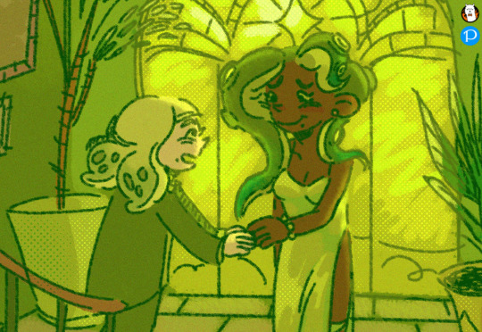
with versus without the added layer! i have this set to add on 31% opacity and ill add more or less if i want the effect to be more or less subtle. it's not very noticable but i think it helps a lot with line clarity and can make something almost glow if you wanted that effect.
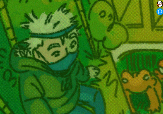
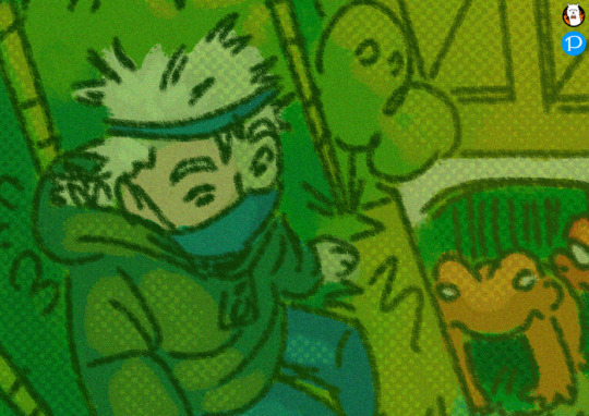
here's another example with a multiply layer (i turned up the opacity to give a better example) subtle and it fights a lot with tumblr image degradation but it makes me happy.
i also make a lot of use of halftoning as you can see in the examples above. I usually only use it to make shadows darker and highlights stand out but they're also really good at filling up dead space like backgrounds to make them more visually appealing


with versus without halftoning! in firealpace you achieve this by using a 8-bit layer (one highlighted) once you add the layer hit the gear icon by the layer and use that to modify the halftoning to your choosing


i usually have mine with a density of 40 but you can tweak it to your choosing. you can also change the blending type on these types of layers i usually just use multiply/ add and occasionally overlay. mess around with the opacity! make it more or less subtle! have fun!
halftoning is tricky to use in firealpaca however due to the way it works. usually i apply it with my soft crayon brush since it hangs around 35% opacity. you can get a more dense halftoning using more or less opacity on your brush and can go back and forth over the halftoning to layer more on. you can also layer two different layers of halftoning to create interesting effects

two different halftoning layers laid on top of each other ^

more opacity + two different halftoning layers laid on top of each other ^
when you go to combine all your layers however because 8bit layers when combined with regular layers lose their halftoning properties. my way around this when combining everything is going layer > merge all when going to finish up and convert everything to png.

that, for the most part is all the technical stuff. i wish i could tell you how i knew what colors to pick but for me i usually pick some variation of green and just go with it. i usually pick the lineart color with my background colors in my mind and go from there until i get bored. complimentary colors such as blue/ orange and red/ green are usually good picks.
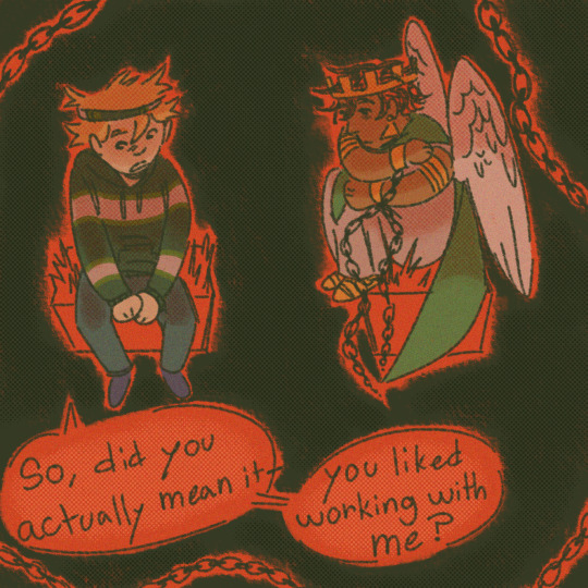
did you notice the background/ lineart is green in this picture? that's because the red cancels it out. i sneak it in there sometimes C:
that's pretty much the how of it all, as for the where, usually my bed
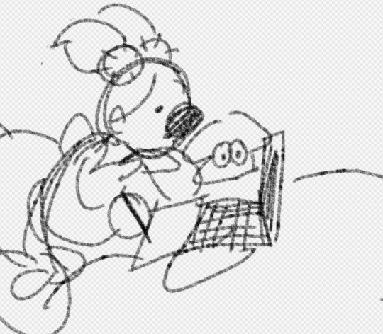
that's all
24 notes
·
View notes
Note
hi dema! i’m learning how to do digital art, would you mind sharing your coloring process? coloring (and lineart) is the hardest thing for me to do T_T… what brushes do you use for coloring and how do you not make it look muddy? i’ve been trying to follow tutorials from different artists on youtube but i find my work to look so muddy… thank u in advance >__<
Hi, and thank you for thinking about me for advice! I'm honoured to share a bit of my process, nerve-wracking as that is for my shy self, and hopefully help you out as much as I can. Forgive me if I don't express myself very clearly—I have a bit of a hard time explaining these things. Now, let's get started, shall we?
I'll be using the first panel of this artwork as an example.
My process is pretty straight-forward for most artworks. Make a sketch, draw the lineart, and follow a self-made guideline for coloring and rendering.
Sometimes I'll throw the guideline to the trash bin and start experimenting with brushes and chiaroscuro and color palettes, but that doesn't happen most of the time and, when it does, it's more a challenge than anything else, and not really what I think you're looking for.
I'll include my usual steps here, however, and like I said earlier, these steps are more like what you'd call guidelines than actual rules.
(I just realized I didn't save the sketch for this artwork. Oops)
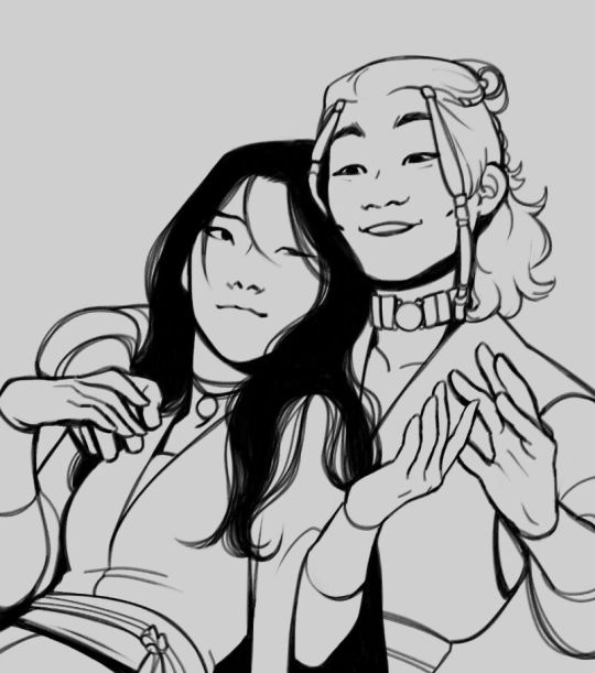
This is the lineart!
I tend to think that details bore me and are actually pretty exhausting to do, but then I go and make things as clear and detailed as I can. Because I'm a hypocrite like that.
I did try to keep things simple here, though, mostly because I had to go through three other panels and didn't want to burn out my fuel mid-process.
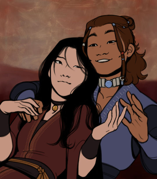
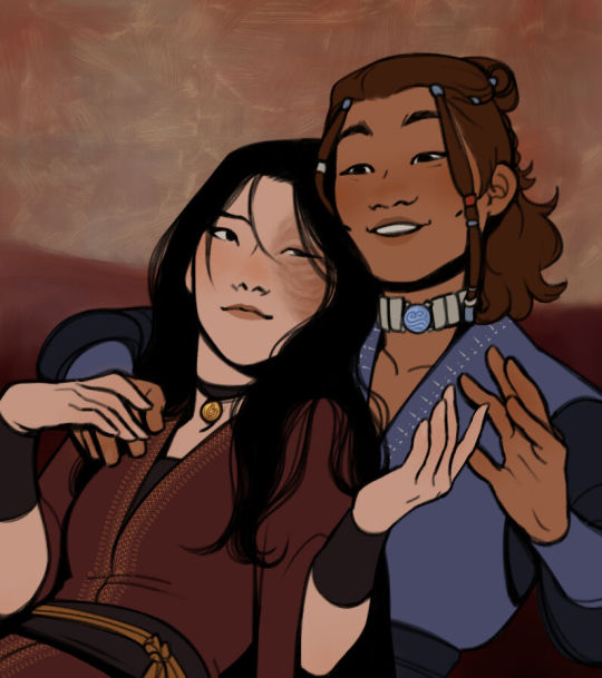
Base colors! The blush (and Zuko's scar!) I draw in a different layer in case I need adjusting the brightness or saturation later.
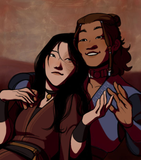
It's time for shadows!
Pick a color depending on the atmosphere you want the artwork to have. Is it a cozy, warm scene in a honey-tinted room, or is it a moment shared under the moonlight? The color choice should come as an answer to those questions—deep red for the first one and dark blue for the second.
Choose a color and make it dark and saturated. Then, play with the layer opacity! A darker shadow means harsher light, while less opacity works best for a softer look. See the difference? It's subtle, but it's there.
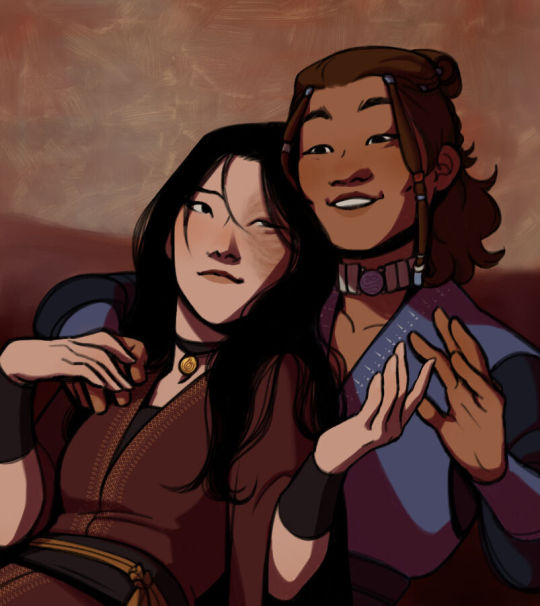
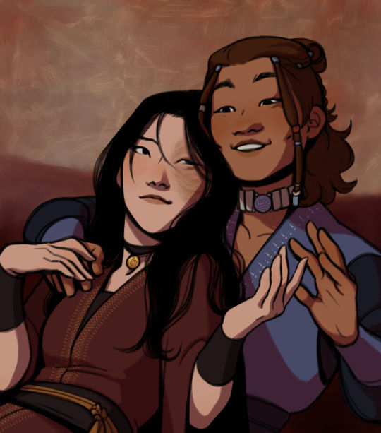
Of course, this is my personal choice. The way shadows are drawn and color is chosen depends on the artist and the artwork. I choose to play with a more simple coloring style, keeping shadows from blending into each other, but you may like a more realistic approach to shadows and colors.
My best advice? Try doing it every way you can, but in the end choose what works best for you. Whatever feels more comfortable, whatever you enjoy drawing the most. And then work to improve it. Love the little proof that you've gotten better, even if it's subtle.
And talking about subtlety...
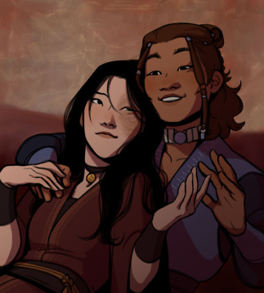
I love to play with gradients. I use them mostly to give the artwork some form of atmosphere, and make it look cohesive and whole. A light gradient in the color and direction of the shadows will help the characters blend with the background, as will another gradient in lighter colors for the light.
Get creative with gradients! Use them so the lights feel brighter and the shadows darker.

Now it's time to work with the lineart again.
The pure black lineart makes the artwork look harsher, sharper, so I tend to give it some color to soften its edges and compliment the rest of the drawing. In darker shades as the rest of the colors, growing more saturated as the light comes closer.
I love to make the characters' eyes pop and glow! It's really fun what you can do by just messing a bit with the tones of the lineart.
Finally, I play with the level correction. A high contrast will help your artwork stand out and look brighter. See the difference?
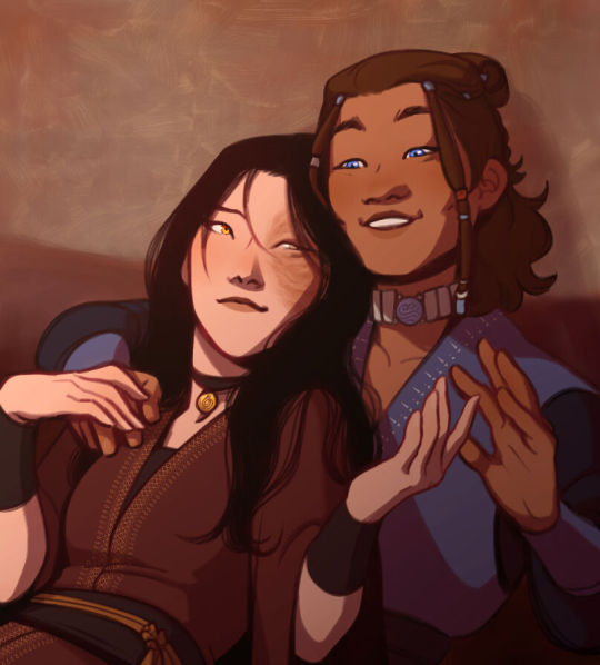
And it's done!
Sometimes I like to add other effects or details, but this is the very, very rough shape of my usual process, and thus what I thought you'd like to see.
Once again, I'd like to point out that this is what works for me, and a large part of improving as an artist is just fooling around and messing up until you find the tools and tricks you're most comfortable with.
So keep drawing those muddy shadows and colors! They're only a step of the process.
#dema answers#zutara#art advice#art process#I hope this helped you anon#Tbh I have zero idea of what I'm doing most of the time#So don't worry if you don't#Worry instead the day you feel like a drawing comes easy and poses no challenge anymore#Always strive to do better to improve to fix that lighting or find a new way to depict a scene or find other filters and effects#No artwork is ever perfect and perfection itself should never be the goal#“Don't trust a song that's flawless”#Don't give up on the strain and the frustration of struggling against your own skills#Never fall out of love with the process#That's where art is
28 notes
·
View notes
Note
Hi, i hope this question doesn't bothers you, do you have any videos of your process?, im currently starting to learn how to do digital art and have trouble knowing where to start and what to do (im always like, should i start drawing this part first?, is it better to do clean lineart or just paint over the sketch?, do i work on the lights first or the shadows?, etc)
I can probs make you a video on this at some point based on something I'm currently working on, although I have a few on my tiktok already (@ xephia) if that helps!
My process is a bit messier than many other artists - I alternate between stages of sketch and colour before I even think about ‘final colour’. I’ll start with a sketch like the ones below, then slap some rough colour on. This is because IMO colour is an important part of the composition so I want to see what works before I line. They’re not meant to be pretty or social media ready. This stage can look super messy or tidy depending on how I feel or how complicated it is. And they can look wildly different; here’s some examples:
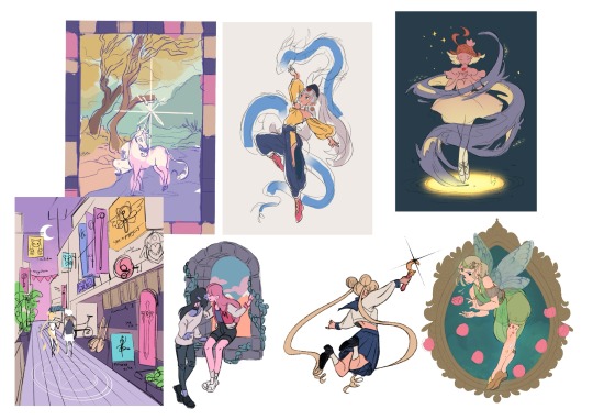
That stage also helps me decide if I want to finish the piece or if I should abandon it (I abandon a lot). Sometimes this stage takes 15min, sometimes 2 hours, it really depends on the piece. But for me personally, it’s crucial because otherwise I find it very hard to envision how it will look later, or forget what I was planning.
Then, I do at least one more layer of ‘sketch line art’, which is basically a first layer of line art to see what works and what needs changing. I colour the important bits relatively cleanly (usually character/s) and add might some subtle shadows/gradients and/or lighting to get a feel of what it will look like finished. Sometimes I repeat this process a couple of times if I’m not happy with how the first iteration looked. This stage usually looks a little like this character sheet I’m working on, and this slice from a Kiki delivery service sketch:


It’s usually not until I’ve done all that, that I go over and do the final lineart, making it thicker, colouring the lines, redoing the flat colours, tidying it up, and adjusting where needed. Essentially I don’t start ‘finishing’ a piece until I’m happy with where everything sits and what colours I’ve picked. It’s only at this point I feel like the sketch is ready to line, and lining and final colouring can actually take less time for me than all those layers of planning somehow haha.
At this point I keep tidying, cleaning, lining, colouring, until the piece feels complete. Sometimes complete for one piece is tidier than complete for another, it really depends.

I’ll also use Procreate’s push tool to adjust things as I go in all steps - it saves a lot of time and isn’t cheating.
Although as you can probably tell from my examples, I do change this procress up a lot depending on the piece! Sometimes I’ll even paint over parts of my final piece like I did in this magical girl street. I think find whatever works for you, everyone will work differently and things like mood, energy levels, how patient you feel, how stressed you are, if you have any hand pain or shaking, and how much free time you have that day to draw can all affect your process day to day, week to week.
Some days it will be easier and more comfortable to sketch messily, other days tidier. Some days you will draw well, other days not well at all. At least for me, I find consistency almost impossible.
So I think there's no right or wrong order to do things and it's great to switch it up and keep things interesting for yourself, and different processes work for different people. Hope this helps!
#faq#art process#art advice#art tips#drawing guide#sketch progress#digital art#procreate#human artist
33 notes
·
View notes
Note
Hello! I am a beginner artist and I love ur art!! Super pretty and the colors are very tasty. Do you have some tips? I'd love to see your art process!
HELLO ANON!! first of all i am very honoured that u would ask me this because 90% of the time i feel like i have no idea what i am doing and like im still a beginner artist myself DSDSJDF. i would love to share some stuff i learnt and some stuff about my process (regardless of how messy it is sdfhsj)
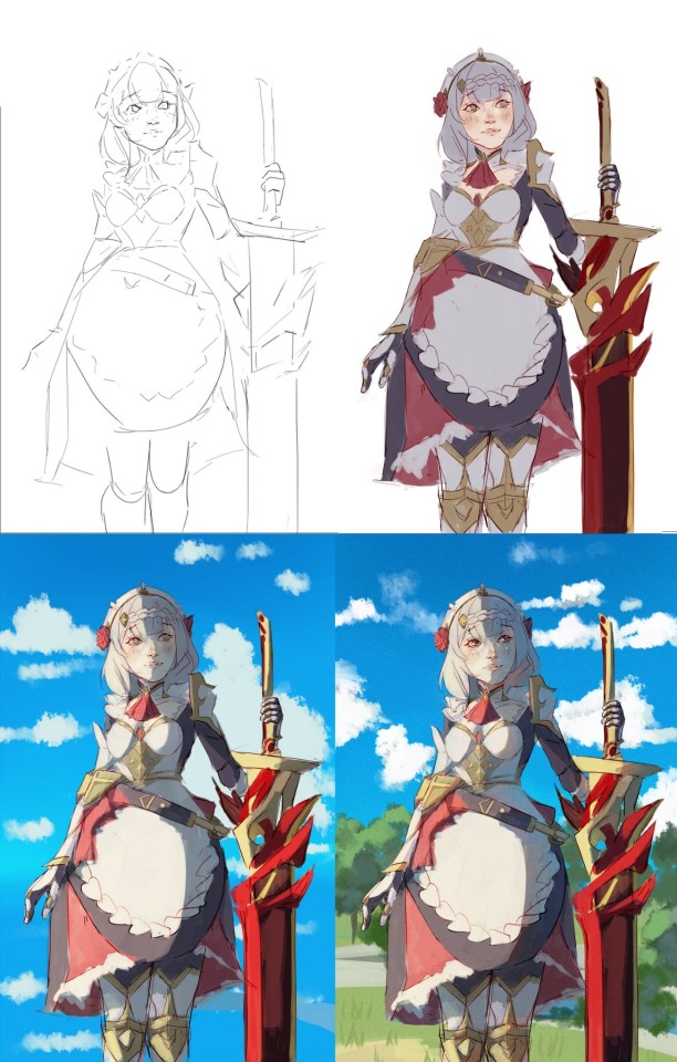
(final piece)
here's an old example of my process i found! while the steps sometimes look different for other pieces, i feel like this is a good demonstration of how the basic structure looks.
1. the sketch - this is where i'm mainly figuring out how i want the piece to look. i was redrawing a screenshot for this piece so it looks a LOT neater than what a lot of my other sketches look like, for example, here's the process of me figuring out my recent drawing of haise:


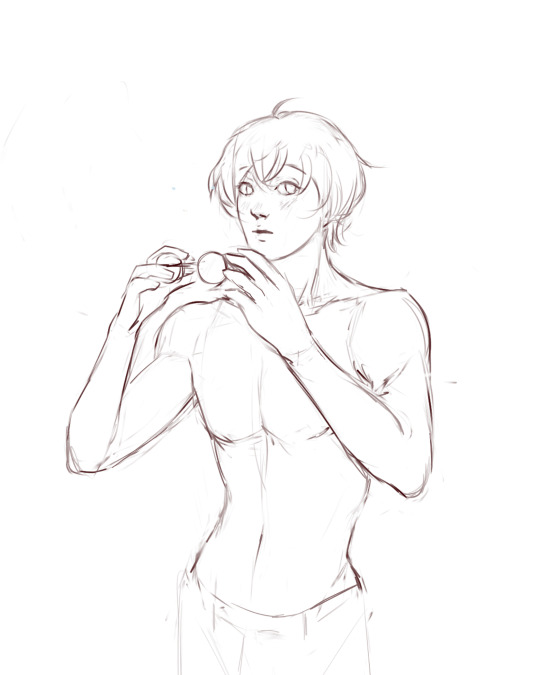
(final piece)
in the first two steps, i was mainly working with showing myself what the piece was going to be. the last one was where i used references/technical knowledge to try and show whoever will be looking at it what the piece was
2. cleaning up the sketch + base colours. these two usually occur simultaneously because i will get bored cleaning up the sketch midway through and want to start adding colour LMAO. on a more practical note, sometimes putting down the base colours and having a better idea of what the finished product will look like might make it easier to refine things.
a note: cleaning up for me doesn't mean doing lineart. it mostly means erasing any overly messy lines on the sketch and redrawing small parts to make it look tidier where needed. i often leave it 'messy' at this stage, too. like here:

(final piece)
3. light/shadow. this is my FAVOURITE part because it's where the piece starts pulling together. the method i used in the current piece was putting a multiply layer over the colours folder and filling in where light would be obstructed. after that, i used a luminosity layer to put in some bright sunlight. marc brunet has a great way of explaining it by advising to pretend that the light is the camera and you're behind the lens. this is such a good way to block in average light/shadow values! sometimes this looks a bit crazy because everything is still so messy but that is why we have...
4. rendering. this is where i fit all the remaining pieces of the puzzle together. i'll refine the colours a bit more -- e.g. colouring in the eyes, -- and fiddle a bit with the shadows to add some more variation to the hues/value. this is where i think a lot about light and shadow theory and try and make it look more realistic. marco bucci saved my LIFE with his videos about ambient occlusion and ambient light (part 1 / part 2) -- essentially, what i keep in mind the most is that if a plane in shadow is facing the sky (or is open to any other form of light that isn't the direct light source) it will contain ambient light. it is SUCH a game changer when you add it to your pieces, trust me, even if youre lazy about it. if needed i'll pull up some references to make everything look good!
5. rendering... part 2? honestly this step kind of blends with the last one as i tend to do it simultaneously. i basically clean up all the messy lines from before by painting over them! with the majority of the colours i need put down, i can just eyedrop them and paint over anything that's needed. this also comes in with the light/shadow, where, if i need a more subtle hue for either/or, i will eyedrop it and brush it in.
some further notes:
i very rarely use references during the first stages of my sketch. i think it tends to look quite stiff and unnatural if i rely too hard on the. and i personally prefer the creative room when the idea is still being conceived. references come in when i can look at what i have down on the canvas and have a fairly decent idea of what i want, including pose, composition, etc. it's essentially a first draft to guide me to where i want to go with the piece. it's when i'm done with this that i bring out references, and even then, they don't necessarily have to be the exact pose -- i'll usually get a couple of pics which show what i need to double check and keep them up as a guide. by the end of the 'sketch', i usually have a basic construction of what i need to continue, even if it's messy.
i use very soft brushes when putting down colour because it allows for more hue variation. like i said, i enjoy eyedropping and brushing in colours afterwards, so this really helps!
layer modes are ur friend! i try not to rely on them too hard during rendering because i like the freedom of painting over but they're very useful when you're blocking in your initial colours
sometimes, when i feel like i want to try something new with my art, i'll keep pieces that inspire me up in front of me. i have two of sui ishida's art books and sometimes i'll just flick to a page that oils the Art Gears in my brain and keep it open while i draw. i don't necessarily reference it, but i like having it there so i can glance over every once in a while. i don't usually make a conscious choice where i'm like "ok i want to render skin the way he does" but it's more like. my brain knows what it likes in his art and it'll try and push that part of my art in a similar direction.
honestly the best advice i have is that art is very much based on vibes. everytime i've tried to think too much about it, to do things 'correctly', to rigidly stick to art theory, my art has not come out nicely. i think the technical parts of art are important to know and understand but i also think it's important to let your knowledge come through naturally when it is needed instead of pressuring yourself to do things 'right'. tbh you probably already know that but it's something i forget a lot so maybe it serves as a helpful reminder?? sedsfhsl
ANYWAY SORRY THIS WAS SO LONG! i hope i covered what you needed and if you need anything else/want me to expand on anything feel free to drop me another ask ! <3
make sure to look after yourself and trust yourself and ENJOY!!! art is about having fun!
81 notes
·
View notes
Note
how do you make your oc screencap edits?? i also have a td oc and i dont really know where to start 😭
ok so!!! i use firealpaca which is just my usual drawing program. so i'll keep using it as a reference for my steps but of course im sure whatever similar program u use should have similar features
i'll be long winded for funsies as usual 💕
FINDING YOUR SCREENSHOTS
the key to decent td edits is to flat out trace screenshots whenever possible. stock pics will do, but of course itll be a lot more fun and less obvious if u use a screenshot from the show and put it into your new context
in terms of making your ocs, you will likely have to do what someone once called "frankensteining" your pics. this is where you use pics of other characters for their specific features and put them together since your oc doesnt have official screenshots to trace. this also absolutely comes in handy w canon characters! maybe you have a pose but u need them to be sitting. so try to stitch together two different pics to get what u need
it will look very scary but just trust the process. here is a random example i made using a dawn screenshot (where i removed the background), gwens eyes and eyebrows, and kittys hair

the sketching part is semi-optional. if you think you can freehand the lineart then go ahead but i assume your oc wont be a complete copy of something found in canon and therefore you will have to draw the newer/different features (such as the hair or the outfit) at least a little bit. and sometimes when i frankenstein the pics, my brain gets all overwhelmed so sketching makes me feel better jfbdjdnd
(in terms of my own oc, i screwed myself over bc his body type is so unique i gotta freehand it like all the time 😭
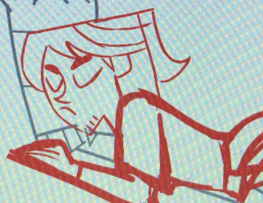
you can see i traced his head from his render (ALWAYS DO THIS BTW!!! TRACE CONSTANTLY), but then the body was freehanded using a canon pic as reference because tracing the pic wouldve been inaccurate)
THE LINEART
yes the iconic td thick, sharp, flat lineart. i achieve this by using a normal pen tool, turning off the pen pressure, and then turning up my pen stability to 40-60 (very high). you could use a curve tool if that works for you! but i would suggest against that for ALL of it bc the tool just wont respond well to rly drastic curves and such
the pen size varies on the pic. if the characters are close-up, itll likely be a bigger one. and then the characters' little details and facial features are usually a slightly but definitely noticeable smaller size. for the most part, ive had the bigger pen size at 13 while the details are around 9. or big size 10 and smaller size 7.
heres my technique:
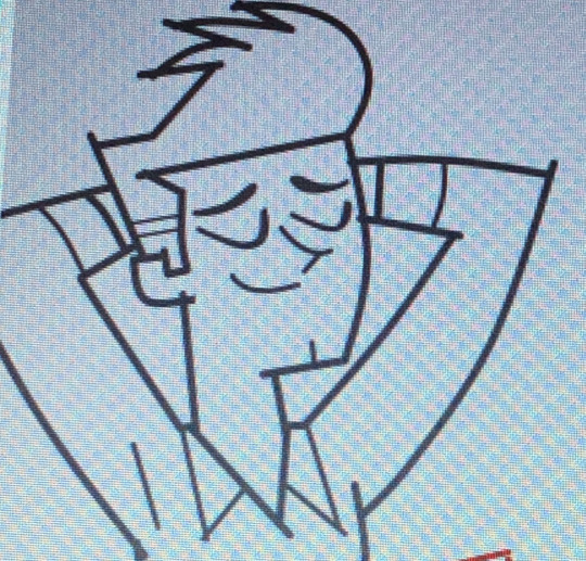
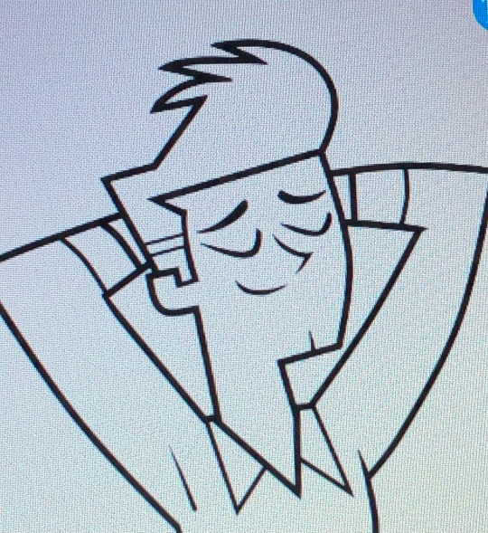
as u can see, all of my lines go a bit too far. this is so that when im done drawing them, i can go back in and slowly erase where they meet and get them all sharp and pointy. this is just how i personally do it lmao. when it comes to facial features and other stuff that doesnt connect to anything, just get a close look at your reference to see how thick or how thin the edges get and do ur best to erase the edges to the point where they should be
THE COLORING
not much to it! the bucket tool is the best way to go. again just get a good look at your references just in case any parts have the lineart also colored in
THE BACKGROUND
you can find some generic td background pics on google or u could get them from the show and try to erase any character in the way lmao. if ur recreating something like, say, a dunc/ney scene w a different ship, then its very tedious but youll have to do your best to erase the canon characters and piece the background back together.
i like using the smudge tool a lot for this!!! just kinda pulling whats already there towards the characters. to save time, put your drawing visible on a top layer as you do this so that you dont have to edit the ENTIRE background, just what you need
THE RENDERING
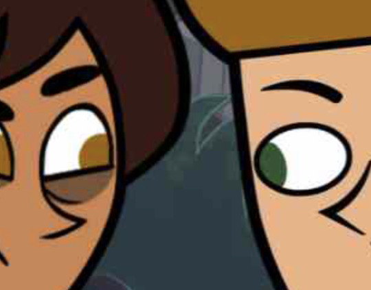
ok so heres a big one imo. after youre done, youre gonna have to fuck up the quality at least a little. well not that u HAVE to but like..... to match the standard quality of a td screenshot? ive never seen a td screenshot in perfect hd quality outside of stock art. so u could blur ur drawing just a little bit. maybe add in the teeniest bit of chromatic aberration (just set it to 1 or -1). not ALL of them together but u do whatever u gotta do
my personal favorite is blurring just a little and then saving it as a jpeg (around 65-80%) so that its pretty crunchy and looks all the more real
obviously not a NECESSARY step but just something to point out. especially if ur background isnt the best quality so the characters have to match it
this one from yesterday i didnt even redraw topher bc i was lazy and he looks fine enough. i just put danny onto the pic to cover the other character. so i blurred danny a little bit and then saved it in a pretty low quality so that they match one another. look at those pixels. that crunch.
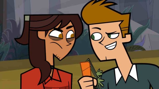
SO THE TLDR IS just trace and copy your references as close as possible. if you cant find a reference for your character, try finding another character w something close enough
28 notes
·
View notes
Note
hii!!! i’ve been following you for a long time now and i really love your art!! i’ve also been trying to learn how to draw so i was wandering if you’d have some advice for someone who’s completely new to this ??? pleek-
forgot to say this in the original ask, but of you have any tips on how to draw hair i’d thank you forever 😭 i’m really struggling with that
aw thanks! idk if im the best to ask for advice but hopefully you find any of this useful!
honestly it's really as simple as just drawing even if you think it looks bad don't get discouraged because it's all part of the process and you will get better when you are drawing on a regular basis. just look at the first drawings i had on here compared to my more recent stuff - the more you do it the better you'll get!
look for inspiration and references, its not cheating to use references as long as you are not straight up copying your reference 1 to 1. i like going on pinterest for inspiration especially for clothes! i also like to see what other artists are doing, instagram is also good for finding art inspo, i also found watching speed paints on youtube a good way of seeing how other people color and how to apply it to your own drawings
I'll talk more about what i do under the cut lol
for my process, i like to start off with a super messy sketch im talking chicken scratch. it's not supposed to look good its just supposed to give you a base for your drawing and allow you to figure out what you want to do.
then i start a new layer on top, lower the opacity of the initial sketch and i start drawing on top and refining everything so I have a cleaner sketch that's closer to the final drawing. this is usually where i finish figuring out the poses anatomy, hair, expressions, hands etc. it's still kind of messy but it'll feel more like you are filling in the blanks rather than starting from scratch
finally i do my lineart in another layer and for your lineart where you just make sure to keep your lines smooth and clean


Then i just do my base colors and shade, for this one i didn't really go all out with the shading so it may not be the best example lol, i just kept it simple which is ok! sometimes less is more it just depends how you want the final piece to look.
for hair specifically - i don't really have a tutorial, when i draw hair i just sketch out the shape i want the hair to have in the initial sketch, and then i had more detail when i clean up my sketch. I usually start by adding the strands that frame the face first or the hairline and then go out from there to the rest of the hair. I also don't draw every single strand, i tend to keep it more simple since i have a simple style
I found this tutorial on pinterest which pretty much how i go about it execpt i usually have a rough idea of the overall shape first and i don't go as detailed as the final result, i usually stop around the third step
i hope ANY of this was helpful and not too rambley! feel free to ask more if you have any more questions!
18 notes
·
View notes
Text
i don't feel like there's much to say about my art improvement this year. however, in 2023, i wrote a long retrospective about my art in which i mentioned my goals for 2024, so let's see if i achieved all of them ^w^
"so for 2024 i want to study some stuff i feel i'm still lacking in. i think i've always had a good eye for composition, but i've never actually pushed it in my finished illustrations - they depend a lot on the poses because i've always been prioritising drawing over everything else. that needs to change this year."
this was actually one of the first things i did in 2024. just around this time of last year, i was in the process of making 7 fullbody illustrations for class, depicting my ocs from a visual novel i still haven't finished. i never shared them outside of artfight (😂) because i get shy talking about my ocs in public, but they are still fire and almost no one reads these posts anyway so...


i had to use so many references for these pictures, from magazine covers to fashion to layout design. i think this was the first time i was actually putting into practise all the knowledge i had learned in my degree, as up to that point i was getting through it kinda passively.
overall, my 2024 was filled with great compositions. who could have known that paying attention to it would lead to better illustrations, right? here are some other highlights i'm still very proud of:


that leblise piece is probably my favorite piece of art i ever did period. so simple yet so delicious and full of symbolism. the aqours fanart is based on an S shape, from "sunshine", and i felt so smart for coming up with it even though it's really simple. and then there's kanadiamari as always - what i really like about that fanart is that i was able to put my design knowledge into good use again.
"i also want to get better at drawing characters from extreme angles. i've always felt like my poses are a bit flat and i think i can study photos taken with wide angle lenses to improve at that."
before we get into this let me remind everyone that i trace all the time. sometimes i wake up and forget how to draw, so i open an app called Magic Poser and play with the 3D dolls until i have a decent base for what i'm picturing in my mind. but it wasn't until last year that i started pushing the angles of those scenes so that i could get the best of them.

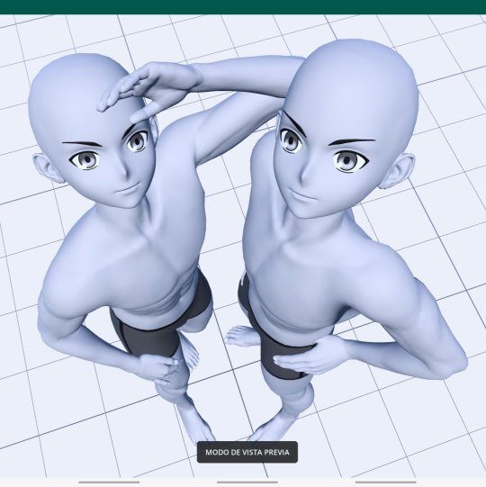


of course, you need to have good skills in order for your traced pieces not to look like shit. i can work with anime models with innacurate anatomy precisely because i already know where the muscles sit on the body. the suselle artwork is more referenced than traced, in the sense that i first sketched the pose, then re-created it in 3D, then traced it and then re-sketched it. the things i do for yuri orz.
okay this was kind of a tangent. i did improve on this particular point but the reason isn't that i got better at perspective, i just made better use of the tools i have - the result is the same and it's positive, so i'll take it as an achievement!
"and of course i still want to draw faster, which is something i've always struggled with. […] i'm still too slow for the kind of artstyle i want to achieve, which includes having a looser lineart and less details in irrelevant areas of the drawings. i think that overdoing the lineart actually hurts my illustrations, because everything ends up pulling the viewer's attention with the same energy. i also think messy artstyles are neat."
this is a tricky subject. in my 2023 post i showed some examples of what i wanted to keep doing in terms of lineart, and while i certainly got better at not overdoing it, i'm still far from that goal. definitely something i need to keep an eye out for, as i really like it when i manage to get loose with my art.


not much to say here except that i'm sorry i never posted these farcille sketches. they are 12 in total and the rest of them are porn and i'm too shy to share them with the world. also those furry guys i draw a lot (twice) are me and my and my best friend's fursonas, in case anyone is curious.
"as for the stuff i like about my current artstyle, i definitely want to keep the way i color!! and by that i mean the method i have for applying filters that make my colors pop. i could maybe play more with textures too."
i actually think i went backwards here. what i do now is more visually coherent, but my 2024 doesn't shine for the way i use colors in comparison to the previous year. it probably happened because i got too comfortable with the way i post-process my illustrations nowadays, in contrast with how experimental i was when i started playing with filters. a shame, truly, but not a huge downgrade.
"i also like the way i depict intimacy, and people have praised it too. i don't think i'll ever change the content of my art, i eat breathe and speak in yuri. if anything, there are still some ways of conveying feelings that i haven't been able to draw because i lack the skill to do so, but i'll keep trying ;)"
not sure about this one either, but i know it's just because i didn't draw a lot in 2024. among finishing my degree and final thesis, organizing stuff for aqours when they came to spain and preparing for my current job, i didn't have much time for yuri brainrot. my best drawings were dunmeshi and lgts fanarts, and i'm glad i got into both of these pieces of media because they still warm my heart today :)


i'm very proud of all 3 of these artworks, especially the frebkuchen one, i cooked so much there. maybe this skill of mine (the ability to depict intimacy) is the one that's closest to mastery among the ones i have, and that's why i don't see much improvement.
overall, 2024 was a good year, but not my peak. i can't rate it just in terms of improvement, but i can't deny that i like my 2023 artworks more than my current ones either. i think i'm on the right path, and while i don't have any art resolutions for 2025 i hope i can bring better art to the world from now on.
thank you for reading until the end if you did, and i hope you have a nice year!! <3


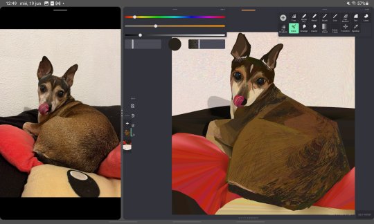


2024 art summary!! lots of oc art this year :) i also started painting digitally and it's sooooo fun~~~
(template by PEPPERTODE on deviantart)
58 notes
·
View notes
Note
Hey do you have any tips for drawing Rabbids?
I’ve been wanting to draw a lot of Kingdom Battle’s enemies but I’ve found difficultly in drawing the basic Rabbid to begin with.
Could you give some advice?
I'm honored to be asked! I don't do a lot of art tutorials or anything AND my sketches are the messiest in the world, but I will try my best!
So like most things I draw, I start with the head and the eyes, and then a rough body shape with stick-limbs to plan the pose. Rabbids are very peanut shaped so I just kinda do two circles. This goes for the majority of them, with various size disparities between the head and the body. Of course some of them have weirder body shapes (Orion your body is absurd) but we're just talking about a fairly basic one right now. For a basic one I tend to make the head and body about the same size or maybe the head even slightly bigger because it's cute!

Ok right now he just looks like a weird little alien, or one of those creatures from Earthbound who were really shy, or Mr. Peanut lol but ANYWAY this is how I plan things. Ok, from there...

The legs are easy, you just kinda draw... that little cylinder shape, I normally have it kinda "flare out" toward the foot because it has better weight that way. If it helps you can mark out an oval as part of your sketch, marking where their foot touches the ground, like I did as an example on the right. For their hands, some people like to draw them with more detailed paws but I love their canonical mitten hands and that'll be easiest too. Just put a mitten on the end of that stick, like a snowman! And then fill out the rest of the arm to attach to the body.
So normally this would just be my ultra rough sketch and I'd start the lineart layer on top of it, but for our purposes here I'll just clean up the sketch (and decide I don't want him to be winking)...

I find that their... mouth skin doesn't really look good in 2D, and even official 2D art usually has it left out (sometimes I put it in while coloring, but if you're just doing lineart it's hard to not just make it look like weird lips). But you can add the tummy skin and the paw pads :3
Now the ultimate galaxy brain strat is to make them a little furry, or add other details. A bit of fluff helps round them out a bit. I also like to add the suggestion of a snout sometimes.

I hope this helps somewhat!! Honestly I started out REALLY struggling with how to draw them myself when KB came out, and nothing has helped me out so much as just looking at concept art or the in-game illustrations. I feel like rabbids look a little different in 2D versus 3D and trying to translate them from 3D onto the paper isn't nearly as effective as simply taking inspiration from the existing 2D illustrations. @randomrabbidramblings linked me to the instagram of one of the concept artists recently, I think this is a great place to start!
33 notes
·
View notes
Text
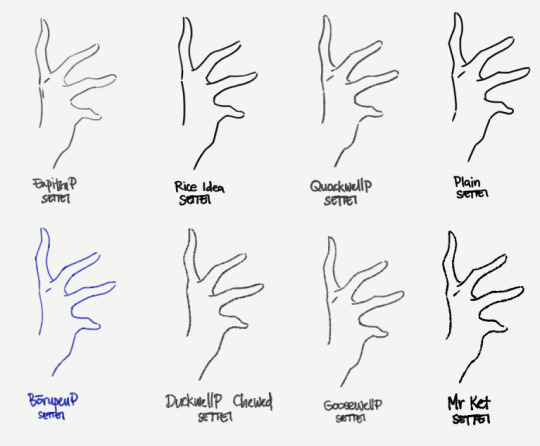
EnpitsuP Settei
I'm trying to finish up on the few demo/showcase/test uses for the EnpitsuP Settei
I figured the better way to document these brushes in a way that's actually usable for users is to just put down my thoughts as I go. So I started this separate blog.
Motivation
The Settei set was inspired by a pretty common need that comes up for me:
Sometimes, I just need a pencil or line brush that's not overly clean (has some texture and grit) and doesn't have too much variation in opacity and thickness.
What is it for?
I know some people just like the feel of this style of brush. But for me, this is particularly useful for:
animation and animation tests, where variations in thickness and opacity causes distracting flickering; A little bit of it can add to a charming look, but too much will make movements fall apart.
writing, where the evenness helps readability;
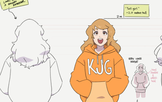
clean, uniform lineart, like simple, cute illustrations, or anime-inspired illustrations;
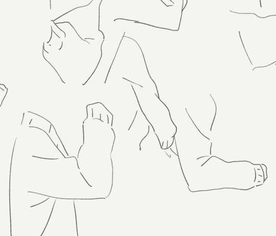
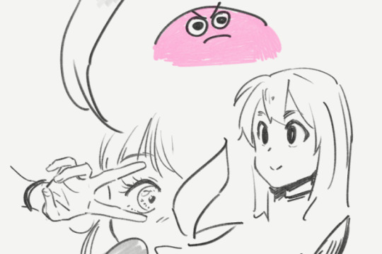
and just certain of styles of studies and line doodles in general.
Why have pressure response at all?
This is sort of halfway towards having a plain brush with the pressure sensitivity turned off altogether, which makes me feel uneasy when I use it because it feels a bit like an uncontrollable firehose when I just press the pen lightly.
The Settei set is designed to have a little bit of pressure response so I can at least still feel like it's obeying my stroke, but still mostly stay within a narrow and predictable range of thickness and density so that it's easy to achieve uniform lines. It's a bit more like a pen with flowy ink than a straight binary tool.
The pencil ones retain their ability to side-shade with a really low opacity. I'm actually not sure how useful this will be in most cases, or if it will adversely affect iPad users in particular. I’ll have to update it if it becomes a problem but from testing, it has been okay.
On pencils and [Compare Density]
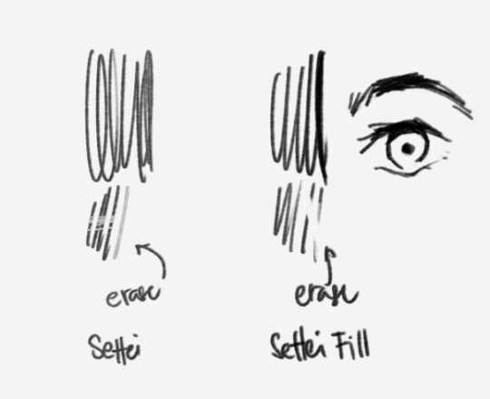
I've chosen to set the brush blend mode of the pencilly ones like Quackwell to [Compare Density] which serves the purpose of better uniformity. But that makes it not work well as an eraser (when you switch to Transparent color). Not everyone uses this but I recognize that enough people do, so I included a "Settei Fill” version of Quackwell as an example of how to make it work better for that purpose, which is just to set the brush blend mode to [Normal].
Incidentally, this is useful in cases where you may prefer to sculpt the strokes or fill-in areas with black, like parts of anime-style eyes.
Of course, it's not for everything
Like most brushes, I don't think think this is a literally-use-it-for-everything-now brush.
For sketching most things, I'm more comfortable with pencil-like brushes that do have opacity response. And I know a lot of artists who prefer to work that way too. I'd be pretty stressed out while drawing if I used the Settei brushes for the sketch stage of a big, clean drawing and I didn't know where it was supposed to go both in big chunks and in the small details.
On "standard" anime cels
The actual typical anime pipeline requires a lot of things to be predictable, efficient and easy to edit and process. So don't misunderstand this set as anything close to what is actually used to produce anime frames.
The standard practice for anime production is to use pure black, aliased/pixelated pen brushes and curve tools.
This is necessary to make it easy for different artists to work on different steps and pass it to each other for editing, correction or completion. And the aliased lines and blocks of colors are especially important for the compositing step (in a program like After Effects), where colors are adjusted, final lines are smoothed, and overlays and effects and motions are added.
One type of character sheet specifically uses the same aliased brushes to be used in their actual production to help different animators keep the same look (brush size, simplification levels, etc) when making actual frames for the animation.
Using custom textured brushes for a finished animation is a deliberate artistic direction that has to be made, and comes at a cost of increased complexity to a scaled up anime production.
If you're just one or two people making stuff for fun though, using something like the Settei set for short animations is not a problem at all.
12 notes
·
View notes
Text
Art Block tips that helped me
I’ve recently experienced art block after 3 or so months of overcoming my last one. Thankfully this block only lasted a few days thanks to some things I’ve observed and noted down from the previous time. So I’m sharing these few tips in hopes that it might help someone get unstuck :D!
First and foremost if you’re tired, sad or anxious don’t be surprised that you can’t make art, go and take care of yourself by treating yourself with kindness and patience, the sketchbooks and canvases will wait for you :)
The tips are under here:
Separate art studies from the creative time: When you do art studies you’re there to focus on specific things, learn and understand how things work so you can apply them later in your art. Studies take a lot of energy and focus and are the opposite of the creative "flow” of making your own pieces. If you combine the two the results are either unfocused studies or stiff drawings. When you sit down at your desk ask yourself “Do I want to learn something new or do I want to create something of my own?”
When you have an idea don’t be afraid of being messy: Let’s say you want to make a picture of several cats kolo dancing in the moonlight. How do you go about doing this? Well since you came up with the idea you already have a vague image in your mind, sketch it out with simple shapes, stick figures, circle and spheres etc Don’t worry about cat anatomy, or the dancer’s moves, sketch out the essence of it. This method removes the need to be perfect or accurate.
Ok after the messy sketch then what? Well now that you have sketched out the essence of your idea (and hopefully had fun doing so) now you go on to look for references! You put the creative process on pause and you can do a few brief studies if you need to: anatomy, color schemes, values, poses. Pick out a few of your favorites but don't obsess over them, they are a guide, a tool.
You know much more than you think. You’ve probably been drawing for a few years now. You’ve probably done some studies and drawn more than one type of subject. Then you have already internalized some of that information. I used to be obsessed with capturing the minute detail of the subject, and not be able to draw ANYTHING without reference. Instead of a useful tool, references became another obstacle to my creativity. That’s perfectionism my friend, and that’s no good. Here is an exercise a good friend of mine offered: Draw a few characters, animals and objects from imagination. Make sure that the subjects have no personal value to you (no ocs for example) so that if you make a mistake you won’t feel bad about it. Make the process relaxed and comfortable, pour a nice cup of joe, listen to your favorite music ... You will notice that you do indeed know how to draw some things without reference, and it’ll help with your confidence.
The more you do studies the more you understand This seems evident but the more you understand your subject the freer you can be and the easier it’ll be to draw it from imagination in the future. If you really struggle with something to the point of frustration (as in you can’t get it right even with reference) It means you have to study it. Have a study list, for example: hands, perspective, color theory etc. And one of those days you want to study pick something from the list, and look for videos on youtube or useful sites like line of action etc. Only study one thing at the time. You can go from studying hands to studying arms since they’re more immediately connected, but you can’t study hands and then jump to learning perspective right after. Trust me you can learn perfectly fine with the resources online, and I’m sure you’re clever enough to do it :D
Mistakes don’t mean you “suck” I’ve noticed that the two most common causes for art block are perfectionism and lack of self-confidence. The two can often go in tandem which is worse :’D But let me remind you of something, you can fix your piece along the whole process. Use erasers, lasso tools, liquify , select, paint it all over etc If something looks off to you then you also know deep inside how to fix it. Useful ways to see what clunks: flip canvas horizontally (helps with placement, proportions), turn the image to grayscale (helps to check values and where your eye tends to look), look at your image in thumbnail size and ask yourself if it’s clear, see the pose’s silhouette and ask yourself if you can tell what the character is doing etc. Don’t fret, everything can always be fixed :)
Perfectionism, sometimes it stops you before you begin Perfectionism causes you to overwork a piece, it makes you draw less, it makes art stressful, it brings insecurity. Let’s remove it with a simple exercise. It can be combined with the “draw things from imagination” once you’ve drawn something you like: dont do line art, don’t shade it, keep it as simple and crude as possible and then...post it. Yes, post it. You’re not at your best? You’re only human, this will help you embrace that very human side of you. You make mistakes. So what? The more mistakes you make the more you know what you need to study and the better at art you become. Mistakes are there to show us what we need to learn. See them as another tool and not a sign of failure.
Make the process as enjoyable as possible: You like art. You love drawing. Never forget this. Otherwise why are you drawing if you don’t enjoy it? It’s easy to fall prey to the mentality of those relatable memes that “art= suffering” or “I can’t even draw the other eye”. No no no my friends, these messages are fueling your insecurities instead of overcoming them. Let me tell you what, art is fun. It is. Art is fun, because I decided to make it fun again. And you should decide on that too. Personally I adore lineart but my hand-eye coordination is lacking to do it digitally, so....I just skipped it. Yes. I skipped it. I do the sketch, I clean it up a bit and then jump onto color which I adore. It allowed me to draw more and more freely. When I draw I listen to music, make strokes with the rhythm, I take breaks often and I drink my favorite iced teas. If you don’t like coloring do it in grayscale, if you love lineart then do that etc It doesn’t mean you won’t learn your weak points in the future with studies and practice, but you won’t let your weaknesses prevent you from drawing at all. No no, you won’t let them. You draw because you want to, despite of them.
Don’t wait for inspiration, provoke it Inspiration is not a divine and capricious muse. You make inspiration. It’s easy just collect all the things you like, music, artists, objects, characters, animals, patterns, plants etc Make boards on pinterest or similar sites, combine things you like. You like suits? You like birds? You can draw a bird in a suit, or a bird-inspired suit design, there is frankly a lot of ideas that can spring up from little things like these.
When a project stops being enjoyable either pause it for now or move on to the next thing. Pieces aren’t precious. They’re not “the one time I got x right” they are one of many. This advice goes mainly to hobbyists who can afford the luxury of passing to a new project. I have a WIP of a character who is overly complicated (I enjoy a challenge from time to time) sitting for half a month. I sometimes come back to it and add something... but as soon as it starts to create discomfort and insecurity instead of enjoyment I move onto something else. In the meantime I created 3 or 4 new pieces. If I had waited on finishing that piece I would have been severely creatively and physically exhausted. The art comes from you, not inspiration. The more art you make the better you become.
That’s about it :D I know it’s long but I prefer to be thorough and cover all the possibilities. If you have read of this: Thank you so much I hope this helps you at least a bit, if it helps only 1 other person I’d still be very happy. Have a nice one, and kick art block’s butt!
#art block#art block tips#art block advice#art advice#art help#BloggityDiary#art reference#I hope this will help someone out#This will also help me remember my own advice sksksk
200 notes
·
View notes
Note
I know anon hate made people leave the fandom and is pushing people to make the same decision, which saddens me deeply. I'm only relatively new to this Tumblr community, and I know it's natural to see people come and go, I just want them to be able to make the decision for themselves and not being pushed/motivated by hate they're receiving.
I'll leave it to that with the anon hate and will focus on art now ❤️ Because I know your struggle, I've been (seriously) drawing for almost 20 years now and only picked up drawing humans because of this clone community. Drawing humans is HARD, anatomy is a b*tch and proportions not my cup of caf. But if I look back at my art when I started drawing clones, I can see I've come a long way.
Some drawing tips below the cut (that no one asked for but I'm gonna drop them anyway) (:
#1: practicepracticepractice. You'll only grow when you keep practicing! And sometimes the result just sucks, but don't take it too hard on yourself; it's part of the process and your artistic journey.
#2: use references!! Screenshots from TCW, photos of humans (could be their faces or poses or just mash them together), but also art from other artists. I really like to add 'sketch' to my google search (for example: 'male torso sketch'), because I find it very helpful to see how other people draw certain parts/expressions. Keep those references open on your screen when you're drawing, see how the shapes and styles work. And don't feel embarrassed about using other artists' art as reference (you can always credit them, I think all artists love to see how their art inspires others)! Go and experiment and see what you like and what works for you, before eventually establishing your own style!
#3: you don't have to stick with one style. Took me a while to find this out, actually. Also once you've found a style, you'll keep improving if you keep drawing. So your style will most likely keep changing as your art journey continues, and that is totally fine!
#4: you can always use paper and pencils. Especially when you're not really confident with using your digital drawing tools and software yet. Go get that pencil and just sketch, fill that paper up! I used to do this when drawing with a mouse (because have you ever tried sketching digitally with a mouse? I find it's impossible). Sketched something you really like? Take a pic of it, transfer it to your computer/tablet/drawing device and trace it with proper digital lineart (it's your own work, after all)!
#5: don't be too hard on yourself. I'm a bit of a perfectionist so I know this is easier said than done, but just try to be kind to yourself <3 No one expects you to become a digital Picasso overnight. Just give yourself time and space to grow, and struggling mostly means you're progressing to the next phase of your artistic journey!
So far my ramblings, I hope this is useful to you (and anyone reading this)! Please keep continuing because I love your art and I'm sure you'll get even better if you keep practicing ❤️
Dear Sunny,
I'm sorry for the recent anon hate you received. I can totally understand how this weighs on you, how this is totally demotivating. I find it so sad to see anons spreading hate around here. But please remember there's also still so many around to support you! I really hope you'll keep drawing, because I love your drawings and can't wait to see how you'll grow if you keep trying (I'm still learning myself with every drawing)! <3
Kriff disrespectful anon, have Hardcase love (this is him whenever he looks at you):

Thank you so much! The hate saddens me for the fandom at large as much as it hurts me personally.
Your words mean so much to me! Thank you. I struggle with art because I’ve been trying to do it for so long. It’s only since getting a tablet and picking it up again I’ve made any progress. It took a lot to post any art because I was incredibly self conscious about it. Until this anon my art has always been met with encouragement. I am trying to focus on that.
Thank you so much for beloved Hardcase heart eyes!!! Omg he’s adorable!!!! (Going to go over here and scream/snuggle him he’s so cute!!)
8 notes
·
View notes
Note
I'm relatively new to your blog so I apologize if this has already been answered (I couldn't find a recent ask on it and couldn't find a FAQ page to make sure I wasn't asking something that'd already been asked) but may I ask how you get character face shapes down so accurately? Even your sketches seem like they have highly accurate character facial proportions down to a science, and I was wondering if you use any specific methods for that (such as Reilly or Loomis method for head-drawing) - 1/2

No need to apologize, I've never been asked this before!
So to answer your ask, I think it's important that I tell you that the characters I draw on my blog are characters that I have been drawing non-stop for more than a year, so I'm kind of used to their facial structures as far as like ease goes.


So it's just natural progression at that point.
On top of that I keep a bunch of references of them, including their 3D models and multiple Pinterest boards. For example, the reference I used for the middle one was this:

Nowadays I don't really use 3D references and when I do, it's only loosely based on them. But when I started out, it was a great tool for me to learn face structures and difficult angles. I have files of me tracing the models' faces and then drawing them from scratch, that I haven't shared online because they were for me to practice, but those really helped me with studying faces and how they look from different angles. For the third one, the only thing I really referenced was myself and my expression (as well as some face features i.e. my nose and eyes). As my style and understanding of facial structures progressed, I became more comfortable giving Daud some of my Southwest Asian features while also trying to keep him recognizable (e.g. his hair, his ears, his narrow chin).
The greatest thing to come out of these exercises and fanart is that now I have a good grasp on faces just generally. My OCs now don't look flat and all of those 3D studies really helped me understand proportions and feature placements better. So my advice to you would be to just practice with 3D models if you can, the trick is to really think about what you're doing tho, and pay attention to proportions and structures.
For expressions, I really just use myself as a model, or go to Pinterest and search up what I want. Usually, I don't need Pinterest for this though, my parents will just walk into my room and look at me doing all kinds of facial expressions in front of my mirror. Sometimes, TV shows are REALLY good expression references too! Some good references might just come at you from the places you least expect them to.
As for my sketches... they might look clean but they're not my initial sketches. Often I will have multiple layers, and I usually tend to just clean up my sketches instead of doing lineart, it just ends up giving me a more natural look at the end.


No matter who you talk to, they'll say that my initial sketches are incomprehensible, but as long as the sketches makes sense to you then there is no problem! I usually find that loosely sketching the idea before it disappears from my fleeting memory helps me capture the mood, no matter how bad it looks lol. I then try to rationalize it but drawing the face by creating the circle first and then the cheeks and jaw, as well as the ears. I then go onto sketching the features which I will then clean up for the final version.
I think that coloring the face is just as important as sculpting the sketch. Light sources and shadows can help really articulate certain features and show the face's depth better. For that I usually use this tool right here as reference!
https://www.artstation.com/artwork/GX3Ax1
It's free and it's super useful!
I hope that this answers your question a bit!
96 notes
·
View notes