#i think cyan yellow magenta black also fits still
Explore tagged Tumblr posts
Visit Tumblr Blog
Explore Tumblr blogs with no restrictions, modern design and the best experience.
Last Seen Tumblr Blogs


Fun Fact
Tumblr was named as a finalist in Lead411’s New York City Hot 125 in Aug 2010.
Text
imagine coughing roses and crocus lane exist within the same universe (apocalopsis #0012)
#crocus lane is ghibli post-apocalypse. a world where humans have died out and now beatrix potter critters live in communities#and started thinking jaja imagine this is just what comes after coughing roses#like the extreme end of no fantasy is world like ours except there's animals living in houses* now#first chapter of crocus lane involves finding and collecting a human body so it's not that they don't Exist. they just died out#it makes Sense. but it's just wild to think coughing roses (my doom days by bastille book) exists alongside crocus lane#idk how many wips still exist within 0012#i know my (as i've been calling them) magical girls don't because they're more like... magical realism#there isn't supposed to be an explanation to their magic they're just Metaphors for being aroace etc.#but maybe from the mouths still fits????#i think cyan yellow magenta black also fits still#(sidenote: i think i want to post from the mouths online 👀)#i need to think of 0012 less of a Continuity and more of a Worldbuilding Gimmick#like. no the rules don't have to be the same for every book. but depending on hiw much magic there is...#....that tells you about the end of the world#funny enough i don't think keep staring fits lol that is its own mess#BUT i do think my dreamwalkers idea fits within 0012#butterfly labyrinth fits too i think.....#pia.txt#( misc ) apocalipsis 0012
5 notes
·
View notes
Text

aphysical | aemotional | atertiary aphyspec | aemospec | aterspec
Some alt a-spec flags :)
I wanted to make matching a-spec flag sets for aphysical, aemotional, and atertiary microlabels. I do like the original flags (link), but the colors didn't really work for my purposes (they represent attraction, rather than the opposite), so I made alt ones.
-
Flag colors:
Aphysical: ✦ Light yellow/green, teal, purple - aphysical colors. (From the opposite colors of physical attraction, which I think orange, red, and dark red/pink represent well.) ✦ Dark grey/black, light grey - the spectrum of not experiencing physical attraction. Such as those who don't experience this attraction at all, and those who do (demiphysical for example). (Inspired by other a-spec flags.) Dark grey also represents aphys people who are a-spec in other attractions (like being aemotional in addition to aphysical), and light grey is also for those who are allo-spec in other attractions (like being alloplatonic, for example).
Aemotional: ✦ Dark grey/black, mid grey, blue, light green, blueish green - aemotional colors. (Like above, this is based on the opposite colors of emotional attraction, which I picked purple, blue, orange, yellow, and pink for. I also greys are just fitting colors in general.) The greys and lightest green also represent the spectrum of not experiencing emotional attraction. Such as those who don't experience this attraction at all, and those who do. They also represent aemo people who are a-spec and allo-spec for other attractions.
Note: to avoid looking too much like other flags, I used the 3 main colors plus dark grey/black for aphysical (microlabels), and dark grey/black, blue, blueish green, and light green for aemotional (microlabels), instead of only the bright/opposite colors (so excluding the greys). Traditionally the bright colors are used to represent the respective a-spec identity (see here for an example), and the black/grey/white is left out, but since they'll look too similar to other flags, the dark colors are included to help with this. (Just check my aphyspec and aemospec flag sets for a visual example.)
Atertiary: ✦ Light green, cyan, blue-purple, orange - atertiary colors. (Based off the opposite colors of the tertiary attraction flag, which are light blue, yellow, orange, and magenta/pink. I also rearranged the color order, just to make it more of a gradient / different.) ✦ Black - not experiencing this form of attraction. I didn't include grey/light colors like in the other flags, but that's just a visual thing. Ater-spec plus other a-spec and allo-spec people/labels are still included under this.
Aphyspec, aemospec, & aterspec: Are all based off of the above flags, but arranged into a gradient / color adjusted to represent their spectrums. Inspired by other a- spectrum flags, like ace-spec & aro-spec. There's no specific color meanings.
-
Wowie that's a lot of text haha. I felt it was important to explain it though. (Maybe I could have formatted it better, they do kind of repeat themselves.)
#aphysical#aphys#aemotional#aemo#atertiary#ater#aphysical spectrum#aphyspec#aemotional spectrum#aemospec#atertiary spectrum#aterspec#physical attraction#emotional attraction#tertiary attraction#aspec#pride flag#alt flag#long post#I really like these attraction labels though and wanted to make stuff for it
105 notes
·
View notes
Text
Downton Abbey Fashion 27 - 1920s indoors fashion
This will be a short post because only Sybil’s and Rose’s indoor outfits are left, and we don’t see much of Sybil anymore and not a lot of Rose yet.

Weirdly, I kind of like Sybil’s new albeit limited wardrobe. It feels so much more down to earth. She’s now a pregnant wife of a journalist from a working family, not a lord’s daughter, and her dress looks a little more like something my grandma might have worn when she was young; they still liked them some colorful fabrics in the 60s. This one has an abstract print in what seems to be yellow-magenta-cyan, and Sybil still has some nice, simple jewelry to go with it – she was never the type for grandeur anyway.

This one is technically one she wears for a picnic, but take off the hat and it doesn’t look much different from her other indoor dresses this season. No offense to the colorful print, which is cute. Also, this goes a little into the square neckline which is a plus in my book.

Little grey for my taste, but again, the flower print is nice. And I’m a sucker for this type of top, everything quite wide including the upper sleeves that look like they are barely set off from the body, and then the lower sleeves fitted like extra-long cuffs. Nice. Also worth noting that, with her pregnancy progressing, Sybil opts to shove the waistband that is usually probably somewhere on her hips up under her chest.

Or, you know, she picks a dress that doesn’t have a waistband at all. I’m not sure if this is black or dark blue, but it does at least have chiffon sleeves to make it look a bit less shapeless. It also seems to have embroidery on the front, but some genius thought dark brown was nicely visible on black, so I can’t tell you much about it.
--------------


And where Sybil wears dark, muted shades and is leaning into the maternal look, Rose is all sunshine and girly. This dress is one she keeps into season 4, and it consists completely of pin-tucked chiffon and lace with the faintest bit of lilac piping around the neck; the color is repeated down at the skirt hem. And I’m shocked, shocked I tell you, to find buttons that are actually functional for once!


Another of the outfits she wears at the end of the season and then takes with her when she moves to Downton. Blue skirt and blue piping on the shirt – you know what that means; she’s put on her good daughter persona. Although you wouldn’t think it with that exuberance. She also comments on one occasion after her mother has been nasty to her, “I felt terribly blue”, so that aspect of it is going into it, too. This is not exactly a happy color for her in the beginning. Though I honestly think this shirt is adorable, although the fabric structure leaves me wondering whether it’s woven, knit, or crocheted. Can’t get a close-up. The way that little light brown pattern on the bottom and neckline is done inclines me to think it’s knit.


More exuberance, and another holdover shirt for next season… and then she just kinda hands it down (up?) to Edith in season 5 or something. Rose wears this red one a lot under her coats and jackets; with it being very simple it makes a good backdrop for practically everything. It’s rather tame for being in her rebellious color, but in this outfit, she says goodbye to her stuffy and emotionally uncomfortable childhood home, so it is rather befitting the situation.
7 notes
·
View notes
Note
For the Lightseekers (Lightbulb, Test Tube, Fan, Cabby): The abilities the Wisps give you!
White Wisp �� White Boost (This will boost your speed to the point of becoming a projectile.)
Cyan Wisp — Cyan Laser (You can turn into a living laser by bouncing off of crystals. You can't really change directions though so you have to aim! You can also destroy obstacles and enemies in this state.)
Yellow Wisp — Yellow Drill (You can drill through the ground or water in quick speeds.)
Orange Wisp — Orange Rocket (You can rocket to any locations you need to, but if you hit any solid surface, you stop.)
Pink Wisp — Pink Spike (You can climb up walls and safely traverse across spikes.)
Blue Wisp — Blue Cube (You can create shockwaves to take out enemies! You can also swap around blue cubes and blues rings and take out chroma cubes but I don't really see them around here)
Green Wisp — Green Hover (You can hover around)
Purple Wisp — Purple Frenzy (You turn into a berserker chomper growing bigger with every enemy or obstacle you chomp down on)
Red Wisp — Red Burst (You can become a fireball and can burn enemies alive)
Violet Wisp — Violet Void (You become a black hole that grows bigger with every enemy or obstacle you suck in)
Indigo Wisp — Indigo Asteroid (You become a planetoid that destroys enemies and smaller (non-living) things and create an asteroid ring that can grow in size and reach)
Crimson Wisp — Crimson Eagle (You can soar in the sky like an eagle!)
Gray Wisp — Gray Quake (You become made of iron and start moving automatically. You can ground pound to destroy obstacles and damage enemies by touching them)
Ivory Wisp — Ivory Lightning (You become a bolt of electricity and can even shock others)
Magenta Wisp — Magenta Rhythm (You can bounce off of notes and can stay in midair for a long time)
Black Wisp — Black Bomb (You can roll down enemies to increase in size. When you leave the form, you explode! Don't worry, aside from looking like a cartoon character when a bomb blows up in their face, you're unharmed.)
Jade Wisp — Jade Ghost (You don't die but you do get the abilities of a ghost. You can phase through things, appear invisible, and fly around. You can still destroy enemies though)
These Wisps can give you different forms which can even depend on who's using the wisps! These Wisps can be combined for the ultimate form!
There's also the Mother Wisp but I didn't really bring her here
The Wisps will change your body drastically for these forms so you'll have to get used to the form changes. You can willingly enter and exit these forms with them.
BTW, the Purple and Violet wisps are pretty clingy and might want you to stay in the Frenzy and Void forms.
OK have fun with these lil' guys!
🧪- golly- FASCINATING!
🪭- WOAH WOAH WOAH WOAH WHICH WISP SHOULD I TRY?
🗄️- writing all of this down wow... this is incredible!
💡- WOAHHHH LIL GUYS!!! what wisp do you think fits each of us! :0
3 notes
·
View notes
Text
Its May the 4th!
What lightsaber colors would the batfam have? Would they be Jedi? Sith? Something in between, or something that is neither? Lets see! This is purely just for fun for me, if you don’t agreed with colors or anything that's fine, feel free to put in the comments what you think their lightsaber color would actually be!
Alfred: I feel like Alfred wound have a Light Blue Saber, based on his background in military. When he was younger he would have had a Brilliant Blue Saber, but as he grew older it faded. He isn’t any less capable, just older. Just a single sided Saber
Bruce: While it would be great to give Bruce a Black Saber, I personally don’t think it actually fits him. Instead I think that Bruce would have a Magenta Saber. He used to have a Purple Saber, tapping into some dark side techniques whilst training with the League. It turned Magenta after he struggled with his connection to the Force, losing it for a short while after Jasons death. When he finally reconnected with it, he found that his saber had dimmed from Purple to Magenta. He uses a single sided Saber.
Barbara: Babs has a Yellow Green Saber, more Yellow than Green as of late but still Yellow Green. Her color has never changed, not even when the Joker injured her. It didn’t change her, just made her think and use her abilities in a different way. When she does use her Saber it is a single sided one.
Dick: Cyan, a mix between Blue and Green. He used to have an Indigo Saber, a mix between Blue and Purple, and before that a Green Saber. But he no longer uses any Dark side abilities. And after many long hours of meditation he was able to reestablish his connection with just the Light side, although his new connection was no longer just on the spiritual level like it was before. He carries two like his escrima sticks.
Jason: At the moment Jason has an Indigo Saber, although it could change as Jasons Saber has changed the most. When he was first starting out as a young Padawan he had an Orange Saber, never fighting unless he had to, although pranking was very much on the table. After his death and subsequent revival his Saber took on a Purple color, due to Talia and the Leagues teachings. Talia was, unhappy, with this, hoping that he would come out with a Red Saber. When Jason was accepted back into the fold, his saber slowly changed into his now Indigo Saber. You know Ezras gun Saber, yeah Jason has that. He also just has a couple blasters in him, because, it’s Jason.
Cass: Cass has a White Saber. A White saber (for those who might not know) is a Saber that has been ‘healed’ so to say from the red of being on the Dark side. She had a Red Saber growing up, from exclusive use of the Dark side and her fathers influence. When she came to Gotham and started to work with Bruce and the rest of them she went through a Jedi healing ritual for the soul and came out of it with a blinding White Saber. She switches between a double-sided Saber and a single sided Saber.
Steph: Now Steph, you could give her a couple of different colors but I've decided to go with Blue. A deep brilliant Blue, a guardian of her order, always on the front lines, although she does seem to be dipping close to Indigo. She uses a single sided Saber
Tim: Tim has a Yellow Saber, his focus always been on more practical ways of fighting and learning. He and Babs have upgraded countless numbers of Jedi and Sith technologies, improving and perfecting them. He uses a double-sided Saber, like his Bo staff.
Trace: They have an Orange Saber, cementing their insistence on not fighting unless they had to because they are a healer. She has taken it upon herself to learn as many different ways to heal others with and without the force. Their saber is single sided, although rarely used.
Duke: Due to his Metahuman abilities I feel like Duke would have a Green Saber. Those with a Green Saber will tend to use Force abilities more than their saber. It just feels right. Fun fact Duke actually didn’t have a Saber for a good amount of time, and he just used the Force and his Metahuman powers. When he did get his Saber he didn’t want any modifications so he kept it single sided.
Damian: To the disappointment of Talia and Ras Damian has a Purple Saber rather than a Red Saber. He takes after his Father in that way, which is the reason Talia sent him to Bruce. While fighting with his Saber Damian will switch from single sided to double-sided to two sabers swiftly.
Happy May the 4th! May the Force be With You
#BatFam#Batman Oc#dc#star wars#lightsaber#shapes and colors#alfred pennyworth#bruce wayne#dick grayson#barbara gordon#jason todd#cassandra cain#cassandra wayne#tim drake#tim drake-wayne#trace drake#trace drake-wayne#stephanie brown#duke thomas#damian al ghul#damian wayne#this was fun for me
23 notes
·
View notes
Note
spare coloring tutorial for your colorful sandman gifs? they're stunning! 💜💫
hi! tank you so much!!!!!
so to be honest i dont remember exactly how i edited each of them because i usually color every gif from scratch. sometimes i save as psd but sadly i didnt this time.
but i tried to replicate the one i liked the most and is almost the same way i edited the rest of that gifset, maybe with just some things more or less. i hope it helps!
first, this is the first frame with the brightness and contrast adjusted w a levels layer

then layer > new fill layer > rainbow gradient
next i adjusted the layer to saturation and adjusted the fill to 17%

and now it looks like this:

i like this method because makes every color pop, even if it was ALMOST gray, you will see a color and its so much easier to use selective color after.
next usually i would need to adjust the screencaps a little with color balance UNDER the gradient layer. adjust to fit the kind of coloring you have in mind like for example this gif

i needed to adjust the color balance to be more reddish so i could be able to adjust the color of the floor because otherwise i woud not be able to, since this scene was too blue and if i adjusted the blue i changed everything.
but here i didnt think it was necessary.
next is just playing around with selective color, the best part imo. and chose the colors you want to make more vibrant ou change the tone etc.
in this gif the main colors are red, a bit of magenta, yellow and blue so i played with those


just play around and add as many layers as you want. i used one more to adjust the yellow and add a little more contrast adjusting the black


now see how it affected his hands? i used clipping mask to erase the layer that adjusted the reds on his hands

eh, its still doesnt look perfect but i didnt mind much
i added one more selective color layer to adjust the magenta a little bit to kind of make up for the red parts i erased and also adjusted cyan


add a little bit of vibrance just to make a little more vibrant, why not

anddd its done!
thats usually the way i go. levels > gradient layer (or vibrance layer) > color balance UNDER the gradient/vibrance layer > play with color balance > a little more of vibrance
let me know if i helped! if you have any more questions feel free to ask. if you’re interested i can also share the psd (since now i remembered to save lol)
28 notes
·
View notes
Text
description advice: COLOURS
btw if you tell me its "colors" i will disintegrate you with a laser.
anyway!
I've seen a lot of tiring advice on colours lately; it's the same old "describing the love interest's eyes as 23823 non-interchangeable shades of green because Why Not" type of thing that I'd hoped we left behind. I've also seen a lot of people having trouble with colour descriptions in general, so I've made this (using some of my art knowledge, which is finally useful) to help!
comparing similar colours
By this, I mean showing the difference between two shades. You can always call to mind existing things; e.g. wine red is going to call to mind a specific colour. But if you can't do that for whatever reason (perhaps the colour's name doesn't fit the tone of what you're describing, or you want to get more detailed), there are some helpful words to use.
Saturation: The less saturated a colour is, the closer it is to grey. Typically, a saturated colour will be on the brighter side (though if it's low in value, it will probably still be fairly dull).

(as you can see, the colour on the left is much more desaturated than the colour on the right, despite them both being blue.)
Other words to describe saturation level: dull/duller, bright/brighter (though again this one has to do with value, too), faded, vibrant, eyesore (for particularly saturated colours).
Value: how light or dark a colour is. The darker it is, the closer it is to black. The lighter it is, the closer it is to white. Value can have a play in how bright a colour appears.
^ as shown in the above picture, value can have quite the effect on a colour. These are the same hue and saturation; the only difference is the value.
Other words to describe amount of value: light/lighter, dark/darker, bright (see saturation), faded (see saturation), shadowy.
Hue: specifically general colours in relation to others, since I highly doubt anyone's about to compare hex codes in their stories. But there is a difference between, say, yellow-green and bluish green.
[I could not get a picture here because of tumblr's limit. wonderful.]
Think of 2 reds; one that can be described as purplish red (and can also be called a purple or magenta) while the second is a more of an orange-red (and can also be called orange, technically). They're different, right?
You can call over other hues (specifically hues nearest to the actual colour) to give more of an idea of what the colour looks like. While describing something as a blueish yellow probably won't work, you can do things like yellow-green.
Specific kinds of colours
Just because something is green does not mean you can describe it with any type of green you like. Olive and viridian are not synonyms, despite both being green. Same with mustard and sunflower as yellows. (I've read far too many instances of someone's eyes being described as "sapphire" on one page and "sky blue" on another.)
Obviously it's not terrible if you describe something as both, say, crimson and blood red. They are very similar, and can give people a sense of the general colour you're going for (especially because it's usually not the exact hex code). However, some colours are much more far apart than people realize!
(also, these are obviously not every colour ever, just a couple of each major hue.)
Under the cut, because this got long:
REDS

ORANGES

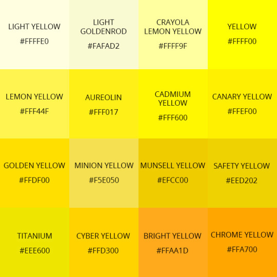
YELLOWS
GREENS

[I'm not personally satisfied with this chart because it doesn't include a lot of greens that are described a lot, such as olive and emerald, but it's a start.]
BLUES

[can we now acknowledge that azure and sapphire are not the same?? please?? Also, as you can see, some are very close; calling something 'baby blue' and 'sky blue' isn't some blight against humanity. Saying it's both cyan and true blue is <3]
PURPLES
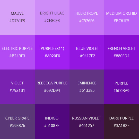
[purple, along with yellow, are the colours im most lenient about when it comes to description. They are very similar, often, though things like orchid and violet are not the same.]
When do you describe a colour?
This is something I see people struggling with a surprising amount. Specifically, with eye colour. Let me put this to rest:
YOU AREN'T GOING TO STARE INTO SOMEONE'S EYES AND FIGURE OUT THE EXACT HUES WHEN YOU FIRST MEET THEM UNLESS THEIR EYES ARE REALLY DESTINCTIVE.
And no, I don't mean "their green eyes emerald orbs have faint flecks of gold you can see if you're half a foot away".
Do their eyes glow? Ok, you can describe them. Are they bright red? Ok, describe them. Do they have no whites of their eyes/colourful sclera? Ok, describe them. Do they have four eyes? Ok, describe them. But for goodness' sake, please don't wax poetic about the eyes of everyone who walks into the room.
Even something like "they don't have pupils" actually may not be noticed at first. There's no realistic reason to immediately zone in on the eye colour of whoever just walked into the room. Eyes are really only noticeable when they're either abnormal or you're very close to the person.
As for the colours of other things: think about if it's relevant. Do you need to go into detail? Is the thing you're describing relevant enough that it deserves to have a bunch of description, or does "it was blue" work just fine? Describing a colour is meant to give you more insight into the thing's appearance, and sometimes the appearance isn't needed.
For example, you should probably describe the clothes of a king if your protagonist is meeting one in the scene, and that includes describing the bright, rich royal blue of their shirt. But you (probably) don't need to wax poetic for a hundred words about the grass; it's just green.
There's also symbolism. It's easiest to make things symbolize their common meanings (like, describing a lot of blue & grey tones in a sad scene and a lot of bright and red tones in an angry scene) but you can try and flip that around if you'd like a challenge!
There is probably more to say here, but I've already spent an hour on this guide and am quite exhausted. If anyone has more tips, feel welcome to share, and I hope this is helpful!
#colours#description#writing advice#nico yells writing advice into the void#writblr#writeblr#describing colours#colors
73 notes
·
View notes
Note
Hi ^^
First of all – your Art is INCREDIBLE!!!
I especially love your use of colors and textures :) Everything is so bright and colorful, but still cohesive. And your images are so clear without being overly detailed! It’s all literally perfection!!!
I like to draw digitally as well and your art-style is a huge inspiration for me. So I wanted to ask if you have any work in progress videos or pictures? Or if you could explain your process in general? Like, are you using a sketch layer underneath, with how many layers are you normally working, what kind of brushes do you use or any tips overall to improve digital painting?
Of course you don’t have to answer this (kinda a lot of questions, sorry 😅 ). Just know that I adore your art and that you’re helping me on my own art-journey just by sharing your work with the world – so, thank you!!! <3
Hey!! So first of all thank you so much for everthing you said about my art, I really appreciate it! But also omg thank youuu for this amazing ask like this is for real the kind of ask I've always wanted to get, where a total stranger is interested in my process XD So yeah don't worry about asking a lot of questions, they were great and I loved them!
Also I'm super flattered that my art has inspired you in your own digital art journey and I hope the stuff I say here can also help somewhat! This will get pretty long so sorry in advance everyone for making you scroll so much cause for some reason the read more option doesn't work on mobile :/
But anyway to answer your questions!
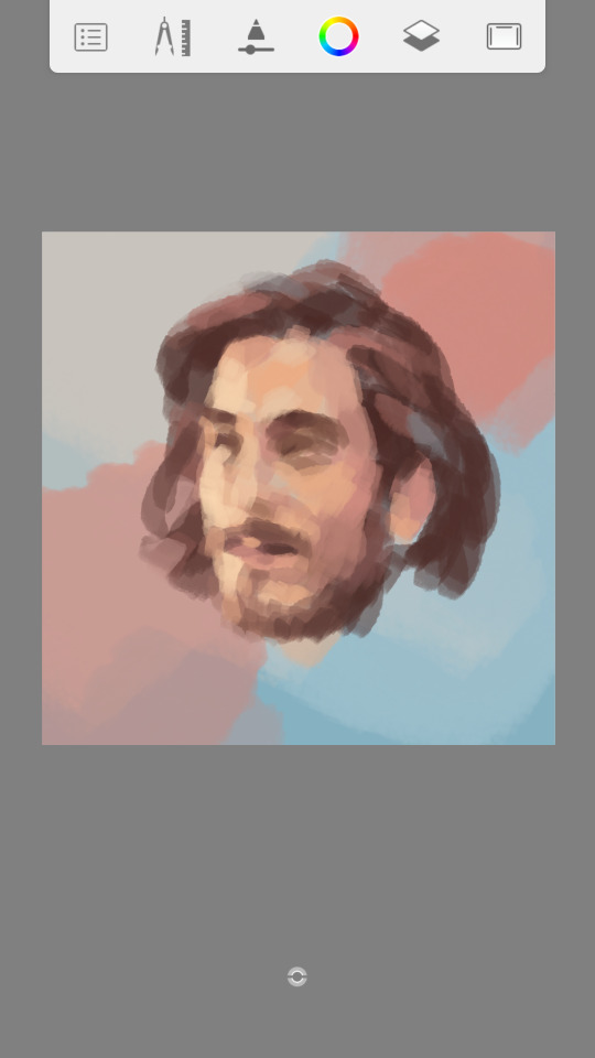
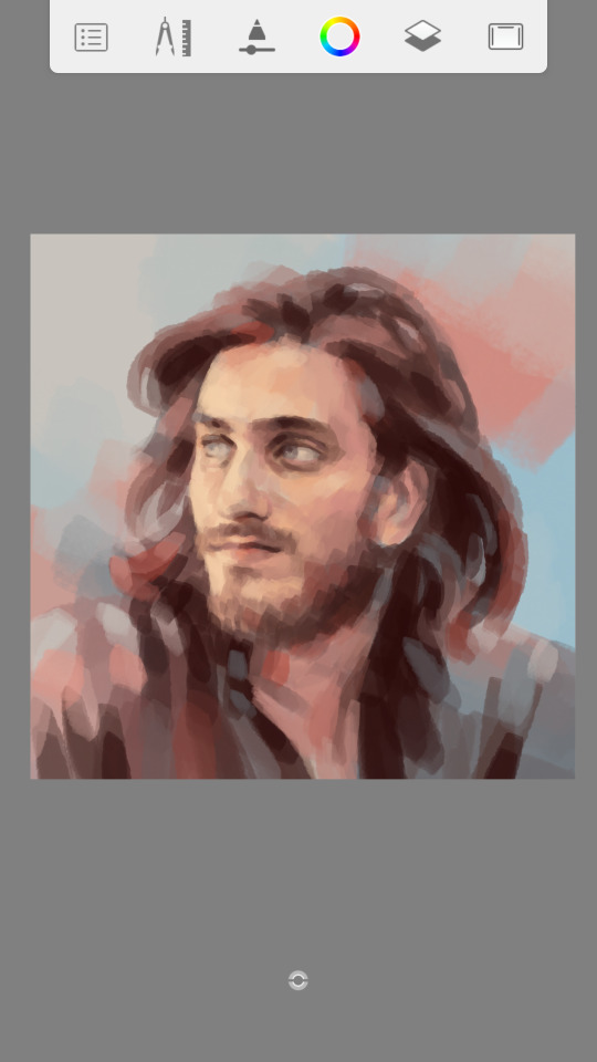
Sadly I don't have videos but I do have some pics I'll share. This is actually my second attempt at answering this because before I was going to use some WIP pics of the Majid drawing as example but then I didn't want to because it was in black and white and color is kind of one of the main things I like to emphasize in my art so I wanted to talk about it in the example XD Then I started a couple new drawings and was taking pics of those but I got super artblocked, but luckily I just finished one out of the blue that I can use. Okay so... I started answering this, again, and it was getting way too long and rambly so I'm gonna try to keep it simple this time and maybe I can elaborate more another time if you're still interested/ if anyone else wants know X'D
My process in general: I always start by making a simple basic background to work on, just fill it in and add some blotches of color. Then on a new layer I just start painting the subject, no sketch, so again just laying down some colors (I usually take whatever color in the bg is closest to skin tone and adjust the new color from there) and I just start blocking some shapes in aproximately the right places to start defining where things will be and how they fit together and just go from there. It's hard to explain it more cause that's kinda it, I just paint until things look like they're supposed to or at least visually appealing enough XD I add or adjust whatever colors seem necessary along the way (in this particular drawing I left the darker values until way too late which I don't recommend) and just refine and refine and refine things and add as many or as few details as I feel like, working on everything simmultaneously bit by bit.
Layers: like I mentioned before there's no sketch, and I try to use as few layers as possible so usually I'll have about 3-5. One for the basic background, one to three (though sometimes I merge them) additional layers for more background effects/colors/value fixes that I usually add later in the process, and I try to have just one for the subject. Sometimes I have one or two more if I'm feeling too hesitant but I always merge them in the end.
Brushes: I only use one brush at 50% opacity the whole time for everything. It's a squarish/rectangular brush that has some sort of jagged edges and a bit of a watercolory texture.
Tips: so this part is especially hard cause like.. I feel like any tips I could give are only applicable to drawing portraits and even then it'd be for doing it in the particular way that I prefer.. Like for example I could say it's best to work on every area at the same time and never spend too long one thing before moving on to the next but.. some people actually prefer finishing the eyes completely before moving on to the nose for example you know? So honestly the main thing I'll say is kinda to just experiment with a lot of methods and styles and see what works or doesn't work for you. Something that I think always helped me a lot was watching speedpaints of people who were more skilled than me and had a distinct style, just literally watch how they did their thing and every once in a while I might notice something I'd be interested in trying for myself and yeah with practice and experience you just kinda figure out what kind of things you not only like seeing but actually want in your own art. Like years ago I used to sketch but then I saw enough videos of people painting without sketching that I wanted to try it and I realized it's just more fun and makes more sense to me that way. So yeah try lots of different things and see what works for you and what you want to incorporate into your own art style!
Some more standard digital art tips I could give I guess are like.. the thing I said about not spending too much time on just one area (if it applies to your prefered process XD). Flip the drawing every now and then to catch stuff that's off. Stay zoomed out as much as possible and when you do zoom in for details always keep an eye on how the bigger picture's looking. Take your time finding or arranging a good reference pic that really inspires you cause it'll save you time and frustration later. And aaa idk I could say more but I don't think it's that informative or helpful, and all of this is probably really basic obvious stuff anyway and this is long enough as it is so yeah I'll leave it there...
I hope any of this can help in some way or that I've at least answered your questions in a satisfying enough way haha And finally here are some of the WIP pics I took. Where you can see some parts of the process. I did a lot more after that last pic but yeah at that point it's just about fixing little things, refining and adding details, but there you can see the color adjustment thing I usually do as the very last step (though not for this pic). I don't always have to do it, and there are probably times when I shouldn't, but I almost always like to do it anyway and that's why my colors look so exaggerated and bright XD I usually make the midtones more red and/or magenta, the shadows more blue, and the highlights more yellow (and sometimes a bit cyan) but if you wanna try something like that it's definitely fun to experiment with the different color possibilities ;u;

And yeah that's it for now! I'm sorry this is so long, and this was the short version lol I hope you like the answers at least a fraction of how much I loved the questions X'D
#asks#asks and stuff#sorry for the late reply#ugh this is so long sorry#but seriously I love questions#feel free to ask me stuff lol#I apparently also love to talk X'D
43 notes
·
View notes
Note
Hey, did you have any coloring tutorials regarding your pride headcanon gifsets? The coloring looks so nice and I wanted to try and attempt to use some coloring for my gifs but I dont know how
thank you !! its usually kinda specific to each gif but i can try! theres usually 2 ways i go about it
using the color overlay feature:
this is probably the easier one as it can be used with more scenes
you need to find a scene where the person you're giffing/the camera moves very little (here she moves a bit but its fine enough for me)
colour and sharpen the gif as you normally would
then create a new layer and simply colour the background in the colour you want
it will look ridiculous at first but then u wanna change the overlay setting from normal to color (the drop-down next to the opacity)
and it should look something like this:
and then sometimes i add a gradient (pink to transparent) on a new layer on each side if i want a bit pinker (i mess around with the opacity of this layer to whatever i think fits this is around 70% opacity)
it doesnt make a ton of difference here but i tend to use it more when there are things happening on the far left that i want to draw attention away from as it makes those areas more opaque
and thats basically it for this way!
the cons to this way are sometimes you can see gaps/overlap where the character moves at certain points of the gif
im usually pedantic about these things but its honestly not as noticable as you think it is and ive uploaded gifs that have overlap (i tend to think overlap is better than a gap but thats personal preference)
using selective colour:
this is harder to do as you need the background to be a specific colour (but i think it tends to look better)
this colour can be the colour you want the gif to be but from my experience blue backgrounds tend to be most easily manipulated
red/yellow/pink backgrounds are hardest to change as they affect the skin colour of the character (but it can sometimes work if the character doesnt move much as you can use a layer mask and erase your colouring from the person)
im gonna try and colour this gif (idk if it will work yet as the background is a greyish blue rather than a brighter blue like the sky would be but it should do)
colour and sharpen as normal (i also recommend using a blue/cool photo filter layer to really get rid of the yellow undertones the later cm seasons have it makes a world of difference for me but its up to you/how you colour things)
then from here honestly its a lot of trial and error; im gonna try and make it pinky purple
this is gonna be different for each gif but for reference i added 2 selective colour layers (as the bg is blue im only gonna change the cyan/blue and maybe black/green) and one hue/saturation
1st selective colour: GREEN (C = -100, M = +100, Y = -100) CYAN (C = -100, M = +100, Y = -23) BLUE (C = -100, M = +100, Y = -91) BLACK (C = +1, M = +13)
2nd selective colour: GREEN (C = -100, M = +100, Y = -100) CYAN (C = -100, M = +100, Y = -23) BLUE (C = -100, M = +100, Y = -91)
hue/saturation: (the background is now pinky/purple) MAGENTA (hue = +1, saturation = +32, lightness = +19)
this is my result:
as you can see their skin tone hasnt changed as i didnt touch the red/yellow selective colour options. if your background is one of these colour you could add a layer mask to that selective colour layer and erase the area of the person but this might cause effects similar to first version i showed you (gaps or overlap)
im still not entirely happy with it as firstly, luke is in the picture as we want to draw attention away from him and secondly, there are still some non-purple colours in the background
to fix this is once again use the color overlay feature from the first version to touch up some of the areas (i colourdrop a colour from the background) there shouldnt be much overlap/gapping as im not colouring precisely around their skin (and if there is it wont be as noticable as the background/shirt is the same colour)
and then to get rid of luke i simply draw over him in a colour from the background and then add a gradient and move it so the opaque side of the gradient is near the edge of where i stopped drawing over luke (i also transform it and mush it inwards so the more transparent side doesnt go all the way over to matt just next to him)
this is what it looks like finished!
it turned out pretty well considering it was a random video i had on hand !!
also dont be scared to experiment with overlays/opacity etc and its okay to realise that it’s just not working for this gif and scrapping (ive lost many gifs </3)
im not the best at explaining things but i hope this somewhat helped!! if you have anymore questions feel free to ask <3
18 notes
·
View notes
Text
instead of ppl asking me to do this i’m just gonna do it for the sake of being bored
Color Asks
red: describe your favorite shirt
i don’t have one but if i do, it’s prob one that makes my titties look big
orange: if you could, would you change your eye color? why? to what color, if so?
yes, to blue because that would be kinda sexy on a poc
yellow: name of an artist you think is underappreciated
billie eilish. she’s very much appreciated but i still think she deserves more. also, arlo parks is a legitimate one
green: do you have a favourite flower?
vaginas maybe i don’t really like flowers like that
blue: preferred type of weather?
idk if this is weather but las vegas at night bc its dark n still warm bitch i THRIVE
purple: a poem you think describes your closest friend
to this day by shane koyczan could make me think of everyone i’ve ever met in my whole life so theres that
magenta: do you keep your fingernails long or short?
short unless i get them did okiiiiiir
turquoise: favorite sea animal?
seals, sea otters, or sea lions omg them thangs can cuddle me at night any night i love them
fuchsia: favorite land animal?
maybe hamsters but also dogs n cats idk i love all animals that aren’t bugs or reptiles
cyan: are you religious? spiritual?
religiously and spiritually that bitch
sea green: can you fold a fitted sheet?
yes
violet: are you a part of the lgbt+ community?
yes
amber: what's saved as your phone's lockscreen?
one of billie eilish’s vogue shots LOL
aqua: do you thrift?
yes but not as much as i used to
pink: what's your natural hair color?
black in the winter but it gets sun bleached easily so probably brown to light brown in the summer if i get out enough
beige: have any pets? what're their names?
mason, kelso, keagan, and berry wherever they all are now. i’m a slut for adopting pets with others
black: would you ever try going vegetarian or vegan?
i did and it lasted 2.5 days but i’ll try again when i have my own place i just really love chicken
coral: an animal you wish hadn't gone extinct
humans before social media
grey: how many languages do you speak? do you want to learn any more?
english, spanish & asl but i’m not fluent in those last two so idk if that counts
maroon: do you care for clothing brands?
no
rose: favourite scent on a person?
pheromones
charcoal: have you ever been camping?
yes *gags*
claret: do you play an instrument? do you want to learn to play any?
yes and i’d like to be an exceptional violin player
copper: gold or silver jewelry?
silver
cream: any piercings or tattoos? do you want any?
yes n yes more peas
salmon: how many pairs of sunglasses do you own?
i truthfully don’t even know
ebony: would you ever want to play a game on television? (jeopardy, family fued, etc)
YES
indigo: have you ever lived on a farm?
no
emerald: if you had the option, would you choose to move and live in another country? which one?
yes n idk where yet but ill figure that out someday
lavender: relationship status?
i’m dating billie eilish n ashley lumba
erin: what was/is your best school subject?
math or english
mauve: any unpopular opinions?
we should all have sex with one another
fulvous: another name you think would suit you
venus
coconut: a subject you enjoy learning about
everything
frost: a -core you enjoy
a WHAT
porcelain: an tv show you used to love
american idol or the walking dead LOL
fawn: any interesting family stories?
one christmas, the police swarmed my grandmas house cause my uncles bashed in someones knees with bats hahahahahha
gold: do you wear your socks mismatched?
yes
honey: your thoughts on magic- does it exist?
yes
rust: form of art you enjoy doing?
masturbating
ginger: any sideblogs?
no
cherry: YouTubers you enjoy watching?
binging with babish
wine: do you have a 'type'
physically no but mentally yes
mahogany: your sun, moon, and rising signs
leo sun, aquarius moon, scorpio rising
blood: twin beds, queen, or king?
california king
hot pink: did you/do you had/have strong feelings against the color pink?
no but i have strong feelings towards the color pink we love her
plum: a food you've never tried
caviar
lilac: dogs, cats, or fish?
no fish
amethyst: do you collect anything?
yes
mulberry: earbuds or headphones?
earbuds for public headphones for private
azure: jean jackets?
sure
teal: have a job?
unfortunately
denim: kill the spider or take it outside?
die!!!!
sapphire: do you think you can sing well?
sometimes
mint: favourite flavour of gum?
mint
pecan: shuffle your playlist, what's the first song that comes up?
my boy - billie eilish
penny: icecream or cake
i dont like either unless its icecream from coldstone or that cheap chocolate cake w white frosting on it thats so sweet, u get cardiac arrest lol
ash: can you do your own makeup?
yes but not well
jade: ever written fanfiction?
i don’t think so
grape: how many blogs do you follow?
its in the high hundreds i think
umber: do you brush your teeth before you eat?
yes but i try not to within an hour of eating cause itll taste n feel weird
chestnut: type of phone you have
i think its an 11 pro max
prussian blue: what's your first choice at the vending machine
chips
aquamarine: beach or pool
beach
brass: least favorite food condiment
relish
mustard: how much sugar in your tea/coffee?
not too much
silver: ever broken a bone?
no
rose quartz: rings or necklaces
necklaces
onyx: do you still play Minecraft?
no
burgundy: ever ridden a motorcycle?
i dont think so
scarlet: favorite holiday
thanksgiving
apricot: opinion on 3 in 1 body wash/hair wash
please god no
platinum: do you follow politics?
yes
magnolia: your Instagram handle?
vincentvangoghsrightear
1 note
·
View note
Note
all of them again??
red: describe your favorite shirt
its this black tshirt that has the british flag in white and says london on it
orange: if you could, would you change your eye color? why? to what color, if so? probably not but if i have to id want blue eyes cause i think theyre pretty
yellow: name of an artist you think is underappreciated
umm idk
green: do you have a favourite flower?
yes. dasies and roses
blue: preferred type of weather?
RAIN. also like cool and sunny autum weather
purple: a poem you think describes your closest friend
umm idk
magenta: do you keep your fingernails long or short?
semi short cause i play guitar
turquoise: favorite sea animal?
dolphins
fuchsia: favorite land animal?
dogs and pandas
cyan: are you religious? spiritual?
kinda ish
sea green: can you fold a fitted sheet?
no
violet: are you a part of the lgbt+ community?
no...?
amber: what's saved as your phone's lockscreen?
a group selfie of the hamilton cast
aqua: do you thrift?
no..?
pink: what's your natural hair color?
brownish red
beige: have any pets? what're their names?
yes.two dogs- parker and shadow, 3 cats- ray, boromir and faramir, and a rat peaches
black: would you ever try going vegetarian or vegan?
i was until i was like 9
coral: an animal you wish hadn't gone extinct
most of them..
grey: how many languages do you speak? do you want to learn any more?
english but im learning french and american sign langauge
maroon: do you care for clothing brands?
no
rose: favorite scent on a person?
idk
charcoal: have you ever been camping?
yes all time
claret: do you play an instrument? do you want to learn to play any?
i play guitar and piano but also want to learn violin
copper: gold or silver jewelry?
silver but i actually cant wear either if its in an earing
cream: any piercings or tattoos? do you want any?
i have two piercing in each ear
salmon: how many pairs of sunglasses do you own?
non lol
ebony: would you ever want to play a game on television? (jeopardy, family fued, etc)
no
indigo: have you ever lived on a farm?
n
emerald: if you had the option, would you choose to move and live in another country? which one?
franceeeeee
lavender: relationship status?
singleeeeeeeeeee
erin: what was/is your best school subject?
math probably
mauve: any unpopular opinions?
...no?
fulvous: another name you think would suit you
eliza idk
coconut: a subject you enjoy learning about
history
frost: a -core you enjoy
? what ?
porcelain: an tv show you used to love
used to? idk
fawn: any interesting family stories?
my cousin tried to kill me several times when we were babies
gold: do you wear your socks mismatched?
all the time
honey: your thoughts on magic- does it exist?
not really
rust: form of art you enjoy doing?
painting
ginger: any sideblogs?
yes. @a-hammy-boi and @random-out-of-tune-songs
cherry: YouTubers you enjoy watching?
idk
wine: do you have a 'type'
yes? i guess?
mahogany: your sun, moon, and rising signs
idk all i know is im an Aquarius
blood: twin beds, queen, or king?
queen?
hot pink: did you/do you had/have strong feelings against the color pink?
no
plum: a food you've never tried
most sea foods
lilac: dogs, cats, or fish?
dogs
amethyst: do you collect anything?
sharpies and sweat shirts
mulberry: earbuds or headphones?
earbuds
azure: jean jackets?
i dont have one but i want one
teal: have a job?
no. i is child.
denim: kill the spider or take it outside?
KILL IT WITH FIRE
sapphire: do you think you can sing well?
yes
mint: favourite flavour of gum?
mint
pecan: shuffle your playlist, what's the first song that comes up?
ok this was my 8 hour playlist of random songs
wish i knew you- the revivalists
penny: icecream or cake
cake
ash: can you do your own makeup?
no..
jade: ever written fanfiction?
no
grape: how many blogs do you follow?
146 i think
umber: do you brush your teeth before you eat?
no. after.
chestnut: type of phone you have
iphone 7
prussian blue: what's your first choice at the vending machine
ive never used a vending machine...
aquamarine: beach or pool
beach
brass: least favorite food condiment
hotsause
mustard: how much sugar in your tea/coffee?
a meduim amount?
silver: ever broken a bone?
no
rose quartz: rings or necklaces
necklaces
onyx: do you still play Minecraft?
sometimes
burgundy: ever ridden a motorcycle?
noooooo
scarlet: favorite holiday
halloween
apricot: opinion on 3 in 1 body wash/hair wash
i dont personally use it but whatever
platinum: do you follow politics?
kinda
magnolia: your Instagram handle?
i dont have insta gram
4 notes
·
View notes
Note
How do you edit your GIFs ??
Heya ! I wasn’t quite sure whether you specifically meant the creation of a GIF, or simply my creative process. I can gladly make you a small step-by-step to making ( or editing ) a GIF !
I use Photoshop CC 2018, generously provided by birdysources over here !
As of right now, many of my GIFs feature angel-psd’s “O6 Red Light” with varying degrees of adjustments. Beyond that, I honestly just slap on what I feel might work, and then play around until it looks good.
I personally tend to start with Hue / Saturation* and Brightness / Contrast to really bring out the colors but still keep a certain level of softness if desired. Don’t be afraid to go wild with the amount of adjustment layers !
This GIF uses 3x Hue / Sat and 1x Bright / Con layers. Top with PSD, bottom without.

* Hue / Saturation also allows you to adjust primary colors ( + Magenta & Cyan ) individually, but none of that has been used in the above GIF.
With Alastor in particular, Selective Color plays a great part. It gives you extensive control over individual colors. I crank up the reds and take out most everything else. E.g.: Greens will appear in greyscale. ( Of course, there’s a bunch more to it. )
You can see the effect quite well in the scene below ! Top with PSD, bottom without.

All in all, PSDs are a very… “ see what sticks “ and “ learning by doing “ situation, at least for me. And I’ve only been using it for about a day in total. PS is a very advanced and intimidating program, which is why I never used it. But once you see past the mountain of features, it’s quite simple !
My suggestion ( what worked for me ) is to find some PSDs you like and adjust them to fit your needs*. That way, you get a feel for the many options available while already having a starting point. This helps you make your own from scratch later. ( it’s how I learned basic theme editing as well ! )
Angel’s original PSD taught me quite a bit while I was fitting it to Hazbin / Alastor. Yellows ended up a pixelated black. You can imagine what that did to the poor demon’s teeth !
* Just remember not to claim the original PSD as your own and to give credit where it’s due ! Especially when requested by the creator. PSDs take a lot of time to make. ( another thing I’ve learned the past days, hah ! )
And as with everything, take it easy ! Editing is time consuming, especially at the beginning, and can get frustrating. But the end results are very much worth it, and you’ll most likely end up with a lot of happy accidents to use on another graphic !
I apologize for the mountain of words, and I think you meant it more in technical terms, but I hope it answered your question to some degree. If not, let me know !
— KASZ ! ❤
29 notes
·
View notes
Note
color asks all the colors. i promise i’m very friendly and not evil
you are extremely evil and that's ok!
red: describe your favorite shirt
any of those overly specific ones
orange: if you could, would you change your eye color? why? to what color, if so?
i wouldn't change my eye color 💖 its fine as is
yellow: name of an artist you think is underappreciated
*hypnotizes you* ooo you wanna give teddy hyde more attention ooo
green: do you have a favourite flower?
Larkspur
blue: preferred type of weather?
warm
purple: a poem you think describes your closest friend
idk if i have a closet friend...
magenta: do you keep your fingernails long or short?
long but short if i want to paint them
turquoise: favorite sea animal?
sea slug or that one fucked up shrimp that punches really hard
fuchsia: favorite land animal?
uhhh pangolin? my fav animals change frequently
cyan: are you religious? spiritual?
no
sea green: can you fold a fitted sheet?
fold a what now
violet: are you a part of the lgbt+ community?
ye
amber: what's saved as your phone's lockscreen?
an aesthetic photo
aqua: do you thrift?
no
pink: what's your natural hair color?
dark brown
beige: have any pets? what're their names?
2 pets <3 cyrus n goldie
black: would you ever try going vegetarian or vegan?
ill probably go vegetarian once i graduate
coral: an animal you wish hadn't gone extinct
all of them
grey: how many languages do you speak? do you want to learn any more?
1, working on 2. id love to learn as many as possible
maroon: do you care for clothing brands?
no
rose: favourite scent on a person?
any fruit
charcoal: have you ever been camping?
yes
claret: do you play an instrument? do you want to learn to play any?
i can play. the kazoo and the snare drum
i wanna play the bass guitar so bad it's the sexiest instrument
copper: gold or silver jewelry?
it depends on what im wearing but silver
cream: any piercings or tattoos? do you want any?
i have ear piercings. i wouldn't mind a septum piercing
salmon: how many pairs of sunglasses do you own?
0 :(
ebony: would you ever want to play a game on television? (jeopardy, family fued, etc)
yes i love money
indigo: have you ever lived on a farm?
no
emerald: if you had the option, would you choose to move and live in another country? which one?
i have no fucking clue
lavender: relationship status?
single but crushing on... someone
erin: what was/is your best school subject?
english ig? im good at math but i hate it lol
mauve: any unpopular opinions?
i think bi women should be able to use butch/femme
fulvous: another name you think would suit you
i was originally going to be named phoenix so ig that
coconut: a subject you enjoy learning about
computer science
frost: a -core you enjoy
lovecore, glitchcore, what eva
porcelain: an tv show you used to love
i used to really love total wipeout
fawn: any interesting family stories?
my great grandma fucking. murdered her husband and got away with it
gold: do you wear your socks mismatched?
yes
honey: your thoughts on magic- does it exist?
no but i wish it did
rust: form of art you enjoy doing?
painting. sketching. breathing.
ginger: any sideblogs?
no im too lazy for that
cherry: YouTubers you enjoy watching?
i like vine star-turned commentary youtubers (drew gooden, cody ko, etc.) i watch a couple of video essayists and movie reviewers
wine: do you have a 'type'
i am looking away
mahogany: your sun, moon, and rising signs
i had to get my birth certificate for this one fuck off
sun: libra(?) moon: aquarius rising: also aquarius
blood: twin beds, queen, or king?
queen
hot pink: did you/do you had/have strong feelings against the color pink?
no pink is a cute color
plum: a food you've never tried
i don't think ive eaten most indian food? id like to
lilac: dogs, cats, or fish?
all of the above
amethyst: do you collect anything?
i collect ribbons and buttons
mulberry: earbuds or headphones?
earbuds
azure: jean jackets?
yess
teal: have a job?
not yet
denim: kill the spider or take it outside?
KILL
sapphire: do you think you can sing well?
no
mint: favourite flavour of gum?
mint
pecan: shuffle your playlist, what's the first song that comes up?
sir chloe - too close
penny: icecream or cake
cake
ash: can you do your own makeup?
ahh im not a makeup person
jade: ever written fanfiction?
i am looking away part 2
grape: how many blogs do you follow?
627 🤢🤢
umber: do you brush your teeth before you eat?
after
chestnut: type of phone you have
it sure is A Phone
prussian blue: what's your first choice at the vending machine
chips
aquamarine: beach or pool
beach
brass: least favorite food condiment
MAYO
mustard: how much sugar in your tea/coffee?
a lot 😌 i want that shit rotting my teeth
silver: ever broken a bone?
no
rose quartz: rings or necklaces
necklaces i fidget with rings too much
onyx: do you still play Minecraft?
no
burgundy: ever ridden a motorcycle?
no
scarlet: favorite holiday
halloween
apricot: opinion on 3 in 1 body wash/hair wash
it doesn't fucking work!! just buy them all separately its worth it
platinum: do you follow politics?
sometimes
magnolia: your Instagram handle?
gucci_smarttoilet but i don't post things
1 note
·
View note
Note
same anon from before,, ;u; how did you like,,, give them filters?? they're very pretty, not to mention my gifs are always over the limit for some reason, even when they're extremely small
i’m flattered that you have chosen to come to me!! under the cut i will be covering the most basic of basics in my gif making processes. i use photoshop CS5 but these are likely transferable to other versions of photoshop dont take my word on it ok buckle up kids
Sizing
To get started you obviously want to find what you want to gif. Generally, I’ve found that the less realistic the footage is, the easier it will be to make it a small file. For example, making an adventure time gif will be much easier to get under tumblr’s limit than a live action movie or show. Remember that tumblr’s gif size limit is 3MB. There’s many factors you can control to get the picture size down, but the main two are the amount of frames in a gif and the pixel size of the image.
I try to keep my frames between 80 and about 130. The fewer frames will help decrease file size, but you have to watch the animation for sometimes too few frames can make the gif hard on the eyes or tacky (for lack of a better word).
For image size, I first crop the image to the part I want to gif and then reduce it to a width of around 500px. This is for the standard 2x4 post I usually do (example). It might look small in photoshop, but remember tumblr shrinks it to fit in the post.
Coloring
The best way to color gifs (or add filters) is to experiment. There’s really no correct way. I’ll show you where you can find the tools to start experimenting.

First, I like to put all my layers into a group folder. Then, you’ll want to click on this black and white circle which will open a drop-down menu. It’s fun to mess around with all of them, but I’ll talk about the ones I use the most: Brightness/Contrast, Levels, Vibrance, Hue/Saturation, Color Balance, and Selective Color.
Brightness/ContrastThis one is pretty self-explanatory. This feature makes your picture lighter or darker and can add more contrast between the colors in the image.
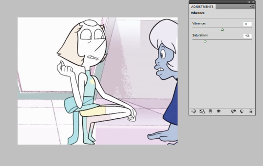
Let’s start with the base image. I’ve taken a random clip of pearl and agate for the purpose of this tutorial. This is what it looks like in its unaltered form. The brightness and contrast window is right next to it.
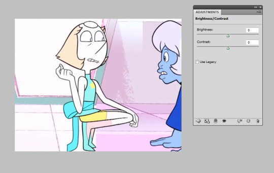
Unaltered, the image is already very bright by itself. You’d play with this setting if you wanted to make a darker gif with that scene or maybe bring out the colors with less contrast. It might help with a pastel gifset, which I will talk about in Levels.
LevelsI’ll be honest, I didn’t know what this meant until I wanted to try pastel sets and searched for tutorials.

Levels is going to give you a weird ass lookin’ graph like this. It will vary depending on the original image, so don’t panic if it looks different than my example. Bringing the middle arrow to the right of the scale makes the image darker and more vibrant, like so:
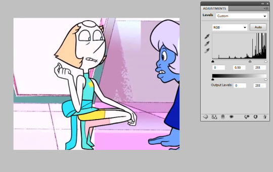
On the opposite end, bringing the arrow to the left will give a more pastel effect.
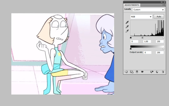
It’s best to just play around with this one; results really depend on the original image. You might want to go only a little to the left, or much higher -- you’ve got to use your eye and what you think looks best.
ViberanceViberance is a good choice for when I want to bring out the colors of my gifs or even tone them down.

If you look back earlier at the original image, this picture altered with the viberance adjustment has a bit more color. It’s more... vibrant. Saturation is used to make the colors pop (going right) or make the colors more dull (going left). I upped the saturation in the image above; let’s see what happens when you go down:
It takes out the color, but not so much so that it is made black and white.
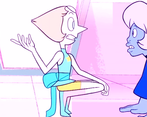
Hue/SaturationThis setting is similar to the saturation in viberance, but you can get more detailed in this one. Let’s say I want to tone down agate and bring the focus on pearl. We’re gonna go back to the unaltered clip. In the window, there’s a drop-down with different colors. These are the main color categories photoshop works with, so to speak.
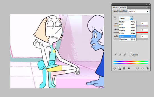
Let’s go to blue, as that is agate’s main color. Our options to mess around with are the hue, saturation, and lightness. I’m going to take down (move the arrow to the left) agate’s saturation and lightness.
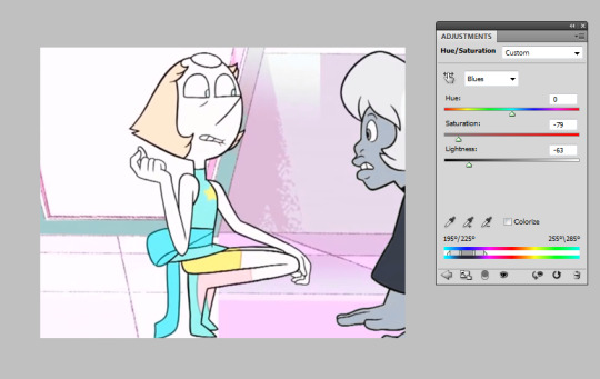
Now she’s practically black and white while pearl, who doesn’t have any blue on her (it’s cyan), stays the same.
Wondering what the top bar is for? You can use that to change the color. Let’s say for some reason, I wanted to make this blue agate one of pink diamond’s agates instead.

Move that bar around +90, you’ve got a pink agate. It was a little grainy, so I messed with the lightness too. You can experiment with all kinds of colors!
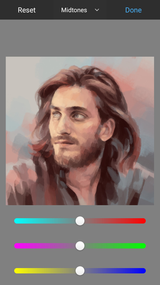
Color BalanceI rely on this one a lot. Here we are with the unaltered image again. In this window, you can see three tones -- shadows, midtones, and highlights -- as well as three color bars. The highlight setting colors the pictures highlights, the shadows color the shadows, and the same for midtones. This is a good setting for a “filters.”

I would be lying if I didn’t say my main strategy here is to just mess around with it until I get something that looks decent. I’m going to give this a pink/magenta-y color balance setting as 1) I like it on Pearl and 2) I just like it in general. This image is a bit over-exaggerated for the sake of a tutorial.
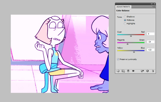
As you can see, moving the arrows toward magenta and blue have given it a pink “filter.” It is up to your best judgement to decide how far those arrows go down the bar, and don’t be afraid to combine changes in the other tones, too!
Selective ColorThe main reason I use this adjustment is to avoid whitewashing. It’s easy to do it by mistake when making pastel gifs. Let’s take Marina from Splatoon 2 and say I want to make a pastel splatoon set. Here’s the original image. I already used Color Balance to get the color I want.

Now I’m gonna add the pastel with Levels -- AHH! What happened to her skin?? NO THANK YOU. BAD.
Let’s fix that immediately. Here comes Selective Color! It will give you the option of colors to alter. We want to choose Red, as where that’s where most of the brown comes from. She also had a bit of yellow in her face, so I altered that too. Go to the bar labelled ‘black’ and push it to the right.
Better! She keeps her dark skin while still keeping the pastel feel.
What a cutie!!
You can use this adjustment setting when you don’t want a certain color to be as altered as the others.
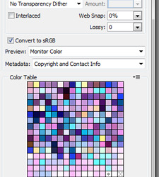
Saving SettingsSaving your gif is probably the most frustrating part of the entire process. I sit waiting for it to load, asking it to please be under 3.0 MB. If you don’t already know, File>Save for Web & Devices will look like this.
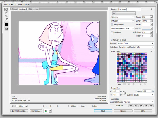
Sometimes, Photoshop will make your gifs look like garbage. This is frustrating. To work around it, you are welcome to copy my settings. Be sure to change the colors to 256 for the best quality.
Luckily, my gif came out to below 3.0MB. If yours doesn’t, don’t panic. Make the image smaller or take out some frames.
Hope this helped! Happy giffing!!
#tutorial#gif tutorial#photoshop tutorial#coloring tutorial#ask#let me know if you have any questions#Anonymous
13 notes
·
View notes
Text
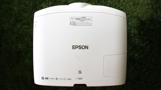
Epson Home Cinema 5050UB review: Superb projector for serious home theaters
New Post has been published on https://appradab.com/epson-home-cinema-5050ub-review-superb-projector-for-serious-home-theaters-2/
Epson Home Cinema 5050UB review: Superb projector for serious home theaters
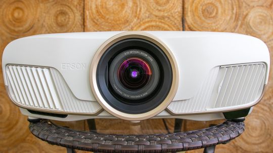
The Epson Home Cinema 5050UB is a serious home theater projector for serious home theater enthusiasts. It features a motorized lens with horizontal and vertical lens shift, plus ample zoom. Its 4K enhancement technology offers lots of detail. Its biggest benefit over less expensive 4K projectors, however, is an excellent contrast ratio for deep, dark shadows and bright, popping highlights.
Like
Superb overall picture quality
Excellent contrast ratio
Motorized lens
Ample lens shift and motorized zoom
There are only a few disappointments, and they’re minor. It doesn’t quite have the color or razor-sharp detail of its direct competitor, the LG HU810P. That’s not to say the 5050 isn’t sharp and colorful. It is, just a bit less so — although I liked the Epson’s overall picture quality a lot more than that of the LG. The 5050UB is also an absolute unit, several times larger than any of the projectors I’ve reviewed in the last year (including the LG).
In sum, the Home Cinema 5050UB is an excellent all-around projector that looks fantastic with all content. It offers a significant step up in picture quality over less expensive projectors, like the Optoma UHD35, while offering anyone with a dedicated home theater a projector worthy of the space.

Geoffrey Morrison/CNET
Specs 4(K) days
Native resolution: 4K enhancement (1920×1080 x2)
HDR-compatible: Yes
4K-compatible: Yes
3D-compatible: Yes
Lumens spec: 2,600
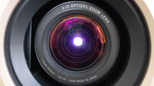
Zoom: Motorized (2.1x)
Lens shift: Motorized H/V
Lamp life (Medium mode): 4,000 hours
The 5050UB is a 4K- and HDR-compatible projector. As such, it can accept 4K and HDR signals, though keep in mind that no projector can do HDR very well.
Like all Epson projectors the 5050UB uses an LCD light engine, not the DLP that’s found in most other projectors. The ones used on the 5050UB are not technically 4K native resolution. Instead, they’re a technology called “4K enhancement” that “shifts each pixel diagonally to double Full HD resolution,” according to Epson. This is done very quickly, so it’s just a higher-resolution image to the eye. Here’s a deeper dive into the technology. The short version: It looked plenty sharp to me, if not quite as razor-like as the DLP-powered LG; see below for details.
One of the 5050’s most notable features that sets it apart from less expensive projectors is a motorized lens. This offers ±96.3% vertical and ±47.1% horizontal movement, which should be enough to let the 5050 fit in just about any home. There’s also a significant motorized zoom of 2.1x.
Now playing: Watch this: Six things to know about home theater projectors
2:33
Epson claims the 5050UB can produce 2,600 lumens. I actually measured slightly more than that… in the less accurate Dynamic color mode. In the more accurate Bright Cinema mode I measured roughly 192 nits, or about 1,732 lumens. This puts it among the brightest projectors we’ve ever measured.
Lamp life is on the low side. Even in the Eco mode, Epson rates it at up to 5,000 hours. Some projectors of similar brightness we’ve reviewed in the last year were capable of upward of 15,000 hours in their most lamp-conserving modes. That said, 5,000 hours is still over three years of use at four hours a night.
Geoffrey Morrison/CNET
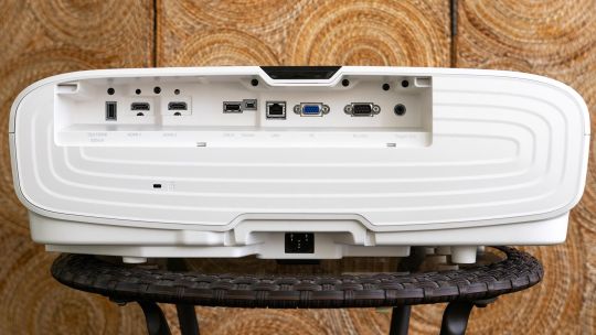
Connectability
HDMI inputs: two HDMI 2.0
PC input: Analog RGB
USB ports: two
Audio input and output: No
Digital audio output: No
Internet: LAN
12v trigger: Yes
RS-232 remote port: Yes
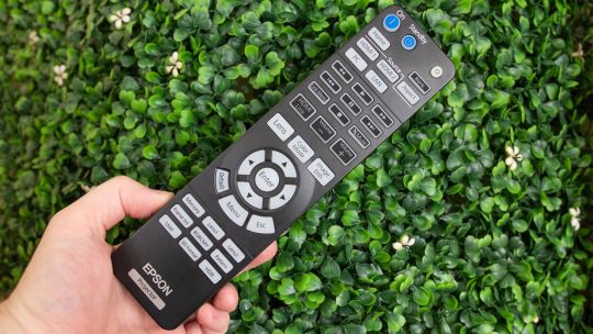
Remote: Backlit
Both HDMI inputs are HDMI 2.0 and can accept up to 4K60. As you might expect from its intended use as a projector for a dedicated theater, it lacks an audio out. Epson assumes, rightly in my opinion, that anyone getting a 5050 would have a traditional projector arrangement with either a receiver or at least a soundbar for audio.
Along the same lines, there are lots of control options for home automation systems, including a 12v trigger, RS-232 and a LAN port.
The remote is a big boy (just like the projector it controls) and has a pleasant amber backlight. If you have a 2.35:1 screen, as I do, you might reach for this remote for more than just on and off, since you can zoom the projector and fill the screen with 2.35:1 content without getting off the couch. That’s always a bonus.
Geoffrey Morrison/CNET
Picture quality comparisons
LG HU810P
The LG HU810P is the most notable competition for the 5050. They’re the same price but the HU810P uses newer technology, namely two lasers and a phosphor instead of the 5050’s more traditional lamp. I connected both using a Monoprice 1×4 distribution amplifier, and viewed them side-by-side on a 12-foot-wide 1.0-gain screen.
Right off the bat, both are great projectors, but their strengths and weaknesses are almost polar opposites.
As far as light output goes, they’re very similar. In their respective most accurate modes, the LG can do 166.3 nits to the Epson’s 192. Objectively, that’s a fair bit of difference, but subjectively, side-by-side, they both just look bright. So we’ll call that more or less a tie.
Color, though, goes to the LG. The lasers, with help from a phosphor, are absolutely deeper and richer. Throw on some HDR content and the deep crimson reds and vibrant purples are far beyond what the 5050UB can produce. This is sort of like saying a Porsche is slower than a Ferrari, however, since the 5050UB is no slouch in the color department. On its own it looks great, the LG in this regard looks better.
Geoffrey Morrison/CNET
It’s a similar story with detail. The LG uses a 4K DLP chip to create an image, and detail is that technology’s main strength compared to LCD with pixel shifting, which is what Epson uses. The image just looks a little sharper, especially with motion. However, if you’re not watching them side by side, I’m not sure you’d notice. The 5050UB certainly doesn’t look soft, it’s definitely 4K to my eye.
The next aspect of picture quality is where the tide turns toward the Epson by a lot. In a word, or technically two: contrast ratio. Even without using its iris, the native contrast of the 5050UB’s three LCD chips is significantly higher than the LG — 10 times higher. So the image has significantly more punch and is less washed out. Even if you dial the LG’s lasers and iris back as much as possible, it only just matches the Epson’s black level while that projector is in its brightest and most color temperature-accurate mode.
Which is to say, the Epson’s black levels are roughly the same while at the same time (in the same mode) it is capable of having highlights or bright parts of the same image that are seven times brighter than when the LG’s lasers are dialed all the way down and the iris is closed. Flipping that around, if you match their light outputs, the Epson’s black levels in the same mode are nine times darker.
Geoffrey Morrison/CNET
What does this look like? An easy example is watching any movie with letterbox bars. If I set the projectors to be roughly the same brightness overall, the letterbox bars on the LG are gray. If I match their letterbox bars by reducing the LG’s laser power and closing its iris, it ends up looking dim compared to the Epson.
So when watching any content, the deep blacks of the 5050UB, while maintaining bright highlights, make for an extremely pleasing image.
Charge your friends admission
The Home Cinema 5050UB is an excellent projector. At $3,000 it’s certainly not cheap, but for those looking to buy a PJ for a dedicated home theater or a light-controlled living room that can do its black levels justice, the image quality is definitely a step above less expensive projectors. Is it, say, over twice as good as the $1,300 Optoma UHD35? Perhaps. The Optoma is very good for the price, but that’s certainly the caveat: “for the price.” It holds its own, but it has a way worse contrast ratio and doesn’t handle HDR nearly as well as the Epson.
I think most people would be perfectly content with the UHD35. But for enthusiasts looking for a more “home cinema” experience the… oh wait, I just said the name of the thing in the thing. Let me try that again. For those looking for a more “home theater” experience, the Epson Home Cinema 5050UB does just about everything right and looks fantastic.
Geek Box
Test Result Score Black luminance (0%) 0.046 Average Peak white luminance (100%) 192.3 Good Derived lumens 1732 Good Avg. grayscale error (10-100%) 7.624 Poor Dark gray error (20%) 6.223 Average Bright gray error (70%) 7.432 Poor Avg. color error 3.636 Average Red error 3.527 Average Green error 2.199 Good Blue error 4.345 Average Cyan error 5.111 Average Magenta error 2.461 Good Yellow error 4.173 Average Avg. saturations error 8.34 Poor Avg. color checker error 8.5 Poor Input lag (Game mode) 28.4 Good
Measurement Notes
I found the Bright Cinema color mode offered the best combination of light output and accuracy. In the six-color temperature mode, the 5050UB was pretty spot on D65 across the grayscale range. In addition, all primary and secondary colors were spot on their Rec. 709 targets. This is one of the most accurate projectors we’ve reviewed in the last year.
The native contrast ratio was excellent for a projector, with an average of 5,203:1 across various modes. For comparison, the second best contrast ratio we’ve measured recently was the BenQ HT2050A with a native contrast ratio of 2,094:1.
With the lamp mode (called Power Consumption) set to High and the iris off, the 5050UB puts out an impressive 192.3 nits, or roughly 1,732 lumens. The Eco mode drops the light output by about 30%. If you turn on the iris, which opens with bright images and closes with dark images, the dynamic contrast ratio rockets up beyond 100,000:1.
While the Bright Cinema mode looked better overall, the Cinema mode offered wider colors for HDR content. However, it was also much dimmer. I didn’t find the ~10% greater color gamut for ~60% less light to be a worthy trade-off, but feel free to check it out. The contrast ratio was about 40% better in this mode as well, which was only slightly noticeable.
If you need even more light, the Dynamic color mode puts out an impressive 323.6 nits, roughly 2,914 lumens, though the overall image isn’t as good or accurate.
0 notes
Photo


PSD PACK 3
I’ve had some people ask me for psds I used, but since I almost never save them, I made a bunch of psds to show how I color my scenes. I think you can use most of these on different scenes, if you adjust them accordingly.
please like or reblog this post, then send me an ask off anon asking for the psd you want (example: hey! i liked/reblogged your post and I would like the link for the amaya psd).
Under the cut you’ll find more info about the psds and how to adjust them!
General
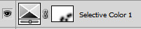
I give all my selective color layers their own color so it’s easy for you to find a certain adjustment. If the selective color layer is orange, it means both red and yellow have been adjusted. If it is grey, it’s either neutral, white or black selective color.
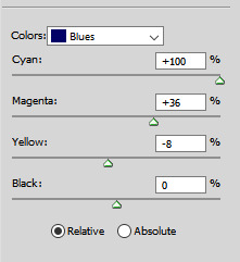
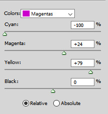
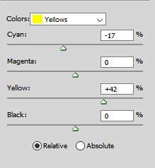
Tip: when working on yellow scenes with characters of color, instead of heavily decreasing yellow/using blue color balance I suggest adding magentas and cyans in the yellows. It’ll go from this

to this

by using these settings

and most of the time it won’t whitewash or make the skin color look weird
Amaya psd
this psd is made for characters of color in darker/neutral scenes, so when you use it on a white face or on a yellow scene, it might not work. Also, if you use it on a bright scene, it might still whitewash the character. In that case, add extra vibrance or shadows in levels.
The layers look like this . I added a lot of extra layers you can use to adjust this psd + named some layers so you know what click or unclick to adjust.
Kendra psd
this psd is made for character of color in bright scenes, so when using it on a darker scene, it might not work at all. If you use it on yellow scenes, you’ll have to adjust the color balance A LOT
The layers look like this. I added the vibrance under all my other coloring, because the curves whitewashed the color away if the vibrance was above it. If your gif is way too vibrated, you should move the vibrance layer up and see where it fits better.
Liv psd
this psd is made for normal (yellowish) bright scenes. You can use this on most bright scenes and all the selective color layers have a color. If you want to use this on darker scenes, you should add curves on top and possibly some black levels or black selective color to reduce grain
The layers look like this
Ravi psd
this psd is made for characters of color in bad lightning (like the lighting in the morgue). You can use it on other scenes if you adjust the layers
The layers look like this. When editing, it’s best to focus on the two bottom layers and the orange/yellow colored selective colors. Of course, you should also add curves or brightness to your liking
Nominita psd
this psd is made for yellow scenes with character of color (but as you can see, it also works if there’s white people in it)
The layers look like this. I think it’s pretty easy to use, You should adjust all the optional layers if it looks bad (it’s a hue/saturation layer to slightly change the yellows, a color balance layer that I think you’ll definitely have to adjust , a selective color layer that changes the yellows and a selective color layer that changes the neutral tone of the gif).
If you want to use this on blue scenes, I suggest using the bottom layer to adjust the color balance like this:

Daisy psd
A psd for redish scenes that is easy to adjust.
The layers look like this. If you want to adjust this psd, it’s best you focus on the color balance and the selective color layers. I added yellows in the reds to make sure Daisy doesn’t look like a ghost, but in other scenes it might make the skin way too yellow so you’ll have to adjust that.
Izzy psd
a colorful psd for shadowhunters that is harder to adjust since shadowhunters constantly changes it lightning so you either have very yellow scenes, very blue scenes, very green scenes, ... You can fix all this with a color balance layer
The layers look like this. I heavily adjusted the blues/cyans in this psd, so you might have to unclick some of those layers in other scenes. The grey layer has some adjustments to the whites that you can use when coloring scenes with character of color in them. It can look really ugly in some scenes though so you might have to unclick it. The yellow selective color is used to make the skin less yellow and more pink, but not whitewashing it.
The exposure layer is used to give the gif more depth but can make dark scenes look really bad. If your scene is way too dark, I suggest unclicking that layer.
If you’re using this psd, i suggest adding a color balance under it to adjust for different scenes.
I used this psd on this gifset
Elektra psd
This one can be used as a base for all the netflix marvel scenes. The only ‘special’ layer used is the red selective color layer that I used to give Elektra more color in her face. When using this psd, you’ll probably need the adjustment layers I added on the bottom or add some of your own.
The layers look like this
I used this psd on this gifset
If you need any help with adjustments or a specific type of psd (for blue scenes, green scenes, dark scenes, ...) let me know
#completeresources#yeahps#itsphotoshop#psds#5#i promised to make these a while a go and I know it took me long#my psd
479 notes
·
View notes