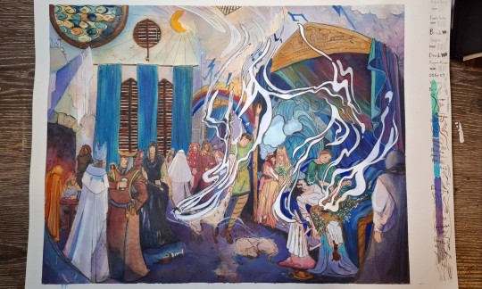
#i painted over a print of a digital drawing i did
Explore tagged Tumblr posts
Text
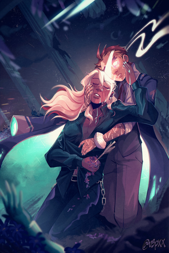
alas 🌙🏹✨
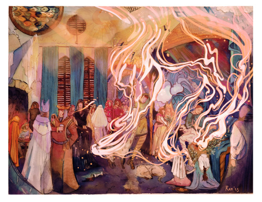
originally drawn for day 7: truth for klapollo week 2022 like this art? it's a print here, babey!
❤️💜 day 1: hair | day 2: brothers | day 3: fantasy | day 4: fake dating | day 5: comfort | day 6: love languages | also, happy klapollo day! (2/9) <3
girl help i already put the timelapse for this one on my hard drive so all i have right now for posting is the one i downloaded from my twitter LMAO sorry, once i have my drive with me i'll edit it, but in the meantime!!! happy klapollo day that i made up (9/2)!!!! (explanation here)
i forgot to draw them last september (ddon't worry about it, i lost track of dates orz) and i don't have any new art, free time, nor have my tablet pen with me to draw smth new so have this old klapollo week art from 2022 (3 YEARS AGO!!! SCARY!!!!!!) that i haven't crossposted here yet!!!!
ok, enough talking from present-day me, here's 2022 den talking about drawing this (bc i barely have my memory of the process now lmao)
fun fact! this was the first one i've drawn for this week! always plenty emotional about all the things these two have been through. loosely inspired by "the death of hyacinthos" by jean broc. i don't often paint so i have to reteach myself how when i do bc i forgot pft
and other bonus stuff from this people might've not realized, but klavier holding an arrow to his side is a reference to constance courte!!!!! dies!!!!!
i wasnt much of a digital painter back then like i am now (thank you art of disco elysium) but i remember how much GRIEF rendering klavier's hair gave me. this one was like an amalgamation of lineart and somewhat painterly stuff, i do also remember i that i wasn't confident enough to paint over my lines but i still think it looks neat! still sort of obsessed with how i lovingly rendered klavier's dress shirt.
also, the art i did for the previous days! (when i remembered to do them, that is 😅)
#ace attorney#klapollo#apollo justice#klavier gavin#apollo x klavier#klavier x apollo#kyodoroki#sunnysidedraws#klapolloweek2022#tagging that bc i did finish it by then#odoroki hosuke#kyouya garyuu#sunnysideattorney#cw blood#jic with arrow thing yknow#described#bananaqueue
1K notes
·
View notes
Text
Katara
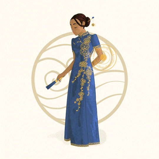
[ image description: a digital drawing of Katara from Avatar: the Last Airbender in my style. She is a dark-skinned woman standing in ¾ view with brown hair pulled back into a bun and held with a gold and blue jewel pin. Her ‘hair loopies’ are braided into her bun too. She is wearing a blue cheongsam with gold wave embroidery on the mandarin collar, sleeve and skirt hems, and gold embroidery of gardenias and plum blossoms. She is holding a blue and gold hand fan and standing in front of a brown water tribe symbol ]
prints ✨ commissions
Okay so this is from (I think) last year, but I'm really struggling and burnt out right now, what with having to fight once again for my basic rights (gotta love the UK - “we’re a first world country guys, we have trillions of £££ worth of billionaires, so of course we'll strip away your ability to live with dignity if you don't meet our arbitrary ‘productive’ threshold”), so anyway I'm just gonna repost some of my old faves while I take some time to collect myself again. This is from an ATLA project I did, drawing the protags in Republic City at a New Year's Ball. It originally came with text slides delving into water tribe cultural wear and how I came up with this design, but I cannot for the life of me find where I put them or remember how I made them, so I'll include the text under the cut (should also note that there is just so much nuance missing from these, since it's impossible to condense thousands of years and miles worth of culture into a few Instagram slides):
A bit of background:
The Water Tribes' culture is based primarily on those of Arctic and Siberian peoples. The Northern Tribe has more influence from Siberian peoples (for example, the Yakut, the Buryat, and the Evenk), while the Southern Tribe has more influence from Arctic peoples (such as the Inuit, the Sireniki, and the Yupik). Since the Southern Tribe was founded by ancient immigrants from the Northern Tribe, this reflects the real world relationship between Arctic and Siberian peoples. However, the Water Tribes also draw from other Indigenous peoples, such as Native American, Aboriginal Australian, and Polynesian cultures. And, like all cultures in the ATLA world, the Water Tribes also have extensive Chinese influence.
Some examples include: the igloos used by the Southern Tribe, which resemble those used by the Inuit; the Water Tribes' reliance on hunting and fishing, similar to the Inuit; Water Tribe warriors wear face paint into battle, a practice associated with Native Americans, as well as African and Southeast Asian tribes; Water Tribe boats are based on Polynesian catamarans; Water Tribe boomerangs are based on the “returning boomerangs” used by Aboriginal Australian tribes.
Standard Water Tribe Clothing:
Water Tribe clothing typically resembles the clothing of Arctic peoples. For example, the large, pullover coats are drawn from Inuit anoraks (also called parkas, although they are strictly speaking not the same). Anoraks are typically made from reindeer or seal skin and lined with fur.
Water Tribe shoes are influenced by the mukluks worn by Arctic peoples. These shoes are also made from reindeer or seal skin and are often worn with an inner liner and protective overshoe.
‘Hair loopies’ are also based on an Inuit hairstyle. While braided hairstyles are found in cultures all over the world, ‘hair loopies’ are based on a uniquely Canadian Inuit hairstyle and are called qilliqti in Inuktitut.
Warm-Weather Clothing:
Katara's warm-weather clothes are inspired by the Chinese cheongsam (Cantonese: 長衫; literally 'long shirt/dress'). It is typically a long, form-fitting, one-piece garment with a standing (mandarin) collar, an asymmetrical, left-over-right closure (右衽; youren), two side slits, and Chinese frog closures (盤扣; pankou).
The cheongsam developed in the 1910s and 1920s following the overthrow of the Qing dynasty and the establishment of the Republic of China (1911). It was chosen as a national dress in 1929.
Over the past century, the cheongsam has developed into several distinct styles: the Beijing style, which retains the original loose fit and is typically elaborately embroidered and adorned; the Shanghai style, which developed in the 1930s and 1940s with Western tailoring techniques to be more form-fitting with less elaborate embroidery; and the Jiangnan style, which tends to be the most elaborately adorned, with embroidery and hand painting.
My Design:
Cheongsam's are typically decorated with motifs of animals or plants and each has its own meaning in Chinese culture. I chose to draw floral designs, namely gardenias and plum blossoms:
Gardenias are associated with November, sturdiness and feminine beauty, and I think all of these link to Katara, even November as a winter month. Furthermore, they are a symbol of clarity, faith, hope and rejuvenation. As the most hopeful member of the gaang, I think they sum her up perfectly. Plum blossoms are also a symbol of winter, since they bloom in the cold, and they are a symbol of wisdom, feminine charm and logevity so I chose them because Katara outlives most of the gaang. But they are also a comment on how the war affected Katara, as she was forced to grow up and become an adult while she was still a child.
Water Tribe clothing typically comes in shades of blue and silver but I chose to replace the silver with gold. I did this to represent Katara's relationship with Aang and the multicultural family that they went on to have
#katara#katara atla#atla katara#atla#avatar the last airbender#avatar the legend of aang#atla culture#atla cultures#cheongsam#gardenia#plum blossom#blue and gold#blue aesthetic#gold aesthetic#water tribe#digital art#fan art#fantasy art#disabled artist#no ai#comms open#commissions open#art commissions#hanfu#chinese hanfu#small artist#artists on tumblr#qipao
99 notes
·
View notes
Text
Title: Home
Ship: Knock Out x Autobot! Reader x Breakdown (POLY!)
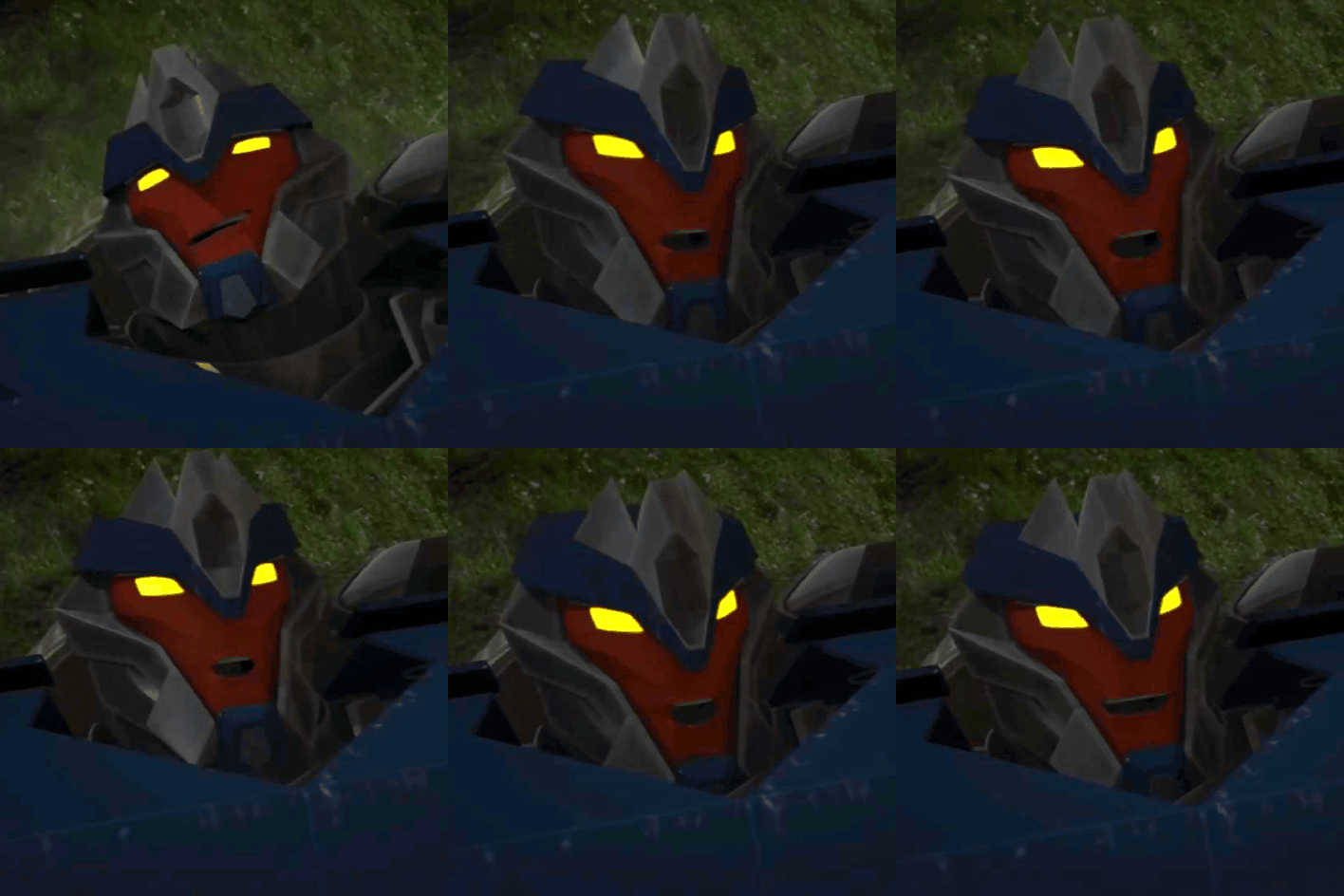
(Cant believe there's a lack of Breakdown GIFs)
You are a scout, while scouting an area with your bestfriend Bumblebee in a complex system of the underground mines, you both are forcefully separated when the structure collapsed. As you walk around the only remaining pathway trying to find a way back to your bff, you came along two mechs you haven't expected to meet

Note: Pronoun of Reader is not specified and there will be OOC!
You groaned when you came up with a dead end. Again.
You and Bumblebee were assigned to scout an abandoned human mine, now filled with pestering drones and whatnot. You were entailed that the mine is about 100 years old, give or take
From the supporting beams itself, you know it's old as fuck. Not older than you but with how short a human life span could be, it is definitely way pass their average life span.
You let out a steam of pressurized air again and went back to where you came, crossing a 'X' on the path in a poorly digitally drawn map by your wrist. You really are somewhat thankful for the tracking chip that was drilled into you, who knew it could be this handy personally?
You again looked at the map, wobbly lines of your walking pattern printed itself in a red line by the screen, only a single pulsing dot indicates of yourself. With your signals and comms disrupted by the fallen debrees earlier, it would have been easy tracking your partner and other forms of sentient beings that could possibly surround you right at this moment or you could have just commed the team and sens a SOS signal but bad luck seems to follow you in dark damp places. Ugh
You turned off the screen and continued trecking on dark paths, it took for a silent while before you started humming and murmuring the song with the tongue of Old Cybertron. It's a song with the oldest language you have learned.
Your scouting program in your processor warned you of such action, which is logical but you're tired. The war is going on for too long and you just want to go back to the times of festivals and bantering with old friends.
Humming such a lively tune warmed up the constricting pressure in any mech or femm's spark. The tune where it reminds of home
You hummed and hummed. Slowly trecking the long tunnel before you stopped and heard familiar voices far ahead and chuckled.
You moved fast but silent, drawing in closer by the dim light and quickly jumping by the corner when you knew they were present
"GLITCHES!" You whooped, immediately dodging a large fist with a loud laugh
"[NAME]! WHAT IN THE DESIGNATION OF PRIMUS WAS THAT FOR?!" Knock Out huffed, holding back the larger mech by the arm to avoid him toppling over you
"Hey, I heard you guys and thought why not?" You chuckled, which earned you a falling mech on you and you squawked
"I should've let him hit you" Knock Out groaned, crossing his arms as he watches the other two grounders piled on the ground
"Miss you too guys" You huffed and hugged the mech on top of you who snorted and did a noogie on your head, that definitely would have scratched your paint off "Nah we miss you more" Breakdown sighed and contently laid down on top of you
"Up Big Boy, you dont want to pressurize [Name] into a flat sheet of metal" Knock Out smirked and watched Breakdown slowly stand up, both then holding a hand out for you as you stood up with their help
"I'd still look pretty as a flat sheet" you chuckled and rotated your door wings to get the debrees out in between cracks which earned you two different actions from them
The three of you then hugged eachother, nuzzling eachother's armor as each bonded sparks hummed a happy and content melody. A melody like home
"Scratch my paint or else."
You and Breakdown froze and took a big gulp
*-*-*-*-*-*-*-*-*-*-*
You, Breakdown and KnockOut have been conjunxes before the war, but have been separated during the Decepticon uprising.
You had joined the Autobots when the bombing and raid had started, thinking your conjunxes had also joined in but you haven't seen any of them
Only when the war had started to worsen when you caught a glimpse of them with a Decepticon symbol as they boarded a ship
Due to being in different factions, you had tried to secretly meet them in order to avoid suspiciouns from each side. Soon you and your conjunxes saw eachother with relief, they thought you were somewhere safe and hadn't joined any factions. They both had joined in the faction willingly, also thinking they could have found you earlier and kept you safe if they ever found you
From there on, you had kept secret of having conjunxes and them for having a third one. It avoided the affair of cross-faction relationships that could be used against any of you. So, you guys had secretly met up once in awhile
It hurted your spark to be so far away from them, and so were they. But, it kept you all safe.
During the war, with your small frame and a grounder alt mode. You had taken up a scouting role, soon meeting Bumblebee, a young spark, in one of your missions and you both became friends. Soon becoming partners in every mission you went out to
Bumblee actually followed you one time when you sneaked out and found out you're in a relationship with decepticons and he hadn't told anyone. Even you
When the war is finally over, everyone who you were close to were shocked when you kissed each of your conjunx infront of them, while Bumblee is just in the sidelines clapping, happy that his best friend is finally free to love
#non canon compliant#transformers prime#tfp#knock out#breakdown#tfp knock out#tfp breakdown#knockout x reader#breakdown x reader#tfp knockout x reader#tfp breakdown x reader#tfp knockout x reader x breakdown#polyamourous
205 notes
·
View notes
Note
As far as I remember, or like years ago, you’ve used sai right? Sai or sai2(man the brush engines better and Binary brushes feel smoother..) but I also saw you used procreate at some point for that one Jessie draw- which digital programs have you used that you enjoy the most for different things, or which kind of traditional medium for example also, is interesting and/or satisfying? Have been doing lots of ref and tutorial searching and looking at art inspiration for the direction I wanna take my stuff and I was curious about your preferred setup; I just like to hear people’s workflow and what they use to create what they do. I think it’s neat. Also if this is too long sorry 😅
I use sai 2. I switched to sai once oekaki became more and more inoperable. The binary style aspect ended up sticking. Oekaki has limited layer capabilities and this rewarded a simpler pixel style that was more easily edited. I still miss the ease of using pixelated screen tones in oekaki. There are other programs that can make them, but not how oekaki did. But I prefer sai 2 most now.
I use clip studio for larger scale images like print pages for its more versatile and expensive selection of brushes. It has unique settings that still allow me to turn these brushes into pixelated work without anti-aliasing artifacts. There is a setting for level of anti-aliasing, but this is often not enough for more complex brushes using spraying patterns. Using the "replace alpha" blending mode forces many brushes into a binary color mode because drawn on top of a solid color the brush's color can only be 100% opaque. The binary layer color mode also allows you to do this. Both of the latter options often only let you do this with black and white. I usually do this to be able to transfer it back to sai 2 where it's more comfortable to work in. I also use it for its ability to produce text in multiple sizes without anti-aliasing. Sai 2's text tool is fairly primitive.
I use Aseprite for animating. It is mostly for pixel art. It reminds me of an animation program I used to use a long time ago called easytoon due to its simplicity though...
For traditional I prefer paint pens (I mostly use poscas). Gel pens are okay but very small and cheaply made. I really wish someone would make paint pen versions of gel pens. I also had a big black and white plain ink and hatching phase a long time ago. Generally I gravitate towards opaque materials that make the process feel straightforward. The ability to "erase" or white out mistakes for correction is one of the most important qualities in a medium to me.
Less opaque, more time-consuming layered media yield more textured and nuanced results, but I hate few things as much as ruining a piece of art irrecoverably over a relatively small mistake be that accidentally pilling the paper or drawing a line wrong or splashing watercolor the wrong way. Mixed media was fun, but I just prefer having more purpose to what I'm doing. When I'm too preoccupied with the aesthetics I waste a ton of time on useless tweaking or experimenting that never goes anywhere.
26 notes
·
View notes
Note
totally okay if you don’t want to do this request, its kind of a dead request atp as I don’t see it much in fandoms but..
could you maybe write a Froggy x Portuguese reader? Gender neutral and an artist?
I feel like if there are PNGs of ‘food’, Froggy + a Portuguese reader could bond over the overlap of Portuguese influences in some Japanese foods
If you don’t feel up to the Portuguese part for any reason, just an artist reader will do!
I'll do you one better
Froggy x Portuguese Artist!Reader
Now, I myself am not Portuguese but I am an artist, and google is free, so I will be looking up some things. Do correct me if anything could be made more accurate.
When Froggy first met you, he was def fascinated. The greeting was just a simple handshake and a greeting in another language. Still, it wasn't the most odd greeting he's received. If anything it was the most mundane up to date. However, once you two became more situated with each other, on your side the formality dropped a bit. You felt no need to stay so professional. It started off as it normally did. You walked over to him, waving as you said, "Tudo bem?" which of course was nothing disarming. It was just the two kisses on the cheek he received afterwards that left him a bit shocked. It wasn't a very flashy display or anything. It was pretty quick and honestly not that note-worthy. Froggy is just dramatic and for a second thought you were charging up an attack or something.
Well, this reaction isn't so much as because he's dramatic, but also because he is used to the interactions in his home town being as casual as possible. Prioritizing distance and greeting each other at a lower volume. Though, he can't say he minds how you approach him. You greet him rather energetically like you're always happy to see him, and it feels pretty nice.
Once you tell Froggy you're an artist, expect a lot of questions about it. "What, as like a job or something? Does that even pay high enough?" And if it's not a job, "Are you one of those people who draw naked people? How perverse...", and of course everyone's favorite, "Can you draw me?" If you do draw him he'd cherish it forever. He'd show it to everyone.
Depending on your chosen medium, he will def react differently. If it's a typical one like digital or traditional art, he might watch as you draw or paint. Maybe stick his fingers into your paint actually. Or he'd draw on the corner of your page if you're not drawing anything serious. If you do other types of art like sculpting, graffiti, embroidery, wood carving or clothe making he'd be super interested. If you are in the fashion route, I don't think he'd try anything on but he'd enjoy watching you model them. "Whaaat, you do graffiti? I didn't take you for the delinquent type." He will not watch you if you use spray paint. Or at least not from a close range. He'd start tweaking out from the fumes. I think he'd jokingly ask you to sculpt a statue or make a wooden figure of him and not actually expect anything from it. It'd be a fun surprise if you did do it. He'd take it as a marriage proposal. Like actually.
The two of you talk a lot about your cultures. The differences and similarities mainly. It's a common event for the two of you to lose track of time while talking about childhood memories living in your respective areas. Experiences you've had growing up since leaving your countries.
The two of you would be introducing each other to your favorite dishes, and pretty often a conversation would start about how you have really similar foods where you're from. Maybe you two would go down a rabbit hole about the history of your combined cultures on one of your more relaxed days.
As I sort of said earlier, if you gift him any form of art he'd genuinely be so stoked about it. Physical drawing or painting? He'd hang it up where everyone could see. Digital art piece? He'll have it turned into a print and still hang it up? Oh, you actually did make a statue/figure of him? It's going in a glass case in the middle of his home. Fuck the Lourve, they have nothing of this capacity there. He'd brag about the art and you as often as he can.
10/10 pairing. Also, I didn't know there was Portuguese influence in Japanese dishes. Will look into this more. Thank you and I hope you enjoy anon>
#ena dream bbq#ena fandom#imagines#writer community#ena dbbq#fanfic#froggy dream bbq#froggy ena#froggy x reader#portuguese#x reader#lalalalalala
12 notes
·
View notes
Text
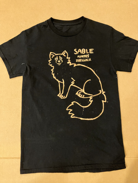
I see a lot of 'diy gear' around so I'm surprised I've hardly ever seen bleach dyed shirts! They're honestly one of the coolest, easiest, and relatively inexpensive ways to make discreet gear - especially if you're like me and you can't exactly find shirts of your theriotype being sold.
Tutorial under the cut!! :3
What you will need:
A black t-shirt, preferably 100% cotton (avoid polyester and spandex)
Bleach
Water
Sidewalk/blackboard chalk, or a chalk pen
A paintbrush to apply the bleach
A disposable cup
A bit of cardboard or plastic to put under the shirt (to prevent the design from bleeding through onto the other side)
GLOVES and other safety gear (ie, a mask and goggles)
fabric paint, not puffy paint (optional but if you're heavy handed like I am it helps so you can fix screw ups)
SAFETY:
Work in a well ventilated area.
Wear gloves, goggles, and ideally a filtration mask when handling bleach.
WASH YOUR HANDS thoroughly after handling the bleach and do not touch your eyes or face before washing your hands
Be mindful of chemical reactions that can occur when mixing bleach with other cleaning products - never, ever, EVER mix bleach with anything containing ammonia as it can react and create toxic chlorine gas.
Keep bleach out of the reach of pets and small children, and if you have small animals like birds or rodents, work AWAY from them as the fumes can damage their lungs.
Make sure you read the back of your bleach container so you know how to handle and dispose of it safely.
Process:
Slide the cardboard into the shirt, adjusting it so you'll be drawing on the side you want your design on.
Use the chalk to draw your design on the fabric - don't worry about screwing up here, it'll wash out later. (If you want to, you can digitally draw your design, print it out, then trace the back with chalk and press it onto the shirt to transfer the art)
Put on your safety gear (ESPECIALLY your gloves) and move to a ventilated area (I did this on my back porch)
Carefully pour some bleach into your cup, then cut it with water. Remember that the more water you add, the more of the solution you'll need to apply to get your design to show up.
Apply the solution over your sketch using your paintbrush. You might need to apply it multiple times if your bleach solution is less concentrated.
Once your satisfied with your design, let it sit for 20 minutes to allow the bleach to fully stain the fabric.
After 20 minutes, rinse out the fabric under cool water. Make sure you're wearing your gloves as you do this so you don't hurt your skin.
Wash your shirt in your washing machine by itself, otherwise the bleach might transfer to other laundry. Put it in the dryer after or hang it up to air dry.
Clean up your area, wash your paintbrush out thoroughly, throw the cup away, and then remove your gloves to scrub your hands with soap and water.
Once your shirt is clean and dry, you can use fabric paint to touch up any mistakes. I used black paint to remove excess lines and white to give my design eye shines. Follow the directions for fabric paint on the back of the bottle, as the instructions for washing it can be different. Don't use puffy paint, the touch ups will end up raised and it'll look funny.
And there you have it! :D DIY gear shirt for all your alterhuman needs >:)
#therian#therian gear#alterhuman gear#otherkin gear#textile art#bleach dye#otherkin#alterhuman#therian gear tutorial#otherkin gear tutorial#bleach tshirt#alterhuman gear tutorial
35 notes
·
View notes
Note
Hewwos!! I'd like a matchup request please! Both romantic and platonic!! From the DC fandom if possible!
I'm 18, trans masculine Gender fluid person (He/She pronouns) who's bisexual (masc pref), I'm 5'3 and a half, with a curvy yet chubby figure and a ENFP-T personality type! I have dyed half red and half pink hair with black underneath the color! I have a round face, slightly upturned round nose and deep set eyes that are blue, I have a beauty mark on my bottom right eyelid and a snakebite piercing on the right side of my lip. I'm often described as Loyal, funny, silly, motherly, caring, energetic, emotional, laid back, sarcastic, blunt and sassy!
My style is a mix of multiple styles like Emo, scene, Goth and a skater style as well! My hobbies include: drawing, writing, Crafts, crocheting and playing video games. my favorite series is Dragon Ball Z, my favorite book is the Five nights at Freddy's the silver eyes and my favorite movie is howls moving castle!
I hope that's enough for the matchup, if it's not please let me know and I'll resend my ask!! :] I also hope your surgery goes/went well and you are doing okay!!
Hi!
I'm sorry for the wait!
And thank you, the surgery went perfectly, no complications :)
<3333333
I really hope you like your matches!
<333333
Enjoy!
Romantic and Platonic Matchup; DC
~~~
Platonic;
~~~
DC;
Barbara Gordon (Batgirl/Oracle) -

You met Barbara during your first week of college
Same classes, same sarcasm, same "don't mess with me" energy
You walked into a computer science class wearing a hoodie covered in Dragon Ball Z pins
She instantly clocked you as cooler than anyone here, and you noticed she had a lot of cool stickers on her laptop
You bonded instantly over mutual nerd love and shared caffeine (coffee or tea) dependence
Nicknames for each other started pretty early
Barb, Barbs, Babs, BabsBabs, and more from you
Barbara has a lot of nicknames for you, too, most of them involve Howl's Moving Castle in some way
Really, it was like you both had known each other for a lifetime already
Your friendship was fast, intense, and filled with both mischief and meaning
You studied together
Or more accurately, she studied while you tried to keep up and doodled Goku in the margins
You helped each other get through all-nighters
When she wasn't being Batgirl
You didn't know about her little hobby until way later
You were always hugging her goodbye after meetings
She was the tech-brain and quit protector - always patching up your projects when your laptop glitched out at 3 a.m.
Your dorm room was a constant chaotic mix of your crafts, her tech, old anime DVDs, and stacks of books
You'd crochet little plushies for her desk
She'd print out copies of your digital art and stick them on her corkboard
Now, at this point, she told you that she was Batgirl
And that scared the hell out of you as much as it impressed you
When the Joker attacked her, your entire world shattered
You were at the hospital in under an hour, still wearing a hoodie stained with pain from a craft project
You never left her side
And it was also then that you met Bruce, her father, and the other bat kids
When she did leave, stuck forever in a wheelchair, you knelt beside her and said, "You still scare the hell out of our professors. You're a strong, intelligent force to be reckoned with."
But something inside you broke
Your loyalty turned to fire
The young woman who once joked and painted bats on your walls was not going down without a fight
She still wanted to do something to help, so then, she became Oracle
And you? Well, you began piecing together your own vigilante outfit
With the help of repurposing a leather jacket, spiked gloves, and whatever else you could get from Hop Topic or thrift stores, you came up with a badass hero name
You didn't need vengeance
You wanted justice
The Joker would never get away with hurting the one person who understood you
Barbara eventually found out
Of course, she did
She caught you sneaking out
And when you returned bruised and breathless, she was waiting in her wheelchair, arms crossed
"So, what's the plan?"
You expected her to scold you
Instead, she offered to help
She couldn't fight on the streets anymore, but she could guide you, be your eyes and ears
You officially became her vigilante partner
She gave you a comm link
You gave her your notebook of Joker hideout theories
She hacked into Gotham’s street cams
You handcrafted new gloves with knuckle padding and her initials stitched in purple thread on the inside
So when you eventually punched Joker in the face, it'd be like Barbara was there punching him too
Your relationship was a mix of heart-to-hearts, chaotic banter, and late-night recon
You'd crash at her place after missions, curled up on her couch with a blanket she learned how to crochet for you
She'd read you books aloud when you couldn't sleep, and you'd do the same for her
She was the brain
And you were the fury
Together?
Unstoppable
You set up her wheelchair with custom wheels, using Bruce's card, of course
You help her dye a good few strands of her hair purple
She loves it
She upgrades your gear constantly
Tracker-resistant tech, heat-masking fabrics, and even voice-masking software so no one can recognize your voice
She keeps every drawing or sketch you ever did
You crochet her a new plush almost every month, always something fun and new
A bat, a cat, an elephant, an ostrich, and a dino
You both got matching tattoos
You and Barbara?
You're the kind of friendship legends are built on
And together, the Joker doesn't stand a chance
~~~
Romantic;
~~~
DC;
Michael Jonathan Carter (Booster Gold) -

You joined the Justice League fresh from an impressive solo run
Rumors of your talent, unshakable loyalty, and unapologetically badass style were already circulating
The moment Booster saw you in the Watchtower halls - half-red and half-pink hair, snakebite piercing glinting under the lights, he nearly walked into a wall
You gave him a flat look, unimpressed with the theatrics, but your sarcastic comment ("You drooling, Goldie, or malfunctioning?" made him laugh so hard he actually did walk into a wall a moment later, hitting his nose bad
He was fine
From then on, he was hooked
Line and sinker
You were different
A chaotic cocktail of cool and comfort, silly and motherly, with a fiery wit he couldn't get enough of
At first, Michael tried to flirt
Badly
You snarked right back with sass and sarcasm that floored him
Instead of pushing him away, you out-choas'd him
Out-choas'd is totally a word
He'd hang around you constantly
To the point that you would joke to yourself that he was your golden retriever puppy
Your growing friendship was filled withhhhhh
Late-night video game battles
He swears he's better, you're clearly the champ
He's better at games with less fighting, funnily enough
Craft nights where he pretended to help with your crochet, until he tangled the yarn
He's been banned from going near the yarn
Dramatic reenactments of Howl's Moving Castle
He likes to act like Howl
(For some reason, he's got in his head that the American voice actor for Howl sounds like Bruce... Isn't that odd?)
And he'd text your memes, spam you with selfies in ridiculous poses, and leave small doodles on sticky notes on your mirror
Doodles of stick-figure-you kicking a stereotypical alien's butt
Doodles of stick-figure-you on a badly drawn unicorn
And doodles of stick-figure-you swimming in a bowl of cereal
Totally normal drawings
It started slowly
Him noticing how you always made sure everyone ate after a mission
How you'd drop everything to comfort someone crying
How you'd press a hand to his shoulder when he was quiet for longer than usual
You noticed, too
How his usual showy front melted when it was just the two of you
How he remembered your favorite snacks
How he always looked at you like you were the only real thing in the room
How he sat through bingeing Dragon Ball Z with you
And I mean the entire series binge
No breaks, no intermission
He watched you crochet in silence one day, sitting across from you, just watching the movement of your hands and the calm in your eyes
"I've traveled through time, you know," He murmured, "But nothing in any timeline compares to you."
You rolled your eyes, tossing a piece of discarded yarn at him
Your heart was racing
It happened after a brutal mission
You were beat up, exhausted, but trying to act fine
He found you on the Watchtower balcony
Do they have a balcony in space?
Yeah, probably
Anyway
You were curled up in your favorite hoodie, eyes misty
He didn't make a joke
He just sat there next to you
"You don't have to be okay."
You blinked, slowly turning to look at him
He continued, "It's okay to not be okay."
At that, you sniffled and leaned your head on his shoulder, and he held you close
"You know, for once, you said something actually smart." You said jokingly, making him chuckle
"Don't make me start reenacting that castle movie again. I will do it." Michael joked right back
And in that moment, in the peace and in the quiet, there was this soft and gentle unspoken feeling that washed over the both of you
And you both knew
That this was the start of something beautiful and pure
Michael as a boyfriend?
Choatic good with a heart made of glitter and gold
~All that glitters is gold~
That's his theme song
He adores your style
Worships it, even
He takes so many candid photos of you, it's insane
He has an old trifold accordion wallet, where the pictures of you are located
When meeting someone, to brag about you, he just opens his wallet and there are the pics of you, folded out in that accordion style
He keeps little trinkets you make
Your first handmade bracelet is hidden in a special compartment in his suit
So he always has a piece of you with him
He
LOVES
Couple
Cosplays
Lots of dressing up, whether it's for a con or Halloween (if you celebrate)
Or just dressing up for fun
Howl's Moving Castle cosplay, Five Nights At Freddy's cosplay, Back To The Future cosplay (obviously he is Marty), and Dragon Ball Z cosplay
You draw him often, and even when you exaggerate his ego or muscles in cartoons, he frames them all
He sneakily learns how to crochet just to surprise you with a very ugly but earnest scarf
It's oddly shaped, and he missed a few rows, but it's the thought that counts
And of course, it's gold and blue
You spend hours curled up on the couch, you crocheting, him playing with your hair, or reading your favorite FNAF book, The Silver Eyes, over your shoulder with wide-eyed horror
"Why is the animatronic alive!? Why is this for children!?"
"Uh, technically, most of the people who like FNAF are teens or up, since, you know, the first game came out in 2014."
Michael, being the perfect man he is, somehow gets permission from the big three, (Bruce, Diana, and Clark), to allow him to build you a craft room on the Watchtower
He reveals it like you're in freaking Beauty And The Beast
He calls it your "cozy cave", with a somewhat dark aesthetic lighting, plushies, a drawing desk, a couple of shelves for books, and a beanbag chair for reading
I'm sorry, but you're falling in love all over again after this
You paint his nails
He loves it
He will dramatically freak out if the paint chips
Warm baths with cherry and vanilla bath bombs
Always light candles first
Got to have that ambiance
He adores your emotional side
If or when you cry, he holds you gently and lets you cry into his chiseled chest
He memorizes your favorite DBZ scenes and quotes for you
You tease him relentlessly, and he lives for it
He'll sass you right back, but if you ever genuinely praise him?
He turns pink and gets all quiet
Hehe
He would fight gods and rewrite timelines to keep you safe
He would give you the moon if you asked him to
He will learn every craft you like, just to sit beside you and make badly shaped little projects
Surprisingly, the one thing he really is good at is coloring in coloring books
He is really good at staying within the lines
He will wear matching outfits with you
There was this one time that you both got dressed up and pretended that you were in a music video
That was pretty fun
He will take a million selfies with you and make a little scrapbook for you
He will introduce you to every major League member as "the person I'd give up my life for."
So dramatic
But he means it
...
He will surprise you with a VR version of your favorite game
How he got it for you, you'll never know
You help him write his autobiography
It's 60% filled with him bragging, but the rest is written pretty okay
You make him a calming playlist and soft crochet sweaters
You hug him when he's feeling like he's "just a joke."
You remind him that you see him
That you love him for Michael, not the image
You hold his hand through bad nights
You press your thumb to his cheek when he's scared of not being enough, caressing and soothing
You threaten anyone who is rude to your boyfriend; they don't know true fury until they meet you
You draw the two of you as a comic series, gifting him pages one by one - your story together, in bright ink and love
You and Michael?
What's not to love?
#cute#fluff#x reader#x you#x y/n#request#requested#anon request#matchup#matchups#dc#dcu#dc comics#dc universe#dcu comics#barbara gordon#barbara gordon x reader#batgirl#oracle#booster gold#booster gold x reader#michael jonathan carter#michael jon carter#michael jonathan carter x reader
5 notes
·
View notes
Text
Thrifted Art
Anyone can have and art collection. We often think of original art pieces as a rich person thing – way too bougie for up plebeians. But a collection of original art is accessible to anyone who is willing to sift through thrift stores or browse Marketplace. I’m at the point where if I want to hang a new piece of art, I have to get rid of something else because I’ve just got so much amazing art second hand art. I re-sell art, antiques, and vintage for a living now and I started out selling pieces just so I could live with a piece for a while before finding the person who would love it forever. A few of my best tips:
Look around your home for places you might want to put a piece of art, maybe snap a picture of that spot and take some measurements. Then every time you go into a thrift store and look at the art you know if you’ve got a spot for it.
But don’t let not having a spot for it stop you! Art is the kind of thing you can easily slide under the bed or behind a piece of furniture to someday go into your dream future home. You might not have a place for it now but one day you will. I have pieces on my walls that I kept squirreled away for years until I had the right place to put them and it was so worth the wait.
You’re going to see a zillion kitschy prints (and not kitschy in a good way), soooo many copies of old master’s paintings, some very bad original art, many many TikTok and Pintrest DIYs. But there will be gems in there, like any other treasure you want to thrift you have to learn to look past the crap and pinpoint the diamonds.
Art and frames don’t have to stay together. You might find a piece of art you love but you hate the frame – take it out, thrift a different frame, re-framing stuff is incredibly easy. Maybe you want to buy a digital pic from some artist you love online, do it! Thrift a frame for it.
Flip through all the frames and if anything catches your eye, stop. Pull it out, take a close look. Is it just the colors you like? Or the subject matter? Is it the whole thing you like? Or does it just have a something you can’t put your finger on?
If a piece speaks to you get it. There’s been so many pieces that I’ve stood in front of trying to talk myself out of it because I couldn’t even tell you WHY I like it – I just look at it and I feel stuff. I know when I find a piece that I stand there and just feel things I can’t even name, that I need to bring it home. I have an ink drawing I call the ‘creepy old man in my bedroom’, and he is objectively creepy, and I love him, I like having him watch over me as I sleep, many people would not like having him around, but he speaks to me.
Art made from decades even centuries ago up to just the last couple of years, all ends up at the thrift store. Sometimes you find a fabulous modern piece, like the gorgeously intricate watercolor of fungus and lichen growing on a tree that I have that has 21 on the back. People are gifted things that don’t fit their style, or they change their minds, or an artist has a clean out and sends all the pieces they’re not happy with to the thrift store. Sometimes you find wonderful old pieces that have the double whammy of being original art and an antique at the same time, like the lonely tree on a windswept hillside I have that I found in 2024, and it had a very faint 24 next to the faded signature – exactly a century old when I bought it into my home.
A bit of research can make a piece so much more special. Whenever I buy a piece of art, I’ll Google the artist if there’s a legible signature or try an image search if I can’t make out the name. Honestly 99 times out of 100 you’re not going to be able to find anything. But sometimes you do find something, and it gives you a whole new reason to love the piece. I found a painting a few years ago, a typical tropical beach scene but done in a really unique dynamic style. I did some research and found out that it was by Semisi Maya, who is widely regarded as the first Fijian artist to find international recognition, he was a leprosy survivor who developed his unique style because his hands were deformed by the disease. I’ve since picked up a second piece of his, I instantly recognized his style from researching the first piece I found.
Don’t try to thrift a particular style or subject matter. A, that’s hard. B, that’s boring. Go with your gut, pick up pieces you love, that speak to you; you’ll find a cohesive style emerges organically without your needing to put effort in. And it will be YOUR style, unique and interesting because we’re all different. Honestly there’s nothing more soulless than a home filled with tasteful art chosen to fit a style, instead of being chosen because the owner looked at it and some weird facet of their brain went ‘Me likey!’.
Check out my thirfting tag
6 notes
·
View notes
Text
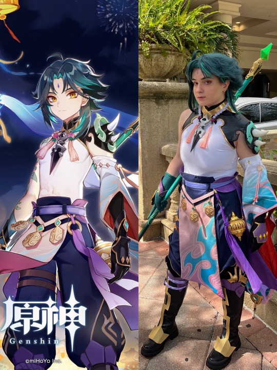
taking some time today to discuss xiao! specifically the upgrades i made to him for metrocon 2023. i did so much experimenting with new techniques and materials, so i wanted to share that here to document, and maybe inspire some of my fellow artists/cosplayers!
i don’t think i could ever properly explain how happy i was after remaking xiao’s shirt. the previous version (which was purchased) fit really poorly, and the fabric was not great. it constantly pulled out from the waist of the pants and it practically blocked any airflow. the solution was simple: remake it from a bodysuit. that way the shirt not only stayed in place but also already gave me a much better form-fitting base to start out with. the mesh panel in the back was the part i worried about the most but ended up being the part i’m happiest with! i used power mesh that i hand dyed to be close to my skin tone (though the color isn’t very clear due to my binder’s color).
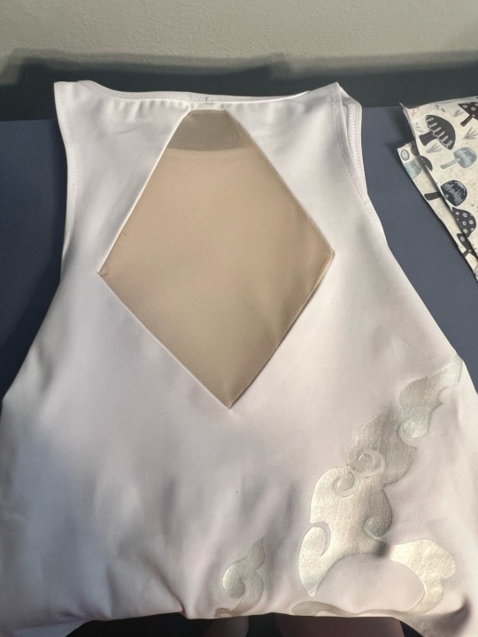
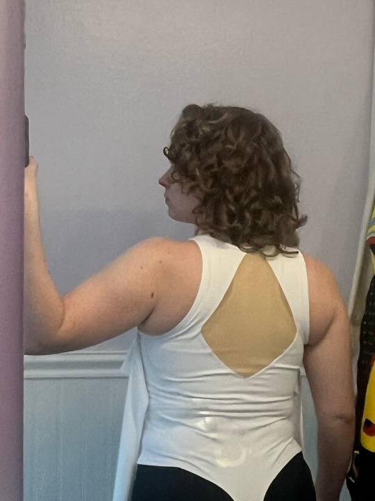
the swirling pattern on the bodysuit is a metallic white fabric paint. i made a digital drawing of the pattern on procreate, then printed it onto freezer paper. after cutting it out with an exacto knife, you can actually iron freezer paper onto fabric (shiny side facing the fabric) and it creates a nearly seamless stencil for fabric paint! i see myself using this technique a lot in the future, it’s literally perfect!!
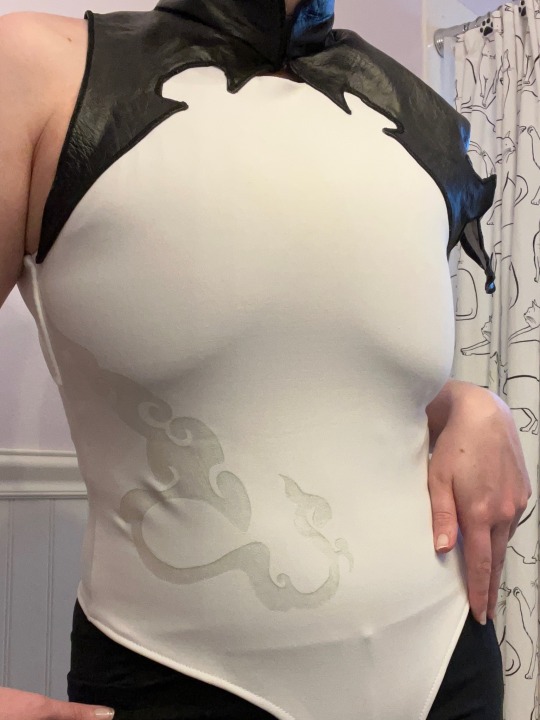
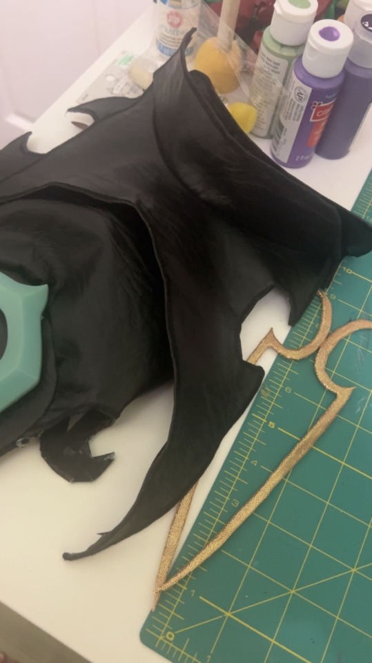
the black leather piece at the neck and shoulders was my biggest obstacle. not only have i never worked with leather, but it is also a non-stretch material i’d be attaching to the collar/neck portion that very much needed to be able to stretch to be pulled on. thankfully the design worked out that i could have 2 closure points, one on the back of the neck and one at the front of the neck. the entire piece is hemmed by folding over and gluing the raw edge to the inside, then i glued hem tape over those raw edges to cover them and make them softer on the skin (the entire leather piece is unlined, due to its complex shape). all the visible edges of the leather were satin stitched to give them a clean, crisp edge. the gold appliqués on the front and back are 2mm eva foam covered in a gold stretch fabric, then glued onto the bodysuit with e6000!
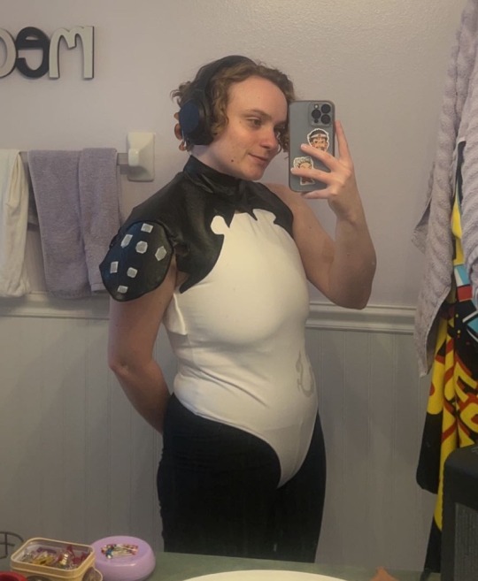
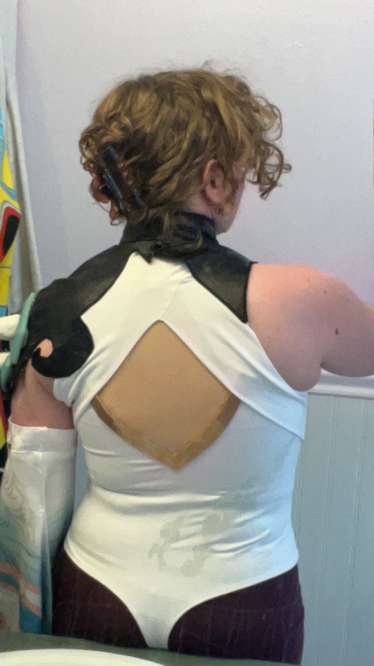
the two white pieces that frame the mesh panel on the back gave me more difficulty than i expected. their shape is a bit deceiving, and needing them to lie flat on my back without sacrificing the stretch of the main garment meant i couldn’t just top stitch them onto the back. and while i’m not super happy with how they ended up aligning (where they meet at the top is much further down than i was aiming for), i still think it came out really nice!
and that’s the finished top!
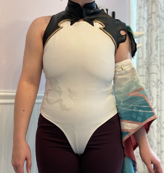
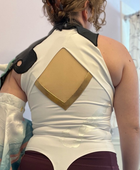
here’s a front and back of the finished top! the sleeve is held up with clear bra straps that hook onto the inside of the shirt at the shoulder. all in all, i absolutely love how this newer shirt came out.
besides the shirt/bodysuit, the boots also got an upgrade! i snagged some boots on sale on amazon for $20, which was an insane steal! this style is very universal for so many costumes, and it also helps that the boots are comfortable and flat too! all of the accessories on the boots are affixed temporarily or from the inside (velcro, snaps, and elastic) so that the integrity of the outer boot remains untouched and i can reuse them for several costumes and even everyday wear. i also replaced the gold piece around the neck that holds the “scarf.” just like the pieces on the shirt, it is 2mm foam covered in gold fabric. this not only helps the gold elements feel more cohesive but also lies a lot more comfortably on my neck!
#cosplay#cosplayer#tutorial#sewing#sewist#cosplay breakdown#cosplay tutorial#genshin impact xiao#xiao genshin impact#genshin xiao#genshin impact#genshin impact cosplay#genshin impact xiao cosplay#genshin xiao cosplay#xiao cosplay#genshin cosplay#cosplay wip#metrocon#metrocon 2023#xiao#adeptus xiao
110 notes
·
View notes
Text
Here's my works for my BFA (Bachelors of Fine Art's Capstone class aka the Exhibition we had to put together yay!!!!)
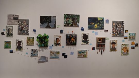
It's to note, yes I did use my Small Town AU story as the works I wanted to use. In my artist statement, and the title of my works, I refer to the story as Catalyst and I will be bouncing back from Small Town AU and Catalyst. Small Town AU feels like it's more closer to the original source, the Intermission characters, while Catalyst serves as me slowly but surely taking these characters and changing them in terms of giving them a whole new story as they're in a different and new sort of setting. Like they'll have their own families, reasons to live at this town, some personality changes (mainly the Pickle Inspector group as I am not as knowledgeable on them cool.)
So basically, I'm at that point where this story is between an AU and being its own thing as I want to be able to have these characters stand on their own with more thoughts being put into them as new beings of some sorts. But I have grown way too fond over their original versions of themselves. Googoo....gaga.... much to think.
Here's a simple quick synopsis of Catalyst (as I re-read my artist statement and I don't like it anymore):
In my story I present to you all, there’s a simple small town that slowly but surely changes for the worse. This body of works serves as a small introduction to the world I’ve been creating for around three years. In my artist statement, I touch upon how this small town faces peculiar cases that amplify the feelings of whimsy and the uncanny valley. These issues all stem from one single entity. The Catalyst *insert dramatic music cue*
Yes, the Catalyst in this case is the one, the only, Doc Scratch. But more on that in another time.
And here's a song to listen to while viewing these:
Little Dark Age - MGMT
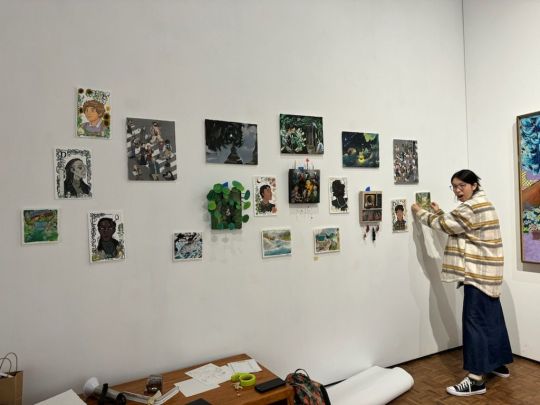
ALSO PLEASE READ SOME OF THE ALT NOTES I PLACED ON SOME OF THE IMAGES!!!!
Faces: 8 x 12 inches. Digital print on Arches paper. Additional watercolor and color pencils. (There were going to be more faces, I might draw them digitally and post at another day but aoruaghhh... not enough time to finish them) (also not shipping Die and Quarters lol, I just thought they would match in terms of ah yes the green balls)
I really really really love Medieval Illuminated Manuscripts and think the borders, interlaced patterns, and text(?) or manuscript work is just handled so wonderfully. I also turned to Alphonse Mucha with how he also handled borders and sweeping motions that are a thing of the Art Nouveau (you can tell I am a SLu- for historical or past art works, styles, achievements, and aesthetics. Not so much for DADA surrealism/abstract, faktura, minimalism, etc (more towards modern shit. So like Picasso time stuff to now contemporary art stuff I just don't really fuck with it lol but I'm trailing off)). And so I wanted to try and give a nod to that stuff with the borders I used to frame these portraits.
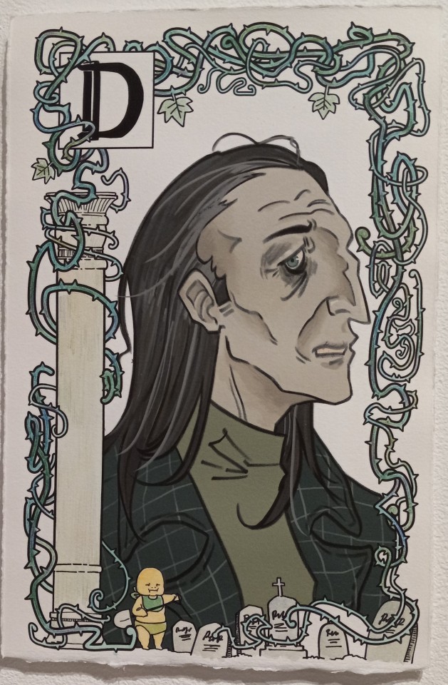
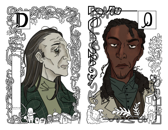
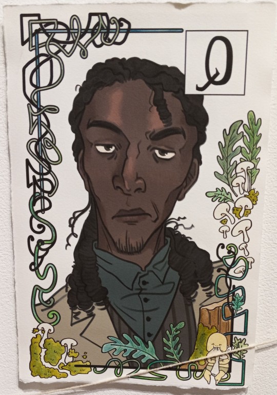
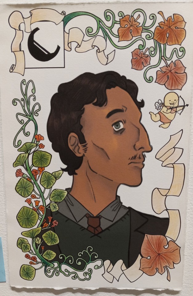
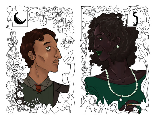
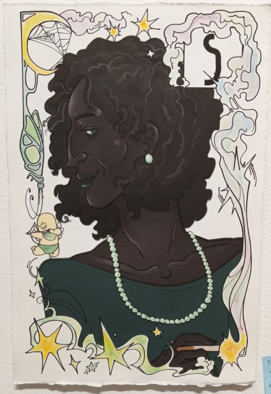

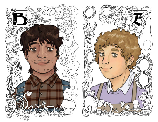
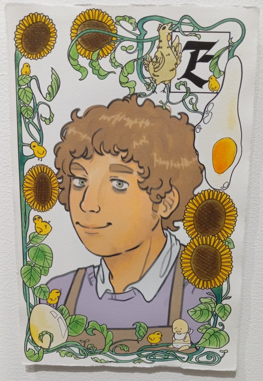
Wood panels: 8 x 10 and 10 x 10 inches. Digital drawings printed on mulberry paper that's rabbit skin glued to the wood panels then post coated with acrylic soft gloss medium thing yeahhh.
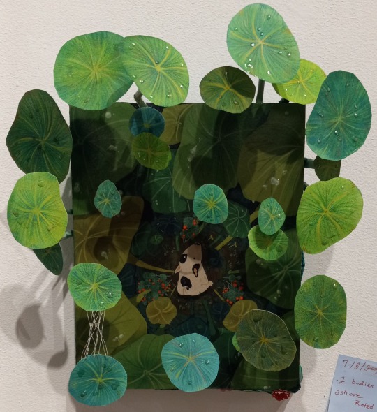
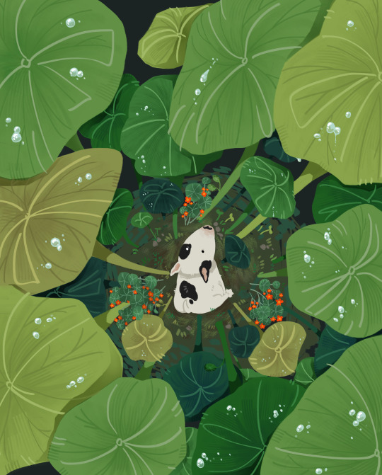
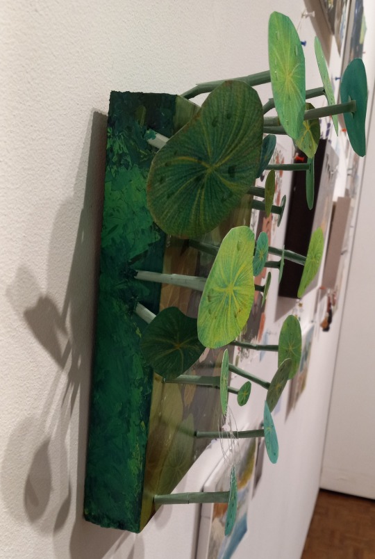
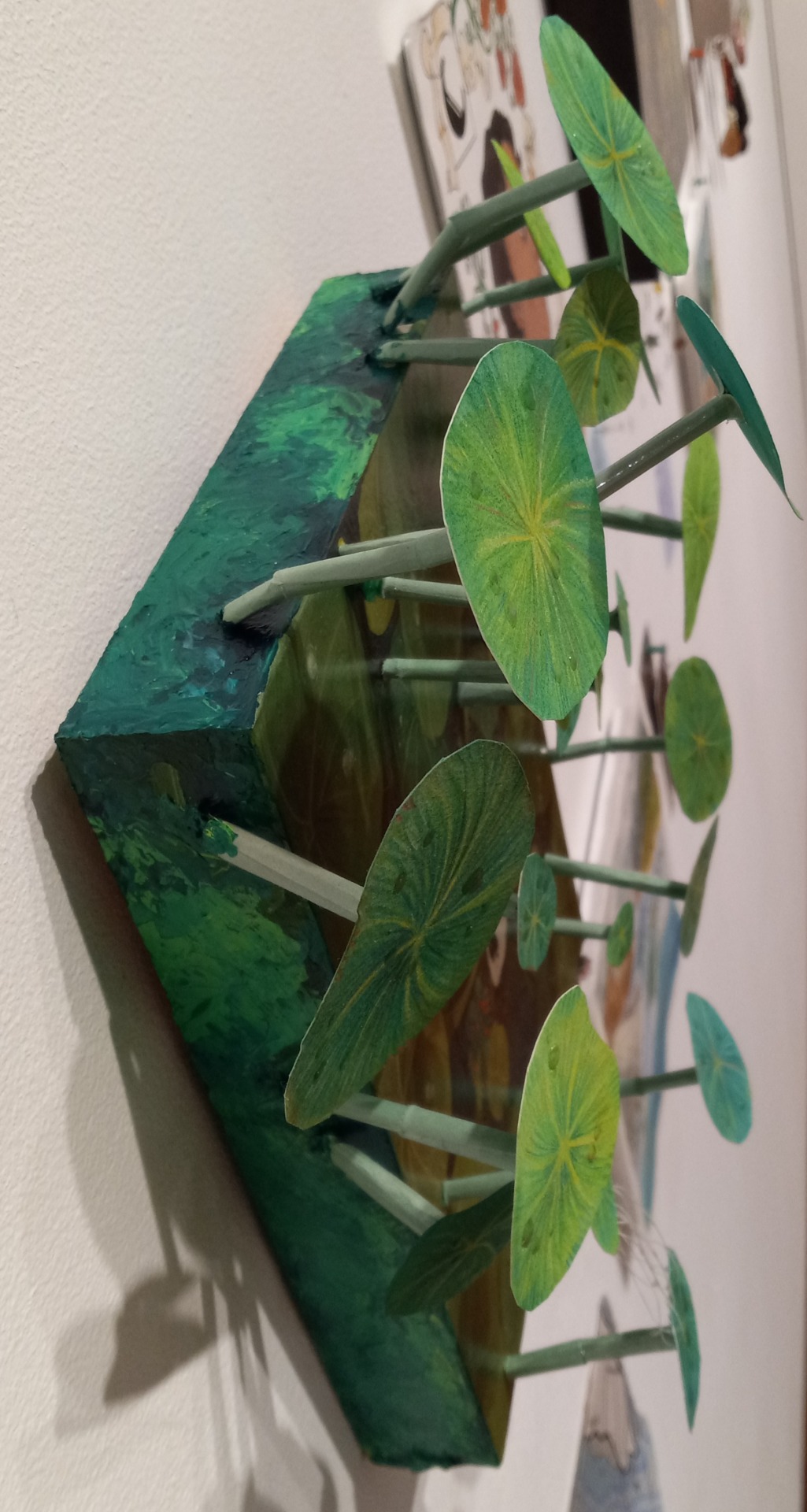
Additional leaves lily pad things: watercolor paper with ya know, watercolor, color pencils, acrylic modeling paste is applied to the sides for some texture or add on (I didn't put too much as I ran out of material) and acrylic paint (Liquitex) is then painted on but I used a palette knife to apply and blend some of it in, satin glaze (for the rain drops), pipe cleaner with construction paper wrapped around (for the stalks to bend them and hold them up) Each stalk (which is based on the plant, nasturtium. God I love the flowers and leaves oauragh) has a hole drilled into the wood allowing me to poke then bend the pipe cleaner to hold it still.
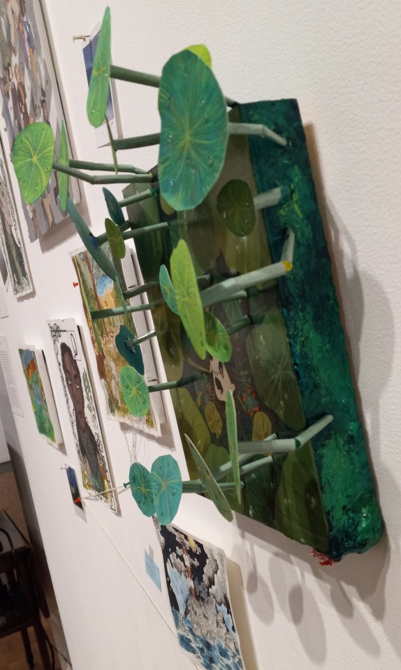
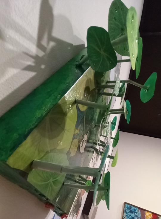
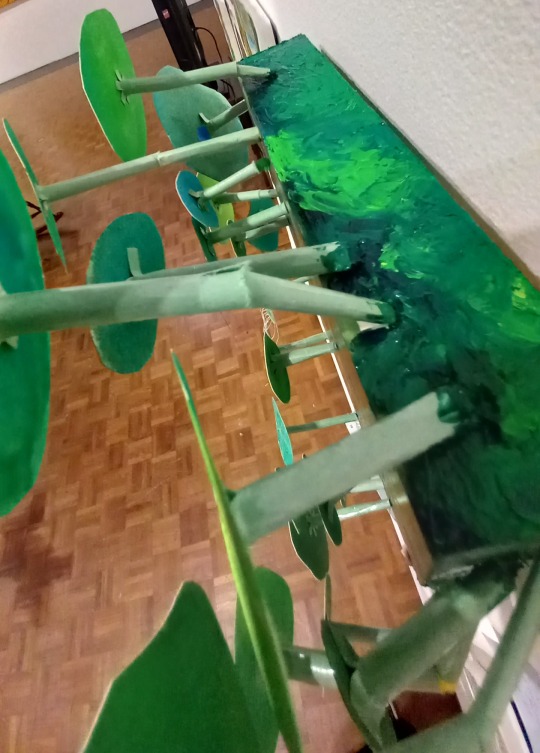
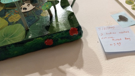
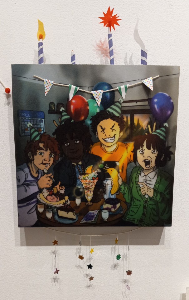
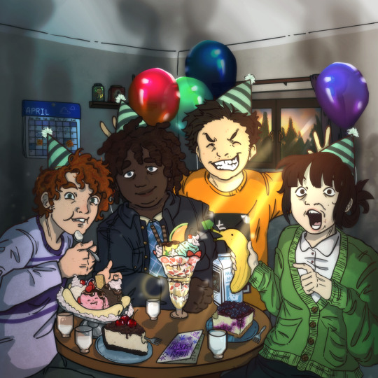
Additional: Pipe cleaners with construction paper around it for the candles, acetate colored sheets for the light, patterned origami paper on string, and star cut out thingies below wahoo


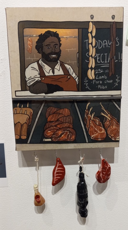
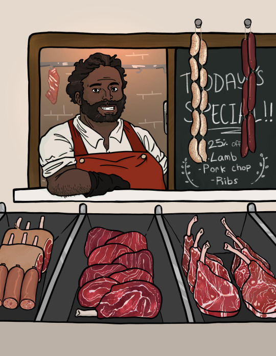
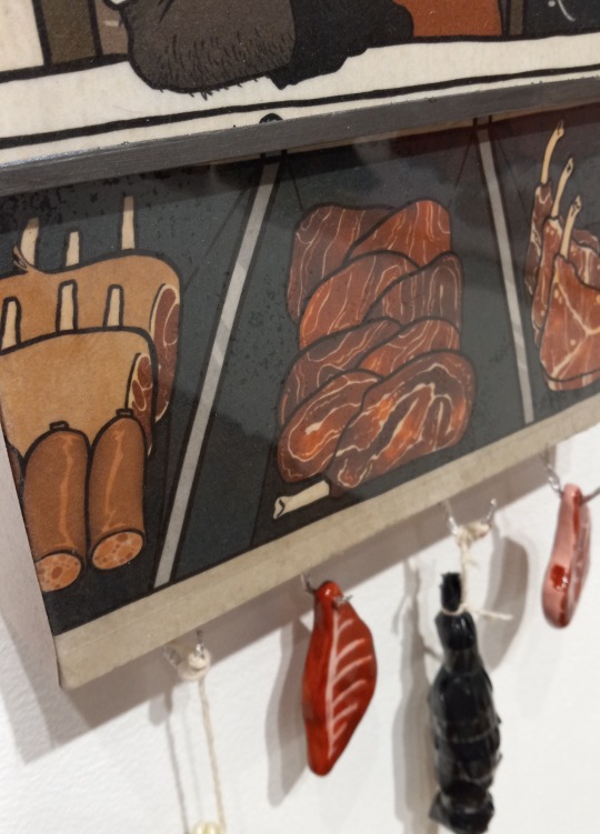
Additional: Oven-bake polymer clay for the meats with acrylic paint then satin glazed, pipe cleaner with foil around it for the hooks, foam board painted silver (acrylic), acetate for the glass, and the body is just tissues crumpled up with a trash bag wrapped around it! BOXCARS WAOUGH

PART 2 OF MY WORKS AS I CAN'T FIT ALL HERE
3 notes
·
View notes
Note
Helloooo, I saw your post about the Nagano Nuis you previously made and I thought I’d ask how you did the faces?
They look really good and I love the style of plushes with the sort of “painted on” faces but I’m not sure how to do it myself, thanks so much :^)
Hello!
I painted these digitally and then printed them on paper that lets you make your own iron on designs!
It's far from ideal, because it cracks when stretched too much (gin cracked when I turned him from left to right after sewing), but since I can't print on fabric and can't embroider either, this was my best shot and I'm glad it worked!
Went to find some WIP on twitter

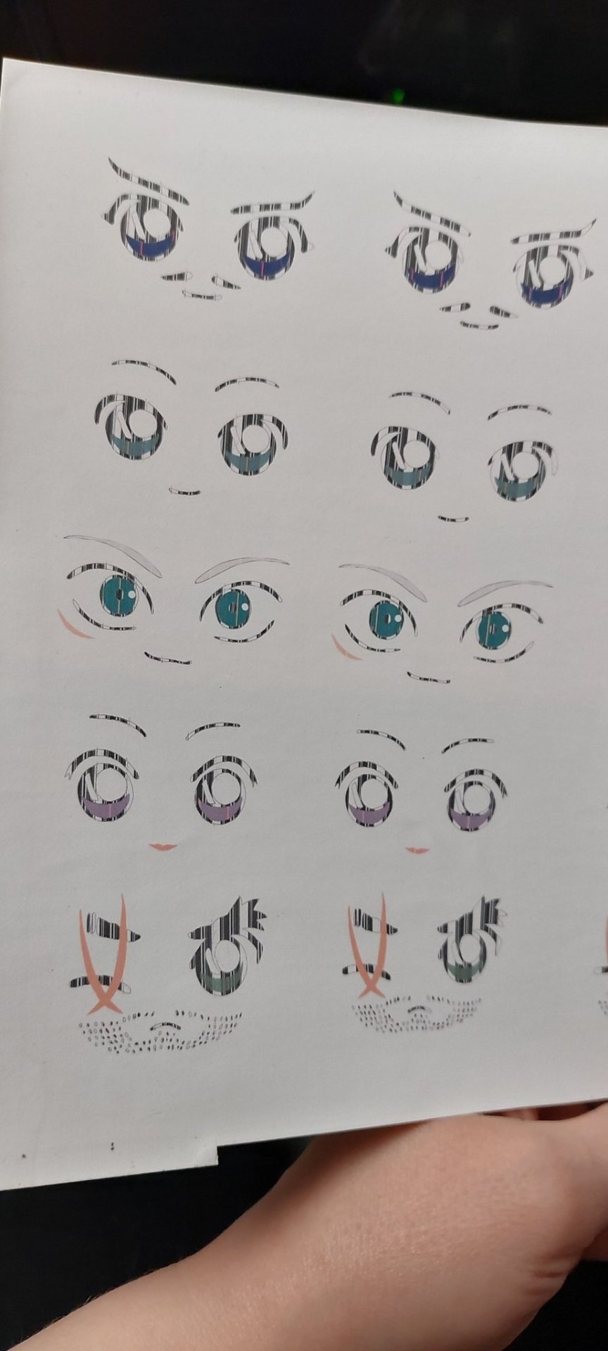
My printer is a bit shitty, so I had to go over the print with some alcohol markers to fill in the lines. It worked well!
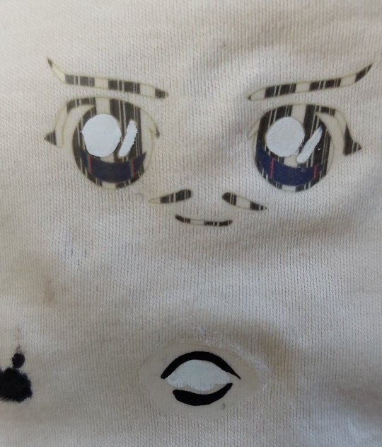
Also used some acrylics to draw on the whites before ironing on, since everything printed white will disappear after ironing
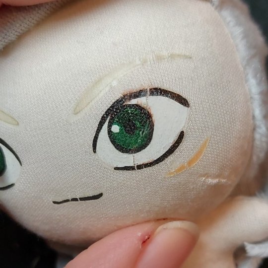
And cracked Gin. It's not too bad, but annoyed me a bit.
#dcmk#Mi answers#finding these took a bit 💀#they're done in 2023 and the only one with clothes to this day is Kansuke
3 notes
·
View notes
Note
PLEASE TUT ON GOUACHE
omg hahaha i’m no good at tutorials but i did actually take some process/wip pictures of my most recent painting, so i can share those!!
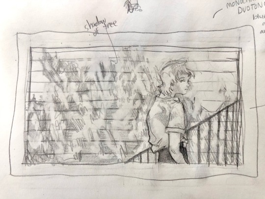
i started off with this drawing in my sketchbook
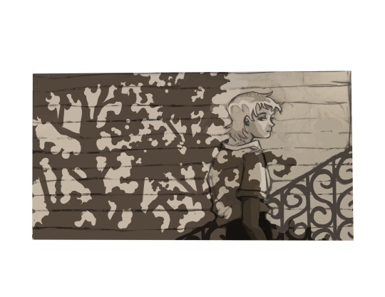
then i took it into clip studio to redraw digitally to figure out composition and the shadows… i printed this out and then lightbox traced it onto hot press paper to paint
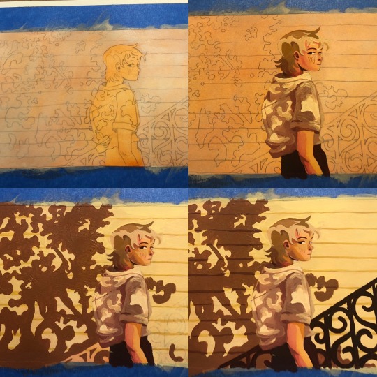
these are scattered throughout the painting process but. i put down a wash of orange ink so i’m not painting on white, immediately got mad that it’s bright orange, then rushed to paint over the whole thing LOL… this painting was also supposed to be blue but the wildfire smoke rly influenced my palette :’))
#asks#idk if this is helpful but i love sharing these things#i also use acryla gouache#but i also mix it with regular gouache cuz i rly don’t care lmao.#i just have a lot of acryla gouache and it’s cheaper than regular… kinda sorta.. depends on the brand#if i use regular gouache i like winsor and newton cuz i’m spoiled but it’s so expensive. i only use one color from w&n and it’s red#cuz no other brand gets the color right
29 notes
·
View notes
Note
5 and 14 for the artist ask game!
5. Estimate of how much of your art you post online vs. the art you keep for yourself
I post almost all of my digital art! and a lot of my digital pieces come from my sketchbook, whether i planned out a piece in there or I was looking through it to see what I could line and colour digitally.
Some of my pieces I posted earlier this year were from a project i did for school where scanned and printed a bunch of pages from my sketchbook and then printed the digital versions on clear acetate and layered it on top
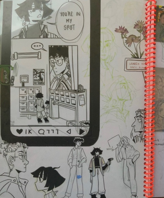
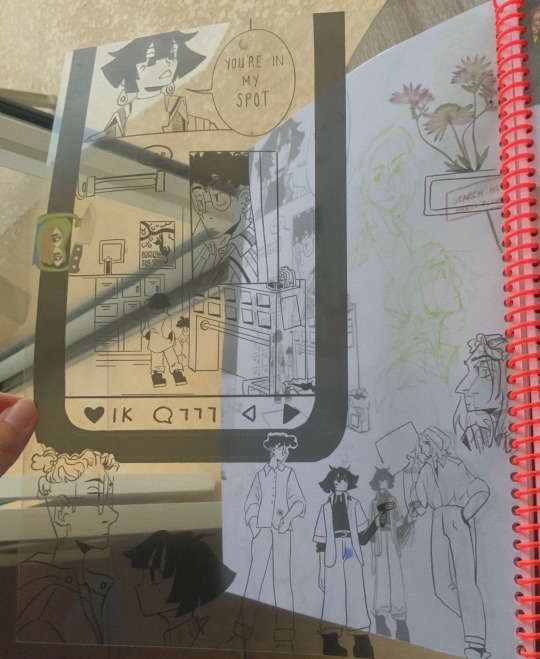
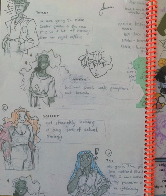
That being said I went to a very traditional museum art school so I do have a lot of drawings and paintings I don’t post here. Mostly figure drawings bc i love taking classes for it.
14. Any favourite motifs
idk if this counts as a motif but i love doing hearts over the knees and elbows! I picked it up bc i was (and still am) inspired by punziella’s work and she did the same thing.
17 notes
·
View notes
Text

So just a little check in. I won't... no this is for me I will ramble.
You know, or may not know, that I have been drawing my way through alanna: the first adventure book for a few years doing a couple of pieces each year. Originally that started in part as a way to practice my drawing but mostly really it was a way to try and trick myself into reading again. I still don't enjoy sitting still and reading for more than a short while but the drawing keeps coming along, slowly, but I can feel a difference in my confidence, especially with traditional mediums.
Anyway an unexpected consequence of doing these alanna drawings is I have solid punctuation marks all across the years now documenting how I'm progressing with my art most notably making a real effort to learn to make work traditionally.
You see I learnt to draw digitally first, sort of, i did go to art school but made some poor choices and didnt make the most out of it. So i leaent to draw digitally before i learnt to draw normally and i got okay at it and digital art is still fun, I still like my first alanna drawing and I think it is technically better than my last one I just did buuuut... i really like making traditional art.
I cannot straight up draw on paper as well as i can digitally becuase of course i cant. I dont have my much used warp tools and layers and shit; fixing every micro mistake, but god traditional art is so fun.
And I can see that enjoyment grow over the alanna drawings as I learn something new or push myself to draw something outside of what I feel I can because that's what the scene calls for.
Once I was very embarrassed to show what the first image actually looked like. It's my first traditional piece in my collection and one of my very first serious tries at traditional drawing maybe since even before uni and I really hated it. I'm showing how the sausage is made but I've put what the picture actually looks like next to what I've put together on the computer as the finished works and... God I remember being so down about the first one, I'd laboured over it as I always do, wanting to make something nice to do the story justice, and I just... could not match traditionally what I knew I could do digitally and that pissed me off so much ahaa I didn't even know where to begin polishing this turd I'd made so I just stripped all the colour out of it and called it finished so I could stop thinking about it.
I did kept practising though obviously and as I said I've got these paintings of alanna to demonstrate to myself how I'm growing.
This latest one one, now this is a sausage. So I can't draw straight down onto paper as well as I can digitally but I don't like to paint digitally but I want a nice drawing I can splash my watercolours onto what do I do? Well for a while on things I care about being finished nicely I've been drawing the big complex thing digitally, warping what ever the hell I want, as many layers as desired, flip flop that file until I get something mostly polished and then I can get my light box or my projector and trace the thing out and ink it or maybe use coloured pencils but right now I'm inking.
And that's what I did here, it's an A3 hot press most expensive bit of paper I've used since printing class and boy I was determined to do right by the materials.
Had so. Much. Fun. with my watercolours once I got there after the ink. This is probably my second most big complex watercolour ive tried and i loved painting it. Loved it. Made a huge mess of my carefully planned out line work. Ah well, no worries, I can just draw them again on the ipad i thought, too easy.
Yeah nah I hated that. Took the photo, popped it into procreate, got to drawing over the little washed out ink lines to sure everything up. Ugly, felt wrong, hated it, not doing that.
So I sat with it for a bit. I knew I did want to bring the lines back an not leave it washed out and I knew that meant going in with a pen or a brush or pencils but I really didn't want to fuck it after I'd been so happy with where I'd gotten with it. But I did go in, with a brush pen, and I did fuck it. I fucked it so bad, in so many places. I fucked vital bits of the drawing that i had done so prettily in the first pass. I fucked with bits I had already fucked with splashing paint water too enthusiastically and fucked it some more. And then, boy, then I tried to unfuck my fuck ups with gouache and fuck me that was the biggest fuckshit mistake. It was fucked. I had fucked up and fucked it. In my defence, I'd had a chest/sinus thing and covid for 6 weeks. But actually, i... did care i fucked it but it wasnt crippling, so i probably dont even care to have a defence, i didnt fuck up that badly, actually.
That's a really revolutionary thought for me.
So I took another photo of my fucked but now much better defined painting, slapped an orange filter over it, ironed out the gouache situation, pushed a couple of the faces around so they werent so soulless and called it finished because... it was. It was really a very easy thing to clean up, I had not fucked anything up beyond the scope of my ability to repair a little and the worst fucks well... I couldn't really see them for all the good I had done.
Rev-o-lutionary.
When I got out the first picture to have a look at tonight I was surprised by how neutral I was to see it. I had hated it but, by extension and more worryingly, i had felt resentment towards my own fumbling hands for this thing I thought was ugly being the limits of their ability to create.
I don't see what I was thinking in that picture now. It just is what it is. Something to practice my drawing and trick myself into reading. A punctuation mark showing my first steps into a new medium. Making it i should have just allowed it to be time spent recovering from what i remember being a pretty shit time, a respite. I didn't need to be so cruel to myself.
And, gladly, doing this latest picture I didn't feel any dissatisfaction with my hands. I made plenty of mistakes, pleeeeeenty. But i can see what ive done and how i might avoid shitting things in the future. That's enough. I did good things in the painting too
And it's time to sleep. I just was pondering over this. I don't reeeeally know what I've said but i felt it boiling in my chest, I mean outside of the infection that's mostly cleared, and I just felt like getting it out
Yep
#ratts complaints department#i read somewhere edmund dulac burnt all his imperfect work and sketches which i cant comprehed theres not much so shattering as looking back#on a painting a realising it wasnt all bad like actually this bit or that bit is quite sweet
1 note
·
View note
Note
Your art is really cool! What is the process for making it?
Thank you! I'm a relentless filter-fader, digital manipulations that I apply and then mostly remove, ||: then apply again, mostly remove :||
before 2000 I did similar things with ink & silk screens, distorting images and lightly reapplying them over themselves over&over. There's still some shirts and skirts of mine out there.
I often start with a pencil or ink drawing; I used to use paintings but I don't have the studio for it at the moment - I have the space, the flesh is weak. I also will paint or draw something on stiff paper, photograph it, mess with the photo digitally, print it out on some stiff paper, mess with that, take a picture & post it (maybe after some filter-fading)
Thanks for asking! & feel free to mess around with it; seamless images (that tile) are usually tagged "seamless" or "tiling"; "texture" has some gems; "scry" means I hid something in it, a drawing or photo lurking in there.
6 notes
·
View notes
Text
Disruption: A Conclusion
What's up Tumblr,
With the Christmas holidays starting that means that the disruption project has come to an end. I enjoyed doing this project. I'll be honest, I was lost at first. When I heard disruption I immediately thought of my Type 1 Diabetes, but I didn't want to do my project on it since it was already consuming most parts of my life I didn't want to spend weeks focusing on it through art as well.
From some talking to my friends, lecturers and even some doctors , I came to realise that it is a major disruption in my life that I don't voice often but I want people to know about. It majorly impacts my everyday life, I've missed days from college, workshops and outings with friends over it (and almost my LC as well) . I shouldn't be ashamed of it and should be talking about it more.
I'm glad I did in the end, originally I thought of doing how emotions can disrupt someone and their ways of thinking but I realised very early I didn't have much to say on the subject. Whereas, with my diabetes I had plenty to say. The carb counting for every meal, snack and sometimes drinks. The countless needles I've injected myself with. The constant checking of my blood sugar and drawing blood. The nausea. The recent decline in my control of it and sudden threat of vision impairment because of it. It's all things that have disrupted not just my day-to-day life but things that could disrupt my future if I don't find ways to deal with them now.
In the end I got a good few pieces from it. Some embroidery, prints, an animation, a painting, etc.
If I had a few more weeks I would've liked to have made more paintings and digital pieces. I love digital art but unfortunately my drawing tablet broke and I won't be getting a new one till after Christmas. I would've also liked to try out some other workshops like photography and publication.
In conclusion (I'm now just realising how long this post is 😅) my project is about how diabetes disrupts a lot of my life. How I'm struggling to live along side it rn, go to college, work a job and attend hospital appointments. I am fighting a constant battle to keep myself healthy, but also how despite my struggles it also doesn't define who I am. Yet strangely I also wouldn't be the same person without it either.
Thank you for reading this. You're awsome and have a great Christmas! :D
5 notes
·
View notes