#i need to find better quality screencaps
Explore tagged Tumblr posts
Text


pfp set (200x200) for Jafar 3/?
Free to use.
#magi#magi: the labyrinth of magic#magi labyrinth of magic#magi jafar#magi ja'far#pfp icons#happy belated birthday my guy <3#no snb ones this round sadly :(#i need to find better quality screencaps#jafar's photogenic saga continues xD#my stuff
31 notes
·
View notes
Note
Hello, im wehaveagathering from my main blog, im kind of obsessed with your hockey poetry edits and I think your blog is great! I guess I kind of have a dumb question, where do you find the images you use for your edits? Did you say Getty in your tags?? I’ve gotten into making icons recently (and i have ideas for poetry edits hrrrghhh) but it’s hard to find high res images. Thanks for your time and I hope you have a nice day :)
first of all thank you so much 🥹 and second that’s absolutely not a dumb question!! i do pull a lot of images from getty and i’ll also download pictures from sports articles (i got a lot of the hugheses pictures from online access articles, for example), or sometimes from instagram/facebook/twitter if an account is public. freely admitting that i am not technologically advanced? inclined? in the slightest here, but the image editing software that you use and how you import/export photos with it makes a difference in the quality of them as well!
if you haven’t seen them yet, i would also recommend checking out @simmyfrobby @national-hockey-lesbian @hauntedppgpaints @tapedsleeves @starscelly and @captainbradmarchand’s blogs just off the top of my head!!! they might know more places to get high res images and also i love their work 💕🫶
#sorry can’t type hands all butterfly hearts i’m just out here like 🥰🥰🥰🥹🥹🥹😭😭😭💕💕💕#@ everyone i tagged ty i love you i hope you don’t mind the tag 😘 also i KNOW i am unintentionally forgetting people so tag them at will#forgive me i am eepy. we are running on <4 hours of sleep and over 18 hours awake 🫡#liv in the replies#join the club!!! join the club!!!!! we love the hockey poetry edits!!!!!! i’m so excited to see what you create!!!!! :)))))#the process of me finding images is very much like. either i have a vision in my head and i troll getty looking for it or my screenshots#if i know i have one l m a o but either way i am always 68 pages deep in a hyper specific search labeling my photos like ‘ohHHH buddy’#‘menace 1 abd 2’ ‘but he’s not a cup winner’ ‘ohhhh the nolpat media scrums are rich earth’#‘because WILLY WON’T CUT HIS HAIR’ ‘deJA FUCKIN MILK BAYBE’ ‘is it truly sn edit if u don’t find a devastating baby pic’ ‘yes MF last line’#and so forth. like. glad it’s comprehensible to ME but if anyone else ever tried to use these photos based on file name alone i am so sorry#also i forget that y’all can’t see all of the metadata notes on photos to know where they’re from :/ i gotta be better abt making it clear#also on the note about image quality i just need to state for the record i am so photoshop whatever illiterate.#i learn one (1) new trick on GIMP a year maybe two if i am lucky & no i have never figured out consistent sizing 🫡 but the one hack for res#i HAVE figured out is that when i do edits i usually make a whole doc w/the poem lined up on it (helps me keep somewhat consistent sizing)#and then i export that document as a pdf and edit the pdf in the software instead of trying to screencap or jpeg or anything. PDF quality >#that is probably so convoluted lol if anyone has tips please lmk i am always learning#ANYWAY. rambling u did not ask for but is inherent to Me.#have a great day too!!!!! you literally made mine so 💕😭#wehaveagathering#indecisor
9 notes
·
View notes
Text

COLORING + SHARPENING TUTORIAL
someone asked for a coloring tutorial and my sharpening settings, so here it is! there are also a few tips to achieve more HQ gifs. :)
tutorial under the cut!
FOR HIGH-QUALITY GIFS
FILE SIZES
it doesn’t matter what your sharpening settings are if the file you’re using to gif is too low quality, so i tend to look for the best that i can get when downloading stuff.
usually, movies (+2h) look better if they’re 5GB or more, while an episode (40 min/1h) can look good with even 1GB. the minimum definition i try to find is 1080p, but i gif with 2160p (4k) when available. unfortunately, not every computer can handle 4k, but don’t worry, you can gif with 1080p files just fine if they are big enough. contrary to popular belief, size does matter! which means sometimes a bigger 1080p file is better than a smaller 2160p one, for example.
SCREENCAPPING METHOD
this can too influence the quality of your gifs. as a gifmaker, i’ve tried it all: video frames to layers, directly opening video clips, loading files into stack, and i’ve finally settled down with opening screencaps as an image sequence. with bigger files, it doesn’t matter much what technique you use, but i’ve noticed with smaller files you can do wonders if you screencap (either by loading files into stack or opening as an image sequence) instead of using video clips. for example, this gif’s original video file was only 4GB (so smaller than i’ve usually go for), if you can believe it!
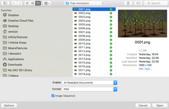
here’s a tutorial for setting up and screencapping with MPV, the media player i use to screencap. again, you can keep using video clips for bigger files, but you’ll find this useful when dealing with dire causes. i don't file loads into stack, though, like the video does. i open as an image sequence (open > screencap folder > select any image > click the image sequence button). just select OK for the speed. this will open your screencaps as a video clip (blue bar) in timeline mode (i'm a timeline gifmaker, i don't know about you). you will need this action pack to convert the clip into frames if you're a frames gifmaker. i suggest you convert them into frames even if you're a timeline gifmaker, just convert them into a timeline again at the end. that way you can delete the screencaps right away, otherwise you will delete the screencaps and get a static image as a "gif".
ATTENTION if you’re a Mac Sonoma user, MPV won’t be an option for you unless you downgrade your system. that is, if you have an Intel chip. if you have M1 Max chip (or even a better one), here’s a fix for MPV you can try while keeping that MacOS, because nowadays MPV is skipping frames in its latest build. or you can use MPlayer instead for less hassle. here are two tutorials for setting and using MPlayer. Windows users are fine, you can use MPV without trouble.
FOR EVEN MORE QUALITY
ADD NOISE
here’s a tutorial for adding noise as a way to achieve more HQ gifs if your original material is too low quality.
REDUCE NOISE WITH CAMERA RAW
instead of adding noise, you can reduce it, especially if your gif is very noisy as it is.
the path is filter > camera raw > detail > nose reduction. i do this before sharpening, but only my video file isn't great to begin with. because it’s a smart filter, you can reduce or increase its opacity by clicking the bars next to its name in the layers panel.
TOPAZ AI
i use Topaz Photo AI to increase the quality of my screencaps when i need to. it’s paid software, but there are… ways to find it for free, usually on t0rrent websites. if someone’s interested, i can make a tutorial solely about it in the future.
SHARPENING SETTINGS
here are my sharpening settings (filter > sharpen > smart sharpen). i sharpen things twice: 500% 0.4px + 10% 10px. here's an action for it, for more convenience. here's a tutorial on how to use Photoshop actions. for animated stuff, i use this action pack.

COLORING
here’s the gif i'm gonna use as a base. it’s already sharpened like the way i always do it.

LIGHTNING THE SHOTS
half of the secret of a good coloring is good lightning. i always useCurves (layers > new adjustment layer > curves) and Brightness & Contrast (layers > new adjustment layer > brightness & contrast). the settings depend on the scene you’re giffing, but i always try make my gifs bright and with high contrast to make the colors pop.
CURVES
besides lighting your scene, the Curves adjustment layer has four automatic options that will color-correct it for you. it’s not always perfect and it doesn’t mean you won’t need to do further coloring, but it’s a great start. it’s a lifesaver for most ridiculously yellow scenes. look at the difference! this gif uses the 3rd automatic option (the screenshot below isn't mine btw so that's why the fourth option is the chosen one), from top to bottom. what automatic option you need to choose depends on the gif.

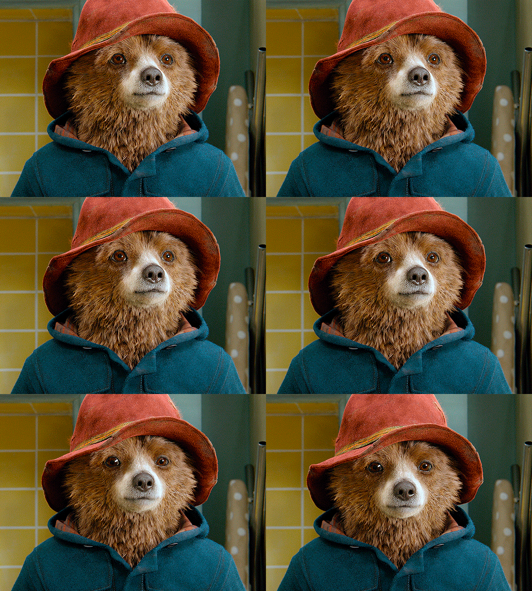


sometimes i like to tweak my Curves layer. not everybody does that, it’s not that necessary and if you’re not careful, it can screw your gif up. to modify your layer by hand, you will need to click and drag points of that straight line in the position you desire. this is the concept behind it:

basically, the lower part of the line handles the shadows, while the upper part handles the highlights of the image. if you pull a highlight point up, the image’s highlights will be brighter. if you pull it down, it will make them darker. same thing for the shadow points. you should play with it to get a grasp of it, that’s what i did when i first started giffing.
BRIGHTNESS & CONTRAST
then i added a bit of brightness and contrast.

CHANNEL MIXER
the scene looked a bit too yellow, so i used the Channel Mixer (layer > new adjustment layer > channel mixer) adjustment layer. here’s a tutorial of how it works. not every scene needs the Channel Mixer layer though, i mostly use it to remove heavy overall tints. in this particular case, the Curves layer got rid of most of the yellow, but i wanted the gif to be just a bit more blue so the Channel Mixer tweaks are very minimal.

SELECTIVE COLOR
now, this adjustment layer i always use: Selective Color (layer > new adjustment layer > selective color). this is THE adjustment layer to me, alongside the Curves one. this is how it works:

ie, you can separately edit a color this way, giving it tints. for this gif, i wanted to make the colors more vibrant. to achieve that, i edited the selected colors this way:
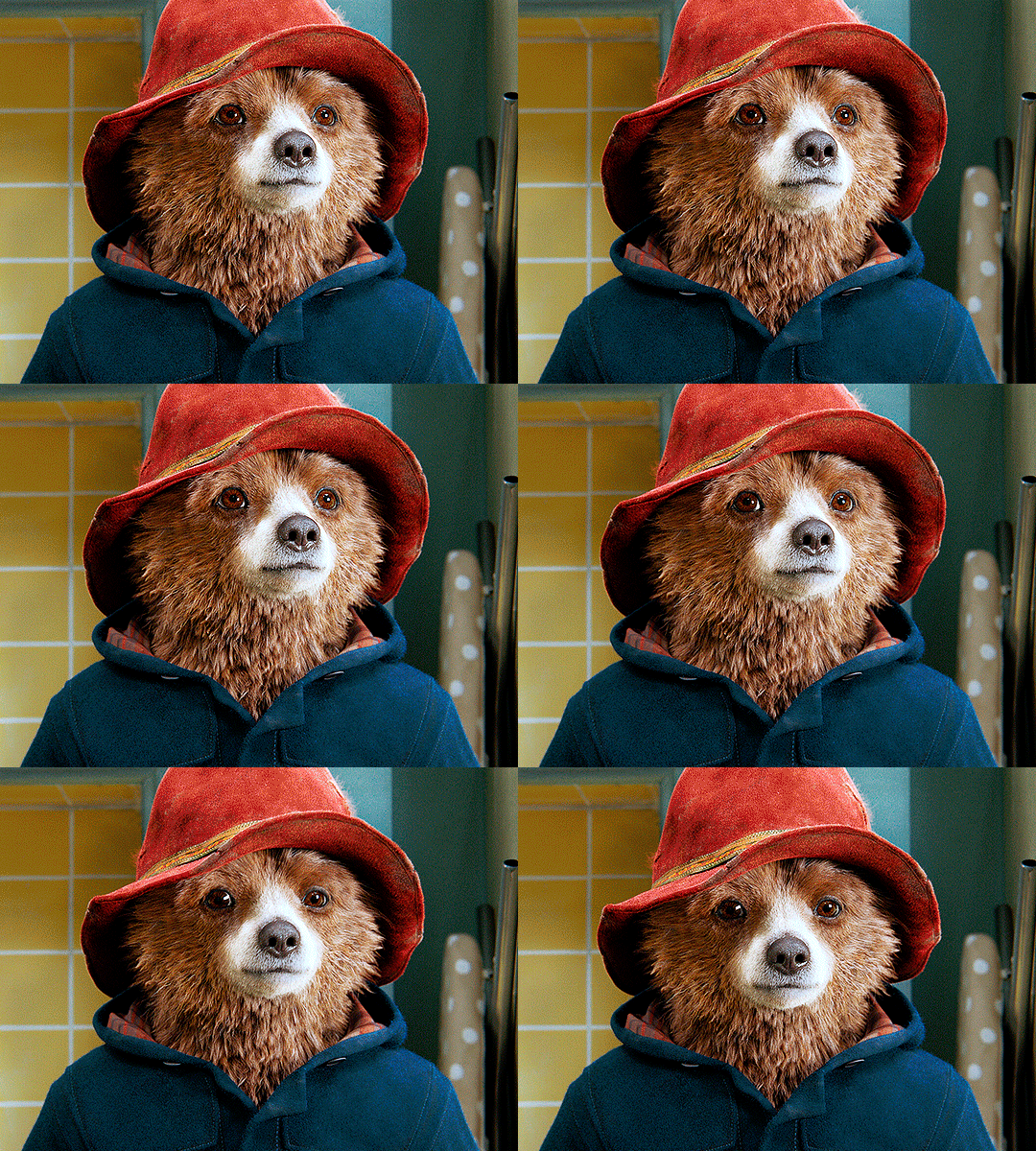
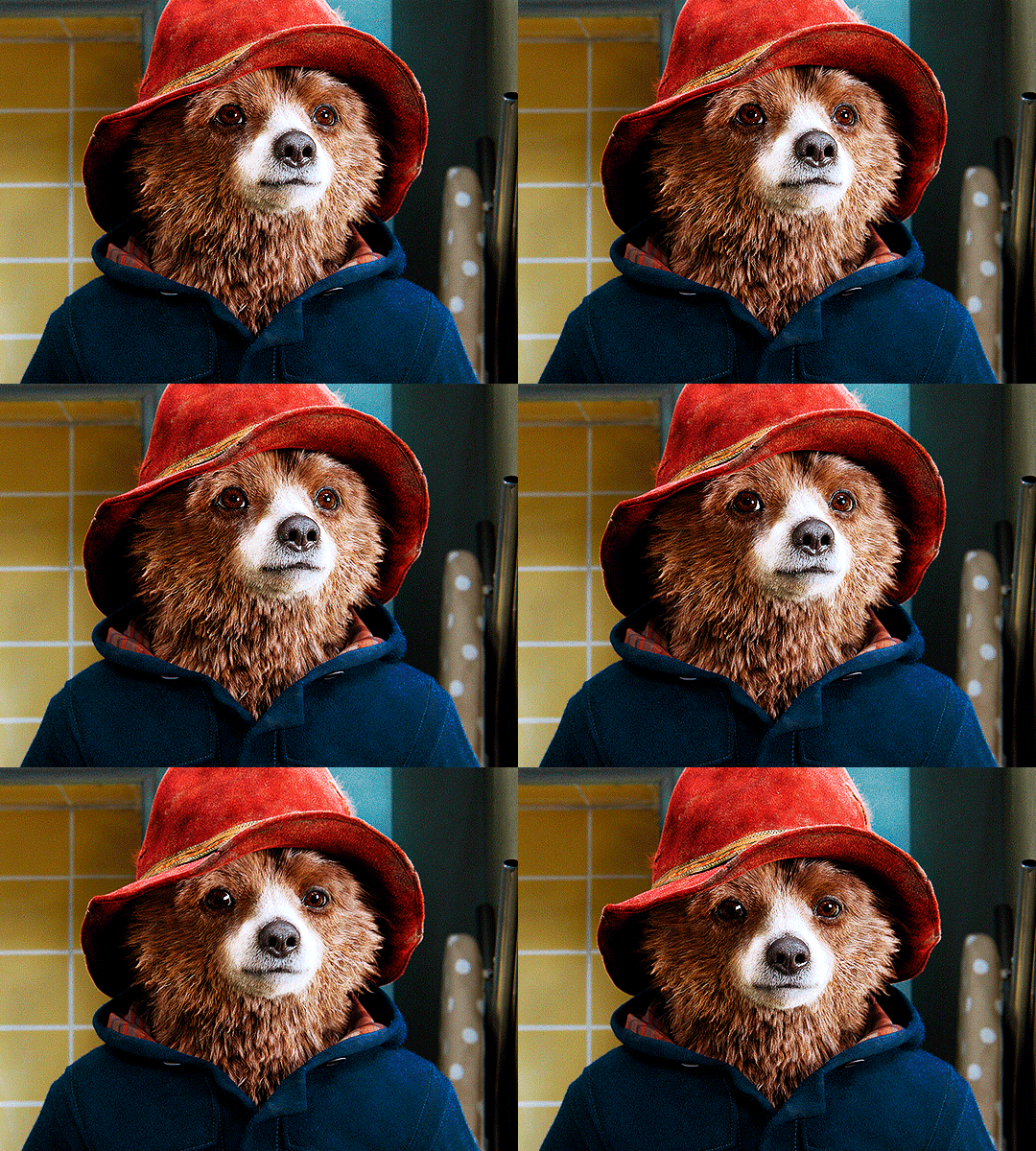
for the reds, i added even more red in them by moving the first slider to the right, making the color more vibrant. for his hat to have a more warm tint, i added yellow to the reds (third slider, moving it to the right). finally, to make the reds stronger, i moved the last slider to the right (more black).
for the yellows, i made them brighter by adding white to them, thus making the tile wall and Paddington more bright as well.
for the cyans and the blues, i just added the maximum (+100) of black that i could.
i wanted for Paddington's nose to be brighter, so i added more white to the whites.
lastly, i added depth to the blacks by increasing their own blackness.
you should always play with the Selective Colors sliders for a bit, before deciding what you want or need. with time, you will automatically know what to change to correct the color grading. it all takes practice!
HUE/SATURATION
i don’t know if you noticed, but there are some green spots on the blue wall behind Paddington. to correct that, i added a Hue/Saturation adjustment layer (layer > new adjustment layer > hue/saturation) and made the saturation of the greens 0%, making that unwanted green disappear from the background.

while the green spots on the wall are specific for this gif, i use hue/saturation a lot to tweak, well, hue and saturation. sometimes someone’s skin is too yellow, i made it redder by tweaking the reds and the yellows, or vice-versa. the hue bar follows the rainbow bar, so the maximum settings (+100 and -100) give the selected color to change its hue to something more red or pink (the rainbow extremities). changing hue can give pretty whacky results, like turning someone’s skin tone to green, so you will need to play with it to get the hang of it. you can also tweak the opacity of your hue/saturation layer to further improve your gif’s coloring. i didn’t do it in this case, the opacity is still 100%. the reds and the blues had their saturation increased to make them pop just a bit more, without affecting the other colors.
COLOR BALANCE
the highlights of the gif still had a green tint to it due to the automatic correction of the Curves layer, so i used Color Balance. this is how it works: instead of giving specific colors some tints, you can give them to the shadows, highlights, and mid-tones. if your shadows are too blue, you counterbalance them with the opposite color, yellow. same thing with the cyan-red and magenta-green pairings. in my case, i added a bit of magenta.


B&W GRADIENT MAP
now, if this gif was a dish, it’s time for the salt and pepper. i always add a Gradient Map (layer > new adjustment layer > gradient map) (black to white gradient) with the Soft Light blending mode, thus giving my shadows more depth without messing with the mid-tones and highlights. it also doesn’t “deep fry” (you know those memes?) the gif too much by adding even more contrast. usually, the opacity of the layer is between 30% to 70%, it all depends on the gif. it always does wonders, though!
COLOR FILTER
finally, i like to add Color Filters (layer > new adjustment layer > color filter) to my gifs. it’s very handy when giving different scenes for the same minimalistic set because it makes them kind of match despite having completely different colors. in this gif’s case, i added a “deep blue” filter, opacity 50% density 25. you can change the density and the opacity of the layer for further editing, again, it all depends on the gif.


VIBRANCE
if i feel like it, i add a vibrance layer (layer > new adjustment layer > vibrance) to make the colors pop. this can ruin your coloring sometimes, especially when regarding skin color, so be careful. i didn't do it in this gif because i felt i didn't need it.
TA-DA! 🥳
AN OTHER EXAMPLE
the color grading of the original scene it’s pretty good as it is, to be honest. let’s see a worse scenario, a VERY yellow one:
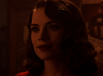
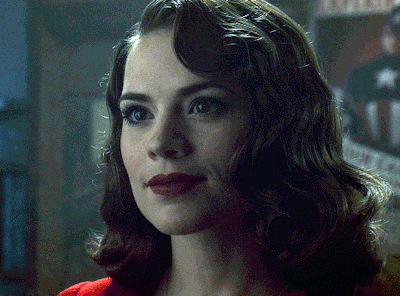
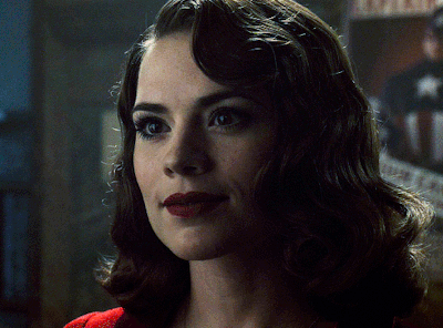
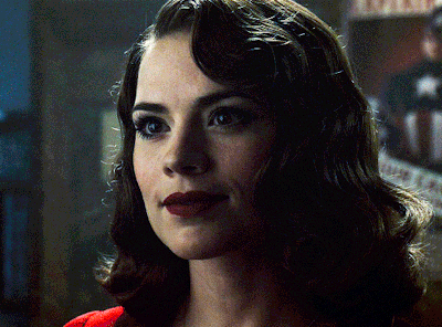
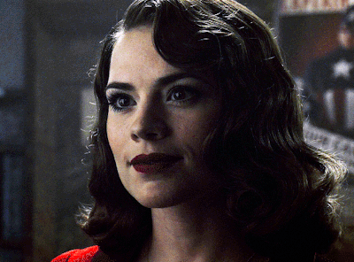
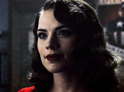
no channel mixer this time because the automatic curves option dealt with the yellowness, but you can see it made the gif too green. i needed to correct that with the following adjustment layers:
curves (automatic option) (gif 2) >> same curves layer (tweaks) (gif 3) >> brightness & contrast (gif 4) >> hue/saturation (tweaked cyan+blue+green) >> selective color >> color balance (gif 5) >> b&w gradient map >> (sepia) filter >> vibrance (gif 6)
i added a hue/saturation layer to remove the blues & greens before my selective color layer because i thought that was more urgent than tweaking the tint of all colors. color balance (gif 4) was the real hero here, though, by removing the green tint. the selective color layer was meant to make the red pop more than anything else, because the rest looked pretty good, especially her skin tone (despite the green tint). you can notice that tweaking the curves layer (small gif 3) also helped A LOT with the green problem.
tl;dr 😵💫😵💫😵💫
here's a list of my go-to's while coloring and lightning gifs. it's not a rule, just a guide. there are gifs in which i don't use all these adjustment layers, or use them in a different order. it all depends!
1. curves (automatic option + tweaks) 2. brightness & contrast 3. channel mixer 4. selective color 5. hue/saturation 6. color balance 7. b&w gradient map 8. color filter 9. vibrance
i'll suggest that you study each adjustment layer listed for more info, either with other Tumblr tutorials or YouTube ones. the YouTube ones focus on images, but you can translate what they teach to gif making very easily. you can ask me to further explain any adjustment layer, too! i was brief to keep this short (which i kinda failed lol).
feel free to ask me for clarification or something else about gifmaking wise, i always like to help. ❤️
#*#*tutorials#gifmaker tag#resources#resource: tutorials#ps help#uservivaldi#tuserjen#userrin#userelio#useralien#userzaynab#userchibi#userbuckleys#usertj#userbess#tuserlucie#useraljoscha#userdavid#usershreyu#usernolan#userhallie#userisaiah#tusergio#tusergeo#userjesslynn
673 notes
·
View notes
Text
GIFMAKING TUTORIAL: PHOTOPEA (for Windows)
Screencapping
Gif Width/Size Limit/Ezgif
Loading Frames
Cropping and Resizing
Rasterize/Make Frames
Sharpening
Coloring (not detailed. Links to other tutorials included)
Exporting
Obligatory Mentions: @photopeablr ; @miwtual ; @benoitblanc ; @ashleysolsen Definitely check out these blogs for tips, tutorials and resources, they're a gold mine. Finally I recommend browsing the PHOTOPEA TUTORIAL / PHOTOPEA TUTORIAL GIF tags. DISCLAIMER: English is not my first language and I'm not an expert on what I'm going to discuss, so if anything's unclear feel free to drop another ask.
1. SCREENCAPPING -> PotPlayer (the one I use) or MVP or KMPlayer
INSTALL PotPlayer (tutorial)
Play your movie/episode and press Ctrl + G. The Consecutive Image Capturer window will pop up. Click Start to capture consecutive frames, Stop when you got what you needed.
Where it says "Image Type -> Format" I recommend picking PNG, for higher quality screencaps.
To access the folder where the screencaps are stored, type %appdata% in windows search, open the PotPlayerMini64 folder (or 32, depending on your system) and then the Capture folder. That's where you'll find your screencaps.
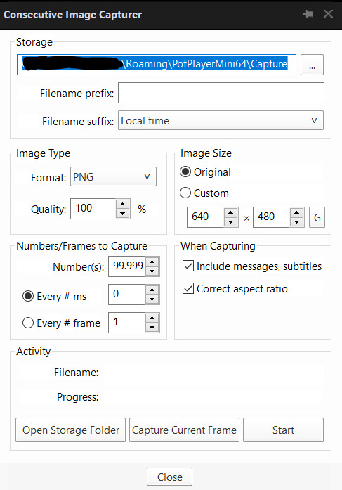
Admittedly MVP is a lot faster but I prefer Potplayer because it generates (at least in my case) higher quality screencaps. MVP kind of alters the hue and it made it harder for me to color my gifs. Still, if you're interested in how to use it, I recommend this tutorial.
As for KMPlayer, every tutorial out there is outdated and I couldn't figure out the new version of the software.
2. GIF WIDTH/HEIGHT, SIZE LIMIT, EZGIF OPTMIZER
At this point you should already know how big your gifs are going to be. Remember the ideal gif width(s) on tumblr are 540 px / 268 px / 177 px. These specific numbers take into account the 4 px space between the gifs. No restrictions on height. Here are some examples:
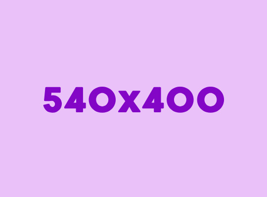


You can play around with the height (177x400, 177x540, 268x200, 268x268, 268x350, 268x400, 540x440, 540x500, 540x540 etc) but if you go over the 10 MB limit you'll either have to make your gifs smaller/delete some frames.
OR you can go on ezgif and optimize your gif, which is usually what I do. The quality might suffer a little, but I'm not really (that) obsessed with how crispy my gifs look, or I'd download photoshop.

Depending on the gif size, you can decrease the compression level. I've never had to go over 35. It's better to start at 5 (minimum) and then go from there until you reach your desired ( <10mb) gif size. Now that I think about it I should have included this passage at the end of the tutorial, I guess I'll just mention it again.
3. LOAD YOUR FRAMES
File -> Open... -> Pick one of your screencaps. The first one, the last one, a random one. Doesn't matter. That's your Background.
File -> Open & Place -> Select all the frames (including the one you already loaded in the previous passage) you need for your gif and load them.
(I recommend creating a specific folder for the screencaps of each gif you're going to make.)
WARNING: When you Place your screencaps make sure the Crop tool is NOT selected, especially if you've already used it and the width/height values have been entered. It will mess things up - I don't know why, could be a bug.
You can either select them all with Ctrl+A or with the method I explained in the ask: "when you want to select more than one frame or all frames at once select the first one, then scroll to the bottom and, while pressing Shift, select the last one. this way ALL your frames will be selected".
WARNING: Depending on how fast your computer is / on your RAM, this process may take a while. My old computer was old and slow af, while my new one can load even a 100 frames relatively fast, all things considered. Even so, I recommend ALWAYS saving your work before loading new frames for a new gif, because photopea might crash unexpectedly. Just save your work as often as you can, even while coloring or before exporting. Trust me, I speak from experience.
Now you can go ahead and delete the Background at the bottom, you won't need it anymore.
4. CROPPING AND RESIZING
Right now your screencaps are still smart objects. Before rasterizing and converting to frames, you need to crop your gif.
Technically you can rasterize/convert to frames and then crop, BUT if you do it in that order photopea will automatically delete the cropped pixels, even if you don't select the "Delete Cropped Pixels" Option. Might be another bug, unclear. Basically, if you crop your gif and then realize you cropped a little too much to the left or the right, you can go ahead, select the Move Tool (shortcut: V) and, after selecting ALL YOUR FRAMES, move them around on your canvas until you are satisfied. You won't be able to do this if you rasterize first and then crop, the excess pixels will be deleted. I don't know why, I found out by accident lol.
CROPPING
(Cropped pixels: the gray/opaque area outside of the selected area. That area disappears once you press enter and crop, but the pixels are retained, so you can move the frames around and reposition them as you like. In this case I could move the frames to the left and include Silver's figure [curly guy in the foreground] in the crop)
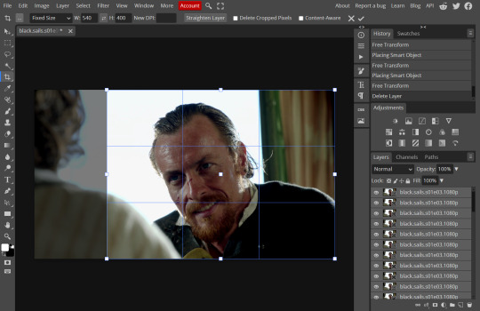
After deleting the Background, you will need to select all your frames (using the Shift key), use the C shortcut on your keyboard to choose the Crop tool. Or you can click on it, whatever's more convenient. Once you do that, a dropdown menu is going to appear. You need to select the "FIXED SIZE" option, as shown in the following screencap.
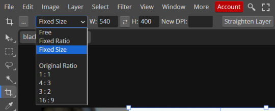
Once you do that, you can type in your desired width and height. Do not immediately press enter.

Your work area should now look like this. Now you can click on one of the white squares and enlarge the selected area until the edges are lined up. You can then move it around until it covers the area you wish to gif.
WARNING: to move the big rectangle around, you're gonna have to click on a random point of the work area, PREFERABLY not to close to the rectangle itself, or you might accidentally rotate it.
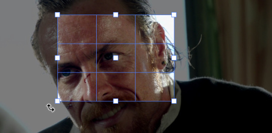
See? When your cursor is close to the selected area it turns into this rotating tool. Move it away until it reverts to your usual cursor, then you can start moving the rectangle. Press Enter when you're satisfied with the area you selected.
RESIZE
This isn't always necessary (pretty much never in my case) - and it's a passage I often forget myself - but it's mentioned in most of the tutorials I came across over the years, so I'd be remiss if I didn't include it in mine. After cropping, you'll want to resize your image.
IMAGE -> Image Size...

This window will pop up. Now, should the values in the Width and Height space be anything other than 540 and 400 (or the values you entered yourself, whatever they might be) you need to correct that. They've always been correct in my case, but again. Had to mention it.
5. RASTERIZE & MAKE FRAMES
Now that your screencaps are cropped, you can go ahead and convert them.
LAYER -> Rasterize (if you skip this passage you won't be able to Sharpen (or use any filter) on your frames at once. You'll have to Sharpen your frames one by one.
Photopea doesn't feature a timeline and it's not a video editor, which makes this passage crucial. When you select all your smart objects and try to apply a filter, the filter will only by applied to ONE frame. Once you rasterize your smart objects and make them into frames, you can select them all and sharpen them at once. Unfortunately this also means that you won't be able to - I don't know how to explain this properly so bear with me - use all smart filters/use them in the same way a photoshop user can. For example, you can sharpen / remove noise / add noise / unsharp mask... but you can't act on those filters in the same way a photoshop user can. When you work on smart objects you can change the blend mode - which is critical if you decide to use a filter like High Pass. If you simply apply a high pass filter on photopea you won't be able to change the blend mode and your gif will look like this (following screencaps). Or rather, you will be able to change the blend mode by clicking on the little wheel next to "High pass" (circled in green in the 2nd screencap), but you'll have to apply the filter to each frame manually, one by one.

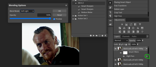
Then you can rasterize/make into frames, but it's extremely time consuming. I did it once or twice when I first started making gifs and it got old pretty soon haha.
Layer -> Animation -> Make frames. This passage will add "_a_" at the beginning of all your frames and it's what allows you to make a (moving) gif. As I said in the ask, if you skip this passage your gif will not move.
6. SHARPENING
Some people prefer to color first and sharpen later, but I found that sharpening filters (more or less) dramatically alter the aspect of your gif and already brighten it a bit (depending on your settings) and you may end up with an excessively bright gif.
Now, sharpening settings are not necessarily set in stone. The most popular ones are 500/0.4 + 10/10, which I use sometimes. But you may also need to take into account the quality of the files you're working with + the specific tv show you're giffing. I've been using different settings for pretty much every tv show I gif, especially in the last couple months. Some examples:

followed by
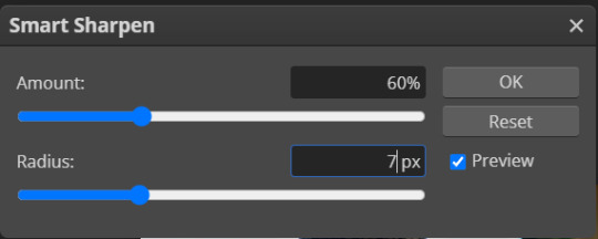
OR
AMOUNT: 500% RADIUS 0.3px followed by AMOUNT: 20% (or 10%) RADIUS 10px
You'll just need to experiment and see what works best for your gifs.
Some gifmakers use the UNSHARP MASK filter as well (I think it's pretty popular among photopea users?) but it makes my gifs look extra grainy, makes the borders look super bright and it clashes with my coloring method(s), so I use it rarely and with very moderate settings. Something like this:

Again, depends on the gif and on what you like. I've seen it used with great results by other gifmakers!
REDUCE NOISE
Sometimes - and this is especially the case for dark scenes - your gif may look excessively grainy, depending on how bright you want to make it. Reducing noise can help. Keep it mind, it can also make it worse and mess up the quality. BUT it also reduces the size of your gif. Obviously, the higher the settings, the more quality will suffer.
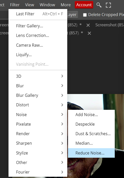

These are my standard settings (either 2/70% or 2/80%). It's almost imperceptible, but it helps with some of the trickier scenes.
ADDING NOISE
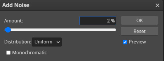
Adding noise (1% or 2% max) can sometimes help with quality (or make it worse, just like reduce noise) but it will make your gif so so so much bigger, and occasionally damage the frames, which means you won't be able to load your gif on tumblr, so I rarely use it.
You'll also want to create ACTIONS which will allow you to sharpen your gifs much faster.
HOW TO CREATE AN ACTION ON PHOTOPEA
The Action Button (shaped like a Play button as you can see in the following screencaps) may not be there if you're using photopea for the first time. If that's the case click on the magnifiying glass next to "Account" (in red) and type "actions". Press Enter and the button should immediately show up.
Once you do that, click on the Folder (circled in yellow)

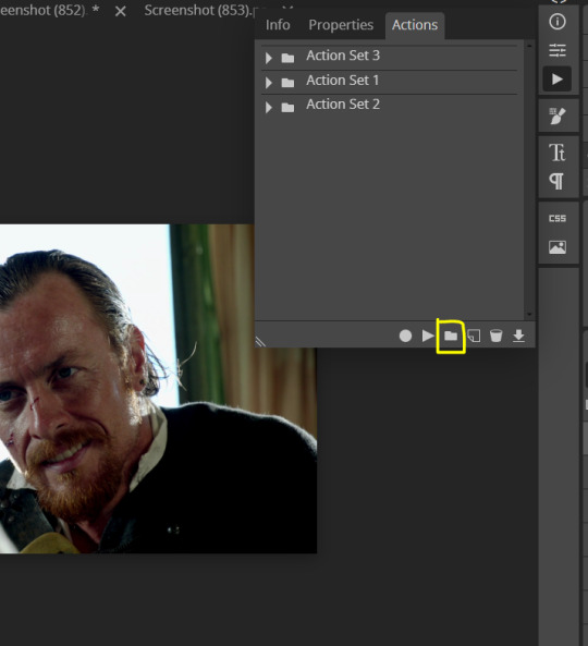
and rename it however you like.

now click on New Action (circled in red). now you can press the Recording button (circled in green)
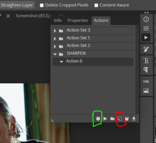
Now
FILTERS -> Smart Sharpen
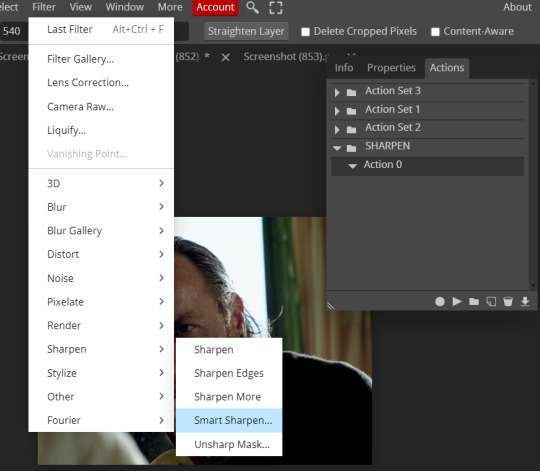
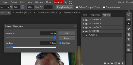
and you can enter your values. Then you repeat this passage (WITHOUT pressing rec, WITHOUT pressing new action or anything else, you just open the smart shapen window again) and, if you want, you can sharpen your gif some more (10%, 10px, or anything you want.)
Maybe, before creating an action, experiment with the settings first and see what works best.
When you're satisfied, you can PRESS STOP (it's the rec button, which is now a square) and you can DOWNLOAD your action (downwards facing arrow, the last button next to the bin. Sorry, forgot to circle it) .

You need to download your action and then upload it on your photopea. When you do, a window will pop up and photopea will ask you whether you wish to load the action every time you open the program. You choose "Okay" and the action will be loaded in the storage.
When you want to sharpen your gif, you select all your frames, then you click on the Play button, and select the Action, NOT the folder, or it won't work.

Actions can also be created to more rapidly crop and convert your frames, but it doesn't always work on photopea (for me at least). The process is exactly the same, except once you start recording you 1) crop your gif as explained in step 4, 2) convert into frames. Then you stop the recording and download the action and upload it. This won't work for the Rasterize step by the way. Just the Animation -> Make Frame step.
7. COLORING
Now you can color your gif. I won't include a coloring tutorial simply because I use a different method for every tv show I gif for. You normally want to begin with a brightness or a curve layer, but sometimes I start with a Channel Mixer layer to immediately get rid of yellow/green filters (there's a tutorial for this particular tool which you will find in the list I mention in the link below)
[Plus I'm not really an authority on this matter as my method is generally... fuck around and find out. Two years of coloring and I still have no idea what I'm doing. 70% of the time.]
Simple Gif Coloring for Beginners -> very detailed + it includes a pretty handy list of tutorials at the bottom.
8. EXPORTING
Now you can export your gif. Some gifmakers export their (sharpened) gifs BEFORE coloring and then load the gifs on photopea to color them. I'm not sure it makes any difference.
FILE -> EXPORT AS -> GIF
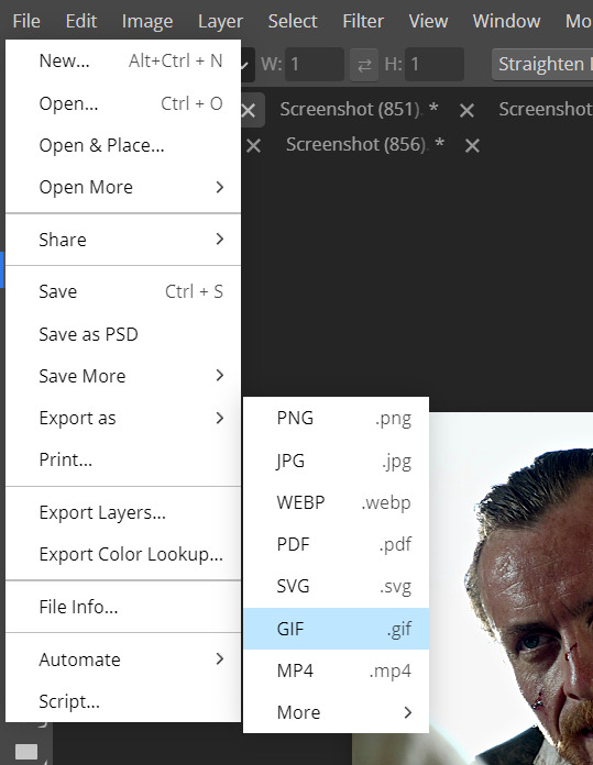
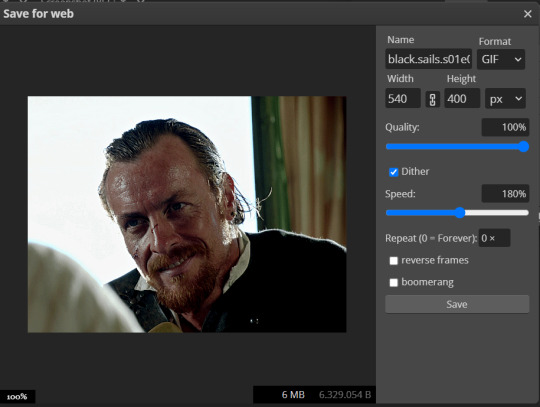
(not colored, just sharpened)
As you can see, unlike photoshop the exporting settings are pretty thread bare. The only option available is dither - it sometimes help with color banding - which, and I'm quoting from google for maximum clarity:
"refers to the method of simulating colors not available in the color display system of your computer. A higher dithering percentage creates the appearance of more colors and more detail in an image, but can also increase the file size."
SPEED
When you export your gif, it will play at a very decreased speed (100%). I usually set it at 180/190%, but as for every other tool, you might want to play around a little bit.
GIF SIZE/EZGIF OPTIMIZER (See Step 2)
And that's it.
P.S.: worth repeating
Save your work as often as you can, even while coloring or before exporting.
#photopea#my inbox is open if you have any questions <3#image heavy under the cut#photopeablr#tutorials#gif tutorial#allresources#photopea tutorial#completeresources#gifmaking
417 notes
·
View notes
Text
Mike was saying "I love you" to Will
Most people see Mike's monologue and think of it as "proof" that he and El are an endgame couple, but it's actually one of the strongest hints of a Byler conclusion.
Because Mike was saying "I love you" to Will.
Sounds crazy? Of course! He was speaking directly to El, after all. What the hell am I talking about?

Some have focused on contradictions and other issues with what Mike says, including listing El's superpowers instead of the full person she wants to be loved for being. Plus he had to do it (and was pushed by Will), or else El and their friends in Hawkins might have died. It does seem like El sensed something off in what he said, which would explain why she hardly talked to him afterward. But I actually disagree about Mike's "I love you" being a total lie. In the official script it's written that it had a positive effect on El (although the way it was ultimately shot and edited made it more ambiguous). (I got this screencap from a TikTok video):
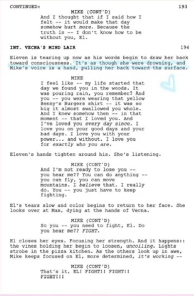
And so, in the van, Will DID make Mike love El. Mike MIGHT have wondered whether Will was talking about himself too, but one thing he was convinced of was that that El loved him because "he's the heart." Feeling like she loved him for who he was made him love her. I think it's more accurate to say that, while Mike's monologue may have had issues, he DID feel something genuine... BUT the logic of events leads more toward a BYLER conclusion than away from one.
The problem for Mike and El is that Mike was saying "I love you" to the idea of El that WILL put in his head:
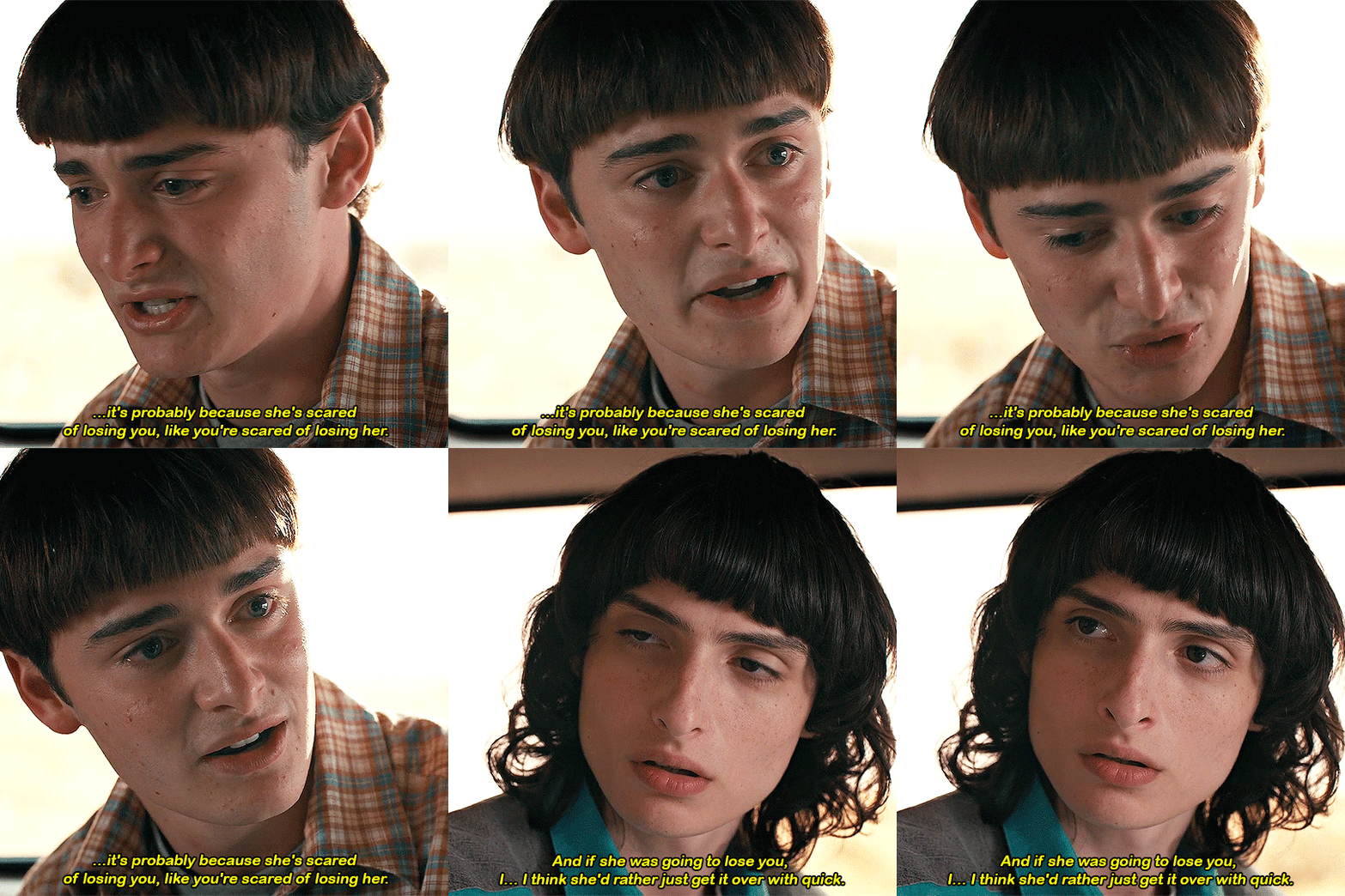
Will said that El felt like a mistake, and that Mike made her feel like she was better for being different. She was terrified of losing him and so that's why she pushed him away.
So Mike came out of that conversation with new feelings for El: he thought that SHE needed HIM to love her, not because of "dumb luck," but because of his unique qualities. Who HE is helps her be a superhero.
But El's journey in Season 4 was to LEAVE Mike to "be a superhero." When she left a note for Mike, she tellingly signed it "From El." When she realized he couldn't say he loved her, she chose to let go of their romantic relationship. Her journey in Season 4 was about finding who she was independently from others in her life (most importantly her "papa" Dr. Brenner). El went through her own journey that REQUIRED separating from Mike.

By the time they reunite, she has grown. Instead of Mike coming up with the plan (like so many times before), EL came up with the piggyback plan. While she was piggybacking, Mike said "I love you" -- but having her self-image rely on how Mike sees her was something she was moving away from.
She had felt like a monster. What liberated her from feeling that was NOT Mike and not an elusive "normal life" (with a relationship) -- let alone something as token and symbolic as saying "I love you." She had to realize this on her own:

There were clues in Mike's monologue for her to pick up on that he wasn't fully telling the truth, first and foremost him saying that he "knew, in that moment, that I loved you." (He couldn't have, when he was openly scheming in s1 to get her sent away, possibly to a mental hospital, loud enough for her to hear.)
But Mike DID love El when he said "I love you." Mike saw someone who desperately needed him, someone whom MIKE was a hero to and not just the other away around.
That person he was thinking of, of course, was WILL.
It wasn't like it was news to Mike that El needed his love: El confronted him earlier in the season for not saying he loved her. We all saw that El's heartbreak didn't convince Mike that he loved El.
Ironically, it was WILL'S heartbreak, HIS emotions, and HIS words that did. And Mike felt something real this time, because it came from WILL.
Will's words affected Mike deeply. Deep down, Mike wants to be someone's hero. He's the leader; he's "the heart." When dealing with a superhero like El, he can admire and love her, sure... but does it make MIKE feel loved for who HE is? Does a romantic relationship with El COMPLETE him? Mike doesn't want to be a discount Lois Lane. He wants be loved because who HE is makes him THEIR hero, too.
Mike has always been bullied, misunderstood, and angry. He rambled just before Will's speech about being "some random nerd" and feeling like he didn't deserve El. He felt inadequate, and this affected him ("leader Mike" recedes when he's in a relationship with El, and comes forward when someone -- usually Will -- needs him). Will's point "You make them feel better because they're different" doesn't just describe El + Will; this is what Mike is looking for, too.
Being "some random nerd" is part of why Will loves him so much. Will's painting was the perfect gift; Will knows and understands his best friend better than anyone. The D&D theme was a tribute to Mike the nerd -- he sees everything he is, the "good" and the "bad" -- AND he sees the hero and the leader. WILL's love for WHO MIKE IS made him feel like he's a good person.

(Here's an angelwithnightmares video that shows this about Mike exactly)
Mike's journey in s4 was him rediscovering that he is a hero. And this required separating from El and hearing this from Will. Will said that he's the leader of the group: "You keep the party together." And earlier in the season he reminded Mike "you guys saved me" (with a proud "I did, didn't I" reaction from Mike that was super cute lol).
Will's love gave Mike the strength to be a hero again. Mike pretty much used Will's words in his monologue to El. Two scenes at the end of Season 4 foreshadowed "leader Mike" coming back; his speech to El, and his "We will" shoulder grab with Will. Whatever issues there were in his monologue, this was THE callback to "leader Mike" of s1 and s2. He didn't help El beat Vecna, but he helped them survive. Mike spoke of his genuine platonic love for El, while thinking it was romantic love. And it was WILL's romantic love that helped him be this hero, to say "I love you" to the person he thought made him feel that way, who as it turns out was WILL.
So we'll have a final season where there is this hugest of loose ends when it comes to Byler: Mike will somehow realize that Will in the van was describing himself and not El. Mike will realize that the first time he felt romantic love, was because of Will, and that Will more than anyone helps him be the hero he wants to be. (It's the perfect formula, writing-wise, to make a closeted boy confused about his romantic feelings!)
AND Mike will learn that Will sacrificed his own happiness for him and El. How does that NOT lead to Mike loving Will even more than he already does?
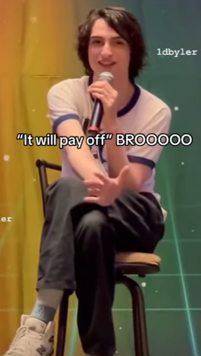
Finn Wolfhard himself said about the van scene:
How is he this clueless right now? What with the Will scene... I remember asking the Duffers, "Why would he not know all this?" And they were like, "Don't worry, kid, it'll pay off in the end."
I think it will.
-teambyler
442 notes
·
View notes
Text

with cc by @ice-creamforbreakfast and @surely-sims!

everyone, i apologise for the quality of these pictures. truly atrocious. the moschino stuff pack is fired.
LILAC: So this is our first fashion feature where we spotlight a cc creator (or two). Hopefully it won’t be our last, but we know what a flake the Watcher is.
ARAMINTA: She has good intentions.
LILAC: Yeah, and we all know what the road to that Dine Out pack is paved with. Anyway, I don’t think we can entirely blame her for the screencaps this time. Dodo is maxed out on photography, Moschino pack, and this is the best you can do?


ARAMINTA: Quite. I can… understand photographs regularly being ruined by the flash when one is first acquiring the skill. At Level 5, however, the Watcher shouldn’t need to delete over half the captures from her screenshots folder.
LILAC: Plum right she shouldn’t. Anyway. Minta, what do we think of Poppy?
ARAMINTA: Oh I love it - and her! How about you?


LILAC: Well coming from @ice-creamforbreakfast and @surely-sims, I was expecting quality. What I was not expecting was just how versatile this set would be, especially considering that it’s based on a 60’s spy aesthetic. I knew that you’d find things you like but you’re the Pattie Boyd to my Anita Pallenberg. You’re Kensington Gardens while I’m more Haight-Ashbury. But these Daffodil glasses and this turtleneck from the Daphne set? Sweet - I mean, groovy.
ARAMINTA: Well-made clothes stand the test of time, regardless of era.
LILAC: Yeah? And with these two, you know that you’re guaranteed a great product. The Watcher’s downloaded like every single item of theirs to her cc folder.
ARAMINTA: Speaking of versatility, how did you find the cut?


LILAC: Perfect. As a curvier girl, I know that I always look amazing. But the problem is that CAS doesn’t always look amazing on me. This though? Actually does the deity that is Indya Drake justice - and that woman has curves like an Indy 500. The stretch test? These pass.
ARAMINTA: EA, take note. Your favourite item of the set?
LILAC: The Wolfsbane dress. In the black and white palette. And you?
ARAMINTA: The Larkspur dress. Absolutely timeless.
LILAC: And Dodo? I bet I know what yours is.


DODO: The Holly set. But I think I’d like it better on the floor.
ARAMINTA: Really, you should put it in the hamper - oh, Dodo!
LILAC: Well if that isn’t a ringing endorsement, then I don’t know what is. You may get your wish later, Dodo, but for now we’re taking these to the clubs.
DODO: Yeah? Have fun.
ARAMINTA: Oh, do come too!


LILAC: You won’t look out of place. In fact, Rosamund and I put together the perfect ‘fit for your new ‘dirty smelly hippy’ ethos.
DODO: Fantastic.
DODO: And I’m not smelly!
LILAC: Only because you have someone to help you with the soap.


DODO: Yeah, about that. I’ve kind of forgotten and need a reminder?
LILAC: Later, Tarzan. Jane is coming out with me, and so are you.


poppy was last sighted here & here. catch her if you can! dodo's clothes by @ice-creamforbreakfast
indya by the ever talented @cinamun. dodo is loaned by @akitasimblr (likely much to his regret)
#simply lilac#simply lilac fashion feature#sims 4 cc#other people's cool stuff#my sims#lilac moon#araminta hearst-irsay#other people's sims#dodo harper#yeah the moschino pack came in clutch with the announcement shot of lilac and minta#but now it's in my bad books#also can confirm that free love was autonomously practiced by 'tarzan' and 'jane'#my eyes everyone...
96 notes
·
View notes
Text
GUYS I JUST FOUND OUT SOMETHING
I don't know if you already noticed it before, but I need to share some tears here otherwise I'm gonna drown in a new ocean, so take some tissues if you think you'll need them.
I discovered a thing while I was looking for screencaps to make a new blended edit about the last race in the first cars movie, and I looked on through the 4K pictures that are also wider than the original frame that is basically the one from the dvds (so 16:9)...
The moment I'm talking about is the one that comes right after the scene i made a gifset just the post before. I noticed this cute little thing: when Tex calls Lightning and he turns to talk to him, you couldn't basically see the other characters first in the 16:9, but now you can and LOOK
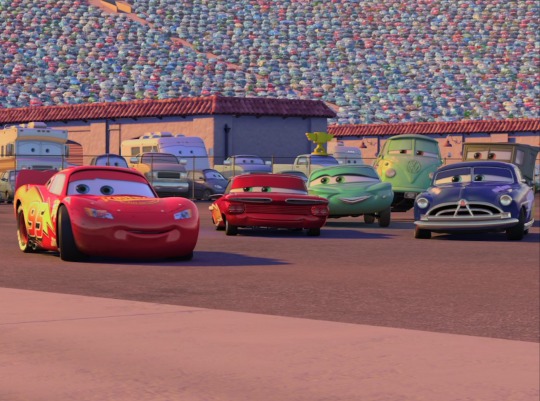
While Flo, Ramone and Fillmore look at Tex as well as Lightning, Doc doesn't give a damn and still looks at his boy with such a proud face I JUST CAN'T YOU GUYS HELP ME. It's barely a second of the movie but I'm literally melting over this.
I tried to made a gif but I couldn't find a better quality for the wider frame, sorry! Here it is

#ik im crazy but look how he just keeps his eyes on his kid#hes probably just thinking “I'm adopting you right now son deal with it”#and that makes me explode from pure joy your honor#lightning mcqueen#doc hudson#cars pixar#pixar#cars 2006#pixaredit
135 notes
·
View notes
Text
How I Make Gifs ~ For Anon ❤️
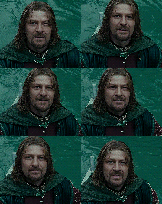

An anon asked me if I would ever consider doing a tutorial for how I make gifs! It's very flattering that you like my gifs enough to want to know exactly how I make them, so here is a little tutorial using my favourite character from my favourite movie ❤️
I might also make a separate tutorial for giffing dark scenes later 😌
Here's a download of my gif in PSD form if you'd like to get a better look at the settings I used.
Programs used: PotPlayer, Photoshop.
First, you need to get your screencaps. I would suggest using a high quality recording of whatever movie/TV show/video you want to make gifs of. My recording of Fellowship is in 1080p, and the quality looks incredible!
I use PotPlayer to get my screencaps. To do this, open the video file in the program and find the moment you want to gif. It's probably best to go back to just before that particular moment, and then press Ctrl + G. This will bring up the consecutive image capturer window. Below are the settings I use to get my screencaps:
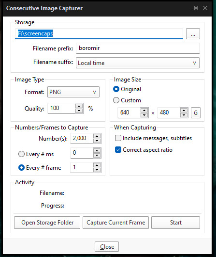
Then, press start and wait for your moment to be captured! Once you've got everything you need, press stop and navigate to the folder that you indicated under storage. Here you will find all of your screencaps! You probably ended up with way more than you need (I know I certainly did 😅). Now, delete all of the screencaps that you don't want in your gif.
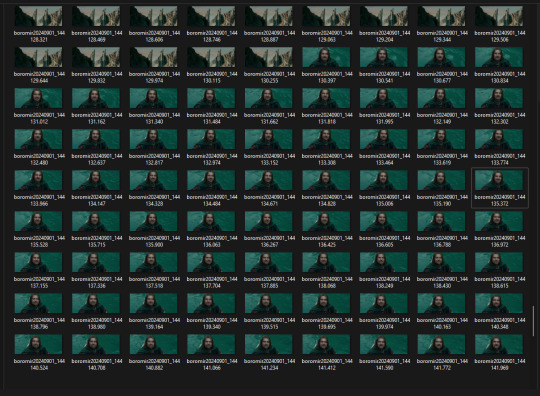
For the actual gif making, I use a cracked version of Photoshop. I don't exactly remember where I found it unfortunately, but I'm sure that there's people out there who might have some links handy if you look around! Once you've got PS open, navigate to File > Scripts > Load Files Into Stack... and click on it! That will open the Load Layers window.
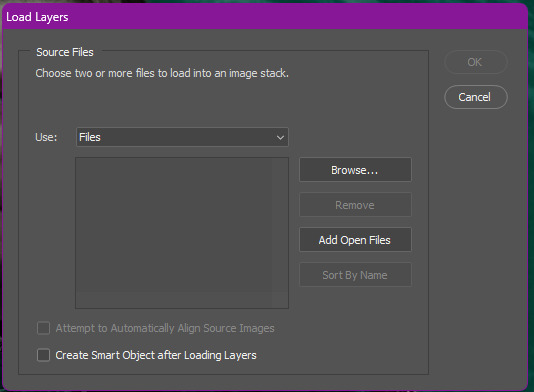
Now, change Use to Folder. Then, click browse and navigate to the folder that contains your screencaps. Click select folder, and after a few moments of loading your window should look more like this.
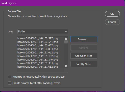
Then, press OK, and wait for your layers to load. Depending on how many caps you have, it could take longer. Once it's finished loading, you need to decide on your gif dimensions! For this, I decided on 268px x 225px. Once you've chosen your size, use the crop tool to get your gif to that size. Now, you should have a smaller image, like this:
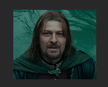
The next step I do is to use this Photoshop action by @maziekeen. They have a little tutorial on how to use this action there, so I'll just say that once you've loaded it into your program, use part 1 / load into stack. Press the play button, and then the OK button on the two windows that pop up. Now, your gif will be nice and sharpened, and you'll be able to see it move for the first time! Here's what mine currently looks like, without any other edits:

Now, it's time to start on colouring. Every gif (or scene, sometimes you can reuse the same colouring if you're giffing an entire scene) is different, so it will have different needs. However, I tend to always use the same layers in the same order for all of my gifs — it's just the settings that change. I think the colouring of this particular scene is lovely, so I don't want to change it drastically, I just want to enhance it.
First, I create a Curves layer. At this point, I also like to make a group to hold all of my adjustment layers. This makes it easier for you to switch your adjustment layers on and off if you want to compare with the original colouring!
Going back to your curves layer, pick the little white eyedropper tool in the Properties tab. You want to find and click on the whitest area in the gif and make it a bit brighter! I picked the white in one of Boromir's eyes.
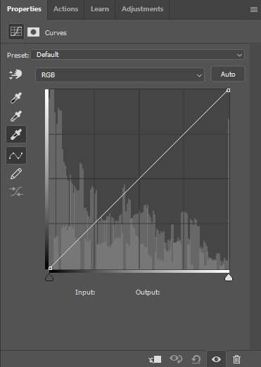
This is what my gif looks like now with the Curves layer:

Next, I use Levels. It's a very subtle change, but you can notice a slight darkening of the blacks in the image. Here's my settings for this layer:
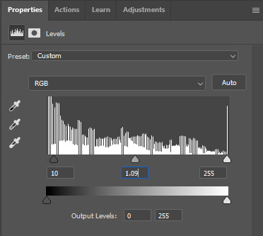
And here's the gif with this step applied. Like I said, it's a very subtle change:
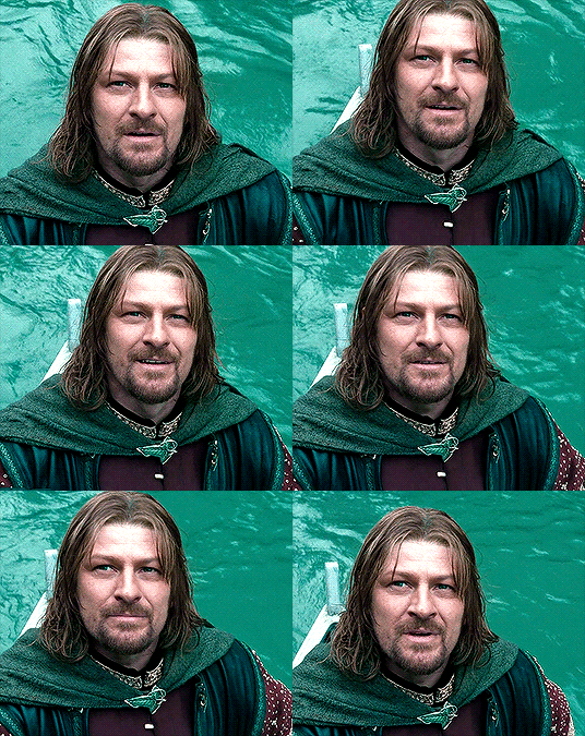
Up next is Brightness & Contrast. This layer is just a case of messing around with the settings until it looks right for you. You don't want to make it look too bright or too contrasted, though, because it will make the colouring look weird.
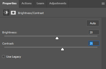
A bit more of a change this time! We're getting there:
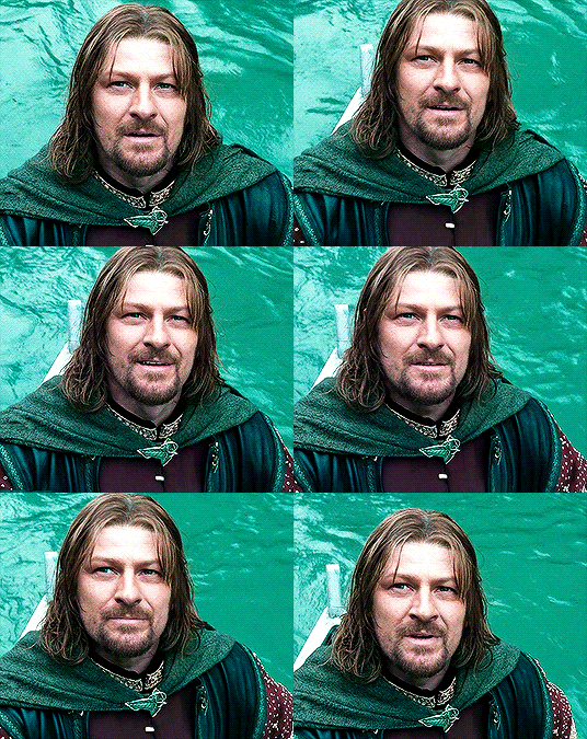
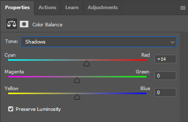
Next, I like to do Colour Balance. Sometimes I wait and do the Selective Colour layer first (it'll still be above Colour Balance though), but with this gif, I decided to do it first. I want Boromir in the foreground to contrast more with the watery background, so I upped the Red in the Midtones. I think Midtones is the most important part of Colour Balance, so the Highlights and Shadows are more minor adjustments here.
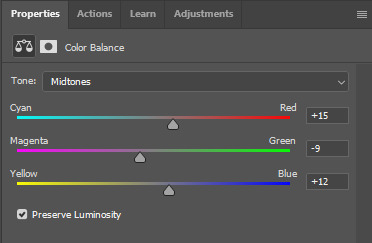
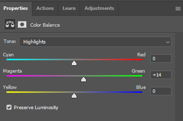
Here's the gif with the Colour Balance layer!
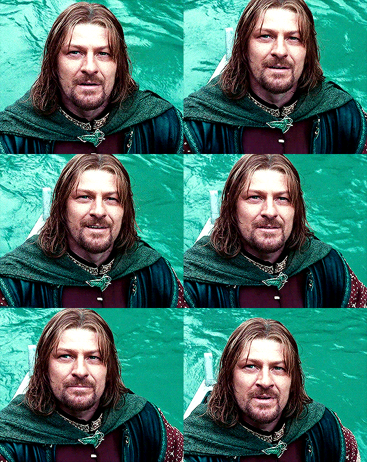
Now, we have Selective Colour. Like I said before, I sometimes like to do this layer and then go back to the Colour Balance to make minor adjustments. For this gif I mainly focused on slightly reducing the cyan in the reds and yellows to add a little more colour to Boromir's tunic and hair.
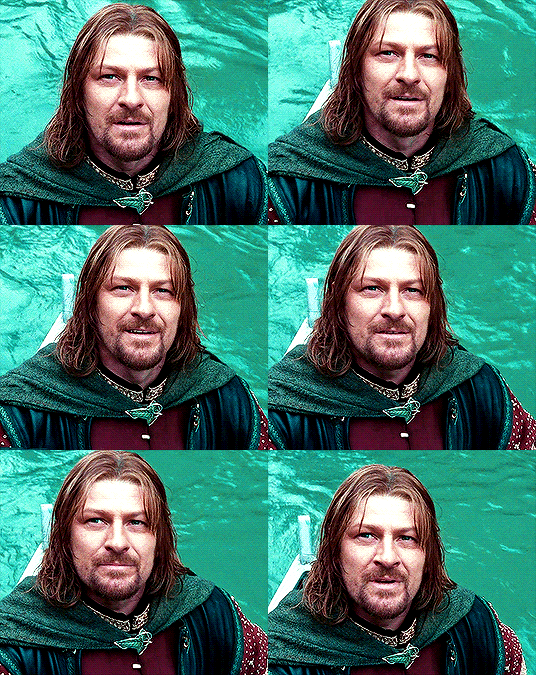
I'm a big fan of bright, vibrant gifs, so I like to use the Vibrance layer copiously.
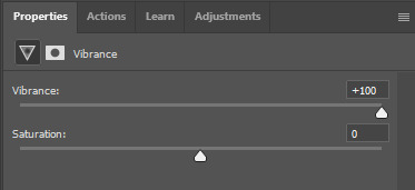
I upped the vibrance to max, but it's left Boromir's face looking a bit too red and his neck is a little pink, so I went back and did some minor adjustments to the Colour Balance and Selective Colour layers to fix that. Then, voila!
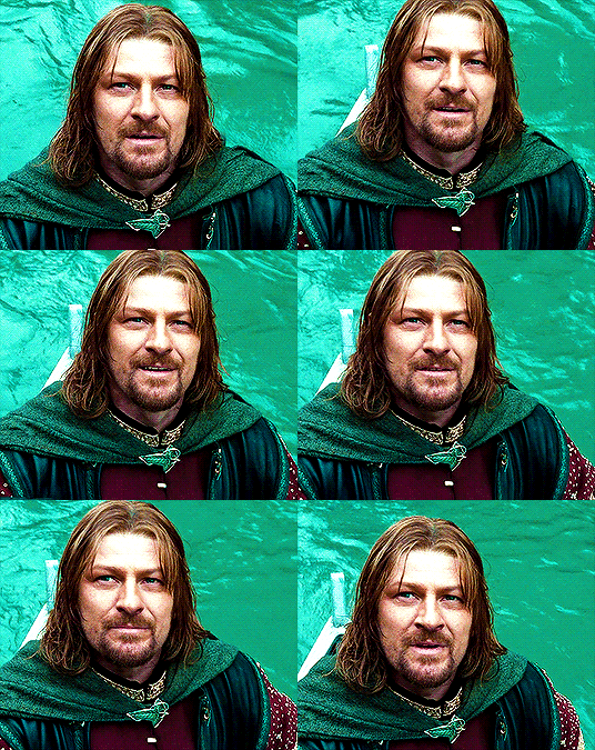
Now that we're done with colouring, go back to the beginning of the timeline at the bottom the screen. Then, go back to Actions and scroll down to the bottom, and look for the action called part 2 / finishing. Just like with the first action, press the Play button and it will work its magic!
Press Ctrl + Shift + Alt + C, and try playing your gif from there. Sometimes, the gif will be too fast and you'll need to slow it down, and you can't always tell until you play it in the 'Save for Web' window. I ended up slowing mine down from 0.05 to 0.07.
Once your gif is looking just right, press Ctrl + Shift + Alt + C again. These are the settings I use to save my gifs, and I think it makes them look really nice! Then click Save, and save your gif wherever you want.
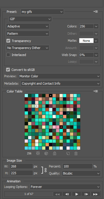
Now, once you've saved your gif, you can post it to Tumblr (if that's what you're wanting to do) or simply keep it to yourself! But I'm sure that others would love to see your creations :D
***
A little extra info - this gif doesn't have text because there's no dialogue, but these are the settings I use for gifs with text (the text size depends on the dimensions of the gif):

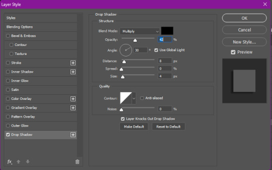
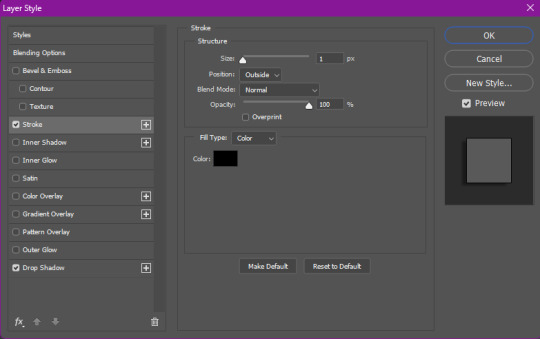
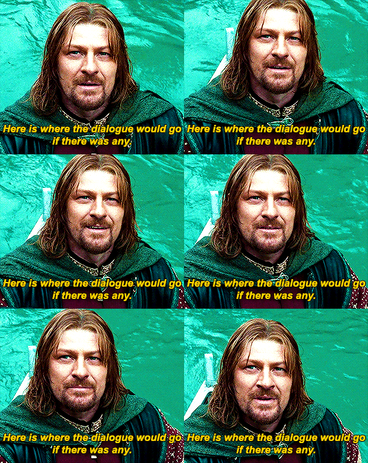
Sometimes I use white text, sometimes I use yellow. And if there's more than one person talking I use both!
I hope that this tutorial was helpful, and if you have any more questions, feel free to ask!
#gif making#gif making tutorial#gif tutorial#psd tutorial#gif coloring tutorial#gif colouring tutorial#mari speaks#mari’s stuff
39 notes
·
View notes
Text

some quick info: ↳ this is specifically for the screencapping method. i use mplayer osx extended to get my caps, but there are a few other programs you can use as well. i’ll specifically be going over mplayer here. ↳ i’m using ps 24.4.1 on a 2020 m1 macbook air
[tysm to @kyubinz for looking this over and adding some things ily]
☆ feel free to send me an ask/message with any questions you have! ☆
「 setup 」
1. finding videos
one big thing to remember is that the overall file size of your video will impact the quality of your gif. the larger, the better. i almost never use anything below 1080p, and try to use 2160p whenever i can. 4k video downloader is the program i use for downloading videos from youtube, it’s free to install and works great! because of how large some files can be, i always store any media on my hard drive. i highly recommend using one if you plan to keep lots of files on hand.
.mkv files are best, but .mp4 works fine as well (.mkv files are usually bigger aka better quality).
2. getting your screencaps
after downloading mplayer, go to the top bar and click file > open. open the video you’ll be screencapping.
you can either drag the little time indicator or using the arrow keys on your keyboard to move to the spot you want to capture. the > key can also be used to move forward frame by frame. to start capping, pause the video and press shift + cmnd (ctrl if you’re on windows) + s to take a screencap. i usually just hold it down until i’ve gotten all the screencaps i need.
by default, screencaps go right to desktop. you can set up a folder for them to go to automatically by going to settings > general and then selecting a spot in the menu under “interface”, but i just let them go to desktop and then sort them into individual folders so they’re easier for me to find while i’m giffing. in general, i try to stay under 80 frames so my gifs fit into tumblr’s 10mb image size limit.
3. importing screencaps into photoshop
to import your caps into ps, go to file > scripts > load files into stack. this window should open:

click browse, and navigate to the folder with your caps in it. select all of the caps you want to import, and then click open.
click ok to create a file with your caps, and then wait until it’s finished loading your caps into the layers tab. once they’re loaded in, this is what your screen should look like:

(if you aren’t seeing the timeline at the bottom of your screen, go up to the top bar and go to window > timeline)
click create frame animation, then go to the hamburger menu at the top right of the timeline and select make frames from layers. once your frames have loaded in, select the same menu again and click reverse frames. play through your gif to make sure everything looks good.
if you were to save your gif at the speed it’s set at now, it would be way too fast. to fix this, you have to set the frame delay. do this by selecting all your frames in the timeline using shift click, and then clicking (on any frame) where it says “0 sec”. select other from the menu that comes up, and you should get this popup:
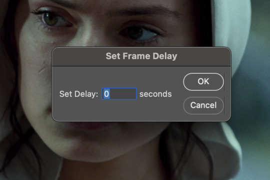
the general rule of thumb for gif frame delay is 0.05 seconds. there are some cases — certain animated movies or video games, for example — where other delays are best, but for the most part, 0.05 is what you want to use (0.05 can slightly slow gifs, and sometimes using 0.04 better matches the clip's original timing. this is really a "train your eyes" thing, and picking the best delay gets easier as you gif for longer). you can set this by typing the number into the text box and then hitting the ok button or enter on your keyboard.
at this point, i’d go ahead and save your file. you can go to file > save in the top bar, or just hit cmd/ctrl + s on your keyboard.
「 making your gif 」
1. sizing
after your frames are ready, the next thing is to size your gif. to crop your gif, press c on your keyboard to open the cropping tool. white borders will show up around your gif.
before doing anything, i would suggest making sure “delete cropped pixels” is unchecked. this will allow you to drag your gif around later if you want to reposition. you can find this option at the top of your screen. drag the borders on either side until you have the area you want selected. mine looks like this:
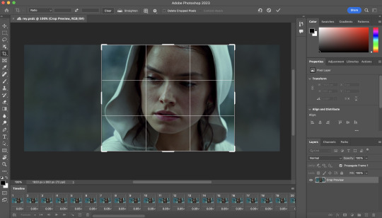
once you’re happy with your selection, hit enter on your keyboard to finalize it.
the tumblr image guidelines require gifs to be 540px across (here’s a post detailing this). to change your gif’s image size, go to image > image size in the top bar. you’ll get this popup:

instead of setting the width right to 540, i’ll be setting it to 544, and then trimming down the edges using canvas size. this makes the quality just a little better, and also prevents any weird borders being made around your gif on the off chance photoshop decides to add them. this isn’t necessary at all, you can absolutely size right to 540, but i just like doing this. if you choose to do this, open canvas size right after you set image size (image > canvas size in the top bar), and trim your width down to 540 and your height down a few pixels as well.
2. sharpening & other filters
sharpening is essential for good-quality gifs. the first step to this is converting our timeline from frame animation to a video timeline. select this little icon in the bottom left of your screen:
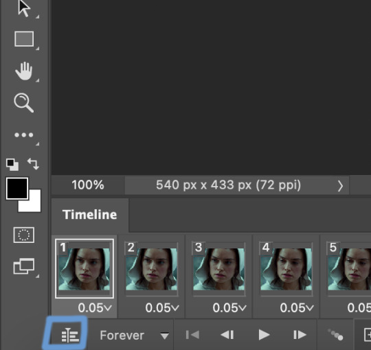
this is what your timeline will look like now:

you can use the little slider with mountains on either side to change the width of your frames in the timeline for easier access when editing. now that we’ve got all this set up, we can sharpen! i use this action pack to sharpen my gifs in addition to a few of my own settings (here is a video on how to install actions into photoshop). go to window > action in the top bar if you aren’t seeing the action tab.
i’ll be using the sharper action from the pack. to use an action, select it from the list and press the little play button at the bottom of the panel to apply it.
in addition to this, i usually also add unsharp mask at 50% amount with a 0.5px radius:


there are a few other filters than can be helpful when giffing:
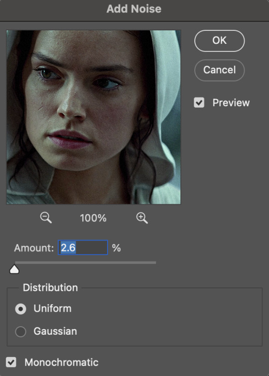
a. add/reduce noise noise (aka grain) can be added with “add noise”. go to filter > noise > add noise.
these are the settings i usually use, but the amount depends on the gif (i don't ever go over 3.5 for the most part):
(if you want a grain effect but moving noise doesn't work for the gif, you can also add a grain overlay and then mess with blending mode and layer opacity until it looks how you want)
reduce noise can be used to remove some of the pre-existing grain on a clip. go to filter > noise > reduce noise. here are my settings:

leaving reduce noise on its own at 100% is a bit too much, so double click this icon and change the opacity (i usually do around 45):

b. gaussian blur if your clip is a bit pixelated, gaussian blur can help with smoothing it out a bit. go to filter > blur > gaussian blur. my settings are 1 pixel radius w ~20% opacity (this changes based on the gif).
3. coloring
time to color! i want you to keep in mind during this section that everyone likes different colorings, and this is just my process! please don’t feel pressured to follow exactly what i’m doing, the best way to find what you like is to just mess around and experiment!
i like to start off with lighting adjustments: brightness/contrast, levels, exposure, and curves.
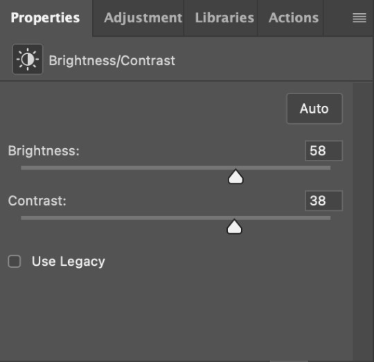
a. brightness/contrast i usually start out with this first, just because brightening the gif right away helps me start thinking about how i want to color! here are my settings:
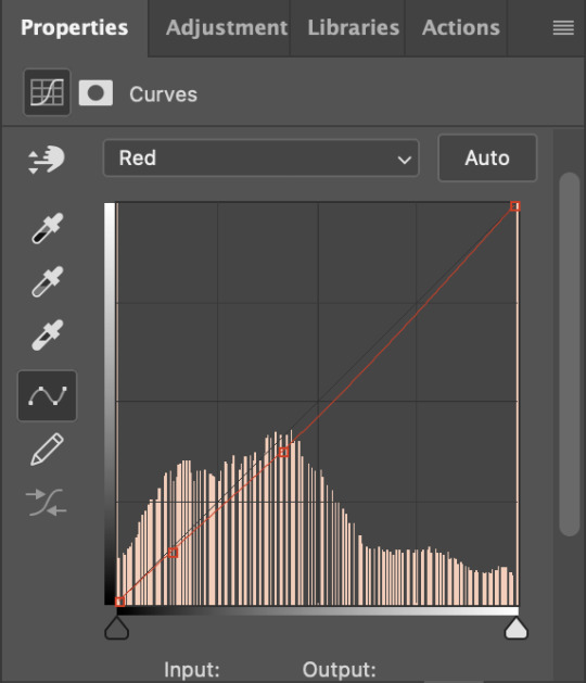
b. levels/curves levels and curves can either be used interchangeably or together. i usually use levels to adjust lighting and curves to adjust color values, but i’ll go over using both for lighting as well as using curves for adjusting color values.
for both of these adjustments, i use the eyedropper tools to pick out white and black points. for levels, the top eyedropper tool to the left of the graph is used to pick out a black point. i do this first. use the tool to pick a spot on your gif that you want to be the base for black values. for me, that’s the shadow inside rey’s hood. the bottom eyedropper tool picks white point. use the tool to pick a spot on your gif that you want to be the base for white values. i chose the outside of rey’s hood. make sure you’re doing this on a new levels adjustment layer.
now, on to curves. you can either use the same eyedropper method or manipulate the graph directly. using the eyedropper is the same as levels, so i’ll just go over graph manipulation.
shade lightens as you move to the right along the x-axis of the graph — black is the far left, white is the far right, middle is the midtones. generally, i don’t work with midtones.
i’m going to use levels for this gif’s lighting, and curves to adjust color values. here’s how to do that:
curves can be used to adjust the amount of a certain color in different lighting areas of a gif. for example, i can specifically decrease the amount of green in the gif’s whites. to edit these values, select the rgb drop-down menu and adjust them one at a time. here are my final graphs:


c. exposure this one’s pretty straightforward. the exposure slider adjust general exposure. the offset slider adjusts how dark your dark points are, and gamma correction can be used to lighten/darken scenes as a whole. here’s my settings:

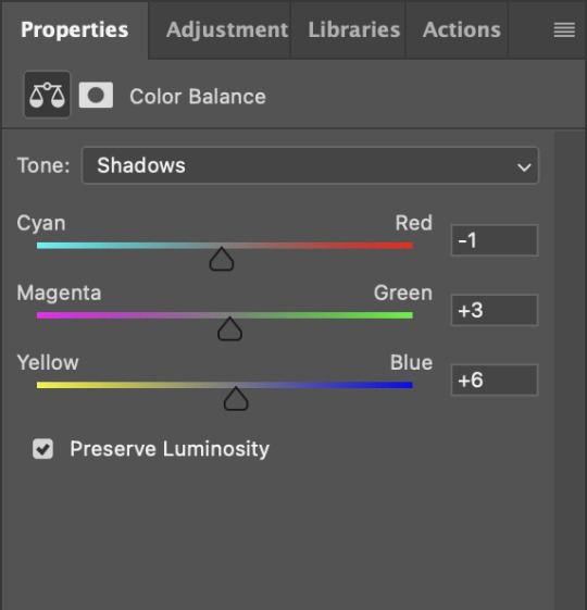
d. color balance color balance is used to adjust overall tint of a clip. this is in general pretty simple, but i do want to point out that using the shadow and highlights tabs in addition to just the midtones can really help. here’s my settings:

e. channel mixer channel mixer is one of my favorite tools in ps, especially for coloring scenes that are a pain in the ass without it. to avoid taking up too much space, here’s a great tutorial covering channel mixer. here’s my settings:


[at this point, i’m noticing my gif is still a bit darker than i’d like it, so i’m adding just a bit of brightness/contrast to fix it. there’s also a patch of blue over one of rey’s eyes, so i’ve used a hue/saturation layer to get rid of that bit and masked it to her eye. i’m not going to go over masking here, but there are lots of great tutorials out there!]
f. selective color selective color can be used to adjust the amount of specific colors within a color. for example, if i were to go into the red tab and take out cyans, the reds would become more red. if i were to add yellows, the reds would become more orange, etc etc. this can be especially good for color manipulation. for this gif, i’d like to make the background more blue, so i’m going to use selective color to do this. here’s my settings:

g. color lookup color lookup uses 3dlut files to remap gif colors (it’s a preset — think instagram filter or something similar). i don’t always use these, but when i do, i almost never leave them at 100% opacity. color lookup is great for giving gifs a film-type look if you want to do that, it’s got loads of different options. here’s my settings (adjustment layer is set to 20% opacity):

atp i’m pretty much done with coloring! i usually end up doing a few extra little lighting adjustments at the end. for this gif, i added some brightness/contrast at +8. i’ve also noticed that my gif’s looking a bit grainy, so i’ve added some noise to lean into it. this is usually the way i fix it, but you can definitely do reduce noise/gaussian blur as well if you don’t want a grainy look.
here’s my fully colored gif + a process gif (fast images warning):
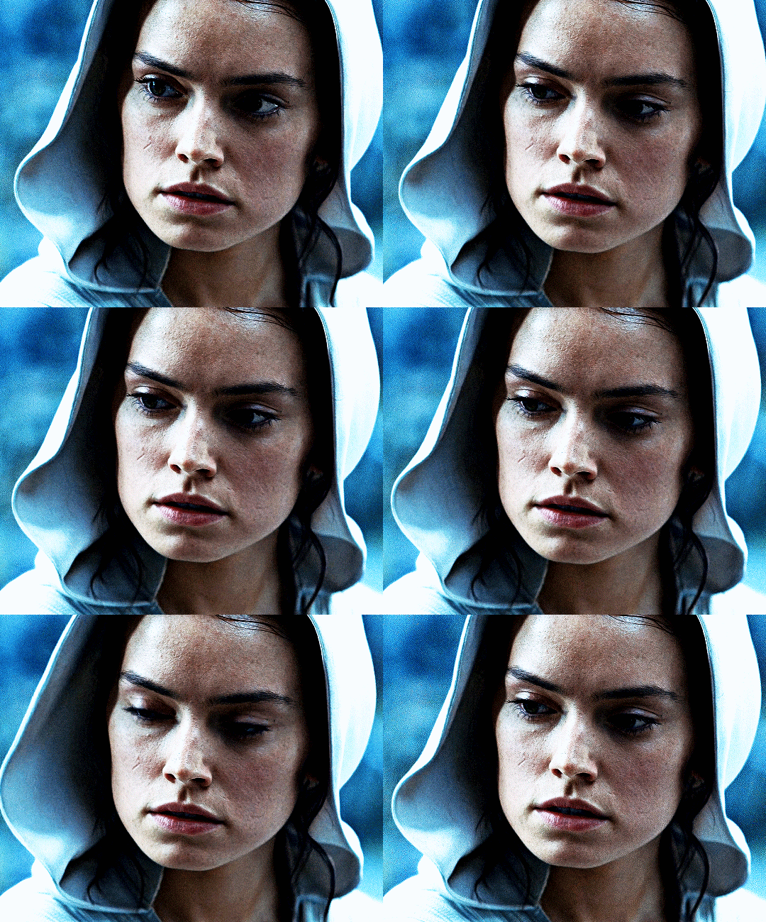

「 saving gifs 」
1. frame rate
one thing you may have noticed is that my gif is looking a bit choppy. photoshop has a tendency to mess with frame delay after gifs are converted to video timeline. here’s how to fix that.
select all of your layers and convert them to a smart object (right click > convert to smart object). next, click on the hamburger menu in the top right of the timeline and go to convert frames > flatten frames into clips. now we need to change the timeline from video timeline to frame animation. click the little 3 boxes symbol in the bottom left corner of the timeline:

go to the hamburger menu again and select make frames (this is the same one you used earlier), then go through your frames and delete any duplicates. the first frame usually needs to be deleted specifically. once you’ve done that, set the frame delay back to 0.05 the way you did earlier.
2. exporting
once you’re happy with how your gif looks, go to file > export > save for web (legacy).
these are my export settings, but feel free to experiment with the menus where i have selective and diffusion selected, different settings work best for each gif. in general, most gifmakers only use selective/adaptive and diffusion/pattern because they generally work the best for tumblr. before saving, make sure your looping option is set to forever:

gif size for tumblr has a 10mb limit. my gif is under this, so i don’t need to make any changes, but if yours is over, you can either delete some frames from the beginning/end of your gif and/or adjust the height of the gif (width needs to stay 540px so your gif doesn’t get stretched/compressed on tumblr, but height is fair game).
here's my final gif!

happy giffing, and please don’t hesitate to send me any questions you have! ♡
#*mine#gif tutorial#tutorials#allresources#usertheos#userzesty#userzaynab#usershreyu#rogerhealey#userabs#userhekaates#usermaria#userraffa#usermorgan#uservivaldi#tuserheidi
340 notes
·
View notes
Text
Aaron Hotchner & CM Content Creator Spotlight
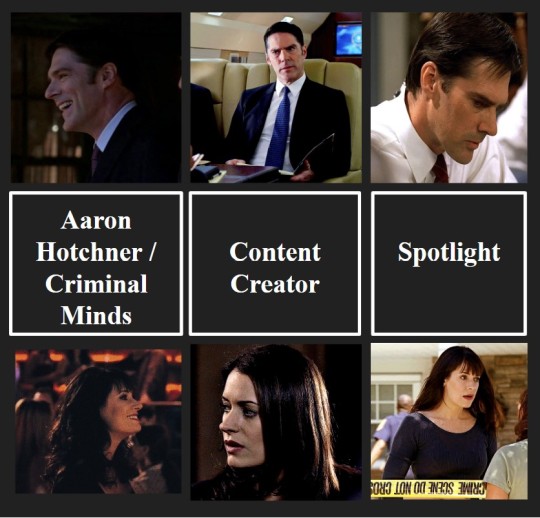
Good evening, loves! I hope you are all having a good start to your week. I just wanted to take a moment to shout out some of the amazing content creators that I see putting out the most breathtaking, content related to Aaron and Criminal Minds in general.
The fact that we get this content, for free, never ceases to amaze me. I’m lucky to interact, read, and view your work every day. It really does help my writing and makes my days a 100 times better. And an extra special shoutout to my moots (y’all are so keen! ❤️) Please check these awesome people out and give them a follow if you are so inclined. I will continue adding accounts to this list as I find them. See the list under the cut [accounts not listed in any order]

Creators who Write for Aaron & the BAU All fics mentioned are linked
@criminalskies - They have lots of Aaron-centered fics that are so comforting.
My favorite work of theirs: “In Your Orbit” Part I and Part II. I still haven’t recovered from these.
@luveline - She has lots of Aaron content and some Spencer fics as well. She also posts for other fandoms like Stranger Things and The Mauraders. Her use of tone and diction always blow me away.
My favorite work of hers: “If Things Go Bad”
@little-diable - A truly prolific writer! The consistency in style is incredible. She also writes for Harry Potter and Peaky Blinders (thank you, thank you, thank you!)
My favorite work of hers: “For You, always” [18+]
@softhairedhotch - He shares lots of Aaron head canons and ideas that get my writing juices going.
My favorite works of his: “cold case” and the “Trans masc Aaron headcannons” ← This is still making me want to give him a hug and go to a pride parade with him and Jack!
@ssahotchnerr - When I read her stuff I just kick my feet and scream into my pillow. Her Aaron stuff sends me. I love the fics with fluff so much.
My favorite work of hers: “Sleepless”
@winterscaptain - To say that her series A Joyful Future actually changed my life is an understatement. I go back to it again, and again, and again. I’ll link the master list here (link) but if you want to literally feel like you are really married to Aaron, then give the series a read.
I like all of Tali’s work, but I’m extra partial to “Though and Though” and “Berry Hill”
@itsrainingreid - I’m still pretty new to this blog, but the fic “Ride” [18+] sold me instantly. I can’t stop thinking about it. I look forward to reading more of your work.
@mandarinmoons is a very sweet Spencer Reid fic writer! All of their stuff is amazing and comforting! I like their story Office Romance

Creators that share Screencaps and Inspo
@milla984 A L W A Y S comes through with the Aaron screen caps. Literally my hero!
@hotchs-big-hands [18+ account. Minors DNI!] Her nsfw Aaron inspo content does things to me.
@hotch-girl The way I keep saving her pictures like I need to have the whole set. [I need the whole set]
@sadgirlzluvdilfs [18+ account. Minors DNI!] A generally lovely person who always posts/reposts good Aaron/Thomas content! It's a joy to hang out on her blog.
@hancydrewfan Always shares the Emily content I need.
@littlecarmine Has amazing CM photos. Always clear and good quality. And they share photos of the whole team!
@pennyspearl Amazing vingate-esque photos of the whole team. Their pictures are such a vibe!
Creators that make Prompts and also Write
@imagining-in-the-margins It was her Meet Cute Writing Challenge prompts that got me writing again. I cannot thank you enough for that. Her prompts have really helped me get my writing mojo back.

Criminal Minds Artists
@k1ngari
@lilliesthings Soft pastel aesthetic of Spence, Em, Garcia, and Derk. What more could you ask for? Nothing in my book.
@weirdlybeans Super cute art of Hotch! I love their work!
@hannaloony So cute and cozy digital art. I want all of your pieces as prints!

Creators that share the Dark Academia Aesthetic [my aesthetic]
@optimistic-nihilist
@peacefulandcozy Maybe more soft academia / mori kie than dark academia, but I still find it very aesthetic!
@flowersforfrancis Always shares great dark academia content
@shakespearesdaughters I use their images with almost every mood board I make. I would be helpless without them.
@cafekitsune has the cutes text breaks and dividers on here. Her work has been a gamechanger for my page. Please check her out if you are into aesthetics on your blog! Remi I love you so much.
Text Break Banners by @cafekitsune
#criminal minds#fanfiction#ssa aaron hotchner#emily prentiss#spencer reid#aaron hotcher#criminal minds shoutout#cm#reader insert#fanficion#Is aaron a shared delusion?#i love my moots#reading recommendations#fic recommendations#criminal minds art#aesthetic#spencer x reader#aaron x reader#emily x reader#levi fic recs#talented people alert!
59 notes
·
View notes
Note
I seem to recall you talking about your gif-making process somewhere?? It's a creative medium I'm now poking at, so I'm freshly curious as to your thoughts on the subject <3
Hola, Red! :D <33
GIF making is a pretty simple process when you strip it right down to the basics. It's really daunting to get into but once you're set up and used to the shortcuts, I can make a GIF in like, 5 mins.
The first thing you need is a video player that can automatically take screencaps. I recommend something like Potplayer. Over the years I've used things like VLC Player and KM Player, and Potplayer is a better/newer version of KM Player, I think. It can play HQ videos which is what you need for GIFs.
The next thing is videos. Potplayer can play pretty much anything. Just go for the best quality you can find. 720 should be like, bare minimum. I just have to be careful not to go too big because my laptop can't handle HQ for more than a minute lol. 4K is glorious but I think my laptop would explode if I tried to cap 4K LOTR extended edition rip.
To make screencaps in Potplayer, use ctrl & G and it should bring up a menu that lets you alter the settings for auto screencaps. I can go into this part in more detail later.
Next you need something to make GIFs. I have a really, really old version of Photoshop that I nicked from a workplace in 2009, so my advice is kind of limited from this part onwards because my process is just so outta date now. I think the process is generally the same for most apps and places where you can make GIFs. You import a folder of screencaps, edit it, and save it as a GIF. I think newer versions of PS can do the screencaps for you which is just wild to me and my super old version lmao.
There's a lot to talk about, such as editing and adding text and frames and speed and stuff, but generally the three biggest steps are to get your app, get your screencaps and get something to make GIFs with. I can ramble on about editing in part two :D
The editing is the fun part :D
I hope this helps to give you an idea of where to start. Once you're set up it's awesome but the set up is just...sheesh, where to even start.
<333
28 notes
·
View notes
Text
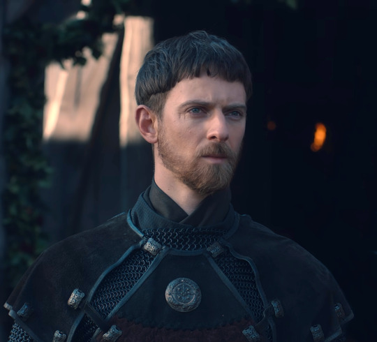
Aldhelm Character Analysis (and why I love him so much)
The following is a character study and my own opinions. I meant to post something like this several months ago when I started this blog, but I had so much other stuff going on I forgot about this in my drafts, so I am posting it now. I know there will be people who disagree with me, and others who maybe think I am being ridiculous or whatever, but I don't care. This is my blog and I want to share this because it is meaningful to me, and maybe perhaps it will resonate with someone. This is a kind of "about me" but mostly a rambling mess.
Aldhelm means so much to me, more than any other character in any other show or movie I have watched. I have fallen super hard for this man; he has bewitched me body and soul, and just imbedded himself into the core of my being. He is my muse, and has profoundly permeated every creative aspect of myself, from creating this blog, screencaps/edits, gifs, memes, artwork, poetry (don't ask), and fanfics. No one else has managed to do that to me. This show in general, and him specifically, have led me deep into this fandom and made me do things that I have never done before.
My attraction to him goes far beyond just him being a pretty face; my feelings for him are complex and multi-faceted. Of course I think he is exceptionally handsome, and I find everything about him attractive. But I was attracted to his personality long before I was attracted to him physically. The two go hand in hand, and it takes more than just being a hot dude to hold my attention. This show is loaded to the brim with attractive people and yet he is the only one that has captivated me.
I love him for so many reasons. To me he is absolute perfection and I would not change a single thing about his character. He is introverted, quiet, soft-spoken, and dignified. He is highly intelligent, has a calm confident demeanor, and has a great fortitude for dealing with difficult situations. He is elegant and refined, despite sometimes coming off as awkward. I love his quick wit and dry sarcastic sense of humor. I melt whenever he rolls his eyes or sighs with exasperation. He is so pure and wholesome, and loves with his whole entire being. His selfless and unwavering devotion and loyalty to both Mercia and Aethelflaed are unmatched. He sets aside his own needs and desires to serve others, ultimately to his detriment. (He deserved better in so many ways) He has many personality traits that are normally only seen in women characters, while still being very much masculine, and I find that dichotomy incredibly appealing.
Additionally, something about him triggers my nurturing instinct; I want to hold him in my arms and cuddle him for all eternity. He is so unbelievably sweet and gentle, and the way he was so soft around Aethelflaed just melted my heart. In fact. he embodies my idea of a perfect romantic partner. He is so calm, patient, understanding, eager to help out, very devoted and loyal, cares more about his partner's happiness than his own. I feel as a boyfriend or husband he would be very attentive and in tune to his partner's needs. Never arguing, or trying to avoid it as much as possible. Never raising his voice. He would go out of his way to do nice things for them just to make them happy. Acts of service, gift giving, quality time, and humor are his love languages.
But more than that, I see in him a reflection of myself, that I have not seen in any other character or real-life person, ever.
His quiet, contemplative, introverted nature, and preference for solitude matches my own. He is very Byronic/Jane Austen coded, with that brooding moody energy. Like me, he is the kind of person who dislikes bars, parties, or large gatherings of people, and prefers to keep to himself. He comes off as cold and calculating, but inside he is anything but. He is overwhelmed with emotion and allows himself to love wholly and intensely, despite not having his feelings reciprocated. Despite doing his best to hide his feelings, he actually wears his heart on his sleeve and allows others to use him just for the sake of feeling needed. He allows himself to cry, although he does so in private, not because he is ashamed, but because he wants to appear strong for others. He is the kind of person that hides the deeper parts of himself well from others, but I know that if you really got to bond with him, he would show you another side of himself, one that smiles freely and loves openly, laughs and jokes, and allows himself to be comfortable in the presence of others.
He appears to me to be demi/ace coded. I don't know if that was intentional or not, but seeing ace representation on the screen is incredibly rare and refreshing. Especially since his sexuality, or lack thereof, is never really brought up or ridiculed by the other characters (as ace-presenting people so often are in media). As someone who is demi/ace myself, I find his characterization in this way very comforting, especially since I have been ridiculed and downcast over my asexuality. I also find it delightful to see a male character who is not constantly talking about getting laid, making sex jokes, or aggressively pursuing or objectifying women. Much the opposite; he treats Aethelflaed with a level of respect and admiration that women are not often given by men. In fact he treats women in general with a lot of respect.
I feel his pain when he is ignored or his words are brushed off by others time and time again. As someone who has felt simultaneously invisible and freakishly "other" her whole life, I can identify with that strongly. I am always the one who others talk over or ignore in social settings. I have always felt like an outcast, even among my friends and peers. I never feel like I truly belong anywhere or with anyone, and have always felt like an outsider, just drifting along the perimeters of multiple social circles without ever fitting in. It is such a horrible feeling, and I empathize with him when I see him go through the exact same treatment.
I also feel his sense of uniqueness in that, like me, he is neither a leader nor a follower, but marches to the beat of his own drum. He had no desire to be Lord of Mercia even when it was offered to him (which I personally think was a mistake on his part). But I get it; I hate being in charge. I prefer to work behind the scenes and stay out of the spotlight myself. But while I am not a leader, neither am I a follower. I am always doing my own thing regardless of trendiness or popularity.
The biggest difference between him and I is that he is far more patient than I could ever be! He is much more level headed, whereas I tend to be more emotional and have a kind of firecracker reaction, especially when I am in an argument or when something upsets me. I think I would be a better person if I could learn to remain calm and collected during emotionally stressful times.
So, this is much more than me thinking the dude is super hot. And it also goes so far beyond me just thinking he is a cool and interesting character (which he is no doubt). He has actually become a permanent part of me, one that will not be replaced by the next hot thing to cross my screen. Even if I run out of things to post here (which will happen at some point), he will still occupy my thoughts, and I will still be drawing him, and writing for his character for a very long time to come.
27 notes
·
View notes
Text
tagged by @18minutemajor for a hockey art share tag game! I enjoy talking about myself but am terrible at posting so this is perfect. i WILL talk too much, this is a threat.
rules: post your first ever hockey art, your latest hockey art, and your favourite hockey art, then tag three hockey artists.
FIRST ART
I made the Kraken Orb (Korb) at the end of the 22-23 season, as a commemoration, although a sort of ironic one considering i had only gotten into hockey in time for the playoffs so there are a couple players here i actually never got to see play at all before making this (Joonas, Jaycob, Burky, Fleury)
it was a whole lot of fun though! Prior to this i was in a months-long art slump after leaving a fandom, so it was a total surprise to have hockey of all things be what revitalized my art.
technically, the very first hockey art from this was Matty; you can kinda tell by the way his lines are a bit thicker than the rest since i wasn't in my groove yet. i also knew coming in that i wanted to arrange the faces in a circle, but didn't plan out beyond that, so i just made sure that i was getting a variety of head directions in my references and hoped for the best. My favorites from this are Gru, Soucy, Dunn, Schultz, Borgen, and Eeli. I think they all turned out really well.
LATEST ART
MEAT CUT MEAT CUT
this one is fun for me because it's quite different from my usual style of art, with lineart and non-realistic forms/face. I've had the concept in my head for awhile after hearing/reading so many interesting descriptions of the physical qualities that good hockey players possess.
'Sacrifice the Body' actually came in mid-art when i had an epiphany doing something like driving my car or an activity similarly unrelated. Before that, it was going to be a lil heart drawn on the chest and the going contender for the label was 'Ferda.' which would've been great, but sacrifice the body just worked too dang well with the themes.
FAVORITE ART
i mean, c'mon. it's gotta be this one.
my magnum opus, my white whale. it came out even better than i saw it in my head and i love everything about it. when i came up with the idea, i had TOTALLY forgotten that Climate Pledge has those giant windows, so when i set out to find references and saw it, it instantly made everything even better with LIGHTING!!!!
It was my first time drawing this kind of interior architecture and although there's definitely things i would do differently now, im so so proud of how it looks and turned out. I was also still drawing through my decade-old laptop at that point, so I had to split up the work on this into two files - i sketched everything, then worked ONLY on the bg until it was about 90% done, then made a flattened copy to open as a new file to draw the players on top of.
I also have a bunch of WIP shots of it in my drafts I guess I'll throw in here now!
initial sketch to get down the composition before i remembered the window | lines of the building! i actually found a 3d virtual tour of CPA from before it was built which had the PERFECT angle, so i screencapped that and straight up traced the architecture. Ultimately, the scoreboard and the paint lines ended up getting moved around.
planning out my lighting in greyscale (i really need to do this more often, i struggle with values so much, alas) | in progress bg! at this point, the ice and the boards/glass were the only things completed. I eventually said 'fuck it' to being able to see the areas behind the stands like you could in all my references, and just put the people dots all the way up.
Now the most gut-wrenching part
THE TAGS
this is where me being bad at posting comes into play, because instead i just lurk and thats not great for forming connections HERE GOES
@ruinedcasket - it has been awesome seeing your art progress! would love 2 hear your thoughts about it
@rouzys - your kraken stuff is so pretty, love how you capture likenesses
oh god oh fuck everyone else i know has already been tagged fuck oh sshit
If You Are An Artist On Hockey Twit And See This, It Is A Sign
#believe it or not this is actually a sideblog#and i dont do any posting on my main blog either#just reblog memes from sun up to sun down baybeyyy#i am simply not as funny as i think i am and only realize it when i go to post and so i hit delete#but i love babbling i truly do#its why my tag section is always a CVS receipt in length#if you are an artist please i want to see you work#submerge me in art i love 2 see it bless my eyeballs#maybe this rambling im doing rn is because i need to actually eat so im gonna do that#godspeed#rambles#tag game
17 notes
·
View notes
Note
Actually no I can't let it go. As someone who finds TC hot, pls rank the MI movies based on Ethan's hotness in each. I have a Guess on the correct order and am dying to know.
ok so i have an order but i really want to know what order you would guess....i wonder how close you'll get. ALSO arc i need to know your order as someone who appreciates TC's physicality but is still on the fence about his hotness
i will say i agonized over this...and rewatched bits of each movie on the list to try to solidify my answers and make sure they were as accurate to my actual feelings as possible. every version of ethan has a different Brand of hotness, so I'll also go on little rants for each one trying to explain how i think each movie tries (and succeeds or fails) to make Ethan hot.
From least to most hot, including visual aids in the form of low-quality screenshots handpicked from the movies:
7. Mission: Impossible III
The thing about MI3 Ethan is that of all the Ethans he's the one who's trying the hardest to assimilate. Which means it is completely understandable that he is the most boring of all the Ethans. I don't blame him for it. It's just a fact, an unfortunate fact. He's cute, he's sweet, I'd probably like him better if he wasn't completely obscured by shaky cam all the time. Overall he's not striking enough to be sexy. He's got this very girl-next-door energy that's nice but not my thing.
Honestly I think MI3 Ethan's hotness falls to the JJ Abrams curse that hits this entire movie, which is that he's treated as an action hero instead of as Ethan Hunt. So much about him feels generic, simplified. I think if the movie leaned more into the way Ethan intentionally takes his teeth out, the domestication of Ethan Hunt, the devoted house husband thing, it would make this version of Ethan way more interesting and the movie way better. As it is, Ethan's supposed to have been out of the field for a while (a year? a few years?) but the second he gets back in he feels like a soldier to me. Just an action hero.
6. Mission: Impossible - Rogue Nation
This is where it starts to get difficult (which is to say almost immediately)....Rogue Nation ethan is my dearly beloved. I chose this screencap cause i feel like the scene in the record shop encapsulates to me what makes RN Ethan sexy, which is his gentleness. He's got so much calm and warmth in this movie, you can feel it even as the action ramps up. He's also got an edge of vulnerability especially later on that goes hand in hand with the sweetness (shoutout to that one scene after he drowns where he's dazed and happy to see Benji, there's something so deeply charming about him there, and in the car chase after). And he's really handsome in that one scene with the purple shirt. My problem with Rogue Nation Ethan is simply that I find other Ethans sexier. This will continue to be a theme
5. Mission: Impossible - Fallout
featuring screenshot that i edited for my own nefarious purposes (you know that one post about slut meaning end in swedish)

I LOVE FALLOUT ETHAN. The vulnerability that we see from him in RN continues, and deepens, making for one of the more expressive Ethans we get in the franchise, an Ethan who feels worn thin, who's too tired and old to hide how much he cares. I love his little hoodie at the end of the movie I love the way he reacts to comfort from the people he loves I love him in the helicopter when he is devastated by losing contact with his team I love him in the bathroom scene fucking Wheezing after getting hit in the throat. I love his build in this movie, I love how solid he is. I love the shot where he starts awake with a gun in his hand. The thing about Fallout Ethan is that he's dearly beloved to me more than he is sexy...sex feels like too much to expect from him...this is probably his most asexual movie, it's the movie where despite being basically required by circumstances to try to leverage Alanna's attraction to him he can't find it in himself to do more than just stand there and take it, he's there to protect people and try to survive and that's it. That worn-thin edge makes it difficult for me to fantasize about more than petting his hair and tucking him in a nice soft bed and turning off the lights and then LEAVING. so he can REST.
4. Mission: Impossible
we've all seen the slutty corset we've all seen him and max but i want to take a second to highlight the tank top and specifically this one back muscles shot that made me snap my teeth at the screen the last time i watched this movie (last night)
The thing about MI1 Ethan is that he's just objectively by far the sluttiest Ethan gets, and I'm including MI2 in that. MI2 is the movie where Ethan has sex with a girl he likes. MI1 is the movie where Ethan has sexual tension with every single person he meets and strings along all of them for his own purposes. MI1 is the movie of the corset, the glasses, the pretty-eyes-slightly-open-mouth look, the long shadow of his eyelashes in the alley with Sarah after Jack dies. The problem with MI1 is that despite Ethan being at his sluttiest, and looking just gorgeous, and the camera loving him, I just actually don't find MI1 Ethan as hot as other Ethans. The hair doesn't do it for me. He's a little too young, unstable, desperate, cocky. He doesn't have the power he has later.
3. Mission: Impossible - Dead Reckoning Part 1
ETHAN IS SO HOT IN THIS MOVIE!!!!!!!!!!!!!!
Shoutout to this scene in particular which ended up pushing both MI1 and Fallout down a rank so I could place DR1 above them. Ethan Owning kittridge without ever raising his voice probably ranks among the sexiest things he's ever done for me. DR1 Ethan feels so earned--there's a deep sense of strength, a knowledge of who he is, and a fearlessness that comes from having survived this long. I love the contrast between his conversation with Kittridge in this movie and his conversation with Swanbeck in MI2, for example--both are films where Ethan is asked to take a powerful object from the hands of the enemy and transfer it to the IMF; both are films where Ethan knows immediately he's not going to fucking do that. But in MI2 Ethan is still young, still subject to authority, and he plays along. In Dead Reckoning Ethan says, "no." and it's really hot
I feel like by DR1 there's so much confidence in the handling of Ethan, too. There's a confidence in the audience's love of him and trust in him. It doesn't feel like we're being sold on him so much as given the privilege of seeing this character that we all adore. It kinda has the feeling of Harrison Ford in Force Awakens, except if that movie was good, and also if Han was the protagonist. It's pretty fucking powerful.
2. Mission: Impossible - Ghost Protocol
im such a fan of this shot cause it's the first time we see his face in the movie--incidentally if i could make gifs my entire argument for ghost protocol ethan hotness supremacy is That One Shot of him vaulting smoothly over the railing and dropping down a floor, which happens immediately before this--and there's so much tiredness and kindness in his face, it feels softer and older than anything we've gotten from him before, it's really striking. This to me is the first time we ever see what I think of as McQuarrie Era Ethan, you can see it in his expression and his eyes. And I love it.
This is where we get into pure indulgence picks. I love Ghost Protocol Ethan so much because I love how feral and flawed he is, I love how hard he's trying, I love how annoying he is at times (shoutout to the seduction scene my best friend the seduction scene), and I Love his hair. He's one of the most striking Ethans to me, especially in the very opening, because he feels so (as I've talked about before) purely physical, purely functional, or at least like he wants to be both of those things. He ends up feeling deeply genuine, raw, and grounded, because he's so sorta prickly and reclusive. There's a focus on his body and physicality that's outside of just fighting ability, that is all about grace and control. He's powerful in a way that doesn't need to be shown--he doesn't do a lot of fighting this movie. His power is all private, self-contained, gorgeous.
Mission: Impossible II
look, you know. look. it's just.
how are you gonna beat that? you can't beat that.
ethan is just so fucking beautiful in this movie it's absurd. I have so many screencaps that happened when I was watching and went "oh ok so he's breathtaking let's just take a quick shot of that." I love the way the camera treats him in this movie, there's a reverence to it, an indulgence, and also a playfulness. I love his outfits!!! I love that he's grimy, I love that he's utilitarian. I love that he gets wounded in the most aesthetically pleasing ways. I love his leather suspenders. Obviously I love his hair you guys all know how I feel about the hair. There's a kind of--no idea how to describe this--doggedness about Ethan, both in the sense of determination and in the sense that in the screenshot above he literally feels to me like a guard dog who's come trotting back to his owner.
anyway he's gorgeous. the end
arc ill be expecting your ranking. and like i said at the beginning im interested to know what you expected and how close my ranking was to your expectations
46 notes
·
View notes
Note
Hi! I'm curious how you make such amazing gifs. I know you're talented & skilled, but what advice would you give to a beginner? (No, I'm not talking about myself :) I'm also curious if you've ever made fanvids.
P.S. Have a nice day 🌞
You're too kind! My gifs are pretty basic actually compared to what some people on this site do nowadays. I do like to keep it simple, both by personal aesthetic, and cause I can't spend half a day on a gifset.
Anyway, the main things for a good quality gif are:
Get a good quality video file, to start with. 1080p if possible. 4K if you have the hard drive space for it (I do not). 720p if you must, but the better the quality, the lesser the noise, the better the gif. I stick to 1080p.
Add a little bit of sharpness to, well, sharpen the image. Going from a 1080x1920 to a 540px wide image makes the gif a little blurry. Sharpening corrects that. Don't over do it though, or it'll look weird.
Brighten your gifs. The original images are 99% of the time too dark. So, do what you want (levels, brightness, curves, etc...), but tweak the colors. Cause I'm lazy I usually do a basic "level" thing, but it's worked well for me. For gifs and screencaps.
et voilà :)

Ah and yes, I made a few fanvids back in the days. Mostly for White Collar. I do enjoy it, but it's very time consuming. I do have a couple of ideas for DOC fanvids, but I need to find the time and the motivation. One would be to do a side by side comparison with the trailer of the US remake, cause some shots are uncannily similar. And the other would be a regular fanvid based on Charlie Winston's "I Love Your Smile". But again, fanvids are gigantic beasts. Especially when your source material is made of 3x16 episodes.
Thank you for the ask :)
8 notes
·
View notes
Note
Hey!! How do I get into making gifs? Any tips for a beginner? I literally know nothing about it just that the I'd like to start. Also is not having photoshop a big obstacle?
Hi there! Yeah I can give you some tips to get started! Keep in mind I use windows to make my gifs and not a mac.
So to get into gifmaking you don't need to have photoshop. If you find that you enjoy making gifs I do recommend you look into getting photoshop (and there are ways of getting it without paying *raises pirate flag*) but to start there are several online programs you can use.
Here's a few that i've used before I learned how to do it in photoshop:
photopea
ezgif
giphy
imgflip
makeagif
This is an excellent tutorial to using photopea to make gifs
Each one of those will allow you make a basic gif. For complex coloring, sharpening, layouts, typography, blending, etc you'll want to upgrade to using photoshop because the quality is just way better and you can do so much more but when you're just wanting to get start all of these websites are great places to learn.
I also recommend learning how to take screencaps because I find it's a lot easier to make gifsets using screencaps than it is to try and screen record, cut, and upload videos.
My recommendation for screencapping is KMPlayer. It's a video player that you download to your computer and has a very easy way to save screencaps. Then you can just upload the jpgs into whatever program you're using to make gifs.
I made a basic gif making tutorial using photoshop and kmplayer here if you want to take a look at it.
Basic gifmaking steps:
Get your video. You can download it through pirating sites or use dvds or screen record. I download from sites like soap2day.to.
Take screen caps of the specific scene you want to gif OR cut your video to just the scene you want
Upload either clip or jpgs into the chosen program
Set the speed
Do any trimming of the scene and/or cropping the sides you want to do
If your program allows you (some don't) you can sharpen it, brighten the colors, add text
Then just save it as a .gif
Some other things:
The higher quality video, the better quality gif. 1080 is better than 720. Try to get a nice quality video if you can
Some websites will have a watermark on it that can't be removed so keep that in mind. Another reason why I prefer using photoshop.
Try to keep the gif either the same speed as the episode or just a little slower. Too fast isn't good.
That's all I got for now! If you have any other questions please feel free ask! I'd be happy to help with anything!
109 notes
·
View notes