#i might change the whole psd and make a new one
Explore tagged Tumblr posts
Text
So uhm... I did a thing...
✨Character Info Template✨
UPDATE 11.24.24: this template now has a page theme version! if you're not a fan of templates, you can get the code to use it as an interactive multimuse page >here<
Been meaning to do this a long time ago (and actually started it but never finished it, lol) as a way to share some more information about my ocs without needing to use a custom page theme, but mostly because I haven't found any page theme that looks exactly as I want and allows this much customization.
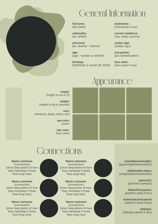
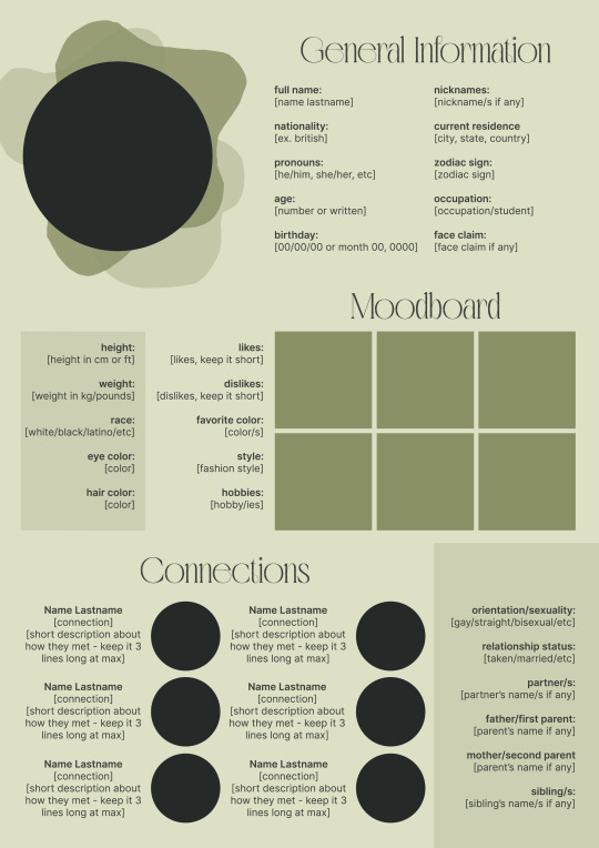
There are two versions and both are almost exactly the same; but the example shown in the left has an 'appearance' section which is small and has few quick facts regarding the oc's appearance; while the example on the right has a 'moodboard' section instead which allows you to add more info about your oc.
You can change every section/title to fit your needs like I did in the examples below; I personally removed some categories as well and got rid of some connections as this oc doesn't have that many close friends/partners to fill the original template. However, I also included an extra separated 'connections' section in the download in case you want to add more people and more information.
I recommend you stick to square-shaped pictures so it's easier to fit them to each section. Also if and when you edit the information or section titles, please select only one line at a time to replace it so you don't lose the text format. (Titles shouldn't change because that's a single format/font within the same text box, but should it change you can always hit ctrl+z hehe) When you're done, I strongly recommend you save this as a .png instead of .jpg so it's the best possible quality!
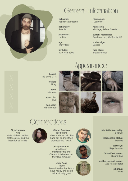
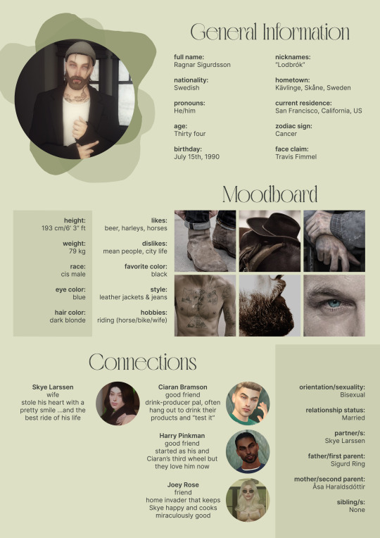
Last but not least, this is a .psd file. So you'll need either Photoshop (I did this with Photoshop Portable, but it supports newer versions of PS and it *should* support older versions too) or Photopea to open and edit this file.
Credits: Adobe Photoshop, Inter font, Golften Vintage font
>DOWNLOAD< (patreon but free :p)
(note: I'm posting this with my gaming blog because I think my fellow gamers might be interested in this, but please consider giving credits to me if you use this template by tagging @synindoodles instead of this blog)
More info on how to use and edit this template below the cut!
Layers:
>Each layer is properly named and categorized. The general layers such as the background, the icon shape and background shapes are under the groups.
>If you don't want to see/don't need one of the connections' pictures and information, I recommend you find which one it is (1, 2, 3, 4, 5 or 6) and click on the eye symbol next to the layer to hide it so that way if you ever need it, it won't be truly gone.
>To edit a text section, simply find the layer (such as General Information>Left Column) and double click on the 'T' symbol next to the layer. That way it will open edit mode and allow you to edit the text, just don't hit delete or enter while everything is selected or you'll erase it :p
>Main text sections aren't separated, they're blocks of text. I recommend you don't remove the amount (for example, if you downloaded the version with the 'appearance' section, which has 5 sections of information, don't remove the fifth line.) Either leave it empty or replace it with another data, otherwise it will look weird. The 'general information' section might look good even if you remove a few lines, just don't get rid of the whole block of text.
Pictures:
>To add a new picture, simply paste it over this document and move it using the Move Tool.
>To frame it (so it becomes a circle or fits over the shape you want), make sure the picture layer is over the layer you want, then while holding alt click between the two layers. [For example, if you want to add a new main oc picture: 1) paste the pic you want, 2) move it with the Move Tool so it's covering the big circle, 3) once you've fully covered the shape (if it isn't you can resize it by right clicking on it then on 'free transform', sometimes you might need to hold shift to proportionally resize it) make sure the newly pasted pic layer is over the layer named "picture goes here", 4) hold the alt key and hover your mouse cursor over the line between your pic layer and the circle layer until you see an arrow going down symbol, once you see it click it and tah dah! your picture should now have the same shape as the circle! - you can further move it if it doesn't fit the way you want with the Move Tool (;
Others:
>You can change every color, font and section to your liking, just don't change the general layout of the template.
>To hide/show the guides (those bright blue lines all over the document), click ctrl+,
>'Inter' is a free font and you can get it in the link above (linked with the credits), Golften Vintage is not, but you can get the demo version >here< (just scroll down and click the blue download button under license). I will not tell you how to install fonts as it might be different for everyone (for me it's C:/Windows/Fonts and I just drop the zipped files (except the .txt one) there), but google is your friend.
>I can't think of anything else that needs to be said here, but if you have any other question feel free to send me an ask or dm and I'll help you out!
>Last but not least, a like is appreciated if you plan to use this plus consider tagging @synindoodles if you use it <3
#psd template#template#characters page#muses page#muse page#muse template#character template#character page template#oc page#oc page template#synindoodles#rp resources#rp template#roleplay resources#roleplay template#writers resources#writing resources#writing template#writers template
190 notes
·
View notes
Note
How did you find/make your aesthetic profiles of the gods in your book?
i was gonna link you to my guide that i posted a long time ago, but i realized how old it was and that it was lacking some details...... 💀
so i'm gonna do a new one that hopefully helps a bit more!!!!
websites used: pinterest, tumblr, canva, deviantart, & photopea!
first off, i find the pictures from sites like pinterest and tumblr. the color schemes of each pic need to be somewhat close to each other (but it doesn't always have to be like that depending on the psd you'll be using later on)
i'm gonna use hades for example. this is the first pic i find of him lol:
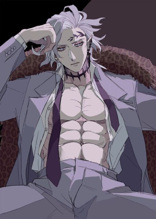
the most dominant color here is purple, with some tinted ivory from his skin, and brown in the background, so the next few pics i find should have somewhat similar colors too, or they should at least be purple cuz it's the most frequent color here
here are the next few photos i found:
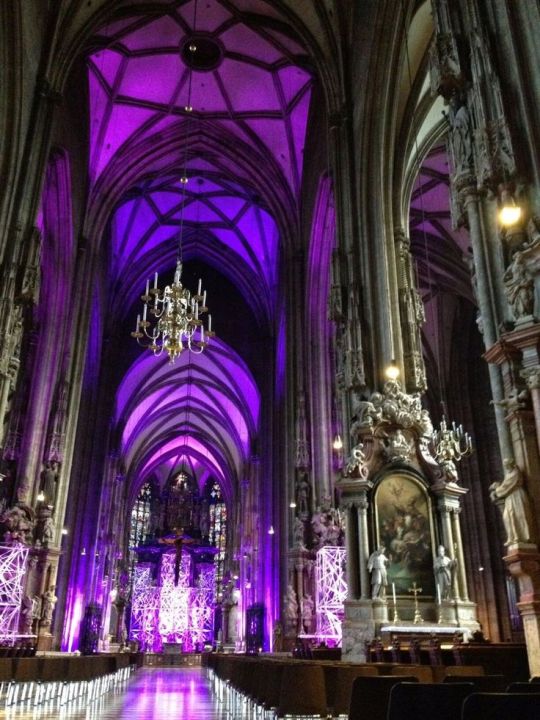
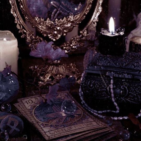
they don't look perfect, but we can always individually tweak the colors and shades later
i download the photos and then i go to canva. the site provides you with templates that you can use but since i only got three pics, i chose the "email header" option.
(for those wondering which template i used for the bigger ones you see in the first chapter with percy and the yans, i don't use a template. i just use "custom size" and type in "800 x 800 px")
go to the sidebar, click "elements" then scroll down for "grids" and then find the one with 3 parts. i reduced the spacing between the photos to zero.
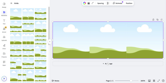
then i upload all 3 photos and put them in the squares. because they're not exactly the closest in color schemes, i individually edit them until i'm satisfied.
canva provides filters that you can use, but i always find it best to toggle with the adjustments like brightness, contrast, saturation, etc.
here's what i ended up with so far:
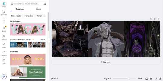
again, not exactly perfect, but whatever
now that i'm done, i go up to "share", select "download", and increase the size by 1.5 (that's 900 x 300 px). idk why, but for some reason, the quality looks better when you enlarge the size before download.
once that's done, i download the whole thing.
(keep the file type as "png" btw)
then i go over to photopea and upload my graphic. it'll look like this:
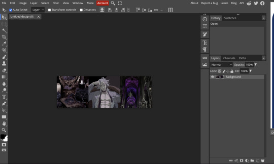
in another tab (not the photopea tab, but like... the actual tab of whatever browser ur using), i can find a bunch of psd colorings in deviantart. since i want one that's specifically purple, i just search up "psd coloring purple"
and i get all this:
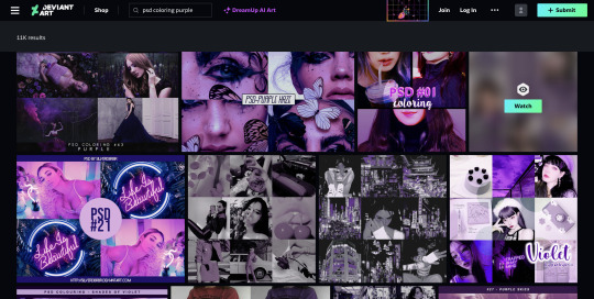
i pick whichever one i think might look best and download it.
then i head back to photopea.
at the top, click on "file" and the new psd you just downloaded, and it'll show up in a new tab.
stay on that tab, go up to "layer" -> "layer into" and select the first tab where the graphic's at. this applies the psd coloring onto ur graphic.
over at the side, there's something called "opacity: ___%" you can toggle with that if the psd is too overwhelming, so you can lessen it by dragging it down if you need to.
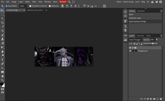
once you're satisfied, click "file" -> "export as" -> "png" and it'll be downloaded.
and that's pretty much it!
THIS CAN BE A LONG PROCESS THOUGH! literally in every step, you might end up going back and changing stuff.
for example, i do not like the right photo that i selected. the purple is too bold compared to the purple shades in the left and center photo. i'd probably go aaaalll the way back to the earlier steps by returning to pinterest to find a better photo
or maybe you don't like the psd you picked. if that's the case, delete the photopea tabs and redo the above steps with a different psd.
it can be a bit annoying if ur the perfectionist type and have to go back again and again 😅
but anyway, psd coloring's are great. i'm looking back at the og versions of all the graphics i made (og as in, before i applied the psd colorings) and they're soooo different from the finished pieces
23 notes
·
View notes
Note
hiya! I did check if you had a resource page but couldn't find one (sorry if I missed it!) I was wondering what re/gshade preset your using? Also how did you make your weather/task templates for gameplay like here (post/736165530204028928/completed-task-swim-for-1-hour-in-wakabas) I wouldn't even know where to start in photoshop lol Thank you!
hello, hello!! I don't have a resource page yet so don't worry! l'm using a personal, sorry.
how i make my templates under the cuts (reminder that english is not my first language and that i have photoshop in spanish so i don't know the actual name of things in english)
we'll be creating the simple one from here:

Now, for the templates, it depends on what i want to do, but i usually try to keep them simple, so I use mainly 2 photoshop tools: as you can see here, the weather template I made has (1) a rectangle layer, (2) an image and (3) text layers.

keeping this in mind, let's create a thing (a bank notification) together so I can show you the steps I follow:
(0) Create a new file
There's no size I ALWAYS use, but i usually choose a bigger size since i can always resize it down later when I use it (if it's too small and you have to resize it to be bigger, it might end up looking pixelated). You can also open one of your screenies in the size you usually edit them, and deciding how big your template has to be.
(0.1)
I recommend creating a group (using the little folder icon) where you will drop all the layers of the template so you can move it around and all that
(1) Shapes
This is the first thing I always do for this type of templates, just create a base shape that will contain all the other stuff on top. In this case i created a rectangle with rounded corners.
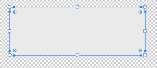
you can use those circles in the corners to round them or make them pointy. If you press alt while doing it, you can round corners individually.
I added a parallel shadow so it integrates better with the whole screenie, but that's a personal preference.
(2) Now, if you want to have icons/images/etc. I recommend creating another shape (in another color, just so you can see it), and positioning it where you want your image to go.

Now you want to transform that shape to an intelligent object (right click the layer and click that option). This way, if you double click the layer image, it will open in another tab: you can add your image/icon there, click save, and when you go back to the other tab, it will be there. Much easier to edit it! An intelligent object layer will look like this:

(2) Text is literally what MAKES most of templates. When you're creating templates, i recommend looking for inspo AND getting fitting fonts for it. Let's say I want to create a netflix template: i'd do a quick google search to find what fonts does netflix use. Sometimes fonts are not free, but try looking for similar ones.
I'm using manrope for this one because it's simple and easy to read, but when i'm doing this kind of phone notifications i also use fonts that are usually called something UI.
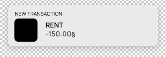
Now you only have to move things around until you like it. Then save it as a .psd so you can edit it and use it whenever you want and that's it!
(4) This is how it looks like

you can now edit it as you want, lower the base rectangle opacity, add more shadow, change the colors...
From this simple thing, i created another version using... you guessed it: another shape, another icon and another text layer. Here you can see the final templates being used in a screenie:

Honestly, don't let the big amount of tools and options photoshop scare you! As you can see, you don't need much to create something like this
Hope this was helpful enough! Let me know if you have questions 🧡
104 notes
·
View notes
Note
hii, apparently, when gifs or pics have too much yellow or reds/pinks, tumblr automatically think that is a nude/porn 💀 I would recommend that if you still have the psd, try to change the coloring a bit. this also happened to a yeri set I did (and all was performance gifs, so there were a lot of colors light for every stage) and someone told me about this issue that tumblr think that is nude, so I changed THE WHOLE set coloring, and surprise! is appeared on the tag then.
but tbh I don't know why can be that a problem with your set since to me the dominant colors look good, to tumblr think that is something indecent....
also, this can be a probably a reason, or just tumblr being a mess as always...
hope you can solve this so we can see all that pretty set :(
it's a psd i made that i used...a lot??? like not just on this set, several before and also on my kdrama blog 😭 ajdiwjei omg this has me laughing at 11 pm that Tumblr might think my designer renjun set is p*rn..... ohmygod 😂
but thank you so much for reaching out because i didn't know all these 💕💖😳 it appeared for a while for everyone now it's goneeee again. oh well I guess there's nothing much I can do right now 😔
#i might change the whole psd and make a new one#but like it didnt happen before to the other sets its just a hate crime against renjun widbwidjwidiis#thank you again 🥺💖💕💕💕💕💕#mutuals#asks
1 note
·
View note
Text

HOW TO USE SMART OBJECTS ! (photopea version). . . okay so I was talking to a friend one day walking them through photoediting without opening my laptop and I found my next tutorial to be SMART OBJECTS and how to use them! This tutorial will cover what is a smart object, how to edit one, and how to make one. Credit to fleursource for the icon border template used in this tutorial AND on my icons in the indie at this time.
Let’s start with what a smart object is and by doing so, going to google the definition: A smart object is the ultimate non-destructive layer in Photoshop. So that means that you can use them in a way that won’t mess with your whole image / can easily be taken out and redo. Like how on filters you can click the little eye and it is as if that sharpening didn’t happen.
As always, if you have a tutorial request, need help with something, or anything else my ask box is always open. Please LIKE / REBLOG / COMMENT on this post if you find it helpful. Reblogging this post shares it to others that might be struggling with smart objects as well.

So I open up my ICON PSD (not sure if this originally had a smart object or if I did a conversion myself). Changed the labeling on the psd a bit to show you what I am looking at ( THIS IS A SMART OBJECT ) is the important layer. Under it has smart filters such as sharpening used which as long as I make my icons with the same smart object? There will be no need to sharpen every single icon layer as I go.
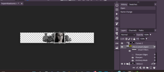
So above the words smart filters is an image layer with a box around it. Click that little mini box.
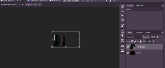
So this tab pops up for me. This is an UNEDITED version of my icons table. We are going to drag / drop / position a new screencap (made by me) onto this template.
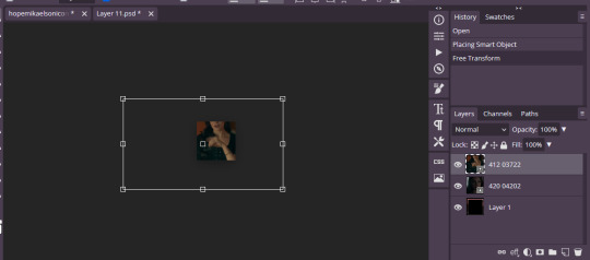
Okay so this is what this looks like now. This is simple and easy can be done but say I want to increase the brightness of my image or color correct JUST this screencap but don’t want to mess with a bunch of layer masks that clip to my layer below or anything. Great, you can do that. Just edit your image as needed.
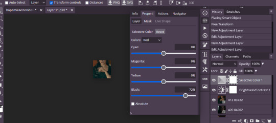
So then it looks like this edited up. I didn’t do much of anything this time around but still the picture / idea is now made. Now if you were to exit from this without saving the progress will be gone. So go to FILE > SAVE ( SMART OBJECT ).

This gif shows you what I just did. Now, I had a layer mask color adjustment layer that I had to delete on this cap hence why my image is suddenly really BRIGHT. But my coloring is there in place now and everything like that.

This is what my layer section looks like. So now that we covered how to use said doc let me show you how to quickly turn any shape into a smart object that can be edited.
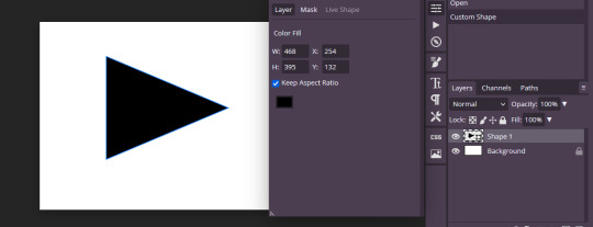
So I lay down the shape that I want. Rasterize that layer by clicking right and then going to RASTERIZE. Then click left and go to CONVERT TO SMART OBJECT.
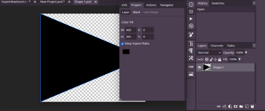
And when converted this is JUST the smart object layer that I can go ahead and edit away to fit my needs or fit into a template.
151 notes
·
View notes
Text

HELLO EVERYBODY! been a while since i did one of these, i hope you're all doing well, and have a great day / night wherever you are. i'm officially back from my vacation which means i'm officially returning to this blog. yay! now you might be wondering what exactly this means, and truthfully, i'm not too sure yet either. what i do know is that i plan on being around here more regularly. also, i'm planning to finally start working on the christmas giveaway gifts ( if you're one of the winners i've messaged previously, i'll message you again in a few days to discuss details ).
another thing i'm not sure i've mentioned here yet: i got a new job last month which means i definitely don't have as much time anymore as i did previously. it's also one of the reasons i've been so absent since the start of the year because i had to get used to it, learn some new stuff, etc. my schedule changes every week so i can't even give you reliable info on when i'll be able to be here and do stuff but i promise you that'll be something i'll figure out.
anyway, as for content i've planned, i really should start going through my inbox and try to answer as many questions there as possible. things have been really piling up in there and i'm very sorry about the delay in answers. there are also a few requests (primarily for certain kinds of memes ) that i will be working on slowly but surely. in terms of memes, i have some half-finished ones sitting in my drafts so i might just post these sometime soon. additionally, there are some other things i started working on a while back ― like some psds, templates, etc. ― that i might try finishing. so just a whole bunch of new content to use.
one new thing i might try out in the future is something one of you mentioned when i made that post about putting some very time-consuming or image-heavy templates behind some kind of temporary paywall. not sure how exactly i'm gonna do this yet ( i have a few ideas and websites, like patreon, in mind already, but i first want to see all the different possibilities i have on what site and what makes it the easiest and most user friendly for both you and me ). but that is something that's probably gonna take a few weeks / months still ― we'll see.
even though i could probably go on for a while and tell you about everything that's going on in my mind regarding this blog and its future, that's gonna be all for today. because honestly ― none of it is ever set in stone and while i do have some exciting things i wanna do here, real life can always get in the way so i feel back if i make too many promises i then have to delay. but i'm gonna try my best because i care about all of you people, the rpc as a whole, this stupid little hellsite i could curse multiple times a day, and although it's not much i do wanna contribute a little something to make this a nicer place for everyone.
so yeah, take care everyone, don't forget to drink enough water and get enough sleep, and i'll talk to you again soon. 🧡
12 notes
·
View notes
Photo

not sure how to make an introduction for this tutorial. i might have gone too extra because it’s so long...but this is highly requested and i said i would do this as detailed as possible, so here we go!

adobe photoshop 2018 (ahoy, matey!)
topaz lens effects (just for grain)
srwe (sometimes, but not for this tutorial)
reshade (i dont use a specific preset)
drawing tablet (wacom intuos art)
macbook pro mid-2015 (but bootcamp)

//part one
grab a screenshot from your own lovely screenshot folder! mine is straight from my reshade screenie folder. then crop it how you like it! my original screenshot size is 2560 x 1600, and i almost always cut the background out. this is how i do it:
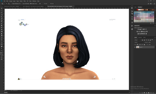
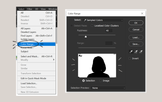
click color range, then click on the background of your sim. the little screen above will look like that. the background should be white. it’s easier when it’s a fully solid color. those are my settings above. click ok! the selected area will have those teeny tiny marching ants.
click quick selection tool, then select and mask...
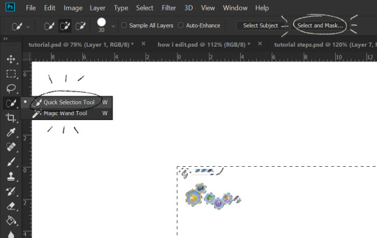
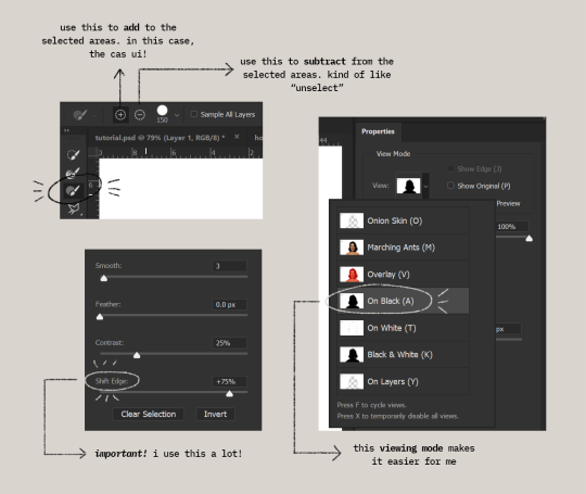
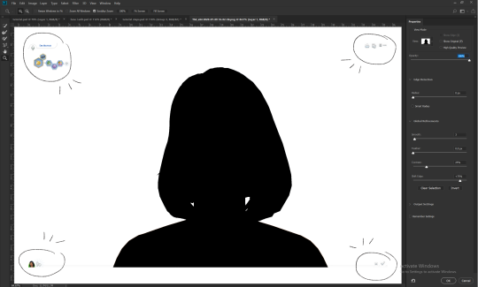
i drew over these circled areas using the “add brush” i showed above. use “on black” viewing mode, then make sure that the sim is completely filled black (it’s the unselected area). use shift edge so there wouldn’t be any of the original bg left over. my settings are shown above. then click ok if you’re all done. press delete and then ctrl + D to unselect. the marching ants should be gone. go ahead and crop it!
after cropping, i resize the width of the photo to 1280px! always!
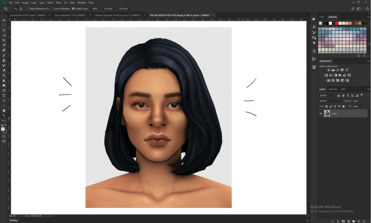
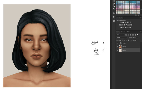
i create a new layer for my background, then add in the psd that i use for my edits. (i hide my psd layer while drawing)
sometimes i also use liquify to edit things like this:

//part two
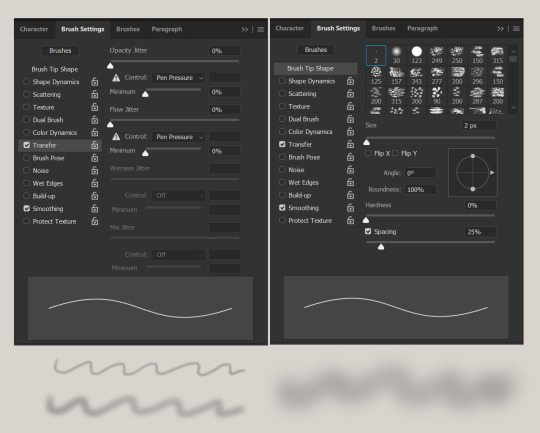
i use a soft round brush to do everything! it’s literally from adobe, but i changed a few things like the flow jitter in transfer.
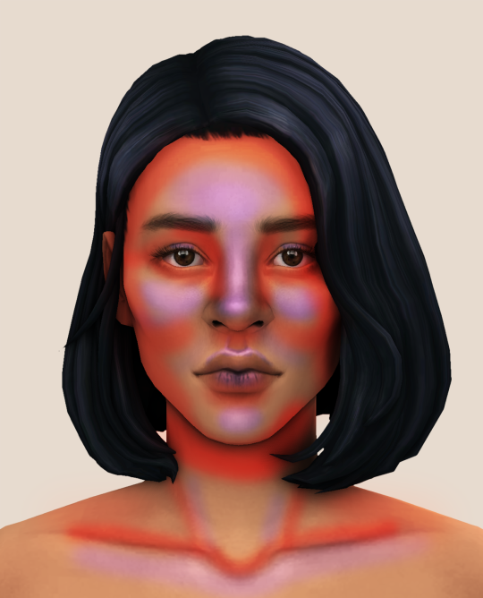
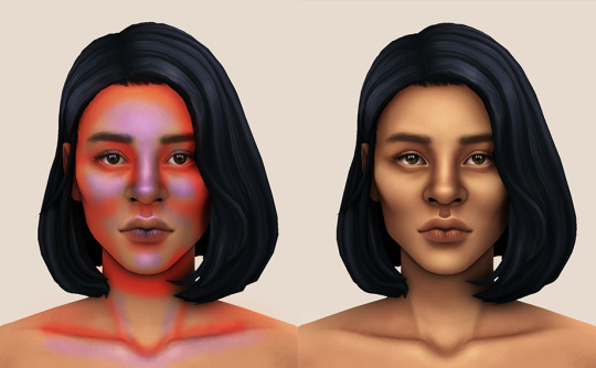
red areas are usually where i put the shadows, purple areas are usually where i put the highlights
i usually do the shadows before anything else! it’s pretty simple. using the brush i showed above, i create a new layer.
use the eyedropper tool on her skin, then pick a slightly darker shade. change the blending mode of the layer to multiply, then draw the shadows.
right click on the layer, then select “create clipping mask” to make your life a little bit easier. an arrow will appear beside your layer.
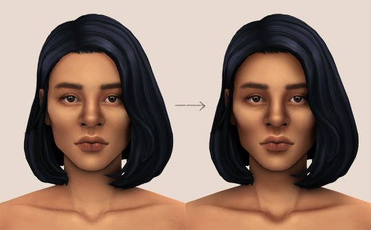
//part three
this is where i draw over the features. let’s look at her face. these are basically what i think it needs:
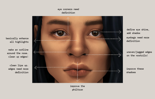
pay close attention to the imperfections and clean it up! that’s what makes it “sharper” in my opinion. small brushes will do the job! something like this:
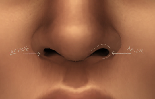
define the edges!!! define!! zoom in and take a look!! even though these are tiny little details, it makes a whole lot of difference! the eyedropper tool is your best friend!
i start with a big brush and then i use smaller and smaller ones as i go, which creates the sharpness. go a little darker as well! im not very skillful with my graphic tablet, so i add stuff bit by bit since it tends to become too harsh when i just go for it! im not as talented as some of u here ;-; i just wing it and pray it doesnt look too bad. half of the time im just experimenting since i literally do not know where some shading goes
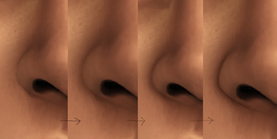
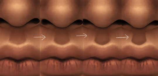
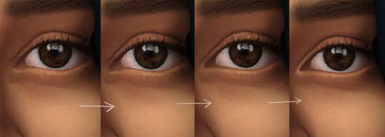
i wont be showing every single thing, but basically that’s the idea! i’ll add in the stuff i pointed out above and more shadows. sometimes i might turn down the opacity of some layers if they look a bit too much. here’s what we got so far:
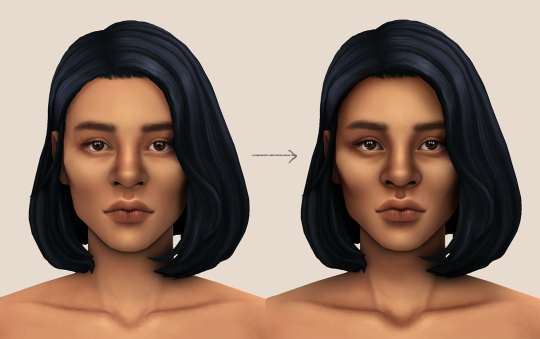
i also like adding some face pores using this amazing “skin texture 1″ brush from this brush pack!
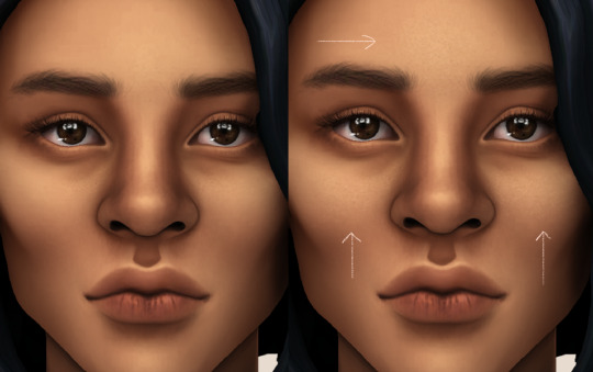
//part four
for the highlight layer, i change the blending mode to either overlay or soft light. use a slightly bigger brush for the bigger areas. use the eyedropper tool on her skin, and instead, pick a lighter shade.
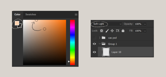
let’s start adding highlight to the purple areas i marked above!
try to enhance the highlight on tiny details too such as the eye corners! if you want something more dramatic, create a new layer and do an overlay layer this time! don’t be afraid to add some on the hair, eyes, lips etc.
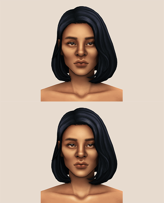
//part five
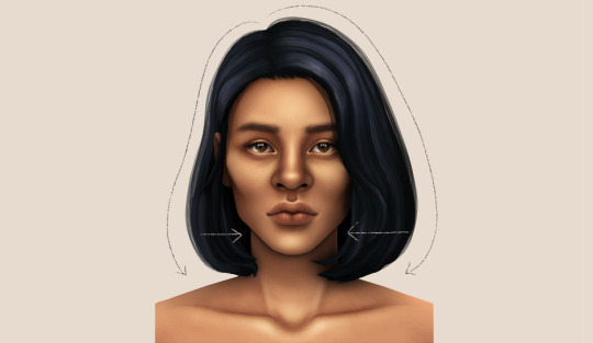
ok lets add some not decent looking hair strands. i almost always avoid this part because i literally have 0 idea on how to draw hair. i use the “hair base” brush from the same brush pack i linked to above and also have smoothing on to about 35%! the eyedropper tool is still your best friend! just follow the flow of the hair and i guess you’ll be fine ???
i’ll also fill in the annoying gaps beside her neck
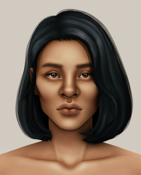
unhide your psd layer and wooowweee
//part six
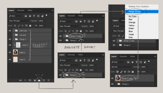
select all the layers, then click create a new group!
select the new group, then hit ctrl + J or right-click the new group, then click duplicate group
right-click the duplicated group, then click merge group!
i do this so i have a backup of the collapsed layers and can make changes anytime.
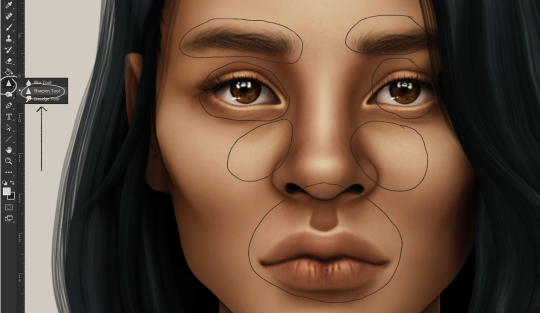
i use the sharpen brush on small details i circled below. i used to do stylize > oil paint or topaz clean before, but since the personal action that i use blur things a lot, i try to keep small details visible and sharp.
next is smart sharpen, my settings are below. sometimes i go for a smaller radius, but it looks like this most of the time.
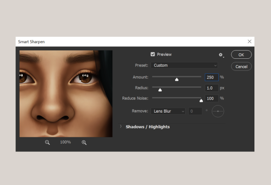
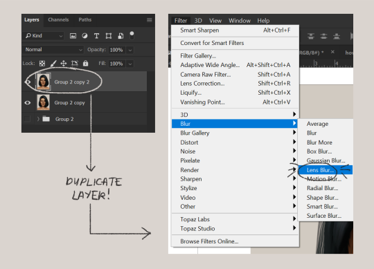
my personal action set consists of this:
duplicate the layer that you just used smart sharpen on, then click lens blur!
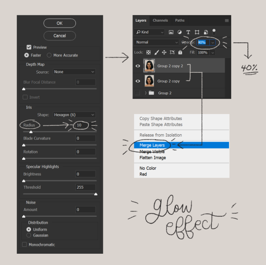
below are my lens blur settings
turn the opacity of the layer (that you just put the lens blur on) to 40%
select both layers, right-click then merge layers!
duplicate the layer again (yes, again) then right-click, choose blending options.
uncheck the R located on the “channels” under “advance blending” then click ok.
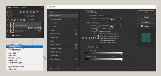
an icon will appear on that layer!
make sure you have that layer selected, then click the Move tool
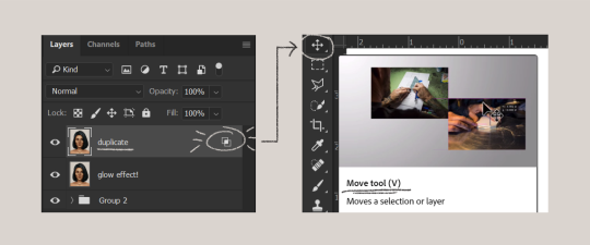
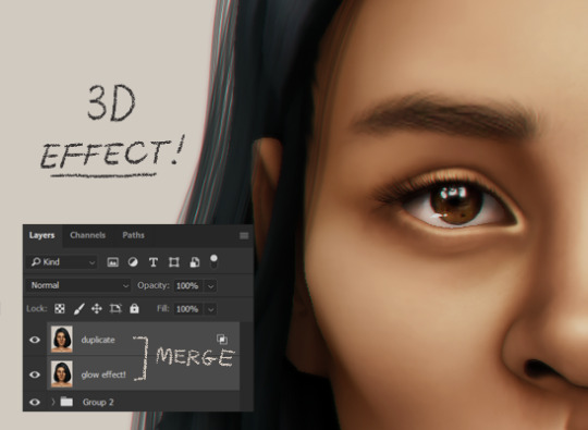
then hit your arrow left/right key once or twice! i do it once because i only want a subtle 3d effect! go ahead and merge those layers!
last step is the grain effect. i use topaz labs > topaz lens effects. if you don’t have this, you can also use filter > noise > add noise that photoshop has.
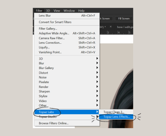
these are my settings:
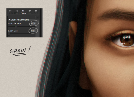
//final look!
here’s a before and after gif! (here’s the finished edit) i hope everything’s clear! i’m really bad at explaining things (っ˘̩╭╮˘̩)っ
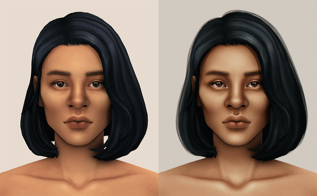
feel free to tag me when you use this tutorial for an edit!! i would like to see it! i hope this helps! ♡\( ̄▽ ̄)/♡
2K notes
·
View notes
Note
hi!! I'm a beginning gif maker, and I was just wondering if you have any tips on making/using PSDs? I just don't understand them very well, and I admire your gifs so I figured I'd reach out to you. ofc you don't have to respond if you don't feel like it! thank you for your time either way!

hihi anon! first of all thank you so much for reaching out, i always love helping aspiring gif makers with any trouble they run into or concerns. when it comes to psd's its always gonna be down to your preference. what colors you like, what styles you like, what vibes the scene youre giffing gives off, or what vibe you want to bring new to the table etc. and it makes me feel warm and fuzzy inside being told someone admires my gifs so thank you so much for letting me know ପ(๑•ᴗ•๑)ଓ ♡
id also like to say before i start PLEASE PLEASE if you have more questions dont hesitate to ask or even send me a private message so that I can elaborate more and even make a video for you that might be better for visual learners. and i would so love to see your work and help support you so send some my way! <333
How to make your own PSD
This is gonna be a long long explanation so ill put it below ^^ <3
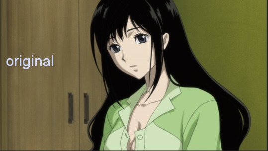
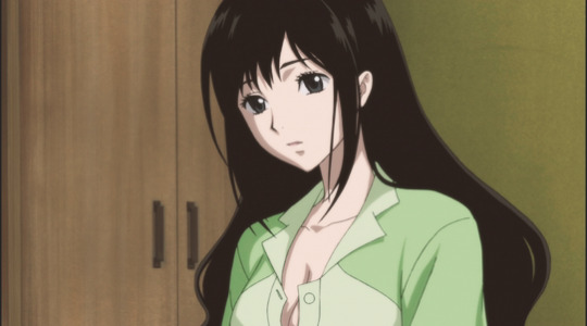
So before I even grab up all the frames to make a gif, if Im starting new fresh with a show I like to figure out what colors would make the scene pop or give it a new feeling. so ill start with just the 1st image, bare scene. so the image below has nothing done to it.
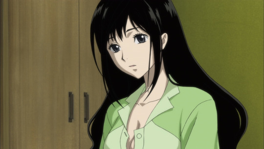
with a scene like this you can choose to express any color on its palette, for example the green. you can make the green pale or super bright. so go to the layer section and click this
(also i recommend to use photoshop when making gifs, so this is kind of a photoshop tutorial/tips.)
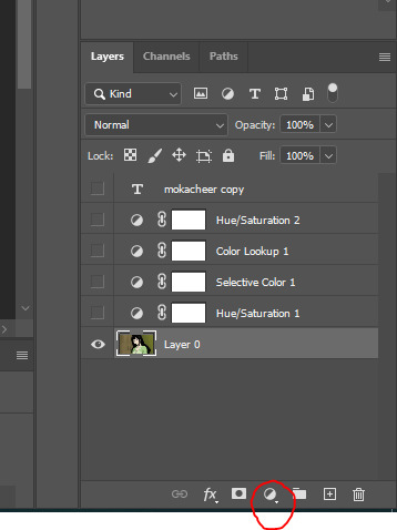
what comes up on the drop box is a bunch of editing filters and i highly suggest you take time to familiarize yourself with them each. it doesn't have to be all at once you could just say ok im gonna mess around with selective color and color lookup today! and little by little grow your understanding of what each "filter" gives you. however I do suggest selective color as it's super easy to understand and a good starting ground.
so ill start with selective color, here is how the window looks:
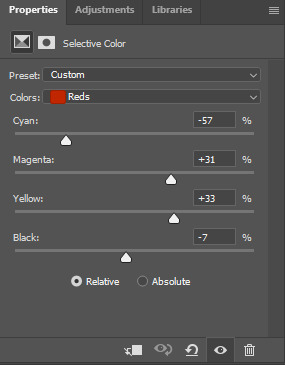
as you can see ive already moved the notches but play with these! you can mess with a variety of colors (click on "colors: red" and more colors will pop up for you to change) you can make a scene cool, warm, pastel, dull, etc with this.
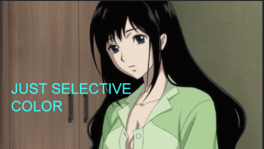
on this i decided to mess with my reds, yellows, and cyans. Here is the outcome of just using selective color!
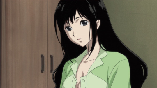
so you see how different it makes the scene? i didnt really enjoy the bright greens so I decided to give it more of a pale color and here was my outcome. so again it is always gonna depend on the new feeling you want to give a scene.
and you can always stack your filters, thats how in the end you make your own unique psd! what I also highly recommend is messing with these options:
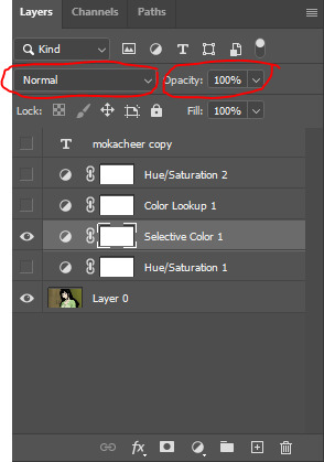
make sure youre selected on the filter you want to mess with. when you click on normal its also another huge drop box thatll REALLY change the end result of just that single selective color change. for example if i change this layer to "screen" itll look like this now:
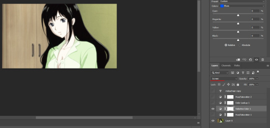
see how pastel its gotten? then if you mess with the opacity as well it would look something like this:
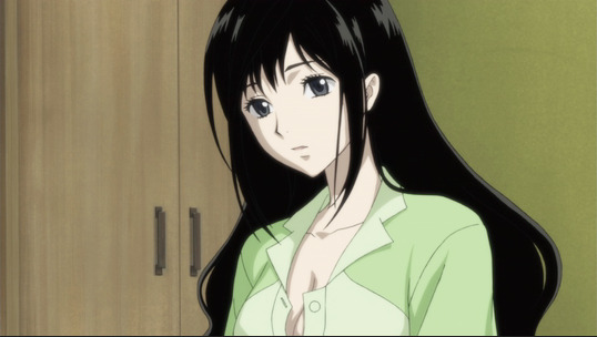
the normal and opacity tabs im gonna highly suggest you also mess around with because it changes the composition so much and gives you a free range on that filter youve added to the mix! im gonna stick with my normal and 100% opacity with this psd and continue on to my next filter, one of my favorites "color lookup!"
color lookup comes with a variety of photoshop picked filters that are full edited themselves and REALLY change things up to the whole scene and even more so if you mess with the "normal + opacity" part. heres what the panel looks like:
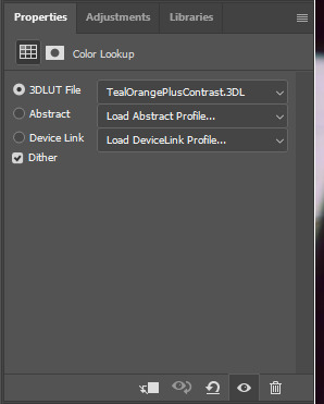
all of the sections have drop downs and color palettes you can choose from, with this piece i went with tealorangepluscontrast. heres what it looks like bare on top of my selective color:
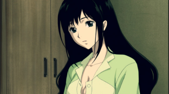
i didnt really like how it made some parts of the scene BUT i did like how the skin was colored so i decided to mess around in that "normal + opacity" section and decided to go with "pin light + 70% opacity and heres the outcome!:
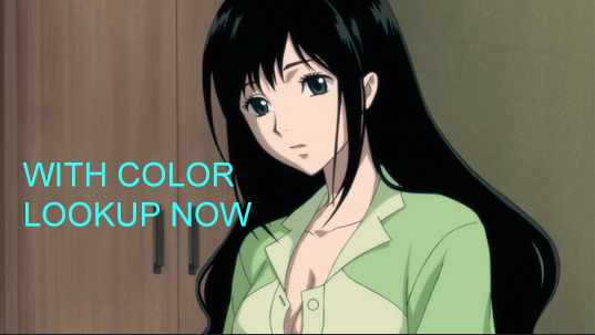
the difference is super subtle but if you look at it closely you can see that i've warmed up the scene! the skin color isnt so pale and even the highlights in her hair + eyes appear a bit green.
moving onto the next filter i put in this specific psd, i went with two different layers of "hue saturation"! this one is one of my new favorite filters to mess around with :3 heres what the panel looks like:
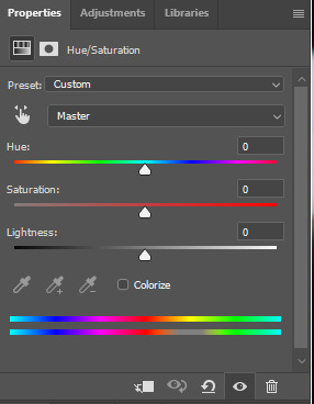
so its similar to selective color in the sense of the drop down box when you click "master" (btw the option master is just all of the colors combined but its nice cause you have the option to just change the reds or yellows etc. saturation with this one.") so i decided to mess with the yellows! here is the outcome:
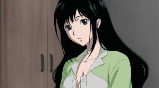
wow you can really tell the difference in this. all the yellows are super pale/grey even. i know its down the "peachy" skin i originally wanted but not by much and the skin is still healthy looking! but i definitely wanted to change the sickly green outfit shes got so I decided to go with another hue saturation layer! and this time i made it to mess with the greens >:3 and here is the final outcome of my PSD mostly used for the show Blood-C:
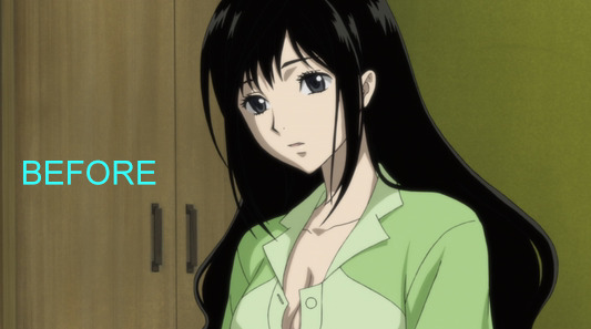

the scene is both palesh blue green with hints of warmth! that was the vibe/feeling I got from the show and wanted to go with. and i dont know if i mentioned this but the order in which the filter layers are placed also play a huge part in how the colors play with each other so play around with that too! because for example heres my final outlook layer order:
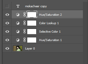
but if I place the hue sat 2 under selective color 1 heres how it would look:
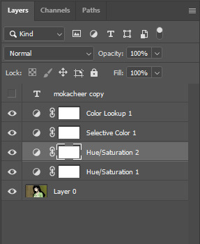

everything is more on the grey scale which is also really nice but not what I wanted.
ive also decided to show you a couple different ones of my psds ontop of that image and youll see how much it just changes everything:
with my panty and stocking psd (ugh i love this one and it doesnt look bad at all on this anime >.<):
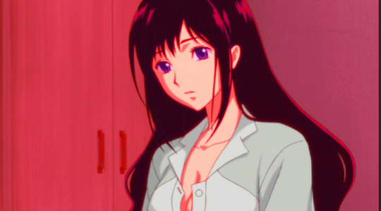
with one of my yellow ashy psds:
with one of my bright color psd:
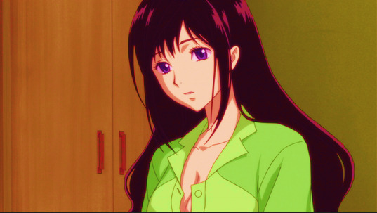
oh and one last tip! always save your psds :p its really simple just save it on photoshop and by default it'll save as a psd file. and make a folder to keep all of them organized!
so all of that you can take an apply with using someone elses PSD. atleast I think you can, make sure to read the rules theyve applied to see if you can tweak it a bit or honestly just use it as a study. look at what theyve used, how they use it and make something thats of your own. i never recommend stealing and saying somethings your own, always add credit somehow somewhere!! oh and to use someones psd you basically just open the file and select the filter layers all together and drag them ontop of all your gif files!
this was super long and i am sorry but i wanted to make sure there wasn't anything that i missed with this. i really hope ive answered your question and gave some clarity to you so you better understand how to mess around with making your own psd!
in the end it really does come down to preference and your own style. making your own style is always gonna be recommend because if anything id want to be the content creator that when someone looks at a gif they KNOW that I made it just based off the colors, you know? thats just me though and its definitely a long road to get to that and establish yourself to that "level" so don't feel rushed at all. gif making should be fun and exciting so go crazy with whatever you decide!
and again, could never stress enough, please go crazy with more questions if you have any! helping is my favoriteeee <33 have a wonderful day <3333333
2 notes
·
View notes
Text
Sketchbook and You
If you’ve been following me for a bit (or you take a read through the descriptions over on my Art Blog), you’ve probably noticed the name of a few non-standard art programs. This is about one of them!
Things I want to get out of the way before the break:
No, I’m not here to sell you on the program. I’ll simply tell you what I like/dislike from my years of using it.
Yes, I’ll help you with some stuff that might come in handy if you decide to take the plunge.
And now… Here's a long-time user’s perspective on Sketchbook.
So! Sketchbook… it's been around for a while. I bought my 1st copy way back in the day for my (at the time) brand new 2nd Gen iPod Touch! It was great for doing quick sketches on the go. The thing I liked about it over the other popular paint program – Colors! - was the Pencil brush. Not surprising that a guy who primarily draws on paper would go for the brush most like the main tool he uses but hey? I’m basic like that.
For me, a solid feeling pencil was the difference between me drawing on my iPod or sticking to my physical notepad.
Back then, it was still owned by AutoDesk and went by SketchBook Express, SketchBook Mobile Express and SketchBook Pro. Each had their own quirks with the Express series being their “Free" versions. Over on the desktop side, they had things like the Copic Edition – a free program that allowed you to try use the official Copic marker colors in your pics. That would get walked over to SketchBook Pro later on and remain 'till the Sketchbook crew split off from AutoDesk in June of 2021.
Alrighty… With all of that history out of the way, To the Point!
Yes, I enjoy using Sketchbook. It’s the way I draw on my devices when I'm not using a mouse in Illustrator or doing basic stuff in Fireworks. It's super simple and good for what I need. No triple deep menus of things it can do that you need proper classes to learn to take full advantage of. Since it’s always had a mobile version (maybe that was it’s original platform), the menus are simple and easy to hide. You can import, export and build your own brushes from scratch. In the version that released closest to this writing (the October 2022 release), they even added something close to what was lost during their split from AutoDesk – a really neat color feature. Although it (currently) lacks the Copics from before, it makes up for that in both the ability to select colors and import, export and build whole color books.
Does this mean I’m recommending it? Not really.
I dig it, sure… but those used to neat things like the ability to save out timelapse videos from your desktop files or native 3D models or even just being able to add text will find it lacking. The formats it uses – TIFFs and PSDs - are fine for some. I personally like to work in PNG so I have to be careful to save out my layers individually or the whole thing will be flattened. Same goes with saving things in general. Like with any program, you need to be sure you’re saving things in the right file. I’ve noticed my copies of SB tend to remember the last file name used, auto filling the field. If I’m going too fast, I face a real risk saving over an older project.
The only thing I can recommend is to try before you buy.
How does one do that when the program is a one-time-fee dealie? Well… before the split, AutoDesk made the last version of SBPro free for everyone. I don’t normally do this ‘cause it’s a bit of a dick move and links will change as time goes one but I’ll drop a link to it and the archived page for the Much older Copic Edition in the next bit. Just understand that, for as good as Sketchbook is and for as long as it has been around, it’s kind of starting from scratch again with their newfound independence.
That’s about all I have to say about the subject. All in all, I enjoy using Sketchbook and have found it worth the price over the years. If You want to give the program the best shot it can, here’s some links that might help you along the way:
Sketchbook – The main site. Gets you the latest versions and a little more.
Extras Page – Like the name suggests, this has extras. Stuff like downloadable brush sets and some color books.
SketchBook Pro Free Brush Mega Set – Thanks to the hard work of a redditor, this is the best way to get damn near every free brush set that was offered by AutoDesk over the years.
AutoDesk SketchBook ver 8.7.1 – A link to the last edition they released before the split. It is free and comes with access to all the stuff the old Pro version did (Copics, perspective grids, other non-standard stuff I can’t remember). You can still import/export/build brushes with this.
SketchBook Copic Edition – What it says on the tin. This old version allows you the (at the time) new feature of the official Copic color book… and not much else if I remember right. It predates a lot of improvements. I don’t even remember if you could import brushes. It’s the least sketchy way to try out the basics of Sketchbook before you decide on jumping in completely.
If this helped you make a decision, I’m both shocked and amazed. Personally, I’d give one of the older copies a shot if they’ll run on your gear (That Copic one is OLD). Between the simple interface that knows when to get out of the way to the newer features they Just introduced, I think it’s worth it if only to try it.
3 notes
·
View notes
Text
Background Text Effect Tutorial
Got asked by @owenpatrickjoyners how I did the effect for this gif:

First of all, let me preface by saying that this actually took a whole lot of time and it still came out really choppy, so the first tip I can give you is if you’re gonna do this effect, you better have a shit ton of patience and choose a gif where the character doesn’t move alot because it will make things so much easier.
I’m using photoshop 2020.
This is an advanced tutorial that supposes that you already know how to create gifs and add text (i’ve explained how to add text layers here, if you want), so the first thing you wanna do is make the your gif, resize, sharpen, add adjustment layers and whatever else you want to add and then save the psd files (just as a precaution).
Once you’re satisfied with the gif, open your animation timeline bar to the frames animation mode.
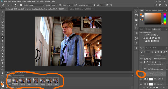
This is what mine currently looks like (I’m just doing 8 frames for the tutorial):
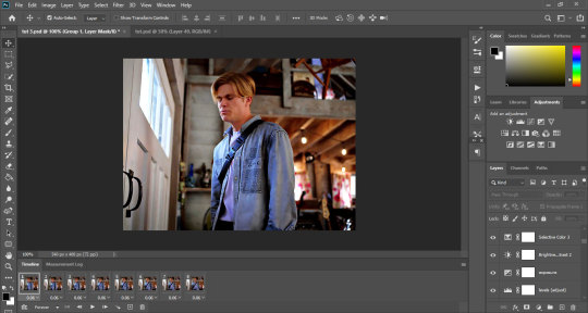
Now we’re gonna add the text layer that’s later gonna become the background. I’m choosing The Bold Font as my font, set to Bold, size 29pt, line spacing set to 30pt.
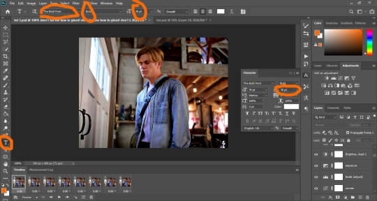
You’re gonna fill the page with the text so it fills the whole space, then you’re gonna make sure the first frame in your animation bar is selected and you’re gonna set the text layer’s opacity to 60.
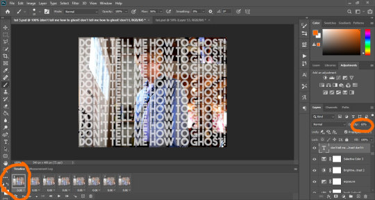
The first thing you’re gonna do is duplicate the text layer to match the number of frames you have. I have 8 frames, so I’m creating 8 text layers. Then you’re gonna hide them all by clicking on the small eye icon next to them:
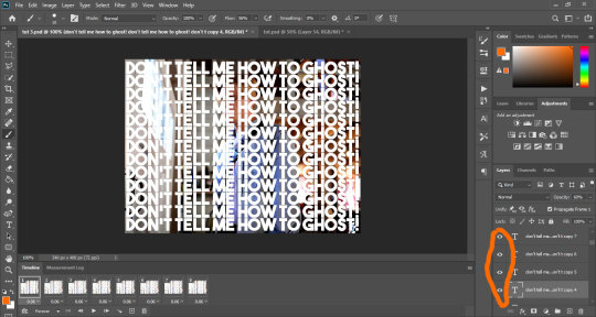
Your text should now be hidden:
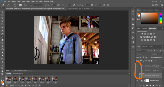
So, this is where it gets tricky, because to get a good result (which I didn’t really manage that well), you have to work the layers one by one.
Start with the first layer. Make sure the first frame is selected in the animation bar, and click on the small eye icon of the first text layer to make it appear.
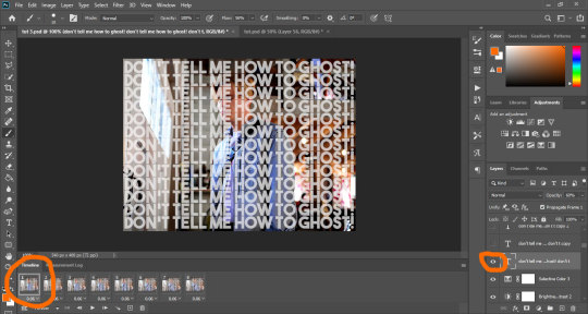
For the first frame, if you make any change, it applies to the rest of the frames, so before we do anything else, we’re gonna make sure it doesn’t. To do that, just select all the other frames, and hide the text on those by clicking the eye icon:
Now, select the first frame again. Add a layer mask to the text layer by clicking on the mask icon at the bottom of the layer tray.
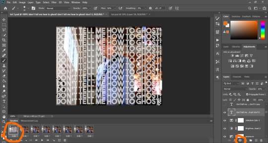
Your text layer should now have a small white rectangle next to it. Click on that rectangle, grab a hard round brush, make sure the selected color is black, opacity set to 100%, and use it to hide the text on Alex. You do that just by clicking and dragging the brush all over him. I’m starting with my brush sized to 37, but depending on what I need, I might change the size to make sure I get the edges.
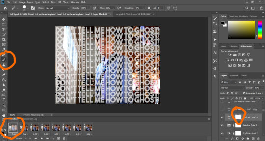
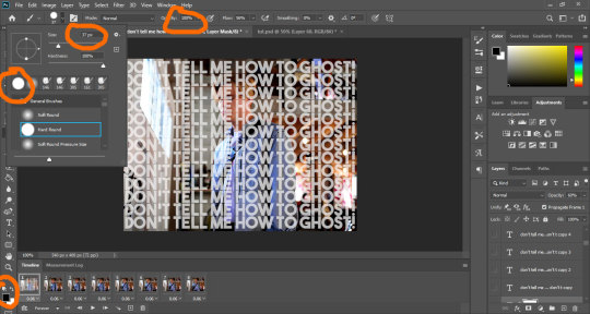
If you don’t know much about layer masks and how to use them, I’ve explained it a little bit in this tutorial.
Basically, the black brush hides anything on the layer, and the white brush makes it reappear.
As you work and mask the text, you’ll notice the white rectangle start getting some black color in the shape you’re hiding. Once you’re done and satisfied, your frame should look something like this:
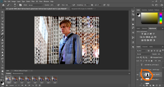
Now you’re gonna move on to the next layer. You’re gonna select the second frame on the animation bar (which should only show owen with no text). You’re gonna make the second layer of text appear by clicking on the eye, add a layer mask to it like we did before, and then start masking the text on owen the same way you did before.
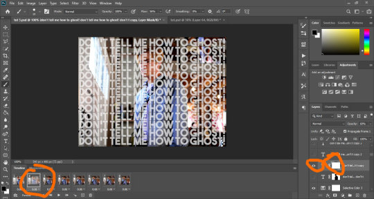
Alternatively, you could just duplicate the original text layer and work on the existing mask, but you would have to go back and hide that layer from the first frame and all the other frames. It’s up to you.

And now you’re gonna repeat the process on each frame. Select a new text layer, add the mask, hide the text on owen. It takes a whole lot of time, energy and patience, and if you look closely at my og gif, I didn’t do much of a good job, lmao.
This is why I mentioned it might be better to use gif with minimal movement - if the characters are not moving, the edges stay aligned and you can use the same layer on multiple frames instead of having to do them one by one.
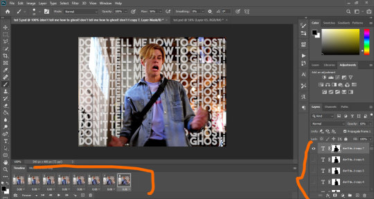
Anyway, once you’ve done all your frames and layers, your psd looks something like this:
And once I save (check this for more details on my save settings), my gif looks like this:

And that’s it!
If I skimmed over anything or you feel it’s not clear, just hmu and I’ll try to do a better job at explaining things :)
I hope this works for you! <3
#tutorials#resources#photoshop 2020#photoshop tutorials#gif tutorials#my edits#kinda#tuts*#owenpatrickjoyners
80 notes
·
View notes
Text
Tu... torial? Pt. 5.
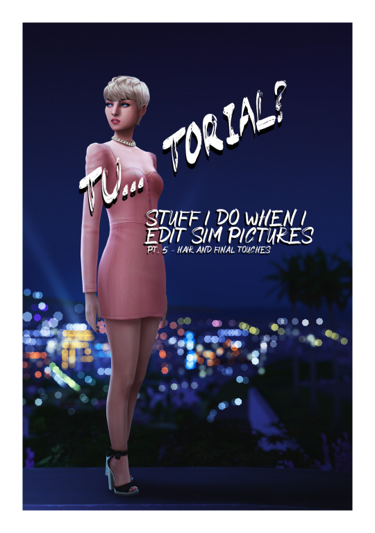
Final part of my tutorial! This is a little all over the place, because that’s how I am in this stage of editing. Also I didn’t proofread this...
Open this in dashboard for best view of the screenshots.
Disclaimer: I have no formal training for any kind of graphics stuff, I work in an office as a receptionist - I serve coffee for a living. I am absolutely self taught and while I consider myself pretty comfortable with photoshop, that doesn’t mean that there isn’t about a gazillion of other things that can be done that I have no idea about. There are people far superior than me in the Sims community. This is just how I do it, with techniques I have picked up through the years. Some things I go over in these will be pretty basic, some things a little more unorthodox. Disclaimer 2: My edits take time. This is what I do to relax, one edit takes several hours for me. Sometimes days :))) Disclaimer 3: My photoshop is in Swedish, which is my first language. I tried my best to find the English translations for every step that I do.
Tools used: The Sims 4, Adobe Photoshop 2020, One by Wacom Pen Tablet (very basic and unfancy).
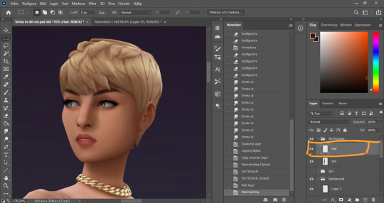
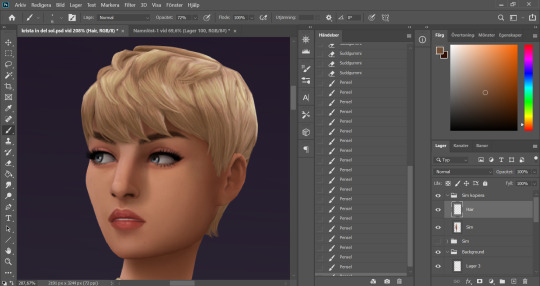
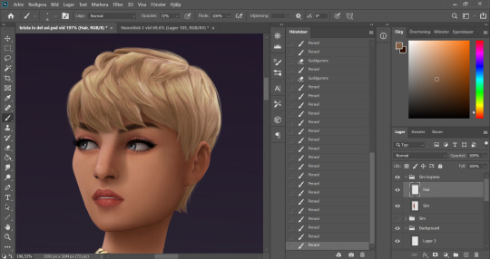
It´s hair time baby! I very much enjoy drawing hair on sims. I make a new empty layer on top of my base Sim layer.
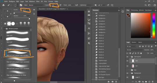
This is where having a drawing tablet makes a huge difference. We need the brush to be sensitive to pressure to get the effect of hair strands. I chose a hard brush, small small size (how small depends on the picture size of course, but I usually land somewhere 6-9 px)
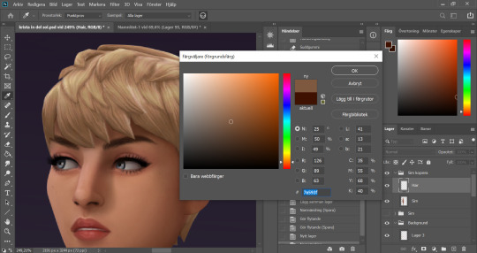
I pick up a color from the hair, I usually starts with a medium light color.
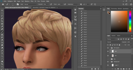
I start by drawing strands around any tips of the hair so they don't look quite so solid. I do this part with both short and long hairs. Hot lazy tip: straight unlayered hairs is the absolute easiest. This is a layered hair so I start with the bottom and work my way up. I pick up different colors from the hair as I go along, to add dept.
Continuing up in the hair and add strands to the pointy bits.
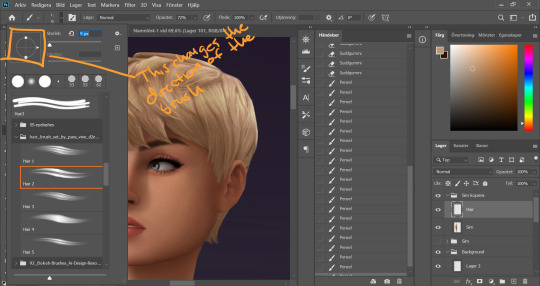
When I feel like the pointy bits have been softened I select one of my hair brushes. I use these ones by Para Vine.
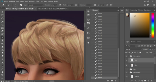
I start painting "around" the hair with one of the lighter colors picked up from the hair, changing the direction of the brush every once in a while for a more natural result.
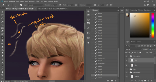
After this the hair is looking a little fuzzy, so I'm going to go back with my small harder brush to fill these parts out.
I don't add a lot of them, just small bits here and there for filling.
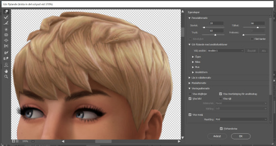
This is a little overkill but... now we have some of that "squary" thing going on in the hair as well that are still showing through our painted layer. Now we could paint over these, but painting can actually be overdone and I wan't to keep the hair recognizeable because the creator put a lot of work into it! So I go into liquify and smooth over any wonky lines still showing, just slightly.
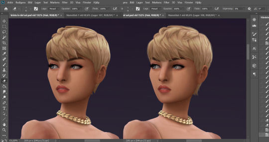
A comparison of before and after hair. Still recognizeable, but softer.
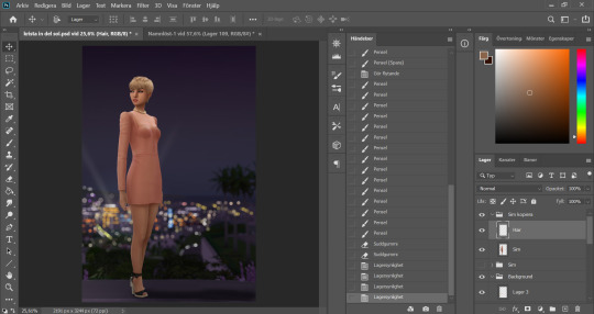
This is our result so far. We've come a long way, but we're not done.
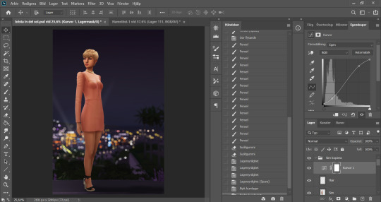
At this point (or actually sometimes sooner) I add an adjustment Curves layer, this will not end up in the finished image, this is just to give me an idea of what the image might look like with more contrast (which we will add later). I keep this at the very top of the layer panel and turn this on and off as I go. Very important to have it turned off if we are going to eyedrop a color and use that to paint, since it would pick up the wrong hue if we have it turned on.
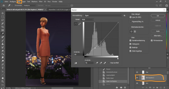
Now I still want the front of my sim to be a little darker to fit my lighting, but I don't want to go over with any more shadow. So I duplicate my Sim layer, and go to Layer -> Adjustments -> Curves. This will only change the active layer, as opposed to creating an adjustment layer down in the Layer panel that will change all layers below it. I drag the curve down a bit to make my new Sim layer darker.
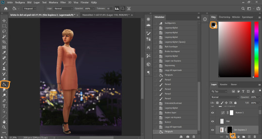
I add a layer mask to my new Sim layer, and bucket fill it with black color so the new layer gets hidden.
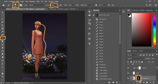
I chose an absolutely HUGE soft brush, with medium opacity, and starts painting white on the areas where I want the new darker layer to be showing. And blend by going back with black where the line is to harsh.
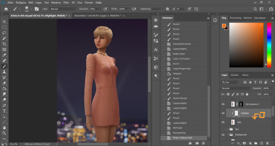
Time to add some highlights. I create a new empty layer between my two Sim layers, and add a clipping mask by holding Alt and hovering on the line between the new layer and my bottom sim layer, until the little square with the arrow symbol comes up and then click. This will make whatever I do on my new highlight layer, only show up on the areas where the layer underneath is filled.
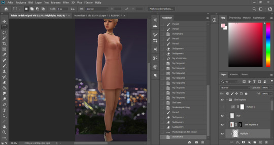
Time to paint. I disable the curve adjustment layer for this. I choose a bright color, in this case a light pink because I didn't want a contrasting color for this picture. I go with a big soft brush around the edges where I want my highlight to hit. In this case, the arm, the hand, the arch of the back and the calf. I didn't add anything to the face in this picture because I didn't like the way it looked, but usually a little highlight to one of the cheeks is just *chef's kiss*
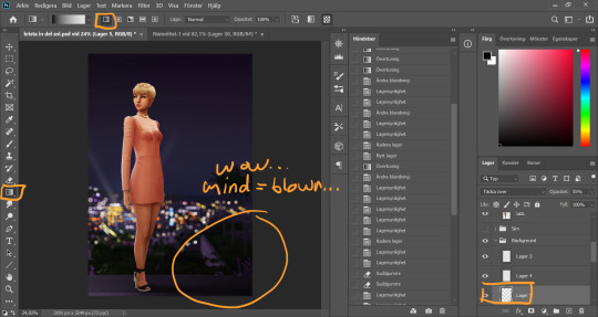
And somewhere around here I got really stuck and really struggled to follow with this tutorial. I felt the picture was lacking something and I tried several different things. I added light rays, tried creating different light sources, there was a moon at some point. But I ended up with just a simple additional gradient shadow down in the right corner (on a new layer down in the Background layer group). Life changing…
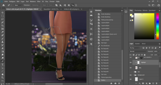
And then I didn't like the pink highlight on the skin (sigh, this is how I work, but it’s not recommended to be this indecisive) so I removed that and added a more beige-yellowee highlight instead. And forgot to take a picture after the highlight was added....
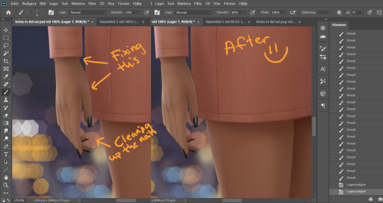
And now I go into nitpicking mode. I add a new empty layer on top of my Sim layer, I add it under the highlight layer so it automatically takes on the clipping mask of the Sim layer, I name it Clean-up Crew and go in to refine anything slightly wonky. Picking up colors with the eyedrop tool and going over flaws with a tiny brush.
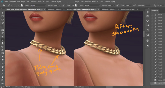
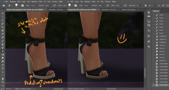
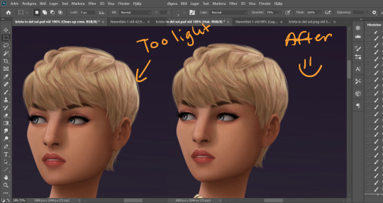
When I fixed this little light area on the back of her head I left the Clean-up Crew layer and went to my Hair layer instead, because I still have that separate and it's above all the other layers.
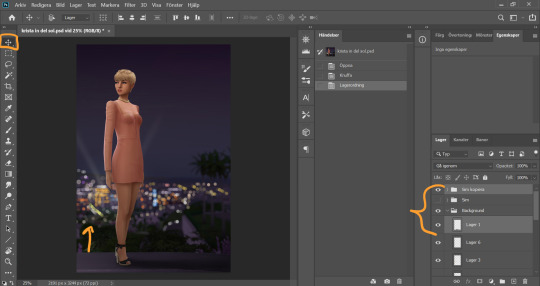
I thought my sim was a little too far down in the picture so I moved her up by selecting my whole Sim layer group and the layer on which I have her ground shadow, chosing the move tool and pushing them up. This will move all the layers in the Sim layer group as well as the ground shadow layer equally.
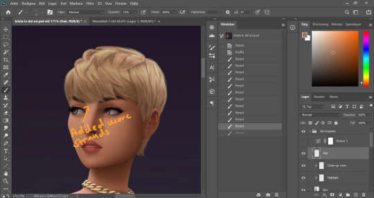
I'm telling y'all, nitpicking mode could go on forever. Added more strands to the bangs.
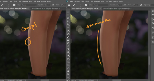
Noticed a little pointy part on the calf, so I wen't into Liquify on the base Sim layer and smoothed that out. Since the highlight layer has a Clipping Mask corresponding to the Sim layer, the highlight stayed in place.
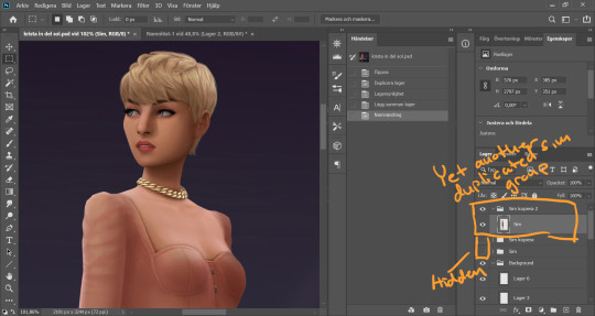
I duplicate my Sim layer group once more, and merge the layers within this group. So now the Hair, Highlight and Clean-up Crew is all merged onto the Sim layer. I hide the previous Sim groups.
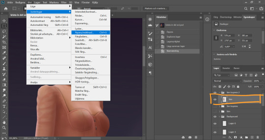
With my new Sim layer selected, I go to Image -> Adjustments -> Hue/Saturation. I want to make my Sim a little less bright so it will match the background a bit better.
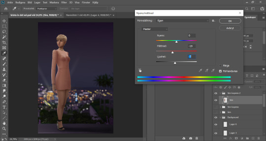
I drag down the Saturation and Brightness slider a bit until I like what I see. After this I save my whole image as a PNG-file because from now on I want to edit the whole picture but still want to keep this psd-file as it is for anxiety purposes. Important: I disable my curves layer before saving this as a picture, I don’t want that brought with me into the next steps because I will be adding new curves there.
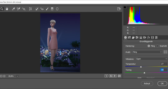
I open my new saved PNG-file. I go to Filter -> Convert for Smart filters. This will allow us to go back and change any filters we add to this layer. I go to Filter -> Camera Raw Filter and for some reason this window opens up humongus. I start by dragging down the temperature. How much depends on the picture, usually more if it's nighttime.
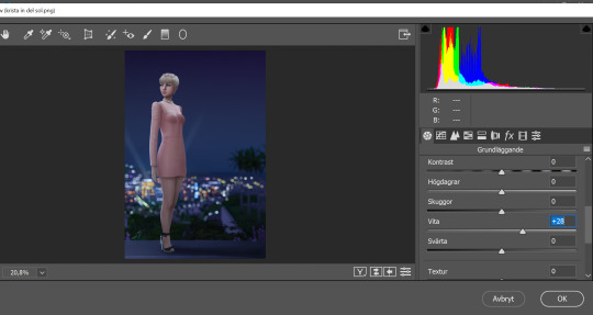
I pull up the Whites a bit for a cleaner look.
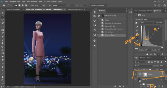
Now I add a Curve Adjustment Layer. Now you can add Contrast in the Camera Raw Filter as well, but I prefer the curve layer because I like to control the different levels. This way I can make my darkest parts a little brighter, giving just a little washed out flair to it all.
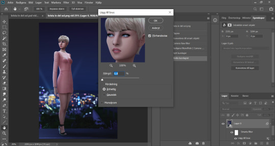
I select my background layer again and go to Filter -> Noise -> Add Noise and choose a level that I think looks good. This just brings the picture together a bit more. Also vintage vibes :)))
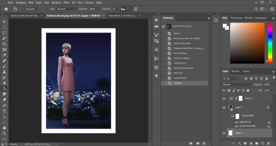
I add my frame (because it´s my aestethic and I think it looks cool on tumblr) by resizing my workspace and adding a filled white layer underneath the background layer.
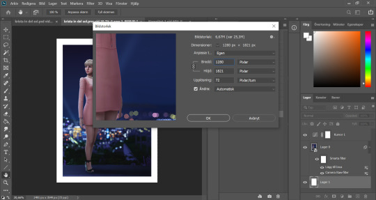
I resize my picture (Image -> Image Size) because we don't need it to be huge.
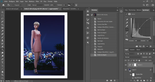
And they I just fine tune the Filters and Curves until the end of time :’)))
And that is that my friends! That’s the end of the tutorial! I hope you could follow somewheat and that someone found it useful. Thank you for reading and never be afraid of contacting me if you have any questions :) I’m very friendly.
63 notes
·
View notes
Note
hello! please ignore my question if it bothers you, but i wanted to ask how you make your gifs so high quality? thank you for your wonderful graphics and i hope you have a great day!
Hello~ Thank you Anon for finding my gifs high quality ;;w;; I always find them so trashy compared to some of my mutuals that make such clean gifs. I made a tutorial a few years ago, but I changed my way of making gifs so here’s a new one ! Hope it will help you, I tried to be as accurate and detailed as possible, but if you have any questions, don’t hesitate to send me another ask ! You can also try to read other tutorials on tumblr ! Have a nice day ♡ヾ(๑❛ ▿ ◠๑ )
PS: GIF TUTORIAL *updated*
STEP 1 : DOWNLOAD VIDEOS
First of all, you will have to download the video you want to gif. Since I make anime gifs, I usually download my videos on nyaa.si (720p or 1080p). Your video must be .mp4
STEP 2 : CHOOSE THE MOMENT YOU WANT TO GIF
So you open Photoshop. Go to File > Import > Video frames to layers. Select your video. A window should pop-up. This is when you will select the moment you want to GIF.
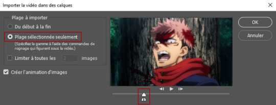
Check “Selected range only”. Select the moment you want by moving the sliders. Once it’s selected, click on OK.
STEP 3 : DELETING FRAMES
So you clicked on OK and imported the video to frames. You will have something like this :

Now you can delete the frames that you don’t want to appear on the gif. You just have to select the frame (will have a light gray border, like on the first frame on the pic below), and click on the bin icon which is below the frames.
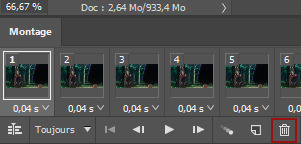
Then, we will select all the frames. Go to the drop down menu and choose “select all frames”. The drop down menu is here :
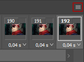
With all your frames selected (all the frames have a light gray border), you can change the time. Most of the time, I use 0,04s, but sometimes if the gif is too short I change it to 0,05s.
STEP 4 : ANIMATION BAR TO TIMELINE AND RESIZING
After that, we will convert the animation bar to a timeline. Select all your frames, and click on this :

A timeline will appear.

Then, go to the right bottom of your photoshop, where your layers are. Select all your layers (=scroll up or down, hold shift and click on the last layer).
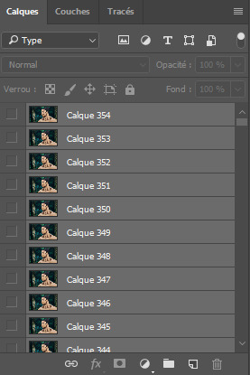
Now, go to Filter > Convert To Smart Object. You will have only one line in the timeline like so :

Then, you will change the dimensions. You go to Image > Image Size. A window will pop up. You enter the dimensions you want (540px, 268px…) and click on OK. I don’t know if it happens to others but when I change the dimensions, a white border appears around the whole gif, as you can see below (idk why).
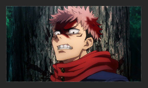
So I usually increase the dimensions by 2 px (for a 268 px gif I choose 270 px for example), so I can crop the borders and still get the right dimensions for my gif.
STEP 5 : SHARPEN THE GIF
Now, the important stuff. How to make your gif as HQ as possible. First of all, the settings really depend on the anime. Every now and then I have to change my settings because it doesn’t look good with this or that anime. BUT my go to thing to do is :
- Duplicate the gif : click right on the gif layer and choose Duplicate the layer
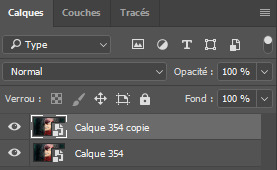
- Set the opacity of the above layer to 10%-30%. Most of the time, I use 30%, but depending on the anime, it might be too blurry in the end. For this gif of Itadori, I decided to go with 10%.

- Use the glaussian blur : Select the same layer and go to Filter > Blur > Glaussian Blur. A window will pop up, choose 1 px.

- Use Surface blur : now, you’ll select the layer below and use the surface blur (Filter > Blur > Surface Blur). The numbers may vary a lot here, because I want to make the gif look the cleanest possible but without erasing too much details. Most of the time I use 3 to 6 ratio, or 4 to 8, really depends on the details and the anime. Here, I’m gonna use 3 pixels and 6 levels.
NB : The gif might become a little transparent on the borders, so I usually create a black layer that will go below all the layers.

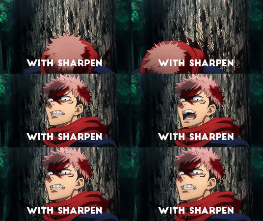
- After that, we will sharpen the gif. Select the same layer (the one below), you go to Filter > Sharpen > Smart Sharpen. Then you just adjust the sharpening to your liking. As for me, it’s most of the time 120% (varies between 80-150%) and 0,3px. Be careful not to oversharpen. Your gif will look worse than if it wasn’t sharpened. I’m choosing 120% here.
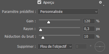
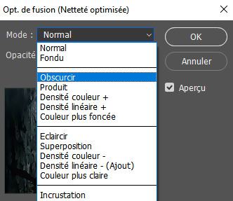
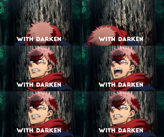
- To make the sharpening smoother, I usually go in the blending options (double click on the little arrows next to Smart Sharpen, as seen below) and choose darken (the blending mode depends on the scene, on brighter gifs lighten might look better, try it and see what you prefer).


STEP 6 : COLORING THE GIF
You can save it as it is or color it so the colors are prettier. For that you will use the settings there :

Or you can use a .psd already made (you can download them on resources blogs). Here, I’ll be using one I made. So you open the file (File > Open) and you select the one you downloaded. Click on the folder of the psd and drag it on your gif.
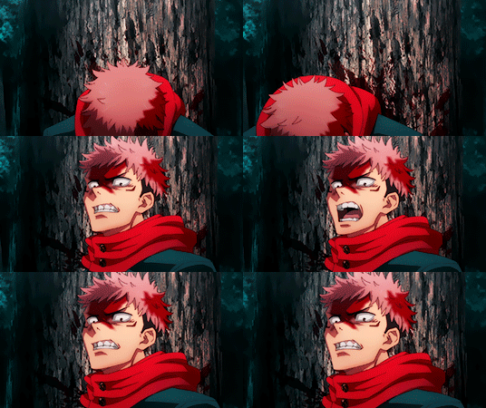
Be careful ! The more you change the colors, the grainier the gif is gonna get. You can find some tutorials on how to color gifs on tumblr, I’m definitely no pro lmao I usually click everywhere until it kinda works out ^^’
STEP 7 : SAVING THE GIF
Now it’s time to save the gif ! FINALLY ! Go on File > Save for web. You will have a lot of settings. First, before saving make sure the looping option is set on “forever”. Then, be sure that your gif is NOT wider than 10Mb (i think it is the latest limit, i’m not sure ^^’). If it is, try do delete some frames or adjust the colors, select pattern… Play around with the settings until it’s under 10Mb. Then, click on save and it’s done !!!

#tutorials#i hope it will help you !!!#I'm definitely no pro but I did become better with time#have a nice day Anon !#replies#anon
65 notes
·
View notes
Note
hi! sorry to bother but i was wondering how do you stack 3 gifs in a single layer without losing the quality, like in that jimin live gifset? mine always lose the quality when i do that :(
Hi! Its never a bother don't worry 🥺 So i use a different method (a rather complicated and time taking rip) for stacking. I've explained it under the cut! <3
So when I need to stack gifs, I dont export the (to be) stacked gifs and save it as .gif files. After completing the gif (as in putting my colouring and watermark etc) I convert it to a smart object and drag it from the timeline itself to the document in which i'll be placing the gif. Because if we stack the exported gifs (which already has some noise) and export the stacked gif again, it just adds a second layer of noise to the gif. I'll explain my process with pictures so it might be easier!
after completing the colouring and everything, I choose "Flatten frames into clips" by going to the option I have circled
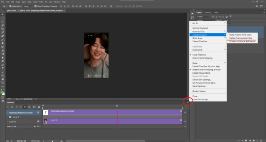
It'll look like this after doing that:
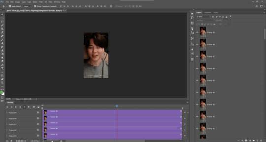
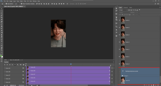
After this is done I scroll down in the layers panel and delete the layers whose visibility is off:
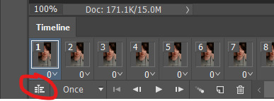
After that I click on this little icon called "Convert to frame animation" after which the interface looks like the second picture.

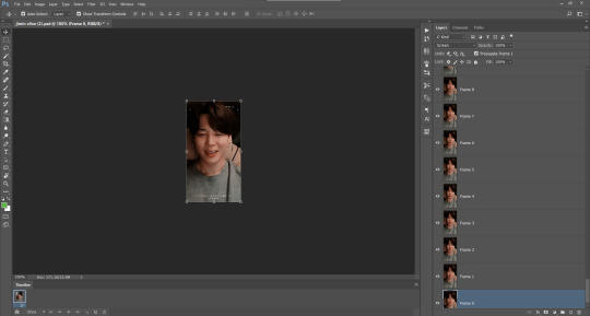
After that I select "make frames from layers" from the icon ive circled
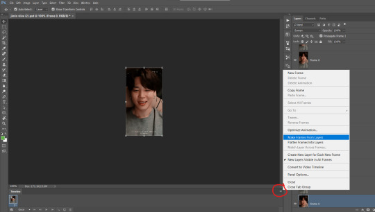
After this much of work (😭😭) (like this was just my saving process i have for exporting the gif if I don't need to stack it) the actual stacking process begins.
The number of frames you have in your gifs that you want to stack should be equal. since I deleted the other psds I had from this live I have just this one so Im gonna place it 3 times skdjfhdjhdjs
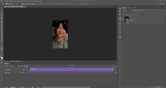
After the Make frames from layers step my timeline looks like this with the first frame's delay automatically set to 3 (or it can be anything other than 3 too) I change this to 0 as well like the other frames and after that I convert the timeline into a video timeline again
After that I select all the layers here and convert it into a smart object
After this is done, I take a new document of size 540*the height of my gif (for eg: its 330px for this gifset so I take a document of 540*330px) and drag this smart object onto that document (and the same with other two gifs) and align it
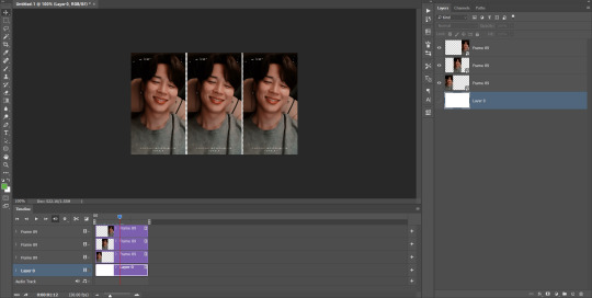
and after that I follow the same saving process I explained from the first picture, but this time I set the frame delay to 0.04 or 0.05 as per my liking and save the gif! I know you probably didn't need this whole explanation but i figured it would be easier to understand if I just explained my entire method 😭 basically the noise that is already there after exporting an individual gifs gets eliminated. I don't even know if you were exporting the gifs and then stacking it or not tho I'm sorry 😭 and there are a lot of different ways of doing this but I'm the most comfortable with this even tho its long I don't know what else method is there to not make stacked gifs look noisy but this is the one I follow (and it does help 8 out of 10 times hehe). Sorry for this huge essay but I hope this helps you 💞 If you want more help then please don't hesitate to send an ask!
7 notes
·
View notes
Note
hello, hope you had a good day and enjoyed your cookies hehe .i tried searching your tags for editing replies but nothing popped up and the resources page also didn't help me so asking directly do you use a ps action set or could you list your editing steps cuz your gameplay editing is so subtle yet so beautiful and aesthetic thank you in advance <3
hi there!!! thank u, I ate too many cookies if I’m honest but it was worth it! <3 thx for checking my tags I appreciate it, you are correct though I haven’t actually answered any editing questions yet so you are the first!
also thank you so much for the compliments! 💕
for my subtle gameplay editing my goal is usually to cut down the time it takes to edit, just so I can sit back and enjoy my game a little whilst also posting on tmblr!

I’ll answer under a cut!
1. Taking Screenshots
I always try to be very careful with my screenshots and their composition, just because the better your base the easier it makes editing. I use reshade in game, and I only turn it on when I’m taking screenshots, but I use the zoom in camera feature that hides the UI! You probably already know but just in case you didn’t know, when you’re using that camera you can use Q and E to move up and down, so you can get the perfect framing you desire pretty easily!
2. Photo Adjustments
Once I find a screenshot I’m happy with I open it up in Photoshop, this will be a PS tutorial since that’s what I use:

My first step is always to adjust my image, and I usually start with curves, you might not want to though, but there are a lot of adjustments there you can play around with. After I do curves I always mess with brightness/contrast then call it a day (as simple as that if I’m honest)!
3. Editing
This is where things get a little more complex, and also please bear in mind that I have a drawing tablet it is EXTREMELY helpful and does a lot of the work for me, I am basically cheating compared to those of you who don’t have a tablet so don’t get discouraged if these steps are challenging with a track pad that being said there are some cheap screenless tablets online and if this is a hobby you really enjoy I strongly recommend investing in it!
As you can see above, my edited screenshot is a lot brighter than my first pic and I achieved this using overlays! on the menu there on the right you should see a pull down that looks like this:

make a new layer and change it to overlay, and then take a soft brush (or any brush you prefer stylistically) and begin to draw an outline around your sim, use any colour you want but overlay works best with lighter colours! Play around tho it’s really fun to see how the overlay layer works!

the outline basically just helps my sims stand out a little against the background! but you can see I didn’t outline her whole body, just certain areas I felt blended a little, or where definition was lost!
I still want my image brighter though, so I then make another overlay layer, and take a tool from the left instead (our intention here is to make a screenshot more vibrant I guess!)

This might be a bucket symbol in your PS by default but switch over to the Gradient Tool instead, and a new menu should appear at the top:

as you can see I have my gradient set to move from colour to transparent, and Radial Gradient selected as opposed to linear, this just gives the gradient a nice soft edge which I like, but I have used Linear in the past (so it just depends on what you are doing) I then pick a colour I like, select the gradient tool and drag my mouse from point A to B to brighten the section of sky I want lighter:

4. Finishing Touches
Now that I have my image brighter and a little sharper looking I now need to add a few finishing touches so I create yet another overlay layer, take a soft brush, lower the opacity of that brush and go over my sims jewellery/eyes just to brighten them a little. This makes them look more ‘shiny’ and I love doing it for necklaces/earrings! I might also sometimes create a dust overlay affect myself but drawinf tiny dots/squiggles (but you can also find dust overlay PSDs online!)

and that’s pretty much it for my gameplay editing I like to keep it pretty simple compared to my edits (those I normally do a lot more adjusting/layers etc. but if you’re looking for simple editing overlays are your best friend)! One thing I didn’t mention is that I sometimes edit hair on to my sims, but I stopped doing this so much for gameplay because I’m lazy. If you do want to edit hair tho just do it before you do anything else! and do it on a regular layer just above the image. There are plenty of hair brushes available online!
#raesponses#itsmegxbree#editing#photoshop help#also if ur PS looks diff#it's cuz mine is old asfk#photoshop actions rarely work on mine so I don't use em#tutorials
65 notes
·
View notes
Text
how I make my gifs: a tutorial
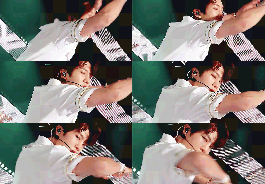
Hi everyone! Just in case someone asks in the future + for those curious, I'm here with a tutorial on how I make gifs! If you have any questions whatsoever, please do send me an ask! I’ll be glad to help! The gif I made with this tutorial is the one right here!
So... let’s start this tutorial with the programs I use.
Adobe Photoshop 2020 - To make the gifs, majority of the work is done in this program.
TopazLabs (Topaz DeNoise 6 and Topaz Clean 3) - To "denoise" and "clean" the gifs, as the names would suggest. Links for download: Topaz DeNoise 6 & Topaz Clean 3
KMPlayer (an alternative would be PotPlayer, or any other video playing program that allows you to capture the frames) - To capture the frames. - I use an older version of KMPlayer, though I don't know which exact version that is.
Now let’s continue onto how I use these programs to create gifs!
Step 1: After you’ve downloaded the necessary programs, download your video. The way to get the best gifs? Quality videos. That’s the first step. For K-pop performances, I recommend this website (the hq files are in .ts form, KMPlayer should be able to open these). Bookmark it! It’s really handy :) Get the video you want to make a gif from and open it in KMPlayer (or PotPlayer or any other program, but for this tutorial I’ll use KMPlayer). Open your video in said program and look for the part you want to make a gif of. Then press CTRL+G (I apologize because I cannot for the life of me remember if this was a standard shortcut or not)
Step 2: After pressing CTRL+G, you’ll be met with this screen:

I’ll briefly explain the numbered parts, but before that, these are my standard settings and just make sure you have them all the same and it should be good!
1: This is where your captured frames will be extracted to. I have them extracted to the standard folder, but you can change this if you want to. You’ll need this folder later when opening the frames!
2: Like it says, this is the image format. I use PNG in the highest quality, as the name would suggest, for the quality.
3: These are the amount of frames the program captures. Say you put in every 2 or 4 frames, you’ll get more choppy gifs. To get the smoothest gifs, put “every frame” (this in turn will increase the gif size as the amount of frames will obviously be bigger).
Once you’ve put in the correct settings and you’ve put the slider where you want the capturing process to start, press “start” (now, before you do this I recommend putting the video on mute as the audio will start to get kinda demon-y the longer you record lol save your ears pls). Then, when you’ve captured all the frames you need, pause the video, press CTRL+G again and click “stop” and close the pop-up/program.
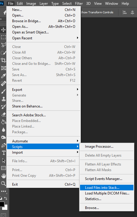
Step 3: It’s time to open up Photoshop! Then go to File > Scripts > Load Files into Stack... (for older versions/another version I used in the past this one didn’t work and I had to use the “Load Multiple DICOM Files...” instead. It should work similarly though, if I remember correctly).
You then get a little pop-up that looks like this:
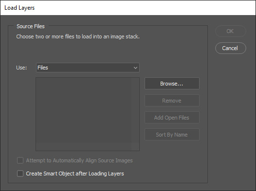
All you have to do here is click “browse” and navigate to the folder where your captured frames have been saved in. Select all the frames you need, wait for them to load in and then click “OK”!
Step 4: Depending on the amount of frames you’ve selected to load in, as well as the beefiness of your PC/laptop, the frames loading part might take a little while. Photoshop is importing every frame as a separate layer into one file, so just... grab a drink or something and wait a bit! When you’re done waiting, if you haven’t already, go to Window > Timeline. This will show you the animation timeline. For older Photoshop versions this is slightly different (I believe it’s called animation). Then click “Create Video Timeline” and click the 3 squares on the left bottom side (in older versions it’s on the right bottom side, not sure).
Step 5: After you’ve done all that, you’ll want to select all your layers. You can do this by pressing ALT+CTRL+A or going to Select > All Layers. With all the layers selected, you have to go to Layer > Arrange > Reverse. You only have to do this if you used the “Load Files into Stack” option!
Step 6: After reversing all your layers, you’ll want to go to the three lines you see in the following screenshot, and click “Make Frames From Layers”.
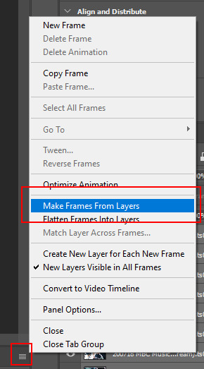
As the name suggests, this turns all the layers into frames. I don’t know why but the first frame will always be 5 seconds long, so to make it easy on yourself when you want to check your gif while editing, just put that on 0 for now. You can do that by clicking the seconds under the frame and clicking “No delay”. After this, check to see if you have the right frames and if you need to delete some (you can do this at any point in the process but I didn’t know where to put it in the tutorial oops).
Step 7: Time to crop the gif to the correct size! For this gif I’m using as an example, I’m making it specifically for Twitter, so the sizes aren’t that obvious (for Twitter I usually use a width of 850 px to keep it sharp, for long size gifs (more height than width for example), I add a background so that it eventually still becomes 850x850 pixels). There’s many posts on Tumblr about the correct sizes for gif/photosets, but a brief rundown of my most used sizes: one gif spanning the entire width of the post has to be 540 px in width. Two gifs next to one another need to have a width of 268 px. I use these dimensions the most! For others, you can Google!
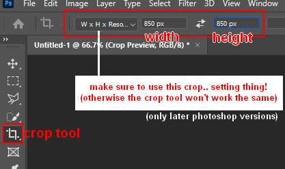
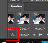
Step 8: After you’ve cropped the gif, you can do either of two things: either you first add the coloring of your choice and then sharpen the gif OR you do it the other way around. I usually switch these two around depending on how sharp the gif already looks before sharpening because I can’t stand looking at 2 pixels while coloring (lmao). For this one I’ll do the sharpening first.
The whole sharpening process is actually quite simple but you need to make sure that you do the following little steps in the right order or else it won’t work! Select all the layers (CTRL+ALT+A or Select > All Layers) and then click this little thingy:
Then you’re going to Filter > Convert for Smart Filters
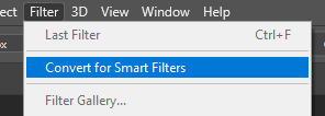
If you don’t do it in this order, your gif will end up... well, not being a gif and not moving. If that happens, track back in your history to see if you did it in the correct order! :)
Step 9: The actual sharpening process! After clicking the “Convert for Smart Filters”, you’ll want to go to Filter again and find the Topaz Labs tabs. Personally, I usually do it in the order of DeNoise first and then Clean, but this is a personal thing, really.
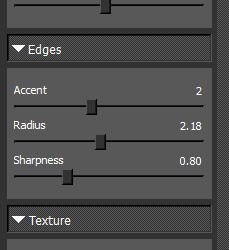
I recommend playing around with the settings to see what fits the gif but here are my go-to DeNoise settings (tip: save these as a preset so you only have to click that for faster giffing!):
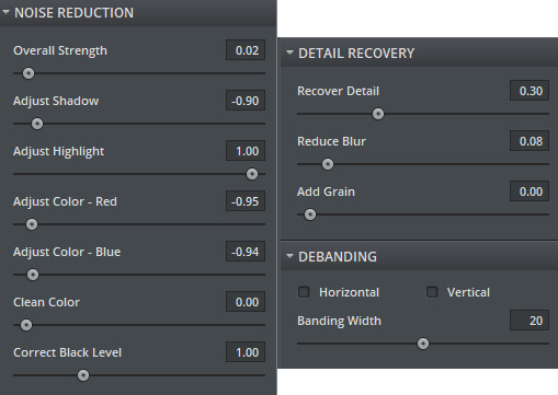
And my Clean settings:
Press OK when you’re done with these and then go to Filter > Sharpen > Smart Sharpen. These are my SS settings (just copy these, and again, save as a preset!):
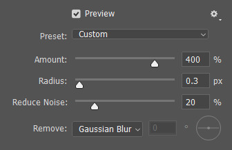
Depending on how sharp you want the gif to be, you can input the same settings or go to this in the layers and change the percentage.

Now that we’re done with these... it’s time to flatten it! Just follow these little steps:
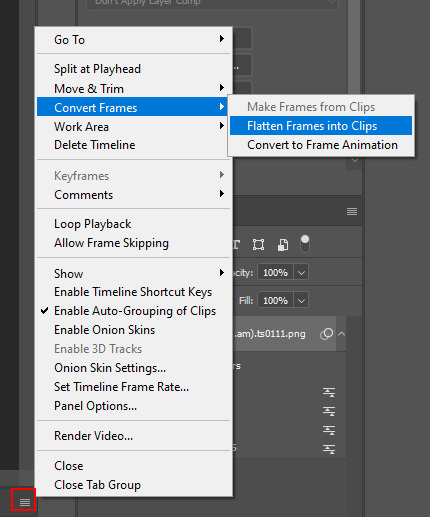
And then you wait. Again. I know.
Step 10: After playing the waiting game, you’ll click the three little squares again and do the same thing you did earlier: “Make Frames Into Layers”. Delete the first frame. Add a coloring of your choice (can be a PSD, can be your own coloring, etc. this is honestly just... playing around with things and see what it can do). After you’ve done coloring, select all your frames (same lines as previous screenshot except now you’ll see a “Select All Frames” option, click it!) and change the time to whatever you like (I usually go for 0.05, 0.06, or 0.07. Again, just play around with this!! Try different things!)
Step 11: Final step! Saving :) I use shortcuts a lot to make things faster so either press ALT+SHIFT+CTRL+S or go to File > Export > Save For Web. Not much to do here, just copy the following settings and save the file!
!!! NOTE: After making a new gif today I realized there’s a weird dotted border on the top of my gifs, it’s a bit difficult to explain but I had no idea what it was. Turns out that the reason why this showed up was because, as shown in the screenshot below, I had “Transparency” selected. If you’re experiencing this too, UNSELECT the transparency and it should be all good!
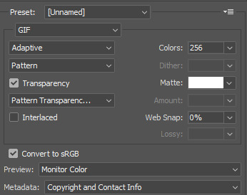
Also make sure that the “Looping Options” is set to Forever, or else your gif will play only once and then stop!
Tip: While making gifs for Twitter I at one point noticed that if I added in a white background, no matter what I’d do, it’d show up as yellow-y in the preview box. After googling I found that going to the options (1 in the screenshot) and then clicking “Sort by Luminance”, then double-clicking the lightest color (not the transparent one, 2 in the screenshot) and selecting white (or FFF) will get rid of this! This likely won’t be that useful for Tumblr gifs but just in case you ever want to have a white background...!
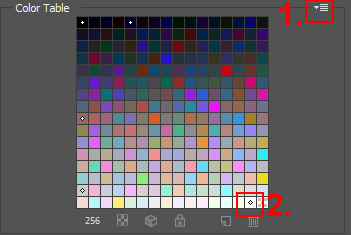
Then just... save, and upload to Tumblr! :)
Final note: Tumblr has a mix gif size of 3MB. If you have a gifset of 4 gifs you want to upload, all 4 gifs can be max 3MB each. Keep this in mind! If you’re over 3MB, delete a few frames and try again, or resize/crop your gif!
As it turns out, Tumblr has increased their gif size to 8MB, however, the quality tends to get compressed with larger gifs like that so per recommendation: keep them below 5MB! (thank you @yeoli for letting me know!)
I hope this helped! If you have any questions, feel free to send me a message and I’ll try my best to answer them.
75 notes
·
View notes
Photo
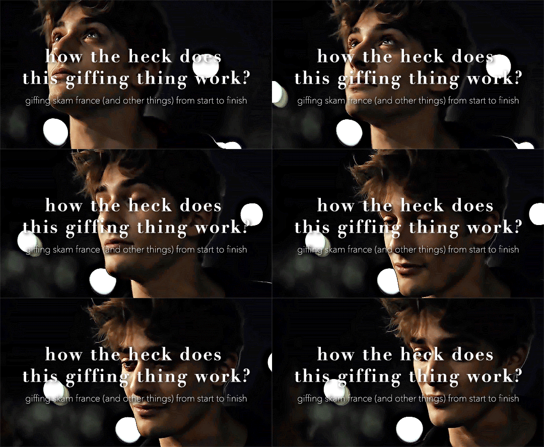
so here’s my disclaimer: I hardly know what I'm doing. This is my glued together homemade giffing method that I’ve created over months of just random experimentation and bits and pieces from all kinds of tutorials. there are probably better or more correct ways to do a lot of these things! this also isn’t a completely universal tutorial, some of the specifics are geared towards giffing skam, specifically skam france.
I gif in photoshop cc 2020 on a macbook. Some things like keyboard shortcuts and little things about the photoshop interface will probably vary if you are on a pc/ other version of photoshop!
this is very long and very unprofessional, but I hope there is something in here that someone will find helpful!
we’ll be going from this:
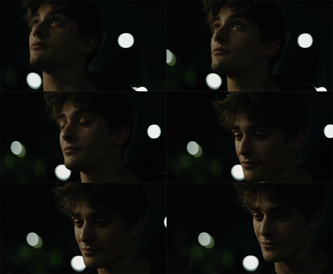
to this:

up to date as of October 25, 2020
downloading clips
selecting what part you’re going to gif
cropping
my action for resizing, converting to a smart object, and sharpening
coloring
exporting and setting the delay
tldr tips
1. downloading clips
4k video downloader (which you can get for mac or pc here) is great for things posted to youtube, especially from skam france because all the clips are on their youtube with no weird geoblocks or anything! it’s really easy, you just have to open the clip in youtube, copy the link, and go into the program and hit paste link. I like to put on smart mode first and set the destination folder so all my clips go into the place I want.
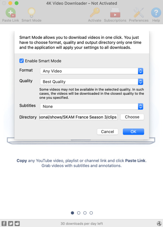
There is a 30 video per day download limit, so if you’re thinking you really want to gif lots of stuff from the show, and want a big chunk or a full season it’s definitely worth hunting for a mega or google drive with full episodes to download because it’s just less hassle! I might come back to this post later and compile a list of all of those, but for now if you type “[remake] no subs google drive” or “[remake] no subs mega” into a google search, you’ll probably find something! the all of skam website has no subs for several remakes, but not all!
If you don’t have enough space on your computer to be keeping full seasons, I know there are methods to get screencaps without having to download (generally for giffing movies and regular tv I think this is a common method), but I’ve never done it so I’ll redirect you to this tutorial that explains it! you should probably just go there for the whole thing tbh it’s much more coherent than this, but I digress.
2. selecting the piece of the video you want to gif
now that you’ve got your episode or clip you’ll want to just open it in photoshop! if you go the screen capping route the way to do that is a bit wonky, so you can keep following the tutorial I linked above and join back in here at coloring if you like!
if the timeline at the bottom doesn’t pop up automatically you can go to window > timeline and turn it on! now you can use the scrubber bar thing to find the moment you want to gif!
The advantage of this over screen capping is you can scrub with more precision. the arrows circled in blue below let you jump only one frame, where in screen capping I'm pretty sure you can only go by ten second or one minute intervals.
I usually drag the scrubber as close as I can to the start of the shot/moment I want to use, fiddle with the arrows circled in blue below to jump forward or back one frame at a time until I'm at the first frame I want. I move the left grey handle to the scrubber and then I hit the play button and let the whole shot/moment play. Pause and repeat the shuffling with the arrows until you’ve landed on the last frame you want to use and move the other grey handle.
the moment you want to use should be between your handles (it’ll look like what I have circled in red), and if you hit play, you should see the thing you want to gif playing on loop above the timeline. the speed will probably be weird, but we’ll deal with that at the end.

now I recommend doing command or control + s to save your gif as a psd (photoshop document). this is a working, editable file which means if photoshop crashes you can open your file right back up and keep working as long as you’re hitting command or control + s at regular intervals as you work. later we’ll go through exporting in gif format that can actually be uploaded to tumblr.
3. cropping
next I crop out any logos or black space at the top and bottom. Just click on the crop tool on the lefthand side of the screen, drag the edges and hit enter when you’re done. you can of course crop out more than just that, but regardless of what you crop out, now is the time to do it.
you can set an aspect ratio for your crop at the top of the screen if you’d like to be positive that all the gifs in your set will be the same:

4. my trusty action: resizing, converting to a smart object, and sharpening with one click
Now is when I use an action I made that does all the resizing, converts to a smart object, and sharpens. I’ll take you through the steps so you can conceptually get what’s going on, but I highly recommend using the actions window to record your process as you follow along so you have this action as well. It easily shaves at least 5-10 minutes off of the whole process, and these steps will be the same every time.
here’s how you make an action: go to window > action and open the action panel. click the plus symbol to start recording a new action:
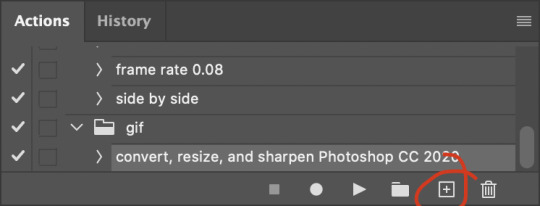
in the window that pops up, give it a name and hit record:

now just continue with the steps below, and it will save them!
first you flatten frames to clips (I think it says flatten to layers on older versions of photoshop). this is in the menu at the top right corner of your timeline:
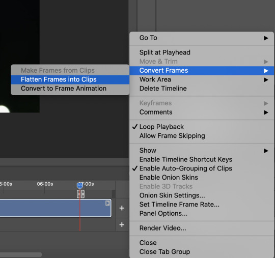
next you convert to frame animation by clicking on the symbol in the bottom left, circled in red:
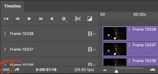
if there is more than one thing in the frame animation, delete the extra one. you don’t need to keep the last one but it won’t let you remove it until there are other frames in there. also go into your layers and delete video group 1 and its contents. don’t ask me why these steps are necessary, I don’t really know, but I’ve noticed it sometimes gets wonky if you don’t do this:
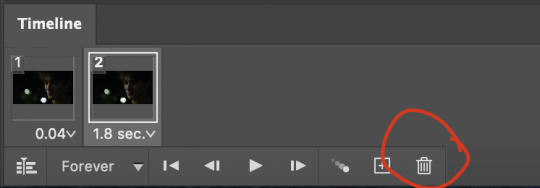

now you want to make frames from layers and delete that first frame that was there before:
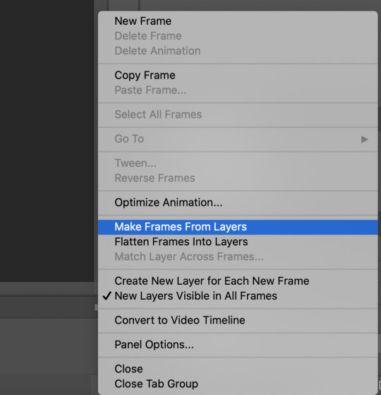
then we return to the timeline:
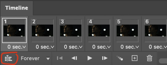
use command + option + a (control + alt + a for pc I'm pretty sure) to select all layers and then right click within your layers window and select convert to smart object. It’s important to convert to smart object after you go back to the timeline, or the gif won’t move:
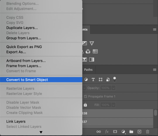
next I resize. gifs for tumblr should be 540 pixels wide. for recording your action you should just go into image > image size and only change the width to 540 in case you ever have gifs cropped to different aspect ratios. don’t touch the height, let constrain proportions figure it out!

now, here’s what our base gif looks like, no sharpening, no coloring:

now to sharpen. go to filter > sharpen > smart sharpen. this is up to personal preference, but my go to settings are:
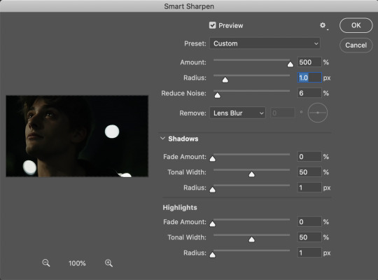
this is what we have after sharpening:

now is when you can stop recording your action.
just press the stop button in the action window:
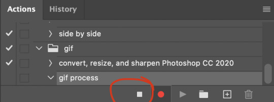
this action is pretty much universal and after I select the moment the gif will be and crop however I want, I use it on every gif I make! so although this initial setup is tedious, now you’ll never have to do these steps again, and the process is magically much quicker.
5. it’s time to jump into coloring!
I typically start with exposure and sometimes some brightness/contrast. with really dark gifs like this, you kind of have to make it worse before you make it better. I did this:
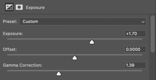
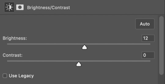
now the gif looks like this:
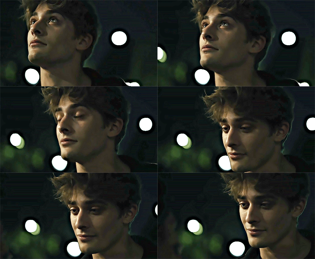
we have some static and some ugly bits, and this is where selective color comes in to fix it! boost blacks like this:
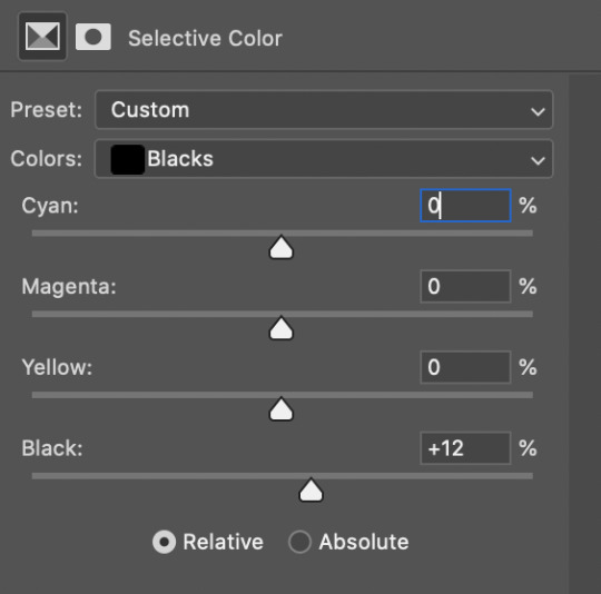
and now your gif looks like this:

the skin tone is looking a little sickly and weird, so I go into the yellows and reds in my selective color layer to fix it! I also messed with the greens here because I didn't want color in the background (that part is totally optional and just up to your preference):

now we have this:
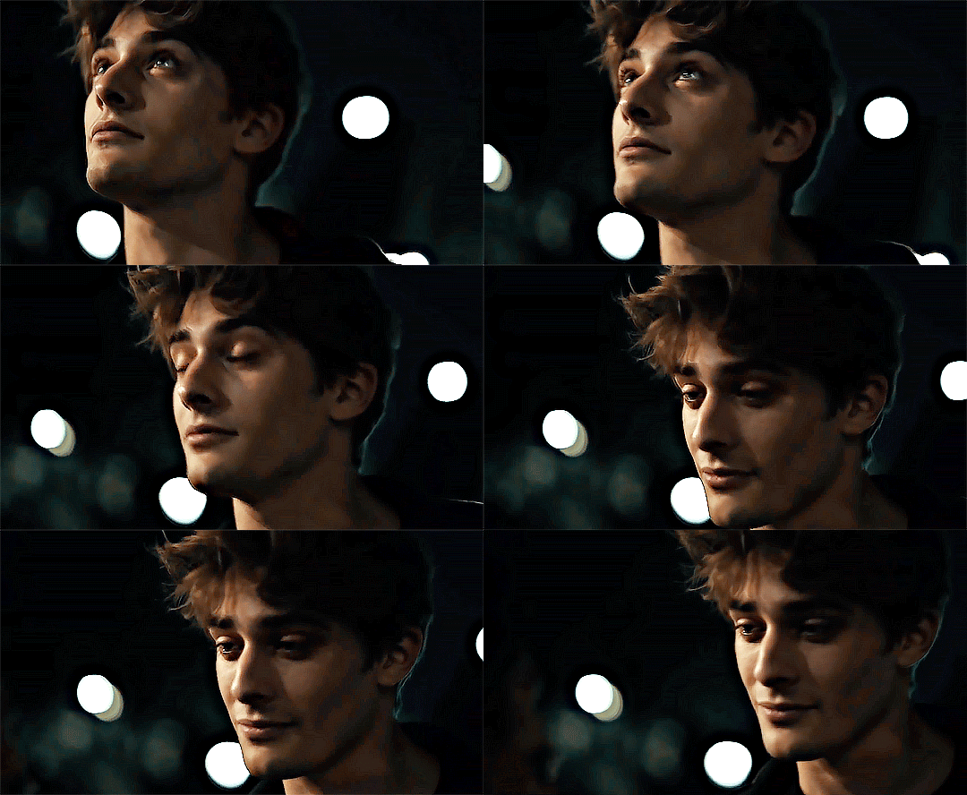
to really take the color 100% out of the background, I did one more separate selective color layer for cyan (again, I just felt like it but this is optional!):
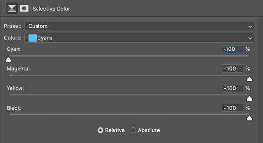
and now the finished gif:

there’s lots of fun extra things you can add like text and tints and overlays and all that I won’t get into, but feel free to reach out for help on those types of things!
this gif was certainly not the most complicated to color. some ridonkulously dark clips (*cough cough* vendredi 20h27 *cough cough*) take tons and tons more effort than this and a lot of the time you’ll want to use color balance layers and vibrance layers and all of that to mess with your coloring.
with all of this coloring business, I really just learned by doing. I don’t know all the technical purposes of each type of adjustment layer, and I tend to stay away from curves just because I find them confusing and annoying. The bottom line is that you should always experiment and find out whatever coloring works for you and run with it! I’m sure every gif maker you talk to does things at least a little differently!
I highly recommend taking the time to go through all the types of adjustment layers and just move the sliders around to see what they do! That’s honestly one of the best ways to learn and decide what you like!
6. now to export and adjust the delay!
the keyboard shortcut for exporting on mac is command + option + shift + s, control + alt + shift + s for pc, otherwise you can go to file > export > save for web
my settings are here:
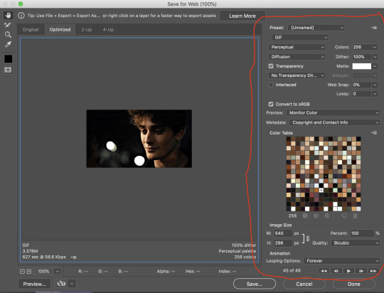
the settings only need to be configured once! otherwise just hit save and follow the pop ups to choose where to save and what name you want to give your gif. Since you saved as a psd way back, that will be the name it’s automatically given, but call it whatever you want!
then I adjust my delay by opening the gif I just exported (not the psd, the .gif file) and using one of my delay actions. I’ve made an action for each delay between 0.05 (real time) and 0.08 (really slow mo for certain super short shots, typically for more ~artsy~ sets).
all my action does is select all frames:
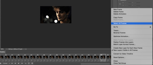
adjust the delay (which will differ based on whether you want them slowed down and by how much):

for reference, this is a 0.05 delay:

and this is a 0.08 delay
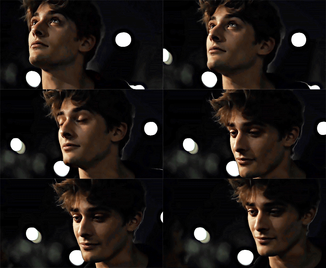
now you just export the same way you did before!
remember if you’re recording this as an action, you don’t want to touch the file name, just say yes when it asks if you want to replace the file. if you always save your gifs to the same place, your action will now enable you to override any gif with the incorrect delay with the correct one with one click!
7. tldr: the main tips
for downloading 4k video downloader works well for non geoblocked youtube videos, the all of skam website is another place you can look to download with no subs, here’s the screen capping method if you don’t want to download
The main way I combat dark lighting is to bump exposure to the right, gamma correction to the left, and then enhance black in a selective color layer. The amount of these three adjustments will vary gif to gif. I know lots of people use curves, but I find them really confusing for some reason, so this is my method! As my graphics teacher likes to say: there are always at least 3 different ways to reach the same result!
there’s a little bit of additional coloring on this one, but here’s another before and after example so you can get an idea of how those steps get you a better lit result without making the lighter parts super over exposed:

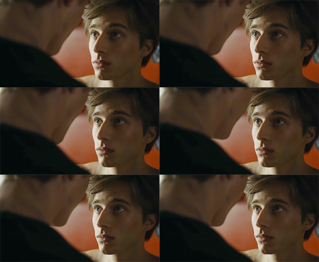
besides those three steps, you have free rein to use the other selective color channels, as well as color balance, vibrance, hue/saturation, etc. to restore color that was lost or to change the colors altogether! mess around with it and have fun experimenting!
7a. bonus coloring tip:
sometimes you can make use of selective color to completely alter an isolated color in your gif. You can get very adventurous with this, but here's a simple example of changing blue tones to teal (I got away with these gifs being longer because they were in rows of two in the set I posted them in. I'm too lazy to trim frames so I can put them here at 540 px without going over the 10mb limit so just ignore the quality ok):
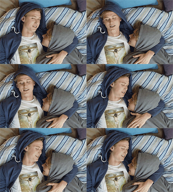
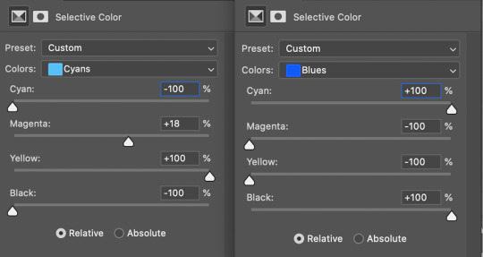
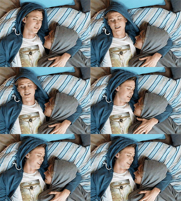
7b. actions, actions, actions!
if you find yourself doing a certain thing over and over, always record it as an action. the amount of time they will save you is honestly really impressive.
You can duplicate actions, so, for example, if you have different sharpening preferences for different shows or scenes, you can duplicate your gif process action and go into the steps, double click smart sharpen, and alter it however you want!
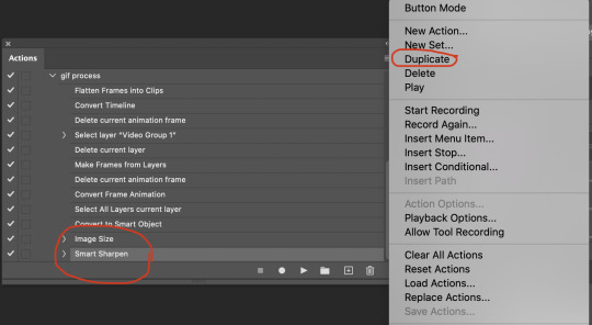
This could also be good to do for the different widths for tumblr if you ever do sets with rows of two or three! Duplicate actions is also how I made my actions that set delay at 0.05, 0.06, 0.07, and 0.08!
when in doubt, always make an action! it’s worth minimizing the tedious bits of the process as much as possible so you can focus on the fun part of seeing your awesome gifs come to life! any little task you find yourself doing often, make an action!
and for now that’s all I have. if any of this made no sense, if you want to suggest a correction or addition I could make, if you’re ever curious how I did something on any gifs I post, or if you have any other sort of questions, feel free to send me an ask or a dm! if I can’t answer your questions I’ll be happy to try to direct you to someone who can or a tutorial to help! again, I'm no expert, not even close, but I hope at least one person will find one thing in this mess that helps.
#this got . so long omg#mystuff#mytutorial#gif tutorial#tutorial#resources#fellow gif making peeps feel free to correct me or give input on how to improve or add to this tutorial!
31 notes
·
View notes