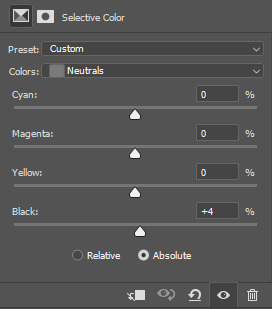
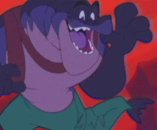
#i love low contrast as a tool
Text
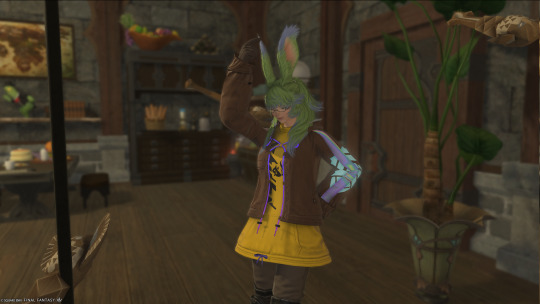
i am. so bad at taking photos of my knitting… this thing is so much prettier in person the camera hates my low contrast colors.
#i love low contrast as a tool#the striping would be so distracting in high contrast#shout out to color theory for making the griege into a gorgeous silver#also it’s so fucking soft#ula and lia yarn i love uou#the pattern is chart B of lindisfarn#i didn’t like how wide it was getting with the full pattern#knitting#making matching gloves also#maybe a hat if i have enough yarn left
10 notes
·
View notes
Text
unpopular astarion headcanons r.e. mirrors and reflections:
while I love the memes around this, I don't think, unless you had a particularly charismatic tav/durge, the whole party would draw him / contribute to some kind of spell where he could see his reflection. Obviously there's room for difference given how many routes your playthrough can take, but generally: he's not universally loved in the same way Karlach is, he's not the heart of the party, he's mostly clinging to the edge of it (and that's fine!)
I think showing him his reflection would impact him deeply and therefore if it is done at the wrong time/place, he'd actually resent the person who did it. this is because you're making him appear vulnerable.
e.g. if the venue is too public, if the others could see, he'd dislike the fact that others can see a moment of vulnerability
alternatively: if your approval with astarion is too low, he'd automatically distrust it / question your motives. this is someone who simply does not believe that people will be kind unprompted to strangers (because doing so violates his worldview and in some ways makes his abuse feel crueller -- if no one cares, there's a logic to what happened to him, at least)
the more permanent the method, the more effort put in, the more likely he is to have mixed/negative feelings towards it. a sketch is a kindness, but not one that requires a great sacrifice or planning - it's easy to dismiss as a fleeting gesture (while he will keep it, obviously, to look at, because he's not that willing to believe his own bullshit).
in contrast, if a permanent method of showing his reflection was given - e.g. a charmed mirror that casts a spell - I think astarion, with a high approval PC, would feel on some level obligated to pay that 'debt' back. astarion strikes me as someone who distrusts thoughtful, non-flippant gifts because again, he's used to transactional relationships.
I also think it might strike at an insecurity: the knowledge that astarion lacks autonomy/independence to deal with his own issues by himself, and, with some bitterness, is dependent on the PC to help him. if you give astarion an enchanted mirror, he, on some level, feels he is dependent on your magic and your supply of magical items to gain access to an element of his humanity. that doesn't entirely sit comfortably with him.
the "best" way to deal with this? let astarion figure out how to handle this himself. for example: gifting him a 'mirror image' spell scroll or something similar. give him time to study the scroll and he'll find a way to cast that spell himself. mechanically, astarion isn't a wizard, but narratively, his default class is arcane trickster, he has access to magic, I don't think it is really that much of a stretch to believe he could achieve that. in general, I think handing astarion the tools to achieve his own goals by himself will be more appreciated than handing that to him on a plate.
however! counterargument to consider: it may be more valuable in the long run to confront astarion's fear of dependence and the sense of reliance that exists particularly in a tav run, where you the PC have 'saved' him without needing to be saved in return. he needs to realise that the PC isn't expecting anything in return for friendship/romance.
either way, i think showing astarion his reflection is going to be more fraught than one might expect - a generous gift, obviously, he will take (he's been poor and starving enough not to turn it down), but there might be some tension beneath any show of gratitude your receive (or he might feign disinterest, if approval/trust is low enough!)
278 notes
·
View notes
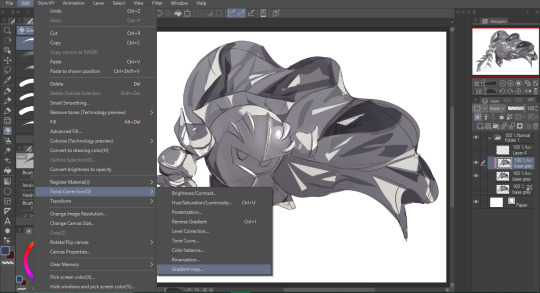
Note
your rendering is so good how do you do it
Thanks, I love your rendering too!! Gonna try and make a tutorial ^^
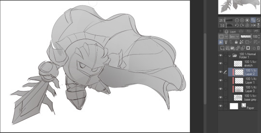
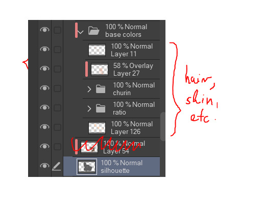
To start off, I'm on Clip Studio Paint and these are the brushes I use! First two for rendering characters (round brushes) and the other two for mostly backgrounds (square brushes)


I used to do lineart, but it takes too long >:( now I just make a sketch and sorta clean it up!

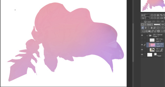
Next I fill it in with a gray color. For simpler pieces I just put in the flat colors, but for more paint-y pieces I do grayscale -> color! I'll be doing that here :)
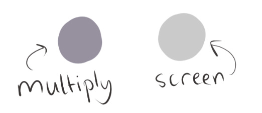
Also, I make 3 clipped layers on top of the gray - two are multiply, and the top one is screen. On the first multiply, I do a soft gradient using an airbrush
On the next multiply layer, I fill everything in with either a cool-ish or warm-ish gray, depending on the mood ^^
I also determine a light source, and use the lasso tool on the screen layer to block out where (I think) the light hits! Tbh I just do wherever feels right lmao, but I recommend having a reference! I like doing it in triangle patterns
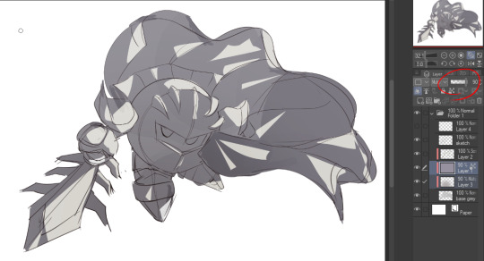
Then adjust the opacity of each layer to whatever feels right, and merge everything (I don't merge the sketch/lineart yet, I do it before adding colors in!)
Now... rendering. Some tips I have are color pick (greys) off of the canvas and use them to paint! Clean up the sketch more, erase edges, but I save details (like Galaxia's red gem, his eyes, etc.) for the end, or during coloring.
After I'm sorta happy with it, I merge the sketch layer, then duplicate it, and add a gradient map! I did this sunset-y one but changed the hue to yellow-ish, then lowered the layer's opacity ^^
Play around with the hue-saturation-luminosity setting!
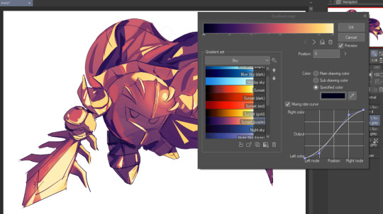

Now go crazy with blending modes! Multiply, overlay, color, glow/color dodge, etc. Feel free to layer them up on top of each other too, and this is to add the character/piece's actual colors in. For example, I used a white-blueish overlay layer for his mask and glove, blue for his cape, blah blah
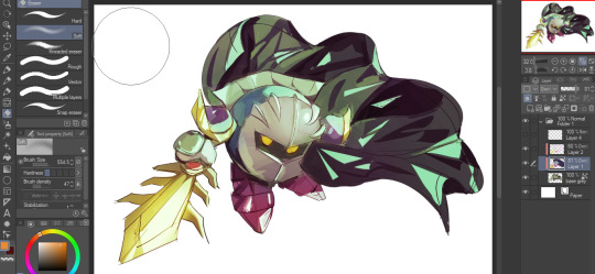
Now I clean the sketch up/refine it more. Also, to "harmonize" the color palette, you can add a colored gradient on top. Then set it to multiply, and add overlay/glow dodge layers with any colors you see fit! I like using teal and light/warm orange!
Here is an example of a colored gradient:
Another tip is to add saturated colors on the edges of both lighting and darker shadows, before blending it:

Also I usually add in a light blue/grey in shadowy areas, and lower the opacity for reflective light:

Also! You can lasso + use an airbush with a light blue to block out parts of the background (his cape here, for example). It helps with more depth!
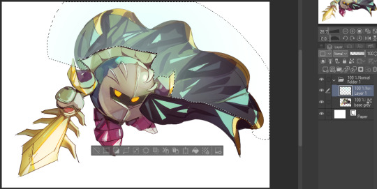
Finally, I like adding sparkles on low opacity :3 And gaussian blur to certain areas! I'm using radial blur on this piece though ^^

For the background, I like doing blocky shapes!! I use my square brush on 90% ish opacity, to color pick different hues from the piece. For lighting I use a glow dodge layer, here's a mini timelapse as well as the finished art!
At the very end, play around with the hue/saturation and contrast tools to change the colors :)
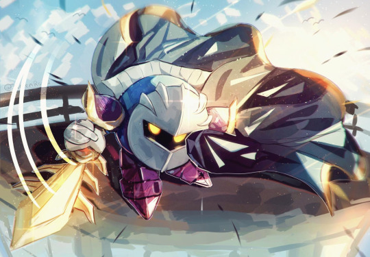
#iiii hope this helped??#first time making a tutorial sorry!!#art tutorial#kirby meta knight#meta knight fanart#meta knight#nintendo kirby#kirby nintendo#kirby fanart#kirby series
537 notes
·
View notes
Text
Pulp Covers And How To Paint Them
With the rise of cheap printing in the early twentieth century, mass-marked paperbacks swept the world, each offering lurid thrills for obscenely low prices. Sex, sadism, and incredible violence for as little as ten cents. An easy purchase to slot in between fifty cigarettes a day and enough bourbon slugs to kill a small garden.
Pulp fiction is where some of the greats of American literature cut their teeth, including the big three, Raymond Chandler, Ross MacDonald and Dashiell Hammett. The contents of these stories, both the dizzyingly good and astoundingly terrible, have been absorbed and digested and remixed and regurgitated in nearly every permutation imaginable, fuelling pop culture some one hundred years on. This isn't an essay on that. Nobody likes to open a tutorial and be greeted with a wall of text. The history is for another time.
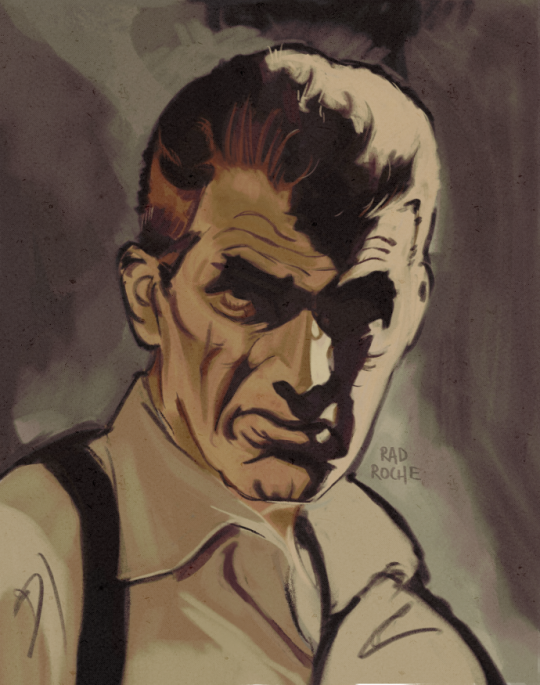
But it is about how to paint it.
Don't let the pre-amble intimidate you, it's not as hard as it sounds. You will need:
Painting software with some image editing capabilities. You don't need all the bells and whistles of Photoshop, but I wouldn't recommend something like MSPaint, at least not to start with. I'm using Clip Studio Paint.
A really beat-up paper texture. The grungier, the better.
A lightly-textured brush. Here are the specific brushes I use, 99% of which is the well-named rough brush. Try and avoid anything with any impasto elements.
Go to your colour-picking tool and use the 'select from layer' option. Doing all the painting on a single layer is going to make your life easier.
A complete willingness to make mistakes and, instead of erasing, painting over them. It generates much more colour variation and interest! Keep your finger off the E key.
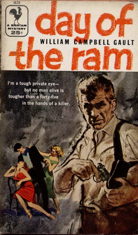
Good reference! That painting is a master copy of Mitchel Hooks' art for Day of the Ram. Find a style you really love and want to learn? Have no clue where to begin? Do direct studies!
Let's not worry about whatever is happening in the background. It's probably fine. Let's get started! Pulp magazine art is a lot more varied than you might first think, so don't agonize over having a style that 'fits' or not. I'm also specifically aiming for something you'd see on the cover after printing, not the initial painting they would use for printing. The stuff I'll show here is a pretty narrow band of it, but here are some general commonalities. This is a painting by Tom Lovell.
Let's dig into this.

The colours are very bright and saturated, but the actual values, the relative lightness and darkness of them, are actually grouped very simply! You can check this by filling a layer full of black, putting it on top and setting its mode to colour. If the value of a painting looks good, you actually get a lot of leeway with colour. But here's what I think is the most important thing to keep in mind.
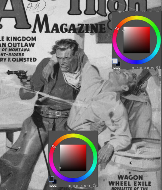
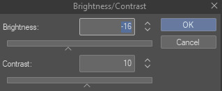
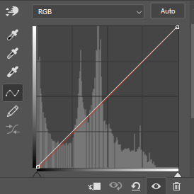
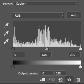
The darks aren't that dark, and the lights aren't all that light! Covers are paintings reproduced on cheap paper. Anything you wouldn't want to happen in the printing process, you lean into. Value wash-outs, lower contrast, colours getting a weird wash to them, really gritty texturing. So let's get painting! Here's my typical setup.
That bottom folder is the painting itself. The screen layer is the grungy paper texture. To get the effect you want, put it down, invert its colour, then set it to screen. That washes out your painting far, far too much, so to compensate, I put a contrast layer up on top. Fiddle around with the settings, but this is where mine ended up sitting.
Note I'm saying this before even starting the painting: you want to do this as early as possible. This is where the 'select from layer' colour picker comes in handy. You can paint without worrying about the screen or contrast layer. Something not looking right? Enable your value check layer and keep painting. When you turn it off, it'll still be in colour. Here's a timelapse so you can see what that looks like.
And when you check the values...
They're pretty simple! This isn't a be all and end all, but I hope it serves as a decent primer. I want thirty dames on my desk by Monday!
#rochedotpng#art tutorial#art resources#couldn't find a thing online about this style so here's how i do it#pulp#it's how i did the death shroud one more or less
307 notes
·
View notes
Text

CHAPPED

pairing ༄ kakashi x gn!reader
warnings ༄ slightly suggestive, reader and kakashi are in an established relationship, and there is an implied age gap. this is mostly fluffy fluff (who am i?)
word count ༄ 1129
notes ༄ happy belated birthday to the man who started it all! my first 2d love <3 dedicating this to my kakashi girlies: @honeylavendr, @strawberrystepmom, @purpleskyvenus @rookie98writes and @delirious-donna!
it’s late—too late to be up on a work night, you think as you glance out the window, curtains not yet drawn closed. the moon is suspended high in the black satin sky, countless stars twinkling in adoration, graced by her brilliance.
diffused lamplight and flickering candle flames illuminate your bedroom, their warmth bathing everything in a dusky orange. your nightstand acts as a makeshift workstation, tools at the ready: rose water spray, moisturizer, lip treatment, and a headband.
your boyfriend pads out of the bathroom shirtless, dark pajama pants slung dangerously low on his narrow hips. “all done,” kakashi announces before smoothing a large hand down your back and pressing his still-wet lips to your forehead.
“i told you to pat your skin dry after you washed your face,” you pout, wiping away the chilly droplets that prickle your skin in the wake of his kiss.
kakashi settles on the edge of your shared bed, feet firmly planted on the plush rug. when you first moved in with him, you insisted the rug would feel cozy under your feet on a cold morning—a stark contrast to the unforgiving hardwood floors of your apartment. as usual, you were correct.
your comfort is more important to kakashi than anything else; a truth he probably shouldn’t admit as hokage.
“i did my best, love,” he hums, pulling you in by the hips, lithe fingers slipping beneath the waistband of your shorts to knead the supple flesh.
you grip kakashi’s strong shoulders to keep your balance, willing yourself not to melt into him, knees trembling as he nuzzles your neck. his day-old silvery stubble grazes your throat and sets your nerves afire.
“can’t we just go to bed?” he murmurs, chapped lips moving hotly against your skin. your pulse thrums under his heady breath.
“kashi, you promised,” you whine—overdramatic? yes, but you’re eager to pamper him. “the sooner you cooperate, the sooner this is over,” you tease, pushing yourself away from him to swipe something from the nightstand. the ninja cocks a pale eyebrow when he sees the headband: cheap and fuzzy with a pair of pink and black cat ears.
ridiculous.
“to keep your hair out of your face,” you explain with a mischievous smirk as kakashi rolls his eyes and crosses his arms, tolerating your antics. he opens his mouth to speak, but clamps it shut when you comb your fingers through his unruly hair, pushing the snowy mane out of his face. gently, you slide the headband in place. tufts of hair poke out in front of his ears, his expression that of a disgruntled cat.
your lighthearted giggle has his slate irises fixed on your carefree radiance as he prods (voice betraying his amusement), “what’s so funny?”
you shake your head and press a delicate kiss to his cheek before grabbing the rose water spray. “nothing. you just look cute.”
“i think you’re the only person who would describe me as cute,” he chuckles, sharp incisors glinting in the low light. you think of contesting his statement, but his naïveté is endearing.
at your instruction, kakashi’s eyelids flutter shut. you spritz the rose water onto his face, the refreshing mist coating his skin, beading on his ivory eyelashes and at his cupid’s bow. you then pop the lid off of your moisturizer bottle, pumping some of the product onto your fingertips.
kakashi doesn’t ask what all the steps mean, nor do you feel the need to explain. he has watched you do your skincare routine day and night more times than he can count. he knows each product you use by name, what purpose they serve, and the order in which they need to be applied. it’s not like you asked him to memorize all of this; it’s just a habit of his—soaking in every detail about you, what you care about, and what you do.
as you massage the buttery moisturizer into his skin, your boyfriend keeps his thoughtful gaze on you: the furrow of your focused brow, the way your front teeth catch your bottom lip, the slight flare of your nostrils. your touch is featherlight as you rub tender circles of the product all over his face, careful to not get too close to his eyes, taking it up to his hairline and down his neck.
satisfied with your work, you rub the remnants of the moisturizer into your hands. kakashi seizes the opportunity to pull you into his lap and guide your legs to wrap securely around his waist.
“what?” you squeak in surprise.
“what?” kakashi parrots back, drinking in the alluring metamorphosis of your features from shock to annoyance to amusement.
you cup his face—large in your soft embrace—admiring the beauty of the man you love. “your skin is perfect, it’s not fair,” you playfully huff, smoothing your fingertips across his high cheekbones and down the distinct cant of his nose.
kakashi barks out a laugh, falling on the sheets to his back. you follow his lead, leaning over him, hair framing you both in privacy. “i’m pushing forty, my love. my skin is nowhere near perfect.” one of his scarred palms cradles your head while the other traces down your bare arm to rest on your waist. “you have youth on your side,” he rumbles, uncharacteristically wistful.
he isn’t wrong. there’s the jagged scar that bisects his left eye, a sigil borne of recklessness. kakashi once lived as though he had no future; life was merely death’s antechamber—a brutal purgatory of violence and meaningless suffering. he lived with no regard of himself as a person, but rather as a vessel of retribution, a tool to be hidden in the shadows away from light and life.
now, kakashi has proof of life, etchings across his flesh to mark the passage of time: his gambles and failures, his missteps and wrongs. but as your fingers map the planes of his face—fair skin, sinuous veins, laughter lines, dappled moles—you realize that his supposed shortcomings only make him more perfect to you. he’s just a man, after all. he’s fallible and flawed but he’s yours.
“your lips are a little chapped,” you warble as you reach over to the nightstand. you open up the jar of your favorite lip treatment and scoop out some of the balm using your pinkie.
as you move toward his mouth, kakashi catches your wrist, pearly eyes ablaze. without breaking eye contact, he leads your hand to his face, guiding it so that the product on your finger spreads across his lips. when your wrist falls, he wraps you in his arms, any space between your bodies too much to bear.
“you need to rub the balm in,” you whisper.
“sure,” your lover sighs before smearing his lips against your own.
#idk how i feel about this tbh#i tried but i’ve spent too long agonizing over the details#it’s messy but hopefully? full of love#hbd to my first love#kakashi x reader#kakashi hatake x reader#naruto x reader#kakashi fluff#naruto fluff#kakashi hatake fluff#kakashi hatake#hatake kakashi#naruto
610 notes
·
View notes
Text
gif tutorial
i was asked to make a tutorial for this set i made, so let's get right into it!
first things first, i downloaded the music videos from youtube in 1080p using 4k video downloader. unfortunately, the quality of youtube videos always seems... not great, to put it simply. plus these music videos are from the 90s, so they've been upscaled to 1080p after the fact. all of this works against us, but i've definitely worked with videos of lesser quality than these, so at least there's that!
when i gif, i import video frames to layers rather than screencapping. this comes down to personal preference. after everything has loaded, i group all my layers together and set the frame delay to 0.05. i then cropped my gif to 540x500.
the next step in my process is sharpening. i did play around with my settings a bit given the quality of the footage and the dimensions of the gif. i compared both @hellboys low-quality video gif tutorial to my regular sharpening action and my vivid sharpening action and in this case, i preferred my normal vivid sharpening action. i used this tutorial to create the action for myself, and you can find other sharpening tutorials here. this action converts my frames to video timeline and applies sharpening.
once my gif is sharpened and i'm in timeline, i begin coloring. i wanted to simplify the amount of colors used in these gifs, again because of the video quality -- i knew it wasn't going to have the crispness i would normally like for my gifs. here are my coloring adjustment layers and their settings (not pictured: my first layer is a brightness/contrast layer set to screen) (explanation in alt text):

all of these layers and their settings will vary depending on your footage and its coloring (and obviously, feel free to make the gradient map whatever colors you like if you aren't going for this exact look).
pretty basic coloring, especially with just slapping a gradient map on top (my beloved), but at this point, i still didn't like the quality of the gif, so i added a couple textures/overlays.
i put the left one down first and set the blending mode to soft light and the opacity to 8%. depending on what look you're going for, you could increase or decrease the opacity or play around with different blending modes. i like using this texture with lower quality footage because even when it's sized up a bit, it adds some crispness and makes things feel more defined. for the second texture, i set it to overlay and 75% opacity. we love and respect film grain in this house.
now for the typography! sometimes i really enjoy typography and other times it's the bane of my existence for the sole reason of just how many fonts i have installed. anyway, here are the settings i used for this set:
make sure the color of your font is white and then set the blending mode to either difference or exclusion. i can almost never see a difference between the two, but for this set, i used exclusion. below are the blending options (double click on your text layer to bring up this menu or right click and select blending options).
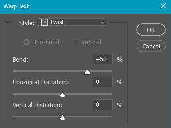
now we have to add the warp effect. with your text tool still selected, click this icon at the top of your screen:

from the dropdown menu, select twist. these were my settings, but feel free to play around with different warp options and their settings. the ones i use most often are flag, fish, and twist.
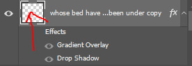
this last step is completely optional, but it's an effect i use in most of my sets with typography. duplicate your text layer (select the layer and ctrl+j), turn off the layer effects (click the eye icon next to effects), and set the blending mode to normal. right click on the layer and select rasterize type. right click on the layer icon itself and choose select pixels.
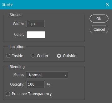
at this point, you should see the moving black and white dotted line showing that only your text is selected. then go to edit > stroke. here are the settings i almost exclusively use.
this is what your text should look like now:
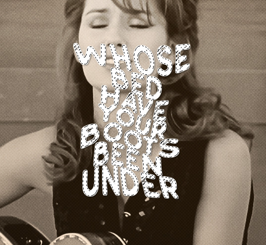
using ctrl+T, move the layer off the canvas so you can't see any of the text anymore. you should be left with only your outline. click anywhere on your canvas to de-select the text we just moved. use ctrl+T again as well as your arrow keys to nudge the outline over to the left 2px and up 2px. this is personal preference as far as the positioning, but i almost never move it any other way. you can leave it like this, which i sometimes do, or you can set the blending mode to soft light like i did for a more subtle effect.
and that's it! rinse and repeat for each gif in your set or use a different warp effect on each gif to switch it up! if you have any questions about this tutorial or would like me to make one for anything else, please feel free to ask any time!
#gif tutorial#my tutorials#gifmakerresource#completeresources#dailyresources#chaoticresources#userdavid#coloring tutorial#typography tutorial#tutorial#photoshop tutorial
218 notes
·
View notes
Note
E1, ?, 🤍
Chels 😫
Your Person is Gargoyle Eddie
Your Place is a Cemetery
Your Thing is a Guitar
Pick Your Poison
18+ONLY, smut, monsterfucking, unprotected piv, reader wears a dress, creampie, f! receiving oral, slightly public sex
word count: 1k
There were only a handful of public places you could be with your gargoyle boyfriend during the daylight hours, and one just happened to be a cemetery. You took walks and had little picnics at the one in town, holding hands along the rows like any normal couple would if they had graves to visit. It was rare for people to cross your path, but when they did, he'd literally make like a statue and freeze, wings pinned to his sides or expanded wide.
One day, a woman thought he was so breathtaking that she stopped to snap a photo of him, long dark hair flowing over his slate gray flesh and shoulders, face upturned to expose his throat, hands positioned to shield what was between his legs. Meanwhile, you were on the lawn a few yards away nibbling on some cheese, casually sipping your beverage.
You wondered what she thought his hair was made of. Plants or ivy, perhaps?
Come to find out, Eddie was familiar with quite a few instruments. He'd been a huge lover of music back in the day, back in his world. Picking up notes by ear on the guitar came second nature to him, and he'd brought the acoustic, obsidian Fender that was a gift from you on the trip that day. He offered you a few of the songs he'd been working on while you sat reading against a sugar maple tree near a few ornate headstones, yet far enough away not to disrespect the dead.
He had his new wire rimmed spectacles perched on his nose (pair number 22 since he kept breaking them) which worked in curious contrast with the pair of slightly curved, menacing horns coming out of the top of his head. He went through a phase when he wanted to file them down, to make them more palatable for polite society, but in the end, you were glad he changed his mind.
Near the spot you frequented was a collection of graves that no one seemed to visit anymore, and you talked with their headstones every so often, while Eddie loomed behind you mumbling about the fragility of mortals.
It was dusk by then, and the burial ground was empty of the living as far as you could tell. The early June air was crisp, smelling bright, a gentle breeze sweeping a few strands of hair across his full lips.
You'd transitioned to your back on a blanket in the grass, staring up at the gathering night through the tree boughs, when you happened to glance over and catch how beautiful he was. Propping up on an elbow, you inched your way over on hands and knees to plant kisses up the muscles of his smooth bicep as he held notes on the fret board, removing his glasses to kiss his eyelid.
"Hmm, do you not like this song?" Even at a whisper, his voice bellowed deep. Over the last couple years, his English had improved by leaps and bounds, and verbal communication between the two of you was coming easier. Learning his language, on the other hand, was still a challenge. It forced your throat and tongue to produce sounds that were utterly foreign in every way.
"No, I love it," you found his mouth with yours, stroking the leathery ridge of one of his wings as you went. "I was just missing you."
Eddie moved the guitar aside for you, and it wasn't long before his length bobbed like a bludgeoning tool between his thighs.
There were clothes in his wardrobe that you had made for him by sending measurements to a tailor in the city, but his outfit of choice was usually nothing at all.
Looking around before straddling his lap, you also scooped the top of your dress down so that your chest was bare against his, eliciting a low growl from him.
"Should we go home?" You asked as his strong hands palmed the meat of your ass. You prepared to secure your arm around his neck so that he could fly you up and out of there.
In answer, he sank the throbbing tip inside of you, making you curse into his mouth, shifting your hips to take more of him.
With foreheads locked together, he whispered vows of devotion edged with lustful, filthy promises that made your arousal drip down his shaft.
The way he took you was always animalistic but soft, pinning your hands above your head while he dove in again and again, making you whine, bucking up against him for more.
He was always insatiable, but never selfish. He'd pull out before he was finished to move between your legs and taste you, touching you, bringing you close with his forked tongue before entering you again, dragging out the inevitable burst of pleasure that would make you explode around him, white hot and blinding.
The breathless words of love seemed to accompany every thrust, but somehow it was never enough. You needed more of him, you needed to rip him open and bury yourself inside.
The first orgasm shattered you with a cry, watching his wingspan spread wide above you, blocking out any view of the sky.
"Look at me," he said in his language, just before locking his chiseled, stone pelvis to pour himself inside with a groan, staring into your soul, his seed dripping out with each additional pulse.
He moved down to lap you up, and you held tight to his horns, rolling through the aftershock with gasping whimpers.
In the distance, one of the caretakers paused with a shovel in his hand, wondering if his eyes were playing tricks on him. Was that a gigantic pair of wings he'd just watched expand in the darkness? The wind picked up, so forceful that he had to plant a palm on top of his head to keep his plaid newsboy cap on, training his pointed stare over the long stretch of headstones.
An owl hooted, more night creatures gathering in the shadows.
He blinked a few times, mumbling to himself. He'd go home and tell his wife later that after twenty some years in the business, he's sure he finally saw a ghost.
#Pick Your Poison blurb game#Eddie Munson blurb#Eddie Munson fanfiction#Eddie Munson smut#gargoyle!Eddie#monsterfucking
54 notes
·
View notes
Note
How do you nail that movie screencap effect thingamajig?? I'm a sucker for VHS-animation looking stuff but sometimes fiddling with blending modes, gaussian blur, noise, ntscQT etc. just doesn't feel right.
For me, I love experimenting with a mix of using blending modes and using ntscQT, but I definitely get the feeling of it still not feeling right despite using those methods!
I'll do my best with explaining how I go about achieving the look! The art software I use is Paint Tool Sai 2 (but any art software with blending modes + layers will do!). Apologies in advance if this is too wordy haha
1.) I draw the usual setup- a background with a character or so. I usually flatten all the layers into one but, for this case, I just only flattened the layer the character's on:

2.) I duplicate the character layer, blur it, set its blending mode to "Lighten", and adjust the opacity as needed before merging the two layers together. I duplicate again, blur again, set the mode to "Darken", adjust opacity, and merge again!

3.) (1st pic) Once I do that, I duplicate & blur the character layer again, then move it a bit to the side (any direction is fine; for this I moved it to the right). Then I set the moved layer's mode to "Color"! After that, I add a drop shadow behind the character layer to give it the look of a traditional animation cel being used.
(2nd pic) Next, I flatten ALL the layers now into one layer, duplicate it and blur it greatly + set blurred layer mode to "Saturation" & move it in any direction before merging all layers again!! lots of duplicating and merging LOL!!!
4.) OK THE LAYER DUPLICATION + MERGING PROCESS IS FINISHED FINALLY! Now we just adjust the colors!
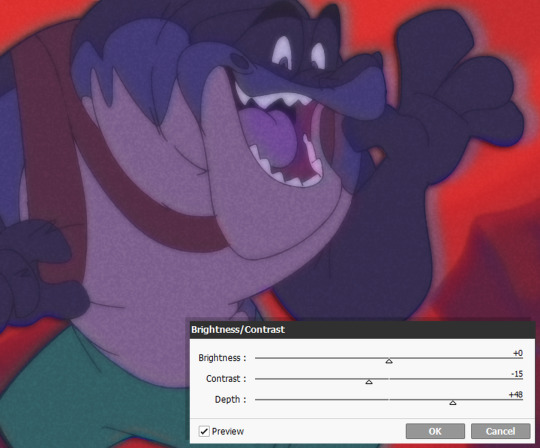
I like to lower the Contrast and raise the Depth, though the adjustments can vary with each piece, depending on how much of a effect you want! Image on right includes the settings I used for this. (I also added a noise layer, but that's optional)

5.) And for the final step.... make the image a smaller size and save as a JPEG/JPG file!!! This should somewhat achieve the low-quality crunch look!
This step is entirely optional, but you can take the JPEG image and add it to ntscQT to mess around with different settings! Here's one I put together:
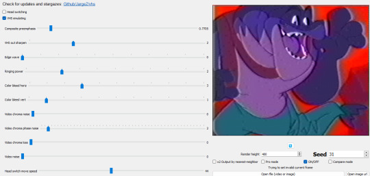
52 notes
·
View notes
Text
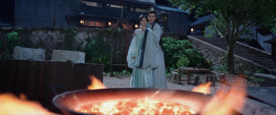
Visual Analysis of the Slow Burn: My Journey to You, Story of Kunning Palace
How do you film a slow-burn romance?
One of the challenges of filming slow-burn romances is that creators have to figure out how to slowly build tension and intimacy between two characters without testing the audience's patience. We have to feel a couple’s chemistry and growing feelings for one another even if it takes a long time for them to get together.
And here's where cinematography and visual parallelism can be a helpful tool. Visual parallelism is when we link two or more characters, events, storylines, etc. through a shared image. When we see repeated imagery, our brains connect those moments and give them more meaning than if we had looked at them in isolation. Because of this, visual parallelism can help complicate our understanding of characters and the world around them without having to spell out those nuances in the script.
In slow-burn romances, visual parallelism can be used to:
Connect characters who, on the surface, appear incompatible or unattracted to one another;
Signal major moments of change in a show's romantic storyline;
Compare and contrast a new relationship with a character’s past relationships;
And much more!
I think two dramas that use this technique in interesting ways are My Journey to You and Story of Kunning Palace.
My Journey to You
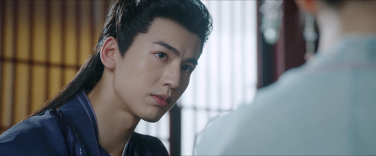
Before we jump into that scene, let’s talk about some of the visual techniques My Journey to You (MJTY) uses to establish the enemies-to-lovers relationship of its secondary couple, Gong Shangjue and Shangguan Qian.
Something I immediately noticed about MJTY is that the show loves using certain camera angles and blocking patterns (or how actors are positioned in relation to one another) to define characters’ personalities and their relationships. This repeated imagery is an example of visual parallelism, and in the case of Shangjue and Qian, the show then uses breaks in that parallelism to communicate the subtle changes in their relationship over time. Through this technique, we see their growing feelings for each other even if we don’t hear the characters express those feelings with words.
For example, at the beginning of the show, Shangjue is usually shot from a low angle while Qian is usually shot from a high angle, and the repetition of that camera language reflects the characters' constant game of cat and mouse.


In cinematography, low-angle and high-angle shots are often paired to visually enhance the power imbalance between characters. Low-angle shots make the subject look more powerful and threatening while high-angle shots make the subject look weaker and more vulnerable.
Qian, who is an assassin, has infiltrated Shangjue’s clan, and he is immediately suspicious of her identity and allegiances. He is cold and intimidating towards her, and she does everything in her power not to get caught. But because she is particularly good at reading and manipulating him, Shangjue soon finds himself intrigued by her. He might be filmed looming over her like he has more power in the situation, but her weakness is an act. We know this because we can see how Qian isn’t filmed with such high angles when interacting with characters who know her true identity and nature like Yun Weishan or Gong Yuanzhi. She is pretending to be subservient and delicate to seduce Shangjue specifically.


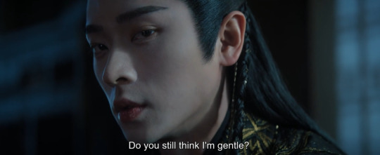
Side Note: One of my FAVORITE moments in MJTY is Shangjue and Qian’s “do you still think I’m gentle?” scene in Episode 12. Not only is the writing and acting electric, but the camera’s subtle shift in angles pinpoints the moment Shangjue begins to feel sexually attracted to Qian. When she gently blows on his fingers, the camera quickly pans to an eye-level shot and we see Shangjue clench his jaw. After that, the camera uses less extreme angles to film his conversation with her—his moment of desire and her strategic thinking equalized their power imbalance.

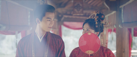
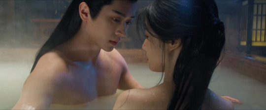
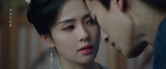
Which brings us to the famous bath scene in Episode 17.
Whenever they share a scene, Shangjue is usually positioned at a higher level and facing forward in a thronal position while Qian is at his side, looking up at him obsequiously. The lack of visual alignment in their actor blocking represents how the characters can’t be completely vulnerable or honest with each other while the dominant/submissive pose plays up the sexual tension of their interactions.
So we know that the bath scene represents a critical turning point in their relationship because of the break in parallelism:
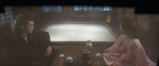
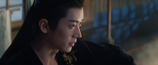


Not only are they sitting at the same level while facing each other, the camera is set at a much more neutral over-the-shoulder and eye-level angle. Over-the-shoulder and eye-level shots are often used to bring intimacy to a scene and that camera language reinforces the actors’ relaxed physical acting and flirtatious dialogue. The two characters are sharing a moment of honest pleasure and have temporarily let their guards down, which is why Qian decides to take the opportunity to share her true intentions for wanting to marry into his family. It’s probably the most truthful and revealing conversation she has had with Shangjue up until this point and creates complications for each others' plans.

One of the lingering questions many MJTY viewers have about Shangjue and Qian’s relationship is whether or not Qian developed real feelings for him in the end. While the script could have done a better job of developing her character’s arc at the textual level, I think the show’s thoughtful use of visual parallelism gives us the answer.
Not only does their final scene together subvert the camera language and actor blocking we talked about, but it also parallels an earlier scene where we can be reasonably sure of Qian’s honesty: the torture scene. And it’s the juxtaposition of what is shown versus what is said that gives us what I’d consider a satisfyingly bittersweet conclusion to their love story.
Story of Kunning Palace
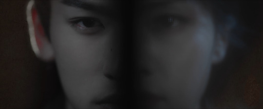
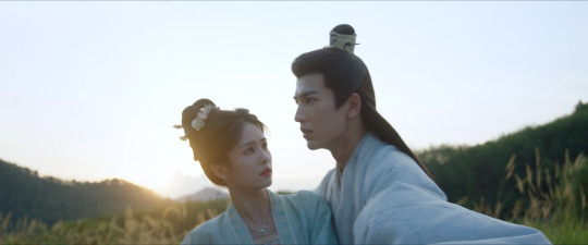
Unlike MJTY, which uses visual parallelism to show changes in the secondary couple’s relationship, Story of Kunning Palace (SOKP) uses this technique to represent the undeniable compatibility of its main couple, Jiang Xuening and Xie Wei.
Given the popularity of the show's second and third male leads, many viewers have expressed confusion as to if and when Xie Wei truly emerges as the rightful male lead. Even as a slow-burn romance, SOKP is slow slow.
And yet when we take a step back and look at the show’s visual storytelling, particularly its use of symbolism and parallelism, we not only see why these two characters complement each other but how they find healing in their (admittedly messy and toxic) love. At its core, SOKP is a story about two traumatized and self-loathing people finding "the one" who still sees them as worthy despite all their flaws. Ning-er and Xie Wei are like two jagged pieces of a broken mirror reflecting one another’s sins and virtues, and the show constantly reminds us of that deep connection with how it juxtaposes the two characters on screen. (Just look at that split screen above--they literally complete each other.)
We see this connection from the moment Ning-er and Xie Wei are introduced in Episode 1:


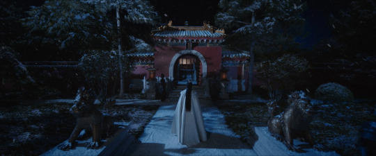
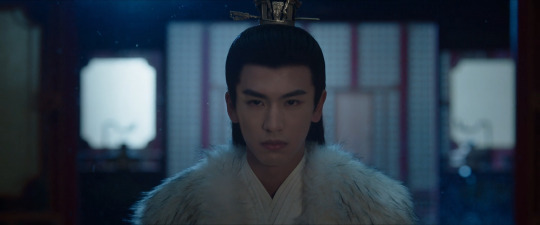
The composition and camera movement directly mirror each other.
When we see parallelism in the portrayal of two characters, we should stop and think about the similarities and differences between them. Both Ning-er and Xie Wei share the trauma of having grown up alienated from their birth families, and the pain of what they experienced drives their ruthless desire for revenge and power. During the show’s first timeline, Ning-er violates her innate sense of goodness while Xie Wei hides his true self.
Side Note: SOKP also reminds us of this connection with its consistent use of a fire motif. Throughout the show, we often see Ning-er and Xie Wei surrounded by candles, furnaces, fires, etc., and this symbolism comes to a head in Episode 34 when Xie Wei desperately argues that they belong together because they've both been forged by the fire of their upbringing.
And yet at the same time, as noted by several characters, they are both incredibly loyal people, sacrificing themselves to change the fate of the people they care for.
Both Ning-er and Xie Wei overlook these redeeming qualities about themselves, but they “see” them in the other, which the show demonstrates through the visual parallelism of their gazes.
In Episode 14, Ning-er asks Xie Wei:
Jiang Xuening: Between my past self and present self, who do you think is better?
Xie Wei: Be it the past or the present, it is all you. You're the one and only Miss Ning'er. Besides, the present exists because of the past. Just face it as is. But if we have to make it clear, I think if the present Ning'er knows what she wants, she will be well. And she'll be even better in the future.
In a previous analysis of Episode 14, I've noted how "Ning-er's character arc isn't just about becoming a better person but also about recognizing that she has always had goodness in her and that goodness makes her life worth just as much as someone like Zhang Zhe....Despite being brash and cunning, Ning-er is also tenacious, brave, and even kind (all of which Xie Wei recognized when they first met years ago). She is an 'unrefined jade', someone who can choose a more righteous path than the one she started on. And he sees her. He truly sees her."
So across the show's multiple timelines, the camera will linger on Xie Wei's tender gaze toward Ning-er. In this case, the parallelism of such a distinctive shot communicates something that Ning-er doesn't realize: Xie Wei sees and loves sides of her that she is unable to accept about herself.


She eventually starts seeing him too.
During the first timeline, Ning-er sees Xie Wei as a threat and warily engages him only out of desperation. But despite her fear, Ning-er also recognizes his true qualities enough that by the second timeline, she implicitly trusts him to help her carry out her own goals. She unlearns her assumptions about him and pushes him to find meaning in life beyond his self-destructive need for revenge.


So it's fitting then that during their private wedding, Ning-er and Xie Wei are shown gazing at each other, fully aware of and accepting of their true natures:
Jiang Xuening: “I’ve seen your light and your darkness, your vulnerability, and your madness. I know everything about you that is known or unknown to others. I might even say that I know you better than you do.”
They've fully entrusted themselves with one another.

#my journey to you#云之羽#story of kunning palace#宁安如梦#cdrama#meta#cinematography#zhang ling he#bai lu#cheng lei#lu yuxiao
101 notes
·
View notes
Note
Hello! I love your art sm, and seeing your art inspires me to continue making my own. However, I struggle A LOT with shading. Do you have any tips for how you do shading? Especially dynamic lighting?
HI! First of all, sorry for the late response. It's been a very busy week! Second of all, I'm so glad to read you say this. Seriously, thank you so much <3333
I'll start by saying I'm NOT the best person to explain color theory and all that jazz, but I can describe to you my process and see if you can get something out it!
If you're interested in dynamic lighting, the important thing is to start DARK and work your way through the light. I've also just recently realized that this is the best way to shade in general for me.
So, usually I put down my base colors and slap a layer of a preferred hue on it in "multiply" (I'm sure your drawing program has a similar tool with a different name). This helps you "locate" the subject in your ambience of choice, whose color will always be changing the base colors of your character (unless it's open daylight, but personally, I'd still add an orange tint to it).
After this, you can start placing lights. Choose your light source (you might have noticed I often prefer a warm light/with a green/purple/blue shadow) and think of your drawing subject as a 3D object that will reflect light accordingly. Keep attention to what objects might block light from passing by, or how light might "bend" when it meets the surfaces in a different angle. Remember this is NOT a one layer process. Not for me, at least. This, for example, is the result of 6 layers of light. Same hue, different intensity. Start from low intensity and build up to it.
(LITTLE NOTE INBETWEEN: remember the shadow changes size depending on how close it is to the surface it's been casted on.)
(END OF NOTE)
Depending on what you want your result to be, you might be done here or you might want to add more shades as well. I tend to overshade a bit in the last period, but it does help me see flaws in the anatomy that I might have not noticed without the volume that shading brings out. Shades are ALSO a process of multiple layers.
And finally, if you went a bit too hard with the shading, you might want to bring back the silhoutte through a bit of reflected light from the ambience... very soft, I usually go for green and light blue unless I have a different light source that might suggest another color. It really adds to the piece, especially if you have very reflective surfaces in it (ex. metal or silk).
Final suggestions, remember that skin under a strong contrast between shadows and light does this kind of over-satured line inbetween the two (the terminator line). Really helps pull off the whole thing! It's usually even more defined then the ones I draw.
And remember that references are always the best way to go, especially if you want to put your light source in an angle you haven't drawn before.
51 notes
·
View notes
Text
Dawntrail Retrospective
Okay, it's been two weeks since Dawntrail launched, a bit over a week since I've cleared it and have had time to think things over, wanted to do a big dump of my thoughts, a non-scored review of it all.
Full spoilers after the break.
So, I want to give this all a nuanced look; I know this has been a polarizing expansion; I did very much enjoy my time while still having some qualms, and I'll try to highlight both sides of that here.
Overall, while it would be low in my expansion rankings, that's not to say it's bad. Just as I probably bump Heavensward up a bit in my rankings because it did so much with so little (in terms of budget, gameplay tools available, story to build on, cast, etc.), Dawntrail takes a hit because I know what they're capable of these days.
But a 10 year saga is a tough act to follow, and I know if this was my first FFXIV experience (it might be a lot of people's one day, if the 'second saga starting point' for new players they mentioned ever gets implemented), I'd be going 'oh wow'.
Anyways, before I pick things apart, I'd like to highlight what really worked for me.
Sphene was my problematic fave. I know Artificial Intelligence tropes can be overdone, but I have a fondness for them because when done right, an AI is clearly authored by someone. Just like a biography, even an autobiography, paints the subject in a certain way, an AI really reflects the creators' biases.
Just as the soul technology was shown as a mechanical version of the aetherial sea, Sphene really felt like a sort of digital primal for Alexandria, the people's desires latched on to her, sort of a vtuber Zodiark.
I loved the development that her compassionate personality (taken from the OG Sphene) was distinctly incompatible with her unsustainable primary directive, protecting and preserving Alexandria's way of life (the directive from the people)
And I appreciated that part of the thesis statement of her character is "a Garnet who never traveled with Zidane would become a tool of Alexandria, her kindness taken advantage of as a figurehead''. Which makes it nice when Wuk Lamat breaks through during The Interphos to appeal to her.
She can feel like a bit of a rehash of Hades and Metion, but I do enjoy the contrast of her valuing life too much to Metion not valuing it enough; it's important to know how to live in spite of despair, but it's also important to accept that even memory is not forever.
Also while I'm here I have to say I absolutely respect the zone change of Living Memory from stunningly beautiful to hauntingly somber. I hope that change is not reverted in patches, as it's absolutely the starkest environment change in the game.
I like the idea of casting aside nostalgia to care for the living, and I thought this zone was a welcome surprise from the "Golden City" imagery a South and Central American expansion invokes.
(PS, massive Simulated Twilight Town vibes)
And I thought Cachuia was well done in this zone; I was a bit antsy earlier with how they made her into just a drone, but I liked the resolution between her and Erenvelle
But one thing I want to stress as I sing the praises of the last zone and change, is that neither half of this expansion works without the other, because unlike other split expansions (SB having the Gyr Albania and Yanxia halves, EW having Islabard then the Ancients), it felt clear in why it had both halves, and that was for the contrast of the same theme,
Namely, the ideas of culture, tradition, and history, and how they affect the living.
When Wuk Lamat is giving her speech during her ceremony, she notes one of the societies taught her "they believe death is not the end, and we live on so long as we are remembered", which Sphene says almost verbatim of her people later, menacingly polite as that same belief is twisted.
There are some roots of this conflict in the first half too, with Koana's disinterest in culture and tradition, before realizing progress and culture weren't incompatible.
While Alexandria instead takes it to a logical, Black Mirror extreme, discarding culture and history, literally forgetting anyone who passes (while assuring themselves anyone who is lost still lives on) and living purely in the present moment; death itself removed from the public circle.
I don't think the Alexandria half, the modern, present-focused society works without first setting up a region with a rich culture and history.
In the first few regions, you see how those who walked before led those who walked after, while in Heritage Found... you see a heritage lost. On both sides of the divider there are abandoned buildings; a sidequest in the graveyard has the keeper note that memorials have fallen out of favor due to regulators,
Alexandria had a perfect record of history (data, people, all stored in the cloud), but didn't use it; specifically keeping it away to prevent painful memories from affecting the present.
While Yok Tural had an imperfect history (a lot in legends, retold/inconsistent oral history), but that history distinctly affected their day to day; even the painful memories, the tragedies, all played a part in shaping the present.
Even though it could make the pacing clunky at times, I did like that Wuk Lamat's basic setup of "learn about these people and understand why they make the choices they do" extended to Solution Nine and even Living Memory.
Garool Jaja was also a very good character, loved his performance, do kinda wish his solo duty where he confides the true nature of the contest was the very start of the expansion; I feel like it would have set the tone for this being the "The WoL is a mentor arc" better.
Also to wrap up the good side: every single dungeon and trial was ace. Dungeons finally hit a good level of difficulty for normal content, and were well designed and very pretty. Vanguard and Everkeep in particular were delights, as was the postgame dungeon Tender Valley.
------------------------------------------------------------------
And on to my more mixed feelings.
Wuk Lamat- I don't hate her, but I don't like her that much either. I tried to keep an open mind for the full MSQ, but ultimately she's not a character I really vibed with; I do get the shonen protag/Naruto appeal, but it's really not for me. She's been described as 'Lyse 2.0', and while I admit I have similar feelings about Lyse, I do think Wuk Lamat has a more natural progression. Lyse started Stormblood feeling like a 20 something on a mission trip, while Wuk Lamat feels like a reasonable candidate who just needs a little encouragement.
I don't mind too much our WoL taking a mentor role and taking a backseat, while downplaying their powers; but what I struggled most with was fatigue. Wuk Lamat was always there, like the memes of "Talk to Wuk Lamat" say. Like Shadowbringers was the expansion where Graha was the main character, and a lot of the time he was away doing city stuff or being mysterious. Wuk Lamat would have benefited from more time to breathe, especially in the back half of the game. She should still be there in the back half for sure, for the expansion to work she needs to be a player in all this, but I'll admit I sighed when I got to Solution Nine thinking I'd explore by myself (probably bumping into her at one of the locations) but instead needed to escort her.
As I noted earlier, I don't mind the Interphos interruption (though I did appreciate the chance for the WoL to be at full strength) because Wuk Lamat appealing to Sphene's humanity fit the expansion themes well.
Succession- I'm happy this didn't go into my worst fear: a retread of the Azim Steppe where we actively interfere in another nation's politics by being their champion; but it left a bit to be desired. Notably, while I knew the Scion Civil War was a bit of a misdirect, it felt kinda pointless? Like Thancred and Urianger are here helping an alumni from their university out as he applies for the same job, but they're totally chill with you. And honestly there are no stakes to him getting the job, he's the only other qualified candidate to the point where you hire him later yourself.
I didn't want any longstanding inter-scion conflict, but for a character as frequently duplicitous as Urianger and driven as Thancred it just felt like a waste.
Also, GJJ clearly told the WoL that the keystones didn't determine the victor; he would pick a successor that was worthy- I kinda wish they just stuck to that. Having the "good' rulers and "bad" rulers paired together for the cooking challenge felt like a bit of a cop-out, , plus needing to win back a stolen keystone, etc. just felt like missed opportunities.
Zarool Ja and Bakool Jaja - I get what they were going for in the end with each of these: ZJ being the "impossible son of an impossible son, the weight of expectations causing him to shun those around him, and that loneliness twisting him", BJJ being desperate to help his people, feeling the major survivors guilt of his own life costing so many others.
but neither of their narrative arcs are smooth, and in the first half, especially during the trial, they seem to be doing comically evil Wacky Races Dick Dastardly behavior with no regards for a continuous arc. BJJ releasing Valigarmanda was the icing on the cake for me. He could have done this in a reasonable way, weakening the seal in an attempt to sabotage the trial, then feeling guilt over what he did in desperation, but no he walked up to the gate keepers like 'no I'm evil, I'm gonna destroy that now'
any hints of ZJ sympathy come like, during his trial and from the Wandering Minstrel, who even notes most will see him as a one dimensional tyrant
I also think they could have distinguished both more from just being warmongers; in the same way that Wuk Lamat and Koana are somewhat aligned but have different visions, personally it would have made more sense to me if BJJ had a different brand of conservatism; putting a stronger emphasis on defense and isolationism rather than world conquest. It would fit his background better too, as someone who wanted to protect his homeland
--------------------------------------------------------------------
My most negative thoughts are really just pacing. I would like to not have so many quests just running around talking to people, not learning much of note. I know there are only so many things you can do (stand in purple cloud and kill 3 enemies isn't great either), but at this point I'd honestly just take a shorter MSQ if it meant better story pacing.
I know the first half is meant to be like an abbreviated ARR, and I don't mind it being low stakes, just wish it had a bit more polish.
I will also say I felt a lot more limited in my dialog at times? Like I don't need every box to have "I'll kill your god if I have to, maybe even if I don't", but there felt like a lot of instances where you had two ways to say the same sentiment. I like it when the game lets you have opinions, even if the opinions are objectively bad (you can straight up tell Noah the Allagans were visionaries)
A lot of that pacing was more actual story content than the quests though; the first three zones could feel like extended allied society quests (solid enough ones), which wasn't bad for a 'fresh start', but Shalooni is where things felt off. I liked the vibes but frankly the quests left barely any impressions at all.
(loved the trolley dig though)
------------------------------------------------------------------
Overall, like I said, I enjoyed my time. While it may not be a favorite expansion, it sets a good baseline for another ten years, and I hope they can refine it in the patch series and beyond.
There's a lot more I could probably say, I realized I didn't have a chance to touch on Erenvelle (very glad he tagged along) and Krile; but I feel I'll have more thoughts on both of their plotlines after the patch series.
P.S. though I rolled my eyes at some of the running jokes I genuinely got a chuckle out of Wuk Evu always freaking out then snapping back to polite with "well I won't overthink it then" and similar. Felt very Chocobo Racing GP.
P.P.S. Wood-carved owl nouliths are the best idea. A+ weapon.
26 notes
·
View notes
Note
How do you get your screen caps ??? they’re literally so amazing and perfect and I love them so much 😭
Hey gamer, thanks for the ask~
Prob a good place to mention that I take free screenshot commissions in Fallout 4! Free! Send me a poseprompt/NPC and in my downtime between fic chapters I'll see what I can do! You can browse my photos on my archive with this tag -> Fallout Screenshots. I can pose pretty much any NPC/animal. Long rambly post so there's more below the cut.
I was a film photographer before I ever was artful about game screenshots. I came up in the Ansel Adams school of thought. His whole thing was he'd hike up to a mountain with a large format camera on a heavy tripod. He'd see the resulting image in his "mind's eye" and imagine each and every problem possible he'd have to contend with in the creative process to get there. He was the most low-key, soft-spoken batshit crazy control freak artist who made each photo look easy. You'd never guess at the amount of time and work and travel it took him to take one photo. Even his simplest works make people feel ant-small compared to the arresting grandness of the American landscape's most boring viscera. I have several books of his and four of the official/authorized prints, and I bring AA up because I'm kinda insane in the same ways when it comes to screenshots. In my books, it should never be just an image, it should be the most elevated version of the image you can make given your current skill and tools available at that present moment. My Yeehawgust 2024 entry, Rocky Mountain High, is an example of that. A five image composite stitched in post processing with set and lighting design including hand-placed trees and custom terraforming of a map in Creation Kit.


The easy answer is Photo Mode. I have a 400ish-entry mod list that is built around taking photos, but Photo Mode is really the key because it allows you to rotate the camera and pause game time with a user interface instead of relying on console. I approach screenshots the same as my film cameras.
My simplest game -> upload pipeline are my candid portraits. I will notice the way light creates shadow on an object or a character will be doing something interesting and then I bring up Photo Mode to capture it. I then load the image in Clip Studio and adjust using correction layers; normally levels/saturation/brightness and contrast set to lowish opacity, a sharpness action then a crop and that's it.
My more complex game -> upload pipelines can be as "easy" as posing characters (mine often begin with premade anims/poses but the end result is almost always a custom-tweaked pose; I'm considering releasing a pose mod of my custom work) or as complex as set and lighting design. Sometimes that's as easy as using the settlement builder. Sometimes that's as complex as fixing up a model in Blender/Nifskope, or opening up Creation Kit and making custom tweaks to the world map because the way I need it to look doesn't exist in mods/vanilla. Depending on what I am trying to accomplish, it can take me several days to create a staged scene. Work on Chapter 15 screenshots started two months ago because I knew I would need a lot of time to test and iterate.
Uhhh what else? Most photos take between 10-30 test photos before I get it right. I also use 4k-8k textures; Jack, Livvie and RJ all have unique clothes and bodyslide presets. Shit gets weird when I forget and put RJ in clothes meant for Mr. Bowling Ball Deltoids himself, Jack. I manipulate game time and weather with console. I dislike most ENB and in my arrogance I believe there's almost nothing ENB can do for a still image that I can't achieve in post-processing.
I could go on for hours about taking photos so I will stop here! Thanks for the ask!

#thanks for the ask#game screenshots#fallout 4#photography#robert joseph maccready#maccready#rj maccready#my oc#olivia dallaire#jack ward#deacon fo4#preston garvey#fallout screenshots#fallout 4 mods
15 notes
·
View notes
Note
cousin dayurno…. thots on tsc. i remember you mentioning before it came out that you weren’t super excited about it/might not read it for a while. im curious now if you think it’s worth getting into sooner rather than later! as someone who keeps forgetting to start it i must know the opinion of the council
cousin dayurno............... hi! well okay so. going into tsc i didn't have many expectations besides maybe seeing kevin at some point, and getting told an interesting story. i was not disappointed in the kevin front nor whenever the foxes were concerned: i think nora sakavic's grasp on them is as strong as ever and the few that showed up (kevin, renee, neil) were capable of carrying any story no matter what. jean spends a good chunk of the book in palmetto and you can tell it's nora's strongest suit as a writer; it's the most interesting part of the book and the character work is, as expected, very well thought out. i couldn't stop reading for the entire period of jean's stay with the foxes.
i will say the book kind of fell flat for me after jean left palmetto. half of it is because jean sucks the life out of basically any of the trojans character-wise; the foxes were able to compete with him because they are well established characters with complex backstories who already feel real to the reader, whereas the trojans (bar lucas, who is a highlight if there was ever one), while lovely, aren't really much of characters at all. i think nora sakavic likes to write a very specific kind of story, and in that niche she is fabulous, but she stumbles when she has to make simpler stories interesting. she is a high-stakes writer writing a very low-stakes story, and in tsc you can tell.
jeremy was supposed to be the main character along with jean, but in his very few chapters, not much about him is learned; from the moment he is in a room with jean, jeremy's whole character starts to revolve around him. yes, you can say this is jeremy repressing even in his own mind, and maybe that's true where it concerns his backstory, but that's not all there is to a character. even if jeremy's backstory wasn't going to be discussed, there's effectively nothing else about him: we know that he's rich, that he's gay, and that's it. no particular quirks nor non-trojan related interests. the only discernable character trait i can put out about jeremy is that he is very pushy, and i don't think that's what nora intended for him. he was a breath of fresh air in his first chapters, but what little personality he shows is immediately mowed down by being on 'taking care of jean' mode 24/7. i thought he could use more personality, and overall more scenes away from jean (and even laila and cat) to establish himself as a character
you have not yet read it so i will not spoil you the reason, but i felt that neil's appearance later down the line was the highlight of the book because it made the story feel interesting again. neil steals the show because he's neil, and he's more interesting than all of the trojans combined. he also makes them all look worse by comparison: we see personality and chemistry and history and that is something that the trojans just don't have. they're lovely, but that's all there is to it. jeremy and the trojans feel more like tools to achieve jean's happiness than actual characters, and that's a bit of the upperclassmen curse in aftg, but in a book that's so specifically centered around jean's inner world and his healing trajectory, they feel flat and out of place by contrast. they can't win. they can't even compete. but if they could, catalina and laila would get the closest to being real characters
this got away from me so tl;dr: tsc is fine! it's not tfc, and i think the contrast might feel surprising and hard to adjust to, especially when it comes to character work. it has all of nora's trademark writing with none of the groundwork there was for tfc, and it would have benefitted a lot from staying in the drafts for a little longer. it's an ok book! it didn't change my life nor did it save anyone, but it was there, and it did what it said it was going to do. if i saw it on ao3 i probably wouldn't read it, but i wouldn't hate on it either
#hope this was understandable! i have many thoughts but this is as concise of a review as i could give LOL#for me it was just ok with some really good and interesting bits weaved in#and i was happy to know kevin is doing well and in therapy :)#there were some other points for me like the pacing and the fact you can really tell it was one book split in two#but i dont even particularly feel strong enough about the book to talk about that#im not nitpicky about things i dont care for#asks
23 notes
·
View notes
Text
UUUnite Analysis: Fuuko Izumo
(combining my love of undead Unluck, fighting games, and making shit up by pretending an undead Unluck fighting game already exists)
Normally, the main character of a fighting game has a pretty simple moveset. Easy to pick up, low skill floor, a consistent choice. The Ryus and Sol Badguys of the world.
Fuuko is not like that.
At first glance, she seems like a pretty weak character. No real standout options- her normals are just weak punches and kicks, and her gun is a mediocre ranged option at best. And yet, she's able to hold her own against some of the strongest members of the cast. How is that?
Unluck.
It's because of Unluck.
Unluck is Fuuko's signature gimmick, and the reason her normals are allowed to suck so much. Unluck gives her the single highest damage potential in all of UUUnite, and it's honestly not even close.
Unluck is a resource that builds as Fuuko hits the opponent with melee attacks or throws. Her ranged attacks won't scale Unluck, since those are all weapon attacks.
Anyway, what does Unluck actually do?
Unluck triggers if Fuuko either goes five seconds without building Unluck, or manually activates it with her 214U, "It's coming...". Depending on how much Unluck has been built up, some misfortune befalls the opponent, ranging from tripping and having pans fall on their head all the way to being hit with a meteor- the aforementioned 'highest damage potential'. However, it's not a linear scale- three blocks of Unluck is way more powerful than two.
This doesn't mean playing Fuuko is just limited to rushing in with 236P and hoping for a meteor, though. Your other specials and supers are integral parts of your gameplan, too.
214S and 214H are both connected to the gun, being Reload and Firing Stance, respectively. They're pretty self-explanatory. Her most complex special is her 236K, which lets her throw down a banana peel that opponents with Unluck will slip on, giving her an opening for a pretty easy grab- her fastest-scaling Unluck option.
As for her supers, they both have to do with her Unluck. 632146U, or Chain Reaction, turns all current Unluck into a bunch of quick combo-extenders, letting her use it to chain together enough melee hits for a bigger Unluck hit. By contrast, 236236U, "I want to know more about you", gives a temporary multiplier to how much Unluck each individual hit gives.
While Fuuko's gameplay does have a few weaknesses, they can be patched up with your choice of assist character.
Fuuko's one of a number of fighters with unique assists- in her case, it's Andy. While Latla and Move both provide her tools to get up close, Andy lets her keep her distance.
When summoned, Andy will come in and give Fuuko a smooch, at which point Fuuko will cut off his head. At this point, Andy basically becomes an Unluck-filled grenade, and replaces your weapon normals until you throw him or the Unluck triggers.
Carefully timing when to throw Andy is important- get it right, and you can hit your opponent with a bunch of stun, but get it wrong and you can completely whiff your assist, or worse, end up hitting yourself if you wait too long.
All in all, while certainly not as easy to pick up as most other 2d fighter protagonists, Fuuko can certainly hold her own- as long as you pay attention to her unique mechanics.
24 notes
·
View notes
Note
I look at your art and i cannot even comprehend how you do it. Do you use procreate? what brushes do you use? I’m deeply in love with your work
Hi anon
Thank you so much for your message and for taking the time to contact me. 💗 Sorry about the late reply, I was quite busy in the past two weeks. 😳
Ok! So, to answer your question, I very rarely use Procreate. I used it a bit when I installed it on my iPad one-two years ago: it was exciting and new but I must admit that now, I work mainly on Photoshop. Don't get me wrong, Procreate is an amazing app, you can create tons of effects but I'm much more confortable with Photoshop. However, this artwork and this one were created using mainly Procreate.
More recently (= about 10 days ago 🤓), I bought an app called Rebelle 6 that emulates oil painting and watercolors. I used it on this Sherlock portrait but also on this one on Twitter. If you see this kind of textures in my art from now on, it's thanks to this app.
These were the exceptions, though. As far as the rest is concerned, I use Photoshop CS6 with an Xp-pen tablet. I tried all kind of brushes but the ones I always come back to give my artworks an "old painting" effect are the Mar-ka brushes and the Deharme brushes. (look at this artist's DA page, you have several sets of brushes available). However, sometimes, I change the settings: I add more texture, change the spacing, the brush dynamic, etc…(everything can be found in the PS brush settings). You have to see what works best for you.
On some artworks, I also add a paper texture a bit like the one below, at a low opacity (layer: soft light). Make sure it's a bit grainy and don't hesitate to adjust it using the "brightness/contrast" or "levels" tools.

However, the opacity and the paper vary according to the artwork. What can work for one artwork is not going to work for another one because of the lighting, the exposure, the effects you want to give. You'll have to try different textures and opacities to reach the effect you want.
The rest is…my style. 🤓 I did a post HERE about how I draw realistic portraits and HERE about a step by step (it was several years ago though so I don't talk about textures, just how I block colors and how I draw realistically).
I hope I managed to answer your question. Thank you for enjoying my work so much and see you at the end of the week with a Stede Bonnet portrait (and then, I'll go on a break to rest a bit ^^)
80 notes
·
View notes
Note
HEY YOU
Um...
Hi hope you're having a a wonderful day
I just wanted to ask since you're a digital artist... how do you color your art?? Because I'm a traditional artist trying to become a digital artist but I have no clue how to color my work (I made the mistake of using 'fill' on ibis paint before realizing oh wait that's not how digital artists color their work dummy) like I know base color and all that but the layers... how... How color? Line art no fun...
*cries*
I have no idea what I'm doing 😭
Don't feel pressured to answer this or anything, just thought to ask you since your art is so CRUNCHY I LOVE IT
Hello there!! I hope you're having a nice day as well
Sure! I'm very happy you like my art and as I also started as a traditional artist, I'm glad to entail some tips! :]
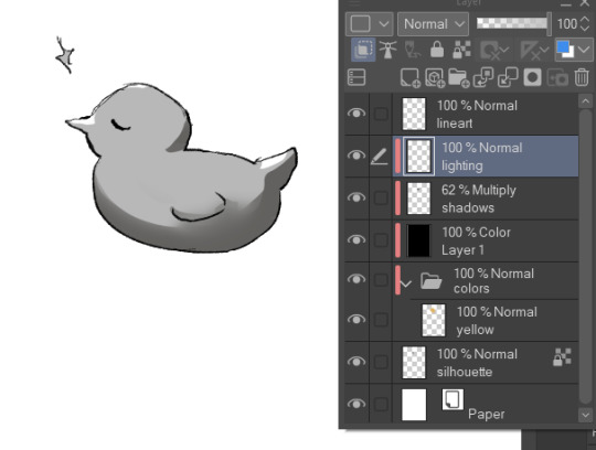
Base colors:
After finishing the lineart (can be sketch too), I use the Magic Wand tool and click it on outside of the lineart. This will give you a silhouette, but in the wrong space. Therefore, we have to go to 'Selection -> Inverse selection', after, you can proceed to use the fill tool on a separate new layer, beneath the lineart.

(Advanced tip: if you use Clip Studio Paint (CSP), there's an asset called 'Erase Along Edge'. Set your lineart layer to a reference layer (light house icon) and you can continue to erase and adjust the silhouette more easily with this eraser!)
Next, make a folder, clip it down to the silhouette, within this folder, add separate layers for each base color. This will help you manage your colors more effectively.
Shading:
This is extremely tricky and I cannot give a standardized process for this, but I'll attempt to do so. There are much better ways to do this I'm sure, the one I entail on forward is a bit time consuming (but it might only be a personal thing as I tend to over-render)
My method:
For a simplified method, skip all the purple colored parts of text.
We are going to continue working here:
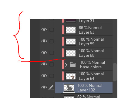
I fill a separate layer with all black, and set the layer to color mode. This is to help us see the values better. Should we play around with contrast, brightness, focus points etc.
Then, with a layer, set to multiply mode, I begin shading shadows. Can be grey for now.
After I'm done, I use a layer to block out bright parts, with white. It makes it very dramatic, bless. (You can use different colors for this of course, I just keep this specifically very bright.)
Additionally, make a separate layer, use it for reflection lights with a lightish gray.
Adjust, add, tweak layers to ensure your overall image meets your expectations, including background. Most of the times, I even additionally paint a complete image by blocking out bigger shapes (messy and undefined) to see how the values should match in this stage.
Simplified demonstration:
We'll come back to these layers later.
Hide the previous black color layer. We now have colors again, but it's all so muddy.

Therefore, we alpha lock our previous layers of shading, and fill it over with colors. Unsatisfied by any colors? Use the Hue/Saturation/Brightness sliders or add a new correction layer. Important thing to note that you can use other colors than this purple/blue one in the image below for the multiply layer.
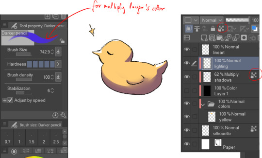
I use correction layers unapologetically. My favourite is Tone Curve + Gradient Map.
Naturally, I have a lot more layers than this in the demonstrated picture, such as Overlay layers to emphasize focus points or further darkening parts with multiply layers, etc. I do most of the hard work during rendering stage! Excuse me for the low effort rubber duck also hahah. Here's a closer example for what I usually do:
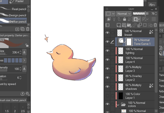
All we got left to do is Rendering (painting over mistakes) and Effects. I cannot give much advice on Rendering, it's pretty much the same as in traditional art.
Effects:
I sometimes leave little speckles/sparkles over my art to make it more detailed.
After, there can be correction layers, simply to adjust the final look.
I usually save the image as png or jpg (or in CSP case, merge all visible layers to a new layer) and add noise.
Sometimes, when I just want to post a sketch I add a 3d effect but in Photoshop. It helps a bit in faking extra details.
That's the end of my process! I hope this proved of help, and I wish you a smooth journey :D In the future, I can post timeline speed paints, if there is interest.
My other related threads are this (on my process) and this (on mindset and learning).
You can see me working in action through gifs here. (The gifs include extra planning stages (mentioned in the previous 'on my process' thread, but they follow the same principles I mentioned.)
----
Another note: it is possible to get a cracked version of CSP, which I won't entail because of account safety reasons, but if you research it, a pointer I can give is that the distributor's name starts with 'o'.
#if there's any related questions feel free to send more#thanks for the ask!#art guide#asks#art tutorial
19 notes
·
View notes
Last Seen Blogs

pega-dor
Pega-dor
4dvant
iNerd
peenak3-fullwatch20220nlinethai
พี่นาค 3 หนังเต็ม เรื่อง

peethambar
Untitled
