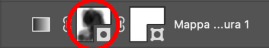
#i literally made a gradient map
Explore tagged Tumblr posts
Visit Tumblr Blog
Explore Tumblr blogs with no restrictions, modern design and the best experience.
Last Seen Tumblr Blogs


Fun Fact
69% of Tumblr users are millennials.
Text

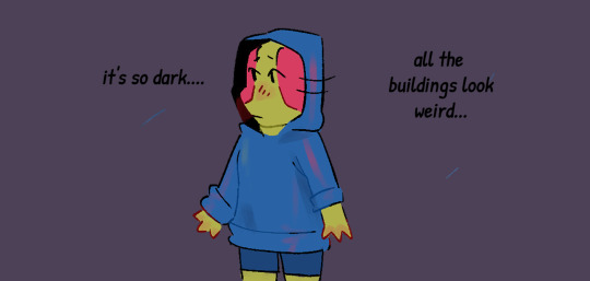
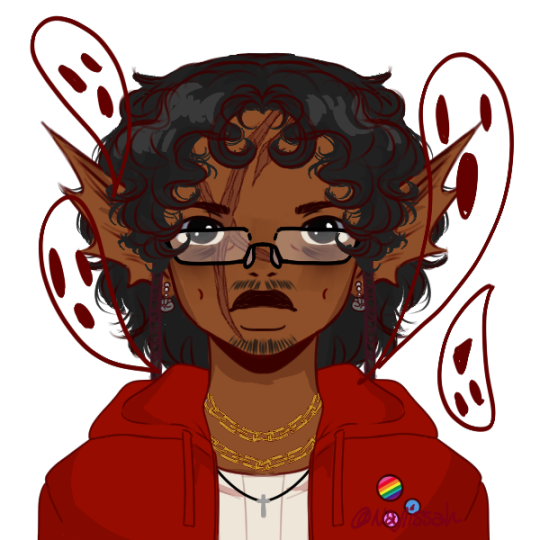
i have ideas for tomorrow and the day after but yeesh yesterday and today were "low energy and don't have the energy to think too much about this particular prompt" days
anyhow have an aurora borealis colored couple
#xzerowinter2024#xzero winter 2024#xzero#zerox#megaman#mega man#rockman#megaman x#mega man x#rockman x#mmx#mmx x#mmx zero#i literally made a gradient map#also krita threw a fit when i did that and it crashed#i forgot to save so i got set back a few minutes TuT#oh well#it's finished now
39 notes
·
View notes
Text

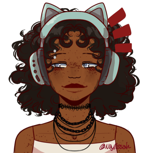
half-elf yearning
#idk where this came from#but i got blasted with inspiration#okay no actually i couldn't focus on the youtube video i was watching so i opened csp#and i haven't drawn in so long i guess there was something pent up#i'm real happy with this#i don't think it's technically great and i had issues with lots of parts#but i made a thing#i made a yearning sailor oc#what more could an artist ask for#mb overdid it on the gradient maps#but i just learned how to use them#not fanart for once :0#enjoy#oc#oc art#fantasy#half elf#half-elf#sailor#literally the only part of him that looks like a sailor is the shirt#oh and his hair is clearly being blown by a sea breeze
1 note
·
View note
Text

wait were the unedited colors prettier
you could never hurt me
#it feels like i made this a month ago but it was literally a little over a week#actually i think the edited colors ARE better but since it was a gradient map on low opacity elias looks a little worse#which you know. could work cause he is technically a corpse#this is so abnormal why did i take 8 minutes to show up on my dash#IT*
423 notes
·
View notes
Text
My Favorite Cheap Art Trick: Gradient Maps and Blending Modes
i get questions on occasion regarding my coloring process, so i thought i would do a bit of a write up on my "secret technique." i don't think it really is that much of a secret, but i hope it can be helpful to someone. to that end:

this is one of my favorite tags ive ever gotten on my art. i think of it often. the pieces in question are all monochrome - sort of.

the left version is the final version, the right version is technically the original. in the final version, to me, the blues are pretty stark, while the greens and magentas are less so. there is some color theory thing going on here that i dont have a good cerebral understanding of and i wont pretend otherwise. i think i watched a youtube video on it once but it went in one ear and out the other. i just pick whatever colors look nicest based on whatever vibe im going for.

this one is more subtle, i think. can you tell the difference? there's nothing wrong with 100% greyscale art, but i like the depth that adding just a hint of color can bring.
i'll note that the examples i'll be using in this post all began as purely greyscale, but this is a process i use for just about every piece of art i make, including the full color ones. i'll use the recent mithrun art i made to demonstrate. additionally, i use clip studio paint, but the general concept should be transferable to other art programs.


for fun let's just start with Making The Picture. i've been thinking of making this writeup for a while and had it in mind while drawing this piece. beyond that, i didn't really have much of a plan for this outside of "mithrun looks down and hair goes woosh." i also really like all of the vertical lines in the canary uniform so i wanted to include those too but like. gone a little hog wild. that is the extent of my "concept." i do not remember why i had the thought of integrating a shattered mirror type of theme. i think i wanted to distract a bit from the awkward pose and cover it up some LOL but anyway. this lack of planning or thought will come into play later.
note 1: the textured marker brush i specifically use is the "bordered light marker" from daub. it is one of my favorite brushes in the history of forever and the daub mega brush pack is one of the best purchases ive ever made. highly recommend!!!
note 2: "what do you mean by exclusion and difference?" they are layer blending modes and not important to the overall lesson of this post but for transparency i wanted to say how i got these "effects." anyway!
with the background figured out, this is the point at which i generally merge all of my layers, duplicate said merged layer, and Then i begin experimenting with gradient maps. what are gradient maps?
the basic gist is that gradient maps replace the colors of an image based on their value.

so, with this particular gradient map, black will be replaced with that orangey red tone, white will be replaced with the seafoamy green tone, etc. this particular gradient map i'm using as an example is very bright and saturated, but the colors can be literally anything.

these two sets are the ones i use most. they can be downloaded for free here and here if you have csp. there are many gradient map sets out there. and you can make your own!
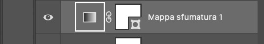
you can apply a gradient map directly onto a specific layer in csp by going to edit>tonal correction>gradient map. to apply one indirectly, you can use a correction layer through layer>new correction layer>gradient map. honestly, correction layers are probably the better way to go, because you can adjust your gradient map whenever you want after creating the layer, whereas if you directly apply a gradient map to a layer thats like. it. it's done. if you want to make changes to the applied gradient map, you have to undo it and then reapply it. i don't use correction layers because i am old and stuck in my ways, but it's good to know what your options are.

this is what a correction layer looks like. it sits on top and applies the gradient map to the layers underneath it, so you can also change the layers beneath however and whenever you want. you can adjust the gradient map by double clicking the layer. there are also correction layers for tone curves, brightness/contrast, etc. many such useful things in this program.
let's see how mithrun looks when we apply that first gradient map we looked at.

gadzooks. apologies for eyestrain. we have turned mithrun into a neon hellscape, which might work for some pieces, but not this one. we can fix that by changing the layer blending mode, aka this laundry list of words:

some of them are self explanatory, like darken and lighten, while some of them i genuinely don't understand how they are meant to work and couldn't explain them to you, even if i do use them. i'm sure someone out there has written out an explanation for each and every one of them, but i've learned primarily by clicking on them to see what they do.
for the topic of this post, the blending mode of interest is soft light. so let's take hotline miamithrun and change the layer blending mode to soft light.

here it is at 100% opacity. this is the point at which i'd like to explain why i like using textured brushes so much - it makes it very easy to get subtle color variation when i use this Secret Technique. look at the striation in the upper right background! so tasty. however, to me, these colors are still a bit "much." so let's lower the opacity.

i think thats a lot nicer to look at, personally, but i dont really like these colors together. how about we try some other ones?

i like both of these a lot more. the palettes give the piece different vibes, at which point i have to ask myself: What Are The Vibes, Actually? well, to be honest i didn't really have a great answer because again, i didn't plan this out very much at all. however. i knew in my heart that there was too much color contrast going on and it was detracting from the two other contrasts in here: the light and dark values and the sharp and soft shapes. i wanted mithrun's head to be the main focal point. for a different illustration, colors like this might work great, but this is not that hypothetical illustration, so let's bring the opacity down again.

yippee!! that's getting closer to what my heart wants. for fun, let's see what this looks like if we change the blending mode to color.

i do like how these look but in the end they do not align with my heart. oh well. fun to experiment with though! good to keep in mind for a different piece, maybe! i often change blending modes just to see what happens, and sometimes it works, sometimes it doesn't. i very much cannot stress enough that much of my artistic process is clicking buttons i only sort of understand. for fun.
i ended up choosing the gradient map on the right because i liked that it was close to the actual canary uniform colors (sorta). it's at an even lower opacity though because there was Still too much color for my dear heart.

the actual process for this looks like me setting my merged layer to soft light at around 20% opacity and then clicking every single gradient map in my collection and seeing which one Works. sometimes i will do this multiple times and have multiple soft light and/or color layers combined.
typically at this point i merge everything again and do minor contrast adjustments using tone curves, which is another tool i find very fun to play around with. then for this piece in particular i did some finishing touches and decided that the white border was distracting so i cropped it. and then it's done!!! yay!!!!!
this process is a very simple and "fast" way to add more depth and visual interest to a piece without being overbearing. well, it's fast if you aren't indecisive like me, or if you are better at planning.

let's do another comparison. personally i feel that the hint of color on the left version makes mithrun look just a bit more unwell (this is a positive thing) and it makes the contrast on his arm a lot more pleasing to look at. someone who understands color theory better than i do might have more to say on the specifics, but that's honestly all i got.

just dont look at my layers too hard. ok?
2K notes
·
View notes
Text


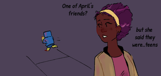


Kid Leo Au: Finding Home
Part 3!!
Shoutout to everyone guessing it was Carol O'Neill!! She was on a late night grocery run :)
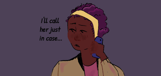
her coloring kinda changes between the first two panels and the ones after Leo runs off because CSP decided to delete the palette I LITERALLY JUST MADE FOR HER!! and then I couldn't just eyedrop tool it because I use a gradient map layer over th color layer and coloring these pages was just a mess >:(
ANYWAY!! I really like my design for Carol and I hope everyone else does!! I spent a lot of time researching diferrent hairstyles for her but ended up going with the one that's most like her canon appearance! I also gave her a similar hair color to April ( coloring is messed up a bit in the other two panels cause again, palette issues). I also did a bit of research to get the texture right since I was giving her a slightly different hairstyle than her canon one ( v similar but not exactly the same ) so hopefully it reads well!!
I'll share the sketches I did of her before I finished lining/coloring this in a bit :)
Also hi it is in fact 3 AM im just feeling a bit silly :)))))
Kid Leo Au Masterpost | First | Next
#art#rottmnt#fanart#rottmnt fanart#rottmnt leo#rottmnt comic#rottmnt fanfic#comic#digital art#rottmnt art#rottmnt kid leo au#kid leo au#turtle tots
1K notes
·
View notes
Text
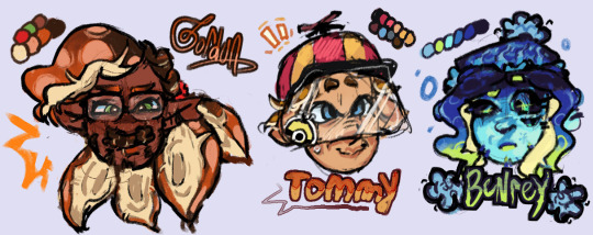

been meaning to post my designs for these little guys forever. insane splatoon rambling under cut to explain design choices and lore related things ... read my autism boy
btw this is a repost from our art side blog this was written and drawn like months ago <- minorly rewrote some things tho
thx splatoon users drfreeman & drcoolatta for fueling my splatvrai autism brainrot ... i hate u /J

GORDON
idk how to explain this but Theoretical Physicist is inkling coded . maybe its cuz splatoon species social hierarchy
Native ink color is Orange, but he has Dark Brown tentacle roots.
Uses custom weapons to attach in place of his prosthetic; It works best with Splatlings but can be adjusted to attach other weapons.
If the thing above didn't make it obvious, he's a Splatling main. He switches out depending on his mood though.
sighhhhh technically an Agent... stares at the ceiling...Main character...
His arm loss is like pretty much the same as in-canon but it's with the octarian army shrugs. don't ask me why he doesn't just regenerate it cuz hes a squid thats for me to know and you to find out. (get partially sanitized loser)
Born & Raised in Inkopolis pre-splashtags; He wasn't informed of the switch to Splashtags being expected when participating in most activities around Inkadia.
TOMMY
I forgot why i made him an inkling why did i do that. I think it was bc i didnt wanna make them all octolings but i was wrong srry we all make mistakes /hj I ALREADY REDREW HIM ONCE IM NTO DOING IT AGAINNN
Native ink color is orange-brown.
His hat has an eye guard for sensory reasons; He covers up as much of his skin as possible because he doesn't like the feeling of foreign ink on him.
He isn't a specific weapon main, he just uses any long-range weapon to minimize the possibility of getting ink on himself. If he has enough guarding, he prefers to use N-ZAP '89.
Makes his own gear for sensory reasons as well :) It's legal when ur dad's the G-Man.
Exclusively plays in Turf Wars, Anarchy Battles, etc with friends. He hates playing with people he doesn't know.
Born in Splatsville !! He feels like a Splatsville resident. His occupation is resident I cannot imagine him doing Anything
His dad is that creepy curtain in one of flounder heights windows /j
BENR(E)Y
Octoling bc I wanted him to be sanitized :) Other than the visual part of being sanitized, I thought him being clinically dead fits /hj also lore reasons below
Pre-sanitization, his native ink color was blue.
Great Turf War veteran; He didn't do anything in the war itself, he was just enlisted lol. He was primarily security for the Octarian Domes in the years after the war. Yes, that also means he is over 100 years old.
"Raised" (debatably) in Octo Canyon.
E-liter main (4-star Base + 5-star Scope) and avid squidbagger. He also uses any heavyweight weapons (dynamo, tenta, etc)
Absolutely hates working at Grizzco, he only does Turf Wars and Anarchy Battles. He only works at Grizzco during Big Runs. The type of guy that does X battles.
Professional Anarchy / Ranked / X Battler btw. That's literally 90% of what he does.
Got on Gordon's azz over him not having a Splashtag; i wonder what that parallels.
BUBBY
Genuinely don't have a lot to say about his design. He gives off Splatoon 2 Octoling vibes (showoff /hj) also i wanted to make his hair wispy like it should be.
Native ink color is a light blue-gray gradient.
The drawing doesn't give it credit but I swear those are glasses not goggles .. they're opaque-colored slanted oval glasses !! ^_^ u can interpret them as spiked or just eyelashes, both are right.
oh also the text under bubby says "Is Best" in some splatoon font we downloaded awhile ago . i think it was ripped from splatnet
Blaster main. I don't know how to explain this one but it feels right.
helps with the practical Map props (ie ink rails) and with some weapon gear manufacturing ^_^ tech guy
COOMER
Was going to make him an Octoling for the convenience of making his hair curly but i didn't want to make all of them octolings + i think his personality generally fits Inklings more.
Native ink color is an off white gradient.
Slosher main cuz he likes moving his arms. this makes sense to me. Also is a fan of Splatlings and other Shooters.
i felt ill trying to design coomer without making his eyes two lines with eyelids
War Veteran...Stole some octarian tech and got fucked up super limbs. Cyber Inkling stealing from octos !! [inkadia crowd goes wild] /j
anyways outside of the war™ he's a data researcher. just generally. he does shit with splatfests and eggstra work.
If you splashed him with ink he would stand unmoving. He would not shake it off.
DARNOLD
Ok i'll be honest the Octoling choice is primarily bc Octolings have the afro style & inklings have no textured hair styles (i didnt have the energy to design smth that could work) . His personality fits octoling too though :3
Native ink color is red-orange.
The fucked up guy that makes those drink effects people never use ( i use them ... )
He doesn't participate in Turf Wars or Anarchy Battles, but he works some gigs at Grizzco for extra cash every once in awhile !
the type of guy that goes after flyfish cuz no one else will . god bles !!!
not a lot to say about his design & his place in inkadia , it kinda speak for itself . he just wants to get by and make his drinks in peace . #autism ... he is pretty much exactly the same as his canon self
#my art#hlvrai#half life vr ai#half life but the ai is self aware#i dont usually tag things this hard but ur GOING 2 read my autism /j#benry#benrey#gordon hlvrai#gordon feetman#hlvrai benrey#hlvrai gordon#hlvrai tommy#hlvrai fanart#dr coomer#hlvrai coomer#hlvrai benry#hlvrai bubby#dr bubby#hlvrai darnold#darnold pepper#<- I FUCKIN FORGOT DARNOLDS TAGS
212 notes
·
View notes
Text
I actually really like the way you use colors!!! it always reminds me of an aged painting you’d see in a museum

after doing some thinking, I realized that one other way I can offer art advice is making art exercises for yall. so here’s one of my feyre sketches that yall can color (if you want)! go crazy!! make her green or something!!


#but if you do want less gray I seriously suggest using a gradient map (if you’ve got procreate)#It’s the forth option when you click the sparkle wand symbol at the top left of your canvas#my colors used to be literal garbage (like look at my elain art from last november or something) till I used those#lmk if you want to see the ones I’ve made cuz the presets are kind of garbage 💪💪💪#OH and also sometimes tumblr/your camera will automatically desaturate stuff#literally has screwed me over so many times whyyyy
106 notes
·
View notes
Note
heyyy i just had a question - feel free to ignore! but do you gradient maps to color your edits or know a way to color edits that isnt the gradient maps on ibis paint... everyone i see on editblr uses it and i cant find any good sites for gradient maps!! :sob: :sob: sorry for the bother- have a nice day!

No need to apologize! And kinda — I do a mix of grabbing gradient maps from pinterest, and using the "parallel gradiation" filter on ibispaint (which you can find in the filters "draw" section :)


You can't do your own gradient colors though — you have to stick by the pre-made ones for this effect method
I BELIEVE there's also a premium version of the same effect where you can do custom coloring as well !
For pinterest I literally just search the color(s) I want followed by "gradient"
There's also websites you can use iirc. Hopefully that helps!

#⋆⠀♡⠀⠀rentry help⠀⠀—#editblr#rentryblr#edit help#new post#rentry stuff#rentry resources#rentry help#gradient#gradient map#ibispaintx
25 notes
·
View notes
Text
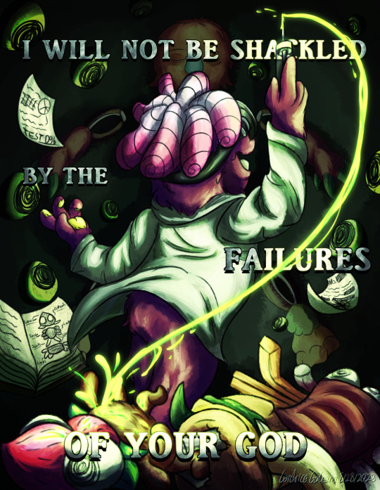
"Blasphemy? Before what? God? A God repulsed by the miserable humanity He created in His own image? I will not be shackled by the failures of your God. The only blasphemy is to wallow in insignificance. I have taken refuse of your God's failures and I have triumphed. There! THERE is my creation!"
I am so normal about Re-Animator and Bride of the Re-Animator, trust me guys. My friends and I watched both movies back to back, and these movies go so hard. We couldn't stop making lowkey comparisons between Herbert and Floofty, and it just went "this is literally what Floofty probably would have done if Head Games went differently."
Insanely proud of how this turned out, I made a BUNCH of different versions, with and without text!, check them out below!
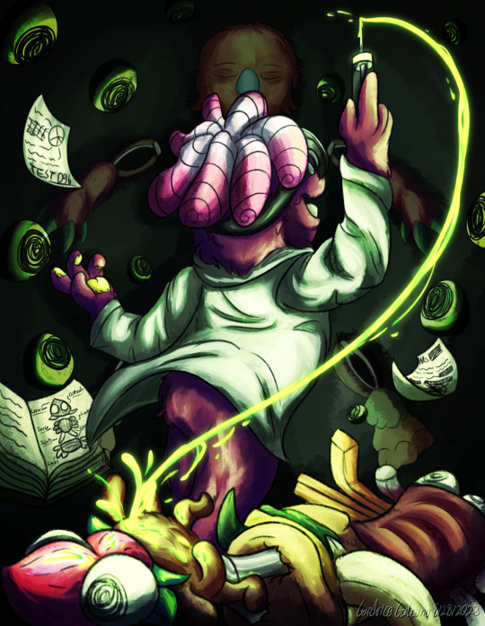
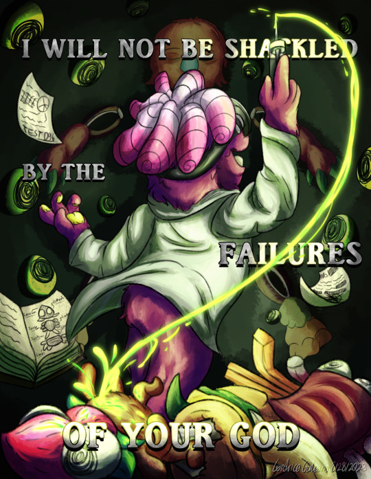

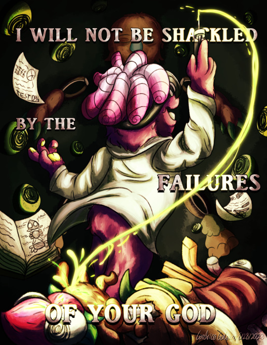
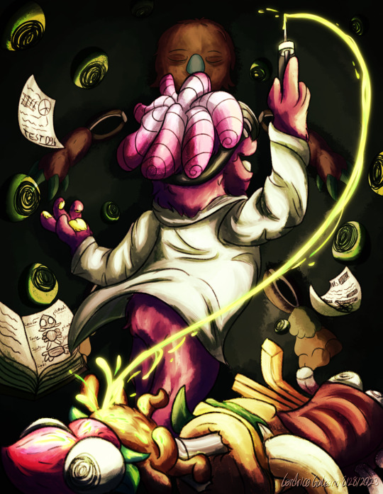
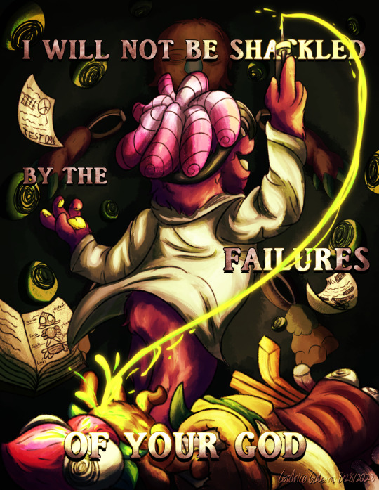
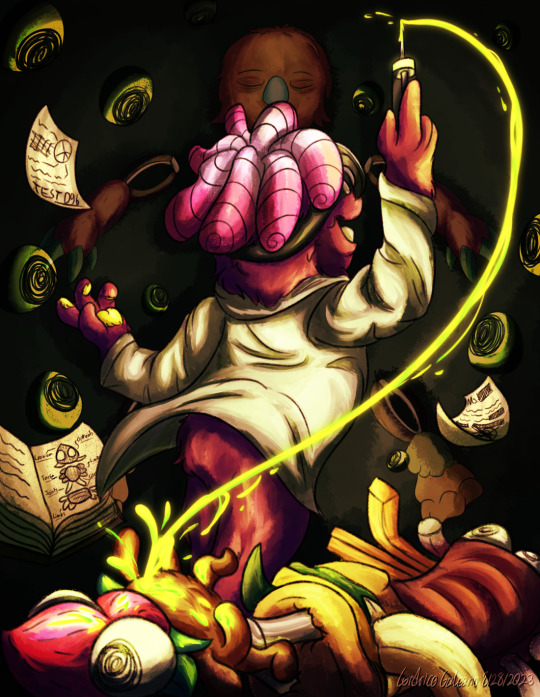
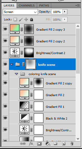
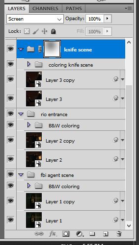
1st image is the main one I showed, just without text. 2nd and 3rd image is without any additional overlay/gradient maps. 4th/5th are another type of gradient overlay leaning on somber red colors 6th/7th land more on the harsher red/blacks for the the gradient map.
#Bugsnax#ReAnimator#Re-Animator#Bride of the Reanimator#Floofty Fizzlebean#Grumpus#Bugsnax Ribblepede#Bugsnax Kweeble#Bugsnax Strabby#Body horror#cw needle#Illustration#Digital Art#artistis on tumblr#thegalleonsnest art#illustration art#cw eye#scopophobia
293 notes
·
View notes
Note
Hi! Can you please share if you don't mind, the tutorial of this gif set please?
Thank u xx
https://eddiediaaz.tumblr.com/post/763685257313714176/pscentral-event-32-magic-laurabenanti-and-me
heyy!
sorry for being 2 days late, i've been quite busy! here's my blending tutorial for how i put all the gifs together. my tutorial shows how to put 2 gifs together but it works the same for 3 gifs as well, as shown in the gifset you're referring to. blending is literally the only effect i have used for this whole set!
for the coloring i basically made the first gif green with gradient map layers and a base coloring, while retaining their skintones with layer masks, and the third gif orange with the same technique. then for the middle gif, i've colored the gif in black & white and added a few green to orange gradient fill layers (of different opacity intensities) set to the blending mode soft light. i've also used layer masks, as i always do. my layers looked like this for the middle gif:

i also have added some dust textures on top of the gifs, on top of the coloring. i find mine by searching "dirt texture" on different resource websites. they're usually black or dark grey with white specs. once you have it placed it on top of your gif layers, set its blending option to screen. in the pictures below (enlarge for more details): the first one is without the texture, the second is the texture itself, and the third is with the texture set to screen.


for the text on top it's simply screenshots from my discord dm's. i have one layer set to linear light at 100% opacity, and then i duplicate the exact same layer on top of it, and set it to normal and 50% opacity.

let me know if you'd like a more in depth tutorial :)
23 notes
·
View notes
Note
I love your coloring style! I struggle so much with painting color, do you have any advice for cohesive color schemes, or how you go about picking what colors and values to use? Do you always use references?
Yes!!! Ok so for a long time I struggled with color too, I would get stuck and give up on whatever I was working on because color just didn't make any sense
truth is, I don't think you can get very far with figuring out color without first figuring out VALUES
So when we color first and then desaturate the left pic, we get a very boring, flat pic, limited values. Middle pic and right pic are 2 examples of grouping values by foreground, midground, and background to create more contast & dynamic layouts.
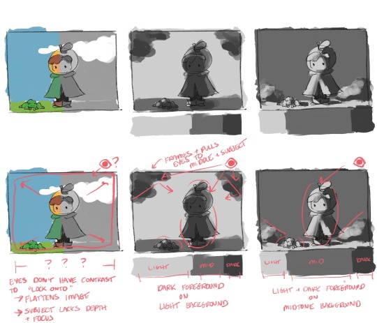
Case in point; contrast shows our eyes where to go. Our eyeballs like having clear focal points, it makes a good drawing that much more satisfying to look at within its borders.
2 layouts for values that I personally like are dark foreground on light background, and light/dark foreground on midtone background.
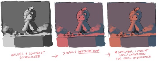
once I have a value study I like, I start laying color in by applying a gradient map. Drawing programs will have presets, but I highly recommend learning to build your own gradient maps. From there I'll tweak the hue around until I find undertones I like (more on that later)
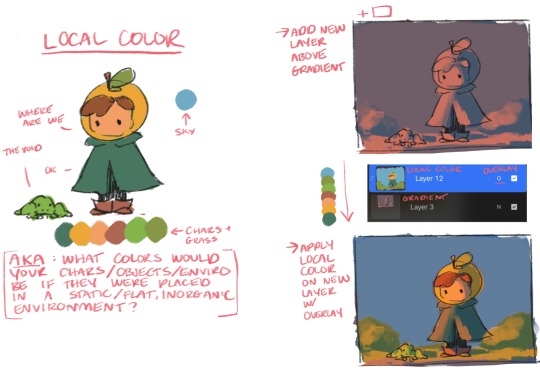
NOW LETS TALK LOCAL COLOR. I define local color, aka "flats" as the color your character is "made out of." Basically ask yourself what colors are your character, if your character was sucked into a vacuum where there was no organic source of light/shadow/sun/etc that would influence the local colors.
Once I have local colors, I use a new layer set to overlay and "lay" the local colors over the gradient. Local colors we want + gradient undertones + dynamic values = cohesive colorssssss
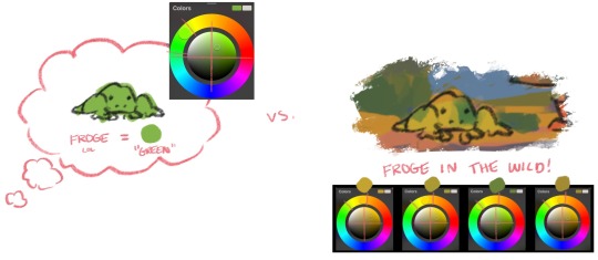
Now one thing I want to mention about color in general is, when I started doing digital art, my brain would "icon-ify" colors and pick colors based on an object's "information" (e.g. frogs are green). As a result, I'd pick a lot of saturated colors in the upper right quad of my color picker, and this would limit my color pallets quite a bit.
Now that I'm more well-versed with values, I've intuitively gotten better at picking local colors in other quads and on parts of the color wheel that go against object "info." In general, I like picking local colors that are warm & earthy.
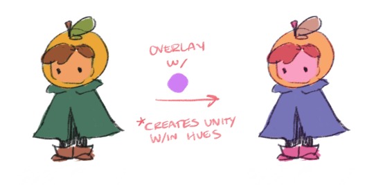
Additionally, you can always use overlay to create cohesion if you're trying to go for a certain look/feel that's tricky to manually pick out on the color wheel!
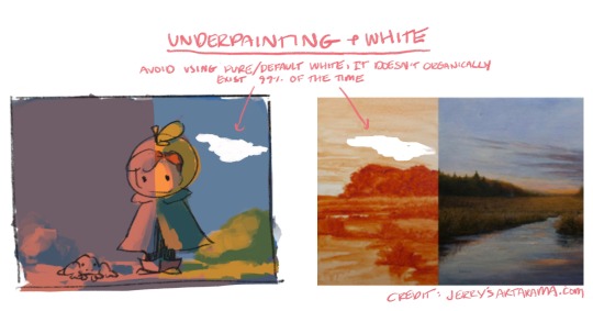
Last 2 things I'll mention are I avoid using a large amount of default digital "white" in artwork. This white literally does not exist in nature, it's like a vacuum to the point where these "clouds" just look like holes in the pictures here. I highly recommend looking at examples of traditional underpainting & using undertones, this was a gamechanger for me since I learned how to carry a traditional technique into digital art and it greatly improved my digital art
References I always use references, for 2 reasons: 1) I have a tough time conceptualizing whole ideas in my head and can't draw most things from memory (womp womp). 2) I legit do not practice anything ever, oops, I am usually learning at least 1 new thing every time I draw, so basically it'll be like "ok time to learn how wolves work" and this requires references lol. I'll use photos or hostages (ie my partner lol) for anatomy & poses, pinterest & posemaniacs are fantastic for this.
Anyway that's every silly little thing I could think of to say lol. I've done digital art for 10ish years, I'm fully self-taught, take that as you will lol. Thanks for asking this, hope it was helpful! :+)
#hope tumblr doesn't make these too blurry#can't believe I know things thats crazy#i was so resistant to learning all this stuff but I'm so glad I did and glad I can explain it in ways I wish someone told me!
25 notes
·
View notes
Text
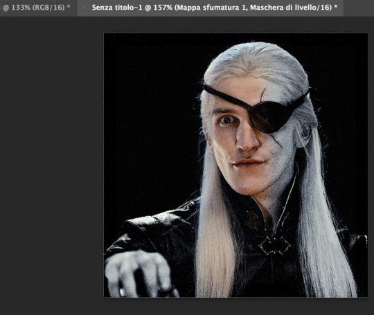
Aemond's toast PSD
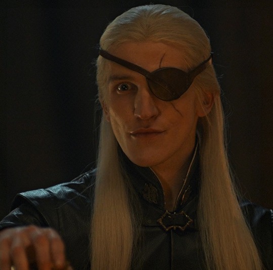
Let's try this again. So, one of my moots asked me how I got this coloring for Aemond, erasing all the background colors but keeping his skin tone, so I thought to share it cause God knows what a nightmare is the dinner scene.
Disclaimer: I’m not an expert at making psds, this was literally a stroke of luck after months of toying with layers
Disclaimer 2: I made this psd before the camera raw filter bliss, may update it in the future.
So, after sharpening and converting to smart object we have this
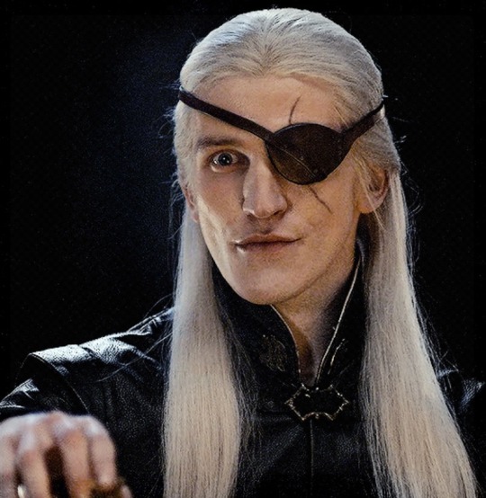
We just need to open the psd and copy every layer into our gif. Et voilà:
You can play with layers as much as you want of course and you can use this psd with other dark scenes but careful, it always depends on each scene and it better be a scene without too much movement otherwise, if the character moves too much, their face will be half natural half black and white lol.
Also, if you want to change saturation or make the skin stand out more (or less) you just have to delete my edits on the gradient map layer
Next create a new mask in the gradient map one
Then pick a soft brush with opacity at 40-45%
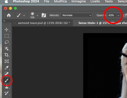
And start “painting” his face to erase the black and white. See?
When you’re done -> save for web -> post!
And that’s pretty much it! Happy giffing :)
psd
51 notes
·
View notes
Note
hi I’m like. kind of obsessed with your artstyle and the way you render. your one vendetta chreon post with the really intense lighting is literally so nice to look at I was wondering if you have any like timelapses or speedpaints or tutorials or something as a fellow artist im just really interested in your process.
Hello, of course!!
Admittedly, this particular one was a bit of a bad one for a time-lapse as the actual painting part of the drawing is rather short
(And it flashes a little)
So just to explain what the hell happened with the colours as you can't really see what's going on:
Basically, first I coloured them in with the usual colours I'd use for them. Then, I did a greyscale layer on top for the shadows AND light. On top of that one I put a gradient map that made all the shadows on the greyscale layer a blue and the light portions yellowish, put that entire thing on "hard light", and that's basically how I got to those colours I've had in the end. Just lots of trial and error
But my entire process is usually truly just:
Sketch -> rough colouring -> rough shadows -> painting over everything on a new layer atop -> merging everything at the end to adjust the colours a little
Sorry if this barely helped though, feel free to ask me in dms or something too! And thank you for the compliment, I'm glad you like it <3
25 notes
·
View notes
Text
HEY wanna hear my insane derranged ramblings abt my ocs???? YOU DO??????? well, its below the cut so u know what 2 do
{divider credits here}
{picrew credits here}

ok so, im gonna skip over the worldbuilding (because i... haven't done it) but i have some basics mapped out and my ocs. it's a self contained superhero universe, but slightly more magic than sci-fi. the basic concept is that there is, like, magic called arcana, and it sometimes affects humans and gives them powers. they've been around for AGES, for a while everyone like really loved em, and then a bunch were killed off, and now in the modern day (by modern day i mean 2019, don't ask why) theyre still pretty oppressed, but there aren't as many super blatant laws affecting them, and people r starting to respect them a lot more and treat them normally.
arcana doesn't just give humans powers, but also affects them physically. this is basically just because the arcana changes peoples body as a way to make channeling their powers easier, so their physical changes and powers are often interlinked. for example, if someone had powers over water, theyre probably like. a fish.
i have 8 ocs in this universe, all apart of the same superhero idea. they operate out of a city that i'm still figuring out the lore of, but the basic idea of it is that it's a fairly progressive area with a government that has made a tentative agreement with the team to let them operate within the city.
SO, now onto the ocs!!! i'll just be saying their names (both hero and civillian), pronouns, age, explaining their powers and showing a picrew i did of them, but i do have a lot more details worked out :333
the characters are a lot more inhuman, but the picrew didn't have all of the stuff i needed, soooo you'll have to use ur imagination a little
Bianca Madeline Moore, she/her, 25
hero name: Circe
Bianca can channel arcana physically, which takes the form of a pink glow/beam around her body. When normal humans encounter this glow their bodies can't take the energy, and they become incredibly weak, feverish and ill. When other magic people (i need to come up with an official name for them thats so lame) come into contact with it they basically get a power up, and she uses it a lot during missions to either help or friends or blast rubble out of the way.
physically, Bianca is also, like, a cat. cat ears, cat nose, cat eyes, cat tail, the whole shebang. in universe this is because cats are more susceptible to arcana than normal humans, thus making it easier to control her powers if she's part cat. personally, i just wanted her to be a catgirl. what can i say, i'm a simple person.
2. Ajamukhi Kumar, she/her, 24
no hero name, she has a very public identity and only goes by Ajamukhi
Ajamukhi probably has my favourite power out of all the ones i came up with, i think its really versatile! the basic run down of it is she has shadow manipulation, she can move em around, grab people with em, you know the deal, but she uses it in a lot of unconventional ways. For example, if she's standing in a dark building, she can use her shadows to figure out where literally all the hallways are, and where certain objects are too. She can also use it for stealth as well, obviously.
the way that this physically affects her is basically a shadowy gradient, from the elbow and knee down her limbs become made of this shadow esque substance, which she can also manipulate with her powers. she commonly turns these into weapons, or tools she may need, but theyre also still apart of her body and can in fact get damaged, although they tend to heal faster than the rest of her.
3. Danielle Esther Rose, she/they, 28
hero name: The Shatter (but everyone just calls them 'shatter' :((()
danielles abilities are pretty basic- she has the power of illusions, and they're also invisible. Her illusions themselves are slightly complex, for example they only target the brains of people around them, and they don't show up on camera. if they focus hard enough, they can make sure only specific people are being targeted by her abilities, but that takes a lot of effort.
mini rant incoming but i hate the trope of invisible character loves to be naked all the time, its weird and gross and bad. danielle loves dressing up and wearing gloves and hats so their friends always know where they are (may or may not have anything to do with their intense abandoment and neglect issues).
anyway, rant over, when danielle wants to go out in public without being clocked as 'the invisible hero' they project an illusion form onto themself. most of the time illusions like that would be more complex and straining for her, but because even though theyre invisible she's still, physically, there, it's more like painting a 3d model than sculpting from scratch, and it's a bit easier on them. they base the illusion on their parents, so she ends up looking eerily similar to their mother when they stand side by side. Most of the time, they're fully invisible though.
(picrew showing her projected illusion form)
4. Josephine Chanel (soon to be Weber, she's engaged), she/her, 25
hero name: Photon
Josephine has super speed, but with some of my own (as well as my friends) flair. She can move incredibly fast, which is basically a prerequisite for super speed, but can't really... control it, if that makes sense. my friend (@opticblast1963) and i were talking about how in movies and comics and shows they always portray superspeed as slowing the world around them, while they walk normally, and we agreed it would be funny to have a speedster who didnt do that. so, Josephine basically runs super fucking fast, and she can barely control it, because she is also processing everything at the same speed everyone else is. she doesnt tend to use her ability to its fullest for this reason, as well as it contributing to how awkward she often feels.
she has long as fuck legs, like theyre massive, as well as super large feet. Josephine is fairly insecure about this- she often feels awkward, and weird, and ashamed, but her friends are really good at helping her feel more confident.
5. Qī Wěi Zé, they/it, 19
hero name: Hubba Bubba
Wěi Zé is another one of my favourite powers, and one i like actually want irl. they can basically generate gum. that's it. it's more useful than u think i promise. Wěi Zé can basically create like a fuckton of gum whenever it wants, and they often use that to capture villains, stick shit together, or like create massive bubbles that can be used for a lot of stuff. its stupid, but i love it.
also, the gum is grape flavoured
Physically, they don't have any bones. no teeth, no ribs, no spine, no nothing, theyre replaced by this weird, pliable material (except for teeth, theyre just gone). they're like double jointed and can basically move ina bunch of weird freaky ways, which does cause it mobility issues. it's mostly been ok with handwaving these for most of their life, but when they met Bianca the two had a more in depth conversation about mobility aids, and it's started using crutches when they need them. they also often wear dentures, but not always
6. Talia Sami, she/her, 26
hero name: Boombox
I also really love talias power, as well as talia in general. she can basically make anything she touches instantly combustible and blow it sky high. she generally uses this for diversions or break ins, and tends to be really cagey when it comes to actual fights, mostly because she gets freaked at the idea of what her powers could do to a person (which relates to some other stuff i'm still workin out)
she's also always on fire. well, not always. Talias body temperature runs incredibly hot, her skin can actually burn people sometimes, and it's generally affected by her emotions. when she's particularly emotional, whether that be because she's happy, or angry, or miserable, she literally catches on fire. not in a dramatic, big bang way, but in a 'her whole skin is covered in a layer of flames' kind of way. before she joined up with the team clothing was a massive problem for her, she often had to try and restrain her emotions as much as possible, but Danielle helped her design some clothes that were flame retardant, and she's started being freer when it comes to expressing herself.
7. Joseph Borden, he/him, 42
hero name: Goliath
Joseph has psychometry, which in case youre not familiar is the ability to read somethings past/history via touch. his in particular is a bit more advanced, where if an object has a particular emotional connection to a person he can also read into them specifically, even stuff that happened since they parted with the object. if the connection is strong enough and he works on it for long enough he can pinpoint a persons location
just like how Bianca is a cat, Joseph is basically a frog. i thought this would be an interesting one because of the way frogs absorb water through their skin, like how josephs psychometry works. it doesn't go much deeper than that, but he does have a cool tongue and no one likes to watch him when he eats bc of how weird his eyeballs look when he swallows.
8. Hail Valentine, she/he, 22
hero name: Sublimation
hails is definittely the power i have trouble explaining the most. she was the last one i came up with, and it took me ages but i finally figured it out when one my friends made a joke abt walking on water. the best way i can describe it is that he can make the choice to interact with the world in anyway she wants regardless of the state of matter. thats a bad explanation. i'll just gives some examples. Hail can move through water and walls effortlessly as though they were made up of gas, or walk on water or through the air, stuff like that. he basically just makes the rules. this does mean that she has a harder time interacting with individual objects like chairs, and sometimes even food, but it's really useful for missions.
her physical powers are pretty simple, he basically just kind of changes state of matter sometimes. not fully, but her skin will be dripping or melting, or maybe his hair will be barely there, or on bad days his entire face would just be gas. it varies, but she's basically never solid.
Also, some more information relationships wise- Bianca and Ajamukhi are a couple, although it takes them a while to get there. Josephine and Bianca used to be in love with each other when they were 15, but now Josie is engaged to a guy named Lucas and they' really happy. Wěi Zé has a boyfriend named Ethan as well.
Wěi Zé and Bianca are really close. Wěi Zé likes to make jokes abt their similarities (eg haircuts, mobility aids, etc) and its a kind of sibling esque relationship (which brings in more angst when it comes to Bianca and her older brother Ciro, who i am resolutely NOT talking abt in this post because its already massive)
Josephine and Bianca are best friends, and Talia, Hail, and Danielle are pretty close knit as well.
and josephs relationship with everyone is. weird. he's weird.
rank wise josephine is the leader, joseph tends to handle detective work, danielle likes to hang in the lab more often, and hail and ajamukhi are often put in charge of stealth missions. the others fluctuate fairly often in their roles.
thats all i have for today, but please if you're interested in these guys shoot me an ask i want to ramble sooooooooooooooooooo much its not even funny. im obsessed with them. i cant stop thinking about them. i am going to implode.
im gonna be tagging all my content abt them with av btw:33
@punkeropercyjackson it is a LONG ASS POST feel free to not read the whole thing, but heres the tag you asked for :33
#original post#av#ajamukhi#bianca#danielle#joseph#hail#josephine#wěi zé#talia#my ocs#long post#ocs#my ocs <3#oc stuff
10 notes
·
View notes
Note
Can I ask you how you make your black and white gifs?
you absolutely can! i'm always happy to help and answer questions/make tutorials whenever i'm able 🥰 generally, black & white gifs are some of my most simple gifs just in terms of coloring and how many layers i use. i'm going to use my latest billy joel set as an example:

i always color my gifs after sharpening them, but that varies from person to person. for this set, i literally only did a curves layer and then the b&w gradient map. curves will depend on your source material, but here are what mine looked like using the turn the lights back on music video:

with curves, i almost always use the eyedroppers on the left side. i don't think the order in which you use them matters, but i typically use the black eyedropper and then the white.
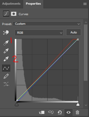
to use these, you click the eyedropper and then click a point on your gif. for the black eyedropper, you typically want to click on the darkest/blackest part of your gif. for the white eyedropper, you want to find the whitest/lightest part. you can definitely experiment a bit, like curves are incredibly useful for tinted scenes. that didn't come into play with this mv, but for heavily tinted media like the haunting of hill house, ready or not, chernobyl, mindhunter, etc. curves are a game changer. sometimes i'll find a dark part of the gif, but slightly lighter than pure black because it will work to counteract the tint. for really blue scenes, it will increase yellow. for red scenes, it compensates with cyan. green is adjusted with magenta. i find the black eyedropper to do most of the heavy lifting, but the white one also helps with the overall brightness of the gif as well.
anyway, like i said, my coloring was extremely simple for this gif, so from here, i went right a gradient map adjustment layer.

(alternatively: layer > new adjustment layer > gradient map)
what happens immediately after clicking this icon depends on what two colors are selected as your foreground and background colors on your canvas:
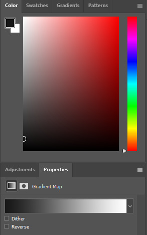
if your colors are something completely different than the gradient map you want, just click on the gradient itself, which brings up this menu:

it depends on the effect you're going for, but this should typically be your darker color. in this case, i did use a very dark grey rather than pure black, but whatever color scheme you're using, this side should be darker than the color on the right side.
your lighter color! in this case, white.
photoshop's pre-made gradient maps, which i definitely play around with from time to time.
if you scroll all the way down in box 3, any new, custom gradients you want to save will appear. to save your current gradient, press new. pictured below:
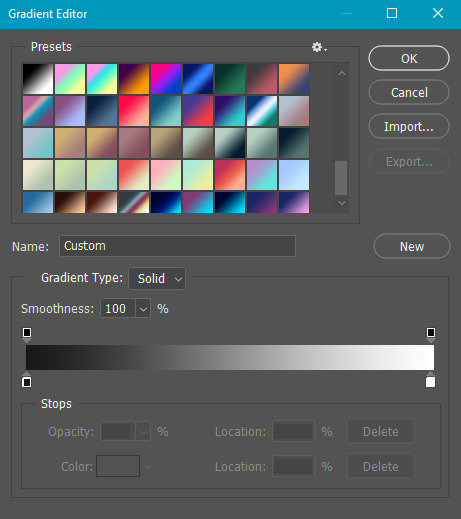
i save a lot, as you can see lmao. the possibilities are endless!
once you're happy with your colors, black and white in this case, hit okay! that's literally all there is to it. sometimes before the gradient map, i'll do a brightness/contrast layer set to screen to brighten the gif, then curves, then levels (where i also use the black and white eyedroppers), then a selective color layer where i darken the blacks by 1-5 and sometimes lighten the neutrals by -1 to -5, but this all depends on the scene i'm working with.
i hope that answers your questions! if you need any additional info, just let me know!
22 notes
·
View notes
Note
How did you create your banner?!??! Its literally the coolest thing I've looked at today
Ahh thank you 🥹 I've done it with Photoshop, I used Pinterest for graphics inspiration and some resources.
My main inspo was this picture and initially I wanted to do it just like that but things happened on the process lmao as you can see the base was still the 3 pics but I decided it would be cool to add the gif of him walking so I screencapped the scene from the eternity music video, made the full gif and then had the very hard work of cutting every frame one by one (it was 46 frames 😭) to create the effect i wanted which looked better in my head but I think the finished product is still very lovely!
The other non-chan elements were taken from Pinterest as well, the background is a polka dot sheet like the ones that are for notebooks, and the book cut outs were from some collages I found on a deep dive opening pages lol I don't remember what I was searching but I ended up on the page of a collage that had book excerpts and i liked the vibes
The rest is just Photoshop, the squares were made with the rectangle tool and given a 10pt border and the text that says eternity is made with a font. The chan pics inside the squares are also from eternity, I used frames he wasn't looking at the camera and then i put a b&w gradient map over each
I usually explain my process with pictures but my computer is in another room right now, if you want to know how i did something specific of the banner let me know and I'll try to explain with pictures later when I get on my computer!
10 notes
·
View notes