#i like the 3d design but their movement is exaggerated
Explore tagged Tumblr posts
Text
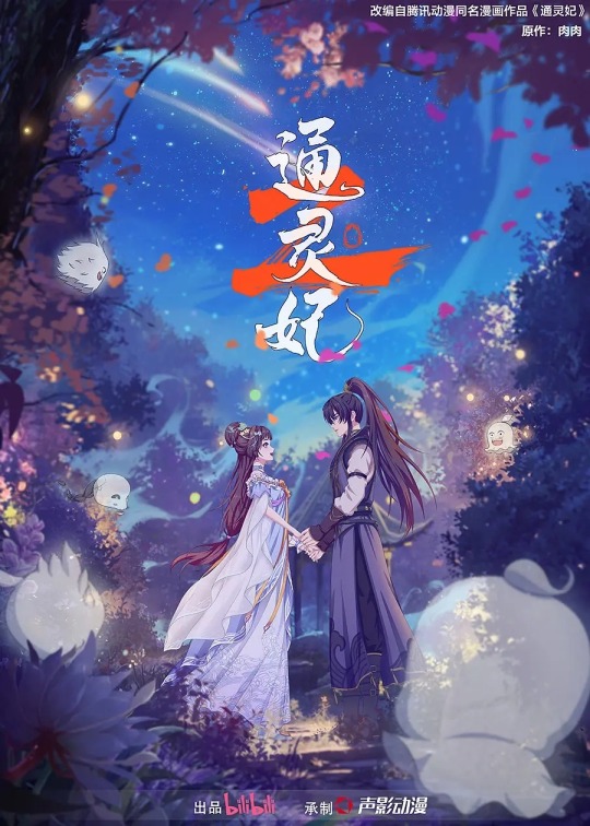
Tong Ling Fei (Psychic Princess) is now back with season 2 but as 3DCG animation!
One of my first shoujo-ish donghua. Its hard adjust when they pass the series to different studio because its hard to get use. Especially if the animation difference is like heaven and earth. I don't have problem with 3DCG but I wish the vibe is more similar to Liang Bu Yi (No Doubt in Us) and Cheng He Ti Tong (How Dare You). I think its closer to Jian Wang 3: Xia Gan Yi Dan Shen Jianxin (JX Online 3: Adventure of Hero Shen Jianxin). Unfortunately, I feel they overdid the movements. I like the character designs though. Very cute. I put the season 1 opening after it so you'll know how different it is.
Watch out for Bilibili international yt or app, they might upload the season 2 there!

#i like the 3d design but their movement is exaggerated#i dont know how to feel about that#tong ling fei#psychic princess#donghua#romance#comedy
6 notes
·
View notes
Text


More Navia adventures ♡
#genshin impact#gamingedit#genshinedit#genshinet#genshinimpactedit#navia#video games#gifus#is it an exaggeration if I say she feels like a Premium character#her character design her 3D model her combat movements...#she's just incredible wtf 😩💙
151 notes
·
View notes
Text
How to properly create a readable reference… !
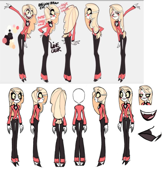
Using old pilot reference as an example, I’m here to expand on this to make a turn around sheet that will be more helpful to someone who would be looking at this while animating the design….
1st, get rid of the posing, it’s stretching anatomy and complicating the image, how will we be able to see how her shoulders rest if we can’t see her arms down at her sides? Leave poses for a separate page for exaggerated expressions
2nd, giving her a neutral expression can not only help us better balance the thickness of her lashes but also make the eye shape clearer- and where her features should rest naturally when she is calm. Giving the animator a consistent anchor after an especially exaggerated movement of the face. We always must have a proper clear default.
3rd, proper side angle, her arms pinned back slightly to expose her side, showing the animator how the shirt ends at the side or how the lapels connect to the back and wrap around the neck- which can be shown at the back angle too.
4th, proper back angle, you can see I have two set here one where her hair is out of the way and exposing her back while one had the hair fell down, showing us not only how the back of her shirt looks but as well as how her hair would fall- leaving nothing to imagination and guess which could have contributed to animation consistencies to the pilot art style. Preferably we would also have a straight on shot as well, but for space sake I left that out for now.
5th, all are in the same pose and all body parts match up, none of the hand on hip or out in an awkward position. We have to know in animation the BASICS then from there the animator is free to bend it in practical ways but will always know what the rules may be. It’s exactly why so many shows have animation bibles. The more information you feed your animators the more streamlined your project will be. Don’t make the animators work any harder then they already do by guessing what the hell you were going for…
6th, add ons, what is the inside of her mouth look? What about a place we can’t see such as her top lid (while also getting a view of what her lashes look like down at half lidded) or the underside of her foot? Leave no place left untold! Remember animation can help give your characters the illusion of living in a 3d environment. They can and will see the underside of them or behind them- work thoroughly.
Whether you are making animation or even a comic, a proper reference is crucial to character consistency as well as a perfect place to add additional information one might not see at first but grow incredibly vital in later drawings.

341 notes
·
View notes
Note
you’re one of my favourite artists and one of the reasons I want to start drawing!!! >.< I’ve started and it’s a bit difficult but fun!!
I was wondering if you had any tips on how to draw face shapes and dynamic poses? I love the way you draw face shapes and the actual expressions!!! (it’s always so hard for me 😭) and your poses are super cute!!!
YAAYY NEW ARTIST🥳!! i’m SO happy to hear this -
and absolutely i’d love to share what i’ve come to learn (so far!) re: face shapes and poses as a hobby artist ^^
just to preface everything, when it comes to giving art advice there’s always a general disclaimer that there’s no right way to do art, in the end you should do what you like to do! sometimes i like to think of art as problem-solving, and there are many ways to tackle specific problems <3
for face shapes and expressions - lately i love to reference and do studies of Ami Thompson and Shiyoon Kim’s character design and expression sheets for Spiderverse. these are INCREDIBLY evocative and useful. you can study these expressions and poses and try to recreate them on different characters, and you’ll notice the difference in eye shapes, face shapes, noses, etc; studying these differences is what will help us avoid same face syndrome. what i generally like to do is find art that i like - comic/manga panels, fan art, anything i want to learn how to draw like - and copy it into my sketchbook for personal practice and study to see what elements i can incorporate into my own drawing.
another tip - any medium is good for drawing, but i highly suggest esp when you’re starting - learn to draw with ink! drawing traditionally and with something unerasable will help with your draftsmanship and line confidence. it’ll be wonky at first but you learn to be deliberate with every stroke. tbh becoming a digital artist has deteriorated my draftsmanship and has made me heavy-handed, and it’s something i’m trying to consciously remedy right now. digital art is highly convenient and best for sharing, but when i do studies i stick to pen and paper :)
as for poses - one v important thing i learned in creating dynamic art is to “push” or exaggerate the poses. what you see in a photo reference - if you try to draw that 1:1 on paper, it doesn’t always translate well—the energy is not always captured, and it usually looks so stiff. what is in 3D has to be translated a different way to 2D. so “push” it to create more energy - exaggerate the movements - even if they’re just standing, you can make it dynamic by being conscious of how they’re standing (where the weight is balanced, push one hip up, make them lean one direction, for example). i doodled some examples here:
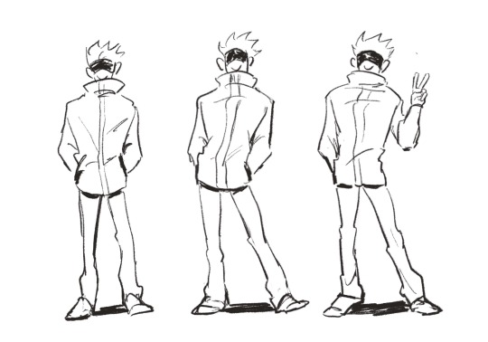
^ first one is gojo just standing; now how i would “push” this pose is to show him putting more of his weight on one hip and maybe putting his opposite foot up a bit to suggest some movement (and balance). the third one is just a bit more variation where his body is still putting weight more on one side, his feet are more glued to the ground, but i put his hand out to do his signature victory sign just for a bit of flair. so it’s a lot of figuring out how to convey balance and weight and movement and personality :) start with exaggerating the pose - then you can create more and more dynamic art from there ^^
pushing and exaggerating applies to facial expressions, too! instead of merely drawing someone with a smile, try tilting their head a little sideways (and show how their hair might move as well bc of this), add some blush, raise their shoulders a bit, etc).
and i 100% recommend taking gesture drawing classes for dynamic poses ^^ there are a lot of artists who have draw-with-me tutorials on youtube, and i personally like to use line-of-action.com for timed sessions.
i hope this is helpful in even a little way—good luck on your drawing journey and remember to trust the process bc progress is def not linear as an artist but deliberate practice and studies WILL help you! <3
17 notes
·
View notes
Text
thoughts/braindump about the new zelda game:
-PLAYABLE ZELDA!!!!!!
-fairy design VERY good. what a funky little creature. also i can't believe zelda is hyrule's first poketrainer
-god i almost feel like this would work really well if it was closer to like the tunic style? tunic isn't nintendo but it's very much a love letter to games like alttp and i think it really does a good job mixing the cute/charming with the sinister/mysterious in a way that would REALLY make those portals hit harder visually.
-i don't have a problem with the cutesy-ness of it - wind waker + the other toon games are some of my favorite zelda games visually and they go for a cuter style, but they work really well because they're a) a really nice stylized mix of 2d/3d and b) the character models are all very very emotive, exceptionally so for zelda games especially. by contrast, the link's awakening remake style they're bringing back for this game is very. plastic looking. instead of inviting you into this colorful world, it pushes you a step back emotionally, because you're playing with plastic dolls, and even worse they're plastic dolls that barely emote. cartooning relies on exaggeration - exaggerated emotion, movements, character design, etc. plastic looking 3d chibis running around a plastic chibi world are stiff, their movements are limited, their expressions feel fake.
-re playable zelda: yay!!!!! re the visual style they're going with: vaguely disappointed, but unsurprised. totk came out last year, and reusing this style means they're probably recycling assets from link's awakening (models/rigs/animations, environment models, probably all of the coding for the mechanics/enemy behaviors) which means it can come out faster and cost less money.
-i'm kinda assuming this is them testing the waters with playable zelda, and maybe if this game is successful they'll decide it's worth spending money/time/resources on a more serious game featuring player zelda.
-might do some fanart of the new zelda in the toon/windwaker style and maybe play around with scenes from the trailer to put it in the tunic style? we'll see
-where in the timeline is this Eiji Aonuma??pink crystal zelda is from oot. dont tell me this is a FOURTH timeline Eiji Aonuma i'll lose it. you still haven't explained what the hell is going on with totk. sir. mr zelda man. please
#echoes of wisdom#i know i compared it to toon link but honestly i think this style is nintendo's knew version of the pixel zelda games#like with loz there are the big budget 3d games. and then there are the pixel games which are a little simpler overall#(pre-oot everything was pixel i know i know i mean since oot it's been mainline 3d vs less mainline lower budget pixel games)#but pixel is i guess not in fashion anymore and/or more expensive/time consuming to produce#so instead they're using this plastic style. 3d models look like plastic by default so they dont gotta worry about textures so much#they can probably use the same base model and rig for every character#and there are fewer/less complex animations
29 notes
·
View notes
Text
8. kigurumi gyaru
kigurumi gyaru is a unique and playful substyle within the gyaru fashion movement that combines the vibrant, bold aesthetics of gyaru withe the whimsical charm of kigurumi (costumed animal pajamas). this fusion creates a cozy, yet eye-catching look that stands out in the broader gyaru culture. here's a breakdown of kigurumi gyaru fashion!!!!!!!
origins and development
kigurumi: kigurumi originally refers to the full-body animal pajamas or costumes popularized in Japan as comfortable, fun lounge wear. it became a cultural phenomenon, often worn at events, conventions, or as casual street wear
gyaru: the gyaru fashion movement, know for its bold, glamorous, and rebellious styles, has a wide range of substyles. kigurumi gyaru is a niche but distinctive makeup and accessories typical of gyaru.
fusion: the blending of these two styles likely emerged as a way of gyaru fashion identity. kigurumi gyaru is often seen at gyaru events, parties, or within informal, fun contexts.
key motifs
kigurumi outfits: the central feature of kigurumi gyaru is the kigurumi itself-- full body pajamas that are typically designed to resemble animals, cartoon characters, or fantasy creatures. these kigurumi are often over sized, adding to the playful and comfortable feel.
gyaru makeup: despite the relaxed nature of the outfits, kigurumi gyaru still maintains the dramatic gyaru makeup style. this includes bold eye makeup with think eyeliner, long false lashes, and sometimes colorful eye shadows. white highlights around the eyes, heavy contouring, and glossed lips are also common.
accessories; to enhance the gyaru influence, kigurumi gyaru often incorporates exaggerated accessories. large chunky jewelry, over sized bows, or colorful wigs that natch or complement the kigurumi are popular. hair can be styled in voluminous curls or other dramatic looks under or around the kigurumis hood.
footwear: while traditonal kigurumi is usually worn barefoot or with slippers, kigurumi gyaru might add platform shoes or boots to maintain a sense of height and drama associated with gyaru fashion. these shoes can be brightly colored or feature bold designs
nail art: like other gyaru substyles, intricate and bold nail art is a key component. nails might be decorated with 3d charms, glitter, or bright, contrasting colors ro add a touch of glamour to the otherwise cozy outfit.
music
the music associated with kigurumi gyaru tends to over lap with the broader gyaru culture. j-pop, eurobeat, and upbeat, fun tracks that complement the playful, energetic vibe of the aesthetic are popular. here are some music artists to look at.
kyary pamyu pamyu
koda kumi
namie amuro
ayumi hamasaki
capsule
perfume
charli xcx
rina sawayama
ayesha erotica
yasutaka nakata
movies
movies that emphasize whimsy, fantasy, and fun, reflect the playful and fantastical elements of kigurumi gyaru! here are some movies I suggest
kamikaze girls (2004)
love & pop (1998)
funky forest: the first contact (2005)
sailor moon r: the movie (1993)
shimotsuma monogatari (2004)
suicide club (2001)
paradise kiss (2011)
nana (2005)
cutie honey (2004)
the girl who leapt through time (2006)
other medias
manga and anime: characters in manga and anime who embody playful, exaggerated styles can inspire kigurumi gyaru. series like one piece, with its colorful and diverse character designs, or fruits basket, featuring characters in animal forms, resonate with the kirgurumi aspect.
fashion magazines: Japanese fashion magazines like agesha and egg may occasionally feature kigurumi gyaru, particularly in issues focused on fun, casual, or part styles.
social media and online communites: platforms like Instagram, tiktok, and fashion centric forums or blogs are vital for kirgurumi gyaru enthusiasts to share their outfits, connect with others, and find inspiration. the aesthetics playful nature makes it particularly popular in visually-driven social media spaces
inspo
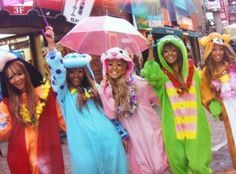
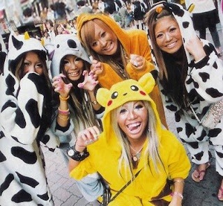
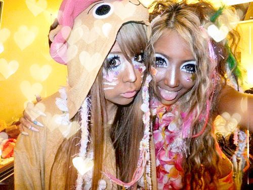
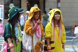
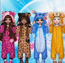
overall, kigurumi gyaru is a unique fusion of the cozy, whimsical charm of kigurumi and the bold, glamorous edge of gyaru fashion. its playful and expressive style that allows for creativity and individuality, often seen at events, parties, or within communities that celebrate both comfort and fashion. the aesthetic is defined by its dramatic makeup, oversized, playful outfits, and the blending of cute and bold elements that challenge traditional fashion norms.
make sure to like, reblog, and follow!! my requests are open on my page!!
videostar signing off..........................
#cinema#fashion#favorite movies#fashionblogger#i love this movie#films#femcel#movies#style#movie poster#gyaru#gyaru fashion#gyaru gal#gyarustyle#gal#kigurumi#girl blogger#gaslight gatekeep girlblog#girl interrupted syndrome#girlcore#im just a girl#this is a girlblog#daddy's good girl#girlhood#hell is a teenage girl#girlblogging#beauttiful girls#cute#woman#beauty
2 notes
·
View notes
Text
DFX452 | Blog Post 1 | 2/1/25
Bringing Pocket Goblins to Life: A CG Toy Commercial Project
Welcome to the first blog post for my personal project, Pocket Goblins — a fictional toy line brought to life through 3D modeling, texturing, and animation! This project is not just about creating a visually engaging 10-15 second advertisement but also about exploring storytelling, post-production techniques, and world-building within a short commercial format.
The Idea: Pocket Goblins
I wanted to design a toy commercial aimed at younger children with big imaginations. The concept behind Pocket Goblins is simple yet fun: small, green goblin creatures that come in a variety of unique outfits, each with their own personality and role. These figures have three points of articulation—their two rotatable arms and a rotatable head—giving them just enough movement to spark creative play.

After sketching out designs, I settled on a cute, stylized look: large round heads, expressive faces, and fun, distinct outfits. The toys themselves would be made of hard plastic with sticker faces and bodies, while accessories like hats and weapons would be hard-surfaced models. So far, I’ve designed four unique goblins:
The Wizard – Wielding a tiny staff and magical wisdom.
The Barbarian – A fierce fighter with a powerful stance.
The Blacksmith – Ready to forge weapons for battle.
The Pirate – Treasure-loving and always on an adventure.

To expand the world of Pocket Goblins, I designed a treasure chest playset, which serves as their home. This small detail enhances the storytelling aspect and makes the toy line feel more immersive.
The Commercial Concept

The storyboard I drew up features an exciting, high-energy sequence:
A treasure chest drops into view, squishing slightly before springing open.
Bright lights shoot out as the Pocket Goblins rise into view, filling the screen.
The background transforms into a pop-art-inspired motion backdrop created in After Effects.
The goblins pop up and float, rotating dynamically before one zooms into frame and blinks.
As it lowers, the chest appears again with the goblins gathered inside, followed by the Pocket Goblins logo popping into view.
The commercial fades out, leaving a fun, playful impression.
Technical Approach
To bring this project to life, I’ll be utilizing a variety of 3D software tools and post-production techniques:
Modeling & UV Unwrapping: Autodesk Maya
Texturing: Substance Painter
Lighting & Rendering: Unreal Engine
Compositing & Final Editing: Adobe After Effects
I started modeling the goblins in Autodesk Maya, focusing on basic shapes—circles and cubes—to build their forms before refining them using the soft select tool and sculpting tools. Their arms, especially their fingers and curved shapes, required careful manipulation of vertices to achieve the right look.


Once the goblins’ base models were complete, I moved on to their hats and weapons, ensuring they had a higher poly count to maintain smooth, detailed surfaces. Since these models won’t require extensive animation, I can afford higher poly counts, especially with Unreal Engine’s Nanite system, which handles high-poly assets efficiently.


Next, I designed the treasure chest, keeping it cartoon-inspired with exaggerated proportions. The interior is still a work in progress, but once completed, I’ll move on to UV unwrapping to prepare for texturing.


What’s Next?
In the coming weeks, I’ll be sharing progress updates, behind-the-scenes looks at my modeling process, and insights into the challenges I encounter along the way. Stay tuned as I bring Pocket Goblins from concept to commercial!
Thanks for following along on this journey — I can’t wait to share more soon!
1 note
·
View note
Text
Movement and Storyboarding
youtube
As stupid as the thumbnail looks, it's this video which helped shape the new direction of my film. I used to watch a lot of Source Film Maker animations when I was younger and this SFM tutorial reminded me of the stupid 3D animations that I used to love. They never make a lot of sense, things just happen but they happen in an unpredictable nonsensical way. I want to focus on that more than any defined narrative, I want to try and let my instincts guide this process and do whatever I enjoy not what looks flashy or technically difficult.
youtube
I grew up watching a lot of animations using Valve assets in SFM and this youtuber stuck out in my mind as an animator who enjoyed animating because of how improvisational they are as they hop between actions which they thought would be fun to animate. I want to try and do the same by flipping assets from sketchfab and other places to build my scene into a miniature world with lots of crap to make the spaces feel lived in where applicable.
youtube
This is a much more polished animation in SFM with great editing, animation and special effects which I saw last year and I want to try and emulate the fast cuts and closeups alongside the lower framerate and added 2D graphics as a way to cut the render time in half so it doesn't limit me giving me more time to experiment.
youtube
The characters in this animation feel like they're made of rubber because of how much the faces change from shot to shot, expressions are exagerrated to the point of caricatures and again the premise is stupid and unimportant. Its another animation where things just happen which is a little different from the guard duty premise I'm working with but I really want to bring this expressiveness into my film because its these outlandish unpredictable movements which I know that I'd enjoy making.
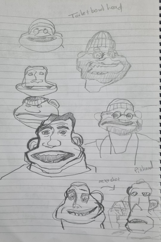
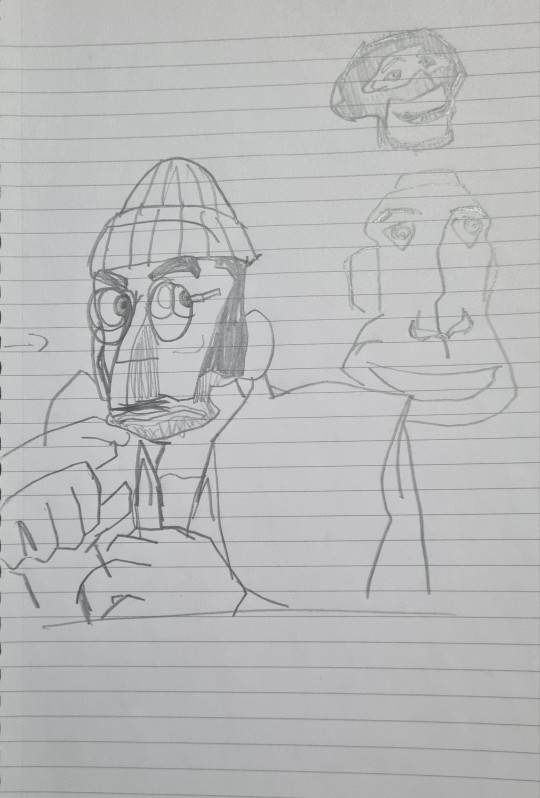
I sketched some of the faces to get an idea how the faces contort throughout looking almost unrecognisable if not for the voice and clothing. I want to bring this into the characters emphasising these expressions above making sure to include a walk cycle or other generic technical displays.
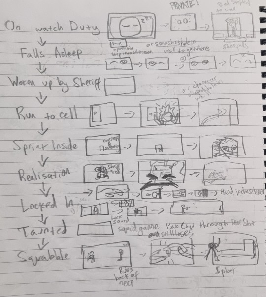
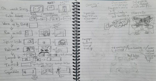
This is the roughest storyboard I've ever made and I don't expect it to make sense to anyone who isn't me but it's this layout which I want to develop and tidy up for the animatic, hopefully with some experiments with facial expressions in the process.


I tried messing around with the Ray Rig to see how difficult it would be to push facial expressions and shape to suit caricature the pose and action and after messing around for just a few minutes I found that it was actually really easy. It'll probably be much harder with my own rig because it wont be nearly as complex and versatile but I'll do my best to push the boundaries of the facial and mould it like clay.

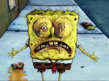
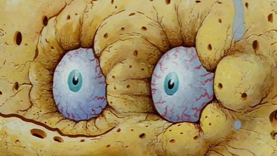
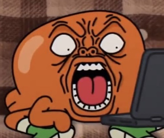
This type of caricature was used in a lot of great animated shows I watched growing up where the shift in design would happen for a single frame. It's this sort of this which is similarly exaggerated in 3D in these SFM animations, I don't want to overdo it but I rarely see 3D characters moving in a stretchy cartoonish manner as realism is more often favoured.
0 notes
Text
Concept Development
Digital Avatar of Myself
3d representation of my identity.
Create a bold, larger-than-life 3D representation of myself, perhaps in an exaggerated or stylized form that emphasizes those traits. The avatar could interact with symbolic objects or environments representing my idealistic side. Also, the avatar could interact with symbolic objects or environments representing my ideals.
1. Visualizing Boldness:
Use striking colors, sharp contrasts, and dynamic forms. I can play with large, unconventional structures that stand out visually, much like how I might express boldness in real life.
The project includes an animated 3D character or avatar of myself give them bold, confident stances or exaggerated movements. This can represent how you assert yourself in the digital or real world.
2. Expressing Idealism:
Utopian or Conceptual Themes: I could design a world or a space that embodies my idealistic visions whether it's futuristic, serene, or entirely abstract.
Symbolism: Incorporate elements that symbolize my idealist side, like open spaces (freedom), harmony in shapes (balance), or levitating objects (aspiration and reaching for ideals).
Textures and Materials: Smooth, reflective surfaces that give a sense of perfection or endless possibility, which could echo my idealistic outlook.
Technical Research
Blender: Free, open-source, and very powerful for creating both static and animated 3D models. It has sculpting tools for organic forms, hard surface modeling for bold structures, and excellent texturing and lighting systems.
Substance Painter: For bold textures, Substance Painter is excellent. It allows you to paint highly realistic or stylized textures directly onto your models. I can use this to give your idealistic world textures that feel polished and perfect or create bold, dramatic surfaces with strong contrasts.
Bold and Idealistic Design Techniques:
Non-Photorealistic Rendering (NPR): Instead of going for hyper-realism, I can experiment with NPR to create artistic or stylized renders. For example, I can use cel-shading, line drawings, or painterly effects to give your 3D models a more bold, artistic identity.
Dynamic Posing (Character Animation): As creating an avatar, I can use tools like Mixamo (auto-rigging and animation) or manually animate using inverse kinematics (IK) in Blender or Maya to create exaggerated, bold movements.
0 notes
Text


paul robertson
a lot of his work involves mature content, a common theme is almost women with quite exaggerated features. his work despite being very cartoony doesn’t seem to be directed towards children. it is reminiscent of a lot of adult cartoons.
i think his colour palettes are great. i also love his colouring style, it looks like cross hatching but in pixel art. the way he shades is very clever in making things look 3D and his form is very good. he uses shape language a lot when designing characters. i also love his general art style, i like the round features and the big cartoony eyes. the backgrounds frame his pieces really well. some of his work is quite obscure, with random characters and backgrounds involved. the meaning behind his artwork doesn’t seem to make much sense.
he also utilises the symmetry tool to create some illustrations, and this would be because pixel art takes an incredibly long time.
he also creates animated gifs, and i really like them. the movements are usually very bouncy and exaggerated and i like how weird they are. this one is particularly eye straining with how vibrant the colours are but i think it really represents his style of it feeling like an acid trip most of the time.
some of his art also seems to have loose cultural influences, this one in particular looks to be inspired by desert temples.
he is also working on an animation called Jimmy and Baby, which is fully animated in pixel art. i think that this is incredibly impressive, the amount of movement and flow he is able to achieve is amazing. i really liked the trailer, i thought it was silly and fun and i like all the character’s designs and they all look very different from one another.
youtube
youtube
he also created a 12 minute pixel art animation called Kings of Power 4 billion %. it is definitely interesting. i do really like it though, and i like that despite its randomness it has somewhat of a story. i also like it looks a little like an 8 bit fighting game. as i imagined, it took years to create. the first trailer was posted 16 years ago. and i believe that even just the trailer probably took 2-3 years. the official animation was posted 8 whole years later, so it took 8 years to create the rest. he also has a lot of other animations posted to youtube, but they are all mostly under 1 minute long.
youtube
1 note
·
View note
Text
Assessment 2
what would you define as your 12 principles of animation?
Movement/gestus — how movement informs us of their characterisation, their nature, their motivations, archetypes
I would like to use a mix of 2D animation with 3D elements.
Stylistic art style — removed from realism and accuracy. I would like my projects to be very stylistic when it comes to art style because I think animation works best when you move away from trying to be as realistic as possible and instead embracing how outlandish your art can be in animation without the pitfalls of the possibly of falling into the uncanny valley.
Continuing on the point of staying away from realism, I also think exaggeration is a big element for me as I think it makes the characters and world more interesting to look at. While in real life or live action, exaggeration doesn’t look good, I think in animation exaggeration of things as simple as line delivery make a huge difference in emotional impact for the viewer.
Additionally, I am not interested in making the animation as smooth and fluid as possible at all times. I think using the frame rate and changing it at different points in your animation can serve as a great dramatic effect (eg: during a fight) and can also be used as a narrative device. I also think that sometimes making your characters’ movements choppy can serve as a great stylistic choice.
If fantastical, I would like to make use of soft world building and soft magic rather than well defined world building as I think this allows for a more compelling fictional world.
I want all my work to have some sort of message, whether that be just an expression of my emotions and experiences or if I want to make a social, political, or historical statement. I think art is at its best when it has something to say.
Tasteful storytelling — I’m not concerned with shocking imagery. I don’t think that a story is good or impactful just because it is shocking or hard to watch. I don’t want my art to veer into the gratuitous, and I would overall like to avoid depicting overly violent or triggering imagery. Instead I think it would be much more interesting to find new and creative ways to depict these same events off screen.
Visuals take precedence, especially when it comes to things such as exposition. I don’t like creating art that needs to be explained though dialogue or a story that gives too much expositional dialogue. I do think words can be important, but I want my art’s visuals to be able to carry the story.
Use of music and sound design is important
Simple character designs
0 notes
Text
Time for a fun class activity!!
After we were taught about the 12 principles of animation, we were told to identify them each separately in a cartoon clip. I selected a clip from Tom and Jerry.
youtube
Principle 01- Squash and stretch
This principle is found in almost every shot, but in some shots this quality really stands out. For instance in the beginning of the clip when Tom falls down the stairs he is squashed like a ball. Even when Butch hits Tom's tail accidently using the axe, Tom's face becomes all stretchy.


Principle 02- Anticipation.
Anticipation is used to prepare the viewer for an action, and to make the movement to appear more powerful. When tom grabs the phone, there is a slight delay to show anticipation in the shot. Before Butch hits Tom with the Axe, there is a delay to prepare the audience for what's about to happen.


Principle 03- Staging
In this scene, the composition or in other words staging is used brilliantly to highlight Tom and Butch and their actions. First the highlight of the scene is Tom as he opens the door. Then we see Butch entering the scene. The Centre of attraction is him. And then once again the highlight switches to Tom.


Principle 04- Straight-ahead action and pose-to-pose
These two methods of drawing are different from one another. Straight ahead scenes that happen immediately are animated frame by frame from start to finish, whereas "pose to pose" scenes are created by first drawing the key frames and then filling in the gaps later{In betweens).


Principle 05- Follow-through and overlapping action
This refers to the loosely tied parts of a character's body continuing to move after they have stopped. The tails of Tom, Jerry and Butch in these scenes are examples for this principle.


Principle 06- Slow in and slow out
Real-world objects, like the human body, move slowly at first and then pick up speed. In order to achieve more realistic movements, more images are drawn at the start and end of an action, creating a slow in and slow out effect. In this clip, when Jerry is dragged to the magnet, We see a Slow-in and then the movement becomes fast as he nears the magnet.


Principle 07- Arc
The best thing to do when creating animation is to adhere to the laws of physics. Your animations should reflect the arc that most moving objects take when they move. In Tom and Jerry this arc is presented in many shots. For example When Tom is hitting Jerry with the shovel, this arc is shown.


Principle 08- Secondary Action
A scene comes to life and can support the main action by including secondary actions. For instance, in the following scene Butch washing his hand is the main action. Water dripping down and splashing is the secondary action. In the next example, the wall pieces falling down is the secondary action.


Principle 09- Timing
Timing refers to how many drawings or frames there are for a specific action, which gives an idea about how quickly the action moves on screen. You can direct the mood and the behavior of your characters and objects by using the right timing.
Principle 10- Exaggeration
An animation can be ruined by too much realism by appearing static and monotonous. Instead, by giving our characters and objects a little exaggeration we can give them more life. In this clip, Butch's head bump is purely exaggerated to give a comedic view for the scene. In the other shot, Jerry is surprised and this surprise is shown using the principle of Exaggeration.


Principle 11- Solid drawing
This principle says that you should always understand the fundamentals of drawing. Understanding form and anatomy, lights and shadows, and drawing in 3D are all part of this. In Tom and Jerry solid drawings throughout the show and it is one of the major reasons for the success of the show. Following are the first character sheets used for Tom and Jerry.
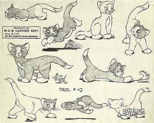
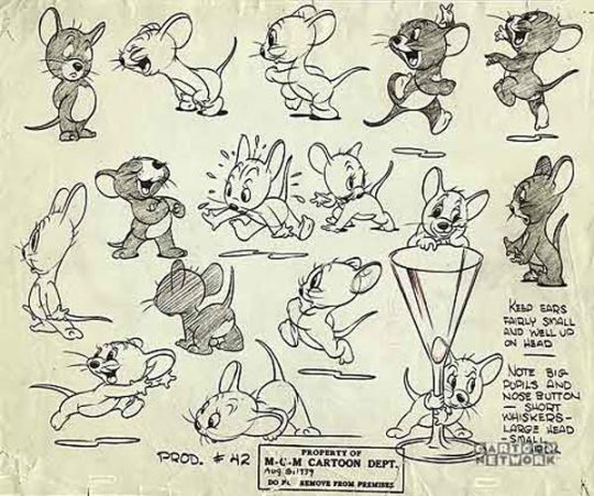
Principle 12- Appeal
The characters, objects, and the setting in which they live should be appealing to the viewer. This includes having a design that is simple to read, solid drawings, and personality. It's crucial that the viewer viewer feels the character is real and interesting.
0 notes
Text
1) Sadly I don't have a lot of experience with textured brushes, I tend to leave it out or draw the textures myself. I always add a noise filter on top of my pieces for a slight texture overall.
2) Instead of thinking in shadows, what works for me is to think in lightsources instead. So what I tend to do is put a multiply-layer on top of my basic colors and then erase where I want the light to go. Just be reversing the steps I get much more interesting shadow shapes. It also helps to work from big to small; erase the big parts first where you want the light to go, following the shapes of the figure and then do the tiny details. You can add multiple light sources to make it more 3d. I often add a colored rimlight on the other side.

So in short the steps are; 1) Base color 2) Fill completely with multiply layer (color is based on the mood you wanna go for) 3) Erase where you want the light source to be 4) Add and erase shadows for details. Think of stuff like objects overlapping each other (like the head overlapping the neck) which causes shadows too. 5) Optional; add a second light source for even more of a 3d effect This video explains my method more in detail.
youtube
But if this is too complicated it might first help to find out how lighting works in the first place (I don't know how deep your knowledge is one this). This playlist goes in depth about that. (and of course there are many more tutorials to find)
3) Gesture drawings have helped me a lot to make my poses more fluid. Gesture drawings are more focused on the movement and feeling of a pose instead of what's anatomically correct. What especially helped for me was to exaggerate the poses I studied.

Websites like Line-of-Action and Sketch-Daily have great library of references where you can also set a timer for these! I personally do 1-minute studies, but I've also seen people do 30-second or 2-minute studies, it really depends on your preference. What's important it that you have enough time to get the motion down but not too much that you start focusing on anatomy and details.
A sneaky detail I love to add is to play with the hair and clothes. By making the clothing and hair move in a way that goes with the motion you get it even more flow in your piece!

4) Sometimes I color my lineart, sometimes I don't. I have very thin lines and they tend to disappear when I add a lot of shading. I do add it when I have simple sketches or want the drawing to appear more soft. I have two methods of doing this; 1 The lazy method. I make my lineart a dark color and put it on multiply mode.

2 The longer method, I make a new layer on top of my lineart and clip it to the lineart layer, that way the original layer goes untouched. I then color pick the shadow of the hair for example and then slide that color muchh darker and more saturated.
Sometimes I even change the hue depending on the element (ex. for the skin I tend to go in the reds). The red circled area is the place I tend pick the lineart colors from. (so very dark and very saturated)

5) Angles has been the bane of my existence too and only recently I've started to experiment with that. An exercise that has helped me a lot is to draw a pose and then draw that pose from different angles. I keep the sketches very loose and simple.

If you can't do it from memory don't be afraid to grab a 3d model and draw it from different angles. Posemaniacs has great free ones online!

It can be very hard to do, so I tend to try to think of the body in simple shapes, like a sphere for the head, cylinders for the limbs and an egg for the torso (you can also use box-shapes if that's easier for you)
I hope any of these tips will help and if you have any questions don't be afraid to ask them!
Artist thing I have that are the bane of my work and I haven’t been able to figure out myself yet:
1) How do I make my coloring on procreate not look so airbrushy/flat? I don’t use the airbrush that way but I don’t know how to use certain “textured brushes” what do I use the textured brushes on? Skin? Clothes? How do I do that and make it look good? I use texture sometimes but it ends up being out of place bc other parts of my work don’t have texture bc what type of texture am I supposed to use on this type of object????
2) Lighting??? Midtones??? How do I figure out where to put them?? What shapes are the shadows/lighting supposed to be?? Just follow the shape of what I’m shading?? That makes it look stiff to me tho… (I just wing it most of the time)
3) making poses more fluid?? I look at references but everything still seems stiff
4) making lineart less noticeable. Do I leave it black? Do I make it the same color as my object/person? Slightly darker?
5) angles.
22 notes
·
View notes
Text
Animation Night 133: Disney, Dreamworks and the Emperors
Hey everyone, happy Thursday! It’s Animation Night. Come, have a seat~

We’ll get to you, Iron Giant. Hold on.
Earlier this week, I got fixated on writing a post attempting to figure out my answer on the question of why the big American animation studios abruptly turned away from traditional animation in the early 2000s - a subject previously visited, if briefly on Animation Night 31 and Animation Night 49. A string of high-profile 2D and 2D-in-3D failures, such as Treasure Planet, set against a string of 3DCG successes by Pixar, Dreamworks and increasingly other studios may have been the justification for executives claiming audiences no longer want to see 2D animation - but were they really the reason? Did the higher-ups deliberately sabotage 2D with (for example) scheduling decisions in order to make cheaper, non-unionised 3D films?
I’m grateful that people seemed to like my post there, but I actually don’t think my argument is quite satisfactory. I argued CG films by the same studios weren’t cheaper to make by and large (and also aren’t entirely non-union), but I only pulled up a handful of data points to make that claim. A more thorough investigation is due.
But in the meantime, it’s Animation Night. When I made that post, I was critical of the artistic decisions made in the post-Prince of Egypt films of Dreamworks, such as Spirit and Sinbad, which we watched back on Animation Night 43. I speculatively extended that to The Road to El Dorado, which I haven’t seen, and was promptly challenged by fans of that movie to give it a fairer shake. Sorry guys!
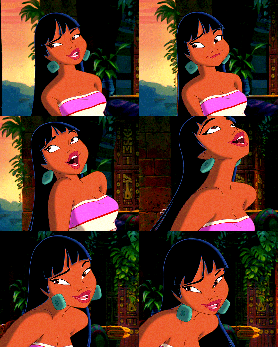
Let’s put that right. Tonight we’re going to be taking another look into that era. You’ll get to see this gif...
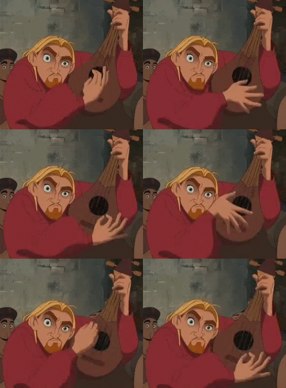
...and this one...
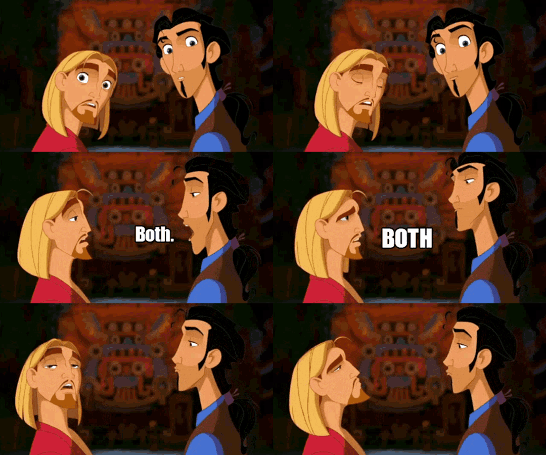
...in their original context.
But this is Animation Night, so we’re gonna be putting some Context down.
The first decade or so of Dreamworks was defined by sour grapes. To summarise briefly, Jeffrey Katzenberg left Disney after a bitter falling out with Michael Eisner over succession following the death of Frank Wells. Instead of promoting Katzenberg to Wells’s position of President, Eisner took over Wells’s duties himself, in part at the behest of Walt’s nephew Roy E. Disney. A furious Katzenberg, who was already not loved by many animators for his heavy-handed meddling in the direction of films, departed and founded a new company with Steven Spielberg and David Geffen. (He’d also start a lawsuit with Disney, eventually settled for hundreds of millions of dollars. It was bloody!)
Thus began the years where Dreamworks seemed to be trying very hard to show up Disney and Pixar - although Katzenberg always denied this and insisted the similarities were coincidental. This was primarily true on the CG side, with movies like Antz targeting A Bug’s Life (much to the upset of Pixar’s John Lasseter) and Shark Tale targeting Finding Nemo.
But the year 2000 also saw a battle of traditionally animated films on the subject of the Maya and Inca, both with the conceit of someone assuming the position of Emperor. Disney released The Emperor’s New Groove, while Dreamworks released The Road to El Dorado. Whether these films were intentionally similar is not entirely clear, but Disney certainly thought Katzenberg was copying them, and both studios ordered their animators to race to get their movie out first. (In the end, Dreamworks won by some margin, releasing in March.)

Since these two movies deal with at least superficially similar subject matter, coming from the same era and animation tradition, it’s interesting to contrast them. Disney’s character designs are highly graphical and stylised, pushing into more angular shapes and generally very broad, exaggerated movements. To an extent its characters share some DNA with Mignola’s designs for Atlantis: The Lost Empire. The backgrounds are just as stylised, the stagings more flat and theatrical.
Dreamworks, meanwhile, takes the same semi-realism approach as all its other designs in this period; its cinematography is a little more towards the live action end of the scale with more close-ups and a stronger sense of space, the proportions of its characters a bit more grounded.
Beyond the setting, the major similarity between these movies is that both were conceived initially as a dramatic story, and retooled into a comedy during production.

In the case of Groove, the story goes that Lion King director Roger Allers was called into the office of Thomas Schumacher, who proposed making a film about either the Maya, the Inca or the Aztecs. Allers liked this idea, and set about drafting a film that would be called Kingdom of the Sun, drawing on 1894 novel The Prisoner of Zenda. An outline of this film is available (ty wikipedia)...
Kingdom of the Sun was to have been a tale of a greedy, selfish emperor (voiced by David Spade) who finds a peasant (voiced by Owen Wilson) who looks just like him; the emperor swaps places with the peasant to escape his boring life and have fun, much as in author Mark Twain's archetypal novel The Prince and the Pauper. However, the villainous witch Yzma has plans to summon Supay (the evil god of death), and destroy the sun so that she may become young and beautiful forever (the sun gives her wrinkles, so she surmises that living in a world of darkness would prevent her from aging). Discovering the switch between the prince and the peasant, Yzma turns the real emperor into a llama and threatens to reveal the pauper's identity unless he obeys her.
During his time as the emperor and doing Yzma's orders, the pauper falls in love with the emperor's soon to be fiancée Nina who thinks he is the emperor that has changed his ways. Meanwhile, the emperor-llama learns humility in his new form and even comes to love a female llama-herder named Mata (voiced by Laura Prepon).[12] Together, the girl and the llama set out to undo the witch's plans. The book Reel Views 2 says the film would have been a "romantic comedy musical in the 'traditional' Disney style".[13]
However, after Pocahantas and Notre Dame failed to make the stonks go up enough, Disney got cold feet about another movie with such dramatic scope. First, they called in Mark Dindal of Cats Don’t Dance to co-direct; then, worrying about making the summer 2000 release, Disney producers Thomas Schumacher and Peter Schneider ordered that the animation team would split in two and fight to the death each produce its own proposal to fix the film. Dindal proposed making it a straight-up farce; Schumacher and Schneider liked this and Allers quit, rather heartbroken at having spent four years of his life on the project.

Thus, starting in September 1998, with about a quarter of the film already animated, the project was extensively retooled on pain of cancellation. The basic premise (evil witch, emperor gets turned into llama) was kept, but the tone changed, and the animation was to be made simpler. A number of people left, notably animator Andreas Deja supervising Yzma, who went to work on Lilo & Stitch. You can read this grisly details here. The whole affair was documented by Trudie Styler as a condition of her husband Sting providing music, which is probably why we know quite so much about it. Sting actually also intervened in the story, demanding a rewrite of a planned ending where the emperor Kuzco, restored to humanity, bulldozes a rainforest to build a theme park (idek).
The movie that resulted from this tortured production process is basically a long string of rapid-fire visual jokes in the manner of a much older cartoon; it didn’t make a lot of money, but nevertheless gained something of a cult following. Which is also something that can be said of Road...
The story with Road is not quite so messy but still pretty messy. While Disney steered well clear of having any Europeans involved, Katzenberg decided to set a film during the Spanish conquest of the Americas, contemporary with the invasion of Hernán Cortés. Cortés, exploiting the tensions created by Aztec imperial rule over the many other peoples like the Totonacs and Nahuas, pursued a divide-and-conquer strategy which resulted in the Spanish and their new allies sacking the Aztec capital Tenochtitlán, thus installing the Spanish as the new imperial rulers... who unfortunately turned out to be even worse than the last guys. In place of the Aztecs’ system of tributary provinces and spectacle of human sacrifice, the Spanish brought in hundreds of years of genocide, epidemic disease, brutal slavery under the encomienda system and indoctrination to Catholicism, which would in the end constitute one of the largest episodes of mass death in human history.
Somewhat fraught, you might say. However, it doesn’t really seem like anyone did say.
The impetus for this movie came from above: Katzenberg summoned two of his screenwriters and said (this is definitely a direct and real quote) “here is a book about the Maya and the Conquistadors, write me a movie about this kthx”. “How about,” said Ted Elliot and Terry Rossio, “a spin on one of those Road to... movies from the 40s, a buddy comedy with a guy following a map to a mysterious city of gold?”
“Great!” said Katzenberg. “Sounds like another grand, dramatic animated film like Prince of Egypt! That’s the kind of movie I like.”
“What if it’s a kind of white saviour thing where our guy, who accidentally becomes Emperor, goes on to save the Maya residents of a fictional city from Cortés? And we’ll make it horny, we’ll have a Maya princess love interest who doesn’t wear a lot?”
“Mm, sounds good.”
“OK, cool. Yo, Will Finn and David Silverman - direct it! Elton John, get us some of that Lion King score magic, eh?”
Time passes. The Prince of Egypt is well underway, with all of Dreamworks’s best animators, such as James Baxter, drawing it.
“Actually,” says Katzenberg all of a sudden, “I’ve changed my mind. We need a comedy to follow that. Movie’s on hold. Rewrite it to be funnier. And that’s too horny, let’s keep it PG-13.”
“Oh.” say Finn and Silverman. They leave. Finn writes to Katzenberg to try and smooth things over, but Katzenberg brushes him off. “You don’t quit Jeffrey.” said one unnamed source. “If you do, he closes the door behind you.” Instead, the film goes to some guys called Eric “Bibo” Bergeron (no idea where the nickname comes from) and Don Paul.

Katzenberg’s micromanagement seems to be the throughline for a lot of this. At one point, he was so overbearing that James Baxter had to intervene:
In one meeting, character animator James Baxter, a normally shy and bashful Brit, stood up to his boss in front of the other artists and told him to back off.
“You don’t know what you’re doing.” Baxter said. “You’re too involved. You’re losing the respect of the artists.”
Katzenberg, who respected Baxter, had seemed to listen. For a few weeks, at least, he kept a greater distance from the production. But soon, he was back to his old habits.
The other notable development in this movie is the increased use of painted CG sets, similar to the tech Disney would use on Treasure Planet. A contemporary Animation World Network article talks about it in detail, describing how the film’s backgrounds were completed on computers by the new generation of ‘tradigital’ artists - so for the first time you couldn’t hold a painting in your hands to review it. As well as a shortcut to complex staging in 3D space, the new technique allowed economical reuse of background elements in different shots. Further digital tricks could be used to add small amounts of animation to background characters without increasing the drawing count. The character animation pushed for naturalism and subtlety to suit the ‘buddy comedy’ tone. And judging by the tone of that article, Dreamworks had high hopes for the reception of this movie.
But on release, the movie was met with... a pretty lukewarm response. Mainstream critics were dismissive of its animation and found its characters unconvincing. Indigenous organisations were especially unhappy; Olin Tetzcatlipoca of the Mexica Movement, appalled, compared it to making an upbeat film about a guard in a Nazi concentration camp that doesn’t mention the Holocaust. Audiences, for the most part, paid it little regard. So, like Groove, it dropped out of history, only to be rediscovered decades later and gain a small cult following who declared it a hidden gem. (A large part of the reason likely being that the main pair is eminently shippable.) A couple of gifs were extracted as memes, as seen above.
What do I think? Haha, well, I haven’t watched it yet. But this is going to be an interesting review to treat after we have.

Now, I’ve covered Disney and Dreamworks, but there was another player in the 1999-2000 period who’s relevant to the story. That’s Warner Bros., and director Brad Bird, who would in the future go to direct The Incredibles and Ratatouille at Pixar; his 1999 movie The Iron Giant is as I recall a good film, and interesting as one of the very few animated films to address a cold war setting and the terror of living under nukes. (We watched another, When the Wind Blows, on Animation Night 26). That’s a story worth telling, but with an eye on the time, I think it’s going to have to be told another night.
So, if you will join me, tonight we’ll be watching Groove and Road. Are they indeed forgotten gems that did not deserve their dismissal? Are they just shallow comedy? Big racist messes? Let’s go and find out.
Animation Night 133 will be going live shortly at twitch.tv/canmom, and we’ll be screening movies in about half an hour (22:20 UK time roughly) - hope to see you there!
33 notes
·
View notes
Text
ok i need to rant about puss in boots if i dont ill explode, probably will talk more about it later
the message
so we all know the message of the movie is that death comes for everyone, it was literally stated in the inciting incident of the plot. but i love this "fuck nihilism" message going on here. yeah everyone's gonna die one day but you should live your life well and with the people you wanna be with. i think that's a good message to send to kids and the metaphor is told in a simple way that kids can understand. (people will definitely shit on the blatantness but will forget to understand that this movie is intended for children as well as adults) but it's also a message that resonates with adults, as everyone is afraid of death. also there's a second thing going on here with kitty learning to trust others, perrito enjoying his life and being kind to others even though his life has been so hard (although that kind of gets muddled when it's told he's never actually been sad or struggled through any of it) and puss learning to not be an asshole and trying to run from inevitability and commitment, and let go of his ego. btw "i couldn't compete with your one true love: yourself" is the hardest fucking line ive ever heard. also the film is based and tells you flat out that the ultra-rich did not earn their wealth and will use you and your labor to try and gain complete control over everything.
the animation
god i fucking love the animation so much. the character designs are just so fucking good. there's a blend of 2d accents and backgrounds and 3d characters and environments that works amazingly together, and the stylized low frame rate of the action scenes just bring it all together like a beautiful symphony. if a short animatic is a treat for the eyes, this is the whole cake. there's so much dynamic and exaggerated movement and chaos happening everywhere, guys are dying onscreen, there are sparks flying and there's fire and there's tiny little details everywhere that you could watch the scene a few times over and still find something to gawk at. it's sparked new hope for the animated film industry in me, it stands out so starkly from the same homogenous purely cgi animated films that are churned out every year (cough cough disney, illumination, netflix, etc). the character designs are absolutely impeccable and astounding, seriously insanely creative for a blockbuster movie. dreamworks did not have to go this hard for a spinoff sequel but there's beauty everywhere and yadda yadda. i wish i could rant more about it but i truly dont have any more words to describe it so please do go watch it for yourself. i didnt pay 29.99 just to rent it and you shouldn't either. fuck you amazon.
12 notes
·
View notes
Text
it's been a few years since I'd gone back to the Boom comics at all but I just skimmed through them again and wow, Boom Eggman's design is a lot more appealing to me there than with the 3D model in the show for some reason.
I'm not saying it's bad in the show but something about it in 2D with more exaggerated expressions and movement is much better to me. I think the design benefits a lot from the various artists' styles and brings out the more cartoony expressiveness with it that I felt the show didn't have as much of.
I especially love how he looks in Diana Skelly's art as I'm a huuuge fan of how she draws modern Eggman and his expressions too, it really brings out the cartoony fun.
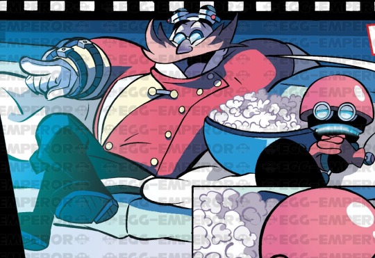
like he's actually adorable here wtf 💜
also he kind of looks a bit more like a lil guy in her style, which is how I like to imagine him being in comparison to modern Eggman lol
#I understand modern and Casino Egg in finding him cute in the comics most XD#dr eggman#eggman#dr robotnik#dr. eggman#sonic boom#archie sonic#my post
76 notes
·
View notes