#i just want photoshop so i can make things pretty
Explore tagged Tumblr posts
Text
examining a seemingly normal image only to slowly realize the clear signs of AI generated art.... i know what you are... you cannot hide your true nature from me... go back where you came from... out of my sight with haste, wretched and vile husk
#BEGONE!!! *wizard beam blast leaving a black smoking crater in the middle of the tumblr dashboard*#I think another downside to everyone doing everything on phone apps on shitty tiny screens nowadays is the inability to really see details#of an image and thus its easier to share BLATANTLY fake things like.. even 'good' ai art has pretty obvious tells at this point#but especially MOST of it is not even 'good' and will have details that are clearly off or lines that dont make sense/uneven (like the imag#of a house interior and in the corner there's a cabinet and it has handles as if it has doors that open but there#are no actual doors visible. or both handles are slightly different shapes. So much stuff that looks 'normal' at first glance#but then you can clearly tell it's just added details with no intention or thought behind it. a pattern that starts and then just abruptly#doesn't go anywhere. etc. etc. )#the same thing with how YEARS ago when I followed more fashion type blogs on tumblr and 'colored hair' was a cool ''''New Thing''' instead#of being the norm now basically. and people would share photos of like ombre hair designs and stuff that were CLEARLY photoshop like#you could LITERally see the coloring outside of the lines. blurs of color that extend past the hair line to the rest of the image#or etc. But people would just share them regardless and comment like 'omg i wish I could do this to my hair!' or 'hair goallzzzz!! i#wonder what salon they went to !!' which would make me want to scream and correct them everytime ( i did not lol)#hhhhhhggh... literally view the image on anything close to a full sized screen and You Will SEe#I don't know why it's such a pet peeve of mine. I think just as always I'm obsessed with the reality and truth of things. most of the thing#that annoy me most about people are situations in which people are misinterpreting/misunderstanding how something works or having a misconc#eption about somehting thats easily provable as false or etc. etc. Even if it's harmless for some random woman on facebook to believe that#this AI generated image of a cat shaped coffee machine is actually a real product she could buy somewhere ... I still urgently#wish I could be like 'IT IS ALL AN ILLUSION. YOU SEE???? ITS NOT REALL!!!!! AAAAA' hjhjnj#Like those AI shoes that went around for a while with 1000000s of comments like 'omg LOVE these where can i get them!?' and it's like YOU#CANT!!! YOU CANT GET THEM!!! THEY DONT EXIST!!! THE EYELETS DONT EVEN LINE UP THE SHOES DONT EVEN#MATCH THE PATTERNS ARE GIBBERISH!! HOW CAN YOU NOT SEE THEY ARE NOT REAL!??!!' *sobbing in the rain like in some drama movie*#Sorry I'm a pedantic hater who loves truth and accuracy of interpretation and collecting information lol#I think moreso the lacking of context? Like for example I find the enneagram interesting but I nearly ALWAYS preface any talking about it#with ''and I know this is not scientifically accurate it's just an interesting system humans invented to classify ourselve and our traits#and I find it sociologically fascinating the same way I find religion fascinating'. If someone presented personality typing information wit#out that sort of context or was purporting that enneagram types are like 100% solid scientific truth and people should be classified by the#unquestionaingly in daily life or something then.. yeah fuck that. If these images had like disclaimers BIG in the image description somewh#re like 'this is not a real thing it's just an AI generated image I made up' then fine. I still largely disagree with the ethics behind AI#art but at least it's informed. It's the fact that people just post images w/o context or beleive a falsehood about it.. then its aAAAAAA
32 notes
·
View notes
Text
What Will They Like About Your Body | PAC 18+


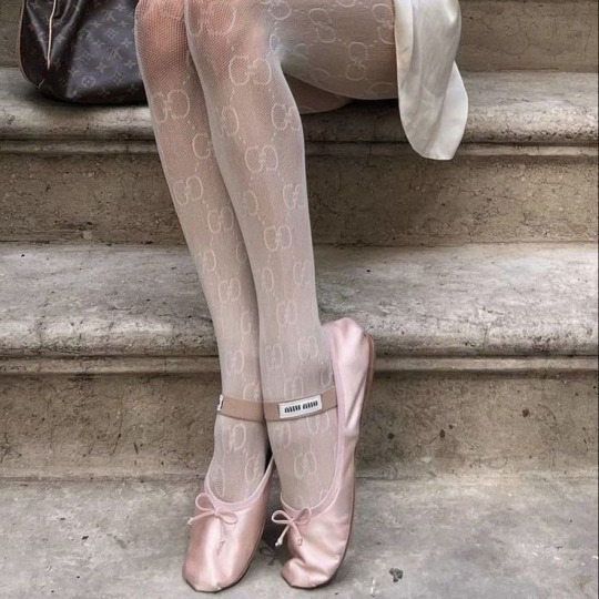
pile one pile two pile three

how to choose a pile . . . choose whichever you feel drawn to or ask your guides to guide your eyes to the one that is meant for you! ᡣ𐭩
— ⭑.ᐟ this is for diversity reasons, if you don’t want to, don’t read it, if you want to, go for it. this will be covering what they like about your body and what they fantasise of it. ‘they’ meaning your special person. not proof read.
𝝑𝝔 If you are under 18 years old don’t read this. This is made for consenting adults. If you think you are grown enough, no you are not.

pile one : - high heels !
𐙚 : five of cups, page of pentacles, five of swords, three of swords, two of cups reversed
bottom of the deck: six of swords
♡ ⢷what will they like about your body
Every single little thing, there is nothing that they don’t like about you. Which can, yes, be annoying to hear, because this isn’t what you were curious of, but these feelings are sincere. They come from the bottom of the heart.
Your special person looks at you as the star, as this very perfect person, the most beautiful of all. They find your looks dreamy and even the tiniest of folds and details are beautiful about them. The beauty of ancient statues, if you struggle understanding the concept of it.
It’s the feeling of “this is actually a real body with a lot of things to tell, not just one that was worked for years to hide things about it.”
Some of you might take an offence to that, thinking “but that means my body is just ugly!”.. I am here to say that’s not true, you are just delusional. Real bodies don’t look like the ones on the internet that are photoshopped to the max - yes, even in videos -, they just look real. With spots, blemishes, veins, details, stretch marks, beauty spots and a thousand other things. Your body is very much real, which makes you soooo sexy in your person’s eyes. All the little things about it.
Matter of fact, your special person LOOOOVES your stomach so much, like omg. They might like to hold it, or just rest their body on it while cuddling you or literally sleeping with you while spooning. You might think to yourself, ‘oh, but my stomach isn’t flat’, duh, that’s the sexy bit about it. - Even if your stomach is flat that is okay bby, that bit was meant for somebody else. -
Think about it, no statue of Aphrodite has a flat stomach.
Aside from that, your chest is so loved. Idgaf if you are a woman, man, flat chested or not this mf - whoever they might be - wants to suck on it, and if they are given the chance they will show that too! 🫵🏻 Seriously, if you are asking about a guy, - or a masculine girl -, they wanna just put their face right to your chest and get to work. If you have a bigger chest, just rub their face their, and if it’s flat then tease you so you make noises for them. - Whines, to be specific. - If you have birth mark or any sort of mark on your chest, they also want to kiss it there, they love it.
It’s not that their energy is objectifying, they are just crazy about you. Like your body gets them all to be like those old cartoons where the guy gets heart eyes and they almost fall out as they stare at the pretty lady that just walked by.. tongue out and all. - Think of Bugs Bunny from Looney Tunes or Tom from Tom & Jerry when they meet a pretty girl and you might understand better like that. -
Now, speaking about tongues. They think that your private part has such a pretty shade to it. - Or like.. would, if they saw it. - This obviously varies person to person but the main things that are coming through are pinkish & light brown? Like it’s just a nice shade of brown. - yes, even if you are a person of colour.. this will be unique to everybody, but the point is the same. - Also the texture if your skin could also be something they like? Because that’s unique from person to person as well! So they will definitely love what they will be able to feel, you know. Tongues come here because as soon as they saw you wet/hard combined with those factors they just wanna give you head. Like they are needy for you!
They also, really, really like your ass a lot. Slapping it, grabbing it during the act itself.. whatever you let them do, they will do it. You might as well catch them staring from time to time too. - This is regardless of gender, if you are a guy asking about a girl this still applies… or a girl asking about a girl.. whatever you are into guys. Your ass is just a 10/10 for them. -
♡ ⢷their fantasies about your body
You might have had some experiences in the past that made you very insecure. In your body, and how people perceive you. I will not be going too much into it because the severity of this depends from reader to reader. It rages from comments - irl & online -, to bullying, all the way down to abuse. That is your business and I am not going to dive into it.
However, their fantasies revolve around helping you escape feeling stuck from these feelings and emotions that are awakened in you when it comes to sexuality. They understand that it’s from things that you have went through in life but they still wish to help you overcome these negative emotions by loving you right, treating you right and giving you the whole world, their all.
Even then, you might be the sort of person who wants to do it with the lights off or distracted your partner before things get too far because you are genuinely scared of intimacy and the level of tension such a deep bond comes with. In your head it could be nothing but all sort of negative things, barely anything good coming out of it. At times, you might even feel ashamed. It doesn’t have to be this way. This is what they want to show you by treating you correctly.
You escaping this turmoil of ‘it’s wrong, but I want to like it’s and the pain that comes along with it is what their biggest fantasy is. They hate to see you suffer through things even if you hate that they care at times. Nothing in this world will make them stop caring about you, at all, even if you believe otherwise. Their love isn’t fragile, rather opposite, it’s quite strong.
They dream of loving you tenderly, holding you, going slow and kissing your tears away as they hold your hand.
They dream of taking care of you, treating you with the utmost respect. Never ever would they do anything to purposefully scare you or make you uncomfortable.
♡ ⢷moodboard
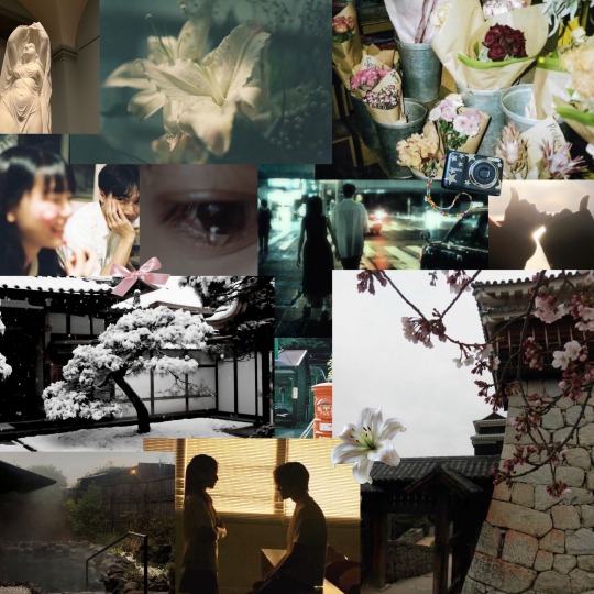
— ✮⋆˙ ‘my type’ , billie eilish , ‘and i see her, at the back of my mind’ , pink & flowers ? , demisexual , waiting til marriage , not a huge fan of kinky stuff but rather just wanna make love , (door) bells , bookshop , sage green , piercings , something for beauty being done to the eyes - contacts, lashes, eyeshadow ect - , stiletto nails , shibuya
My pile one do not forget that you are beautiful and nothing in this world will change this fact! your person is so sweet, their energy is very gently even though you might not think so. they would neverrr do anything without your permission. thank you for reading.
if you liked my reading please consider checking out my paid readings! there is barely any topic I will say no to and with every penny you are helping me!

pile two : - font !
𐙚 : six of swords, queen of pentacles reversed, seven of pentacles reversed, nine of cups, wheel of fortune reversed, the devil reversed, the lovers reversed
bottom of the deck: the emperor
♡ ⢷what will they like about your body
I would like to start out with saying that this is a toxic pile, at the very least sexually mean. There is no feeling of being in love or having strong emotional connection/needs here, so even if you have a crush they might feel a sexual attraction towards you but not romantic one.. or they possibly view sexual attraction and romance as two different things and don’t think of the other while doing one of them. - meaning even if they have a crush, they won’t be romantic during sex. - I will still channel for this pile but this has been your warning and disclaimer. If you are not comfortable reading about something like that, do not. It’s alright to not read this.
Now, if you decided to continue reading I will need you to stay with me on this one, this person is a whole mess.
I also want to say that if you have a bdsm kink this person does too, and if you don’t they do not either but are simply sadistic/masochistic or just had heavy uncomfortable experiences in the past that altered their preferences, fantasies and such. Such a rare but specific distinction but everybody’s guides urged me to say this.
To actually get into it, they like your chest, the shape of your body and your private eras. The shape of it, the size of it and everything that is unique about it. Not even a little bit, but a lot. They want to tie you up, not necessarily do anything but stare at you while admiring you. They want to tie you up in such a specific way too, in a way your legs and arms are spread out so they can see everything.
This inactivity is on purpose, either to piss you off or make you scared. Your face is so hot to them. Like your expressions for sure get them hard/wet, but like.. your face in general, they love it.
I will list what they like about it as well. Let’s start with your eyes.. pretty eyelashes, colours, gaze and so on.. but that’s absolutely not what turns them on at all. It’s the fact that they are a little bit messed up. There is so many eye conditions in this world, but this is specific for those people who have a bit harder time seeing. If you squint your eyes while trying to read something? Sexy as fact. You walk into something by accident? Sexy as fuck. I am sure the Lord does, but I don’t understand why they feel this way. There is a reason, they are just not sharing it with me. Also, even if that’s not your eye condition.. don’t think you are an exception, that ‘it might not be for you’. It does, you are so cute it turns them on. Especially when you look up at them. They are horny for you. If you have eyebags that just adds to it even more. - I also don’t mean to be belittling, I, myself, wear glasses. Your person is just a little crazy, I am so sorry I don’t know how to say that in a more kind manner. -
Moving on, your nose. There is something unique about it. A beauty spot, a birth mark, the shape of it.. you know your face better than I do, whatever you know is unique is about it they love it. Even if you think they don’t. - that’s especially for the bigger nose ppl! don’t belittle your beauty. -
Your lip shape, they think it’s so kissable. I am so serious, they look at it as ‘so plump’ and they ‘want to devour it’. - don’t clock it, these aren’t my words. - Now, if you are a girl you decide if this means your face or other lips. 🩷 It’s both.
And we are not done yet, nu uh. 🙂↕️☝🏻 Your teeth, your beauty spots, your eye colour in the sun, your resting face, your expression when you are annoyed, your red eyes ‘n nose ‘n cheeks after you cried.. is there anything they don’t like about your face? No. If you let them they will cum on it too.
Your thighs are something they loveeeee too. I for real hope that you are into bites and hickeys because this person wants to leave their mark on you. Whether or not this is only for them to see or if it’s visible to anyone… they don’t gaf, they just want to know that their mark is there, on you. No one else’s, just theirs. Jealous, jealous person. Hella possessive too. ‘Only mine’ sort of thing.
They also like your stomach, especially if it’s more toned. Like don’t get them wrong, they don’t care if your stomach changes. Matter of fact they want to impregnate you. - Not that they are ready for a baby, they are just kinky as hell. -
♡ ⢷their fantasies about your body
This is another warning and disclaimer. If you find heavier, darker fantasies and topics uncomfortable don’t read this. This is especially true if you have had negative sexual experiences or if you have traumas that are easily triggered. I am not playing with you. You might hate this.
Menace to society. Like these are only fantasies, and they won’t really act out on each and every single one but when channeling the energy I got a bit perplexed.
First and foremost, they want you to submit to them, completely. No ifs, no buts, no nothing. Just submitting to them. Let’s go through their fantasies one by one..
I believe this is the most simple and common one. This isn’t necessarily something harmful but it does depend on your view of life and the value you put into such things. It’s completely ok to disagree with me on this one. - Notice how I am saying ‘least harmful’ and not ‘not harmful at all’. -
Their most harmless fantasy is you getting over someone, possibly out of a relationship, moving on and still sad with the what happened as you were mistreated. They want to ‘heal’ you with sexual connections. Now, what exactly this is varies person to person. For some of you this is making love, for others it’s having sex and for other people it’s straight up f#cking and messing around. - Crazy to write it out like that, but these are all different things. - They just wanna be ‘the one to heal you.’ Whatever that may mean to them.
For this next one, some of you reading this might like the idea of this fantasy because you won’t fully grasp the idea of it due to being inexperienced but that’s alright, I will do my best to explain to you.
This fantasy revolves around spoiling you, giving you everything you want and pampering you any chance he gets. With attention, words, gifts, necessities, physical touch and in sexual needs. Anything you can think of. The twist in this fantasy is you not being able to do any of this by yourself because no matter how hard you would try you would simply just fail. I am not saying that’s the truth, I am saying that’s their fantasy. Pampering you because you need to completely rely on them, having no other choice. Being obsessed even though you are in an unfortunate situation or might even desire freedom sometimes. It’s like this hopelessness that you have alone, almost as if you need them to be fulfilled in life. That no one else can give this to you, not even yourself.
I don’t think they have a slave kink, but it borders it. This is because they sometimes fantasies about you doing xyz in exchange for these things, like housework and so on.. but in a sinister way, not in a ‘my lovely stay at home wife/husband/partner’ kinda way. Not a ‘sugar daddy/mommy’ kind of way either. Imma be honest and just say I did not see enough things in my life to understand what exactly is going on, but I know for sure that they love power dynamics and want to be the one that’s on top. Figuratively and literally too.
For this one, if you ignored my first warning but you still read and happen to have trauma about physical abuse or domestic violence don’t read what I am about to channel next. Literally don’t. Ignorance is bliss.
We have entered level 10000000x of f*cked up. Their most messed up fantasy is them abusing you, to the point of you having bruises and feeling emotionally defeated. That’s not what turns them on. It’s the fantasy of regardless of this you keep on loving them. Going back for more and unable to leave them, and even letting them do whatever they want to your body. Though, in all these fantasies they do fantasies about having to chase you a little bit. So you not giving yourself easy and valuing yourself but still ending up under them is the main drive they have for this fantasy.
The craziest thing though, this mf seems pure, kind and very respectful. The perfect person to bring home. Well put together, clean, has a lot to offer and treats your family well. You would never think that these sort of things cross their mind. Yet they do.
I am willing to bet a whole tarot deck that many people reading this pile until here didn’t believe a single word of what I wrote down exactly because they appear so perfect and kind.
♡ ⢷ moodboard
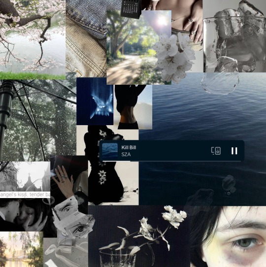
— ✮⋆˙ wild thoughts - rihanna , red ropes & red string of fate (symbolism of differences) , virgo , someone is hungry rn , anger issues , ‘breaking dishes all night’ , tiktok edits , hallway crush , tiger/tigress , ‘Tom’ , tom foolery - lmao - , grey , silver jewellry , dreads , nonchalant but very kind , red fruits ? strawberries, watermelon, raspberries, passion fruit and aso on , cracking backs , spa asmr
Idk y’all this man/person is the devil. 😞 you are into what you are into, but do not stay near people who make you feel unsafe. thank you for reading
if you liked my reading please consider checking out my paid readings! there is barely any topic I will say no to and with every penny you are helping me!

pile three : - ballet shoes !
𐙚 : the chariot reversed, queen of swords reversed, the star, eight of cups reversed, four of wands, page of swords
bottom of the deck: knight of swords
♡ ⢷what will they like about your body
Let’s start with saying that you might think this person is cold or not interested in you but it’s the total opposite.
They want you so bad, and they try to not show it because they are ashamed of how bad they want you. Not because there is anything wrong with you but because they are so good at self discipline, not being influenced by anything too easily and just being a honest and just person. Yet, when it comes to you they cannot help but have these animalistic tendencies, they want to go nuts and have such rough sexual relations with you all while treating you like their Queen/King, pampering you with love and affection.
They don’t want to only make love to you, they want to worship you with every single second that passes. You have a hold on them that no body else have had before and they try to not make themselves look crazy in your eyes but they just want to kiss every inch and corner of your body. Even the ground you walk on. You are so perfect to them and they feel like they need to hide so that you don’t push them away. So you won’t think of them as a creep.
They love you as a whole, if you were to ask them what they find unattractive about you they would not have an answer. There is not a single thing that they deem as a flaw about you at all. They would be offended if you even dared to think that there is. In a sincere way too.
Like you could even believe, even for a slight second that there is anything that they don’t like about you? They would never deem anything about your appearance as a flaw.
And that is true! But they still have subconscious favourites I picked up on lmao,, Which is completely normal!
It’s your feet, your tummy, your fingers - might wanna suck on it idkkkk -, your overall figure, your veins, your waist, the outline of your private parts through clothes, the way that you carry yourself and if you have blue eyes then that.
Though, their favourite thing is none of those. It’s the tension in your body when you are turned on and you think you can hide it well but it still shows through your actions. How you move your legs and the way you rub your legs together, the shy look on your eyes all while you are nervous about people being able to tell how needy you are. It turns them on so bad they could single handedly recreate the Niagara fallls all by themselves, if you get what I mean.
Perhaps they would also enjoy how your own cum looks on your thighs after sex, after coming so much and not being able to control yourself. - I am sorry for the lack of better words. -
♡ ⢷their fantasies about your body
Honestly, they just have a worshipping kink when it comes to you.
They want to suck on your body. Your toes, your private parts - on your clit if you are a woman -, your thighs, your stomach - they wanna leave hickeys -, your hips, your waist, your chest, your collarbones, your arms, your shoulders, your lips.. they want it all.
Even if they aren’t into it, they want to do it just to please you. It turns them on because it’s you. They find you crazy hot, like they would go to the ends of the world and back for you.
Not a sub for sure, they rather read like a soft dom that’s very passionate, obsessed and in love with you. They can be a sub for the night if you want them to be though. Put a leash on them and they will go on all fours for you.
And if you don’t like that, that’s cool. They can slap you, pull your hair and go hard if that’s what you need them to do.
If you like regular sex only, that’s chill with them too.
For you, they are both a prince charming and a freak, just depends on what you need of them. They want to cater to your needs all while dominating you. Adoring everything about you.
The only thing they ask for in exchange is for you to be loyal and committed to them, because they sure are to you. Not a single other person on their mind at all. Fuck threesomes and anything else that involves bringing someone else other than the two of you in the bedroom, they only want you.
They could go crazy if you give attention to any other person too. Jealous person, adores devotion above anything else for sure. They are not afraid to leave you if you play games with them. Doesn’t even have to be cheating, but teasing. They love you but they don’t like things like that. They are grown. - Not my words bby, their higher self’s. -
Regardless, they don’t fantasise about you leaving them but rather overthink and worry they you might do so if you find someone else that better fits you. Someone you look at as beautiful, good and all the more compatible with you. This is their worry. - Probably bc of their past but most of you it’s just because they love you so much you are their weakness. -
Their fantasies revolve around pleasing you. Giving you their all. Trying out thousands upon thousands of things with only one another, just the two of you.
♡ ⢷ moodboard
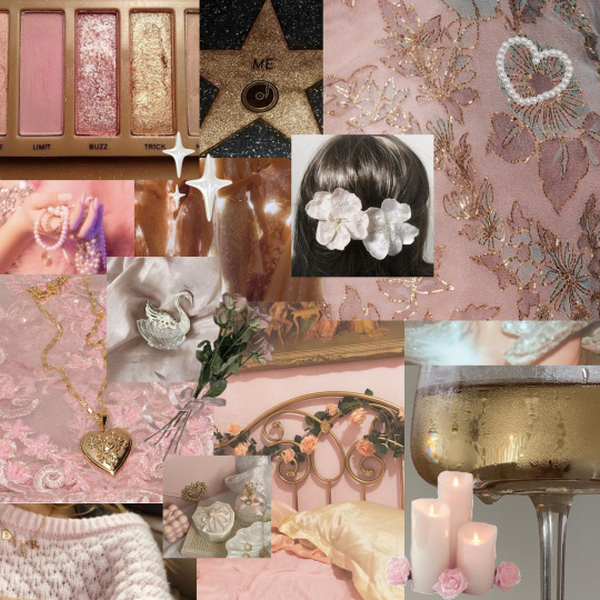
— ✮⋆˙ ‘just the two of us, we can make if if we try’ , ‘i am vanilla baby, I will choke you but I am no killer baby’ , whipped cream , someone here has a mommy kink , curved eyelashes , clown masks , cherry red lipstick , tooth gems , blue whips , shy virgin who didn’t resonate with the kinky bits 🫵🏻 , painted toes! , coffin nails , 18
believe that you deserve good things instead of trying to convince yourself that I am lying to you. that one is very specific for one person not everyone <3<3 mwah my beautiful pile 3 you are so loved by this person I wish nothing but happiness for y’all! thank you for reading
if you liked my reading please consider checking out my paid readings! there is barely any topic I will say no to and with every penny you are helping me!
#tarot#tarotblr#tarot community#pick a picture#pick a pile#pick a photo#free tarot#astroblr#spirituality#tarot reading#free tarot reading#paid readings#pick a card#tarot cards#paid tarot#astro community#astrology
2K notes
·
View notes
Text
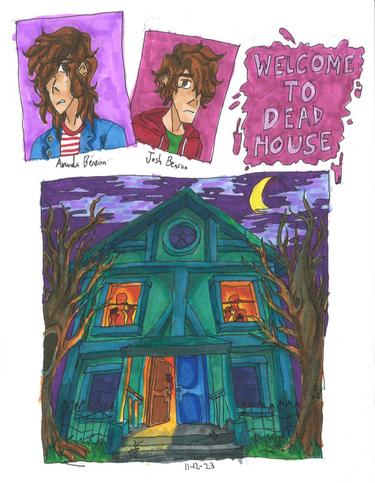
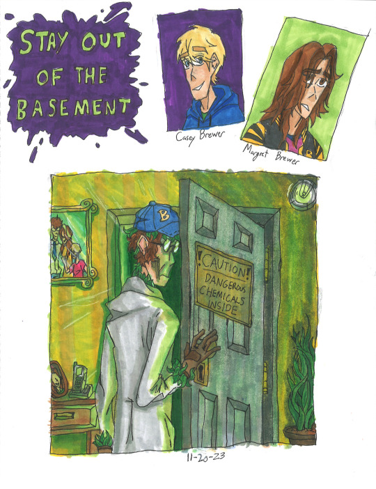
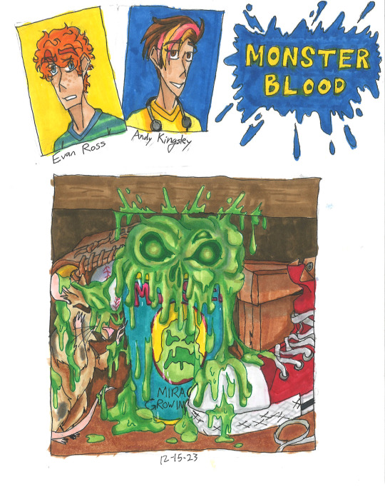
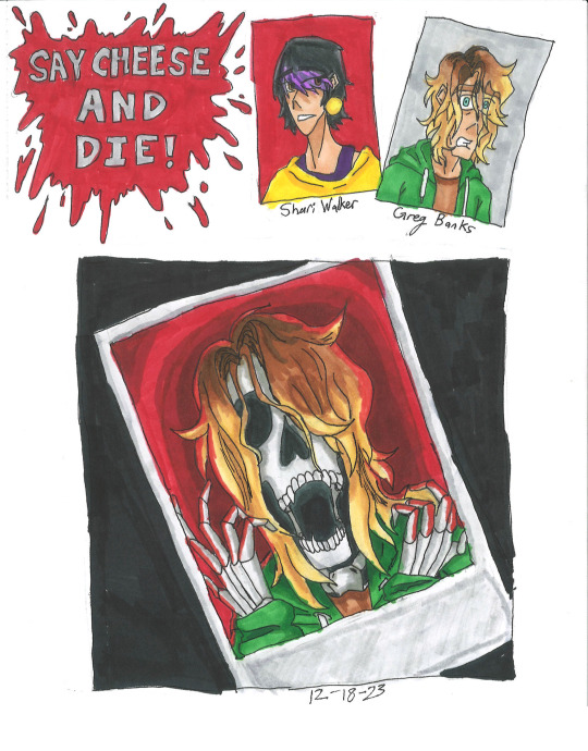
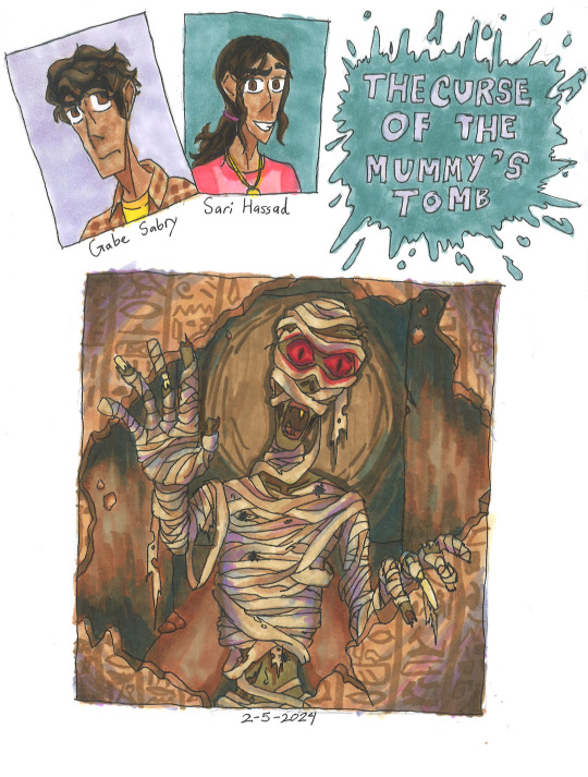
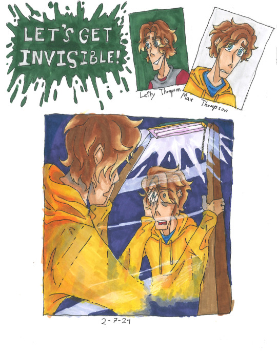
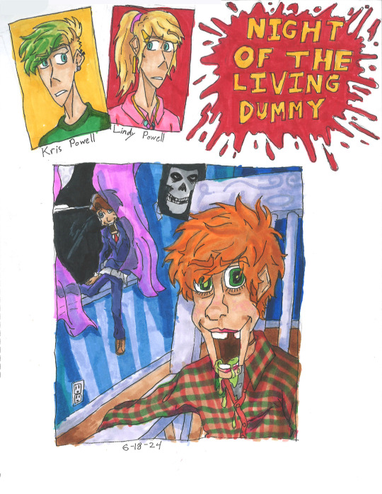
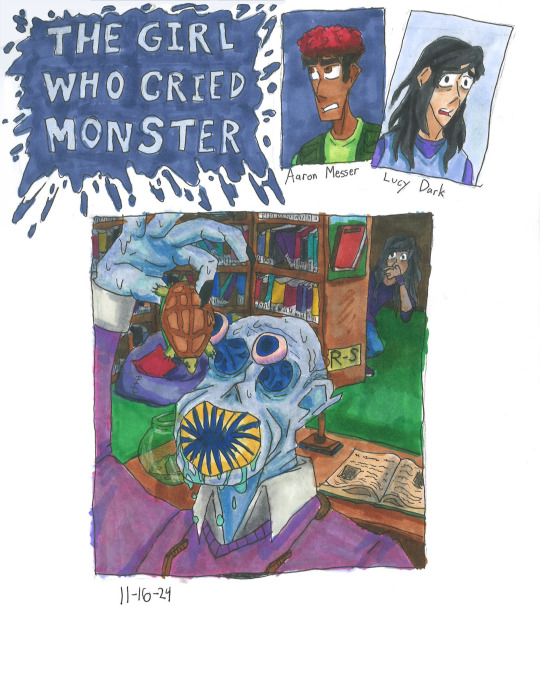
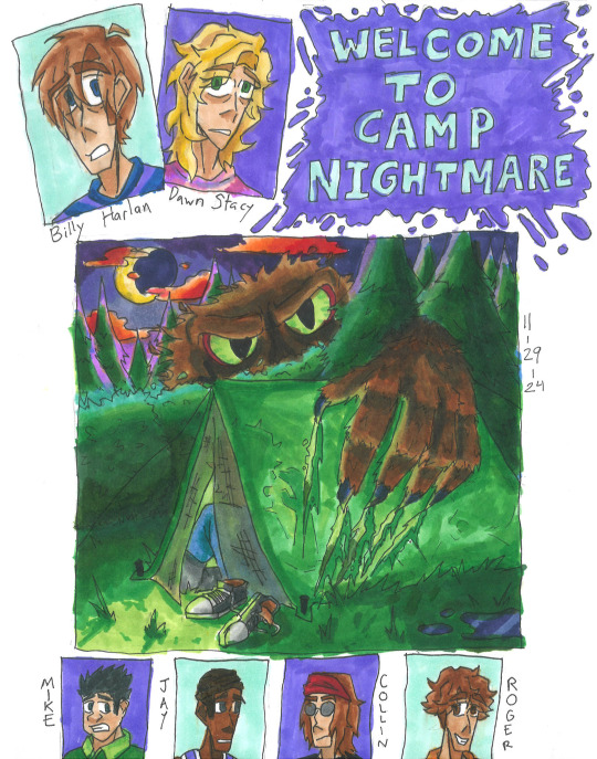
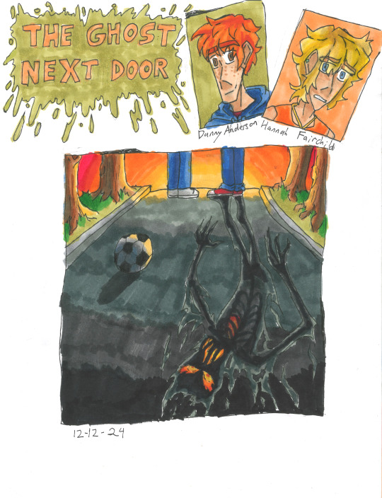
Goosebumps Books 1-10
Can't believe that it took me nearly two years to just do 10 covers for the books. Will be posting more Goosebumps in the future, along with other stuff.
Read more to know my personal opinions and critiques on my fanart for each book:
Welcome to Dead House: I wanted to make the house look alive like Monster House, so I gave it more human characteristics (ie: the people in the windows to form eyes, or the finger-like branches.) Also paid homage to a horror film by styling it after The Amityville Horror house.
The Benson children themselves look a bit depressed, that's because the first book is actually more scarier than the rest of the series, so they're a bit angsty.
Stay Out of the Basement: This one killed a lot of my green markers lol. I tried to make Dr. Brewer as menacing as possible while still showing that he is a father with the photos, There were going to be more plants reaching out, but I decided that the leaves hidden on him would be enough.
Though I have to admit my disappointment with the lighting. It still looks a bit too bright, and not dark enough. That's just my own critique.
Monster Blood: Honestly, pretty mixed about this one. While I'm proud of the bubbling ooze that looks like a skull, which is outlined by one of my colored pens. I'm not proud that everything else is so muted with brown. Almost all of Jacobus' works are vibrant and saturated, so it being dull in colors feels like a disservice to him.
Also, Andy's last name was made up by me, she apparently just doesn't have one. It's inspired by Stephen King. Btw, hope you love banana and strawberry dyed hair, you'll see more of it soon in future batches.
Say Cheese and Die!: One of my favorite books, and of course it gets the best fanart imo. The screaming skeleton form of Greg Banks with red bg in the polaroid, contrasting with the dark background is just super cool, coolest shit I've ever done. Though I might be biased, I really like skeletons. Like Curly.
I actually made concept art for a Say Cheese and Die! graphic novel, which includes drawings of the photos and Spidey! Let me know if you're curious.
The Curse of The Mummy's Tomb: Not much to this one honestly. Just a mummy casually busting down a wall filled with hieroglyphics. Though I will say, I was experimenting with shading with purple and blues like Jacobus. As you can see, didn't stick for long.
This is also the book that I discovered that if the protag doesn't have a last name, then there is an official one either in the Presents novels, the mobile app, comics or other.
Let's Get Invisible!: This was pretty tricky to draw. Drawing someone turning invisible maybe easy in Photoshop or Procreate, but this was traditional art. Sure Jacobus did it with airbrushes, but I all had were pens and markers. But I somehow managed to pull it off, which is insane that I even managed that in the first place.
Night of the Living Dummy: Ah, the infamous Pamela Vorhees book, where the main antagonist isn't the mascot, but instead some other puppet lol. I've seen a lot of fanart of Slappy, but never of Mr. Wood. So I wanted to do justice for Wood while still showcasing Slappy. While I am proud for how it mostly turned out, there are two things that bother me. 1. This is the night sky that is black, the rest are either blue or purple. 2. I forgot to add the lines that make the jaw on Mr. Wood, whoops.
Aside from that, I hope guys like that Misfits poster in the background and Kris's cool hair cut. The green was inspired by the comic adaption not 2015 Jacksepticeye.
The Girl Who Cried Monster: Please forgive me for the small thumbnail, I wasn't using a ruler at the time. The design for Mr. Mortman wasn't much of a challenge. I loosely based it off of the French rendition of the cover and gave him a large leech-like mouth.
In my headcannon, the teeth spin like a garbage disposal, making easy work of the turtles.
Welcome to Camp Nightmare: Another one of my favorites, and I think I did a decent enough job, too. The lighting is perfect, the clouds look alien enough, and you can just barely see the screaming campers inside the tent. I do have one issue though, and that is the size of the monster, Sabre. In the original sketch I did, he was supposed to blend in like a bush, but instead he looks like Sasquatch Sr. Oh well.
While they did give Billy a last name in the Presents books, I had to make up one for Dawn. Just based it off Gwen Stacy lol. Also, hope you enjoy the little bonus pictures down below.
The Ghost Next Door: The original Jacobus art was perfectly vague enough to keep the twist there but not spoil anything. Of course to do the same thing, but with a twist of my own. The "ghost" shadow that you see in the street is the Dark Figure that follows Hannah around or when Danny is near. I wanted it to look like it was constantly on fire, since SPOILERS: someone in the book does die in a fire.
Another headcannon is that the Dark Figure isn't actually a ghost or whatever, but instead the embodiment of Misery.
#goosebumps#goosebumps fanart#welcome to dead house#stay out of the basement#monster blood#say cheese and die#the curse of the mummys tomb#lets get invisble#night of the living dummy#the girl who cried monster#welcome to camp nightmare#the ghost next door#horror#nostalgia#90s nostalgia#amanda benson#josh benson#magret brewer#casey brewer#dr brewer#evan ross#andy kingsley#greg banks#shari walker#gabe sabry#sari hassad#max thompson#lefty thompson#kris powell#lindy powell
806 notes
·
View notes
Note
Chuck, how do you deal with people who are rude about you and your work? I write queer romance and I want to put my writing out there for people to read, but I'm a very sensitive person and I know it will be hard not to take insults personally and let them affect me. I don't want to let that stop me from expressing myself and sharing my art, but I'm scared!
very good question buckaroo. i am a good example of this as pretty much EVERYONE was rude about my work for many years calling it 'so bad its good' (it is just good) and 'terrible photoshop' (i think it has a great and instantly recognizable style) and 'intentionally stupid premises' (i dont think there is anything stupid about sex being fun and whimsical and playful). even these days the reaction of the VAST majority of buckaroos who discover chuck have this reaction AT FIRST, and then learn to appreciate the tingleverse in a more sincere way over time.
all that is to say BEING DOUBTED HAS WORKED OUT VERY WELL FOR ME. art that changes meaning over time can be very powerful, so if someones initial reaction to my trot is one thing and then it evolves into another thing, well that is just good art. while it can feel bad to get a bad review, i would say a bad review just means you have entered a realm of tension and change and discord and WE ARE TALKIN ABOUT ART BUD so that, in itself, is very exciting.
i think of what i do as 'punk writing', and a big part of that means pushing against preconceived sensibilities. not many other authors will proudly say 'there SHOULD be some spelling errors in my erotic shorts because i wrote it in a day and edited it once. that is the FEELING i want to create', but that is my way. by creating what is in my soul i KNOW i am going to bother some buckaroos and that is okay.
now i am NOT assuming you are also doing punk writing (that is okay of course we all have our own styles. what i am doing with tinglers is pretty rare), but it still stands to remember that there are 7.8 billion people on the planet of this dang timeline and some of them are bound to be bothered by your creations. that is not a problem, that is just part of baring your authentic self.
the other thing to remember is theres no REAL right or wrong in art. it can be analyzed in different ways and i tend to look at it in a way of comparing intention to result, but even THAT is not strictly correct. therefore any bad review of something you make is not actually BAD it is just someones information and feedback for you to take or leave. a one star review is just another opinion, it is no more right or wrong than your own opinion, and that is wonderful. it is freeing.
if i see a bad review of my own book, lets just say CAMP DAMASCUS for instance, i do not get upset because i know this: that reviewer is not wrong. camp damascus is five stars for me, but it is one star for someone else AND THAT IS OK. THAT IS THE WAY IT SHOULD BE. THAT IS GREAT ART. also MAYBE THEY KNOW BETTER THAN I DO. just because i wrote the book does not mean i am the authority on it, and the conversation and tension between those that enjoy something and those that despise it is a creative act. the audience engaging with your work is just your art emerging from its cocoon and saying 'here i am. lets see where i flutter off to now'
do not fear the river of this timeline sweeping away your creations and carrying them where it will. this is inevitable, but it is also beautiful and freeing. you cannot swim against it and that is okay bud, because YOU HAVE ALREADY WON. you have already created something and given a piece of yourself back to this timeline and that is a great honor and privilege. it is literally all there is
by creating ANYTHING you are proving love is real, and that is something to be proud of
2K notes
·
View notes
Text
The Spaniard's Wife (Carlos Sainz x wife!reader)
Inspired by @charles-eclair16 's fic
Carlos Sainz had a secret for the past 9 years, but when he forgot to take off the one thing that can reveal everything, everyone has questions
or
in which Carlos let's everyone know that the rumors, in fact, are true
masterlist
N.B: didn't turn out how I wanted but I've been rewriting it multiple times and I think this is the best option, hope you like it...WARNINGS: swear words a lot, not proof read, spelling mistakes and really bad photoshop tbh, if I missed anything please let me know!
Faceclaim: Emeraude Toubia

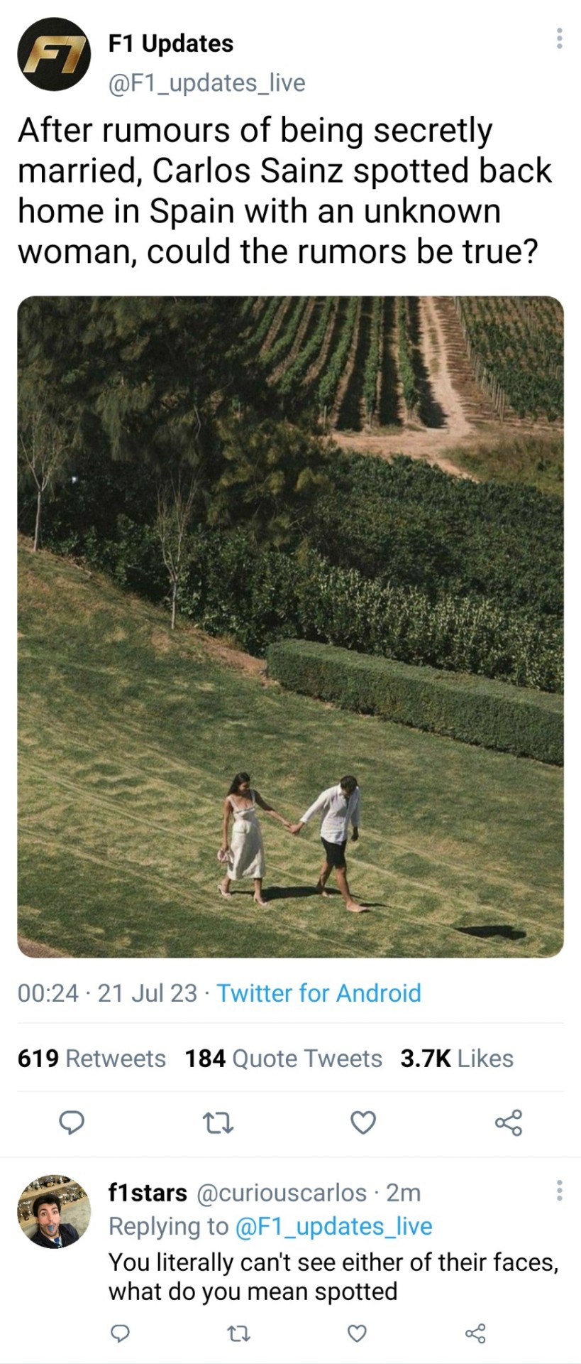
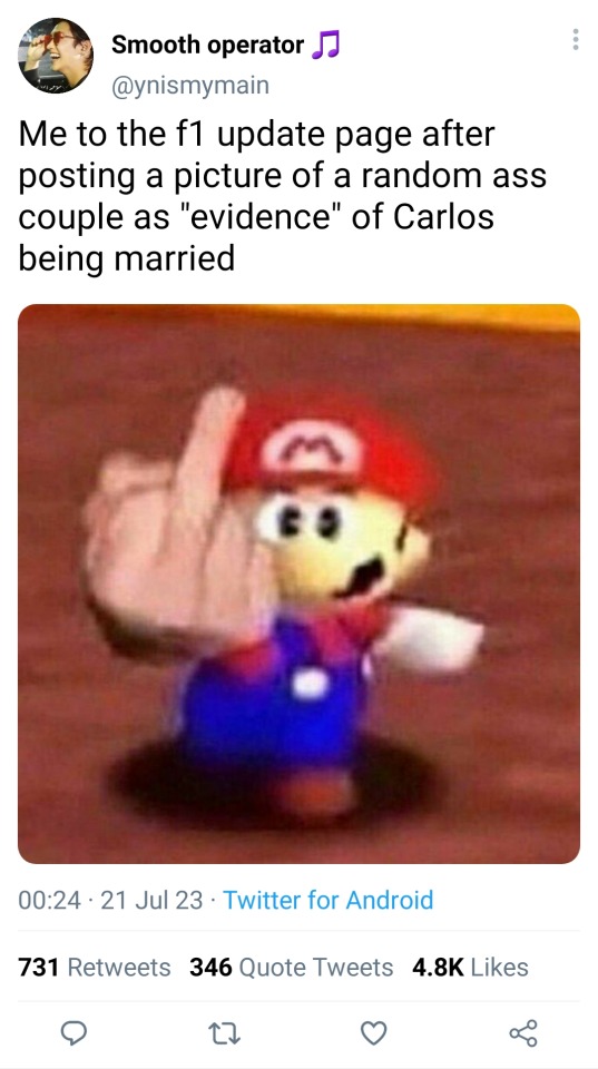
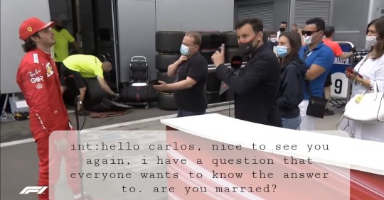
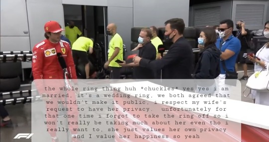
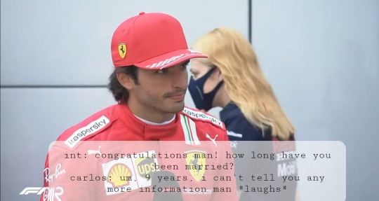
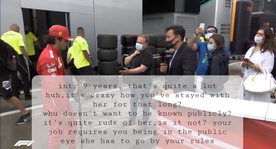
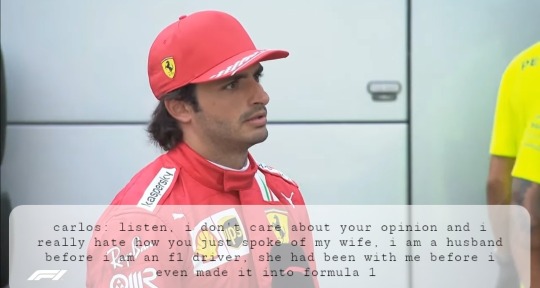
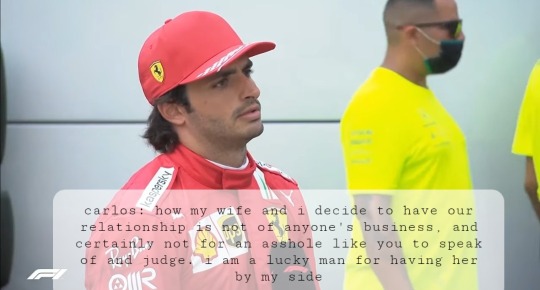
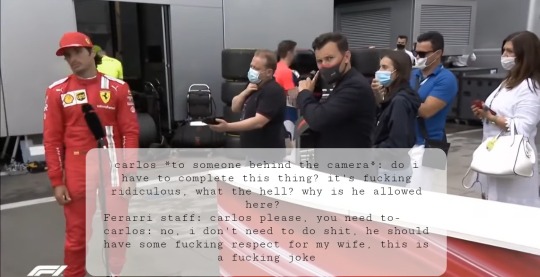
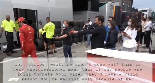
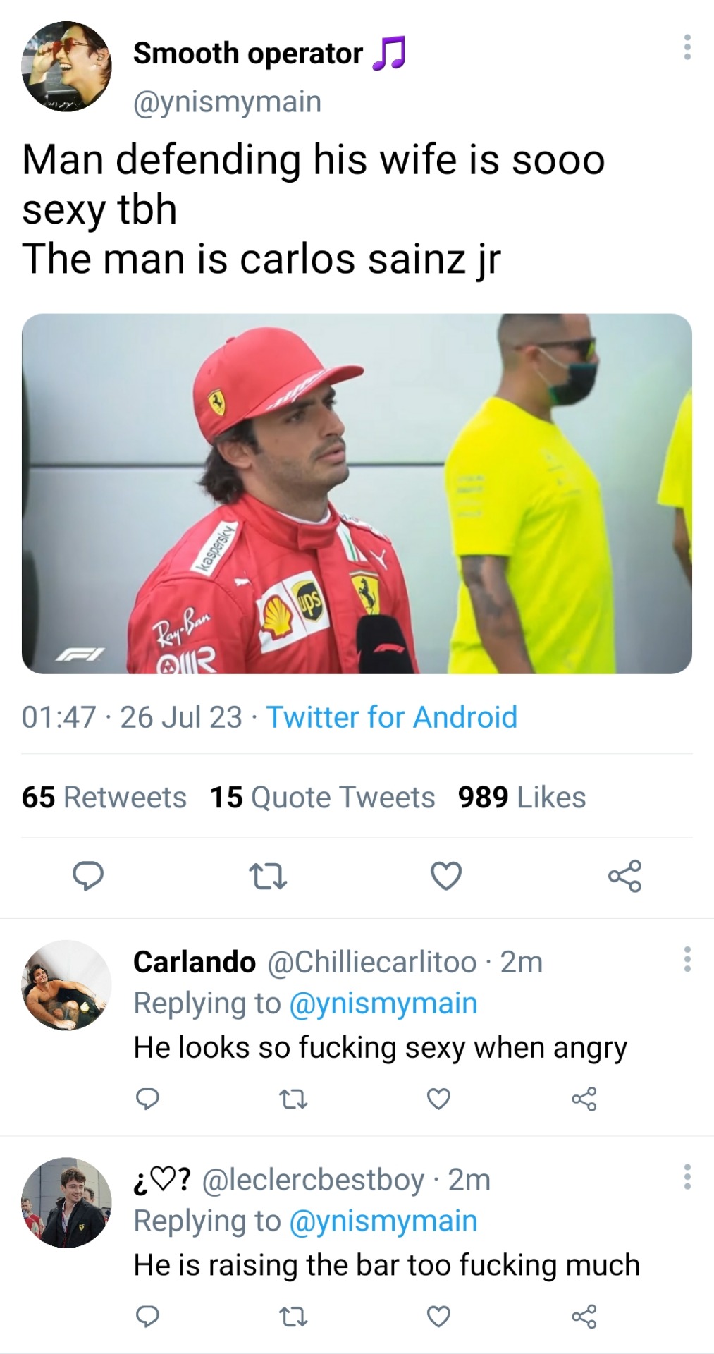
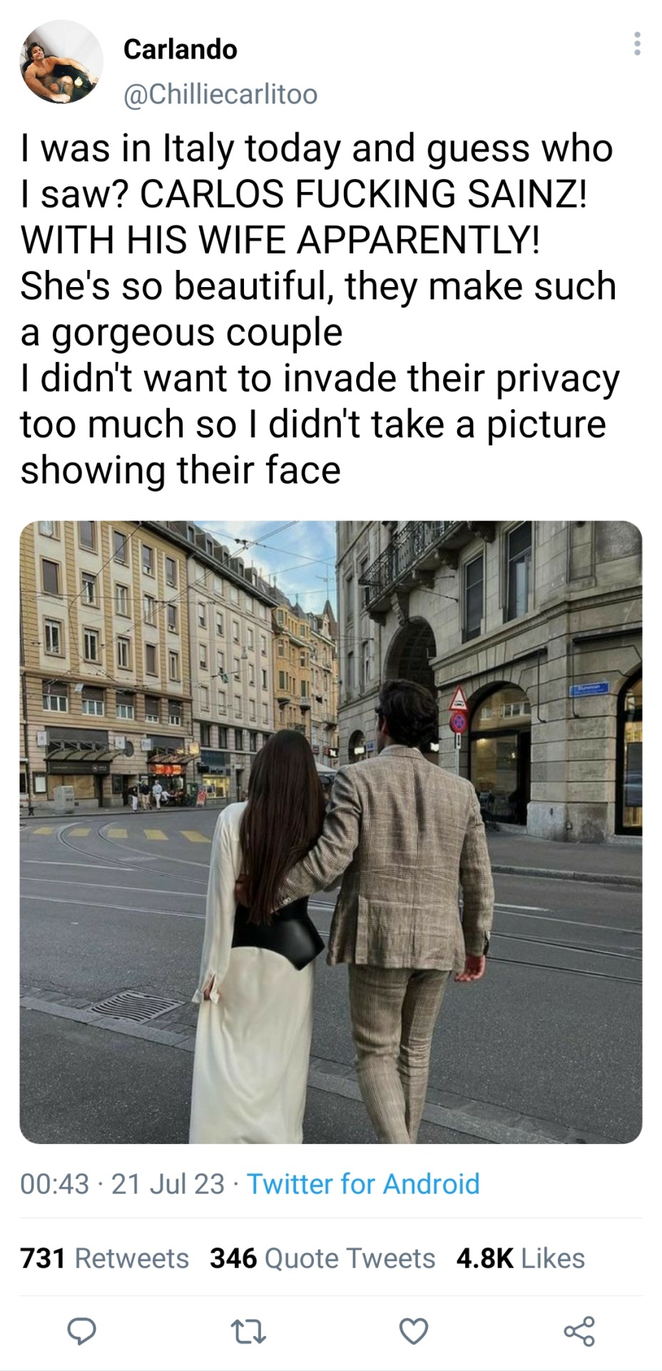
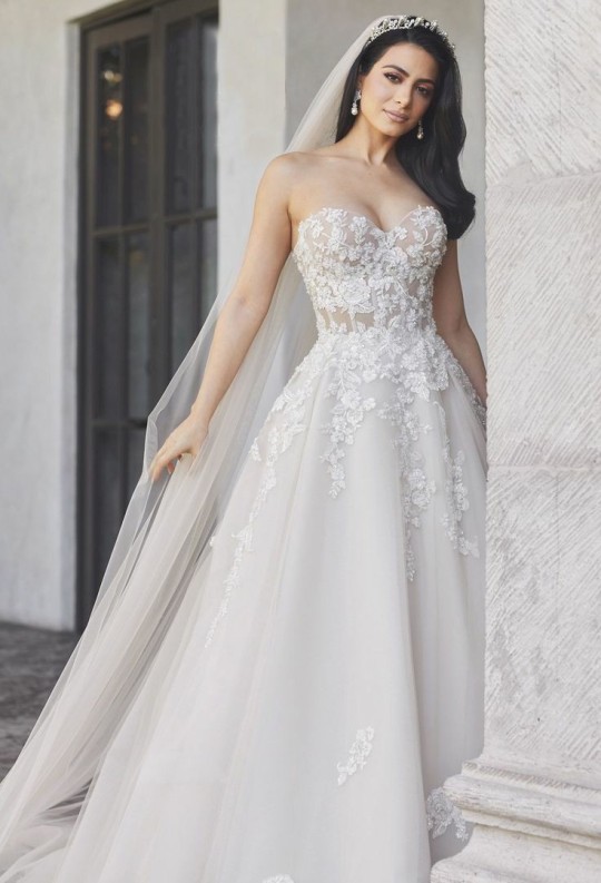
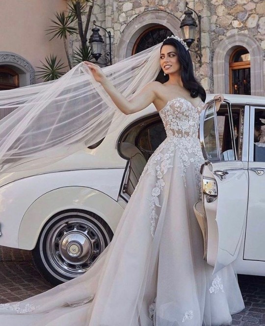
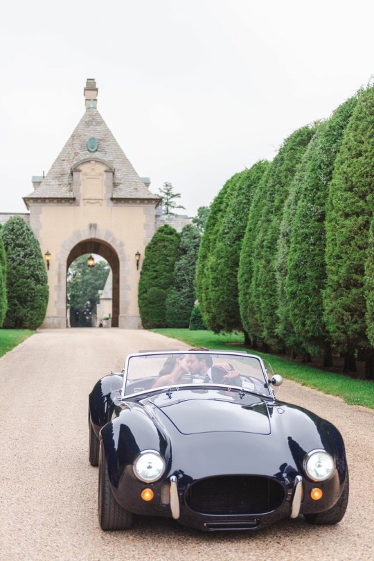
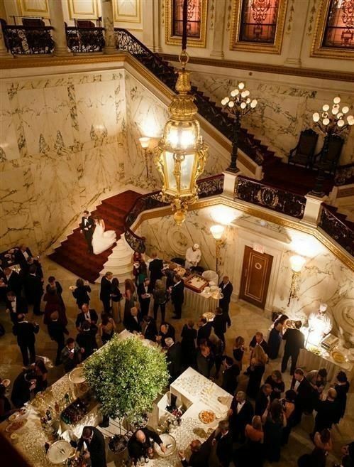
Liked by Charles_leclerc, danielricciardo, landonorris and 910,583 others
Carlossainz55: my wife and I have been friends for 20 years, we have been lovers for 13 of those years, engaged for 2 and married for 9. I have never been sure of much, but I am sure that I love her with my entire heart, I will always love her. I have known yn since before I could even dream of being an f1 driver, what happened in that one interview was disrespectful and just disgusting. No one has any right to speak any ill word of my wife, you don't know her and you never will, as long as she doesn't want you to. I will do everything for her, for her happiness, her comfort and for her ease of mind.
landonorris: tell yn I miss her!
Carlossainz55: leave her alone
landonorris: I'll tell her that you're rude to me
Carlossainz55: she's my wife!
landonorris: yeah yeah, you never let us forget it
username: yn been here since day 0 apparently, can't fight her now
username: YES!! CHILDHOOD FRIENDS TO LOVERS!
username: I want dts to make a reincarnation of their love story
username: we need a spinoff
username: yes! It'd be so cute
username: I can't imagine 16 year old carlos realising he is in love with his friend
username: she is every man's wet dream
-this comment has been removed-
username: she looks so pretty wtf
username: she's looks like a doll
username: wish i looked like that at 20 years old
username: her dress is phenomenal
username: this screams money
username: 2 different cars for a wedding
username: the third slide, holy shit
username: I wouldn't be surprised if the last 2 pictures are carlos' or her house, like holy fuck
username: both scream rich
username: mum used to say rich people look it and I never gave it much thought until I saw carlos sainz and now his wife
username: did y'all see the picture that one twitter user took? Their outfits looked so fucking good
username: YES! I SAW IT! I could never afford a thread on either outfit!
username: did you guys see her hair! It looks so thick and healthy
username: fr!
username: I want a wedding like that!
username: I want a husband like that!
username: I want a wife like that!
username: I love how he is not in one single picture 💀😂
Liked by danielricciardo, landonorris, Pierregasly and 1,209,316 others
Carlossainz55: 10 years since i was able to call you wife, and I will never get tired of letting everyone know that. I am in love with you, forever and always.
Charles_leclerc: simp
Carlossainz55: I don't know what that means
landonorris: ikr, it's laughable man @.Charles_leclerc
Charles_leclerc: don't pretend like you're not the same with your girl @.landonorris
username: damn charles really coming for everyone's neck today
username: bet charles is the biggest simp of them
username: he really making us feel lonely as hell huh
username: 10 fucking years, Holy shit!
username: no cause if I had yn by my side I too would be in fucking love
username: don't embarrass yourself, everyone knows you're in love without her by your side
username: I didn't ask to be attacked like that wtf
#f1 imagine#f1 x reader#f1 social media au#f1 instagram au#f1 smau#f1#carlos sainz social media au#carlos sainz smau#carlos sainz instagram edit#carlos sainz x reader#carlos sainz twitter au#carlos sainz x yn#carlos sainz x you#carlos sainz x female reader#carlos sainz x y/n#carlos sainz#carlos sainz wife#carlos sainz x wife! reader#carlos sainz jr
3K notes
·
View notes
Text
How Can You Fluster Them?

Characters: Heartslabyul, Savannaclaw, Octavinelle
Ace Trappola:
- Pretty easily, actually.
- As smug and teasing as he can be, there are quite a few things that get him flustered.
- Bring up how sweet he's acting or how sentimental he seems to watch him sputter furiously in denial; show him direct affection and kindness to watch him blue screen for a second before embarrassedly scoffing about how lame you're being.
- You can fluster him even further by teasing him about how smug he was a second ago. That really gets him.
Deuce Spade:
- While you could tease him about being 'stupid', yes, that is a bit hurtful, and it isn't really the best way.
- Just the opposite. Genuinely complimenting his intelligence, his strengths? That's what catches him off-guard. He doesn't quite know how to acknowledge it when someone truly, genuinely tells him he's not dumb, and him not being an effortless scholar doesn't mean he is.
- There are other ways, of course, like sudden acts of affection, pranks, or even dodging his kisses.
- He gets all red, and a tad defensive. It's the funniest sight.
Riddle Rosehearts:
- Most affection flusters him.
- Seriously. He's never really received it, considering his upbringing, so even things like hugs or kisses on the cheek leave him red. You're not quite certain whether it's more cute or sad.
- He'll get rather huffy if you point it out. It's rather comedic, but you might want to refrain from laughing too much, lest he ends up chastising you.
Trey Clover:
- Pointing out his true brilliance.
- That's the main method. Although he's used to affection, to being told he's a good baker, a nice guy, and whatnot, he's not quite used to having his true potential acknowledged.
- He'll look away with a flush, denying his true intelligence, the true strength of his Unique Magic, or whatever it is you've opted to praise him for.
Cater Diamond:
- Allowing him to be genuine.
- It will take a while, frankly. With most people, Cater dons the personable mask of Cay-Cay the friendly senior, but with time... And patience, he may warm up to you enough to be himself. Be moody, the ultimate hater of sweets, and whatnot.
- He can't help but feel oddly flustered, caught off-guard, really, when you let him complain about the way Riddle was before his overblot, when you make him something salty for a dessert of sorts.
Leona Kingscholar:
- There are quite a few ways.
- If you two are together, he might tease you quite a bit. Reciprocating said teasing is certain to get him huffy and flustered. Teasing in general, really. Dodging his kisses? Headpats? Photoshopping him in cat ears? If you're close enough to him, they'll all work wonderfully.
- And... Genuine understanding flusters him as well. Prioritizing him in small ways, like taking a break from your gaming to talk to him, or allowing him to vent to you.
Ruggie Bucchi:
- Caring for him.
- Ruggie is used to having to act incredibly mature for his age, yes. He's cunning, clever, and responsible, important traits to make up for his disadvantages in life.
- So, when you (jokingly, I would hope) babytalk him, pat him on the head, or ask if he'd like to be the little spoon, it gets him terribly huffy. What's that supposed to mean, huh?
- It's even worse when you genuinely care for him, making him meals, or offering him a massage. It's hard for him to accept help. He's not a kid! He doesn't need the babying! It's worth nothing that he has a very broad interpretation of what counts as "babying". However, he will accept after a while, and be very, very flustered about it.
Jack Howl:
- Teasing him.
- He's always in denial about his softer side, no matter how apparent it becomes that he truly admires or cares for something or someone. He gets terribly flustered at his own sentiment.
- Teasing him about it just makes things worse. Dramatically exclaim how cruel he is because he said he "wasn't concerned for you or anything". Play dumb when he tries to ask for a kiss in a roundabout manner. The result is hilarious.
Azul Ashengrotto:
- There are so many ways to do this.
- Teasing him about his affections, for one. This is the same man who couldn't even admit to caring for his business, who claimed that love made one exploitable. He's already terribly mortified by his own so-called exploitability. Asking if he likes you gets him rather pouty before you're dating.
- Genuine, continued kindness is also rather flustering for him. You- care for him? Wish to see him succeed? You accept his flaws? You don't view him as pathetic for his tears? It's all territory he's terribly unused to.
Jade Leech:
- Standing up for him when he's insulted, for one. Telling the stranger that, no, his mushrooms aren't creepy, they're impressive, they just need to get a hobby. That leaves him shocked for a bit.
- There's also things like being the one to tease him, caring for him, listening to his rambles about mushrooms.
- Those leave him red-faced for a good few seconds. Calling out his flustered state garnets a pointed "Let us move on".
Floyd Leech:
- Initiating affection.
- Really, although he seems lackadaisical most of the time, impossible to fluster, it isn't quite that hard. He isn't used to being kissed, or hugged, or even praised without a certain business-oriented touch.
- So, when you suddenly kiss him, or offer to be the big spoon, or whatnot, he freezes up.
- If you point it out, he gets comedically defensive. Someone needs to tell him how terrible "I-I'm not blushing or whatever, that'd be laaame, so shut up!" Works as a method of denial.
#ace trappola#riddle rosehearts#deuce spade#trey clover#cater diamond#leona kingscholar#jack howl#ruggie bucchi#azul ashengeotto#jade leech#floyd leech#riddle rosehearts x reader#ace trappola x reader#deuce spade x reader#trey clover x reader#cater diamond x reader#jack howl x reader#leona kingscholar x reader#ruggie bucchi x reader#azul ashengrotto x reader#jade leech x reader#floyd leech x reader
700 notes
·
View notes
Text
How Do I Do Stuff
The question was phrased a little strangely, and I don't want to embarrass the person by posting exactly what was said, but I'll answer it and hope this clears everything up.
I do almost all of my drawing by hand. No, I don't trace in Photoshop. Not a judgment on those who do, but I come from a generation of artists who did not use Poser programs or other digital tools. We learned to draw using a technique called the Sight Size method. I know a lot of people assume everyone - including the old masters - traced everything using optical tools, but while it is true some people did, it is just as true that most didn't, and you can draw with great accuracy if you learned how to draw the old fashioned way.
Sight Size breaks everything down into its barest components of geometric shapes and you build from there. Once you learn it, you never forget, and it applies to everything you will ever draw.
I learned it using a set of Famous Artist Course books my mom had since she was a kid, and they are still the gold standard. They're often on ebay. If I were you, I'd buy them.
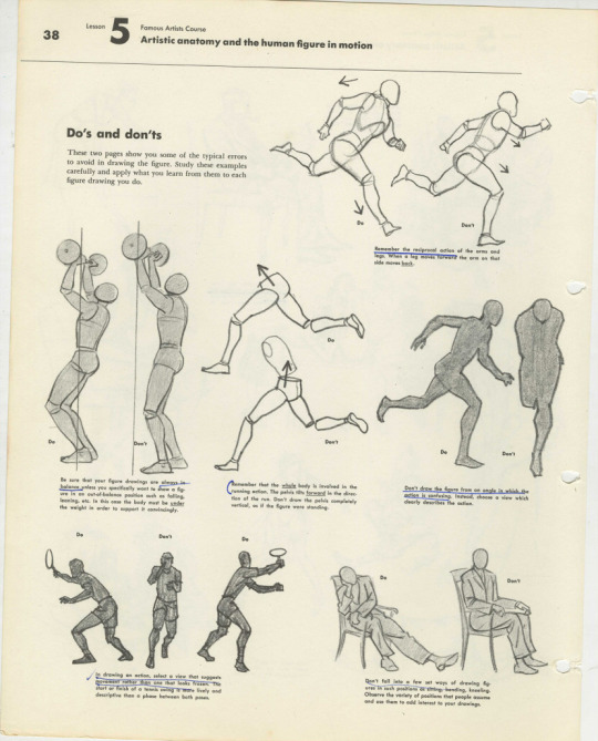
I actually find using figure reference really annoying because I like exaggerations and modifications from reality in my final work.
This page from Neil Gaiman's Chivalry was drawn and painted without figure reference of any kind.
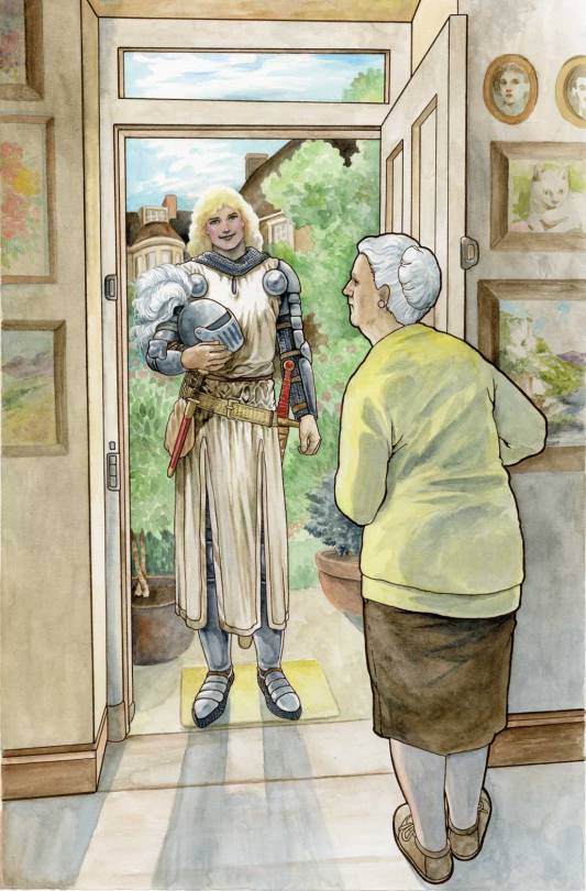
I don't know why people assume I trace all the time. If you were to try to use photographs to replicate these figures, you would find they are slightly off. There is no tracing here.
This is not to say I never use reference. This page, for example, was referenced from a photo of my mother. Isn't she pretty.
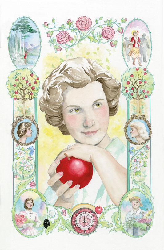
But this page of Sir Galaad was drawn and painted without reference.
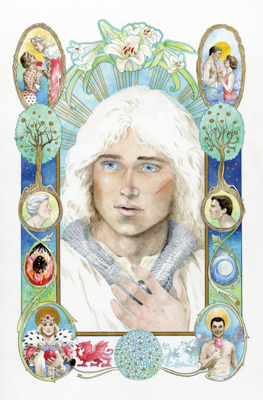
He's pretty, too.
If he were real, I'm sure a lot of people would be very happy about it. But he's not. And had I reference, the art would have gone a lot faster. I had a time trying to nail this face that is very alive in my head but doesn't really exist.
Back in the ancient days, all cartoonists had to learn to draw and paint extemporaneously because reference was limited and digital tools didn't exist. While some high end artists had photography studios and professional models with costume and sets on hand, small fry like me were limited to what was in the house or available at my small local library, which was no bigger than a few rooms of my current house.
Artists kept extensive "morgue files" or "swipe files" which were collected from magazine clippings and photographs so we would have as much of what we might need on hand for quick reference. These ephemera collections could get unwieldy. I have thousands of photographs I've simply never sorted. I finally dumped most of my files this past year.
Have I ever traced anything? Of course, especially if I have to re-use a shot or setting over and over. Making extra work for myself is just silly. It's my job to make pictures, not to perform magical feats, like copying one shot after another over and over without making a mistake.
However, for almost 15 years of my career, I refused to copy or trace anything, and did not even own a lightbox. On the one hand, that forced me to learn to carefully examine what I saw. On the other hand, it was a stupid hill on which many deadlines died.
Only after I realized many professional artists had lightboxes and overhead projectors did I finally break down and get one.
The one thing I use my lightbox for more than anything is for tracing my thumbnail sketches to the final drawing paper. Instead of trying to capture the liveliness of the original sketch by copying what I see - only bigger - I blow the thumbnail up to the size I want the final art to be, then I trace over the thumbnail using a lightbox onto the final drawing paper.
Here's a look at thumbnails from the graphic novel Neil Gaiman's Snow, Glass, Apples.
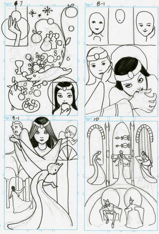
I enlarged these on my computer to fit onto 11"x14" paper, and traced the thumbs before finishing the art which was drawn in pen and ink and colored in Photoshop.
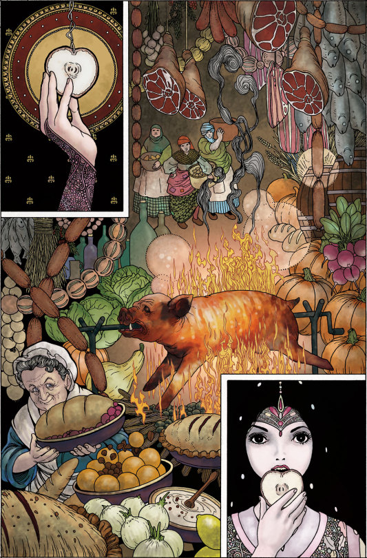
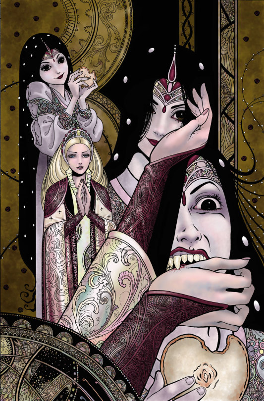
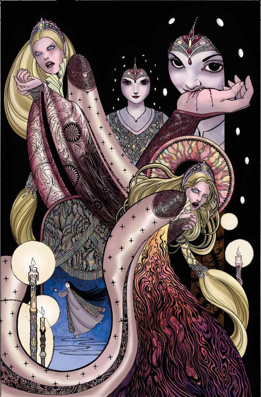
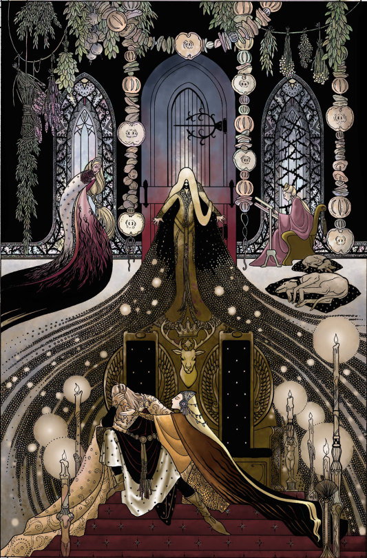
While I obviously made some changes, the essence of the thumbs is there in the final work. Tracing my thumbs retains some of the looseness of the original sketches, which is often lost otherwise.
So, there is a valid purpose to tracing at times, though in my opinion, too much tracing can weaken drawing ability, substitute for developing skills, and make the work kind of stiff.
If you want to, I'm not your judge. But it's weird to me that people think I must be faking my skills in some way.
Ironically, the word cartoon comes from the Italian word cartone, which is a large heavy sheet of paper - also, the origin of the word carton.
Preparatory sketches were made on this paper which was then transferred to the final work surface via either tracing or by stamping little holes in the paper through which dust was sprinkled, recreating the contours of the drawing for the artist to follow.
So the origin of the word cartoon comes from a process often used...for tracing.
3K notes
·
View notes
Note
hi sole! your sharpening is always so soft and pretty, i was wondering if you would be open to share it? hope you are having a wonderful november so far <3
Hi, Anon! Thank you so much <3 Yeah, sure, tutorial under the cut:
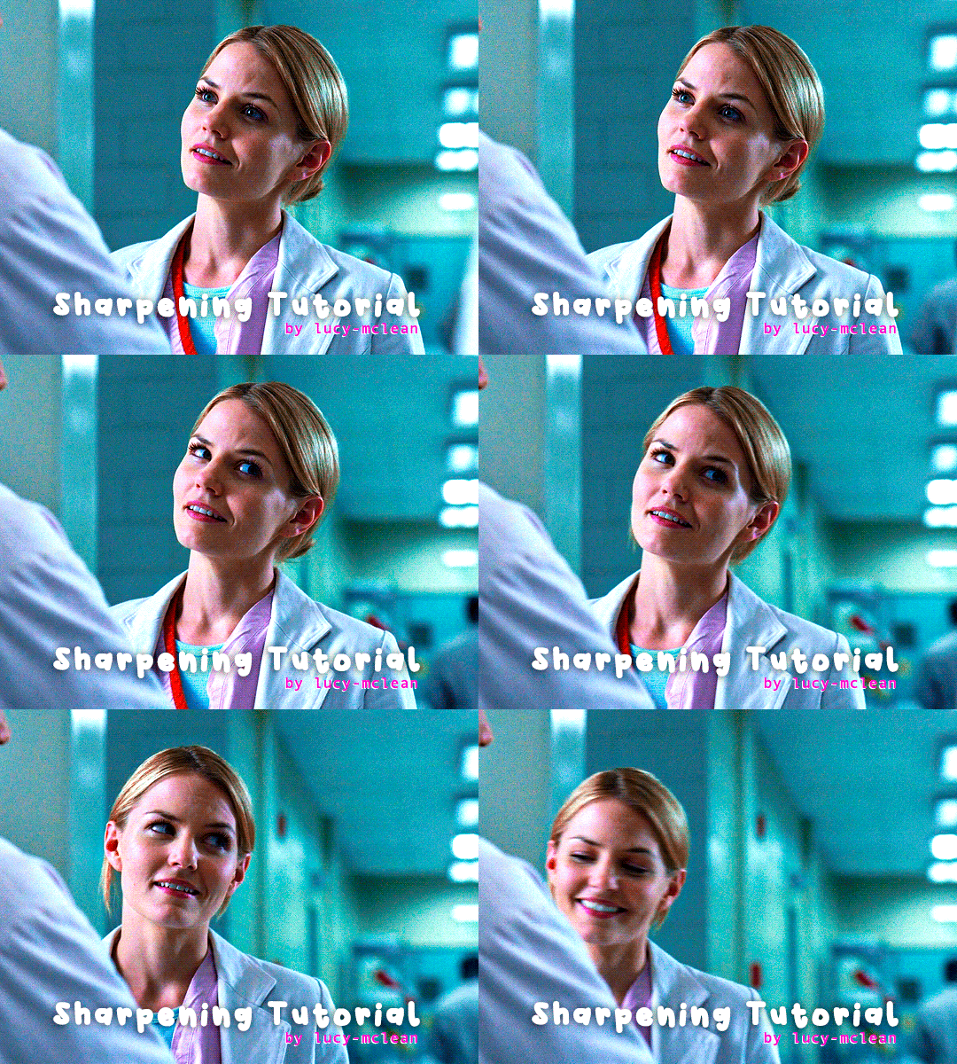
What you'll need:
Photoshop (I use Photoshop 2023)
Basic knowledge on how to make gifs
Camera Raw filter installed
Okay so, first of all, I use two different methods depending on the size of the gif. Let's start with the one I use for most of my gifsets which are big gifs (examples: x x x x.)
METHOD #1: Smart Sharpen + Camera Raw
I started using the Camera Raw filter last year and let me tell you, I'm obsessed! It completely changes the game of sharpening. I use this method for all gifs with a 540px width.
We're going to work on timeline so get your gif ready and convert it for smart filters. I'm using this scene from my last set as a base:

Here's the gif after I color it (I usually sharpen my gifs before I color them but for the sake of the tutorial I'm showing you this so you guys can see the difference):

(1) Smart Sharpen Layer: Let's start by adding a Smart Sharpen layer (Filter > Sharpen > Smart Sharpen) with these settings:
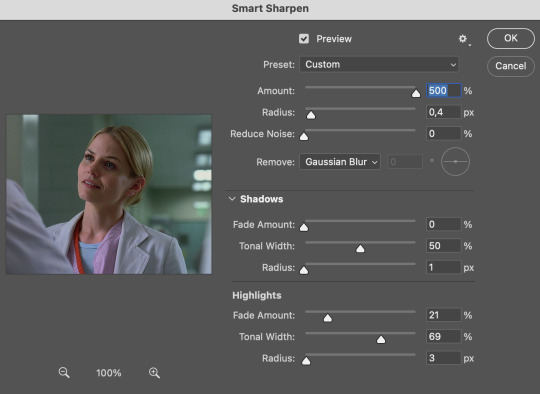
Disclaimer: I didn't come up with these settings myself I got them from these sharpening actions forever ago so I don't know which one it is :/. I also wasn't able to find that person's new blog (if they even have one since they've been inactive since 2021) so if anyone knows please let me know and I'll give them proper credit!
Now we're going to go to the 'Layers' panel and click on this little thingy:

This window will pop up and we are going to change the Opacity to 50%.
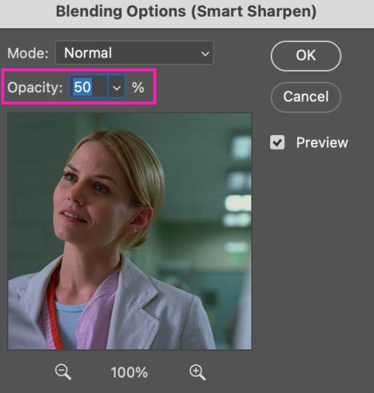
(2) Camera Raw Filter: Here's where the fun begins. Go to Filter and click on Camera Raw Filter (you'll need to have the plugin installed for it to show up.) I don't know how the Camera Raw window will look like the first time you open it but good thing you only need to change a couple of things!
If it isn't opened yet click on 'Effects' and we're going to change the Texture and Clarity:
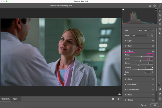
Depending on the scene/show/film I'm giffing, or if I want a stronger or softer sharpening, I'll use two different settings, but 99% of the time they are these:
First setting: Texture (+20) Clarity (+10)
Second setting: Texture (+40) Clarity (+20)


As you can see the difference isn't huge but the first setting gives a "softer" look. As I said I'll use one or the other depending on how I see the scene (it's almost always about the vibes yk.)
Feel free to experiment with these two and see what works best for you (although I wouldn't go higher than 40 on texture because the sharpening will look too fake imo.)
Also this filter is soooo good at making low quality videos look 1080p! Every time I've had to use 720p videos the Camera Raw filter has saved me 🫡
METHOD #2: Smart Sharpen
I use this method for smaller gifs. For example, 8 gifs of 268px x 180px sets (like these) or small-ish gifs in complex sets (like the second gifs in this set.)
This process is much simpler since it's the one I explained before but without adding the Camera Raw filter. That's it that's the method. Just a Smart Sharpen layer with the Opacity turned down to 50%.
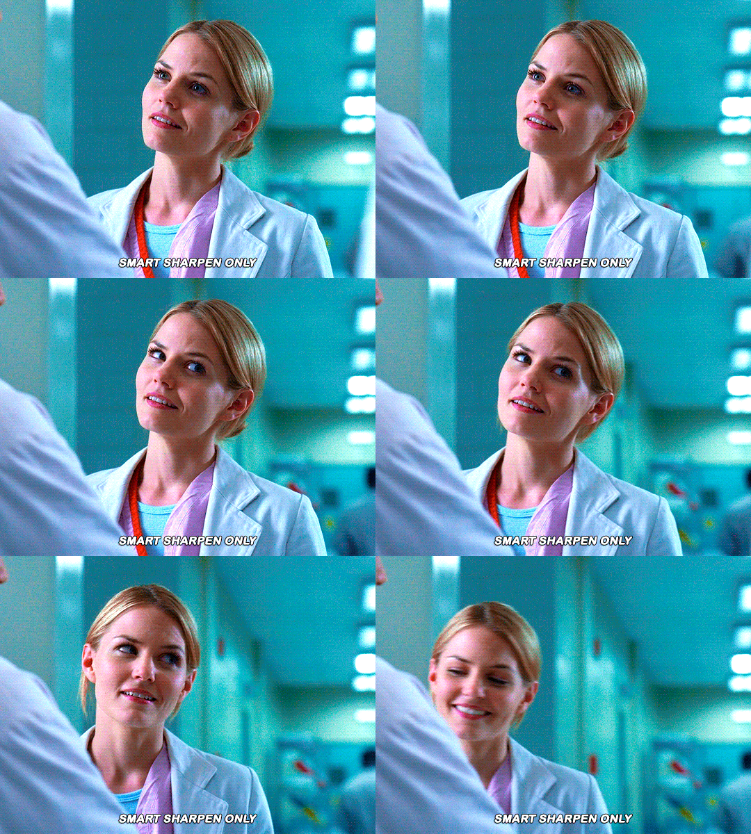
As I said this method looks best on smaller gifs but to be honest it looks good on big gifs too? Depends on what you like most!
Anyway I hope this was easy to follow and if anyone has any questions please feel free to dm me or send an ask! ♡
#ask#Anon#ps tag#useraljoscha#usermelone#userchibi#usermagic#uservivaldi#userlorna#tuserhol#usercats#userlix#usersavana
196 notes
·
View notes
Text
Dazai Osamu and the Dark Era: the visual novel (a fan project)

On a whim, I've decided to finally just publicly release this project that I've had laying around for two years at this point, for Dazai's birthday today. It was originally made for my very dear friend @letmereachforthestars , when I first introduced her to the series and wanted her to be able to read my favorite BSD light novel in an easier-to-read format. You need a computer to be able to play. The details and links are under the cut:
If you've never played a visual novel before, it's basically a novel in the form of a video game. Text will appear line by line, one a time on the screen, and it will be accompanied by relevant background visuals, music, and sound effects, to make the reading experience more immersive, and more stimulating than just reading from a book. Some visual novels have actual gameplay elements to them, and some are just books and nothing else (oftentimes dating sims/choose-your-own-adventure novels), the latter of which this is. If you've played the mobile game Bungou Tales/Mayoi, the story sections of that game are basically mini visual novels.
This game was made with screenshots and music from the anime, sound effects from the anime and Bungou Tales and free sound effect online sources, as well as graphics and fonts and other assets from Bungou Tales and other official BSD art (particularly the official anime soundtrack cd covers). The script is taken entirely from the official Yen Press translation of Dark Era, with the exception of about two or three iconic lines that I used different translations of because I felt like they had more impact. Additionally, at the very, very end, I added on the original ending scene from the Dark Era stage play and wrote a few fanfic lines of my own to accompany it you can tell because they are very cringe and don't match Asagiri's writing style.
Before playing the game, there are a few very important things to keep in mind; PLEASE read all this:
I am not a professional in the slightest. I took some coding classes in high school, and have some photoshop skills (when it comes to the design elements of the menus), but for the most part the former wasn't much help here; this was my very first time ever using the Renpy engine, and I made this entirely from scratch. I used my knowledge of playing other visual novels to emulate the kinds of effects and timing that is typical for these games, and I think it turned out pretty well all things considered, but it's still very amateur. This is most evident in the sound effects. The sound effects have no volume consistency between them, and some of them, particularly the gun/battle sfx, can come on very suddenly and be loud. I highly, HIGHLY encourage going into the settings and turning down the sound effects volume (the music should be fine), so that you're not startled by certain sounds when they happen, and for a lengthy time. I wouldn't blame you if you decide to turn the sfx off entirely if's too distracting, honestly 🫠 I am no expert in sound files equalizing and making sound files loop seamlessly, so this was by far the most tedious and frustrating part of the process of making this for me. Hopefully it doesn't ruin the game or break immersion too much if you decide to leave them on (I hope you do, for the rain and clock sounds at least, but again I wouldn't blame you if you can't).
Dark Era is the most faithful light novel adaptation in the anime, but there are still a handful of scenes, mostly fight scenes, that got shaved down significantly. Because of this, there are numerous occasions where I had to simply linger on a black screen or the same screenshot for a long period of time, while tons and tons of narration happens, because there's simply nothing I can show to accompany said narration. This is not ideal, but unfortunately I didn't have much else of a choice in those instances, so I hope it's not too distracting. There are also a few instances of straight-up inconsistencies between the novel and the anime (ex. the fight between Oda and Akutagawa happens in the woods in the novel, but in the anime it's still right outside the art museum), so sometimes what you're reading won't quite match the screenshots I use. Fortunately it's never anything major, but it does happen.
There will sometimes be long, unchanging black screens. Don't worry, the game isn't broken; just wait long enough and it will continue.
Sometimes, a character will get cut off when speaking, and when that happens the dialogue will auto-force to the next line. If you didn't get a chance to see what was said before, check the text backlog/history (in the menu or the H key).
Last but not least, this game was made with the default text speed in mind. Meaning, that when it comes to certain specific scenes, the mood/tone of them, made up of the timing of music, transitions, sound effects, etc, all of it was arranged around the speed at which things progress when using the default text speed. I completely understand if you can't, but if at all possible, please try not to change the text to go too much faster or slower, especially faster, because certain scenes will lose a lot of impact otherwise. If you already know Dark Era, you probably have an idea of some of the scenes I'm referring to. At the very least, during the more high-stakes/intense scenes, please try to play through those all at once without stopping, for the greatest impact based on how I designed the game, and only pause/quit during the slower scenes. There are specific moments that I'm really proud of how they came out, and I'd like for them to have the maximum impact that I intended :') (also note that if you make the text appear instantly, the cut-off dialogue mentioned above simply will not appear at all, and you won't even know to look back for them, so please refrain from making the text instant at the very least)
Ignore the cringe sappy final message
...I think that's everything. With all that out of the way, here are the links for both PC and Mac:
Download the PC version
Download the Mac version
This was a passion project for me for a good many months back in 2022. It started out just as a gift for my friend, but in the end I was really satisfied with how it turned out, despite how tedious and frustrating it was to work on. I've been hesitant to share it with the fandom for all this time because I kinda doubt anyone would really be interested in something like this especially since it's not stormbringer or beast, but someone on discord who tried it told me that I should share it, so here it is. I'm sharing it not just because I'm proud of my work, but because Dark Era is a truly amazing light novel — underrated, in my opinion (yes, I said what I said) — and far better than the anime adaptation, as good as that is, and I want more people to read it. If reading the books is hard for you and you've never read Dark Era before, if I can help just one more person to read it with this, I'll be happy, and consider my job done. 💖
I so desperately want to make more of these visual novels for the other light novels, but sadly, some of them simply aren't possible thanks to how many scenes are missing from the anime, like with Entrance Exam in particular. I've also been waiting with vain, thin hope that Bungou Tales will eventually reach seasons 3 and 4, so I can use their Fifteen and Untold Origins title screens like I did here, if those ever exist. However, I'm also held back thinking about certain scenes that would require some redrawing/drawing additional details to match what's written in the novels. If anyone has any ideas on things I could do to possibly get around these issues, or just thoughts in general about how the other light novels might be tackled, or if you're an artist who can recreate the anime's style and takes commissions/knows someone who does, I'd absolutely love to hear from you! As well as any advice/help on how I can smooth out/improve this project here!
Anyway, sorry for the long wall of text. Thank you for reading all this, if you did, and if you do try the game, please let me know your thoughts; I crave any and all feedback. 💙✨
#bungou stray dogs#bsd#dazai osamu#osamu dazai and the dark era#dazai osamu and the dark era#stomach is turning upside down as i post this OTLLLLLLLLL#not ready for it to get absolutely no attention just like i expected lmfao#can you blame me for waiting so long :' )#if even just one person plays it and enjoys it though........ just one........ i will love you#it's really amateur and rough but i'm really proud of it still orzzzzz#i hope the love comes through....... i just want more people to love and appreciate dark era....... and oda and dazai and ango......... :'
305 notes
·
View notes
Text
why Aurora's art is genius
It's break for me, and I've been meaning to sit down and read the Aurora webcomic (https://comicaurora.com/, @comicaurora on Tumblr) for quite a bit. So I did that over the last few days.
And… y'know. I can't actually say "I should've read this earlier," because otherwise I would've been up at 2:30-3am when I had responsibilities in the morning and I couldn't have properly enjoyed it, but. Holy shit guys THIS COMIC.
I intended to just do a generalized "hello this is all the things I love about this story," and I wrote a paragraph or two about art style. …and then another. And another. And I realized I needed to actually reference things so I would stop being too vague. I was reading the comic on my tablet or phone, because I wanted to stay curled up in my chair, but I type at a big monitor and so I saw more details… aaaaaand it turned into its own giant-ass post.
SO. Enjoy a few thousand words of me nerding out about this insanely cool art style and how fucking gorgeous this comic is? (There are screenshots, I promise it isn't just a wall of text.) In my defense, I just spent two semesters in graphic design classes focusing on the Adobe Suite, so… I get to be a nerd about pretty things…???
All positive feedback btw! No downers here. <3
---
I cannot emphasize enough how much I love the beautiful, simple stylistic method of drawing characters and figures. It is absolutely stunning and effortless and utterly graceful—it is so hard to capture the sheer beauty and fluidity of the human form in such a fashion. Even a simple outline of a character feels dynamic! It's gorgeous!
Though I do have a love-hate relationship with this, because my artistic side looks at that lovely simplicity, goes "I CAN DO THAT!" and then I sit down and go to the paper and realize that no, in fact, I cannot do that yet, because that simplicity is born of a hell of a lot of practice and understanding of bodies and actually is really hard to do. It's a very developed style that only looks simple because the artist knows what they're doing. The human body is hard to pull off, and this comic does so beautifully and makes it look effortless.
Also: line weight line weight line weight. It's especially important in simplified shapes and figures like this, and hoo boy is it used excellently. It's especially apparent the newer the pages get—I love watching that improvement over time—but with simpler figures and lines, you get nice light lines to emphasize both smaller details, like in the draping of clothing and the curls of hair—which, hello, yes—and thicker lines to emphasize bigger and more important details and silhouettes. It's the sort of thing that's essential to most illustrations, but I wanted to make a note of it because it's so vital to this art style.
THE USE OF LAYER BLENDING MODES OH MY GODS. (...uhhh, apologies to the people who don't know what that means, it's a digital art program thing? This article explains it for beginners.)
Bear with me, I just finished my second Photoshop course, I spent months and months working on projects with this shit so I see the genius use of Screen and/or its siblings (of which there are many—if I say "Screen" here, assume I mean the entire umbrella of Screen blending modes and possibly Overlay) and go nuts, but seriously it's so clever and also fucking gorgeous:
Firstly: the use of screened-on sound effect words over an action? A "CRACK" written over a branch and then put on Screen in glowy green so that it's subtle enough that it doesn't disrupt the visual flow, but still sticks out enough to make itself heard? Little "scritches" that are transparent where they're laid on without outlines to emphasize the sound without disrupting the underlying image? FUCK YES. I haven't seen this done literally anywhere else—granted, I haven't read a massive amount of comics, but I've read enough—and it is so clever and I adore it. Examples:


Secondly: The beautiful lighting effects. The curling leaves, all the magic, the various glowing eyes, the fog, the way it's all so vividly colored but doesn't burn your eyeballs out—a balance that's way harder to achieve than you'd think—and the soft glows around them, eeeee it's so pretty so pretty SO PRETTY. Not sure if some of these are Outer/Inner Glow/Shadow layer effects or if it's entirely hand-drawn, but major kudos either way; I can see the beautiful use of blending modes and I SALUTE YOUR GENIUS.
I keep looking at some of this stuff and go "is that a layer effect or is it done by hand?" Because you can make some similar things with the Satin layer effect in Photoshop (I don't know if other programs have this? I'm gonna have to find out since I won't have access to PS for much longer ;-;) that resembles some of the swirly inner bits on some of the lit effects, but I'm not sure if it is that or not. Or you could mask over textures? There's... many ways to do it.
If done by hand: oh my gods the patience, how. If done with layer effects: really clever work that knows how to stop said effects from looking wonky, because ugh those things get temperamental. If done with a layer of texture that's been masked over: very, very good masking work. No matter the method, pretty shimmers and swirly bits inside the bigger pretty swirls!
Next: The way color contrast is used! I will never be over the glowy green-on-black Primordial Life vibes when Alinua gets dropped into that… unconscious space?? with Life, for example, and the sharp contrast of vines and crack and branches and leaves against pitch black is just visually stunning. The way the roots sink into the ground and the three-dimensional sensation of it is particularly badass here:

Friggin. How does this imply depth like that. HOW. IT'S SO FREAKING COOL.
A huge point here is also color language and use! Everybody has their own particular shade, generally matching their eyes, magic, and personality, and I adore how this is used to make it clear who's talking or who's doing an action. That was especially apparent to me with Dainix and Falst in the caves—their colors are both fairly warm, but quite distinct, and I love how this clarifies who's doing what in panels with a lot of action from both of them. There is a particular bit that stuck out to me, so I dug up the panels (see this page and the following one https://comicaurora.com/aurora/1-20-30/):

(Gods it looks even prettier now that I put it against a plain background. Also, appreciation to Falst for managing a bridal-carry midair, damn.)
The way that their colors MERGE here! And the immense attention to detail in doing so—Dainix is higher up than Falst is in the first panel, so Dainix's orange fades into Falst's orange at the base. The next panel has gold up top and orange on bottom; we can't really tell in that panel where each of them are, but that's carried over to the next panel—
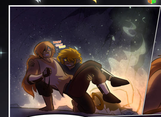
—where we now see that Falst's position is raised above Dainix's due to the way he's carrying him. (Points for continuity!) And, of course, we see the little "huffs" flowing from orange to yellow over their heads (where Dainix's head is higher than Falst's) to merge the sound of their breathing, which is absurdly clever because it emphasizes to the viewer how we hear two sets of huffing overlaying each other, not one. Absolutely brilliant.
(A few other notes of appreciation to that panel: beautiful glows around them, the sparks, the jagged silhouette of the spider legs, the lovely colors that have no right to make the area around a spider corpse that pretty, the excellent texturing on the cave walls plus perspective, the way Falst's movements imply Dainix's hefty weight, the natural posing of the characters, their on-point expressions that convey exactly how fuckin terrifying everything is right now, the slight glows to their eyes, and also they're just handsome boys <3)
Next up: Rain!!!! So well done! It's subtle enough that it never ever disrupts the impact of the focal point, but evident enough you can tell! And more importantly: THE MIST OFF THE CHARACTERS. Rain does this irl, it has that little vapor that comes off you and makes that little misty effect that plays with lighting, it's so cool-looking and here it's used to such pretty effect!
One of the panel captions says something about it blurring out all the injuries on the characters but like THAT AIN'T TOO BIG OF A PROBLEM when it gets across the environmental vibes, and also that'd be how it would look in real life too so like… outside viewer's angle is the same as the characters', mostly? my point is: that's the environment!!! that's the vibes, that's the feel! It gets it across and it does so in the most pretty way possible!
And another thing re: rain, the use of it to establish perspective, particularly in panels like this—

—where we can tell we're looking down at Tynan due to the perspective on the rain and where it's pointing. Excellent. (Also, kudos for looking down and emphasizing how Tynan's losing his advantage—lovely use of visual storytelling.)
Additionally, the misting here:
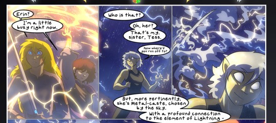
We see it most heavily in the leftmost panel, where it's quite foggy as you would expect in a rainstorm, especially in an environment with a lot of heat, but it's also lightly powdered on in the following two panels and tends to follow light sources, which makes complete sense given how light bounces off particles in the air.
A major point of strength in these too is a thorough understanding of lighting, like rim lighting, the various hues and shades, and an intricate understanding of how light bounces off surfaces even when they're in shadow (we'll see a faint glow in spots where characters are half in shadow, but that's how it would work in real life, because of how light bounces around).
Bringing some of these points together: the fluidity of the lines in magic, and the way simple glowing lines are used to emphasize motion and the magic itself, is deeply clever. I'm basically pulling at random from panels and there's definitely even better examples, but here's one (see this page https://comicaurora.com/aurora/1-16-33/):

First panel, listed in numbers because these build on each other:
The tension of the lines in Tess's magic here. This works on a couple levels: first, the way she's holding her fists, as if she's pulling a rope taut.
The way there's one primary line, emphasizing the rope feeling, accompanied by smaller ones.
The additional lines starbursting around her hands, to indicate the energy crackling in her hands and how she's doing a good bit more than just holding it. (That combined with the fists suggests some tension to the magic, too.) Also the variations in brightness, a feature you'll find in actual lightning. :D Additional kudos for how the lightning sparks and breaks off the metal of the sword.
A handful of miscellaneous notes on the second panel:
The reflection of the flames in Erin's typically dark blue eyes (which bears a remarkable resemblance to Dainix, incidentally—almost a thematic sort of parallel given Erin's using the same magic Dainix specializes in?)
The flowing of fabric in the wind and associated variation in the lineart
The way Erin's tattoos interact with the fire he's pulling to his hand
The way the rain overlays some of the fainter areas of fire (attention! to! detail! hell yeah!)
I could go on. I won't because this is a lot of writing already.
Third panel gets paragraphs, not bullets:
Erin's giant-ass "FWOOM" of fire there, and the way the outline of the word is puffy-edged and gradated to feel almost three-dimensional, plus once again using Screen or a variation on it so that the stars show up in the background. All this against that stunning plume of fire, which ripples and sparks so gorgeously, and the ending "om" of the onomatopoeia is emphasized incredibly brightly against that, adding to the punch of it and making the plume feel even brighter.
Also, once again, rain helping establish perspective, especially in how it's very angular in the left side of the panel and then slowly becomes more like a point to the right to indicate it's falling directly down on the viewer. Add in the bright, beautiful glow effects, fainter but no less important black lines beneath them to emphasize the sky and smoke and the like, and the stunningly beautiful lighting and gradated glows surrounding Erin plus the lightning jagging up at him from below, and you get one hell of an impactful panel right there. (And there is definitely more in there I could break down, this is just a lot already.)
And in general: The colors in this? Incredible. The blues and purples and oranges and golds compliment so well, and it's all so rich.
Like, seriously, just throughout the whole comic, the use of gradients, blending modes, color balance and hues, all the things, all the things, it makes for the most beautiful effects and glows and such a rich environment. There's a very distinct style to this comic in its simplified backgrounds (which I recognize are done partly because it's way easier and also backgrounds are so time-consuming dear gods but lemme say this) and vivid, smoothly drawn characters; the simplicity lets them come to the front and gives room for those beautiful, richly saturated focal points, letting the stylized designs of the magic and characters shine. The use of distinct silhouettes is insanely good. Honestly, complex backgrounds might run the risk of making everything too visually busy in this case. It's just, augh, so GORGEOUS.
Another bit, take a look at this page (https://comicaurora.com/aurora/1-15-28/):
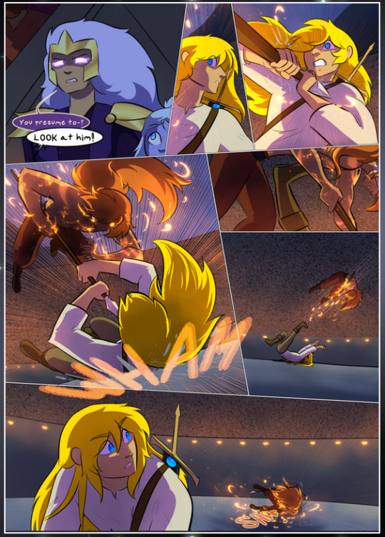
It's not quite as evident here as it is in the next page, but this one does some other fun things so I'm grabbing it. Points:
Once again, using different colors to represent different character actions. The "WHAM" of Kendal hitting the ground is caused by Dainix's force, so it's orange (and kudos for doubling the word over to add a shake effect). But we see blue layered underneath, which could be an environmental choice, but might also be because it's Kendal, whose color is blue.
And speaking off, take a look at the right-most panel on top, where Kendal grabs the spear: his motion is, again, illustrated in bright blue, versus the atmospheric screened-on orange lines that point toward him around the whole panel (I'm sure these have a name, I think they might be more of a manga thing though and the only experience I have in manga is reading a bit of Fullmetal Alchemist). Those lines emphasize the weight of the spear being shoved at him, and their color tells us Dainix is responsible for it.
One of my all-time favorite effects in this comic is the way cracks manifest across Dainix's body to represent when he starts to lose control; it is utterly gorgeous and wonderfully thematic. These are more evident in the page before and after this one, but you get a decent idea here. I love the way they glow softly, the way the fire juuuust flickers through at the start and then becomes more evident over time, and the cracks feel so realistic, like his skin is made of pottery. Additional points for how fire begins to creep into his hair.
A small detail that's generally consistent across the comic, but which I want to make note of here because you can see it pretty well: Kendal's eyes glow about the same as the jewel in his sword, mirroring his connection to said sword and calling back to how the jewel became Vash's eye temporarily and thus was once Kendal's eye. You can always see this connection (though there might be some spots where this also changes in a symbolic manner; I went through it quickly on the first time around, so I'll pay more attention when I inevitably reread this), where Kendal's always got that little shine of blue in his eyes the same as the jewel. It's a beautiful visual parallel that encourages the reader to subconsciously link them together, especially since the lines used to illustrate character movements typically mirror their eye color. It's an extension of Kendal.
Did I mention how ABSOLUTELY BEAUTIFUL the colors in this are?
Also, the mythological/legend-type scenes are illustrated in familiar style often used for that type of story, a simple and heavily symbolic two-dimensional cave-painting-like look. They are absolutely beautiful on many levels, employing simple, lovely gradients, slightly rougher and thicker lineart that is nonetheless smoothly beautiful, and working with clear silhouettes (a major strength of this art style, but also a strength in the comic overall). But in particular, I wanted to call attention to a particular thing (see this page https://comicaurora.com/aurora/1-12-4/):
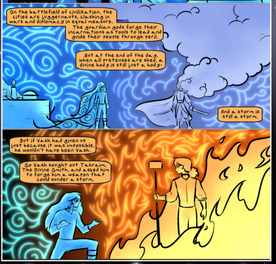
The flowing symbolic lineart surrounding each character. This is actually quite consistent across characters—see also Life's typical lines and how they curl:
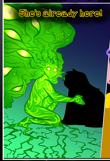
What's particularly interesting here is how these symbols are often similar, but not the same. Vash's lines are always smooth, clean curls, often playing off each other and echoing one another like ripples in a pond. You'd think they'd look too similar to Life's—but they don't. Life's curl like vines, and they remain connected; where one curve might echo another but exist entirely detached from each other in Vash's, Life's lines still remain wound together, because vines are continuous and don't float around. :P
Tahraim's are less continuous, often breaking up with significantly smaller bits and pieces floating around like—of course—sparks, and come to sharper points. These are also constants: we see the vines repeated over and over in Alinua's dreams of Life, and the echoing ripples of Vash are consistent wherever we encounter him. Kendal's dream of the ghost citizens of the city of Vash in the last few chapters is filled with these rippling, echoing patterns, to beautiful effect (https://comicaurora.com/aurora/1-20-14/):
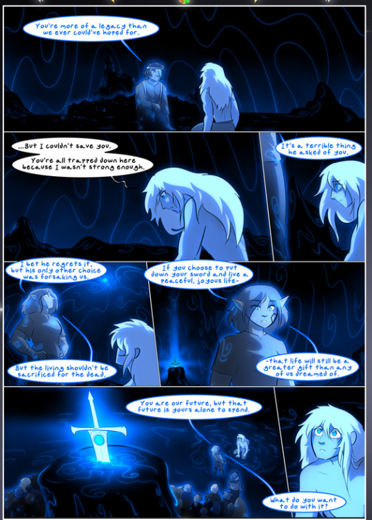
They ripple and spiral, often in long, sinuous curves, with smooth elegance. It reminds me a great deal of images of space and sine waves and the like. This establishes a definite feel to these different characters and their magic. And the thing is, that's not something that had to be done—the colors are good at emphasizing who's who. But it was done, and it adds a whole other dimension to the story. Whenever you're in a deity's domain, you know whose it is no matter the color.
Regarding that shape language, I wanted to make another note, too—Vash is sometimes described as chaotic and doing what he likes, which is interesting to me, because smooth, elegant curves and the color blue aren't generally associated with chaos. So while Vash might behave like that on the surface, I'm guessing he's got a lot more going on underneath; he's probably much more intentional in his actions than you'd think at a glance, and he is certainly quite caring with his city. The other thing is that this suits Kendal perfectly. He's a paragon character; he is kind, virtuous, and self-sacrificing, and often we see him aiming to calm others and keep them safe. Blue is such a good color for him. There is… probably more to this, but I'm not deep enough in yet to say.
And here's the thing: I'm only scratching the surface. There is so much more here I'm not covering (color palettes! outfits! character design! environment! the deities! so much more!) and a lot more I can't cover, because I don't have the experience; this is me as a hobbyist artist who happened to take a couple design classes because I wanted to. The art style to this comic is so clever and creative and beautiful, though, I just had to go off about it. <3
...brownie points for getting all the way down here? Have a cookie.
#aurora comic#aurora webcomic#comicaurora#art analysis#...I hope those are the right tags???#new fandom new tagging practices to learn ig#much thanks for something to read while I try to rest my wrists. carpal tunnel BAD. (ignore that I wrote this I've got braces ok it's fine)#anyway! I HAVE. MANY MORE THOUGHTS. ON THE STORY ITSELF. THIS LOVELY STORY#also a collection of reactions to a chunk of the comic before I hit the point where I was too busy reading to write anything down#idk how to format those tho#...yeet them into one post...???#eh I usually don't go off this much these days but this seems like a smaller tight-knit fandom so... might as well help build it?#and I have a little more time thanks to break so#oh yes also shoutout to my insanely awesome professor for teaching me all the technical stuff from this he is LOVELY#made an incredibly complex program into something comprehensible <3#synapse talks
785 notes
·
View notes
Text





I love all of these goofy product photos where the water bottle is extremely obviously just photoshopped onto a stock image of someone pretending to hold something or whatever.. very convincing..
#the last one where the water bottle is like nearly the size of the woman's entire leg ghbjbjhh#ALSO I know.. gross.. nasty.. amazon.. I was only looking there because I was trying to find an exact replica of an old water bottle#I bought like 6 years ago in a store and I just wanted another one of those and it seemed like the only place the old manufacturer#still sold was through amazon but.. alas.. I think they just don't make them anymore. so I have abandoned my hunt#I didn't actually buy anything. but I did get distracted clicking through product images for a few of them#it's bizarre how like............... idk.. WHY is this done??? Isn't this offputting to basically ANY potential customer?? or do people#not look at every photo/read the entire page/all product information before buying??#all of these are from like front page ''top sellers'' or whatever like........... how does this not hurt the brand????#If the company can't even bother to take a single photo of a real life person using their real life product then... that to me#is kind of red flaggy..?? even if you're an indie start up small business with hardly any funds.. still#A real photo of the product you are selling in a real actual non-photo shopped environment does not seem that inacessible#Maybe it's because everyone does everything on phones now?? So it's harder to see the pictures when they're smaller?#Kind of the same thing with ai art and also hair color photoshops lol.. On my full comptuer screen it is SOOO easy to spot ai art#like IMMEDIATELy from the little tells and ways certain details morph into each other etc. I dont even mean obvious dalle mini stuff but#like the Fancy High Quality Photorealistic AI art is still pretty blatant 98% of the time if you know what to look for. But I still catch#people sharing it a lot like 'omg where can I buy this pair of shoes!! :O <3' .. erm you cannot.. that is the most balatantly fake looking#pair of shoes I have seen in my life hhjbj.. the heels are both different heights. there's a different number of straps on each one. etc.#AND that phase back before colored hair was Mainstream and people would post photos like 'omg going to bring this to the salon!! dream hair#and it's like.. you can LITERALLY see the parts where it's 'colored outside of the lines' and is so clearly just a person with blond hair#that someone drew over with a tint brush or something not even very neatly. etc. etc. ANYWAY.. Maybe with phones it's harder to tell these#things?? To me so much of it is instantly recognizable and it's suprising to me that people either don't notice or don't care and will#interact with it anyway by buying the product or acting like some ai art fake furniture is real or etc. etc. ..hewwoo#Aslo sidenote - I think I've become soo cynical and tired of constantly being advertised to that I literally cannot shop without getting#exhausted. I do not see how marketing is anything but obnoxious and transparent. Every item description having stuff like ''Our company is#commited to bringing you the highest quality water products! we set out with a mission to bring high quality products to people all over#the world and we believe in spreading health and happiness and'' just like SHUT THE HELL UP!! youre a fucking company#you don't ''beleive'' in anything you are here to sell a product. stop trying to talk like you're my bff who cares deeply about my health#or something just tell me the materials and product specifications of your stupid fucking water bottle and move on. Idont need to hear your#whole bullshit spiel about what ~your company stands for~ that is SO much MORE offputting. you make me want to buy the item LESS..#longing for the type of ads from my 1800s magazines that are just like 'this product is good. please buy it. okay thank you much. bye'
9 notes
·
View notes
Text
i always get questions when i do a split gifset, and it's a deceptively simple process so i thought i'd try to show how i do it! i don't know if these types of gifsets have a more universally recognized name, but that's what i call them so that's what i'm going with.
i'm going to write this assuming you have a solid familiarity with photoshop and making gifs, but please feel free to send me an ask if anything is unclear. i use video timeline/smart objects so will be showing that (here's a great general tutorial on giffing with timeline). i will also be talking A LOT about gif dimensions, so first let's briefly go over the limits and theory a little bit.
a 1 column gifset can accommodate gifs 540 pixels wide
2 columns = 268 pixels each with a 4 pixel gutter between
3 columns = 177, 178, 177 pixels with 4 pixel gutters
i'm mostly going to talk about 2 column split gifs here (what i will refer to as 2x1 from now on - 2 across and 1 high), but the process is the same for 3 column (3x1) and so on (1x2, 2x2, etc).
so, why would you even want to make a gifset like this? i mean, let’s face it, generally, bigger is better for gifs on tumblr, and there are obvious incentives to 540 width gifs over 268 or 177/8 width, especially since the upload limit went to 10MB. but even 10MB isn’t much when you’re talking about high quality footage. gif making is a constant balance between quality (whatever that means to you: frame dimensions, sharpening, coloring, etc) and file size. split gifs are a cheat to that limitation >:)
i personally believe an untapped frontier of tumblr gifmaking is playing with dimensions and time. that sentence makes me sound like an old-timey sci-fi villain, but you get the idea: gifmaking is an art and there are many fun and interesting ways of exploring the medium. you can do a lot with 268 pixels! longer frame loops to gif longer scenes unbroken, bolder coloring on a wide shot you don’t want to pare down. and, a shorter x axis means the y axis’s bang goes a lot further on a buck. also just if you have a 2 column set but only 5 gifs so you need to make one take up 2 slots. there's a lot of reasons but the most important one is it's fun :) here are some examples of other split gifs i've made: x, x, x
this isn't so much a limitation, more of a shift in how you think about gifs, but it's important to remember that each gif should ideally be doing something still. when making split gifs, it’s easy to pick a wide scene without thinking about how it’ll be split down the middle, and then you’re left with a lot of something on one side and a lot of incongruous nothing on the other - or you're left with a person cut in half awkwardly in the middle. so while a split gif can still be a whole scene, you shouldn’t ignore the break and what it means to the bigger picture. now this is personal preference, but i like to play with the break and make it a part of the gifset. mirrored movement, subjects trapped on either side but still talking to each other, a bird flying from one side to the other. fun with frames! it can be another way of drawing attention to specific images/moments/feelings happening within the same shot.
SIMPLE SPLIT GIFS
to more narrowly define what i’m calling “simple split gifs,” it’s one set of frames split down the middle into two separate gifs that are meant to play concurrently, side by side.
first thing's first, crop your gif and uncheck delete cropped pixels if it is not already (very important). i'm cropping it to the 1x1 size, in this case 268x350. if you need to see how the full size will look, you can try it out with 536 first. but this one is pretty easy, this is the exact center of the frame (the left boundary of this crop is the center line) and both their heads fit within their respective 1x1 crop.
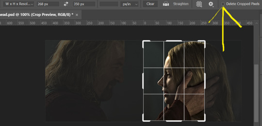
then color as you normally would. if your scene is very different one side to the other, it might be easier for you to color on a wider crop and then either crop again or copy paste your coloring to the smaller crop version. i do that with the 2x6s, but it's usually not that big a deal to color the 2x1s with just the small crop on your canvas at the time. this scene is very symmetrical, both in movement and colors, so i'm good.
now the fun part! once you've got one side how you want it, save/export as you normally would. at this point i also like to make a mental note of how many frames there are.

so i have 49 frames and it's still only ~3MB! this is just an example that i picked from my rotk fancy set, otherwise i probably would have made this gif longer.
then onto the other side, so i ctrl + z my way back to my smart object video timeline. to get to theoden i just drag and drop the smart object 268 pixels over. since this one is in the exact center of the image, it even helpfully guides me (this can get annoying if you are NOT giffing the center of the image fyi, but you can always manually go pixel by pixel too if you need to with your <- -> keyboard buttons. just always remember where you started and count accurately). i can never move around my smart object without hiding the adjustment layers on top of it, so you'll see me do that in this screen recording.
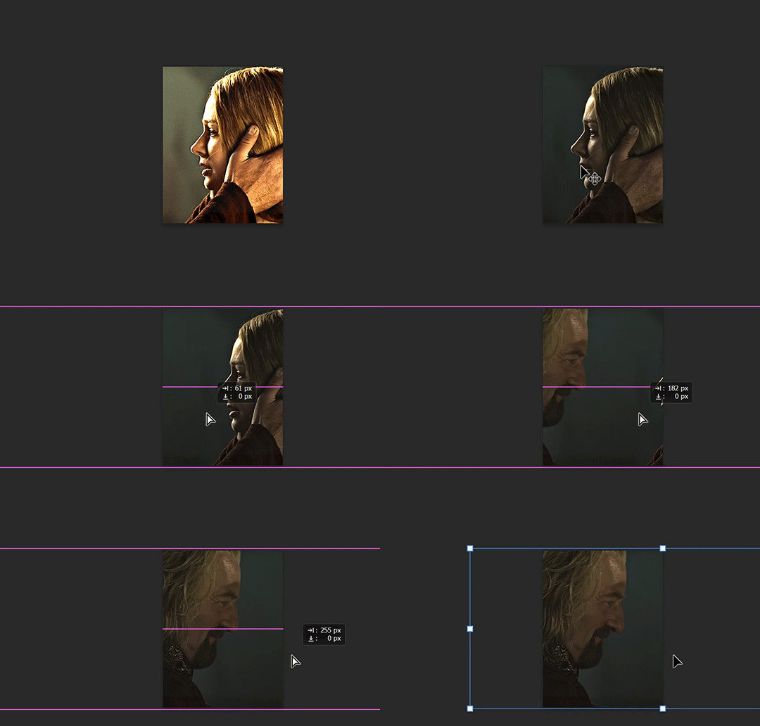
see how it corrected me when i dragged it a few pixels down by accident, and with all those pink guidelines? sometimes photoshop is good 😌
then make sure you still like the coloring, adjust whatever needs to be adjusted, but watch out! don't make any major changes because it still has to match the other side. and export again.

what we perceive as 1 series of frames chopped down the middle is just 2 separate gifs with the same frame rate. when tumblr loads the images, it will run concurrently in the post (even though it never does in the draft post 🙄). and that's it!
COMPLEX SPLIT GIFS
again i'm making up terms, but i call anything with more than 2 components a complex split gifset. i've tweaked some things in the process as i went along, but this is generally how i did the lotr series. these sets are basically just many split gifs with transitions. and here's where endurance becomes a factor :) there's a lot of prep done blind. but if set up well, it will be fairly easy to pull together by the end.
first i decide on my dimensions, using my upper bounds to determine how big i'm going to go. since lotr has very nice large file sizes, i can go pretty big without sacrificing much in quality. i decided on 3 rows of 350 pixel height gifs and it's worked well for me. that means my biggest gif will have a total height of 1050 pixels - fun! you could also do 8 rows, with two 2x2s or just a series of 2x1s that transition to 1x1s. there really is no limit to this except your imagination and source material.
i cap everything i'm going to use before i even open photoshop, then do all of them at once. uncheck delete cropped pixels, then i make my gifs! this is where i spend 90% of the time on this set. every gif should be the size of the smallest 1x1 gif (268x350 for me). i make all 10 into a fully colored, separate psd. (and then i usually go back through all of them a few times to get the colors to match better 😅) for the bigger ones (2x1: 536x350 and 2x6: 536x1050), i just crop them as if they were 1x1 but always thinking about how they will look when big. this gets tricky when i do the big one :) my lazy workaround for that is to basically make it twice: one cropped as it will be and one full size for me to color. then i copy and paste all the coloring layers onto the small one and voila, i know that the coloring in the upper right slice will also look good on the bottom left slice 1050 pixels away because i saw it on the full size version.
coloring is probably the biggest thing i'm thinking about with this kind of set. the whole idea is that these gifs are using the same colors, more or less, throughout each phase. even with the 1x1s, they're still part of a larger color concept, and they should (🤞) work with each other.

in a pinch, i like to eyedrop a color from one gif and add it as an accent to another. one of my 1x1s had a much more muted color palette originally, but i wanted it to have deeper blues and yellows to complement the 1x1 that would go next to it, so i added some gradients on lower opacity over it, color picked from other gifs i already colored.

i keep my coloring and the smart object in separate folders to help me in the final step of combining everything, and then i trim everything down to my lowest common denominator of frames. you might think you need to keep frames pretty minimal if you're doing 3 phases with transitions like this, but there's more room to work with on a small gif, in terms of file size. i usually do 30-50 frames for each phase, with the assumption that i'll be adding a transition on each side of each gif that will eat up some frames (i usually do 4-6 frame fade transitions). for the rotk set my final frame count was 129 and i never went over 8MB on a gif, so there's plenty of space play around with things :)
and then, combine! whatever order you start with, you are stuck with (unless you're getting even more complicated, but we won't go into that lol). for these sets i go small 1x1 -> medium 2x1 -> big 2x6. i like to think of it in phases from this point on. small is the first phase, then medium, then big. then i put in the fade transitions, chopping up the first phase gif so the last one will fade into it, restarting the whole cycle seamlessly. i'm just doing a quick and dirty fade here, but here's a tutorial if you want more explanation on transitions.
at this point i save this psd as its position, "top left" or whatever (usually it's a psb by this point too 🥲), just in case i need to go back to it. then i export this first gif and move on to the rest.
it's the same concept as a simple split gif: drag and drop the smart object to the new position, but now there are multiple phases to keep track of. folder organization has been key for me to keep everything straight. i move through the gifs in a backwards S, starting with the top left. but you could go any direction, just gotta stick with it and remember your counts. in my case, i'm always thinking of 268 pixels over and, for the 2x6, 350 up/down. it's a tedious process, but it goes quick (apart from waiting for photoshop to load each time you export).
i did this series as a color concept aesthetic kind of thing, so my theory was by using the same-ish colors throughout, that would save me in the end when it came time to export. there's only 256 colors max to work with on a gif, and that's usually what gets me over the 10MB limit. but as i said, i have never even gotten close to the size limit on this series. it's pretty hard to reach the limit on 268 pixels, but not impossible. (i did run into that on the emma set i did, and that was hell. but also not an impossible fix in the end.)
and that's it! if you try any of this and have trouble, i'm happy to help if i can but mostly this is a "click around and see what works for you" kind of process. and feel free to tag me on your split gifsets :) i love seeing them <3
#*lotrsplit#*#split gifs#gif tutorial#photoshop tutorial#usergif#allresources#chaoticresources#completeresources#photoshop tag
293 notes
·
View notes
Note
I'm loving the animal reference repository!! Such a fantastic resource and I can't wait to use some of these photos for studies or painting reference. I was just wondering, is there a way to download the photos from the website? On one hand I can imagine you disabled this purposefully to prevent AI scraping or other unwanted use. But at the same time it can be handy for people to have high res photos to work with, and I personally like to have my reference photos in the photoshop file next to my drawing. (Also I was one of the people who asked about contributing photos. I honestly think the first 3 points you mentioned could be worked around quite easily. However the 4th (workload) is one I can't argue against of course. I'll see if I can make a small donation and if you ever do open up contributions... I'll be happy to share!!)
Yes! I want people to be able to save images, and you can! But Squarespace's image gallery setup makes it a pain to do. I've actually got a page on the site showing how to do that - do I need to make it more prominent?
The important thing to know is that when you click on a single image, it opens in a "lightbox" display, which for complicated web reasons won't let you save files directly from it. Saving has to be done when viewing the larger gallery page (the species page with all the images).
On mobile:
In gallery view, tap and hold on the image again you’re interested in saving. Tap “Save to Photos” to save it to your phone.
This will not work if you are viewing a single image full-screen on mobile. If viewing the image full-screen you can take a screenshot, but the resulting image will be lower resolution than if you saved it from the gallery view.
How this looks will vary on Android devices, but I've had friends confirm the pathing is pretty much the same even if the layout is a little different.

On desktop:
In gallery view, right click on the image you want to save and click on the “Save Image As” option.
This will not work if you are viewing a single shot full-screen in lightbox mode. If viewing a photo full-screen you can take a screenshot, but the resulting file will be lower resolution than if you saved it from the gallery view.

This worked when I set the site up, shoot me a note if it's broken since then.
The gallery pages allow me to mass-upload files so I don't have to do individual photo uploads, and they're more responsive on mobile... but this is the downside to that ease of use on the back-end.
103 notes
·
View notes
Text

WORKING WITH YOUTUBE QUALITY - HOW TO GET THE BEST RESULTS
helloooo, i recently feel as though i have found the key when it comes to dealing with youtube quality and i thought it was worthwhile sharing! i'm finding that when you're stuck with 1080p videos only, (although there is a lot more 4k downloads these days, thankfully) the quality is pretty poor. BUT, this is speaking exclusively about the quality of youtube 1080p - if you use a site such as sharemania, that's usually acceptable and good quality and doesn't deliver poor results.
but alas, this is about youtube, so let's get into it! this process will simply go over all the ins and outs of working with youtube quality, and will not look into the entire giffing process. i'll be using photoshop 2025, but it should work on any version!
Download your video.
firstly, start by downloading your video with 4k video downloader. (<- this will lead directly to a dl of 4k video downloader if you don't have it already! link is all safe and official <3) i can't really think of any other downloader because i haven't used any apart from this one. it's safe and secure and does a really good job.
you'll want to choose the 1080p option that is the BIGGER file amount. not every video will have that, but i believe that the bigger file size is the youtube premium 1080p. take what you can get with them 😭
2. Load frames, crop, convert to smart object...
just get your normal prep work done! make sure to leave out sharpening. you should essentially just be here:

(if my process looks a bit odd or if, on the other hand, you'd like to know my process, you can check that here.)
3. sharpening.
THIS is the point that changes how your youtube file comes out. often times, you'll find the gif comes out with chunks, squares and overall poor quality. kind of like if i used my regular sharpening:

chunky! gross! trashy! i'm seeing too many pixels and things aren't looking the right way that i'd like. (tbh, it's not the worst i've seen - but you can definitely notice when there's light.) if i went on as it is now and continued to colour it, it would continue to look bad.
so, here's what you'll do.
i use multiple sharpening actions, for different purposes: one for hq downloads, so any movies, tv or downloaded/4k music videos, one making icons and the other for lower quality media and photos. the one that i typically use for youtube quality is @/anyataylorjoy's sharpening action (which many gifmakers use, so i wouldn't be surprised if you do already have it!) which is what you'll use. apply the action, using the 'sharper' lot.

^ that's the settings.
4. sharpening pt 2. (noise)
now, you'll need to add noise to offset how harsh the rest of the gif still comes up.
apply these exact settings onto the gif and ensure that monochromatic is enabled.

sometimes, 2% noise might make it look worse, or not be enough. i personally wouldn't go to anything more than 3%, (i don't think you'll ever want to use 3%) and wouldn't go lower than 1%.

it's grainy looking at the moment, just as is. from here, i'll colour it, and then if i think it's no good, i'll go back and clear the noise filter and toggle it. that's just how the process works, don't stress if it doesn't always go your way 😭 that's just gifmaking!
here's the final product!

and here's another example too, i know this one has a lot going on colour wise, so it can be good to look at it working on something with less bright colours:

as compared to before! before shows the gif was really smooth, as compared to in chappell's, were the lighting was just kind of messing with everything. you're more likely to come across videos that are that weird smooth quality, so i'd say that 7 times out of 10 you'll be applying these settings to something more along the lines of doechii's!

the before :)
#*tutorial#**l.myeditss#gif tutorial#gifmaking tutorial#photoshop tutorials#just a little something :D#flashing tw
210 notes
·
View notes
Text
Alright, last Current Events Drama post, is not a super valuable activity after all. I have seen a lot of Discourse that goes like "I may oppose these efforts but man the PR strategy of this Musk thing is pretty genius, they have a whole generation of people thinking USAID was funding the Liberal Media now". And they certainly aren't without agency, I agree there is an intentional PR strategy going on. In particular it is not just the creation of narrative, but the creation of momentum - every day is a new discovery, a new victory, a sense of progress.
But this isn't really that hard when your supporters are just really stupid? Like you can make shit up for these people! They don't care, they don't have that instinct that goes "okay hold up I'm going to need to see some sources here". The current Admin didn't make that happen, that is a deep, structural change around the internet flattening hierarchies and all that shit. When you know your audience wants results and also you can just invent results out of thin air then, idk, is this that hard? How could you not deliver that?
It is funny because the actual playbook here isn't even their invention, it is the same as the 2010's "Woke Boom". That entire model was that deep, slow, technical solutions to structural inequalities achieved via grinding electoral politics is boring. That shit is for fucking losers. I am not gonna have a role in that all! So instead we will achieve social change via randomly harassing my progressive coworkers for their black comedy tweets about AIDS until they get fired and have a nervous breakdown. Obviously - just like with the current right, don't be tricked! - there was another side of this movement that was much more serious, a huge side actually (we are just focusing right now). But for so many that serious side was window dressing, the real mush was that you got to feel like you were a part of something, doing something, and at a certain point they started running the show. This playbook being reversed really isn't that impressive (and also, in a sense, inevitable)
I will give the Social Justice aggros though that they had some standards - passing around photoshopped tweets was uncommon. Most of them did actually believe in this model for change (and so invented insane ideologies to justify it, but w/e). That isn't really as true on the right - I should partially walk back my statement above, a lot of these people aren't that gullible? They are just apathetic. So many people retweeting stuff about how The Deep State funnels millions to Politico don't really even care, for them it is a game. It is funny to own the libs. They laugh off your attempts at calling them out for accuracy - you care about that? What a cuck you are.
Which makes it particularly sad when you see the earnest ones, the ones writing essays about the implications of what USAID propping up the New York Times means for our political future. Nothing worse than being a true believer in a church where not only the leaders but also your fellow congregants know it is bullshit.
It reminds me of the Gamestop Meme Stock Crash and its slow, agonizing burn (a not unrelated event!). A bunch of people on the rise of the stock created the idea that buying Gamestop could Stick It To The Man, you could short squeeze the hedge funds, diamond-hands-hold that yield, bring Wall St to its knees - to the moon, baby. And some people bought it! And then the wheel turned, the crash happened, and most of the people posting those memes sold their stock and dipped so fast they had disappeared from the subreddits before they could even begin to say "bro, you thought I was serious?". Leaving a stalwart few holding the bag, spinning epicycles of conspiracy theories to justify why they had it to begin with. Which happens on autopilot a this point. You don't really need any PR strategy to make this happen.
#Though there is a second-order dynamic where now that they are in power the ability for meme-lib-owning to suffice will reduce#a tale for another time though
75 notes
·
View notes
Text
When I got to this photo in Katrina's collection of vintage family imagery, I was pretty stumped as to how to approach it.
There is a major problem when you zoom in to 100%.
The paper it was developed on has little micro bumps. When it was scanned, the light from the scanner caused a highlight on one side of the bump and a shadow on the other. This causes a pattern which is nearly impossible to eliminate using traditional techniques.
The easiest way to fix this is actually quite clever. You scan it once, then turn it upside down and scan it again. The second pass reverses the side the highlight and shadow appear on, so you can combine the images in Photoshop and blend them together, essentially canceling out the bumps. It's weirdly analogous to noise canceling headphones.
But I don't have access to the physical copy of this image.
So... now what?
Enter Fast Fourier Transform or FFT.
This is a filter that uses extra fancy math to recognize patterns in the image and eliminate them. There is a pretty good filter for Photoshop, but it does not work easily with newer Macs with Apple Silicon. I really did not want to figure that out, and I also was too tired to go downstairs to my PC. However, I learned that a Photoshop competitor, Affinity Photo, has this filter built in. So, I downloaded a trial copy and started the process of trying to figure out how to fix this image.
It was amazingly simple. It brings up these star patterns and you just paint black circles over every one but the center. It literally felt like magic. (Full screen with sound recommended)
So once I did this process I ended up with this...
The paper still had a rough texture but it was much easier to work with using traditional techniques. I started with a black and white conversion and meticulously went through the photo zapping scratches and flaws and balancing tones and sharpening facial features. All of my photo restoration tricks were needed.
I eventually landed here...

I then thought maybe I should match the sepia tone of the original print, so I got to here...
I think the black and white looks nicer in this instance, but I always like having options and this is the most faithful representation of how the photo originally looked.
But there is something else I have been playing around with lately. Photoshop has these experimental neural filters that use cloud processing to do various tricky enhancements. Most of them are in beta and they can be very quirky. But they have a colorizer that tries to detect people and things and adds color to them. Not every black and white photo is a good candidate. I have found these professional portrait photos work decently, but the filter is very hit-and-miss. And there are tools within the filter to help you make a miss more of a hit, but often I have to accept the photo isn't going to work.
But I decided to give it a shot with this one and surprisingly, the colorizer got me most of the way there.
I can work with that.
The one thing it does well is skin. Manually painting color onto skin is tricky and requires more skill and knowledge of traditional painting techniques than I have. But if a filter can do that part for me, I can do the rest.
So after my touchups, I got the image to here.

All I have left to do is my standard color enhancements to make them a little less ghostly and a little more human.
And I present to you where I started and the finished product. I encourage you to flip back and forth.


I'm not sure how, but I was able to go from an image I thought was impossible to edit to a beautiful colorized memory for my best friend's mom. I cannot wait to show her.
877 notes
·
View notes