#gifmaking tutorial
Explore tagged Tumblr posts
Text

WORKING WITH YOUTUBE QUALITY - HOW TO GET THE BEST RESULTS
helloooo, i recently feel as though i have found the key when it comes to dealing with youtube quality and i thought it was worthwhile sharing! i'm finding that when you're stuck with 1080p videos only, (although there is a lot more 4k downloads these days, thankfully) the quality is pretty poor. BUT, this is speaking exclusively about the quality of youtube 1080p - if you use a site such as sharemania, that's usually acceptable and good quality and doesn't deliver poor results.
but alas, this is about youtube, so let's get into it! this process will simply go over all the ins and outs of working with youtube quality, and will not look into the entire giffing process. i'll be using photoshop 2025, but it should work on any version!
Download your video.
firstly, start by downloading your video with 4k video downloader. (<- this will lead directly to a dl of 4k video downloader if you don't have it already! link is all safe and official <3) i can't really think of any other downloader because i haven't used any apart from this one. it's safe and secure and does a really good job.
you'll want to choose the 1080p option that is the BIGGER file amount. not every video will have that, but i believe that the bigger file size is the youtube premium 1080p. take what you can get with them 😭
2. Load frames, crop, convert to smart object...
just get your normal prep work done! make sure to leave out sharpening. you should essentially just be here:

(if my process looks a bit odd or if, on the other hand, you'd like to know my process, you can check that here.)
3. sharpening.
THIS is the point that changes how your youtube file comes out. often times, you'll find the gif comes out with chunks, squares and overall poor quality. kind of like if i used my regular sharpening:

chunky! gross! trashy! i'm seeing too many pixels and things aren't looking the right way that i'd like. (tbh, it's not the worst i've seen - but you can definitely notice when there's light.) if i went on as it is now and continued to colour it, it would continue to look bad.
so, here's what you'll do.
i use multiple sharpening actions, for different purposes: one for hq downloads, so any movies, tv or downloaded/4k music videos, one making icons and the other for lower quality media and photos. the one that i typically use for youtube quality is @/anyataylorjoy's sharpening action (which many gifmakers use, so i wouldn't be surprised if you do already have it!) which is what you'll use. apply the action, using the 'sharper' lot.

^ that's the settings.
4. sharpening pt 2. (noise)
now, you'll need to add noise to offset how harsh the rest of the gif still comes up.
apply these exact settings onto the gif and ensure that monochromatic is enabled.

sometimes, 2% noise might make it look worse, or not be enough. i personally wouldn't go to anything more than 3%, (i don't think you'll ever want to use 3%) and wouldn't go lower than 1%.

it's grainy looking at the moment, just as is. from here, i'll colour it, and then if i think it's no good, i'll go back and clear the noise filter and toggle it. that's just how the process works, don't stress if it doesn't always go your way 😭 that's just gifmaking!
here's the final product!

and here's another example too, i know this one has a lot going on colour wise, so it can be good to look at it working on something with less bright colours:

as compared to before! before shows the gif was really smooth, as compared to in chappell's, were the lighting was just kind of messing with everything. you're more likely to come across videos that are that weird smooth quality, so i'd say that 7 times out of 10 you'll be applying these settings to something more along the lines of doechii's!

the before :)
#*tutorial#**l.myeditss#gif tutorial#gifmaking tutorial#photoshop tutorials#just a little something :D#flashing tw
251 notes
·
View notes
Text
How To Gif: Glass Shatter Effect
By popular demand (ie, 7 people who voted in this poll), here is a tutorial on how to do the glass shatter effect I used to create the first gif in this set.
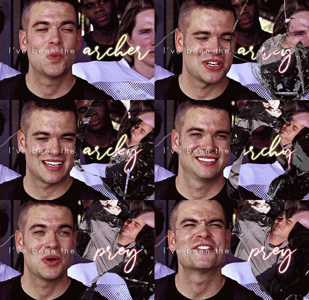
I use Photoshop CC 2015 (yes I know it's old) for my gifmaking, but you should be able to apply everything to newer versions of Photoshop. For this tutorial I'll be assuming you know the gifmaking basics, but if not, I would recommend this tutorial, which is the process I use to make gifs. Note that this particular process involves saving all of the frames, importing those frames into Photoshop, and then using an action to convert to a smart object.
Keep reading below the cut to learn how to do this effect!
Before I could start making this gif, I needed three things; the two scenes that I wanted to use, and a video of the glass shattering effect. I already knew the scenes I wanted, so then I took to YouTube to find a video which I can't for the life of me find again (edit: thanks to add1ctedt0you in the replies for linking this video!), but it looked like this:
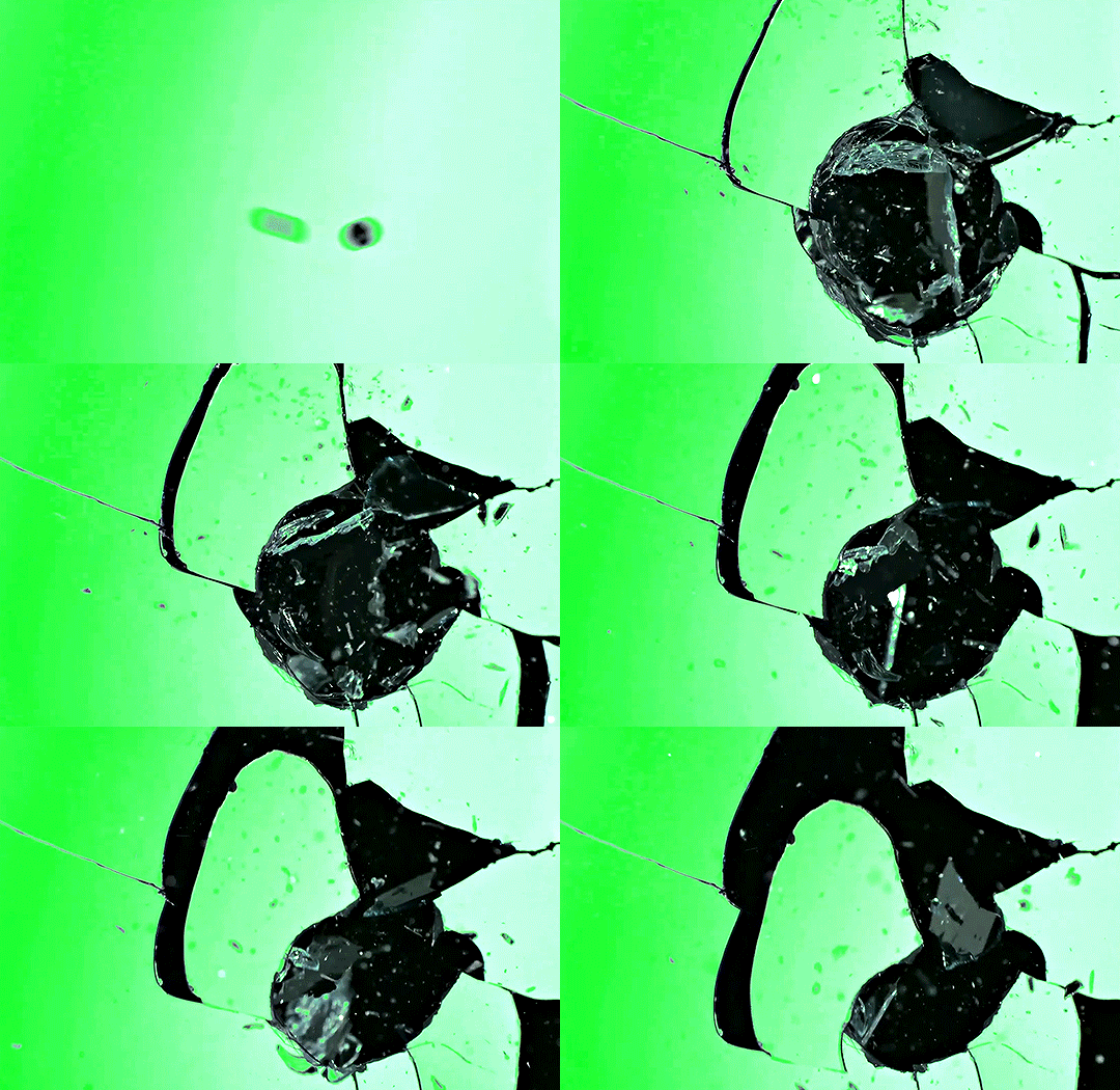
Something like this is what you want. Ideally the green part would be entirely white, but as long as there are two clearly different colours you can usually work with it.
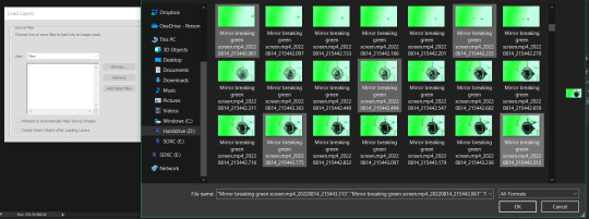
This looks a lot slower than the gif that I made, but that's not because of the frame rate - which is exactly the same above as in the final gif - it's just because there are extra frames in this slower one that I cut out. In the video I used, the glass shattering happened very slowly. I didn't want that, so I ended up skipping several frames when I loaded the frames into Photoshop before using my gifmaking action. I just did this by manually selecting one frame, skipping the next several before selecting another frame, and repeating this until I had selected 60 frames.
After using my gif action, I had a smart object of the glass shatter effect that looked like this:
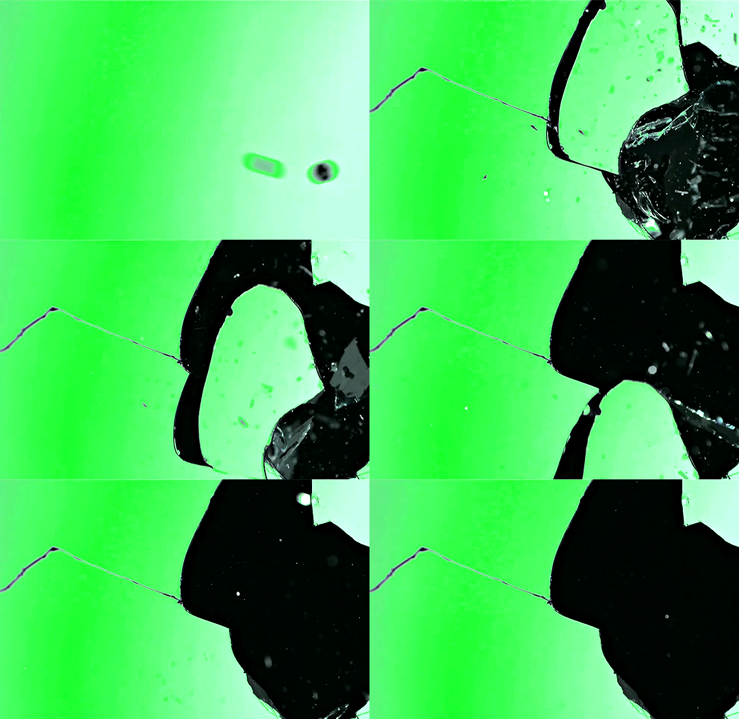
That's a much better speed! It still wasn't quite where I needed it to be though. I needed this in black and white, so I slapped a hue/saturation adjustment on the smart object and set the saturation all the way down to -100.
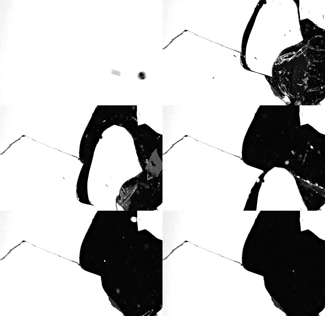
Okay great, I could start putting the gif together now.
First, I made a copy of the glass shatter smart object, because I'll need that later. Then, I pulled in frames from the scene that I wanted to appear in the hole after the glass shatters, and I used those to create a new smart object with my gif action (we'll call it Scene-bg). I pulled Scene-bg into the same window as the glass shatter objects. Then I created a new smart object by combining one of the glass shatter objects with Scene-bg, which I did by selecting both layers right clicking, and selecting "Convert to Smart Object".
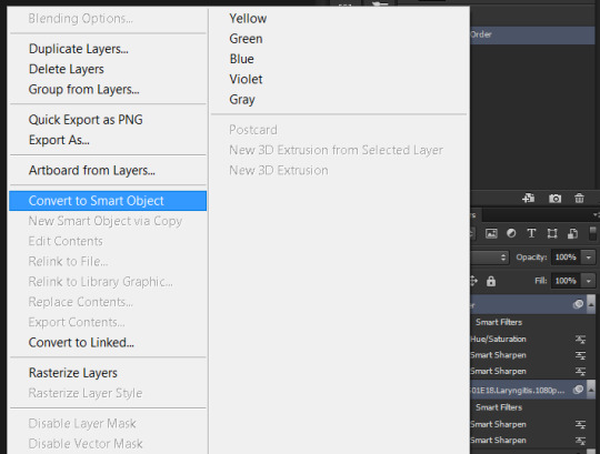
I renamed this smart object to Shatter-fg. I opened it by clicking on the little icon next to the layer name in the layers window here:
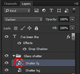
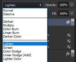
The most important thing here is that the shatter effect object should be the top layer, and I set the mode to "lighten". This will make sure that the lightest colour of either this layer and the layer behind it is displayed; that means that anywhere that's white in our shatter animation will still show up, but anywhere that's black we'll see what's in the layer(s) behind it.
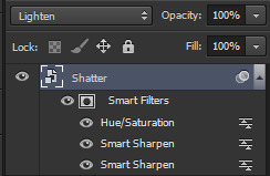
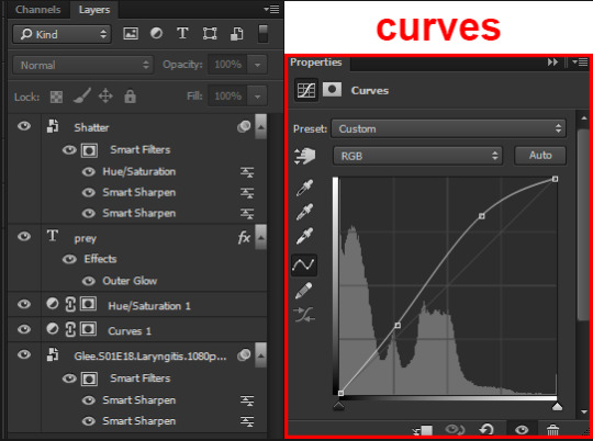
Then I threw some adjustment layers between them to get the colouring I wanted. I used a curves layer, a hue/saturation layer, and I also added text with an outer glow layer effect. Here's what the layer order looked like and the settings I used for each layer:
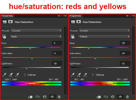
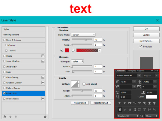
After this process, Shatter-fg looked like this:

Okay nice, this is starting to look like something! I saved this and went back to the main file with the other glass shatter object.
I needed to invert that other glass shatter object. There's a weird quirk with the version of Photoshop that I use where it doesn't like it when I apply specifically an invert adjustment to a smart object (it appears correctly when editing, but not on export) so I did this by creating a new smart object which included a separate invert layer, but if you have a newer version of Photoshop you can probably just apply the invert adjustment directly. Just note that you'll need to do one of these options; it won't work if you add a separate adjustment layer in the main file, it needs to be applied specifically to the smart object (which we'll now be calling Shatter-bg). It looked like this after I inverted it:
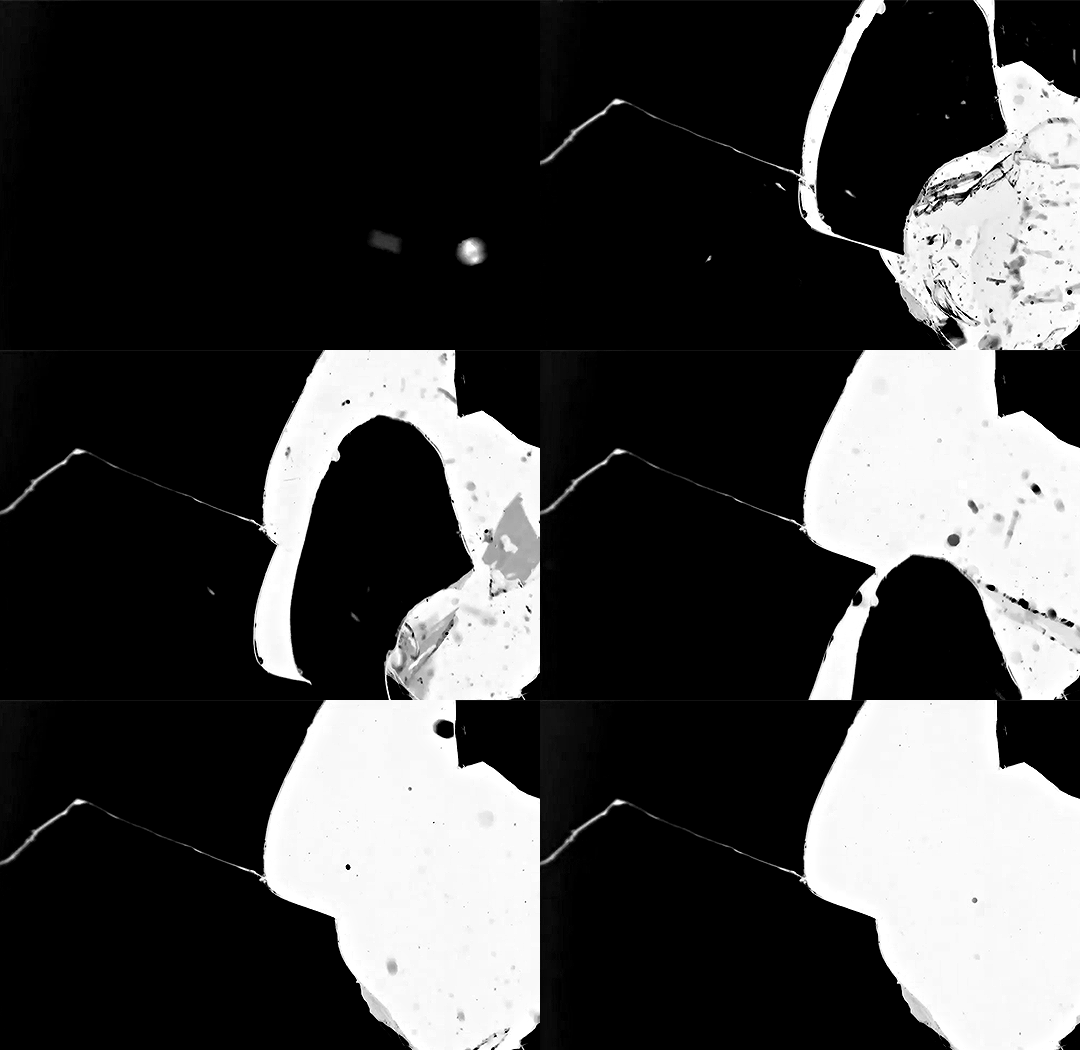
Once that's done, I made sure Shatter-fg was the layer directly above Shatter-bg, and set the mode of Shatter-fg to "darken" and Shatter-bg to "lighten". Since Shatter-fg is set to darken, it will be visible only when it is darker than the layer behind it. By setting Shatter-bg to lighten, I've guaranteed that the layer behind it will always be lighter (ie, white) in the places we want Shatter-fg to be visible, and will be black otherwise. Once I update those settings, this is what the gif looked like:
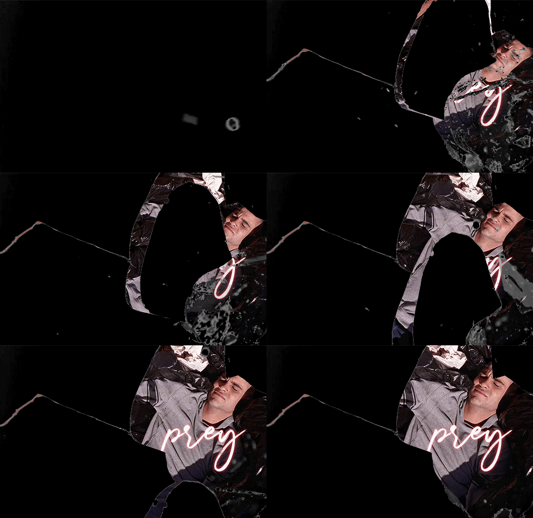
This is all there is to the glass shatter effect itself. Next I pulled in frames from the second scene to fill in the black areas. This layer needed to go below both glass shatter layers, so that it only shows through where the black. Then I added adjustment layers and some text. I used curves, hue/saturation, and vibrance adjustment layers, and I also added the "archer" text below the glass shatter layers so that it would be hidden to reveal the "prey" text. The other text I added above all of the layers, since I wanted this to be visible all the time. Here is the layer order and all of the settings I used for each of the layers:
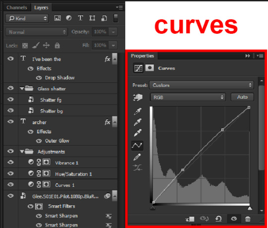
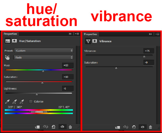
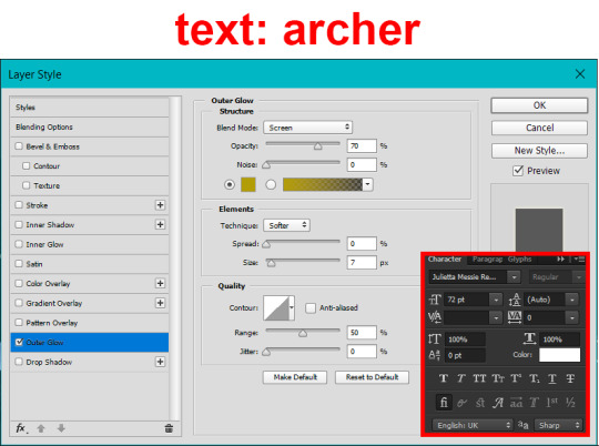
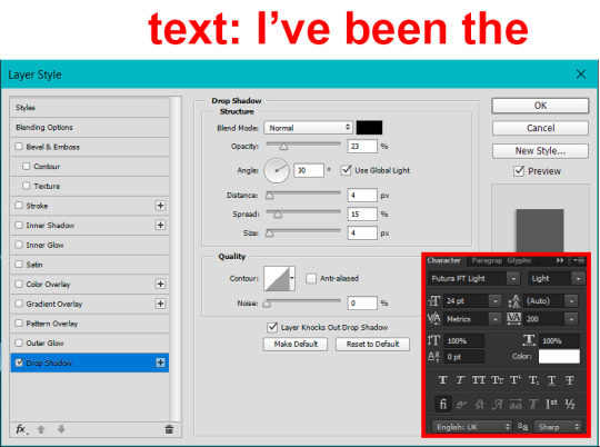
I also grouped Shatter-bg and Shatter-fg and shifted them on the timeline so there would be some time to see the background gif before the shatter effect starts.

And that's all! Then it''s just a matter of exporting the finished product:

This is the first gifmaking tutorial I've ever made, so I hope I was able to be reasonably coherent and helpful! I'd love to hear if you make anything by following these steps, or even if you just feel like you've learned something reading through this. And if you have any outstanding questions, feel free to reply or send me an ask and I'd be happy to answer!
#gifmaking#tutorials#gifmaking tutorial#gif tutorial#photoshop#photoshop tutorial#usergif#gleesource#my tutorials#mine#how to gif#tw mark salling#mark salling tw#not tagging as glee because it's not actually about that but wanted the tw tags just in case#this was so much more effort to put together than I thought it would be lmao#I was like oh yeah I've already made the whole gif I just need to go back and explain how I did that...#it took A WHILE#anywayyyy it was fun though so I'm glad I did it#would love to know if anyone finds this helpful or interesting or tries out the effect or something similar!#you can also just grab the black/white gif I included above if you want to do the effect since I can't find the video... sorry lol#but yeah you have my permission to steal the black/white gifs for gifmaking purposes if you would like#just don't like. post your own tutorial claiming you made it or something?? but like you don't need to credit me or anything obviously.#ANYWAYYYY#I feel like... a LITTLE pretentious thinking I'm good enough at making gifs to be qualified to make a tutorial#but like it's fineeee everything is fine#gonna finally post this now enjoy byeeee
118 notes
·
View notes
Text

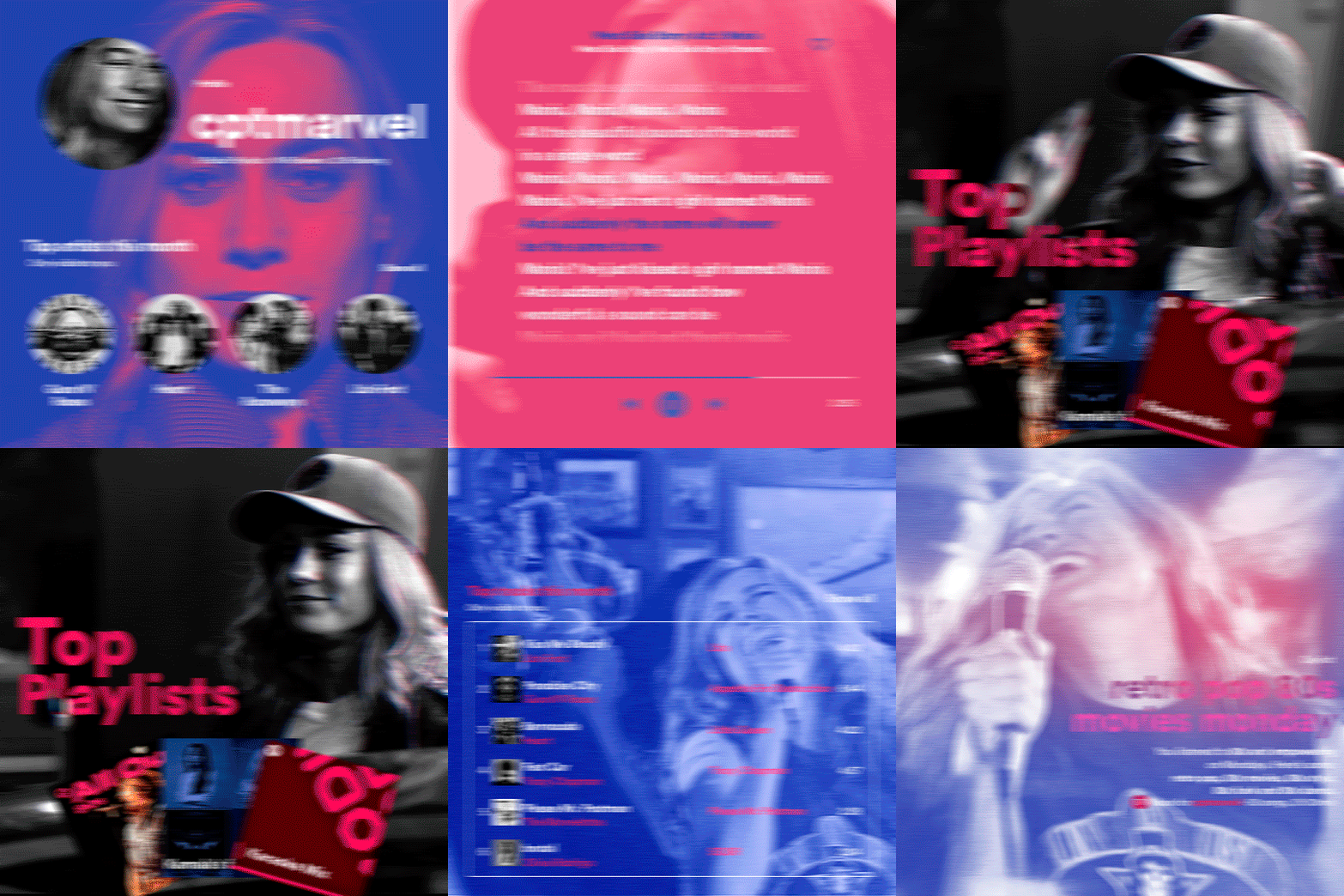
hi! someone requested me to do a tutorial based on this gifset!
this tutorial requires an intermediate knowledge of gifmaking. i won’t teach you how to do gifs from scratch, there are other tutorials for that out there.
[tutorial under the cut]
THE BASICS
AN INTRODUCTION
first off, the gifset in question is based on this gifset by @/eddiediaaz and i got permission from them to explain the process. i won’t be sharing the template because it’s a near replica of theirs (that isn’t shared to the public) and i don’t feel comfortable doing so, but you can recreate it by yourself just like i did!
also, ESL, so please pardon any mistakes.
THE FONT
Circular ST (Medium & Black). download it here & here.
CLIPPING MASKS
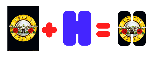
clipping masks are the way i put images and gifs inside of shapes. i used that method in the first and second gif of the Spotify gifset as you can see here. what does a clipping mask do? basically, it links two or more layers together in a way it follows the “shape” of your base layer. ie, everything that is shown follows the “shape” of your main layer and nothing more. your base layer can be anything: a shape, an image, a gif, a text, an adjustment layer, really everything. let’s see an example:
CLIPPING MASKS & SHAPES

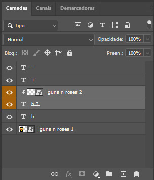
the original image (Gun 'n' Roses logo) is intact, as in, it’s not cut like a circle, something that cannot be undone. instead, everything outside the limits of the blue circle is just hidden. if i delete the base layer (the circle layer), the original image will appear as it originally is, as an rectangle. talking about layers, let’s see my layers panel (some things are in Portuguese, but i think you can understand):
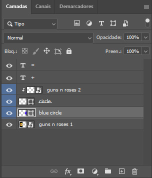
notice the little arrow pointing downwards to the “circle” layer. that is the clipping mask symbol. the base layer always needs to be below what is being clipped. if the base layer is deleted, the chain is broken and every layer clipped will now act independently and have its original shape. you can have as many clipped layers as you want. you can also have multiple chains going on in a .psd, each one with its own base layer. to clip a layer, you just need to press ctrl+alt+G or cmd+option+G while having the layer you want to clip selected (NOT your base layer). or, you can go to LAYER > CREATE CLIPPING MASK.
CLIPPING MASKS & TEXT
let’s see the same example, but with text instead:
A TIP
because adjustment layers are clippable, you can completely gif by using clipping masks. this is very useful when you have more than one gif inside a canvas and don’t want an adjustment layer to affect everything besides a certain layer/element.
let’s take my first gif of the Spotify gifset as an example.
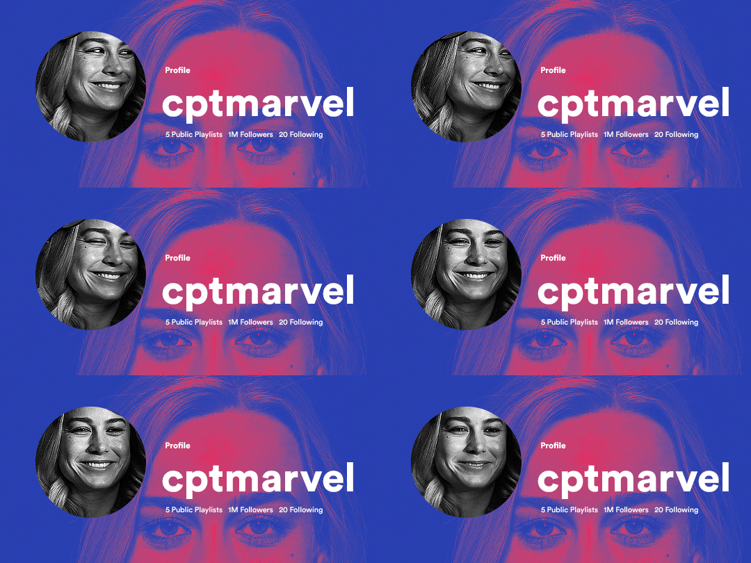
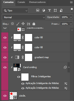
the circle is the base layer. the “Carol smiling” layer is my gif converted to a smart filter. above that “Carol smiling” layer, there is a black and white gradient map and two color fills of white so i can achieve the coloring you see. all those layers are clipping onto the circle layer, making my now b&w gif have the shape of a small circle as well. those layers are in a folder in the .psd of my first gif, so i don’t have multiple files sitting on my PC to assemble just one gif. i could have giffed that small gif separately and pasted it onto my canvas as well, but i like to do this way so i can adjust everything i want in real time instead of redoing a gif over and over every time i want to change something.
HOW TO MAKE EACH GIF
all gifs are 540x540px.
THE FIRST GIF
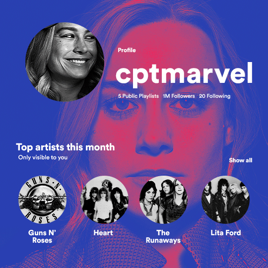
the first gif has 6 elements. the elements are: a big gif serving as a background (a close-up of Carol), a smaller gif inside a circle (a b&w gif of Carol smiling) as a profile picture and four static images for the featured artists. i giffed as i normally do (loaded screencaps, resized the gif, sharpened the gif, etc) for my background gif. to achieve the coloring, i’ve added a gradient map (layer > new adjustment layer > gradient map) purple to pink. to the profile picture, i made a 160x160px circle in the top left corner. the color of it doesn’t matter. the next step is a matter of taste: i giffed the smaller gif in the same .psd thanks to clipping masks that i explained earlier, but you can do it in a separate canvas too. for the featured artists, i made four circles with 98x98px each. for the images, i had to check Spotify for their selected PFPs. after that, i googled “[band/artist] spotify” to find the images. the PFP of bands and artists in the Spotify app are displayed in black and white, so you might have to make them b&w if you happen to find them only in color. to make the artists PFPs pop a bit more, i transformed them into smart filters and added a bit of sharpening to them (intensity 10 x radius 10). you can adjust the colors and the brightness if you want, too. the sizes of the texts in the gif are: 58px (username), 20px (top artists of the month), 15px (name of the artists), 12px (only visible to you + show all + profile) and 11px (following and follower numbers).
SECOND GIF
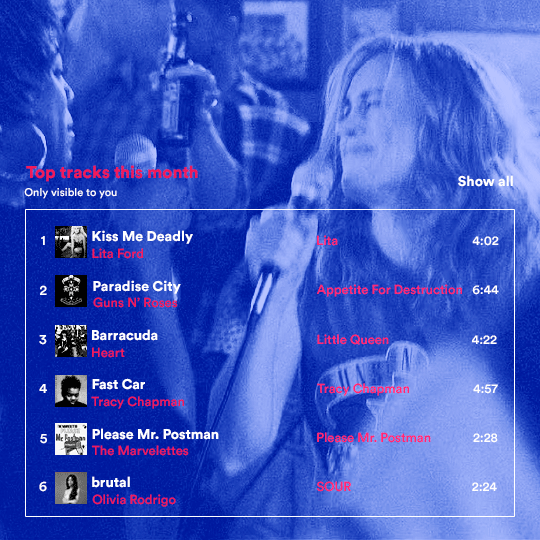
for the chart, i created a black rectangle (490x308px) that i set its blending mode to lighten (thus making it transparent) and i added an internal white stroke. i added the text and the little squares next to the top 6 numbers. the font sizes are: 17px (top tracks this month), 11px (only visible to you), 14px (song title, show all, top 6 numbers), 13px (artist/band, album title, length of the song). i added the album covers — that i made b&w — by clipping images onto 32x32px squares. for the coloring, i added a gradient map (dark purple > light purple).
THIRD GIF
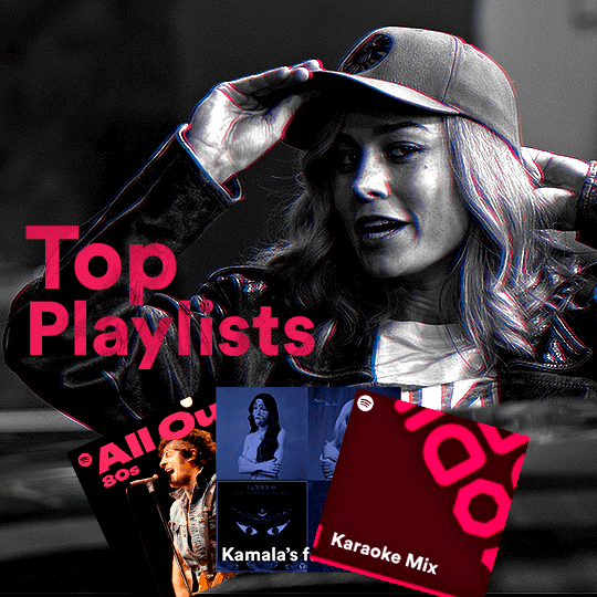
there are three types of playlists in this gif: a Spotify original playlist, a playlist made by a user and a Mix. you don’t have to follow this formula if you don’t want to, but in the case you do, here’s how i did it: browse Spotify for an original playlist of theirs. chances are, if you google the playlist’s name, you can find its cover on Google Images. at least, i found the “All Out 80s” cover that i used in my gifset. you can also create your own. for the user playlist, just pick four songs and find their (album) covers, also on Google. create a square canvas on Photoshop and make four squares, each in one quadrant of the canvas. paste your images onto your canvas and clip the images to each square. then, add a gradient map (black + whatever color you want) to all those images and title your playlist (font size: ). save that collage as a PNG and load to your gif canvas or merge all the layers+transform into a smart filter and drag the smart filter layer onto your gif canvas. now, the trickiest one. while you can invent your own Mix, i wanted to use a real one, but i had no idea on how to find them. thanks to reddit, i discovered that, if you search “made for you” on Spotify, you will find their Mixes! some of them are very whacky and specific! i just picked the Mix that made the most sense for Carol from that (gigantic) list. before doing the next step, i would advise you to google the name of the Mix you picked to see if you are able to find the cover of it with good quality. i wasn’t able to find mine (Karaoke Mix), so i just screenshotted my Spotify app, pasted that screenshot into Photoshop and cut the Mix cover and pasted that onto my canvas. the quality wasn’t great, so i transformed the cover into a smart filter, added a bit of gaussian blur and then sharpened it (intensity 10 x radius 10). the color wasn’t what i wanted either, so i used Hue/Saturation to change the hue. because the original image for the Mix was smaller than i wanted and i stretched it to make it bigger, the quality of the text and the Spotify logo was botched. i painted over the Mix cover and created a text with the font i linked earlier to replace its now pixelated title. i also painted over the little Spotify logo, found a logo in the internet and pasted over the Mix cover about the same size of the original logo. to achieve the “3D effect” of the gif, i made my b&w gif, the base. then, i duplicated all layers and added a gradient map (black > pink) and merged all the layers of that duplicate. i made a second replica of my gif, now with a different gradient map (black > blue). i set both replicas to the ligthen blending mode. you will notice that the replicas will "disappear" and only the original b&w gif will remain. if you move the replicas a bit, that colored border will appear. this doesn't work much in very bright gifs without a lot of dark areas, btw.
FOURTH GIF
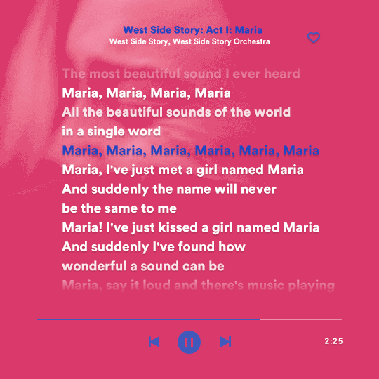
this gif used an altered (by me) version of this template. (i changed the fonts to match the rest of the gifset, too.) for the color text effect, you will have to gif with the timeline bar. take your gif’s length and do the math to find how many frames are ⅓ of it. take your lyrics’ layer and cut it into three equal parts or close to it by using the scissors icon in the timeline panel. in each third, change the color of just one line, line by line. when you play your gif, the colors of the lyrics will change like in Karaoke. you can do the same thing with frames iirc, though. i explained the timeline method because that’s the one i used in this gifset and use in general gif making. for the coloring, i added a gradient map. to make the colors pop a bit more, i add two gradient maps: the first one is in black and white, the other is in color. that adds depth to the blacks and darker colors of the gif.
FIFTH GIF
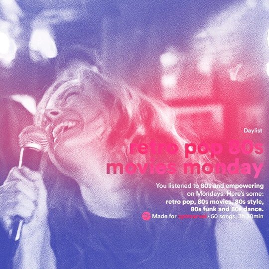
like in the Top Playlists gif, i wanted for my Daylist to be real as well. to achieve that, i listened to my Carol Danvers companion playlist (that you can listen here) for a long time until my Daylist refreshed itself. (Daylists refresh in certain times of the day — don't worry, Spotify will tell you when.) then, i just copied what it told me — the title and the genres i listened to generate such a Daylist, plus the genres i should check it out. you can invent your own Daylist if you want, but because it is generated by AI, i find very difficult to mimic its crazy titles, but you can try! you can also search in the web for other people’s Daylists if you want, but usually people don’t tell you what they listened to to get those playlists and nor what was recommended for them to listen to and i, at least, find that information important for the gifset. be aware that Daylists aren't available for every country yet (like in mine), but i found a way to work around that. the browser Opera GX offers a free "VPN" — not exactly a VPN, but it works close enough — so you can set your location to the US and listen to in-browser Spotify. i recommend not log into Tumblr while using Opera's VPN as there is a myth (that could easily be true!) that Tumblr terminates people's accounts that use a VPN. font sizes: 43px (daylist title), 13px (text), 12px ("daylist" & "made for"). for the flare effect, i searched for flare overlays on YouTube and downloaded one of those videos with 4K Video Downloader, a free software. i loaded the overlay into Photoshop and added a gradient map (purple > pink) over it, thus changing its color. i pasted the overlay onto my b&w gif and set its blending mode to screen. voila!
that's it! i hope you liked it and that i was able to express myself well. if you have any questions, feel free to contact me, i love helping people about their gifmaking questions! 💖
#*#*tutorials#gifmaker tag#dailyresources#usergif#completeresources#alielook#userairi#userhallie#userbess#userrobin#usershreyu#userzaynab#tuserju#tusermalina#tuserheidi#usertina#userabs#userbuckleys#usermagic#userjoeys#antlerqueen#userarrow#flashing gif tw
404 notes
·
View notes
Text
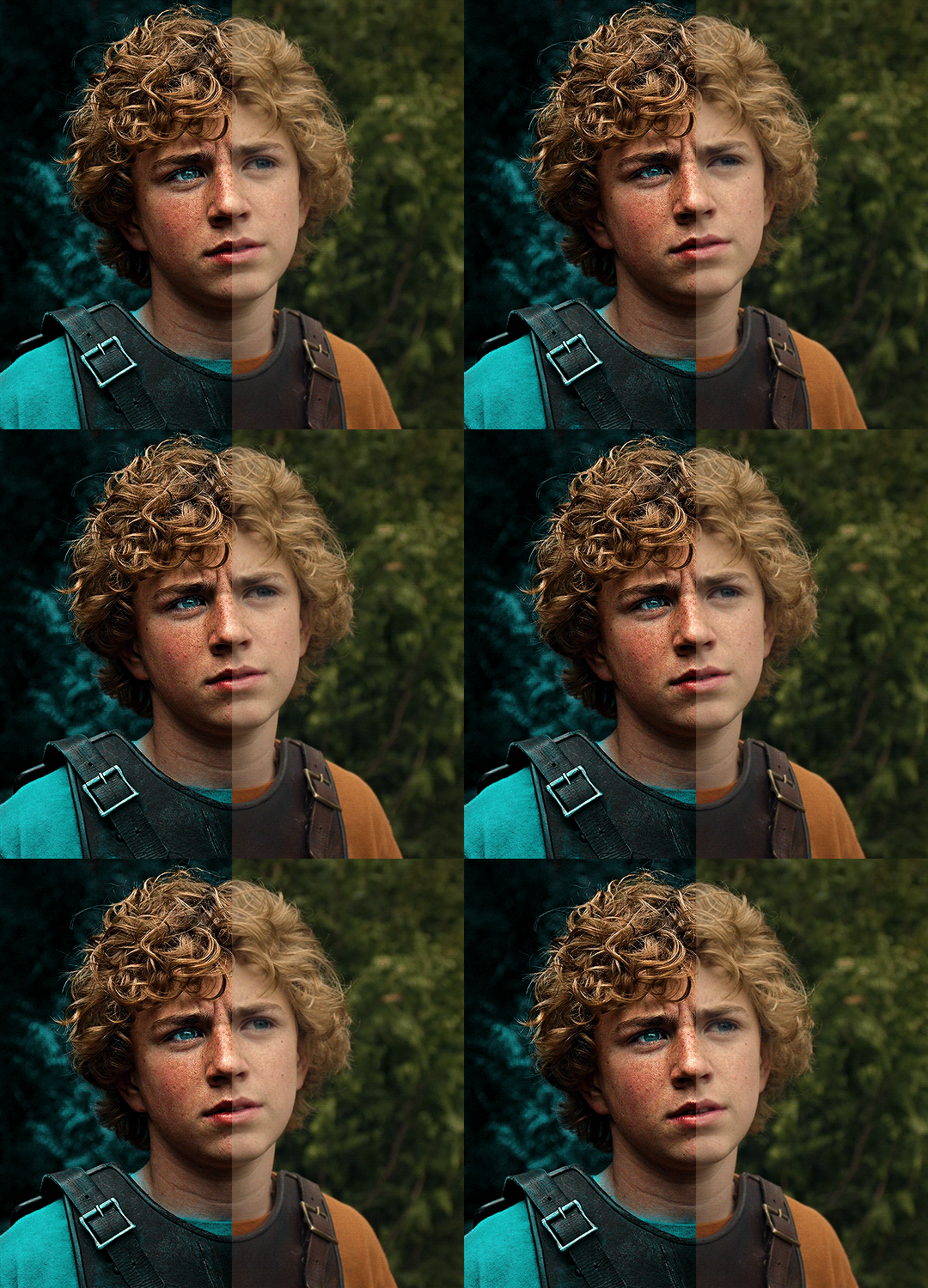
The silent art of gif making
The gif above has 32 layers plus 6 that aren't shown because this is part of a larger edit. I wanted to share it to give everyone a glimpse of the art of gif making and how long it usually takes for me to make something like this. This one took me about an hour and a half but only because I couldn't get the shade of blue right.
I use Adobe Photoshop 2021 and my computer doesn't have a large memory space (I don't know what to call it) so usually most of psds get deleted because I'm too lazy to get a hard drive. It doesn't really bother me that much because I like the art so when it's done, it's done. Off to somewhere else it goes.
Here are the layers:

Everything is neat and organized in folders because I like it that way. I prefer to edit it in timeline but others edit each frame. There's a layer not shown (Layer 4 is not visible) and it's the vector art. Here it is:
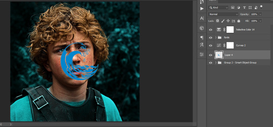
Now it is visible. I don't plan to make this a tutorial, but if you're interested I'd love to share a few tricks about it. I'm pretty new to the colors in gifmaking but the rest is simple to understand. Here, I just want to show how much work it takes to make it.
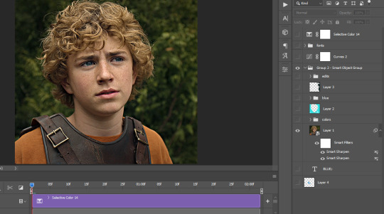
I opened Group 2 and here's the base gif. I already sharpened and sized it correctly but that's about it. Let's open the base coloring next.
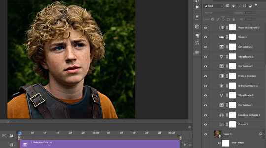
Yay! Now it looks pretty! The edits are in Portuguese but it doesn't matter. There's a silent art of adding layers depending on how you want the gif to look but you get used to it. The order matters and you can add multiple layers of the same thing (for eg. multiple layers of levels or curves or exposure).
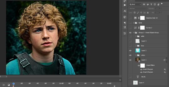
This was pretty much my first experiment with coloring so I don't know what I'm doing (this happens a lot with any art form but gifmaking exceeds in DIYing your way to the finished product) but I didn't want to mess up his hair, that's why the blue color is like that. Blue is easy to work with because there's little on the skin (different from red and yellow but that's color theory). I painted the layers like that and put it on screen, now let's correct how the rest looks.
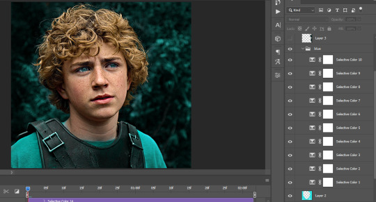
I was stuck trying to get the right teal shade of blue so yes, those are 10 layers of selective color mostly on cyan blue. We fixed his hair (yay!) we could've probably fixed the blue on his neck too but I was lazy. This is close to what I wanted so let's roll with that.
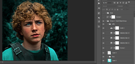
BUT I wanted his freckles to show, so let's edit a little bit more. Now his hair is more vibrant and his skin has red tones, which accentuates the blues and his eyes (exactly what I wanted!). That lost Layer 2 was me trying to fix some shadows in the background but in the end, it didn't make such a difference.
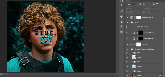
This was part of an edit, so let's add the graphics and also edit them so they're the right shade of blue and the correct size. A few gradient maps and a dozen font tests later, it appears to be done! Here it is:
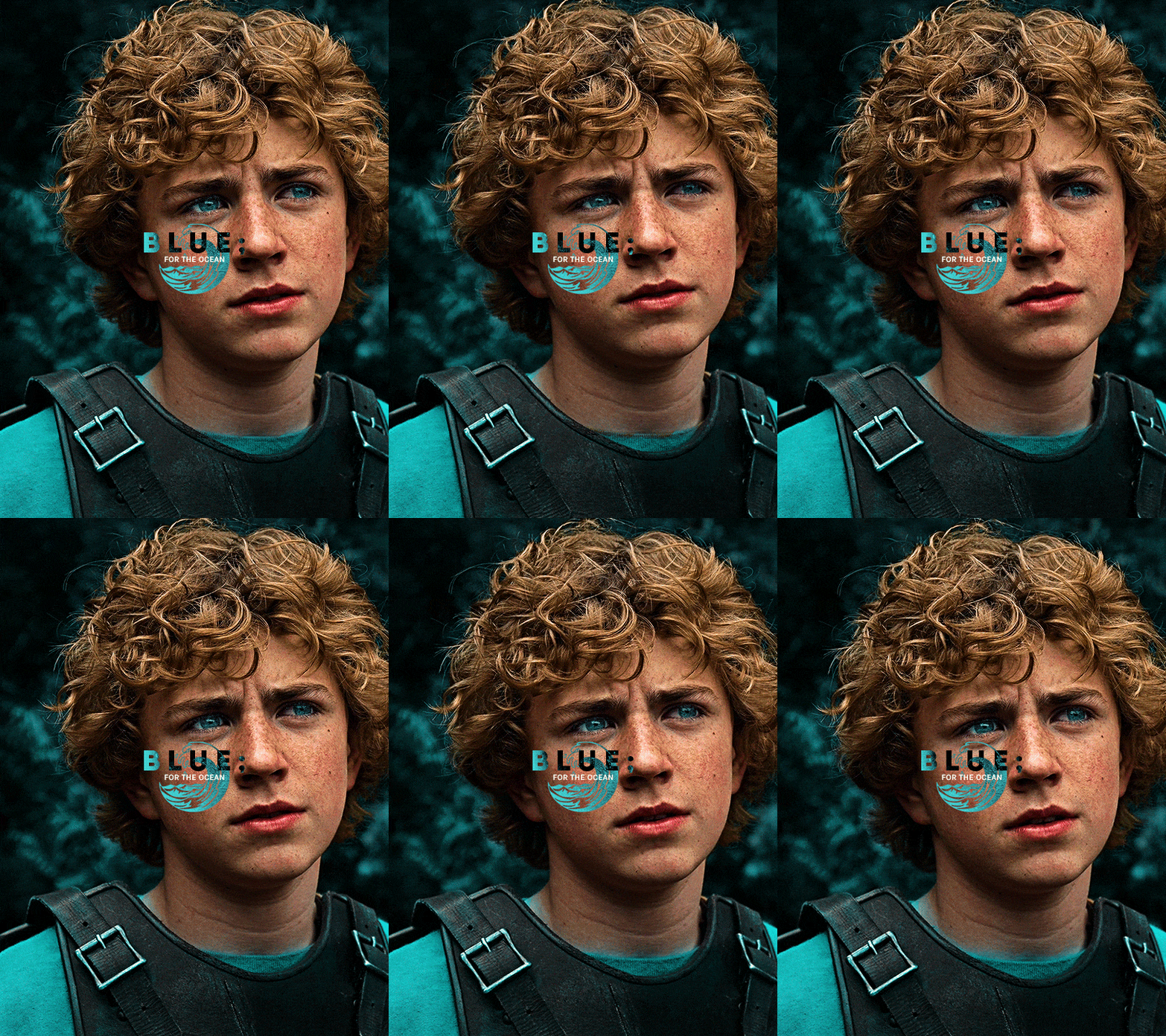
Please reblog gifsets on tumblr. We gifmakers really enjoy doing what we do (otherwise we wouldn't be here) but it takes so long, you wouldn't imagine. Tumblr is the main website used for gif making and honestly, we have nowhere to go but share our art here. This was only to show how long it takes but if you're new and want to get into the art of gif making, there are a lot of really cool resource blogs in here. And my ask box is always open! Sending gifmakers all my love.
#gif making#gif tutorial#resources#completeresources#y'know what that post yesterday got me into this#i love creativity so i send all my love to gifmakers#this is HARD#my tutorials#tutorials
668 notes
·
View notes
Text
Yaaaaaaay the tutorial for all of us who don't understand a thing 💖
For some reason, i only can use one main "Picture" folder to store them cause otherwise nothing works lmao Need to find out why, but that's story for another day lmao
Making Gifs Part 1 - Capturing Video
I am making this for @errruvande but I thought maybe others could use this guide to. This is my own personal workflow on how I make my gifs. Everyone has their own way of doing it, and there is no right or wrong way, but I have found this works best for me, with my limited tools and since I do not have photoshop.
Please note I am not an expert lol! There are people out there making far better gifs than me, and many other gifmaking resouces on Tumblr that are probably better than mine.
Keep reading below >>>
So there are two ways that I have found that work for capturing video. If you have the discs like I do, using a program like Videobyte BD-DVD Ripper works really well to grab video clips from Blu-Rays and DVD's. I recommend only using Blu-Rays if you have them. since DVD's are much lower quality.
However I have noticed the videos I captured with this program tend to be dark and have some compression artifacts, even when rip to an MKV with high quality settings. So I use a different method which I feel produces higher quality video captures.
I use Windows Screen Recorder (I have Win11 but this will work for all versions of Windows) with the quality settings set to High. In order to do this, go to Settings > Gaming > Captures and set the following:
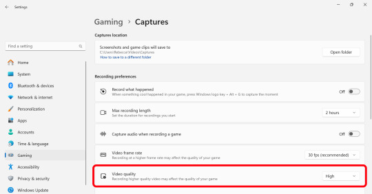
Make sure the Video Quality is set to High, set your Screenshots folder, turn off Audio (you don't need it), and keep the frame rate to 30 fps.
For Windows 11 press WIN + ALT + R to activate the screen recorder. There is usually a bit of a delay so make sure you start a few seconds before the scene you want to capture. And try to keep the length of the capture below about 90 seconds; the shorter the better.
______________________________________________________________
Capturing Sequential Caps
So, for those of you with Photoshop, you can import your video directly into the program and make your gif from there. But I found that Photopea really does not like videos, and will stall and crash if I load a video directly. So I have to capture sequential screencaps to make my gifs.
I use VLC Media Player. There are a few others out there that take sequential caps, but I have not been able to get them to work myself.
Download and install the latest version. Then go to your settings to set up the Sequential Caps function. They have a great guide on their website here but I will reiterate it in this post.
Go To Tools > Preferences and then at the bottom of the screen select the All radio button to show all settings.
Select Video from the left menu. Scroll down about halfway until you see the Snapshot section. Choose the folder where you want the caps to go.
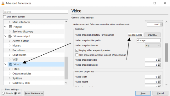
3. Then, under Video on the left, expand the Filters list.
4. Check the "Scene Video Filter" from the list.
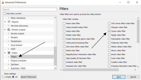
5. Then scroll down on the left menu under Filters and click on Scene Filter. This will open up the settings for that particular filter.
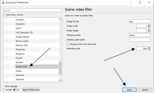
6. Set the Image Format to PNG.
7. Then for the Recording Ratio, change to "1". The Recording Ratio is the frame interval. So for example, if it was set to "300" (with a 30fps video), then it would take one cap every 10 seconds. Setting it to "1" will make it take a cap once per frame.
8. None of the other settings need to be changed.
9. One more important setting, otherwise this will not work! Close the menu, and go back to Tools > Settings and leave it on Simple. Go to the Video section and MAKE SURE the output is set to "Automatic". This is important because if it is not on Automatic the Scene Filter won't work!
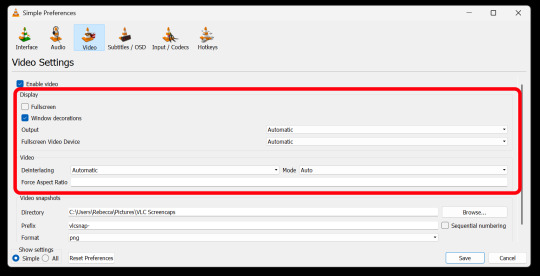
Then just open your video with VLC. VLC will automatically take the screencaps while the video is playing. If you pause the video, it will stop taking caps.
Your screenshot folder will look like this:

Then we are done with this part and onto Photopea! Which I will go into detail in another post....
39 notes
·
View notes
Text
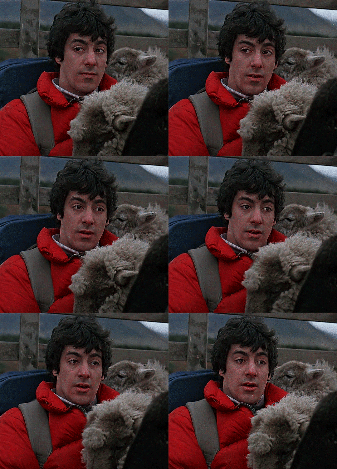

AN AMERICAN WEREWOLF IN LONDON (1981) dir. John Landis
#an american werewolf in london#aawil#horror#david naughton#griffin dunne#mine#I finally managed to download a decent quality copy of this fckin movie hjsdfhjhfds#which means I'm back on my bullshit. not that I ever left my bullshit. but we're so back 😌🔨💥#who would've guessed that higher quality footage yields higher quality gifs (answer: every giffing tutorial ever)#ofc these are still kinda wonky but there's?? marginal??? improvement??? and that's a win in my book lmao#pls be patient w/me in this trying time (as I slowly bamboozle and blunder my way thru learning gifmaking)#anyway. I ain't never seen two pretty best friends.#one always gotta be turned into a werewolf on the moors unwillingly#and the other? doomed to walk the earth in limbo until the werewolf's curse is lifted#smh 😔...................................#(sidenote: not sure if it's intentional. but the blood? on the sheep next to jack? eating the symbolism up w/a spoon tysm for asking)
510 notes
·
View notes
Text
PSA for my (HotD) fellow gifmakers
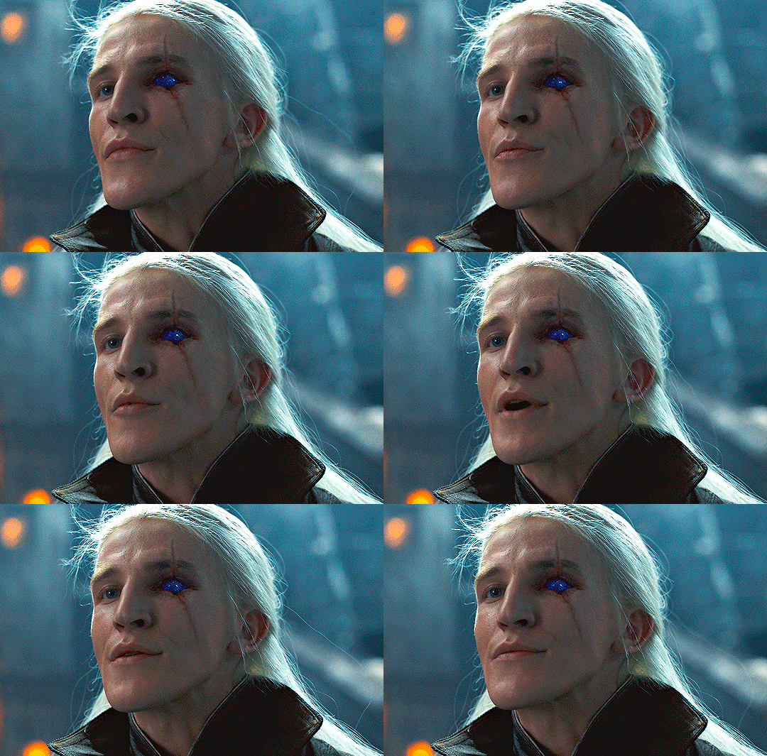
So, maybe you know this already but I’ve just become aware of this thing called camera raw filter which essentially is a photoshop plug-in very, very useful, especially with poorly lit shows like HotD or Got.
You can download the plug in here
I made this very basic gif during my lunch break to show you lol so:
Taking for granted that you know how to a make a gif using timeline, we have to work with smart objects so after you convert your gif into a smart object we have this
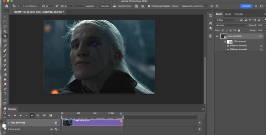
What we need to do is go to Filters > Camera raw filter
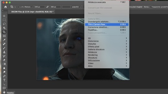
Sorry, my PS is in italian
This will open a new window full of beautiful options to go through (scroll, there are so many!)
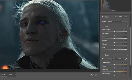
Now there is not a main road to follow here, just play with them and fix light/contrast/colors etc, to your liking.
I was in a hurry so I didn't play with them as I would've liked to, but I got this
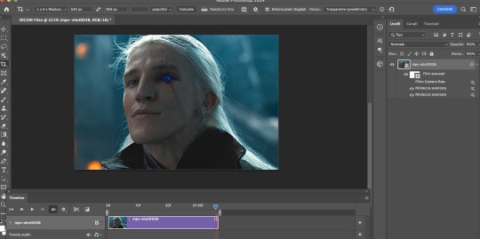
Then, I did some of my usual adjustments (curves, layers, color fixing) which by the way I'm always open to explain if you have questions and basically we went from this
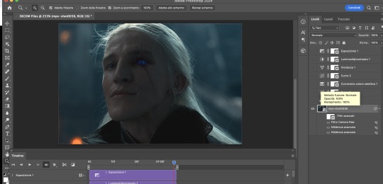
to this
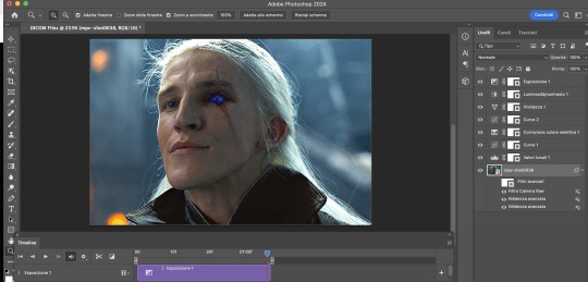
FINAL RESULT:

If you have questions, my inbox is always open!
Happy giffing :)
73 notes
·
View notes
Note
Hi, i love Regina gifset especially the text
https://www.tumblr.com/itwasmagic/749567705846251520/i-am-what-i-am-cause-you-trained-me?source=share
would you please post a tutoria for making this text with those colors?
hi! thank you so much, I've never been asked to do a tutorial before 🥹🥹 this is pretty easy but i overexplain things so if it doesn't make sense just let me know!
&& please let me know if this worked ok for you!
*assuming whoever is reading this already knows how to make a gif in photoshop*
I'm pretty sure I used the font Elephant for this set that you linked.
tl;dr if you have a lot of photoshop/text editing knowledge already: create a layer of text > duplicate it > select the bottom layer > go to blending options > add a stroke > ok that > set the layer fill to 0% > reposition the layer a couple of nudges to one side and a couple of nudges down > select the top text layer > go to blending options > add a drop shadow > add a gradient > ok that > set the top layer to difference > enjoy <3
if you want a more in depth tutorial with screenshots:
add your text to your gif with whichever font, size and placement you like
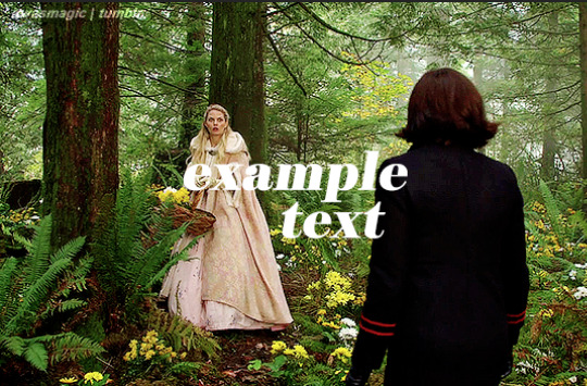
make sure the first text layer you want to edit is selected and press ctrl+J to create a copy of the layer (or right click > duplicate layer... > ok)
select the first text layer again

double click the layer (or right click > blending options), tick the stroke box and use these settings:
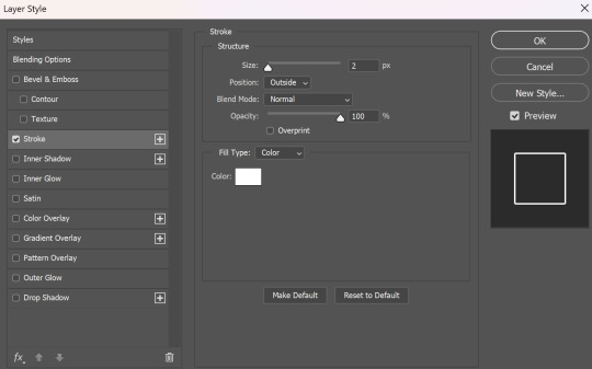
press ok
change the fill to 0% (leave the opacity at 100% because you still want the layer itself with the stroke/outline to be opaque but you want the text colour/filled in part of the layer to be transparent)

make sure the 'move' tool is selected

use the arrow keys on your keyboard to move the text layer with the stroke (i did 3 to the left and 3 down but do whatever works with your chosen font and size (edit: i think i moved it a few nudges right for the original set rather than left just make it up as you go along with me jfngkf)). it should look like this:

select the duplicated layer you made above the first one
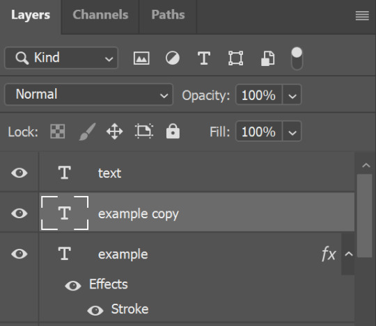
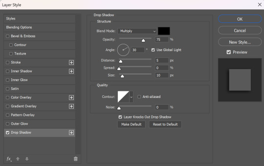
double click the layer (or right click > blending options) and tick the box for drop shadow. I pretty much always use these settings:
then tick the box to add a gradient overlay, it doesn't matter which colours or angle you use, you can play around and adjust it to whatever makes sense with your gif, so if you think the gradient would look better horizontal or vertical or at a different angle, just change the number of degrees it's at until you like it.

click the coloured box next to the option that says 'Gradient:' and this box should pop up:

to change the colours click the little coloured box under the gradient bar you want to change then the box underneath called 'Color:' should light up for you to click on, then either pick a colour or paste in the hex code

for the colours in the set you linked i used #9fb552 for the lighter green and #2f4f2b for the darker green then press ok
if you want to adjust the colour fade, you can drag the coloured squares along the bar or click somewhere just under the gradient bar to add another colour (you could add a third colour or another shade of the same colour, play around until you like how it looks! you can always go back into it at the end and keep adjusting once you can see how the whole thing looks put together.)
ok everything when you have it how you want it, then your text should look like this:
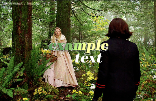
now change the blending on that same layer to 'difference'

the text should now look like this:
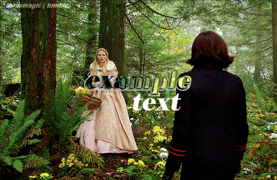
*note, the colours may change when they're blended differently, so like i said earlier you can go back and play around with the colours or shade you picked until they match your gif
if you have another text layer you want to look the same rather than repeating all of the steps, duplicate that one too, use the move tool to reposition the lower layer again and right click > copy layer style > right click > paste layer style on the corresponding layers


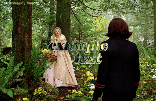
now when you play your gif, the text should look like this:

and you're done!
#answered#anonymous#userssam: tutorial#gifmaking#resource#tutorial#gif tutorial#text effect tutorial#text tutorial#photoshop tutorial
52 notes
·
View notes
Note
I have to ask how you do gifs for bg3!! Do you record your whole gameplay then splice the moments, or do you just have a hotkey to screen record and how do you edit and augh i have so many questions, i'd love a quick lil tutorial (if you want!!). I wanna do my tav justice :')
Hi hi! Sorry this has taken me a while to get back to! I'm very very new to gif making, like, literally started making them on Dec 31st to count in the New Year hahaha, however, I've am blessed with many, many GIF maker friends that have been helping me and some of them have made really good tutorials and others have shared some really good tutorials, which I shall link here because I am in no place to make one myself, not yet anyways! [I have not used all of these, however these have been shared among friends and if anyone is getting into giffing you may find them helpful!] Tutorials: @snug-gyu - Colouring Tutorial @quokki - Full giffing process - tutorial @seonghwasblr - Tutorial @hanjesungs - Colour Table Tutorial @scoupsy-remade - Tutorial @renjunniez - Gif tutorial & extra tips @ashleysolsen - Giffing Masterpost @woozis - Tutorial @kangyeosaang - How to pan gifs & how to fix grainy gifs @theedorksinlove - Tutorial @saw-x - Guide for beginners @brainwasheds - Sharpening Gifs @jjnxs - Gifs on Gifs
Also this video helped a lot, which I helped me understand it better more easily. Though I make all my gifs in photoshop. For capturing I record my footage through OBS and import it into DaVince Resolve where I cut up the sections I want to use, because I record a lot at once so it's easier for me that way since I know my way around editing videos and then bring my photo editing skills in after in Photoshop to enhance them. But you can also do this in Photopea which is basically a free photoshop and the video I linked also covers how to use this website! I also film all of my stuff using Otis' freecam mod! I hope this helps! ❤ [I will keep adding to this list as my friends recommend me more, I find the more resources and different ways things are explained sometimes the better!]
80 notes
·
View notes
Text
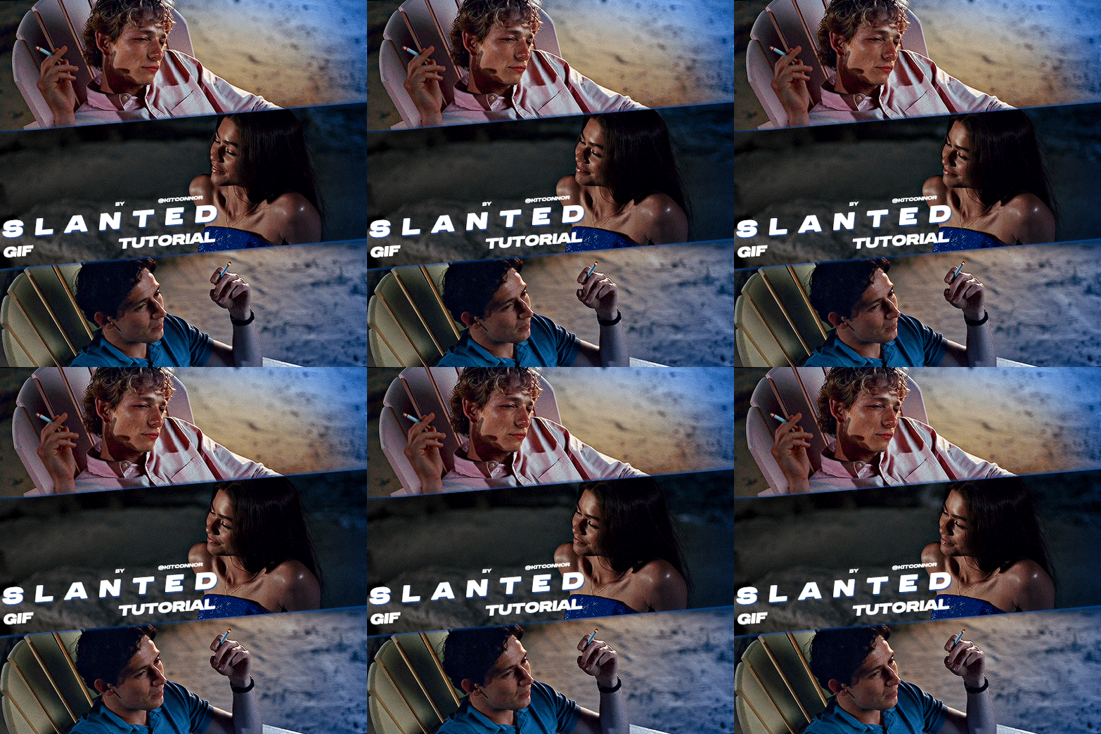
SLANTED GIF LAYOUT
anon asked 💬 : \kitconnor\754446373230919680 Hey, do you have a tutorial for how you created this layout style? easy done! i've also attached psds, found in my layouts folder, that you can use too, but i've laid out the steps as well if you want to change things up for your own layout.
want a tutorial on anything? send an ask!
set up the layout
make sure you are following these dimensions, if you're working on a 540x540px layout (it only really works with this layout anyway 😭) if you DON'T want spaces on your gif: 1st gif: 180x540 2nd gif: 180x540 3rd gif: 180x540

and if you DO want spaces on your gif: 1st gif: 177x540 2nd gif: 178x540 3rd gif: 177x540
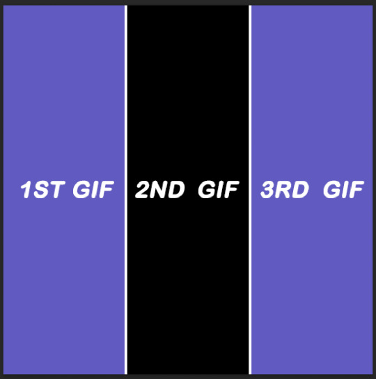
just use the rectangular marquee tool, using fixed size settings to get the shapes. also, make sure they're completely centered if you're using gutter sizes! additionally, ensure you use seperate layers.
2. use the angle tool
you're going to select your three layers, and then angle them to whatever degree you want. you WILL have white spaces, but don't worry about that for now.
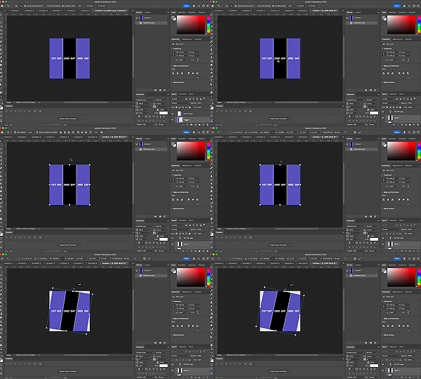
(i'm so sorry the quality sucks, i can't go any bigger and get the whole process in one 😭)
3. fill the gaps
now, you need to fill it in. i probably use a "sloppy" method, but it does eliminate the need to fiddle around with other processes. to do this, i literally just pull the corners until i fill it. after that, i center the layout as much as i possibly can, so everything is adequately filled.
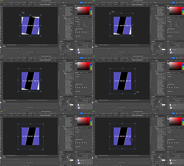
4. clipping gifs
to match the angles of the layout, you will add your gifs on, then angle it and size it to fit, the same as what you did with the layout and then clip. this part was too big to clip, but stepped out below:
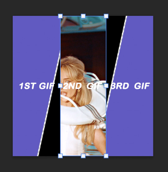
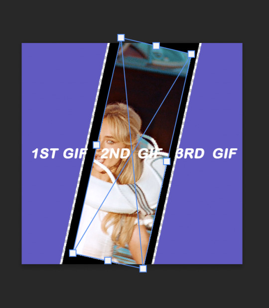
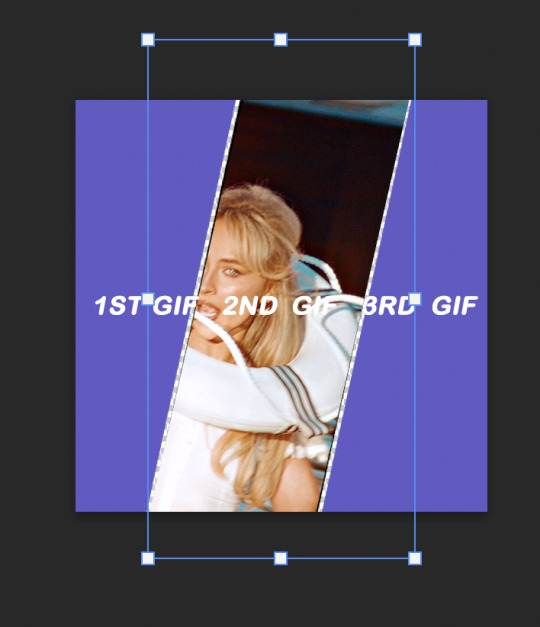
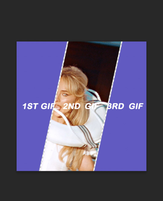
repeat this with the others, then you're done!
find the psds, ready to have gifs sized to fit, here.
tip: sometimes it can give a weird jagged looking line when it saves, like this:
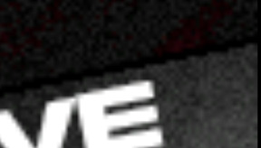
if you choose to do the no spaced layout, i'd suggest adding a black or white background underneath the layout, or adding outer glow to the rectangle shape which you can see in my cover gif! however, if you use the spaced one, you will notice it. there's not really a way to get rid of them, but it is a common "problem" amongst gifmakers, so i wouldn't worry too much!
42 notes
·
View notes
Text
Color Reference Guide to Recognize & Avoid Whitewashing by mihareth How to Spot and Stop Whitewashing POC in Edits by augustds Don't Whitewash Me: A Guide to Coloring POC (Pastel & Pale) by mohanas How to Fix Orange-washed Characters by aubrey-plaza How To: Coloring East and Southeast Asian Celebs by blueshelp POC Coloring Tutorials Tag by gifmakerresource
Please share any other resources you might have in the replies or tag @gifmakerresource!
DISCLAIMER: I am white and in no way do I wish to speak for or over people of color. If anything here is offensive, incorrect, or nonsensical, please let me know and I will remove it and do better moving forward.
When I first started making gifs again last year, I didn't really know about whitewashing. It was a concept I'd definitely heard of and I knew what it was, but I didn't think about it in the context of gifmaking. Since becoming part of a couple gifmaking networks and starting my own resource blog, it's something that I am now very conscious of. I will periodically ask for opinions on my coloring when people of color are in the gifs and I've learned so much from doing so! I genuinely cannot recommend networks like PSCentral and LGBTQCreators enough. Everyone is so kind and helpful and being part of them has only served to better my gifmaking.
I have always liked to give people the benefit of the doubt and believe the best of them until I'm proven otherwise. I know not everyone feels this way, but especially since my personal experience was borne out of ignorance rather than malice. When I see colorwashed gifs, I want to believe (or hope) that OP just isn't aware, the same as I was. But ignorance also isn't an excuse. If someone points out to you that your coloring has whitewashed or otherwise colorwashed a person of color, you should take that and adjust your coloring as necessary, removing the original post. The resources listed above have been instrumental in helping me keep skintones realistic and true to life. There are, I'm sure, many more tutorials out there that discuss this topic. It is on you to take the initiative to learn, not on the person educating you. If being told you've white/colorwashed someone makes you angry, I would urge you to ask yourself why.
As always, please be kind to one another.
103 notes
·
View notes
Text
GIF Tutorial
This is going to be a long post, so I'm going to place the majority of it under the cut.
Disclaimer - There are many ways to make gifs, and this is just one way to make them - it's the process that I have figured out works best for me. I am in no way claiming that this is the "definitive" or "best" way to make gifs. There are probably other, better ways to do things, but because people have asked how I do it, I am sharing my process.
Introduction I use a Mac. I am assuming most of this will also be applicable to those of you using Windows as well. This tutorial is divided into three parts. Here is a video of the following process as well: https://www.youtube.com/watch?v=lBRbWC-iMOM
Actions I use three Actions, that you can download here through my Google drive, if you want. A tutorial for how to install Actions in Photoshop can be found here.
Photoshop Layout I use Photoshop CC, but I used Photoshop CS5 for years, got used to it, so when I upgraded to CC, I arranged it to resemble what I was used to.
I have the following windows open:
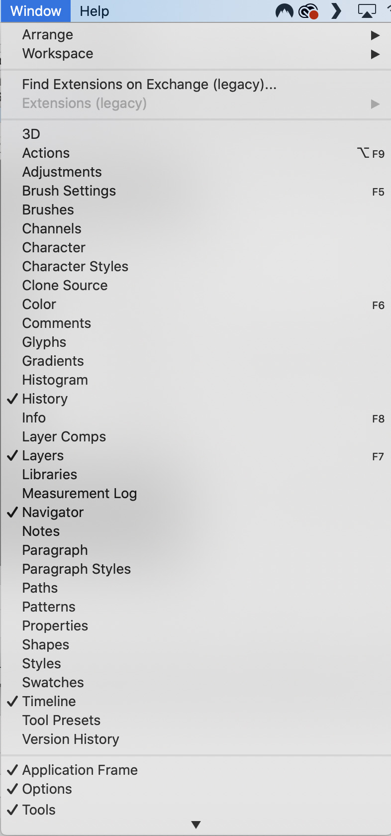
And they are arranged like this:
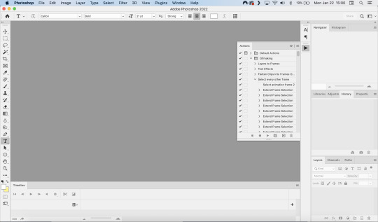
PART ONE - CLIPPING Part 1 consists of using a screen recorder (i.e., Quicktime) to make short clips of scenes or parts of a scene that you want to make gifs of. I have a Mac, so Quicktime is what I use. For Windows users, I’m sure there are equivalent alternatives that are just as good. Years ago, when I was first starting to make gifs, I frequently heard people refer to KMPlayer as what they used, so that might still be a good option for you if you are a Windows user. The most important part is that it takes high-quality recordings, with as little detail and quality loss as possible.
With this screen recording method, you can make screen recordings of video files that are stored locally on your computer (I use VLC to play videos), or streaming on sites like YouTube, Amazon Prime, Hulu, Disney+, HBO, etc. No downloading of the video is necessary. For some of those websites, if you have trouble with getting it to work, you may have to disable your browser’s hardware acceleration. This process is described here (https://www.theverge.com/23715928/netflix-amazon-prime-screenshot-mac-windows-how-to).
I record the clips with sound, to make it easier to transcribe/write out the dialogue in Photoshop later. When I have recorded all the clips I want, I put the clips into my folder where I store all my clips, and into another folder that is labelled with the episode number so I can remember where each clip came from in order to properly label them later when the time comes to upload them to Tumblr.
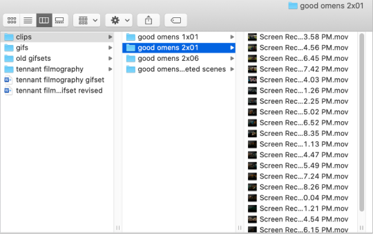
Example: A folder containing clips from Good Omens 2x01
PART TWO: EXTRACTING/MAKING GIFS FROM THE CLIPS
Open video file in Photoshop To do this, click on File > Import > Video Frames to Layers
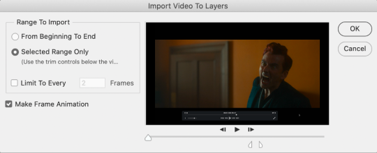
Use the markers to select roughly where you want the gif to begin and end.
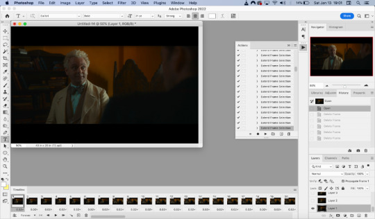
With videos that have been clipped with Quicktime (not sure about other programs), the vast majority of the time there are twice as many frames as needed – every other frame is a duplicate. For a smaller gif size and smoother playback, I delete every other frame in the timeline box at the bottom of the screen. I used to do this manually (very time consuming), but now do it with the use of an action that I created that will automatically select every other frame. Downloads and installation instructions for all the actions I use are available above.
To use an action, click on the title of the action, then click the play button at the bottom of the window.
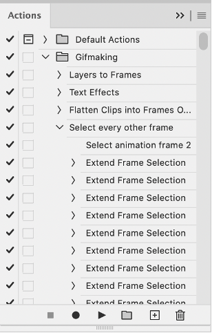
I often get an error message that says “The command ‘Extend Frame Selection’ is not currently available”, but it still works. Just click “stop” and every other frame will be selected.

Click the trash can icon in the timeline window to delete the selected frames.
At this point, you will have half as many frames in your timeline as you did before. You will also likely have extra frames at both the beginning and end of the timeline that you don’t want to be part of the gif – from the previous shot, for example. You can delete those now.
This next step is optional: There will still be some duplicate frames in the timeline that were not deleted earlier. It is not strictly necessary to delete these, and I see many gifmakers who don’t get rid of them. It’s usually not all that noticeable. However, because I’m a bit of a perfectionist, I always go through the timeline frame-by-frame and delete each duplicate. This ultimately will reduce the gif’s file size and make the movement in the gif appear much smoother. I usually find that every fourth or fifth frame is a duplicate. Unfortunately, it’s not always consistent, so using an automated action would not work to make this process go faster.
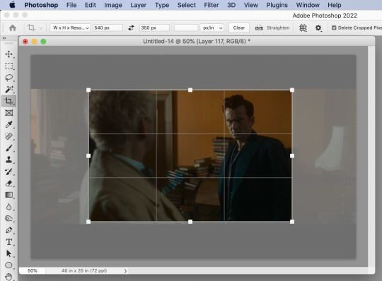
Cropping Once this part is complete, I select the crop tool. I usually make my gifs 540px wide by 350px high. You can change the height to whatever you want, but Tumblr’s max width is 540px. I find the aspect ratio of 540x350px usually allows gifs to feel large, while at the same time not cutting off too much of the sides. Depending on the type of gif I’m making I may adjust this, but generally, if I’m giffing a scene from a TV show or movie, I stick with my standard 540x350px dimensions.
Adding Text Next, I add text. Select the text icon. In the layers window, make sure the top layer is selected, otherwise the text will not show up when you start typing.
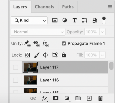
The top layer is selected
These are the font settings I currently use:
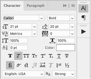
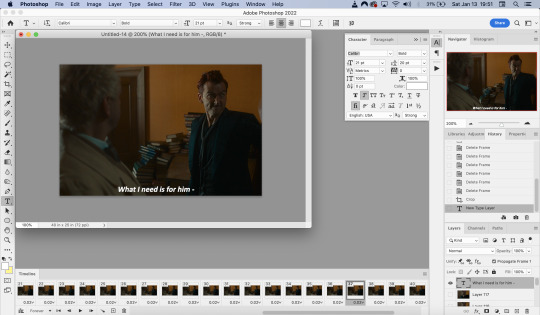
If I am just making one gifset, or one or two gifs, I’ll go straight on to the next steps. However, if I’m making a large amount of gifs, I save the gif right now, close out of it, and repeat the steps in this section for the next gifs, so I eventually have an entire folder of “raw” unedited photoshop files that have been cropped and captioned, and just need to be colored, have text effects added, and be sharpened. For me personally, I find I make gifs more efficiently by doing it in this “batch” style process.
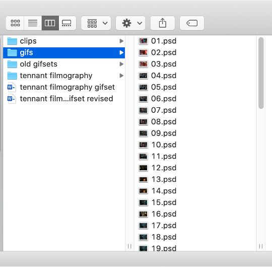
All cropped and unedited gifs (psd files)
PART 3: COLORING, EFFECTS, & SHARPENING
Coloring I do plan on making a separate tutorial on this at some point, but will include a brief summary here. When it comes to coloring, I generally tend to go by a “less is more” attitude. I am not by any means great at coloring, but nonetheless I’ll explain the types of adjustment layers I typically use.
Note: Before making any adjustments, make sure you have the layer directly underneath the text layer selected, as shown in the screencap below, otherwise it will also apply those adjustments to the text, which makes it look weird.
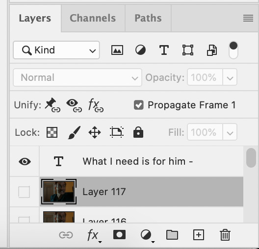
I start with a Curves layer to change the overall brightness/contrast, then a Levels layer to adjust the shadows and highlights, and then a Brightness/Contrast layer to do some final minor tweaks. The only time I ever reuse gif coloring is when they are from the same scene with the same colors, lighting, backgrounds, etc. Every other time, I tailor the adjustment layers to the specific gif.
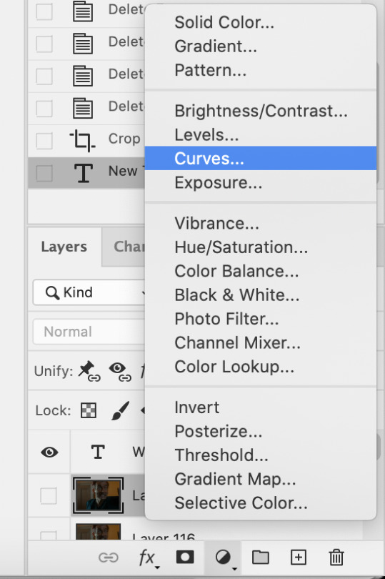
You can add adjustment layers by clicking the half light/dark circle on the bottom of the Layers window.
How the gif looks with both a Curves layer and Levels layer
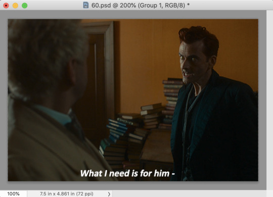
Before adding the adjustment layers
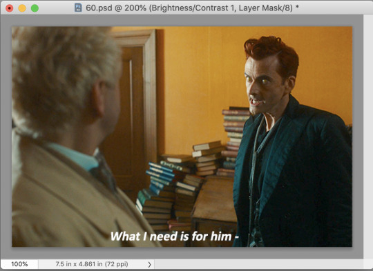
After adding the adjustment layers
A lot of the time, I'll just stick to adjusting the lighting. However, if the colors look gross, or if they are over/undersaturated, I’ll add a Color Balance layer and play around with the settings on that, or use a Hue/Saturation layer and increase/decrease the saturation of specific color channels. It really depends on what you’re going for, and what you think looks good. There is no one “right” way to color a gif.
Text Effects If you are using the Actions I included in the download, you can just run the "Text Effects" action with the text layer selected, and it will do the following automatically. If not, you can do it manually by doing the following.
Right click on the text layer in the Layers window and click on Blending Options.
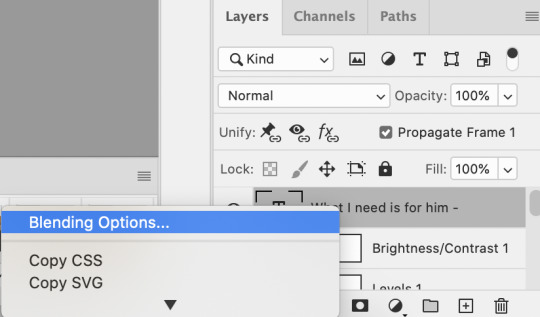
I use a stroke and drop-shadow on my gifs. Here are the settings I use.
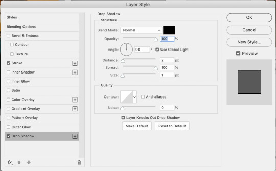
Drop Shadow settings
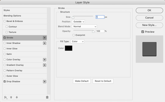
Stroke settings
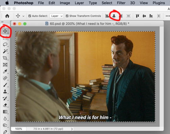
Next, to center the text, click on the text layer. With the text layer selected on the Layers window, Select All by clicking ctrl+a (Windows) or command+a (Mac). Then click on the "Align horizontal centers" icon in the “Move tool” option menu.
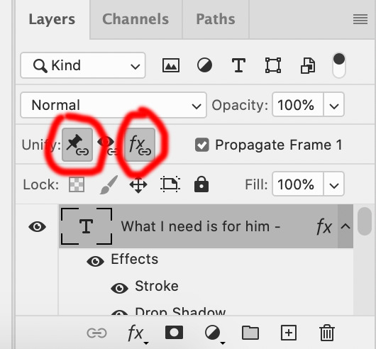
Important – in the Layers menu, make sure the buttons “Unify layer position” and “unify layer effects” are clicked an enabled for the text layer.
Sharpening Select all the frames in the Timeline window. Then in the lower left-hand corner click “convert to video timeline.”

In the Layers window, select all of the frame layers (do not include the text layer or adjustment/coloring layers in the selection) and right click on it. Select “Convert to smart object.”
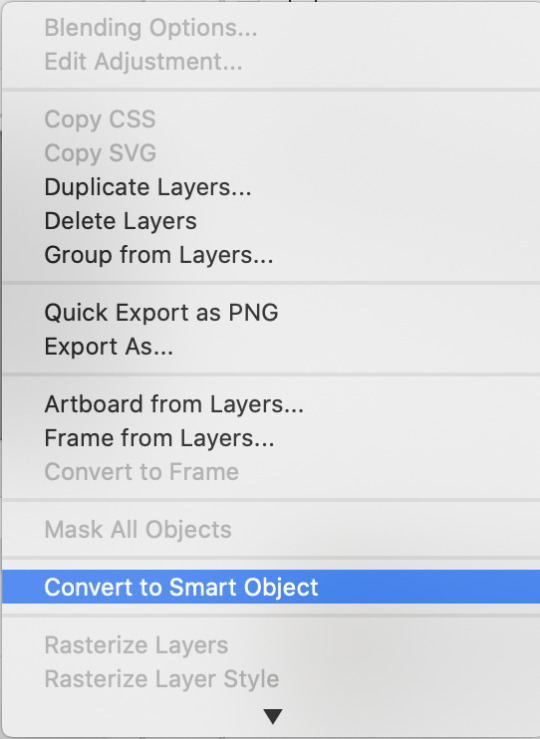
Select Filter > Sharpen > Smart Sharpen. In the same way that coloring can differ depending on the gif, the ideal settings for sharpening can also differ from gif-to-gif. It can really depend on the quality of the source of the gif, like whether it’s HD or not. These are the settings I’m using for the current gif:
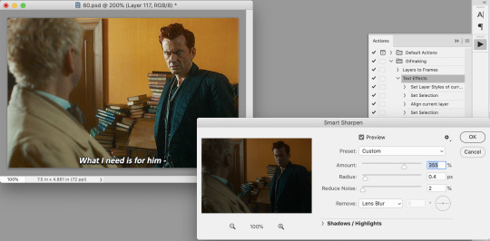
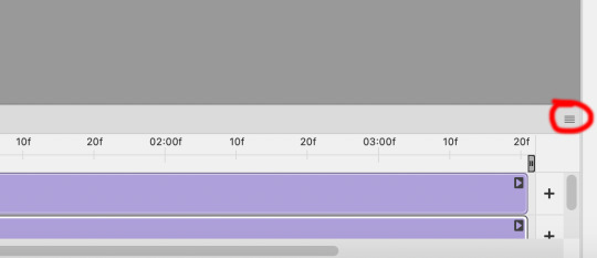
If you are using Actions, you can run the "Layers to Frames" Action. If not, do the following:
Click on the button circled in red
It will open up this menu. Click on "Flatten frames into clips"
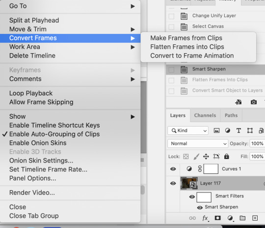

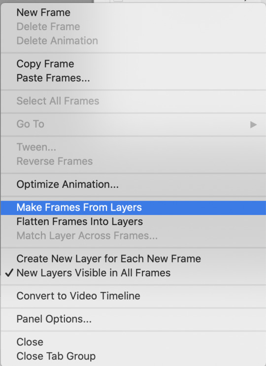
Click the button circled in red, then click "Make frames from layers"
Delete the first couple of "junk" frames
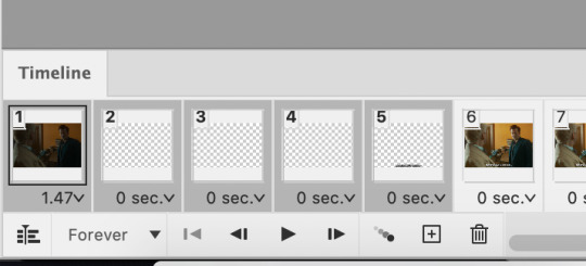
Select all of the frames. Right click on the "0 sec." to change the frame rate. I usually use 0.05, but it might depend on the gif itself.
Exporting Click on File > Export > Save for Web (Legacy)
I cannot add another screencap because I've reached Tumblr's max for this post, but here are the settings I use: Selective Diffusion 256 Colors Dither 100%
You may find that when you try to export your gif, the file size is too big. Tumblr’s gif file size limit is 10mb – try to make it under that – even anywhere in the 9.9mb range. As long as it’s under 10mb, it should work.
To get gifs that are too large to fit under the limit, I usually end up deleting frames from the beginning or end of the gif. If you’re using the 540x350px dimensions, I typically find that the average number of frames I can fit into one gif is between 80-90. Depending on the colors in the gif, it’s sometimes more, sometimes less.
69 notes
·
View notes
Text

COLORING + SHARPENING TUTORIAL
someone asked for a coloring tutorial and my sharpening settings, so here it is! there are also a few tips to achieve more HQ gifs. :)
tutorial under the cut!
FOR HIGH-QUALITY GIFS
FILE SIZES
it doesn’t matter what your sharpening settings are if the file you’re using to gif is too low quality, so i tend to look for the best that i can get when downloading stuff.
usually, movies (+2h) look better if they’re 5GB or more, while an episode (40 min/1h) can look good with even 1GB. the minimum definition i try to find is 1080p, but i gif with 2160p (4k) when available. unfortunately, not every computer can handle 4k, but don’t worry, you can gif with 1080p files just fine if they are big enough. contrary to popular belief, size does matter! which means sometimes a bigger 1080p file is better than a smaller 2160p one, for example.
SCREENCAPPING METHOD
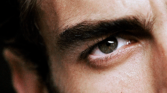
this can too influence the quality of your gifs. as a gifmaker, i’ve tried it all: video frames to layers, directly opening video clips, loading files into stack, and i’ve finally settled down with opening screencaps as an image sequence. with bigger files, it doesn’t matter much what technique you use, but i’ve noticed with smaller files you can do wonders if you screencap (either by loading files into stack or opening as an image sequence) instead of using video clips. for example, this gif’s original video file was only 4GB (so smaller than i’ve usually go for), if you can believe it!
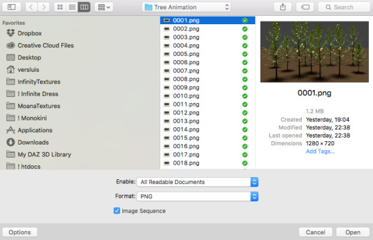
here’s a tutorial for setting up and screencapping with MPV, the media player i use to screencap. again, you can keep using video clips for bigger files, but you’ll find this useful when dealing with dire causes. i don't file loads into stack, though, like the video does. i open as an image sequence (open > screencap folder > select any image > click the image sequence button). just select OK for the speed. this will open your screencaps as a video clip (blue bar) in timeline mode (i'm a timeline gifmaker, i don't know about you). you will need this action pack to convert the clip into frames if you're a frames gifmaker. i suggest you convert them into frames even if you're a timeline gifmaker, just convert them into a timeline again at the end. that way you can delete the screencaps right away, otherwise you will delete the screencaps and get a static image as a "gif".
ATTENTION if you’re a Mac Sonoma user, MPV won’t be an option for you unless you downgrade your system. that is, if you have an Intel chip. if you have M1 Max chip (or even a better one), here’s a fix for MPV you can try while keeping that MacOS, because nowadays MPV is skipping frames in its latest build. or you can use MPlayer instead for less hassle. here are two tutorials for setting and using MPlayer. Windows users are fine, you can use MPV without trouble.
FOR EVEN MORE QUALITY
ADD NOISE
here’s a tutorial for adding noise as a way to achieve more HQ gifs if your original material is too low quality.
REDUCE NOISE WITH CAMERA RAW
instead of adding noise, you can reduce it, especially if your gif is very noisy as it is.
the path is filter > camera raw > detail > nose reduction. i do this before sharpening, but only my video file isn't great to begin with. because it’s a smart filter, you can reduce or increase its opacity by clicking the bars next to its name in the layers panel.
TOPAZ AI
i use Topaz Photo AI to increase the quality of my screencaps when i need to. it’s paid software, but there are… ways to find it for free, usually on t0rrent websites. if someone’s interested, i can make a tutorial solely about it in the future.
SHARPENING SETTINGS
here are my sharpening settings (filter > sharpen > smart sharpen). i sharpen things twice: 500% 0.4px + 10% 10px. here's an action for it, for more convenience. here's a tutorial on how to use Photoshop actions. for animated stuff, i use this action pack.

COLORING
here’s the gif i'm gonna use as a base. it’s already sharpened like the way i always do it.

LIGHTNING THE SHOTS
half of the secret of a good coloring is good lightning. i always useCurves (layers > new adjustment layer > curves) and Brightness & Contrast (layers > new adjustment layer > brightness & contrast). the settings depend on the scene you’re giffing, but i always try make my gifs bright and with high contrast to make the colors pop.
CURVES
besides lighting your scene, the Curves adjustment layer has four automatic options that will color-correct it for you. it’s not always perfect and it doesn’t mean you won’t need to do further coloring, but it’s a great start. it’s a lifesaver for most ridiculously yellow scenes. look at the difference! this gif uses the 3rd automatic option (the screenshot below isn't mine btw so that's why the fourth option is the chosen one), from top to bottom. what automatic option you need to choose depends on the gif.

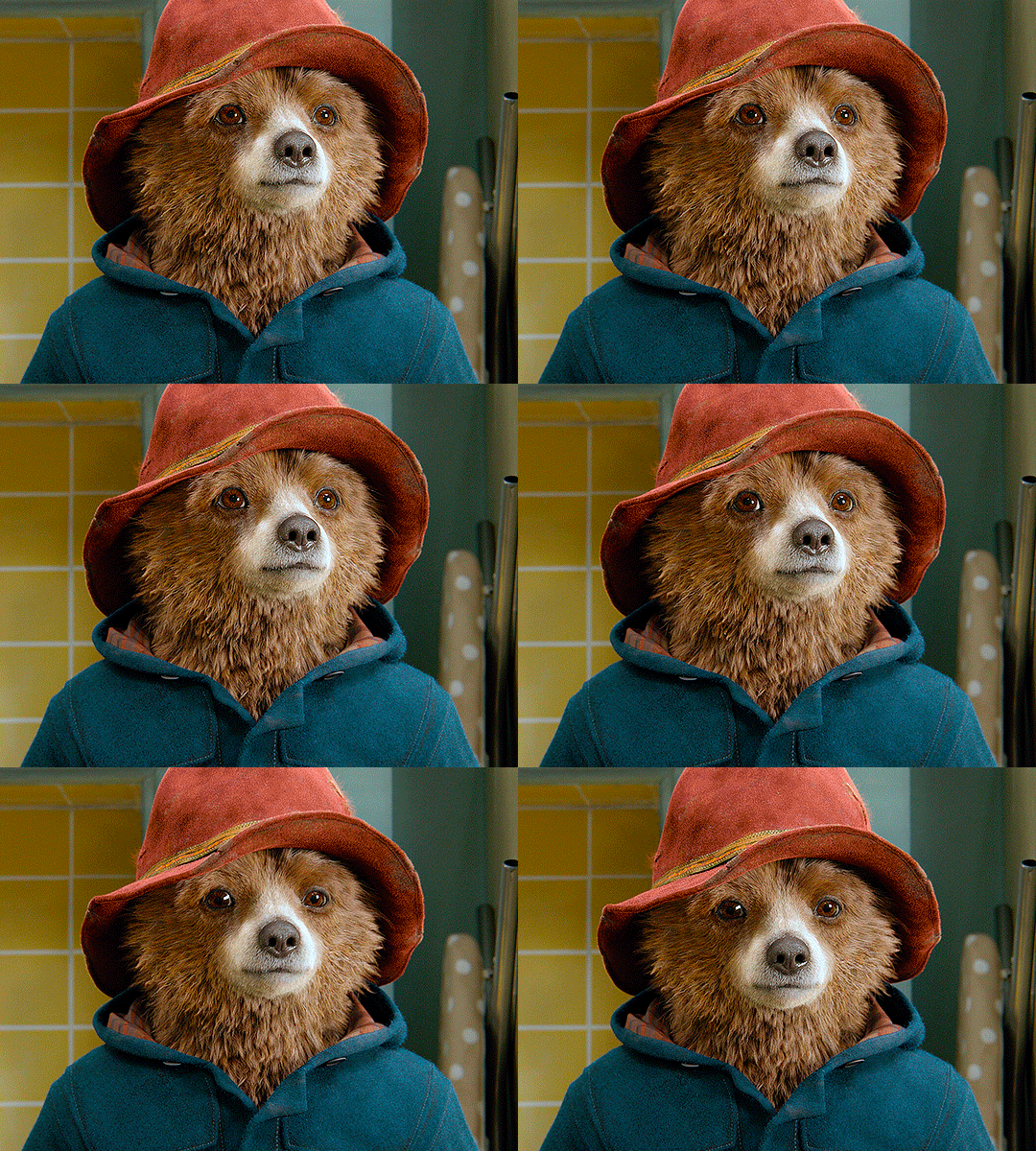


sometimes i like to tweak my Curves layer. not everybody does that, it’s not that necessary and if you’re not careful, it can screw your gif up. to modify your layer by hand, you will need to click and drag points of that straight line in the position you desire. this is the concept behind it:

basically, the lower part of the line handles the shadows, while the upper part handles the highlights of the image. if you pull a highlight point up, the image’s highlights will be brighter. if you pull it down, it will make them darker. same thing for the shadow points. you should play with it to get a grasp of it, that’s what i did when i first started giffing.
BRIGHTNESS & CONTRAST
then i added a bit of brightness and contrast.

CHANNEL MIXER
the scene looked a bit too yellow, so i used the Channel Mixer (layer > new adjustment layer > channel mixer) adjustment layer. here’s a tutorial of how it works. not every scene needs the Channel Mixer layer though, i mostly use it to remove heavy overall tints. in this particular case, the Curves layer got rid of most of the yellow, but i wanted the gif to be just a bit more blue so the Channel Mixer tweaks are very minimal.

SELECTIVE COLOR
now, this adjustment layer i always use: Selective Color (layer > new adjustment layer > selective color). this is THE adjustment layer to me, alongside the Curves one. this is how it works:

ie, you can separately edit a color this way, giving it tints. for this gif, i wanted to make the colors more vibrant. to achieve that, i edited the selected colors this way:
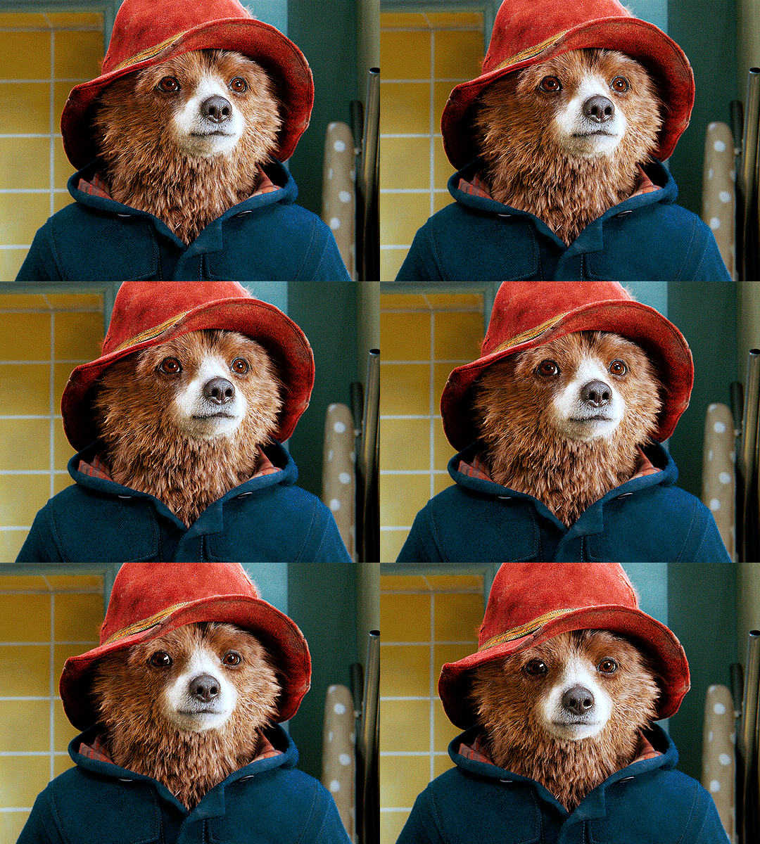
for the reds, i added even more red in them by moving the first slider to the right, making the color more vibrant. for his hat to have a more warm tint, i added yellow to the reds (third slider, moving it to the right). finally, to make the reds stronger, i moved the last slider to the right (more black).
for the yellows, i made them brighter by adding white to them, thus making the tile wall and Paddington more bright as well.
for the cyans and the blues, i just added the maximum (+100) of black that i could.
i wanted for Paddington's nose to be brighter, so i added more white to the whites.
lastly, i added depth to the blacks by increasing their own blackness.
you should always play with the Selective Colors sliders for a bit, before deciding what you want or need. with time, you will automatically know what to change to correct the color grading. it all takes practice!
HUE/SATURATION
i don’t know if you noticed, but there are some green spots on the blue wall behind Paddington. to correct that, i added a Hue/Saturation adjustment layer (layer > new adjustment layer > hue/saturation) and made the saturation of the greens 0%, making that unwanted green disappear from the background.

while the green spots on the wall are specific for this gif, i use hue/saturation a lot to tweak, well, hue and saturation. sometimes someone’s skin is too yellow, i made it redder by tweaking the reds and the yellows, or vice-versa. the hue bar follows the rainbow bar, so the maximum settings (+100 and -100) give the selected color to change its hue to something more red or pink (the rainbow extremities). changing hue can give pretty whacky results, like turning someone’s skin tone to green, so you will need to play with it to get the hang of it. you can also tweak the opacity of your hue/saturation layer to further improve your gif’s coloring. i didn’t do it in this case, the opacity is still 100%. the reds and the blues had their saturation increased to make them pop just a bit more, without affecting the other colors.
COLOR BALANCE
the highlights of the gif still had a green tint to it due to the automatic correction of the Curves layer, so i used Color Balance. this is how it works: instead of giving specific colors some tints, you can give them to the shadows, highlights, and mid-tones. if your shadows are too blue, you counterbalance them with the opposite color, yellow. same thing with the cyan-red and magenta-green pairings. in my case, i added a bit of magenta.


B&W GRADIENT MAP
now, if this gif was a dish, it’s time for the salt and pepper. i always add a Gradient Map (layer > new adjustment layer > gradient map) (black to white gradient) with the Soft Light blending mode, thus giving my shadows more depth without messing with the mid-tones and highlights. it also doesn’t “deep fry” (you know those memes?) the gif too much by adding even more contrast. usually, the opacity of the layer is between 30% to 70%, it all depends on the gif. it always does wonders, though!
COLOR FILTER
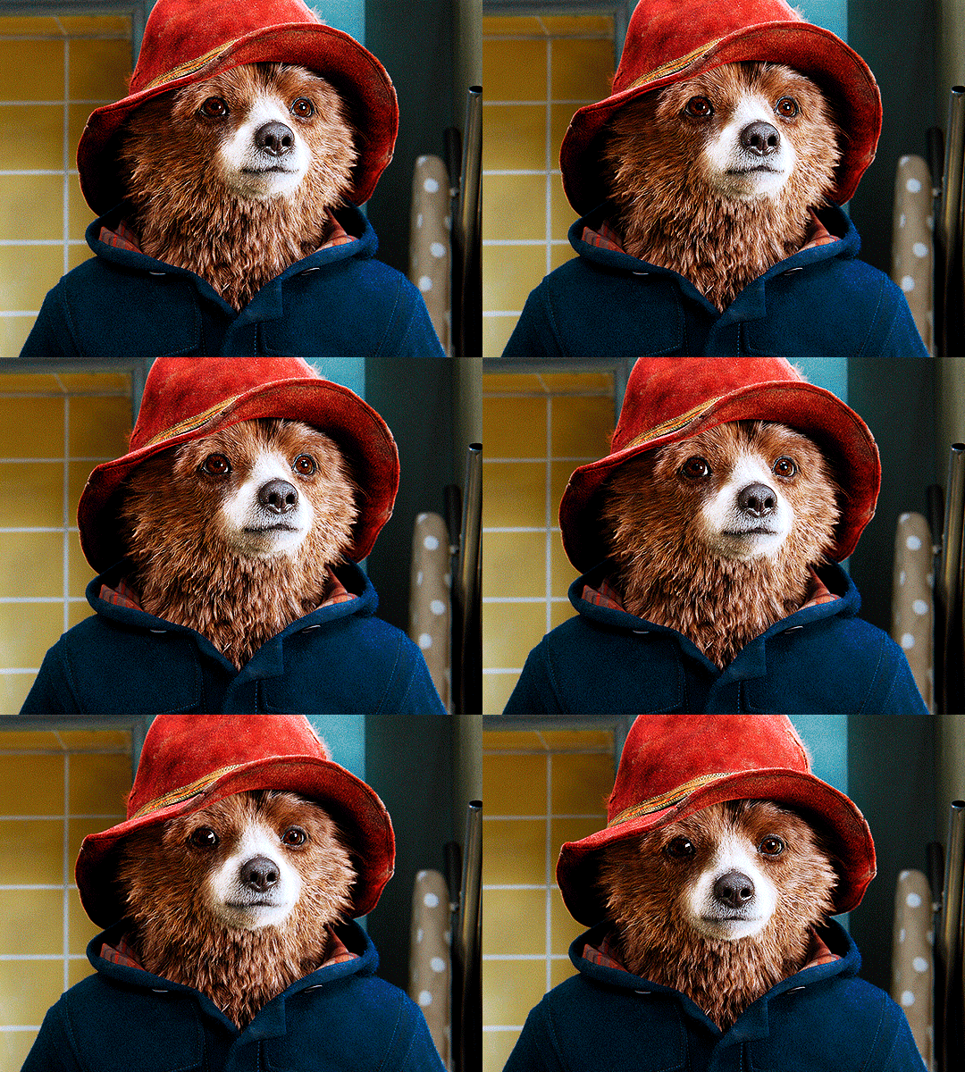
finally, i like to add Color Filters (layer > new adjustment layer > color filter) to my gifs. it’s very handy when giving different scenes for the same minimalistic set because it makes them kind of match despite having completely different colors. in this gif’s case, i added a “deep blue” filter, opacity 50% density 25. you can change the density and the opacity of the layer for further editing, again, it all depends on the gif.


VIBRANCE
if i feel like it, i add a vibrance layer (layer > new adjustment layer > vibrance) to make the colors pop. this can ruin your coloring sometimes, especially when regarding skin color, so be careful. i didn't do it in this gif because i felt i didn't need it.
TA-DA! 🥳
AN OTHER EXAMPLE
the color grading of the original scene it’s pretty good as it is, to be honest. let’s see a worse scenario, a VERY yellow one:
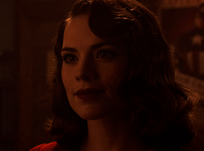
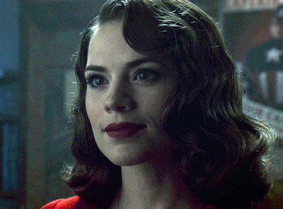
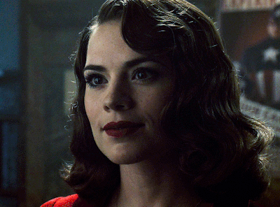
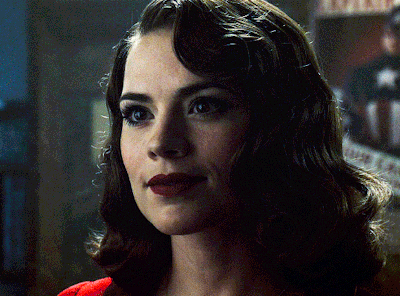
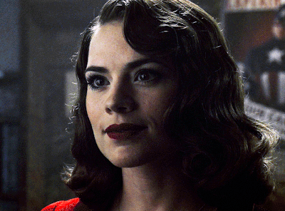
no channel mixer this time because the automatic curves option dealt with the yellowness, but you can see it made the gif too green. i needed to correct that with the following adjustment layers:
curves (automatic option) (gif 2) >> same curves layer (tweaks) (gif 3) >> brightness & contrast (gif 4) >> hue/saturation (tweaked cyan+blue+green) >> selective color >> color balance (gif 5) >> b&w gradient map >> (sepia) filter >> vibrance (gif 6)
i added a hue/saturation layer to remove the blues & greens before my selective color layer because i thought that was more urgent than tweaking the tint of all colors. color balance (gif 4) was the real hero here, though, by removing the green tint. the selective color layer was meant to make the red pop more than anything else, because the rest looked pretty good, especially her skin tone (despite the green tint). you can notice that tweaking the curves layer (small gif 3) also helped A LOT with the green problem.
tl;dr 😵💫😵💫😵💫
here's a list of my go-to's while coloring and lightning gifs. it's not a rule, just a guide. there are gifs in which i don't use all these adjustment layers, or use them in a different order. it all depends!
1. curves (automatic option + tweaks) 2. brightness & contrast 3. channel mixer 4. selective color 5. hue/saturation 6. color balance 7. b&w gradient map 8. color filter 9. vibrance
i'll suggest that you study each adjustment layer listed for more info, either with other Tumblr tutorials or YouTube ones. the YouTube ones focus on images, but you can translate what they teach to gif making very easily. you can ask me to further explain any adjustment layer, too! i was brief to keep this short (which i kinda failed lol).
feel free to ask me for clarification or something else about gifmaking wise, i always like to help. ❤️
#*#*tutorials#gifmaker tag#resources#resource: tutorials#ps help#uservivaldi#tuserjen#userrin#userelio#useralien#userzaynab#userchibi#userbuckleys#usertj#userbess#tuserlucie#useraljoscha#userdavid#usershreyu#usernolan#userhallie#userisaiah#tusergio#tusergeo#userjesslynn
677 notes
·
View notes
Text
。゚Gif tutorial
How to remove the shakiness of old animation and reduce gif size.


I use Photopea.
It wont work on every gif because what we’re doing is making the not moving parts of the gif a static image.
• Find the right scene to gif. The moving part of the gif must be easily removed from the static part.
• Make your gif.
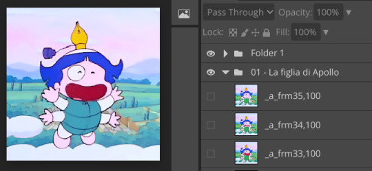
I picked a scene from Little Pollon (Ochamegami Monogatari Korokoro Poron) 1977-1979.
• Duplicate one of the layers and put it on top of the others. Below the adjustment layers.

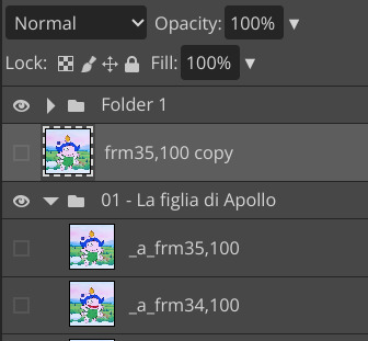
• Rename the duplicated layer. It’s not part of the gif anymore but an element on top. You have to remove the _a_. That´s what turns the layers into frames.
• Add a raster mask to delete parts of the duplicated layer.* You can make one by selecting the layer and clicking either the rectangle at the bottom (pic below) or clicking on layer at the top then rester mask and add (revel all).
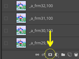
Click on the white square next to the duplicated layer. With a black brush paint over the parts of the gif you want to see moving.
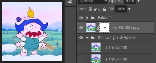
In my case I will paint over the mouth and the wings. The first visible layer is the duplicated one with his mouth closed when I start brushing over his mouth it will reveal the second (from the top) visible layer, the one with his mouth open. To be sure I deleted everything needed the second layer will be the one with his mouth at its largest. For the wings I picked a softer brush and I just make sure not to touch the hands that are more clear than the wings.
*You can directly use the eraser on the layer but with a raster mask is easier to correct mistakes.
• Save as .webp. Or .gif. The gifs at the top are both .webp.
✨ We’re done! you can stop reading but if you’re interested next I’ll explain why I prefer .webp and I’ll post .gif for comparison. And the last gif I made with this method (a slower and bigger gif from a 720p quality anime).
I think .webp looks better than a .gif when there’s a still image on top. With .gif, the image part will have those dots with dither, without dither there will be bending. This is not the best gif to use to show the difference because I made it particularly pastel and bright. Zoom in on his clothes and the background on the left in the 2nd and on the sky in the 1st. They’re more visible in the preview before saving. First gif is .gif without dither, second one .gif with dither, third one a simple gif without dither and fourth one is a .webp.
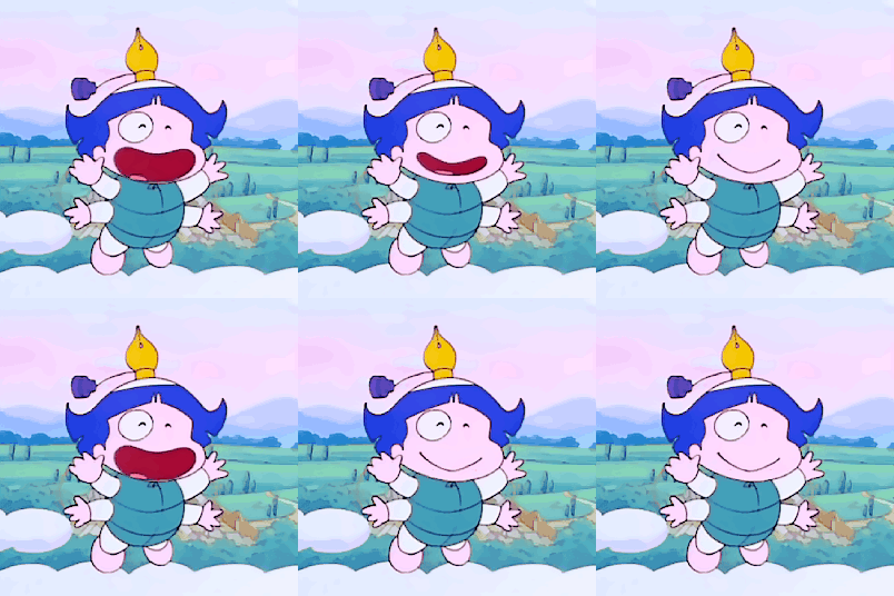
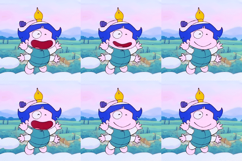
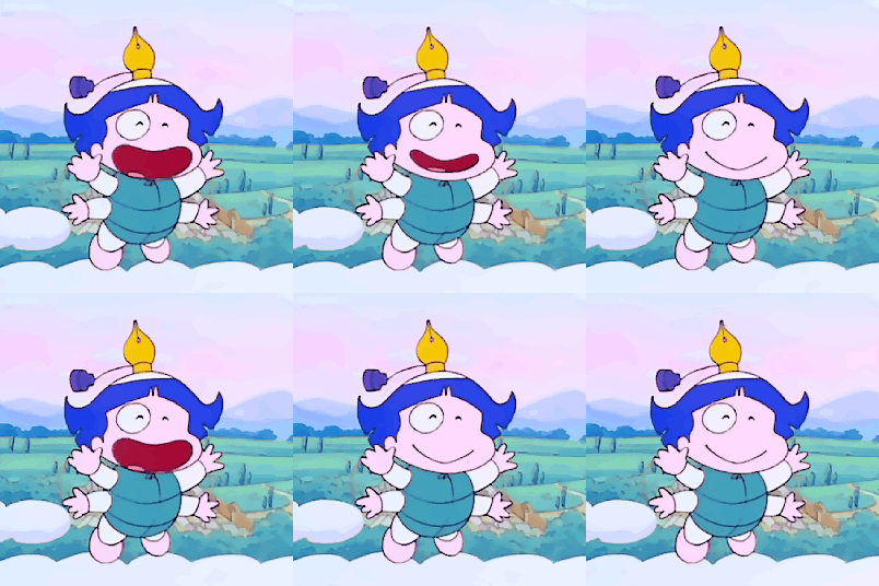

(Of course if you’re putting a pattern on top or some grain the discussion about bending and dithering will be moot since it wont be noticeable as much.)
(And if it’s not very noticeable does it matter?)
Take in mind .webp is way heavier and it doesn’t look right sometimes.
Regular gif (the 3rd one of the group of 4 above): 1.1 mb
First .webp at the top of this post: 3.5 mb
As a rule of thumb I’d say .webp is at least x3 heavier than .gif. At least at 100% quality. For old stuff is not a problem since we’re working with 30-something layers most of the times but if you prefer the look of .webp this method will help you reduce the size.
For a gif like this you probably could cut down to a quarter of the layers and if you really care about the size that’s faster than brushing over the gif. Anyway I left the number of layers as it was (36) and for comparison:
First .webp at the top: 3.5 mb
Second .webp at the top: 281 kb
The bigger the moving part the bigger the gif size.
This gif is from a gifset I made using the same method (it’s a .webp):
If you notice around the trail the background changes. This gif was more time consuming than the gif in this tutorial because it was moving a lot. The deleted part had to be as little as possible to be less noticeable. I was following that water drop basically layer by layer.
If you have any question feel free to ask 😊
#photopea tutorial#gif tutorial#gif making#gifmaking#hisources#allresources#gifmakerresource#completeresources#tutorial#editblr#resources#photopea#this is a very easy thing#i’m sure there’s a photoshop tutorial around#maybe from when you had to keep the dimensions down#i remember those gifs with only a small part moving#but i didn’t find it#and most importantly#i haven’t seen one for photopea
6 notes
·
View notes
Text
Making Gifs Part 2: Photopea
This is part 2 of my own personal gifmaking guide. Please read Part 1 to learn about how I capture the sequential screencaps to make my gifs.
Once you have your screencaps, open Photopea. They have a very simple guide on how to make animations in their help guide. I will be going into much more detail.
Note: ***Tumblr has a limit of 10mb for the filesize of each gif, and recommends no wider than 540 pixels. If your gif is wider than 540 pixels Tumblr will resize it, and it will cause the quality to be reduced, and also take much longer for the gif to load in your post.***
1. RENAME CAPS:
First things first. Rename all of your caps that you will be using for a gif to have the prefix _a_ on your computer. Select all and right-click on the FIRST file and select Rename (windows) and type _a_. Windows will add the numbers.
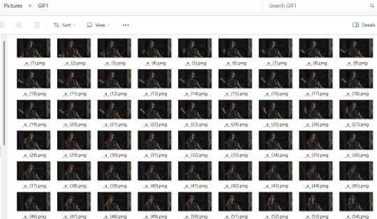
For most gifs, try not to have more than 60 frames as it will make the gif too large to upload to Tumblr. I usually aim for 45-50 frames max for most of my gifs.
2. IMPORT FRAME #1:
Drag and Drop _a_ (1).png into Photopea. Rename the layer from Background to _a_ (1)
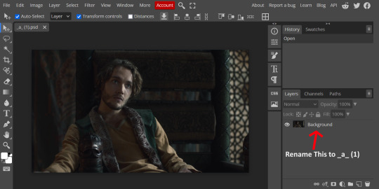
3. IMPORT IMAGES:
Select all the rest of your images from the folder on your computer, and drag and drop ON TOP OF the image (not the layers section). Make sure the file you grab to drag/drop is the next one in the sequence (so _a_ (2).png in this case. Otherwise they will be out of order. If you do it right, you will see the layers section on the right get populated with your caps in reverse order, with 1 at the bottom and the last one at the top.
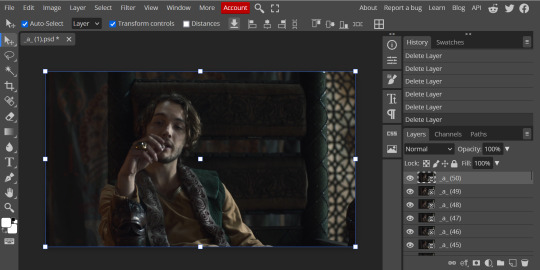
4. RASTERIZE:
Next, select all of the layers (on the right, by holding CTRL and clicking on each layer), go to Layer > Rasterize. They are currently Smart Layers, and if you keep them this way the sharpening will not apply (for some reason, I have no idea why that is)
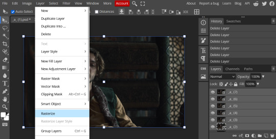
5. CROP:
Next, crop your gif. This tool is on the left menu. You do not have to have all the layers selected for this, it will crop all layers together. Move the blue lines at the edges until the frame is cropped how you like. Be mindful of the character moving in other frames; you may want to check your other layers to make sure nothing important gets cropped off in another frame. Once the blue lines are where you want them, click the checkmark at the top right to finish the crop.
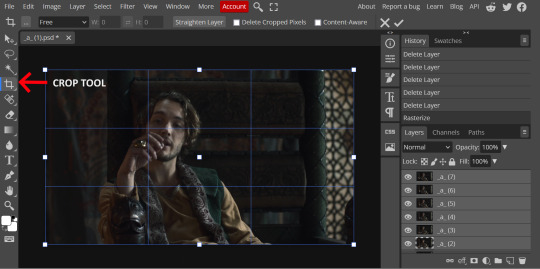
6. RESIZE:
Resize your gif so that it is 540 pixels wide. Go to Image > Image Size in the top menu. Make sure you choose "Bicubic Sharper" as the resample mode. Once this is done, you will see your image is tiny, so go to the Zoom tool (on the left menu, the magnifying glass near the bottom) and select Fit the Area at the top of the screen so you can see what you are doing.
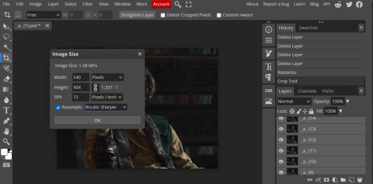
7. SHARPEN:
Next is sharpen. Select all your layers again (on the right), then go to the top menu: Filter > Sharpen > Smart Sharpen. The default settings here are for 150%, and that is good for most things.
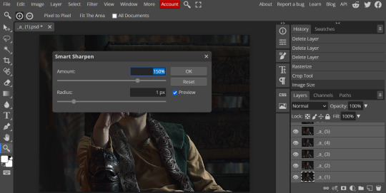
8. ADJUSTMENTS
This is the tricky part. You now need to adjust the brightness, contrast, exposure, color balance, and saturation. This will vary from gif to gif how much to adjust these values. I will show how I adjusted this one and you can apply that to whatever gif you are making.
For starters, since this show is SO DARK, you will need to brighten it. There are many ways to do this, but I found the method that works best for me is adjusting the Levels.
First off, in order to make adjustments, make sure you scroll all the way to the top of your Layers panel and make sure only the TOP LAYER is selected. Otherwise the adjustments will only be applied to whatever is BELOW the selected layer. You want all of them.
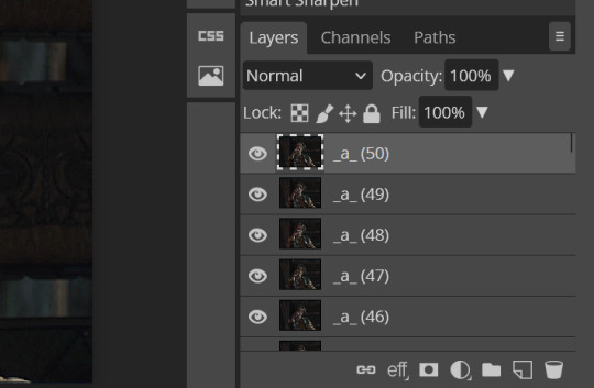
8a. ADJUST LEVELS
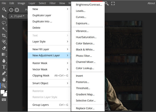
Next, go to Layer > New Adjustment Layer to pull up all your adjustments. For this first example we will use Levels, which is the second from the top.
You will see a histogram like this one:
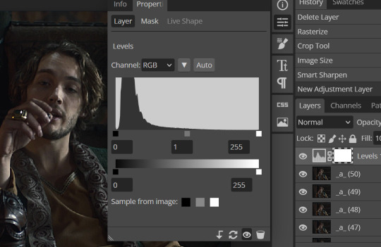
This is a lot of information about the image, but pay attention to where the curve starts and stops. On the left, you see a "0". That is your dark point. This image is slightly washed out so I need to move that adjustment to the right so that the little square is just below where the curve starts. The third number is "255" and this is your bright point. The images are very dark so most of the graph is shifted to the left (dark) so in order to brighten, move the third square (the white one) so that the second square (grey one) is just at the edge of where the curve drops off on the right.
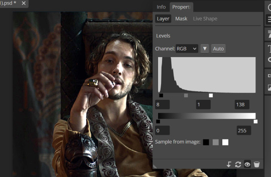
You can now see the numbers changed. Moving the first dark square will enhance your contrast, and moving the THIRD square will enhance your brightness. It is usually not necessary to move the second square, but you can experiment with this by moving things around and seeing how it affects your image. After this, it may be necessary to also increase the Exposure and Brightness if it is still not bright enough, but most of that can be done here.
8b. ADJUST COLOR BALANCE
Again go to your Layer > New Adjustment Layer > Color Balance to get this tool. This is a neat one with A LOT of variables, so play around with it to get the colors to look how you want. A lot of the raw video tends to have a bluish or greenish cast to it, so you just move the sliders to get rid of the cast and make the colors look how they are SUPPOSED to.
In this case there is a very slight greenish cast to the pictures so I will adjust that slider to compensate. The Range (at the top) you can select Shadows, Midtones, or Highlights, depending on where the color cast is located. Usually I stick to Shadows but sometimes will use Midtones if the color cast is really bad. Make sure Preserve Luminosity is checked.
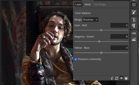
8c: ADJUST SATURATION
Layer > New Adjustment Layer > Hue/Saturation. This will brighten up your colors. This tool is VERY COOL in that you can select color families to selectively increase or decrease the saturation of. Under Range you can choose Master, which is all colors, or choose only Red, Yellow, Green, Cyan, Blue or Magenta. The slider at the very bottom (when a single color is selected) allows you to set the range of colors to. I chose Master and increased the saturation of all colors, but be careful as this can make skintones look VERY orange. So select other colors in the Range to adjust single colors only.
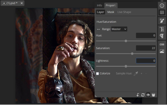
With this tool you can also change the HUE (which is changing the overall colors to a different color, like shifting all the reds to orange) and Lightness (which may or may not be necessary if you did the Levels correctly)
If you need to go back and change something in your adjustment layers, you can do so by clicking on the white box in the Layers section next to whatever you need to adjust.
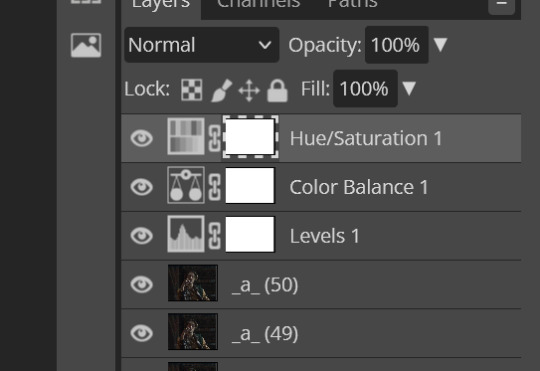
There are many other Adjustment Layers you can play with, so have fun and experiment!
9. ADD YOUR WATERMARK AND TEXT
Next, you can add a watermark if you have a premade file, by dragging and dropping it on the image. Then move it around to where you want it, resize it if needed, and change the opacity if it is too bright. Make sure this layer is the TOP layer.
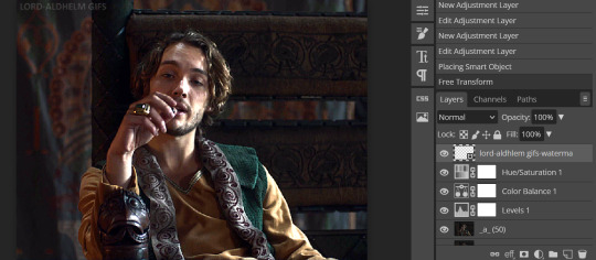
To add text (for subtitles or effects) simply click on the Text icon in the left menu (the T) and click anywhere on the image and start typing. You can change the font, color, size, and style in the menu on the top. Move the text around by using the Select tool (arrow on the left) Again make sure this is the TOP LAYER so that it will be present over the entire gif.
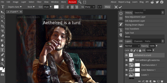
10: EXPORT YOUR GIF
File > Export as > GIF
A pop up dialog will appear and you can change some settings here if you want. I usually don't. Pay close attention to the filesize (at the bottom) and make sure it is under 10mb. Keep the quality at 100%. And most importantly MAKE SURE DITHER is checked! This will prevent compression artifacts from ruining your gif.
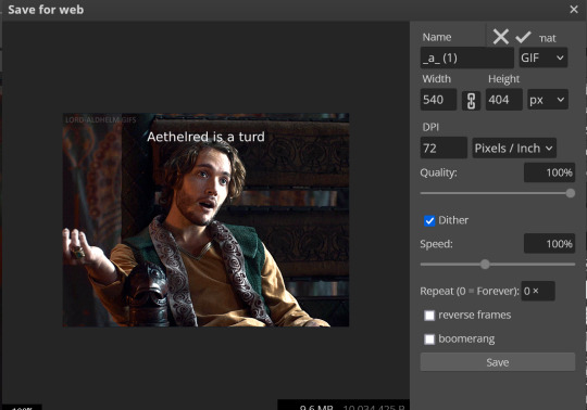
Save the file to your computer and VIOLA! Gif!
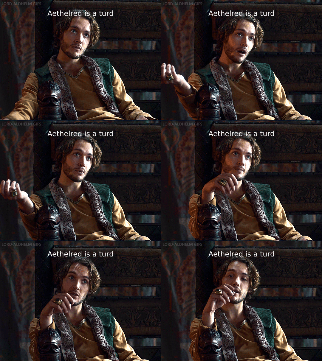
Have fun!
#gifmaking#gifs#gif makers#gif making resource#gifmakers#gif making#gif#gifmaking resources#gif making resources#my guides#giffing tutorial#gif making tutorial#photopea#photopea tutorial#photopea resources#photopeablr#photopea gifs#long post
48 notes
·
View notes
Text
rocambolestim's super duper cool awesome mega stim gifmaking tutorial!
[plaintext: rocambolestim's super duper cool awesome mega stim gifmaking tutorial!]
what you need:
a pc w/ a good amount of storage
a video downloader
honeycam (gif making program)
ezgif (helpful site which has many tool inclduing a gif optimizier if your gif is over the 10mb limit)
hello everyone, this is my own attempt at making a gifmaking tutorial, today ill be using an instagram video as an example. make sure your device has a good amount of storage avaliable. (please note some of the wording might be off since english isnt my first language & the honeycam interface in the screenshots are in bulgarian so its translated)
download your video. since im using this extension, click on this button. it will download your video

or you could just use an instagram video downloader site instead of an extension to download the source vid (pro tip: always use an adblocker so annoying ads wont show up on some of these sites)
2. open up honeycam (you can download it here) then click on edit.

then it will land u on this page.
now click on file & now click open and choose the video file you downloaded.
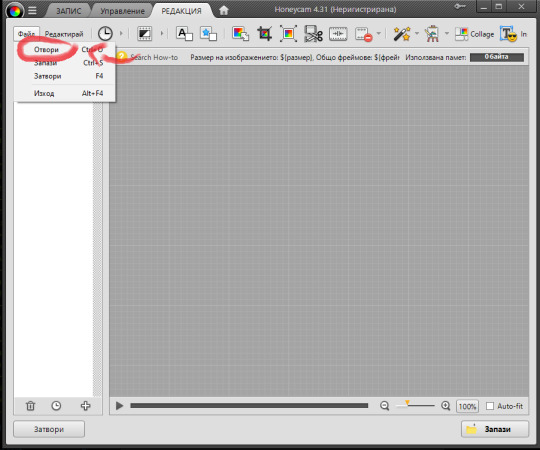
tadaa! you now opened your gif file!
since its already square shaped, ill skip this step, but if your video is in a non square size, you can crop it by clicking this icon

3. filtering the footage (optional)
im gonna filter the footage first before making it into several diff starting points, click on this icon! (the magic wand w/ sparkles) it is the filters option.

boom! we're now in the filters section, so ill click on this box which says multiple filter, i even put some filters which i commonly use as shown here as an example. then press ok to save it.

then ill press save & download the filtered footage as an mp4 file just incase + before i make it into gifs
4. making the gifs
alr alr, so this is where the fun part starts of gifmaking.
click on this icon (cut frames)

and it will bring u up to this menu!
now u can cut any part of the video, then press ok.

5. exporting the footage
export your gif by clicking save then click on the save menu the gif option & resize image & set it to around somewhere in the screenshot (u can resize it if u think its too big or too small), it will be saved in the honeycam folder by default, so click the option where it says see in folder to drag & drop it onto a new post. optimize the gif via ezgif's optimize option to lower its filesize so it isnt over the 10mb filesize if the gif has too many frames and/or if its too long

6. (idk what to call it)
repeat the previous steps (5 & 4), and dont forget to link the gif's viddeo source if you post a gifset, have a great gifmaking experience, bai bai!!
[gifset from the tutorial will be added soon as a link for u to check it out!]
update: gifset from tutorial can be found HERE!!
#mod rocambole speaks#not a stim#gif making#gif tutorial#helpful#resources#gifmaking#stimblr#stimmy#visual stim
6 notes
·
View notes