#i just played around with some default brushes settings
Explore tagged Tumblr posts
Note
I would love to see something from the beginning of poly!marauders relationship where they are figuring out that they all want to be together and learning how to make it work. I’ve always wondered how their relationship would start!
Thanks for requesting my love! It took me so long to get to it, I appreciate you being so patient with me <3
poly!marauders x fem!reader ♡ 1.4k words
Sirius is playing with Remus’ fingers, and you’re trying to figure out if the ache of longing in your chest is some relative of jealousy. You don’t want it to be. Remus and Sirius are your friends, and you’re happy that they make each other happy. And honestly, looking at them now, with Sirius’ leg slung over one of Remus’ and Remus’ long fingers in his grasp, you’re not sure which one of them you’d trade places with if you could.
Things have gotten…complicated, lately, though none of you are talking about it. Two weeks ago, James had kissed you, and you’d really, really liked it, but you’d felt obligated to confess your confusion to him. You do like James and want him to kiss you, but you can’t help feeling guilty for also harboring feelings for two other people at the same time. It wouldn’t feel fair to start something with James, who deserves all the best anyone has to offer, if you feel like you can’t be fully in it with him.
And of course you’d known he’d be cool about it, but you hadn’t expected him to truly understand. He’d told you that Remus had kissed him back before he and Sirius had gotten together, and James hadn’t been able to stop thinking about the other boy either. Neither of you had quite known how to move forward in light of your admissions, but you’d agreed to put things between the two of you on hold for the time being.
Then just yesterday, you’d been walking to class with Sirius, and he’d accidentally brushed your bum with his hand. The zing you’d felt was probably more a nervous response than anything else, but it had felt markedly different from the icky feeling you’d gotten when boys had touched you without your consent before. Sirius had been quick to apologize, and you’d waved it off, but you’d seen the look in his eyes. You aren’t usually one to flatter yourself by presuming anyone might have feelings for you, but the attraction in his gaze was unmistakable.
You haven’t said anything to anyone about that, but even now, when he’s half atop his boyfriend, Sirius’ eyes keep flitting to where you’re working on your homework.
“Anyone started on the potions essay?” Remus asks.
“No,” says James. “Have you?”
“No.”
You and Sirius both make quiet sounds of agreement.
It’s silent again, the only sound the gentle scratching of pen on parchment.
“Alright.” James sets his pen down with a thwap. “What’s going on with you guys?”
You look up, and he’s staring right at you.
“What, me?”
“Everyone!” James shakes his head. “No one is talking to each other. Did something happen?”
You press your lips together, but Sirius blurts, “I told Remus I was into Y/N.”
James blinks, looking about as shocked as you feel but without the added embarrassment. You wish, not for the first time, that you could apparate straight out of Hogwarts.
“It’s fine,” Remus says. “We’ve sorted it.” He gives you a kind look. “Don’t look so nervous, love, I wasn’t upset. It’s not like we don’t all have thoughts about other people sometimes.”
Sirius looks unsurprised, and you gather that was a part of the conversation they’d already had, but James nearly chokes on air.
“Do you?” he asks.
Remus flushes, his fingers tightening almost imperceptibly around Sirius’. “Sure. Sometimes.”
James and Remus’ gazes are locked, a sort of heaviness building in the air between them, and you hurry to dispel the tension. “I mean, you’re all very good-looking,” you laugh. “It’d be impossible not to notice each other.”
Sirius seems on board with your plan of levity, falling easily into his default flirtatiousness. “Yeah, gorgeous? Do you notice as well?”
For a second, your mouth works without sound, your thoughts flittering about your head like frenetic butterflies. You’re sure your face is turning a humiliating color. “I—I mean, like I said, it’s hard not to.” You clear your throat. “You don’t get to be the golden boys of Gryffindor for nothing.”
“And here I thought it was our brains.” Sirius grins, letting you out the trap he’d unintentionally ensnared you in. “Well, if we’re known for our looks, then it makes sense why you’re part of the group too.”
It takes you a second to catch his meaning, but you don’t miss Remus’ tiny nod of agreement.
“Wait a minute,” James says, still looking between the lot of you like he’s refereeing a particularly perplexing tennis match. “So…Sirius and…who all here likes who?”
You go mute, as do the other boys.
James nods, and he’s sticking his tongue in his cheek like he does when he’s nervous, but the set of his brows is resolved. “Okay, I can go first. I fancy each of you.”
You look over at Remus and Sirius, but neither of them appear as shocked as you’d think the profession would warrant. Sirius opens his mouth like he has something to say, then shuts it again.
“Trust me, I feel very weird about it,” James goes on anxiously. “I just wasn’t sure—”
“No, it’s alright.” Remus leans forward slightly, looking like he would reach out and comfort James if he were close enough. “I’ve…I’ve had similar thoughts.”
Sirius has ceased his toying with Remus’ hand, but he doesn’t let it go, looking down at their joined fingers. “Me too,” he says, not quietly but noticeably lower than his normal half-shouting volume.
“I never…I don’t really understand it all the way,” you admit. “But I think I like each of you too.”
There’s another agonizing silence. Remus starts to brush his thumb gently over Sirius’ knuckles.
“It doesn’t make any sense to me,” you say finally. “I see you two together, and I’m not jealous at all. But I like you both.” You look over at James, and your face hasn’t cooled at all, but it gets a new wave of heat now. “And you, too.”
James gives you a little smile, and it’s like he can’t help himself, reaching over to give your shoulder a tiny squeeze.
“I don’t think,” Remus says carefully, “that there’s anything wrong with that. I mean, it’s not like any of us doesn’t like anyone else, apparently. Just…what do we do about it?”
You and James exchange a look, but this suddenly feels like something you shouldn’t intervene in. You’re both single, but Remus and Sirius aren’t.
“Well,” Sirius drawls with a nonchalance that’s definitely forced but so familiar that you’re grateful for it anyway, “if it’s alright with you, I think I’d like to date.”
“You are dating,” you point out.
Sirius shoots you a mocking look. “Date all of you, smart-ass.”
James lets out a little laugh, and you smile a bit at Sirius’ brashness. The both of you look to Remus.
Remus only shrugs as if you’ve asked him to comment on the weather. “S’alright with me.”
James really does laugh now, the loud, hooting sound you love so much. “It’s alright? You really do know how to make someone feel special, Moons.”
“Fuck off,” Remus laughs. “What else am I supposed to say?”
“Um, that we’re the most attractive people you’ve ever seen and nothing would make you happier?”
“Well there you go, James. You’ve said it for me.”
The laughter dies out, the new awkwardness of more-than-friends settling over the four of you.
“Well shit,” Sirius says after a minute. “What do we do now?”
“I don’t know,” you reply. “You’re the only ones who have been in a relationship, what do you guys do?”
Sirius looks at Remus, and Remus looks back.
“What do we do?” Sirius whispers to him. “Do we…we go on dates sometimes, yeah?”
Remus nods, one corner of his lips twitching amusedly.
Sirius turns back to you and James, nodding decisively. “A date,” he announces. “Pick you all up in, uh, our common room at eight?”
“Eight is good for me,” James says, grinning so hugely you can’t help but smile with him. “Now, if we’re all done being weird—Y/N, lovely, could you help me with this charms homework? I’m dying over here.”
You scooch closer to him, peering at his parchment and wondering if now you can stop cataloging all the places your bodies touch, your shoulder brushing his upper arm.
“It looks fine to me,” you say after a moment.
“I know, sorry” James replies, leaning into you so that the warmth of his arm seeps into your skin. “It was a charade.”
#poly!marauders#poly!marauders x fem!reader#poly!marauders x reader#poly!marauders x y/n#poly!marauders x you#poly!marauders x self insert#poly!marauders fanfiction#poly!marauders fanfic#poly!marauders fic#poly!marauders imagine#poly!marauders drabble#poly!marauders scenario#poly!marauders oneshot#poly!marauders one shot#james potter#james potter x reader#sirius black#sirius black x reader#remus lupin#remus lupin x reader#the marauders#marauders#marauders fanfiction#marauders era#the marauders era#marauders fanfic#marauders fic#marauders fandom
1K notes
·
View notes
Text
how to make cool blobby turing patterns in photoshop
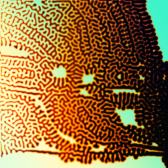
i'll preface with i learned the basic loop from skimming a tutorial on youtube, but as someone who prefers written tutorials i'm sure many would appreciate one! also, the second part of this is some of the visual effects i figured out on my own using blending modes and stuff.
i'm using photoshop CS4 on a mac so some buttons and stuff might be in different places on windows and newer photoshop versions but all the actions are the same. my canvas is 1000x1000 pixels.
UPDATES (i'm hoping these'll show up whenever you open the readmore?)
it's possible to do something similar in krita using this plugin, made by the love @arcaedex
it's also possible to do this in photopea, a free browser alternative to photoshop! the results are pretty much identical.
FIRST off you wanna get or make a black and white image of some kind. it has to be one layer. can be noise, a photo, a bunch of lines, whatever. here's mine, just some quick airbrush lines:

now find the actions tab. idk what it looks like in newer versions of photoshop but you probably won't need to dig!
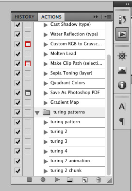
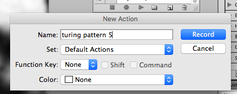
hit the little page thingy to make a new pattern. once you hit 'record', it'll record everything you do. the little square 'stop' icon will end it.
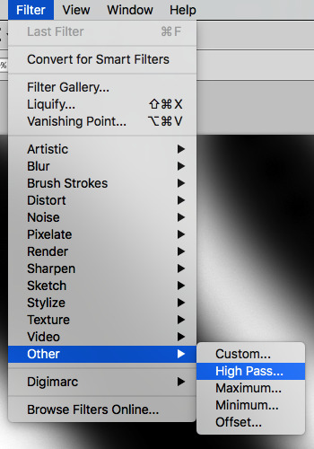
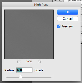
now you want to do a high pass filter. you can mess around with the radius to change the size of your squiggles, but the tutorial had it set to 6. experiment!
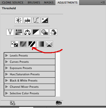
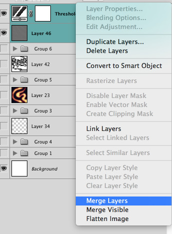
now add the 'threshold' adjustment layer. i use the adjustments tab but i think there's also a dropdown menu somewhere. keep it at the default, 128. merge it down. (control or command + E or you can right click it like some kind of weirdo)
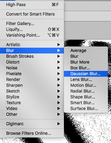
and finally, the gaussian blur! the radius of this affects the shape and size of your squiggles as well. i like to keep it around 4.5 but you can mess around with that too.
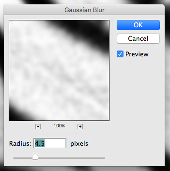
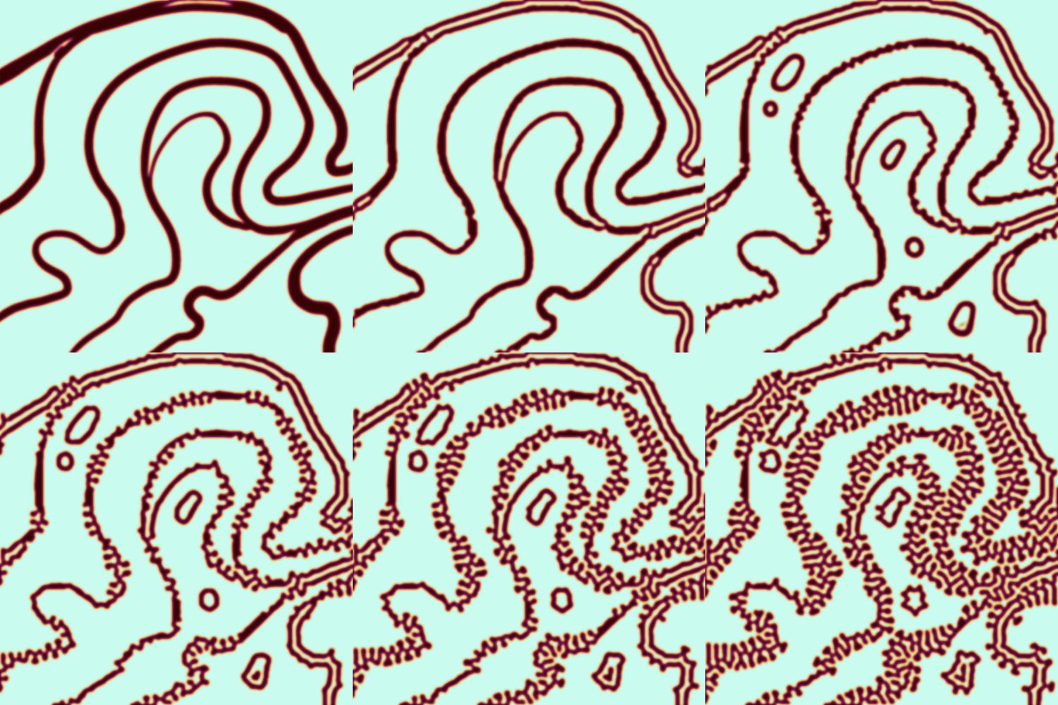
after that, hit 'stop' on the action you're recording, and then repeat it a bunch of times using the 'play' button, until you have something you like, like this:
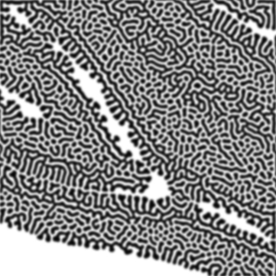
WOW!! that was fun!! and only a little tedious thanks to the power of macros. anyway, here's some fun layer blending stuff i like to do. it's with a different pattern cause i made this bit first.
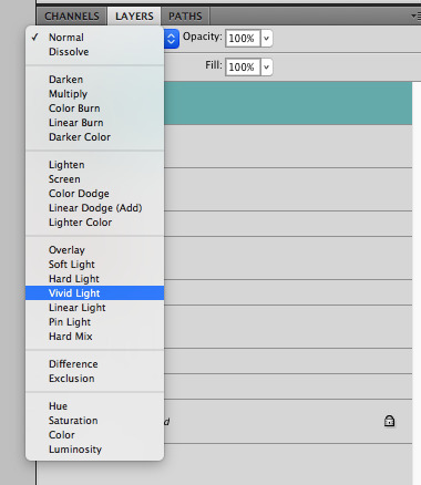
anyway, using a black and white gradient (or a grey base that you do black and white airbrush on), make a layer with the vivid light. this will make the blobs look thicker or thinner.
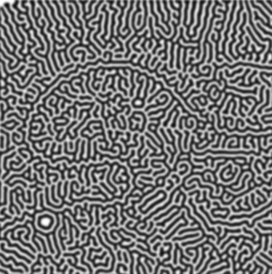


then, for cool colors, do a gradient map adjustment layer over that:

and finally, my best friend, the overlay layer. just using a gradient here bc i'm lazy, but feel free to experiment with brushes, colors, and blending modes!
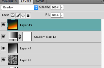

NOW GO. MAKE COOL SHIT WITH THE POWER OF MATH. AND SEND IT TO ME
also these are not hard and fast rules PLEASE mess around with them to see what kind of weird shit you can make. here's a gif. as you can see i added some random airblush blobs in the middle of it, for fun.
933 notes
·
View notes
Note
your gifsets are perfect, I'm always in awe of what you can do and you're creativity!!! Could you please explain how you made the broken glass gif with different gif in it on photopea? https://www.tumblr.com/dengswei/754916132337729536/userdramas-creator-bingo-green-asiandramanet?source=share and would it be possible to do something similar with other shapes? Thank you for your lovely creations <33
heyy thanks so much!! and of course! i have to admit the way i do it might be a little bit tedious compared to like everyone else (though i don't know how photoshop users or other photopea users might do it 🤣) okay this is gonna end up being so long because of the way i do it so i'm sorry about that and i hope it makes sense 😭
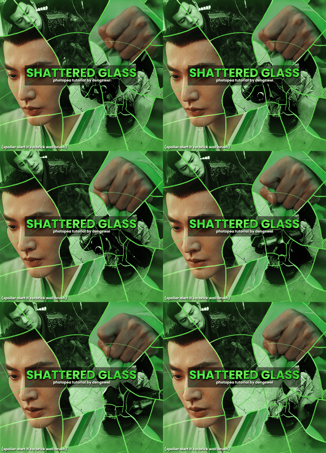
okay i have to admit i couldn't find the texture i've seen people use for the shattered glass effect so i actually used a photopea default brush from this pack
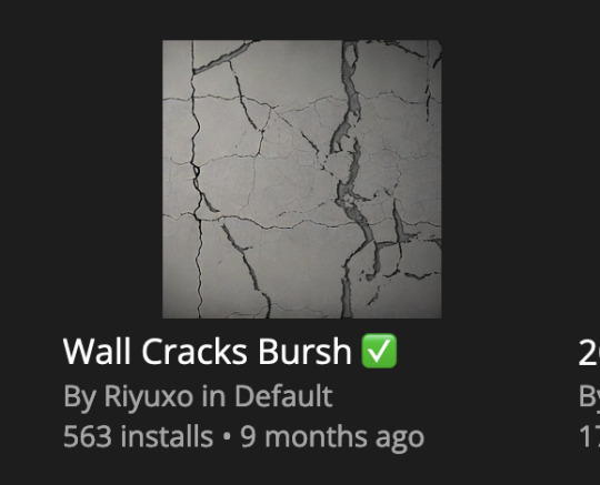
to download the brush set go to window -> plugins -> brush and then search for wall cracks brush (it's literally the only wall related brush set in photopea so it'll show up the moment you download it)
so for the gif i did above i did my giffing the usual way of creating & colouring for different gifs seperatly and then adding them all to one project (it doesn't have to be 4 gifs i just chose 4 because that's what i wanted to show in this gif)
i've done this twice once for this set and another time for this the blood of youth set and i have to say the most important part of this is keep multiple versions of the brush in the position you want as you can so once you've used it to test it out and you like that version keep it because unless you can manage to position the brush in the exact same place every time you're gonna need to reference those (or even use the magic wand tool for it later) and also you need to keep at least a white on black background version for the outline
in the brush pack the one i used was this one: (3564, crack b 9)
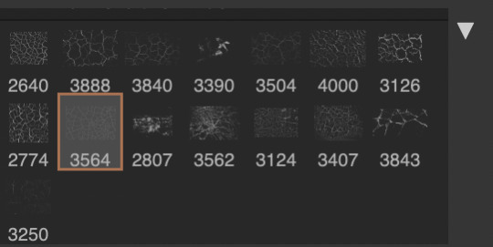
for this part i just say play around with both positioning and sizing of the brush, it automatically opens with the size 3000+ which is fine i think with the tushan jing one (the green gif above) i stuck with that size and just kept clicking around until i got the positioning i wanted (this is another reason why i said what i said in the paragraph above because if the brush size is bigger than 1000 it's doesn't come out in the exact positioning as you expect it too
i decide the positioning of the gifs on the way i like the brick brush looking rather than the other way around, this is the positioning i went with if you're curious & would like to use it if that's easier 🤣
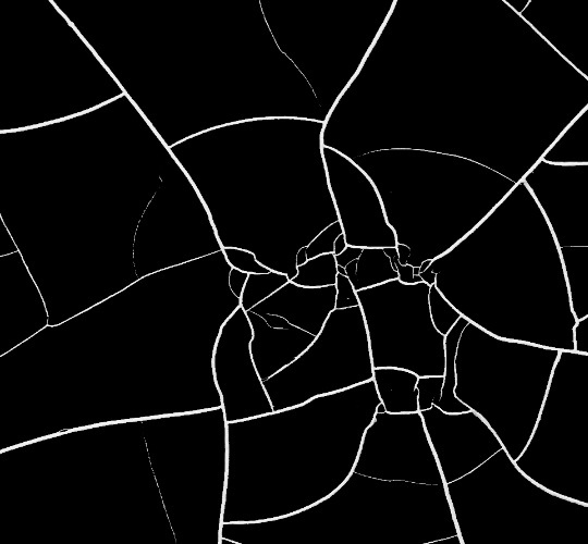
you'll need to keep this as a seperate layer at the top, i had it set to screen and then added a colour fill layer clipped on later so that i had the outline for when i was masking
so to start off i have the base gif which i do nothing to, that stays as it is, with the brush layer above set to screen
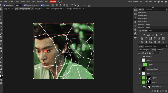
next is where you want to position your other gifs it may benefit to figure this out all at first before doing any of the masking so you know which parts you want to erase and which parts you want to keep
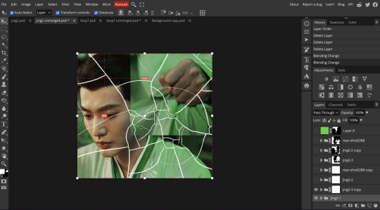
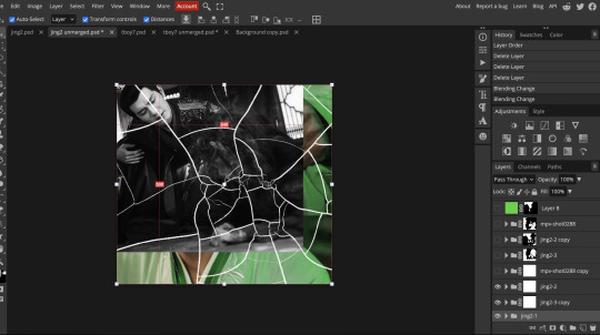
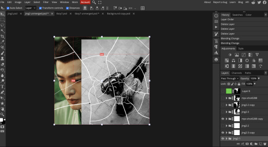
so this is what i decided with my positioning looking at where each of the cracks are
now comes the tedious part, in some ways the way i do this is a lot similar to how i do grid but it's not as easy (for grid photopea automatically locks onto the squares making it easier to mask, here you have to do it all manually)
first put a raster mask on all of the other gifs except for the base gif & use the magic wand tool on the brush layer so you get the outline of the brush and you mask that away from your gif (so if you turned off the brush layer it should look a little something like this: (it's not perfect but it won't matter that much because you should have the original turned on at the end anyway) (you don't have to do this step tbh i just did it because i thought it looked better)
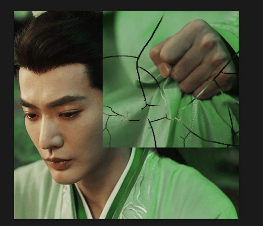
so with the brush layer turned on you can use that as a template to which parts of the cracks you want to erase, you can either use the magic wand or the paint brush tool it really depends on how much of a perfectionist you are and whether or not the sharp edges bother you (plus some of the cracks have small openings so it might erase another part you don't want if you use the magic wand tool so it really is another instance of playing around and seeing what you like, and it might also change once you add the other gifs too)
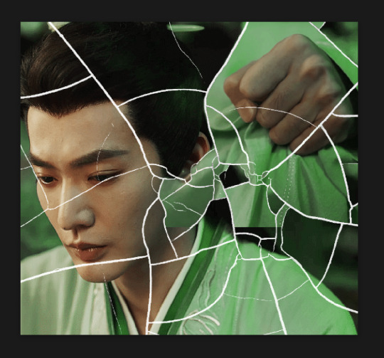
so this is how it looks after i've done that (notice in the middle you can still see the edge of the gif? that won't matter because one of the other 2 gifs i still have yet to mask will cover that) & just repeat the same thing for the other gifs you want to add
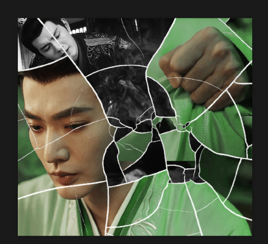
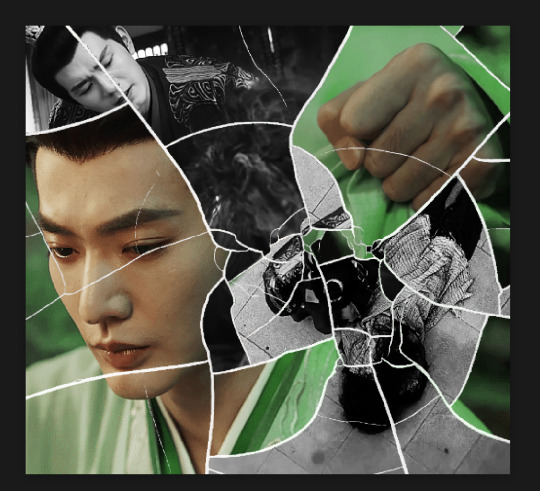
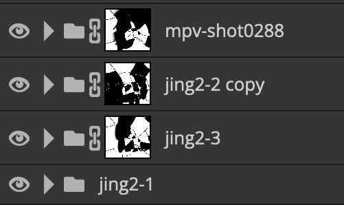
this is how my masking folders look if you're curious
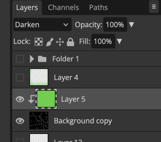
& last but not least i added a green colour fill layer clipped to the brush layer and set that to darken to get the green effect (make sure that the brush layer is still set to screen)
& once you've merged all of the gifs together you should get your desired outcome like the gif above (make sure that all the gifs have the same amount of frames too)
when it comes to other shapes i'm sure you can! like i did a tutorial with the grid version here, i guess it'll just be a lot of trial and error & finding a texture or brush with different shapes to try it out with kinda like how i did with both versions of this (i definitely did it a lot better this time around compared to the first version i did of this)
hopefully this wasn't too long or too confusing, if anything is please feel free to ask me again and i'll try and explain it a little better 🤣
#replies#Anonymous#photopeablr#usergif#tutorials#photopea tutorials#completeresources#mine | tutorials#gif tutorial#photopea#resources#gif resources#gifmakerresource#photopea tutorial#tutorial#gif tutorials
94 notes
·
View notes
Text
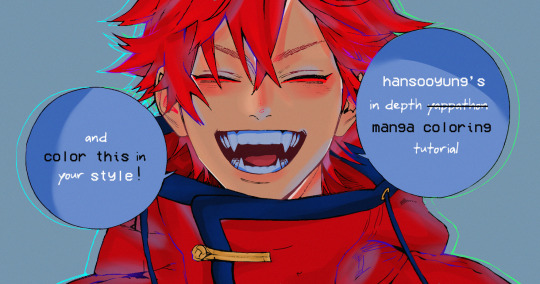
hansooyung's coloring tutorial & ctiys: alma time! 🍒
hello everyone! though i've been meaning to for a while, i've finally gotten around to making my first manga coloring tutorial! i'll be going over cleaning panels and screentones, choosing base colors, and finally shading and lighting.
this will also be a color this in your style challenge, so if you're willing, feel free to post your colored panel and tag me in it!! i'd love to see all the results :)
find details under the cut! 🦋
DISCLAIMERS:
this is just how i personally color! i know for a fact that some of my other friends follow other methods and have such beautiful colorings <33
for colors specifically, i play around a LOT. if you don't like your color scheme for the time being, mess around with it! i don't use psds since i like to mess around by hand with color palettes, but maybe i'll look into it for the future.
i explain a lot just bear with me gang 🙏
TECHNICAL STUFF:
software: ibis paint x (on iphone). i use ibis since it is FREE for all phones and it worked on my chromebook as well.
while this tutorial is made for ibis paint x, everything works on other softwares except the brushes, which i've provided alternatives for below.
brushes: i will be using dip pen (hard) which is automatically included with ibis, and two other brushes i made myself which you can find here and here. for more brushes, @/bkdkdh was incredibly helpful and posted her awesome set here!
for other softwares, you can use similar brushes. dip pen (hard) can just be the default brush, while wet edges is just the default brush on lowered opacity (and more of a rectangle/marker shape?). watercolor pencil is a watercolor brush in the rectangle/marker shape as well. if you can't get the shape, you can always smudge your lines into shape as well, so don't fret too much! a bunch of people only use one brush for coloring everything (which is insane to me, personally, they are so talented!)
fun fact: the first brush listed that i made was originally called "aki tao watercolor smooth" 👍
ok here we go guys!!
STEP ONE: CLEANING THE PANEL
i think of this part as setting up the panel for coloring! usually it's pretty exhausting cuz it's all b&w but it's all worth it i swear. the panel i'll be coloring is this beautiful one of alma from chapter 2:
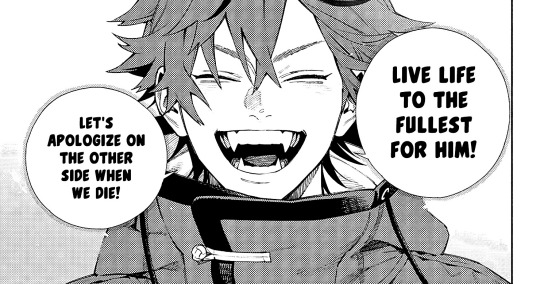
imgur link here (x)
a lot of people redraw their lines to avoid screentones, which is extremely helpful. however, i work on a phone and my fingers are not steady even with the stabilizer turned all the way up T~T. i do it this way, but a different (possibly easier) way may work for you!!!
your first step will be to remove all the white, giving us a transparent background to work with. THIS IS THE NUMBER ONE REASON WHY I USE IBIS PAINT X.
when you upload the image to ibis, a popup comes asking if you would like to "extract line drawing". this creates a lineart of your image. click yes, and your work is like 90% done.
if you're not on ibis, you can redraw your panel, put lineart layer on screen, etc. or you can just extract line drawing from ibis and upload to software of your choice
for those of you not on ibis, i've included the line drawing here (x) if it looks black, don't worry and set your background to white.
omg i was not kidding when i said i explained a lot. ok now onto the three main steps of cleaning the panel:
cleaning background
removing screentones
repainting black lines
for cleaning the background, we're going to clear off all the extraneous stuff. this includes the text in the speech bubble, the gradient screentones behind alma, and the panel line on the left side. just use your eraser tool and go crazy! (i forgot to save the panel at this point of the coloring OTL)
for removing screentones, we're going to remove all those "dots" that mangakas use for shading. these are used to show value for b&w art, but since we're coloring we don't need them—a lot of people have really cool ways of incorporating screentones in their colorings though, and it looks amazing! i used it on nana's hand in my bnha coloring.
remove the screentones from alma's hair and jacket with your eraser tool. this will take time, but it's worth it in the end!
for portions with a bunch of lines, you can create A NEW LAYER and redraw some of the lines. that way, you can erase indiscriminately from the original layer but the lines you drew are still there. again, like i said, my hand is really shaky so i don't do it a lot, but it's extremely helpful for smaller parts where i have control! i used this on alma's jacket, and here's a screenshot of the process:

(i made his jacket purple so i could distinguish between layers easily).
it should look like this when you're done:
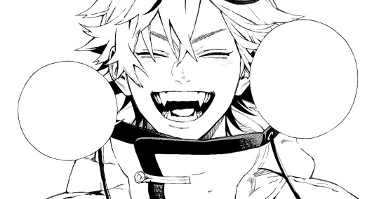
for the final step of cleaning, i like to erase all the things colored black (the collar and strings of the jacket, along with the back part of his hair). that way, i can color them in with dark colors and it adds to the whole look of the coloring.
i've circled the parts i'm going to erase below:

and it should look like this when you're done!
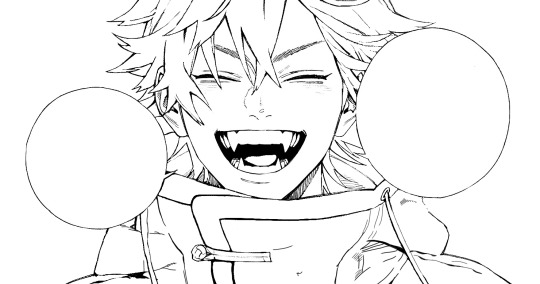
ok everyone cheer we're ready to color now!!!!
STEP TWO: BASE COLORS
CROWD CHEERS ok lets go!
this part is the most important to me, because it sets the tone for the whole coloring. i like to use three-four main colors in my colorings, and it's usually background, skintone, hair, and the secret fourth color. the secret fourth color is usually whatever color fits the character's vibe, or if the character's color is the bg, it'll be an accent color.
for example, with my nagi coloring, i used white for the hair, i had my skintone, i had blue as the main coloring vibe (as nagi's color), and black as the accent color.
for alma, i chose his main color to be red! it's the color of his hair and his jacket, so i wanted it to be vibrant and stand out. since blue contrasts red, i went for a greyish-blue shade for the background. (i went for grey rather than solely blue because then it would clash rather than complement).
disclaimer please please please take your device off night mode warm mode f.lux whatever you have. this has screwed me over more times than you may think :(
i like to make my vibrant colors closer to the right end of the color square. for alma's hair, i chose this color:

i dragged it down from the corner a bit but kept the saturation since his hair is kind of dark. we can use vibrant colors to shade it though, so don't worry!
here's his hair and the background together:
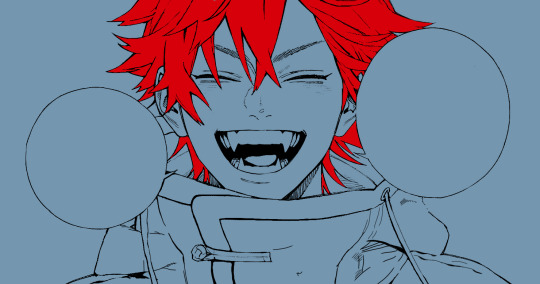
now from here, play around with skintones until you find one that matches the hair!
i usually drag around the wheel to the orange-red intersection, and have it on the lighter, more saturated side. here's the color i chose for alma's skintone.
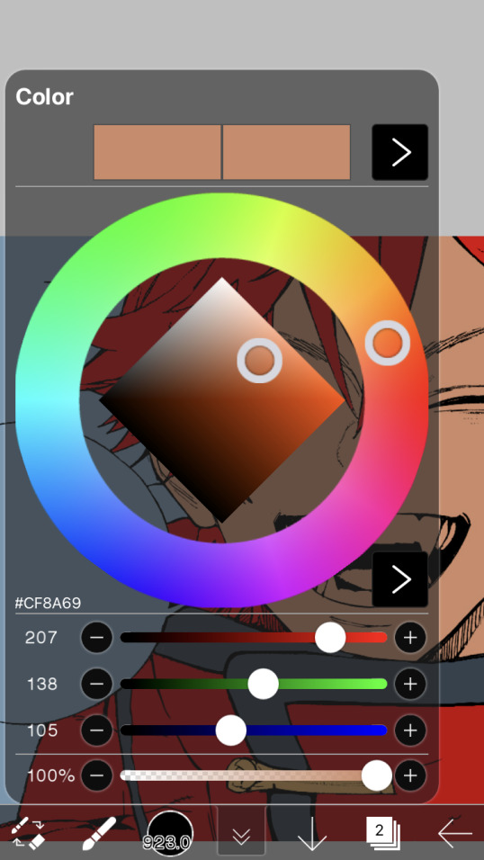
i thought his original skintone looked a bit too orange, so i pulled the saturation back a little bit (moved closer to the left side of the square).
after that, color in his jacket with a bit darker red than hair, choose a gold color for the accents on his jacket, and color in the black parts with a grey-ish color (we will change that later).
here's the base colors!
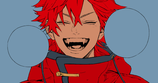
if it looks a bit bright, don't worry! we can change that with shading. or you might just have to. accept the light.
STEP THREE: SHADING AND LIGHTING
wooo we made it!!!!!!! ok now i lied, we have a bit more of base colors to go. on a layer above the skin, color in your teeth and tongue. for pieces that have a more red feel (like this one), i like to make the teeth and the shading a more vibrant blue color. (for blue pieces, i make it a purple!).
IMPORTANT NOTE: ALL SHADING AND ALL COLORS SHOULD BE DONE ON NEW, CLIPPED LAYER.

i'll then go in and do some light shading with my wet edges brush. i'll use a darker color for hard shadows and then a lighter, more vibrant color to accentuate it.
next up we have blush! a lot of people do this in very different ways but i like to do it directly under the eyes, in a vibrant red shade. make a new layer above the skin and clip it on. color pick alma's hair and drag it to the most saturated shade (red corner). then using the watercolor pencil brush, lower the opacity of the brush and drag a line under the eyes on both sides.
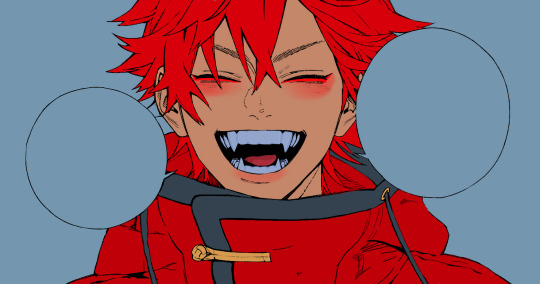
make sure to erase the portion of blush that goes above the eyeline. i also added some lips for alma as you can see, and then added a red line under the eyes! this was back to the regular dip pen (hard) brush on 100% opacity. it may take a few tries to get your blush to the way you want it, so don't worry too much.
now we can start our actual shading!
i break this part up into three steps: skin shading, blue shading, and light shading (highlights?)
for all of them, think about where the light is falling and how it will look on alma.
quick interlude about brushes: i use the watercolor pencil brush for softer, bouncy looks (like blush and noses) and i use the wet edges brush for more hard lines in shading.
again, make a new layer above the skin and clip it on. (i like to have it below the blush, so it doesn't cover it). for skin shading, i take the vibrant red and lower the opacity of the wet edges brush by a significant amount (specifics don't really matter, as long as you're happy with it). i'll trace his neck, from the shadow of his face, shadows of his hair falling on his face, ears, and nose. (for the nose i used the watercolor pencil brush for a softer look).

this is what i have once i'm done!
next we have skin shading part two, where we basically make a new layer on top of our first shading, lower the opacity further, and trace outside whatever we just did to blend it in more.

i used the watercolor pencil brush since it's more softer shading meant for blending! i also added it around the eyebrows for depth.
next up we have our blue shading! this is a technique that i learned from @/bkdkdh's colorings, but adding blue as a shadow really adds to the whole coloring. using the watercolor pencil brush, select a light-ish blue shade (a bit more saturated than background color) and use it to shadow a few more areas than your skin shading. i always make sure to hit the underside of the nose, cuz i think it adds depth!
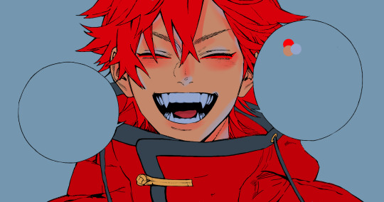
finally, to wrap up our skin shading we have our lights. i use an orange-ish yellow color, which i set pretty light to not blend into the skin. using the watercolor pencil brush, i'll basically highlight any areas opposite to where the blue was, and highlight different parts. i always highlight one side of the nose as well.
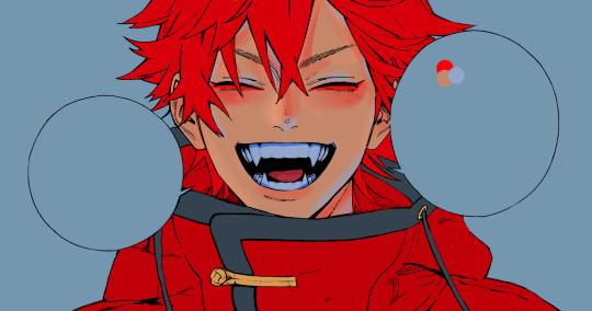
i erased the line around the nose since we now have shading there, and added a darker shade to the teeth since i felt it wasn't shaded enough.
now onto the hair!!! (guys we're almost done bear with me, skin and hair are the two main things and then you can half-ass the clothes)
color pick alma's hair color, then drag the red a bit further down to get a darker yet still saturated color. here's mine:

then, using the wet edges brush, draw lines of shadow wherever clumps of his hair fall or overlap with each other. you can have the opacity set to whatever level you want, i just went with around 90. just try to follow the natural lines and patterns of the original line drawing, and everything should work out fine.

here's how mine looks! then, just like we did for skin shading, place a layer on top and lower the opacity to around 50%. place some more shading to blend it in. you can also shade more parts with this shade for some softer shading. i actually forgot to take a screenshot of this step but you'll see it in the next one!
for our (almost) last part of hair shading, take a layer and place it below both of your shading layers. this is going to be our highlight layer! you can see it below, labeled 49%.

remember how we set alma's hair a bit darker from the corner color? now select that corner color and draw highlights in the center of each hair clump.

lightly visible but it's there!
now here i skipped around a bit bc i was having fun and forgot i was doing a tutorial, but repeat the shading (not highlighting) steps with darker colors for alma's jacket. you should have your base layer, a dark shading, and a softer shading for blending.
we're almost there guys!!!
for the pretty much final step of shading, select a light blue color and do some blue shading with the watercolor pencil brush opposite to wherever your darker shading falls (just like we did on the face). make sure to do it to both your hair and your jacket! here's mine:
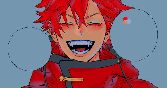
now for the black portions, we're going to color the whole thing in a dark blue color. just alpha lock your layer and make a big stroke of dark blue, almost black. for our black shading, we're actually going to go lighter.
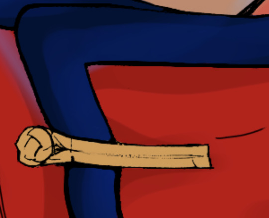
select a lighter (but still dark) color and place highlights on the base layer, then take an even more vibrant, lighter blue and place it on the very outside for highlights. a better example of this would be nagi's legs in his blue lock uniform here. then, choose a shade to apply shading to the gold accents on alma's jacket and we're done!
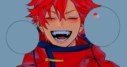
CROWD CHEERS!!!!!
STEP FOUR: FINISHING TOUCHES

we made it guys!!!! for finishing touches, i'll usually do background effects or text or that kind of stuff.
step one is coloring your lines. you can add a new layer and clip it to your lineart, or simply alpha lock your lineart and color directly on top. for hair i like to add vibrant blue/purple lines, along with a few red ones. for skin lines i try to do dark brownish purples, but leaving some black is good too bc it adds flavor!
i colored in the text boxes and added shadows using the wet edge feature, then added some text. for the glitch effect, i duplicated the lineart, dragged the layer below all of my colors (including speech bubbles) and then used the glitch effect with height full from ibis. if you don't have ibis, you can look into features on your software, or you can also just drag your lineart layer a bit to either side and color it in. i also applied just the tiniest bit of noise on top of everything
and there we go!!!!! we made it to the end :)
if you've read all the way til here, thank you so much! if you decide to color this panel of alma (or any other panels!) don't be afraid to post them and tag me for a color this in your style type of thing! (you can also put it in my tracked tag, #user.roy) i'd love to see everyone's works :)
here's the full timelapse: (it stalls for a bit at some times but hey we can't have everything)
#roy colors#tutorials#manga coloring tutorial#useraki#usergojoana#usermica#usernikiforova#tagging some friends <3#alma#gokurakugai
98 notes
·
View notes
Note
what kind of brushes do you use for your digital work?
Hi! Firstly I work Mainly in Procreate so I will just talk about those brushes.
There I use a bit of everything!
So I love the defaults brushes procreate has and use them a LOT. Especially the 6B Sketching pen and the inking dry pen! (Default Chalk brush in Calligraphy and Bonobo Chalk Brush in Sketching as well!) Then for more texture I use a lot of brushes from @maxulichney Gouache and Watercolor Max pack! oh! And I recently too started using some brushes From Olguioo! https://olguioo.carrd.co/ And of course I have a few brushes I made myself that are always good.
But really I recommend playing around with brush sets and packs one at a time. Its easy to get overwhelmed by brushed and what they can do believe me! Start by trying to narrow down what kind of effect you are looking for in your art! Its is for lines? is it texture? is it blending? then you can experiment and find the right brush you need! All in all I use mostly maybe 6 to 10 brushes for 99% of my work. And I have maybe 100 (150?) on my ipad.
Just find the ones that work for you!:)
Hope this helps!
#the ghosts are asking#but really to find the brush you like#its a lot of playing around.#dont try to have TOO many brushes or you might get overwhelmed#i get overwhelmed#need to clean up some brushes so I have less
60 notes
·
View notes
Note
Have you ever drawn Sephiroth? Also my favorite post of urs is Cloud and Zack chained together and getting caught by a poll XD ALSO ALSO how do u find an art style?? I've been asking this question to a lot of ppl but never get anything that helps me- my "art style" is always inconsistent and I'm trying to do something that expression how I feel as a person while drawing a character (but maybe it's because as a person I'm all over the place and I can't pinpoint how to express myself) I can give a little ref for a few of my drawing to show how inconsistent they are😓 though some things stay the same a lot of other things change (people say I'm hard on myself but I feel like it needs to look a certain way for me to like it ig also also also the 2nd drawing was a fixed version of the og because it was well elongated.. can you tell im no good at anatomy-?)
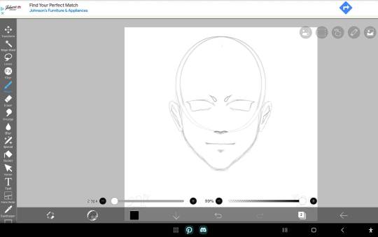
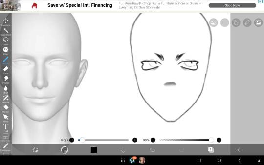
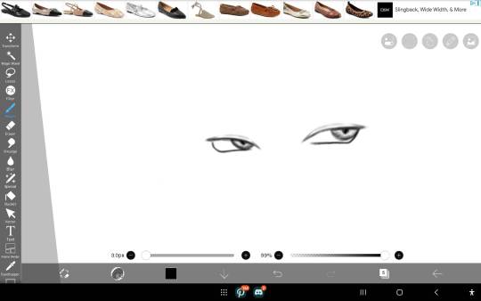
ANYWAYS SORRY FOR THE RANT!! 😓
HI NO WORRIES FOR THE RANT!! Regretfully I have not drawn a whole lot of Sephiroth... perhaps that shall change someday? 🤔
Hmm I think I know what most people's advice would be, like "oh don't worry about art style just do whatever you like!" and yes, that's kinda true, but it's not really helpful. So here's my thoughts on the matter:
I find that the best approach to finding a style that fits you is to start by identifying your own tastes in art. Instead of worrying about consistency, focus on finding brushes/tools that feel good to use, colors and lines that appeal to you, and then play around with those. You'll find it a lot easier to make art that you like if you let yourself have fun with it, as opposed to subjecting it to pass/fail criteria.
For example, it's probably not surprising to hear that I love vibrant, colorful geometric art. I struggled for so long trying to use fancy brushes and weighted paintstrokes to make more realistic portraits, and it frustrated me because even if other people said it looked great, nothing I made looked right to me. Turns out it was my toolkit hiding my own art style from me. The moment I switched to solid colors and the goofy default pen setting, BOOM. Suddenly I was on a roll.
As for anatomy, you're already doing great!! My trick for anatomy (and for anything at all, really) is to break it down into simple 3d shapes. Fun fact, almost everything with the human body is just varying cylinders. Your neck? Cylinder. Hand? 5 cylinders attached to a cylinder that's been slightly squished. Torso? That's cylinder, babe! Arms? Legs? You guessed it, cylinders.
Challenge yourself HARD, EARLY. Don't wait until you think you're "good enough" to do a big intimidating project, or else you'll be waiting forever. Draw those difficult angles, perspectives, and compositions NOW, not later! It'll make the things that you're already good at feel ridiculously easy, and make those things come naturally to you, enabling you to focus your efforts into the stuff you do want to get better at.
#OK DONE RAMBLING! thank you for the ask and i wish you the best of luck on your art adventure!!#asks#<3!!!!
21 notes
·
View notes
Text
Krita tutorial the way I know it.
Basics: What is where.
Gimmicks.
Specific advice on specific tools.
Basics: What is where.

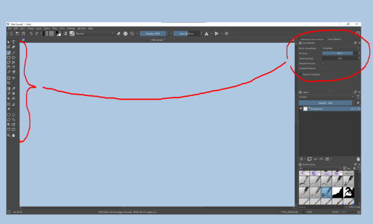
Upon opening the program this is what you're met with. First of all, must comment: The layout is HEAVILY editable so you can just drag menus anywhere you want, even leave them floating amidst the sheet you're drawing on.
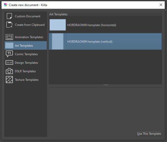
You can create custom art templates, I have two o'mine here as both have my signature background color.
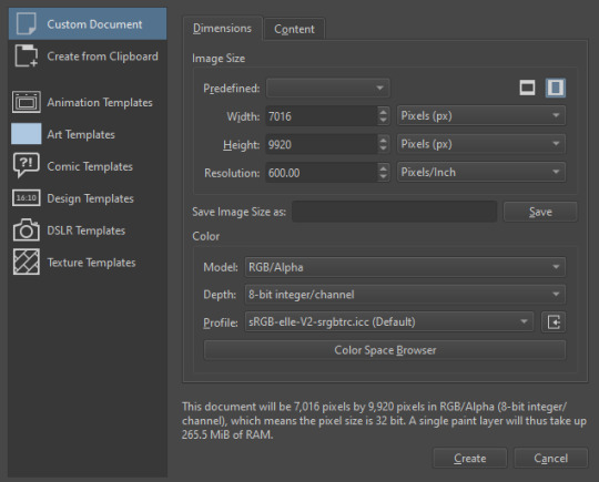
As well, you can edit the custom document settings, as in what size you want it, what resolution, even the initial content of the image. As well you can create from clipboard: Just copy some image from your browser and Krita will recognize it (useful for making meme edits lol).

Now, once you have your file, I will show you what is where.
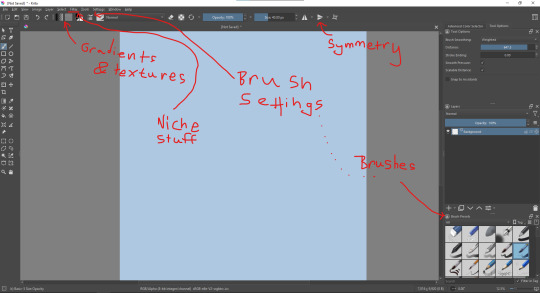
Brushes:
Brushes are easy to edit and there are tons of free bundles to download online. I myself only got one bundle, Jackpack (bit hard to find now due to original source being lost, it is still available but bit tricky to come by).
There. Are. Tons.

Some of these are my custom brushes for calligraphy in neography, you might even guess which ones. You can edit existing brushes, make new ones from the ones you've edited without changing the original, and all sorts of stuff (more below in the third chapter).
There are numerous packages of brushes once you enter Krita, but only one/two are available when you first open it. To unlock them all, click here:
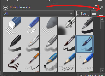
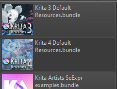
And make sure all bundles are dark gray in color (example of both dark and light below).
Now Tools Options: those will pop up depending on what tool you're using.
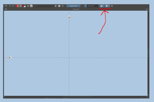
Symmetry: Fun stuff. You can drag the lines depending on how you need them and then center them back to the center of the screen if needed.
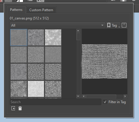
Gradients and Textures also have their tools options, you can play with those to get the feeling what they can do (more in third chapter).

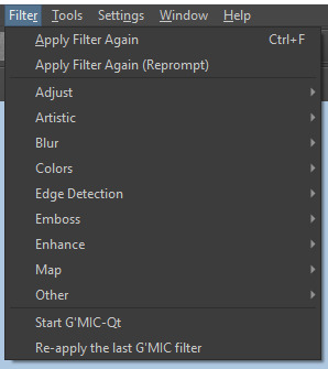
The Filters tab is useful too. Blurring, motion blurring, color mapping, artistic filters and all that: Quite fun.
Gimmicks.
Krita allows you to customize your workspace freely. Floating menus, tabs, anything you want. It has quite many drivers at that-
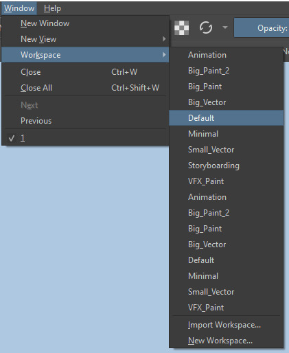
To access the workspace templates, go to Window and choose Workspace.
Krita allows for copy-pasting any image onto the sheet. Though, for me it sometimes crashes if I accidentally copy-paste text into it without choosing the Text tool first.
The software allows for both raster and vector work. It is basically Photoshop sharpened to be used by artists primarily.
There are some interesting mechanics regarding the Eraser (default bind E).

You can use it with any brush, allowing for textured erasure/quick work. Good for sketching.
You can use it on gradients (given there's a transparent point on the gradient preset).
There's a Multibrush tool:

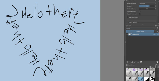
People say Krita is good for animation but my brain can't wrap around it yet honestly @~@.
The keybinds:
B - Brush tool.
E - Erase tool option.
M - Mirror (useful for checking accuracy from a new angle).
Ctrl - Color pick (when used with brush or other color-using tools).
Shift+L.Mouse+drag - Changes the size of the brush by dragging left and right.
Ctrl+E - Merge layer with the one below.
Ctrl+G - Group selected layers.
Ctrl+A - Select whole sheet.
Ctrl+Shift+A - Deselect everything.
F - Bucket tool.
G - Gradient tool.
Ctrl+S - Save document.
Ctrl+Shift+S - Save As document.
Ctrl+N - New document.
Ctrl+O - Open document (will be seen in a new tab on top of the sheet).
Ctrl+C - Copy selected layer or selection.
Ctrl+X - Cut selected layer or selection.
Ctrl+V - Paste copied/cut layer or selection.
Q - Multibrush tool.
R.Mouse - Interesting thing: Opens up a quick selector for brushes and colors you've already used in the piece.
1 - Zoom 100%.
2 - Zoom to fit the piece vertically.
3 - Zoom to fit the piece horizontally.
4, 5, 6 - Turn 15 degrees (4 and 6) or undo the turning whatsoever (5).
Ctrl+I - Negative filter applied to layer.
Ctrl+U - Color editing on the layer.
Ctrl+Y - Soft proofing mode (for color mistakes and stuff like that, mostly annoying for me tbh).
Ctrl+T - Transform selection/layer.
Ctrl+R - Square select tool.
Ctrl+J - Lasso select tool.
Honestly you can just hover your mouse over tools and see their shortcut binds, as well. Or edit them in Settings.
Specific advice on specific tools.
Brush:
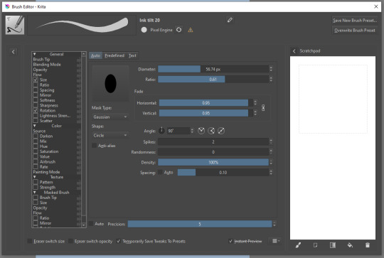
Brush editor is a great tool for making custom brushes, and it even has a sratchpad to test them out. Lots of settings, but no need to be afraid; Most of them you might never use on purpose.
Use Brush Smoothing for great and pretty lines in lining pieces or making calligraphy.
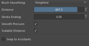
Gradient:
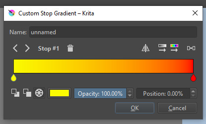
The four icons to the right top are:
Mirror gradient.
Arrange by lightness value.
Arrange by color value.
Space the stops evenly.
Click the gradient to add a new stop. The three things to the left are:
Make the stop use Primary Color.
Make the stop use Secondary Color.
Make the stop use a fixed color.
305 notes
·
View notes
Note
hi broski ummmm what programs do you use for art and what brushes
I use procreate! For lineart/sketching I usually use a slightly modified version of the Shale brush in the default procreate “calligraphy” section- just w/ the streamline feature turned down to zero and more like…size variation? (Idk I modified it a year and a half ago I don’t completely remember what I did lol)
Then for my grayscale comics, like these,

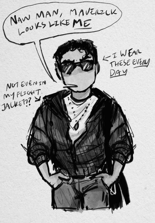
I use this Copic marker brush w/ just straight up black and varying levels of opacity. Usually I don’t use blending brushes in these, but in my most recent one I did.
For my colored stuff tho I use a lotta this pencil brush for everything (shadows, highlights, base flats, etc) and then depending on whether I want something more painterly (like the ocs on the left) or more cell shaded (like stevepop on the right), I either use soft texture brushes or a chalk brush (I cannot for the LIFE of me find where this chalk brush came from?? I’ve been digging but idk I can’t find it outside of my duplicate??) for highlights
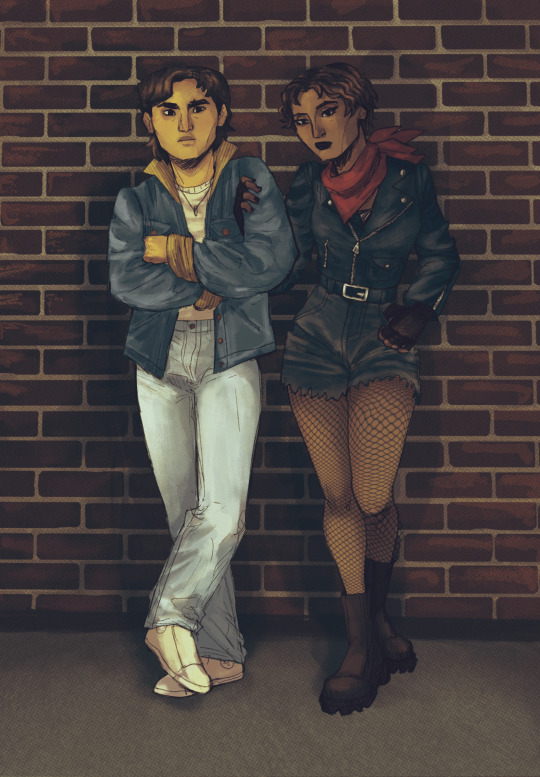
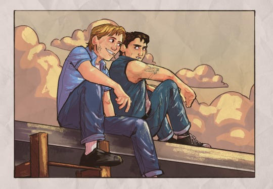
Some other brushes/brush sets I use (all of them are free as of rn ‘cuz I’m broke):
Habook Brushpack (specifically the rectangle one- it puts down flat colors nice and fast but also doesn’t annoy me the way most “ink” brushes do!)
Laurenillusrated Brushpack- I use these mainly for skin, they’re really nice. (Also, @laurenillustrated is on tumblr- her art is so pretty, it’s like a storybook istg. Check it out if you haven’t it’s AMAZING)
I’ve recently started using @loish’s brushpack too, and I ADORE these brushes. I used them a TON on the Christine poster. You can get them by signing up for Loish's Digital Art School, which is a great collection of art resources as a whole, and it’s totally free. Would absolutely recommend
And finally, for the halftone texture I like to put on everything, I use the Halftone Hospital Basic Tone Kit. All of their brushes are fantastic, definitely check them out if you like the look of traditional art but also like the lower supply cost of digital art lol. Or just in general, ‘cause they’re great
(Then for the paper texture overlays I love so much, I usually use stock photos tbh.)
Anyhow, these are some of my favorites. But I do use others too, and this all came from years of playing around and finding what I like! I had this phase about…1 1/2-2ish years ago where I hated my art style and nothing was coming out right. It pushed me to try a bunch of different brushes- in retrospect I don’t think the brushes were what made it better, I just improved over time, but I had a lot of fun trying out different brushes. So definitely try ‘em out and experiment, because it really is a fun time :))
(As for my workflow, I talk about that here if you wanna know more about how I draw!)
28 notes
·
View notes
Text
Late Nights in Hyperspace
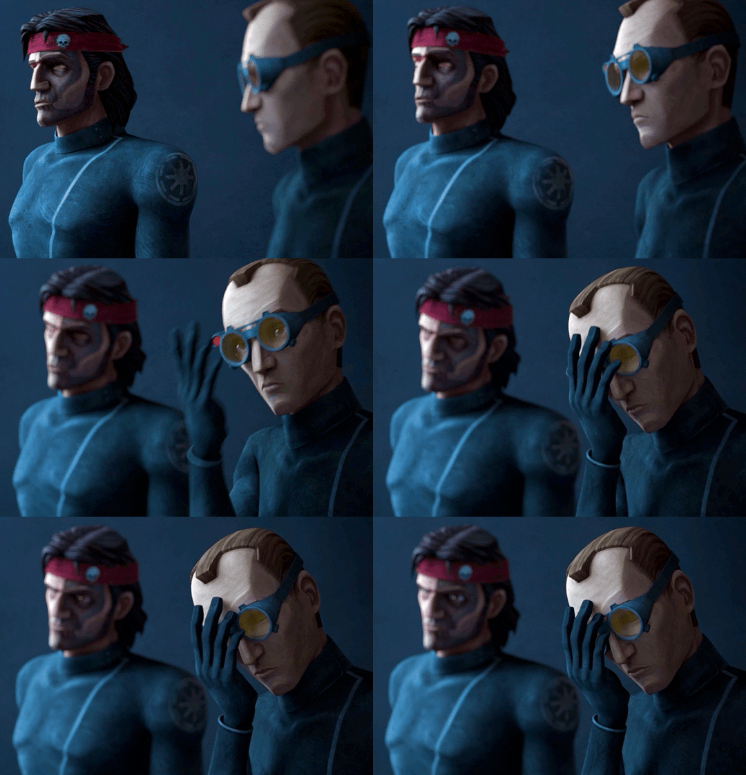
Summary: As the rest of Clone Force 99 sleeps, you and Tech spend some quality time in the cockpit of the Havoc Marauder playing games on your datapad.
Pairing: Tech & GN Reader (Could be read as romantic or platonic, no Y/N or physical description of reader's appearance)
Rating: G
Warnings: None!
Word Count: 1k
A/N: A friend introduced me to The Watermelon Game the other day and now I am obsessed! Maybe too obsessed, since this is what came of it (as well as a full circle of evolution with Star Wars fruit)! Wrote this silly little fic in between rounds of the game while I finish up the next chapter of Busted Hyperdrive, hope you enjoy! <3
AO3 | Masterlist
“You are still doing it wrong,” a deadpan voice mutters over my shoulder, I can practically feel the frustration radiating off of the man behind me, betraying that flat tone, “I have devised a strategy to avoid total failure, allow me to take the controls.”
“I know what I’m doing, Tech, relax.” My grip tightens around the controls almost posessively, hoping he didn’t pick up on the fact that any confidence in my voice is bogus. I know I’m flying blind, that's the point, but I’m not telling him that. I take a deep breath and plot my next move.
“I would strongly advise against that.” He’s leaned forward in his chair, his voice much closer than before, and his fingertips brush against my shoulder as he grips the back of my seat.
“Would you.”
“Yes, I would. Though, I know you do not plan on heeding my advice, please know my strategy would be much more effective.”
“Would it.” I don’t crack, no, I keep my cool as I finally align the shot and take a deep breath before hitting the button. Bombs away.
The tension in the cockpit is astronomically, laughably high. If this were a holofilm the scene before me would be playing out in slow motion as Tech and I lean forward dramatically to watch the little cartoon jellyfruit fall from the top of my holopad screen to the jumbled pile of fruits below. It’d then cut to the horror on my face slowly transforming into triumphant delight, and Tech’s into shocked defeat, as it comes in contact with another jellyfruit, metamorphosing into a shuura and setting off a chain reaction. Fruits combine, growing larger as they bounce around the screen before settling at the bottom in a small pile. What once was a jumbled mess of fruits has become a single lamta, two meilooruns, and a handful of jogans.
I turn to Tech with a smug grin, “You were saying?”
After a moment, he finally pries his gaze from the screen in my hands to meet my eyes. It’s a rare occasion, proving Tech wrong, so I may as well savor it. I don’t get long, though, as the corners of his lips start to curve into the beginning of a smile, “That should not have worked.”
“But it did!” I nearly shout in glee, laughing quietly in hopes I didn’t just wake the rest of the squad, fast asleep in the racks behind us as we drift through hyperspace. “C’mon, you have to admit that was impressive. I’m only one away from getting the shi-shok and I beat your high score!”
“Your current score is quite the accomplishment. Though, I must admit, it would have been much more impressive had you planned it, dear,” he chides, leaning back into his seat.
“I mean, technically I did,” I shrug, returning my attention to the screen to line up the hovering jogan with the pile below. “Like, it’s the objective of the game. It’s all intentional by default, isn’t it?”
“Yes, I suppose it is,” Tech chuckles behind me. He shifts forward once again when a dricklefruit appears at the top of my screen with another just behind it, “Place those on top of the meiloorun on the left.”
“Stop backseat gaming, I need it by the kavasa.” I shift the fruit to the right side of the screen.
“The transformation will disrupt the top layer, sending the smaller fruits to the bottom,” I want to disagree with him, but the longer I linger over the drop button the more sound his assessment seems, “Strategy, dear.”
I shoot him a look over my shoulder, I should’ve expected the knowing grin I’m met with. Taking his advice, I move the tiny fruit back to the left side of the screen and let it fall before dropping the next on top of it. The two fuse into a jellyfruit, and a jellyfruit appears at the top of the screen. “You didn’t know that was gonna happen.”
“It was highly probable,” he counters, readjusting his goggles with a confident smirk.
“Nah, I don’t buy it, no way,” I laugh as I drop the fruit, watching as they turn into a shuura with an animated poof, the force of it sending the matching fruit on the right straight to it. The fruits settle into a perfect opening for my next two moves, turning the meiloorun below into a second lamta, then, the final fruit, the highest possible combination in the game: the shi-shok. It’s the closest I’ve ever gotten, I’m well past my previous high score and I should feel victorious, but I can’t seem to bring myself to, “It feels wrong.”
“What do you mean?” I don’t turn to look at him but I hear the confusion in his voice.
“I didn’t catch that, it doesn’t feel like my win.” I bite the inside of my lip in thought, tapping my fingers on the side of the datapad.
“I did not mean to steal your victory, so to speak.” He leans forward once again, thoughtfully this time; his hand returning to the back of my seat, his fingertips ghosting over my shoulder. “This is entirely ‘your win’.”
I meet his eyes and find nothing but sincerity. I nod just once before turning back to the screen and dropping the fruit. Who knew watching cartoon fruits turning into slightly larger cartoon fruits could feel so cathartic. When my gaze returns to Tech, after the lamtas become a massive shi-shok and the fruits begin to settle, I can only smile.
His hand now fully rests on my shoulder and his smile drops to something just a bit more serious, “You now hold the highest score in the game. I will change that.”
Though I pick up on the humor in his voice, as much as he tried suppressing it, I play along and clutch the datapad to my chest, “Never.” Our little act only lasts a few seconds before we’re both trying to keep the volume of our laughter to a minimum.
A/N: Thank you for reading! Comments and reblogs are greatly appreciated! <3
68 notes
·
View notes
Note
hello! i'm not sure if you remember me, a while ago i asked about digital art and if it's possible to do on an ipad or something similar. i was really grateful for your response and i got an ipad over christmas! i didn't realize how expensive the pencils were though and was only able to get one recently. now that i have all of that, i download the first art program i saw (ibispaint x, i don't know how good that is) and feel super overwhelmed by everything, all the tools and brushes and i have no idea where to begin. i know this is a super broad topic, but i don't know if you have any advice for a beginner hoping to become a digital artist? or know of any resources? thank you so much in advance and no worries if this topic is too broad to really get into properly!
Oh hey!! Congrats on getting an iPad! And yeah, shopping for the pens is a big pain in the butt, but I'm glad you finally got it all setup!
So most of the advice I'm gonna give you is very basic, starter advice that can apply to virtually any digital art software, as the vast majority of them are built with the exact same base tools, they just vary in their intended purposes which means they may differ in more advanced settings and what they offer beyond the basics (ex. Photoshop has more colors than Clip Studio because it's built for editing high quality photos whereas Clip Studio is meant to emulate comic art, but Clip Studio offers more in the way of comic-creating tools such as specialized rulers, 3D material support, built-in screentoning, etc. and all of the software available will tend to have different brush engines, meaning it doesn't always 'feel' the same to draw in one software as it does in another).
Your bestest friends:
Layers! This is the biggest pro to going digital, because now you can work with layers! So anything you draw on each layer is preserved and can't touch or affect whatever's on the other ones :3 You can find the layers tab in Ibis Paint X in the bottom right, don't be afraid to make a bunch of them and mess around with what you can do. Play around with the different blending mode settings (in Ibis Paint it's the menu that's labelled 'Normal' in the layers popup) especially Multiply, Color Dodge, and Overlay, as those three are the most commonly used to make coloring more efficient and give your art some extra pop.
Lasso/marquee/magic wand tools! These are basic selection tools that allow you to select an area within the layer you're working on, so that whatever you paint won't travel outside of that area. The Lasso is a free draw tool, the marquee tool is typically 4 sides by default (so squares/rectangles) and the magic wand detects and selects a closed area with one click! (just note that by default it's only on the layer you're on, so if you use it on a layer that has nothing, it will typically select the entire canvas).
Alpha locking! This is a simple button setting you can click to 'lock' the layer you're working on, which basically means that whatever you've drawn on that layer, anything you add can't travel outside of that drawing. So if you want to quickly shade something without going outside the lines, alpha locking is your solution!
Clipping groups/layers! This is a bit more advanced but is basically an even better version of alpha locking that you can use in conjunction with it. Clipping layers are basically additional layers that , when you click the 'clipping group' button, 'attaches' that new layer to the layer that's below it. It performs the same function as the alpha lock by preventing whatever you draw on that layer from travelling outside of it, HOWEVER it comes with the added benefit that it's on an entirely different layer, meaning you can erase and mess with whatever's on that new layer as much as you like and it won't hurt the base layer. It kinda follows the same logic as animation cels !
Masking! Y'know when you're doing a traditional painting, and you put down tape to cover the area so you can paint over it and later remove the tape and everything underneath is untouched? That's basically what masking is! Once you put down a layer mask, using the erase tool on it will 'erase' whatever the mask is applied to, and using the brush will make it magically return! This may sound silly at first, but I find masking is especially helpful if you want to erase something on the layer you're working on without it disappearing forever! It's also really helpful for comic work because you can mask whatever's outside of the panels and voila, nothing you draw will travel outside of those panels!
Stabilization! I don't know how extensive Ibis Paint X is with offering stabilization tools, but many digital art software comes with it and it's a LIFE SAVER for new digital artists adjusting to the feel of digital art. It essentially 'slows down' the output of the ink on the canvas which helps a lot with getting cleaner lines in fewer tries. It's not quite as big of a deal when drawing on iPads because obviously you have more control by default by drawing directly on the screen, but it can still be really helpful when you need to pace your hand ahead of the actual drawing tool to pull cleaner lines!
That's pretty much all I can think of for now! But here are some other commonly asked questions:
1.) There are so many brushes to choose from, which one do I use?
The round brush is small but mighty. Virtually anything can be painted with it, it's simple, but malleable, especially when you start messing around with the hardness and opacity settings. Don't get too lost in the sauce with the brushes that are available to you, it can be very easy to get overwhelmed by all the options and variety. Some artists still work purely with just round brushes, some artists have custom brushes they like to use to speed up their drawing process or achieve certain textures. Play around with them, but don't get too stressed about which one you use because there's no wrong answer, the right brush to use is the one that gets the job done ! <3
2.) What canvas size should I use?
It depends on a variety of factors such as whether or not you're planning to print, where you're going to be posting it, etc. By default I like to work on 8.5 x 11 inch canvases (standard printer paper size) at 350 dpi, which if you want to make that canvas in Ibis Paint X, means you just have to make a canvas with a pixel ratio of 2975 x 3850 pixels! Just note that the lower you go in either pixel count or dpi, the lower the resolution, so it's typically encouraged you work at a minimum of 300 dpi (but you usually don't have to go any higher than 600) to ensure you don't wind up with any blurry low res JPG's/PNG's.
3.) Should I export my final drawing as JPG or PNG?
This is usually just up to personal preference, but like the canvas size, it depends on what you're using the image for. You can always export as both, the biggest difference between them is that PNG is lossless meaning you won't experience image compression like you will with JPG, BUT you're also going to have much larger image sizes. JPG is often fine for any standard posting, PNG is typically recommended if you want to have a drawing with a transparent background for printing (as JPG can't do transparent backgrounds) or if you just want to have a really high res image file for sharing outside of social media sites (as social media sites like FB/IG/etc. will typically compress the hell out of your images anyways)
Here are some other super helpful resources as well if you need some visual and/or audio guides:
Sinix Design - How to Learn Digital Painting (Beginners)
Marc Brunet - The Beginner's Guide to Digital Art
Skynix Art - 50 Digital Art Tips in 5 Minutes
One thing I also like to do is watch speedpaints of digital artists as it can really help pull back the curtain on what they're doing (or at least, it can help you see what they start with which can help you better picture the process of turning a blank canvas into a finished work of art!) And though I don't do it as often, if there's an artist whose work I REALLY like, I'll try and find their actual work files (many bigger artists sell them on their crowdfunding sites/Gumroad/etc.) so that I can actually break the drawings apart layer by layer for the purpose of analysis. Of course, all that is something that you'll grasp better over time as you learn the tools and learn to recognize what artists are doing in their own workflow, so don't worry if you don't glean a whole lot of info from the "big guys" right away, you should always be referencing artists who are higher along the skill ceiling from you but not too high that they're using techniques and tools that are outside of your realm of understanding.
Other than that, just try to have fun, don't stress too much about it, and save often!!! Part of creating art is learning to be at peace with the process, so don't stress too much if it takes you a while to get adjusted to the layouts and tools - at the end of the day, digital art is another medium entirely, so it's not uncommon at all for traditional artists to need a lot of practice to 'switch' to digital, because they both utilize different tools and techniques. Be patient with yourself, always be on the hunt for new resources and guides and references, and don't be afraid to experiment and make mistakes (the best part about digital art? Mistakes don't cost you any paint or materials!)
Good luck!! And congrats again! 🥰
60 notes
·
View notes
Text
I Never Really
Part Six
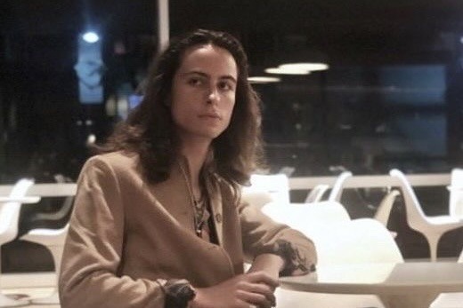
Word Count: 2.4k
Warnings: Marijuana use
Playlist | Masterlist
Sam didn't show up to class on Monday morning. It had been radio silence throughout the day Sunday, though that hadn’t bothered you – you didn’t necessarily want to talk to him anyway. But when you didn’t see him Tuesday either, you started to get a bit worried. You considered texting him, but anything you typed seemed to come out wrong. And it wasn’t like he was dead; you’d noticed he had added a few lines to your joint project since Sunday.
You made your way back to the dorms after classes, thoroughly worried, and utterly exhausted. You stared at the ground the whole way back, letting your feet take you home. Rounding the corner on campus, the residence hall came into view, with its towering concrete walls and rows of prison-like windows. And on the corner, out front, was Sam.
You slowed your pace. Suddenly, you weren't so concerned. You wanted to avoid him, wanted to avoid the inevitable conflict that would come when you passed him by. But the hall had only one main entrance. You silently cursed the building for having such a terrible design flaw, and braced yourself for whatever was to come next. He didn’t look at you as you approached, staring at the clouds instead as he took long drags of the cigarette between his fingers.
“Hey,” he called as you passed by.
“Hi.” You didn’t stop, only glancing at him.
“Can we talk?”
You froze. This was what you’d been afraid of. “About what?” You played dumb.
“About the other day.”
“What is there to talk about?” You shifted your backpack on your shoulders, still not quite looking at him – you weren’t ready for that yet.
“I want to apologize.”
“...Well?”
“Can we talk about it in my dorm?”
“Won't that be awkward with your roomie there?”
He barked out a short laugh. “Roomie is never around. He’s got some girlfriend he stays with off-campus every night.”
You weren’t sure you wanted to be alone in a room with him. Awkward apologies were not something you enjoyed bearing witness to, much less in someone else’s home. “I’m not sure about that.”
“Please.” He sounded so broken, so defeated. You turned back to look at him, and his appearance matched his tone of voice. The cheerful smile that normally donned his features had been replaced with a frown, with dark circles under his eyes and hair that looked like it hadn't been brushed very well lately, pulled back into a haphazard bun. He looked sad, and small, and sorry. "It's too much to say for us to be out here in the cold."
“Fine. But I can only stay for a bit.”
He led you up to his dorm, finally opening the door after a crowded elevator ride. His room was decorated rather conservatively, in stark contrast to the maximalism of his bedroom back at the house. It was the same layout as your room, though the second bed actually had sheets on it, unlike the bare mattress in your room. Sam sat at the head of his bed, his back against the wall. You set your backpack down near the door and looked around, figuring out where to sit.
“Here.” He patted the empty space on the bed next to him. “It’s a lot more comfortable than those chairs.”
Reluctantly, you climbed onto his bed, sitting cross-legged and trying to make yourself as small as possible, as far away from him as possible on a tiny twin bed.
“So, let me just start by saying…I’m sorry. I shouldn’t have talked to you that way on Sunday.”
“It’s alright.” You defaulted to your typical response when receiving an apology. Conflict wasn’t your thing, and accepting an apology as quickly as you could had always been the best way for you to get through it fast. Even when you didn’t mean it.
“It’s not alright. You said it yourself, you’re not my property. And I spoke to you like you were.”
You fidgeted with your hands in your lap, feeling his eyes on you but not able to make eye contact. “I just don't get why. Why would you…care so much?”
He sighed, shifting his gaze to stare out the window. “It’s hard to explain without digging myself into an even deeper hole, here.”
“I think I deserve an explanation.”
The air was still with the tension between you. “Those three, they’re…” His voice faltered. “They’re partiers. They’re, like, rock stars. They’ve always gotten girls in a way I just don't. Both metaphorically, and…physically.”
You suddenly wished you hadn’t asked for an explanation.
“Every time I bring a girl over there, whether she’s a friend or not, they sort of steal her away from me. And I get kicked to the curb.”
“Do you bring different girls there often?” Your mouth felt dry. You didn’t want to know the answer.
“Sometimes,” he half-whispered.
“You sound like just as big of a player as they do right now, Sam.”
“I told you I’d only be digging myself a deeper hole.”
It still pissed you off, but, somehow, you understood. It wasn’t that he viewed you as his property, or something equally malicious. It was that he was afraid of losing your friendship, as he had evidently lost from others before you.
“But,” he began, and you finally caught his gaze. The gold in his eyes was highlighted by the sunlight through the window. “Whatever the reason, there’s no good excuse for how I spoke to you. I shouldn’t have accused you of something like that, and I had no right to be angry anyway. Not at you, at least.”
“I’m sorry too. For saying we’re barely friends. You’re actually my only friend.”
“Please, don’t say sorry to me. I don’t deserve it.”
“I think you do, though. I don’t want to hurt you, either.” You smiled at him. “You’re important to me, too, by the way.”
He turned his eyes away and breathed out a laugh, a weak smile on his lips. “Is it sorted, then?”
“Yeah, sounds like it to me.”
“Thank god.” He heaved a sigh, like a weight had been lifted from his shoulders. “And I’m not your only friend. The guys are your friends now, too.”
“You sure made it sound like I should stay away from them.” You were only half joking.
“They’re not bad guys. Just a bit more socially adept than me, I guess.” He pulled at the tie that held his hair back, letting it fall down onto his shoulders. He combed his fingers through it, and your eyes were locked on his hands, and the way they moved so delicately. “I have a question for you, by the way.”
“Oh, god. What?”
“Hey, don’t give me that attitude." He gave you a smile, a genuine one that you hadn't realized you'd been missing so dearly. You wanna split a j before you go?” He asked, grabbing for an altoid tin on the windowsill and popping it open to reveal several pre-rolled joints.
“I don't know…I really should go.” You didn’t have a busy day ahead of you, but you were feeling rather burnt out. Worrying about him had been exhausting.
“C’mon. You look stressed as hell.”
He wasn’t wrong. Maybe a few hits would help. “Fine. But then I’m leaving.” You seemed to have a bad habit of caving to every word that came out of his mouth.
“Sweet.” He fished in his pocket for a lighter and slid the window open with his other hand.
“In here?” You asked, a bit nervous. “Won’t you get caught?”
“Nah. I do it all the time.” He held the joint between his teeth, sparking the lighter.
You passed it back and forth, blowing the smoke out the window while you anxiously watched the smoke detector. Things felt some semblance of normal now, though you’d crossed a bridge you couldn’t turn back on. Needing to have a conversation like this felt intimate, in some way you couldn’t put your finger on.
“Sorry I got so drunk, by the way. Didn’t mean for that to happen,” you told him between hits.
“You were totally knockin’ them back around the fire, miss eclipse.”
You used every ounce of strength to ignore his little pet name for you. “Yeah, I guess I didn’t really…comprehend how strong you guys would pour.”
“You said you threw up, too?” He tapped the remainder of the joint on an ashtray on the windowsill, licking his finger and touching it to the smoldering end to extinguish it fully. “Hopefully not on anything, right? Besides yourself, apparently.”
“No, I made it to the bathroom, thank god.”
“Sorry I couldn’t help you. I passed the hell out.”
“It’s chill. I shouldn't have drank so much.”
“Did you have a good time, at least? Besides the throwing up part. And me yelling at you.”
“I did.” Your eyes met his, and the warmth in them reminded you of how kind his family had been to you. “Thank you for bringing me.”
"My pleasure, really."
You gave him a smile that somehow communicated all the words you couldn't formulate right now. The high settled on your mind, heavy and comforting like a weighted blanket. You curled up on his bed while he wandered about the room, talking at you about whatever topic came to mind. He showed you the small collection of records he kept there, telling you the rest of them were stored at his brothers’ house. He was so animated when he spoke to you, even as your eyelids started to feel heavy and your eyes started to slip shut.
He played some record you’d never heard, something with a lot of piano. You could feel your consciousness fading as he told you about how he was trying to learn this song. The bed dipped when he sat next to you, but you didn’t even open your eyes to look at him. Before his sentence was over, you were drifting away into sleep.
* * *
Unknown to you, Sam had fallen into a light sleep of his own, his back propped up against the wall and his chin tucked to his chest. As you slept, you moved around quite a bit – not an uncommon occurrence in your daily life, but an inconvenience when sharing a space as small as a twin size dorm bed.
Somehow, in all your twisting and turning to find a good position, your head ended up resting against his shins, then on top of his crossed legs, and then fully in his lap. You slept peacefully, though Sam was anything but peaceful at the current moment. He'd woken up to you in this position, and he was stuck here, unsure of what exactly to do. I shouldn't have rolled a fucking indica, he thought to himself.
He couldn't move, couldn’t budge even an inch. You were asleep with your head in his lap and he was not about to interrupt that. With great effort, he willed himself to stay calm. Be chill. Don’t embarrass yourself. the words repeated in his head like a mantra.
He watched the slow and gentle rise and fall of your chest as you slept, the way your face twitched in response to your dreams. If only he knew he was the face you were seeing behind your closed eyes. But the light was getting low, and Sam could no longer feel his legs, and he knew it was time to wake you. As much as he would gladly watch you sleep until the day he died. He called your name softly, and you stirred, shifting around a bit in his lap, but not waking up. Your hand came up and wrapped around his thigh as you nuzzled closer against him.
A shiver ran down his spine. You were rubbing your cheek right against him, and it took quite literally every ounce of his willpower to stay calm. He called your name again, louder this time, almost frantic to wake you up. You rolled over onto your back, drawing a contented sigh as you were slowly pulled out of your dream, pink sunlight registering behind your closed eyes. You opened them, and blinked a few times, the world a streak of blurry colors.
You assumed what you were seeing was a continuation of the dream you’d been having. Sam, silhouetted by the light streaming through the windows. A few strands of hair hung down to frame the sides of his face, which was twisted into something like borderline panic, or pain.
“Sammy,” you breathed, smiling at him.
His brow furrowed and he turned his eyes up to the ceiling, his head falling back, his face out of sight.
It dawned on you that this wasn’t a dream.
This was all painfully, terribly real.
You scrambled your way out of his lap and onto your feet, swaying a bit with dizziness. He looked at you with an expression you couldn’t quite read, something like fear, his body frozen in the same position.
“You fell asleep like that and you seemed so tired I didn’t want to wake you up–”
“I didn't mean to do that I just fell asleep I didn’t–”
You talked over each other with hurried out explanations.
“I should go.” You said it as you grabbed your keys and your shoes, throwing your backpack over your shoulder with one hand already on the door.
“You should.”
Not another word passed between you as you nearly fell over your own feet getting out the door. Faces passed in a blur as you ran down the hallway, to the stairwell, crashing through the door to your room. The high was gone, replaced by debilitating sobriety, just you and the unbearable volume of your thoughts. You collapsed onto the floor, dropping your head between your knees. It felt like you might cry at any moment. That was something you couldn’t take back. It had been so comfortable and warm, so right, having your head there. You could have slept that way all night.
So, maybe it was more than a silly crush. Maybe it was more than just wanting him in a carnal way. Maybe you wanted to sleep curled in his lap like a cat, your fingers tracing over his legs while his hands played with your hair. Maybe you were…you couldn’t think it. The word you’d been avoiding for so many years, after the last guy ruined the concept for you.
You didn’t have time for that word. And you didn’t believe it was real, anyway. You weren’t destined for it, it wasn’t in the cards for you. Relationships were pointless. You picked yourself up off the floor, running on autopilot as you sat in front of your computer and went through the motions of keeping yourself busy. He was the only thing your mind could focus on, all your attempts to study being ultimately pointless. Sleep eluded you once you finally managed to calm yourself enough to attempt it, and yet again, your dreams were littered with Sam.
#we are so close to the sex guys i promise it's coming#greta van fic#greta van fleet fanfiction#greta van fleet fic#gvf fanfiction#gvf fic#sam kiszka fanfiction#sam kiszka fic#sam kiszka x reader#sam kiszka x y/n#i never really
33 notes
·
View notes
Note
I just saw the ask by slushysblog. In response you sent a gif that blew me away:

You see, I'm just getting into digital art, and my PC can only handle about 5 or 6 layers before my graphics environment crashes. (Ofc this forces me to restart my PC and lose anything not saved.)
I've learned to work around this, my art isn't nearly so complex as yours, but I know if I want to continue I'll have to get a better computer at some point.
I was hoping you could tell me a bit about the technical side of your work. What are your PC specs? What software do you use? That sort of thing.
Thanks in advance! I love your art!
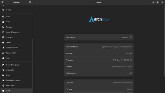
My set-up is complete overkill for art. It's a heavy gaming-ready desktop PC I got a few years back that I've upgraded the RAM and storage on over the years. I was doing fine with 16GB of RAM but I always have open a lot in CSP and other stuff so upgrading was definitely something I needed to do. 16GB should be fine for most people though.
You can also see that I run Arch Linux and uh yeahhhhhh it's a long story. The short of it is that my old laptop broke its Windows install during an update and I was completely unable to fix it so I just.... switched to Linux lol. I started out on Ubuntu and switched to Arch after a while. I don't rec using Arch unless you know what you're doing, Ubuntu is way easier.
What you might find more interesting is my away from home set up on my laptop since it's an older gaming laptop.
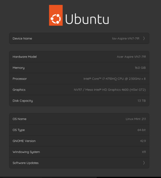
The graphics card is actually a NVIDIA Geforce 850 or something. It's so old that you can't play some games on it. However, I have no issues with it for art. I can open my comic project files in CSP fine on it. It's also running on Linux Mint, which isn't showing up on the little image for some reason. Both of my devices run Linux, but that's a me preference/need thing and I don't rec messing with your operating system if you don't know much about computers. It gives me a bit of an edge since the system doesn't use as much RAM as Windows but yeah don't touch unless you're committed to learn. Windows will serve you fine. Or MacOS even.
As for my program, I use Clip Studio Paint EX. I bought Pro a long time ago and upgraded to EX because of the extra tools for comics and animation (I've heard animators don't like CSP though, it's the BEST program for comics however). It's a really solid program but the recent changes to pricing and updates is really stupid. Fun fact: I use only default brushes and materials because getting it to run on Linux breaks the store. I also use an older version of it because of how I got it working on this system.
For my tablet I use an XP-Pen Artist 12 Pro. It's a pretty solid screen tablet on a budget (I bought it on a sale) and I have no issues with it. I actually partly got it because I thought it was cool that XP-Pen carries official drivers for Linux too, and this helped a bit since this was before Windows bricked on me and I switched to that. It was kinda weird how it played out lol. I would heavily not rec a Wacom tablet unless it's an older one for cheap. Wacom is stupidly expensive and you can get a better bang for your buck at other companies. My first tablet is a Wacom and it's still holding up pretty well but their quality on their new tablets isn't great. Check out XP-Pen, Gaomon, and Huion for better tablet options.
29 notes
·
View notes
Note
I LOVE this set and i was wondering if you could pls explain how you did the text, including how you added texture to the ripped text and the highlighting/circling/etc of words? thank you for posting your beautiful gifs 😊
thank you!! 🥺 & of course! (photopea tutorial)
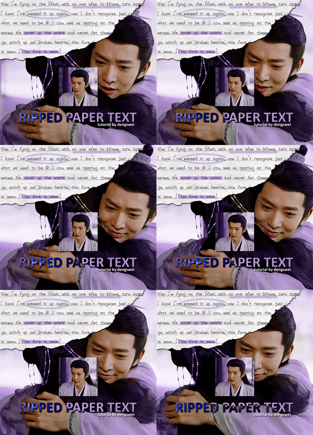
the majority of the texture for the ripped paper effect i can't really take credit for it's on the paper it's self all i did was make the paper white (because the texture was yellow) and used curves to darken the texture), i got the texture from one of photopea's templates but it seems their whole template section has changed drastically and no longer has like anything i used to see before ???? so i'll just share both versions here:
(original & my edited version)
for the ripped parts i just played around with this brush set in the plugins
once i decided which of the paper brushes to use i had a new layer and used it where i wanted, so top left in the gif above, i clip masked the paper texture (and the adjustment layers as well) onto it so you get that ripped effect (if you don't like or want to add to that you can always use the brush tool again (or the erasure tool) set as the paper brush to add or remove sections i did this a lot when i realised certain words i wanted to show weren't on there (also changing the size of the paper brush when wanting to add a little bit or take a little bit away was a massive help)
i also always add a drop shadow to my paper textures, the settings i used is mostly the same EXCEPT for the angle for all of the ripped paper (it's also my text drop shadow settings) because depending on how the ripped paper looks you might have to change the angle
also i know in the screenshot below it's on but make sure the use global angle is off if you're going to have multiple different angles of drop shadow in your one gif (so if you want your paper texture on 125° but anything else on 60° the global angle needs to be off but if you want them the same then you can keep that on, which is why it's on for me because the angle is the same for both the text & the ripped paper) (and by text this isn't the text on the ripped paper, there isn't any drop shadow on the text itself there, just to clarify this was for my "ripped paper text tutorial by dengswei" text)
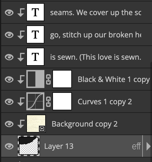
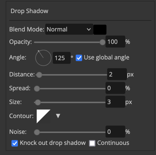
as you can see i also clipped my "handwriting" text to the paper layer this is so it stayed on the paper rather then going onto the gif itself (and it saved the fiddly part of masking it away & it felt more authentic this way too)
i found for me it was easier to seperate the text line by line so i knew exactly which part of the text was on which and if i wanted to change anything either it being a typo, changing the paper texture, or wanting a different word on a different line it was easier that way because it didn't end up messing up all of the text (though you don't have to do it that way, it's just what worked for me here)
font i used was: vag-handwritten (a default photopea font)
all of the next part needs to be above the text on your ripped paper:
for the highlighting, circles, and the lines it's pretty much all the same, i chose the colour which matched the gif (so say purple), for the highlight used the rectangle select & colour fill tools and set that to multiply & then played around with opacity (for most of my highlighting it's set to 50%), for the circles it was the same except the circle shape tool (no fill just stroke) set to purple, set to multiply, with 100% opacity (i found the circles looked better with 100% on some gifs depending on what colour i used), & then duplicated it once or twice and then just moved each circle to where i thought it looked best & the double lines is also the same using the line tool, set to multiply, & playing around with the opacity, & positioning them where i like
for the squiggly lines, the hearts, the 3 small doodle lines at either side of a word, & any other doodles i had on there i doodled them myself with my drawing tablet (you probably don't have to use a drawing tablet i just found it easier that way) using the free pen tool and then did the same thing set it to multiply and played with the opacity
if the colour you choose looks too dark or too light with it set to multiply either try a lighter/darker colour, try out something else like lighten, or screen, or increase/decrease the opacity more (i found i had this issue with the yellow being hard to see on the white paper so i used a darker yellow and kept everything at 100% opacity rather than 50%)
hope that helps! and please if anything is confusing or you want to ask any more don't hesitate to ask i know i ramble on a bit and it can sometimes get a bit confusing 🤣 or if there was anything i missed feel free to ask again 🥰
#replies#edwinas#mine | tutorials#gifmakerresource#photopeablr#photopea tutorial#photopea tutorials#gif tutorial#gif tutorials#usergif#tutorial#tutorials#photopea has so many great default fonts i just spend hours searching through them i barely download fonts now 🤣#i hope i didn't miss anything#also i don't know why the paper textures & my screenshots posted this way i had them side by side#okay they're side by side on mobile but not desktop ??? but mobile doesn't have the read more okay
97 notes
·
View notes
Note
Pls tell me about the perfect app that lives in your head rent free
hello!!!! ok!!!!! i am here to dump all my brain sludge right here now!!
to preface i know there's like a bajillion productivity apps out there with varying degrees of quality so the likelihood of this already existing is very much nonzero BUT i think the possibility of it not existing yet is also very nonzero so here it is!!
essentially, the main premise is that one post, which said 'if thinking naruto would be proud of you for brushing your teeth, then grab that toothbrush dattebayo' or something along those lines.
it's an app that gives you a character to motivate you and work alongside you and celebrate your successes with you and encourage you to get up when you're. currently not up
mockup images!
is this miku? maybe.
anyways so the basic user workflow is that you would open the app (perhaps through a morning notification, if you're into that) and be greeted by your beautiful and supportive character, as well as your daily tasks. then you get to work!
each task or work session you complete will earn you currency! and with that currency you can deck out your character in the shop! think of a picrew. you can change their hair. their clothes. their body type. you can turn them into naruto if that helps you. you can make a whole new character if you want! and then you'll have two supporting characters!! this will all cost you 'work' though.
notes about the to-do list area:
morning routine section. this would hopefully be sort of a built-in feature. it would give you a morning notification to do all this stuff and include an animation of your character doing routine stuff with you so you feel like you have a friend brushing ur teeth with you lol
the tasks all have a label attached but i guess you don't really need one if you don't want one
the little tag that says '25m' on laundry means that you think doing the laundry will take 25 minutes of focus time. if you click on the hourglass icon next to it, it'll take you to a timer for 25 minutes automatically.
if you don't set time it'll just give you the default pomodoro timer sessions, which you can change in your settings. i'm a freak for settings so if this actually gets made you can rest assured there will be enough minute settings to go around
it lets you do 'counter' type tasks too, see 'apply to jobs'. thanks to habitica for that idea
notes about the timer page:
basically it tells you to focus on a single task. if you clicked the timer button for a single task in your list on the homepage that will be the highlighted one. if you clicked the general timer button then it'll just pull the first or a random one or something. but it only shows you one.
unless you click the expand button because i'm not gonna lock you out of viewing your own todo list
you can also 'quick' add a new task! like y'know when you suddenly realize you need to do that extra thing on the side just WRITE IT DOWN instead of getting sidetracked. maybe if i feel like it i'll let you take photos for tasks or speech to text or y'know. just make it easy and quick
during the breaks it plays a little break animation to remind u to drink water or eat something or whatever
i think i need to move some buttons around and stuff but generally this is what so many hours of my life (like years of turning it around in my mind plus the past few days of making these images) has turned into. some other features i would ideally have are screen time checkers so your character pops in when you've been on your phone for too long and says Hey. plus other stuff but this is already long
am i ever actually going to make this? probably i'd only get to a super basic version of it. at least a todo list. but those apps already exist...
there are some super limiting/challenging problems that i haven't really been able to solve. like 1. the picrew. god damn i want to make a picrew so badly but i just do Not have the time or energy. and if i use animations inside this thing to make it cuter than i would essentially be making a whole picrew like FIVE TIMES (FOR THE FRAMES).
and it leads into the next issue 2. the continuous motivation. it's easy to be motivated when you're using a brand new cutesy app and have like a hundred things to buy but what if you run out?? how many things do i have to draw to keep up with the demand and keep it motivating?? especially if the items in the store are hit or miss (which is. inevitable, because no store can be 100% only things that you want to buy) then the pickings get slim REALLY fast.
3. the personalities of the characters. it's one thing to provide a character and make its personality myself (i would do that anyway, a small handful of default characters, because you do need to get started somewhere) but it's another thing entirely to make a billion different lines of text to minutely capture the possible words of encouragement that every fictional character you ever liked would say. so you can have an accurate replica of them in your motivational app for maximum motivational affect. is this actually important to people? idk but i feel like if ur productivity app said smth weird and u went like 'he would not fucking say that' it might break the spell. so
thats the basic rundown if u have any questions OR FEEDBACK (!!!!!!!) hmu if you want to use this app also hmu but maybe don't depend on me making it in full... so some alternatives i found while looking for inspo are
habitica (classic gamification, does a lot of similar stuff including personalization!)
finch (just a supportive buddy, mostly for habits and self care)
otto (it's really cute and basically you take care of a Creature by focusing, but it's only a browser extension i think)
someone on a reddit thread made a feature-heavy gamified habit/productivity browser extension here and it seems very useful!!!
also other resources:
Magic ToDo - GoblinTools breaks tasks down into subtasks for you! it's not always 100% accurate but can be a start :) especially since you can decide how many parts you want
forest (i used this a lot before, it's more of a screen time stopper but it's got a sort of fatal flaw in that you have to actively begin using it each time. sometimes i just need someone to kick me out of a scrolling loop.) (also after they started monetizing the prizes it got boring :( )
my friends used opal before for screen time reasons but it's paid. if u have money that's probably a good choice
'amazing marvin' is another productivity/habit browser extension which is also paid. if you're into paying. heard it's good and super customizable to you too
i once tried cold turkey to break my screen habits and at least i can say it is VERY effective at what it says it does. just be careful with what you block lol
if u made it this far here's an extra miku for ur troubles. i drew it bc. i was gonna make a sprite and then got lost in the sauce. these mockups are gonna singlehandedly make me a master at ms paint mouse/trackpad drawing
btw it's not wednesday september 11 right now unless it is for you in which case how is it living in the Future? or the Past. i don't make the time rules
#thoughts from hel#star signs#if you're an innocent bystander wondering if you should expand this post it does take 2 scrolls on my laptop to bypass. just fyi.#my art
7 notes
·
View notes
Note
Hello! Sorry if you’ve been asked this before, but what app and brushes do you use for your art? It’s all so beautiful!!
Thank you so much!! and no worries, I actually haven’t gotten this question before! I use procreate and i mostly use default brushes that I edited a bit
For sketching and lineart, I used to use the default ink bleed brush (with some minor setting changes) bc I rly liked the flow of it, but I eventually didn’t like the texture of it. I still really like how comfortable and flowy it felt to use though and it was so hard to find another brush with that feel, so I played around with it to make the texture more subtle. For any procreate users, I just changed the shape source to “blotch” from the source library, but for some reason that messed with the flow so i had to play around with some other settings. I also tend to use it on a little less than full opacity. Sometimes tho when I just want to be really loose, I still use the default brush in the sketching phase bc I was never able to completely match the flow of it with my current brush!
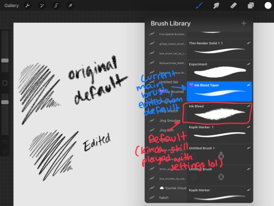
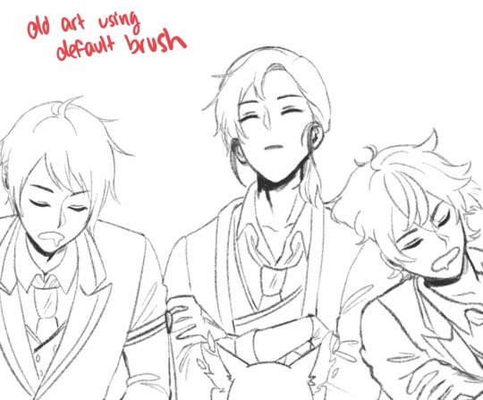
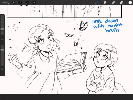
For coloring and rendering I really just use (lightly edited once again, usually just for flow/taper preference) default hard airbrushes, then medium airbrush for things like blush, lips, gradients, and other soft color applications
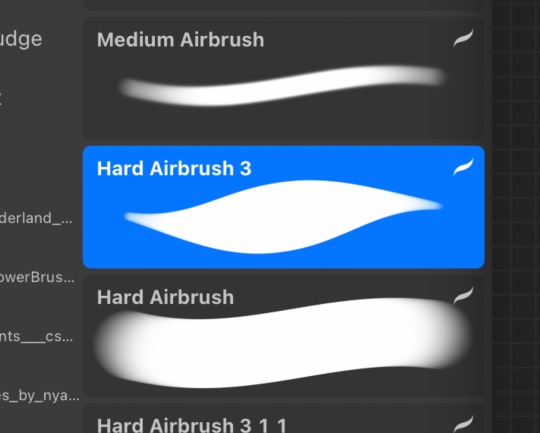
When i haphazardly color doodles (and sometimes in rendering), i use this “kopik marker” which I’m PRETTY SURE I downloaded from an artist but unfortunately I can’t remember from whom anymore 😭😭
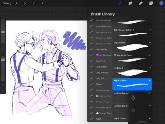
or when I want a watercolory feel, I’ll use spectra which is another default brush

Those are my main brushes! Other than that ofc I might use a bunch of specialized brushes depending on what the piece calls for, like for nature, magic effects, texture, etc. I have a ridiculous amt downloaded or some i made myself lol
#replies#i also have so many i bought that i dont even use LOL#Im a creechur of habit n i stick to the brushes im comfy with#i don’t really know what im doing when i change settings btw i just adjust things that SOUND like theyd make a difference#then test it till i like it
62 notes
·
View notes
Note
please post a tutorial or walkthrough or even just a longer process video talking about how you draw!! im obsessed with the textures and colors but i cant seem to wrap my head around it!! (i would pay money for a whole mini course tbh if you were interested in uploading one to gumroad or wherever 😵💫)
thank you, i'm flattered :') texture and colour are really important to me so i'm always fine-tuning them to find what works. to be honest i feel like i'm not qualified to teach others since i haven't really even settled on a process, i just kind of mess around until i like what i'm looking at. there are certain things i do much of the time but it's definitely not a linear process!
that being said lately i've been experimenting with traditional media and i've found i really enjoy how gouache behaves so i've been trying to replicate the process in digital. i'll try and explain how i've went about it recently using this super boring piece of a random person...
i'm using a basic pencil brush and a default procreate brush called gouache. i picked it for the name when i was looking for something similar to the paints i'd been using but honestly it looks more like a marker to me.


i find trying to do separate inks on top of a sketch distracting so i just erase what i won't need. i'll add a darken layer on top of the sketch and go over it with a single colour as a kind of underpainting. i did the flat colours on a separate darken layer here but generally i'll just work on one layer.
we'll add some colour variation and shading, it looks super subtle here but i'll punch it up later. i think the critical thing with this kind of brush is working with transparent layers so you don't lose the texture and you can play with mixing colours.
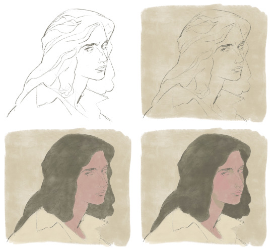
i'll often mess with the curve tool a lot but this piece is pretty simple and i ended up only using it once or twice. when i'm happy i'll duplicate the colour layer and see which blending mode i like, testing stuff out at different levels of opacity until i find something cool. i think i went with a transparent overlay layer here.
the lineart is getting buried so i duplicate that layer as well, drag it to the top of the pile and repeat the process of stacking blending modes. something i like to do is add one layer with the lineart blurred to give it a softer look.
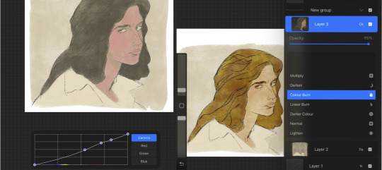
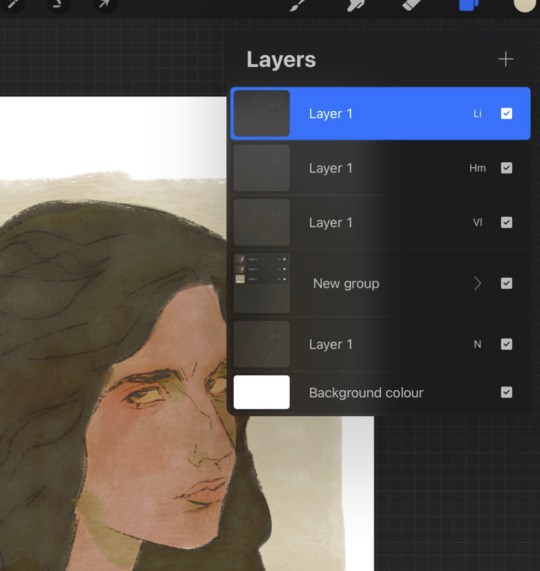
i'll fill a new layer with a dark colour, add about 80% noise scaled up a bit and set the layer to saturation. again you can experiment with the blending mode but i've been using this one recently.
this next part might be pointless but i save the image, open the new file and resize it without actually changing the resolution much, then sharpen it to bring back the detail. maybe it's in my head but i feel like this makes the image look a tiny bit more finished and adds some crunch.

finally i duplicate the whole thing, blur the layer on top and set it to luminosity on low opacity to create a soft glow effect.
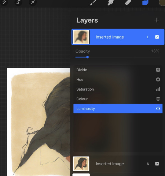
final touch-ups and you're done!
sorry for the convoluted explanation! my process tends to messy, i get distracted and don't often work in distinct steps but i think i managed to describe some of the things i do the majority of the time. i hope it's even a little helpful :)
99 notes
·
View notes