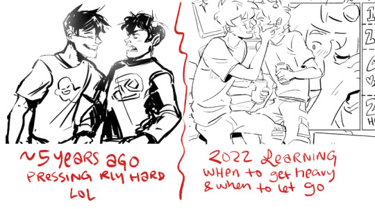
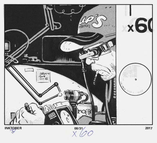
#i have some more sketched out but i might do a separate post
Explore tagged Tumblr posts
Visit Tumblr Blog
Explore Tumblr blogs with no restrictions, modern design and the best experience.
Last Seen Tumblr Blogs


Fun Fact
Tumblr.com rank in the US is 25.
Text
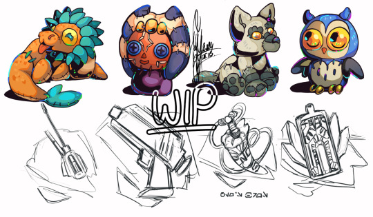
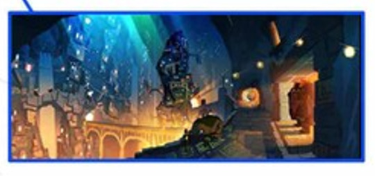
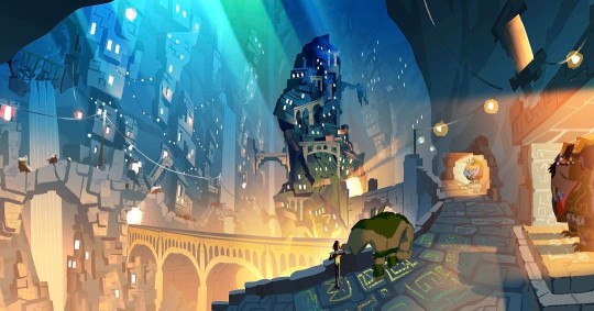
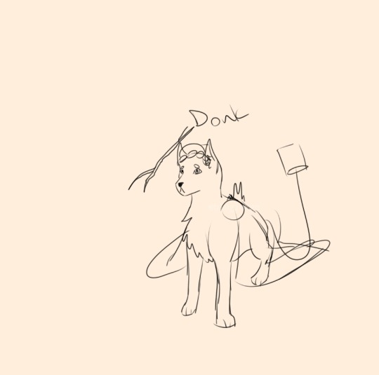
Trembling Essence:💙Cabin development progress💙

Helloo guys and welcome new followers it's been a long while, now that spooky month is over here's how the game is coming along!
A very big thank you to the recent influx of interest around 2 weeks or so ago, I wasn't expecting much since I was busy/drawing for Noahween. :,,]
**I'm going to still be busy but in good news not as much as before. Game development posts might be every 1-2 weeks now depending on how things go! :,]
After I posted the previous game development I wasn't able to work on the game until recently and I wanted to give myself another week to re-adjust before saying anything.
Now that I'm getting settled in here's what I've been doing to the game:
Dialog adjustments:


I've been going through and gradually adjusting certain scenarios. I want to keep the foreboding flow with hints of comfort in between so I'm still adding a little more depth on how the player(Y/N) feels/reacts from being back in the cabin again and Noah's attempt at hospitality during this segment. I also cut down the dialog again by combining smaller sentences into one text box unless the situation calls for it to be separated. :]
More CG work in progress:


One quality of life change I really wanted to do back then was add a few CG's of Noah when you're back in the cabin again. Originally there was going to be one or two in the [Extended Demo] but they were scrapped because my art skills weren't where they are now and I still need to practice perspective, etc but enjoy these really really rough sketches, the second one is old but I'm trying to figure out how I want it to look and how I want the pose to be. :,,]
Choices that effects Noah's closeness with the player(Y/N):


Some of Noah's reactions to the player(Y/N)'s decisions give a neutral response versus a negative one that effects closeness are still being worked on. I'm going through everything but the process will need a lot of careful planning. Just have to make sure all the variables line up. :]

If you like what I create, please consider supporting what I do on kofi! All donations and tips help tremendously while I continue to work on the game. Thank you to those that optionally bought the [Extended Demo] and the March 2023 demo on itch.io. :,]
Q&A / Ask box is open:
To know and understand Noah through Asks and random posts about lore, they'll be under #Get to know: Noah ! :]
**Some asks won't be answered if it contains spoilers but I do appreciate what I receive. :,,]
If you have any questions about Trembling Essence/Noah feel free to ask here or on itch.io please. This makes it easier for me to see and answer accordingly! I enjoy hearing from you guys!
Thank you to everyone for the continued support during this long game development absence! >:]
#male yandere#visual novel#dating sim#yandere#itch.io#illustration#digital art#artists on tumblr#art#anime drawing#drawing#indiegamedev#te updates#renpy#otome#anime art#artwork#doodle#indiedev#game development
30 notes
·
View notes
Text
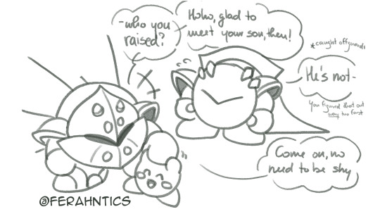
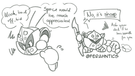
Quiver Knight meeting Kirby
So I was originally gonna sketch out her interactions with other characters like Dedede and Tuff/Bun, but I got carried away with Kirby so here we go xD
Quiver is not the easiest to approach starting off. She used to be very open, but is much more reclusive now. Although bumping with Meta Knight after so many years would help her walls to be sliiightly easier to penetrate. Though let’s be honest, they wouldn’t be a problem for Kirby either way.
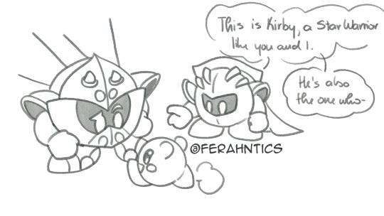
Heck, hanging around Kirby would honestly help her be more like her old self, actually able to crack a genuine joke or harmless fun poking at others. She’s very observant too, and would be able to spot anything from a country mile - mostly just to throw jabs at someone, in this case, Meta Knight - because she’s familiar with him. The others not so much (read: not at all).
Now it wouldn’t be the smoothest sailing all the time. For years Quiver has been very reserved and locked up almost all her feelings after Robin’s incident. And Kirby would notice that, and would try to interact with her more - which in turn makes her back away more OR become snip-snappy. Though in Kirby’s case she’d probably just shoosh him away if he got a tad bit too prodding.
But Kirby’s not exactly someone to back away from a potential friend, nevermind someone who he can feel is struggling with something. So it turns into a bit of a game of persistency, who can last the longest out of pure and utter stubbornness - one out of her own bad habit of brooding, and the other out of completely pure intentions on trying to give affection and love and care to the other.
Results are obvious.
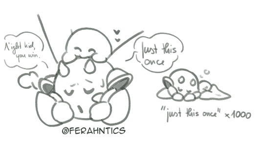
It’s never just this once.
#quiver knight#kirby#meta knight#fan character#kirby oc#mine#my art#i was in the mood for cute ya'll#i noticed I forgot quiver's tiny scar under her eye oops#quiver's a bit of a rough patoot to understand#but despite being a cranky nana#she's still a nana#i have some more sketched out but i might do a separate post#this got a little long kjsdhg
38 notes
·
View notes
Text
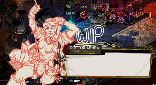
SW Hades AU May Status Update
I wanted to make a dedicated post about what I’m currently working on for the Star Wars meets Hades AU that looks more consistent than just sharing bits and pieces whenever I’m tagged in a Last Line Challenge. Because what else do I have but the poly sketch requests and this AU for my weekends? (If nothing else I know that the Hades AU has got me XD)
Other updates: June - July - August
For now Obi-Wan and Maul are stuck at the same stage: they are both lined, have their base colours down as well as the two adjustment layers of coloured lighting.
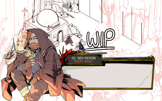
I suspect if I were ever to get through the agonozing few hours of shading Obi-wan’s face it would be mostly smooth sailing from there. The problem is that there are at least 2 - if not 3 - separate stages where the shaded face looks like I have no idea what I’m doing, and you need to get through the whole thing before it really comes together 😅 on the other hand Hades 2 has a lot of the directional shading I might need for his character art so that might help to get me there.
It also needs to be said that Obi-Wan comes with the extra disadvantage that is the entire background behind him. I’m really hyped to line it finally, it is quite a challenge, but at the same time I’m slowly coming to the realization that I have no idea how I will colour it. Hades backgrounds are so so pretty and full of details and gorgeous colours, and while I’m not delusional enough to think I could match that on first try… I still wish I could, you know? At the same time I will have to erase or recolour a lot of my lines, which will hurt quite a bit, I imagine. I’m so bad at killing my darlings 😅 also I hate laying down flat colours. I just find it very difficult to immerse myself in that process, while lining and shading can have their flow.
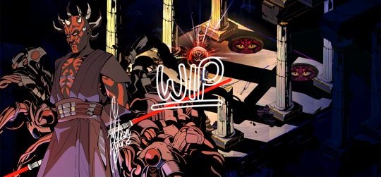
I had covered up so many lines and details in Maul’s spider parts it’s a miracle I didn’t cry XD However, tips on grouping my shadows and allowing the shape to speak for itself and the details in them are very helpful and on point.
Worrying over writing dialogue for them is also not as far down my to-do list as I wish it were. I have a good enough idea for a quip for Obi-wan, but Maul? He’d need a whole melodramatic rant of his own XD
Aphra has gotten some new lines and I had fixed the satchel I had forgotten the last time I shared the rough sketch for her, thanks to the new character art for Hades 2! Seeing Odysseus and Hermès’s updated looks were great helps here, so I might as well move on to lining her, and finally adding another female character to the roster on top of Ahsoka!
And then there is the biggest update on these little guys below! I will need to clean up the ones I had drawn for Cobb and Boba (and Din) well over a year ago, but with these my version of chtonic companions are done, and thanks to @lesquatrechevrons I have a full list of keepsakes for each character as well. I’m not very good at drawing these little tchotchkes (I say with Rex’s blaster right there LOL) but I hadn’t been very good at lineart or cell shading when I started this project either, so through forced practice I’m determined to change that :D
(It’s not a screwdriver under Boga, it’s one of Cody’s antennas. “It will grow back, don’t worry,” he says as he snaps it off his pauldron and hands it over to Din. Rex backs him up on that one without question. They can't lie for shit but trolling the shiny is their thing.)
Additional fun fact: the reason why I’d picked up the chtonic companions concepts was because I’d been poking at minor details in the background behind Maul (aside from the Chaos doors), and I started adding credits and recoloured nectar to the corner (before I realized that they wouldn’t be visible once the character interaction comes up oops), and I tried to figure out to whose keepsakes Maul would react favorably. I also mixed up companion dolls and keepsakes, so that’s why the Ahsoka doll came to being (I also forgot that that one belongs to Rex, and not Ahsoka herself but uh… they are close enough that they should count by proxy anyway. It’s not Obi-wan’s cup of tea and that should be enough!). Also bless @mapleowl18 for suggesting Lil Soka as companion for Rex ❤️
So this is the current state of this AU project right now. I have my lists and notes, a few scribbled pose ideas in my sketchbook for Sabine (she might be next, unless Bo and her Nite Owls make a comeback), Satine and Omega (with Batcher), as well as some angry scribbles and question marks for Quinlan (who has apparently made his way back into this AU even though he didn’t get a little icon of his own originally orz), and Obi-wan The Second that would stand with Cody post reunion, but I cannot make that one work for now 😅
#I have absolutely nothing for a very long time and then a lot of SOMEthings - this is how we roll apparently#I wish I could spend as much time on these as I wanted to and keep dreaming about them but my attention span still sucks T^T#I will try to make posts like these a regular thing what do we think?#maybe that will keep me on track#hades au#my art#obi wan kenobi#darth maul#doctor aphra#star wars fanart#wip#work in progress#long post#artists on tumblr#sw fanart#hades au update
157 notes
·
View notes
Note
i really love your lineart!!!!!!
sometimes in the inking stage i kind of mess up about the thickness about the lines and such. and in general it looks stiff in comparison to the sketch. any advice for a novice?
thanks!! wow it's been two years since someone asked me about lineart :') in addition to the stuff i wrote in that post, some ways my process has changed since then:
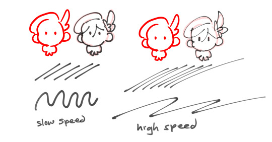
using a pen at lowered opacity w/ velocity variation:
(example used is ciro pen!) if you draw a fast stroke it thins out, but consistent speed/pressure gives you a uniform width. it took me awhile to get used to bc developing speed + control just takes practice, but i like how pens with velocity make it quick to vary line width easily. (it might be a placebo effect but i also feel like drawing with these types of pens forces you to have more line confidence, bc it's very visually apparent when you go slow or unsteady...haha)
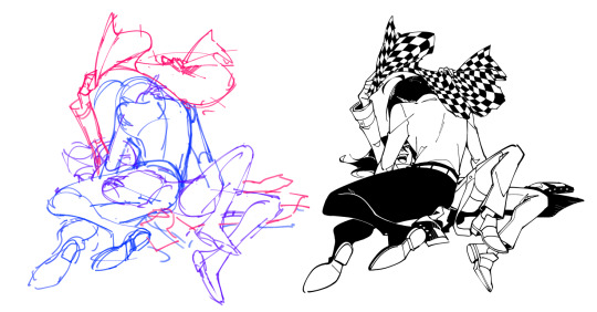
2. sketch vague, draw detail in later
for pictures that i draw separate lineart for, i usually do rough bodies/shapes and then draw in details while inking. if there's too much detail in the sketch, i think it's easy to focus too much on following the sketch perfectly with your lines, so it gets really stiff and loses the motion in the original sketch. example sketch -> lineart
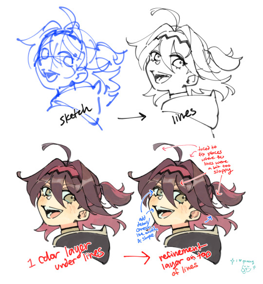
3. the "this is fine" or "eh fix it later"
try not to overwork it! its fine if there are holes... and the lines dont connect... and the width is weird... it is okay.... employ the time honored techniques of "it's fine" it or "ill just fix it later" lol i tweak or add details as part of coloring to correct places where the lineart got weird. you can probably see it better in this process vid i posted before, but i also drew an example today ft. my boy gaming
like any other skill, i think developing skill + speed with lines follows with time and practice, but i totally empathize with the struggle against it looking too stiff... getting past the mental block of trying Too Hard and losing the charm is tough. you can do it!! i hope this helps!
#ASK EVER#i love u gaming genshin impact... ur joie de vivre and kindness are so charming....#fun fact the first character in gamings name is the same as in mine. a rare irl ever fact
332 notes
·
View notes
Note
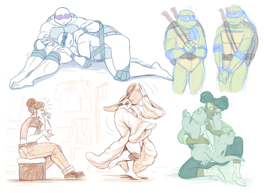
Well I really love your art, may I ask how do u color? I struggle with coloring turtles and I wasn't to know how do u do that?
Hi anon! That's a very broad question, so you've given me a great excuse to ramble anything I want about my coloring, eehehehee~! This will be in two parts and I'll start with talking about my simpler coloring style.
As in, when I color characters on a white background, with a limited or light palette.
The driving force behind this style is me being lazy. My time, energy, and attention span are pretty limited, so if I want to finish anything, I gotta do it fast. And with fanart, I'm usually just doing it for fun and relaxation, so there's no need to push myself to polish it too much.
Despite that, I rarely post just black and white sketches or line arts. I always try to add at least a little bit of toning or shading, because that makes the image easier to read. The characters and their shapes pop out and catch the eye of the viewer better.
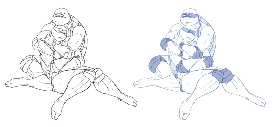
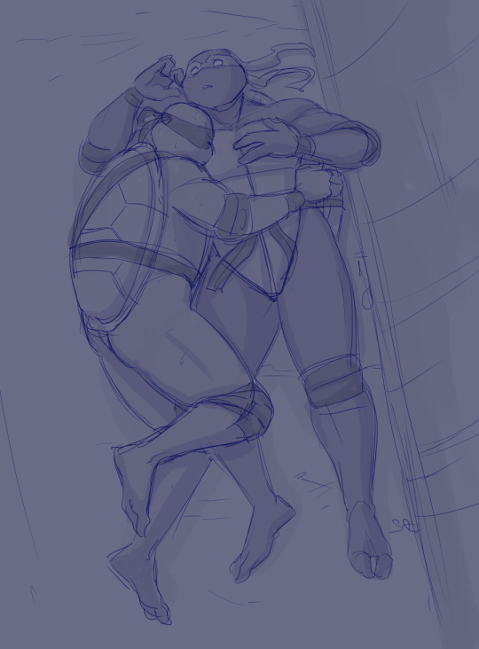
However, in this particular example, just the couple toning colors don't quite do the job. The way Don and Leo are entangled makes the center area of this illustration very busy and hard to read.
As a comparison; this pic has only one tone + mask colors, and it works. This is because all the characters are standing separately and their poses are very stationary and simple.
So for the Don + Leo pic, adding some shadows helps in bringing out shapes and depths. Also in general, if you don't feel like drawing BGs, it's good to at least add a shadow below the characters. It grounds them and makes them feel like they exist within a space.
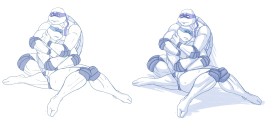
Sometimes if the posing looks too complex and busy, it might just be best to color in the characters fully.
However, even if I do full flat colors, I tend to use a lighter palette. Putting characters in their neutral/default color on a white BG can look a bit jarring as if they're floating in a void. It feels less immersive and like the picture is unfinished.
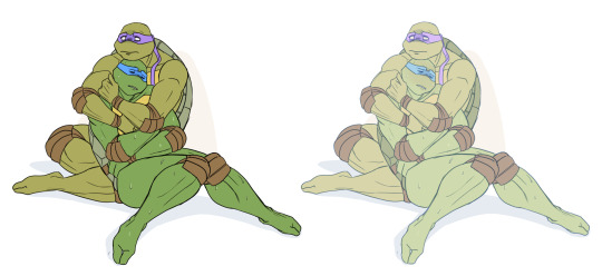
Using lighter colors makes the image more cohesive, and fits the characters into the white environment a bit more naturally.
If I'm too lazy to draw a BG, I prefer using stylized and limited colors. It feels deliberate and that the whiteness is just part of the palette, whereas the character-accurate colors on white don't match as well, even if they're more pastel.
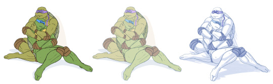
That being said, there's nothing wrong with just slapping the flat-colored characters on a white background. As you know, I do it too. I'm just exposing my 'fancy coloring style' for what it is; me being lazy, hah!
Limited and monochromatic palettes are a nice shortcut even when you do actual backgrounds. It's faster and you don't have to worry about clashing colors. And you can still convey atmosphere and mood.
Also, on the topic of conserving your time and efforts; I think it's very common among younger/less experienced artists to think that the amount of time you spend on your art piece = how good and well received that piece will be.
Which has some merit to it of course, but it can lead to putting too much effort into areas where it's not necessary. E.g. filling the piece with tons of details and clutter that don't serve an actual purpose, but rather make the image hard to read. Or doing really complicated shading for a meme/comic, where simplicity would deliver the joke better.
So whenever I'm drawing something I intend to publish, whether it's a quick doodle or a more polished piece, I try to follow these two principles: Make it easily readable and do the bare minimum that needs to be done to convey what I want to convey.
Putting time into practice is important, but if you draw for work, it's also crucial that you know how to prioritize and use your time efficiently!
Anyway, thanks for reading! In the next part I'll go into how I do my fully colored pieces, so stay tuned for that!
179 notes
·
View notes
Text
Decided to split up the artwork that turned up over the weekend in part as wanted to focus on THIS thing first:
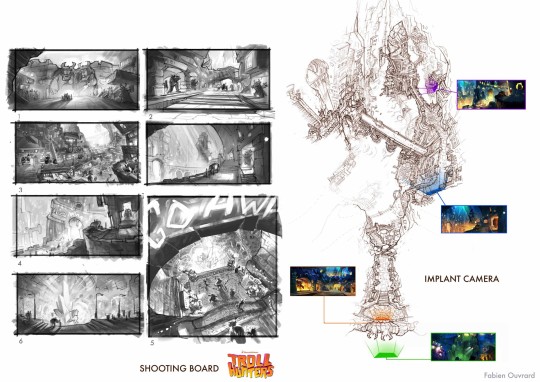
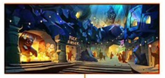
Brunch Studio has a now hidden page where they go into detail of what they did for Trollhunters (Both og film and TV) including creating the Trollmarket set design. Which is neat because some of Rémi Salmon's work was saved from whatever his website is doing! Another of the artists mentioned on there is Fabien Ouvrard. Through some tracking down I managed to uncover his instagram and later his artstation account. The first had some cropped work from Trollhunters whereas his artstation didn't... Until Saturday.
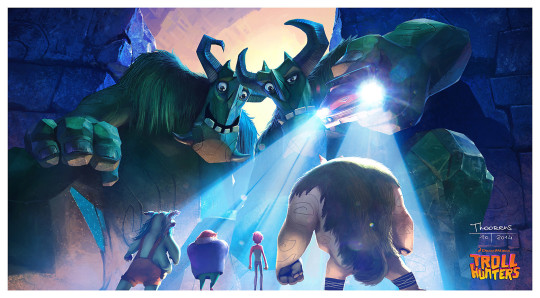
Being able to have a proper look at this thing managed to figure out it is in fact the shooting board for the below video:
Not entirely sure if it was part of a pitch, a spec or what just that it's incredibly cool.
If you really zoom into the Shooting Board you find this image which given the other artwork. Who painted it is currently a mystery.
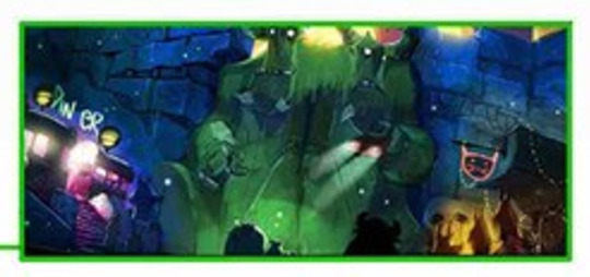
The matching image on the reel is a pretty easy one to ID, Geoffroy Thoorens dated back in 2014. The trolls beforehand are a bit more of a mystery though there is a suspicion who they might be which we'll come to shortly.
Next zoom in is this which the artbook confirms is Zibach.
Whereas the Reel is Thoorens again, also 2014. It's likely this is an overpaint of Alfonso Blaas' version because of the remarkable similarity.
From the zoomed in stills again this one can absolutely confirm is Zibach because it was on tumblr with an instagram redirect.
Broken tumblr posts can't stop me:
The next transition gets a bit more in the air seeing as it's a composite. From what I've been able to figure out:
Alfonso Blaas - Trolls, he has them all uploaded separately and they're painted over Headless Studios linework
Christopher Zibach - Heartstone
Geoffroy Thoorens likely had a hand in the rest as he does have those funky gem bridges on his artstation which have not really shown up elsewhere. It could be a mixture of him, Blaas, Ouvrard or even other artists too!
After that is a bit of a mystery. On the shooting board it's clearly Zibach so somebody must have made their own version of it. When that happened they added Blinky and Toby in the process.
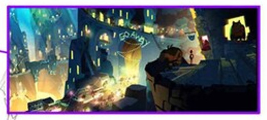
With nothing for the sweeping in to GO AWAY shot it like was based on Fabien's sketch using the above Zibach as a reference.
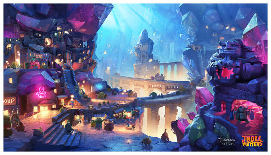
The Heartstone went through all sorts of weird and wonderful transitions though being in water with the posing did show in Zibach's shown below. According to the artbook and comparing to the reel it looks like that particular image was drawn by Dominique Lewis possibly with Thoorens's background, difficult to tell.
It's been incredibly neat seeing some brand new work (If small), sketches and an excuse to watch that video again.
#Trollhunters#Tales of Arcadia#Vis dev: Christopher Zibach#Vis dev: Geoffroy Thoorens#Vis dev: Alfonso Blaas#Vis dev: Dominique Lewis#Heartstone Trollmarket
92 notes
·
View notes
Note
sorry if this has been asked before, but i wanted to ask about your lineart! the weight and line economy are just so nice, i get stars in my eyes looking at your lineart and doodles. could i ask what your approach to lineart is and what tips you might offer?

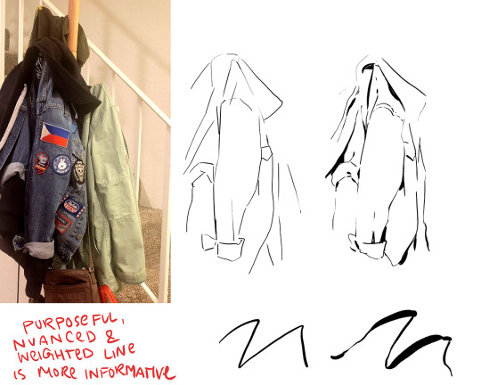
Wow I love these questions - Line is so interesting!!! It's a really big topic so I feel like any tips I give will be just barely scratching the surface. It's like deceptively simple...any given line drawing is essentially taking all the information we glean from seeing something irl ie light, shadow, dimension, texture, perspective, etc and boiling it down to the simplest possible visual information.
I think most commonly my line is informed by light source so like. thicker more continuous lines face away from the light and thinner more broken lines towards. and a lot of my spot blacks r simply cast shadows.

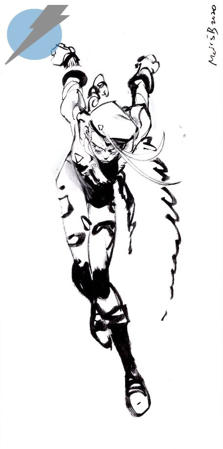
here's a more extreme example

BUT like everything to do with art there's no hard and fast rules. I use blacks when I think it'll be effective or interesting and I leave them out when I don't need em. umm couple things I find myself doing a lot... using spot blacks to make the separation between characters clearer. I like casting shadow in between characters so its easy to separate and read their silhouettes even when they're mashed together.

u can go even further to purposely create a silhouette like

to draw attention to a finger or tongue LOL. There's some comic book artists who are absolute masters at this type of stylization. Alex toth and his spiritual successor Chris samnee come to mind for me right away.
(toth)
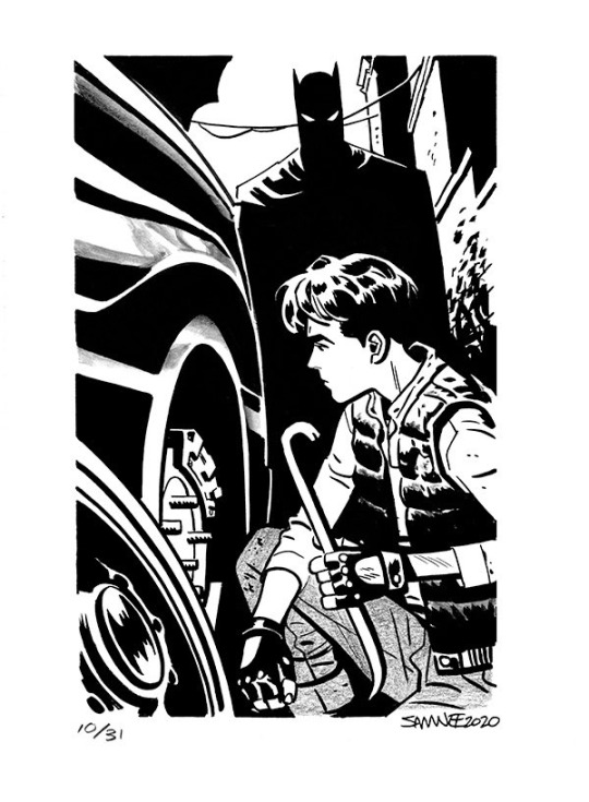
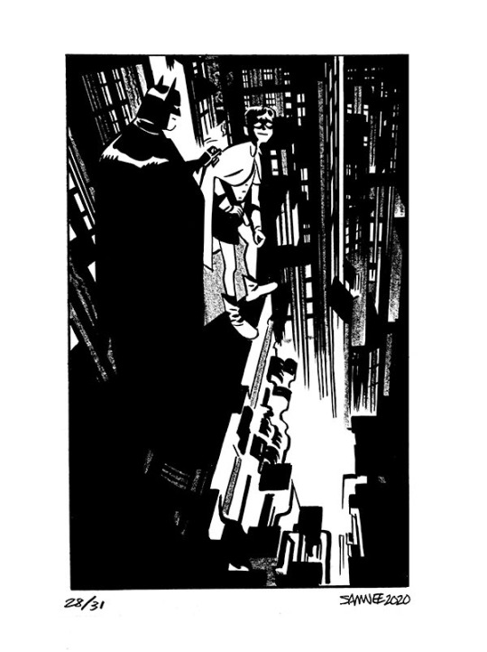
(samnee)
I feel like I'm also often using line weight to separate planes receding in space

im naturally a really heavy handed and scribbly drawer(...?) draftsman. and im nearsighted so when i see things i percieve and break it down into big shapes over thin contours. so stuff like spot blacks and shadows came easy to me, the tricky part was making the rest of the lines lighter when they needed to be so the blacks could actually have impact LOLL. a lot of effective visual communication is about balancing contrasts. like I had to really train myself to press less hard on the pen. I think this is actually really evident if u go back in my archive to older sketches LOL


I actually feel like a lot of how I trained my hand to tackle line weights was thru stuff like hand lettering where you rly have to focus on being sensitive to that kind of thing.. contrasting strokes etc.

also exercises like figure drawing will have you flexing those muscles constantly

I'm starting to just regurgitate lessons from freshman year of art school so I'll stop here with the demos but yeah...I hope this was helpful!? I love line!!! I want to get even better at line work so I can feel confident posting work that's only line no color or value... I'll leave you with a bunch of artists who I think have particularly expressive and beautiful linework (not including toth and samnee who I already mentioned and who's work I love so much). You can probably learn much more from them than you can from me...!

Charles dana gibson LOL


Matias bergara
tonci zonjic

naoki urasawa

Daniel warren johnson


shiyoon kim

michel breton
also yoji shinkawa, tomer hanuka, leo romero, I feel like I'm gonna post this and think of so many more. there's so many good artists...!
1K notes
·
View notes
Text
This is such an unserious criticism, Yana and I just have different tastes. I do straight up find the dress ugly but I feel like I should preface with my tastes too: I'm a bit pretentious and love historical fashion, and I don't like Lolita very much so me and Yana are clashing like crazy. The pink 'robin' dress is so iconic but I have a few thoughts.
I hate Ciel's pink dress and I always have. I might redesign it because it is so unflattering and fucking PEACH PINK BLEGH like dusty pink lemonade that's been in a store cupboard for too long. It's a very childish colour which I wouldn't dare change cus that misses the whole point of it being a ploy to seduce good old uncle Druitt, unfortunately. I think I'd incorporate a dusty dark magenta in place of some of the black accents but I'd like to keep a little black to match ciel's dark blue hair. The magenta accent would definitely be satin because I am absolutely yearning for satin but I'm apprehensive since he is supposed to be "a young girl" and satin has a much more mature vibe.
Though it does make him appear taller, the fucking absence of a waistline/no separating hemline between the bodice and skirt ticks me off. The ruching blending into his bodice makes me so mad. He looks swamped in fabric which counteracts the attempt to elongate his torso. The bodice totally lacks structure.
Of all Ciel's outfits to not feature a bustle, you choose not to put a bustle on his ACTUAL DRESS?? Sure, there's a huge pink bow, but Yana actually LOSES the petticoat around the rump, it's bizarre. I hate bows so much I don't know why. The one on the front just feels so disjointed from the flow of the dress and disrupts it entirely imo. I'd probably change the texture of the bodice with a ruffle-front in place of the bow. I have no qualms with the petticoat besides there's just too much of it. The dress has a wider silhouette than typical 1880-90s evening gowns so that's an easy compromise: I'd give the bodice a more prominent waistline higher on his waist but pinch in the diameter of the skirt to maintain his illusionary height. From a large initial bump at the top of the skirt, I'd want it to fall straight down instead of the typical "ball gown" that widens towards the bottom.
Fucking black and white stripes is NOT giving evening elegance. It's giving beetlejuice (which gives me a black butler Halloween drawing idea...), or Mrs. Lovett's beach day dress in the tim burton Sweeney Todd. Despite this, I'd keep the stripes as there is so much character to them, it probably helped to entice the viscount 🤢 since they're so fucking jarring and out of place but I digress. I do think the black is incorporated really nicely in that horizontal strip on the petticoat ruffles. I HATE the vertical black strips holding the ruched pink gown - I'd probably replace this black accent with the dusty magenta. I hate the length of the ruched fabric but it wouldn't offend me so much if there was a WAISTLINE. (Again, I'm being dramatic. It's a product of 2006 Lolita-core and I can respect that. But I do detest it in places.)
I will make sketches I think which I'll add onto this post cus I LOOOOVE designing dresses. I've rambled too much.
31 notes
·
View notes
Note
kk wow you went so much more in depth than i thought but that was awesome. sending another but pls take all the time you need to answer this one.
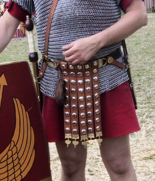
i don't think i realized you had a colored version of two of them til today because i was going off of the sketches you posted at the start of the month. the one that caught my eye in that and who i have a different perspective of now that i've seen full color is the shortest hero. you mentioned that the clothing didn't come from any one culture, but if you have an answer it would be cool to hear: what's the long cloth hanging off of the waist belt of this hero called? or, if it's part of the belt, what's the name of the full thing?
[ also a more in-universe follow-up: am very curious about the symbols all four have on their clothing and what your thought process was behind each. i'll settle for the shortest hero's butterfly-esque symbol if you just wanna do one (: ]


Thanks for sending another ask!! This is probably going to get quite long again!
So first, to answer the question, there’s actually not a very easy answer for what that long cloth is called! It shows up quite often in fantasy outfits and armor of knights, and you might sometimes find it being called a tabard or a surcoat online. Really though, it’s closer to something called a monastic scapular, which is a western Christian garment that hangs over the shoulders and goes down to the knees.


The tabard is usually some form of light tunic or jacket worn over chainmail and underneath armor, and I think in fantasy armor the stylization of it as longer and thinner towards the bottom eventually turned it into a pretty common thing? But the point is that it’s usually attached to something hanging from the shoulders and not just from the belt. But having something hanging in front of the crotch from the belt does have some precedence in the Roman pteruges, so this might be where that kind of belt fabric came from.
So in the hero of yore designs, the pieces of fabric hanging from the belts aren’t actually very historically accurate, and follow more the trends of fantasy outfit design. But mostly they act as a sort of conisistent point between all the heroes that shows each hero’s insignia. This sort of hanging centerpiece of fabric has been a pretty consistent part of my designs for a really long time, though in my previous Kirby designs this mostly took the form of some part of a double breasted coat, like so:
But yeah! On another note, while the hero of dark’s outfit isn’t based on any specific culture, the hero of soul’s (the butterfly hero) outfit definitely is based on Japanese clothing! The very long sleeves are based on furisode, but there are some liberties I took with the whole design as a whole, I.e. the pants are based on hakama in construction and shape but don’t actually have all the pleats a hakama should, and have added slits for style. You generally also wouldn’t wear hakama with fancy long kimono I think, nor would you use a tasuki with it. Tasuki are generally used to keep the sleeves out of the way while doing activities, while long sleeves are more ceremonial and decorative. I did intentionally keep the sleeves very long on the design, however, for character reasons that I might go more in depth in if I ever make an individual outfit breakdown post.
I’m sorry I didn’t get around to answering about the symbols! I also have a lot of thoughts about them, so I might also make a separate post about that haha
93 notes
·
View notes
Text
HELLO TO THE PEOPLE, I AM DONE WITH THE DESIGNS!!.
So I did go a little bit much with some details (but I think they are fine) here they are in their full glory and I will also give a small rundown of the theme I went for each (mixed with some small headcanons of my Au, so that you guys can get to know them a bit) :)


Here is all four of them together, to let you know Nugget and Lily are together on my Au and Billy is together with Kid!. All 4 are young adults at the age of 23, all of them are in college.


With Lily, I went with a flower design, (lilies just like her name), mixed with a navy blue color that reminded me of her hoodie in Kg2. Lily in my mind also was one of the more elegant one I guess and this dress screams it to me! (Fun fact, Lily really likes the color pink but doesn't normally wear it)
With Nugget though, I went with the anubis theme as he is part egyptian in my Au (I do have another sketch of him which I made for practice, maybe I could show that in another post) with the anubis theme, of course, I went with a black and gold color pallet with some slight dark blue accents on the mask. The red lining was done for me to separate the colors.


With Billy I decided to have him in a black suit and a mask that most referenced the cthulhian type monsters from Kg1 as it would be fun to kind show case that with his white marks ( which most are covered except the ones on his neck!)
With Kid i kinda went more of a mythical being type theme and for some reason the dragon stuck to me. The dragon mask design is actually inspired by one sketch of a tattoo I was thinking of giving him (which he might still get, I just haven't finished it, maybe upload it sometime soon!)
I think they turned out pretty good ( I have never done a masquerade them on characters before btw)
I am excited to interact with all of you and i can't wait to see you, I have already seen some of the designs and they look fantastic!
#kindergarten lily#kindergarten nugget#kindergarten kid#kindergarten 2#kindergarten billy#kindergala#themes#i can not wait for the interactions
27 notes
·
View notes
Text
@101maverick I've put this in a separate post so my original one doesn't get too long but here is your ficlet with tattoo artist Steve and florist Billy.
I really enjoyed writing this and might expand this into a proper fic at some point.
"just go talk to him, dingus." Robin said, causing Steve to tear his eyes away from the window.
"Just go talk to him? Do you hear yourself Buckley?" He asked, returning to his spying as their newest neighbour continued moving about his own shop, carrying a large bucket filled with brightly coloured roses. He gestured behind Robin to the whiteboard she'd hung there a year ago. "You said so yourself, I can't flirt for shit."
Robin glanced at the board, at the 10 tally marks under the 'you suck' column. "I didn't say flirt, I said talk. Go and talk to him."
"What would I even talk to him about?" Steve whined, leaving the window and flopping over the reception desk. "Why would a god like that even speak to me?"
Robin rolled her eyes with a heavy sigh. "Jesus Steve, keep it in your pants okay? Besides, he's tatted to fuck, you've already got something in common." She gestured around at the shop when Steve simply looked blank. "Tattoos dude, he's covered in 'em, you do 'em. Use that as a jumping off point."
"But..." Steve trailed off when the bell above the tattoo shop jingled. He turned to greet whoever had come in and promptly had a minor panic attack.
It was the florist.
Standing there in his tanned, tattooed glory. His golden curls piled on top of his head in a messy bun, a pair of stonewashed dungarees and no shirt, the man didn't even seem to realise that he was a walking wet dream, or that Steve was having trouble breathing.
"Hey." The man said, his smile blinding as he raised a hand. "I'm Billy. I moved in across the road last week, got the flower shop just there." He jerked his thumb over his shoulder, his smile dimming somewhat when Steve didn't respond.
"Nice to meet you Billy." Robin said, shoving Steve forward. "The mute here is Steve, he owns the place. I'm Robin, I help his dyslexic ass keep the books."
Billy laughed, walking further into the shop, holding his hand out and beaming when Steve took it. "So, you're the artist huh? I've been admiring your work since I got here." Billy pointed to some of the framed sketches that lined the walls. "What's your waitlist like?"
"Oh, uh... Depends what you want really." Steve finally found his voice, this he could talk about. "What do you have in mind?"
Billy leant against the reception desk, tugging one of the dungaree straps down, exposing one of the few bits of unblemished skin just above his right nipple. "Here I think." He said, tapping the skin. "Another flower, about this big." He circled the spot.
Steve nodded along, pulling his sketch pad towards him as he continued to stare at the exposed skin. "Which flower?"
Billy's grin grew. "What do you know of flower language?" He asked.
Steve blinked, caught off guard by the question. "Uh, I know it exists but I don't know that much about it. Roses mean love though right?"
"Red roses do." Billy agreed, nodding his head. "Or more specifically they mean passion, romance." He traced a beautiful watercolour rose on the inside of his wrist.
"Was it a rose you wanted?" Steve asked, trying to steer the conversation back to safer waters, his cheeks were warm and he was sure he was pink despite the fact that this conversation seemed completely innocent.
Billy shook his head. "No, not a rose. I'd like a green carnation." He said with a wink.
Steve was now certain that he was glowing with how red he must be, because he might not know about flower language but he knew enough LGBTQ history to know what that meant. "A green carnation." He repeated.
"Yup." Billy popped the 'p', his grin just as cocky as it had been since he'd walked in. "You like green carnations Steve?"
Steve nodded, swallowing loudly as he tried to come up with the courage to say what he wanted to. "I do." He said quietly. "Do you like trilliums?"
Billy's face lit up. "I love me a good trillium."
Steve smiled bashfully, looking down at his sketch pad. "I can book you in on Friday, last session of the day."
"Perfect." Billy stepped closer, leaning in and whispering his next words into Steve's ear as he slid a business card across the desk. "That way I can take you out for a drink after, can't I my pretty trillium?"
For info green carnations are a historic symbol for gay men and trilliums are a slightly more recent symbol for bisexuals.
66 notes
·
View notes
Text
I don't think I'll have the motivation to digitalize this but I really wanted to talk about my new au, so I'm just gonna post the dirty sketches.


I'm calling it "Post-apocalypse AU", and it's about what if all of the main characters (Bonnie, Finn, Jake and BMO) where born at the same time period as Marcy (during the Mushroom War) and they all end up finding each other and they help each other survive?
Some of the things I've decided:
- once, when Marcy was little, she ended up accidentally separated from Simon; Bonnie, who was the same age as her, ends up helping her out 'till she finds Simon again; they ended up running into each other a few more times over the years and became friends;
- after Simon left, Marcy went to stay with Bonnie for a bit 'cause she didn't know what else to do, but left a few months later to keep looking for resources;
- Finn grew up in a human colony, but once he went exploring the area on his own and got lost because he got chased by vampire; that's when he met Jake, who promised to help him find the colony so he would stop hanging over him (since he is a mutant he was really skeptical of humans) but they become good friends in the process;
- Finn and Jake met Marceline when she saved the two of them from a vampire and the three of them decided to stick together since them;
- the three of them met Bonnie when they fell into a trap she had set for oozers; she let them go as soon as she saw Marcy, but Finn and Jake were suspicious of her for a long time;
- they were all there when Marcy got turned into a vampire, and Bonnie took care of her during this time 'cause she didn't have blood, so she wouldn't be in danger around her, before they found out that she could feed on the color red; Finn and Jake started warming up to her after seeing how gentle she was with Marcy during this time;
- once, Bonnie gets taken by a group of humans that hated mutants, and Marcy was visiting Simon, so Finn and Jake were the ones that helped her, and that's then they truly became friends;
- they end up finding BMO at some point randomly and he just sticks with them without taking "no" for an answer;
- Marceline takes the whole gang to visit Simon sometimes; he already knew Bonnie from when she was a kid and used to spend some time with Marcy, so when they started dating he got really happy for them (also, how cute would Bonnie and Simon father-daughter in law relationship be???);
- also, it would be really interesting to see Marcy, Bonnie and Jake in a world that still wasn't accepting towards non humans;
- also, it would be cute to see Bonnie and Marceline as actual teenagers and not centuries years old immortals who look like teenagers.
I might edit this if I remember any more things to add :)
#my art#adventure time#adventure time fanart#do not repost#made on phone#bonnibel bubblegum#princess bubblegum#bonnie#marceline#marceline abadeer#marceline the vampire queen#finn#finn the human#finn mertens#bubbline#post-apocalypse au#my au#adventure time au#sketch#au
14 notes
·
View notes
Text
"Nice Corpse House My Guy" Remastered Behind Scenes!
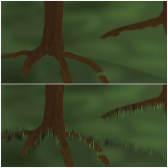
The most glaring and obviously annoying thing that's evident in this comic- if you even wanna call it that- are the god forsaken BACKGROUNDS. There was a lot of experimentation going on for backgrounds here. Because the first couple pictures, THAT is what I used to draw backgrounds as. Trees are sticks and grass is flat. I realized that wasn't gonna cut it. I didn't like it at all. So I started experimenting and boy was it messy. It finally sorta settled on the style by the end of the comic. I'm still unhappy with it, but it'll have to do for now.

Here's a small comparison
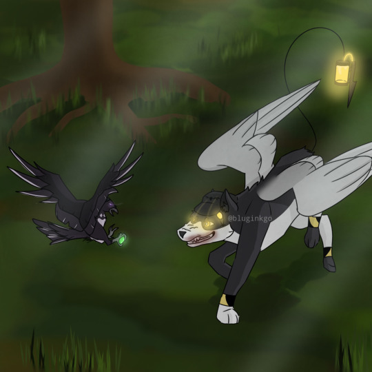
One thing that I ran into was how I was gonna show that N was in his "killer mode." I could have placed the X's over the pupils, but found it unnatural looking in my style. So instead, it was settled to a concentrated light in the pupils.
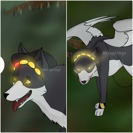
Best seen between these two. The second N snaps out of it, the X/light in his pupils disappears, and the normal light returns to his eyes, which is similar to Uzi's.
Another thing I started slowly including was Uzi's little tooth on her beak.
The jutting out portion on her beak is a personal touch. Although it doesn't really matter, I included it to separate her from the rest of the "worker drones." Seen as she's an absolute solver host and has a solver form, something was going to creep up in her crow design, hence the little teeth. Doll would have them too, given I draw her in the form I've been thinking about.
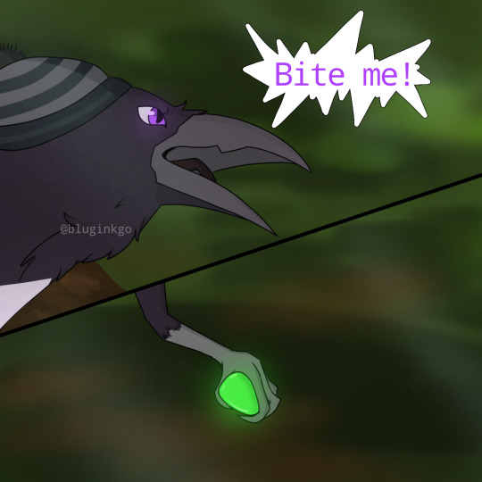
Another thing I ran into, was WHAT WAS UZI GONNA TAKE N DOWN WITH?! This is a bird vs. a dog! No way was a bird gonna decommission a whole dog! Then this scene came up in my recent rewatch of Murder Drones.
And it clicked. Loooong long time ago, I had a very specific hyperfixation: birds. One thing I learned that some pigeons do, was they're capable of doing a somersault. And in mid-air, too!
I was finally set. The SICK AS HELL RAILGUN was downgraded to a simple piece of shiny glass/pebble that attracted Uzi- and crows love shiny things. And the same pebble will be used to launch at N's sensor that made him trip over. Because I was also not going to draw N doggo losing his head. I love gorey and bloody shows and art- hence why I watched Murder Drones- but I honestly had no idea how to recreate that, and I suck at drawing gore in general, I mean, did you SEE the crow N was chewing on? That was my best try honestly.
Here are some progress shots and how the layers worked in the scene where N is bonked with a stick.
As per usual, start with a sketch, this is actually 2nd sketch. The first is much rougher, just some circles and random shapes to outline his body form.
Then, this is all outlined and rendered. Along with some additions like the stick and the little rock.
The background was the hardest, aside from some weird angles I picked to draw Uzi and N at. I suck at backgrounds, like I've mentioned many times before. So, this needed a lot of testing and experimenting. Most of this works because I found some cool brushes to use. But aside from that, I honestly still don't like how it looks. It's slightly better than my stick trees and flat grass though, I guess.
Put it all together, add a black layer to simulate nighttime, put some lights to show moonlight through trees and voila, you've got an N doggo that got bonked by a stick! I see this project/comic mostly as practice and testing. Background testing mostly, and some brushes. The background/brush testing actually spilled over into another post of the solver Uzi I made a bit back. I'd say I was pretty happy how it turned out, but brush wise, I was going to test around a little more.
NUzi comic 'Sleep' is my next project. Uhhh, don't ask me when I'm gonna have it out, I have no idea. I'm guessing sometime end of Jan and beginning of Feb. But that might be delayed seeing as Murder Drones ep7 should be out sometime soon too, so I'll need to go crazy about that for a bit and then I'll go back to my usual thing ^_^ 'Sleep' will take place still between the Pilot and Heartbeat.
P.S. I have all 26 pages story boarded... good god what happened to the 'mini' part of the comic 😭
Anyways, why are you still here?! Have a cookie ^_^ you made it! Have a nice day now, bye bye <3
#murder drones#glitch productions#serial designation n#uzi doorman#murder drones fanart#md uzi doorman#md uzi#md serial designation n#murder drones serial designation n#murder drones n#bluginkgo's murder drones as animals#n x uzi#murder drones uzi#md n#n md#md nuzi#murder drones nuzi#nuzi#md biscuitbites#biscuitbites#n murder drones
91 notes
·
View notes
Text
OK
Before I talk a LOT (I'm not joking, A LOT)
About this au, how I stumbled upon the idea, story and all in a rushed format,
APPRECIATE THIS
TOOK FOREVER
COMPLETELY out of my general comfort zone in art BUT OH WELL LOOK AT IT :DDDDDDDD
Also serves as a good hook for what this post is about mehehehehehehehe
CUT TO RAMBLINGS
Oh I have your attention?
Excellent.
It started with me thinking and wondering about a specific fic that is unrelated to this post, frankly different fandom, and I was wondering how it would play out in a movie format, but seeing as the fic in question currently is unfinished and won't be for a while I decided to direct my attention to other fandoms, got to DCA fandom, came up with a few cute ideas i didn't write down for unfinished fics, for the record I do think it would be interesting if Solar Lunacy was a musical just saying, and then I started to think about ok what fics ARE fini-
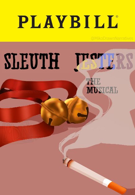
SLEUTH JESTERS HECK YEAH
Unfortunately at the moment I don't have any digital sketches to share for some of these points and the sketches I do have are pretty messy SO I'LL JUST RAMBLE cause I already wrote down a lot of these separately
Firstly, I imagine this kind of musical being in universe kind of au. Possibly an extension of the Actor AU where the original media (tv show? movie?) got so popular it got a musical adaptation
I imagine the actual music, whether the songs or just sound track, would be heavily inspired by Jazz or smthn. Like, the genre of music most popular during the time period Sleuth Jesters is in ish. It would still be musical-like but you can tell the genre they are going for
And before continuing, to get around not actually saying "y/n" on stage cause that might be a little awkward MAYBE there could be some kind of special sound affect for the actors mics that the audience knows is y/n's name?? Half baked tho
COSTUMES
Sun, Moon and Eclipse (at least) would have highly decorated masks to match the original just added onto because they are on stage. Masks, so that there are more options for who to cast. To make up for this, the actors have to make it clear in their body language to make up for lack of expression
in productions with higher budget mayhaps one function could be the eyes have options for what emotion they could express
In most productions there will be sound effects in the background that mimic the noise that Sun Moon and Eclipse make as they move. Or at least be incorporated into the sound track ooooo
Y/n's clothes would have an easy to notice difference in quality compared to the DCAs, which makes the bell and ribbons much more noticeable on stage
Smaller note but I think y/n's make up could be kind of fun with how they show the y and n on their face
Would probably have a wig colored various shades of silver but not required
FIRST SONG FIRST SONG FIRST SONG
Would be the introduction (of course) and depict the first chapter and likely have something to do with "Until Next Time". I think possibly it would have little breaks in the song to fit in the dialogue
Honestly, in an adaptation there might just be more scenes added between the earlier chapters to fill in points in time or smthn
OR (the answer I like better) The first act uses time between chapters to fill in reader watcher on backstories or past's of characters
Actually yeah little hints would be packed in the first half
Any other songs could be filled in for the boys or y/n that could have the potential to return as a Reprise
Now listen Mandatory Eclipse Villain song(s)
this is not optional
Duets Duets DUETS
One duet could be between characters that are foils or mirror each other but it's one of those duets that have different lyrics that still match up musically
Particularly I think the latter could be used for Sun and Moon's complicated relationship with Eclipse but not completely sure where that would be, probably second half, speaking of which...
ACT ONE ends in the chapter that Y/N has to return the favor to Eclipse, where he crashes the party and they go with him, reassuring Sun and Moon that they allways can wiggle out of situations
REPRISE OF THE FIRST SONGGGGGG
Until Next Time Reprise
Which will have a moment of silence after, showing their mutual understanding yet make it perfectly clear sun and moon don't want to do resort to this
Doesn't last to long as it proceeds with the sound track DROPPING in tone as Eclipse stuffs y/n into the car, that is actually just a prop that leads to the back stage
FADE TO BLACK INTERMISSION
ACT TWO (any major costume changes or forever hold your piece) I think would start off with Sun and Moon's dilemmas first before getting back to y/n
WHICH would likely cut to y/n maybe already in the burgundy shirt but meh that's not solid
I think the way Eclipse gives them the burgundy ribbon and bell could be changed in an adaptation of the story since it would be easier I imagine to show it later than in a car set piece
(Admittedly I have to reread these specific chapters to know specifically the order) But when Eclipse drops the bombshell he knows their past, and I think he leaves them alone for a bit after that, SONG TIME (though song could still happen with him there honestly)
Something similar to the theme "I thought I burned everything" and would just
And after that likely more backstory could be cut to depending on what it is and how relevant it is at that point. WOuld be much grimmer in tone but hey it's the second act.
Though if this opportunity is taken, this could be reprised later when Y/N proposes to the boys, with the necklaces to show being more comfortable with their past
More song opportunities with Y/N's trust issues, Sun and Moon's brother issues, etc
Final act-ish, where y/n first runs away after Sun and Moon "find out" and from there would have more focus on the score than any songs that could be fit into that small frame.
My thoughts went kind of to Heather's Dead Girl Walking Reprise and then Veronica and JD's tussle toward the end if songs got implemented there
AND OF COURSE The moment of Eclipse's death is really what makes me think this would be adapted into a musical in universe
Because it does kind of fit the bill for being tragic
You feel bad enough for what could have been
But also remember "Nah that bitch deserves it"
But also.. it's sad
PERFECT FOR MUSICAL ENDING
ish
After proposal, there is possibility to do a QUICK little glance into the future at the end, not unlike Dear Evan Hansen's ending, but maybe not
Ok now Applause section!!
Freddie and Gregory would bow together
I forgot to mention earlier, but the character that is revealed to be a spy for Eclipse at the police station I'd imagine would have hints on their clothing (like burgundy) that would foreshadow their side
Eclipse would bow by himself, flaunty as ever, yet you can still kind of tell the actor is kind of a sweetheart
Sun and Moon would enter, bow together and then welcome Y/n
Who would get to bow on their own, then with Sun and Moon
Then the rest of the cast is welcomed
How the arrangement would go from left to right I was thinking
Law Enforcement and basic background cast making up crowds, Freddy, Gregory, Sun, Y/N, Moon, Eclipse, Michael, Other Aftons and Spy, rest of Law Enforcement and basic background cast making up crowds
AAAAAaaand thats what I've got.
@naffeclipse did you catch all of that?
and @sunnys-aesthetic for their detective au! :3
#ow my hands#musical au#sleuth jesters the musical#sleuth jesters#detective!sun#detective!moon#vigilante!y/n#mafia!eclipse#mafia boss eclipse#moon x reader#sun x reader#eclipse x reader#fnaf sb#fnaf moon#fnaf sun#fnaf eclipse#my art#ramblings#I gotta go eat and get hw done bye#MDN art tag
433 notes
·
View notes
Text
Behind the canvas: Painting 'Finally getting that drink'

This is a post about some of my thoughts while painting Rugan's pin-up for this month. Some technical ideas, rambling and mild nudity below the cut.
Inspo and references
The pin-ups of Gil Elvgren are on the left, and 'Elspeth Resplendent' by Anna Steinbauer is on the right.
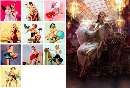
Elvgren is one of my favourite artists and I spent some time looking through a book of his collected work to see what ideas I could take for this pin-up project. The things that jumped out at me were:
The women felt like 'subjects' rather than 'objects'. There's some implication of hobbies, an inner life. They're often in the middle of doing something when they're captured on the canvas.
The subjects know they're being looked at, and they are taking it as an opportunity to flirt (signalled through eye contact, coquettish facial expressions and body language). It feels like a conversation between viewer and viewed.
Parts of the body may be exposed, but the eye is drawn back and forth between the subject's face and more titillating parts of the image.
I knew that I wanted to show Rugan in a similar setup, then; in this case, he's halfway through dinner and then catches sight of the viewer. His eye contact and smirk are flirtatious and mirror what you see of him in Act 1.
I initially wanted the pose to mirror Elspeth's in this beautiful Magic the Gathering planeswalker art by Anna Steinbauer, whose work I am obsessed with. Since I started taking art seriously, it's been my goal to paint for MtG, so I often try to study from artists whose illustrations I admire.
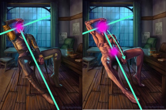
However, I didn't want to copy her pose or the composition of the piece. Don't get me wrong, I'm not above doing this - but I felt it just didn't work with the subject. The horizon line (shown in red) is very low. This is a gnome-level view of Elspeth. And I didn't want to place the viewer at the eye level of Rugan's penis.
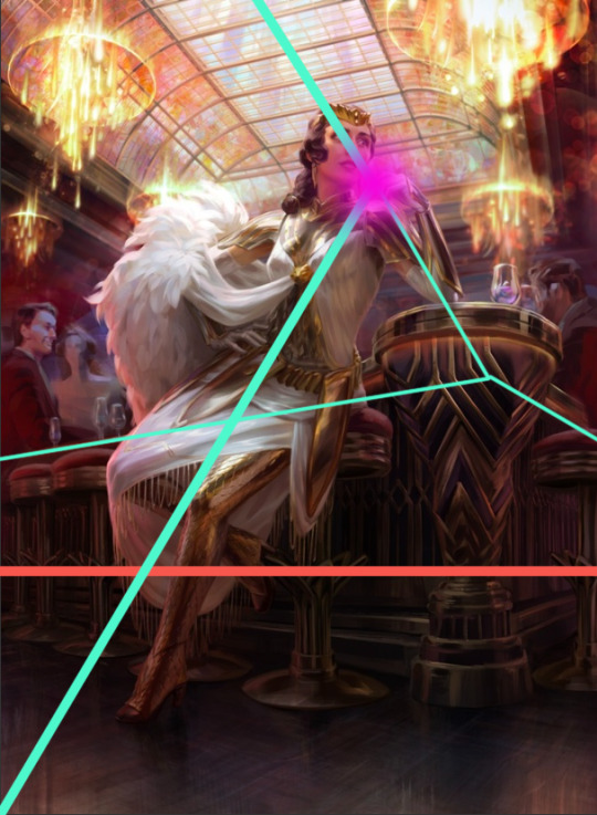
I kept the composition similar in some other aspects though - there's still a T shape (pale green) that draws the eye to the focal point (pink). I did some sketches where Rugan is leaning forwards/sideways in the same way as Elspeth is, but I feel that this final leaning-back pose demonstrates more dominant body language and allows me to paint the musculature of his torso in more detail. This acts almost as a 'ladder' that draws the viewer's eye up and down between the two focal points of the nude variant.
Painting
I've already said quite a lot on a post that was supposed to be short, so I'll keep it brief here and write more about the painting of Gortash and Raphael (February and March respectively).
It's been quite a while since I've tackled such a detailed painting, so I had to do some research/studies to remind myself of some helpful rendering rules:
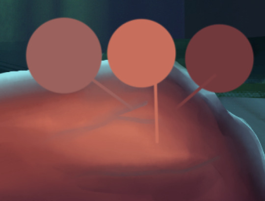
Veins beneath pale skin might look blue, but they're actually just a desaturated version of the same colour. There are other parts of this image where the veins are particularly lovely. I'll leave that to your imagination.
2. Highlights on leather are not as saturated as you'd expect until you get to the most reflective part of the material. Also, a good texture brush can work wonders.

3. I try to use as few layers as possible when painting, but I remembered the importance of putting design detail on a separate Multiply layer. Multiply allows the layer to modify/darken the layers below, so you can more easily add detail that follows the shape of the object. For example, the body hair or the snake's head going over the chest. If I were painting traditionally, I'd have had to put in a lot more effort. With Multiply layers, it's one colour. Nice! I got a great tip from @dustdeepsea about the blue-ish tint that tattoos, particularly older ones, can get. I felt like this massive tat is not something that Rugan has had done recently, so I added a Gaussian blur as well.

Well, if you got this far, thanks for reading! This is a great way for me to reflect and record what I've learned from the painting. I want to paint sexy stuff, but I also want to keep improving as an artist!
Keep an eye out for updates on my next pin-up, who will be Lord Enver Gortash. Time to practice using my hair/fur brushes 🥵🥵
#rugan#digital painting#digital illustration#illustration#pin up#male pinup#bg3 fanart#bg3#painting diary#male pin-up#male pin up
44 notes
·
View notes
Text
Someone asked what my process was to make the Rickbot comic, so I thought I'd make a separate post to show it. The process was kinda all over the place and spread over many months from December 2022 up till June 2023, so I'll try my best to make it understandable. And if you have any questions feel free to ask them!
The idea
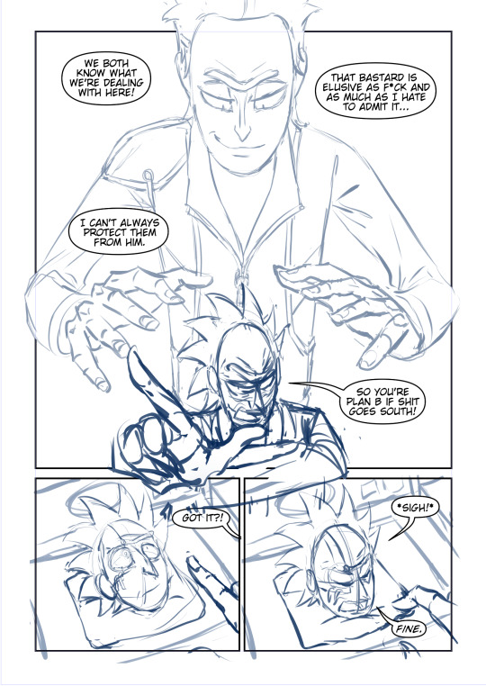
So it all started with the idea of; What if Rickbot came back? And then the idea immediately made me think of two things;
How would Rickbot react?
Why is he brought back?
Which ended up with these two scenarios in my mind;
A. Rickbot awakens and he's not happy B. Rick tells the reason he's activated again
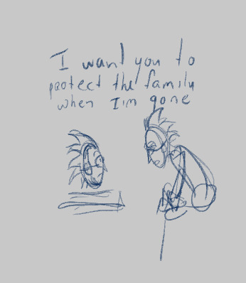
These were the very first scenes that started it all.
So then the question became, how do I go from point A to point B?
I would take moments from the show as reference for how they would act in these scenarios. And I'd take inspiration from manga and other comics of how I wanted the dialogue to flow and what the comic layouts would look like. In this case I knew a lot of dialogue would be involved cause these guys talk a lot! But I also didn't want the panels to feel too crowded and rushed so I limited myself to the amount of dialogue per panel.
Right now I'm writing it down like it was very planned, but for me this was often a very subconscious thing I did. I just thought up scenarios while I was taking walks or daydreaming in the shower etc. And sometimes these very specific moments would pop up that I would write down or draw out later.
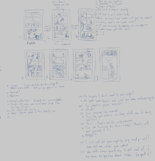

I would make mini thumbnails of how I wanted the pages to go and write the dialogue next to it. At this point I'm mainly thinking of what I want characters to say and how I want the story to flow. Sometimes I make multiple versions of the same scenario to see how it flows better.
At times I even only write down dialogue and then make the thumbnails for them later. I have a tiny a6 sketchbook for little thumbnails and ideas like this. These were often moments were I didn't know where I wanted to take the comic yet, so I would separate the two to keep it more organized for myself.

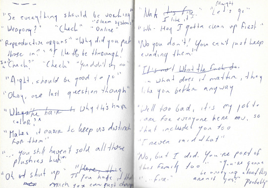

As you might have noticed, not everything is the same in the final comic. I always fine-tune or change stuff up as I go. Sometimes things don't flow as well as I thought they did or some dialogue feels awkward or unnecessary.
Sketching
Once all the pages were planned and I have a good idea of how the story would go I opened a new Clip Studio Paint file and used the comic feature to set that up.
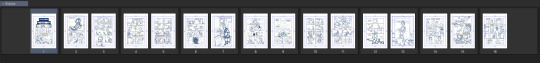
I would then copy the thumbnails I made in the page files and exported a thumbnail draft of the whole comic and 'read' through it to see how it flowed.
After I was satisfied I finally started sketching the pages.
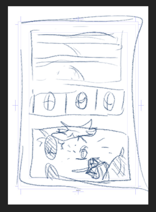

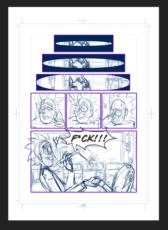
Most of the pages stayed the same from the thumbnail, aside from some poses or expressions here and there. But I would also change up stuff I wasn't satisfied with.
For example, initially the Prime panel looked like the left one, but I didn't like how the pose flowed with the text balloons. There was a lot of empty space as well. So I decided to redo it to the one on the right.

Even now for the final version I'm thinking of resizing Rick a bit more. These kind of changes just happen throughout the process.
The backgrounds
I knew the comic would only take place in the garage, so to save myself a lot of time I decided to make it in 3d.
First I decided to sketch out the four walls of the garage as planes;
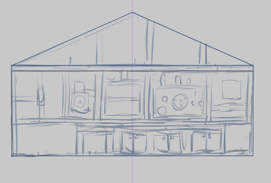

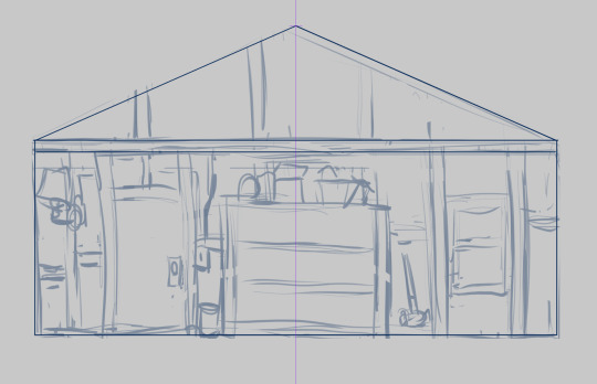

Then I imported those in Blender. I did some simple 3d modeling to get the basic shapes for the counters and the cabinet et voila! 3d sketch version of the garage!

I know this is a very watered down explanation, but trying to explain how I did it would take a whole new tutorial. And there are many other ones out there that explain it much better than I could. I was lucky that I already have some Blender experience cause of past works I've done for school and stuff.
But if you got the time to delve into it I would recommend it! For this here you only need to know the basics. Also Blender is free to download :)
This has saved me a lotttt of time drawing the same backgrounds over and over again!
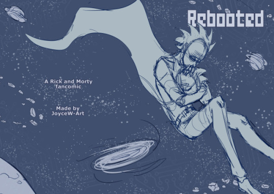
Cover
Lastly I did the cover. That one has also gone through multiple versions. I had a vague idea of what I wanted, but I wasn't happy with the execution so I redrew that one as well.

So that's the whole process so far. I do I wanna continue the comic once I got the energy to work on it again. Gonna do some test pages first to see what kind of rendering I wanna go for. Not sure if'll be in black and white, color or a combo...we'll see.
I hope this helps! And if you have any questions don't be afraid to ask them.
110 notes
·
View notes