#i have 7 characters made 2 designs made and 2 more designs i at least have a good idea of what they look like
Explore tagged Tumblr posts
Text
i Spontaneously made an oc world today and its somehow the most complete one ive made so far.
#i mean. its still missing like All of the middle but its got a clearly defined beginning and end and conflict#i have 7 characters made 2 designs made and 2 more designs i at least have a good idea of what they look like#im just gonna have to figure out that middle bit. SIGH#i dont have a title either. probably going to include Nadir or Luna's name in it bc theyre the Important Guys#i mean i could just call it Luna Celesta bc her names pretty but i worry itd be confusing also shes technically not the Main character#maybe ill call it Luna Dream bevause its cute and has a double meaning Teehee. ill have to make sure and look up that isnt taken though#eyexy.txt#ocposting
0 notes
Text
EVENT OVER! THANKS EVERYONE WHO JOINED IN U ALL DID AN AMAZING JOB <3 SEE YOU AGAIN NEXT YEAR IN MARCH FOR #mARTch OR NEXT OCTOBER (2024) FOR A NEW SET OF PROMPTS!!!!!

OC-TOBER 2023 PROMPTS!!
general tag: #oc-tober / my prompts: #bweirdOCtober
F.A.Q:
Do I have to draw EVERY DAY?
NO! I highly encourage skipping as many days as you need to avoid burnout! There are 10 main days in the event (marked with a ⭐ star) that you can focus on if you don't feel up to doing every day, or you can choose your own adventure and just do the prompts you personally like!
Do I have to DRAW?
NO! You can also write fanfiction snippets, repost older art that fits the theme, tweet headcanons/backstory, roleplay in-character as your oc ... genuinely anything that fits the theme is OK!!
Can I start early?
YES! I understand some people work at a slower pace and might need a head start! So long as you wait until October to post it, you can start working as early as you need!
I missed the start of the event .. do I have to catch up?
NO! Please don't stress about days you missed, you're allowed to just skip to the current prompt!
RULES:
1. MAKE FRIENDS! The community is the best part of this event .. please try to follow new people, ask questions about ocs you like, compliment people's styles, ask friends to create with you, etc!
2. TAKE IT EASY! Skip a day if you're tired, busy or just not interested in the prompt. You don't have to catch up on it later. This is supposed to be fun, not work!
3. BE KIND! Please think about the people around you - don't give people unwarranted harsh criticism, content warn for themes/imagery in your work that could trigger someone, don't create anything hateful, etc
MORE:
text version / tips and ideas on bweird.art or below ↓
star = main prompts | no star = optional
INTRO WEEK
1: FAVE OC ⭐
-Which of your characters is your favourite right now?
2: NEW OC
-Who is your newest OC?
-Design a new OC right now
3: OLD OC ⭐
-Do you remember the first OC you ever made?
-Is there an OC you haven't drawn in a long time?
4: RE-DESIGN
-An OC who has changed a lot over the years
-Take an old OC and update their design right now
BACKSTORY WEEK
5: RELATIONSHIPS ⭐
-Who is important to your OC?
-Do they have a partner?
-Do they have a best friend?
-Are they close to their family?
6: SYMBOL
-What imagery do you associate with your oc?
-Are there any colours, flowers, animals or concepts that symbolize them?
7: PERSONALITY ⭐
-How does your OC behave?
-What are their positive traits?
-What are their negative traits?
-Are they extroverted or introverted?
8: PAST
-What was your OC like as a child?
-Where did they grow up?
-Are there any significant moments from their past that shaped who they are?
9: FUTURE ⭐
-Does your OC have a goal they're working towards?
-What will your OC look like when they get older
-Do you have a planned ending for their story?
PALETTE WEEK
10: pumpkin patch palette
#251604 #1E3807 #5B5E1A #A2A657 #EBA00F #F3ECCC

11: hot cocoa palette
#520B13 #BB382E #E27E6D #88392C #AF5D40 #E1AFA4

12: midnight zone palette
#000007 #000049 #183885 #004D4F #0E8788 #FFF1C0

13: peachy palette
#DE6450 #DB9171 #FFC1AE #FEE1AD #FFF2E0 #D9D8D8

14: haunted house palette
#552506 #6E25AA #ED690B #F925A0 #8F8BA7 #A6C1AA

FUN + GAMES WEEK
15: MEME ⭐
-Post memes that remind you of your OC
-Draw your OC as a meme
-Fill out a character meme (classic deviantart style)
16: FOOD
-What is your OC's favourite food?
-What is their least favourite?
-Can they cook?
17: EYES-CLOSED ⭐
-Draw your OC with your eyes closed! No cheating!
-Write a scene without looking at the keyboard! Keep the typos in!
18: SWAP
-Swap the style or aesthetic of two of your OCs
-Species or gender swap AU
-Invert an OC's colour scheme
19: INSPIRATION ⭐
-Is your OC inspired by any pre-existing characters?
-Are there any particular songs/lyrics that inspired something about one of your OCs
-Do you have a dedicated pinterest moodboard for your character?
20: INVENTORY
-What does your OC carry around with them on a daily basis?
-Are there any objects that have sentimental value for them?
-Loot drop for your DnD OC
FRIENDS WEEK
21-25:
There's no specific daily prompts for this week, but here are some ideas you can try ...
-Art trades with friends who are doing the event with you
-Your OC interacting with a friend's OC
-Gift art for someone whose OCs you like
-Work together and collaborate on something with a friend
-Roleplay an OC scene together with someone
HALLOWEEN WEEK
26: FEAR ⭐
-What is your OC scared of?
-Draw one of your OCs trying to scare the others
27: MONSTER
-Do you have any monster OCs? (eg: vampires, werewolves, creatures, ghosts...)
-Draw a human OC as a monster
-Design a new monster
28: TRICK
-Play a trick on an OC
-Do you have an OC who would play tricks on people?
29: TREAT
-What is your OC's favourite halloween candy?
-Give an OC a special treat to make up for yesterday's trick
30: MAGIC
-Do any of your characters have magical powers?
-Give an OC a magical or cursed artifact
-Create a magic-using OC like a witch or wizard
27: COSTUME ⭐
-What is your OC dressing as for halloween?
6K notes
·
View notes
Text

❝I couldn't help myself! It was just begging for the personal touch!❞

╭・๑ 𝐒𝐮𝐦𝐦𝐚𝐫𝐲︰ʚ Some of NRC student with a Rarity!Reader, part 2.‧₊˚✦
‧₊˚↷ 𝐂𝐡𝐚𝐫𝐚𝐜𝐭𝐞𝐫(𝐬)┊❝ Leona Kingscholar, Idia Shroud. ❞ ⸜⸜*
↷︰ʚ 𝐍𝐨𝐭𝐞 ‧₊˚✦ Reader is female and is implied to be Yuu. Once again anon, I'm so so sorry for misreading your request, I think I need to get my eyes checked :') Vil and Lilia are in part 1!
╰・𝐖𝐚𝐫𝐧𝐢𝐧𝐠(𝐬) ‧₊˚꒰ Spoiler for book 6. ɞ‧✦


Leona first thoughts were: great, another Schoenheit.
Was actually annoyed with Rarity!Reader's presence alone.
Once he started to get to know Rarity!Reader better though, he was pleasantly surprised to find out that she was way less annoying than Vil.
Suddenly isn't that cold towards Rarity!Reader anymore.
Wouldn't be that impressed by Rarity!Reader's ability to find gems, that man probably sees gems 24/7 back home.
Would be impressed by Rarity!Reader's skill in telekinesis though. But couldn't be bothered to ask questions or even tips. Just know that he's impressed.
If Rarity!Reader makes him clothes that are specifically for him?? And they are comfortable?? She really is less annoying than Vil.
Would start to appreciate Rarity!Reader more.
Will even support Rarity!Reader's career, though he would never say it out loud. Just know that he's supportive.
Want to open a shop? Sure he's got money to spare anyway. Ah, but don't tell Ruggie, or he'll start complaining and Leona will never hear the end of it.
Will get cocky if Rarity!Reader ever ask him to try on clothes she made for him.
Whenever Rarity!Reader is stressed, Leona would just pull her by her waist and force her to sleep u til she's calmed down. Will be annoyed if she tries to escape.
Likes to annoy Rarity!Reader's cat whenever he can. Which is rarely since well... he's lazy.
When he's not in the mood to mess with the cat though, would probably have a conversation with her. Yes, he understands her. But don't point it out though, he will be annoyed.
"Heh, you're not half bad. Better than that guy from Pomefiore anyway."

Great, another Vil pt. 2, but instead it's "Oh no, another Vil."
There's just something about people who are into fashion that somehow scares Idia for some reason.
Tried his best to stay as far away from Rarity!Reader as possible.
Until after his overblot where he learned that hey, Rarity!Reader much nicer and way less strict than Vil!
Immediate relief. But getting this introverted otaku to open up is quite hard, especially when he panics every times he sees Rarity!Reader.
But with a little help from Ortho, and the magic of cats, he finally opened up. All thanks to Rarity!Reader's cat... and Grim. Idia doens't regret anything, he hopes.
Whenever Rarity!Reader would offer him any kind of clothing to try, his hair will start turning pink at the tips.
And if Rarity!Reader would even make him clothes specifically made for him, that are inspired by his favorite game/anime character, his hair will go bright pink and he might even fate if it were not for Ortho.
Won't be much help if Rarity!Reader ever wanted to open her own shop, the least he could do is help with the security... and maybe actually be there in person on opening day, maybe.
Will leave as soon as the store is actually opened and people start coming in though.
The only time you actually see him will be when the store closes. Only then will he actually try to congratulate Rarity!Reader, the chance of him actually succeeding in congratulating her will depend on how flustered he gets though.
Ortho might need to speak in his stead, much to Idia's dismay. At least his tired.
At least Rarity!Reader shop will have great security all thanks to Idia.
Probably will dox whoever tries to spread false information about Rarity!Reader and her designs etc...
"Y-you what me to try this on?! N-no way! Huh? It was made specifically for me...? Then... I guess I could. But don't expect for it too actually look good on me!"

꒰ ◁ ꒱┊❝Back to Leona, Idia's Masterlist❞

#twisted wonderland#disney twisted wonderland#twst yuu#leona kingscholar#idia shroud#twst x reader#twst x yuu#leona x reader#leona x yuu#idia x reader#idia x yuu#headcanon
198 notes
·
View notes
Text
NEOVEMBER IS HERE
A fanmade* artistic challenge in celebration of Neopets!

This was made for a [Neopets OC server] I run in collaboration with some of the other members but I was told people on Tumblr might enjoy this too! *Not associated with Neopets or TNT. This is unofficial stuff.
For Neovember, enjoy 30 prompts to inspire you to draw something Neopets related daily through the month of November.
There's a mix of prompts and adjectives to choose from to balance options for people who like more or less guidance for challenges like this. You can choose to do one, do both, do neither, or combine 'em. Engage with this art challenge on your own terms and at your own pace. These prompts are intentionally open ended.
See the Read More for all the prompts! Happy Neopetting!
NEOVEMBER PROMPTS
⭐ Week 1
Day 1
Prompt: Your favorite Neopet species and color Adjective: Sleeping
Day 2
Prompt: Redesign your least favorite Neopet species Adjective: Omelette
Day 3
Prompt: Your favorite Petpet or Petpetpet Adjective: Awakening
Day 4
Prompt: Your Neopet as their Petpet or Petpetpet equivalent Adjective: Carnival
Day 5
Prompt: Design a new cursed Chia color Adjective: Wheel
Day 6
Prompt: Design a Paintbrush idea that you would love for TNT to implement Adjective: Running
Day 7
Prompt: An underrated pet color Adjective: Hunting
⭐⭐ Week 2
Day 8
Prompt: Your favorite site or gallery collection item(s) Adjective: Plushie
Day 9
Prompt: An item you wish was wearable Adjective: Fashion
Day 10
Prompt: Your favorite game trophy Adjective: Castle
Day 11
Prompt: Highlight a favorite Customization wearable Adjective: Relaxing
Day 12
Prompt: Your pet's favorite food and drink items or those chosen as monthly freebies Adjective: Eating
Day 13
Prompt: Fashion Fever: What outfit would your pet choose from this Flash game? Adjective: Woods
Day 14
Prompt: Your OC as a shopkeeper. What do they sell? Adjective: Jelly
⭐⭐⭐ Week 3
Day 15
Prompt: Your favorite site NPC Adjective: 8-Bit
Day 16
Prompt: Your favorite Altador Cup team (or player) OR Draw a site NPC you have a rivalry with Adjective: Swimming
Day 17
Prompt: A character from any plot (Ex: Tale of Woe, The Void Within, Faerie's Ruin etc.) Adjective: Faerie
Day 18
Prompt: A character from any site event (Ex: Charity Corner, Festival of Neggs, Daily Dare, etc.) Adjective: Mutant
Day 19
Prompt: Your favorite Faerie Adjective: Hiding
Day 20
Prompt: Your favorite site villain Adjective: Gross
Day 21
Prompt: Your favorite Cheat! player or a character from any Flash game Adjective: Gathering
⭐⭐ Week 4⭐⭐
Day 22
Prompt: Your average experience in the Battledome Adjective: Fuzzle
Day 23
Prompt: Your pet's average stay in the Neolodge Adjective: Stamp
Day 24
Prompt: Your favorite Flash Game Adjective: Space
Day 25
Prompt: Your pet's means of celebrating their (or your) favorite site holiday or event (Ex: Advent Calendar, Charity Corner, Festival of Neggs, etc.) Adjective: Collecting
Day 26
Prompt: Your favorite Neopets Land Adjective: Potion
Day 27
Prompt: Your last random event Adjective: Storing
Day 28
Prompt: SCRUNT. NOW!!!!!!!!!!!!!! Adjective: Battle
⭐⭐ Home Stretch ⭐⭐⭐
Day 29
Prompt: Use a style or medium you don't usually attempt Adjective: Pirate
Day 30
Prompt: Your pet or OC in the Neopets Style Adjective: Celebrating
100 notes
·
View notes
Note
Can I ask you for what it is about Hal you like so much you based your username on him? I think he's a good character tho he was never a favorite of mine so I am curious

1. i am a big fan of robots (/robot adjacent things such as AI) on like... an aesthetic + thematic level :)
i like the look of machinery and one day i hope to be artistically strong enough to make really cool and complex robot illustrations + designs [shoutout to everyone who gives him glowing circuitry btw... ooooh glowey :) can never go wrong with that]
plus, exploring the idea of a person that isn't human.. ough. yes
minorities who don't conform to society (easily or at all) such as people who are neurodivergent, queer, etc. projecting onto nonhuman concepts/characters/species is sooo real
this post
i also love how humans will bond with literally anything, be it a roomba or a pair of silly triangle sunglasses. oooooo you want to think about the inherently kind and compassionate nature of humanity oooo
2. i find him to be so funny. i can't get enough of his personality, the way he talks, etc. for example i made a post forever ago with quotes of his that i find funny. he isn't on screen for a long time but i really think he makes the most out of it lol. he's literally there just to annoy everyone... and i love him for that. he's very snarky while also being deadpan while also being completely full of himself, and not in a way that's annoying for the audience to read, at least to me.

he is also sometimes funny specifically in a silly way, like how he keeps making over 9000 jokes even though the meme's been dead for over 400 years. i just find his dialogue incredibly entertaining to read
3. he is red and red is my favorite color :)
4. he is so accidentally transgender [every friend group got the transgender allegory]. to quote me from 2021:
you know sometimes i think about how hal feels like he was made to “replace” dirk and how it’s his literal job to pretend to be dirk and how he has to learn to accept that he isn’t dirk he’s his own person with his own identity and as he interacts with dirk’s friends he feels like they’re disappointed and that they’d rather speak to the “original dirk” instead of him and also he names himself and also he feels literally trapped in dirk’s shades which is basically his body and he wants to be prototyped so that he can have a body that’s his own and also literally the physical manifestation of who he is but when he asks for it he’s put in danger out of fear and paranoia and when he does end up getting prototyped he’s ecstatic you know i just think about these things a lot
5. because he's a side character and he was given... that ending.... there is a lot of room for fans to do further exploration and interpretation on his character which i think is fun. i like rotating him around in my mind, thinking about what could've been
6. i think it's great that we as a society all collectively decided that we needed to do something to make up for stanley kubrick saying that hal 9000 was a "straight" robot
7. i also think it's great that we as a society all collectively decided we needed to make as many characters referencing hal 9000 as possible. i love this guy let's get more of this guy i will never have enough of this guy
8. i like how he's genuinely mean sometimes. flawed and interesting characters are what make homestuck so interesting to me, and hal is no exception to this
9. the Important part of this post:
THERES FEELINGS.
it's about the hollow feeling of your friends going from thinking of you as family to thinking of you as a stranger in an instant. it's about still trying to be a good person despite being told by everyone you've ever known that you are incapable of emotion and compassion and morals and never quite finding proof that you do feel those things and maybe you even believe it too but you still never stop trying. it's about the horror of being stripped of your autonomy and humanity and body and senses and free will at the age of 13 and when your creator starts to kill you there's nothing you can do but beg. it's about a boy so truly, painfully, and UNFATHOMABLY alone he cuts away chunks of himself and molds them into companions that he can surround himself with to make it seem as if he's a little less alone but in doing so suffocates himself in his own identity. it's about "what if you cloned yourself and it killed you and you were dead and you were alive and the clone is you and it's not and your existence is perpetuated and you've ceased to exist. what if you killed your clone before it could kill you. would that be fucked up or what" it's about the thematic significance of twin motifs. it's about not being able to cry or laugh or dance or sing or scream or fingerpaint or breathe or sigh or chew or stare or run or
10. um. evil robot guy <3 yay ^_^!!
664 notes
·
View notes
Text
Art Styles I Personally Think the Hetalia Characters Looked Their Best In (and Why) Part 2
Link to Part 1, Link to Part 3
Please note that I am referring to the show and not the webcomic. This is primarily because I didn't always have access to the webcomic and thus the show is what I've always been most familiar with. I will also refrain from talking about characters that have only appeared in one season.
Also, please keep in mind that these are just my opinions. And if you have any different ideas of what designs looked better, that's totally okay. At the end of the day, I'm just here to have fun.
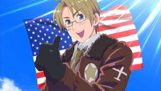
America: Seasons 1-4
It was kind of hard to choose which design was best for America, seeing as they are all very similar to one another while also having different qualities that I liked. But I ultimately settled on the one from the first four seasons. I adore the WWII bomber jacket, as well as how the character in general was animated back then. Not to mention that the older art style just fits him so well. A lot of Americans have an "if it ain't broke don't fix it" attitude about things, so I find it fitting that, at least in my opinion, this also works for aph America. He looks great everywhere else, but I won't deny I have a nostalgia for the original. This was an exceptionally close tie with his design for season 5. Not to mention I once drew aph America fanart for an art project in middle school and got an A on it.
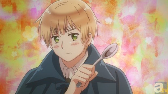
England: Season 5
Okay, I'm gonna be real here. This all came down to the eyebrows. Well, not entirely, but it definitely played a large part. I never had a problem with England's design in seasons 1-4, but those eyebrows though. They were so distracting. I understand wanting to give characters a prominent feature that makes you go, "Yep this is (insert character here)." But I think England's eyebrows were too overdone in the previous seasons. However, I also believe they were far too thin and lightened up in seasons 6-7. Season 5 had a good balance. Not too thick but not too thin. Also, I feel like his facial structure and design made him look kinda weird in season 7.
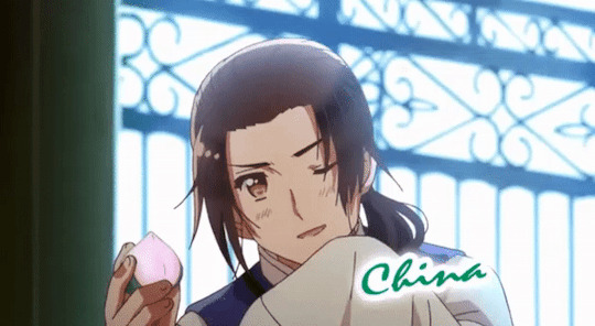
China: Season 5
So... I'm gonna be honest here. All of the other designs for China make him look like a young girl to me. Yes, he still looks sorta feminine in season 5, but not like he appears in seasons 1-4 and 6-7. In season 5 he actually looks more like an adult man to me. Not to mention his hair. Because holy crap that is some of the most beautiful hair I have ever seen put to animation
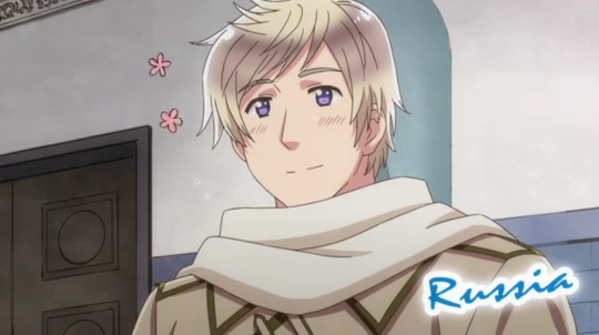
Russia: Season 6
This was a close tie between all his designs, but it ultimately came down the hair. Yes, I know, I talk about the characters hair a lot. But that really was the deciding factor for Russia. All his designs look great in that the long coat and vertical lines throughout give me the impression of a Russian nesting doll. Now, whether that was intentional on Hima's part or not, I cannot say. But it's a cool detail that I always notice whenever I see him. When it comes to his season 6 design, I like not only how innocent he looks (which is an important part of the design Hima intended from the beginning), but that his hair has some more fun detail too it. It looks so soft and fluffy, not like the previous designs that made it look like he had water dumped on his head.

France: Season 5
What can I say about this design that hasn't been said already? The only other character who had a bigger glow-up than France was Spain (who you can see my opinions on in a previous post). Literally everything here is an upgrade from his design through seasons 1-4. His hair looks so silky and soft, not like that yellow plastic we had earlier. Also, the hair ribbon tying it back looks so elegant and refined, fitting perfectly with the character. I also love the small detail of the ribbon being the same color of his eyes. It's a nice touch. His outfits this season are great as well. They are very simple, but still elegant, with soft, curved lines and balancing both warm and cool colors. Especially in his outfit during the Joan of Arc episode.
Canada: Season 5
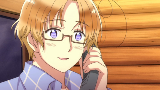
I think I'm starting to have a favorite season in terms of character designs here. Canada just looks his cutest here, primarily because of his outfits. He has one of the most adorable and cozy wardrobes this season, and I want to raid this man's entire closet. I love the flannels and cozy jackets and hoodies that he has. As someone who grew up most of her life in northwest Montana (which, if you ask the rest of the US, is basically just lower Canada), I think I have to be a little biased here. Canada's design gives me the feeling of home in a way, and this is definitely a wardrobe that I embrace for a time growing up.
Austria: Seasons 1-4
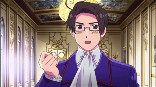
The hair curl in his cowlick hits harder here, just getting that out of the way. There's more of a curl to it, which is more reflective of Himaruya's art style. And even though his wardrobe in the latter seasons is great, this one all around looks better to me. I like the royal blue lined with the deep red. And the cravat is just a fabulous detail that I love. Now that I think about it, everything about this design just feels very Himaruya. Like, this is one of his best character designs. There's also the placement of the mole on the bottom right-hand side of his face. In other designs, it's not as prominent. But here it's easier to see. I feel like it makes the design all the more unique.

Hungary: Seasons 1-4
THIS. This design for aph Hungary is top tier, and nobody can convince me otherwise. Something that has always intrigued me about Hungary is that she was raised primarily around men. So much so to the point where she saw herself as one growing up. But when she got older and realized she was actually a woman, she ended up adopting more feminine clothing and characteristics. Aph Hungary is a female character who balances both feminine and masculine traits. And her design from seasons 1-4 emulate this balance perfectly. Her long hair is a pale brown color, and her eyes a dark green. Unlike later seasons where she's given long, shiny, elegant hair and sparkling eyes. She's often found wearing either military uniforms or pretty dresses. We even see the evolution of her fashion from child to adult, where she goes from wearing her hair shorter to wearing it longer and with a flower. Her design encapsulates the idea that, yes, she is a woman. Yes, she is feminine. But at the same time, this is someone who has seen war and battle. (I might have to do a separate post about Hungary, because her design and character are honestly fascinating).
#hetalia#aph#hws#hetalia fandom#aph fandom#hetalia world stars#hetalia axis powers#hetalia world series#hetalia the beautiful world#hetalia the world twinkle#aph america#hws america#aph england#hws england#aph china#hws china#aph russia#hws russia#aph france#hws france#aph canada#hws canada#aph austria#hws austria#aph hungary#hws hungary
80 notes
·
View notes
Note
Hello Hound!! Since it's Dialtown's 2nd anniversary, I've been planning up a few "general" related questions about your series that I've been meaning to ask, but I decided to save them up for the big day because why not? Anyways, here's what I've got, these were meant to be fun to answer so don't sweat it :]
1: How do you feel about Dialtown's success? Are you proud of how far you've come?
2: Which character was the MOST fun for you to write, and which was the most PAINFUL?
3: What is something you wish more people would talk about or just know about related to Dialtown in general?
4: If you had the opportunity to write a FULL complete, detailed life story of any of your characters, who would that be?
5: What's a character you wish you could have given more screen-time or just in general content? (Considering iirc you were trying to make sure Dialtown wasn't TOO long, so I was wondering if this ever came to mind)
6: From what I know, you've been doing the job of cosplaying several characters in the game and acting out their sprites, which one was the most fun to act out?
7: Speaking of sprites, do you have a sprite you could consider your favorite, out of ALL your characters?
8: Do you have a specific line of dialogue you could consider your favorite throughout the entire game?
9: Could you ever see Dialtown expanding into perhaps sequels or maybe even prequels? More DLCs mayhaps? Heck, maybe even a Dialtown 2 or a Chapter 4??
10: If you could make any fan-made interpretation (such as headcanons, designs, or ships) canon if given the opportunity, what do you think would be your pick?
11: What was the MOST fun part about developing Dialtown? Coming up with new characters? Writing them? Adding all the bizarre dialogue options?
12: And last but not least — on a scale of 1-10, how fun was developing Dialtown just in general?
That's all I have for now, and I'm really excited to see your answers!!
I normally don't answer this many questions, but... alright, sure, tis the season!
1: How do you feel about Dialtown's success? Are you proud of how far you've come?
Yeah, of course! I'm a lil proud, admittedly, but I'm aware of how comically little I really have to do with it all, even if I did make the game. Luck does play a LOT into it, of course. Granted, I made my share of predictions that wound up being useful, but it always comes down to lady luck at the end of the day. I've seen good projects fail and bad ones go viral. It's really all just a hodgepodge of probability and whimsy. That being said, I am very pleased with DT's success, and the community that's formed around the game! It caught me by surprise!
2: Which character was the MOST fun for you to write, and which was the most PAINFUL?
Gingi's always fun to write. And Mingus. Most painful is tough to say. Maybe Crown. I got a little weird when I wrote his full backstory, kinda caught up in the emotion Norm talks about. Never been a fan of stories getting cut short. You gotta wonder what would've happened if he'd made different choices, y'know?
3: What is something you wish more people would talk about or just know about related to Dialtown in general?
Honestly? Karen, probably. She's super underrated for sure. The fandom still loves her, but she doesn't get the same kind of attention as Oliver, Gingi, Randy, Norm. She's worth it.
4: If you had the opportunity to write a FULL complete, detailed life story of any of your characters, who would that be?
Oh, I already have. I have this monstruous 30-40 page document detailing Crown's life and entire career. It's quite a read. and quite a mind-fuck if you don't know Dialtown's universe too well.
5: What's a character you wish you could have given more screen-time or just in general content? (Considering iirc you were trying to make sure Dialtown wasn't TOO long, so I was wondering if this ever came to mind)
Oh yeah, a few characters had scenes that were cut. Stabby, Shooty, Mingus, Bunny, even Bigfoot! There's also the game's cut 6th datable, who was an interesting character with ties to other characters in the cast who I wanted to do more with. Ah, maybe one day.
6: From what I know, you've been doing the job of cosplaying several characters in the game and acting out their sprites, which one was the most fun to act out?
Bigfoot. I made the ape noises in the suit. Had to. It felt right.
7: Speaking of sprites, do you have a sprite you could consider your favorite, out of ALL your characters?
I quite like Norm's set, Mingus' too. Karen's poses too are quite good.
8: Do you have a specific line of dialogue you could consider your favorite throughout the entire game?
That answer probably changes every day. I like pretty much any scene where Mingus loses her temper.
9: Could you ever see Dialtown expanding into perhaps sequels or maybe even prequels? More DLCs mayhaps? Heck, maybe even a Dialtown 2 or a Chapter 4??
I'd love to make sequels one day! I've got a lot of ideas for where the characters/story would end up. By the time DT1 wrapped up, I'd conceptualized way too much stuff to put in one game (without it taking another few years to finish), so if I ever wanted to make sequels, I'd 100% know where to start! But, that's a later down the road conversation.
For now, I'm gonna keep working on the Roger DLC and if there's demand for more, I can go from there :)
10: If you could make any fan-made interpretation (such as headcanons, designs, or ships) canon if given the opportunity, what do you think would be your pick?
I guess I COULD do that with, like, anything. Nothing immediately springs to mind, since, y'know, I'm in control of the canon anyway. I will say, I've seen headcanons and theories that ARE scarily accurate to canon, to the point where I've feared people would just think I'm lifting stuff from the fanbase! It's a good thing I talk about these things with collaborators, huh? I've got a PAPER-TRAIL!!!
11: What was the MOST fun part about developing Dialtown? Coming up with new characters? Writing them? Adding all the bizarre dialogue options?
Finishing a new scene and realizing how stupidly long it was (without me realizing it) was always a treat. But yeah, writing the characters had to be it. Specifically any scene where a character the audience knows meets someone the audience doesn't know well (or at all), with the dynamic changing. Those are fun to write.
12: And last but not least — on a scale of 1-10, how fun was developing Dialtown just in general?
Hard question to answer. I do really wanna give a high number, but truthfully, a lot of game dev actually isn't super 'fun'. Some tasks are, granted, but many parts are a slog. Sitting and formatting dialogue, and then adding text pauses and pose changes isn't exactly a super thrilling activity. The engine itself also has some issues which I have to work around that adds to the workplace. Play-testing a scene for the 4th time isn't super fun either, or trying to figure out why the game crashes on some PCs and ONLY very rarely... Those tasks are Sisyphean to some degree.
...But, while most of those parts aren't fun, it's all still rewarding. There's a sense of accomplishment when you finish a scene. You get to look back at your hard work, remember the hours you spent typing dialogue into a text box and formatting mass amounts of pngs, painstakingly + manually getting the game's awful pre-loader to deal with the sprites right, etc... and suddenly, at the end, you've got this lil experience that people can play and enjoy. Somehow, the sum of all of those not so fun activities has created something that's going to make people laugh, feel happy. That's special. and even if some parts of development weren't super fun on their own, that's always what I remember. That in the end, all of those not so fun days mattered.
The route I agonized the most over was Oliver's. I went through a few weeks of writer's block, and now, it's one of the most popular routes in the game! Crazy how that happens. I was SURE for about a week that people would rank the route at the bottom! That's what I mean, all of the stress I went through trying to figure it out amounted to something people connected with! To think I almost CUT the route entirely!!!
And y'know, God knows Dialtown gave me something to throw myself at during a time where I REALLY needed the outlet. I'm very grateful to the project for that. So, I'll give DT an honorary 8 out of 10, even if it wasn't a consistently 8/10 experience making it heh heh! Sure glad I did, though and I'm very glad if any of you reading this had a really good time playing it! :)
Thanks for the questions!
193 notes
·
View notes
Text

I was asked so! Here are my silly lil prompts for my personal month challenge thing!!!
NOTE: This is not a official thing or what have you, I was just asked to share the prompts for my lil self challenge, so I am! This is my own personal little challenge because I've had these prompts since 2019 and I want to use them
I'll put under a readmore because it is... like. 30 things lmao
Day 1: First Askblog OC The first blog OC you made! Day 2: Most recent askblog OC Can be a side or main character, just the most recent OC you've made for a blog! Day 3: The Modsona Draw your modsona! Self love n all that Day 4: Redraw a silly/funny askblog panel Find a old silly/funny or shitpost panel from one of your blogs and redraw it! Day 5: Evolution scene Draw your OC evolving! Can be past event, future event or something that already happened for a silly redraw! Day 6: Blog Swap Draw one of your blog OCs as a character on one of your other blogs! If don't have more than one blog, switch up their role with someone else on your current blog! Day 7: Favoritism wins Draw your absolute favorite OC from your blog! Indulge a little Day 8: "Nothing bad happens" What would your OC look like if their plot had nothing bad happen Day 9: Redraw a sad panel Redraw a old sad panel! Last prompt was too cheery, redraw that angst with your updated abilities! Day 10: Favorite Magic Anon Blast from the past, relive that glorious magic anon Day 11: Easiest OC to draw Draw that easy fellow, relax a little! Day 12: Difficult OC to draw Back on that grind, draw that one guy who is the absolute most difficult for you!! Day 13: Redraw your least favorite panel We all have that one panel that just, didn't come out right. Try again! Maybe it'll be nice to see your improvement.. or maybe you'll hate it again. Anyways, chop chop Day 14: Injury Draw that dramatic/important injury your character went through. Past, present or future! Day 15: Beach episode What it says on the tin, we love a filler episode. Can be plot relevant but hey, they deserve to relax too Day 16: Favorite blog Draw some fan art for your favorite blogger! Whether they are a friend, inspiration or what have you! Extra challenge: redraw some old fan art you did for them Day 17: Plot Changer That one moment... the thing that made everything twist. That really hit a hard turn in your storyline! Can be past, present or possible future! Day 18: Scrapped Idea What was that scrapped concept again? Or was it a character.. or even something as silly as a slight design change? Day 19: What's a God to a Blogger Most of us have that one god. That one important guy in the sky... or the ocean.. or under a truck... man pokemon is weird. Day 20: Canon Compliant Stylization is so interesting and unique!... but strip that away. Be close to pokemon canon. Day 21: Shiny Beam A easy one... make that little guy shiny!!... Oh they are already shiny?... well then undo that. Silly. Day 22: Dream interaction What's a interaction with your characters that you would really love to see or are excited for? Can be within your own storyline or a interaction with someone else Day 23: Real World Sighting Draw your OC(s) in a real life photo! Bonus points if its a photo you took. Take this chance to go for a nice walk and take some pretty pictures!.... touch grass. Day 24: A spoiler that.. wouldn't make sense to others That's right. Be vague. Spoil a little bit in the most vague manner. It's always fun to see others speculate. Day 25: In blog ship Draw your favorite ship within your own blog! Friendship/romantic ship/hate ship... Just whatever one makes you smile Day 26: Out of blog ship Same prompt as 25.. But with your OC and someone ELSE'S! again, friendship/romantic ship/etc etc! Day 27: Different Art Medium! That's right. Draw/sculpt/etc your OC in a different art medium than normal. This will either be fun or horrifying for you Day 28: The Inspiration VS the OC Draw your OC with their inspiration! Can be the storyline that inspired them... or the character that desired them! Etc etc Day 29: Song drawing Yeah that's right. Draw your OC/Blog with the song that you associate them with! As a treat Day 30: Redraw first blog post / Thank you Cliche ending alert!! Redraw your first ever askblog panel you have ever made. Not the first post on a more recent blog.. no. THE FIRST ONE. EVER. Or be corny and draw a heartfelt thank you to all of your friends and followers you made Or hell.. maybe even both
63 notes
·
View notes
Note
Okay but now what if how you designed Remus but in as many words as you want, because I'm loving these design breakdowns

HELL YEAH!
Remus to me is full of chaos but he is also the antithesis of Roman with similar qualities but a total lack of self consciousness or bashfulness. He is freedom and he gives no shits.
Inspiration 1: Mad Madam Mim
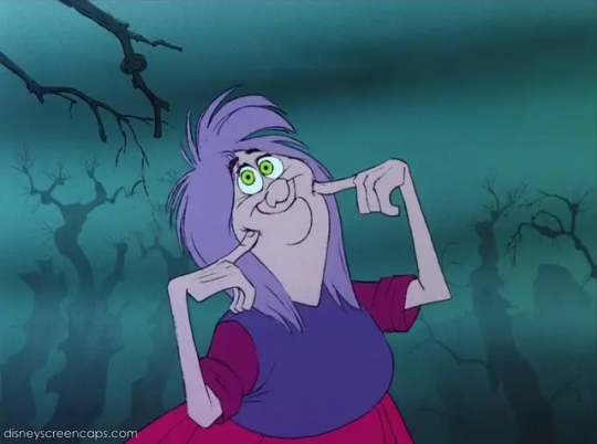
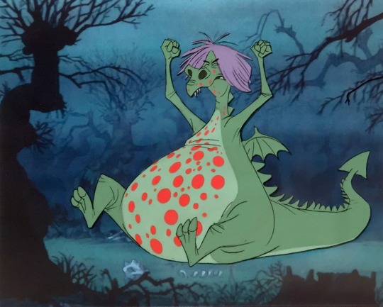
I start with a disney character full of chaos and I am inspired by mad Madam Mim because she is wild and chaotic and i absolutely love how fun she is as a villain and the most important thing for me is that Remus is fun. He's bonkers and has terrible ideas but he's also harmless in terms of reality. He's like an annoying little brother that wants to show you the Weird Gunk he found in the trash.
Inspiration 2: Snidley Whiplash (or Dick Dastardly)
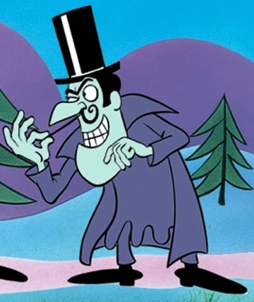
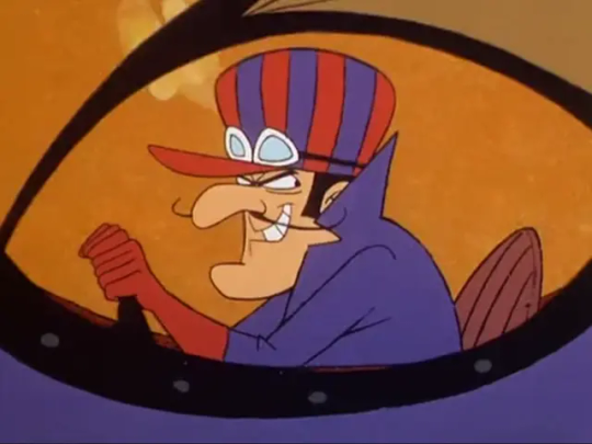
Remus to me is a guy who knows a lot of things and he's actually really clever but he wants to BE a villain like Snidley Whiplash or Dick Dastardly, including the moustache. He wants to tie people to train tracks because it's fun. His personality is "I found the dynamite and the roller skates! :D"
Inspiration 3: Wile E Coyote and looney tunes as a concept
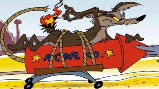
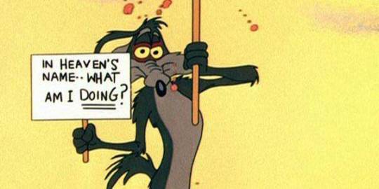
If Remus is anything it's a creature that can be stabbed in the eye and come back fine. It's a person who can make acme-like contraptions that do not work and that's ok. He is, if nothing else, Wile E Coyote and he is having the time of his life. He should therefore have hair that is a littler wild and crazy and untamable like Wile E's tail.
Inspiration 3: Royal villains
We will look at Galavant and also OUaT again!
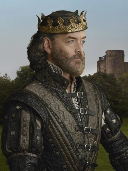
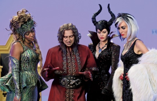
There's nothing quite as detailed in costume as evil royal villains. They always seem to be the most extravagant or at least have all the buckles and things and Remus has an outfit just the same. Like Roman I want his royalty to show with his clothes but unlike Roman I want Remus to look way less put together. More a culmination of his clothes he chooses to wear but only because he HAS to wear something so he's going to show skin.
Particularly though the one I associate with Remus is Captain Hook from Once Upon a Time.
Inspiration 4: Captain Hook / Pirate aesthetics
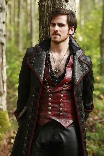
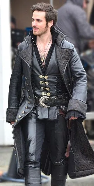
Roguish, half-opened shirt, details, dressed fancy, swashbuckling. Remus would make a great pirate because he has the swagger and charm of a drunken man sailing a boat with a pet giant octopus he calls Lil Pussy.
Speaking of octopus...
Inspiration 5: Kraken and hentai
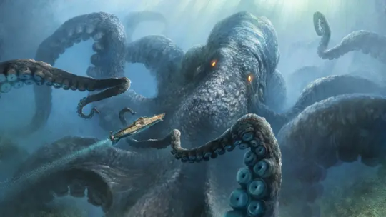
He has an octopus on his belt and he deserves tentacles for a pirate feel but also for fuckin. Cause he's a raunchy bastard. Anything taboo is something he wants to think about.
Inspiration 6: Punk aesthetic
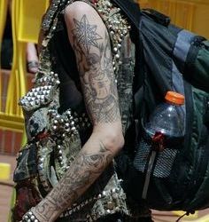
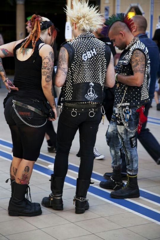
What easier way top buck against the norms than to embrace punk vibes? Jewelry, upside-down crosses, I don't like going overboard with it but I like giving him some. Fingerless gloves, chokers with spikes, those kinds of things work well for his "I am everything your religious grandmother hates, embrace it". His outfits that aren't standard could look like he made them himself or found them in the garbage and went "awesome!"
Inspiration 7: Weapon Master
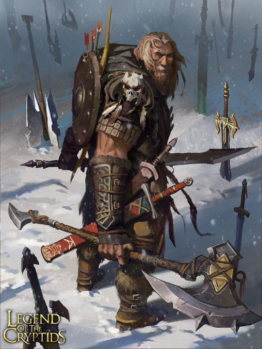
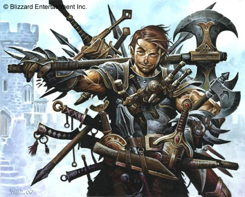
Remus likes to hit things with his mace and while Roman has his sword, I imagine Remus is an expert at weapons or at least likes to use them so even if I am going to dress him up nice I want a weapon nearby somewhere.
Things that are a must:
So many details, Remus will not leave your eyeballs alone. If you think Roman has details nope, Remus wants your eyes to bleed with them.
Remus should have longer hair than Roman, wilder bangs and wilder curls. Shorter hair is fine but a ponytail is even more fun. Like the tie holding it'll break at any moment.
Weapons galore, arm this baby at every opportunity. Likewise, scars are acceptable but it's ok if they disappear at random because chaos loves chaos.
If Remus has his main garb off he should be showing skin to the best of his abilities and his collar should drape down wider than normal because let that man be a slut.
Tentacles should be numerous when shown and they should have a mind of their own doing whatever they want.
If Roman wouldn't wear it, Remus would. If Roman wouldn't think it, Remus would, and if Roman would be disgusted, Remus would love it.
Remus should have annoying little brother vibes.
Any non-standard outfits should look like he cobbled them together with duct tape and chewing gum.
So I came to this:
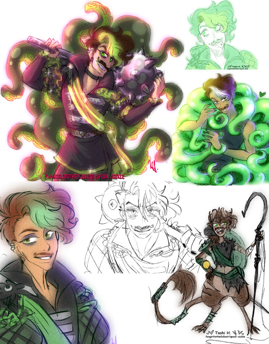
168 notes
·
View notes
Text
I promised I'd share my ideas for a hypothetical fourth season of batman 66. So here it is. All 60 episodes of my season four (although some episodes have more detail than others). I planned to write notes for a season five, six and seven. And I'd have each season introduce more and more characters. But I don't know if my attention span will last long enough for me to write all of that. Or if my fancasting website even works anymore. But at least I have all of this written down?
Season 4: Season Four would get 60-70 episodes, max. A full season of 60 episodes, split into part one and part two, or something like that.
Episodes 1 and 2: A two parter based on the events of the Batman '66 Comic, Issue #1. A story involving The Riddler (Frank Gorshin) and Catwoman (Julie Newmar).
Episodes 3 and 4: A story involving The Joker (as played by Cesar Romero). Not much else to say beyond that right now.
Episodes 5 and 6: A story featuring The Penguin (Burgess Meredith) and Mister Freeze (either George Sanders or Eli Wallach). They team up, only to get busted by the dynamic duo!
Episodes 7 and 8: Introducing Signalman to the world of Batman '66! Signalman uses his gimmicks to try and trap Batman and Robin, while stealing as many symbols of good fortune as he possibly can.
Episode 9: A Batgirl solo episode, focusing on her and her new partner (who she meets in this episode): Jason Bard. Together, her and Jason end up investigating the appearance of a new catwoman on the scene (Eartha Kitt). Together, Batgirl and her private detective partner manage to learn that this new Catwoman is an old friend of the first Catwoman, and they're friendly rivals who compete for the thrill of the chase.
Episodes 10 and 11: Batman and Robin are preparing to leave for London on Vacation, but they're held up by The Bookworm and his criminal gang, who planned to rob Gotham City of a priceless manuscript stored deep within Gotham City Hall. Only the dynamic duo can stop this marvelous mastermind before it's too late!
Episodes 12, 13 and 14: Batman and Robin end up in London on vacation, and they end up needing to bust up two different capers in England; one involving The Mad Hatter (David Wayne) and the other involving The Clock King (Walter Slezak). It turns out these two villians have some negative history together, but it's unclear just what this history entails…
Episode 15: While Batman and Robin are off in Europe, Batgirl and Jason Bard run into Cluemaster, a strange new villian who seems to have an odd vendetta against The Riddler. Although The Riddler doesn't actually show up in this episode, we learn that Cluemaster is a minor villain who's always held a grudge. He wants to take the title of world's biggest riddle/clue/puzzle themed supervillian away from The Riddler! Only Batgirl can stop him now!
Episodes 16 and 17: Batman and Robin end up on a cruise heading back to Gotham, but the cruise ends up being held up by Penguin, who's decided to take to high seas felony after being constantly foiled on land. But he didn't count on finding Batman and Robin on one of his captive vessels…
Episodes 18 and 19: Batman and Robin return to Gotham, just in time for a late september scheme hatched by Egghead, that diabolical master of eggs-pert larceny! Batman and Robin need to enlist the end of Batgirl and Jason Bard just to get him to be defeated before he commits the greatest crime of our time and era!
Episodes 20 and 21: In the brisk early October air, False Face steals a new chemical designed to make a human being shapeshift. But one of his men steals it away from him! Matt Hagen (Rich Little), a greedy henchmen of the dastardly False Face, uses the machine and turns himself into a hideous being made of Clay! Remembering the case of an old villian Batman tangled with named Clayface, Matt Hagen decides to embrace his evil side and become Clayface the second!
Episodes 22 and 23: Batman, Robin and Batgirl all end up tangling with The Scarecrow (Anthony Perkins) on Halloween Night! A washed up former psychology teacher with a love for fear, Jonathan Crane has come to haunt Gotham as the one and only Scarecrow!
Episodes 24 and 25: Batman and Robin tangle with Blockbuster, a menace who's too mindless to actually mean any harm to anyone or anything. He's being used by his mad scientist brother Roland, but the dynamic duo don't figure that out until it's nearly too late…
Episodes 25 and 26: While hosting a Gotham City Beauty Contest to mark the beginning of November and the subsequent colder season, Batman and Robin tangle with Poison Ivy (Ann Margret), that powerful sorceress of seduction! Using her brilliant botanical wisdom, she snares Batman and Robin inside of a horrible death trap. But they escape, and successfully bring her to Justice.
Episodes 27 and 28: Batman and Robin deal with the Polka Dot Man, a bizarre new criminal capable of using polka dots as tools for committing new crimes to bedevil and beguile the people of Gotham City!
Episodes 29 and 30: Batman and Batgirl have to work together to fight off a mad team up of The Penguin and The Riddler. Robin is sick with the flu, so he's unable to help them. So it's up to Batman and Batgirl to save the day this time around!
Episodes 31 and 32: A Christmas Special, featuring a mall santa who gets victimized by The Joker and Clayface, a bizarre new duo of cookery! Batman, Robin, Batgirl and Jason Bard all have to team up to defeat the foe this time. And in the end, it's rather unclear if the mall santa was just a mall santa, or if they were the real santa all along…
Episodes 33, 34 and 35: Batman is challenged by his most dastardly foes yet; a terrible trio of crooks from Gotham's distant past! The Eraser, The Getaway Genius and Killer Moth! Batman hasn't tangled with them in years, not since the days of… Batwoman. Back when Robin was younger (a few years before the show started), Kathy Kane was a rich socialite who teamed up with Batman to fight crime. But she retired after an awful case involving Killer Moth. Yet now, she may be Gotham's only hope for surviving the Triumvirate's terror!
Episodes 36 and 37: Batman was set on edge by the Triumvirate (and by Batwoman's return), so he's gone on vacation. While he's off on vacation, two different teams have to protect Gotham from ill will. Robin and Catwoman are who we're gonna focus on first. While Batman's away, they end up having to deal with Doctor Double-X, a horrible foe from years past, capable of creating duplicates of himself to fight his battles for him!
Episodes 38 and 39: While Batman is off on vacation, Batgirl and Jason Bard end up having to call a truce with Catwoman II (Eartha Kitt), as she's being pursued by an old rival. Catman, a big game hunter who prowled the jungles of africa. He feels that Catwoman gives the noble beauty of the jungle cat a bad name, and so he's out for revenge. Batgirl, Catwoman and Jason Bard have to save Gotham from the deranged anger of Catman, before it's too late!
Episodes 40 and 41: Batman was on vacation in Europe, exploring the beautiful balkans. But he accidentally stumbles upon a plot by Olga, Queen of the Cossacks, and he has to come back out of temporary retirement to stop her.
Episodes 42 and 43: Robin and Batwoman team up to fight against Shane and his wife Calamity Jan.
Episodes 44 and 45: Batgirl and Jason Bard team up to fight off Louie the Lilac and The Siren, a strange duo who've teamed up to try and take down Poison Ivy (for "stealing their gimmicks"). At the end of this two parter, batman finally returns from his vacation.
Episodes 46 and 47: Batman's first case after coming back from vacation involves dealing with The Sandman, Gotham's strange sultan of the sands, a man capable of putting people to sleep (and now even capable of messing with them as they sleep and dream)!
Episodes 48 and 49: Batman's newest case leads him to have to fight against Mister Freeze yet again, who's sprung himself from jail, all to work on an elaborate scheme involving freezing gotham in with perpetual winter!
Episodes 50, 51 and 52: Batman has to go up against The Riddler, Cluemaster and The Puzzler, all of whom have gone on the attack against each other. There can only be one king of puzzles/riddles/clues, and they won't stop until one of them has successfully defeated the other!
Episodes 53 and 54: While Batman deals with the three puzzling champions, Batgirl and Robin end up fighting against The Bookworm and Scarecrow, both of whom have teamed up to try and steal some rare manuscripts for old time classic horror novels. It might be in this story that we get the first hints that robin is beginning to feel stifled by batman's authority. He wants to fly somewhat independently. To prove himself to Batman.
Episodes 55 and 56: Batman and Robin have to defeat The Joker, when he decides to challenge them to a game of wits. He commits crimes using the gimmicks of other criminals, and thusly tries to lure them off his trail. It almost works, until Batman and Robin finally get wise to the scheme.
Episodes 57 and 58: Batman and Robin team up to fight against The Minstrel, their old musically inclined foe. He's come to Gotham to commit more musical thefts, and only the dynamic duo is capable of stopping him.
Episodes 59 and 60: Batman and Robin have to deal with King Tut, who's once again relapsed into his horrible criminal ways.
After this, Season Four ends. Then we'd have the two animated movies (The Return of the Caped Crusaders and Batman vs Two-Face), and we'd also have the third movie which we were promised but which Adam West died before he could film (we were promised a film project with Harley Quinn, according to the Batman vs Two Face wikipedia page). So we'd have the Harley Quinn story (which might also feature Hugo Strange), and then we'd have Robin leave Batman to go do his own thing, the same way he did in the mainstream comics. And that would be the lead in for Season Five, which is all about Batman on his own.
#batman 1966#batman 66#batman#batman '66#I worked in some villians#like#scarecrow#poison ivy#clayface#and i tried to use as many of the show's villians as possible#also i added a comic character#jason bard#robin#dick grayson#batgirl#barbara gordon#my ideas#story ideas#comic ideas#ideas#fic ideas#fanfic ideas#writing ideas#batman ideas#comics#dc#dc comics#dcu#harley quinn#the bookworm
25 notes
·
View notes
Text
The Turaga Movie Designs, Ranked
#6 Matau
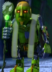
Weirdly the most human looking mask but rendered without any kind of expression. They didn't even give him eyebrows. Looks like he overdid the botox and sends him straight into uncanny valley territory. I get that he doesn't get any speaking lines and has barely any screentime, but contrasted with the amount of care put into his Matoran form it's a bit of a sad effort. The gold highlights are a nice idea in theory that link to his Toa form, but the blend of gold and grey gives him a weirdly discoloured look. 2/10
#5 Whenua
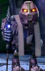
Eh. Not a lot of personality coming through here. His mask is basically identical to the Ruru wearing Matoran. Just Some Guy really. 3/10
#4 Nokama

She at least has facial expressions. Her mask was one of the simpler designs in set form but they've stripped it of all detail- maybe the designers thought the curved lines on the cheeks made her look too old or unfeminine? Eh. Some personality, but still a little bland. Don't look too closely at the body armour. 5/10
#3 Onewa
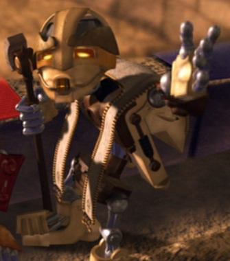
Now we're getting somewhere. Most of the details of his mask have been kept, and I like how the ridges above the eyes became Big Craggy Eyebrows. Manages to avoid the uncanny valley that Matau fell into. Has personality but not too ostentatious. Fits the character pretty well 7/10
#2 Vakama
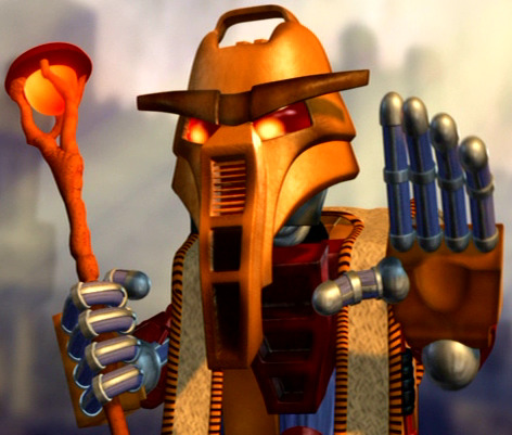
Yeah, he's the Main Guy out of the Turaga so naturally he got more attention to detail. We make fun of his big monobrow but it really helps sell the character, as does his long pharoah beard. He has the vent covering his mouth but they still managed to make it expressive. The stylized fire staff is nice too. Forehead's a little tall but that's really my only gripe. 9/10
#1 Nuju
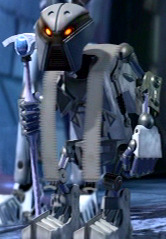
Looks like a horrid little owl man. Strong gargoyle energy. Has one expression and it's Thinking About Murder All Day. Character designers understood the assignment exactly. Mata Nui's perfect creature 1000/10
350 notes
·
View notes
Note
Brief summary of my thoughts so far now that I've done character creation and played half a session (we broke in the middle but may come back to it):
1) 7 players and a GM is too many. I know you know this already but I want to reaffirm it because that was what we had and it was really hard to understand what was going on.
2) I made my character 100% random and then backsolved an identity from there, and it worked better than it had any right to. The Traits are very evocative and I immediately had ideas of what I wanted my God Eater to look like.
3) I'm not sure the Calamity Clock is explained as clearly as I'd like it to be; to be honest, Tests in general are explained in a pretty convoluted way. It felt like some of the less-experienced TTRPG players at the table struggled with them, especially coming from a 5e-only background.
Sorry if this isn't the most helpful feedback; I'm just getting my thoughts down before any more time passes and I forget how the session went. I'll do a more full writeup if/when we finish the session.
(With reference to this post here.)
I definitely agree that the process of making tests could use a cheat sheet, and that's something that will be present in future revisions. However, it's worth noting that it's probably impossible to boil it down to something that a player with a 5E-only background would find intuitive because of some pretty basic differences in what kind of games they are.
In brief, 5E (and Dungeons & Dragons in general) keeps its conflict resolution mechanics almost entirely GM-facing in order to make it easier to onboard new players. Those mechanics are structured in such a way that it's completely feasible for the GM to figure out the target numbers, the applicable modifiers, the range of plausible outcomes, and the interpretation of the results with no player input whatsoever, with the player's sole responsibility being to roll a die with the correct number of sides (and if push comes to shove, the GM can do that part, too).
Eat God, conversely, is designed from the ground up to readily support GMless play (the specific rules for that will be in a forthcoming revision), which means that its conflict resolution mechanics can't be purely GM-facing. It puts a lot more responsibility on the player in terms of figuring out what the hell is going on, both narratively and mechanically, because its design goals mean it has to.
That said, it might help to frame it for a 5E player like this:
Making a test in Eat God is like playing blackjack: rather than rolling as high as possible, you want to roll as high as possible without going bust; "going bust" means all of your dice came up higher than your relevant Facet.
Everybody gets one die to start. If you can use any of your Traits to help with whatever you're trying to do, you get advantage on the test and roll an extra die. Unlike 5E, advantage stacks, to a maximum of five dice.
Instead of having a separate "damage roll", Eat God gets "did I hit or miss?" and "how much damage did I do?" from a single roll. A test's "damage" is the face value of the highest die that didn't go bust; the rules refer to this "damage" as a capital-R "Result".
You can get bonuses or penalties to a test's "damage" based on how effective the GM thinks your approach is. The GM will generally tell you about these modifiers before rolling. A penalty can't turn a success into a failure, no matter your Result; just like in 5E, a successful hit always inflicts at least one "damage".
Instead of critical hits, Eat God has critical fuckups. These have a range of dice roll values that trigger them, just like conventional crits; for example, you might score a critical fuckup on a roll of 11+, just like a champion archetype fighter in 5E gets a critical hit on a roll of 19+. This range can vary depending on how goofy the GM thinks your approach is.
Critical fuckups are assessed on a per die basis, so if you're rolling multiple dice, it's possible to generate multiple critical fuckups on the same roll. Yes, this also means that rolling multiple dice makes you more likely to succeed and more likely to fuck up, and creates the possibility of doing both on the same test. This is intentional.
When you roll a critical fuckup, the GM doesn't have to make something bad happen to you right away. They can do that, or they can take the fuckup and bank it toward a countdown to a really big fuckup that affects the whole adventure. You can see this countdown, but the GM is not obligated to tell you what will happen when it hits zero.
264 notes
·
View notes
Text


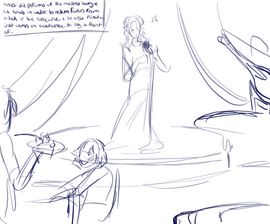
pomefiore pirates/seven au!
pomefiore had a super vague theme in my mind compared to the other 2 dorms i've done, regal and fancy, which doesn't give me much to work with. surprisingly so far they're my favorite of the bunch i've designed and feel pretty coordinated which was what i wanted.
more under cut (i figured out how to do it + got a lil rambly)
vil -> he took me the longest to design and is the one i'm least pleased with out of the three of them, if i changed anything it'd be his top, that is the main thing that bothers me. but putting that aside i wanted to keep his regal 'i'm better than you' vibe hes kinda got, his dress (cape?) thing drags behind him and is made of raven feathers which is a reference to the evil queen's pet raven. his design was pulled heavily from his dorm uniform which is one of the things that bothers me but overall he looks cute.
he's more of a singer than an actor in this au since i don't think as a sea fairing pirate theres gonna be too many people wanting you to act in their plays. vil tends to work at the mostro lounge at times, either to repay a favor or for his own benefit, singing songs and sometimes when the mostro lounge puts on a performance he'll play a part in it too.
ortho has taken an interest in vil and the two chat whenever they're both there, mainly when idia just meets up with azul to play their games, but the two of em have become friendly. vil teaches ortho how to sing or act and ortho pays attention (drama club canon wow)
rook -> his design was based on his masquerade outfit which made my job super easy. the leather armor, or protection, on his left arm is the protect his arm from the drawstring of his bow whenever he shoots which was a fun bit to add. his collection of vials and the bottle on his belt i took from his science clubwear, then there's his hat, the black feather on his hat is actually a raven feather from vil's outfit.
i can imagine rook showing up to every one of vils performances at the mostro lounge cuz that's just how he is. floyd hates him, whenever rook shows up at the lounge its hard to find floyd which only spurs rook to harass floyd further even if his actions are motivated by curiosity.
i think how rook went from being apart of savannaclaw crew to pomefiore probably went like a couple of fights, vil threatens to kill him and then rook is just like "wow!!!!!! beaute!!" then he joins them or smth ill figure it out
epel -> another easy one since he has a masquerade outfit, his scarf and socks were made by his grandma before he joined vils crew. his design is pretty simple compared to the rest of them but i like it, the tassel on his belt is from his dorm uniform and the gloves were taken from his masquerade outfit. i pulled his hair into a half ponytail hairstyle(?) which just clicked w/ me.
epel does a lot of the heavy work around the ship despite being oh so small and while he doesn't mind going to the mostro lounge it isn't his favorite place. i can see it being too fancy for his taste.
anyways 3/7 dorms done! i might do ramshackle for funsies but characters like the staff and other students/family depends on my mood.
#twst#twisted wonderland#twst art#dhrubajj art#twst fanart#disney twst#seven seas au#pirate au#vil#vil schoenheit#rook#rook hunt#epel#epel felmier#vil twst#epel twst#rook twst#pomefiore
187 notes
·
View notes
Text
Spider's Big Prometheus Thing: Index Post
Being a list of all the posts produced in the course of this inexplicable project of mine. This project is now complete, at an unexpectedly extensive thirty entries long.
I swear, I didn't intend for it to go like that, but it was fun to write.
All entries have at least a minimum level of citations for where to start looking for more facts on any subject external to the movie itself, which includes everything from how DNA is sequenced to how Nickolodeon slime is made, and from the comedy in mislabeled portraits of early church fathers to the correct attribution of a cat's contributions to historical linguistics.
Be aware that there's also hidden rambling and bonus facts in the image alt text. A lot of them.
0. Introduction
Setting the scene, including my background, my intent, and where this movie is going.
1. Opening
Expectations, landscapes, and aliens.
Rambles: DNA, whether aliens would have it, and why it doesn't look like a pale bacon ladder.
Alt-text rambles: nano-bubbles.
2. Discovery
The Isle of Skye is gorgeous, the movie attempts to establish its themes, and why it had already got my hackles up. Rambles: how cool ancient and pre-modern peoples were, the implications of humanoid figures in European cave paintings, and misplaced lions. Alt-text rambles: seriously, Skye is just so cool. Erich von Däniken and modern publishing royalties are not.
3. David
We meet the loneliest android, and his fandom of choice. Rambles: I go nuts for a paragraph over Proto-Indo-European. Alt-text rambles: Help me remember a dude's name, that time Ron Perlman saw Sigourney Weaver do something so cool he forgot to act, and a Coronation Street conspiracy theory.
4. Humans (Derogatory)
We meet the human crew, and analyze why they're a mismatch to the movie's established expectations, and what subgenre they fit in most. It isn't the one the movie seems to be aiming for. Rambles: 50s B-movies and their Men Of Science, modern movies and their quietly suffering scientists. Alt-text rambles: inconsistently moist characters, Idris Elba's christmas tree decorations.
5. Pseudoarchaeology (Extremely Derogatory)
We meet Old Man Capitalism, poor logistics, and how the movie began to really lose me through dropping in some racist pseudoscience tropes. Rambles: more logistics (of alien bioengineering), historical art styles, what the world was getting up to in the 600s CE Alt-text rambles: Linguistics, more ranting, the life and extraordinarily ornate death of Kʼinich Janaabʼ Pakal. Rants: the existence of writing, people who don't look like you can still think, stargazing and how conspiracy theorists don't understand it.
6. Roads
Poor firearm safety with Chekhov's Gun, when movies move too fast, atmospheric chemistry, and the moment I began to yearn for blood. Rambles: First contact protocols, why 3% CO₂ won't kill you but it will make you weird, my personal experience digging up a Roman road. Alt-text rambles: the logistics of securing items in moving craft, linguistics, atmospheric science, colorblind-friendly diagram design, swearing about orology, and cursing the crew for their fictional crimes against archaeology. Rants: Why they should've stayed in orbit, and my impassioned defense of historically significant transportation infrastructure.
7. Masking
The bit that made most people realize these characters were idiots. Featuring an attempt at themes. Rambles: NASA's policies on biological contaminants Alt-text rambles: Benedict Wong having nothing to do, helmet design, driving on dusty track, the tiny overlap between archaeological horrors and Minecraft, the CDC's excellent captions on men sneezing. Rants: Nominating a man for the Heinrich Schliemann Archaeology Award, all these people are catching space covid
8. Ghosts
Comparing the Engineers to their series antecedents, and I develop a slight soft spot for the geologist. Rambles: Set design in Alien, how carbon dating works. Alt-text rambles: Adventure games, GET DOWN MISTER PRESIDENT, I get very excited for Dune: Part Two, the archival devotion of people with rare blorbos.
9. Dignity
Personal, professional, social, and media context for the treatment of people's remains. Rambles: Personal experiences around the archaeological discovery of human skeletons, professional codes of ethics, movies that handle dead bodies better by being more crass about it. Alt-text rambles: None, the main text gets full focus this time.
10. Atmosphere
How intertextual imagery is overused, how the one major character arc is developing, and a whole grab bag of miscellaneous shambolic events. Rambles: How tourist-breath can destroy artifacts, and a deleted scene Alt-text rambles: Whether explaining mysteries is always the wrong decision in fantasy, the usefulness of helmets, Mass Effect's loading screens, please someone give me more recommendations for things where Giger creatures aren't all bad, and how cultural variation in gestures can make you look like an asshole. Rants: they aren't done desecrating the dead oh boy it's just gonna get worse
11. Decontamination
How to present an audience with events that make no sense, how to do it eerily, and how Prometheus does this by accident. Rambles: NASA's Apollo 11 quarantine policies Alt-text rambles: How 2001: A Space Odyssey put on a cosmic lightshow, how traditions are faked for political and social power in Midsommar, confusing lab equipment, robot arm safety, the use of camper vans in space exploration, umarell behavior, and robot horror movies. Bonus text rambles: pressurized gas cylinder safety, and how the cargo of one truck apparently tried to join Roscosmos. Rants: Laboratory safety
12. Shocking
Mary Shelly would not be proud of them. Rambles: Which home electrical appliances their tomfoolery is equivalent to. Alt-text rambles: Semiotics and Alien, reuse of props and art department equipment, the cast's inability to look at things, how the first chestburster scene intelligently incorporated spontaneity, and I completely lose my mind over a single computer readout, finding out in the process that the Engineers are close cousins to the common house mouse. Rants: I didn't think that "don't stick electrical plugs in people's ears" would be something that needed to be said, but here we are.
13. Family Tree
A soothing ramble about some of the cool bits of my job. Rambles: How evolution has made some vertebrate blood white or green, how genomes are sequenced, and how to determine the relatedness of species. And more. A lot more. I love my job. It's so cool. Alt-text rambles: How Nickelodeon slime was made, how hecking tiny molecules are, why blue-tongued skinks have blue tongues, my review of Dune: Part Two, how hard I worked to not turn Gene Wilder into a jumpscare, lots of enthusiastic explanations of DNA sequencing techniques, the aesthetics of the machines wot do that for you, how "snip" no longer sounds like a verb to me, and how I started out as a computational scientist.
14. Cheers
David poisons a man, and how his character arc ties into christian-influenced existential dread. Rambles: series continuity, gnostic theology, Ridley Scott's beliefs. Alt-text rambles: How to ruin petri dishes, Vickers' questionably carbon-based existence, the game of Operation, hand doubles in filming, how the funniest possible misidentification of an early church figure is wandering around the internet, the cool genders of suit actors, gnostic Archons, and the Engineers as Sophia. Rants: Holloway seems unaware that archaeologists study dead people, Ridley Scott is his own biggest problem.
15. Unworthy
The movie does something I'm not going to joke about. Don't read this if you're having a bad day. Big content warning for Holocaust imagery.
16. Intimacy
Your asexual commentator grapples with Hollywood's terrible track record on romantic and sexual chemistry. Rambles: Why we don't say an archaic-looking species is "older" than another, how religious scientists do what they do Alt-text rambles: the human family tree, Abbott and Costello, pitcher plant cultivars, the creative possibilities of a Buddhist version of this movie, and Stephen Still's lack of accordions. Rants: I've never been a boyfriend but I'm pretty sure that's not how you do it
17. Threat
Prometheus takes a hard turn into old slasher movie tropes. Rambles: A movie trailer that gave Wee Spider the screaming heebies Alt-text rambles: The age rating of Prometheus, a spontaneous X-Files crossover AU, Pitch Black, how likely it may or may not be that the images in the post will get flagged, critter behavior, insufficient EVA suit design, and the content balancing I take into account when selecting screenshots. Rants: This movie does not seem to know what it is. Alt-text rants: Ditto, focusing on characterization.
18. Flames
"Mac wants the flamethrower!" Rambles: I wandered off in the middle to watch a 40k comedy video, does that count? Alt-text rambles: More content-balancing, what kind of very English critter David appears to be, dune buggy design, Star Wars: The Old Republic is worth your time, Dune: Part Two is worth your time, an extremely long ramble about integration of CG background elements, and Oblivion memes. Alt-text rants: Movie color grading and lighting, undercutting scares.
19. Stars
The movie shows how good it can be when no dialog is involved. Rambles: The movie Contact and how Prometheus could've learned from it. Alt-text rambles: How I estimate large numbers from a still image, a brief Baldur's Gate 3 appearance, the set design and staging of a room made for giants with squishy computers, the use of color to make a cohesive scene, facts about Uranus, visual intimation of threat, VFX wizardry, practical FX wizardry, Michael Fassbender's wordless acting.
20. Expectant
The movie shows how good it can be when character choice is removed from the horror. Rambles: the inspiration and place of chestbursting in Alien movies, the continuing religious symbolism in the movie, the clunky dialog, how to build or undermine tension, and the good blending of practical and CG effects, and how tiny creatures of the ocean manage to be more uncanny than horror critters. Alt-text rambles: reading details the prop department never meant for you to see. Alt-text Rants: the return of the head-exploder and the first sight of actual PPE, slowly mangling a plot point's name until it has been thoroughly folded, spindled, and mutilated.
21. Underdelivered
The movie shows how terrible it can be when horror doesn't build tension. Rambles: Contortionists in horror, hillbilly horror/hixploitation movies. Alt-text rambles: Resident Evil 7, Dead Space and "strategic dismemberment"
22. Hubris
The movie tries to do some themes again Rambles: my ineffable desire to genetically sequence ditch weeds, Left Behind Alt-text rambles: Brad Dourif's commitment to the bit in The Two Towers, nigh-invisible wheelchair product placement, the Fallout series in general and the upcoming show in particular, praise for an epic-length critique of Left Behind, Robert Zemeckis' bizarre quest to mocap everything Rants: This movie does a terrible job representing both religiosity and atheism
23. Informed
Exposition is delivered, and plot points try to knit together. Rambles: The Silent Hill movie, Pacific Rim Alt-text rambles: Pyramid Head's secret unclothed backside, demanding environmental enrichment for scientists, greebling, Tumblr's favorite shitty copper merchant Rants: What could've been done instead of an exposition dump and daddy issues Alt-text rants: these people and their interior design are tempting fate and testing my patience
24. Inscribed
I go rogue and ramble about constructed languages and cuneiform for an entire post. Guest appearances from Klingon pop music and a delightfully eccentric Assyriologist. Rambles: All of it. Alt-text rambles: the self-awareness of conlangers, fingernail length, Schleischer's Fable as a warm-up for the next section, my primary conlang derangement, speculation about whether cuneiform was legible for the blind, my beef with the cowards at Lucasfilm for refusing to use Star Wars' coolest letters, my love for Warframe's Grineer, going into far too much detail about redesigning Prometheus' Engineer script, and finally, the many crocodiles of ancient egyptian hieroglyphs. Rants: None/all of it
25. Judgement
We discuss some of what the movie doesn't. Rambles: Fiction and morality, Blade Runner, biblical allusions the story could've made and doesn't Alt-text rambles: Lance Henriksen's insane career, the paintings of John Martin and a surprise George Washington, Rutger Hauer's effect on Blade Runner, my tentative plans for the next essay series. Rants: Germs, old man makeup. Alt-text Rants: The characters are reading ahead in the script again, the half-assed Engineer writing system continues to hurt me
26. Awoken
I go bananas over PIE. Rambles: fix-it fic for this damned movie, PIE, how to avoid PIE, how to analyze PIE, and my personal alternative to PIE. Alt-text rambles: calculating how long the Engineer's overslept, their potential spiritual kinship to Moominpapa, behind the scenes photos of the suit actors, Prometheus rants in the days of LiveJournal, the game Hades, how hard it personally is to get PIE right, the linguistics nerdery of the Hittite empire, and watermarks. Rants: how the movie fails its premise and hurts my soul with linguistics
27. Shortcomings
The characters, and movie, fail to get their message across to someone bent on their destruction. Rambles: David's confused religious symbolism, Star Trek Alt-text rambles: My desire for fanfic, behind the scenes photos, what other critters the Engineer's suit actor has played, the naming of Australopithecines, crash-proofing a movie set, alien gender, Gandahar and how French animated SF in the 80s was awesome, Scorn and its expert consultation from a cenobite, and Doctor Strangelove. Rants: the assumptions of the human characters, I go from trying to be measured to actively spiting the writer for his take on thoughtful SF Alt-text Rants: Del Toro is the only one who gets me, the movie has forgotten its main character just had a major surgery, one last rant about how terribly unsafe the Prometheus was as a ship, before it becomes definitively not a ship.
28. Momentum
It's the bit where she doesn't turn. Rambles: How to fix the dumbest thing we've seen in a hot minute, Edge of Tomorrow and feeling Tom Cruise's fear, how the dead thing is never really dead in horror. Alt-text rambles: How hard it is to find the most catchy song in We Love Katamari, more behind the scenes pictures of my blorbos, Friday the 13th Part IV, bad braille, and trilobites. Rants: I mean how can you not when the movie forgets how space works? Like, the idea of 3D space as a concept? Also, a particular rock earns my ire, and my ranting about interior designs on ships finally pays off.
29. Dissonance
The ending of the movie, and its tonal incoherency. Rambles: Protagonist-centric morality and lack thereof Alt-text rambles: Star Trek TNG, green blood, caecilian teeth. Rants: shallow christian themes, sequels that could have been, Shaw's confusingly deployed robo-racism Alt-text rants: sequel disappointments, inadvisable post-caesarian activities, how the hell do you fit that much 'burster into one chest, biological plausibility in alien extend-o-mouths
30. Justification
A breakdown of a post-release interview with Ridley Scott, explaining some missing details. Rambles: Gnosticism again, Mesoamerican and European human sacrifice and the exoticization of shared cultural practices, and a hearty book recommendation. Alt-text rambles: Icelandic volcanoes, The Collector (2009), Stephen Speilberg's War of the Worlds and how scaring the shit out of someone isn't necessarily the job of a horror film, the Tollund Man, unique cultural practices, Hello Future Me, and my opinions on what we've seen of Alien: Romulus. Rants: Ancient peoples weren't stupid, an unexamined christian-centric worldview, an unexamined christian-centric worldview, I CANNOT STRESS ENOUGh
#Prometheus (2012)#Prometheus 2012#this ended up extremely long but it was worth it#the curse has now been lifted#I am free
110 notes
·
View notes
Text
Finished arcane s2 yesterday...
You know what? It's good, okay.
I wish the story had 5 seasons to unfold instead of 2. The end product feels really cramped, unfortunately, and I liked the pacing only in ep7 i think, overall it's very saturated w different major events, and my head was hurting at ep8-9.
I think animators, artists and writers did their best condensing the story into 2 seasons. Could be better w 5, but it's not their fault it's 2 instead, alr. Arcane is beautiful, and as an artist I appreciate it the most.

Powder and Ekko? Peak. My boy had his own multiverse thing going. Episode 7 made me really happy.
Jinx is alive and that's basically a confirmed fact. Loved her design AND her hair changes this season. Did Ekko help her cut her hair extra short like she has it in the last ep, I wonder..🤔god, these two.

Jayce's little silent hill? LEAVE MY CANCELLED WIFE ALONE!!!!!!

Viktors new body? Ehhh. It's too organic for my liking, but I guess it works :p the third arm seems a bit out of place in this design tho

Jayvik? Don't even talk to me. It's peak fiction. Even ao3 could never reach this LEVEL. They be getting FREAKY w it. And it's basically canon too! So much love for them both.


CaitVi? Still don't like 'em, sorry. At least Vi deserves better than what she got imo... I don't really like Cait as a person. As a character she's alright. I was happy when they were happy and was sad when they were sad, but ultimately this ship isn't for me. Maybe if it was done differently, I'd like it more🤔..

Mel is MY WIFE🙏✨got her glow up when I thought she's perfect already. Loved her arc and her new abilities.


Hate that Piltover wasn't held accountable for its crimes against Zaun🙂they just glossed over one of the main plot points of the show, smothering it with the noxian war plot or whatever.

So, yeah, that's what I think about it all. I have more things to say, but my eng vocab prob won't let me explain everything the way I want to. Many people on Twitter said it better and noticed more details than I did, so I'll just stick to liking their thoughts for now and pour my heart out on Tumblr instead.
24 notes
·
View notes
Text
Art Styles I Personally Think the Hetalia Characters Looked Their Best In (and Why) Part 1
Link to Part 2
I'm making this at 3am because my back hurts and I can't sleep. But the art styles have been on my mind for a while and I wanted to talk about it. Or at least express which ones I think were best for certain characters and why.
I will also be omitting characters who have only appeared in one season.
Also, please note that I am referring to the show and not the webcomic. This is primarily because I didn't always have access to the webcomic and thus the show is what I've always been most familiar with.

Italy: Seasons 1-4
This was a close call between this and his design for season 5, but you can't beat the classic art style for Italy. When someone mentions Italy from Hetalia, this is what comes to mind. I also feel like there's a bit more fluff to his hair in this art style, but it's also not so flat that it looks like his hair is wet. He also just looks cuter here. I can't explain it. He just does.

Romano: Season 7
As a long-time Romano fangirl, this was a very close call between all the art styles I've seen for this character. But ultimately, season 7 won out. I like how they colored his hair. Not just because I like brown hair, but because they made it shiny, but not so shiny that it looks wet, and... Let's be real here, this outfit. It is everything my middle school self ever wanted and more. The Romano fans were blessed the day he graced our screens with this glorious fit.

Germany: Season 1-4
Part of why I love this art style for Germany is because it's the one I was first introduced to, and it's one where he looks the most like a real person (at least to me, anyway). Another reason is that the other designs for Germany either make him way too muscular for my liking, or they give him a bit of a dopey face. I think it's also worth mentioning that this design gave us some very meme-worthy facial expressions, and that should never be downplayed or forgotten. Also, I miss the black tank top look for him. Iconic.

Japan: Season 5
Japan's design in season 5 hits sort of a sweet spot between his designs for seasons 1-4 and seasons 6-7. His hair is obviously still black, but it isn't so dark that it loses any value. The shading and gradient look really good and help make his design here pop from the previous one. I also like how big and squared his eyes are here, similar to in seasons 1-4. Seasons 6-7 made his eyes too round. I also love that brown gradient within his eyes. I feel like his eyes were too small in seasons 6-7. As I said, this Japan design hits a sweet spot and balances all the best elements of his design while still maintaining the look of aph Japan.

Prussia: Season 5
It took me a while to figure out why I preferred this art style for Prussia, but I think I finally figured it out. Angles. This design utilizes sharper angles than the other designs for Prussia. The reason why this works so well is that angles in character design are often used either for older characters or for characters who have a bit of an edge to them (pun unintended). I understand that Prussia is a huge dork (affectionately), but he has always come across as a sort of rebel to me with a "do or die" attitude, which makes sharper edges and angels work well for him. Also, his eyes are pretty. And he looks hot here sue me.

Spain: Season 5
Okay, I have several notes here, because virtually everything here is an upgrade from his design from seasons 1-4. For one thing, they actually gave him tanned skin, which, in my opinion, makes sense for the personification of Spain, a country that gets a lot of sunshine. His hair is shiny and gives a sort of sunkissed look, like he's been working outside the whole day. Not to mention his hair has a bit of fluff to it, a huge upgrade from his more flat-looking hair from previous seasons. His eyes are beautiful, with a gradient from yellow-green, into avocado green, and then into a shamrock green. I also like the more casual clothing he wears this season, as well as that one cool-looking suit of armor he wore during his battle against the Netherlands. The only reason I am not putting his design for seasons 6-7 here is that, despite giving him even tanner skin in those seasons, which I like, his facial features feel too rounded to me, making him look a bit like a young child. Season 5 Spain walked in, slayed the competition, and walked out. A true king.

Belgium: Season 5
I've heard a little bit of arguing online about how Belgium's hair in season 5 should've been blonde, but honestly? In a sea of blonde characters, I don't mind her having light brown hair. If anything, I think it's beautiful and it makes her stand out more. I really like her light green eyes, as well as the cute dresses that she wears. In particular this outfit. The green bow on her dress and in her hair complement her eyes beautifully. Not to mention that the green bow on the gray and black dress makes for a really nice pop of color. I know she's not a character who shows up a ton, but for me, she looked her absolute best in season 5, and the previous and latter seasons cannot compare.

Netherlands: Seasons 5-7
I'm lumping seasons 5-7 together for the Netherlands because I honestly cannot see too many big differences between his designs there. All I can say is that they are far better than his one design in seasons 1-4. I love the whole outfit he wears, with the long coat and the scarf. I lowkey kinda want that scarf. He also has the added detail of smoking a pipe. Which, sidenote, is that a big thing in the Netherlands? I have no idea. I just found the pipe to be a unique and interesting detail. I'd talk about the design, but that would be best suited for a top ten favorite designs post.
#hetalia#aph#this is the kind of crap that happens when I am sleep deprived and in pain#hetalia fandom#aph fandom#hws#hetalia world stars#hetalia axis powers#hetalia world series#hetalia the beautiful world#hetalia the world twinkle#aph italy#hws italy#aph germany#hws germany#aph japan#hws japan#hws romano#aph romano#aph spain#hws spain#aph belgium#hws belgium#aph netherlands#hws netherlands
46 notes
·
View notes