#i had two vers in the lineart
Explore tagged Tumblr posts
Photo
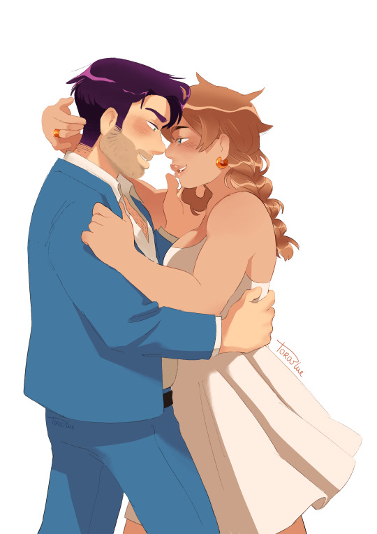
Redrew an old shane/farmer drawing <3 old version under the cut
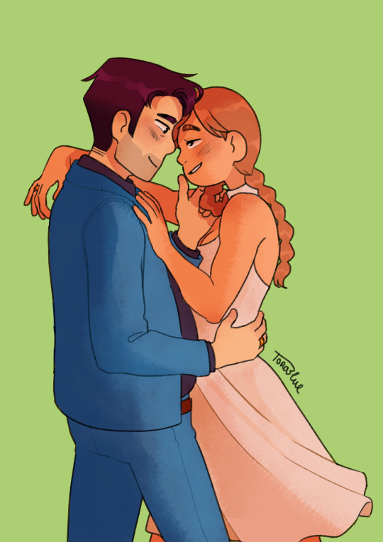
I made them a little sassier in the newer version oop
#stardew valley#stardew shane#sdv shane#shane x farmer#stardew valley shane#sdv#farmer sarah#looking at this again im kinda#hesitating on whether i shouldve gone for the soft stare#i had two vers in the lineart#OH WELL HOPE YALL LIKE
387 notes
·
View notes
Text
FORGOTTEN LAND'S SECOND ANNIVERSARY :3
I AM SOOOO BACK
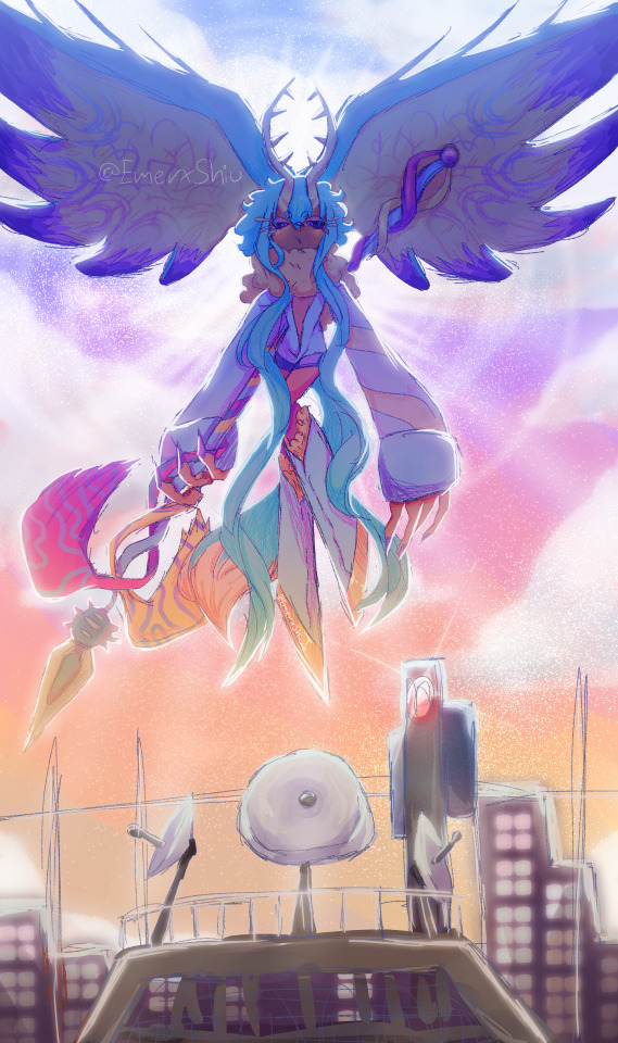
I started this drawing yesterday around afternoon and finished it just a few minutes earlier.
I went with a messier type of drawing instead of more clean like the elfilin one from yesterday, i find it fun doing it like this, mostly cause i dont have to worry about making it perfectly so i dont get as frustrated as normal. Id place this one as my second best digital drawing. im pretty sure i havent posted what i consider my best digital drawing here, tho i do have it in instagram, i might post it here one day, tho these two are way too tied up, i love how this came out, its not exactly like how i imagined it but its really close to it, and also itd say that since i dont tend to play around lighting that much, this was such a joy to draw and i cant help but stare at it a lot, at least until i start hating it because i made quite a lot of errors. i also changed my elfilis gijinka just a tad bit from last time, but its not that big of a difference, mostly.
ofc i had to draw elfilis for forgotten land's anniversary, i tend to deny it in my head but yeah they're my fave of the kirby characters even tho i hate them a bit. I wanted to draw some more doodles, like, elfilis eating cake, kirby car, a bunch of other stuff (not elfilin cuz i already drew him yesterday) but when i tried i couldnt draw anything more, guess this drawing burned me out a lot, huh?
you can definitly tell i spent all the efforts on him cuz if you look a bit closer to the bottom part you'll see its almost barely detailed, but i mean, they're the focus so make sense i guess for me not add that much detail there. um also, maybe because i dunno i had OVER 130 LAYERS jeez no wonder firealpaca was slowing down so much, i need to manage my layers better next time, tho i did do something i keep forgetting, wich is naming them (most of them at least) that was a real life saver
Also, antares (fecto elfilis' spear/cadaceus), as always, was a pain to draw, but this time its probably been draw the most accurate out of every other drawing ive made with it in it, i didnt notice it was like, a little curved when it reached the blade
some close ups since his face is a bit hard to see
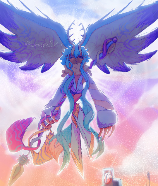
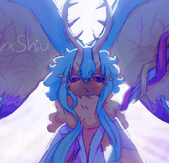
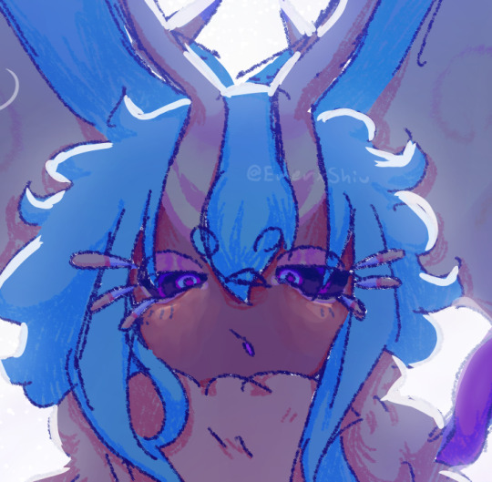
silly :3
fun fact! actually, this is technically a redraw, somewhere around between february and march i started a fecto elfilis drawing for the first anniversary, but i couldnt finish it in time, and i never finished it
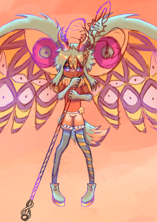
thats...quite the improvement! (i remember being so proud of it)
also his wings are like that cuz i did not want to draw the pattern, its way too hard, i literally copy pasted it, wait, i was talking about the 2024 version but i looked at the 2023 one and i just noticed it also has the pattern copy pasted, i guess some stuff never changes since i still abuse the ctrl+c ctrl+v to this day
Also i ended up making a huge error there, i was planing to add the phantom spears from orbital pulsar (the attack he does first when you battle them at lab discovera) but theres an innacuracy, when they do the attack, they always close their eyes, i had actually sketched him (well i mean both these drawings are basically the first sketch (2023) or second sketch(2024) with some color, shadows and lighting. i didnt do lineart in the 2024 one cuz i wanted to be a bit like the og i made (too bad i sketched that one with black since the og was sketched with white due to me drawing the bg first)) with his eyes closed but them decided to make them open for a reason i cant remember, maybe i thought itd look nicer? idk
ive had the idea of redrawing this for quite some month now so it was kinda already planned
background cuz i think it came out really pretty
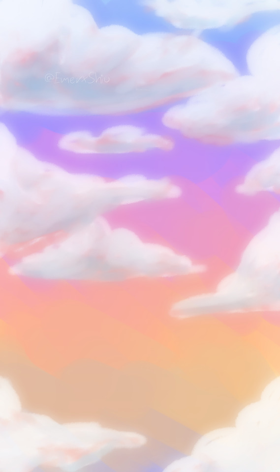
doesnt have the little stars since without elfilis and the structures it looks fucked up. the actual sky in game is more blue, but the clouds have some orange, in the 2023 ver. i made the sky orange, and in the 2024 ver i wanted it more accurate, but i didnt wanna loose the orange sky, so i did a gradient. pretty...
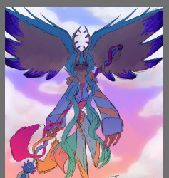
also here's a screenshot i took when i was like halfway trough it, its barely noticeable but i changed his mouth in the final drawing
I really love katfl, like a buncha whole lot, its basically almost my first mainline kirby game. 100% the demo, finished the game in almost one day, i literally play it monthly, like, every month i put the card in my switch, start it up, get morpho sword, and go shred elfilis in lab discovera. i would probably not even be here on tumblr and the kirby fandom if it werent for it. and i love it so much i genuinly cannot express how much i like it and treasure it with words or anything
Thank you for reading my unnecesarily long rambles lol
I hope i'll post tomorrow and dont forget like usual
Jambuhbye!
#art#fanart#kirby#kirby fanart#kirby gijinka#silly#digital art#firealpaca#fecto elfilis#fecto elfilis gijinka#my wife fecto elfilis and his new drip#yep changed them again#fecto elfilis lives in my head rent free 24/7#fecto elfilis fanart#kirby and the forgotten land#katfl#katfl spoilers#katfl second anniversary#kirby and the forgotten land second anniversary#katfl fanart#kirby and the forgotten land fanart#please reach a lot of people i spent way too much effort on this drawing#kirby series#kirby elfilis#kirby of the stars#:3333#:3#digital artist#artists on tumblr#small artist
47 notes
·
View notes
Text
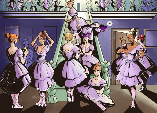
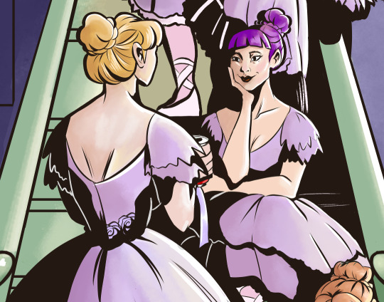
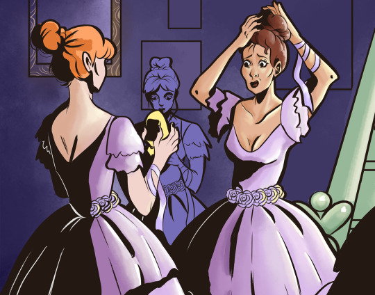
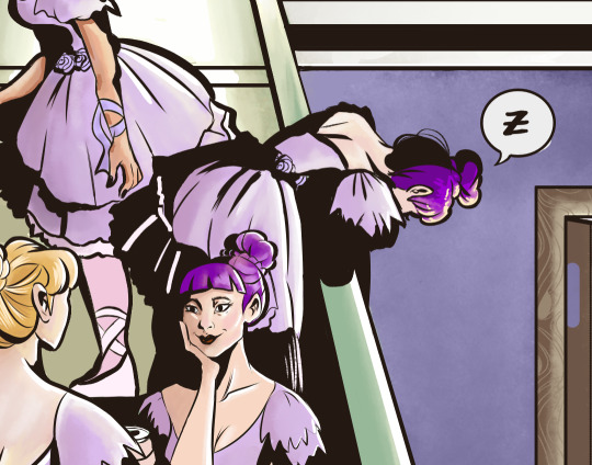
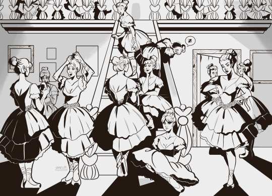
Finally! Wooo! Finished! I had this idea from seeing so many pics of ballerinas on my pinterest feed. I used a ref, but lost it. I expanded a lot upon it, so I think it's ok. It was cool to draw so many people in the same space, too, cause I never do that if I can help it, lol. Under the cut is usually only lineart vers. but I wanted to put it up there cause I added shading. So, really, under the cut there's ballerina lore. All of them have backstories. You're welcome.
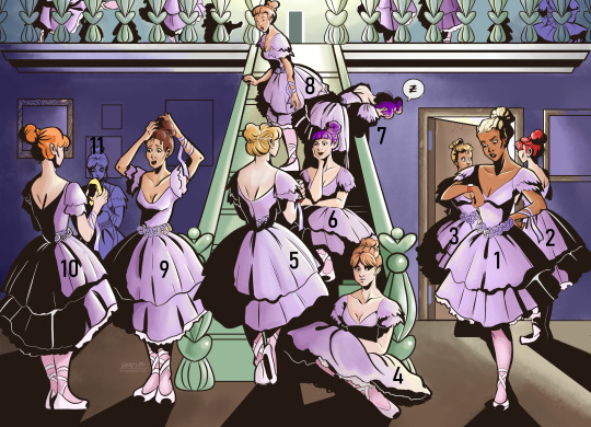
Ballerina lore. (Reminder that I have no idea how any of this actually works cause I never ended up doing ballet. Thankssss~ <3
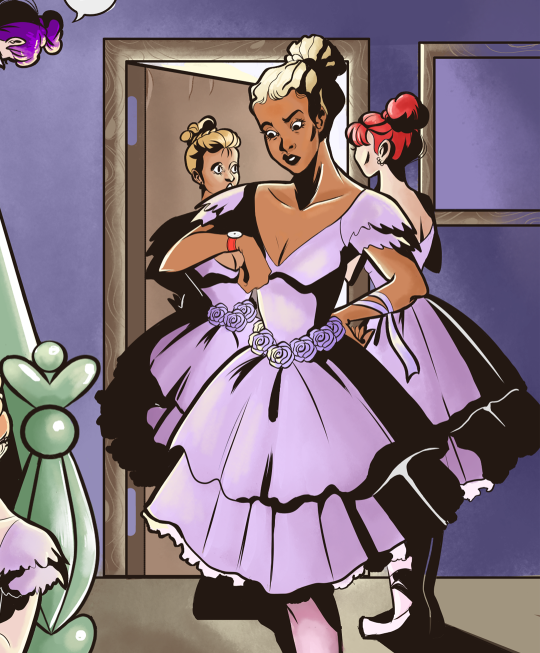
She's waiting for the rehearsal to begin, and is very annoyed that it is so late, cause she woke up so early for this. The other girls aren't as worried, but my girl is punctual.
She's telling her friend about all the conspiracy theories she knows. It's a lot.
Her friend is actively shocked about all the stuff she is hearing and she believes it 100% purely based on delivery.
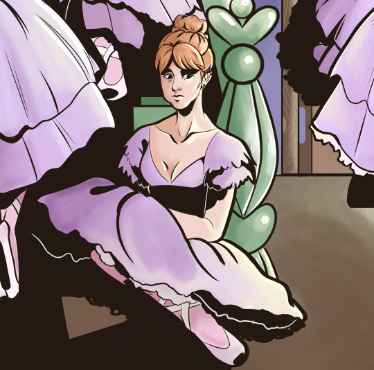
Sad ballerina is sad cause her boyfriend is away. She is also a bit introverted, and just likes thinking a lot. She feels like she doesn't fit in with the rest of the group, but she's neutral-to-like when it comes to them, esp. conspiracy theory girl cause she's enthusiastic. She thinks funny ballerina is obnoxious though <3
Funny ballerina is funny, she's the class clown. She is always trying to make everyone happy, but she's just very anxious. Addicted to caffeine, shouldn't drink it, esp. not cocla cola, cause she's on an obvious diet, but it's her cheat day, get off her ass.
Lesbian ballerina as hell, in love with the disaster in front of her. Not much is known about this woman, though, she is mysterious and usually quiet, although good humored and friendly when approached/towards new people.
She's so sleepy
She's waiting for her friend to arrive. She is late, and she's worried they're gonna start without her. She's go fairy emotions, so only space for one at a time, aka known as anxiety and fixation. Her friend grabbed coffee and now she is hurrying there. Not many friends here, they're close together though.
She thinks her hair is a disaster and it is, cause she doesn't have any really long bobby pins. She's trying to balance everything in place, but at least three girls will be helping her with this in less than 5 minutes, crisis averted.
Trying her best to help her friend, but she's sort of tired, zoned out. She's also a bit of a bitch, but people like her cause they realize that's her way. Not actively mean, and actually means to help, she's just a little rough around the edges. Friendly when treated calmly, like a cat in away.
She's reading the latest internet drama. She will regret this later and stop doing this, cause she's not missing anything and it doesn't add anything to her life. She's also usually happily amongst other people, but she's trying to distract herself with other things, to pass time. She's gonna sit down by sad ballerina and ask how she is later.
Upstairs ballerinas: Don't know them, but the last one on the right is reading Twilight. She likes the vibes of it, hates the characters, and she wishes Stephenie Meyer wasn't rushed on her next two books cause she wants to know what a Twilight world without Jacob and werewolves would be like. She's also quite smart, and is sort of the one the girls listen to when something is up. She is also into conspiracy theories though, esp. the scary ones.
#cool#so now I'm gonna do something easier <3#yay#finally#probably today and gonna post it tomorrow but who knows#today is my sister's day on the computer#yeah we share the dreaded 2012 dell computer#listen#no money for two laptops what do you mean in this economy#either way#art#original art#oc art#character art#character design#original characters#ballerina#digital drawing#digital art#artists on tumblr#my art#illustration
11 notes
·
View notes
Photo
Eng:
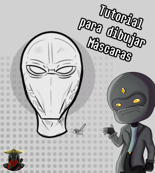
Hi everyone!. A couple of days ago I made a tweet asking if you would like me to show you the process of how I draw and what you would like me to show you. This tutorial was requested by @HenryTuiter.
Note: This tutorial is a front view as I want to talk about the different views later in other tutorials. If you would like to see more tutorials don’t forget to let me know.
————————————————————
Esp:
¡Hola a todos!. Hace un par de días atrás hice un tweet preguntándoles si les gustaría que les mostrara el proceso de como dibujo y que les gustaría que les enseñara. Este tutorial fue petición de @HenryTuiter.
Ojo: Este tutorial es de vista de frente ya que después les quiero hablar en otros tutoriales sobre las diferentes vistas. Si les gustaría ver más tutoriales no olviden comentármelo.
Eng:
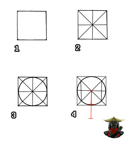
1-First we need to make the base of our mask using the head. I start with a square to make the head.
2- I draw diagonals looking for the center of the square and then I draw a cross that will serve as a guide.
3- We draw a circle using as a base the lines we made.
4- With the points of the diagonal lines that connect with the circle we draw two lines to give volume to the skull and with the height of half of the circle we draw the height of the jaw.
————————————————————
Esp:
1-Primero necesitamos hacer la base de nuestra máscara usando la cabeza. Empiezo con un cuadrado para hacer la cabeza.
2- Trazo diagonales buscando el centro del cuadrado y luego trazo una cruz que me servirá de guía
3- Dibujamos un circulo usando de base las lineas que hicimos.
4- Con los puntos de las líneas diagonales que conectan con el circulo dibujamos dos líneas para darle volumen al cráneo y con la altura de la mitad del circulo sacamos la altura de la quijada.
Eng:
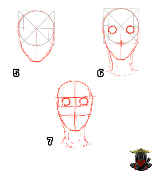
5-We trace the jaw with diagonal lines a little bit circular.
6- We place the nose, eyes and neck.
7- We erase the previous guides and put more guides in the sketch we made to have more exact references.
—————————————————————
Esp:
5-Trazamos la quijada con líneas diagonales un poco circulares.
6- Ubicamos la nariz, los ojos y el cuello
7- Borramos las guías anteriores y ponemos más guías en el esquema que hicimos para tener referencias mas exactas
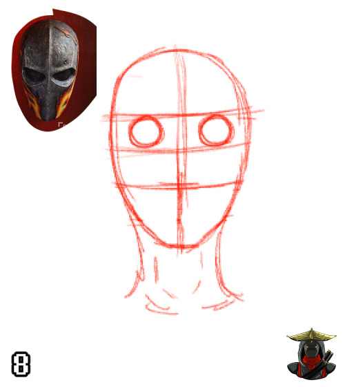

Eng:
8-I look for references of the mask I want to draw, in this case it will be a simple and not very detailed example mask from this tutorial. (The credit of the original reference goes to El Farandi)
—————————————————————
Esp:
8- Busco referencias de la máscara que quiero dibujar, en este caso será una máscara sencilla y no muy detallada de ejemplo de este tutorial. (El crédito de la referencia original es para El Farandi)
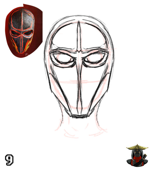
Eng:
9- We draw the basic volumes of the mask and we draw them on the base of the head that we already had.
Note: The mask is not completely attached to the face, so leave some space between the head and the mask.
————————————————————
Esp:
9- Sacamos los volúmenes básicos de la máscara y los dibujamos en la base de la cabeza que ya teníamos.
Ojo: La mascara no esta completamente pegada al rostro, por ese motivo se deja algo de espacio entre la cabeza y la máscara.
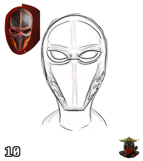
Eng:
10- Add the necessary details to our mask and correct it. Take as much time as you need in this part. I usually add more than 3 layers of details. For this tutorial because of the time issue I didn’t do it.
————————————————————
Esp:
10- Añadimos los detalles necesarios a nuestra máscara y vamos corrigiendo. Tomate el tiempo que necesites en esta parte. Yo por lo general agrego más de 3 capas de detalles. Para este tutorial por el tema del tiempo no lo hice.
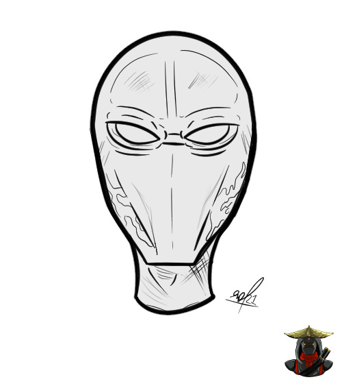
Eng:
We make a lineart adding even more detail and that’s it. Now we have our finished mask. I hope you liked this tutorial and if you would like to learn more things don’t forget to follow me and comment on my networks so I can keep an eye on you, thank you very much for watching!
—————————————————————
Esp:
Hacemos un lineart agregándole mas detalle aun y listo. Ya tenemos nuestra mascara terminada. Espero que les haya gustado este tutorial y si les gustaría aprender más cosas no olviden seguirme y comentarme por mis redes para que yo este pendiente. ¡Muchas gracias por ver!
62 notes
·
View notes
Note
uhm i'm really sorry if you've already answered this before but with the csp sale going on rn would you recommend csp pro or ex? (and also it's a one time purchase.... right?)
aaa it depends!! if youre getting it for pc, its a one-time purchase, but if youre getting it for ipad its unfortunately a yearly fee (but i think its like...25$ a year which is still very cheap)
ex has everything pro has!! but really you should only get ex if youre planning on animating, everything else can be done with just the pro version. i know some hardcore/professional comic creators use ex but tbh...you can make comics with the pro version too. theres just subtle feature differences between the two, off the top of my head, i think the stuff ex has that pro doesnt is:
- no frame time limit on animations, if youre into animating
- you can turn 3d models/backgrounds into “lineart” (but the 3d models are pretty limited so dont buy it just for that)
- i believe theres a “story/script” function for comics?? tbh i have the ex version just to see, and i dont use it, i just type things in manually
- theres also some webtoon functions if you use webtoon!! which i do, but again its not THAT useful. the most useful one for me is being able to export the webtoon chopped up into “pages” but there are websites you can use for free on that
all in all, if you never had csp before just start with the pro version!! it has all the same amazing features minus those few i mentioned above, so its a great bang for your buck. they have sales all the time, so you can always upgrade later if the pro ver is holding you back, but i dont think it will tbh
26 notes
·
View notes
Note
ur lineart -> BELOVEDDD
ACTUALLY I want to talk abt all the part sof my art so much here we go (I'll be cutting the urls up bcs I dont want this to show up in the search

THE HAIR the way I draw hair- with layers drawn on instead of just a solid mass, which is what I did before, is from ag ayan glerfish!! A lot of people do it but thats sepecifically where I got it from. Actually a LOT of things are from their style. Thats also why most of my art is transparent

primary color themes are from the same person!! Previously I had a warm color scene (took that from ye llogaz ello) which is why I lean towards a purpleish blue and a golden yellow

THE SHAPED PUPILS were from SOMEONE and I CANNOT for the life of me remember their username 😔✌️ HOWEVER the white pupils were an original idea! Obviously I'm not claiming to be the First to do that, but I wasn't specifically inspired by anyone

THE LINEART has multiple things to it- The thickness of it is from sol abee nd / po ntsa lind ! The way in which I color (in that I only color the lineart in the same color, but when two overlap I leave it blank) is from ver ymerr yma rt!! The colors I use, though (Esp. for around skin tones) were, once again, angl erfish person. I clearly had. a lot of influence gkfjfjs
mmmmm and I think the rest of it is just general learned experience!! =^>.<^=
8 notes
·
View notes
Photo


Prepare for Trouble, and Make it Double! [Team Rocket’s Jessie and James, Streetwear Ver.]
wasn’t sure whether or not to give james white pants or black pants hmm also the hard part about giving him a “modern” hairstyle is making him not look like butch though he’s ended up looking kinda like cyrus
i think this was a fun experiment! a little wonky looking but that’s all my art simple colours and shading, keeping it plain but im happy with these? i think it’s cute, more of a Generic Anime Look© i love team rocket so much they’re So Good™™™ i used the pencil brush on photoshop this time and man it really makes lineart a lot easier huh two backgrounds bc yall already i know im indecisive as hell with bg’s first one might make a fun print idk (ツ) anyway please enjoy
references for jessie:
luxury ball for mimikyu
snake tattoo for ekans/arbok/seviper man she loves snek
yanmega and dustox rings
zig zag on the hem of the jacket for wobbuffet
in hindsight i wish i had given her the egg necklace kjfsgkhfjkhj
references for james:
team rocket bottlecap from training daze
classic rose™
crossbones hair clips for koffing
chimecho earring and jacket zippers (he should be fine by now give him back)
keychains with yamask, victreebel, growlie and mareanie
#pokemon#pokemon fanart#pokeart#team rocket#team rocket fanart#team rocket trio#rocket dan#jessie and james#pokemon jessie#team rocket jessie#pokemon james#team rocket james#musashi and kojiro#ポケモン#ロケット団#ムサシと��ジロウ#modern au#streetwear#casual wear#street fashion#casual au
99 notes
·
View notes
Text
The 1000 And One GBA SP Special Editions
I was browsing through my issues of Pokèmon World yesterday and noticed that almost every copy published between the years 2003 and 2004 had at least one new Special Edition GBA SP to show. We're not talking about a few instances, either: Pokèmon World was a monthly subscription, so these special editions were indeed prolific.
When the GBA SP was released in February 2003, it was actually a big deal in the history of portable consoles; it was the first Game Boy to feature a rechargeable battery, implying a great energy and economic improvement, the screen was backlit, so it could be played anywhere without concerning about external light sources, and its folding design contributed to screen preservation (plus, I'm pretty sure the design of the DS was based on the SP). The GBA SP was also the last Nintendo portable console to be actually named Game Boy, as we all know the DS is just called Nintendo DS (seems a bit silly though... I don't find anyhing wrong with the name Game Boy DS). Personally, I owned both the classic GBA and the GBA SP; when the battery case of my classic GBA broke, I decided to switch to SP and never got back: this little jewel has been with me since probably the year 2004, still works perfectly nowadays, and up to this day I still play both GB and GBA titles on it.
The GBA SP was released at the beginning in three standard colours: Silver (AKA Platinum), Black (AKA Onyx/Graphite) and Dark Violet (AKA Cobalt) (the paints used are all opaque, but translucent with a slight “pearly” texture). The rest listed here are all special editions. I'll also try to be cronologically correct, but one can never tell. This could be a nice reference guide for further researches, or as a checklist for whoever is rich enough to collect them all. It'll be also subject to updates from time to time because who knows, maybe Pokèmon World actually missed a few of them in the way. Wikipedia has no complete list of this either, so I guess it's gonna be helpful.
BlastoiseMonster's Guide List For GBA SP Special Editions
- Tribal. Released worldwide as the first special edition of the console, this one is simply a Platinum SP with black, tribal tattoo designs printed on the case. - Pearl Blue. A worldwide special edition release sporting a light, sky blue case. A later edition got released with an even brighter backlit screen. - Pearl Pink. Primarly aimed at the female audience, this special edition is pearly pink. It’s the SP I have! Looking at it in real life, the pink is actually very subtle and leaning more to a silverish tone, which is a good thing. xP A later edition got released with an even brighter backlit screen. - Pearl Green. Special worldwide edition with a subtle, light green tone. A later version got released with an even brighter backlit screen. - Dual Tone Platinum/Onyx. One of the many variants that took advantage of the SP’s foldable design, this one has a black case for the screen and a silver one for the buttons. - Mario VS Donkey Kong. This one got released in bundle with the Mario VS Donkey Kong game: it’s red on the top, silver at the bottom and the upper case has Mario’s “M” logo printed on! - All Blacks. This one is a variant released in New Zealand only! It’s... well, all black, and the front case bears the All Blacks football team logo printed in white. - Classic NES. Aaah, the nostalgia! This cute American and European special edition is painted all over to look like a Nintendo Entertainment System. Its buttons are colored to emulate a NES controller, too! - Famicom (Ver.1). A japanese-only counterpart of Classic Nes edition, painted in white and crimson to emulate the good old Famicom colours, of course. Version 1 is mostly white with the bottom part (battery side) in dark red, with the buttons and screen border of the same colour. - Famicom (Ver.2). An updated version of the japanese Famicom special edition sports a white top and a dark red bottom, painted in gold on the button side to emulate a Fami controller. It war released in honour of the 20th anniversary of the beloved console. - Final Fantasy Tactics. This special edition was bundled with a Final Fantasy game and is of a milky, pearly white colour all over. - Gold. This golden special edition with a brighter screen was exclusively sold in “Toys R Us” stores of both Japan and North America. - China Dragon (iQue). When the GBA SP got released, China had very strict restrictions for game importing, so Nintendo had to release its games throughout the “iQue” brand: this special edition is available only through that brand and in fact bears such a logo on the front instead of the Nintendo one. It’s red coloured on the front, black on the back and sports a very nice black dragon design printed at the top! - Kingdom Hearts Deep Silver. This special variation bundled with a Kingdom Hearts game is silver on the outside cover and dark grey on the inside; it also bears a logo printed at the top and two graphics near the buttons. - Lime Green. Released in North America only, this SP was bundled with Donkey Kong Country (again? how many ports does this game have?) and has a very bright, acid green colour all over. - Naruto. Probably bundled with a Naruto game, this SP is bright orange all over with blue buttons and a white printed logo coming from the anime/manga. - Pokèmon Emerald: Rayquaza. Let’s start with the Pokèmon themed editions! This one is to celebrate the release of Pokèmon Emerald in Japan, and Pokèmon Center stores were the only ones to sell it: it’s emerald green with a silhouette of Rayquaza at the top. - Pokèmon Ruby: Groudon. Of course, Pokèmon Center had to celebrate each third gen Pokèmon release with a new SP! Ruby version is dark red with a close up of Groudon at the top, its eye stands out as it’s printed in yellow. Only 1000 were made! - Pokèmon Sapphire: Kyogre. Pokèmon center exlusive for Pokèmon Sapphire, it’s dark blue with a close up of Kyogre at the top, its eye stands out as it’s printed in yellow. Only 1000 were made! - Pokèmon Fire Red: Charizard. Luckily, some Pokèmon themed special editions got released worldwide, too, like this one for Pokèmon Fire Red: it’s in bright, light red (almost orange) with a white lineart of Charizard on the front and inside. - Pokèmon Leaf Green: Venusaur. Of course, even Leaf Green got it special edition. It’s in bright green (leading towards teal on the inside) with a white lineart of Venusaur on the front and inside. - Pikachu. This very fun worldwide special edition is completely in matte yellow plastic and has Pikachu’s muzzle printed on the top! The buttons are brown and a dark yellow silhouette of the electric mouse can be seen on the inside. - Torchic. Orange is Japan’s national colour, and to celebrate the 5th anniversary of Pokèmon Center, the japanese store chain released a bright, pearly orange SP with the silhouette of Torchic on the top. It’s hard to see in pictures, but the graphic is etched on the case rather than printed. - Rip Curl. A silvery white American and Japanese variant printed all over with the Rip Curl logo, both on the top and in the inside. - Rockman EXE. A japanese exclusive bundled with a Rockman (or, as we call it, Megaman!) game: it’s in bright electrric blue with sky blue buttons and yellow rubber protections above the screen. - Gundam G Generation. Another japanese exclusive, bundled with a Gundam game in bright red with a yellow logo printed on the top. - Swiss Gamer. A Switzerland exclusive! It’s crimson red with a white cross on the top, making it look like Switzerland’s national flag! - Sword Of Mana. This japanese exclusive bundled with the Sword Of Mana game is of a pearly, aqua blue shade. - Who Are YOU? This street art special variant got released in North America: it’s black all over and has a white logo on the front. - Zelda Edition. Probably one of the most famous and beautiful special editions after the Pokèmon ones, this worldwide-released SP is obviously made to celebrate the Legend Of Zelda franchise, bundled with the Minish Cap game; it’s gold painted (a far richer golden hue than the Toys R Us version, I must say!) and has a triforce logo printed at the top. 30 of these units were autographed by Shigeru Miyamoto and given away randomly as a secret prize for the lucky ones who decided to preorder the game! - Samus Satin. The players in Europe, North America or Japan who wanted a special refurbish for their SP could send their own units to the Nintendo headquarters to get it back with this variation; basically, Club Nintendo subscribers could pay 600 points and have their console completely renewed in bright red at the top and orange at the bottom, just like Samus’ space armor.
There’s 34 editions in total, which is indeed an impressive amount! And seeing them all together is quite a show!
0 notes