#i finally learned how to actually use photoshop assets ^_^
Explore tagged Tumblr posts
Text
fuck it censored version of the show poster i just mocked up for jc bc i am stupid proud of it
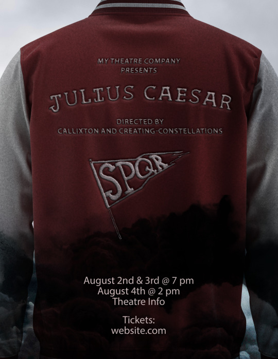
#coming to a theatre (not near you) soon!!!#i finally learned how to actually use photoshop assets ^_^#ted talks#jc concept
23 notes
·
View notes
Text
Making a Compass
To help me recall the controls for Maya and learn how to properly texture an asset, I have created a compass that using several tools that Maya provides and have textured it using Photoshop. To begin, I started with a cylinder for the main body of the compass.

Next is then shortening the cylinder so that its actually the same height as what a compass would actually be.

We can then select the faces on the top of the compass by going into face mode and shift + double clicking to select all of the faces on a side.

We can then use the extrude tool to create an indent in the centre of the cylinder for where the compass rose will go. By using a slight offset (0.1) makes it so that the indent is further into the compass. Making the thickness a small negative number (-0.1 in this case) we can create a small indent into the compass.

Now we select the faces again and extrude once more with a higher offset (0.8) and a positive thickness (0.1) to create the pin in the centre of the compass.


Next is beveling the pin so that its rounded rather than being a sharp cylinder. This is done by selecting all of the edges at the top of the small cylinder and using the bevel tool. The more segments there are means the rounder the object and the fraction means the steeper the curve.

I also added small bevel to the top and bottom edges of my compass' body so that the body itself wasn't as sharp.

Now we need to add the top of the compass by selecting the two faces at the top of the compass and extruding them. When doing this, make sure you use W to make the extrusion come out straight rather than angled.

We can then also bevel the two edges of the extrusion to make it smoother.

Next is then adding the small fob at the top of the compass by adding a small cylinder and rotating it to be 90 degrees.

We then use the multi-cut tool (use CTRL + shift for this) to cute a line at 20%.

We can now select the new faces and extrude them to shape the fob into the correct form.

Next is combining all of the different shapes by shift clicking all of them and using a Boolean. We can then use the union option to create a mesh using all of the shapes combined.

We can then use the clear history feature to make the combined shape the default.

We can now make the needle of the compass by taking a cube and shaping it.

First, we use the multi-cut tool again to cut 50% both horizontally and vertically before cutting both sides by 30%.

Next is selecting both edges at the sides and using the scale tool to drag them out into points.

Then we select the 3 side cuts on both sides to move them inwards.

This then makes a needle for our compass.

The final shape we need is the ring of the compass which can be made using a Taurus.

To edit the thickness of the Taurus, we need to use the PolyTaurus tab in the attribute editor and edit the section radius (0.1).

The Taurus should now look like this.

We can now assemble the compass fully by moving the Taurus and the needle into their respective places and using the union Boolean tool again.

0 notes
Text
Critical Appraisal
What is my final outcome?
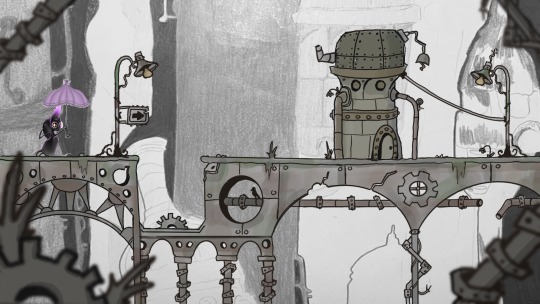
My final outcome for this project is a finalized 2D character for a collaborative games design brief, in which we have made a playable platform game, named “Shadow and the Magic Umbrella”. The story behind the character is supported by the idea that it must hide from the light to get to the end point of the game. The environment in which it travels gradually turns from being an abandoned, mechanical factory setting to a wild, overgrown forest, as the levels progress. The prop held by the character is a steam-punk style umbrella, which the shadow has found along the way, once belonging to a human. It uses this object to hide itself from the sporadic light shining through the shrouded area, as well as to help it float above obstacles. The tapered end of the shadow’s head emits a purple glow, signifying a magical element, as well has having connotations of mystery, power and ambition.
What went well?
I think that overall, the artwork came out effectively for this project, and we were all able to come up with successful assets as a team. I was particularly happy with the moth NPC character I created, following the brief I was given from the games design students. This was a fairly niche concept to have to create artwork for, but with some referencing and research, I was able to produce an interesting design, along with a sprite sheet for the animation. I think that we communicated effectively as a team to produce all the elements we needed for the game to be complete, despite some issues with timing at the start. The design students were helpful in their putting across of ideas to us in the thought generation stage and we felt confident in what we were making. Collaborating was a key part of this project, and I feel that we did this sufficiently which ultimately led to our success as a team in the end.
What did I struggle with?
The part of the project that I struggled with the most was definitely the frame-by-frame animation part of character creation. I struggled to grasp how I might go about altering the character frames into a sequence that worked when put together to suggest movement. I wasn’t sure how the character would actually move or get around the scene, given it’s fluid structure and mainly due to the fact that I had never tried to animate a character before – I was going into this hugely un-equipped for success. After some turmoil, I gradually started making progress by duplicating character frames, erasing and altering certain parts in order to change the pose each time. As I was doing this from scratch each time, I had no idea how this would look in the end. Luckily the animation that I produced did work effectively and the rest of my team were happy with what I had made.
What would I do differently next time?
If I were to do this again, I would have put more research into how I could have animated my characters more effectively. Since completing the project, I have learnt how to use the Timeline tab in Photoshop, which aids frame-by-frame animation. When I did my frames, I didn’t have the “onion skin” layer from the previous frame to help me, or any real guideline. I think that if I had taken less time on this part of the artwork creation, I could’ve had more time to possibly help my teammates with other parts of the asset list necessary for gameplay. Further on this, something I would have done differently is make more frames for the animation, thus making a more fluid and seamless loop. This would have made the movement seem far more realistic and powerful for the player, and ultimately more immersive. Despite this, I think that the rough, sketchy style of the artwork is charming and adds to the stylistic nature of the overall outcome.
What did I learn from this project?
Undertaking this project taught me a great deal about creative collaboration. This was my first time working with a group of other students to produce a fully realized digital game – it was also my first time working with students from another pathway. It was important for me to learn the value of timekeeping and to have certain elements ready for the team by a deadline so that it could be used in production. I felt that it thrust us all into an environment where we had to communicate sufficiently, otherwise the work would suffer greatly. We were all able to voice our opinions on how the project was going, things we would like to change, and setting the pace for workflow. I think that we all rose to the occasion and were ultimately successful in this project. It goes without saying that I learnt valuable skills about 2D animation, and the steps required to execute this – I look forward to using the skills I have learnt throughout the Professional Practices unit in my future work.
0 notes
Text
System76 Spotlight with Adam Balla

Welcome to the first of an ongoing series where we get to know some of the amazing people behind System76! This week, we kick things off with one of our newest members, Adam Balla (AKA chzbacon), who has just joined the Marketing Team as our Content Producer. Learn what makes his content creation heart go pitter-patter, and why his electric smoker is his must-have cooking appliance.
When did you first become interested in Linux computer systems?
When my roommate introduced me to Slackware in 1999, he was working as a Linux system admin and he really got me interested in Linux. I was going to the Art Institute of Houston at the time for a Multimedia Design degree, and the thought that you could create your own desktop operating system really appealed to me. I didn’t need to stare at the same old tacky operating system I’d used for years.
I found myself, like many nerds of the era, at a Micro Center in the early 2000s rummaging through the discount software bins, trying to snag up multi-CD Linux distributions. This journey exposed me to several of today’s most popular Linux distros. One of those was SUSE Linux 5.3, of which I still keep the tattered book on a bookshelf as a reminder. I did however finally find my place in the world of Debian, which is where I essentially live today. Honestly not much has really changed other than using Pop!_OS as my main distribution—though like any Linux diehard, I still love to download, test, and sometimes install all the Linux.
When did you start becoming a champion for open source hardware and software?
It was a few years after that. Once I got back from the Art Institute and I was working in the area, we needed a server for the screen printing shop that I worked at. Knowing about Linux at that point, I was able to set up a server using consumer-grade gear that we could store all of our artwork and assets on. Moving forward, I set up a server for the newspaper that I worked at for a decade, which I know is still running to this day. After using Linux in that sort of environment and knowing it was good enough for a business, I knew it was good enough for me and my needs.
How did you get involved in content creation as a career?
My father was an engineer. When I was young I was always, like most kids, into drawing cars and doodles and cartoons, but I was used to having a drafting table at the house. Computing came around, and my father bought an IBM 486 and one of the original digitizing tablets, and so I got to play around with that. Eventually, he got upset because I was on the computer more than he was, so he bought me an IBM 386 to use.
Around 1995, my dad learned from a coworker about Photoshop. I begged him to get me a copy, and he finally did for Christmas. That’s when I started playing around in Photoshop and really fell into wanting to create for a living. Similar to what my father does, but maybe not as stringent in the decision that I make—no building is going to fall down from my creative process.
And that’s how I got into the whole content creation piece. I created a cover for the album of my high school bands and then started doing work for more local bands. Back then, there were no digital art courses, so I learned a lot by doing and trial/error.
What is your favorite part of the creative process?
Working together as a team during the initial brainstorming process. Going through all of the ideas and details, sometimes writing them down, sometimes not, and even laughing at myself at how ridiculous an idea may sound. I love the process of the very first step. I love to set the vision for the project work from there to turn that vision into reality.
How did you first learn about System76?
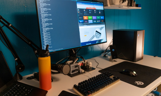
I first learned about System76 through Chris Fisher and Jupiter Broadcasting. I believe they were reviewing the Leopard Extreme in 2012, on what at that time was the Linux Action Show. That’s when I started to look at System 76 and their offerings and wondered if it would be better for me to build my own Linux desktop, or adopt something and support the open source community. It’s been a little while since then, and I’ve always kept my eye on System76. Then with the release of Thelio, that really pushed me to the point of, “Wow, these guys are creating their own beautiful custom chassis and they’re incorporating different materials together. What a beautiful machine.”
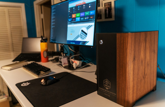
I was speaking to my wife (financial advisor) about purchasing one in 2019, and I spoke to Emma and some other people at System76 about my desire for one, and I don’t know how, but Emma encouraged me not to buy one! And then I was given the opportunity to come to System76 for the Superfan event, where I was fortunate enough to be one of a dozen people who were gifted a Thelio desktop. It sits on my desk to this day; I even bought a larger desk just so I could put it up there and see it every day. I really appreciate the humble beginnings of System76, and I’m so glad to finally be a part of this amazing team.
Let's get into that creative brain. What is your favorite viral video and/or ad, and why do you love it so much?
I have a few ads that I like. I’ve always liked Honda’s messaging and their ads.
I like these ads because of the way in which they go through their history and lineage and the way that Honda itself has marketed its products as “People First” products—very similar to when they introduced their motorcycles to the US with their “You meet the nicest people on a Honda,” campaign. I think that was in 1962, so this was during the height of the motorcycle gang craze. Then comes this little Japanese motorcycle company and markets their products in a completely opposite image from the rest of the industry. They dared to be different and it paid off for them. Selling over 100 million Honda Cubs since 1958. Being given the title of most produced motor vehicle in the world.
This may come as a surprise to some, but I also really love the original Orwellian-inspired Macintosh commercial, which only aired once during the 1984 Super Bowl. Created by Steve Hayden, Brent Thomas and Lee Clow. In my opinion, these guys really created disruptive advertising, so much so that the ad still resonates today as much as it did then. While I don’t think you need to incite fear to sell a product, it showed that Apple dared to be different.
I’m not sure what constitutes a viral video these days. I’m not sure if it’s having a billion trillion views or just simply infecting one person who saw your video. One that always gives me a chuckle has to be “News Anchor Laughs At Worst Police Sketch Fail”. The honesty on the anchor's face makes me lose it every time.
When you’re not helping to lead the Open Source revolution, what do you like to do with your free time?
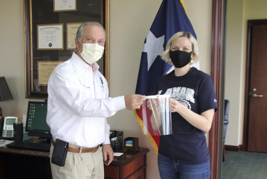
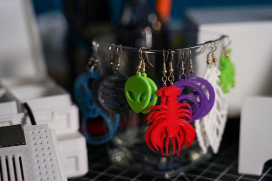
I really like going on walks and taking photos. Photography to me is one of the last honest art forms. What you see really is what you get. I love to tinker and make things, I have a 3D printer that my wife and I purchased as a joint valentine’s gift to each other last year. We started using it right when COVID broke out, so we made around 900 face shields which we distributed to schools, day cares, dentist's offices, anyone who needed one. That’s what we did for about the first 6 months when we first got it. Now, my wife loves to print earrings, for example, and I like to build different fun electronics projects.
I also love to cook, especially for large groups. I just got done with an Easter Weekend + Birthday celebration where we cooked 100 lbs of crawfish, 10 lbs of pork shoulder, sausage, and boudin (which is basically rice and pieces of pork that have been mixed together with seasonings and then put into a casing like sausage). One of my main requirements actually for a place in Denver is somewhere I can bring my electric smoker. It’s a must-have for any Texan.

What are you most excited about with your new role here at System76? To help change the computing landscape as we know it today. Into a future where technology is free and open. A world where you're encouraged to break things, fix things, and learn how they work. Aside from changing the world and stuff, I'm really excited to have a chance to work with such an insanely talented group of people.
#system76#open source#content#content creation#linux#hardware#software#firmware#laptops#desktops#servers#Thelio#Pop!_OS#Launch#Adam Balla#chzbacon#Jupiter Broadcasting#meat#nerd#covid 19#Ubuntu#Debian#SUSE#engineering#design#STEM#3d printing#creative#Denver#Texas
9 notes
·
View notes
Photo
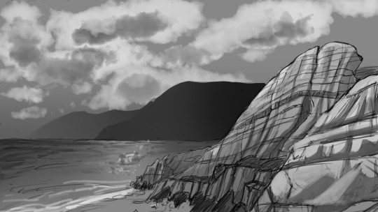
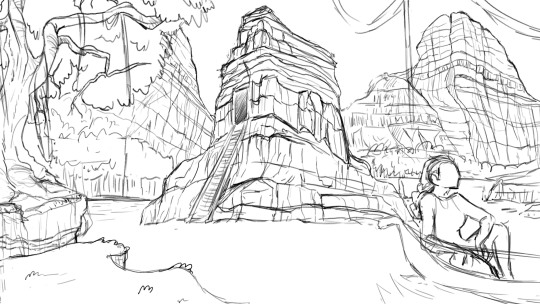
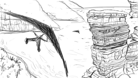
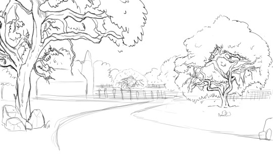
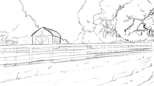
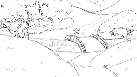
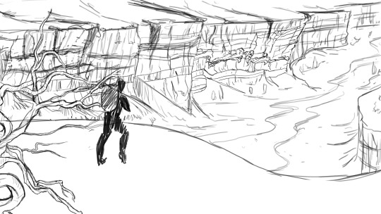
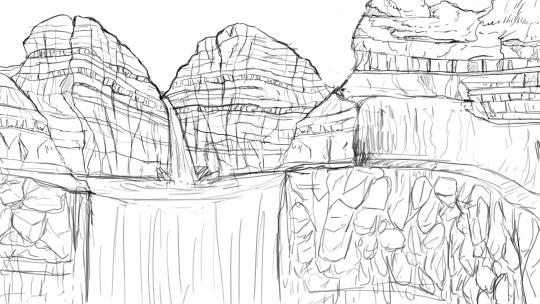
Digital Drawing
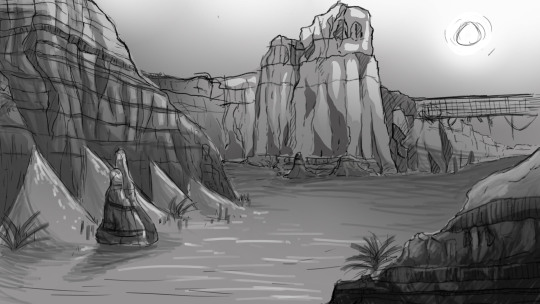
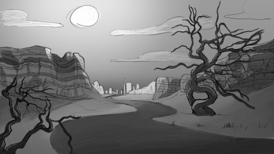
Assignment: Composition/Thumbnail sketch
Medium: Photoshop
At last, The year is 2020 (before a certain pandemic) and I have finally found two classes that are focused around illustration and visual arts. How to plan, how to story tell, how to ACTUALLY use a medium. I was loving both of my art classes and I finally felt like the tuition was worth it. The worst thing is that the two classes from this year weren’t explicitly stated to count for my degree. So I had no idea There were classes that actually interested me until my advisor sent an email that was like, yo btw, we have more than a couple of art classes.
This first assignment focused around a quick and easy way to compose a composition. We gathered a few stock images of trees and rocks to use as reference. And reference came into play a lot in this class for obvious reasons. We made a sort of library of trees and rocks that we sketched out and we had to use those assets to create a nice composition, 10 in total. The three we liked the best would be rendered in grayscale, paying close attention to contrast. You want to be able to see the composition from any resolution.
For this assignment, we actually learned how to use tools in photoshop to our advantage. and what you could to to make one image look like something completely different.
Also, note that this process is far from your finished image, it’s just a way to think about what composition you are going for and what kind of lighting you want. Overall very helpful.
6 notes
·
View notes
Photo
Welcome to part two of our interview series, pixies! Today, we’re presenting our interview with four of the flaptastic people who make this rewrite possible. They had a lot to say, so this post is rather long - keep reading to see the full interviews!
Our first two Game Creator interviews feature two of our beloved artists - Rachel and Ci.
How did you first find out about the WTP project, and what inspired you to start working as an artist?
Rachel: In a computer graphics class I took last semester, one of our projects reminded me and my friend of Pixie Hollow, so we were reminiscing about the game and I really wanted to see if there was a rewritten version of it. When I found WTP and saw they were accepting artist applications, I was super excited because I loved the game and was starting to get into animation at the time as well. I also just adore the process of game development in general, so I was thrilled to become a part of WTP.
Ci was introduced to the project by a friend who’s also a staff member!
What is your favorite part of your job as a WTP artist?
Rachel: My favorite part is being able to contribute my work to a bigger project. Seeing the art I worked on in the game is really exciting to me. Just knowing that the work you put in is helping to further the game is really cool. As for my favorite thing to work on, it’s really strange, but I enjoy creating the UI buttons and signs for different meadows or shops.They’re super small and no one really pays attention to them, but they’re also extremely necessary so I guess I just like to make them, haha. They don’t always take too long to make but I think they’re cute. Also, I’m especially excited for all the new meadows, as I really enjoy helping to restore the beautiful art for the meadows.
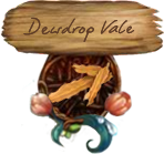
Check out this gorgeous sign that Rachel restored for one of our meadow teleporters!
Ci: My favorite piece of art that I’ve created for WTP was probably a background I restored for a general winter theme/season back when I first joined. It’s not being used right now, but it’s pretty and you’ll just have to take my word for it :’)
How long does it take for you to work on art for WTP, and how do you fit that in your schedule?
Rachel: The time it takes really depends on how much of the project we have completed already. Oftentimes we’ll be working collaboratively and finish what other people have started. So if we are working on something from scratch it can take quite a while, but sometimes it’s just a matter of adding finishing touches and compiling pieces together to create a finished product. And each task takes a different amount of time. For instance, resizing something small will take a few minutes, but creating an atlas for fairy clothing can take hours, especially when you need to restore an item from scratch. Either way, I think it’s still beneficial for us to take our time to create the best product we can. Personally, I don’t always get to work everyday, but when I do, I’ll spend hours because I like to finish tasks in one sitting if I can, although I can’t always haha. I think that working in moderation is always a good idea as long as you’re getting your work done, and knowing we have so many fans really pushes me to get tasks done and do them well. As for fitting it into my schedule, because of quarantine, I definitely have a lot more time to work on WTP, but during the school semester I would have to plan out what I needed to get done and when I needed to do it in order make sure I could get all of my school projects and WTP work done on certain days in order to avoid as much stress as possible.
Ci: I don’t have time to work on artwork daily, but I do try to stay on top of what other people are working on, so a small chunk of my day is dedicated to discord. Sometimes I’ll be busy for weeks and do a whole bunch of tasks afterwards in one go, and sometimes I try to take on smaller things (pre-corona I’d sometimes spend time between lectures because that’s often the only time I have!). Some tasks are 5 minute jobs, like UI, but others, like adding clothing, take a few hours. Backgrounds probably take me the longest. A couple hours for a few days, if I have time to work on them daily. They’re really fun when starting!! but after day 3 it’s quite the grind. I like to sleep on those, since there’s so much detail in the PH backgrounds that I’ll inevitably miss something.
Rachel, you mentioned atlases and spritesheets - can you explain what they are and how you use them?
Rachel: An atlas and spritesheet contains all of the different variations of a clothing item or anything you can change on the fairy. So for instance, the hair atlas has all of the different types of hair you can choose when creating your fairy packed into one single file. So in order to make one you have to create all the hair pieces, position them correctly on a fairy reference, export each hair image, and then combine them all onto the atlas file. Then a json file is also created to describe where each image is in the file in order to use it in the game. The spritesheet is similar and is basically a horizontal version of the atlas with all of the images that we use in CAF to scroll through whatever you’re changing.
Do you start the graphics by hand or via some digital web design program?
Rachel: I almost always use digital programs. Sometimes I’ll plan something out quickly on paper but most of the time I’ll use Photoshop. We also use DragonBones for animation.
Ci: All of the research we do is online, so it saves a couple of steps and retains image quality to just keep everything digital. I also don’t have a scanner :’)
And finally, what’s the most challenging piece of art that you’ve made for WTP?
Rachel: The most challenging piece that I’ve done for WTP was probably the hair atlas for when a player creates a fairy because it was the first project I was taking on. All the hair was made already, I just had to resize, reposition, and fix any pieces that were lower quality, and although it was daunting at first, once I started, I was able to get the hang of it (even if it took a few tries), and now I’m super happy I learned how to do it.
Ci: We were missing a whole area of the CAF background (the part that shows up when you’re picking a name) that got passed around for one or two months, and eventually I got to work on it. It was the closest to a custom piece of art that I’ve made for WTP; the middle was a giant blur when I got to it. My motivation to complete it was honestly just being able to get it off the to-do list forever, when I was done I posted a before and after to the staff chat (which I try not to do bc it’s not really productive) because I was so excited about it :’))
__________________
We had so much fun learning more about our artists’ jobs! Next up, we decided to sit down with WTP game developer and administrator Teresa!
How did you first find out about the WTP project, and what inspired you to start working as a developer?
Teresa: A friend I made in the Pixie Hollow community said that her favorite mini game was Bubble Bounce, so I decided to make it for her. I had started prototyping and showing it around, and someone from WTP saw my work and invited me to join the team.
As we know, WTP is a voluntary project. How do you fit working on WTP into your schedule?
Teresa: I’m actually quite good at time management, and I’ve decided to make WTP a priority. That means that I can’t always say ‘yes’ to other things I want to do, but that’s ok.
What are some of the main things you look for when adding staff members?
Teresa: You need to be able to take criticism well and communicate effectively. A certain level of quality needs to be maintained to build a good game, and criticism sheds light on any blind spots you may have. If you aren’t communicating clearly and frequently, then your value to the team is very low – everyone needs to be on the same page so that work doesn’t get redone and wasted, and to keep an accurate development schedule. Being willing to devote more than a couple of hours a week is also a major plus.
How do you decide which parts of the game you should work on first?
Teresa: There’s this concept called the Minimum Viable Product. Basically, you just strip the project down to what is necessary and work out the kinks. Then you can add new features that enhance the gameplay.
What’s the most challenging issue you’ve faced while creating the game?
Teresa: There was a problem with the animation plugin that I was hoping would be fixed by the maintainers before the demo release. It was a really big deal, the game would be entirely unplayable. At the last minute, I had to dig into the plugins source code and figure it out myself. In the end, it wasn’t actually so difficult – but boy was it stressful. Really I would say that the biggest problems have stemmed from not having enough artists on the team! There have been multiple times where we had to delay updates because we didn’t have all of the assets ready for me to use in the game.
How do you go about fixing a game bug?
Teresa: Gather all the info I can from users experiencing the bug, and try to reproduce it. Just observing the behavior is often enough to figure out the problem. When it’s not, check the logs or step through with the debugger.
Have you ever worked on or made a game before WTP?
Teresa: I’ve worked a bit on some 3D open source game projects, never worked on the multiplayer parts before, though. I also make mods for games.
Lastly, what are your favorite and most rewarding parts of being a game developer?
Teresa: Pushing the boundaries of my knowledge and comfort zone, definitely. As a developer, I’ve learned a lot of new technologies and some new domains specifically for WTP. I also find being able to fix things that I don’t like about games very rewarding. Being an administrator has benefitted me as well. As an admin, I’ve had to cultivate skills in team leadership and project management.
__________________
Finally, we interviewed Lavender Merryheart, our sound designer.
First off, how did you first find out about the WTP project?
Lavender: I found WTP from a Youtube video, and played the demo. I was excited to be able to re-visit PH and when I saw the audio designer application, I wanted to help out however I could!
Are you remaking the music from scratch based on any remaining audio from sources like youtube?
Lavender: Both! We salvage what we can, and re-create what’s needed if. In the future, there will be some new, original music too! When we need a sound effect or music, we first check to see if there’s a good quality clip preserved of the original. It needs to be clear and without extra background sounds. If we can’t find any, then I will dissect the sound or song and try to figure out how it was made, then recreate it.
You mentioned that you make new sounds if needed, how do you go about making them?
Lavender: New sound effects are made by piecing different recordings together, such as the audio you hear when you click the talent orbs, which was re-made from the sounds of a heavy book shutting and wind chimes. If we need to remake a song, I make a new track by re-recording each instrument’s part on a midi keyboard. Then it will be edited it in Logic Pro X, using instruments and synths from the Kontakt audio library.
What’s the part of being an audio designer that you’re most excited about?
Lavender: I’m most excited about getting to write new music for the game! I can’t reveal to you what it’s going to be used for yet, but in the process for the last WTP track I wrote, I thought about how to represent the area it will be used for and what instruments and mood would suit it the best. It was a lot of fun to try to both express my style and also give it that Pixie-Hollow-sound!
Finally, how do you fit working on WTP into your schedule?
Lavender: I keep a to-do list and project notes to help organize what needs to be done, and work on WTP between class assignments. To refrain from burning out, I try to spread out my different tasks and work on a variety of things.
__________________
After we learned about what goes on behind the scenes on WTP, we wanted to learn a little bit about some future plans and hopes the staff have for the game.
Art wise, what sorts of things will be designed from scratch in the future?
Rachel: Although we still have a long way to go before creating our own work as we have to replicate what was in the original game first, I believe that new clothing and hair might be designed from scratch in the future.
Ci: Right now, we’re still committed to restoring the game in its original form–this means that we try not to design anything from scratch. We’ve discussed the possibility of custom content in the future (items + clothing, pets, meadows, maybe even minigames?), and when the time comes, all of that will be built from scratch. That said, pertaining to the look and feel of the original pixie hollow will be a priority for those updates too.
What game feature from Pixie Hollow are you most excited to have?
Teresa: Personally, I am excited for the skill system and wilderness! We have some new ideas to try out, but I don’t want to spoil anything.
Do you plan to have seasonal differences and events, as well as competitions and activities?
Teresa: Yep! Can’t wait! We are already featuring player’s outfits in the shop catalogue, so that’s sort of a mini fashion spotlight, but there’s definitely more exciting things to come. Fashion spotlight was one of the most beloved competitions/events in the original Pixie Hollow!
In the future, will the game be available for mobile and/or consoles?
Teresa: You can already play WTP on mobile! At some point we will have options that allow the game to run smoother on mobile devices. Console versions won’t be a thing, though.
Is there anything that was in the original Pixie Hollow that you’d like to change in WTP?
Lavender: I would change the whisper noise it made when you got a message, it got a bit annoying. And it would be really neat if you could choose from a few different songs to have played in your fairy’s home depending on your mood! I had the ice themed house and have heard the music a few too many times!
Teresa: There are things I want to tweak, and fully plan to! We have already added a couple of small new things, such as the second sitting pose and featuring real player’s outfits in the shop catalogue. I hope everyone enjoys them!
The last thing we wanted to talk about is the staff’s personal feelings about WTP and about their jobs, as well as ask them about their inspiration.
Is there anything new that working on WTP has teached you?
Rachel: As an artist here I am definitely learning new technical skills and developing as an artist in general. Some examples of art skills I’ve been able to develop include creating atlases and spritesheets for fairy clothing and hair, getting familiar with DragonBones as I’d never used it for animation, and just gaining more experience in Photoshop. And I basically just learned all these things by trying them out and asking questions if I needed help.
Lavender: Through WTP I’ve learned more about creating sound effects, because when remaking the old sounds for WTP, I really have to think about what each one is made out of (for example, the pouch sound was re-created using a paper bag rustling, leaves crunching, and a bell synth).
How do you feel about the community growing so much in a short amount of time?
Teresa: I really didn’t expect it, and it has been a bit stressful, but I hope we are handling it well. I would never have imagined that a TikTok would be the reason either! Having more eyes on us makes me feel restless. We had to adapt the discord server to keep it safe and make information more accessible to new members.
What do you remember about Pixie Hollow? And did it change your life in any way?
Lavender: I joined right at the beginning, and loved how it really felt like you were stepping into a different, magical world. My favorite thing to do was decorating and creating/collecting items for my house, as well as the minigames and item crafting/ baking, I’m most excited to see these features again! Also, a good memory from the game I have is going to the summer pool party in the ballroom, and playing games in the tearoom with friends! The music in Pixie Hollow was one of my earliest inspirations for pursuing a career in film/game scoring. Currently I am studying for a degree in film/game scoring! I’m obsessed with fantasy games, nature, fairy tales, magic, and mythology, and I write music to try and illustrate the stories and have the listener feel like they’re visiting the scene. You can hear some of my original music on Spotify under the name June Westfield!
Rachel: I was so young that I have trouble remembering everything. I do remember sometimes getting on the phone with my friends and talking as we played together and explored meadows, which was really fun. I also really enjoyed completing tasks and playing the minigames. I have no idea why that was so fun to me, but I just liked getting achievements and beating my scores.
Do you feel like some people may have unrealistic expectations for WTP? And do you think it can ever be as big as Pixie Hollow was?
Teresa: Yes, but I can’t blame them. So far I am the only developer to have actually worked on this game, so it’s a lot of pressure, but of course the players can’t know that. For some reason the things that everyone thinks will be the easiest to code are always the more difficult ones, funnily enough. For example, a flying mechanic like the original game is sort of complex, whereas adding new meadows is extremely simple. Do I think WTP will ever be as big as PH? Definitely not. Pixie Hollow had millions of players, Disney advertised it, and it had a full development team behind it. A lot of the original players will have moved on. I’m actually surprised that so many people have found us already!
Are there any artists that you look up to or are inspired by?
Rachel: I don’t have anyone specific in mind who I look up to, but I do watch a lot of cartoons and really admire animation and all of the work that goes into it. I get really inspired seeing different animated works and am super impressed by the entire process of it.
Ci: I used to actively make art outside of WTP and definitely had a whole list of people whose styles I looked up to, but now that I’ve moved away from that I mostly remember individual pieces. I had to dig some up for this question! loish, gawki, and Hethe Srodawa, are a few.
Lavender: Some composers that inspire me are Enya, Faun, Loreena McKennitt, and Secret Garden. They are all fantasy/new age genre artists that create enchanting music!
The WTP community is a great place to make friends! Is there a person in the staff that you’ve formed a strong friendship with?
Rachel: I’ve definitely become a lot closer with many of the staff members, whether it be looking up to certain people like our team leads, chatting with the other artists in DMs and helping each other out, or just having fun conversations with all the other staff members and sharing funny stories and pictures.
Teresa: Asteria is probably the best friend I’ve made at WTP, as we have talked the most. I have also met Kass in real life – she’s the sweetest! I love everyone on our team.
(Kass is one of our moderators - we’ll hear from her in the final interview post!)
And finally, What does working on a game that’s so loved by people mean to you?
Teresa: It is so heartwarming to be a part of something that brings people joy and makes them nostalgic. Pixie Hollow’s fan base can make me a bit anxious at times. Sometimes a group of players will want one thing, and then another group wants the exact opposite and it can be hard to make a choice. There’s a lot of pressure in trying to stay true to the original game’s vision while also being fresh, but it drives me to deliver the best work I can. I put a lot of time into WTP, and have actually burnt out a few times already. Luckily, I love building things so much that it never lasts long.
________________
Next up in our interview series - our social media team and server moderators! Stay tuned to hear their answers to some of your questions.
16 notes
·
View notes
Text
Hakuoki Reimeiroku Saito Final Chapter
have i ever mentioned how i’m a masochist when it comes to this stuff? like, i will freely admit how i actually don’t like translating and doing more unnecessary work, but I when I do something for myself, I tend to want a certain degree of quality.... which is why i decided i’d do some video editing for this... a decision that I really regret now though i can say that it’s something that i know hate more than photoshop lol.
after i finished my yuugiroku 2 vid, i figured i might as well try to install Visual Novel Reader to see if that could offer me better visual and audio quality for this... but before I finished installing it, I went and checked what videos were available that I could use for assets and found a video made through vnr had about the same audio quality as to ppsspp... along with videos from someone other psp emulated version of this... which i then clipped for audio.
between visual and audio quality... i’ll pick audio any day so after deciding that i’d be using some of the less grainy audio i found along with my ppsspp footage... i set to work trying to layer the tracks.... but since the audio didn’t match the visuals’ timing, I had to manually cut pieces of my screencap video up so that it matched the audio timing, while also making sure that the visuals looked like they were still continuous (damn circle icon which wouldn’t go away and caused problems)... on top of which, i had to deal with removing a number of random black screens that would just flash on screen for less than a second when i ran reimeiroku through the ppsspp emulator.... then i also had to find the song that plays towards the ending of this cuz the audio i had cut before the end of my screencap vid which was also a pain because i couldn’t find the damn thing anywhere on youtube so i had to go find the game rip audio (thankfully i have a site for that. also in the game, that song doesn’t naturally fade out and i manually added in that effect cuz i felt like it and thought it was better than the audio just cutting off) so i could put that in and align it so that track matched the audio timing for the vita audio track.... and then i also had to do something about the interval where i had to increase and decrease volume since the end kept sounding off no matter what i did....tho i kinda think the video still sounds off in 2 places.
once i got all the damn visuals and text properly lined up, i gave up on having to deal with the the stupid circle icon in that was originally in the bottom right hand corner since i got pissed enough seeing it and cuz it was no longer continuously in motion so I decided to remove it entirely along with the auto-play icon (at this point im on about version 10 of the video).
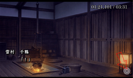
then, to cover up the right side of the video, i figured that’d i’d just stuck up an image over top of that section.... but after several tries i gave up on that since every damn picture i imported regardless if that was a screenshot of the game or a screen capture of the video from the editing software itself, nothing would match the colour of the text box for some infuriating reason... which ultimately led to me redoing everything so i didn’t have the stupid text box then stringing together clips between those stupid bouncing icons to erase the damn thing entirely though i thankfully didn’t worry about the auto-play icon the second time around....
however, doing that in itself posed a whole new problem since what i could effectively clip was less than >0.5 seconds each time to create cropped video layers that would hide that stupid icon, and my comp reaaaaaallllly started to issues when i did more of this and when i copied and pasted too many of those millisecond clips together... it got to the point where i was waiting 15 minutes for about 4 seconds of copied hide-the-damn-icon-video-clips (or about 8 hours for 40 seconds worth)... which pretty much crippled my computer.....
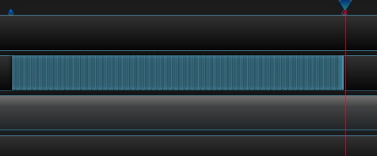
this resulted in me having insane amounts of segments that looked entirely like this^, which occurred whenever there was an icon to hide... or text shake for some reason.... which caused me to create +20 openshot files for editing...(btw this is 138 tiny clips over the span of 6 seconds)
in the end, over the course of a fucking month, which i can honestly say that me finishing this for today was a complete coincidence (i barely managed to finish Warframe’s Scarlet Spear event cuz of how bad this was lol), i lost count of many versions of this video I made sometime after I reached version #32, openshot crashed on me at least 15 times (gave up counting that too), and my laptop crashed twice....
after i finally finished my video, i thankfully didn’t spend that long on subtitles but it took me far longer than i’d have liked to get the damn positioning right since potplayer is annoying when it comes to single lines and i had to guess and check the positioning almost every other time for some strange reason whenever i had a single line... which was never a problem when i had 2 or 3 lines of text... but editing was a slight hassle cuz i wanted the text used to be as accurate as possible... and i checked 3 reimeiroku tls of this chapter and the JP mtl of a bunch of sentences just to be sure.
anyway, thanks to doing all of this unnecessary torture, i am absolutely never going to ever be repeating this experience ever again even if someone pays me because video editing is a serous pain in the ass and I hate it more than photoshop (also why the hell does ppsspp have so many issues with reimeiroku when compared to yuugiroku 2)!!!
also, learned my lesson and didn’t write this post this after staying awake til an ungodly hour lol. my attention to basic grammar plummets like a rock if i stay up past 4 am.... so i decided to write out all my grievances beforehand.... and put my video for this at the very bottom cuz im terrible like that and want everyone who sees this to deal with a massive wall of text xD! suffer! suffer as i have dammit lol!
enjoy the fruits of my damn labour! i’ve passed the point of caring if there are errors in this so keep anything you notice to yourself!! goddammit i noticed something wrong that i couldn’t ignore... namely the chapter name and my credit.... fixed that now.
youtube
on a final note, it’ll probably be more than a year before I touch Reimeiroku again because of my commitment to what I am able to translate for SSL so don’t ask lol....
#hakuoki#hakuouki#Saito Hajime#Hakuoki Game Translation#Yukimura Chizuru#hakuoki reimeiroku#hakuouki reimeiroku#video post
38 notes
·
View notes
Text
15+ Figma Plugins to Help You Design Better
Figma, the second most-used tool for designing user interfaces (and the first most-used tool when counting only Windows OS), has really taken the digital design industry by storm lately, with even Adobe XD shipping their own version of Figma’s multiplayer feature (naming it “coediting”).
However, the hot topic at Figma right now is the release of plugins — extensions that Figma users can install on Figma to allow for extra functionality or to improve their design workflow.
Let’s take a look at some of the best Figma plugins so far.
1. Arrow Auto (create user flows)

Arrow Auto adds flowchart functionality to Figma, which is useful for creating user flow maps. Select any two objects on the canvas and Arrow Auto will enable you to draw a connector between them. You can also hide and show the flows on demand.
Autoflow is a decent (and maybe nicer looking) alternative, but Arrow Auto has more features, including the ability to switch connector directions and also move connected objects around while keeping connectors intact.
2. Angle (utilize device mockups)

Angle allows you to display your screens (i.e. artboards) from within a number of realistic or matte-effect device frames that each come with a variety of angle options and shadow styles.
Impressively, they’re 100% vector as well.
Artboard Studio isn’t quite the same thing, as it allows for inserting a whole bunch of random 3D objects onto the canvas (like a kiwi, for example). If you only care about device mockups, I’d install Angle. Vectory 3D is similar to Artboard Studio, but it outputs actual 3D assets.
3. Master (manage components more easily)
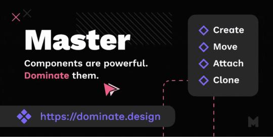
Master offers a better way to manage components, such as the ability to turn multiple identical objects into a component, duplicate components into other Figma files, and much more.
4. Clean Document (auto-clean documents)
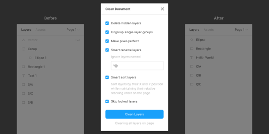
Clean Document, well … cleans your document! It deletes hidden layers, sorts them intelligently, renames them according to your liking, ungroups single-layer groups, and even rounds dimensions to the nearest pixel. A terrific tool for obsessive neat freaks!
5. Similayer (select similar layers)
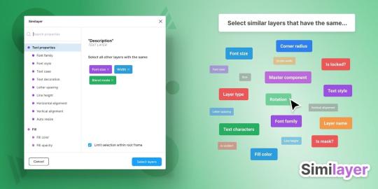
Quite simply, Similayer allows you to select layers based on their similarity to the layer that’s currently selected. Let’s say that you wanted to change a shadow style that’s being used on a number of different elements: Similayer could do that.
You could also use it to batch-reassign multiple components.
6. Viewports (change the viewport)
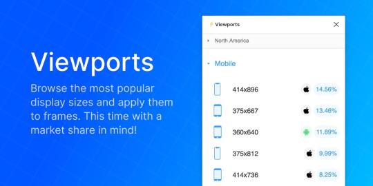
Find out the correct market share of all viewport dimensions, then apply them to frames. It’s insane how useful this is!
Viewport data is live-sourced from StatCounter.
7. Todo (create todo lists)

There are dozens of terrific todo lists, but this one exists within Figma. It’s not designed to replace your everyday todo list, but it’s a more convenient way of keeping track of your design-specific todos without needing to leave Figma. Have a list of changes to make? Need to establish priorities?
If so, install Todo.
8. Font Scale (establish a font scale)
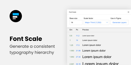
Establish a visually consistent/hierarchical font scale by choosing a base size and scale factor, then save the results to your document for continuous reference (as either em or px).
9. Content Reel (insert better-than-lorem-ipsum content)
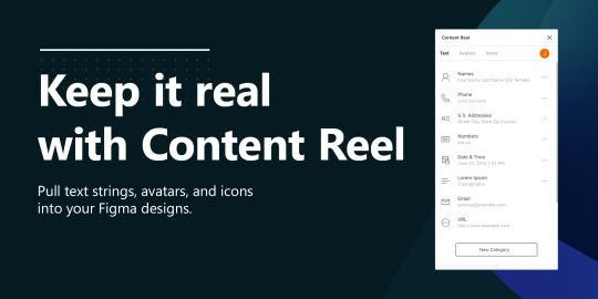
Content Reel inserts “real” content into your design. Need a quick address? Or an avatar? For some reason can’t think of a single name when you need one? Content Reel has your back.
Designing with real data ensures that the design doesn’t look odd once developed, and also helps us to design for edge cases.
10. Google Sheets Sync (sync data from Google Sheets)
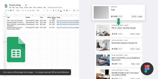
Whether your app has an API or you just want to create a table of data manually, Google Sheets Sync will basically allow you to sync this data directly into Figma. It’s like Content Reel, but instead you define the data yourself. It’s useful for designers that want to build ultra-realistic mockups with data from their actual niche (or live application), and it’s especially useful for teams that want to design using the same library of data.
11. Chart (create “real data” charts)
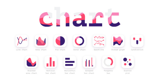
Create stunning, customizable charts with data from Excel, Numbers, Google Sheets, or simply import a local CSV or JSON file. Datavizer is suitable alternative, but Chart can also sync with live JSON (i.e. you can connect Chart to a REST API).
12. Iconify (utilize icon fonts)
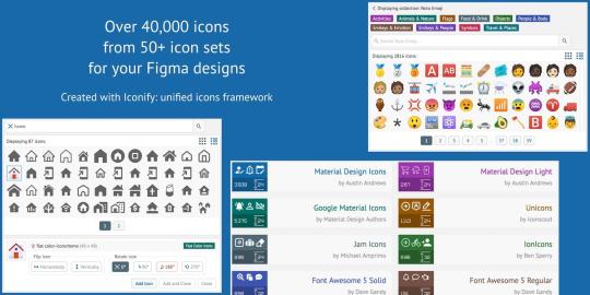
All icon fonts, right inside Figma. Material Design Icons, FontAwesome, Jam Icons, EmojiOne, Twitter Emoji — you name it.
Pretty iconic, really.
13. Figmotion (create animations)
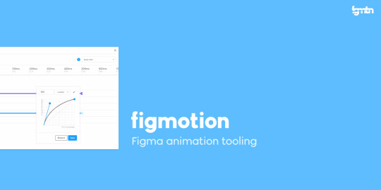
If the thought of exploring animation scares you, or you dread switching tools to access advanced animation features, Figmotion makes animation a lot less anxiety-inducing. The animations are also easy to hand off, since they’re based on web technologies.
14. Split Shape (make columns … and stuff)
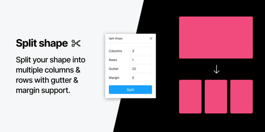
An interesting method of creating columns, Split Shape splits, say, a rectangle into multiple rectangles from which you can then create columns (or rows, or whatever). Split Shape can be used for various things if one thinks outside the box! 😁
15. Remove BG (create transparent bitmaps)
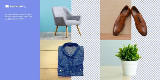
Remove BG is a web tool that removes the background of bitmap images, effectively turning them into transparent PNGs. Remove BG for Figma essentially does the same thing, but within Figma.
If you’ve been hoarding Adobe Photoshop only so that you can remove backgrounds, you can now delete it and probably free up approximately 80 thousand million GBs of space on your SSD 😌.
Popular Figma Plugins
There are a few Figma Plugins that I didn’t mention because they’re already super well-known to users of other UI design tools such as Sketch. You probably have these ones already:
Confetti (create dispersions)
Unsplash (insert stock images)
Rename It (rename layers more efficiently)
Humaaans (insert mix-n-match illustrations)
Stark or A11y – Color Contrast Checker (measure color contrast)
Bonus Figma Plugins
These Figma Plugins are awesome, but you might not need them often (if at all). It’s nice to know they’re there, though.
Arc (arch text)
Roto (rotate-extrude shapes)
Table Generator (create tables)
To Path (create text on a path)
Brandfetch (source brand assets)
Isometric (make objects isometric)
Mapsicle or Map Maker (create maps)
Skew (create simple isometric mockups)
Image Tracer (convert bitmaps to vectors)
Shadow Picker (intelligently create shadows)
Metaball/Blobs/Waves (create abstract shapes)
And finally, all Figma Plugins (in case you just can’t get enough of ’em! 😉).
Keen to learn the ins and outs of developing your own plugins, either to improve your workflow or the workflow of others? Check out Figma’s Plugin Docs.
14 notes
·
View notes
Text
Moving your Tabletop RPG Online: First Steps
Trapped behind a fortress of toilet paper, but still want to play Tabletop RPGs with your friends? This is my quick and dirty guide to getting started running and playing your games online. Toward the bottom, I'll have links to as many digital resources to help run games as I can find. I will update whenever I find new things, so check back, and comment on what you're looking for.
Requirements
You and your RPG table folks will each need a computer, tablet, or smartphone capable of running Discord, and accessing Roll20 via a browser. Discord can run in a browser as well, but I recommend using the desktop app on your computer, or mobile app on your tablet or smartphone. Also, I strongly recommend a headset or earbuds with a mic.
Every participant will need a Roll20 dot net and Discord App account.
https://discordapp.com/ https://roll20.net/
Discord will primarily provide video and voice chat for your table. It has lots of other potential for community building, but for right now we're just going to use it so you and your fellow gamers can see and hear each other.
Roll20 is where you'll host the game itself. It is where you and your RPG crew will roll digital dice, manage character sheets, look at maps, move tokens on the battlefield, and similar. It takes some setup, but not a lot to get started.
The more preparation the person running the game puts into Roll20, the nicer and more streamlined the experience. This can be done over time, between games. I wouldn't delay play to have everything perfect, just get enough set up to get started and go.
Discord for Gamemasters
Don't worry about setting up or joining a server just yet. You don't really need one, and it often just confuses folks that are new to Discord. At minimum, the person running the game should have all the players added as friends. Go to the Friends Tab, click "Add Friends", and put in their handle, pound sign, and number. Your handle and number will be displayed somewhere in the app depending on whether you have the mobile, browser, or desktop version of the app.
Once the person running the game has everyone added as a friend, they can add them to a Group DM. The New Group DM button looks like a speech bubble with a + sign by it, and should be visible in the Friends Tab. Once everyone has been added to the Group DM, the game runner can hit either the start voice or video call button, prompting everyone else to join.
That Group DM will persist in the Friends Tab, regardless of whether anyone is actually online or in the call. People that drop from connectivity issues can pop back in by just selecting that group DM when a call is ongoing. If people are having connectivity issues, they can send text messages to the Group DM, add files, send GIFs, and similar.
The person running the Game can post news and game schedules to the Group DM, and people can chat about the game off camera/mic in between games.
Yes, you can set up your own dedicated servers, forums, and communities using Discord, but you don't need to. In my experience, Discord is just arcane enough to confuse people the first few times they run it. The desktop version of Discord will continue running in the tray, by default, even if you close the main window.
Make sure you either go into settings and turn this feature off, or shut Discord down from the tray, and/or that you've left the call when you're done. Otherwise, you'll continue to broadcast as you talk to yourself, while browsing the Internet (to the amusement of your friends still in the Group DM.)
Roll20 for Gamemasters
Like Discord, Roll20 dot net is just arcane enough to baffle people. It has a lot of functions and features, and you do not need to make use of them all to get started. Don't delay play while you figure out how to get dynamic lighting to work, or build every map for the campaign.
Just get rolling with it, hands properly dirty.
Once you're logged in, you'll need to create your first game. Once you're logged in, there should be a shiny pink button labeled, "Create New Game". Click that, and head to the next screen. Give your game a name, and don't worry about tags (if you're just playing with friends). Pick the character sheet from the drop down menu that most closely fits the game you're going to run.
This will save you a bunch of time later. Don't worry, you can change it after you've created the game if you don't like this feature.
Once you've created your game, hit the menu button, and go back to Home. Click on your game, scroll down to invite players. You can send direct invitations to the email address they used to sign up for Roll20 with, or copy and paste a link, dropping it into your Discord Group DM text chat.
After your players have accepted the invitation, have them launch the game, at least once, so the Roll20 servers fully recognize that they are participants. This will allow you to assign them control of characters, and access to handouts later. This merely saves you the time of having to make those assignments at the first game.
While your players are in the game, have them go to the "My Settings" tab, by clicking the Gear Icon in the upper right corner. Have them scroll down and set Player Avatar Size to "Names only", and Chat Tech to "None" (no video/audio). You're using Discord (which is way better), so you won't need these features.
On your game's landing page, there is a place for Game Discussion where you, or any player, can post topics, people can reply, and so forth. For important game things, you can flag posts to hang around at the top of the Discussion Feed. This is a good place to put house rules, leaderboards, game schedules, and more.
There is also a place to indicate when the next game will be, the time adjusted from your timezone, to whatever everyone else has, depending on where they live. Handy!
When you launch the game to work on it, I recommend having the Roll20 Wiki up in another browser tab. I'm going to run through some of the basics, and give a tour, but there's too much to detail in a single blog post. I'll be focusing on what you'll need to just get started.
https://wiki.roll20.net/Main_Page
The game view has three visible points of user interface. The vertical bar of icons on the left, the horizontal bar of icons at the top of the chat log on the right, and the game board itself. The first thing in the Chat Log should be a "Welcome" message with some helpful chat window commands. At the bottom of the Chat Log is a toggle letting you change your role from yourself, to NPCs, monsters, and even player characters (should they find themselves charmed by a dryad).
Also, note the little blue Page Toolbar button at the top in the middle. This is what you'll use to navigate between different maps, and change what players are able to see on their screens. Your view doesn't have to follow what the players are seeing.
The learning curve with the Roll20 interface is going to feel very steep at first, for you and your players. If you're already anxious about running games, this can feel overwhelming. However, once you learn even a little of how it works, Roll20 is a very powerful tool. I use it to run my local games now with a big screen TV.
It's that good. Trust me, hang in there.
Okay, you're logged into Roll20, click on the games tab, mouse over it, and click the tutorial. Watching a YouTube video is a fine way to learn, but this gets you accustomed to the tools, where things are located, and so forth. Breaking through this initial learning curve, understanding where your game assets are stored, and how to control what your players see and hear takes a minute.
If you've ever used Photoshop or any image editing tool, even Microsoft Word or OneNote, a lot of the user interface will feel familiar, functions and features much the same.
Okay, some general tips that should streamline things for you.
Make a character called "Dungeon Master", "Game Master", or similar. In the Attributes & Abilities tab create several that are going to automatically roll for yourself via /gmroll, or for players using /roll, the most commonly used things. Passive Detection, Surprise, Random Encounters, Treasure, Initiative, and anything else you roll for multiple times per game.
Then, click the "Show in macro bar" box so they are on screen for you whenever you need them.
When uploading assets, give the file names that are searchable in an intuitive way. You can make folders and to organize your art library, but it isn't really necessary. The search feature is robust enough it'll pick through the pile very quickly, provided your file names reflect what the asset is.
Asset0023.png <- No GoblinShaman.png <- Yes
Finally, in the settings for your game, add any applicable compendiums for your game, and click the box that makes them available for players. There are compendiums for Dungeons & Dragons 5th Ed, Pathfinder 2nd Ed, Call of Cthulhu 7th Edition, Dungeon World, Fate, Kids on Bikes, Pathfinder 1st Ed, Starfinder, Burn Bryte, DramaSystem, and Dialext.
A lot of these are paid upgrades, but worth the investment if you plan to stay on and use Roll20 for any particular duration. You'll find the full list on Roll20 dot net, under the Tools Menu Tab, in Compendiums.
Roll20 & Discord For Players
In the beginnning your goal should be to have fun, and understand how Roll20 works enough that you aren't slowing the game down for anyone else. Worry about macros and navigating the game as you play. Definitely watch YouTube videos, read the Wiki, and do whatever else you need to feel comfortable.
But, first, make sure you are using best application available to you for accessing the game.
There are these options for Android and iPad. (Keep reading, don't just grab one of these yet.)
Android iPad
As far as I'm aware, these are horrible, 1-2 star applications with problems, and lacking in support. Only resort to these options if you've tried every browser (Firefox, Chrome, Safari) available for your platform, and can't get it on your desktop or tablet.
Likewise, do this for Discord.
Make sure you are accessing the Discord App using the best option for your platform. I have yet to find a platform where Discord isn't pretty great. Windows, Mac, iOS, Android, and Linux, all awesome with a dedicated app, or in the browser.
Figure out how to mute yourself, and be courteous to other people participating. No one wants to hear you eating chips or yelling at your kids. ;-D Also, perform and audio test with your computer and headset. Have a friend or the game master meet you online and make sure everything is working properly.
This is, literally, 75% of the battle for a game master running their first online game. Just getting people online with the right software, hardware configured properly, with a modicum of understanding of how it all works. The absolute best thing a player can do is be responsible for learning and helping others learn Discord and Roll20.
Preparing games for Roll20 takes more effort for the dungeon master than normal. You can help this along by writing background stories, doing illustrations of your character, or just making a wish list of magical items your character hopes to encounter. Taking some of the guesswork out of making the game fun for you, will greatly streamline the process for the game master.
Likewise, organizing games online is time consuming and stressful as compared to just meeting at the local game or board game cafe. Make sure you communicate with the game master your availability, and be on time for games. This sets a standard for other players. Supporting the table with your reliable presence makes it nicer for you, and everyone else.
Build some custom emote macros for your character in the Attributes & Abilities tab or your character sheet in the Journal tab above the chat log. Whenever my Warlock uses one of his class abilities at my 5e table, I click a macro button that executes one of these commands.
/em holds a rod aloft, summoning hellish fortitude! (Using his Rod of the Pact Keeper)
/em grasps a shard amulet around his neck, closes his eyes, and reaches across into the hellscape it came from. (Using his Dark Shard Amulet)
/em gains terrible fortitude following the slaying of an enemy. (Dark One's Blessing Class Ability)
/em produces a shadowy tome, bound in the hide of an otherworldly beast, flames leaping up from the script inside. (Book of Shadows Class Ability)
/em reaches back into the void, altering his fate. (Dark One's Own Luck Class Ability) /roll 1D10 [Add To Current Saving Throw]
This accomplishes three things.
It lets the game master know you're using a class ability without breaking the flow by babbling about game mechanics.
It marks the use of that class ability in the chat log for tracking purposes.
It enhances the game for other players, giving them a more vivid picture of what your character is doing.
Resources
As of writing this, Roll20 has a ton of things in the marketplace for free, tokens, maps, and modules. It is part of the response to people being stuck at home. I've included links to some notable items, but definitely cruise through all the things.
The Master's Vault, D&D 5e (Free as of writing this) Quick-Start Rules Call of Cthulhu 7th Edition The Lightless Beacon - Call of Cthulhu 7th Edition The Strange: Starter Pack - Pathfinder Playtest Flip-Mat Multi-Pack
Lone Wolf's Hero Lab things provide for Online Character Creation, Campaign Management, and regular old Classic Character Creation. It looks like they primarily provide online support for Pathfinder 2e, Starfinder, and Shadowrun 6th Generation, and classic support for Pathfinder 1e, D&D 5e SRD, and Savage Worlds.
For 5th Edition Shadowrun, there is a keen Character Chummer on Github. Also, this tool for figuring out your Priorities before you start writing things down.
For Star Trek Adventures, there is a Character & Starships tool here. Also, this fan site looks like a keen source for ideas and things.
@Tartle_Games on Twitter turned me onto a service called Astral. I haven't checked it out in detail yet, but folks that play Call of Cthulhu, Pathfinder, Vampire: The Masquerade, Shadow of the Demon Lord, Exalted, Forbidden Lands, or Fantasy Age should probably head there and see what they've got. It looks like those games are specifically supported for playing online, and Astral appears to be free? https://www.astraltabletop.com/
Even More Resources
PCGen
"Compatible with Pathfinder 1e, Pathfinder 2e (coming), d20 Modern, Dungeons and Dragons 3.5 Edition, Dungeons and Dragons 5th Edition, Starfinder, and many more..."
This service went into archive mode December 17, 2019. Take advantage of it while you can.
Fast Character
"Need a few quick pre-gens for a game convention or organized play group at your local game store?
Your cousin from out of town wants to sit in and join this week's game?
The party insists on hiring that NPC to join them for the adventure?
That failed stealth check got half the party killed and now the fallen are playing back-up reinforcements?
You don't have time to min/max your way through a character build but want to try something new?"
Support for D&D 5e, and Cypher System (Numenera, The Strange, etc)
Also, don't forget about ye old' Google Search for free assets and dungeon maps.
#table top rpgs#playing online#dungeons and dragons#vampire the masquerade#star trek adventures#pathfinder#call of cthulhu#roll20#astral
4 notes
·
View notes
Text
Owner screws me over, screws up(s) his business.
To start, I won’t be saying the name of the shipping company franchise I worked for, suffice to say the title is very telling. This is a rather long story, so buckle in. You can skip the backstory and look for the revenge near the bottom. TL:DR at the end.
The Backstory
About five or six years ago I was relatively new to the workforce, having worked one minimum wage job at Mickey D’s. I had been there almost two years, but had little experience elsewhere. Well this one lady always came through early every morning to order a large Diet Coke, and would take a few minutes to talk to me. I mentioned to her that I was displeased with my bosses and the working conditions, and she invited me to come apply for a job at Not FedEx because they were always running low on employees! That should have been my first red flag.
The second red flag went completely over my head, because at this point I was 17 with no previous job experience. When I walked in for an interview, the boss (who I will call Jeph, because it sounds close enough to his name to allow him to remain anonymous) told me it would take five minutes. I wasn’t asked about my relevant experience, my goals within the company, or even told what position I was applying for. I assumed all interviews were different and went along with it, and started the next week with training. Everything went well for the first month. I basically just packed boxes, took down customer information, and sorted mail into the mailboxes we managed. The real trouble started after I was given my one month performance review.
I was deemed to be a valuable asset to Jeph’s franchise, and rightfully so. At 17 I was able to lift more and work better than the 20 and 30 something employees, and due to the work ethic my parents drilled into me I was never slacking off while at work. I was then informed that I would be swapping between Jeph’s two franchises, roughly 30 miles apart. (For context, the franchise I APPLIED TO WORK AT was roughly a mile from my house, so I could walk if I couldn’t get a ride.) Every other day I had to drive out to the location and somehow justify this with my slightly above minimum wage job. ($7.50 for those not in Texas.)
Overall my boss was a massive douche. His physical appearance could best be described as “troll like” with a shirt almost bursting, the top always undone to showcase his aging chest hair, and a face not unlike that of A&F owner Mike Jeffries. He openly cheated on his wife, bragging to coworkers about it constantly. He charged people one dollar for any amount of extra tape they needed on their package, despite the fact that we got roughly two rolls for that price in bulk. He had a special price calculator installed on the computers that charged people roughly 10% more than the package would be elsewhere. He would push employees (who he insisted didn’t work in customer service but sales) to never offer anything less than three day shipping even though we offered standard 7+ days and even cheaper options. I watched him actively lie to customers, claiming it was the price they had to pay blah blah blah, and almost yell at them to go to another store if they didn’t like it. But I digress.
Now here was the first dickish thing that my boss did to me specifically. Until this point, I was only working around 20 hours. After I graduated to working at both stores, Jeph had me sign a brand new W-2 for his second store, which was under a different company. (He owned both, naming one Blue (name for a .44 caliber bullet) and Blue (proper name for visible light)). Again, I had very little idea that this wrong because I had never had to deal with this before. He proceed to add another 20 or so hours to my schedule, bringing me up to 40 hours or more. But since I worked for two separate companies I never earned a dime of overtime or benefits of any kind.
At this point, I started accruing more and more duties, as my boss and coworkers started to trust me more and more. Buy my fourth month of employment (out of a total of eight) I was performing managerial duties such as: opening the store, counting the registers, closing the store, ordering product such as boxes and tape, and preparing shipments for transport. The work alone justified a raise, not to mention the hours I was being asked to work. However when I floated this idea by my boss, he very rudely insisted that since he had a manager for each store already, I was just doing my job and couldn’t earn a cent more.
Then came the second dickish move. We had a large company contract some drop off stuff with us, a telecom company we will say rhymes with Hey Tea and Tea. Customers would bring in their old cable boxes, wires, remotes and the like, and we would scan them and ship them back to Hey Tea and Tea, the company THAT LEGALLY OWNED ALL OF THIS HARDWARE. The customers would not pay us a nickel, but the telecom company would pay almost double what it actually cost to ship the package. There is no way Jeph could look that gift horse in the mouth and decide he was still owed the stable and all the horse’s tack as well, right? Surprise, surprise, Jeph had to take it one step further. ANY and ALL parts/cables/WiFi adapters/USB drives the customer returned to us that didn’t have a scan tag on them, Jeph would pull aside and either strip for copper or sell on eBay. And he would force us, the employees to package his eBay sales or copper wiring into boxes and ship them for him. He even popped batteries out of remotes and recycled them somewhere to get a tax credit. None of his employees ever saw a penny of this money (not that I would have accepted it). We estimated he raked in roughly three to four thousand a month just from stealing alone. For those of you bad at math, that is the price of TWO brand new 2018 Honda Civics.
The Revenge
The third (and fourth) final dick moves are what solidified my hatred for this boss, and my desire to strike back. They both came in the same week, roughly the same time, and both viscerally repulsive. My favorite coworker had recently gotten pregnant, and although the father got the hell out of dodge when he found out, she was doing very well for herself. She and I frequently closed together, and she promised she would bring the baby to sit in the back for the dull hours we had to kill from 6-10. We also had an annual store review from corporate that week, so our boss called a late night meeting after we closed one day. Our boss started out by saying that he was proud of our pregnant coworker for working so hard even with her “disability.” (Yes, even his sense of humor was slimy.) Then, in front of all fifteen employees, HE FIRED HER. He told her that because the Christmas season was coming up, and she would only slow down the store being pregnant and all, he had to let her go.
After she left, hatred seething in her eyes, he turned back to the fourteen of us who were left stunned, and continued on like nothing had happened. He proceeded to tell each of us our jobs for this weekend, leaving mine for last. My job, because I used to drive a decently sized mini van, was to ferry the corporate required supplies, cash for the safe, and OUR ONE WORKING FIRE EXTINGUISHER between the two stores while he kept corporate distracted between visits.
At this point I had taken enough shit from this guy, and I formulated my plan. I started by calling the Hey Tea and Tea fraud department, and telling them everything I knew. I took pictures and emailed them directly to the rep I was talking to, who seemed a little too excited about fraud being committed. I then scheduled a visit from a Hey Tea and Tea rep at the same time corporate was supposed to show up. My next step was to call Not FedEx and explain exactly what I just told y’all, with a few extra things thrown in that I couldn’t share for privacy reasons. They promised to send a rep as well, to the same store, at the same time.
The final step was put into action that Saturday. I dutifully loaded up my van with the supplies, cash (upwards of $4000 if I remember correctly), and fire extinguisher, and headed out. Except I did the exact OPPOSITE of what Jeph wanted. I took the crap to the first store he owned, which was the second one to receive a visit. After he texted the team saying they were moving on, I packed up all the shit and drove it to the other store they just left. Now I am unsure exactly what happened at the other store, but from some coworkers I pieced together that the Not FedEx rep showed up right after I left, but didn’t stay long, and the Hey Tea and Tea rep showed up just before Jeph had arrived and had time to hide his ill gotten gains in his office. The one coworker who was close enough to the office during the corporate meeting said there was lots of angry words being thrown and threats being made towards Jeph and his position as a franchisee. He also lost his franchises the ability to ship for Hey Tea and Tea, at least for a period of time.
Regardless, the very next day I was off because I was (and as cliché as this sounds I swear to God it’s true) helping my grandfather who just got out of the hospital. I receive a call from Jeph, saying I needed to come in right away, and work a double shift as well as close the store. I told him I couldn’t do that, and I was taking a personal day. He fired me right then and there, citing my usage of the work computer to run a photoshop business during work hours. (I’m assuming he was referring to the graphic design work I did FOR HIM, FOR FREE, which he asked me to learn how to do.)
The sad epilogue to this whole story is that he is currently still in business, and still running the same scams he was before. He WAS however fined for not having proper supplies in his stores, as well as forced to use corporate’s package rates rather than his own. So in some small way my revenge worked. He currently has a two star review on Yelp for both of his his businesses, and I hope to have a party outside his store one day when it goes belly up.
TL:DR: Boss is a total douche bag to me and customers, steals from a contract company, fires a pregnant woman for “slowing down the store” then gets his ass reamed by corporate and loses the major contract.
(source) (story by Chewbacca_Q_Wookie)
#prorevenge#by Chewbacca_Q_Wookie#pro revenge#revenge stories#pro revenge stories#pro#revenge#revenge story#last10
206 notes
·
View notes
Video
youtube
Completely finished TrovPod
The animation is complete along with the more important soundtrack for this project.
My section is from 1:21 to 1:59
The process of creating this animation has been mostly recorded on this blog but the run down was; planning for the podcast audio, recording that audio and saving it to a file, once everyone had that file they would then cut down their own favorite sections of the podcast into just over 30 seconds of audio to work with. From the recording process we’d then start story-boarding and planning with dope sheets to figure out both what visuals we’d want to match the audio as well as noting what extra audio we would want to emphasis parts of the video, this lead to Foley, asset creation, asset editing, and then moving onto animation and editing in premiere pro so that all the clips of animation could be merged together.
My part of the animation was created via assets being made and edited in Photoshop and then animated in premiere pro. Such assets were drawings of characters that I made myself on paper and then scanned in before editing and saving to files in Photoshop. pngs, jpegs and other pictures for background and extra assets were found online but are’t as used in such excess as the assets I made myself.
There was admittedly very little research to this task done, only exploring a few versions of other podcasts before going straight into animating - this was definitely part of the project that could have been extended and more research may have overall improved the quality of what we had created. There was a lot more planning, with both dope sheets and story-boarding as well as before hand looking up topics and websites we could use to add content to the podcast audio so that there would be more to choose from when cutting.The practical creation of everything that was needed for the animation was split four ways with the group so that we could focus on our 30 seconds of the audio we wanted to work with. I stuck to creating assets on paper so that they could be more easily used in premiere pro in a rather simple way- it did limit detailed animation like lip-syncing but I was able to add and edit expressions and convey a structure of conversation and story.

The assets I did create are in a very simple, chibi-esque style to try and show expressions as easily as possible without adding a ton of detail that could either confuse a viewer or just end up taking too much time to add. This is also why I kept the figures to black and white, both so that it took up less time but also so that they’d be in contrast to the rest of images I used that would all be in color.
I overall enjoy the final product as a combination of the groups work, each unique style coming through as if it were a MAP (Multi-animator-project) which are very big in certain communities and can easily be found on YouTube- they’re collaborative efforts usually based around songs instead of audio but still try to convey either one large story or mini parts of their own stories to represent the community they’re in; whether it be based around something as broad as art or more specific to certain books or other media. While our video’s quality could be improved in a lot of ways it definitely works in showing the conversations that happened in the podcast and are relatively entertaining.
We definitely could have done more research for our project, especially around the animation section as we did very little - this may have stopped simple issues if they had been looked into which could have improved the overall quality of the video with both the audio track as well as the animation. Examples would be the compression in my parts of the video, having not realized that both the video size and quality were different to the other member’s bits of animation, if more research into premiere pro then these issues could have been changed and fixed. Planning was a lot better, it helped with timing which was overall smooth and ensured that most of the animation could be done with a good idea of what was wanted for the entire video so there as no blank space and that the animation it over the audio well; one thing that could have been improved would be the use of dope sheets- still very unclear on the use of them and they’d be essential to ensuring proper time syncing in actual animation projects such as tv and film.
As mentioned before, there were compression issues on my part with the assets I used, even the jpgs, which was rather concerning, but it lead to rather poor video quality compared to the rest of the video and can seem very jarring to a viewer. Seeing as this was for the entire video I believe it may have been to do with the video’s size or settings and not so much the assets, either way this problem will need to be looked into further on as it really does damage the look of the video though luckily it doesn’t harm the audio so much.
This project definitely links back to collaborative efforts I might try in the future and while I’m rather fond of the kind of animation I used for this project it definitely needs to be improved and looked more into, as for the audio side t’s definitely expanded my knowledge on how to record audio as well as add affects into the soundtrack with Foley but I’d want to learn how to edit the audio more when it comes to volume levels as well as clarity.
I think for the entire project as a whole, more editing and tweaking could have been done to have an assured that the video looked neat and more well executed ;both the compression and size issues of the video should have been addressed if there was time, but there was also smaller things that could have been edited to help the animation as a whole such as the movement of the credits. Volume peaking and levels should also have been edited to work better together as the soundtrack was more the focus for this project.
04/02/19
3 notes
·
View notes
Text
Project 2: Game/Learning Tool
We began this project by brainstorming a variety of simple things. First, we brainstormed around things we learned in elementary school. Next, we thought of daily processes, followed by different professions, and lastly, our hobbies and interests. Below are the lists I had formed.
I selected my top 6 concepts to use to develop simple wireframe sketches. The concepts were a multiplication table game (inspired by the speed quizzes we would do in elementary school), a roadtripping/map of America game (inspired by my interest/roadtripping hobby - I love the idea of getting in a car and going anywhere - it was a large part of my life even if it was just traveling with my family or friends to the beach or my lacrosse tournaments), the life cycle of a butterfly informative site (inspired by my second grade project of documenting the life cycle of the butterflies we kept in our classroom), a DNA code matching game, an outfit choice game (inspired by my passion for biology and my memory of how cool it was learning about how code matching can completely change your physical appearance and other aspects of your body/personality/health etc.), and a fraction game using fruit (inspired by how we learned fractions drawing fruits or coins on paper). These sketches helped to convey the goal of the game, the interactions with the game, and the visual placements. We split into small groups to discuss our ideas and narrow down the three most enjoyable and feasible ideas.
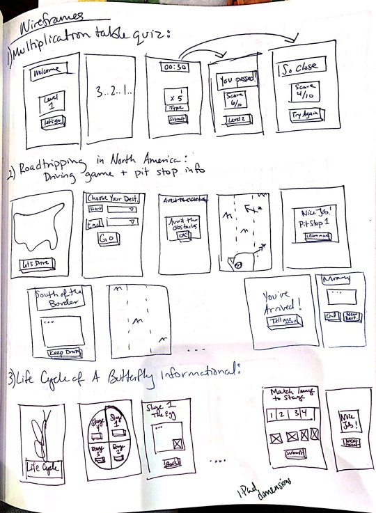
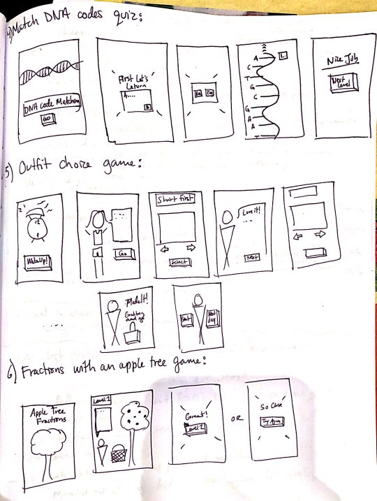
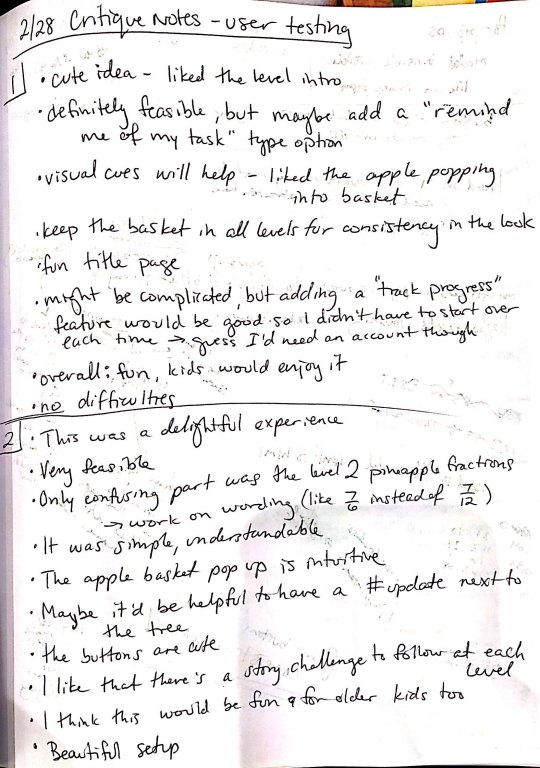
I decided the one concept I wanted to use was the Fraction game. I felt I had the most developed concept for it and it would be most feasible to create for my first interactive multi page website. Using this idea, I created a lo-fi paper prototype of the website (see below).

I used this prototype and a task list I created to conduct user testing with two of my classmates. My goal was to observe and document their process to see if they were able to accomplish my task list. The main questions to consider while they were interacting with the prototype were what was the overall experience like, is it a good idea, is it feasible, did you have any difficulties? The following are my two critique notes.
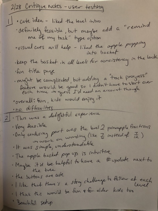
Next, I used Adobe XD to create a static digital wireframe of my site. Then I went on Pinterest and explored Google fonts to create two mood boards that would help me decide which visual experience I wanted my users to have.

After my critique, I used the feedback and static wireframes as a guide to help me code an interactive wireframe using HTML, CSS and jQuery that my content could later be added into. This part was extremely helpful in the final coding of my site because it helped me visually see where the divs would be and how my content should be included and positioned. Also, any interactions I had not thought of or missed in my static wireframe became evident here and I was able to include them now rather than realizing this later.

(The interactive wireframe can be found under Project 2: Interactive Wireframe at http://swalker97.github.io).
I used the mood boards from earlier to create two style tiles/static digital mockups on Adobe XD. These mockups included most of the content that was used in the final site, so it gave a better idea of what the game would look like and how it would function. For both versions, I tried to find header fonts that were playful and childish and pairing that with a simple body copy typeface that would be easier for a child to read. The first version included Fredericka the Great for the header and Raleway for the body copy. The second version included Luckiest Guy for the header and Oswald for the body copy. The first version was more clean cut lines and pastel colors with 2D images. The second version was inspired by a felt board because I remember learning with felt pieces in my childhood, we would be able to move the pieces to accomplish the task. I felt this memory of my interaction with fractions would work well with the movement of the game pieces. However, after critiques, I decided the 2D cleaner version was more visually appealing for the user, so I chose this design when I began coding. I also decided against both pairs of typefaces. My final version uses Short Stack for the header and Open Sans for the body copy.


Using my digital mockup, I catalogued all of the illustrations I would need to create for my site. I used Adobe Illustrator and Photoshop to create these illustrations and learned to save the files as svg’s so that they appeared most clear when on my site. One difficulty I ran into when coding was that my image files had too much transparent background padding and it was interfering with the jquery clicks. Once I discovered this issue, I re-saved all my illustrations with less background and once the images were updated in the code, my issue was resolved!
I made a copy of my interactive wireframes folder, and began to recode it using my actual content and assets (my illustrations). It was really exciting to see my static concept come to life with jQuery. My favorite parts of the site is the fruit appearing into the basket and the popup modals. The modals were a new challenge for me, so when they worked with the opaque black overlay hiding the main page I felt extremely accomplished. This project allowed me to add to my coding skillset and feel more confident in creating future usable sites. My least favorite part of the coding was the frustrations of the illustrations as I explained above. I could not understand at first why my jQuery was not working because the code appeared right to me, but the behaviors were not occurring on the hide/reveal clicks and manipulating the visibility. However, using inspect on Chrome and changing the z-index helped me find the issue, which was the unnecessary background in the images that began to overlap other images inhibiting their click-ability. Now my game is fully functional and is a good representation of what I had intended when designing the concept in the early stages of this project!

My entire site can be found under Project 2: Fully Functional Site at http://swalker97.github.io.
1 note
·
View note
Text
PROJECT 2: Game/Learning Tool
The first thing we did before starting this project was to start brainstorming. We were asked to think about all the things we had learned in elementary school and how we had learned them. We could focus on anything, ranging from science to math to reading to music. This step included an exhaustive process and a deep brainstorming to determine the things I had previously learned in school. Attached below you can see a sample of some of the ideas I came up with about the things I had learned in school and the tools I had used to learned them. This was a project I enjoyed because it really got me thinking about my childhood and the things I am passionate about. I decided to make a project that showcased a bit of my country and the things I can be proud of. Guatemala is one of the countries with the most biodiversity, having a wide range of plants and animals, particularly astonishing for such a small country. I wanted to make a learning/gaming tool that taught a bit about animals in Guatemala and some of the relations they have to the culture or the identity of the country. I choose a total of six animals I wanted to show and focused on those that are not found everywhere or can only be found in Guatemala or have very interesting facts that kids could enjoy learning about. Below you can find the process I followed to obtain my final web design. You must keep in mind that some of the examples I include were modified and changed, as my paper prototype was based on a different idea and was later developed into the resulting project.

We were then asked to create sketches of six possible website ideas. Which we followed by creating paper prototypes of the user experience using our interactive game/learning tool. This was a very interesting tool for me, as I had never worked with paper prototypes and although it could be hard to think about things in this way, it helped determine what was it that we had to work on and how this could be achieved and developed. Below you can find some photos of the sketches and the prototyping activity done in class. It must be brought to the attention that my overall project ideas was changed after the paper prototyping activity, after receiving certain feedback from my classmates and Professor. It must be remembered that the attached sketches and prototypes were created for a different user game and not for the final chosen idea.


Next, we were tasked with developing digital static wireframes in Photoshop based on the feedback and insights gained from my user testing and talking with other friends of mine about my learning tool idea. Additionally, using the digital static wireframes as guides, I had to create interactive digital wireframes using HTML, CSS, and JQuery. This step was developed to create the framework were our content was going to be added. If I am completely honest with you, this was a hard activity for me and something I truly struggled trying to work out and understand.


The next part was to use the feedback received on my style tiles and digital interactive wireframe, to create a static digital layout using either Adobe XD. The static digital layout included the actual content not just the place holders for the site. This step also included creating any digital assets that could be necessary when starting to code the site. Attached you can find the static digital layout.


Below you can find another idea I created when developing my static digital layout in Adobe XD. In this idea each picture was a button to a different site. I ended up deciding to follow a design that had a hide and revel popup for each animal and a quiz for all the information rather than each single animal, as there were six animals in total and a personal quiz would have been less interactive than one that requires knowledge of all the animals.


Lastly, you had to make a copy of the interactive wireframe and then add my personal content and assets to the site. After adding all the content assets, I used the static digital mockups as guides to create my CSS. This was particularly a time consuming and hard step because it required all the necessary coding to complete the project and be able to publish it in my GitHub.o page. Below you can find the projects we talked about attached.
1 note
·
View note
Text
Task 1 - Mini Teach
For task 1, we are asked to design a lesson that uses Art & Design in some way to teach the class skill or some knowledge. Moreover, the lesson session should last for about 10 minutes - not longer and not less. Furthermore, we also had the options whether we are going to stand up in front of the class or create a lesson in a creative way.
To start the project off, I started searching online of what I could teach and these are my mind maps below. However, they seem to be a really boring subject to listen to for about 10 minutes so I decided to scrap that idea.
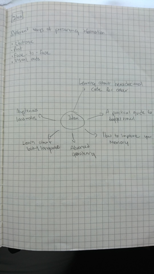
I came to a conclusion to go with teaching the class hexadecimal colours after searching for something to teach that relates to art & design. However, I knew that teaching how hexadecimal colour works alone would not be enough for people to understand; if most people don’t understand the basic of colour theory first. I have decided to talk briefly about the colour theory and how it links to the hex colour codes at the beginning part of the video lesson.
After I have made my mind up that I’d go with hexadecimal colour code idea, I then begin researching from various websites as to how hex code works and how you will be able to guess colours that way. Of course, this was my first time learning about hex colour codes as well so when the deadline comes - I should be really knowledgeable about this subject.
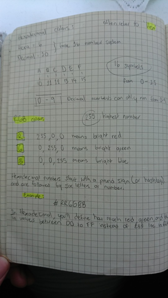
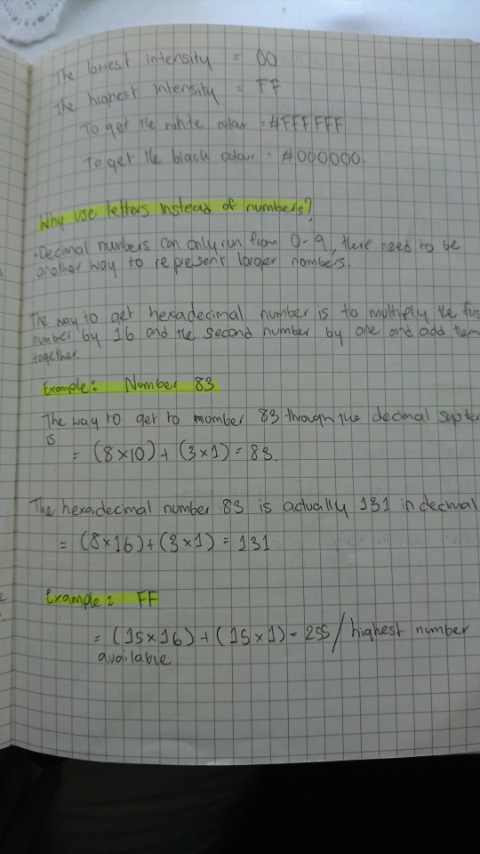
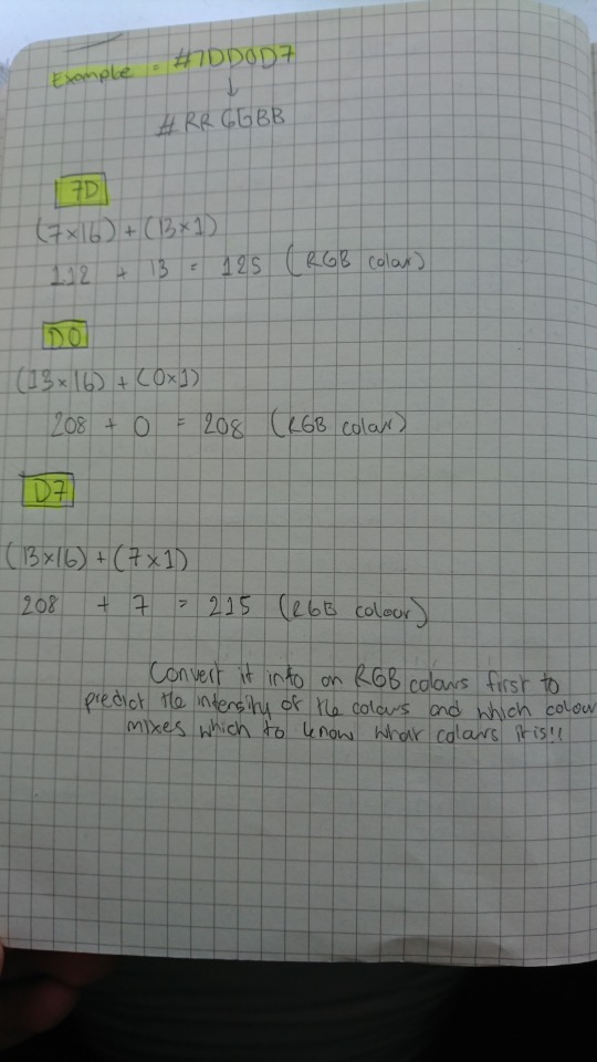
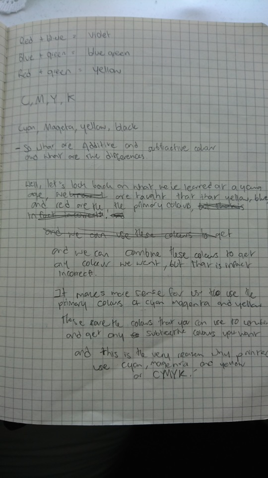
After that, I have also researched briefly about colour theory. However, I am not going to be mentioning terms that are complicated or scientific which we do not need to know about. Just the basic knowledge of colour theory and how colour works.
Once the research is completed, it is now time for me to decide whether to stand in front of the class with a powerpoint slideshow or make a video presentation and to be honest, video presentation sounds good to me. This is because nobody would really like to listen to a boring powerpoint slideshow for a whole 10 minutes. A better way to educate people is through the uses of images, moving images, and animation. This should be enough to grab their attention for the whole 10 minutes and I do plan on doing a voice over instead of just captions as that could overwhelm the audience.
Before I begin, I’d need to write a script as to what I am going to be teaching in the video, and I also need to make sure to pace myself really well as not to go over the mark of 10 minutes. However, the time I limit myself on the video was actually 7 to 8 minutes as I wanted to leave a few minutes for the class to have a go at a mini quiz of guessing the hex colour code.
I recorded my voice using a microphone and I recorded it to only one sentence each as reading the whole script in one go would mean that there is a high chance that I’d mess it up and have to start over again, which is why I decided to record one sentence at a time and put it together in Adobe Premiere Pro. Furthermore, since English is not my first language, I tried to pronounce words as best as I can so that the audience can understand me easily.
After I have recorded the script, I then put all the voice recorded in Premiere Pro where I put them all together, and it came to almost about 8 minutes which is quite good in my opinion. The next step I did was exported the audio file and imported it into Adobe Audition where I equalize and change the volume to a standard volume. The reason why I have to equalize the sound was that the original record was really bad, and I mean some parts were really quiet and some parts are really loud. By equalizing the sound, it will give off a steady and consistence sound which is good for the viewers to listen to.
Once the scripted audio was equalized, it is time for me to export it into an MP4 file and imported the file into Adobe After Effect. I have made some of the assets in Adobe Illustrator and Photoshop which I then imported it to After Effect; however, most of them were made in After Effect itself.
I then started to animate some of the elements that match the script to make some of the areas easy to understand, rather than having the viewers only listen to myself - I thought it would be a good idea to have them see what was going on and how it work as well. Most importantly, I have also used quite a few stock footages that I have found on the internet that are free to use. Not to mention, photos that are being used in the video are from a website called ‘Unsplash’, which is a website that you can use images for free at a high resolution too.
In addition to explaining the basic colour theory and how hex colour code works, I have also made a section where I test out my ideas and using what I have learnt to try to guess the colour using the hex code. I have included that in the video to show that it was possible to guess the colour - although not accurate, as these codes are meant for the computer to process, but it is just a fun way of figuring out the colours.
I did much research into the best way into guessing the hex colour code, but none that I found were as useful or was quite difficult to comprehend and would take some time. This would be a 10 minutes lesson to the class so I want them to learn it in just the amount of 8 minutes, which they would try to take the test on themselves and see whether they have learned anything from the lesson. I realised that this was going to be difficult but I tried as best as I can to use images and animation to make it easy for them to understand.
I came up with an idea to create a number chart which displays 16 numbers from number 0 to 15. Obviously, I have already converted the letter symbol from A - F to 10 - 15 which makes it easier for the viewers to understand. The way it works is rather simple, I did mention in the video that to break the hex colour code in the simplest way, the viewers only need to focus on the first symbol of each red, green and blue colours - which then use the chart to see how much intensity the colour is.
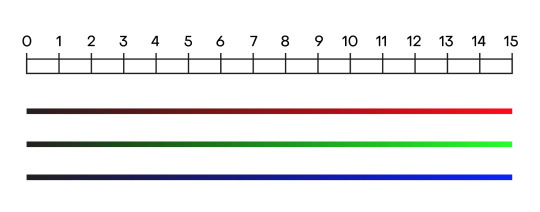
I did also mention that RGB colours started out with darkness or black, which means that the lower the intensity is, for example, number 0 - 4, would actually be a dark colour. The lower the number is, it does not mean that you will get a darker shade of that colour, but would rather get a black colour or nothing the lower the number is. It is a complicated subject to understand but once the viewers understand this point - the rest is easy.
Script:
Hey, welcome to a video presentation of the basic colour theory and hex colours explained. It is a good idea to understand how hex colours works as a lot of the time, you’d be working with them in Adobe software and I know it can be a little bit confusing as you’ll see letters, numbers, and pound or number sign but I’ll do my best to explain it as much as I can.
So what is hexadecimal code?
Well, if you’ve ever worked with colours on your computer, then chances are you’ve seen the hexadecimal codes before. It started off with a pound or number sign which follows by random numbers and letters that make up a colour.
However, before I begin explaining what hex colours is, let’s touch briefly on the basic colour theory and understand the differences between additive and subtractive colours.
Light or white light is a combination of all colours, and to get a better answer to this. Let’s take a look at this apple. It creates colours by subtracting or absorbing certain wavelengths of colour while reflecting other wavelengths back to the viewers. This is called subtractive colours.
If an object reflects all the white light back to the viewers, it will appear white. However, if the object adsorbs or subtracts all light illuminating it, no light is reflected back to the viewers and it will appear black. It is the subtractive process that allows everyday objects around us to show colours. Now, subtractive or CMY colours requires to be illuminated by white light to be visible and seen in original colour.
As for the additive or RGB colours, it starts with darkness or black and gradually add light to get different results of colours, and this is the perfect inversion of the subtractive primaries we have just talked about and this is because, for subtractive, we are taking away light whereas additive, we are adding light into it.
A computer screen blends varying intensities of red, green, and blue light each of its tiny pixels. These pixels are so small and tightly packed that our human eyes are fooled into the perception that there are many different colours when there are only three.
Before we get into the hexadecimal codes, let’s test my ideas of breaking down hex codes and making an inform guesses on the colours.
What we have here is a hex colour code test and what you do is make a well-informed guess base on the hex code given above to figure out the colour.
[Test]
From what I can see from the hex code, I can see that there is no red, a lot of green and a little bit of blue. Now I know for a fact that it isn’t going to be a bright green because it’s not at its highest intensity so my answer would be this colour here. That’s correct.
As for this one, I can see that there is a bit of red, a lot of green and very little blue. Now, can it be a very bright green or a lime green colour? From what I can see from the hex code, I know that there are quite a bit of red in there and red mix with green gives a yellow colour. However, since the red colour is kind of at the medium point of intensity, my guess would be for this lime green colour. And that’s correct.
And for the final one, I can see a medium amount of red, no green, and medium amount of blue. And I know that if you mix red with blue, you’d get magenta. However, because the intensity for both of the colours is at their medium point, my guess for the colour would be a darker shade of magenta. And that’s correct.
That was a quick demonstration of me trying out the test, and by the end of the video, you’d be able to make a well-informed guess as to which colour it is. So how does this work?
It’s simple to understand the RGB colour system because it’s done in the decimal system, meaning numbers are just like what you’ve learned your entire life. Zero is the lowest and 255 is the highest.
To get the colour of red, the set value needs to be at 255, 0, 0. This value will equal to a bright red colour. If the value is set to 0, 255, 0 – you’d get a bright green colour. And lastly, 0, 0, 255 will get you a bright blue colour.
The standard numeral system uses ten symbols from 0 – 9 and that’s what you’re familiar with. All of the numbers in our system are composed of 0 – 9 and any number we have are going to include these 10 numbers, including the number 0.
However, in the hex numbering system, it uses the numbers from 0 – 9 and an additional 6 letters symbols from A – F which represent the number 10 – 15
Now, why do we use letters instead of numbers? Well, when they get to 10, they want to be able to keep the single digits and there are no single digits after 9 so they would have to use letters as a representation for the number 10 – 15.
So now that we know a bit about how hex codes work, let’s break it down even more. Hex numbers start with a pound sign or hashtag and are followed by six letters or numbers. The first two digits will mean red and tell the computer how much red to add, the next two digits will mean green and how much it should add, and finally, the last two digits will mean blue and how much it should add into creating one complete colour.
In hexadecimal, you’ll define how much red, green, and blue in values between 00 to FF instead of 255 like in RGB. But to be honest, they work exactly the same way. In RGB colour, the value 0 is the lowest and the value 255 is the highest – and this means how much intensity the colour is. The same thing can be said for hexadecimal colours. The lowest intensity equal to 00 while the highest intensity equal to FF.
There is a way to convert hexadecimal numbers to an RGB value. For example, let’s take 7D in hexadecimal number and convert it to an RGB value. To do this, you’d need to take number 7 and times it by 16. And we know that the letter D equals to 13. Take the number 13 and times it by 1. Basically, you just take that number and do nothing to it. Once multiplied, add the number up to get the RGB values.
So, before we end this video and onto the quiz, I just wanted to show my thought process and explain a little bit of how you can guess the colour using hex code. Let’s start basic. So we know that the first 2 digits are red, the next 2 digits are green and the final 2 digits are blue. Now you can do the math and convert the hex code into RGB values and guess it that way if you think that’s easier. However, I think that is just way too long. Let’s keep it simple and only focus on the first digits for the red, green and blue. C equals 12 so we know that it is way past the medium intensity. 3 is a very small number for the green so let’s not worry about that and around medium intensity for blue colour.
Now we know that if you mix red and blue together, you’d get magenta and there are two shades of magenta here. It can get complicated, but just think simple. We have a high intensity for both red and blue so the obvious choice would be a vivid magenta as there is no green colour in there.
Now it isn’t necessary for us to read hex code as they are meant for a computer to process the code to generate the correct colour. However, it is great to be able to understand how it works and that there is a way of breaking down the code and make well-informed guesses.
Mini quiz:
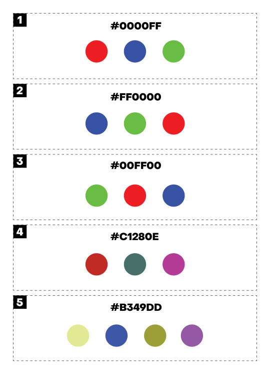
After the video is finished, I then presented them with a mini quiz of five questions to see how much they learn from this lesson. I obviously didn’t want people in the class to feel intimidated by this broad subject, so I started the quiz with 3 simple questions that were mentioned in the video. For example question number one, the question to guess the colour is #0000FF. I did mention that 00 is the lowest intensity while FF is the highest intensity, and the viewers also know that there are six symbols in hex colour code that is divided into a group of 2 to make 6 - with each group representing red, green and blue. FF is the highest intensity and we know that the final 2 digits represent blue colour so the obvious answer would be a blue colour. It is pretty straightforward and this is just to get them started and not feel intimidated by the question.
However, question four is a little bit harder as there are more options and the question wouldn’t be as obvious as the other three. However, it is still pretty simple. Now before I explain the answer, I do feel for the class if they couldn’t get these last two questions as I have printed out a mini quiz for the class, and the colours that they are supposed to be guessing is RGB colours. However, because I have to print these out, I’d need to select the CMYK colours, plus my home printer was being annoying so the colours came out a little faded. I wouldn’t be surprised if they got the answer wrong as the colours are not even correct in the first place. I initially wanted them to try it on the computer screen, but I didn’t know where else they could to take this quiz except for Kahoot. However, I personally don’t like Kahoot and would rather avoid it as it’s annoying so I decided to print it out instead. To compensate for the incorrect colours on the sheet, I tried to make the answer obvious by having colours completely opposite one another to make the choices seem obvious to the viewers.
For question number four, the question is #C1280E and the answer is actually pretty obvious. If the class can remember what I have mentioned that the first 2 digits are red, the middle is green and the last 2 is blue - they should be able to understand this question easily. For example, C equal to number 12 for red. 2 is a very small number for green and there is no blue so the obvious answer would be the red colour.
As for the final question, the question is #B349DD and this is a hard question to test if people have learned anything from this lesson. B equal to number 11 for the red colour, 4 for the green, and D equal 13 for the blue colour. Obviously, the colour red and blue are very high in intensity and if you mix these two colours together - you’d get the colour of magenta which would be the correct answer.
Reflection:
I believe I achieved what I had set out to do at the beginning and managed to make a good quality video presentation. I successfully created the mini quiz as well and I really wanted people to have a go at it - whether they get it right or wrong doesn’t matter as these codes were meant for the computer to process it anyway, but it is a nice way of learning how the code works.
The mini quiz I gave to the class was also well received with 3 to 4 people who actually got all 5 questions correct, while all managed to get at least 3 questions correct. I totally understand it as this type of subject takes time to understand and practice with, but for a 7 minutes lesson - I believe they did extremely well learning it.
As for my presentation, I went a little over 11 minutes but overall, it was a good result. The video I’ve prepared is 8 minutes long and I was planning to have the class do the quiz for about 2 minutes. However, some people took longer than the other but it is no problem as I still think that it was successful.
Final video presentation:
youtube
1 note
·
View note
Text
Bono And also The Edge Of U2 Are Dropbox Investors
Amongst the current glut of minimalist text editors for OS X, Slogan (Mac App Retail store web link) attracts attention by focusing on making documentations using Fall, a profit language that lets you create for the Web making use of clear text as well as a basic formatting syntax. Observe, Guilty Gear Judgment is a side-scrolling rhythm- 'em- up in the timeless style of, claim, Golden Axe, Final Battle as well as Road from Rage, while the 2nd activity, Guilty Equipment X2 #Reload is actually a timeless 2D personalized dealing with activity complying with the rhythm and design PSP individuals will possess faced in Darkstalkers and Road Competitor Alpha. After you have actually boosted your statistics along with the initial few 1000 dev factors you obtain, splurge and acquire a brand-new fighting style. Had together with the climactic scene of incident 2, in which Maximum becomes aware that her energies cannot aid her stopover Kate coming from having her very own life, Life is actually Strange is actually informing all of us one thing worth finding out about life. Digestive tracts as well as Splendor is actually a video game concerning usual people completing in amazing problems of urgent! The following absolute best design to begin along with is battling if street battling really isn't your thing. You'll likewise discover brand-new weapons as well as magic types as you participate in through the game, along with numerous things you can use to replenish your health and wellness, stretch your life meter, revive after death, therefore. on. Some of these things are hidden in secret areas, therefore ensure to poke around the degrees and also find exactly what you can easily discover. Missing an individual is fantastic due to the fact that getting to see them after that duration will certainly create you thus sure and therefore pleased of your relationship. Extensively taken on by newbie creators should smooth the CSS learning contour, Style Expert is likewise very useful to professionals also occupied to lose time don't forgeting many CSS selectors, worths and homes, and their amount of browser support. Step ladder professes that its own provide of pure, condition insurance will definitely probably be the best, very most economical option for consumers. Recognizing our attachment design is actually advantageous, considering that it can easily assist our team to discover methods our company might be actually taking on a dynamic from our past. You should stop paying attention to people which remain in vastly different lifestyle instances and life stages than you tell you that you're just not doing or even sufficing. The 1962-63 version from The Jetsons was actually so leaking with Googie that you might suggest Hanna-Barbera really did not definitely overemphasize the style-- they copied that. Googie at its most cartoonish as well as resplendent is actually almost beyond parody. As http://youre-special.info discussed recently, LifeProof has actually been experiencing extraordinary development. While Photoshop can access all asset styles, Cartoonist is actually slightly extra minimal, acknowledging everything other than coating designs. Obviously off the rate there are a variety of alternatives on call along with the Pro variation that are actually certainly not on call along with the Express version. Leader Hook secures Tinker Bell inside a metallic lantern, as well as in the initial model (certainly not the Disney film) she consumes alcohol toxin to save Peter's lifestyle. Essentially Neuromancer is actually a publication concerning the improving presence of innovation in the life from humans. Its own regrettably a game that simply obtains kind of mixed under the radar present and also age, merely those that take deep are going to really adore it and also appreciate this and also i claim if you like baldurs entrance or any type of classic D&D style rpg to obtain Drakensang asap! Have a look at these styles in the Format Combination (Scenery: Formatting Palette) by selecting the triangular next to Styles and afterwards picking All Styles from the Listing pop-up food selection (view leading screenshot). The Global Insurance coverage Accelerator intends to own innovation in the insurance market. Web web cams likewise give on their own to this type-- thus, the Lumiere Problem task where people mark their online video articles fired under the same constraints the Lumiere bros went through. That's the wonder drug: so this point had not taken place, my lifestyle would certainly be totally other, and every little thing will be actually much better. You can easily after that pick Relationship; the outcoming discussion changes as you develop more detailed, as well as in the onset (neutral, puts up with) may give ideas about what kind of behavior your partner is actually attracted to. A Year in the Lifestyle tracks the lives of the Gilmores during a year, along with each from the 4 90-minute incidents devoted to a various time. Always remember that in some cases that's certainly not a smart idea to change Phrase's pre-programmed styles, since you'll mistake folks which expect these designs to look the common method when they revise your records. The good news is, Design Professional does not make you pick one method or the various other: both the hand-coding home window and the style publishers may be open all at once, and also you could freely leap in between the two. Nevertheless, I found that by just asking my registered nurse good friends direct inquiries regarding exactly what irks nurse practitioners the absolute most regarding their place of work partnership with medical professionals, I got the majority of the solutions I should begin self-improving on this necessary component from individual care. For those from you familiar with Kitty Cannon design games, Hotdog Down a Corridor is actually simply a headline saying the obvious. If More about the author does not eat sufficient veggies and fruits because that stays in city places where such traits are actually limited and also financially prohibitive, you mock its own excessive weight and sickness as signs of social depravity as well as appetite. To get approved for life insurance policy typically you typically will must fulfill minimal essential underwriting criteria. Clicking on the webpage will definitely welcome you to update your partnership if you are listed as singular on Facebook. Just what we commonly don't forget is actually just about anything that distracted us off concentrating on the person's Outer Type. Reprising the whole activity in a brand-new engine handled several technical troubles, offered an excuse for the craft design adjustment, as well as permitted it to become given brand-new platforms. Below's exactly how that electric battery everyday life compares to the outdated 3DS, which has a battery daily life of 3 to 5 hours.
1 note
·
View note
Text
Week Six - Finalising Poster
Following my sketches, computer concepts, refinements, and experiments, I have created my final timeline poster, inspired by Lissitzky’s suprematist design work. The timeline covers 10 important dates and time periods in Lissitzky’s life, with some key dates including blue tinted images to help communicate key ideas. Images that weren’t artworks I created as PNGs in Photoshop. The colour theme in the poster is inspired by Lissitzky’s work, primarily using red, off white, and black. I used the eyedropper tool to make swatches, and then changed the RGB values to create the shades and tones I wanted. I made the black softer by making it slightly more grey, so it would be less overpowering. For the images I used a dark primary blue so the photos would stand out against the white background, and could be layered under red and black. Some of Lissitzky’s painted works use primary colours like the blue and red. To better communicate the timeline of Lissitzky’s life, I added a geometric shape like a rectangle, circle, or triangle behind the date box. These shapes are very common in his design work. I played with these shapes in previous weeks when tasked with creating graphic assets in Illustrator. Using elements that are present in his work strengthens the communication of Lissitzky’s life and works. To signify time periods, I put red rounded rectangles behind the black timeline. These show the extension of a date, meaning the event lasted more than one year. The typeface I chose for the poster headings and dates was chosen because of the Soviet style, linking to Lissitzky’s Russian background. It is bold and easy to read, clearly communicating key information. I made small edits to the type to make it clearer, such as changing the way some letters face, and removing unnecessary strokes. Paragraph text is written in a very basic sans serif type, to make the information clear and legible at a smaller point size.

This final poster is very similar to the last poster in my previous blog post about poster digitising. I made some small refinements to the final poster to make it clearer and cleaner. I smoothed the edges of the PNG images in Photoshop using the eraser tool, to make the edges less pixelated. I also made the stroke on the red date extenders slightly thicker to show the time periods more clearly. As well as this, I moved the arrangement of the shapes behind the dates to make the spacing more even. I also checked for stray points and deleted them to make the final product more professional.
This screenshot shows the guides that I used to make the poster. I used a very simple thirds grid that I created by splitting a rectangle into a grid and making guides from it. Lissitzky doesn’t consistently use grids in his work, so I decided to use a very simple one. I think the use of grids in my work could be improved on because the grid used in the poster is not very present when hidden.

This screenshot shows how the poster would look when printed as SRA3 and with the bleed lines trimmed. If physically displayed, this is how the poster would appear. Due to online learning, we won’t be handing in the physical poster, instead creating a PDF version. These digital screenshots don’t actually show the colour as accurately as I would like. In Illustrator, the red colour appears brighter, which I prefer.
0 notes