Best viewed oldest to newest. This is a place where I dump all my past art-related assignments. I am still in school and still learning and this is just a way to see my progress and keep the teachings fresh in my mind as well as letting people take a look at what assignments go into an art degree. I know I was very scared and confused on what to expect when going for a degree that some people may think is a "waste" and I just wanted to share my experiances.
Don't wanna be here? Send us removal request.
Photo
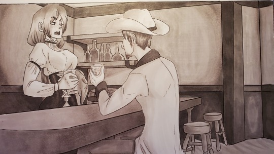
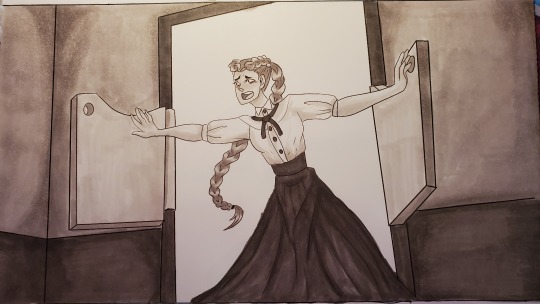
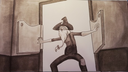
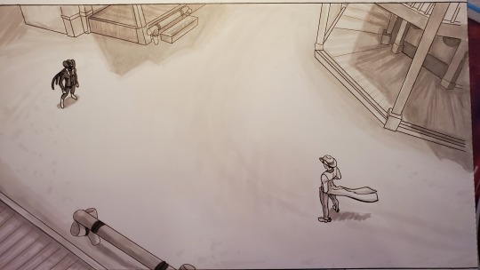
Visual Story Telling
Assignment: Original Animatic
Medium: (Beat Boards) Copic Markers, (Animatic) Clipstudio Paint, After Effects, Premier
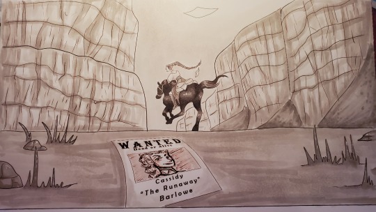
Hoo boy. Okay. This was the final assignment of this class. The big project. The thing that kept me in my room for like a month. Details after break along with a story time and process. Also the final animatic.
The first part of the project was coming up with loglines. A log line, or elevator pitch, is one sentence that summarizes the entire plot of whatever you are doing.
This is the log line of the story I ended up using. There were three and I let my classmates pick which one I made.
“A typical white hat cowboy saves a town from an infamous bounty hunter who’s after a young woman using an unconventional method that winds up getting him a chance with the love of his life.”
I worked so incredibly hard on this damn animatic and it went through so many stages. Like look at my final project folder.
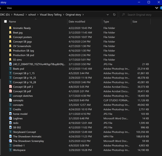
It was fun though. If you’re wondering why there is a folder labeled SS Sims its because I Built an entire western set in the sims to use as reference because I didn’t know how to work Google Sketch Up. Also There’s a folder called OV Screenshots because I went into overwatch to grab screenshots of Hollywood to have a reference for my Beat Boards and I could easily move the in-game camera to get the angle I wanted.
SO ANAYWAY. It started out with a crudely drawn movie poster of a concept that was not fleshed out and characters that had no purpose yet. But the important thing was that I had something.
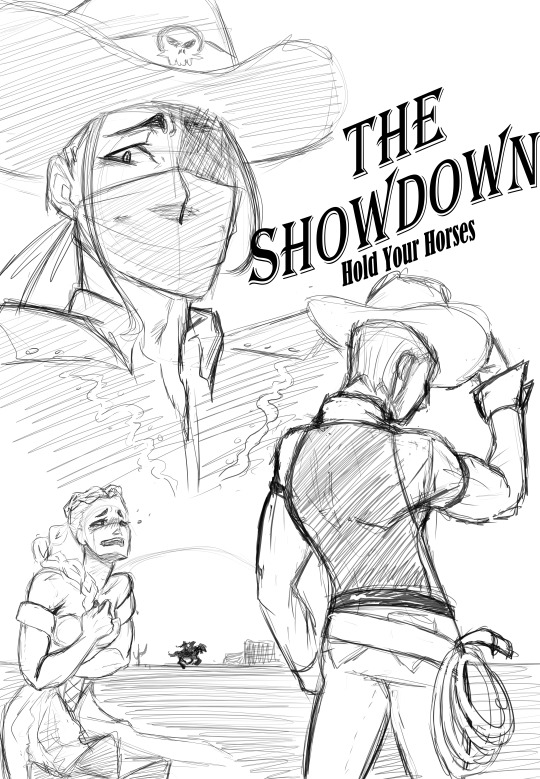
So the major take away is that an animatic is the sketch of an animation or movie or tv show, or anything that comes in the form of video. The animatic does not have to be a work of art, but it needs to be something that has all the stage directions, timing, sound effects, and dialogue so That you know exactly how the project is going to look and sound at certain intervals and how long it takes for things to happen. here is an example of animatics used in The Legend of Korra.
https://www.youtube.com/watch?v=uKm_gvw8aYI
As seen in this example, the animatic can be messy and less detailed in one area and more detailed in others. it literally doesn’t matter as long as the timing is correct.
We shared our loglines to the class and got some ideas from one another and then worked on creating our beat boards (shown at the beginning). It was so early in creation that I had yet to conceptualize what all the characters looked like.
After the beats, I made a script. If anyone is wondering, if you are using the standard format for scripts in word, or whatever other program, each page is roughly equivalent to a minute of screen time. My script was abut 6 pages and came out to 5 and a half minutes, so I unfortunately knew what I was going into. My teacher gave me an unsettling “good luck” when I told her.
After my script, I began designing characters. The girls and old man were kinda set in the beat boards, but my protagonist and antagonist took a bit of time to come to fruition. Then it was time for story boarding.
This is Page 08 of the rough draft of the story board.
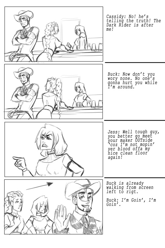
And this is the same page but production ready.
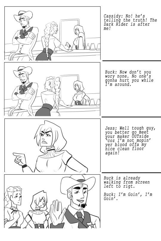
When Cleaning up for the Production ready story boards I had different layers for different objects/people to be moved in after effects. And then it was a matter of making the video. Choosing royalty free music and sound effects were a nightmare because I wanted the right ones.
But the worst part of it all, was when the pandemic hit. I went on spring break 2020, and then never came back to class. That meant that the plans of finding someone to voice act the two male characters at my school never came and I had to, regrettably, voice everyone myself. I am not a voice actor. But I tried my best. I tried lowering my voice, but that sounded dumb. I tried to edit my voice in Audition, that sounded dumb. Ah well. live with my cringy voice acting like I am. I’m sorry.
Well, without further ado, here it is. Once again, I apologize for the bad voice acting.
youtube
1 note
·
View note
Photo
Digital Drawing
Assignment: Final Picture
Medium: Photoshop
Assignment details after break.
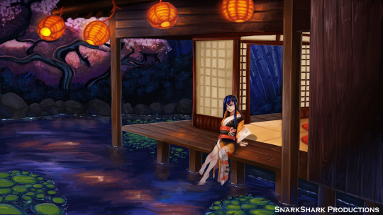
Not much to say about this one. This was our final project in my digital drawing class. We used everything we learned for one final image. I made a 3D model for the building which helped so much. I skipped the assignment on perspective where I figured out that you can literally build a 3D model to use as a reference and a free and easy cite to do so with. I skipped it for two reasons: 1) The work at the end isn’t colored or anything special. Here it is.
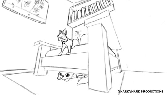
2) I still don’t understand perspective enough to give tips on it. just know that you can make your own 3D models and figure it out from there.
This is an online model maker.
https://www.vectary.com
1 note
·
View note
Photo

Digital Drawing
Assignment: Photobash
Medium: Photoshop
Assignment description and experience under break
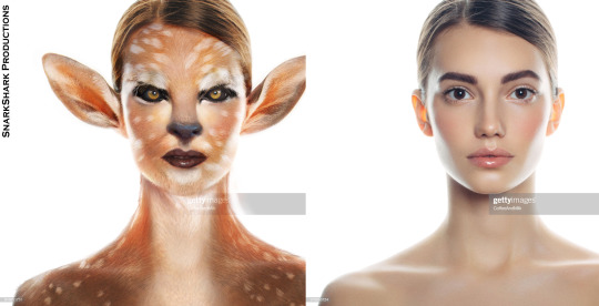
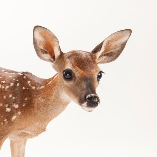
This assignment was one I thought I wasn’t going to do well, but I actually really liked the result. We had to once again find a stock image and turn the person into something else. Examples given included reptile people, aliens, and animals, but we were allowed to do practically anything as long as we took textures and parts from other images and blended them seamlessly into the person we chose.
This skill is used by industry professionals to have a reference to create concept art with. It’s like a realistic sketch. Some people use this method in special effects makeup to see what their model would look like before the prosthetics are sculpted. Essentially, you are manipulating the image and cutting parts and textures from different sources to make a realistic concept of a non-human character. A good understanding of photoshop is needed to be able to manipulate the images and blend them together.
0 notes
Photo
Digital Drawing
Assignment: Character Creation
Medium: Photoshop
Oooooo, Here we go. Now we well into the semester and the assignments are getting good. We had been learning about composition, and using reference, all those nice things and it was time we created our own character.
To start off the project, we picked from a couple of different cartoon character tropes. We could either make a cute character (what i chose), a strong character, or a villain character I believe. And we were using old timey cartoons as references so that we could pick out common traits easier. ie: cute character: big eyes, large forehead, chubby body.
We essentially kept these stereotypical traits in mind when creating our characters. The characters were highly encouraged to be animals or non-human because it would just make things easier. Humans are hard to draw, man.
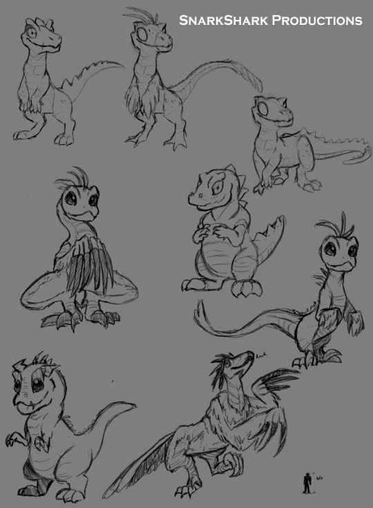
We started off drawing different concepts of the same character. what we were doing here is work shopping our designs. The more you draw a character, the more the character has time and room to grow. Theses aren’t even the first ones I drew as they were scrapped for being embarrassments.
Here’s the reason why you workshop your designs. The first one on this page to the left was my favorite. It was also early into conception as one of the firsts successful designs, I drew more because my teacher wanted 10 different designs but I was set on the first one. I didn’t like all of the ones that came after, but one of the last ones became the one I stuck with.
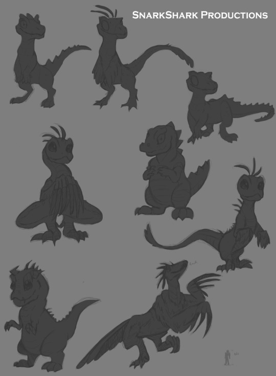
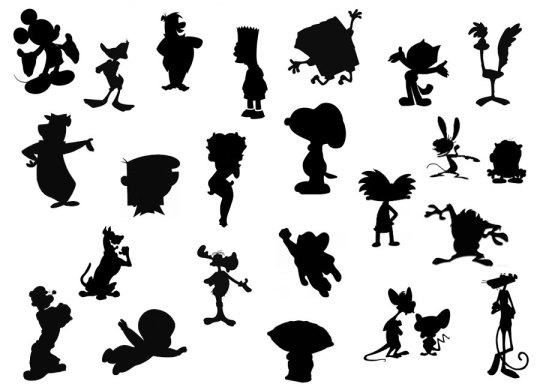
We were looking for a character with a good silhouette. The Silhouette of a character is important because you can identify them easily. Think of iconic cartoon characters you can pick out even if they were grayed out. Think of “who’s that Pokemon” before each commercial break. Think of which Video game character you like the look of the most. What is memorable in what the character looks like is the shape they fill.
After I Looked through all my silhouettes and picked out which character was the cutest in my opinion we moved onto the next part of the assignment: Creating a Skeleton. Is this a fictional creature that I came up with myself? yes. But To take that step further, You should have a general understanding of how that character moves You don’t have to be an expert on animal anatomy, but you can look up pictures of different animal skeletons to build a guide.
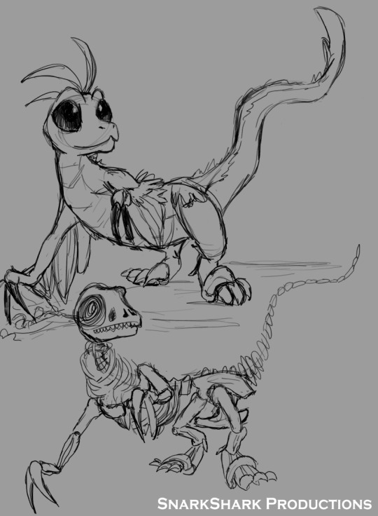
Again, It doesn’t have to be perfect or even accurate, but give the character a structure to move with.
Next you can focus on coloring. Where does this character live? Are the terrestrial? Aquatic? Should they be camouflaged or should their color warn others that they are dangerous? Do you just want to color something bright for the fun of it? That’s what I did.
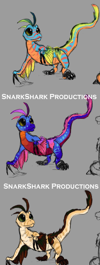
But hey, you could go through all the steps and still have your finished project look like Butt. Like mine.
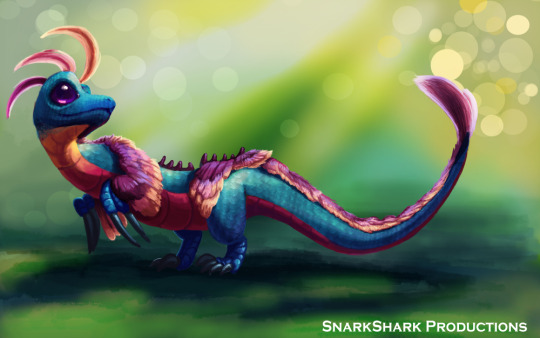
The background didn’t matter so I didn’t need to polish it, but it did not end up like I wanted it to. I started off strong and then I ran out of time and photoshop crapped out on me halfway through. Unfortunate. I might redo this picture. actually. because I like the character so much.
2 notes
·
View notes
Photo
Visual Story Telling
Assignment: Beat Boards
Medium: Clip Studio Paint
Assignment description under break.
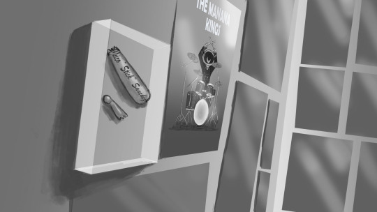
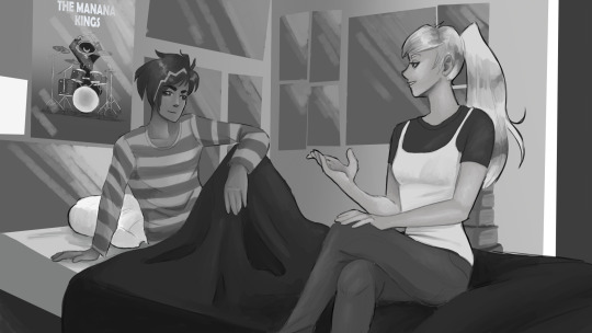
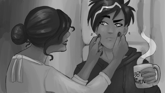
So we had a warm up of taking something that was already visual, and creating a story board for an alternate scene. This time around, we picked from a short list of scripts to turn into a story board. The scripts were from personal projects of some of my teacher’s friends. They were all different in genres, some being horror, some experimental, and one was a kid’s show script. I chose the kid’s show.
We had two assignments for this project using the same script. The first was creating what is known as beat boards. Beat boards are what you depict your major scenes with. Maybe you don’t know exactly how the story will play out yet, but you know which moments that you absolutely want to include. These moments are your “beats”. They act as an outline for the story as they are something you want to hit in certain places that are crucial for your story’s flow.
We had it easy and picked out the beats from the script to use and color them nicely. The beats are usually the most complete looking pieces of imagery. Mine aren’t amazing because, well, my teacher said they didn’t have to be for this assignment. So I did them quickly. But usually they are the things that you want to wow someone with when you are pitching your story to a tv station. Here is an example of beat boards used in the pitch of Disney’s Gargoyles.
https://www.youtube.com/watch?v=u8nWTHZVFz8
Your actual story board doesn’t need to be nearly as detailed or good as your beat boards as long as they are concise and legible. Go ham with the stick figures if you have to.
For my project, I chose the Kid’s show script called Gilbert Rocks, a group of children with a passion for music.

The script came with this image. I cannot find the name of the creator to give direct credit to, but here is the website if you are interested, though I don’t know if production is going well or not. https://gilbertrocks.com/home
Though it was supposed to be a script for a kid’s cartoon, after reading through the dialogue, it didn’t feel “kids” to me. It was wholesome and family friendly, but I felt like the story would come across better if the kids were aged up a bit. so I re-designed the two main characters of my chosen scene, Jose and Hayley, to be teens instead of children.
0 notes
Photo
Visual Story Telling
Assignment: Re-envision
Medium: Photoshop/Clipstudio Paint
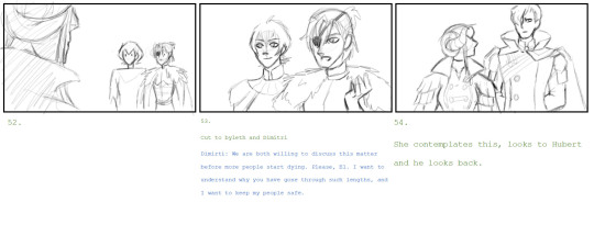
*Spoilers for Blue Lions Route in Fire Emblem: Three Houses*
This is one page of a 20 page long story board that I re-imagined from Fire Emblem: Three Houses. For the assignment, we had to pick a series or game, or movie, or anything really, and revise a scene that we didn’t like or went a way that was unfavorable.
*Game stuff ahead*
I chose this scene from Three Houses because I was really into the game (still am) and had opinions on this scene. While I liked how the scene went and appreciated that the game actually let Dimitri talk to Edelgard to try and understand and resolve the issue before killing anybody else, I still would have liked it to go a different way and touch on some plot points that get brushed over. I understand that because it’s a game, it had to end the way it did, but I’m a sucker for golden route, sue me,
Basically this was just a warm up for our next assignment which is turning a script into a story board.
1 note
·
View note
Photo
Class: Digital Drawing
Assignment: Painting Faces
Medium: Photoshop
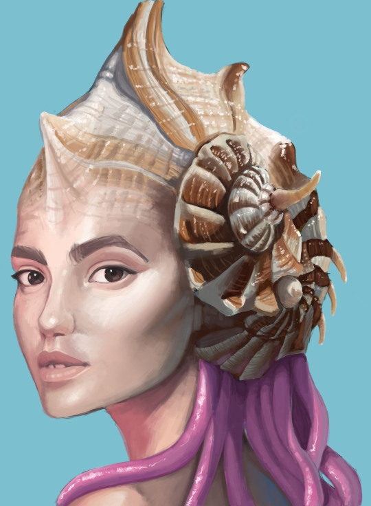
It was time that we started learning how to paint a face digitally. It was kind of terrifying because I wasn’t to confident in my digital art skills. My past art classes were all traditional and even though I had been using a tablet and art program since I was in 6th grade it didn’t mean that I was good at it.
But my teacher had us start small. For this assignment we had to choose a stock image of a person and draw them mixed with something from nature.
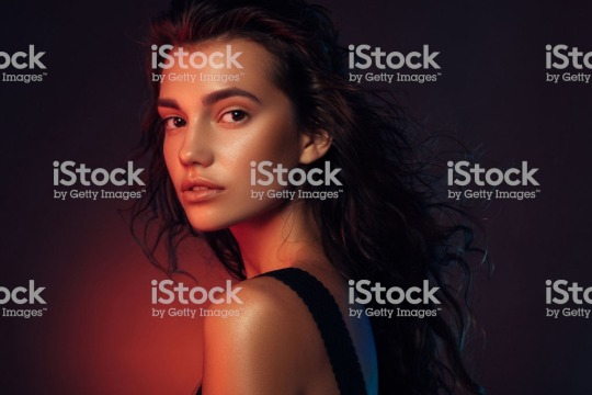
I used this picture as reference and found some image of seashells to study and turned this random stock girl into a.... Mermaid? Idk, just following directions.
I have always had a hard time with picking what colors I need. Black and white is easy because you can see the contrast between to two extremes. But colors might be a different hue, but the same value, which is something I struggled with for a while. But as I said before, My teacher had us start small. He wanted us to color pick from the reference photo to help us understand color itself. He was very adamant about us sticking to the reference photo as it provided a lot of wisdom. We also were advised to play around with filters and such on the reference photo before coloring so that we could better match the colors to whatever environment we wanted.
References are your friend, don’t let anybody tell you that you shouldn’t use them or that it is cheating. Copying and stealing artwork is one thing, but you can never learn what something looks like if you don’t look at it.
5 notes
·
View notes
Photo
Class: Visual Storytelling
Assignment: Story Point
Medium: Clipstudio Paint
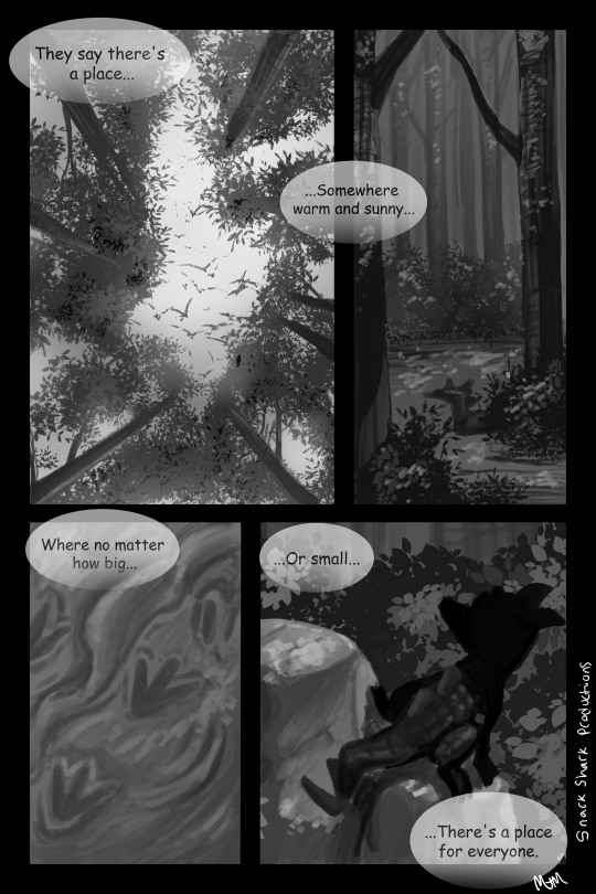
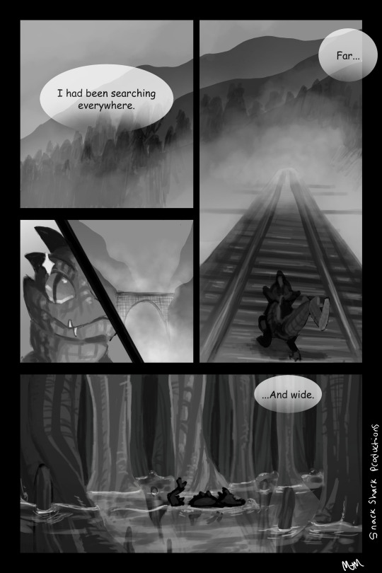
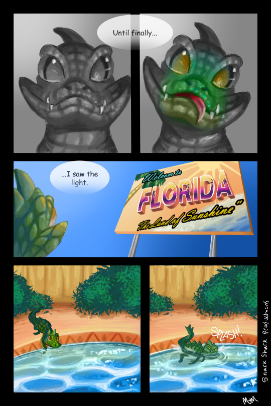
Hi! If you are new to my blog, I’m basically posting my assignments and my experiences from my early college years, in chronological order, for both myself, and for anyone who is curious as to what art school is like.
This project was to connect three random images given by my teacher to make a coherent story. we could have made a story board, comic, how to, basically anything that needs visual story elements that used the images in some way.
My images were: forest, creepy bridge, and gator in swimming pool.
I thought it was very Florida and decided to center my story around the gator part. I’m from Florida so I thought it was very appropriate as we are a living meme.
I really liked this assignment a lot as it let me do something I want to eventually make my career. I am really not interested in the fine arts and would rather learn about story telling and illustration. It’s hard to believe that I took this class in the beginning of the year because of all that’s happened making it seem like 4 years, but it was the first time in my college career that made me feel good about staying in school.
4 notes
·
View notes
Photo


Visual Storytelling
Assignment: How to
Medium: Clipstudio Paint
I took this class in tandem with Digital drawing so I was getting all sorts of digital drawing tips from both classes. It was magical. This class in particular was focused around organizing your story or idea in a way that is easy for your audience to see and consume. From storyboard to major motion picture, how you choose to tell your story is important.
For this assignment we start small. We had to draw a ‘how to’ of a simple or detailed task. The only catch is that we weren’t allowed to use words except for in the title. The goal was to try to convey how to do something with only pictures so that you had to organize your directions very well.
It was hard to try and explain the difference between a top coat, base coat, and regular polish without words but I tried my best.
3 notes
·
View notes
Photo
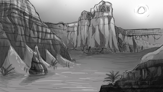
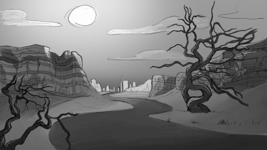
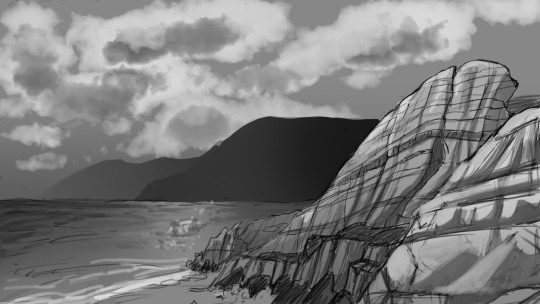
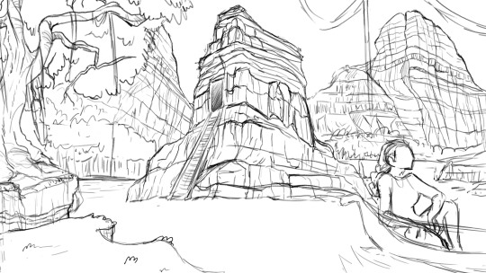
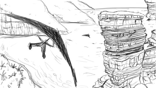
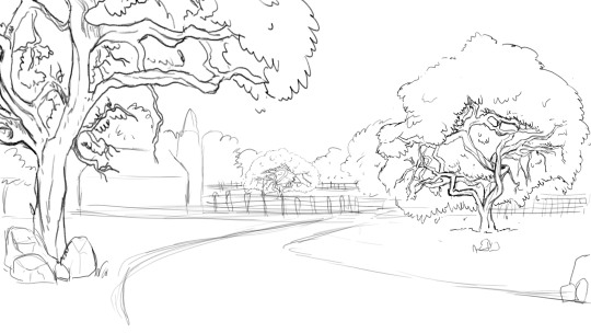
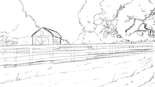
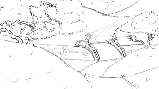
Digital Drawing
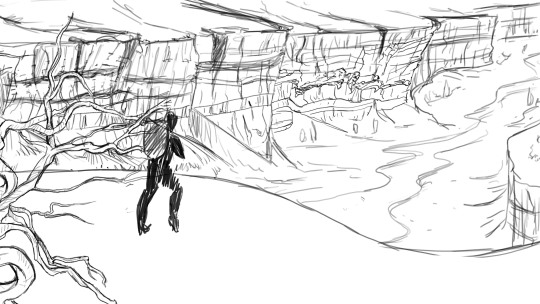
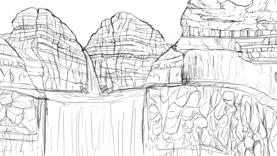
Assignment: Composition/Thumbnail sketch
Medium: Photoshop
At last, The year is 2020 (before a certain pandemic) and I have finally found two classes that are focused around illustration and visual arts. How to plan, how to story tell, how to ACTUALLY use a medium. I was loving both of my art classes and I finally felt like the tuition was worth it. The worst thing is that the two classes from this year weren’t explicitly stated to count for my degree. So I had no idea There were classes that actually interested me until my advisor sent an email that was like, yo btw, we have more than a couple of art classes.
This first assignment focused around a quick and easy way to compose a composition. We gathered a few stock images of trees and rocks to use as reference. And reference came into play a lot in this class for obvious reasons. We made a sort of library of trees and rocks that we sketched out and we had to use those assets to create a nice composition, 10 in total. The three we liked the best would be rendered in grayscale, paying close attention to contrast. You want to be able to see the composition from any resolution.
For this assignment, we actually learned how to use tools in photoshop to our advantage. and what you could to to make one image look like something completely different.
Also, note that this process is far from your finished image, it’s just a way to think about what composition you are going for and what kind of lighting you want. Overall very helpful.
6 notes
·
View notes
Photo
Beginning Ceramics
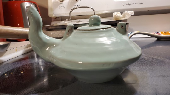
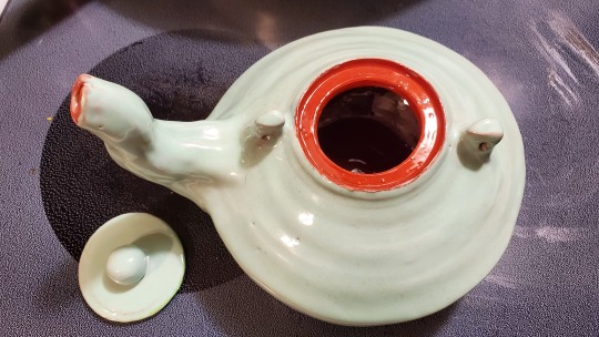
Assignment: Functional
Medium: Red clay
Not much to say or complain about this class. My teacher was great, the projects were good. I’m not good at ceramics but I had to take it to fulfill my last beginning class requirement. It was hard but fun. If you focus in 2D art like me, you don’t have to fear this class.
My teacher was open to interpretation, taught you how to do something with many different demos, answered every question, was understanding that the class was hard, and was just a nice dude with sick sculptures under his belt.
This was the best, least lumpy thing I made in this class. Can it be used? Yes. Do I use it? No. But I’m proud of it.
2 notes
·
View notes
Photo
Intermediate Drawing: Various Works
Let’s just get this class over with because it was just not my favorite.
I want to get this out of the way, first and foremost, I believe that every single piece of artwork is valid. Whether you like abstract or realism or anything else, nothing is “bad” or “good” in my personal opinion and are just a matter of preference. One of my favorite movements in art history is Dada because of it’s impact on how a person perceives art. Anything is literally art as long as you claim it to be. That is how much freedom and expression art has to offer.
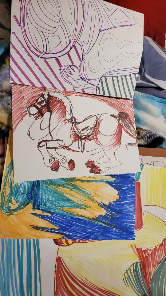
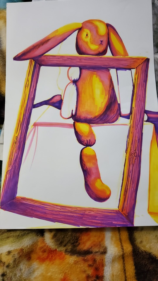
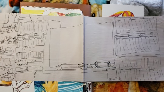
However, this class, Intermediate Drawing, limited my freedom and expression and made the class very un-enjoyable. The syllabus said that we would draw from live models and focus on composition and all that good stuff but we had no live models and we worked with mainly flat artworks as seen above. If anyone is familiar with my previous works (whether they be bad or not), one might think these to not be my best work or that they were older in date. But I’m doing this blog in chronological order.
Again, maybe some one else likes these pictures. Maybe they happen to like this style and that is perfectly okay. I’m flattered if you find these good. But the important thing to take away from this is that I, the artist, didn’t like making them. I am not proud of these works and only sought to please my teacher. Which is never what I want to make art for. Creating something for someone else is fine, but if I can’t be proud of what I did, then I really don’t want it to be seen.
Failures are fine, I learn from and share my failures. But in the eyes of my teacher, most of these were successes. And the ones that I felt like I could kinda like, were ones that my teacher hated.
For a while, my teacher would have us draw the still life with beautiful Prisma Markers. Too bad he had us tape the marker to the edge of a stick and draw 2 feet from the canvas. I tried to take it in stride, using it as a learning experience. My drawings had a tendency to look stiff and and I was using the stick-marker to let lose and just draw with the flow. I focused on a rocking horse in the still life because it had a lot of roundness I could practice on. I liked it. My teacher did not. But I didn’t know why.
After that, I tried different things that I hated until finally, he had something good to say about it. I wish I knew where I put it, but I guess I lost that image so I’ll try to describe it. It was an outline of the entire still life which was massive. a pile of junk that each person in class added to. I started with the outline, in brown, without worrying about overlapping in the lines. I was just about to add color and try to do something with it when my teacher stops by and says that he loves it, that it’s the best work I’ve done in the class and that it looked complete. I left it as it was. I wasn’t going to argue, because at the end of the day, I needed that grade..... I skipped to many classes.... no actually I only missed one at that point and had already lost a letter grade because of it, Idk why man. He liked it so much that I decided to do my midterm in that “style,” (the large picture of the tv above) which he liked too.
My teacher was a nice and understanding person, but I just didn’t want to draw the way he made us. Abstraction is fine, and I like a lot of abstract art. But for a class of Intermediate skill level, I thought we would learn more advance techniques in realism. Realism is the foundation for everything because if one wished to abstract a form, one must first learn what that form looks life first. In some ways, abstraction is a higher skill-set. I’m interested in cartoons which is a form of abstraction but I’m not that good at it because I lack the fundamental skills I was hoping to learn.
Moral of the story: just let me draw how I want and give me a grade based on the criteria of the assignment. If the assignment is draw a duck and I draw a duck or something alluding to a duck, and I’ve put in effort to draw that duck, why not give me an A regardless of how that duck is drawn. If I draw a dog instead of a duck, then you can take points off.
3 notes
·
View notes
Photo


Beginning Sculpture- Assignment: Breaking Boundaries
Screen shots from An Education in Murder.
Medium: Digital art, Clip Studio Paint, and VN Maker.
long post ahead
So strangely enough, we are still in beginning sculpture. This was for our final project which was the most open in terms of rules out of all other assignments.
“Breaking Boundaries” basically meant that for the final project we could do literally ANYTHING we wanted as long as it was out of our comfort zone OR something that we’ve never done before and was scared to do or never had the time/courage to do.
Examples from previous students ranged from time consuming to simple and fast. One student chose to work with metal instead of their comfortable wood working. Another wanted to mix painting and sculpture. Those are pretty much the projects you would expect to see for this assignment. But then my teacher gave us the projects that were interesting but still counted for the grade. For example, one student confessed to the girl he liked as his broken boundary and he showed the receipt from where he took the girl for dinner and my teacher accepted that.
For me, my dream is to one day make a complete, murder mystery game, but at the time, I only had a general idea for it and not a whole lot of confidence in my art or writing skills. I had a couple of visual novel makers but had never really used them. I thought it was the perfect chance to actually put myself into the position to create something that I wanted and also be counted for a grade.
I had never worked so hard in my entire life. I had two weeks to imagine a murder, solve it, draft a script, plan evidence, make characters, draw sprites for each character, figure out how VN Maker worked, type everything, and do the various things that make a point and click visual novel what it is. I worked no-stop, but it was the first time in my life where i felt happy to put that level of work into. This was something I’ve always dreamed of doing but never had the time to even try. But since I literally HAD to commit because I already told my teacher I was going to make a game, my need for completion took over until I finished it.
It’s bad, I know it’s bad. Well no. It’s not good, and I had to wrap up the case because it was already 20 minutes long and I had to present it to the class, but I was, and still am, VERY proud of what I did. Did I have to use assets included in the VN program except for one background I tried very hard to fit in with the others? Yes. Did I have to download sound effects from Ace Attorney because I didn’t have enough time to search for royalty free sound effects let alone make my own? Absolutely. But I am still so proud that I did it.
0 notes
Photo
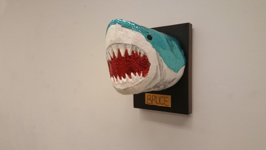
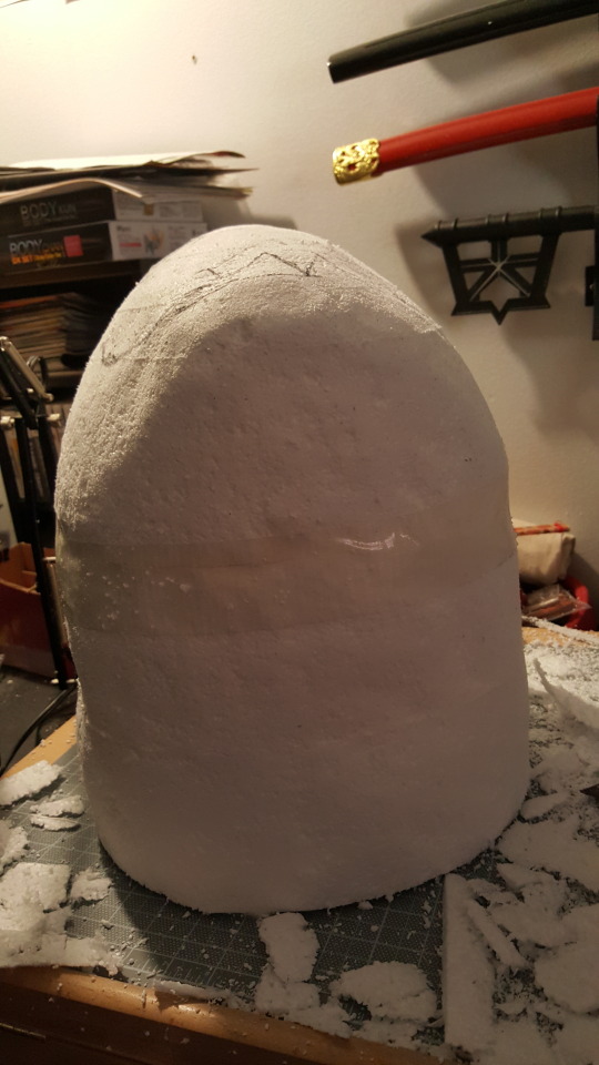
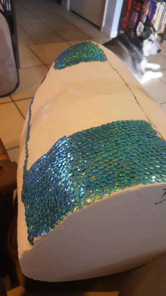
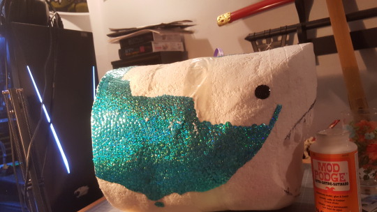
Beginning Sculpture- Assignment: 1,000 Pieces
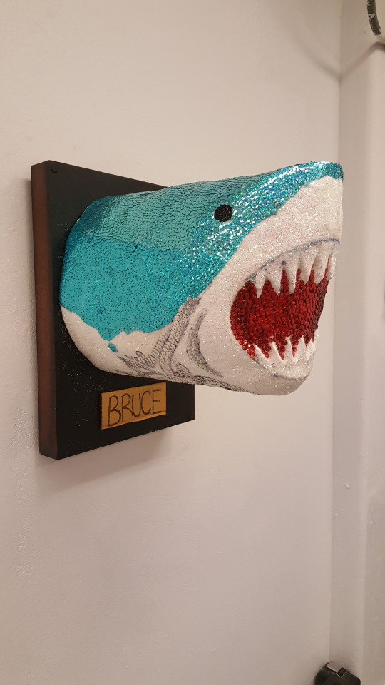
Medium: Styrofoam, Mod Podge glue, and more than 1,000 sequins.
So my first semester at my state college, I took two studio classes, which was not recommended but I still took two every semester. One was Beginning painting, which I already uploaded most assignments for, and the other was Beginning Sculpture.
I wasn’t really excited for sculpture because I would rather do 2D art because I just have a bigger interest in it. But a 3D art class was required for my degree so I just had to do it. It turned out that I actually enjoyed the class, so that was a good surprise.
The criteria for this assignment was: you can make anything and use anything, just as long as you use at least 1,000 of one thing. My teacher told us that one of her previous students set up a podium and on his turn during critique, he pulled out a salt shaker and poured the whole thing on the podium and she gave him full credit. I doubted that she would accept something like that again.
I chose to carve out a shark head and painstakingly glue each individual sequin onto the shark. My first attempt at gluing the sequins were messy and not unified because I was being lazy and was just trying to get them on there. I didn’t like the look and asked the teacher’s assistant for suggestions and she recommended to work back to front so that the sequins would overlap onto each other and look like scales. Though sharks don’t have regular fish scales, it still looked a lot nicer. Then the process of laying down sequins became weirdly therapeutic and I actually liked what I made. I was going to cover the bottom of the shark with silver sequins, but I ran out of time and had to just do a design and cover the rest with glitter.
2 notes
·
View notes
Photo
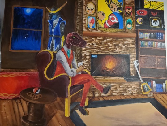
Beginning Painting- Assignment: Self Portrait
Medium: Acrylic paint on canvas
So this was our final assignment in my beginning painting class and it was both fun and stressful. The criteria was that we had to paint a self portrait on a large canvas, much larger than the standard 18″ by 24″ we were used to.
I pretty much hate drawing myself or writing about myself so at first, I was not thrilled on the idea of this project. However, Art is always open to interpretation and I decided to try something different that just barely met requirements.
I didn’t feel comfortable with painting myself due to my own insecurities so I turned to what I normally do in situations like that and I tried to make it comical. I reasoned that my “self portrait” wouldn’t be my face but rather everything that made up “me.” So basically I painted things that I like, from the past and present, that continue to to inspire my work and also my personality.
Though there are many problems with this piece that I can’t stop looking at now (composition, proportion, lighting, perspective, ect), it still made me happy to see my classmates eagerly search for things that they also enjoyed hidden at every corner. For that reason alone, I still like this painting.
0 notes
Photo
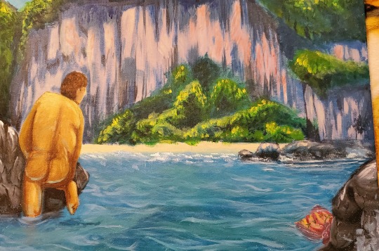
Beginning Painting- Assignment: Narrative
Medium: Acrylic paint on canvas.
Time for nakie people!
For this piece, we had a live nude model and we had to integrate him into a different setting. My teacher encouraged us to use a photo reference and come up with a scenario for our composition.
I really liked this painting because it made me laugh. I just admitted to laughing at my own joke but I don’t care. The challenge was using the model’s pose and coming up with a scene that fits it. My classmate saw what I was painting and said it looked like he was hiding because he lost his shorts and I loved that idea. So I added a small pair of shorts floating away.
2 notes
·
View notes
Photo
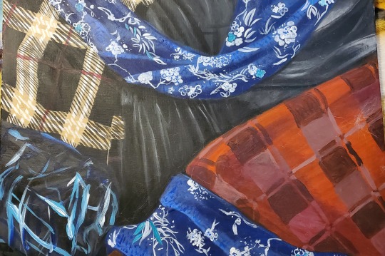
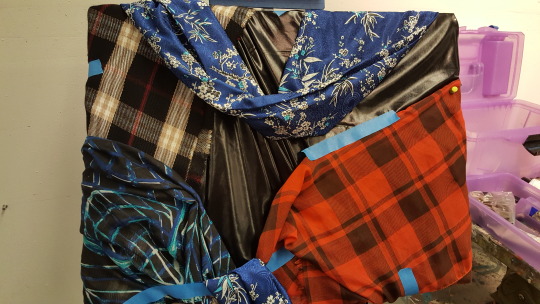
Beginning Painting- Assignment: Fabric
Medium: Acrylic paint on canvas.
I actually like how this one turned out. I didn’t at first because I thought it was going to be boring, but I really liked painting the fake leather and silk scarf. The plaid scarves didn’t do so hot but, eh.
The purpose was to pay attention to the different textures and how the light reacted to it. The plaid was matte, and absorbed light, creating soft shadows. The fake leather and silk were shiny and reflected light leaving a sharp contrast between the lights and darks.
I’d do this again, but with just one fabric at a time.
2 notes
·
View notes