#i enjoy drawing in digital in a way that reminds me of traditional techniques
Explore tagged Tumblr posts
Text

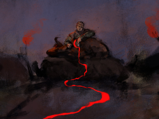
The time for farewells is over. It is time to leave for the Ragi Barrow, the place of blood. Good thing you've come, yargachin. You know the Lines, you can complete the rite.
#pathologic 2#Мор. Утопия#artemy burakh#this is deadass one of my fav moments in the game#also weee i had a lot of fun drawing this#i enjoy drawing in digital in a way that reminds me of traditional techniques#art tag#pathologic#edit: for whatever reason this isnt showing in the main tag????#edit 2: fixed it wee#100#500
653 notes
·
View notes
Text
Excersizes for fighting art block ✨
P.S. these work best for people more focused on character design
1: no-pressure DTIYS
go on a social media page (I like Pinterest the best) and try to find a simple non-competitive DTIYS that you like. I usually find random sketches
2: the emoji combo challenge
Randomly or have a friend pick out 3 or 5 (or any number) of emojis, and try to make a character while incorporating all the emoji motifs!
3: the cursed Pinterest method
I stole this one from PricklyAlpaca on YT— just go on Pinterest and find some image you enjoy. Whether it be cursed, cute, or just strange or random, try and make a character out of it
4: the basic technique
try different mediums. I know you might have heard this one before, but I found that, as a digital artist, just sketching on paper and working with different pencils and pens really helps me enjoy my art more. Especially when it’s a big doodle page, so once you start you’re not intimidated by a blank canvas.
5: the inking method
I saw this somewhere but I don’t remember who said it— when doing traditional doodles, don’t sketch with a pencil. Go in with the ink. You spend less time erasing and more time drawing that way. Also, I like to cover up mistakes with post-its and redraw it
Reminders:
You don’t have to clean your sketch’s unless you want to
you don’t have to do inking unless you want to
you don’t have to color or render unless you want to
you don’t have to do ANYTHING unless YOU want to!
Also:
Art block and burnout are not the same thing, these are methods for dealing with the former. Art block is the lack of ideas and motivation, burnout is the fatigue from creating too much. If you’re experiencing burnout, let yourself rest, don’t force yourself to draw.
EDIT: the last tip is from @/heikala
51 notes
·
View notes
Text
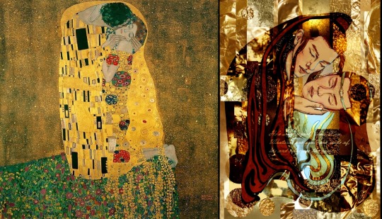
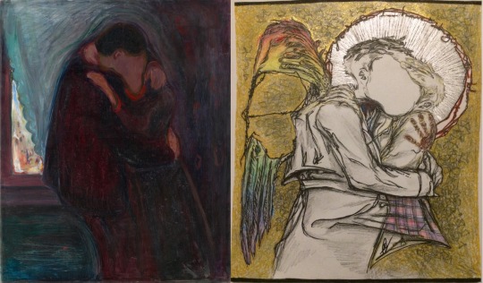
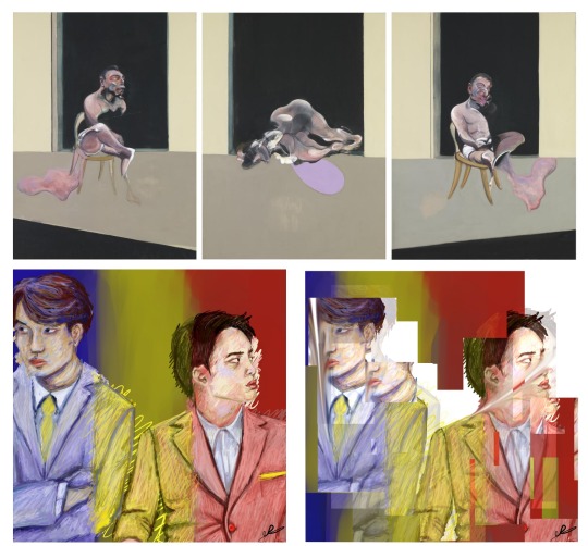
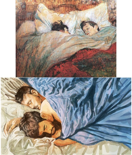

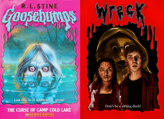
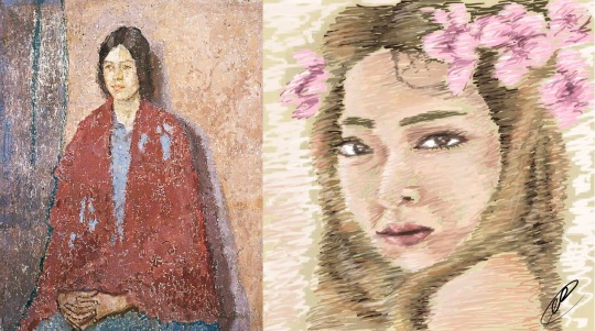
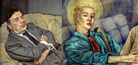
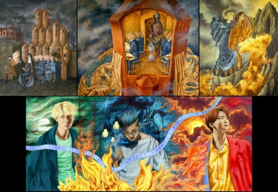
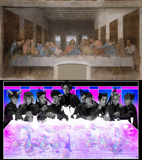
my art inspirations vs my art (2015-now)!
a mini collection of artworks I've done over the years next to the work/artist that I based the style of my piece on!
when I'm basing my work on another artist's piece, I try not to just directly copy the composition, colours or brushstrokes of the original... instead I'm always interested in adapting the original style to my own in order to create more of an homage instead!
another thing I keep in mind is medium, since most of my works above are digital and most of my inspirations are traditional artworks, so I have to figure out how to adapt that artists style into a new format in order to keep it somewhat recognisable to the original!
list of artist inspirations & explanations included in this post are below btw
Gustav Klimt's The Kiss (1907) -> Wangxian digital drawing (2020), with a photo collage background made up of lots of golden things!
This is not the only piece I've done inspired by Klimt's work, but it's one of my favourites hence why I included it here lol! I love how Klimt combines realistically painted portraits with flat coloured backgrounds and patterns, the contrast is just so interesting to look at and is definitely something I use quite regularly in my own work.
Edvard Munch's The Kiss (1897) -> Destiel amalgamation traditional mixed media artwork (2021)
I was also inspired by a few other artworks but the pose is definitely based on Munch's work! I just love how the faces blend into each other that it almost becomes abstract, but is somehow still recognisable as a kiss!
Francis Bacon's 1972 Triptych -> Kaisoo painting (2015)
This is definitely one of the times my inspiration was more based on the ~vibes~ of the artist rather than anything in particular about one specific work lol! (so much so that I only know I based it on that particular triptych cos I wrote about it when I posted the artwork pfft...) Bacon's work isn't necessarily stuff I enjoy looking at (in fact it often makes me kinda uncomfortable), but I do like how expressive his work is!
Henri de Toulouse-Lautrec's In Bed (1892) -> A study from the film Weekend (2023) (which I haven't actually released properly yet shh you'll have to wait until June for that lol)
I didn't actually initially plan to be an homage to this painting, but about halfway through me drawing it I realised it was reminding me of something lol! Henri's (yes we're on a first name basis cos I cba to write his long ass surname pfft) painting evokes such tenderness, a moment in time commemorated in paint, and it's that same emotion I hope my own work emulates!
Caravaggio's Young sick Bacchus (1593) -> Jimin holding some fruit and flowers lol (2017)
Not the only piece I've done inspired by Caravaggio (or baroque painters in general), but I'm still very proud of this piece, even if the proportions are terrible lol! The chiaroscuro of Caravaggio's work still makes me weep honestly! Plus, kinda weird, but I really love the way he paints grapes lol!
Goosebumps book cover (?? possibly 90s or 00s??) -> BBC Wreck fanart (2022)
I grew up with the Goosebumps books, and though I didn't have this particular publication, I remember absolutely loving the cover art! It's honestly kinda mad it's taken me this long to do an actual Goosebumps based work lol! Also the cheesy taglines are some of my favourite parts of the covers and I spent WAYYY too long trying to come up with my own pfft!
Gwen John's Young woman in a red shawl (1917) -> Luna f(x) fanart (2016)
I remember seeing John's work in Cardiff and just fell in love with her muted colours and rough brushstrokes! I don't think I necessarily echoed her work that well with my own (since it's a difficult technique to do in digital), but I still like it nonetheless lol
Lucian Freud's Guy Half Asleep (1981) -> Park Kyung Instant fanart (2018)
This was actually one of the first times I tried to make an artwork that was done digitally but actually looked like it was traditional! I'd honestly really like to do more work inspired by Freud's cos I love the lumpiness (technical term) of how he paints people! It almost feels like you could reach out and touch their skin when you see his work!
Remedios Varo's Triptych (1960) -> BTS Rapline triptych (2018)
I can't even remember where I saw her work first but I knew that I wanted to do something inspired by her work since I absolutely adored her use of colour and the stylism of her figures and backgrounds! I also really loved how her triptych acts as this journey through each piece, which is something I tried to recreate myself and that Rapline triptych is honestly still one of my favourite pieces I've ever done lol :')
Leonardo da Vinci's The Last Supper (1495) -> EXO 'last supper in hell' fanart (2019)
This is one where seeing it next to the inspiration is honestly hilarious lol! I was actually more inspired by the music video for Monster, which has a part in it paying homage to Da Vinci's Last Supper btw! I haven't really done much work based on Da Vinci, even though I really like his painting and drawing techniques!
And that's all (for now)! I know I will forever be inspired by artists and artworks of the past (and present) so maybe in a few years I'll do another one of these compilations lol!
#this isn't an art advice post... not really.. but idk where else to put it so#art advice#art history#artists on tumblr#digital art#art inspirations#fanart#not gonna tag all the artists cos we'll be here for years lol
20 notes
·
View notes
Text
Entry#1: Love at First Sketch
Like a person would fall instantly for someone in just one glance, art had already bewitched me from the moment I experienced drawing for the first time.
It all started in the past, I remember watching my mom work on beautiful illustrations. She was so elegant at doing her drawings that it kept my childhood self guessing how she even did those with perfection. As a nosy youngster, I was also curious enough to be meddling with her things when she was out of sight. I tried to mimic how my mom would hold one of her pencils and copy her facial expressions, mocking her so innocently. I then began moving my hand through the air, as if I were making colorful strokes on an imaginary canvas. After all, I’d been told not to waste paper, so what else could I do?
I did get caught in the end. But thankfully, my mom didn't mind at all. Instead, she found it funny and charming at the same time and thought that her daughter would also want to follow what she loves to do. By then, she had already prepared a sketchpad for me, and looking at it was sure a sparkling sight. From that moment on, I was completely hooked. The feel of the pages turning, the endless possibilities of what I could create—It was like a connection meant to be. It did feel that way when I looked at its number of blank pages, having to claim the sketchpad all to myself. And that specific day marked the beginning of my love affair with drawing. Holding that pencil in my small, inexperienced hands felt like a magic wand when I scribbled on the first page. And guess what? My very first drawing made me so proud at the time! Even though looking at it now seems awful, I knew my young self was totally in love with it.

Ballerina: My first ever sketch as a child
As the years passed, my love and dedication for drawing continuously developed and became stronger. I grew up filled with lots of sketchpads in my room, each one contained with memories and improvements from the previous one. My mom who had always been so supportive even put up a mini art gallery in the house, displaying our favorite artworks from each past year as a beautiful reminder of our artistic accomplishments together.


Our Art Gallery & my other most beloved artworks
The onset of the pandemic, however, led to a dramatic shift in my creative journey. With the world suddenly put on hold for a few years, those times I was trapped indoors with my sketchpads and art supplies surrounding me, I found myself with an abundance of time to explore my craft. While I still enjoyed traditional drawing, I started exploring digital art as a new creative outlet. Seeing the stunning work of digital artists on social media inspired me to try it out for myself. At first, it was intimidating—the endless number of tools was overwhelming. But before long, I also became hooked on it. The ability to undo and experiment with different tools, brushes, and colors at the touch of a button was liberating and I came to love it even more when I got to use a stylus and a drawing tablet.

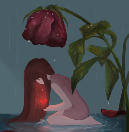

Some of my digital art creations
Looking back, I never thought art would lead me to be the person I am today. From the first sketch I made as a child to the digital masterpieces I am now creating, my love for drawing has only grown stronger since the moment I picked up my first pencil. The skills and techniques I’ve developed over the years have not only been a source of personal fulfillment but have also opened up new opportunities for me to pursue a career. As a college student studying in the field of Multimedia Arts, I am grateful to have the chance to continue exploring my passion and share my art with others. Whether it be traditional or digital art, I know that drawing will always be a part of me, shaping my life and creative expression in countless ways.
2 notes
·
View notes
Text
From Sketch to Screen: My Journey from Traditional to Digital Art
Creativity has always been at the core of who I am. From childhood sketches to exploring the worlds of photography, graphic design and animation, my artistic journey will take me through a very dynamic blend of discovery and growth. With each medium, I will learn new techniques, adapt my skills and always find new ways to tell stories through visuals. This post is simply the beginning of my journey as a multimedia artist and how I will learn to integrate different art forms into my creative process.
In my early days I fell in love with the idea of drawing, the thought of turning my thoughts into visuals into a sheet of paper always intrigued me as a child, and like many artists, my journey began with a pencil and paper. Drawing was really my first love—it was my way of expressing ideas and bringing characters to life, and as someone who is interested in not only illustration but also photography, graphic design, and, eventually, animation, learning digital art feels like a natural progression. Graphic design, for example, depends heavily on software such as Photoshop and Illustrator. Animation necessitates knowledge of digital drawing tools. Photographs frequently include digital retouching. By honing my digital illustration skills, I can bridge the gap between these creative disciplines and broaden my artistic horizons.
Well, of course, moving from traditional to digital isn't easy. Unlike a pencil and paper, where I can feel the texture and control every stroke with precision, drawing on a tablet feels completely different. There's a learning curve—getting used to the pen sensitivity, understanding layers, and figuring out how to blend colors digitally.. At times, it's frustrating. But I remind myself that every great artist started somewhere. One of the most difficult challenges is getting past the comparison mindset. I see digital artists who have mastered their craft and wonder if I will ever reach that level. But instead of allowing doubt to hold me back, I remind myself that this journey is about progress, not perfection. My traditional art skills will serve me well in digital illustration; all I need to do now is figure out how to apply them.
However.. There is another of my interests that I want to share.
Illustration isn't my only creative outlet; I also enjoy photography and graphic design. These fields work better together than most people realize. Photography helps me understand lighting, composition, and color, all of which are useful in digital illustration. Graphic design teaches me about layout, typography, and how to produce visually appealing images.
By combining these abilities, I hope to create one-of-a-kind artwork that blends illustration, design, and photography. Eventually, I'd like to experiment with animation, bringing my drawings to life through movement.
Finally, this blog will serve as a personal journal of my journey—documenting my struggles, achievements, and everything I learn along the way. I want to show that transitioning form traditional to digital art isn't an overnight process, but a rewarding one. I've always wanted to become an amazing illustrator or an amazing animator, so I am willing to take this journey to achieve my goals.
To any other artists out there feeling intimidated by digital art: I get it. It's challenging, but it's also exciting, there is something incredible about thinking about how much potential you can unlock by putting in the time and effort to patiently learn a skill. Every new skill starts with a first step, and I'm ready to take mine. Let's grow and prosper together!
So for now, I'll show some drafts that I worked on in my design classes in school! The whole idea is to combine cats and an animation/illustration vibe..
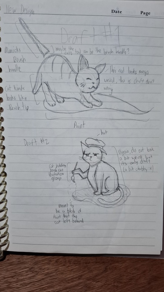
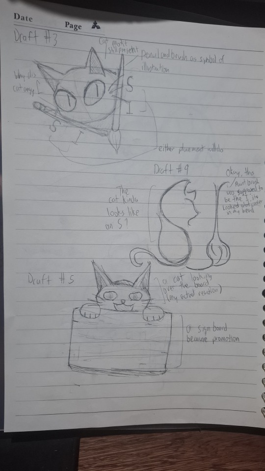
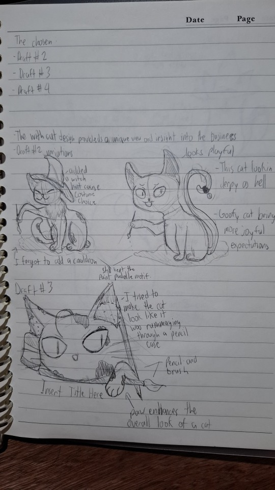
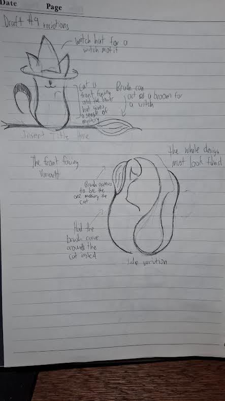
With all that said, if you're also learning digital art or just have any tips to share, feel free to comment below! Let's support one another on this journey!
1 note
·
View note
Note
Hi Nin! I know this might be weird of me to ask because you are an artist yourself, but I am rather new here and was wondering if you have any other artists you'd recommend? If not that is ok!
Hi there, not weird at all! I LOVE supporting fellow artists, I find their wonderful talent and dedication incredibly inspiring, seeing their beautiful works on my feed constantly reminds me to take a step back from my exhaustion and to simply remember why I love to draw to begin with: because it’s fun.
I’m usually really picky about artists I follow and their style, but when I find the ones that I enjoy, I go ALL OUT with my support. So without further ado, the following artists listed are those I am not only in love with, but those who I genuinely look up to.
So make sure you stop by their page to show them some love and appreciation for their hard work (because hard work extends beyond the individual pieces they’ve made, it’s also for the countless hours they’ve spent on practicing and perfecting their craft, constantly challenging themselves to learn new techniques). 💛
👇🏼👇🏼 Nin’s Artist Recommendation👇🏼👇🏼
---------------------
@aku-jumbi - HQ!!, Various, You all had seen me share a BUNCH of their works on my blog, but it’s just because their art is so SOOOOOOOOO good. Your style leans toward photorealism, while still maintaining its painting-like quality, so if you had ever wondered how your favorite characters may look like irl, they’ve got you!!! Watching your speed painting is so fascinating, idk how you do it, but you’re always killing it every time (Like our process is so different, so it was really interesting to see how you approach your works you know?). This piece of Kei Tsukishima and Oikawa Tooru are two of my favorite works you’ve done!
@achieve-the-sun - HQ!!, Various, Let me start off by saying that I love Morghy’s art so much, that they are the first and only person I had ever commissioned from so far. They drew Keishin and I sooo adorably, it brings me so much joy to look at it on the daily. Your style reminds me of freshly baked cookies, or the warmth of bakeries, I can’t help but feel a sense of coziness whenever I look at your adorable artworks. This piece you did of Kageyama and Hinata was what had drawn me to you. Everything from your color choices, fluid gestures, and expressions are such a delight to look at!
@chaotickatts - HQ!! I am so in love with Katts, you all. I had never seen anyone draw like this, her style is really unique. I can go on forever about why I love your art, but one of the biggest things that drew me to your style is the way you draw bodies. I like the variation and realistic details you include, for instance, I absolutely adore the way you gave Sakusa more moles on his body, and the way you drew dad bod Osamu. Idk, I think there’s so many different types of body shapes and details out there, and it brings me joy to see you being so inclusive of them in your art.
@namusw - Hunter x Hunter. Was drawn to their Hunter x Hunter works and I don’t even watch/read that manga. Honestly, just check them out, I love everything about their works, they are also a killer at both traditional and digital styles. This piece of Hisoka, Illumi, and Chrollo was the one that made me fall in love.
@cranbearly - HQ!! I really adore the way they draw expressions and their coloring style (inspired me to attempt some flat coloring). This piece of Oikawa and Iwa made me follow them instantly. Expressions are so difficult to nail, and you’ve done such an amazing job conveying every emotion the characters are feeling, I’ve learned so much just from looking at your works, so thank you for blessing us with your craft.
@a-zebra-was-here - HQ!! Their art has a very carefree type of vibe and their coloring style brings me so much joy. I’ve really enjoyed your drawings of the Miyas’, this piece of the twin was what got me, and this other piece, the first image of young Miyas’ was so SO well done, I am in love with the way you colored that. 😻
@erionmakuo - Various, dude....I want to cry, I don’t even know what to say, EVERY SINGLE PIECE of your artworks just BLOWS ME AWAY. The way you color your art is just so ethereal, the color schemes you had chosen, the way you mix the color of your lighting, textures, and everything in general, I can go on about this all day but just hop on to their blog and you will know exactly what I mean. I don’t have a particular piece that drew me in because I was blessed by all your works at once.
@uranarino - HQ!!, Your artworks bring me so much joy. If I have to describe your style like an experience in life, I would say it reminds me of how it’s like to fall in love with someone for the first time, if that makes sense. That sudden overwhelming feeling you get when you’re doing the most mundane things with someone you care about, only for time to stop as you realize how in love you are with them? Yea, your art captures that really well. These two pieces of Kuroo returning home with his groceries and of him taking a day nap with his cats was what had drawn me to you.
@queenoftheantz - HQ!!, Various, Their style is really unique, it kind of reminds me of an adventurous graphic novel or something you would see on Cartoon Network (idk, I thought of Chowder, but please, I really mean it as a compliment, I just really love the fun cartoon style you have.) They also do some animations! I really love this piece of Kyotani you did, the landscape and colors look SOO GOOD!!
@noodlemanjpg - HQ!!, Various, love LOVE your style and the way you draw expressions. I also really love how you color, your works “appear” effortless, but I know a lot of knowledge and precision is put into crafting it. This piece of Kuroo x Yaku being all cozy at the couch was what had drawn me to your blog, it makes me smile every time I look at it. Kuroo’s smitten expression is just...ahsdl;adjs I can’t help but smile with him.
@diabolism666 - HQ!!, c’mon, you can’t be in the HQ!! fandom without at least seeing one of their artworks. In fact, I had seen your art even before I’ve gotten into this show, and it was love at first sight, lemme tell ya. EVERY. SINGLE. THING. you had drawn are so good, it doesn’t even matter if it’s a more simplistic drawing or elaborate one, I am just always staring at it in awe. Thank you for being so incredibly active about it too, idk how, but you’ve produced so many amazing drawings and we’re just incredibly grateful for it. You draw some of best Tendou, Reon and Toshi out there. Your works have so much range, I really feel like you can draw ANYTHING hahaha.
@viria - Various, Viria *sobs* your works are so good. The way you draw faces and affection just gives me butterflies. I don’t even watch Fullmetal Alchemist, but this piece you did of Edward and Winry made me fall so deeply in love with your works. Your style has a certain softness to it, even when it is of an angry character, and I love it.
@nipuni - Various, another artist that I am incredibly nervous to tag because your works are just out of the world. You also seem so so nice and is always incredibly helpful whenever anyone sends you an ask. Just...I have the biggest crush on you and your works. EVERYTHING you had drawn is so stunning, and I mean it. The details, pose, composition, and coloring, it is just so perfect, I could pull up particular artworks, but I was really blessed by it all at once. If you are into fantasy-esque realistic looking portraits, check her out, she exudes so much knowledge and talent.
@hinamihere - HQ!!, Your artworks are soo stinkin adorable. Your color choices, expressions and the way you draw hair is just so cute, your art always bring the biggest smile to my face. This piece you did of Akaashi and Bokuto was what drew me to you, when I saw it, I “awhhh”ed so loudly, my hubby had to ask me what’s up, and when I showed it to him, he had the same reaction, even if he’d never seen Haikyuu!!
@oxxuri - BNHA, so SO good, the way you color, light, and draw is so beautiful. Every single detail, down to every lashes and strands of hair is so beautiful. You draw some of the most attractive faces I had ever seen, these drawings of Aizawa and Midoriya brings me so SOOOO much joy, and I don’t even know anything about BNHA.
@amezure - HQ!!, their comic strips always make my day, I was giving their blog a peep so I can pull up specific examples and my statement is instantly confirmed when I stumbled across their newest comic art of Kuroo and Bokuto and started laughing HAHA. 😂 Your self study sheets are incredibly informative and I find myself referencing them often, it’s so nice to see my favorite artists continue to polish their craft through endless amounts of studying, practice, and analysis. It serves as a constant reminder for myself to do the same. I love the way you draw people (check out this piece of Bokuto x Akaashi), but I ESPECIALLY love the way you draw animals. (Specifically anything that has to do with lil owl Bo and Akaashi 🥺)
@obobro - Avatar the Last Airbender, HQ!!, I am absolutely in love with the way you color and draw portraits. Your drawing and detailing has so much range; you have a series of hand drawings, and that alone already displays so SO much range. I was really drawn in by this drawing of Tsukki, Zuka + Azula, and of Sokka + Katara, you can really tell they were related and I love it so much. Your art has so much life to it, it’s truly fascinating.
---------------------
I have a couple more artists to recommend, so if you’d like a part 2 to this, please lmk.
But yes, I genuinely stand by my recommendations, these guys are so SO good at what they do and I am currently sweating because the thought of tagging all my artist crushes in one post is actually kinda scary lol.
Hope this helps! ✌️
#Nin's Art Recommendations 🎨#artists on tumblr#haikyuu!! art#fanart#beginner artist#hq!! art#recommendation#art recommendations#artist recommendations#artistsupport#unknown artist#art#digital art#digital artist#traditional drawing#haikyuu!!#haikyū!!#haikyuu!! x reader#avatar the last airbender#avatar art#bnha art#bnha#hunter x hunter#hunter x hunter art
13 notes
·
View notes
Text
Art Analysis Essay
Identifying which printmaking process works for me is pretty hard due to not having much experience in each different process, so I’d have to base this essay and my decision on which technique I’ve enjoyed the most this past year. I evaluated each process and my outcomes, and I feel the best would be Screen-printing. I also, came to this decision due to the speed and efficiency of this process. My art style can be quite graphical, and I feel this process captures that in print form the most, by using digital applications like Adobe Draw initially then exposing them onto a screen to produce a print. Using the specific colours in the initial design or being able to experiment freely without changing the integrity of the initial outcome.
After conducting initial research, I discovered that screen-printing started as early as the 17th Century progressing through the decades ever evolving as the technique, we know it as today. Artists like Andy Warhol, David Hockney and Roy Lichtenstein really giving it the platform of popularity. The process makes up of a exposing a stencil onto a silk screen, then pushing the ink or paint through the screen so it transfers onto the material you’re wanting to print on. The stencil is exposed onto the screen in a similar way to a photograph, using light to burn the image into the reactive emulsion paint which hardens it. Any areas that weren’t covered by the design stencil remain a liquid which can be washed off to reveal the image you’re wanting to print, then allowing the ink to flow the screen to your desired layout or design.
Kate Gibb
Kate Gibbs is artist I’ve researched as part of another project and is printmaking artist from London, England. I loved her work previously, as I find it to be very expressive with her use of colour, lines, shapes and texture. The obvious use of mark making within her work can be visualised in different works. Utilising the chance of happy accidents that can occur during the creative process.

kategibb.co.uk. (n.d.). Kate Gibb. [online] Available at: http://kategibb.co.uk [Accessed 1 Mar. 2021].
My analysis of Kate Gibbs ‘Pleasure Garden’ starts with my initial feelings on the overall, composition, colours, textures and shapes she has used to create this piece. When looking at this design I get cultural references of Japanese printworks though her use on colour and their tonal ranges, after conducting further research I noticed that this design in particular references Kyoto, Japan for a magazine publication. This explains why she worked in this way to portray a more abstract outcome in relation to her way of working. As similar to her other prints works, I’ve researched Kate Gibb prefers the use simple shapes, colours and lines combined with layering. These marks on top of one another make her prints more cohesive to me, I think she does this, so her style is fluent and easily recognizable predominately, in her album cover works. My eyes are more drawn to the circle which looks like sun on the bottom layer, then flow around the composition following the brush strokes down the page into a pool of different mark marking processes. I find this design very relaxing compared to her other designs, the colours are more complementary of each other already mentioning their tones but, also different shades blue ranging to green and aqua. I think she might have done this to relate back to Japanese culture, as I also find the ‘The Great Wave off Kanagawa’ by Japanese artist Hokusai, very harmonious and calming. I like her use on paintbrush strokes to add texture especially in the larger areas where you can see the background peaking through. The little areas of detail filling negative spaces with repeated patterns and the shadowing of the background adds dimension also, contributing to the flow of direction when looking at the design. I like that there are some elements more subtle than others I think she would have done this to keep eyes on the piece for longer a the more I look and analyse different shapes and lines appear.

Google Arts & Culture. (n.d.). The Great Wave off the Coast of Kanagawa - Katsushika Hokusai. [online] Available at: https://artsandculture.google.com/asset/the-great-wave-off-the-coast-of-kanagawa/fAFp7yddSAtcTQ?hl=en-GB [Accessed 10 Mar. 2021].
Laurie Hastings
Laurie Hastings is a printmaking artist I’ve discovered recently on Instagram; her simple illustrative style of screen printing really caught my eye. Her background as an illustrator shows through into her silk-screen works, with the cartoon influenced figures and use of block colours. She is a commission-based artist with displaying works on her online portfolio but, also international exhibits.
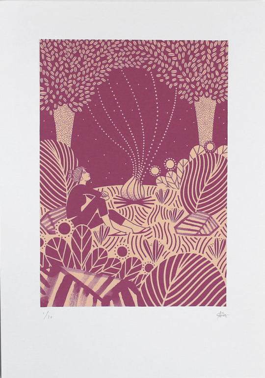
Laurie Hastings. (n.d.). Portfolio | LAURIE HASTINGS Illustrator and Printmaker. [online] Available at: https://www.lauriehastings.com/ [Accessed 1 Mar. 2021].
My analysis of Laurie Hastings ‘The Adventurers - Campfire’ starts with my initial feelings on the overall, composition, block colours and line work she has used to create this piece. My initial reaction was to the process of how this piece was made, as at an initial glance I thought it was a Lino Print, very similar to another artist I’ve researched called Michelle Hughes in terms of line work and block colours. I feel the simplification of only two blocked colours, one darker, one lighter which have no tonal range, shadows or highlights to them, then to be applied in layers create this effect. I get a real homely, warming feel from this, warmth relating the fire and her use of organic lines and shapes in waves. I can feel movement within the design to how it has been illustrated this way with fewer straight lines and the trees being more suggestive than realistic shapes. The figure in the print is of a woman looking out at the sky looking comfortable in her overall position. My own relation to camping and a sitting in front of a fire is that I’ve always found it very peaceful which also, strengthens the warmth intuition as I have a personal relation to it. The ground has also, been flipped in colour to create extra dimension of shape, grounding and stability. Highlighting this area to be different to the sky and other elements of the print. After looking deeper, I discovered this piece being part of a series of 3, with the other designs having similarities within their illustrative forms. Making all 3 designs a cohesive collection together. Looking at the bottom of the print your eyes automatically are drawn upwards due to all the different marks/lines facing vertically then interconnecting with different elements then drawing focus back looking at the print and its entirety.
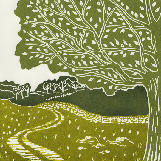
michellehughesdesign. (n.d.). Yorkshire Dales III, original linocut print. [online] Available at: https://www.michellehughesdesign.com/yorkshire-dales-3-linocut-print?lightbox=dataItem-j97a2han [Accessed 10 Mar. 2021].
Chuck Sperry
Chuck Sperry is another screen-printing artist I’ve come across recently. He’s an American printmaker based in San Francisco also, working from his studio there. He exhibits his work internationally propelling his American rock poster style into fine arts using a silk-screen process. His use of text, patterns and various materials to print on caught my eye as I’d not seen this before.
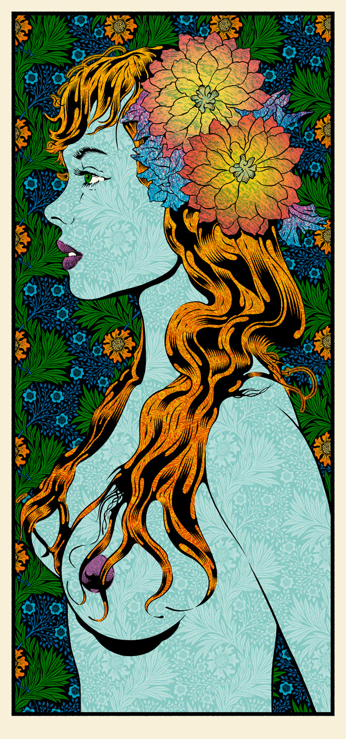
Chuck Sperry. (n.d.). Original Art Archives. [online] Available at: https://chucksperry.net/category/original-art/.
My analysis of Chuck Sperry ‘Vivien 2016’ starts with my initial feelings on the overall, composition, colours, patterns and influences that have gone into creating this print. My eyes are drawn to the initial profile of a woman as the title suggests is Vivien. Vivien reminds my highly of Marvels villain Mystique in the X-men series due to her being topless, the colours used for her hair and body along with the watermarked style texture of the background pattern showing through. I also researched his influences and among them was the era of pop art which I can see this print is heavily inspired by. Roy Lichtenstein portrayed women in many of his designs and the facial features and hair of ‘Vivien’ here compared to his ‘M-Mm Maybe’ print look very similar to me regarding there cartoon comic style. Although I do see the differences, I see I that Roy used dots to add definition in specific areas strengthening comic references whereas Chuck Sperry uses florals it his work. The floral head piece which looks as if it’s glowing from radial illusion created is the most eye-catching part of this design dividing the figure away from the busy background. Highlighting aspects of the background, the style of how the leaves have been drawn remind me of Celtic symbolism, and a traditional illustration of a Scottish thistle, the repeated pattern and the colours used a similar to a tapestry. Chuck Sperry has created a series of these designs uses the description of ‘muses’ and female names to title them, each design has similarities to the hair, florals and beauty creating a series print. Although his more recent work in this style looks less like a comic and more like a realistic portrait of a woman. The title of Muse to me highlights the feeling of confidence, strength and beauty which I feel is portrayed along with sensuality.
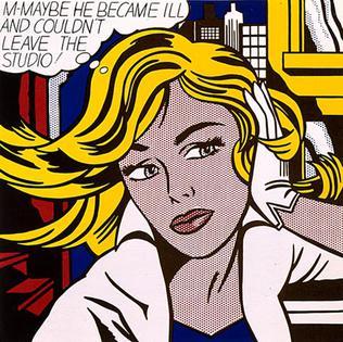
Wikimedia.org. (2021). [online] Available at: https://upload.wikimedia.org/wikipedia/en/2/23/M-Maybe.jpg.
All of the prints I’ve chosen have some form of an organic natural feel I find I am most inspired by these elements in terms relating to my own work. Different aspects of each artist drew me in for the analysis of their work. I find Kate Gibbs expressive abstract style very freeing with the use of her bold colours and layering. Whereas both Laurie Hastings and Chuck Sperry although using the same printmaking process have more of a graphical, planned technical feel. While writing up my analysis I wanted to include both styles of working as depending on my mood I like to work either way.
Word Count- 1,532
3 notes
·
View notes
Photo
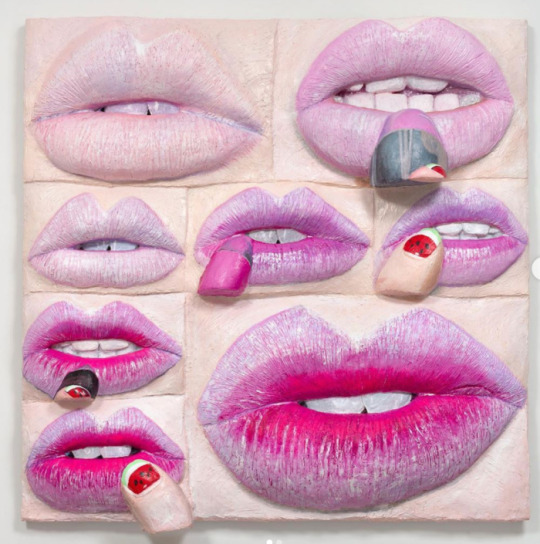
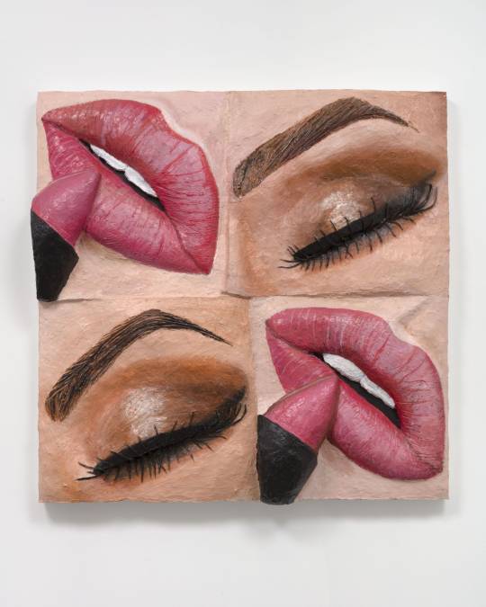
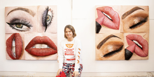
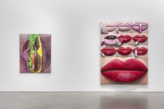
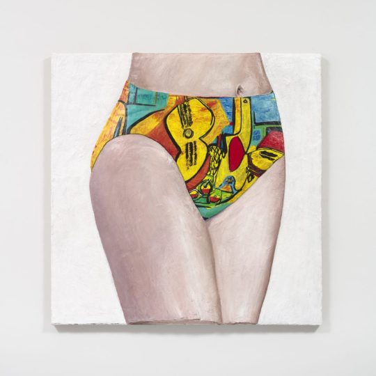
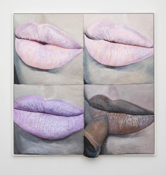
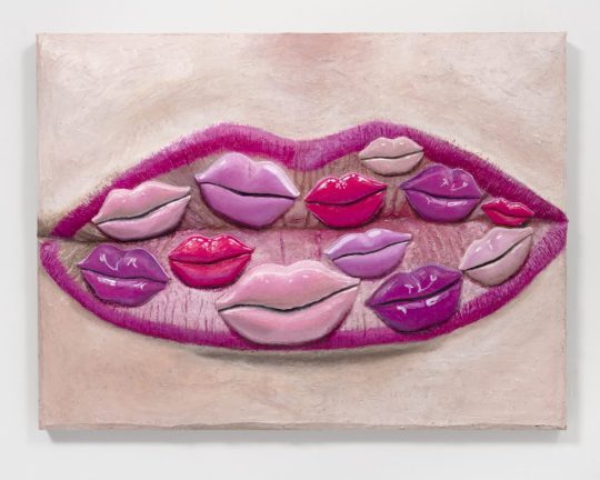

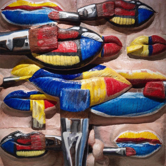
Artist Gina Beavers Satirizes Our Insatiable Appetite for Personal Beauty in Her New Show at Marianne Boesky
Makeup as Muse: Gina Beavers
November 28, 2020
Despite my art history background and general love of art, I am less than eloquent when writing about it. Nevertheless I will continue soldiering forward with the Museum's Makeup as Muse series, the latest installment of which focuses on the work of Gina Beavers in honor of her recent show at Marianne Boesky Gallery. Beavers' practice encompasses a variety of themes, but it's her paintings of makeup tutorials that I'll be exploring. Since I'm both tired and lazy this will be more of a summary of her work rather than offering any fresh insight and I'll be quoting the artist extensively along with some writers who have covered her art, so most of this will not be my own words.
Born in Athens and raised in Europe, Beavers is fascinated by the excess and consumerism of both American culture and social media. "I don't know how to talk about this existence without talking about consumption, and so I think that's the element in consuming other people's images. That's where that's embedded. We have to start with consumption if we're going to talk about who we are. That's the bedrock—especially as an American," she says. The purchase of a smart phone in 2010 is when Beavers' work began focusing on social media. "[Pre-smart phone] I would see things in the world and paint them! Post-smartphone my attention and observation seemed to go into my phone, into looking at and participating in social media apps, and all of the things that would arise there...Historically, painters have drawn inspiration from their world, for me it's just that a lot of my world is virtual [now]."
But why makeup, and specifically, makeup tutorials? There seem to be two main themes running through the artist's focus on these online instructions, the first being the relationship between painting and makeup. Beavers explains: "When I started with these paintings I was really thinking that this painting is looking at you while it is painting itself. It’s drawing and painting: it has pencils, it has brushes, and it’s trying to make itself appealing to the viewer. It’s about that parallel between a painting and what you expect from it as well as desire and attraction. It’s also interesting because the terms that makeup artists use on social media are painting terms. The way they talk about brushes or pigments sounds like painters talking shop." Makeup application as traditional painting is a theme that goes back centuries, but Beavers's work represents a fresh take on it. As Ellen Blumenstein wrote in an essay for Wall Street International: "Elements such as brushes, lipsticks or fingers, which are intended to reassure the viewers of the videos of the imitability of the make-up procedures, here allude to the active role of the painting – which does not just stare or make eyes at the viewer, but rather seems to paint itself with the accessories depicted – literally building a bridge extending out from the image...Beavers divests [the image] of its natural quality and uses painting as an analytical tool. The viewer is no longer looking at photographic tableaus composed of freeze-frames taken from make-up tutorials, but rather paintings about make-up tutorials, which present the aesthetic and formal parameters of this particular class of images, which exist exclusively on the net." The conflation of makeup and painting can also be perceived as a rumination on authorship and original sources. Beavers is remaking tutorials, but the tutorials themselves originated with individual bloggers and YouTubers. And given the viral, democratic nature of the Internet, it's nearly impossible to tell who did a particular tutorial first and whether tutorials covering the same material - say, lip art depicting Van Gogh's "Starry Night" - are direct copies of one artist's work or merely the phenomenon of many people having the same idea and sharing it online. Sometimes the online audience cannot distinguish between authentic content and advertising; Beavers's "Burger Eye" (2015), for example, is actually not recreated from a tutorial at all but an Instagram ad for Burger King (and the makeup artist who was hired to create it remains, as far as I know, uncredited).
Another theme is fashioning one's self through makeup, and how that self is projected online in multiple ways. Beavers explains: "I am interested in the ways existing online is performative, and the tremendous lengths people go to in constructing their online selves. Meme-makers, face-painters, people who make their hair into sculptures, are really a frontier of a new creative world...It’s interesting, as make-up has gotten bigger and bigger, I’ve realized what an important role it plays in helping people construct a self, particularly in trans and drag communities. I don’t normally wear a lot of make-up myself, but I like the idea of the process of applying make-up standing in for the process of self-determination, the idea of ‘making yourself’."
As for the artist's process, it's a laborious one. Beavers regularly combs Instagram, YouTube and other online sources and saves thousands of images on her phone. She then narrows down to a few based on both composition and the story they're trying to tell. "I'm arrested by images that have interesting formal qualities, color, composition but also a compelling narrative. I really like when an image is saying something that leaves me unsure of how it will translate to painting, like whether the meaning will change in the context of the history of painting," she says. "I always felt drawn to photos that had an interesting composition, whether for its color or depth or organization. But in order for me to want to paint it, it also had to have interesting content, like the image was communicating some reality beyond its composition that I related to in my life or that I thought spoke in some interesting way about culture." The act of painting for Beavers is physically demanding as well: she needs to start several series at the same time and go back and forth between paintings to allow the layers to dry. They have to lay flat to dry so she often ends up painting on the floor, and her recent switch to an even heavier acrylic caused a bout of carpal tunnel syndrome.
But it's precisely the thick quality of the paint that return some of the tactile nature of makeup application. This is not accidental; Beavers intentionally uses this technique as way to remind us of makeup's various textures and to ensure her paintings resemble paintings rather than a photorealistic recreation of the digital screen. "The depth of certain elements in the background of images has taught me a lot about seeing. I think I have learned that I enjoy setting up problems to solve, that it isn't enough for me to simply render a photo realistically, that I have to build up the acrylic deeply in order to interfere with the rendering of something too realistically," she explains. Sharon Mizota, writing for the LA Times, says it best: "Skin, lashes and lips are textured with rough, caked-on brushstrokes that mimic and exaggerate wrinkles and gloppy mascara. This treatment gives the subjects back some of the clunky physicality that the camera and the digital screen strip away. Beavers’ paintings, in some measure, undo the gloss of the photographic image."
Beavers also uses foam to further build up certain sections so that they bulge out towards the viewer, representing the desire to connect to others online. "Much of what people do online is to try to create connection, to reach out and meet people or talk to people. That is what the surfaces of my painting do in a really literal way, they are reaching off the linen into the viewer’s space," she says. This sculptural quality also points to the reality of the online world - it's not quite "real life" but it's not imaginary either, occupying a space in between. Beavers expands on her painting style representing the online space: "It’s interesting because flatness often comes up with screens, and I think historically the screen might have been read like that, reflecting a more passive relationship. That has changed with the advent of engagement and social media. What’s behind our screen is a whole living, breathing world, one that gives as much as it takes. I mean it is certainly as 'real' as anything else. I see the dimension as a way to reflect that world and the ways that world is reaching out to make a connection. Another aspect is that once these works are finished, they end up circulating back in the same online world and now have this heightened dimensionality – they cast their own shadow. They’re not a real person, or burger, or whatever, but they’re not a photo of it either, they’re something in between."
Let's dig a little more into what all this means in terms of makeup, the beauty industry and social media. Beavers' work can be viewed as a simultaneous critique and celebration of all three. Sharon Mizota again: "[The tutorial paintings] also pointedly mimic the act of putting on makeup, reminding us that it is something like sedimentation, built up layer by layer. There is no effortless glamour here, only sticky accretion. That quality itself feels like an indictment — of the beauty industry, of restrictive gender roles. But an element of playfulness and admiration lives in Beavers’ work. They speak of makeup as a site of creativity and self-transformation, and Instagram and other social media sites as democratizing forces in the spread of culture. To be sure, social media may be the spur for increasingly outré acts, which are often a form of bragging, but why shouldn’t a hamburger eye be as popular as a smoky eye? In translating these photographs into something more physical, Beavers asks us to consider these questions and exposes the duality of the makeup industry: The same business that strives to make us insecure also enables us to reinvent ourselves, not just in the image of the beautiful as it’s already defined, but in images of our own devising."
This ambiguity is particularly apparent in Beavers's 2015 exhibition, entitled Ambitchous, which incorporated beauty Instagrammers and YouTubers' makeup renditions of Disney villains alongside "good" characters. Blumenstein explains: "So it isn’t protagonists with positive connotations which are favoured by the artist, but unmistakably ambivalent characters who could undoubtedly lay claim to the neologism ambitchous, which is the name given to the exhibition. Like the original image material, this portmanteau of ‘ambitious’ and ‘bitchy’ is taken from social media and its creative vernacular, and is used, depending on the context, either in a derogatory fashion – for example for women who will do absolutely anything to get what they want – or positively re-interpreted as an expression of female self-affirmation. Beavers also applies this playful and strategic complication of seemingly unambiguous contexts of meaning to the statements contained in her paintings. It remains utterly impossible to determine whether they are critically exaggerating the conformist and consumerist beauty ideals of neo-capitalism, or ascribing emancipatory potential to the conscious and confident use of make-up."
More recently, Beavers has been using her own face as a canvas and making her own photos of them her source material, furthering her exploration of the self. "Staring at yourself or your lips for hours is pretty jarring. But I like it, because it creates this whole other level of self,” she says.
This shift also points to another dichotomy in Beavers's work: in recreating famous works of art on her face, she is both critiquing art history's traditional canon and appreciating it, referring to them as a sort of fan art. "I think a lot of the works that I have made that reference art history—like whether it's Van Gogh or whoever it is—have a duality where I really respect the artist and I'm influenced by them, and at the same time I'm making it my own and poking a little fun. And so, a lot of these pieces originated with the idea of fan art. You'll find all sorts of Starry Night images online that people have painted or sculpted or painted on their body. It comes out of that. And I just started to reach a point where I was searching things like 'Franz Kline body art,' and I wasn’t finding that, so I had to make my own. Then it started to get a little bit geekier. I have a piece in the show where I am painting a Lee Bontecou on my cheek, that's a kind of art world geeky thing—you have to really love art to get it."
Ultimately, Beavers perceives the intersection of makeup and social media as a force for good. While the specter of misinformation is always lurking, YouTube tutorials and the like allow anyone with internet access to learn how to do a smoky eye or a flawlessly lined lip. "I think for a lot of people social media is kind of like the weather. We don't have a lot of control of it, it just is. It gives and it takes away. There's no doubt that it has connected people in ways that are great and productive, allowing people to find communities and organize activism, it can also be a huge distraction...I approach looking at images there pretty distantly, more as a neutral documentarian, and I come down on the side of seeing social media as an incredibly useful, democratic tool in a lot of ways," she concludes.
On the other side of social media, Beavers is interested on how content creators help disseminate the idea of makeup as representing something larger and more meaningful than traditional notions of beauty. "I was super fascinated with makeup and all of the kinds of costume makeup and things you can find online that go away from a traditional beauty makeup and go towards something really wild and cool...I also had certain paintings in [a 2016] show that were much more about costume makeup, that were going away from beauty. That’s the thing that gives me hope. When I go through makeup hashtags on Instagram, there will be ten or twenty beauty eye makeup images and then one that’s painted with horror makeup. There are women out there doing completely weird things, right next to alluring ones." In the pandemic age, as people's relationships with makeup are changing, "weird" makeup is actually becoming less strange. Beavers' emphasis on experimental makeup is more timely than ever. I also think she's documenting the gradual way makeup is breaking free of the gender binary. She says: "I mean with makeup, and the whole conversation around femininity and makeup—I think for a long time when I was making makeup images, there were people that just thought, 'Oh, that's not for me,' because it's about makeup, it's feminine. But it’s interesting, the culture is shifting. I just saw the other day that Alexandria Ocasio-Cortez did a whole Instagram live where she was putting on her makeup and talking about how empowering makeup is for trans communities...some people see make-up as restrictive or frivolous, but drag performers show how it can be liberating and life-saving." Another point to consider in terms of gender is the close-up aspect of Beavers's paintings. With individual features (eyes, lips, nails) separated from the rest of the face and body and removed from their original context, they're neither masculine nor feminine, thereby reiterating that makeup is for any (or no) gender.
All I can say is, I love these paintings. Stylistically, they're right up my alley - big, colorful and mimicking makeup's tactile nature so much that I have a similar reaction to them as I do when seeing makeup testers in a store: I just want to dip my hands in them and smear them everywhere! I also enjoy the multiple themes and levels in her work. Beavers isn't commenting just on makeup in the digital age, but also self-representation online, shifting attitudes towards makeup's meaning, the relationship between painting and makeup, and Western art history.
What do you think of Beavers's paintings?
1 note
·
View note
Text
June 2018 Featured Creator
What is a Featured Creator?
Write Way Studio’s “Featured Creator” segment is my way of showing appreciation for the creators of the world. Creative outlets are limitless, because there is no end to human imagination. Every month shows the succeeding featured creator. If you would like to be a part of this collaborative project, contact me at [email protected]!
My ninth guest creator is the artist known as PonPox!
Introduction
Known on the Internet by their username PonPox, they also go by Pon! They are twenty-four years old with their birthday landing on March 16th. Their astrological sign is the Pisces, better known as the twin fishes! They have earned a bachelor’s degree in video game design with a focus on 3D art. At the moment, they are part of an internship with a mobile game company as a 3D/2D artist for a vocational university.
Although they are a 2D artist at heart with both traditional and digital media, PonPox also works with 3D. They create fan-art for a variety of fan-doms they are currently interested in. When they have spare time, they adore experimenting with digital art. With the digital come the opportunities with colored pieces and more advanced work. In comparison to traditional work, digital has become so much easier because of Ctrl+Z and able to freely move pieces around as desired. Programs like Photoshop and SAI help them practice even more with all artistic elements and experimentations.
However, because of their current schedule, most of their creative drawing time occurs on their commute to and from work, an estimated three hours per weekday, and lunch breaks. In concerns to the consequence of the impending time crunch, they elaborated that their artwork was bits of “messy sketches, cleaner lead drawings and sometimes inked pieces.” The minimum of their supplies are sketchbooks, mechanical pencil, and an eraser. At the moment, they possess an interest in coloring, so they also bring along color pencils in order to satisfy the urge.
The most common subject matter for them is fan-art. Original pieces are a close second, particularly folklore and fantasy creatures. Fauns, harpies, centaurs and Scandinavian-styled trolls name only a few. They like to place them into a modern setting with creative narratives attached. The chronicles even develop into full blown backstories during their commutes. The ideas may even develop into something more in the future. But right now? They are just ramblings to them.
What Sparked the Creator Passion?
How It All Started
They started drawing around the same time as everyone else would, in kindergarten. The only difference is that they did not want to stop. They admitted that a huge artistic milestone for them had been the introduction of manga and anime into their lives. They were about nine or ten when they first started reading manga. They later would try to mimic the manga styles they encountered.
All about the Art
The Epiphany
PonPox recalled some sort of news coverage a couple years after they had been introduced to the world of manga. The topic of discussion? “How to draw manga” tutorials, of all things! They then remembered paying very close attention to the instructions the news provided. A new development occurred to them from the experience that never registered before, that “you can learn techniques to draw better.”
Their parents later gifted them with a “how to draw manga” book that actually managed to do a decent job in jumpstarting their journey as an artist. They learned so much in a short time as well as lucked out with the book being one of the decent tutorial texts. It provided a bit of everything for artists, from color wheels, basic anatomy, and even shading rules. It even shared multiple drawing styles and artists, revealing how manga is just one kind of style that happened to originate in Japan.
Manga and Anime
Manga and anime continue to be PonPox’s biggest inspirations. It’s the main reason they started to focus on their art more versus simply aimlessly drawing. However, a clarification is in order: they are not a manga artist. The term implies that the artist is creating manga in Japan and they definitely do not like being labeled with that assumption.
Experimentation
Fantasy and folklore creatures interest them since the beings can freely break away from the norm. People-watching heightens their creativity and curiosity. Humans fascinate them so, just like the creatures. They began to tinker with various body modifications, from body hair, wrinkles, body fat, muscles and body types as a whole. Part of the experimenting is due to them trying to escape from the typical anime/manga body imagery. For the mythical creatures, they feel that “you can bend the rules more . . . [since] their beauty standards and physiques can be very different than what humans are used to.”
Future Projects
At the moment, there is no definite answer. PonPox does know, however, that they will never stop drawing. They sometimes works with their girlfriend on comics of an AU (alternate universe) for the character Leorio from the anime series Hunter x Hunter on a side-blog. They are always creating more art for their blog, though!
There may be the possibility of prints, keychains, and other products (that is the hope anyway). They are simply creating art and completing commissions at the present time.
Where to Find You? Support You?
PonPox is available on the Interwebs, from looking at their artwork to business purposes. To satisfy your curiosity, look at the information provided below!
Two sides of Tumblr house their art!
Main Art Blog
Side-Blog (that also focuses on art)
Portfolio for their 3-D work!
Support their work or even request a commission!
Ko-fi
Commission Details
Last Tidbits
As crazy as it may sound, PonPox had no clue narwhals were real animals! Somewhere they heard about narwals being the unicorns of the sea and it just stuck. It wasn’t until they were about thirteen or fourteen that they stumbled upon a photograph of one. It completely blew their mind! To this day, they still think narwhals are “some of the most magical creatures out there.”
Important Notice
Please understand that some information will not be shared by the creator’s request. If you cannot understand that, there is not much more I can do to help you. Safety is a top priority here, and I am here to help the creators, not instigate negative behavior.
Collaboration Disclaimer
The information provided in my Featured Creator articles is, in fact, from the real people, not some random Internet bot. I do not use random stock photos to fill an imaginary photo quota. Any photos in the Featured Creator segment are provided by the creators with permission to use them in this manner. I want to support the original person behind the work, not a random online copycat creeping around.
To PonPox,
Even though we could not work on this as much as I would like, I hope you enjoyed the collaboration as much as I did! I know that it was hard to consistently connect for the collaboration, especially when some unavoidable occurrences happened on my end and you having work as well. It was definitely not easy and I cannot apologize enough for my lack of professionalism when the situations continued to arise. It also provided me with a painful reminder of the unfortunate reality my technology presents me (since I had to rig it so much just so we could work on the rough drafts – long story!)
We beat the odds! This finished product you’re reading right now is proof of that!
I appreciate this opportunity you gave me and hope we can work together again soon! As crazy as it may sound, you are the first person on Tumblr I have actually asked to work with me (and answered back!) I love your unique art style and quirky personality. You are one of the people I look up to, especially when it comes to art. Until next time, I wish you the best of luck!
Sincerely,
Jasmine Love
{Write Way Studio creator and blogger}
MLA Citation (8th edition)
PonPox. Personal E-mail Interview by Jasmine Love. June 2018 Featured Creator Collaboration, 20 May – 5 June 2018.
#PonPox#Tumblr#artist#mythology#anime#manga#internship#gaming#ninth#Pon#Commissions#Ko-fi#Pisces#video games#2D artist#3D artists#2D#3D#fan-art#fantasy#fan-doms#AU#Photoshop#SAI#digital art#experiment#people watch#commute#college#OC
1 note
·
View note
Text
The Legal Nomads 2019 Gift Guide: Art and Jewelry
I did my first ever holiday gift guide for travelers a few years ago, which was fun to compile. Readers seemed to enjoy the various items, and I was happy to share some of the products that accompanied me on the road. This year, I wanted to do something a little different. For starters, my life is a little different – something all of you already know. As a result, my own gifts to family and friends aren’t souvenirs from far-away places, but fun things I’ve discovered online. I wanted to share some of them here, especially as many are small businesses like myself.
I completed the resulting creative gift guide later than expected, because I could only type in 20 minute increments. I hope you enjoy this gift guide, one that focuses specifically on art and jewelry. There are so many shops with interesting work out there, and sometimes it’s hard to narrow it down.
The items below are from artists that I have supported, some of whom I’ve actually met, and they are all products I stand behind.
Unique Art and Jewelry Gifts for 2019
BECCA JANE DESIGNS
When searching for a gift for my mum’s birthday this year, I thought I would do something a little different. I looked for an artist who could illustrate our family with a beautiful border and then send her a printed copy for her birthday.
I’ve never commissioned this kind of gift before, and Rebecca – the artist I chose – was patient and kind, and we went back and forth a few times until I was satisfied. She even agreed to make my brother as depicted, wearing his favourite martini t-shirt.
I was waiting on this gift guide until my mum received her gift, and she loved it!
Rebecca’s full shop here, and note that she will do other kinds of designs as well, like Save the Dates for weddings, holiday cards, personalized baby blankets, and more.
LEXIGRAPHIQUE
I’ve followed Michael Buchino’s whimsical word work for some time on Instagram, as it combines two of my favourite things: learning, and art. His Insta feed, Lexigraphique, is one of those accounts that I send to multiple friends many times a week.
Before this guide went up, I wrote him to ask if he had any holiday items I could include, and lucky for all of us he was just about to launch the hygge cards below.
(c) Michael Buchino 2019
You can buy his prints and these cute holiday cards in his Buchino shop, here.
PICTRIXDESIGN
Anne Connell’s shop is a wonder to behold, chock full of paper goods designed — as she notes on Instagram and on her website — with an “absurd attention to detail” She lists herself as a precisionist, and it’s easy to see why. Her artwork is meticulous, delicately crafted, and very unique.
I found her botanical card series first, and clapped my hands with glee. As someone trying to get out in nature during brief spurts of respite from bedrest, they were a breath of fresh air. Her constellation cards, featuring each of the zodiac signs, are a clear crowd-pleaser. I’ve put those two types of cards below but honestly it’s worth heading to see her full shop.
I realize these are listed as cards, but I think they are frame-worthy all by themselves.
(c) Anne Connell 2019
(c) Anne Connell 2019
Botanical cards here.
Constellation cards here.
And the full shop here.
NICALLENART
Nicola is a long-time Legal Nomads reader, and a fellow lawyer and traveler. She has generously shared bird illustrations and other fun to keep me cheered up when I’ve been down. She’s also a very talented artist, and her cards and other items are rich in puns and joyful artistry.
Nicola’s work reminds me of the children’s’ books I loved most, with creative characters, maps, and whimsical animals. A talented hand-brush lettering artist, she also includes a lot of drawn typography in her work.
From a grumpy owl to a festive sheep, you’ll be sure to find holiday cards to your tastes. And one of my absolute faves is her wedding card below, “Of all the fish in the sea” — delightful.
(c) Nicola Allen 2019
(c) Nicola Allen 2019
(c) Nicola Allen 2019
Nicola’s full shop is here, with specifics from the above illustrations as follows:
Grumpy Owl here
Festive sheep here.
Of all the fish in the sea here.
BIRDSTRIPS
I’ve had the pleasure of meeting Jess, the genius behind Birdstrips, in person twice. She’s currently in Montreal, and a friend introduced us just before I re-leaked last summer. Her illustrations have grown a huge following on Instagram due to its relatable messaging, and her captions that accompany the drawings are raw and vulnerable. Together, it’s powerful work that makes almost everyone feel heard.
In Jess’ words, the shop comprises “the existential distress of the flightless through the eyes of the flighted.”
(c) Birdstrips 2019
You can check out her images and pick up mugs, shirts, prints and more, here.
ABSTRACT AERIAL ART
JP and Mike Andrews, two brothers from the UK are an Instagram favourite of mine. I often share their images with my community because their eye is unique, and their pictures compelling. Like me, they absolutely love to travel. Unlike me, they specialize in photographing bizarre, aerial images our planet using drone photography.
Their goal: to share perspectives of the world otherwise unseen, captured from a vantage point most of us miss. A great gift option for those who love to roam.
Here’s one I love from them: Skyline, a drone photograph of a freighter that looks like a cityscape.
(c) Abstract Aerial Art 2019
(c) Abstract Aerial Art 2019
And this aerial view of a beach made me smile:
Their full gallery shop here.
TEKSTARTIST
Jason Markow, aka TEKSTartist is an artist I found a few years ago, and was hooked immediately. His work combines both traditional and digital media, a fusion of techniques that result in elegant yet crisp products. Given that my own products are typographic representations of food, I love that his art includes quotes he’s enjoyed over the years, visually represented in unique ways.
One of my favourites: this flower, “Your Garden, Forever” available here, created by warping and twisting the words from Tennyson’s famous quote – “If I had a flower for every time I thought of you…I could walk through my garden forever.”― Alfred Tennyson
(c)TEKSTartist 2019
And the item below, The Giving Tree, was created by warping/twisting the words from the entire set of text from Shel Silverstein’s iconic book “The Giving Tree”. Buy a copy of the artwork here.
(c)TEKSTartist 2019
Full shop here.
EFFIN BIRDS
These illustrations of birds with curse words sayings are all the rage on Instagram and Twitter, for good reason: they’re hilarious. Crafted by Aaron Reynolds, they do seem to offend some, but as the name suggests exactly what they are it’s hard for anyone to be upset. Don’t like them? Close the tab. Personally, I find them exactly what I need, each and every day. Clothing, mugs, pins, and more at the link, including a new Effin’ Birds book.
Buy here.
TOTE BAGS: TYPOGRAPHIC MAPS OF FOOD
I’m excited to share the new tote bags in the Legal Nomads shop. Previously, I offered a canvas, bull-woven tote of the maps, with the map printed on once side. These new tote bags are black and white – and if people like, I can also swap out the handles to make them red or mustard! – and the design is printed on both sides.*
*If you’d like to swap out the tote bag for a different handle (example here), just send an email to jodi-at-legalnomads.com after you order, and I’ll make sure it happens.
The new tote has sturdy handles and holds up to 44lbs, perfect for errands and/or carrying a laptop without a laptop bag. Food maps of Japan, Thailand, Vietnam, Portugal, Italy, and Mexico available.
(c) Jodi Ettenberg 2019
Shop the new totes here. The full shop is here.
VANRILEY
These beautiful macrame earrings are courtesy of the Van Riley shop, run by a fellow leaker. I wanted to share her work as I know how it is to worry about making ends meet with a CSF leak. If someone in your life loves macrame, please consider supporting her shop!
Macrame earrings and other items, on the VanRiley shop here.
MICAPEET JEWLERY
Given my love of nature, it’s no surprise that I also love jewelry that depicts it in design. I saw these gold leaf earrings recently and ordered a pair as my holiday gift to myself. They’re lightweight — great for anyone with headaches — and they are delicate and just so pretty. I like the contrast of the gold with the emerald green stud in the ear.


If leaf earrings aren’t your thing, Mica also has necklaces, rings, and other earrings in a variety of shapes and sizes. They’re lightweight and beautiful, and oh so creative. Her jewelry is hypoallergenic and nickel-free.
Buy the same gold leaf earrings that I love here, with Mica’s full shop here.
GLDNxLAYEREDANDLONG
Several readers nominated this Etsy shop, and it’s the only one on this list that I haven’t also purchased myself. But when my readers are happy, I’m happy, and I wanted to share what brought them such joy in gift giving.
Chrissy’s shop features personalized, delicate jewelry for those who want to memorialize their care with initials or names. The image below is for the necklace that several readers bought, but her shop is full of other options, including rings, earrings, and pendants.
Personalized initial necklace here. Full shop here.
BEBANGLES
I’ve saved one of the best for last.
My friend Chantelle started Be., a company that sells bangles – but also much more than simply bangles. Chantelle is one of the most open-hearted, vivacious people I’ve ever met, and thankfully I’ve had the pleasure of meeting her in person years ago. Her company’s bangles work well in conjunction with the lightness and curse words of Effin Birds, two small business enterprises that use curse words to make a valid point. In Chantelle’s case, Be. takes a stand against societal norms. Her work aims to support women and girls in a society that often expects airbrushed perfection.
I received a few Be. bangles as a wonderful 40th birthday gift from Chantelle, and my two faves – that came with me to Florida are:
“I’m mostly peace, love, light, and a little go fuck yourself” – product here, and
“I stopped waiting for the light at the end of the tunnel, and lit that bitch up myself” – product here.
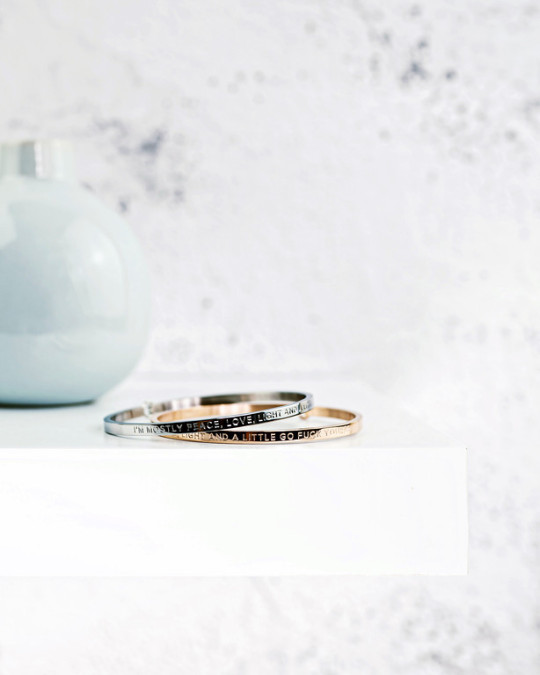
I am someone who uses curse words as a form of punctuation, so those two bracelets are perfect. For those with less swear-y tendencies, lots of beautiful options like:
“Be you. The world will adjust.” (here), and
“Speak. Even if your voice shakes.” (here.)
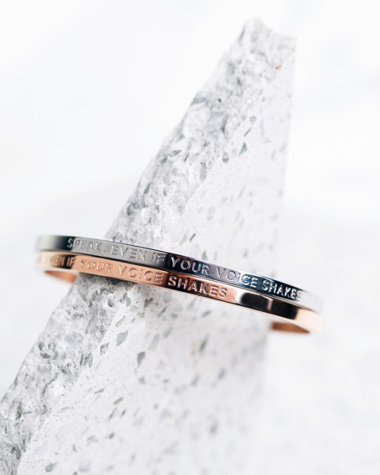
All of Be.’s products here.
That’s it for 2019! A big thanks to my friend Reine who helped pull many of the images and upload them for me, so that I could do this guide more easily. It would have been a 2020 gift guide without her. Hopefully there’s something fun in here for someone in your family.
Happy holidays, and thank you as always for all the incredible support.
-Jodi
The post The Legal Nomads 2019 Gift Guide:<br /> Art and Jewelry appeared first on Legal Nomads.
The Legal Nomads 2019 Gift Guide: Art and Jewelry published first on https://takebreaktravel.tumblr.com/
0 notes
Text
Blog 8
1. Which artist or artists that you were exposed to through this class had the biggest impact on you - why? (in class work, video, trips, etc)
The miniature worlds of Tracy Snelling, I think, provided the greatest inspiration for my work. I think because we were limited to a box, when I read the article detailing Snelling’s work, I was able to make a connection between trying to portray a world in a box. The picture below shows some of the worlds Snelling created.

I wanted to create a world, bigger in size, limited in a box yet expanding beyond. I wanted to create a sense of infinity, and that was what I did through the backgrounds and lighting in my box. Snelling’s boxes, on the other hand, were with backgrounds that helped contain the world immediately in the box itself.
Snelling’s use of light to illuminate, and create shadows, also features in my own picture of the box!
2. How do you feel about your final piece as a box and as a final image? How do you feel that this work differs in viewing it as a 3D collection of objects vs. an image? Explain how these two were connected during your photographic process
The final box, when I was trying to compile the objects I had (more than 30 unique items), seemed elusive. Yet, I used the knowledge that I didn’t have to use everything I had in the composition to my advantage. I placed and replaced and removed many pieces from the box. I didn’t use things that were tangentially related and used things that were directly related to the world I wanted to create. The individual pieces I had were similar in size, and there was no way of creating depth. So, I experimented, and built platforms for some of the pieces, to create depth.
The end result for the box was something I was satisfied with. However, I started thinking about the possibilities a bigger box could’ve had for all the pieces I had created over the course of the semester. I will take all the pieces I have from the Art Studio and try to recreate this in a large storage cardboard box from Home Depot over the second week of May, as one of my creative ventures post-graduation.
The pictures I had prepared for the final critique were ones I was extremely satisfied with! The black and white regular-sized picture encapsulated a city-scape that I had wanted to create towards the middle of the semester! The colorful second picture allowed me to change the same organization of objects into a foreign, surreal setting. It seems set in outer space, rather than on Earth. This was my objective, too! Finally, the large poster of the black and white picture, too, met my goal of trying to create a sense of urgency and fear – personally, the scale of the poster and the objects created this feeling, which I will further describe below.
(The pictures aren’t attached because they’re too big files. I will submit them via email if you’d like me to).
3. What do you think you did well and what do you still feel needs work in terms of your final piece?
I think working away from the physical to the digital went well for my final piece. Being able to use the Digital Photo Lab to manipulate the pictures that we took really allowed me to move the needle towards the world I wanted my picture to depict. Having the ability to magnify, using the poster printer, also broke a ‘barrier’ of sorts that the small-sized box seemed to have reduced the prospect to. For that reason, too, I was very enthusiastic about having my large poster in display for the final critique.
I think what would provide even more clarity to the final piece would be a greater sense of depth. If I could go back and redo some steps, I would iterate many of the processes (3D printing, laser cutting, molding, etc.) to create similar objects of multiple sizes. The size of my objects was set, because of how each phase was based on the previous phase, but with hindsight, I could’ve changed a few outcomes (doing multiples of the same object in different sizes, rather than different colors, etc.) during the semester that could’ve prepared me for a final piece that evoked true depth, rather than an artificial depth that I had to create.
4. Which processes or technology were most interesting to you this semester? What would you like to try again, why? What could you see yourself using again, maybe even for another (non-art) purpose?
I truly enjoyed laser cutting and 3D printing. Both of these will be staples in my near future, as I will try to find places, wherever I may be, where I can go and create more and more objects that I can use to decorate my living space with my own ‘creations’. I know that Photoshop and Illustrator, as well as Tinkercad, will be tools that I will use for various purposes, and I am truly grateful to have learnt these skills before graduating! I was always someone who didn’t want to take a intro to drawing class, or a traditional art class, but this course has piqued my interest and understanding of art and that knowledge along with the many processes I learnt will forever inform my observation of art.
5. What were your starting intentions in this course vs. where you ended?
When we first started to play around with clay and make physical models to 3D scan and then 3D print, my idea was to create a scene where a destructive force was about to engulf humankind, with saviors attacking the destructive force and pushing it backwards. Keeping this initial idea in mind, I moved through the eight phases we had. However, over time, the idea had to evolve due to the nature of materials, techniques, and iterative steps we had to take, as well as limitations of equipment we faced.
While the final pieces seem like either, one, a cityscape, or two, an alien world, I personally am still able to see the main goal I was trying to allegorically depict. There is a destructive force in the top corner, and all the rest of the population is ready to face it.
Through the course, there were a lot of moments of learning and adapting, and I think that the outcome I ended up with provided better learning outcomes that what I wanted to end up with. It led to some abstraction, manipulation, seeking meaning from what exists, reading between the lines, and making deeper observations.
6. What was your intended tone and hierarchy for the final piece - example, how it makes viewers feel, the use of space and scale, the use of color and light, etc.
The three pieces presented at the final critique were all intended to create different effects. I will discuss each below.
The first piece, the black and white 13*19 piece, was created under limited natural light. There were various lights illuminating different aspects of the box. On Photoshop, I stripped the photo of color, and created a black and white picture with emphasis on multiple parts and shadows in others. My intention was to create a cityscape that moves into infinity. The white dots in the background are a continuation of the city, and it truly looks and feels like that is what it is. It is a strong shift away from what the actual box looks like, but a shift that I wanted to create.
This piece, like other pieces, is crowded in the center and right, and empty-ish on the left. This is to create a divide between the object ‘hanging’ above, and the rest of the building and objects below.
The second piece, the colored 13*19 piece, was created with intense exposure to natural and artificial lights in the Art Studio. With long exposure time to light, the image was almost obliterated. However, using the Digital Photo Lab and the digital tools available there, I was able to manipulate light and colors to create the final image which is exactly what I wanted to do – create a surreal landscape, that seems out of this world. Furthermore, in this piece, the art seems to extend into infinity, because the background is no more an extension of buildings but rather into the sky, the stars, and further.
I presented this piece at the final critique to distinguish what the effect of light exposure can do to the same scenario. It also resonated with some of the comments that my peers had made during the in-class critique last week – that the black and white picture reminded them of an alien world. I decided I truly wanted to create an alien world – and allowing the faded colors, as well as the shape and textures of the objects to show, truly allowed me to create this effect.
The third piece, the poster, was my way of magnifying what we had created. This poster was something I deliberated deeply whether to include or not, and in the end, I decided it should be included. It gives perspective about the size of the objects. Throughout the class, we had talked about having some of my objects existing as standalone art work in public spaces, and those conversations also fueled my decision to present this larger scale poster at the final critique. I think the details of the art in the large poster allows the audience to see where the picture came from. The details and mistakes and discrepancies are easily visible, and that is something I wanted to lay bare.
Lastly, this has been a wonderful class of discovery, learning and fun. Thank you, Professor Boone-McCreesh! It has been an amazing journey, and it feels like it ended too early.
0 notes
Text
Nine weeks down. 6 to go.


Thoughts and analysis:
From a central point moving outwards - as I want to continue with this ‘inside-outside’ approach that branches outwards from the centrally placed water point, I have used the spatial diagram and overlapping flower image as a guide to sketch over. Whilst sketching I thought about how the spaces need to be separated according to the function of each space. In most cases the main spaces are divided into 4 with the numbers indicating how each could be divided.
Very similar to previous experimentation with Moringa leaf - although I used an image of a Moringa flower this time, I found the outcomes very similar to what I did last week with the leaf. Both items branch outwards from a central position, so although this affects the circulation route, the spaces which ‘grow’ from this position remain the same. The flower shape as an inspiration for spatial layout could lead to multiple circulation routes (entrances & exits) whereas the leaf shape provided a more linear/ ‘direct’ route. I will need to further experiment with this to be able to decide which would work more effectively.
Nutritional ‘message’ - after doing this experimentation and realizing the similarities of the spatial layout produced, I feel it would make more sense to use the leaf as an inspiration for the configuration of the space. As it is the leaves that are dried into a powder and used as a nutritional supplement, it would be appropriate to use this to inform the design, rather than the flower (which is also edible, but not as nutritionally-rich). This is how I intend to incorporate nutrition into the design.


In preparation for my tutorial this week, I experimented further with the moringa-inspired spatial layouts, hoping to come up with a final one (this unfortunately didn’t quite work out as planned). Although I have an idea of which works best from an ‘inside-outside’ perspective, I keep on branching outwards (excuse the pun) rather than narrowing the concept down. New ideas, routes and compositions evolve and I can’t help but explore them! I need to keep reminding myself of my aims and intentions, and allow myself limited time for this design development stage. It’s difficult to juggle so many things at the same time - then again, this is the life of a designer.
Tutorial feedback and reflection:
Make a decision on the number of patients/visitors/staff based it on what is being done at the moment i.e. how current under-5 clinics are done - How many staff members do they have at a session? How long does a session take?
Take examples of how current NGO’s run clinics - make a list of pro’s and con’s and use these ‘real facts’ as the parameters for this project. e.g. How do Save The Children run their clinics/workshops/presentations?
Remind yourself of the local materials and the community-based factors. These are the most important factors that should be the driving force, although there are also many other factors contributing to this clinic project (identity, progress, belonging). As the community is going to be involved in the making, maintenance and running of the facility, remind yourself what they know - What do they already know about the materials you intend to use? How can their skills help deliver this project? Is there a way I can adjust ‘what they know’, to help realize the design? Juggling this all at once is the challenge!
Pick a scenario to get a sense of how the space will function. Hypothetically, what will be happening in each space during a clinic session? How will they co-ordinate with each other? Will it work as more of a ‘process’ where patients/visitors go from one to the next in a parallel manner? Think about the logistics of how the space will work.
Finalize and make a firm decision on the requirements of each space (I could possibly do this by creating something similar to an FF&E for each).
This is a student project - so although you want it to be as realistic as possible, it is important to keep in mind that it is the research and personal experience that will justify your reasons for making certain decisions.

I have been developing my CV. I am not sure if I am entirely happy with it yet, but I have decided not to include examples of work in it, as I feel this is what my website is for. I have gone for a simple, minimalist approach which is easy to follow and only contains the necessary information. This is what my digital version could (potentially) look like:

Things to adjust:
Photograph - does this fit with the overall layout?
The logo and name - logo too big? name is possibly not bold enough?
The ‘about me’ section - less words could be used for the same description.
The bottom half of the layout - I wanted to incorporate the circles as this would reflect the main layout of my website design, but I think these might distract from the information that is most important on the document.

I have gone through the list of feedback/advice that was given to me at Tuesdays tutorial - it’s time to start ticking things off the list!
I started by clarifying (in as much detail as I could) the functions & capacity of each space. I feel I should have done this a while ago, as I would have been further along in the design process if I had made these decisions more quickly. Below, are examples of how I categorized the information, which will be accompanied by visuals in my design report:

In order for my design to be as realistic as possible, I contacted several people to help with the clarification of my facts and figures (which I initially acquired through research & conversations with my parents and local farm workers). Having lived in Zambia all my life I understand much of the local peoples’ culture, but there is also a lot I have never experienced for myself. e.g. been present at an under-5 clinic. Unfortunately, I am not able to keep traveling back home to find this out for myself, so I have contacted Save The Children Zambia, and four Peace Corps volunteers to help me gain a better understanding of this in particular. This is an example of the e-mail correspondence:

I also contacted Moringa farmers in Zambia. Again, I would like confirmation that I’m not ‘barking up the wrong tree’. And it would be great if I can get some hold of photos that are not on the internet!


The following two precedents have been major influences in my design:
1)

Artists Residency & Cultural Center, Senegal - I chose to include this project primarily because members of the local community and local materials were used in its construction process. It is also a brilliant example of how local knowledge, material and technique can be used in combination with contemporary design innovations.
I take inspiration from the simple ingenuity of its architecture. Basic materials have been used here to create a form that 'celebrates' them, which I believe is very important in my own project. A structure that represents progress (by combining local materials and techniques with modern design solutions), but which also belongs within the African landscape and provides a local identity, is key to the design of the clinic.
Images taken from: http://www.archdaily.com/608096/new-artist-residency-in-senegal-toshiko-mori (accessed: 10th March 2017).
2)

Women’s Opportunity Center, Rwanda - The design of this women's center focuses on the use of the community itself and local materials which influences how it belongs within this rural society and gives these women a sense of ownership. Similarly, in the rural Zambian culture, these two elements are very important to consider in order for it to be successful. In the same way, I would like to use the community of women in each 'catchment area' to gather and manipulate local material in order to be used in the construction of a facility that they will eventually benefit from.
Design-wise, I would like to incorporate circular design elements (taking inspiration from the traditional mud hut), so it is reassuring to see that curved walls can be made using clay in this brick form. They have created a 'clustered' design which is something I have proposed in my design (inspired by the physical layout of rural villages in Zambia). They have deliberately left gaps in between the bricks for natural ventilation, incorporated different levels of seating on the inside and outside curved walls, and have access to small-scale farming 'beds' - all of which I hope to incorporate into my own design.
Images taken from: http://www.archdaily.com/433846/women-s-opportunity-center-sharon-davis-design (accessed: 10th March 2017).
Because I enjoyed working on the Surface Pro, I thought to try out another gadget from the studio: a Cintiq Wacom Tablet. It took some getting used to, but it makes work more exciting! I have been using it to sketch and visualize idea development, hoping to be able to come to a final layout soon, one that I can start drawing up in AutoCAD to get dimensions (as no doubt, sizes of the rooms in the sketch layouts will need to be manipulated & adapted to suit realistic scenarios). I took the concepts from the previous moringa-leaf-inspired 2D diagrams & used case studies to influence the next stage of sketch development. I tried to think creatively whilst still keeping the functions, capacity, circulation & probable materials in mind. I also began sketching in 3D to help with visual perception, annotating and reflecting as I went along.


During the weekend, I worked on updating my website. I have shown my progress below. I am almost finished with it! I will be sending my updated link to family and friends to ask for feedback on whether or not it’s as user-friendly as I had hoped. When you work on something for a length of time, you get used to the way it works; I now need some outside perspectives.


2 notes
·
View notes
Note
Hey, how do you find the motivation to draw ???
Heyo!
I’m not the best person to ask I reckon since I’ve honestly not been in too bad of an art slump in a while but I do know what it feels like. My advice would be to inspire yourself. Find something you absolutely want to draw; whether it be something from real life or an idea or just some random art. I mean even if it’s just the thought in your head of drawing, it still counts. It makes us driven.
Don’t pressure yourself, or worse, don’t look down and be angry at yourself for not drawing. This is something a lot of people do and it doesn’t have to be only art. It’s our own little ball of frustration that we keep to ourselves. But don’t let that build up inside you that it eats you up. Be reminded that this is a steady process, that for good work to be created, an even better state of mind and a good thinking process is required is behind it. Be reminded that this is a process, all tiny steps to create something that is essentially for ourselves. Don’t beat yourself over it, it’s natural to suddenly lose motivation and it’s natural to having slow baby steps towards coming back. No one can ever stay on that treadmill all year, so let yourself be steady and stay at a pace you can handle because otherwise you’re rushing and pressuring yourself. Don’t do that to yourself. Don’t let yourself be the enemy.
As mentioned, take baby steps! Take tiny parts of your day doing what you want to do. For example, at a certain time when I’m not feeling the digital art, I like to draw all over one page each night at least. Usually by then, I’ll have a sketch I’m dying to have done digitally. Tiny things like this and just an hour’s work can really get the ball rolling! The Bubblegum Series was just a random sketch of Cana back then. When I really feel like I’m missing out on the traditional art and losing motivation to do it, I watch other people’s work. See their process and think “I really wanna try out that technique”. That kind of thinking is how I created the style of The Bubblegum Series. Seeing other styles is inspirational as it is, but observing the process of work is something else; I’ve mentioned before that watching speedpaints in something I enjoy to observe the process of an artist and incorporating techniques in my own process to see how it all collides to create something new. It’s how I usually step back and change up how I draw or colour!
Some baby steps;
- Create a musical playlist full of songs you think will def get you wanting to draw that something! I have one and some pretty heartbreaking stuff is there.
- Write stuff down! Dude, this is important! Make sure to jot down your ideas. Like for real, I don’t care if you have perfect memory. Ideas can easily slip out so write down what you want to draw when you think of it in a middle of breakfast or something!
- Draw some real life people! It helps because you don’t have a certain topic to even think about! All you have to do is capture the moment. Let it be the impromptu of art. The most difficult but the most rewarding.
- Draw people you know! Doesn’t matter! There is 90% chance they will love and appreciate it! I did this as practice a few months back; I picked any one of my instagram followers each weekend! It really gets you going because there’s usually a lot of support and of course, you can ask for feedback.
- Draw someone’s OC. Again, so that you don’t have a certain topic to worry about. It’ll make someone’s day and brighten yours, I promise.
Have some time to yourself. Balance out what you wanna achieve and what you want to do with your art. Find a goal and work out the little mini goals towards that goal. How about finding a new style? How about getting better at a certain area? It’s all a learning process for all of us and motivation comes from the determination we build for ourselves. Sometimes, I take a step back from my work and ask what I can do next. This is a topic completely on another spectrum but I despise sticking to a certain way of drawing sometimes, which is why if you scroll through all my art, you can see so many different ways of painting and drawing. Everyone is always looking for their own style but I highly discourage finding that style and sticking to it all the time. Of course, you’ll still improve somewhat but when you see how many ways you can draw one thing and another, you’ll find motivation to pursue those things. Pursue how to do this , how to do that, how to pull off this and how to pull off that. Think about what you can find that might surprise even yourself. Trying to find other ways of drawing things is why I keep drawing today and for god’s sake it is useful as all hell. You develop so many skills and techniques. I can incorporate what I did before to what I do now. I can incorporate this lighting technique before to what I do now. Motivation comes from determination towards what we want to achieve and what I highly suggest you can aim to achieve for is to develop new ways of drawing. Even the thought of finding a new way can motivate you.
Lastly, motivate yourself by knowing this is what you love. This is what you want to do. These are the ideas you want to create and these are the lines and colours and thoughts you want to share. We draw because we love to draw. Motivate by finding new music and drawing because of that. Motivate by looking at other art and wanting to create that same certain effect. Motivate by wanting to find new ways. Motivate by knowing that you want this motivation because you want to do what you want to do. I know the feeling of the loss, about a two years ago I didn’t draw much at all and I always wanted to and I always had the sinking feeling that I wanted to do it but couldn’t. But I do because I’ve found goals and things I want to create. I’ve found out that I’m a sucker for doing extensive stuff and never letting a piece go until I’m fully satisfied (which is never the case). I’ve found out that there are things I’m willing to sacrifice because of art. Motivation depends on you, and only you and maybe even those around you. Surround yourself with people who encourage you to do art. I’ve never had a single person who told me to stop doing this art. I mean, apart from the occasional math teacher in the middle of class but they all mean well. Seriously, find the positive people. They’re there somewhere.
I hope you’re doing alright and having a good day.
Adios, amigos.
#art advice#artists on tumblr#motivation#motivational#the ruler of the bubblegum's advice#the ruler of the bubblegums speaks#sometimes i really do go all out on these advice asks#I don't mind though!#if anyone is out there wanting to know something go ahead#icy-doodles
26 notes
·
View notes
Text
Hello dear Doodlewashers! I am honoured to be included among other amazing guest artists here at the vibrant Doodlewash community and I hope you will enjoy my artworks and perhaps learn something useful from me as well. My name is Michaela Istok and I am from Bratislava, Slovakia though I’ve managed to live already in Kuala Lumpur, Prague, Helsinki and Tampere.
The Beginnings
How did my art journey began for me? Honestly, I don’t really remember; I’ve been drawing ever since I could hold a pencil in my chubby little fingers. My mum, having noticed my leaning towards artistic expression (including on walls, floors, important documents and receipts…) registered me at art classes led by academic painter Ms. Sona Herenyiova since I was about 7 years old and I kept on going there until I left my hometown Bratislava for university, aged 18.
Ten years later, I have my a BA (Hons) Graphic Design degree, about 7 years of experience in the design industry and a rather impressive stash of watercolour illustrations, doodles, sketches and filled up sketchbooks in various places in various countries (Slovakia and Finland, to be exact).
Paint Cheap, Have Fun
Though I see many artists, hobby painters and art course attendants striving to use the best paints, the best paper and the best brushes they can afford, I’ve always had a different approach here. See, I believe that if my skills and technique are underwhelming, even the best paper and the most expensive super premium brush will improve it only up to a point, if at all.
However, if my expression, use of line, colours and composition are good (in my eyes at least – though I always nitpick my work!), the artwork can look charming even drawn with a basic pencil on a random sketchbook paper found in a drawer.
This is just a long-winded way to say this: I didn’t care about the quality of my tools for quite some time when beginning.
Instead, I practiced often with mediocre tools because it was well, just practice where I explored myself as an artist. The results varied and once I started to get satisfied with the progress I was making in my art journey, I started using better tools and better papers as well. Now I am in a place where I am mostly using high quality paints, papers and brushes but I don’t make it a rigid rule. You will see two paintings made on the worst and tiniest sketchbook ever in this guest post. I went into it knowing it’s a bad paper but it was fun anyway.
As for my favourite tools, usually I use Koh-I-Noor pencils, Micron fineliners and St Petersburg White Nights or Van Gogh watercolours. Papers vary – I hadn’t yet found my preferred brand, but I do gravitate towards less textured, cold-pressed ones with at least 300g/m2 weight.
Illustrator in Progress
My favourite topics tend to be animals (including beloved pets), people, silly characters, mythological beings, landscapes, flowers and picturesque village houses. I value traditions (though I don’t adhere to them much – but knowing about them makes me content) and so traditional architecture and old crafts are a big inspiration for me as well.
For illustrations, I work both in vectors (digitally) and in ink and watercolour, though I have to say that so far I have had far more clients for my digital illustrated work than for the watercolour ones, probably due to more focus on marketing the digital work. We are currently discussing a range of dog behavior books for children with a dog behaviorist friend, so let’s see where this takes us – in a not so far off future I might be very busy with a lot of watercolour illustrations too!
The Process
I have always been a fast artist (as in, fast in painting) and I consider this an advantage when it comes to watercolours (and acrylics) – they just dry so fast, I must be fast too! I rarely paint wet on wet, so painting wet on dry is a speedy process for me.
The preparatory stage takes me longer than painting itself – usually I gather some research material (photos, illustrations of the subject, simplified pictograms, etc.) to get to know my theme well and draw a couple of rough sketches on some basic papers. Once I am happy that I seem to know what I am doing, I take an actual watercolour paper and either first sketch it lightly with a pencil or draw directly with the Micron fineliner.
When painting pet portraits I need to be fairly accurate, so first I sketch the pet very lightly on a paper with a B or a 2B pencil (it can’t be too soft or the sketch is too dark and difficult to remove or cover by the watercolour wash). Then I take my Micron fineliners, drawing the subject itself. A moment to dry, and I can start applying watercolours.
Firstly I apply lighter colours in bigger areas and after that I move onto more details in darker colours. This lets me control the values and hues of the painting well, not overdoing it – I strongly believe that an overdone watercolour painting is a mortal sin!
For other illustrations, I don’t always feel the need to sketch first by pencil, so I don’t always do that. In that case it’s a drawing with Micron fineliners first and then the watercolours on top of it. This is, of course, quite risky and scary as I can’t remove or alter the fineliners but I like taking this risk. Painting this way is similar to calligraphy – there are no steps back; once you dare to paint the wash, it is there to stay. Doesn’t that remind you of life with no Ctrl + Z?
Useful Tips For Other Artists
I am not, by any means, an authority on painting but I have learnt some tips and tricks over time, so maybe some of them will help you in your artist journey too!
● Don’t stress too much about your tools if you are just starting out – you can practice with anything, not spending too much money on your art at first. Instead, dedicate your heart, time and imagination to your art!
● Also, don’t fret if you hadn’t developed your style yet – it will come! And it might change over the time too as you will be evolving as an artist and as a person (in that case, don’t fret as well, this is a good thing to happen).
● Paint and draw everyday, even if for 5 minutes while drinking your morning espresso. Practice makes perfect (and creates you that elusive ‘style’ over time)!
● You will gravitate towards some themes – should you focus only on them? Should you enjoy working on them but also develop your skills in other areas? Food for thought!
● Don’t feel self-conscious about your art and if you honestly feel it sucks, take a pencil and focus on the most basic basics – still lifes, portraits, nude bodies. By getting better in these basics you will get better in everything else!
● Leaving a bit of an empty paper (not covered by any paints) in the painting will let it “breathe” and prevent the ‘overdone’ look.
● Most of all, have fun and create art. The world needs more artists like us!
Michaela Istok Illustration portfolio Design & digital illustration portfolio Women Who Draw Behance LinkedIn Society6 Shop
#WorldWatercolorGroup - GUEST ARTIST: "A Tale of Many Faces and Flowers" by Michaela Istok Hello dear Doodlewashers! I am honoured to be included among other amazing guest artists here at the vibrant Doodlewash community and I hope you will enjoy my artworks and perhaps learn something useful from me as well.
#WorldWatercolorGroup#artist#doodlewash#EU#featured#illustration#painting#Slovakia#watercolor#watercolor illustration#watercolour#watercolour illustration
0 notes
Photo


Warning: this post contains a few very random thoughts about the comparison of 3D renders vs. traditional art. I am not judging anything here, just contemplating, using my background as a trained illustrator in traditional painting and drawing techniques as well as in digital media and 3D.
For a change I decided not to work in 3D - as I have mostly done over the last years.
Let's say I grew a bit tired of the same old. The last time I did an artistic render which wasn't a product promo was... I don't know when. Besides, doing hair, clothing or character promos can be extremely tiring. So I took a good chunk out of my slim free time, sat down a few hours each evening and did an actual painting. With gouache colors - my first attempt in painting with them!
You can see the progress above (first three images).
I used reference renders with a morphed and clothed character from inside DAZ Studio as the base of the renders, and then tons of photo references. Some I made myself by photographing bits and pieces of objects, some I found through image search on the web.
The printed out renders were then used to trace the motifs on mixed media paper. Some may call that cheating, I call it saving time to get perspective, proportions and other details right :)
After the initial sketch was done I started painting. The wrong way around, because normally the background would be the first thing to do. But I was nervous and tested the gouache on the pants and boots first. Next were the guitar and the eagle, and as I felt confident enough I started working on the metal arm. After that came hair and skin and the first strokes on the background.
Overall I have been working on this painting a bit longer than 45 hours. The size is DIN A 3 (42 cm x 29,7 cm or 16.54" x 11.69").
You can see the final result in the last image at te bottom.
I am pretty satisfied with this end result. So maybe there will be other paintings in the future. Considering how much time it takes to create one such painting they will always be long term projects.
While I was working on this piece, I was often reminded of the age old discussion about whether or not 3D is "better" or not than traditional art. In my eyes I still think 3D has its huge benefits, as does traditional art. But it also has its challenges - same as traditional art. You cannot do a 1:1 comparison of the two. I do enjoy both ways to create my images. I also realized that for an image like this there would have been no great shortcuts for me. In 3D I would of course have the premade human figure, the basic hair and my ObsidianWarrior outfit to start with. The two approaches which I would have considered would be the following:
• One way to do it would be to create all the elements of the painting from scratch in 3D. I would have for example modeled the eagle, the background, the saddle and the guitar, mapped and textured everything, then set up the scene and rendered it. The metal arm would perhaps be realized with a textured and morphed geoshell or a partial texture with some displacement. • Using premade content would have also worked, but then I would have invested a huge amount of time in postworking the image, painting over it digitally, adding bits and pieces here and there. In terms of time invested the outcome would have pretty much been the same as for the painting.
So, I cannot say I would have saved time with any other approach - which is interesting if you really sit down and think about it. Art takes time, consideration and perhaps several attempts to get it done right. You are never really "done". Right now I see about a dozen things wrong with this painting which I would attempt to correct if I would have to redo it. But the same would happen if this were a 3D render.
I will not go into depth over the possibilities of 3D or traditional painting. Consider this an assembly of more or less random thoughts about different techniques and media :D
And last but not least: enjoy!
1 note
·
View note