Etheria is an open world RPG. I don't know what else I can say without telling the whole story...
Don't wanna be here? Send us removal request.
Text
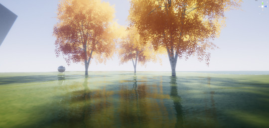
I think im gonna need a break now that I have FINALLY finished screen space reflections...
Ok so I know I didn't say anything about this (I think...), but that was basically because whenever I had something, it was either running at 2fps or looked absolutely appalling. I originally tried doing everything in world space (that didn't work), then I tried following some OpenGL tutorials (those didn't work), then I tried reading Unity's Universal Rendering Pipeline shader documentation (it doesn't exist)... And that was when, while looking on some old random reddit post, I found it: TransformWorldToView(worldPos);
Im gonna be honest, I really dont wan't to talk about screen space reflections in Unity because they (and Unity) have completely exhausted me of all my brainpower.
For anyone who is brave enough to even attempt working with hand-written URP shaders, here are a few things I have learned the hard way:
UNITY_MATRIX_I_P and unity_CameraInvProjection are NOT the same (even though their names suggest they would be).
If you're following an OpenGL tutorial and trying to re-write it in Unity, you're probably gonna need to invert the depth (1.0 - depth).
Don't put SampleSceneDepth() in a loop because it uses SAMPLE_TEXTURE2D_X() which unity really doesn't like being in loops.
Do not try and create a view space position vector by multiplying the world position with UNITY_MATRIX_V, just use TransformWorldToView().
While you can get the inverse of most matrices, UNITY_MATRIX_I_MV does not seem to exist.
when will unity finally document writing URP shaders ;-;
#gamedev#indie#indie games#programming#devlog#graphics#reflections#unity please document your stuff omg
0 notes
Text
Work on the inventory and item systems has been going quite well, I don't remember if I've said this already, but I want to get the inventory done before combat so that I don't have to re-write the whole system to work with items if I had made the items after the combat... unfortunately there's not much that I can show (the logic is there, and anything I haven't done I can do, it's just there's nothing visual yet) so instead have a look at these trees that I spent a while making:
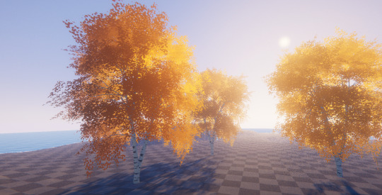
I think these definitely look better than the trees from the first version of this project, I really like how glow-y they look and I've done it in a way that I can easily change the colour:
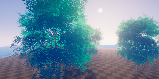
The 100% natural blue-leaved birch
Anyway if anyone sees any noise in the screenshots, thats just because in unity URP there's no temporal anti-aliasing in the editor which I basically use to hide all my problems (I promise I will switch to just downsampling the fog, its just i cant find any documentation anywhere ;-;)
6 notes
·
View notes
Text
Designing Combat - Part One
Even though this game has been quite heavily inspired by Genshin Impact, I currently do not plan to have multiple different characters. This means I get to focus mainly on the main character. Unfortunately, now I have to find a way to make sure people will be able to do as much as possible, and give them the ability to use the character in whatever play style they wish. So, here are a few ideas I've had:
Skill Trees
Skill trees are quite a good way to add a levelling system, while also giving the player more options.

Perhaps something like this? Sorry if you aren't able to read my notes, but this is sort of the design I was thinking of.
This design has its flaws though, for example, actually navigating this when there are loads of abilities would be quite boring, having to scroll up and down for potentially quite a while. Also, in terms of how it fits in with the lore (as of now), there is a better option.
Skill "Web"?
I don't really know what to call this, or if it has a name already, but It's sort of like a better version of the skill tree (or my idea, at least). Here's what I think it'd look like:
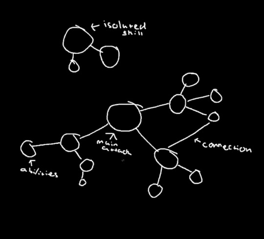
every ability would be sort of like an extension of the one before it, "nodes" (which is what I'm calling the balls) that connect while being from a different parent "node" would do some funky stuff. For example, one "node" could be a basic shield, while another is water (yes, I do plan on adding elemental stuff) which would then give you a water shield. Also, navigating this would be sort of like a map where you are able to move around freely and disable and enable things as you wish. Isolated skill nodes would be things that don't fit in with anything else.
Another thing, this one would also fit in with the lore a lot better! I think this is the one I'm going to go with.
Weapons And Stuff
So, now we've got the skill stuff, there are still a few things I would like to think about.
First off, weapons. I would like to have a lot of different weapons, each with different things they are best at. Some could allow you to use certain skills better, while other weapons would simply increase your damage or make you attack faster.
Something I do think could be interesting, as I only plan on adding mele weapons, there could be different types, like a regular sword would have mediocre stats (attack speed, range, etc...), whereas a spear would have a large range but less damage (I don't know what I'd do exactly).
More Stuff
As much as everyone hates getting artefacts in Genshin Impact, they do allow you to do a lot more stuff. I think I'd like something similar in mine, but not exactly the same. While Genshin's artefacts are mainly for increasing stats and giving some additional things, I think I want to do something more like Terraria, where rather than simply increasing stats, they could let the player do different things, like summon a "phantom sword" that attacks enemies for you, though that is just an idea.
This is all just a bunch of ideas, and things are likely to change. Before I am able to start implementing combat, I want to add an item system first so that I don't have to re-write everything after adding items, but I'll probably get distracted with shadows or something random...
1 note
·
View note
Text
Status Update
Here's a little status update because I've been quiet for a little while:
First off, I've been spending a lot of time writing the lore for the game, I've got a basic timeline written down and am now working on finalizing it so I can move on to actually making the world and environment. Additionally, I have been spending quite a bit of time getting better at the artstyle I want this game to have and, so far, it's going well.
It probably won't come to anyone's surprise, but I've continued to work on my volumetric fog system. There were a few issues with it and, seeing as fog kinda is everywhere, I need it to look at least somewhat good. Also, in terms of performance, I tested it on my Samsung Galaxy A10s, and it still ran just fine (although the game probably won't ever be for mobile).
And one last thing... it turns out writing a quest system is harder than you'd think, so that's been taking a while, as well as re-doing the slime ai and model to fit with the lore and then also trying to allow the player to jump (the animations are not helping).
So that's basically it! I am still working on it, but haven't really gotten to the point with anything that I feel is worth sharing. I'll try to get some more visual updates soon though!
3 notes
·
View notes
Text
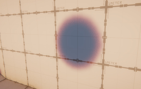
Quick update (because I haven't for a while now).
I spent a little while making this cool effect for the shadows, making the edges a more saturated colour. This is done using the same method as bokeh blur (just look at the shadows from a tree on a really sunny day and you'll see why), just using the sun's information, instead of the camera's.
Anyway, that's about it. The only issue with it is that it doen't work with surfaces that have a colour other than white. but I can probably fix that with the G-Buffer or some other shader magic... My next post will hopefully be about the quest system I've been working on, but it's taking a little while so it might not be... who knows?
3 notes
·
View notes
Text
Just added a time of day system and the ability to roll!
Because of how all of my shaders work in URP, I have to use a single light for both the sun and moon, so I just really quickly switched the light's position. You can see that the player's lighting snaps to a different direction when the sun/moon goes down.
As for the rolling, all I'm doing is removing the player's ability to control its movements and then forcing the player forwards. It's a bit strange at first, but I got used to it quite quickly.
Also, the sun will unfortunately not be moving this fast in the final game (sorry).
[EDIT]
I forgot to mention that I also made the slimes randomly jump around if you're too far away, they'll also start re-gaining health, but I'll probably remove that because there's no way I'm adding a health bar to every single slime...
9 notes
·
View notes
Text
It's so funny watching them trying to attack me... jokes on them, I haven't added a damage system yet!
So basically I needed an enemy that I can attack and that can attack me... So I had the very original idea to add slimes!
The slimes were incredibly simple to program: add a force in the up direction and the direction of the player, with a random delay to make it look like they're hopping towards you. I also check if the player is close enough and do a jump but with a really strong force to make it look like they're smacking into the player.
And yes, I did take a lot of inspiration from Genshin Impact's slimes... but I think you'll agree that they look better for it... Especially once you see the monstrosities I came up with:

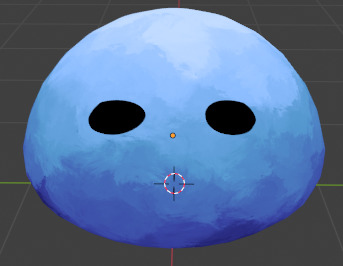

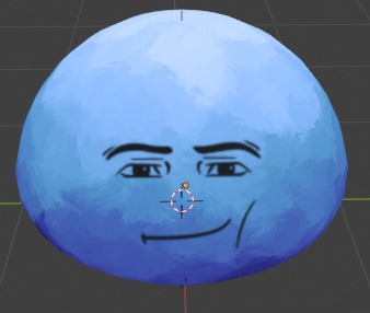
yea...
1 note
·
View note
Text
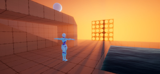
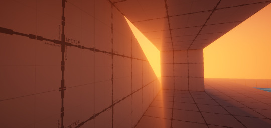
Ladies, gentlemen and people who prefer to go by anything else, I present to you, what is quite possibly my finest work of shader code yet! I, thejinxedartist, also known as Folly, have added shadows to the fog!
OK, OK, enough with the fancy talk. But yes, I have spent quite a while re-writing the fog shader from scratch in its own shader, rather than as a custom function in shadergraph. I was planning to anyway as auto-generated code from node-based editors is generally not the fastest, but I also had no way to access lighting information where I needed it in order to add shadows. If anyone was wondering, in the raymarching loop, before I accumulate the fog density, I check if the point in space is in shadow using mainLight.shadowAttenuation.
Anyway, now that this whole thing is over, I can get back to- oh wait! The ambient sky light isn't working properly you say? Well, I can't just leave it unfinished, can I! Just leave me a few weeks and I'll have it done! (This is a joke, It'll only take 6 days ;)
[UPDATE]
So I forgot that I was rendering this at 512 samples for the screenshots and I was wondering why my my fps had dropped from ~250 to ~150 and so I spent a while adding every optimisation I could, and then I realized "Oh wait, why am I rendering this with 512 samples" so now its back to 64 samples and is running even faster.
3 notes
·
View notes
Text
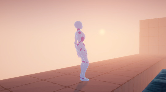
Oh the joys of programming an actual volumetric fog implementation while having absolutely no clue about what you're doing... At least it looks pretty!
This is just a small post because it still needs a bit of work, but it'll be done very soon!
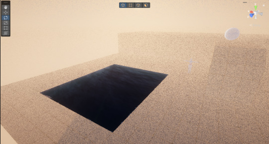
Um... at least there's no banding..?
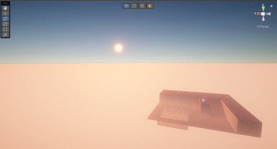
Finally, raymarched volumetric fog, as far as the eye can see, and with almost no loss in framerate. Seeing as I've only just started doing volumetric stuff, this seems pretty good!
4 notes
·
View notes
Text
⋗ FINALLY ADDING ANIMATIONS
You heard that right! I've finally added animations to the player. The reason this has taken quite a while is due to quite a few reasons:
First off, I was converting a bunch of stuff to use the universal render pipeline, which meant re-doing a bunch of graphics stuff. I have a few reasons for wanting to do this, mainly because I can have access to the lighting information, which is quite important for when you're doing cell shaded and stylized lighting. Here's how that's looking:
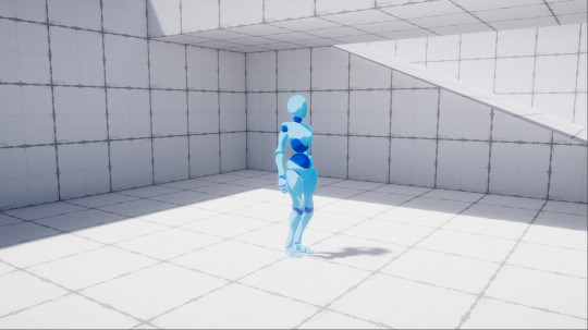
I don't really know why it took so long to get shadows working this time, but they are now, which is great:

Also, because URP has some nice soft shadows, I can have the glow thing around the light transition that I was talking about, and it isn't cut off by some jagged shadows:

It's sort of visible on the sphere, but definitely better looking than without the softer shadows:
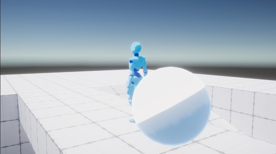
Anyway, the other thing I was doing was actually adding the animations (kinda the whole point of this post lol). They still need a bit of work, like adding some in-between animations for when the character stops running, but its pretty good for now:
So now that I've got some basic animations and I can finally stop worrying about how the player looks (for now), I think it's time to start on actually adding some mechanics to this 'game'.
I think that, seeing as this is supposed to be an open world RPG, either A dialogue system or a fighting system is in order. This may take quite a while, and so I will try and do some stuff in-between, like adding water again... (OK, I may have a slight obsession with water)
2 notes
·
View notes
Text
⋗ WHERE I'VE BEEN
So, as you may have noticed, I haven't really been making many posts lately. The short answer for this is that I've been very busy with college stuff and have been trying to make meaningful progress so that I can actually show something.
Here's a list of what I've done since the last post:
Almost finished adding animations (I want to try root motion).
Begun switching to Universal Render Pipeline (It's faster and, even though I hate to admit it, it gives me a lot more control).
Re-writing shaders for Universal Render Pipeline.
Fixing some movement issues.
So don't worry, I haven't abandoned this project, I'm just quite busy.
1 note
·
View note
Text
⋗ MAKING THE PLAYER'S SHADER
OK, I know I said I would work on animations and stuff, but I just couldn't resist doing some more graphics stuff...
Anyway, I've been spending quite a bit of time on this shader, and I've still only just got the base of it, but its looking quite nice so far:

First off, there's the classic two-tone shading, which is pretty standard with anime-style shaders. But then, if you look closely, you'll see a slight glow around where it changes from light to dark. This not only looks nice, even if it is subtle, but it also makes it a bit easier to see the curvature of an object.
You might have also noticed the blue-ish outline as well. I'm going to be honest, I have no clue why this is done, but it looks nice so I'm keeping it. The outline uses a combination of a sharp transition with a softer transition, the same as with the lighting.
Once I have a player model, I am going to also paint in my own shadows into the texture, like with Genshin Impact, just because you can't really do that with shaders (at least, I'm not willing to try). But I have designed the shader to work nicely with textures, the only reason it looks red is that I have set the lit and unlit colours manually.
I hope this wasn't too much of a mess, but I promise I will start adding animations... I think...
3 notes
·
View notes
Text
⋗ MAKING THE PLAYER FALL
OK, I am back from my trip to Iceland, and I am ready to get back to developing!
This is going to be on the shorter side, but I've been encouraged to share everything that I do, so here's how I made the player fall:
First off, I create an invisible sphere that I use to see if the player is on the ground, I then use this to reset the player's Y velocity (how fast it's falling) if we are on the ground. To actually make a difference and have this "Y velocity" variable move the player, I just use CharacterController.Move(), with Y velocity * gravity * time^2. The time^2 will mean the player will continue to accelerate, so I can just clamp the value.
Here's A video of it working (and yes, I did add some post-processing, I couldn't help myself):
Next up, I'm probably going to end up adding the test model I was using before, and I'm also probably going to start working on the shader again, I really shouldn't yet, but I love graphics programming...
2 notes
·
View notes
Text
⋗ THE PLAYER'S MOVEMENT
When developing any game, you will generally need a good way to control the player. For example, in this game I would like to have a third person view, this is because I want the player to be able to see the whole world around them, and not feel confused when an enemy runs up behind them and kills them without them knowing. Anyway, here is the general way I went about creating the third person movement:
First off, I downloaded Unity's new input system, this is just so that I have a bit more control, and it will allow me to easily add support for consoles in the future. For anyone who would like to learn about the new input system, this video is great:
youtube
Next up: actually moving the player. For this, there were two routes I could have gone: physics based (using rigidbodies), or with Unity's Character Controller. I went with the second option because, once again, it gave me a bit more control on how I move the player, and a few other issues I will talk about later.
Finally, the camera. I downloaded Cinemachine and created a new free look camera, essentially a third person camera that rotates around the target with your mouse input. After changing a few settings: increasing the distance from the player, changing some sensitivities, I have a working third person controller. Here is how it turned out:
Sorry for the terrible recording quality, but anyway, as you can see, I've got some basic movement working, and you can move the camera around, and it all works fine. Next up, I would like to get the player falling off stuff with gravity and have some animations working, but we'll have to see.
2 notes
·
View notes
Text
⋗ RESTARTING
OK, so you may be wondering why I'm restarting, and that is for two reasons. You see, I made the mistake of beginning work on the project and then uploading the first post like a week later, which doesn't really show that I've done anything and doesn't help anyone understand what I'm doing, so this will be an opportunity to do that. The next thing is that, when coming into the project, I didn't really have a goal or anything, this meant that everything was messy and all over the place, but now that I've had some time to mess around, I am able to make the project with a goal in mind, and It will end up better than before.
I think either this post or the next will be the last one for quite a while (or ones where I actually develop the project, at least), but as soon as I am able to get back into developing, I will.
1 note
·
View note
Text
⋗ SOME LORE STUFF
OK, so I may or may not have spent the majority of my free time this week writing and re-writing lore for my game, but it was worth it, and now I have something pretty good that I can easily expand upon. I'm probably going to make another post talking more about the lore (maybe).

This image may look a bit rough... and that's because it is, I still have quite a bit of work to do on it. But anyway, this place is kinda like the player's playground (both in terms of gameplay and lore-wise), the player can go there at any time and practice fighting or just rest (or whatever else I end up adding).
Anyway, I really need a name for this place. Currently, I am referring to it as the 'Etherial Plane' but that's a bit boring so if anyone has any ideas, please tell me (all of my creativity for the month has been used up on writing the first little bit of lore).
If anyone wants some extra story for this place, here you go:
The Etherial Plane is not very well known, only a few people in the world have the ability to access it, and most who do are not too keen on explaining it, perhaps because even they themselves do not know. It is thought that people who can access this place have been gifted by the gods, or even gods themselves, proven somewhat by their seemingly unnatural powers...
Forgive my terrible lore-writing skills, I will refine it once I have a working game, but that is as far as I can go without talking about the lore of the world.
1 note
·
View note
Text
⋗ ANOTHER SMALL UPDATE
This one's gonna be a little bit smaller because I've got college work to do, but still, it's something.
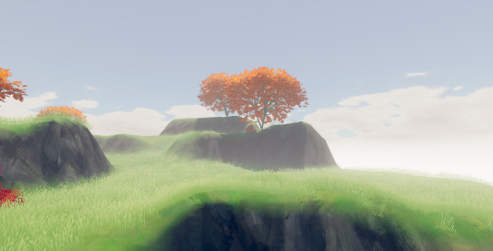
The first thing I did was start work on a cloud system, mainly just some horizon clouds made in Blender with a custom shader to make them glow brighter when the sun is behind them, this is what they look like currently:
Day:
Sunset:

You might also notice that the trees have changed slightly, this is because I wasn't very happy with how they were before (and I still plan on changing them again). Basically they're currently really slow to render, because I haven't added any LODs and I decided that 100 individual leaves would be fine. When I next update the trees there will probably be around 10 leaf objects with a texture painted on them to make them more dense-looking.
I have also updated the water a bit, I mainly switched it to using Shader Graph instead of ASE (Amplify Shader Editor) as It has some stuff I can't do with ASE in the Universal Render Pipeline.
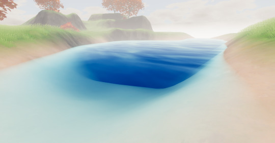
We got waves :)
Thats about it for this week, I'm working on a new college project and will be on holiday in a few weeks so I won't be able to post as much, but I will continue this project when I get the chance.
1 note
·
View note