#i dont usually use lineart but i did in these so
Explore tagged Tumblr posts
Text
“At least I didn’t loose my golden fiddle to some Hillybilly in Georgia”
I heard this audio and immediately thought of @tswwwit ‘s familiar au. This just Feels like the kinda shit Dipper would find out and use as ammo in their argument’s and I mean come on. Golden Fiddle? We already know Bill’s musically inclined! Who’s else would it be?
#this was literally like done in a day#i wanted to try smthn new too#i dont usually use lineart but i did in these so#idk how i feel about it#i also didnt use any references#at all#so#def not my maximum effort#but i wanted to get it down and out and it looks alright#bi.f.art#bill cipher#gravity falls#human bill cipher#billdip#dipper pines#gravity falls au#tswwwit’s familiar au
274 notes
·
View notes
Text


trying to figure out how to draw these guys
#quin sketches#tgcf#tian guan ci fu#heaven official's blessing#xie lian#hua cheng#hualian#ive never tagged for this series before wowie#they are!!! so important to me!!!#also woag! neolxzr art post#i downloaded a new lineart brush and it has tricked me into thinking i got better at drawing#it DID make me a bit faster definitely though#usually when i draw in this sort of style i use a plain circle brush i made with no pen pressure and then i like#erase it. to make it have different thicknesses#but i just got a brush that does that that i dont hate and wow. it is faster#anyways. hi :3#expect more art soon. probably#i felt good about this i dont want to stop now uhweheghfhg#and also im obsessed w this fucking book and i need tthw world to know#lazers art
34 notes
·
View notes
Note
Love your art! What's your shading process / any tips? I really like how vibrant it is
Thank you!! also sorry this is a long post
I usually start painting the character after I already have a background, super sketchy or with a placeholder (a photo usually), just so i know what colors to use
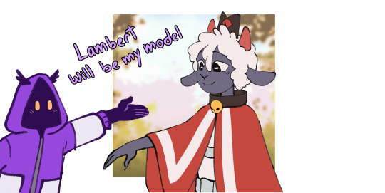
I fill the character with a color from the BG or a similar color and use the multiply blending mode

then i paint the lights on another layer with the "add glow" blending mode (i also pick the color depending on the bg).
I add another multiply layer for anything that needs to be darker, like stuff under the characters clothes
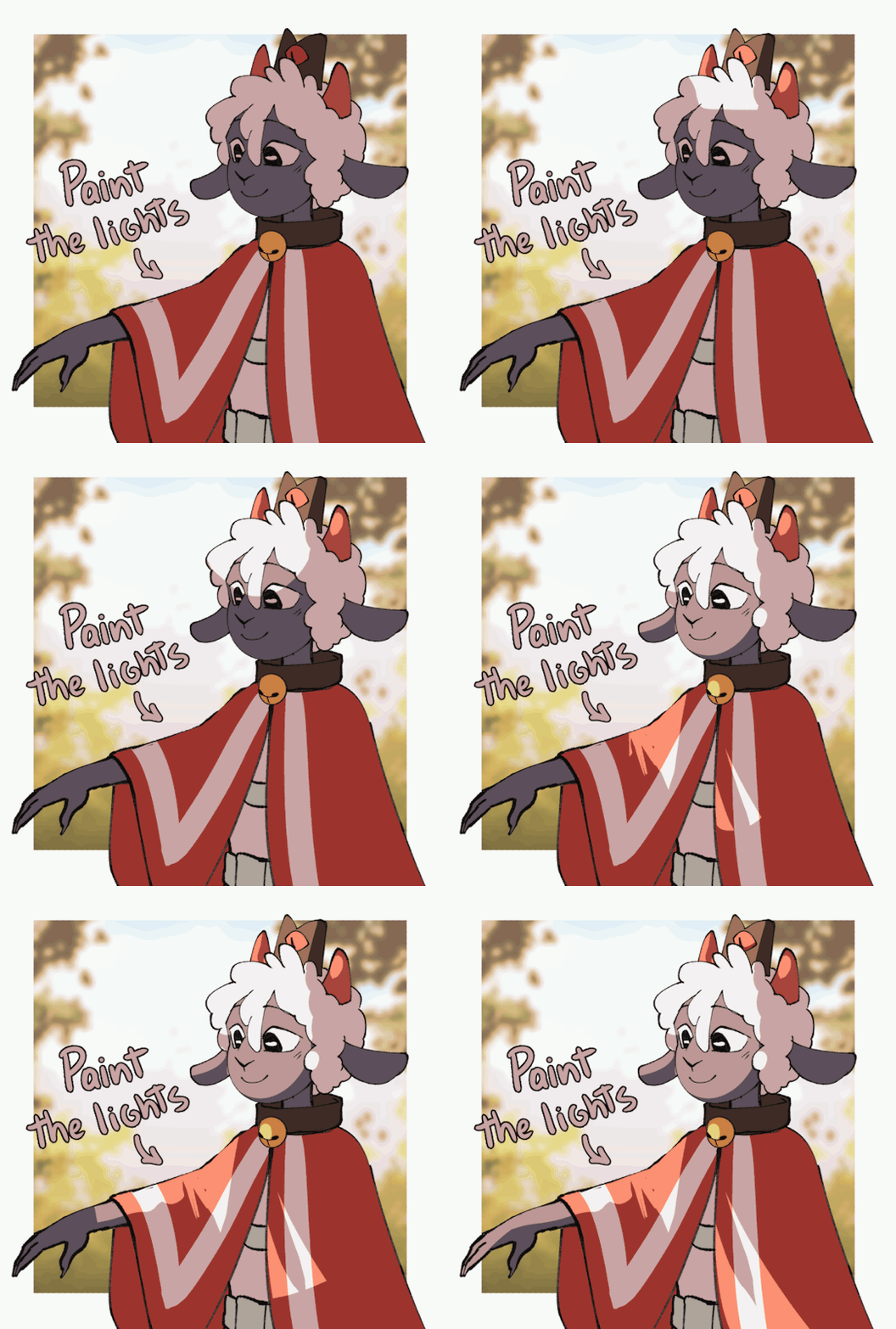

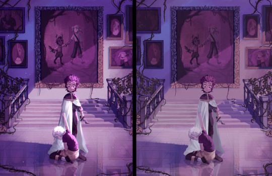
I paint a line with a saturated color between the lights and shadows, for example i added a bright red for the cape and light purple for their skin (? this is subsurface scattering, it doesnt happen on every surface but i like how it looks so i use it on everything lol.
Then i paint the lineart a similar color to each part of the character or you can paint it all red and use multiply

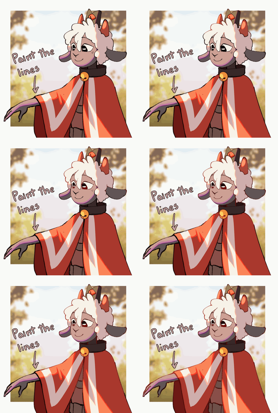
that's basically it
some tips (these are just things that work for me)
I think is better to paint the lights, not the shadows. it helps to see the shapes of the thing/character you're drawing better (its what i did with lambert ⬆️)
Draw backgrounds, i think it makes every drawing look more interesting and its easier to decide the lighting for the character, if you dont want to draw anything detailed you can paint something simple and blur it
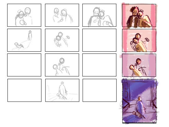
i really recommend to start with a thumbnail, experiment with colors, perspective, composition, etc. before actually starting the drawing thumbnails of this post
this tip is something that everyone has heard before but use references, real life references like photographs for perspective and lighting, 3d models for anatomy and perspective, paintings to see how other artists stylize objects, bgs or characters. use references for everything
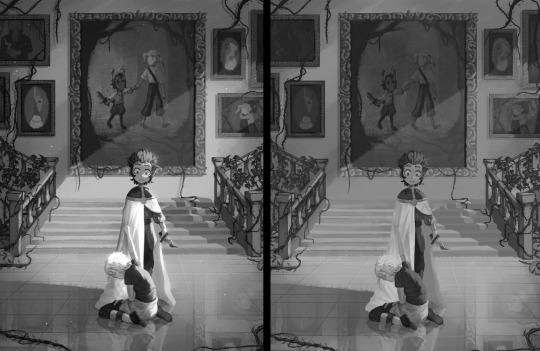
this tip is super important for me: check the values of your drawing, (lower the saturation, with the lineart hidden) if it isnt readable/ doesnt look good in black and white it most likely wont look good with colors (this depends on artstyle and personal preference tho)
287 notes
·
View notes
Text
The Sworn Partners for God's Sake
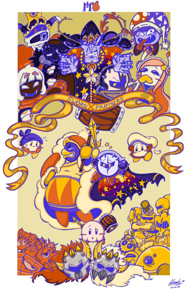
i am SOOOO ecstatic w/ how this came out! i decided to participate in @das-a-kirby-blog 's DTIYS since i needed some fun artistic challenge in my life. i will put all my thoughts below the cut because i need to yap but please look at this image for atleast 5 seconds since i spent like 25 hours on it <3
sketching this alone took some thought since i had to adjust the canvas multiple times to make sure everything fit properly. i've never drawn alot of these characters ngl, so i was a bit nervous going in so suddenly. i wanted to make all the past villians more, well, villainous looking so i just added some crazed expression and dynamic poses. i especially like how i did susie ngl. like shes giggling so wickedly i love. i gave kirby a more confused expression while bandee is in his usual worried state of mind. i also decided to make meta and dedede make sexual eye contact as lovers sworn partners. however... i decided to take dark crafter and yinyarn out back before telling them to close their eyes because, tbh, i really dont give a fuck about either of them. marx and magolor felt like much more fitting choices in the section of past kirby antagonist as i would consider them far more impactful (and fun to draw) than the ladder pair. also added blade knight cuz sword knight was there and he wasnt?? smh. oh and vul is smoking lmao.
the hardest thing in this entire piece was the line art. originally i did all my lines in black just because it's easier on the eyes when crafting all the pieces together before i layer a blue merge layer on top. i questioned whether or not to use the lineart as both eye-black and metal highlight/shadow but im incredibly happy with the result.
coloring became a tricky subject since my art utilizes very bright, vibrant colors with high chroma. i wanted to stay true to the og by only using the base colors but just... tweaking them a lil bit. i cant resist a good highlight in my art. when it came to nightmare and meta's cape, i am a longtime subscriber to the hc that meta is like his "son" in a way so i wanted to make a nod to that by making the gradient and star-design pattern of their cloaks the same.
to be honest, this was so much fun. but holy SHIT my back is on fire. shoutout to anyone who actually read this monstrosity of an artist's explanation, ur a real one. thank you guys so much for ur support and ill see yall eventually with another dumb kirby post <3.
255 notes
·
View notes
Text


hiiii i really like this post-canon concept so heres my rendition of niko!
i made a few changes to the design based on my personal tastes. first off, nikos 13, and as a former 13 year old, if your life sucks at that time (and based on the au, nikos life does suck. on account of the increasingly dangerous games), you Will become not just anxious but actively spiteful and distrustful, hence the expression and posture. i also gave them a proper Pokemon Bag bc every pokemon game has The Bag as inventory, and i wanted it to look really well made, so i put stitching around the edges. i even made fake gym badges! because it was stated to be a pokemon fangame in your other post, i added light and sound, the most popular fake types, and i made regular gyms into dual-type ones. i also tore up the scarf and clothes a lot bc i figure between pokemon and a jrpg there would be a LOT of difficult to dodge attacks, so much so that one half of the scarf is chopped wayyy shorter than the other. and i moved the amber to the bag, partially bc itd make a great button, partially bc you wouldnt be able to see it by their chest.
i think niko and the player have a strained relationship, bc while the player always has the Intent to keep niko safe, that doesnt make them good at it. and, from nikos perspective, the player would likely be the one dragging them into these adventures by opening the games like they did oneshot.

Had an AU concept where Niko's journey through the World Machine is the first of many adventures, and slowly building up to something bigger. About once or twice a year, Niko gets sent on an interdimensional adventure and comes back changed from their journey. Some of their journeys are fun, some of them are traumatic, some are a mix of both. They also write books about their adventures, partially because The Author inspired them to write and their adventures make good stories and partially because it's a way of expressing themselves and processing their trauma. Their first book, about the events of Oneshot and Solstice, is called My Burden Is Light (it's named after the title song) -hence the name of this AU.
#a couple of my favorite details are the feather (which bc its in their hat both works as a joke and also an allusion to the glen bird ppl)#and the badges. i had fun with the badges.#also my note abt the tears is true lol. i didnt draw them to symbolize anything specific i just like drawing niko using square shapes.#however. they Could symbolize thimgs :)#my art#*gives niko my favorite vague fantasy low heeled lace up boots* NOW theyre ready for adventure :]#i debated on whether to attach the amber to their bag as a button or to their hat with a small ribbon awhile#i picked bag bc i didnt have Other ideas for the button and then i realized. hehe. feather in their cap#this drawing was really fun bc i did the sketch and then for the lineart i started with the Outline and made that especially thick#and i got to fuck around with tearing clothing and fun details in a way i dont Usually get to#i also actually like the hat in this one! which is a rarity for me! i hate drawing nikos hat so much!#i made it more bucket-hat than i usually do bc i wanted the brim more ovee their eyes than usual. for the Distrust#i did not in fact put the brim lower than usual. it is what it is.#love to design characters i will never draw again. its so fun to me
5 notes
·
View notes
Note
Looking at your latest influencer*green color drawings (which mwah chef kiss please more unhinged menace content), you have a great grasp on strong color palettes and atmospheric coloring! Can you tell something about your process? Is it referencing or did you do many color studies?
thankyou so much!
as references i tbh dont use so much, i just go w it bc got used too, but a great inspo is Loish, which i think is my big artist ref
as for studies, what i did was recreating something without the color-pick, just and only picking the colors by observing and noticing "ah, looks blue but its just gray" type thingy


and my art process, rightnow this: im really not good at explaning, so i hope it make sense!
i do the sketch, then i clean abit


i paint the background first bc it helps w the mood, then paint a base saturated color fir the character, usually i use a complementary color to it creates a strong contrast, but using a close color to the background also helps


after i start coloring using a brush w a low opacity, i put the color in layers


then i color the lineart and just render xD and w the same way i paint, put the colors in layers w a low opacity brush


and boom

86 notes
·
View notes
Note
Hello! I love your art and your use of colors; I was wondering if you'll ever post a process video or a step by step to show how you approach your art?
hi!! thank you, im always glad people like my sense of color cause it's my favorite part :-) it's a bit hard to show process videos because i tend to work on multiple drawings within a same file, at the same time, so it looks very confusing. but i made this one for that! it shows my process from sketch to finish, and i'll also add some thoughts under the cut
the steps to my art are usually :
sketch, always in color (i dont like sketching in black, it doesn't work as well for me). i did this step on another file so you don't get to see it, but it did happen at some point
set the lines to black, or to whatever color i want the final lineart to be (to make sure the colors work well with whatever lineart i want to have ; if i changed it at the last second, it would look weird)
add very rough colors : here, making the background orange and the character dark blue. if you draw on a white background and try to change it at the last second when everything else is done, it might not work with the colors that well
i work from these basic colors to pick the actual shades. i usually start with skin and hair, then clothes. the idea is to find a color that evokes whatever color i have in mind without clashing with the base tone. so a character who has a bright red base tone, and has blue eyes, i will use very desaturated grey to give the illusion of blue, not actual blue. that would clash too much!
once all the colors are done, i start cleaning the lineart. i usually start with the face, and do that part pretty carefully, but then forthe rest of the body, i might erase the whole rest of the lineart and draw it from scratch. i alternate between cleaning the lineart and refinining the shapes on the other layer, giving them nice clean edges
i think that's about it! i hope this was helpful in some way :-) thank you for your kindness !
109 notes
·
View notes
Note
have u ever talked anywhere about your coloring or composition processes? u are honestly one of my favorite artists and i would love to hear any insight on how you make pieces 💓
wahh thank you TTT !!! I did sorta give a very simplistic answer here but it was more of my simpler sketchy style so lemme redo that, ill try to be consise and make this understandable ?? its a bit hard cuz it honest to god depends on what Kind of piece im even drawing, cuz for some i go the whole length of doing lineart flats and all that, others i just just fuck around untill it looks right?
i do usually start with a rough sketch or colour draft, especially with more compley pieces this helps with figuring out the feel, honestly i should spend more time drafting properly, figuring out poses and such but im so lazy i just go w the first thing that looks good
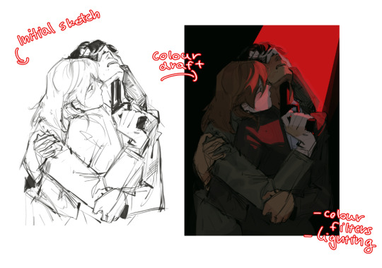
then just lines over the colour draft, fixing lots of anatomy and proportion stuff, and depending on how i wanna do the colours ill either keep the colour layers or merge them together and have the edited colours as the base colour (this might not even make sense help)
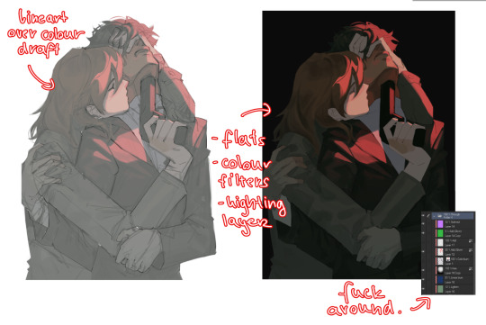
see this piece at the time gave me an insane ammount of trouble with lighting and colours, so after trying to render i ended up merging everything together....which i dont USUALLY do but the rendering is pretty similar except usually i have colours be seperated by layer,
ANYWAYS sadly i dont have a process on how it got from flats to this specific render for this piece...but i still followed my initial drafts/plans with vibe and colours and just painted over it, its why i make it after all!
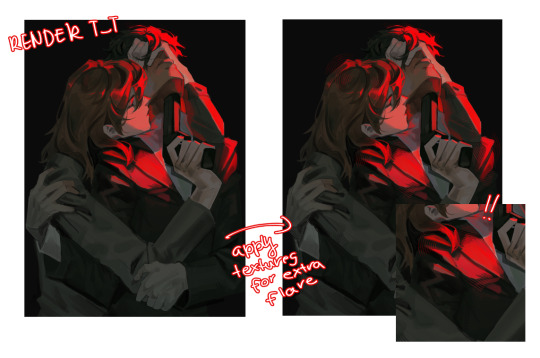
but honestly a lot of times its just very simple colours and just trying to mainting good contrast and values !!!! and THEN fucking around with colours and rextures, for other pieces i kinda just paint as i go? i have this timelapse of my justice piece that may be a bit more help!
it includes the initial colour draft, the cleanup/lining process, flats, rendering, and all that so its probs the most accurate timelapse of my morecomplex work processes, with stuff that doesnt include heavier backgrounds, which is a whole OTHER topic honestly
im sorry if i cant explain it more cohesively, i genuinely barely know what im doing most times and go by muscle memory and stuff i Know but cant. Explain? like i know how light and folds work since i observed and studied them but i cannot put it into words at all )--)0
my brushes also contribute a lot to how i render and colour, depending on what i use, you can find the swatches for them here !
150 notes
·
View notes
Note
hey, how are you? i love your art! i am just learning how to use procreate, and i was wondering what brushes or canvas do you use to get the paper effect when you’re drawing? sorry, i hope you don’t mind me asking. thank you. ☺️
hehe well i’m gonna do a basic comprehensive tutorial on my drawing process and general guidelines i follow when doing art (hope you dont mind im using ur ask), i’ll start with my process first
brushes i use:
lineart: “ink bleed” brush that comes preprogrammed in procreate
coloring/texture: maxpacks watercolor set (while in the pricy range, ive been using it for years and i think its a worthy investment, he also has sales occasionally)
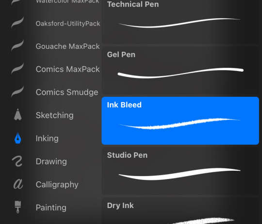
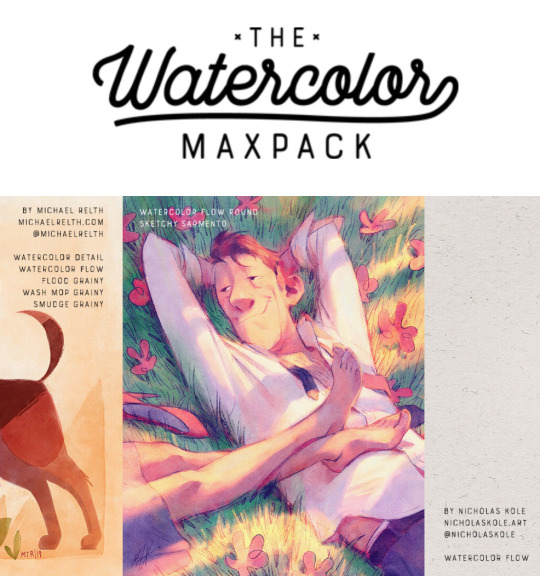
for sketching: HB pencil that comes with procreate but you can use whatever
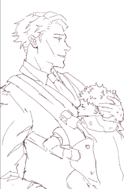
so my lineart, i typically duplicate my original layer, “color fill” the new layer with a dark red (or any dark color of ur choice), gaussian blur it @ 3% and set it to multiply and that just gives it some depth (for this piece i actually copied my dark red lineart and adjusted the opacity to make it a little darker so there’s 3 layers in total here)
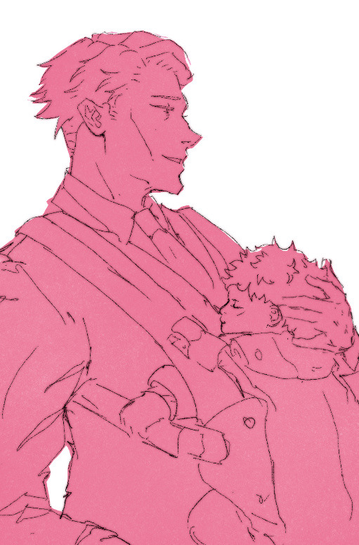
now on to COLORING, i start off with a solid bright color (usually one that goes with the general palette you’d like to use, i wanted something warm so i went with a pink base)
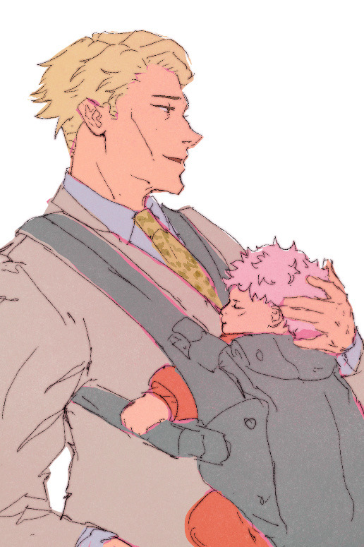
create a new layer and thats where the colors come in, i typically do a rough estimate of the colors i want to use at this point, cause they can be adjusted later in the “color balance” setting under “adjustments” once you have your coloring done (this is all on one layer)
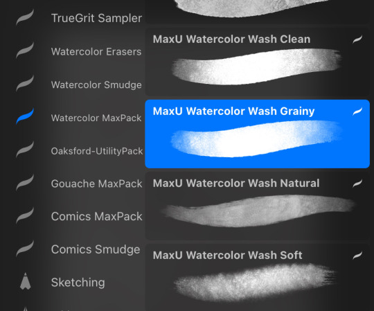
now my SECRET is i use the WASH GRAINY brush as an ERASER and lightly go over my color layer so the pink base comes through a little and unifies the colors and gives it that yummy texture. sometimes i erase the base color too for a little more texture but thats not necessary for every single drawing. once i erase enough, i go to “color balance” adjustment tool and mess with the hues till i get the result i want.
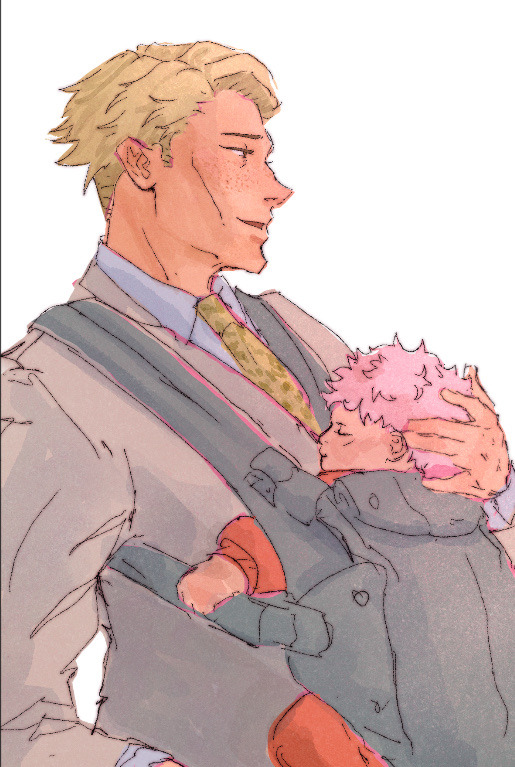
after that i create a multiply layer and with my WASH GRAINY brush i do shadows/face rendering. and with this piece specifically i did an add layer to simulate sunlight on them (i do extra layers at my own discretion, so have fun with it :)
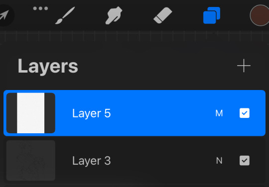
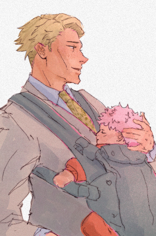
as a final cherry on top i create another multiply layer, fill it with white and then set a noise filter on it @ 17% (dont ask why that number it just works for me lmao) and thats it!
if i need to clarify anything dont hesitate to ask! like i said we dont gatekeep here
and some general tips: dont over-articulate your drawing, cause i find the more i fuss with details the more stiff my drawings look, so i suggest being a little more loose with lineart/sketching and dont sweat the small stuff
same goes for coloring, the more simplistic your shapes are the more cohesive ur drawing will look
another coloring tip: if you’re having trouble with ur drawings looking “muddy” i recommend starting off with a black and white render so you can get a handle on your values before you worry about hue (i do this with my more rendered portraits but i find it helps you focus on the depth of your drawing)
61 notes
·
View notes
Note
Hi! I wanted to ask for advice on finding an artstyle, I've been drawing for sometime but I still dislike my style.
Thank you in advance :D.
Hi hiii
Whenever my artstyle gets kinda boring to me, I try asking myself questions to figure out what exactly is it about my artstyle that I don’t like. Things like what is it about my art that feels boring to me while this other’s artist’s work excites me? What makes me most insecure about this piece? What do my favorite artists do in their artworks that I don’t do?
This isn’t to put yourself or your work down, make sure to go out of your way to still note anything you like or are particularly proud of in any of your artworks, you work hard on your art and that deserves to be appreciated, even if your artstyle isn’t quite at where you want it to be yet! But this is mainly what I do to try to address reasons my artstyle isn’t giving me as much joy, and what changes I can make that might make me happier. Most of the time I can’t really put my finger on what it is that I dislike about my art, so I keep these questions in the back of my mind while I try experimenting through doodles and messing around with my style in each one. Have some doodles dedicated to things you dont normally try in your artstyle. Varying eye sizes and distance from each other, some doodles with different ways of stylizing noses, trying varying levels of realism vs cartoonishness when drawing characters, and trying different brushes if doing this in digital art. If any specific doodles jump out to you as kinda neat, take note of whatever you did in that doodle and try it more often!
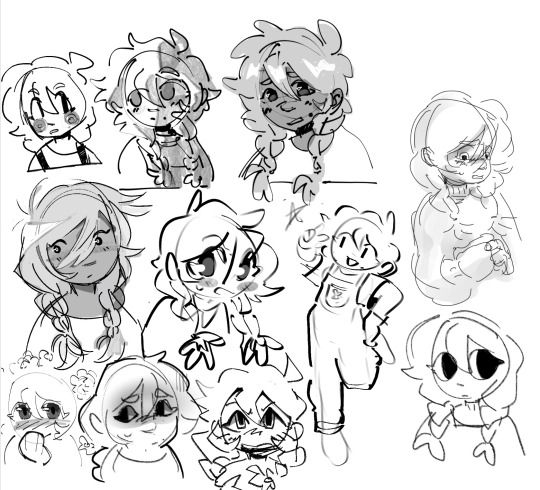
(Sorry i was doing this in a hurry but definitely couldve utilized more full body shots, varying poses, face at more side angles, coloring styles, would 100% reccomend experimenting with that too. But this is mostly what those batches of experiment doodles usually look like for me)
As always, it doesn’t hurt to also study other artists’s whos stuff makes you so happy and figure out what it is about their art style that excites you so much. Whatever that may be, think about if its something you want in your own art style and try replicating and practice doing it if you do want to take your art in that direction.
Quick example from me but november 2023 i remember starting to feel super uninspired with my artstyle. I asked myself what felt like the most unrewarding part of the process for drawing and realized the answer was my lineart. At the time I was seeing a lot of @/bixels ‘s artwork of drawing mlp characters as humans from the 1920’s americana and was so delighted by their lineart. I kept experimenting with brushes in my doodles and realized that using the gel pen reminded me somewhat of bixels’ art, so I took that and ran. It was a neat change after a while of having thicker lineart and actually having fun with pressure sensitivity and how the brush is able to taper.
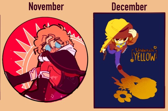
This is what i found works for myself so im not sure how well it applies to other people or if i worded everything well, but I hope its at least a bit helpful in some way!
#tldr main tactic for is asking myself questions on how i feel about my art and why i think i feel the way that i do#asks#moth talk#love u abi. she is one of my oldest oc’s and usually the one i draw for art experiments
46 notes
·
View notes
Text
Handy book of tips and tricks for using Krita (by a user thats used krita for a while)
HI! So i'm a krita user, and i figure since i know fellow artists that are moving to krita, i might as well make a handy guide to some of the tricks i use to snazzy up my art and basic howtos. This will be splitup into three sections: Tools, Layers, Filters. I'll also be interspersing how i used them in my art as examples!! Thisll be a two parter so hold on tight.
Shortcut keys: P = colourpick E = eraser B = brush
Tools:
Obviously try using all of the brushes and seeing which ones you like. Krita has a myriad of handy and good brushes, and you can even make your own if you feel like it. I personally like to modify the rectangle eraser to a normal brush and using it, before i modified it a little more to be my own brush.
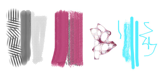
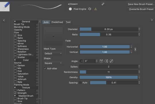
You can change the settings of the brush youre using on any layer by clicking this little dropdown menu in the top left of your screen. That little three dot button by the left side also goes into more detail about the brushes in case you want to fine tune a brush to your liking.

Personally, these are the custom brush edits ive used to make my art just that bit crunchier. As you can see, theres a lot more options you can tick and mess around with if you feel like it too.
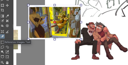
The pin button is the reference tool. If you copy paste an image into krita while the pin tool is selected, it will appear as its own image above all layers that can be moved around using the pin tool to use as a reference. Real handy so you dont waste layers on ref images.
Layer styles
Ok, you probably know the basics of how to change layers, (its this little dropdown menu here) but did you know that krita has a cool thing called LAYER PROPERTIES??


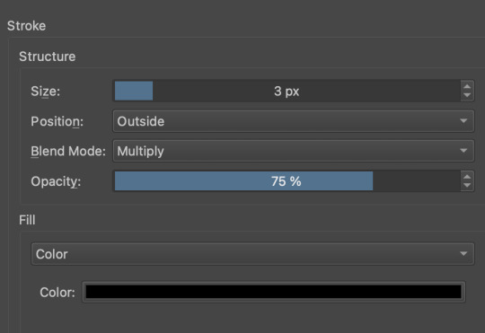
If you right click a layer and click this little button here..it should bring you to this handy menu with styles! These are really useful
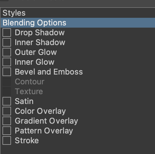
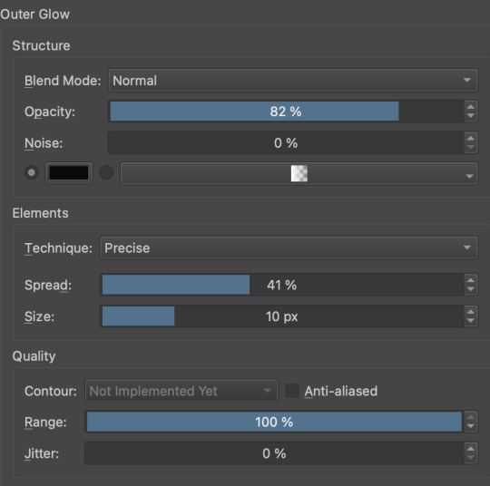
Now, i used to usually use outer glow set to these parameters to give the illusion of lines (and this is how anime artists usually line their very delicate pieces of hair and stuff), but i found an even better way!!
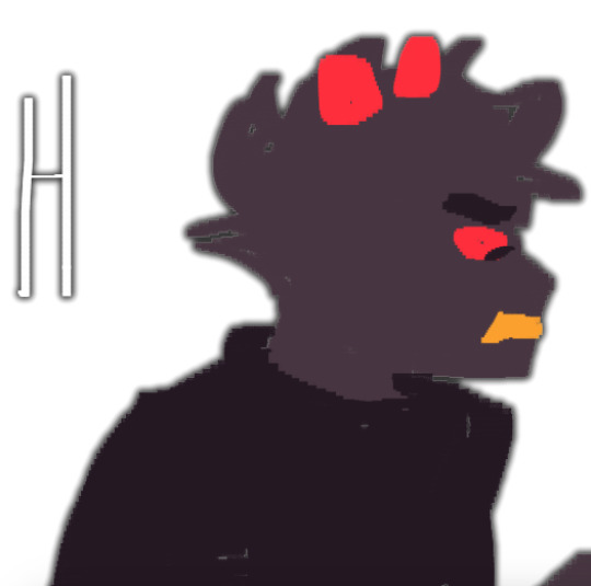
Its called stroke, and you can just modify it to be as thin or thick as you like. I recently used it for these two pieces, because its more precise, and used across multiple layers makes your work look cool and like you gave a damn about lineart. This is especially helpful if youre a stubborn son of a bitch that isnt going to to take the time to line your lineless work, or if you want to line really small items like string on shoelaces and not have it look messy (just set the colour to white and draw as usual.)
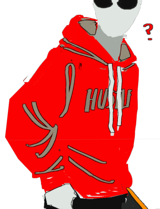
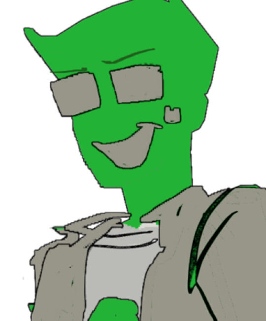
PART TWO
66 notes
·
View notes
Note

Hey so what’s your drawing process?
GET OUT MY HOU---
I have never been asked this b4! :-O Im drawing at the moment so it wouldnt hurt to explain how i do my refs for example heehoo
First i shallablamkdabdomdb I Think. I brainstorm. Im like. How does this character behave and act towards their everyday surroundings. 🤔🤨.... and then im like BAM I GOT YOU NOW!!!!! Sooo for the ram , for example- shes around 17 and is like ,, Shes very messy yet energetic ,, a god of war at her age makes her very energetic and outgoing since she has all this power (and well i guess it doesnt help she has adhd but-) so i was thinking about her pose as something rlly silly and dynamic
As i got used to drawing poses it was actually smth i learned from a couple of my moots- one of my moots got a similiar ask like this nd i took it with a big bag of rice and RAN ,,, Its all about me wanting to make dynamic poses- im not the best at fluid bests For Now but IM GETTING THERE ,

But yes sorry; thinking about my poses, sketch it twice, begin linearting- but after i finish lineart, i create different layers of coloring because my brain (ocd) tells me things and if i dont do This Thag Way I Will Be Killed On Spot With A Nuclear Ray From The Sky
I do lineart first, draw the face over on another layer, do hair color first, then body color under the hair color,, after im finished with that i then go HEEERRRM. NOW. Does it deserve a little razzle dazzling? A little speckle spackle? Do i want to render it? Do i want to change the lineart color to highlight the characters main color scheme? Yap yap yap my process isnt ALWAYS like this but its usually that way-

For allure though i can use a good example for this- when drawing allure—if i want to line their hair with the darker beige—i create two more layers and then draw over their hActually this doesnt make any sense I MEAN. WELL. I COULD PROBABLY JUST SHOW THE TIMELAPSE. Oh yeah I overuse the undo and redo button as well as using a FUCK ton of references from pinterest
But heres what my canvas looks like atm :-] if i want to make size comparisons i lower the opacity of the finished art and sketch over that with how tall or small the character is- aaliyah here is the shortest and smallest so to make sure i did her height and body size right i use the transform tool to slide her across the grid and go "is she smaller than i made her ??? Is she TALLER than i made her?? Did i manage to do her body weight correctly???" Etc etc

,,
Okay maybe nothing i said made actual senseMAYBE ILL TALK ABOUT MY OTHER EXAMPLES...? Im Digging
For something like this i actually kept th sketch BWAHAHA- i didnt really feel like tracing over it again (at least more or so properly-) so i shrugged, went Fuck It, then made my sketch the lineart layer. I put the flat color beneath it afterwards, put Alpha Lock on so i can shade, and bada bing Bada Boom ,, background comes after everything else (BAD HABIT) (COMPOSITION AND PERSPECTIVE R HEAVILY INFLUENCED BY WHERE MY CHARACTER STANDS-)


Uhh what elseOhYeah if its a standalone sheet for me or a friend- i draw the two poses that come to mind first, write down all the information i was provided (eithet myself or a friend), and then draw anything else i want to next to the poses if theres space left,, this is my brothers lamb and so i went back nd forth asking doll if what was okay and what wasnt okay to add-

ABSOLUTELY YAPFESTING . SORRY. I HOPE SOME OF THAT MADE SENSE. I know this wasnt an advice ask but if people ever needed advice from me i usually fuck it up cuz my Very Own process confuses me sometimes-
I usually either take 1 hour or 2 days to finish something (yes im That chronically online and insane to draw for 48 hours straight without sleeping)
That or if i hate something i go insane (negatively) over it and refuse to ask for peer review (at least sometimes-) so im like Okay Fuck This Wip. This Doesnt Exist Anymore
#sydneys asks#sydneys doodles#sydneys wips#i guess that counts here-#i did not read over my own words so in all honesty my english has been pretty fucked up as of recent so if this is ineligble then i am Sorry#OH YEAH I PRIORTIZE SHAPES. UM. NOT SHAPE LANGUAGE. MAYBE SOMETIMES THOUGH. IT DEPENDS ON HOW IM FEELING#I need to go eat somethingThats Unrelated
16 notes
·
View notes
Note
please how do you pick colors 😭 I'm trying to learn how to color and I am obsessed with your comics (like your ivantill ones lol) and how do you pick such a cohesive color palette and choose where to put what????
Your art is amazing like actually :) happy holidays!!
😭 tysm anon and happy holidays to you!! i did my best to explain some of the process behind my color picking and choices for the ivantill comics under the cut, i hope its coherent cuz quite frankly it also takes me a long time to decide what colors to use
a little disclaimer: i tend to just put base colors, before i start adding shading or lighting. i also dont usually start off with a fixed color palette in mind, because my process is pretty much figuring out as i go along, and playing with all sorts of colors; however whenever i do end up with a fixed idea on the color palette the process is still applicable anyways so hopefully its helpful for u too :’]
ok so i usually decide colors by asking what kind of mood or tone im going for. for example, the recent ivti comic i did
the comic imo is pretty playful - theres a romantic element ofc but i think the focus is rly on how ivans being kulit / annoying as usual so i thought a spunky, albeit warm color would rly fit. theyre also chilling in tills house so i thought a home-y, comfy feeling would be good
i was still playing around, so for the first attempt at realizing that tone, i added a hot pink multiply layer to see how it looked
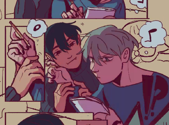
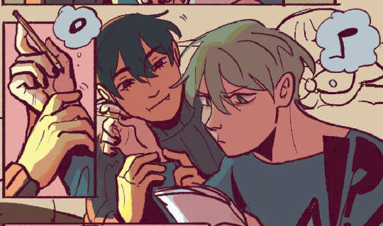
(first attempt vs final colors) (also im sorry for the low quality procreates timelapse is wack)
ironically enough it actually created a really cool looking color palette which was not what i was going for. so i kept testing colors for a bit; the shadow is hot pink, and i ended up going for a bit of a desaturated green as a base / overlay because it mellowed out the pinkness. i also put both the base and the shadow on a darken (50%) layer so that the og colors peek through a bit more compared to a multiply layer. in the end tho, i ditched pink and went for a saturated red
the green also makes for a nice complimentary color to the red, and it overall has that home-y, warm but playful feeling i wanted to include ⬇️
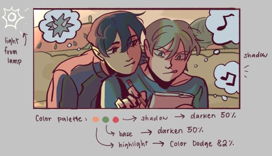
i added a highlight layer (color dodge, 82%) so that it pops a bit more, and also bc i knew i was gonna draw a big lamp on their right in the bg. speaking of the bg i made it a green/yellow hue so that the base for green on ivan n till make sense, and it ended up working for the best cuz the red acts as a nice contrast
(admittedly i think if the lighting of the room is green the shadow should also be green, but tbh i tend prioritize contrast as much as possible regardless cuz it looks nice 🤡 even if it fails to make sense realistically its for the vibes)
^ i ended up remedying this a little bit by adding bits of green to the shadows on ivan n tills hair and clothes, and also because its fairly complementary to the pink palette i have going in for the shadows and even the highlights (esp on ivan)
i also decided to shade in dark parts in the lineart so that it pops a little more
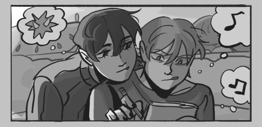
looking at the values also really help! esp in comics, where each panel can have its own lighting depending on what angle ure drawing. u can do this easily by adding a pure black layer above the entire piece, and setting it to color (100%)
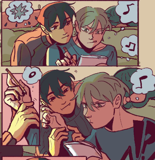
for me the values actually made me realize things that may look too similar, which usually leads to me changing the color. for example, the couch and stuffed animals behind ivan and till were actually a lot darker before i changed it. bc it kinda blended into ivti a bit, it also got the eyes’ attention away from them. i ended up adjusting their hue and values so that it matches the bg, and ivan and till stick out more (alongside other color adjustments) ⬇️
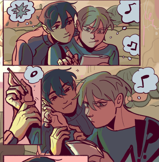
changing the lineart also helps quite a bit! i made the lineart for ivan and till a little darker, while the bg elements got a darker green instead so that the bg elements dont take as much attention
looking at b&w values also helped me realize that the og pink i was using for the panels was a little too dark, so i made it significantly lighter so that the panels stick out more (esp bc they take huge precedence in the second page)
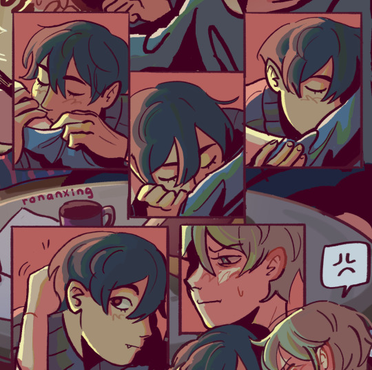
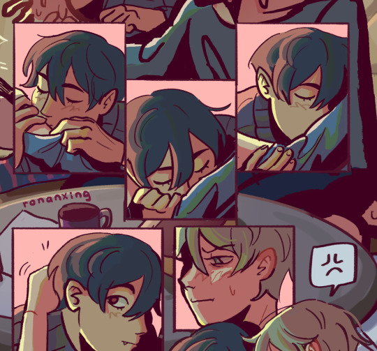
(og panel color vs final)
and finally when i pick all the colors and am satisfied with them, i merge everything into one final color layer for easier rendering :> procreate (and im sure other programs) allows for color / hue adjustments so you can def play around with those!
as for the harana / first ivantill comic i made, it had all the similar steps of the recent comic so ill just talk a little bit about the palette
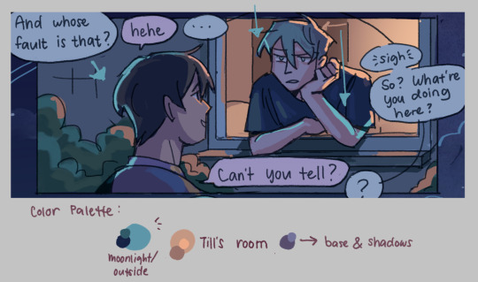
so im ngl this comic was a bit of a struggle to color for me,, cuz i wanted it to be romantic but it was set at night. usually that dictates cooler tones and colors, but i was aiming for something warm. thats when i figured i could just let tills room wash an orange color, which would help with making warm lighting but also help till and ivan stick out again from the surrounding darkness / blues
i went with a purple base, cuz i thought it was a nice warm ish color at night and it makes blue and orange pop. i also figured that i could make the base both purple since the highlights are the most attention grabbing / contrasting colors
also used the moonlight as rim lighting so that ivan sticks out a little more,, i also figured that tills room would be projecting harsher lighting over the moonlight
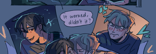
lighting it this way also allows for nice color contrast regardless of what character is in the center: ivans outside but awashed in orange lighting (from tills room), and tills inside but hes sticking his head out a little so hes noticeably purple. it allows for characters to stand out while also being pleasing to the eye
and im ngl i cheated a bit again 😅 i think till shouldve projected a shadow on ivan a couple of times and the highlights might be too harsh but again i just prioritized making their facial expressions seen LOL
for this one i didnt use any layer modes aside from (if i remember correctly) a purple multiply layer and overlay for shadows and base respectively
and thats pretty much my process for figuring out the colors !!
TLDR; i look for the mood or tone im going for, try to make interesting contrasts / complimentary colors and i also double check if each character sticks out by checking values :> it really helps me too to play around a LOT, i think it takes me like an hour or just 30 mins to figure out what colors to use and also adjusting it significantly when i merge everything together
#asks#im sorry this is so long 🫡#hope i was able to help u anon#but ty for the ask it means a lot to me !!#esp cuz i also still struggle with colors
11 notes
·
View notes
Text
yesterday was webcomics day. i am bea and i make "A Ghost Story" - part 4: the art
this part i feel like gets done semi-easy once the rest of the shit is dealt with. yesterday, my knuckles continued to swell and feel like rotten wood so i had to cut it short. this shit happens more frequently than i would prefer. today i need to run to the store and also pick myself up a lil treat (an eighth). for right now tho i have some cbd rich stuff that should help. maybe. while the index finger still hurts, only the middle knuckle is swollen anymore. let's see.
i started with panels 2 and 3 bc they seemed the least immediately labor intensive. ill be copy/pasting the line/flats for panel 3 to edit from there. t...there's going to be a lot of copy/paste this page. its not usually like that. but i usually only copy/paste the lines and flats. i will re-shade things so that they look different
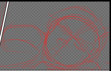
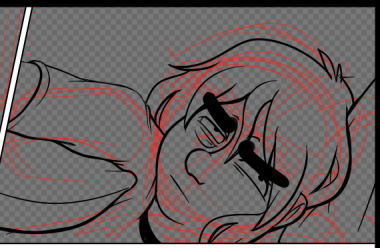
unlike the sketch, the lineart has more "weight" to it. wait thats not how the pillow would deform. hold on.
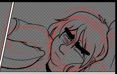
ok that's better. did people even notice that before i changed it. probably not. but it matters to me!!!!! these little things add up and add weight to your world!!!! ive been trying new things with line as as of [looks at watch] last week. so it looks bad right now. like someones vague idea of what good lineart is supposed to look like. practice makes perfect tho....or breeds familiarity or something.
some parts of this look weird. dont worry. we will cover up that shit with speech bubbles. thank you comics for your ways of obfuscating bad art.
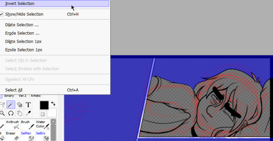
flats are easy. select everything that isnt your line art, invert the selection, and dump a base layer. then color that base layer with a mask
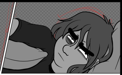
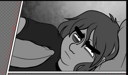
this page will, blessedly, not have any complex backgrounds. i already established the scene previously and can skate on doing my textured backgrounds. the background gradients in the direction the light in the room is being cast, usually.
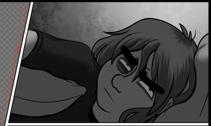
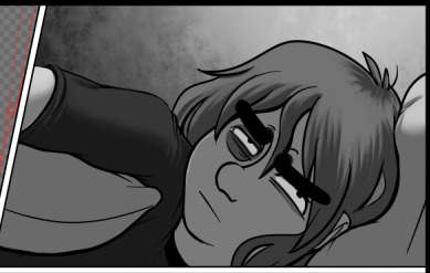
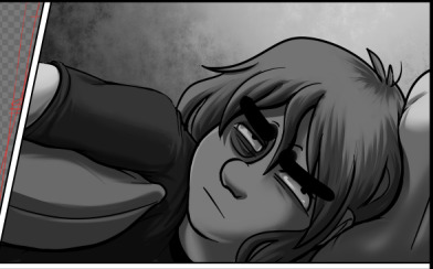
first, a multiply layer at 50%. since she's facing away from the light source, she'll be mostly in shadow. then a white overlay layer at 50%; this is to make the first shadow layer pop and keep from getting too muddy. then a second multiply layer at 50% for the next layer of shadows.
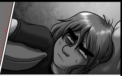
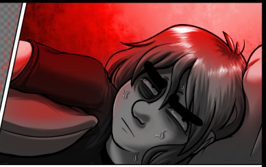
added some sweat beads to make her look more haggard and some shine to her hair, since she's so close to the light. i've started bothering doing this bc it unfortunately looks good. finally i add one more multiply layer at 40% over her eyes to make her look more over this entire thing. and then added the red glow in another overlay layer (100%) where it would land if being cast from above.
completely servicable and theres room for like. a speech bubble later. usually i do text first, but in this case its so secondary to the actions being performed, i want to prioritize one over the other.
looking at it, im not going to be able to copy/paste this after all. she's going to settle in more and her body will rotate too much in the process. i can use this as a base to trace over, though, which will get me started.
but pain is occurring so im going to eat breakfast. what a bitch!
24 notes
·
View notes
Text
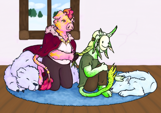
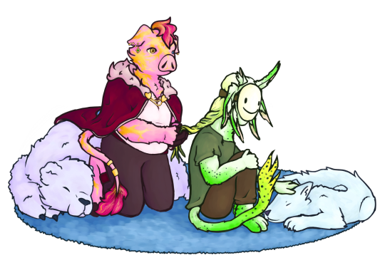
My gift for the @technoblade-gift-exchange !! i was assigned to @simplepotatofarmer who asked for dsmp rivals duo. i hope you like it Loyal!
rambling about headcanons, designs, and my process and stuff under the readmore, because i wanna talk about it but dont want the post to be super long !!
i had originally planned to not have a background and then at the last second i decided to speedrun drawing one in a few hours so um. quality difference but its fine. also unrelated but im pretty sure everything about how i draw animals and anthros makes it very obvious i used to be in the warrior cats fandom lol. anyway onto the designs!!
the gold on techno is scars from the totem at the execution, which i think is a pretty common thing for techno designs. he isnt supposed to be a piglin, but rather similar species of anthropomorphic pig. also his mane and tail fluff are naturally brown but he dyes them pink ^_^ so cool !! um. i maaayyy have forgotten the crown until i was way too far into the piece to add it. haha. oops. pretend its missing because. uuh. hes in a casual outfit. "but he still has the cape" yeah its comfy. "but dream has a mask thats not casual" dream is dream he does Not relax fully ever. see entirely intentional i would never make a mistake.
dream is an original shapeshifter species i came up with because i couldnt decide what i wanted him to be. i havent decided on a name for the species yet but i plan to make almost every solid-color or nearly solid color mcyt into this species. theyre mostly involuntary/unconscious shapeshifters. so like they change slowly over weeks or months to adapt to their surroundings, with little conscious control. basically i wanted him to be like five different things so i shoved them together lol, rabbit ears but in a pattern that looks like an axolotl, a cool tail, TOE BEANS tho you cant see them. this was actually the first time ive ever had a dream design im happy with so thats really nice.
i um. i made full use of my time lol, i spent a bit over a week on the lineart, another week on the coloring, and maybe a week and a half on rendering. unless i suddenly became shit at math(which is possible) that adds up to roughly the amount of time i had to work on it. im really proud of myself actually since i usually take a while to do art, and i wasnt sure i would be able to make something id be happy with in this amount of time. but i did! woah!! this was my first time participating in a fandom gift exchange and it was so fun, and also helped motivate me to draw more instead of getting distracted like i usually do (classic adhd moment) lol. anyway super cool!!
Loyal if u decided to read all this for some reason then again i really hope u like it!! u are so cool and i really love ur rivals duo opinions and creations so i hope u like this! i know theres been shit happening lately, i hope ur doing ok!!
#technoblade#dreamwastaken#rivals duo#dream smp#dreblr#technogiftexchange#<- thats the tag right?#also wow i think i said too many words. i dont think anyone else rambled that much about their gift. um. in my defense the only thing more#powerful than my written language learning disorder is my adhd and autism. so. yeah. lots of words.#aaaaaa i feel like how i wrote everything is so awkward. i am just a creature imitating others i have no idea how to interact with people..#hmmm. posting now before anxiety gets the better of me!#edit: wait fuck i forgot my art tag. how do i ALWAYS forget my art tag.#chara makes things
154 notes
·
View notes
Note
Is there a genre/story you want to do for your future webcomic?
I think your use of color is fantastic! Do you often rough in colors before finishing your lines? Was peeking at the wip you posted, and was curious about your process(👀👀👀)
my planned comic story, if I ever end up working on it, is gonna be fantasy, horror, tragedy! These three are my main characters:


And Maheloas is currently getting a redesign because I want him to be more asymmetrical but jfc its hard. I'm capital S Struggling. And thank you so much! Hm my progress really depends on how serious I take the drawing I work on and how easy it is for me to draw in that moment! For example for that one og trilogy AA fanart I did recently I only did this very rough sketch here:

and then I went into the lineart already without doing a clean sketch. Or I guess in this case my clean sketch is the lineart lol.
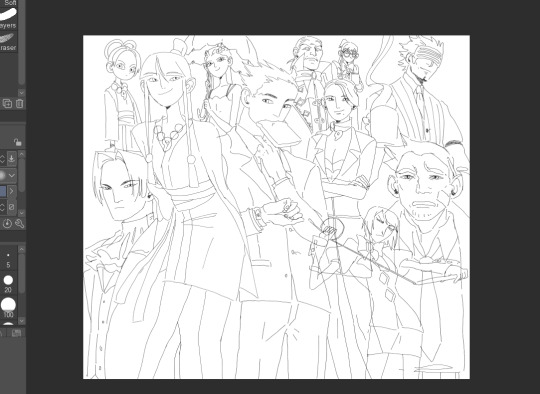
So for this drawing I didnt do any color blocking at all!

I then colored everything in. I usually just pick whatever color feels right so during this step I usually dont even fix much at all unless its super off. And then I start adding effect layers. For this one the amount of layers I put on top is very limited as I wasn't trying to do any crazy mood setting so this is what I did:
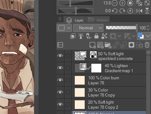

I usually put a light beige color on top of my drawing and then try out various layer settings and copy and paste it and then I play around a little with gradient maps, this purple to orange one being my favourite. Then at the very end I add a paper like texture on top and put it on 50% soft light to get that grainy look. Since you asked about me doing the color blocking in my wip, I usually do that when I draw something that is more out of my comfort zone to establish the shapes or when my sketch is becoming too incomprehensible for me so I need something to tell things apart. I hope this was helpful and thank you for the interest in my progress! :]
29 notes
·
View notes