#i don't mind the company
Explore tagged Tumblr posts
Note
What's your thoughts on Alex Kralie? Y'know, since you follow him, and all of his fans are trying to get to know you.
have you ever looked in a mirror and wondered if that was all there was to it, or if there was something more? you try to catch your reflection moving. a subtle twitch. anything. but you see nothing.
and then you see it all. you look into your reflection and suddenly you don't recognize them but you KNOW it is YOU. they just don't look like you. their hair, their clothes, its just that much different....
and then it's all gone as soon as you had seen it. you are you again.
but who are you, really? are you really you? or are you just a reflection? and if you're the same, but different... what do you think you are capable of?
and if you found out that you're just a reflection of someone else, what would you do with that information?
(X X)
1 note
·
View note
Note
wait i'm curious, what makes you say that gregor doesn't like everyone else (if i read that post right)? just curious since i've never seen anyone else say that
i don't necessarily think gregor dislikes everyone else at lcb but i do think that gregor is an incredibly petty person that isn't nearly as close to the rest of the sinners and even outright dislikes some of them cough cough rodya cough cough which a lot of people just Refuse to see because he's as much of a doormat as he is. there's several examples i could get into to try and prove my point however i'll just focus on what i personally think to be the biggest ones.
additionally, this is going to be kind of long, so i'm adding a read more. read more! read it. sorry for being so wordy. i have several diseases.
Pt1. gregor is the type to try and get along at least decently with everyone, especially if he gets a good first impression from them.
this is less a point in favor of gregor's distance w/ the rest of the sinners and more just a contributing factor to it. once again there's several examples i could point to here but i think the most in your face one happened in canto I with yuri, as several people have pointed out. even before gregor comes clean about growing attached to her as quickly as he did because she reminds him of his sister, we get this interaction.

i'll go ahead and make the disclaimer now that i don't necessarily think gregor is the most reliable of narrators, especially when it comes to his feelings and interactions with most people, but from the way he acts when the topic of yuri comes up (and the way we still see him act even all the way up to c7, nearly a whole year after yuri's death) i don't see reason to question his sentiment here. gregor immediately got that aya and yuri were close, potentially even taking note of their traded belts, and went out of his way to get something nice for yuri despite hardly knowing her.
i feel like a lot of people have forgotten as much, especially since it's been so long since c1, but gregor actually spent a good bit of season 1 doing the exact same thing with the other sinners! gregor reads a connection between him and ishmael pretty quickly despite getting off to a rocky start

mostly because gregor can tell that ishmael is pretty sardonic in a very similar way to him. there's been multiple instances where ishmael and gregor have essentially expressed the same sentiment at different moments, most notably gregor's little argument after ishmael got shot with a decay ampule in c4

and ishmael's response to pilot talking about self-sacrifice in c5

i could go ahead and pull up more examples, but in general pm has gone out of their way to show us that gregor and ishmael are pretty similar, so it makes sense for gregor to assume that they're friends, right?
this will be pushpin 1. keep note of this for Later.
ishmael's only the first sinner we see gregor trying to do this with in s1, we also see him try it out with heathcliff, sinclair, and ryoushuu

he's tried to get along with charon, being one of very few sinners that we've seen actually try to establish a connection with her at all

even rodya, despite my insistence that gregor doesn't like her nearly as much as the fandom thinks he does

all of these seem pretty fine and dandy, right? sure it frequently leans towards self-degradation, micromanaging, and commiseration, but gregor can at least be pretty chummy with most of the sinners, can't he?
Pt2. hell's chicken was more than just comic relief guys please
i'm fully aware that this is quite the hot take, but i think hell's chicken deserves a lot more credit for character writing than the fandom gives it. hell's chicken gave us foreshadowing for several events, such as the donqui bloodfiend reveal

heathcliff's distortion in c6 (as well as hong lu's highly speculated distortion at some point in the future)

and ryoushuu and sinclair's continued connection by making him the odd one out on her team

which, hey! that implies something about gregor's odd one out, don quixote, too, doesn't it? yes. yes it does. that's pushpin 2. keep note of that for later.
speaking of pushpins, hey! that's pushpin 1!

splitting into teams is one of the major events in hell's chicken, and most of the sinner's choices are either motivated by very little, backhanded, or motivated primarily by not wanting to be on the opposite leader's side. i didn't include all of the picks, just because i feel like including most of them already gets this across, but i think gregor took one major thing from this: most of the sinners, when push comes to shove, will only side with gregor when they refuse to or can't take his opponent's side.

now, don't get me wrong, i'm fully aware that this is primarily intended to be comedic relief, but when gregor is being described as having his trust broken by ishmael or nearly crying because no one on his team properly sided with him for him, i feel like it's pretty fair to read into this.
something that i think is pretty important to remember in conjunction with this is that we know that gregor is the type to hold a grudge, both from his general attitude towards the G corp soldiers in c1 as well as his continued distaste for vergilius

even beyond the splitting into teams of hell's chicken, the sinners have given gregor plenty of reasons to feel bitter. i feel like this is something people have noticed but haven't really put a finger on, but it's kind of wild just how often the rest of the sinners make gregor the butt of the joke


and sure, we could argue that a fair few of these aren't really made with any ill intent. quite a bit of it could have been meant as harmless teasing, but with gregor being more sensitive than most, it coming from nearly all sides, and as often as it does? yeah, i think he's prone to taking it a bit personally.
Pt3. yes i do still think gregor was the third most important character in canto VII you guys gotta hear me out okay
of course, all of this leads up to the bit of the story i highlighted, doesn't it? c7? i totally get why people haven't really picked up on all the gregor things i did in it, seeing as they were mostly not *directly* said about him or by him.
personally, i think that gregor's distaste for talking about himself on any serious level and thus leading to him getting sort of "sidelined" narratively (which i take issue with that claim, but still. it's effective for getting what i mean across atm) is supposed to lead players to take a deeper look at the times gregor gets held up to other characters and compare and contrast what's being said about them by the matchup. as i showed earlier with his immediate latching onto ishmael, i think this is something gregor himself is at least partially aware of too.
so, that begs the question, who was gregor compared to in canto VII that makes me think it's one of the most critical pieces in understanding his character?
really, i'd like to avoid getting too lost in the analysis of this canto specifically, since i'd like to do a proper post about this later, but i figure i can bury the lede a little before doing it properly.
c7 features several characters being made to perform in sansón's play, acting out the relevant backstory for this segment of the plot. a lot of these characters have rather direct, degrading reasons for playing the roles they do.
outis, a character with an inflated ego who wants her journey to have a purpose, is made to play an aimlessly wandering villager with a single line.
hong lu and ryoushuu, two characters for whom families and the expectations placed upon them are likely going to play a major role, are made to play bloodfiends.
rodya, a character who resents her lot in life and is constantly shown to be eager to leave her destitution behind her and become someone special, is made to play a helpless villager that's too poor to even offer any money to the hero that saves her.
heathcliff, a character that has spent most of his life getting dehumanized by comparing him to beastly animals, is made to play a literal bear whose sole purpose in the plot is to get beat up and then quickly left by the wayside.
sinclair, a character that has two opposed parties essentially treating him as a macguffin to procure for their side, is made to play the character who was arguably the catalyst for this entire canto, not to mention playing a decently major role in ruina.
our star don quixote is made to play her father, the first kindred, but there's someone by their side the entire time, isn't there? don quixote's dear, steadfastly loyal companion. a character which don quixote has tasked themself with getting to come out of their shell?

hello again, pushpin 2.
gregor has been made to play our unreachable star, sancho. someone had to, of course. you can't really tell a story without it's main character, now can you?
now, i should once again give a disclaimer. i am not trying to say that i think adapting what happens to donqui/sancho in c7 to gregor is the road pm is going to take here, not only would that toe a bit past the line of foreshadowing, but it'd also just amount to rehashing that plotline again, which i don't think would make for a particularly exciting story.
what i DO think is that we can take a lot of the things that are said to either directly be the case for sancho and use them to inform how we see gregor.
and god, does playing sancho have some fucking implications for our favorite ossan archetype.
starting off, the earliest moment we get to see of sancho is quite literally her just waiting for death to take her in a pile of ashes.


which, i should remind everyone, is actually pretty damn close to what happens to gregor's literary counterpart at the end of the metamorphosis. gregor samsa experiences one final breaking point that pushes him over the edge and makes him decide to just wait for starvation to take him.
gregor and sancho both consider themselves to no longer be human, something which sancho goes out of her way to highlight repeatedly throughout the canto and gregor is quick to get defensive on her behalf for when outis starts really tearing into her

sancho spends quite a lot of this story denying herself the joys of community and friendship, despite knowing that, even with the rest of the sinners frequently making jokes at her expense and outright insulting her, they were things that she desperately craved.


and, while this is getting into my "outis is a red herring meant to distract us from gregor's eventual betrayal" theorizing, i also think it's worth noting for this discussion that sancho's fellow kindreds, her family, all seem to be under the impression that she dislikes them and ultimately her departure was an act of betrayal

and that, despite gregor being one of LCB's resident mood makers and attempted conflict de-escalators, one of the sinners that's most prone to making appeals to the bonds they've all forged together, only him and faust remained silent during everyone's speech

so yeah, i think there's quite a lot of little details and hints building up to the reveal that gregor's not quite as fond of everyone as he presents himself to be. i do think a lot of this ultimately comes down to gregor getting in the way of his own happiness, similarly to donqui, particularly because he's been frequently portrayed as something of a self fulfilling prophecy, especially by giving him as many christ allegories as they have by way of priest and garden of thorns. gregor is convinced that the rest of the sinners don't like him because he's not convinced anyone could like him, so he convinces himself that he hates them because why should he care if someone that he hates hates him too?
a lot of this ultimately ties back to my personal interpretation of what happens in the metamorphosis as well as my own theories regarding all the times gregor has made weird callbacks and references to lobcorp and ruina, but yeah. i think about this guy and his deeper characterization a fairly normal amount, i think.
to end this off i'll highlight one of my favorite little "gregor is fucking seething and trying so hard to keep it cool" moments, in the credits CG for c7 we see rodya teasing him by drawing a little horse on his window and actively pointing and laughing at it, which gregor really doesn't seem all too pleased about.

i personally think this ties into the other cruel part of sansón forcing gregor to play rocinante, which is the more literal "he's actually just straight up playing rocinante" side of things. gregor was quite literally made to play something less than human, less than even animal really, as he was reduced to nothing more than the shoes don quixote wore as she got to play the leading role. sansón directly makes jokes about gregor being nothing more than shoes in the play twice, which adds to this reading, i think.
this, imo, really plays into the adaptation of the metamorphosis! i've seen a lot of readings for the book that posit that, despite being the protagonist, gregor samsa can't really be considered the main character due to nearly everything he experiences in it being used to further his family's character development at his expense, which i think fits nicely with limbus gregor seemingly having the most said about him through indirect means by holding him up to other characters. also it's rodya carelessly making fun of His Big Major Insecurities™ again like she did in c1 which i always find fun. rodya i love you but god you're the worst.
#beargregor's property#limbus company#project moon#lcb gregor#something to bear in mind#beargregor's analysis#beargregor's theories#do i bother tagging both of those i feel like i do#oh also.#long post#sorry guys i promised i would try and stay brief when i set out to respond to this ask and before i knew it seven hours passed#my bad#does this give me normal gregor fan cred#i'm fully preparing myself to be screenshotted and posted to twitter or reddit with people making fun of my reading of him but idrc honestl#also i'm really hoping that LCB regular check up has donqui actually like#confront gregor about the fact that he was playing her in sansón's plays#i've seen people insinuate that any deeper reading to the roles they got in them is doing too much#and while i really don't agree with that just due to how much sansón fit the roles to be as cruel as possible to their sinners#i do think at the very bare minimum that the comparisons drawn between gregor and sancho are Very Intentional#despite gregor's supposed lack of proper Deep character moments people love to claim i really do think that we know a lot about him#significantly more than people think we do#just because so much of it has been told to us indirectly or has this aspect of plausible deniability to it#just due to gregor being the way he is#a lot of these smaller subtler details in his proper main writing get highlighted more in his IDs and EGO#like gregor's pettiness and grudge holding in AEDD or the aforementioned self-fulfilling prophecy-ness of priest and garden of thorns#anyway. that's it. gregor is fat by the way did i mention that. also very hairy. refer to my url for more details.#ignore how i just can't shut up about him i promise i'm normal. i promise it's over i can rant about him more another day. i swear.
280 notes
·
View notes
Text
you know it's bad out here on the internet when i, a person who wrote 30,000 words of dragon age theory in 10 days, feel the need to say:
it's a video game.
no one deserves to be treated like this over a video game.
#i don't care how right you feel you are#frankly even if you ARE right it does not matter#no creator deserves to be treated like this#none. not john. not trick.#cuz let's not forget that assuming trick's motives and feelings right now is also a denial of THEIR agency#and is frankly an infantilization of trick weekes that i'm not sure y'all are ready to discuss#they're autistic they're not locked up in a basement#they're not unable to speak their mind#they are lead writer at a gigantic company#everyone did the best they could with the resources they had#fandom critical
213 notes
·
View notes
Text


it's the red-haired woman lover again
#yea i know all of my ishqueg stuff looks the same#sorry i do them at night aimlessly staring at my monitor#trying to escape the necessity of preparing for my exams obv#i love them. a lot. that's the point.#hope you don't really mind seeing this all the time#limbus company#lcb#lcb ishmael#lcb queequeg#lcb queemael#lcb ishqueg
223 notes
·
View notes
Note
Mommy's going to explode your cervix

#what if I put this in the tags#suggestive#canto 7 spoilers#limbus company#don quixote lcb#don quixote of la manchaland#I don't know what this ask was about but it made me lose my mind#and my gf made a meme
71 notes
·
View notes
Text
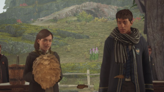
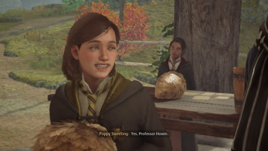
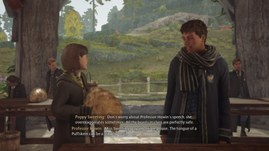
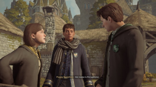
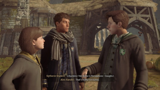
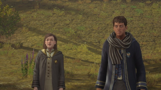
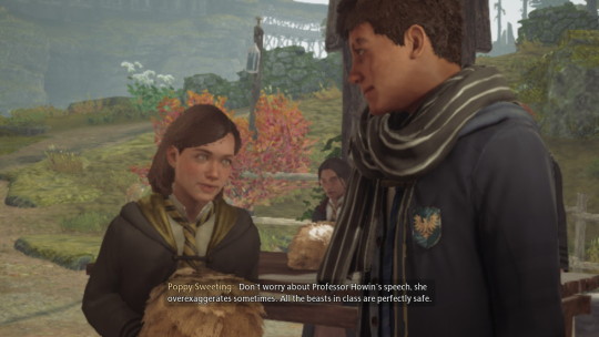

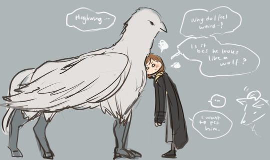
said wolf,
🐺
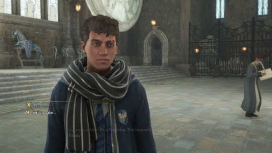
#hogwarts legacy#fanart#poppy sweeting#hogwarts legacy mc#hogwarts legacy fanart#hogwarts legacy oc#seriously poppy got me instantly; she is so sweet; animals ARE involved; A N D the difference between THEIR HEIGHT CLUTCHES MY HEART BAD#i do have forest child kind of image in my mind when i created him#like what type of name is Alex Xander; maybe he was abandoned; maybe he never had a name#and that's the name he gave himself from overhearing normal child being called by their parents ; don't ask how he got that registered#it is said on wiki; she actually preferred the company of beasts as opposed to humans; that's why she was reclusive towards her classmates#maybe poppy is comfortable with him; bcs he reminds her of an animal#he looks so big; yet so gentle 🥺🥺 and probably smell like dirt oppose to other boys who smell like cologne#fsh actually i put Alex Xander bcs the family name I put in make the name looks uncomfortably long in the subtitle#and he is just very close with one of the base look u can choose from the character creation page#he just looks that good; i need to play as him#highwing#Hippogriff
139 notes
·
View notes
Text
I will never~ be the same~ after watching Mignon~ that shit was beautiful~

#HYPERVENTILATE WALKED SO MIGNON COULD RUN#what kind of drugs is that korean animation company on bc it is so STUNNING#everything they've come out with!! i! am! in! awe!#the scene where mignon became a vampire was so... i don't even fuckin know#and that sex scene was mind blowing oh my GOD#mignon with his dark hair 100/10#idk if they're immortal vampires??? but if they are they better stay together forever ;-;#✦ jaid watches stuff.#mignon
648 notes
·
View notes
Note
Ok I know this literally just came out but

She can’t go back. She literally can’t go fucking back I’m going to cry. Are you kidding me.
Certified Outis moment.
#lu speaketh#ask#zenithreach#limbus company#outis lcb#don't mind me i'm just over here malding over more warp ids#we already have a full team of them#i know it's the warp express event but come on#we still dont even have rhino gregor from the promo
65 notes
·
View notes
Text
Detroit Become Human and why does this game decide that the problem in society is individual people treating androids poorly because those androids are choking them out of the workforce and NOT the corporations and governments who deliberately designed the androids to do this
#AUGHHGHH#I promise you dbh is still one of my favourite games I really do#But ohhhhhhhjghh my GODDDD it makes me mad#Like ESPECIALLY this year. With artists and writers being so fucked by ai#Like the game has less than no sympathy for people who were screwed over by cyberlife deciding their labour wasn't worth anything#Like everybody has to be a strawman. Everybody has to be the violent 'android bad because (some vague reason that draws on the#'immigrants are stealing our jobs' line despite the fact that these things aren't equivalent at all)#Like yes. Robots being placed in positions where a real human would be paid a real wage to do that job is bad. This is a bad thing#But the game. Does not CARE#It's so morally neutral for cyberlife to be allowed to mass produce androids in the middle of a poverty epidemic that they created#It's fine! Says Detroit Become Human because everyone rendered homeless or struggling by this company's actions is a violent drug addict#Or something#It's like HUH#H U H#This game was so enamoured with it's weird bad civil rights allegory that it forgot that people do actually need jobs to uh. Pay to live#Because things are hell#And I think it could've been SO much better if the game acknowledged this AS WELL as acknowledging that no android chose this#Like a fresh deviant didn't ask to cause a real person to not have a job. The company who made them did#But dbh doesn't care. Cyberlife is morally neutral in this. I swear#Loses my mind this game is such a mess#Uhhh if anyone's reading this please don't get mad at me I promise I do really love this game. Like this game is the reason I#Met the love of my life. I am physically incapable of hating this game#I just think it's so worth discussing the ways it fails in (what I think is) a constructive manner#detroit become human#game analysis#I guess#If anyone has any contributions or disagrees with me I would LOVE love to hear. Genuinely I love talking about things like this#Essay in tags
42 notes
·
View notes
Text


NOT ME WANTING NEARLY THE ENTIRE BANNER 😭😭😭
#i don't mind not getting full stop announcers#BUT AGH!!!!!!!!!#i saved up but wah.....!!!!! netzie....!!!!!!#limbus company#lobotomy corporation#library of ruina#project moon#spark talks about nothing of relevance
50 notes
·
View notes
Text
i swear my stepdad is so illogical AND stubborn it hurts
#okay so strap in coz this is a wild ride#tl;dr we have been without heat and warm water for years and i mean literal years#because he refuses to pay off some debt he built up with the company#because he feels unfairly treated (let's not get into this. it absolutely makes no sense) by the company#so instead of doing the logical step of growing some balls and admitting he made a mistake and paying off his shit#he's been looking for a new supplier all over but the deal IS#that he's been doing this with a couple of places before and people are hesitant to even make him any offers#and you'd think that learning about THAT at least now he'd be like. idk willing to just pay off his debt and be done with it#but you'd be WRONG#now he's looking to just have our entire heating system replaced for the teeny tiny price of 25000 bucks#mind you his debt isn't even a THIRD of that#and obviously he can't afford those 25000 bucks#so what's his next step now you might wonder?#well good thing you asked. his next step is going off on ME for not paying towards the new heating he wants#and now that that's not working for him guess what he did next?#that's right. he bought shit expensive 'space heaters' that are pretty much just small little boxes that you plug into an outlet#and he swears up and down that they're going to heat up our house (it's negative degrees outside)#(it's obviously not working)#and genuinely. all i can think of is how much money he shoved into trying to macgyver this house into a house with warm water and heating#and how he blew off ten thousands of bucks he got paid when he retired within the span of two weeks#when this debt could have been paid off ten times over by now#so now you might be thinking. okay tiago. why don't you move out#good question you see. my mom is disabled and reliant on someone who cares for her#something that he can't won't and shouldn't do because the last time he sorta kinda tried she almost died and we had to call an ambulance#she wouldn't eat a thing if i weren't there to cook. the house would fall into disrepair if i wouldn't do maintenance all around#i've set up (functioning) heat in some areas she occupies and i've gotten a boiler going so she at least has warm water#i'm paying off their bills to make sure he doesn't skip on paying any others. i'm buying groceries for them because again they wouldn't get#any for themselves#and finally. i've offered to pay off his debt so that we can finally live like normal fucking people do#and guess what. guess WHAT. he just got mad at me for not adding money to that 25000 bucks pool for that new fancy heating he wants
24 notes
·
View notes
Note
Chef greg delivery just for you. it's a wonder I hadn't bearified him yet, he's my fave greg too 🔪

gays literally only want one thing (to be chopped up and eaten by a depressed man) and it's fucking disgusting
#kabukeo#something to bear in mind#other's art#limbus company#project moon#lcb gregor#r.b. sous chef gregor#namesake#i'm sorry for doing a haha funny joke reply i just like#i spent like ten minutes pacing around my house when i saw this in my inbox i'm not exaggerating#thank you for my life i love him so bad#do i need a gift art tag now i just like. i don't even know what to say#i haven't even made any actual proper posts yet i just made a silly blog i feel like i haven't done anything to earn this#to stop myself from blubbering i'm just going to respond to the tags on your rb#no problem for providing details again i think about this grown ass fucking man too god damn much but it's not a problem.#problems are only problems if you call them a problem. it's not a problem.#thank you for seeing the vision on rhino geg.#since kjh refuses to release him that just means that we can continue to acknowledge this as true and canon and there's nothing he can do#[ignore that he has a cameo in a card in game no he doesn't]#to me rosespanner is like. very much the type of guy that when you're crushing on him you try to talk to him#and then you get him to start talking about stuff he's interested in#and then before long you end up agreeing to watch something you don't care for in the slightest#solely for the purpose of having something in common to talk with him about#meanwhile he doesn't pick up on you trying to flirt with him like at all#anyway i could go on about how badly i need hex nail gregor for both bear reasons and thematic Actual reasons#but i'm pretty sure i'm about to hit the tag limit. so i'll just say thank you again for the cannibal i will treasure him forever and alway#it took me like thirty minutes to type this all out after i sat down to actually do it because i kept getting embarrassed lmao#offerings to beargregor#< gift art tag#that's it. thank you for my life once again. keep fighting the good fight soldier. we'll get this to be common fanon one day. trust.
49 notes
·
View notes
Text

extremely late to the trend orz
#limbus company#oh god do i have to tag all of them#yi sang lcb#faust lcb#don quixote lcb#ryoshu lcb#mersault lcb#hong lu lcb#heathcliff lcb#ishmael lcb#rodion lcb#sinclair lcb#outis lcb#gregor lcb#art i made#slowly clearly drafts out of my procreate don't mind me
38 notes
·
View notes
Text
okay, inspired by @dragon-spaghetti's chronic pain Husk headcanons, I present Angel with atypical migraines
Angel getting knocked off balance after a few grueling weeks at the studio (because stress makes them worse), but like with the kind of vertigo that makes you feel like you're floating and untethered, but not spinning
Husk notices when something's off because Angel will stand up from the bar and pause with a hand outstretched before he starts walking, like he needs to recalibrate real quick
he lays on top of Husk with his face in Husk's chest because it's dark and then he'll forbid Husk from moving because that makes it worse, so Husk just kinda rests a hand on his back while they cuddle
#idk idk i've been thinking about this like#if you see this i hope you don't mind that i tagged you#but the chronic pain husk hcs were so good and i am dying to talk about chronic pain husk and atypical migraines angel#i haven't fleshed out the thoughts really at all but i just think angel gets these occasionally and it'll just#wreck him#husk keeps him company because like....there's not much you can do for vestibular migraine#yes i AM projecting onto him#what are blorbos for if not to make them suffer as you suffer#hazbin hotel#hazbin angel dust#i think he would get pain too but as the vertigo part wears off#and more like mild to moderate pain#idk i'm still sort of figuring out how this looks in my head#but i just like the idea of his head feeling bad and the two of them taking care of each other during their bad times
80 notes
·
View notes
Text
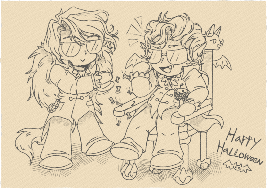
"Smokin' mind flayer tadpoles just to remind the Netherbrain I'm him, this shit ain't nothin' to me man" Sanch--I mean--Don Quixote and Astarion fan art, Dracula Flow style Happy Halloween y'all :> (also Rebelle 7 is very fun I will definitely use this program more!)
#artists on tumblr#fanart#vampire#vampire art#halloween#happy halloweeeeeeen#all hallows eve#bg3#baldurs gate 3#bg3 fanart#astarion#baldur's gate 3#bg3 astarion#limbus company#limbus fanart#lcb#don quixote#lcb don quixote#limbus don quixote#don quixote limbus company#don quixote lcb#lcb sancho#lcb spoilers#project moon#if you don't know what Dracula Flow is PLEASE watch it on YouTube it's super funny#I headcanon that these two are friends you cannot change my mind
43 notes
·
View notes
Text
i think it's interesting how steph is like... the nerds see her as part of the popular group, and sure we see her talking to the cheerleaders a little, but other than that she doesn't really seem to be one of them in the truest sense? i could fully believe that she feels like the tiniest bit of an outcast there, like she's just cool enough for max to give her a pass but she doesn't really click with them that well. she feels to me like the bridge between the popular ones and the nerds, which is appropriate i suppose for her place in the story.
#idk i just keep turning this feeling around in my brain#that she doesn't Quite feel like she's actually proper friends with that lot#in my mind steph is pretty lonely before she starts talking to pete and by proxy the other nerds#like... i feel like the cheerleaders are friendly with her but they don't really Get each other#or enjoy each other's company That much#maybe even on their side there's some slight intimidation factor of her being the mayor's daughter and it's still a bit isolating#poor girl :(#but it's ok now she has real friends :]#... well. at least one. i honestly can't tell if pete and steph would even hang out with grace after everything#even ignoring The Ending And What That Implies#even if that didn't happen#i still don't think??? they would be besties with her#which is interesting for like. yknow. the main protag group who's been through everything together#npmd#nerdy prudes must die#hatchetfield#stephanie lauter
90 notes
·
View notes