#i don't do visual art but this is SO COOL and I'm super excited to see what people make!
Explore tagged Tumblr posts
Visit Tumblr Blog
Explore Tumblr blogs with no restrictions, modern design and the best experience.
Last Seen Tumblr Blogs


Fun Fact
Tumblr.com rank in the US is 25.
Text
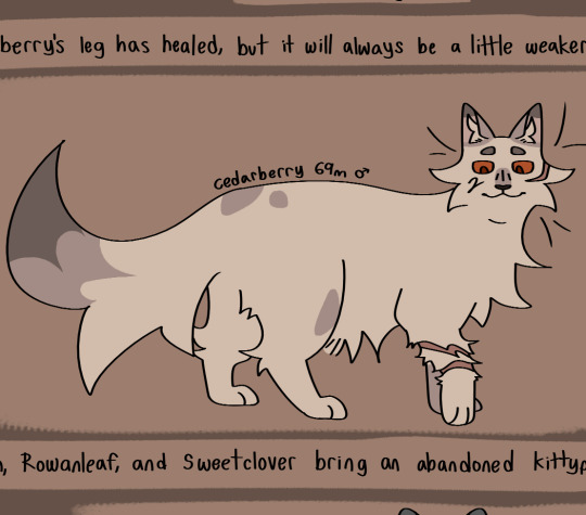
Goodbye, Gendaen
fan art for @mtqcomic
Thoughts and LONG ramble under the cut! (includes spoilers!!!)
A while ago (like last week maybe?) I realized that I've been following this comic for almost a year, and I still haven't drawn Mysta yet! I figured that with the recent end of Chapter 3 and that *huge* lore drop (I was NOT expecting that oh my goodness the theory wheels are turning in the void that is my brain) now would be a pretty good time to draw her! So that's where this came from! :D
I thought that it would be fun to draw Mysta looking sort of like a knight? Partially because it makes for cool posing and composition but also because I think that if she was in D&D she would be a paladin due to the whole "Hero sent by Destiny" thing (I considered sorcerer or warlock as well, but her moveset is mostly melee at the moment so I thought that paladin fits better. Plus this opens up the possibility of Gendaen being an Oathbreaker paladin, depending on how that whole situation with the Crimson went. (also now I kind of want to put the main cast of mtq in D&D even though I don't actually know a lot about D&D ToT. I think Eth would be a ranger maybe multiclassed into something magic-related, because rangers have a favored enemy mechanic that gives them advantages on fighting a certain type of enemy, which could be Crimson enemies for D&D Eth. Yele is (kind of obviously) a druid because of the whole dryad thing, and Zaïl is definitely giving rogue energy to me.)) Anyways, D&D-related sidetrack aside – hello??? End-of-chapter-3 lore drop? (/positive) I have SO many questions. First of all, what happened to convince Gendaen to switch sides? For someone who allegedly spent his entire life trying to cleanse the Crimson, it would've taken one heck of a worldview-upending revelation to get him to join it. With the information we currently have, it seems pretty clear that Gendaen isn't mind-controlled or corrupted or anything – not just because of the reasons Eth gave in page #169, but also because from all the interactions we've had with Nelun Soma'o/Gendaen, he seemed to be pretty chill? I pointed out in my first fan art post that it doesn't seem as if Nelun Soma'o is being built up to be a villain character and is instead more of an antagonist with a slight mentor role, and I think that still kind of holds up now. Gendaen definitely wants Mysta to help him and/or the Crimson with something, and as Yele said in that recent comic, things aren't really adding up. I'm still slightly suspicious of the Order of Learning as well (insert person pointing at conspiracy theory board meme here lol), since you would think that if Gendaen and Eth are really close then Gendaen might have told Eth about the whole Crimson situation, right? On Page #250 (which is marked as 150??? probably a typo but idk) Gendaen says that he didn't want Eth to be roped into this whole situation, which could be a reason for keeping him in the dark – though if he knew Eth really well then he might have suspected that Eth wouldn't just let him disappear and would go searching for him. Another possible reason (in my theory) if the Order is evil or something and Gendaen learned something that he shouldn't have learned, maybe he knew that Eth wouldn't believe him because of his loyalty to the Order? I may just be connecting random dots and calling it a picture here but *something* is going on and until we get more clues on what that may be, I'm sticking with this theory lol :P EDIT, I was rereading Gendaen's character sheet and it says there that he has a strong code of honor and fights for the underdogs (not the exact phrasing but it's close). 👀 does that mean the Crimson is in some sort of underdog position? 👀
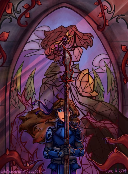
Anyways back to the drawing a little, I gave both Gendaen and Mysta a sort of braid-like element in their designs to sort of tie them together a bit visually (Mysta's is on the sides of her head, which is kind of hard to see so I added a little ribbon to show that parts of her hair is tied back, and Gendaen's is in his golden hair accessory thingy). I think that there's definitely some sort of correlation between Gendaen's disappearance/switching to the Crimson and Mysta being sent to Sol Ybberia, and I also think that both of them are going to play an important role in whatever happens in the future, hence the braids (to show that their destinies are kind of intertwined, as the two Heroes of Sol Ybberia). I also thought that it would be fun to put Gendaen in a stained glass window instead of actually physically being present, because up until the Nelun Soma'o reveal, all the things we know about Gendaen are basically all from Eth's recollections of him, which for me definitely paints a bit of a "Character haunting the narrative" kind of vibe. I also think that with the Nelun Soma'o reveal, the somewhat glorified (for a lack of a better word – I think Eth might be a little biased when it comes to Gendaen, considering that Gendaen has been missing for about 5 years, if my math is correct? 5 years feels like a long time to me and I think that if a person important to me has been missing for that long then my impression of them would definitely start warping to how I want to remember them/who I wanted them to be and I might start unintentionally ignoring the things that doesn't quite match that image in my head. Speaking of/case in point, Eth's reaction to the Nelun Soma'o reveal!) image of Gendaen that we had got thrown in a metaphorical blender with our idea of the Crimson at the time, and it just makes things a whole lot more complicated in a very interesting way. (If you look at the bottom right of the image you can see Nelun Soma'o's cloak coming out of stained-glass Gendaen's cloak, which I thought would be a fun little detail to include). Hence, the stained glass is kind of the "perfect Hero who disappeared to advance the plot" Gendaen and we can see Mysta kind of splitting the glass with her Rotted Fork from a composition point of view, referencing that huge lore bomb she dropped a couple of pages ago and how that changes our (or at least my) perception of Gendaen as a character entirely. I really do like the plot twist, as I think it makes Gendaen a more 3-dimensional character with more complicated motivations and narrative significance, as before I mainly knew him as "predecessor to Mysta" and "one of Eth's sources of motivation", but now he my understanding of Gendaen also extends to things about Gendaen himself and not just about his role in relation to other characters (for example, "Gendaen is helping the Crimson for reasons currently unknown" or "Gendaen is planning something that involves Mysta??? and he's in the Void??? And apparently Mysta is supposed to jailbreak him out at some point in the future?" He definitely has something planned behind the scenes, I don't know what it is and I want to find out).
MORE THINGS about Gendaen (can you tell that he's my favorite character at the moment ToT), what's up with those last words? If I'm correct (and I think I am, I scrolled all the way back to the page where the gods were introduced just to check this ToT), Nomù is Compassion? How is compassion related to Gendaen's alliance with the Crimson? I mean, when you think of the Crimson, compassion definitely is NOT the first value that comes to mind. Right now it seems that to me, Gendaen's plan with Mysta and the Crimson and the Void is connected to Nomù somehow? (the "I won't disappoint you" is definitely interesting). I don't have a lot of thoughts or theories on where this might be going, I just thought that it was something interesting to metaphorically chew on for the next while. It definitely seems like it has some sort of narrative significance, at least.
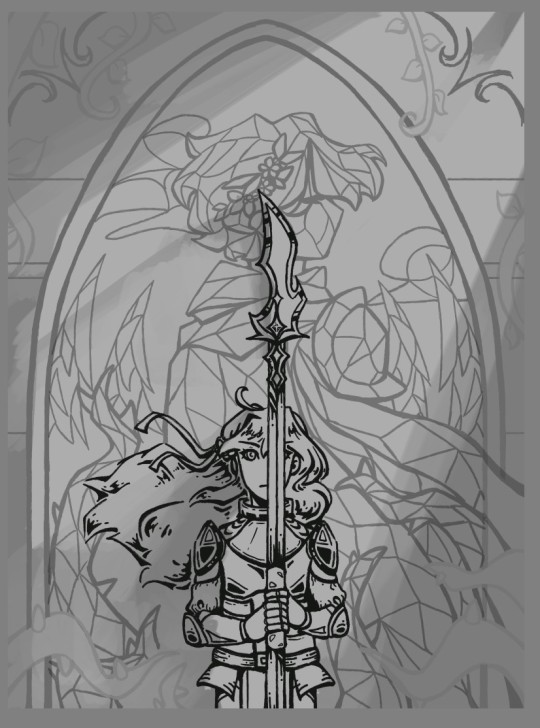
There might be more things that I wanted to talk about, but I can't really think of them off the top of my head right now (it might be due to the fact that it's currently quite late in my time zone ToT I am sleepy) so that's all from me for now :D (Also dropping the version of the drawing with just the lineart here because I think it looks really cool)
I hope you have a really nice day and/or night! :D
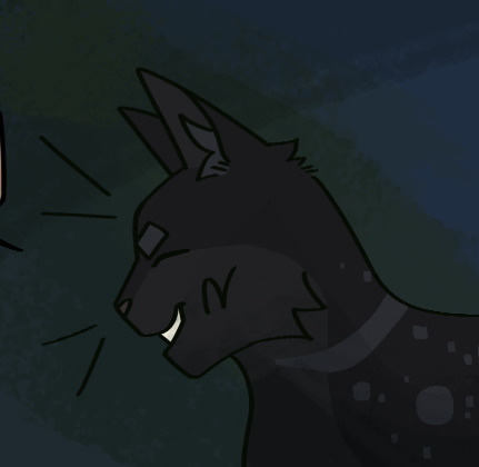
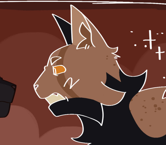
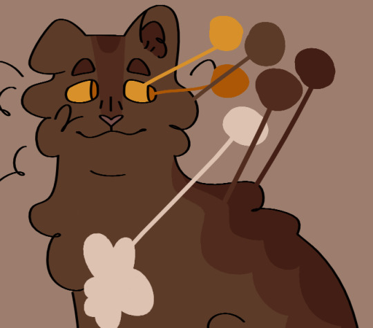
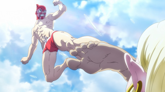
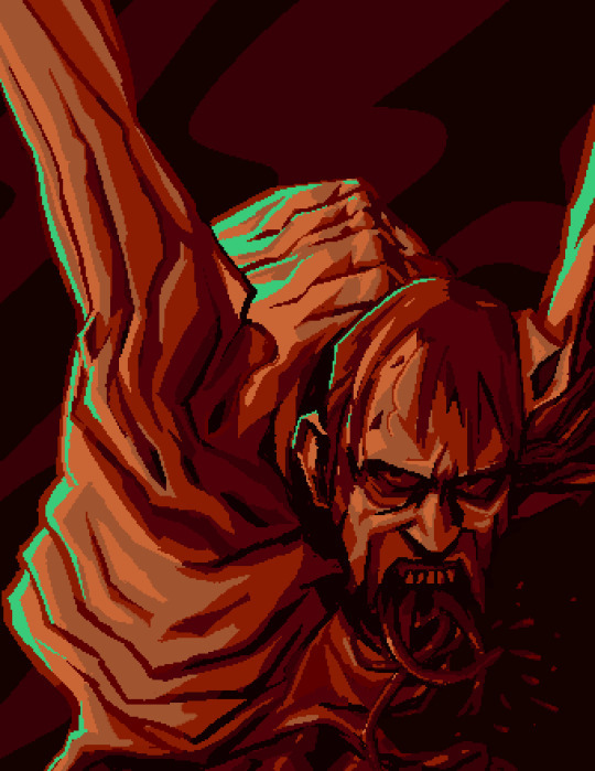
*a starry rift in space opens up in front of me and I faceplant into it like it is a mattress* (gotta make that dramatic exit!) [Image ID: The first image is a colored and rendered image of Mysta from the Mysta's Terrarian Quest webcomic standing in front of a stained glass window of Gendaen. She is holding the Rotted Fork spear from Terraria, and she has a determined expression on her face. The stained glass shows Gendaen with his back turned to the audience, and one closed eye is visible. His cloak is flowing to the right of the image, where it emerges out of the stained glass as it fades from green to dark grey. Crimson vines, green trees, and white clouds surrounds Gendaen in the stained glass. Outside of the glass portrait, real crimson vines are creeping along the stone walls that the portrait is on, framing the portrait and Mysta in the middle. A red light source is shining down from the upper right corner of the drawing. End ID.] [Image ID: The second image is a work-in-progress version of the first image without any color and only some minimal shading, with all shades being in monochrome. Mysta's lineart is noticeably darker compared to the line art of the background. End ID.]
EDIT: Forgot to add image ids, they're here now TwT
#mtqcomic#fan art#my art#whiteboardartstudios#art#also drawing fan art for people is really funny because you'll see them going about their life as usual-#-and then you're there hiding in the corner going “ehehehehehehe they don't know I'm about to hit them with the dodgeball of appreciation”#it's a very >:3 kind of feeling lol (at least for me)#also I had SO much fun drawing that Rotted Fork#I took some creative liberties with its design (aka the weird spine-shaped thingy-#-that was only slightly inspired by Acheron's (Honkai Star Rail) weird spine-shaped accessory. I thought it would be cool for Crimson-#-weapons to have more body parts in their visual design compared to just in the name and color scheme lol. Shading all that dark metal-#-was super fun :D the shiny red bits were great too :D)#also I was SO incredibly excited when I realized that Mysta's armor is reflective and thus I can make it glow#fun art things I guess :)#I really do need to go to sleep now tho#byeeeeee
25 notes
·
View notes
Text
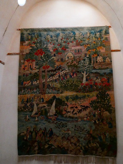
fiber art adventures in egypt
I recently got back from a trip to Egypt & finally got around to organizing some pictures to share. One of the things I was most excited about was seeing what I could find on fiber arts and textiles.
Dropping everything under a read more, 'cause this will be a long post haha
first visit: the National Museum of Egyptian Civilization (NMEC)
At the time of visiting, they had a special textiles exhibit. It covered Pharonic Egypt all the way up to modern times, although I only had time to check out the dynastic & a bit of the Coptic portion of the exhibit (which was what I was really hoping to see anyways)
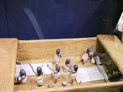
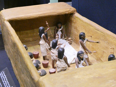
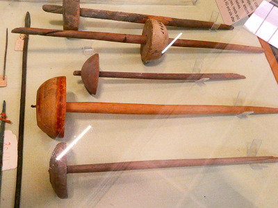
Was super excited to see this diorama in person. I knew about it but had never seen good pictures of it. From the little I've seen of ancient Egyptian spinning, spinning with two spindles seems to be the norm rather than a master technique? It also shows up in tomb art, which the exhibit also shared:

They also used a different fiber preparation (splicing to create a rove of fiber, no traditional drafting to my understanding) so that probably made a difference? Regardless I really want to see if I can replicate the technique, especially because their spindles look so similar to modern spindles??
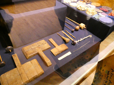
I took so many pictures of spindles, guys, and I fully intend to either have a few replicas made or to learn to make some myself. Also, although they were unlabeled... I'm pretty sure those are beaters for weaving? That was a bit of a trend with this trip, so much stuff was unlabeled :( I would've killed to at least get some date estimates for some of the stuff they had on display. I was nerding out in here though, and my family took a few pictures of how excited I was getting. A bit embarrassing, but eh haha
The exhibit also had a section on natural dyes used with a fun visual;
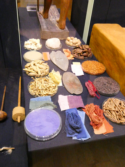
There was several diagrams specifically describing each dye source, but in the interest of not overloading on pictures I'll just list them out. For blues; woad, Yellows; turmeric, safflower, saffron, or yellow ochre; reds; madder, henna, pomegranate, and kermes. I originally thought kermes was another way to say cochineal, but it only seems to be distantly related.
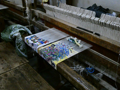
next visit: Ramses Wissa Wassef Art Center
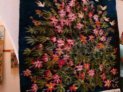
A small art center dedicated to hand-weaving wool and cotton tapestries. All of their work was museum quality & awe inspiring!!
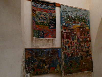
Was even invited to their back rooms to watch a few of their weavers working; no I don't have room to put a room-sized loom anywhere but heck do I want one now

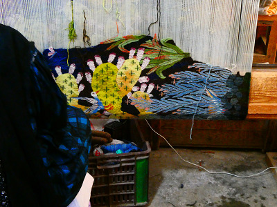
Our guide that took us through talked a bit about the natural dyes they use (all of their dyes are dyed in house with what they grow in their dye garden!!!) and got excited to hear I was also interested in natural dyes! He seemed a bit disappointed I'd never worked with indigo and. while indigo scares me, I'll take it as a sign that maybe I should try some time this year haha.
final visit; the Egyptian Museum
we really had to rush through this one which was a huge shame because it's packed full of artifacts. Also, the lighting in there is atrocious, so apologies for the not great pictures ahead.
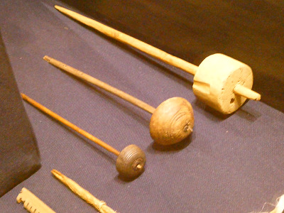
They had a fascinating display of textile tools, more than what the NMEC had;


(Hand for size reference) I want all of these spindles! So badly! But a few of them look so much like a few of the spindles I own already?? A few of them had a spiraling notch, that's so cool? But also, what's going on with the one with two whorls? I have no idea. I'm fascinated.
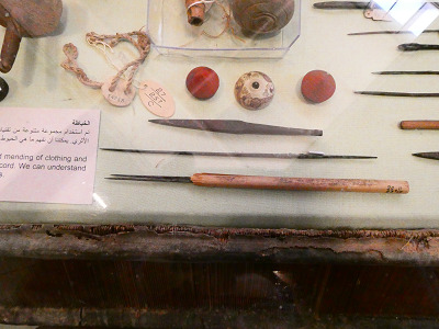

Look at these whorls!! Although again, I'm a bit confused; the lack of labeling strikes again. Unsure why some of these "whorls" have two holes, or what the metal object with the wooden handle is. The display implies sewing needles, and some of them do look like it, but others.... really don't look like sewing needles. I'm absolutely enchanted by this little whorl though. I think it has birds on it?

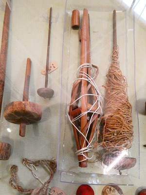
More objects that I'm baffled by- the signage doesn't really indicate what some of this stuff is, if it's even known. Also confused by the object wrapped in white string in the right pic; it looks like a distaff but to the best of my knowledge the (ancient at least) Egyptians didn't use distaffs. It probably popped up in later times and was put in this display since it was still relevant, but I'm still not sure.
I have so many more pictures & thoughts but I'll save those for more specific future projects. I've been doing research outside this trip on ancient Egyptian spinning techniques and desperately want to go deeper into that, this trip just solidified how excited it makes me. If you made it all the way through this, many thanks for reading!
Bonus; look at this ancient linen 🥺

#hand spinning#archaeology#extant artifact#weaving#fiber arts#long post#letters from skylark#sorry for the overall low quality images in this post. Got a new camera and wasn't the best at using it this trip#also the raw image files were huge so I heavily downsized them to make sure this post wasn't a beast to load#would be happy to share the raw images if desired though
278 notes
·
View notes
Note
Related to FallenClan designs! All your designs are super amazing, what’s your simplifying process/how do you decide design for cat pelts? Cause I always struggle with simplifying/deciding how they look especially bengals and cats with white patches… thanks if you respond!
I’m ADHD and struggle with consistency and simplifying lol, though more complex designs are pretty, I lean more towards what you do w/ you’re cats as they are simple but still super pretty + it makes it easier to consistently draw them all for stuff like this! (These comic like moon updates :])
(Also hope none of this came off as offensive, it’s all meant positively! I really really admire you and your designs :])
ty for the compliments!!! very sweet ask and I shall do my best to give a good response o7
generally my method with designing characters/drawing is to just wing it. fuck it we ball basically. but i DO take a lot of inspiration from other people's warriors art, taking the time to analyze what i like about their styles and what different sorts of patterns i can use
(i also regularly consult the Clangen Sprite Guide for better looks at white patches/tortie patterns and such, highly recommend)
the first thing i decide when i'm designing a new cat is what fur texture i want them to have. i have four that I pick from (pictured below, in order), wavy, spiky, curly, and square.
i decide the fur pattern based on the cat's personality (a more stoic cat might have square fur, while someone more bubbly might have curly, or someone more excitable have spiky, so on and so on), and also based on their parents/how many cats i've designed with that fur pattern recently.
after that is snout shape, which is probably my favorite part. i love to draw cats with a very pronounced snout, not unlike an oriental shorthair, but i generally slide around between that and a more typical, stubby snout, occasionally veering off into the very square snout of a maine coon. this is also a great spot to determine how sharp you want their jaw to be, which is something that can really help set a design apart! (a couple of snout examples below)
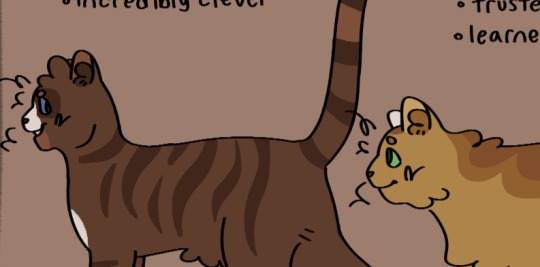
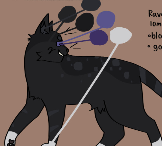
then i usually move onto colors. i like to pick an undertone for the cat first, so i know what sort of pallate to work with. as you can see in the pictures below, ravenstar has a purple/blue undertone, and toadbelly has orange/red undertones
this helps me make all the colors look nicer together, so i don't end up doing something like making a very warm colored cat with blue-toned white patches (which would make the white patches look super cold/too bright), which can be a really cool stylistic choice, but isnt what i tend to go for
once i've drawn out the cats fur shape and picked my colors, i'll move onto the base coat. over my time of having the fallenclan blog i've discovered that having a very simple pattern underneath the normal pattern can add a lot of visual interest to a cat, and make them look less plain.
here's a good example! one of the first cats i designed, oaktuft. their pattern was super basic--one base color, plus the inside of the ears, and then the color of their patterns.
and here's another cat that i designed a little more recently--Shiverspots! you can see that even just the small change of adding a bit of a lighter color to her underbelly made a world off difference. plus my style got a lot more defined lol
i have a couple of different base patterns that i use. here's a few more examples. i've even started to experiment with more than two colors!
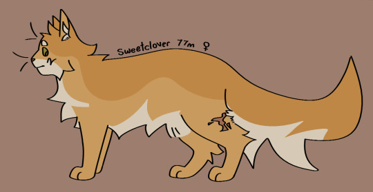
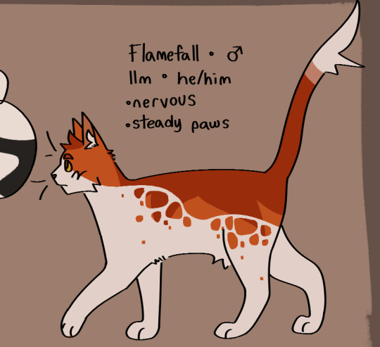
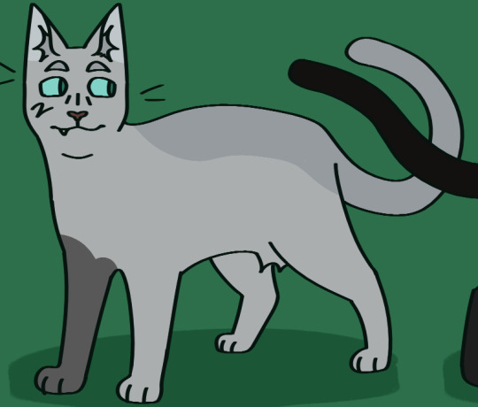
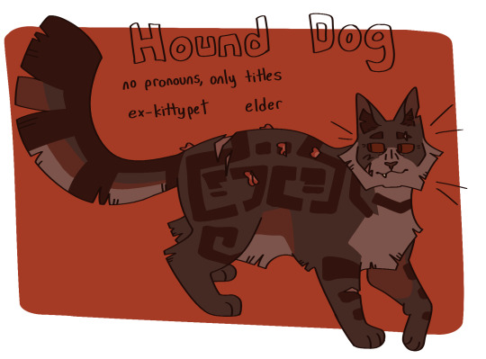
once i've got the base done i move onto patterns. this part can definitely be tricky; trying to make a dozen brown tabbies with short fur be distinct can be . a challenge. i like to follow the steps of what i've already designed--a cat with spiky fur might have very sharp, angular stripes, and a cat with curly fur might have much rounder ones.
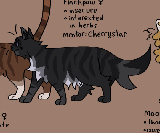
i think a good rule of thumb for if your pattern feels a little too basic is just to throw some more colors in there. another shade of orange, a more pale tint to some of them, whatever. and don't be afraid to erase it and start again! sometimes a design just won't work, and thats fine :)
the final thing i do is to add little design quirks. a particularly sharp jawline, downturned eyes, a crooked smile or a gap tooth, whatever! little things can really give your cats character.
i really hope that this helped!!!
#fallenasks#fallenreferences#<new tag i guess???#looking back at this i suppose i lied at the beginning . i do have somewhat of a method
65 notes
·
View notes
Text
I'm gonna give you guys just a few of the ideas for ALL the voices before I draw them. Because I wanna share so muchhhhh I'm so excited working on all this!
Both spoilers and just long
Hero: Superhero appearance with wings shaped like a cape, even if he's most "human" Though I can make an argument being a superhero to help people is the most human out of the voices.
Broken: hhhh he's my comfort guy. I do have a lot of doodles of him with plucked feathers. [and I don't just mean bald spots, the stems are still in the body] But I wanna add more... diving offering based things for his...opinions on the Tower Princess
Cheated: Oh he needs a X on his chest as a general princess parallel for her being cheated from life too. Also cuts from the Razer princess. Past that, not sure.
Cold: I abandoned the idea of making him look like he was made of icicles, to be wrapped in his wings "But he's a voice numb to the cold, he is the cold itself, why would he be getting himself warm with his wings-?" Because I like that he is cozy within himself. ah? that cool? No? don't care, i'm commited
Contrarian: God I wanna do more past the jester idea and something with his Stranger route arc BUT UGH IDEA MAKING IS HARD. I have a draft of him like a jester for now...
Hunted: I'm gonna reuse the ripped off feathers idea for him. My chickens fight for domanice sometimes so I have a good reference for the appearance. probably bite marks on his wrists and an additional claw. not like a new hand, it's like this thing

Opportunist: EEEHEHEH it's hard to describe without devolving but it's.... a illusion to a Devil pretending to be a Angel thing in visuals, but in representation he isn't a devil just mischievous.I also added the fun ribbons from the Princess and the Dragon chapter.
Paraniod: Heart. Lungs. Liver. Nerves. Oh come on how could I not add them??? also just ruffles up feather coat and wings. he's gonna get a REALISTIC heart design on his chest btw, not a cartoon one [unlike another voice~]
Skeptic: little hard to figure out i'm still thinking about him maybe detective since he doesn't know what's true and wants to find the truth?
Stubborn: KNIGHT. He is a knight. Warrior!!! the willpower to fucking come back to live is badass. I might make a colored drawing JUST FOR HI because I would love him to have some orange for a Phenoix vibe
SMITTEN: MY BELOVED VOICE. HE'S MY FAV Cupid. He's a Cupid and no one can convince me otherwise. Cute cartoon heart imagery, dainty angel [like cartoon cupids] wings, a nice gown. It suits him
i wanna also say. I am not dressing up the voices, I thought feather shaping language would be fun. Though I didn't have that as a "hard rule to follow". Smitten was the first I drew and he's gonna keep the gown
Also part of me REALLY wants to do "evolved forms" of the voices because of the paths they have a huge role in. Like I saw @beartitled with a Goth Smitten form from the Happily Ever After Chapter because of the HUGE role he had and how much of a evil voice he was. [loved your art btw if you see this, it's inspiring to see :D]
Btw I love the Smitten even more because of that route. Not because I like his actions as the epitomy of "Amatonornativity Standards in the World" but because it shows how much more depth he has and also how too much of this one voice/feeling can be super bad. Like it's such a interesting arc on his end alone and the entire chapter is amazing but now i'm rambling.
19 notes
·
View notes
Text
Shangri-La Frontier Episode 1: What Do You Play Games For?
What happens when a gamer who only plays shitty games decides to pick up a so called god-tier game? Shangri-La Frontier is the answer to that and provides an insane opening episode for the concept. I'm just so excited to get 2 whole cours of this, and I really want to explain why.
Also, SiM's vocalist (MAH) on the OP with FZMZ? And Chico on the ending song? This series was made for me man.
First of all, C2C is an incredibly underrated studio considering the quality of the projects that they enjoy. This is one such project. Right from the start the quality is insane. 2D camera movement, detailed animation and character acting, the whole nine yards. Just look at this walking cycle! There's no 3D and their shoulders move!

It's just crazy to see the detail they put into these pieces early on. Walking cycles are super neglected due to how "plain" they are, but there's just something incredible about seeing that effort put into it with stuff like these examples.
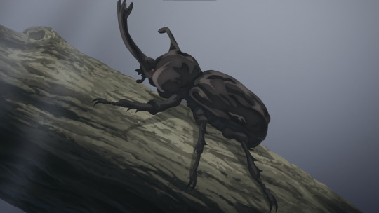
And then there's this (sort of misleading) litmus test. Does your anime have really good art for a random cut? Odds are the production's doing really well. And, well, there's this really good looking beetle shown early on in the episode.
Anyways, to Shangri-La Frontier the game. The direction understands the assignment right away. This is a video game, we need to know it's a video game. So they show us it's a video game. First person perspective is our very first cut shown in the welcome screen and once we enter the world, setting the tone perfectly for what's to come.


But of course, a video game has more to it then just first person perspective, and of course C2C grasp that as well. Slow motion (which you'll see later), and more importantly camera movement are important in establishing that feel. The slow draw towards an endless expanse of world, the bird's eye view of a landmark or feature as the camera slowly rotates. It gets it, and it's able to create a living, breathing trailer for Shangri-La during the episode because of that.

And then, there's the fact that it's a video game. There's talks of skills and abilities and levels and whatnot, but I think most understand that that's a "staple" and that C2C/Shangri-La handle it quite well.
Let's talk about the good stuff, let's talk about action. C2C nails it. They put incredible effort into video game-styled choreography, and it pays off in spades. The slow motion, the harsh camera angles to accentuate the fight, the camera rotation, the way that attacks linger in the air. It's incredible stuff that's augmented by insane animation and visual effects. Seriously, pay attention to the fight and you'll see that they did an impact frame for a crit. Not in the traditional sense, but that the impact frame was the crit. This sort of stuff just makes me so excited because of how well it's handled.
And then there's the worldbuilding. The OP comes into play as well of course, but the details are super great. The enemies Sunraku faces in the starting forest are (mostly) beginner enemies. A goblin with a stone axe and some sort of large pig seem to be the "typical", but there's more to it than that. The Vorpal bunny is a "rare" enemy which makes sense, but the pig enemy only appears as Sunraku ventures closer to the second town rather than the first.
There's considerable detail and effort placed in the creation and appearances of these creatures in the world. The Vorpal Bunny featuring a better crafted weapon than the others that most likely came from somewhere else. Don't forget - we saw a rabbit in the opening.

It's just insanely cool stuff. The world is already shown to be more broad and deep than "it's a big video game world!". There's all sorts of little pieces like this peppered about, and it's just so damn good. Even the concept of Sunraku's "Wanderer" dropping him in a forest rather than the starter town. The detail to really sell this game as god-tier is so damn good.
But it's important to not forget, the god-tier part of the game is only one part of the puzzle. Sunraku here is famous for playing garbage games.
And it's a great way to offset the story and provide a fun angle, I'm serious. It allows them to add fun commentary and responses in regards to frustration from playing bad games, and at the same time provide a novel and excitable approach to a genuinely good game. The best of both worlds that sets the perfect stage for how they want to explore this story.
So, understandably so, I'm very excited about two cours of this and everybody else should be too. C2C is showing us they've got the potential to make the absolute most of Shangri-La Frontier and it's fun and surprisingly unique concept. Can't wait to see what they bring with the next episode!
#shangrila#shangri la frontier#shangri-la frontier#c2c#studio c2c#c2c studio#vrmmo anime#isekai anime#anime review#anime and manga#anime#anime recommendation#anime reccs
46 notes
·
View notes
Text
Check-in for 01/28/24
It's been a while since I did one of these. Time to remedy that!
I've been doing well in my assignments, but due to some registration issues at the start of the semester I was unable to sign up for any web development or programming classes :< It's nice to take a break, but I'm really worried about getting stagnant in those skills, and maybe even losing what I've learned over time.
This is where a couple of new projects come in: A blorbo database and a tool for drawing pokemon from memory. These things are going to keep me avoid stagnancy and help me develop my web dev and Python programming skills, and I'm real excited to talk about them.
First up, let's talk about that tool for drawing pokemon from memory. I love drawing pokemon from memory, but it's a bit of a struggle to find tools online that work well for a solo experience when you're doing this challenge alone. So I made a program in PyGame to solve this problem, and I've actually already completed it! It was a great learning experience when it came to getting a taste of APIs, and PokeAPI really helped me do all the heavy lifting with it. I also ended up using ChatGPT to help me understand how to phrase my questions and the things I needed to research. This is the end result:

If you click "Get Random Pokemon", the program will provide a pokemon's name. The point of it is to draw the pokemon as best as you remember it, and then click "Show Pokemon Image" to see how you did. You will then have the option to get a new random pokemon, which clears the image from the window.
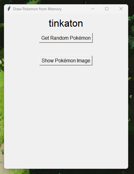

There's a lot of stuff I don't understand about how the program works--- APIs evade my understanding, and Tkinter is a dark art beyond my comprehension. But I was able to make a program that solved a genuine problem for me for the first time, and that's super exciting to me!
Now, for web development--- long story short, I'm making a website dedicated to cataloguing my OCs that's very much inspired by tumblr user @snekkerdoodles's personal site on neocities, which I regularly stare at in an effort to motivate myself to make cool things like it (everyone reading this should check his page out IMMEDIATELY and tell him how cool it is). Here's the screenshots of the WIP I'm chipping away at right now:

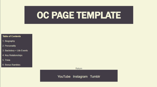
I don't have much to say about it, as the interesting stuff will really be the content of the pages, and I still have yet to finish the template page I'll be filling with my OCs' information. However, I can say that I'm very upset with the lack of proper teaching that took place in the first (and currently only) college web dev class I've taken. I spent an entire semester doing my own research to learn everything they were supposed to be teaching us. I'm still very peeved about that.
To summarize this very rambling post I'm too sleepy to edit properly, I'm making a digital blorbo encyclopedia, and I finished making a little desktop app thingy, which means I need to summon a new programming project. I'm tempted to make it a video game... maybe I should turn back to that visual novel idea I had ages ago and boot up RenPy!
#let me know if you'd prefer I untag you!#I'm still so uncertain of tagging etiquette on Tumblr#stuff by sofie#sofie checks in#web developers#web development#web dev#programming#coding#codeblr#python#software development#app development#pygame
32 notes
·
View notes
Text
Ranking Yu-Gi-Oh! fish art
Yu-Gi-Oh! has a whole monster type for fish, let's take a look at a sample of the art. This is ranking the designs, not how good the card it. I haven't played since before pendulum was a thing so I'm in no position to judge.

This is a neat design. Not really getting panther out of it but it's still pretty cool. Not over the top while still having an identity of its own. Not super exciting, but solid. 7/10

They weren't lying, that moray sure is white. I love a good moray and the shield is neat, but I'm a bit confused as to why it's sideways. It's also not the most visually interesting card art. 5/10

Oh hell yeah! Want to spread that copypasta about how useless molas are? Well eat needles, asshole! Easy 9/10!

This... isn't a fish. NA/10

Oh, I love this. I love this so much. As if a flying shark wasn't a cool enough idea, the coloring on this is great. I wish this was a real thing and hunted people to poach sharks for their fins. 10/10

I don't hate it, but it's pretty boring. A cyborg megalodon should absolutely blow my tits off with concentrated awesome, but this? Not so much. 3/10


They took away her titties in the intl art. 1/10 out of protest.

Tripod fish my beloved! Minus the monster head and lack of skin between the fin rays and this is a pretty accurate depiction of a tripod fish. 7/10.

...what the actual hell? I don't know what this is, but it's not a fish. NA/10

As much as I appreciate a sword swordfish, this is not what I want. The Performapals are supposed to be cute and friendly but this thing looks gross as hell. 1/10.

I might buy this card just because I love it so much. An undead leafy sea dragon is so cool and I absolutely adore the design. I want this as a poster. 10/10

Aww, look at the little baby robot shark. This card is so cute I want to snuggle it even though it's a hunk of metal. 9/10

Eww. 0/10

Not a huge fan of the art, but I do like how they took one of those deformed goldfish breeds with the bulbous heads and made it an actual giant brain. 5/10.

Oh this is sick. I don't even know if it's supposed to be an actual fish but I love it. I like how you can see all the ribs through its skin and even though its supposed to be ghostly pale, there's plenty of color so it doesn't look boring. Absolute beast 10/10.

Ok this one's not even a vertebrate. Are we trying here? You have the aqua type that this would fit into but you're deadass going to try to tell me that a shrimp is a fish? What's next, something that's not even an animal? Are you going to try to tell me that a plant is a fish?

...I give up
#yugioh#fish#fishposting#fishblr#art#rating#fish type#shark#moray#shrimp#megalodon#swordfish#leafy sea dragon#goldfish#flower#mermaid#whale
11 notes
·
View notes
Text


Batman: Off-World #1, written by Jason Aaron, art by Doug Mahnke (pencils) and Jaime Mendoza (inks), colors by David Baron
I'm way behind on my reading, but better late than never, right ?
So... Batman: Off-World. At first glance, it looks like a joke. Batman fighting aliens in space. Brings back memories of those goofy '50s Batman stories.
But it's written by Jason Aaron with art by Doug Mahnke, so I was willing to give it a try. And boy, do they deliver. This is Bruce at the beginning of his career, realizing there's a bigger world out there after meeting an alien mob enforcer, and going to space to learn how to deal with them, willing to take on impossible odds in order to save all the people he can.
Yes, it sounds goofy. Maybe it is, I don't know. But it is the most exciting Batman story I've read in years. It goes to the core of who Bruce is and what he does, it's got lots of action, lots of heart, and super cool visuals (oh boy, those colors). Really cool stuff.

8 notes
·
View notes
Note
how do you get your colors in your art to look so good?
gonna resist the urge to say my colors aren't that great, and i'm gonna try and think about how i do color seriously.... also thank you for the compliment! i've always felt like i struggle with color but maybe i can still be helpful :B if this stuff is all super basic, apologies in advance
ig i already love bright colors, especially warm colors, but i feel like a lot of making visual art is bringing out the contrasts between colors, light and dark, textures, movement, saturation, curves and straight lines, etc., so that just means i usually try to think about the relationships between the colors a little more than the colors individually.
i also don't usually start with a solid color palette defined beforehand. i usually know the basic colors i want, but i don't typically choose them before i start bc that's too rigid for me, and i want to be able to adjust things or throw things out without worrying that i'm messing up the balance of a palette i already committed to.
so for this one
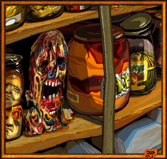

i used a lot of warm colors bc i loove earthy yellows and oranges, but i think it can make colors feel more vibrant if they're next to colors that contrast w/ it (warm and cool, or complementary colors).
the "gray" metal parts of the picture like the shelf stile coming down vertically, and the jar lids behind it, are green to contrast w the oranges and reds in particular, and there's some blue popping up in the zombie head and the shadows on the bottom shelf for the same reason, altho the blue is a touch on the greener, cooler side of blue (as opposed to the purpler, warmer side).
usually if i use a color in one place, i try to pull it into the rest of the picture for better balance unless maybe if it's the focal point. so i'm doing that with the blue, and the orange stickers to spread the bright orange from that big jar around more.
also i don't usually use straight gray/white/black, 99.9% of the time i'll use something tinted like that green metal stile, or the pinkish gray in the jar on the far right.
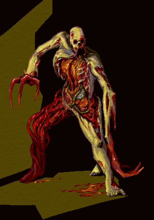
same here: it's mostly green and red bc i like that combo & they're complementary, but i did try to pull a little blue in as well through the shadows on the right ribcage and that one mystery organ under the green intestine, nd in the back of the leg.
that being said tho, it's not really "blue", it's more like nearly gray-purple that looks blue bc it's next to such bright warm colors. that's the magic of gray lol, it's very useful bc it's easy to make it look as if it's warm/cool depending on what colors it's surrounded with.
ig color for me is mostly about color relationships and saturation... the gray can look like blue if it needs to, and it can make the colors next to it look even more vibrant so the skin of this necromorph dude looks sickly and dead but the organs look pretty lively.

when i shade something i always try to use a color that's at least a little bit different from whatever the base color is. so in this case the base color was that kind of pale orange and the orange-ish gray, but the shadows are both super saturated & one is leaning more toward a sienna/orange (on the left side of the pic on the arm and ribs) and the other one is leaning a lil more toward a berry purple/red & i think that usually adds some nice depth to the color. also don't be afraid to add reeeally dark darks and really light lights, but imo the darks give colors the most life by contrast.
since this was a limited palette & not that detailed, i didn't worry about pulling that aquamarine anywhere else.
other than that, i just try to be bold with colors, and go for something exciting & not worry too much about whether it looks naturalistic. plus there's tons of colors you can pull out from regular objects/lighting/whatever else. this isn't specific to color, but the other thing i try to do is practice seeing what colors/forms are really there, not what i expect to be there.
a super basic example would be if i want to draw a banana, i don't want to just automatically reach for yellow bc bananas are yellow, i want to either look closely at the real banana i want to draw, and really try to see what colors are really there (which can be surprising tbqh), or if i'm not actually looking at a real one, then just try to pull in more color for the fun of it, like shading it with purple or blue maybe idk go nutso!
tl;dr i think i usually try to keep in mind
warm/cool color balance
complementary colors (altho tbh you can make any color combo look good, esp if you mess with warm/cool balance)
saturation (i keep a lot of things saturated, but also the contrast between saturation/desaturation can make the colors look more intense)
light and dark contrast
using tinted grays to imply a warmer/cooler color that contrasts with the main palette
color depth (shading with cooler and/or warmer variations of similar colors)
go nutso
#ask#anonymous#cyrsed art#i hope this wasn't completely unhelpful lol i don't know how much of this is just super common sense stuff#but ty for asking it was interesting to try and actually put the process to words
5 notes
·
View notes
Text
.50 Caliber 3D Platformer Post #5
(Flashing Lights Warning near the bottom of the post)
UI UI UI UI UI:
I've been working on UI mostly the past couple of weeks. It has been, as usual, both very cool & fun but also hell and evil. To be more specific, I really like designing the visual aspect of UI, but implementing it is always so horribly tedious and boring that it is really hard for me to focus on doing it. Without fail, I always end up getting UI done very slowly because of this. I am really happy with what I've got so far though, and it has brought me one step closer to getting to the point where I can just start hashing out levels.
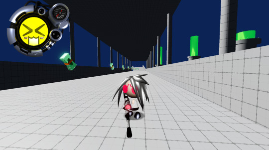
Making the Health UI:
The health UI was something I was extremely excited about implementing, so I eagerly decided to decide that it was time to make it. Let me step u through the process 4 fun.
For me, it always starts with sketching out something crudely in pen. I've had this sketch done for months now, so it was p cool to see it finally come to life in game.

Next I hopped into blender and began trying to make some kind of cool y2k-era greebled out shape, but making detailed machinery (or details in general) is not my strongsuit, so I ended up with this kinda neat smooth shape that I wasn't entirely happy with. It looked cool, but I really wanted to challenge myself to make something closer to the windows media player skins I was inspired by.


More Specifically, I referenced this Half-Life 2 windows media player skin heavily, and started with a ring that I could build little pieces and wires off of. I hope u can forgive me if I maybe made it too similar lol, but I tried to get creative and put my own spin on it. I think the shapes on the top left are the most similar to my reference, and those are not-so-coincidentally the first bits that I modeled. This is my first time modeling something in this style, and I suspect that I'll get better at it if & when I do it again.

Finally, I slapped some materials on, made a texture for one of the faces I had sketched out, and rendered out a few frames of it gently(ish) flashing. I then went into affinity photo and made little speedometer components to slot into the small circle in the top right and programmed some functionality to it. The plan is to have the face represent the player's current health, so I am going to need to make a few more and then animate it rotating into a different face. But yeah, I am super happy with it, and I think it is lookin p sick!
Other Stuff What I Made:
Other than the health UI, I also added in functionality and UI for completing a level and selecting a level.
I was very much inspired by killer7 for the sequence that plays when you shoot your target, and I am addicted to intense flashing lights, so I included a lot of that. There are already accessibility options to turn that off, so if it's something that could harm u or if you just hate it (coward????!!!11) you can disable them. I've always found intense effects like that very cathartic, so I'm probably gonna include similar visuals in a few different things I make. That being said, I do also always want to make the alternative visuals (when the accessibility options are enabled) to also be cool af and get the point across. The level select screen was also really fun to make, I basically just slapped together some textures of warn-out paper into a little files situation and placed that on top of an abstract background that I made in jwildfire.
Conclusion:
I have honestly really loved working on this so far, but there has been a lot of anxiety about money in my life lately, so I really do hope to get this out in a reasonable time. I feel like I say that a lot about this game, but it is because it's always on my mind unfortunately. I don't want to make it sound like I am making this game entirely for money or w/e though, it is definitely a labor of love. Anyways, I hope to get to a point where I can get some environment art done soon, and I cannot wait to show off whatever this game is gonna look like. Have a nice day every1!
#screenshotsaturday#indiegamedev#gamedev#indiedev#game development#indiegames#y2k#y2k aesthetic#3d platformer#3dplatformer#sniper rifle#windows media player#50 caliber 3d platformer#50 cal
72 notes
·
View notes
Text
alright proper thoughts on the mythical island expansion!
fun new exeggutor, i like using dual types like this. 4 energy is pretty expensive but ofc grass is balanced around serperior's ability, which is really fun
MI (mythical island) rapidash is a banger but i don't think i'll run two of it in my blaine deck because i like GA (genetic apex) dash's single energy attack when i go first. MI-ponyta is a straight upgrade though imo, it can donk and i love the artwork. blaine deck is crazy strong now, rip celebi ex...
very curious about salandit's venoshock. doesn't seem super useful to me. if you're very lucky i suppose you could end up punishing a flute or something but i think it's mostly for flavor. i do hope it's somehow useful though because the full art is gorgeous and i got one ^_^. MI-salazzle is pretty neat though, a little fragile but interesting nevertheless
yay volcarona! not sure if i'll end up having a use for it but 80 power bench sniping is crazy
this vaporeon is such a bastard... with lumineon and starmie ex's zero retreat cost it's annoying as fuck. awesome :thumbsup:
playing GA-weezing-arbok against mew ex stall is silly i felt like sisyphus. pretty interesting card
sigilyph is making me wanna play a psychic deck. cool that beheeyem is here too! underrated pokemon. the florges line is awesome too, it's a beedril equivalent imo and i love beedril. so uh. think i'll def build something around these guys while i wait for more darkness type
speaking of deckbuilding i was really hoping they'd raise the maximum deck (and binder etc) cap by at least 5 so we can experiment with the new cards (and make specific counters for solo) without messing with our current decks. boo.
and speaking of darkness type: underwhelming liepard tbh. i'm hyped to try scolipede! the koffing seems kinda mid but could work as a singleton, but i think smokescreen weezing is interesting...
steel type truly done dirty omg especially with the addition of fairy types oof. i need to believe the next full set will be darkness + steel centric...
dragon types bring out the worst in me. i'm visualizing druddigon with the bench sniping duo volcarona-greninja, but i think that's nonsensical. it needs a stalling deck probably to make use of its ability. maybe moltres and misty/MI-vaporeon too
excited to see the poke flute strats. other than pidgeot ex and raichu i can see it paired with bench snipers and/or victreebel to kill the same basic twice or more, though it's kinda risky in case the opponent has an evo in hand. maybe most useful for the third point after you've killed the evo or sth. seems great for the s2 ex pokes but that's rather niche
for the record i've found blue amazing against the flute solo decks. koga and budding expeditioner are probably good counters too, to scoop up an extra guy. not sure how it interacts with fossils
overall some lovely artwork in this set! i love the new binder covers, they're really pleasant. painterly card art is always a win for me ^_^ it'd be nice to have a playmat in this style, i don't like the 3d they're using
#i like the set! hoarding hourglasses was a good move i'm missing only 4 regular cards#i already got two each of mew ex and celebi ex whadda hell#ptcgp#also. why isn't there regular celebi#i suppose it could be a secret bonus for completing the dex but then it'd be in ptcgp tracker methinks#perhaps an upcoming promo / holiday special#it's not something i'm missing i'm just curious#since there's both 151 immersive mew and now a MI mew
2 notes
·
View notes
Text
october devlog!! (two days late, thank you tumblr for glitching out on me on halloween :/)
AAA. OKAY. finished a big thing today since i was like "this update is going to be late Anyway i might as well fix this one issue before i upload"
but before that. did you know i've been working on this project for One Calendar Year??? i feel like it hasn't been very serious until this latest build but maybe that's recency bias talking. anyway cool stuff below the cut
anyway! what i did this month... unfortunately there was a hardware snag in the music production thing, and i've gotten it fixed! which is technically music progress but not in a way that is exciting. so instead i actually went and finished the basic player character movement!
this thing was a MEAN BITCH to code in for like. a lot of reasons. which i won't get into right now unless someone's super curious. but trust me when i say this took so long to actually Get The Way I Wanted
(sorry she's walking on a blank grey background... i don't want to show the testing field Just Yet)
just a little up/down/left/right walk animation for now!! there are still some tweaks i need to do to the animation manager and the controls - of course, i will be doing this Forever And Ever. especially when i start making other things to put on the map. and as i was testing this i realized there were a couple spare pixels out of place (shoutout to the magically growing shirt collar on the walking upwards animation)
(and i'm still trying to figure out if i'm going to make a bespoke running animation or if it's just going to be making the player faster and having things like the ponytail flow farther behind... it doesn't really matter for now that can be a Later Decision)
but also, i made a promise to myself that i wouldn't post about any game characters until they're In the game. and the player character for nightshade mode, which is what i'm building first, is a character... so i might round up some of her concept art and make a post about her sometime this month.
i'm going to stop promising what i'm going to work on Next Month because it always seems like i have to change directions midway through?? maybe that's stage fright since i'm Posting about it. but i do want to finish off some of these player animations and get some other ones in there, like the ones where you're using tools and sitting and such. but also i need to fix a save bug too... we'll see what i actually get to doing this month.
but as far as Next Longterm Goals... it took me about eight months to get from Zero Code to the end of the prototype build... and then after that i've been spending these months kind of organizing what i need to do next
so Next is... doing the same thing i did last year, but with more knowledge and purpose this time.
i'm hoping to get another one-week build of the game done by june, but with all of the game's systems in place and without placeholder text or visual assets. i'm going to measure how feasible that is at the end of the year before making another pact with my brother to hold me accountable for doing that, see if i need to adjust the goalposts, but i think i can do that. (and then after that, it's making all of the content for spring, summer, fall, winter... but for now we're sticking with spring)
3 notes
·
View notes
Note
HI THIS IS THE ANON WHO SAID SHE LOVED UR POST AND i just realised u also write for cove holden ilysm do u have any romance visual novel recs?? so far i've only done cove's one & two demo ones (a celtic mythology one whose name i cannot remember & touchstarved the loml)
have the bestest day and thNk u
was the celtic one the good people (na daoine maithe) because i played that one too 👩🏻💻🫶 RLLY GOOD in typical nia fashion when my Type type isn't there i'm going 4 keagan and flannan
i saw u say error 143 in ur other ask UR REAL!!! ofc i must recommend blooming panic if u haven't played. xyx and toasty r genuinely just. Funny. i rlly liked toasty's va they did a great job. FIRST TIME I HEARD HIS LAUGH I WAS LIKE WOAH. i rlly liked how nightowl's route went w. Anger. u don't see it a lot and i appreciate it i was like WOWWW? AT ME? he's real. robo has answered a Lot of asks on tumblr so u can get loads of content after u finish!
https://gbpatch.itch.io/our-life-nf ... :) No words. Demo. i will build the audience for the 2nd game myself.
DEMO obscura is also vry good,, i haven't played in a Long time but i keep up w reading tumblr asks abt the LIs LOL. love the art and vibes. he isn't my type but iirc cirrus offers a rlly interesting dark romance route + aftercare/safe word system :)
DEMO online @ the perfect time is just,, i love the vibes and concept so far I LOVE WHEN CHARAS R FUNNY. HAVE MY HUMOR. rlly excited to see where it goes it's quite short so far BUT I WANT PPL TO PAY ATTENTION 4 THE FUTURE. PLEASE!
cryptid coffeehouse IS SOOO CUTE I LOVE ARTEMIS ☹️☹️ queer slowburn coffee shop romance BE SERIOUS no one fucking TALKS ABOUT MY ARTEMIS. WHY. so so many cute moments i was kicking my feet and giggling like WOWW
3 seasons is also VRY vry cute i don't usually play games w an mc visual but ivy is so pretty so IDC!!! u can play all the routes pretty easily they're all lovely like... it isn't super often i come out liking all the LIs pretty much on the same lvl. mamma mia!
....the persona 5 vn. IMCRYING I'm so fucking serious like. the characterization is REAL it's super well made. i'd like to say u could enjoy without playing p5 but um. probably not to the full extent. i played out of principle as a p5 enjoyer and for goro bc he's one of summer's fav charas ever and his route was so awesome actually. Epic Major Spoilers obvi. akira slayed also (my good ending completionist side..☹️)i won't say much abt him bc i'll ramble on and on but summer after finding out i had a crush on him yrs ago was like Yeah that makes a lot of sense he is so loz link.. like man
$30 gilded shadows (free demo) which i need to play again I WAS SUPPOSED TO FINISH ARI'S ROUTE MONTHS AGO rika said he was so my type and i trust them fundamentally. caissa my beloved. like the world building + charas it's just,, well done y'know
$12 when the night comes haven't played but rika rlly likes it so i'm putting it here anyways. LOL
NOT VNs. they are IFs...like there's Literally no visuals. read in browser. but i stand by the night market (1st book finished!) which i've rb'ed a bit + speaker . both fantasy,, love both casts i love everything they're doing i'm genuinely so so excited to see where they go!!! PLEASE!!!
YANDERE DEMOS separated for if they aren't ur thing which is obvi Valid. i erm. went down a bit of a rabbit hole. pls read their warnings! always read game warnings. but like. ok anyways
DEMO 14 days with you yeah. ren. i like when mc notes that smth is Off abt him. lots of asks answered on the tumblr! I can fix him.
DEMO something's wrong with sunny day jack jesus Christ . some of the best vn va work i have ever come across like Genuinely wtf. and the concept is rlly cool. was put off for a long time bc of.. jack's appearance.. sowwy. but wow it is just. really well done.
bitter/sweet blythe orange masc blythe va ?? did such a good job?? like srsly what. sorry wow that's the main thing i just rlly wanted to applaud them a bit. also I LOVE THE PARTIAL OST??? i want it so bad i was humming it for a couple hours after like
DEMO our dollhouse I'm so serious when i say i didn't realize it was for yanjam so when i came to my own realization of Oh Shit He's Sus and checked i was like FUCKCKDJ 😭😭 OBVIOUSLY... but srsly love the art and i'm excited to see how mc figures it out and what happens. did a good job at making a pretty Understandably oblivious(??) mc. like yeah i can see why u wouldn't expect him.
DEMO favor Z Intrigues Me. had to try so hard for the secret ending but now i am more intrigued like OKAYYY WHAT HAPPENED BROTHER 🤨 i like the tail animation also. also when u say u like possession horrors woah hey. hey. pal
#🧾nia.answers#<3 anon#💌nia.recs#straight yp just saying summer and rika instead of my friend.#imcriyngkrkfnd
47 notes
·
View notes
Text
Saturday Night Review

Live from New York... IT'S SATURDAY NIGHT! Okay, it's not live. This movie looked really cool from the trailers. I so glad that movies are copying Late Night With the Devil and making movies that look old. I think it's a neat visual identity idea, like making a movie black and white on purpose. I don't know anything about SNL, I don't think I've watched a full episode. I've seen some skits and a lot of Weekend Update, but the most SNL I've ever seen was the Drew Gooden video where he watches one episode from every season of the show.
What's The Movie About?
The first episode of Saturday Night Live, how everything is going completely wrong, and how close the show got to not airing.
What I Like.
First, obviously, is the cinematography. They very effectively capture the chaos of the night, the film grain of cameras at the time, and the shaky hand held approach of a behind the scenes shoot. It's similar to The Apprentice, true, but I really liked that movie too so I don't care. There's quite a few impressive long shots in the movie as well, it give an air of a jazz melody. Actually, the music is really damn good in general. The acting is great, especially portraying wild personalities of the comedians. But the absolute best thing about the movie is it's energy of the scenes, and flow of the movie's pacing. This movie is a roller-coaster. You basically follow Lorne Michaels for the entire movie, and there are several scene of him moving through the studio, with cast and crew members constantly rushing up to present their problems and update him on constantly changing events. It's exciting, electric, keeping you engaged the entire time. I got swept up energy of the movie, which is one of my favorite things.
What I Didn't Like.
So... This movie has a million characters. I get it, the idea is all these people are the chaos that threatened the first show. I'm sure everyone who wasn't famous was real. Or at least was based on someone real. But because there are so many people running around, some of them are very one note. The best example is Dan Akroyd. He's less an actor playing young Dan Akroyd and more an actor doing a comedic impression of him. This also slips into oversimplifying plot beats as well. John Belushi and Chevy Chase are set up as parallels in the movie, but John gets several scene of Lorne trying to appeal to his sensibilities, while Chevy just get's cock-slapped into compliance. Literally. And I have to stress that I don't know for certain, but a lot of this movie smack of revisionism. The biggest thing is Lorne Michaels himself. He's too perfect, just a really nice guy who is passionate about artistry and saying yes to everyone's ideas. His character arc has to do with learning to cut things from the show. He doesn't really change as a person, he's just a nice guy throughout the whole thing. Again, I don't know if that's true or not, maybe Lorne Michaels is super cool. But I feel like it just lacks introspection.
Final Summation.
But Saturday Night has energy and style that overtakes it's flaws tenfold. I love movies that are what I imagine sex is like. A flurry of motion and chaos that build and builds until the satisfactory climax. Saturday Night is good sex, and I highly recommend it!
But y'know... Is this enough? I've been thinking recently about my style of reviewing recently, more specifically about how I review a movie I love versus a movie I hate. You may have noticed that my last negative review, the review for Terrifier 3, was longer than this and my review for The Apprentice. Combined. And I love both those movies! Why am I giving more of my energy to drive away business from art than to drum up awareness of something good? Part of it definitely because I don't want to spoil anything from movies I like. I hope the undercurrent of "Watch this movie, experience it for yourself, it'll be much better than anything I describe" comes through with all my positive reviews. I find it much harder to describe something that makes me happy as well. That sounds... Incredibly depressing, yeah, but I think it's more that I'm critical of myself and what I think when I dislike something. I kinda need to justify hatred in my head. A little peek behind the curtain, I do think out what I want to do with reviews before I see the movies. Not that I inform my opinions before sitting down in the theater, but I'll come up with some jokes, analogies, and obviously the prerelease portions of my review while waiting to watch something. Somethings come to print, like mentioning that I watched that Drew Gooden video more than I've seen actual SNL sketches, but others I drop, like doing the Terrifier 3 review as a written out parody of "Alice's Restaurant Massacre" by Arlo Guthrie. (Although that idea came closer to fruition than I care to admit.) I might be over thinking this silly review blog. I'm going to be taking some time away from movies and focusing on my tabletop gaming hobby for a few days. Maybe not thinking about film for a few days will get some ducks in a row mentally.
4 notes
·
View notes
Text
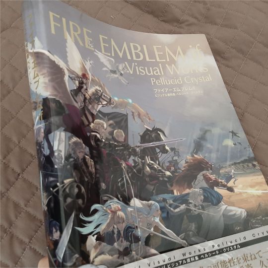
@/damoselcastel was kind enough to show me a bunch of the FE:Fates visual works artbook pages the other day!
and because i am continuing to be .... brain rotted (lol) ... grabbed a copy since there was more than a few relevant pages/official artworks, and wanted to have a high res/color corrected version of these pages for art refs to slap on my reference boards! if i'm looking at them every day now for the past three months they better be accurate!!!
anyway! it came TODAY!!! :D :D pakidge
IT WASN'T EVEN SUPPOSED TO COME UNTIL THE END OF THE MONTH AAAAA
god dang this thing is THICK, now this is what i call a proper artbook! a little hard to see here but you can see by both the front and the spine that it's a chonker -- the two tellius artbooks combined are thicker but they're also a bit smaller elsewhere.
rest is under the cut b/c it's me promptly going feral :P
(and seeing who's on the spine ahhh!!! honestly that's really cool and super appropriate given his subtle plot/character relevance?! super fucking cool to keep seeing nintendo nod at him in symbolically relevant places, but not too overtly )
SPEAKING OF I SHIT YOU NOT GUESS WHICH SPREAD THIS THING FELL TO FIRST
I SHIT
YOU
NOT--
stone cold, swear to you, straight up didn't intend that but this was literally me irl then:

:')))))))))
(also HE GETS A WHOLE SPREAD???? and a turnaround?!!!!!! even freaking corrin's nohr noble design gets like an EIGHTH of the page
gunter gets treated SO WELL in this artbook i'm on the floor trying not to sob like i'm sixteen again and begging for any zihark scraps
also this is so much more high res than what's on my reference board the nitpicky artist in me is literally crying for joy about FINALLY HAVING A HIGH RES REFERENCEEEEEEEEEEE
also what the fuck the architecture is so cool???????????
THE WORLDBUILDING I AM WILDING
for real tho i remember my first conquest playthrough my jaw was on the FLOOR being genuinely amazed at how cool the worldbuilding was especially on the nohrian side with the gothic vibe and y'all don't know how useful this is going to be to replicate nohrian motifs in all of my drawings/probable comics/doujinshi/etc.
[foams at mouth]
this artbook also covers EVERYTHING
like there's a healthy amount of character work , but there's also enemy designs (always thought fate's enemy designs were unusually kickass, like some of these folks could be outright characters themselves), the architecture stuff above....
my room lines....
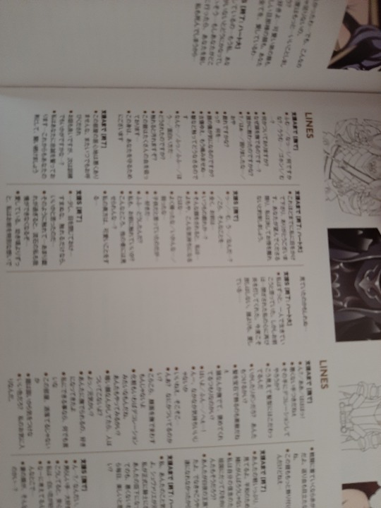
OH MY GOD THIS MEANS I HAVE A THIRD SET OF TRANSLATIONS I CAN CROSS REFERENCE TO FUCK YES
sorry for shitty blurriness it's just me vibrating in excitement lmao i'll upload it in the high res chunk
.....
hellooooo sir~~~~
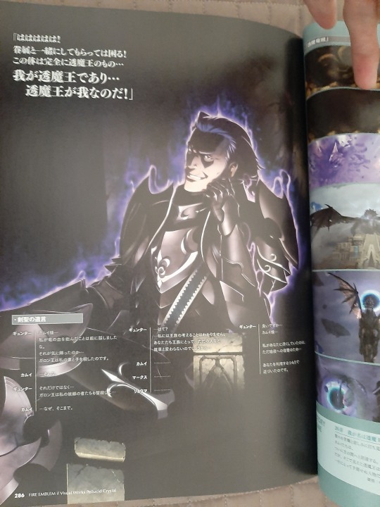
(you knew i was going to be posting that shot >:D )
his possession CGI gets a full fucking page too ajlsjsjkskjhhjshjg
HE GETS TREATED SO GOOD HERE Y'ALL, SO MANY FULL PAGES???????????? is this what it's like to be brain rotted over a major character i will never know the feeling lul
(there's actually at least two other gunter fullbody artworks in here, those have already been scanned/uploaded properly by others so i won't post 'em here unless y'all want em!
and then lastly!
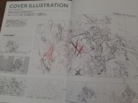
to finish it off, god this cover progress is so cool, kozaki knows what he's doing.
and i'm pretty sure gunter's linework gets changed halfway through, his expression's somewhat different than on the final! and i'll be posting that along with the other high res/cleaned up scans! just need to figure out if my scanner's gonna do a better job than my phone or vice versa.
[tries to stay composed] [fails]
aaaaaaaaaaaaaaaaaaaaaaaaaaaaaaaaaaaaaaaaaaaaaaaaaaaaaaaaaaaaaaaaaaaaaaaaaaaaaaa
15 notes
·
View notes
Note
your ALTTP drawings are so cool <3333 and your artstyle looks awesome!
What are 3 things that inspire you to draw?
thank you so much I'm so excited to hear people like them !!! ;v; I have sooo many things I want to draw that are super challenging for me right but I hope I can get to do all of them at some point !!!!
I feel like it's almost hard to narrow smth down to 3 things bc So many things inspire me to draw ! (my struggle is more so in motivation and energy department I guess)
I ended up typing a lot bc I got excited but I think these 3 are my biggest ones !
1) Nostalgia! especially when felt from environments around me or in little random moments! I always end up with a bunch of random photos of like environments or buildings or the clouds on my phone bc I felt a certain way in a certain moment and while my memory is pretty bad, snapping that photo usually helps me revisit that moment even if it may have been on some random day! and while not rly related to feeling there's also always smth fun to see around like the shape of a tree or the way shadows fall or colours ! maybe it's more about general vibes than nostalgia hmm...
I definitely don't draw environments as often as I'd like to and even when I do I haven't posted much but even so it's smth that fills me with a want to draw! to try and also bring out that kind of nostalgia or warmth !
I want to do more edgy dramatic stuff too but trying to make warm feelings has too strong a grip on me haha
2) Video games a lot a lot !! and other media too!! I absolutely love creating fanworks, I'm just a nerd and I want to share and show my love for stuff !!
video games are especially fun bc I already get to spend my time in x world and depending on what game it is that either means being bombarded with interesting visuals, fun little moments to recreate or for visually "simpler" games you get to imagine it in a 3d space all on your own and I love that ! like right now of course I'm losing my mind over alttp but in the past, games like Yume Nikki (and fangames), older pokemon games and Star Stealing Prince have had this exact effect on me too !
for a little add on I wanna say I used to worry a lot about accuracy and it could make fanworks pretty intimidating but one of my friends (shoutout to Cai) said smth earlier this year that I cannot for the life of me remember right now But it completely changed my mindset to instead be like. it's more important to make up my own interpretation of stuff rather than make sure everyone agrees it's accurate right? I can't even remember it right now but it completely changed the way I played games since like Bloodborne and Zeldas bc rather than worry about getting things instantly Right in my brain I would discover little lore pieces at my own time and instead try to put stuff together in my own way and idk games have been infinitely more fun since And it's inspiration machine to me !!
3) and most of all other people's art !!!! I could spend days browsing the internet just looking at all the amazing things people make and it's so contagious to me ! even if I couldn't ever create the kinds of things I enjoy seeing myself I can't help but feel so inspired and motivated to create something too no matter how it ends up!
creating an inspiration folder for myself that's full of just Anything like environments and character art and photos and colour schemes has been on of the best things I've done for myself! I rarely look at other stuff When I draw (for worse imo, like I rly need to get better at referencing) but if I ever feel stuck I can look through that and almost instantly find smth that kicks me in gear ! sometimes I see art and it's amazing and impressive and sometimes I see it and just think "man that looks like it was so Fun I want to have fun too!" and both work perfectly for me! :D
anyway uuuuh take pictures of nice things and save cool stuff there's always smth to be inspired by in little things! here's a little collection of random photos of my own from the past year that make me happy and also go !!!!!! (not a lot of city stuff tho bc usually ppl are on those )


I ended up going through my camera roll and it was so hard to pick stuff bc everything made me go !!! ocean and buildings are the big themes tho only one shows here haha
#ask#I got a bit lost in the sause here I think I was at a music festival the past days and it was fun but tiring hiufdshfds#anyway this is always so fun to think about and it makes me happy !!!#I will relearn short and clear responses another time dhfiuhfds
7 notes
·
View notes