#i do understand as like an art piece its to balance out the colors but it threw me for a bit of a loop
Explore tagged Tumblr posts
Visit Tumblr Blog
Explore Tumblr blogs with no restrictions, modern design and the best experience.
Last Seen Tumblr Blogs


Fun Fact
Tumblr.com is the 103rd most visited website in the world.
Text
white n3DS
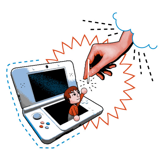
Criiation
#the edit with the buttons swapped is fucking nuts though#i do understand as like an art piece its to balance out the colors but it threw me for a bit of a loop#art#white n3DS#3ds post#i do love the pun and the art is incredible as well ^-^#reblogged from community
20K notes
·
View notes
Note
Hello Shi-Shi! It’s been a while again (three months to be exact, my goodness,,) I hope you’re doing well. I was going to message a lot earlier, but some things came up and life got in the way again. How have you been? How was your Christmas?
Even though I’ve been more silent, I still look at your art a lot! I love your recent art, like the Happy Halloween drawing with Prowl and Jazz and Smokescreens drawing! Jazz looks so happy to be there while Prowls just along for the ride haha! In Smokescreens, I love his little smirk, he’s very pretty. I also love how you didn’t colour him, just his optics and the background, it really makes his optics pop and it just made the whole drawing more appealing! I love your art style so much Shi-Shi, it really is one of my favourites!!
Also, I understand your AI anxiety, not fully ofc, but slightly. I don’t like the idea of AI taking our art and putting it through programs and all of that jazz. I regret to say I’m not fully up to date on how it all works, but hopefully you feel better soon and AI stops using our art if that’s kinda how it works, I think?
For me, I’ve still been working, balancing school as well. Exams are coming up in around two weeks so I’ve been studying and preparing for them. I only have two, thankfully, next semester I have four exams, so two isn’t bad. I think I mentioned that I was going for my road test in my last message, and, well, I passed!! Perfect score as well, which I’m super proud of!
I’m not sure if I mentioned last message, but gun club has started again! I’ve moved onto kneeling from prone (prones laying down, you have to shoot certain scores and get badges to be able to move up if that makes sense) its a little difficult but challenges are good sometimes.
I’ve also, completely off topic (most of this message is just me bouncing around going off topic trying to remember all that’s happened in these past few months, but we ignore that lol) I got into a new fandom! It’s a fandom I’ve been in before, My Hero Academia, so I’m familiar with it, but my liking of it came back around two weeks ago. I know you like Transformers, Genshin Impact and Twisted Wonderland, but is there any other fandoms you enjoy?
A recent development! I’m sure I’ve mentioned I’m in Firefighter cadets, I’m not actually sure though, we’ve been chatting for a long time I sometimes forget what I’ve told you and what I haven’t. But a few days ago, a few others and I got promoted to Junior Firefighters! A cadet just goes to the trainings on certain days, learning new and basic things, etc, but as a Junior Firefighter, I can go on actual calls and emergencies. Of course, I won’t be able to deal with the most serious things that a fully trained Firefighter would, but we’ll be there and observing the things we can and helping out when we can too, which I find really exciting!
I better get some sleep, especially as calls for Firefighting can happen at any point and I have to make sure I’m up and running out the door, to make sure I’m not just completely exhausted lol. I’m so sorry for not messaging as much, and I hope to talk more Shi-Shi! I hope you have a good day/night and I’ll talk to you soon!
-Meister
Hello Meister~ It's wonderful to hear from you! I was beginning to wonder how you were doing.

You've got a lot going on as per usual I see, but you've also accomplished so much! Congratulations on a perfect road test, moving up in your gun club and getting promoted (is that the right term???) to a Junior Firefighter~ That's a long list of accomplishments for just three months, you should be proud.
I've been well, Christmas and New Years were small but really nice (I hope you had a good holiday season too). I had time to unwind and recover from 2024 hehe. I'm glad that you like my newer pieces! Cute pictures are always lots of fun so I really loved working on the Halloween picture. Getting the color palette right for that one was a nice challenge too. I've been doing a lot of art studies behind the scenes and the Smokescreen picture is the product of some of that work. I did a little wiggle when I read your feedback, I'm always so grateful for it.
Just like you I've been lurking around tumblr lately. Lots of art is happening, but nothing actually being posted. It's slow going, but I'm creeping out of the AI anxiety, and I'm feeling a lot better now. Thank you for thinking about me.
As for fandoms, I completely get bouncing to new fandoms or back into old ones. I am a huge enjoyer of things in general so I've been around the block with lurking around in fandoms lol
I walked around in the My Hero Academia fandom for a short while a few years ago, so I'm familiar with it but it's been a while since I actually peeked at it. I remember really enjoying All Might, Fatgum and Suneater (all guys for some reason? I just noticed).
So far as other fandoms I'm actively in…let me think…. I usually fall head-over-heels over some random thing that has 0 fandom and I'm left rolling on my floor with nobody to share my feels with. OR I poke like two content creators and don't interact with the fandom at all outside of that lol. I guess I'll say the King Arthur and Tolkien fandoms are other ones I find myself in the most (I troll the Star Trek fandom for memes, does that count?) But I don't create content for either fandom, so I don't know if they count or not? I used to move in the Gargoyles fandom when I was around 13 on DeviantArt with only a sharpie and a mechanical pencil to my name, but that's been ages ago lol
It was so good to hear from you again Meister! I hope you have a good day/night and I look forward to seeing you in my inbox again~
#meister anon#ask#thank you for the ask#There's so many fandoms#so little time#good to hear from you ^J^
2 notes
·
View notes
Text
trying to figure out how to make art for myself again is genuinely, like, one of the hardest things I've ever had to do.
going to art school and then freelancing full-time for two years made me beat as many "inefficiencies" out of my art as possible. for a while, making illustrations became purely a matter of streamlining my process to take as little time as possible in achieving a result. even now, I feel a little demon in the back of my head screaming at me when I try out a new coloring technique, or take a little too long settling on a sketch.
the demon is also always screaming at me about marketability. you know, like:
"how will this fit in with the rest of your portfolio?"
"what skills of yours will this piece highlight in the eyes of recruiters?"
"will the dimensions of this canvas be eye-catching on twitter? what about instagram?"
they get a little quieter every day. but not by much. not as quiet as I want them to be. not quiet enough to keep me from still being too intimidated to draw on a lot of days, because god forbid I draw anything that looks a little rough, or imperfect, or abstract. when you have clients paying you for art, there's a standard of quality to be adhered to. there's a way they expect it to look. anything else wouldn't make for very strong branding as an artist, now would it?
I don't think that my art is bad. I think I'm pretty good at it, actually. it's why I tried taking a professional route with it in the first place. I thought that with my passion driving me, I'd always be able to strike a healthy balance between making art for a living and making it for myself.
but I... I don't think that I can. I don't think that I ever can. not even in a self-depreciating way; it's just, how can I pour my heart and soul into creating just for the sake of creating the way I used to... while also making sure that I stand out amongst my peers? making sure that I can work consistently and efficiently? making sure that my art is appealing to others?
I don't think that I can get the two to coexist, personally. and that sucks to figure out. I wish I had figured it out before I'd pushed my relationship with my truest passion to the brink of destruction. it sucks to figure out now, after I've gone to art school because art was the only thing my teen self had ever loved for so long, so wholeheartedly. because it was the only thing I ever felt I was kind of good at. like it was the only thing that could possibly get me anywhere in life or make people proud of me.
I think I pushed myself so hard to make art for a living because I couldn't let go of those ideas for a really long time. of course, as an adult, I've learned plenty of different ways at this point to be proud of myself, and that other people will also be proud of me outside of my career and the material things I'm capable of producing. crazy!
even so, trying to draw now after everything feels like trying to coax a hurt, traumatized animal out of its hiding place, knowing that it used to be so sweet and full of love and life. like, I'm trying to make it understand that if it comes to me, I'm not going to yell at it or try beating it with a stick.
and... I'm making progress! I definitely am. it'll sniff my hand now before scurrying away again. and if I'm patient, maybe soon I can give it a pat on the head, too. it's an agonizingly slow process that I know I can't rush, no matter how much I want to.
trying to figure out how to make art for myself again is one of the hardest things I've ever had to do. but there's a certain comfort in knowing it is something i have to do- for myself and myself only.
#nim.txt#nimarts#introspecting on why i haven't posted much art in recent years. maybe some u can relate#sorry lads. i'm just in my feelings today. writing this was therapeutic#also obviously this is not me looking down on or thinking lesser of professional artists. i respect the hell out of everyone that can do it#this is just how pursuing that goal has made me feel
38 notes
·
View notes
Note
hi! dunno if this has been answered before or if youre in the mood to get interviewed, but im sososo in love with your art - im esp fascinated by the different textures n how you color. everything about your art scratches my brain just right!! im rlly interested in your process. are you more intuitive with a piece, or do you usually map out a pretty clear outline/palette beforehand? what's your fav/least fav part of your process? would you ever post timelapses or maybe no bc of ai?
heyo anon, thanks a bunch !! <33
I have talked about my process here and there but I'm generally all over the place about it KFHDSJGJDJSD
I used to plan out my color palettes back in 2020 since I wasn't that great at coloring (it was pretty painful for me..!! lots of my work looked bland bc of it) and I didn't really know how to draw backgrounds either so they were always an afterthought.
I blabbed a bit about how I learned how to jump over that hurdle in another ask!
Usually I have a hard time visualizing what I want to draw in my head, so unless I have a clear picture in mind, my sketches are definitely where I begin forming my ideas.
At this point in my art journey, I plan both the background and the character together so the finished piece looks more cohesive. Most of my coloring process by now is pretty intuitive since I can generally feel what colors work together and what doesn't, and I also edit my pieces with tone curve,gradient maps, and color balance if needed.
this was from an ask I got on twitter, but I think it's super relevant and the best explanation I was able to put into words, so I want to reshare here⤵️
"Generally when in the early stages of a piece, I start off with some limited and often very light pastel-like colors. I also keep shapes simple, just for the sake of planning my composition's direction.
As I render in details, I gradually bring in my more darker + saturated colors. I like to check the piece in black and white often to make sure there's a full range of values. This also helps to verify if the composition itself is clear and understandable even without the help of colors. Usually this is why many artists start in black and white and then bring in their colors, since it saves time in that area."
My least favorite part of my process??? I'd say the sketch 😭😭😭😭😭 sometimes its fun though,,,,?
The feeling of knowing what you want to draw but not being able to put it down on paper is so... RAGHHH. OR that moment where the sketch looks better than the finished product.
Actually I noticed this more while doing commissions, since I become more hyper aware to meet the client's request.
I have posted timelapses before!!! Ta daaa
I haven't recorded more because clip studio used to lag a lot with the timelapse feature on, but I recently got more ram so maybe I'll give it another shot eventually?
15 notes
·
View notes
Text
The Knight Blooms Behind Castle Walls Volume 2: A World of Color
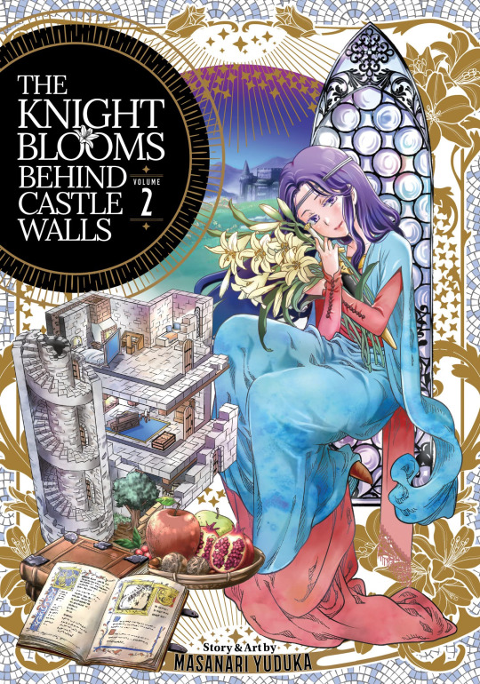
Yes yes, it's back for both the second and second-to-last volume. It's got all of what the first volume does, but adds some nice little pieces here and there and expands on the nature of being a knight outside of what you might "expect". It's still fun, it's still quite interesting, and it's still impressively accurate.
So I'll cut to the chase to make this a short one. There's nothing to really expand on here in terms of "story". Rosa is still a page for essentially all of this volume, and the day to day pieces still exist. It's more so what we learn from it.
I think the piece that really stands out, and is shown throughout is Rosa's approach to honour, chivalry, and knighthood. We as readers get to explore what she feels best defines a knight, and where she sets her sights on her future. Who she not only wants to be as a knight, but as a person.
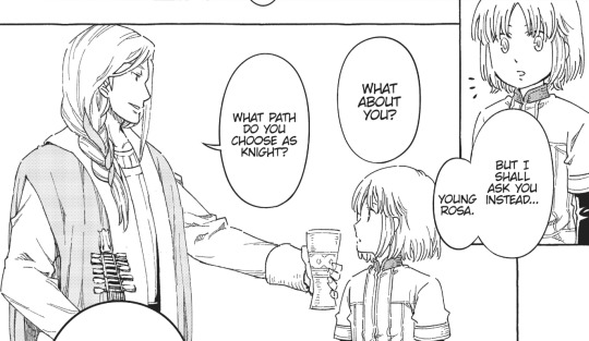
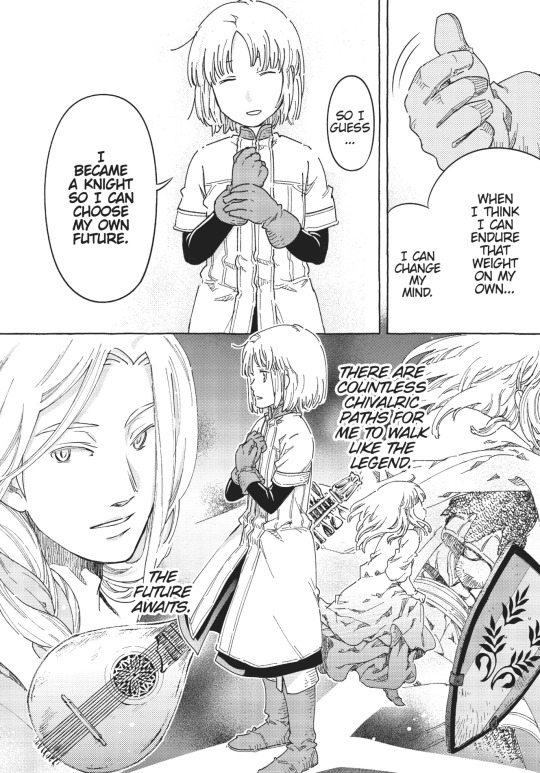
It does a lot to express Rosa's character and her strong sense of duty and passion for what's around her through both implicit and explicit pieces. Dreaming of fighting off an enemy to save your home, or slumbering in a forest with nature, or standing up to an adult for what you think is right. Rosa checks off all the boxes to be a really outstanding person. And it's quite wonderful to experience, and in a sense hearkens back to her conversation with the Bard. There are an infinite number of ways to create the story of a Knight, and alongside its passion for history, this story endeavors to weave a tale of Rosa and Knighthood.


Also, if it wasn't already clear, this manga has some really pretty art. I think the character designs can are sort of neither here nor there, but the clothing and environment work is really well done and is very strongly driven by the author's passion for its history.
Now, moving on to more separated pieces that I like about the story! They don't paint knights as some ineffable existence. They retire, they get injured, they wander and misbehave and all manner of other things. Of course, we've seen Sir Hirundo as a great example already, but this volume introduces a new character: the baker, Grus. A rock hard man that many didn't believe would be able to move on from violence, but found passion and happiness in providing for and aiding the people around him through peaceful fashion.

Next up, we've got the dyer, Gardenia. She's a woman that took over the business from her father, which is uncommon at the time. As such, she lives a decent way away from the rest of the village to avoid any potential issues (but also for historical justifications). It does a really great job of balancing the point that anybody can do anything, but also makes sure not to misrepresent the time period. Within that though, it takes creative liberty and gives us one of the only real forms of art in the story so far. It's really pretty in that sense of pent up expression through calm avenues.

And I think I'll leave off with this last little bit. A simple doctor's visit that's handled really, really well. They don't make a big deal of it, they don't crack some weird joke, and they're incredible considerate. Right away, the Doctor waits for everyone else to leave the room before saying anything to Rosa, and from there tells her where to go regarding that info if she's uncomfortable with speaking about it to them. Clear cut, well addressed, and very appreciated.
The Knight Blooms Behind Castle Walls is really clear cut in what it wants: historical fiction with a romanticization of knighthood. And it's executed wonderfully on both of those. It's not going for some lofty story of goal or anything, but it wants to nerd out over it and show off how cool all this stuff is. It's a very passionate title, and it understands that. It's not trying to make it work for 10+ volumes, but rather, it seems to know just when to cut conversation on your favorite topic before people start to get bored. The pacing is brisk enough that you don't end up sinking when taking in all of the info, but it's not too fast that you can't relate to or understand Rosa. Just all the right notes for something simply enjoyable.
#the knight blooms behind castle walls#kishitan wa jouheki no naka ni hana hiraku#騎士譚は城壁の中に花ひらく#historical manga#anime and manga#manga review#manga recommendation
3 notes
·
View notes
Note
what do you mean by 'not aesthetically pleasing'? I've seen you use it a few times for things that seem unrelated to aesthetics.
You've all heard the phrase "Beauty is in the eye of the beholder." It's so ubiquitous it's a cliché, though a very useful one. We call a pleasurable or appreciative reaction to a particular sensory input "beauty." As we grow and accumulate experiences, we begin to understand that there is a certain set of characteristics that, singularly or in combinations, we find beautiful. This is our aesthetic, and we all have one. It's very hard to define our personal aesthetic, and sometimes it can be damaging to try, like pinning a butterfly to a board, but we know it when we sense it.
As an aside, sometimes enough individuals in a society share so many aspects of their aesthetic in common that it becomes a public aesthetic. This phenomenon can be positive or negative or sometimes both at the same time. You only have to open Tumblr to see debates about public aesthetic and the campaigns to preserve or change them.
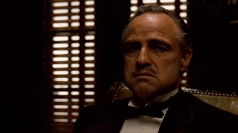
When I use that phrase 'not aesthetically pleasing' I am 99 times out of 100 referring to my personal aesthetic. It's important to me to make a distinction between my evaluation of a cultural object's quality with how it makes me feel. My favorite example of this is The Godfather. The Godfather is among the best United States films ever made. The writing is precise in its economy, insightful into humanity, and perfectly balanced between expository detail and pacing. The acting is exquisite from Al Pacino and Marlon Brando down to Abe Vigoda. The directing and cinematography is symphonic in creating tone. The setting and action is timeless while still being aware of history and the principles explored are universal without ignoring the nature of the Mafia as a product of class uprising and xenophobic oppression. There are many reason that it is consistently listed in the top ten movie rankings, but nevertheless, I hate it.
It does not sit well with my personal aesthetics. I despise the way in the movie the victims of these criminals vanish like ephemeral soap bubbles on the screen, even though I am intellectually aware that this is deliberate because it represents how the mobster justify themselves and 'this thing of ours.' I detest how the movie makes the point that the same qualities that make Michael Corleone a war hero make him an effective don. I am unsettled by how bonds of love and family transform people into heartless murderers. This isn't a rejection of darkness or unsettling images; there are few movies darker than Kubrick's and I am aesthetically pleased by his disturbing works from The Shining to Dr. Strangelove to A Clockwork Orange.
I recognize that there is a difference between the quality of a piece of media and my aesthetic reaction to it. I think it's a significant problem in United States culture -- and especially the fandom -- that this awareness seems to have been discarded. Too many people operate under the oversimplified idea that "if I like it, it's good, and if I don't like it, it's bad." Don't get me wrong, an individual can derive aesthetic pleasure from a quality piece of media, but it's not a necessary relationship.
Take my primary fandom, Teen Wolf. While as a work of art it has significant flaws -- shoddy chronology, an overindulgence in spectacle, needless casting bungles, and a recurring practice of prioritizing the emotional trauma of white male characters and white male characters alone while portraying the neglect of the emotional trauma of characters of color and women as necessary to the plot -- most of it still provokes within me aesthetic pleasure. It's why I talk about it, but I don't try to say it's on the same level as The Godfather.
There is a resistance to separating quality from aesthetic pleasure that I lay at the feet of Post-Modern thought. No, I am not a fan of Foucault or the people he inspired. By rejecting any attempt at objective measurement, we have become bound to the subjective, and it has created a toxic cultural experience. That's why I try to be clear when I voice an opinion dependent on quality or voice an opinion based on aesthetics.
6 notes
·
View notes
Text
virtual sketch book3
The Flight Into Egypt

Today I went to The Ringling Museum. Throughout the whole time I was there I saw a lot of amazing and interesting art pieces there. The art piece I chose to do the analysis on was The Flight into Egypt by Luca Giordano. This artwork was made of oil on canvas. It was a pretty big size. It was about 157.2cm x 230.5 cm. The artwork didn't have many colors. It was mainly like a light brown color. The only color that would stand out was Mary’s blue robe that she was wearing. There were many angels flying in the picture as well has Mary and baby Jesus. There was also 1 horse. The art was designed in a way to story tell the story of Marry running away with baby Jesus on a horse and the angels were guiding them. I do believe that the artwork is balanced because everything looks in place, nothing looks off. Everything is symmetrical and looks like it goes with each other. The colors blend in with each other. Marry and Jesus are emphasized because the artist daker outlining and colors to paint them. I believe there isn't variety because nothing really contrasts with each other.
When I saw this artwork, it made me feel sad and happy at the same time. Even though I'm not religious after the tour guide told me the story behind the artwork it made me feel that type of way. It evoked those feeling because it's sad that they wanted to kill baby Jesus, and his mother marry was running away from that. I was also sad because the angels were guiding them and that just evoked emotions in me.
After doing some research on this artwork I learned some new things. This artwork was associated with the Baroque time in Italy. According to journalist Robert Anderson he said “This subject is based upon the New Testament Gospel of Matthew 2: 13-15. Warned in a dream that Herod the King was searching for the infant Jesus to kill him, Joseph took him and his mother away to safety in Egypt where they remained until after Herod's death.” this is explaining the artwork and its subject which is baby Jesus and the story behind it. By the painting I can tell that Luca Giordano was inspired by the bible to make this artwork. Though he was most likely influenced by other famous artists because he had similar techniques to another artist. According to journalist Anderson he said, “While he was at first influenced by Ribera when living and working in Naples, he later drew on the ideas of other artists, Murillo, Rubens and above all the Venetians and Pietro da Cortona.” This proves that Luca Giordano would be inspired by other artists to make artwork like the one he did. Yes, by looking at the artwork I can understand what he was trying to say in it. The story behind it is obvious just by looking at it. His message is pretty clear because even though I'm not religious I could tell who the people in the artwork were and I could it resembling a story from the bible.
In conclusion I chose this artwork because it interested me. I thought it was a beautiful representation of the story of Marry and baby Jesus. In my humble opinion the importance of this artwork to society is that I believe everyone should know about things that happened in the bible and why they happened. It's always good knowing and being educated about history and facts.

0 notes
Text
Parisian Influence: How to Bring French Elegance to Your Seoul Wardrobe
By Juyeon | The Seoul Edit
I spent three years living in Paris, and if there’s one thing I learned from my time there, it’s that the French truly understand the art of effortless elegance. Whether it’s a crisp white shirt, a perfectly tailored blazer, or a pair of chic loafers, Parisian fashion is all about looking polished without trying too hard. But how do you bring that same energy to the bustling streets of Seoul?
Let’s dive in.
1. Invest in Key Basics French fashion is all about simplicity, but don’t confuse that with being basic. The key is to invest in quality over quantity. Start with a few essentials: a classic trench coat, a crisp white button-up shirt, and a well-fitted pair of jeans. These pieces will form the foundation of countless outfits and can easily transition between casual and formal settings. In Seoul, I love mixing these basics with streetwear influences. For example, pairing a structured trench coat with loose-fitting trousers or a designer hoodie adds a contemporary Seoul twist to a Parisian classic.
2. Neutral Tones are Your Friend While Seoul fashion is known for its vibrant colors, adding neutral tones to your wardrobe can create a more refined, timeless look. Think beige, black, navy, and white. These colors are versatile, and they work in every season. One of my go-to outfits is a monochromatic beige ensemble. It’s clean, understated, and instantly elevates your look. Pair it with some minimalist accessories, like a gold chain or a leather bag, and you’ve got the perfect Paris-meets-Seoul vibe.
3. Don’t Forget the Accessories The French know how to accessorize—subtle but impactful. A silk scarf, a structured handbag, or simple jewelry can take a plain outfit to the next level. In Seoul, I often see accessories being used to make bold statements, and I’m all for that. But there’s something to be said about the subtle elegance of a well-chosen accessory. A classic watch or a sleek pair of sunglasses can add sophistication to any outfit without stealing the spotlight.
4. Master the Art of Nonchalance If there’s one thing Paris taught me, it’s that confidence is key. You can have the most expensive outfit in the world, but if you’re not comfortable in it, it will show. French style is all about looking like you just threw something on and walked out the door, even if it took a little more planning than that. So, how do we bring that same nonchalance to Seoul? It’s about balance. Mix tailored pieces with more relaxed ones. For example, wear a fitted blazer with a casual T-shirt and sneakers. The trick is to always look polished but not overly styled.
5. Embrace Vintage One thing I love about Seoul is the rise of vintage fashion. Paris is home to some incredible vintage shops, and Seoul is catching up fast. Incorporating vintage pieces into your wardrobe adds character and history to your outfits. Whether it’s a retro leather jacket or a vintage designer bag, these pieces often become conversation starters. If you’re in Seoul, I highly recommend checking out some of the local vintage markets. You never know what treasure you’ll find that can give your wardrobe a Parisian flair.
Conclusion
Paris and Seoul may be two very different cities, but there’s a lot we can borrow from each. By mixing the effortless elegance of Parisian fashion with the bold, dynamic energy of Seoul, you can create a style that’s uniquely your own. Remember, fashion is about expressing yourself, so don’t be afraid to take risks. I’ll be sharing more on how to elevate your wardrobe in future posts, so stay tuned.
And as always, don’t forget to check out my latest YouTube video where I break down these tips with live styling examples.
Until next time, stay stylish! What do you think about mixing Parisian and Seoul fashion? Let me know in the comments below, and share your own style tips!
#TheSeoulEdit #ParisianStyle #EffortlessFashion #SeoulFashion #StyleInspiration #TheJuyeonEffect
0 notes
Text
1. Journaling
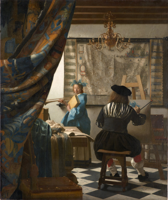
Unity: separate parts of an art piece, such as color and shape, that works together in a composition. (Ex: Unity using color in Johannes Vermeer, The Art of Painting)
Variety: contrasting elements within an art work. (Ex: Variety through color variance in Claude Monet, Jan-Les-Pins)

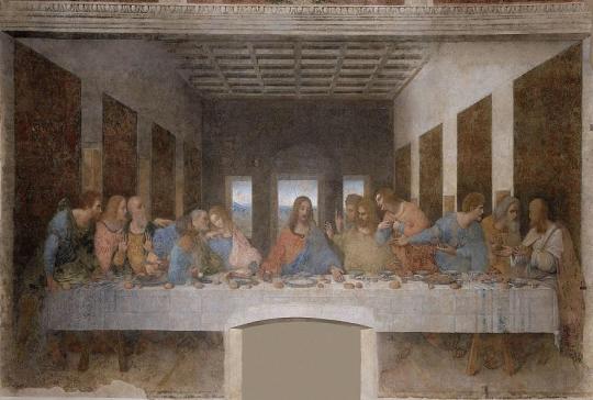
Balance: the distribution of elements in an artwork that makes it pleasing to look at. (Ex: Symmetrical balance in Leonardo Da Vinci, The Last Supper)
Emphasis: a part of an art piece that stands out. (Ex: Emphasis on color and design in Richard Anuszkiewicz, Deep Magenta Square)

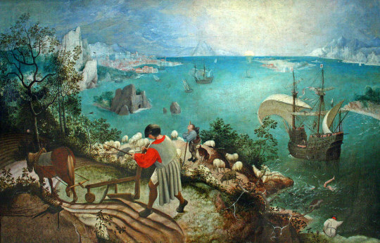
Subordination: to de-emphasize certain parts of an art work to make another part stand out. (Ex: Subordination using color in Pieter Bruegel, The Elder's Landscape with the Fall of Icarus)
Directional forces: a path within an artwork that leads the eye. (Ex: Using the path in the painting to the lead the eye in Prinz Eugene, The Cloud)

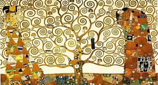
Repetition: repeating colors, shapes, fonts, line, etc. (Ex: Repetition of swirl pattern in Gustav Klimt, The Tree of Life)
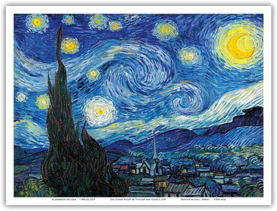
Rhythm: repetition of elements to create a pattern. (Ex: Rhythm using swirling brush strokes in Vincent Van Gogh, Starry Night)
Scale: size of an element in comparisons to the size of another element in an artwork. (Ex: Size of flowers in Georgia O'Keeffe, Oriential Poppies)

Proportion: size of elements in relation to another element in an artwork. (Ex: Proportions in John Everett Millais, The Blind Girl)

2. Connecting Art To Your World
Color can have a significant effect on individuals both psychologically and emotionally. For instance, when I look at a sunset the intensity of the shades/tints of orange in the sky evoke a sense of warmth and happiness. On the other hand, the blue sky during daytime evokes a calming sense. Overall, the colors I see when I look at a sunset and sky makes me feel happy and a sense of comfort.
If I had to pick a color scheme for my life, I would pick a neutral color scheme because neutral colors are my favorite because you don't get tired of looking at them like you would looking at a bright color.
3. Art Project
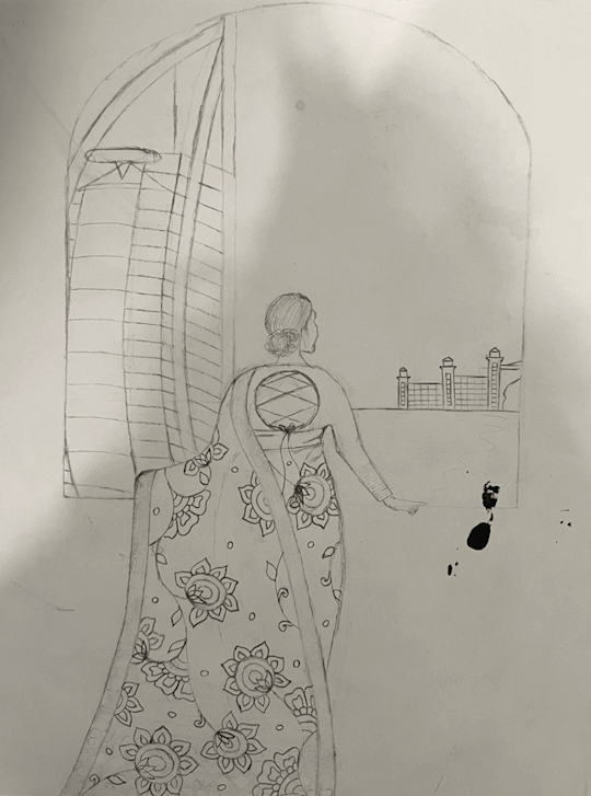
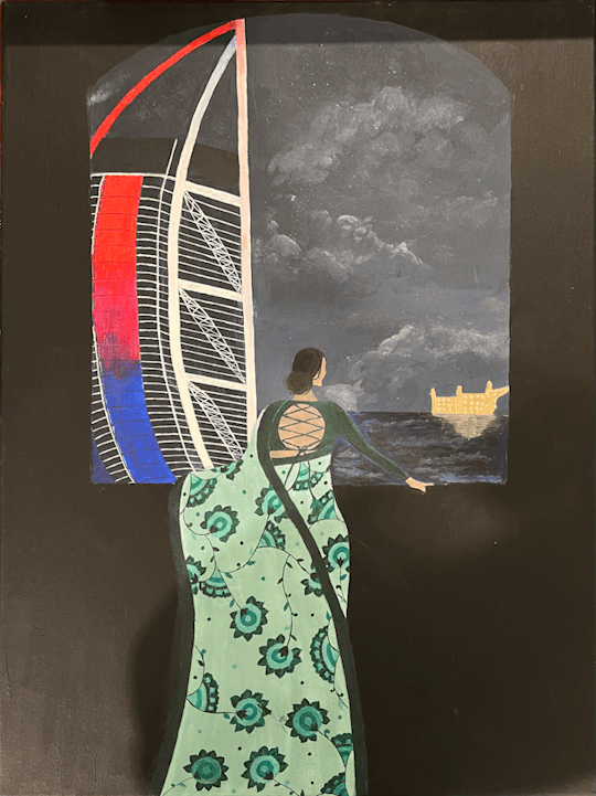
This is an acrylic painting that depicts an Indian woman looking out at the city of Dubai. I'm passionate about this painting because I am an Indian girl and Dubai is my favorite city, thus while waiting this I imagined myself as the girl in the painting depicted.
4. Discussion
Logos:
Michael Kors
Apple
Stanley
Gucci
MAC
The North Face
How do you know about these logos?
The logo's of Michael Kors, Apple, and MAC are ones that I always saw in my house growing up because my parents used products from these brands. When I became old enough to use products from these brands, I began to see the logo's even more. I learned about the Stanley and The North Face logo's when I saw my friends using products from these brands, then later bought them myself. I learned about Gucci by watching influencers on social media platforms.
What is your understanding of the value of logos?
I believe logos are very valuable and serve as a point of identification. Additionally, I think that having a memorable logo is very important thing for brands to have because a logo is often the first people see when looking at a product from a specific brand and its the first thing they will remember about that brand. A logo is also a way for brands to reflect their core ideas.
0 notes
Text
During the height of the pandemic, Claire A. Warden was posting moons on Instagram. Social media was becoming a toxic space, and these photographs inserted moments of awe, joy, and hope into the feed. A universal and unifying symbol to interrupt the divisiveness.
The “99 Moons [@99moonsproject] is a necessary balance that I maintain in my practice,” Warden says. The Phoenix-based photographer creates works without a camera in a process that is expressive, intuitive, and abstract. These one-of-a-kind photographs depicting moons and nightscapes are made in a chemigram-like process in the darkroom, “by contaminating the chemistry,” which brings out different colors in each silver gelatin print.
In her photography classes at Arizona State University, where she received a BFA and BA in 2010, conversations often revolved around the synecdochical nature of photography—a mere moment, a flash, representing the whole. “I was thinking about these ideas: this fraction of a second for a perfect exposure in-camera, the perfect time and temperature when developing film, everything perfectly timed to ultimately get this perfect print,” she says.
Warden began thinking about the finite processes of photography and comparing them to the infinite processes of other media. In contrast to the split second of a camera shutter, “you can work on a painting your entire life,” she says. “Trying to find a way to extend that moment, to make a photograph that is not constricted to a certain time,” Warden found that camera-less processes allowed her to do just that.

In 2013, she began experimenting with her own saliva to alter the emulsion on developed film. The digestive enzymes slowly break down the gelatin in the emulsion layer, and the result is the remaining biological matter and metallic silver, akin to etching. It takes months for this process to take place, during which time they have to stay wet, “which in Arizona, is a particular kind of challenge,” she says.
The resulting body of work forms a continuing series entitled Mimesis. The slow process allows Warden to invest in each piece a long regard, watching for interesting forms to emerge, then, finally, fixing the image and performing either additive or subtractive mark-making on top of it.
Born and raised in Montréal, Canada, to parents of multiethnic heritage, when Warden moved to the United States, she was often confronted with the question, “What are you?” from people trying to pin down her ethnicity. Mimesis engages with that inadvertently existential question through biology and abstraction. “The mark-making process [in Mimesis] is really influenced by personal experiences and research based on my questions about identity and racial issues in the U.S.,” she explains. The triptych No. 59 Double Consciousness (2016)—referring to the term coined by W.E.B. Du Bois—for example, relates to Warden’s awareness of being perceived and experiences navigating the differing cultures she belongs to. “I wanted it to be clear that it was two separate worlds and the central piece doesn’t quite fit,” she says.
The series, in its process of intentional mark-making and enzymatic development, confronts both the construction of identity and photography. “It’s quiet in a sense because it’s not telling everybody what this work is about,” Warden says. While the photographs undoubtedly are derived from her person, from her own matter, she says, “It’s not a portrait of me in a traditional sense, what most people likely understand portraiture to be, but I view each piece in this series as a portrait.”
Along with her spouse, photographer David Emitt Adams, Warden just opened a new studio and educational space centered on analog and digital practices in downtown Phoenix. She is currently pursuing an MFA at the School of the Art Institute of Chicago, and is experimenting further with the medium of photography along with textiles and analog moving-image work. But now, ten years on from beginning the series Mimesis, she doesn’t see an end to it. “It may be a lifetime body of work,” she says, “because it’s changed so much since I started it, and every piece is new, a step further.”
Feature Posted on 9/1/2023, Printed in Southwest Contemporary, Vol 8, Fall/Winter 2023
0 notes
Note
Hi, this is random, but I just wanted to say I love your blog! You have such a fine curation of posts, I especially like your art and history tags, I scroll through them every once in a while and they always make me so emotional (in a good way!) Also love that thing you do sometimes where you write stuff like "HELL YEAH!!" in the tags of art posts, I don't know anyone else who gets excited about art like that and I think that's so cool! Also I feel like you do that with mostly modern art and I think I'm someone who doesn't really "get" modern art, but your excitement always inspires me to look at the artwork for longer and try to understand it better, like you just make me appreciate art a little more and I wanted to thank you for that! I hope this message wasn't too weird lol, have a nice day!
hiii this is not weird at all it's very sweet thank you :'') literally all i want is to get people to look at art thank you so much for spending some time with my little curations 😭💞
also. i know you didn't ask but i also used to be someone who didn't get modern art so here's some stuff that helped reorient me to have a better understanding and appreciation of modern art! if you check it out hope its interesting and helpful :-)
first up is ad reinhardt's how to look comics!

he made a lot of them and i've only read a handful of panels so i won't claim them all as good lol but these panels are really good! this is my favorite image ever maybe it is so good i always say this to myself. i think its a fantastic way to approach all art but its especially helpful for abstract/non-representational art! this was actually the way i got into mark rothko my friend mark rothko. allowing yourself to feel whatever you are feeling in the moment and react instinctually to the colors, lines, whatever visual element and sitting with it, questioning it (why does this color make me feel this way, how does the paint/materiality of this piece feel) and seeing where it takes you is just good good fun i love it. also see this lynda barry comic its a very similar sentiment

if that doesn't do much for me, i usually turn to this. its a little visualization of different modernisms with the same subject with a little description of the goals (so to speak) of different styles. reinhardt wrote in one of these comics that you really do need to know art history to interpret modern art, and i think my opinion is more idealistic than that lol, but it is one way to approach modern art. there are certain artists (like kandinsky for example) that i need to approach from a historical perspective to appreciate. so i think this is a handy little cheat sheet for when you're lost looking at a painting!
some websites i like for art history are smarthistory and the art story. i watched a lot of smarthistory videos when i was just getting into art history bc they do a nice job of balancing historical context with visual analysis in a way that easy to understand, and since then they've added a lot of essays and stuff to their website that cover a lot of different subjects! its not just modern art too, we watched a couple of their videos in a class i took on iberian art 1500-1800! good stuff for whatever kind of art catches ur fancy. the art story focuses mainly on modern and contemporary art, but they've also got the Big Guys of baroque and renaissance art. they have articles on artistic movements but i mostly use them for their pages on individual artists. they've got a main points section, biography, selected works, a super awesome influences chart, and they have further reading recommendations. really good for digging deep into an artist.
if you (or anyone) have gotten this far hope these are cool intros to art and art history! this really was my idea of fun from like. 10th to 12th grade lol i just went onto one of those sites and poked around for a couple of hours i was having a blast! i love art <3
1 note
·
View note
Text
Design Thoughts
Hey there! I am starting a new thing on this blog.
Oftentimes, I spend time thinking about goals and design choices for the art I make. But I never really get the chance to talk about it. So I have decided, that when I have something to say about some drawing I made, I will include it in a reblog (I would put it under a Readmore, but as I learned recently, they just do. not. work.)
I understand that this may not be what some people followed me for, so this will always be tagged BullyDesign, so you can filter it if you want to.
So anyways, here are some thoughts.
This drawing was supposed to be a part of a larger comic, but I realized, that the idea made no sense. But the way I imagined this, I thought this could stand on its own as a cool visual.
Scanned ink drawing

Cleaned up

Now, the basic idea behind this drawing was a contrast between straight and organic lines. I actually drew up the letters with straight line guidelines underneath. I'm not sure, if typing in the letters with a program would have been better. On one hand, it would be even straighter and less organic, therefore heightening the contrast, but on the other hand, I feel like it could be a bit boring. Hmm..
Obviously, these letters would then contrast with the more organic face drawing, which would then be unnaturally cut off at the side by a straight line. This same idea of contrast continues in the knife and the scar, both of which consist of a straight line, contrasted by a curved line. With the scar specifically, I was thinking about the way a wound actually looks, especially with an artificial cut. On one hand, you have this rather straight parting of the skin, but then the skin also... splays, if that makes sense? The edges of it simply get a bit more wiggly as it heals, less resembling the path of that first artificial cut.
I then spent a lot of time shuffling the face and the letters around, until it clicked in my brain. I feel like when you have only two elements in a relatively small space and one of them is all square, you have to place and space them apart in such a way, that it just feels geometrically right. I don't really know any rules for this, but I know it when I see it. I had to shift it around once more, when I added the borders around the letters.
The coloring also took a bit of thinking. At first, I wanted it all to be in black and white, but I thought, that that would be a bit boring. So I added color to the scar and the eye. But then I had a color balance problem, in the sense, that all the color was cramped into this one small area. So I tried to think of solutions. I thought about adding one more color to the knife, or perhaps behind the white of the letters, but I realized, that I was thinking in the wrong direction. Eventually, I made a sort of compromise and made the background black a dark red instead (though, the colors on my monitor are a bit washed out, so on your phone, it might look like an intense red. Oh well!) That way, I kept similar color values, plus this solution doesn't attract too much attention to itself. It really is clean.
In general, with this piece, I was thinking more along the lines of graphic design, which was fun. It was more about arranging shapes, rather than adding flair and details.
Gee, I sure typed out a lot! But it was fun to write. And who knows, maybe there is at least one person out there who will like to read it. I really like reading other artists' thoughts like this. I was actually inspired to do this because I like reading John Kricfalusi's old blog so much.

A designy sort of thing!
32 notes
·
View notes
Note
How do you find a balance between “show, don’t tell” and “readers might not catch/understand this subtle concept or showing it would be too convoluted or more open to interpretation than it needs to be”? It doesn’t help that everyone encourages more showing even if it swallowing little details that are supposed to stand out. Basically, I feel like I overthink my showing as being too tell-y even when it already has several layers of meaning and is already too dense for average readers.
“Show don’t tell” resources & advice...
I think people often mistake the advice of “show don’t tell” as being in the interest of making one’s writing more literary; more “high art” than candid prose typically is. The advice is intended to help one recognize when their prose is becoming dull or unengaging to the reader. Showing is supposed to promote an organically flowing reading experience, rather than turn the writing into a flowery, pretentious, and unintelligible mess. Finding a satisfying way to deliver information in the text that isn’t “I felt” or “I thought” is important. It should never dilute the information. Clarity comes first, and then one can configure the sentence to add as much richness to the reader’s ability to immerse themselves as possible.
If the desire is to show that the character is sad, writing that “she looked down at the floor and wrapped her arms around her own waist” is not going to be any less indicative of that information than “she felt sad”. That is the point of this advice. It is not a way for one to convert information into a code that the reader must analyze in order to comprehend the basic idea of what the scenes are about. This isn’t 1597, and nobody is asking anyone to be Shakespeare.
Density of a piece of writing does not give it inherent worth. Ease of comprehension doesn’t always have to be the number one priority, but it should be a considerable factor when one accounts for their audience and their subject matter. If one is writing a young adult fantasy trilogy, the density of the writing should be adherent to the demographic’s ability to comprehend certain writing styles. “Show, don’t tell” applies to all writing, but different writers interpret it differently, often based on who they’re writing for. If the concept you’re trying to convey to the reader in a subtle manner is not coming across without blurting it out in the text, perhaps the problem isn’t the way you’re describing it, but the concept is weak in its current state.
Easily misinterpreted meanings or concepts are often not the victim of descriptive style, but being underdeveloped sub textually. No important concept can be described once within a dense text and expected to translate as intended into the reader’s understanding. If it’s important enough to the bones of your story and meaning, it shouldn’t rely on the manner of description to shine through. Sometimes the density of a text is a product of too much intentional symbolism or motif. It’s okay to allow some things to be meaningful purely in interpretation. It’s okay to acknowledge that you allowed something that obviously implies meaning to be prescribed its implications by the readers.
Here are some of my other resources on the topic that you may find helpful:
Resources For Describing Characters
Resources For Describing Emotion
Conveying Emotions
All About Colors
A Writer’s Thesaurus
Showing VS Telling in First Person POV
Using Vocabulary
Balancing Detail & Development
+ When To Use “Felt”
Showing Vs Telling
How To Better Your Vocabulary & Description
Describing emotion through action
Improving Flow In Writing
How To “Show Don’t Tell” More
–
Masterlist | WIP Blog
If you enjoy my blog and wish for it to continue being updated frequently and for me to continue putting my energy toward answering your questions, please consider Buying Me A Coffee, or pledging your support on Patreon, where I offer early access and exclusive benefits for only $5/month.
#writing#writeblr#writespo#writing tips#writing advice#writing help#writing resources#writing reference#resources for writing#resources for writers#creative writing#character development#plot development#show don't tell#description#vocabulary
2K notes
·
View notes
Text
Life Worth Living
Jihyun Kim "V" | MC / Reader
*NSFW (under cut)
Happy Sunday friends! Enjoy this very fluffy smut ~
Jihyun’s studio is your favorite room in the house.
Everything about it is light. Light wooden floors and walls a pale shade of ivory, both speckled with remnants of paint that neither of you have ever bothered cleaning. The windows are tall and give you a perfect view of the fluttering hummingbirds drinking water from the feeder you’d hung from the maple oak tree (had sat on Jihyun’s shoulders to do it – swaying and giggling).
The sun filters through the sheer curtains, illuminates the room in golden hues all through the day. It’s the perfect amount of light for Jihyun to work clearly and peacefully (whether he’s drawing, or painting or taking silly photographs of you) and lets you linger quietly in his space as he does so – content and warm in the little blue sofa and the soft blankets he’s placed in here just for you.
This little nook Jihyun has created is where you spend most of your free time. You love to lay down and daydream as you watch him work. His art is wonderful, you’ve always thought so – every piece sketched, every canvas painted, every picture taken leaves you in complete wonder of him, of his talent.
But what you love best of all is watching him create these dreamscapes; shirtless and muscles rippling as he sways freely, careless hair glittering in the light, tools in his gentle paint-stained hands – he’s beautiful.
You could lay in this little corner of yours forever; learning the names of his favorite paints, about which techniques he prefers to use, listen to way he moves and all that he dreams of.
There are days however, when minutes feel like hours and your heart feels weary because everything has gone pear-shaped and wrong. A long warm shower makes you feel a little more like yourself, but you struggle to keep your eyes open as you stumble up the stairs in your robe and nothing else, to the man you’ve given your heart and whole life too.
Ah, there he is; his back to the door and sitting on a spinning stool, paintbrush in hand and a palette in the other.
You go to him instantly, wrap your arms around his waist and kiss his back in greeting, say nothing because you don’t want to distract him from his work. You nuzzle his neck and peek over his shoulder at his current project. A landscape this time – cherry blossoms from the trip he had surprised you with for your anniversary a few months ago.
As you begin to pull away, he pulls you back and wraps his arms around you – kisses you dizzy, calls you darling and sweetheart and tells you how much he’s missed you.
You stumble into your little sanctuary afterwards, lips swollen and a little off balance but warm and happy; fall asleep the moment you wrap yourself in the coziness of your blankets.
You dream of a night in spring, of cherry blossom trees and a quiet breeze and a starry sky – a memory of gentle hands caressing your softness and making love to you under the moonlight.
The dream vanishes, colors and hues of blues and golds fill your vision – you wake to soft kisses along your thighs, on your hips. You shift a little, yawning and chest rising. Then, a gentle tap on your thigh; the solid end of a pencil. Warm, turquoise eyes meet yours as they open.
Jihyun is sitting on the sofa with you, has made room for himself at the very end with your feet on his lap, his earlier work long forgotten.
“Stay still for me, darling.”
You shudder under the weight of his gaze, seeking it even as his attention shifts back to the sketchpad in his hand, charcoal pencil in the other. Those same graceful hands that are always so careful when they take you apart; so careful and memorizing when they trace the outline of your figure on paper, and smooth an array of charcoal down the lines of your body.
Jihyun loves to spill you onto his art – pictures drawn and photographs taken of you, they are strewn all over his studio, displayed on the walls of every room in your home. They are beautiful, just like everything else about him, like everything he graces with his touch.
But hanging right next to them is your own work, a disarray of candid pictures you’ve taken of him. They are your absolute favorites because he’s always radiant and flushed, always giggles shily the moment you turn the camera on him.
“Your thoughts are spinning,” he says, eyes flickering up to you, a soft smile on his pretty mouth. “What did you dream about?”
“The night we camped underneath the stars, when the cherry blossoms were blooming.”
“Mmm,” he hums, a soft agreement. He remembers it perfectly – the night you’d laid naked with him underneath the stars and he’d made love to you until the sun rose. “A good dream then. Spread your legs a little wider, sweetheart?”
You do so, at peace with the warm flush that’s worked its way through your insides. It is still new to you, being bared like this for him to draw you, but you are comfortable. More than comfortable with him, if only a little shy at his attention, but he’s always tender with you.
His gaze flickers down your body; the blankets have long fallen to the floor, your robe in disarray and hiding nothing from him. You don’t fix it – let him watch every bit of you instead. “Are you getting a little restless, darling?”
“A little,” you admit, “but I can stay still a little longer for you.”
Jihyuns nods, a smile tugging at the edges of his lips. “Are you sure?” he asks, using his thumb to massage your inner thigh.
“Jihyun, dearest, you’re not meant to be making this harder for me,” you remind him, lowering your eyebrows in a faux-scowl, lip pouting. Your body shivers in delight as you witness his eyes darken – you know he loves your mouth, know it makes his fantasies unwind like nothing else.
He laughs, something dark and hoarse, but always as warm as the sun. “My apologies. You know I am just as tempted by you, if not more so.”
“Keep your hands to yourself,” you tease, letting your eyes fall closed once again as you slip into a steady daze. “Please finish quickly Jihyun, I’ve missed you terribly.”
And you have. All day long have been feeling a little heartsick for him.
You don’t open your eyes again for a while. Occasionally, you feel him moving you around; a hand adjusting the position of your arm, brushing hair from your face, or ghosting against your thighs.
It’s a while before he moves again, and you feel the sofa cushions shift as he slips his legs from beneath you; hear him place his sketchpad and charcoal down.
You open your eyes when you feel Jihyun hover above you – plush lips, soft lashes, smiling mouth, adoration in his gaze. You don’t need a single star or planet to align if only he keeps looking at you in this way for the rest of your life.
“Can I see the sketch?” You whisper, your body writhing at the wild, desperate look he gives you; know that he needs you just as badly as you need him.
You feel dizzy, drunk as you try to regain control of your body that never, never, never has enough of him.
“Later,” he answers, finally brushing his lips against yours, swallowing your moan as he presses every inch of his body against yours. He can’t ever have enough of you either.
Jihyun loves to capture these moments between you, has taken photographs of him pleasing you, of you pleasing him, of you two together; you wish he would paint this moment, the two of you intwined so tightly that you looked like one.
There is no need for preparation; you’ve been wet since he’d pressed you back into the blankets and asked you to stay there. Jihyun releases a shaky breath as he thrusts up and over your mound, coating himself in your arousal. You press his face into your neck and drape one leg over his hip, opening yourself up fully and giving unspoken permission at the same time.
You both gasp as the head of his cock notches at your entrances. His hips tremble slightly as he drives in, only stopping once his hips are tights against yours. You can’t help it; you squeeze around him, arch a little and writhe at the delicious fullness you feel.
“Thank you for waiting for me, my love” he says, and you know he doesn’t just mean today, or every other day you’ve watched him work while basking in the sunlight.
He means that period so long ago, when both of you were lost and stumbling through life but had fallen desperately in love with each other. When he’d left to learn how to live with mistakes made and figure out himself and his dreams.
You stayed and tried to make sense of what your life had become. Had spent so much of your time praying to the stars, to the moon, to the sun that he would come back to you.
He pulls backs to look at your face, brushes wild hair from your forehead and presses a kiss where his fingers had been. He only moves once he is sure you won’t look away. The first time he draws away and presses back in is enough to make you whine, enough to make you cry with the tender way he is looking at you.
Jihyun fucks into you at a gentle pace, loves to draw out the pleasure and just feel you beneath him. You understand why, too. All those years of secrecy and lying had left his body tired and his soul weary, and now he is eager for a moment of respite. He’s found that peace, the calmness he’s searched his whole life for, in you.
You can feel your wetness coating your inner thighs and his. You suck in a breath as Jihyun slicks your wetness up, fingers grazing your swollen, sensitive clit. A broken gasp leaves you as he presses harder, circling around you and you press yourself against his hand, rocking into him as he thrusts into you. You begin to flutter around him and he groans, his pace finally stuttering, his hips shaking against yours.
“Come on, baby,” he urges, flushed and eyes dark and shining. “Let me hear you.”
And you do. You let yourself vocalize everything that he makes you feel – the adoration, the love, the coursing desire that has lit a burning fire within you. He presses his mouth to yours and tastes every sound you make, pupils blown and completely blissed out in the knowledge that it’s all because of him.
He continues to stroke you through the aftershocks of pleasure, joins you with a jerk of his hips – brows furrowed, eyes shut and his lips parted as he moans your name.
When he finally pulls away, your thighs are shaking and your eyes are dropping with fatigue. He kisses your cheeks, your nose, your forehead, pulls back to look at the mess between your thighs and sings you quiet praises.
“Come here, honey,” he whispers, slowly standing up and hooking one arm beneath your knees, the other under your shoulders and lifts you up effortlessly. You lock your arms around him and nuzzle into his neck, sigh in quiet happiness. “Let’s get to bed.”
He carries you through the hallways of this home you’ve built together. Photographs of you two line the walls, kissing and smiling and always looking at each other with joy in your eyes.
There are pictures of your friends too, posters of Zen’s productions, blurry images of Jumin with Elizabeth the 3rd, Jaehee in front of her new café, Yoosung at his recent graduation, and plenty of the reunited Choi twins on their many adventures (because Saeyoung has taken it upon himself to hang pictures on your walls too).
Days can be long, and sometimes you don’t feel like yourself; but these still images that capture the life you once dreamed of help you remember: you have Jihyun, you have a family – you need nothing else.
You lean closer to Jihyun, kiss up his neck and across his jawline. Press your lips against the corner of his smiling mouth. “I love you.”
I would have waited a lifetime for you, you think. You have made my life a living dream.
#jihyun kim#kim jihyun#mysme#mystic messenger fanfic#v mystic messenger#v mysme#mystic messenger#my work#jihyun Kim x mc#jihyun kim x reader#mysme v#mystic messenger v
171 notes
·
View notes
Note
peculiar prompt: soulmate au where your dick is the same exact length as your soulmate’s (i guess everyone has a dick in this universe idk 😂) anyways drarry discovering they are soulmates in whatever convoluted way you would like!
Nine and Three Quarters
Summer weddings were an unlikely tradition for a family that ran high to freckles and sunburns, but Harry didn't mind. Usually.
This wedding, though, he'd have just as soon not attended. It wasn't that he harbored any romantic intentions toward Charlie, but seeing him so bloody happy made Harry keenly aware of his own solitude.
Charlie and Constantin fed each other forkfuls of cake and grinned. They were perfectly-matched. Identical white short sleeve dress shirts and gold waistcoats, sparkling blue eyes and mirrored grins as they threatened each other with blobs of icing, much to Molly's horror.
Their matching gold rings felt like an extension of the tattoos on the underside of their left forearms. Charlie's was a dragon, of course. Constantin's was a crouched hippogriff. They were exactly the same size, but different designs and colors.
Forearm tattoos abounded among gay wizards, but it had taken seeing Charlie and Constantin together for him to notice the pattern. A plate of cake floated to his table and set itself down in front of him. He picked it apart with his fork, separating the layers of frosting out from the the cake, then mashed the fluffy cake down into a pellet.
A breathless Charlie flopped into an empty chair next to him and surveyed the wreckage on his plate.
"Got a grudge against that cake?"
"Huh? Oh. No. Sorry."
Charlie slid Harry's cake away, probably for its own good. Constantin and Fleur fox-trotted past, and one of them reached out to ruffle Charlie's hair.
"No date?"
"Nah." Harry licked his fork clean, rolled the bits of cake around in his mouth, and wished he'd have eaten the slice.
"Still doing the playboy thing, eh?"
Harry shrugged. "I guess."
Charlie huffed a laugh. "You guess? What else would you be doing at clubs?"
Harry shrugged again.
"Well, if you get tired of it and want the name of a really good soulmate tattoo artist, let me know." Charlie wiped up a dab of frosting off Harry's plate and popped his finger in his mouth. "Until then, enjoy hunting in the dark."
Charlie rose to leave, but Harry reached out and grabbed him by the buckle on the back of his waistcoat.
"Soulmate tattoos?"
--
--
"But I thought the tattoo went on my arm."
Harry kept his hands in his jeans pockets, just in case the man decided to help him disrobe.
"It does..."
Bushy grey eyebrows rose in speculation, and the man's brown eyes squinted at Harry, unsure of whether Harry was playing a prank, playing dumb, or playing at nothing.
"So why would I take my trousers off?"
"Riiiggght," he said slowly, gently spinning back and forth on his stool. "Why don't you tell me what you do know about soulmate tattoos."
Harry hooked his thumbs in his pockets and looked around the tattoo parlour for clues, but there was nothing but drawings on the walls. Pictures of forearms, too, all with differing sizes of beasts and creatures on them.
"Uhm," Harry started, "they go on forearms." The man nodded and motioned for him to continue. "And... they're... magic?"
The man shook his head and sighed. "The death of gay wizard culture, I swear. I blame that app."
"Wait, there's an app for-"
"Soulmate tattoos are the size of the wearer's dick."
Every tattoo Harry had ever seen ran through his head at once, and he stood slack-jawed for what felt like hours.
The man continued. "And so part of getting one is getting your dick measured. Professionally."
"I... Uh..."
"Men lie on the app. That's why all these boys are running around thinking they don't have soulmates, but older men know better. Back in the day, we'd just walk up to a bloke, line our arms up, and pair off."
Harry looked at the ceiling and tried to imagine a scenario in which that didn't sound both terrifying and oddly comforting.
"Why would you line them up?"
The man stared at him for a long. fucking. time.
"Soulmate dicks match, kid." He grumbled something about the Internet. "Now do you want the tattoo or not?"
"I... Uhm... Maybe later?"
"Suit yourself."
--
There had to be a better way to do this.
Harry balanced on tip-toe, focused on his dick with one eye, and dipped his quill. His tongue peeked out a corner of his lips as he concentrated on tracing around his shaft.
Was the quill angled accurately? Was the nib too far from his skin to be accurate? Was width even relevant?
He let out a held breath and dropped down to his heels. The paper on his desk was an embarrassment.
"Looks like a fucking caterpillar," he grumbled to himself.
Maybe they made enchanted quills for this.
--
The nook of art supplies at Flourish and Blotts was overwhelming, but it smelled good. Needle-sharp enchanted nibs sounded like a terrible idea. Image-grabbing paper sounded equally dangerous. What if he got his dick stabbed or absorbed into a piece of paper?
Someone cleared their throat behind him.
"Can I help you?"
Draco Malfoy met his eyes with a hesitant smile. He looked strangely at home surrounded by paper and ink. He wore a rumpled black t-shirt that advertised in bold white letters "Truth Quills: The Reign of Error Ends Here".
"Uhm... maybe?"
"What kind of project are you working on?"
"I'm... just... tracing something?"
Draco nodded and reached up to grab a pack of nibs just above Harry's head. The Dark Mark on his forearm caught Harry's eye. It wasn't a Dark Mark anymore. The skull wore a crown of red roses, and the snake had been filled in with vibrant yellow and blue markings. Harry decided it looked a bit like a Grateful Dead album cover. But prettier.
"These are good for most projects if you're just starting out."
Draco handed him a plastic box with more thingamajigs than he had any idea what to do with.
"Uhm, okay. Thanks."
"No problem." Draco's eyes wandered down to Harry's forearm and his smile faltered. "Anything else?"
"No, I think I'm good."
--
He wasn't good. He was nowhere near good, and he had black ink all over his dick. Also on his hands, and the table, and the floor, but those were less important.
"Looks like a goddamn Holstein dong."
--
"Alright," Draco said, and his smile was bordering on a smirk. "But what's the reference? What are you trying to trace?"
A dozen dick-shaped things came to mind, and Harry blurted, "A banana."
Draco did not laugh. Not with his mouth. Just with his eyes. His t-shirt today said "Blink Ink: Drier than your ex" in jagged black script.
"Mm hm," Draco squeaked through his nose. "Is accuracy important?"
Harry let out a relieved sigh. "Yes."
Draco cleared his throat and schooled his face. "Here."
He handed Harry a Truth Quill. "That ought to give you an accurate outline of your... banana."
--
"Hot damn!"
Harry held the outline of his cock up to the light. Damned if it wasn't perfect. He laid it face-down on his forearm and frowned. How was he supposed to get it onto his skin?
--
Draco faked a cough and covered his mouth and nose with his hand. "Pardon?"
"I need to transfer it."
"But a backlight won't work because..."
"Uhm... it can't... light can't go through the... other... thing."
Draco's t-shirt today had a frilly, looping font that said, "Nearotica: Almost There."
"Dare I ask what material you're transferring this banana onto?"
Harry focused on Draco's forearm, and the curve of the roses, and the sinewy body of the snake.
"Uhm... leather?"
Draco shot him a challenging look Harry didn't understand. "I suppose you'd want a cautery tool for that."
"Uhm... okay."
--
He wasn't okay. He had two burned dots on his forearm, and a hole in his paper at the base and tip of the outline.
Over a hundred galleons spent, and all he had to show for it were what looked like two mosquito bites that were exactly one penis-length apart.
The hell with all of it.
--
Harry dropped bags of barely-used art supplies on the store counter, and Draco's chin snapped up. He cocked his head and looked at the bags while Harry read his t-shirt: "Thrill Your Darlings: Tropes and Nopes."
"Didn't work out?" Draco asked.
Harry bent down, rested his elbows on the counter, and shook his head. "Can I return it?"
Draco shrugged. "Store credit, since it's all been opened."
Harry buried his face in his hands. "I'll take it in coloring books."
"I'll throw in some markers."
Draco shot him a pitying smile and stood to collect the bags. His eyes caught on the two burn marks on Harry's forearm. He set his elbow next to Harry's and pressed their wrists together.
"Huh," Draco exhaled. He rolled his tattoo against Harry's forearm. The peak of the rose crown touched the mark nearest Harry's wrist, and the snake's tail met the other.
Harry stared at their arms, wide-eyed and panicked in the best way.
"Is it-" Harry started. "Do they, uhm..."
"I... do believe so. If your banana outline was accurate."
Harry gulped. "It was."
"Huh," Draco repeated. "Well, in that case, there's a giant mandala coloring poster I've had my eye on, but it's a bit much for one person."
Harry let a grin spread across his face. "Consider it sold."
110 notes
·
View notes
Note
i didnt think about it before now either xD
i know lol 20,000+ is too much, i keep getting distracted XDD I'm also always saving morrrrrrreeeeeeeee. Pixiv in particular is sooo bad for that -- if you have a subscription to it, it just keeps recommending you good art after good art. and it's like! aaaaa! I can't keep up with how many amazing works there are! (screaming)
"The example and your analysis of it are really interesting! You’re right about the unique highlights and warm color drawing attention there. I hadn’t noticed until you pointed them out! Even just the one “simple” artwork had a lot of valuable details."
You get it you totally get it!!!!!! Yeah, exactly!!! Like I get its easy to gloss over as a picture but it actually has soooo much unique value! I really like that kind of thing!! I'm a super nerd when it comes to seeing the unique value of artworks ><. I feel like most artwork has its own appeal. Not to sound weird or anything, but besides saving sooo many artworks, I sometimes also go through the manga I own too and try to write down what I think the mangaka has done super well with paneling/screentones/ect, and what I think they could improve on. It's super useful for reference, as someone who's trying to make comics! Even manga I don't like have good points that are worth learning from!
So how would you categorize something like that?? @@ I get how just one doesn’t encompass all that now!
I think i'd put that picture into "portrait - no background" and also save a copy of it into my "texture" folder? hmmmmm. dang, i should have sorted it while I was looking at it earlier!!!!!! i forgor LOL
I’d love to see how these details are translated into your own works.
I legitimately thought of drawing something new with that pic as inspiration, but im in an art block right now so I can't u_u; But! I will go find a work that I had inspiration for!

so in this one I was trying to give the atmosphere of someone with low contrast dark blue, sort of a creepy mood. The unnaturally still pose in the photo with the low contrast of the anime picture. I don't think it worked out this time, but it is an example of me pulling from other works.
oh! heres another one

that was last year so im trying to remember what aspects I pulled from. the chibis are my character references, the photo is his eye color... and from top to bottom... I think the top white drawing is his face shape? And below that is his hair color. Below that, the low saturation is inspiration, and the bottom reference is... i have no idea. Vibe? lmao. But yeah, my point is not all my references are masterpieces but I try to cobble them together like some goblin quilt lol
(asldfdsaklj I see you show your art with references later on bless you~)
heehee. I like seeing yours too ^^
Oh yeah, all the poses and expressions even in those portraits do have something that makes them stand out! Even art without backgrounds has to have good balance and use of negative space.
yeah! Exactly! Since organizing and seeing similar pieces together Im really starting to understand some patterns. It's good to learn.
A Clothing folder is sooo useful for cool details or cuts, but also the fabric types and specific folds. I struggle a lot with designing outfits so any help is lifesaving orz
8U I should do that. Have you tried pintrest? I have a lot of cool clothes saved on pinterest. I know it's kinda cliche to turn to pinterest for ideas but it always gets my mind twirling when I see the different types of aesthetics. I know you didn't ask and feel free not to bother clicking it, but if you want inspiration with clothes, heres a link to a pinterest board I use specifically for super interesting clothes: xxx
It’s been so many years since I started this organization system now… I think my Pictures folder just got too disorganized so I separated poses, and then just kept separating as the need arose. Haha letting the folder decide must speed things up a lot though! No worrying about which reference has been waiting for years to be used, just following the mood~
Wish... i wish i'd done that xD You realized the benefits of organizing a lot sooner then me. I watched a video lately about how people who are really good at drawing know what references to use in any particular situation (I think it was this one: xxx) and it sort of hit me how I was holding myself back by not being able to sort what I liked and why. It's really cool to see what pictures you chose and how they work together (with the middle distance and long distance backgrounds folders). I can definitely see the impact it has on your work already!! In my opinion I think you're very good at middle distance shots, so I can see how you'd be inspired by those works! And the interesting angles in your references and big shapes translates into your art as well, I believe ^^
I’m down for trading tutorials for sure! o// Anything to do with light or clothes would be treasured forever~ Are there specific tutorials you’d like? (And ones you’d recommend?)
Ohhh yeah let me get together a bundle for you! Here! I hope this helps! https://drive.google.com/drive/folders/1yGCOUpPunk038by_ztRgELAWLRgmxEVK?usp=share_link ^^
as for me, if you find any tutorials on backgrounds or gesture, I'd love it if you threw them my way! no pressure thuogh.
Man, it’s so cool seeing the references near your art. They all came together and made something with the feeling but new. Loving the moodboard lol!! xD Once they’re on your canvas, then you don’t have to go digging through folders any more, I see I see! :3c
heehee, thank you! I'm glad that comes through!! Exactly, I feel like digging through files gets me out of the flow so I just throw them all on my canvas. i dont mean to make moodboards but it does end up working for me!
Watercolor has a distinctive transparent look so it’s easy for me to tell apart at least! Gouache is a bit harder because it can look like acrylic but they can be used the same way so it’s okay if some get mixed in… (I honestly can’t tell the difference between mediums like oil and acrylics though!! I don’t use them so their nuances are mysteries~)
ohhhhhh. i guess thats true, watercolor really does have a texture. Gouache I just recently got some this week for the first time. Did you know that they're basically watercolors??? It's wild. But when I see good gouache it reminds me a lot of hard shading, like in anime. Oil I feel like also has a texture, kind of... thick? I have literally no idea about acrylics though. All I know is I like to watch people on youtube use them to relax.
And sometimes I’ll find inspiration in an unexpected folder– It’s tiny but the pic on the bottom right was the biggest influence on this piece! I loved the strong shadows and greenish tint!
i know this is the last thing in this huge bleeping wall of text but its literally so cool to see your inspiration and the final piece. I can totally see where you're coming from with the blues and greens and it's really interesting to see the correlation. Thats why I wanted to put some of my finished works and references in this post too. I love seeing those kinds of things. If you want to share more, I wouldn't mind.
Anyway, thanks for chatting with me!
How did you learn to draw so well? Like was it from classes or a book on fundamentals or just trial and error?
//// thanks for the kind question!
I guarantee you I would have improved faster if I’d taken a class, but I hope some of the materials I’ve used over the years can be of use to you too:
Andrew Loomis’ books - I never made it past the first chapters, but those had some great advice.
Youtube - Proko’s bean method. Figure drawing references will greatly improve anatomy and “drawing what you see”. It’s boring imo, so doing just 5-10 minutes a day can keep one from burning out while still seeing improvement. Speed painting videos are a nice way to relax and study.
Will Terrell’s People Drawing series - He’s a humble man with personal advice for artists. I watch his videos when I feel discouraged or lost.
Art, art, art - Whenever I see an artwork that I like, I figure out exactly what pleases me: line thickness, nose shape, finger positions, composition, the way the hair bends in the wind, etc. Then I try to incorporate that specific characteristic into my own art.
I have growing folders of (I’m a bit embarrassed) almost 8,000 pictures, organized by characteristics, for the sole purpose of studying their prettiness. Sometimes we don’t need a tutorial to spell everything out, just an example can help us envision our own works’ potential. Also, staring at pictures is a relaxing way to study too!
And of course, trial and error~ I don’t post my sad, failed paintings or all the weird sketches I make, but they exist and teach a lot!
39 notes
·
View notes