#i did not include it here for the design was slightly inconsistent with the others
Explore tagged Tumblr posts
Visit Tumblr Blog
Explore Tumblr blogs with no restrictions, modern design and the best experience.
Last Seen Tumblr Blogs


Fun Fact
Post activity is at the highest at 4:00 pm EDT; notes peak at 10:00 pm EDT.
Text


A collection of five commemorative stamps celebrating the 75th Anniversary of Superman released by the Canada Post in 2013
This five-stamp issue – composed of one commemorative coil and five commemorative stamps featuring period images of Superman over the past 75 years – showcases the wealth of talent that has recreated and refreshed Superman’s image over the years. Images on the stamps include the cover of Superman #1 (1939), drawn by Joe Shuster; the cover of Superman #32 (1945), drawn by Wayne Boring; the cover of Superman #233 (1971), drawn by Neal Adams; an interior image from Superman #204 (2004), drawn by Jim Lee; and the cover of the Superman Annual #1 (2012), drawn by Kenneth Rocafort.
#there was a later addition to include a john byrne art making it 6 stamps total#i did not include it here for the design was slightly inconsistent with the others#oh boy i'm getting too nerdy about superman#superman#transparent#canada#stamps#action comics#joe shuster#wayne boring#neal adams#jim lee#kenneth rocafort#golden age#silver age#bronze age#merch#dc comics
86 notes
·
View notes
Text
INTERVIEW WITH SHIGENOBU MATSUYAMA - PRODUCER ON SILENT HILL THE ARCADE
I had the pleasure of interviewing Matsuyama-san, one of the producers on Silent Hill the Arcade! Here's what he had to say :)
Q - How did the idea for Silent Hill The Arcade come to be?
A - During the arcade boom of the 1990s and the 2000s, a desire was born to combine the unique worldview of the Silent Hill series - which was already a very strong IP console game-wise – with the haunted houses one might find in an amusement part. We wanted something that could provide an easy and pleasurable experience to an extremely varied range of customers… as in, the casual users. This is the idea that brought Silent Hill Arcade (SHA in short) to life. However, since our goal was to create a new kind of experience that could not be replicated anywhere else, we designed a game that could make the most effective use of the 5.1ch surround sound system, which was something that arcade games hadn’t adopted until that point, with a type of cabinet that could be somewhat isolated from the rest of the arcade via the use of curtains.
Q - Roughly how long did development for the game take?
A - At the time, the development cycle of an arcade game was so short it would be unimaginable today. The shortest one was around six months, the longest about one year and a half. I think SHA took us around one year and two months.
Q - What parts of development were most enjoyable for you?
A – Usually, arcade games are tested a certain number of times, both during development and just before launch in each and every country where their release has been scheduled (which, for SHA, meant Japan, the US, the UK, Italy, Spain, France, Hong Kong and Singapore). In order to keep the development budget for SHA as low as possible, however, I personally traveled alone to the US for the market testing, assembled the cabinet all by myself, repaired it when it was out of order, and stood next to it for days on end, pen and paper in my hand, ready to collect the players’ data. Game development, nearly 20 years ago, was very much an analog experience. It was also hard work, but when I look back, I have so many good memories of that time.
Q - Do you remember any kinds of ideas that you and the team wanted to include in the game, but didn’t in the end?
A – I’m sure this will sound obvious, since SHA was based on a pre-existing IP, but since the framework was pretty much already set when it came to characters and plot, we had to be extremely careful not to deviate from it so that we wouldn’t create inconsistencies. Personally, I would have loved to take the story in slightly wilder directions and include new and fresh ideas.
Q - I loved seeing so many locations from Silent Hill 3 and 4 make an appearance in the game! Was the team who worked on those two games involved in making any decisions for Silent Hill The Arcade?
A - We of course personally consulted select staff members of Konami, like for example Producer Yamaoka, with whom I had been acquainted with since before SHA. However, most development teams had a mix of internal and external members that changed pretty fluidly with each and every year, so there was no real collaboration between the various teams.
Q - What level of freedom were you given for creating this original story within the Silent Hill universe? Were you given any specific directives on what you could or could not integrate/use in the story?
A - If I have to express my personal point of view on the matter, however, should you compare the storyline for SHA with the timeline of the other games, you would indeed notice a few minor inconsistencies that we were not able to completely solve. That’s something I still have regrets about.
Q - Tell me about translating a traditional survival horror experience into the rail shooter genre and control style. What kind of considerations did you have to make for this?
A - The biggest challenge was by far to design a game system that could be as simple as possible, and to regulate the level of challenge in a way that felt balanced, because we didn't want to force complicated controls or an exceedingly high difficulty level on the casual arcade players. Moreover, there was another balance we had to strike perfectly: more specifically, the one between the aforementioned "haunted house" element - the one that was unique to SHA, with its sequences of terrifying events - and the thrilling playstyle that a rail shooter should provide to the player.
Q - As a final product, what are your personal thoughts on the game?
A - I think it had a state-of-the-art sound system, that the design of the cabinet, with its creepy-looking curtains, made people want to take a peek inside, and that the rail shooting system was simple and could be enjoyed by virtually everyone. I think we managed to combine these various elements with a one-of-a-kind worldview of Silent Hill in a way that was in my opinion pretty good! Of course, each and every member of the staff did their part, and I thank all of them wholeheartedly.
Q - Are you working on anything currently that you’d like me to mention?
A - Feel free to write whatever you prefer! If anything, I should thank you, since you allowed me to walk down the nostalgia lane and recall memories from almost 20 years ago that had been dimmed down by the passage of time. Thank you very much!
Shigenobu Matsuyama's site: shig.jp
54 notes
·
View notes
Note
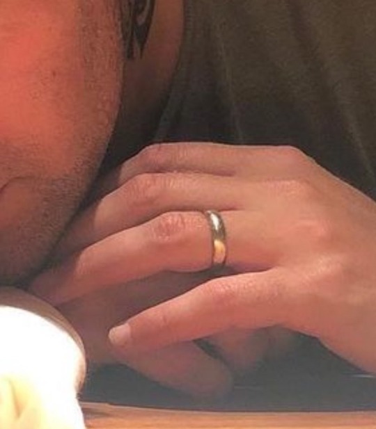
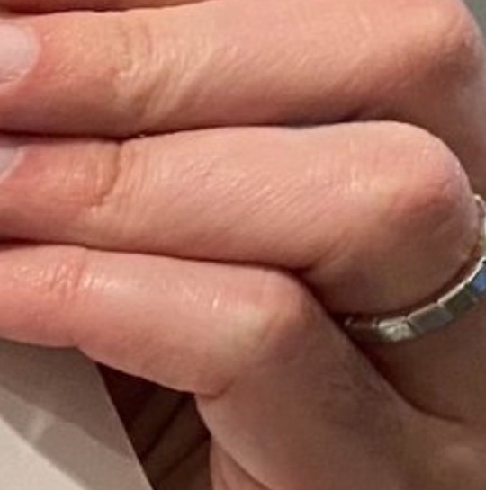
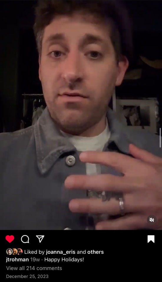
I don't know who else to express my conern to, but... it seems to me that Joe hasn't been wearing his wedding ring lately? I first noticed it in the China pics and thought maybe he just forgot it at home or something, but I did a quick look through 2ourdust pics and it seems to be missing then, too??
i was going to answer this when i saw it in my inbox yesterday but tbh i genuinely got too high last night to type coherently LMFAOOOO. BUT this is the RIGHT PLACE to express this concern because i actually am a slightly insane person who pays like TOO MUCH attention to wedding rings due to the fact that they make me Feel Ways, so i actually have a lot to say about this!!! i am the co-president of the joe trohman hands and ring committee after all (shoutout ash)…however, tldr: i would say that him not wearing his ring is not a bad sign to ME bc of the evidence on this matter. and i’m putting it under a cut cuz i kind of typed a lot here 😭
joe didnt wear his wedding ring almost at all on tourdust or eurodust either (there’s the joe coffee run picture that he’s wearing it, but i believe that was taken in la, and he lives in la, so he could have just dropped it off at home or whatever lol), but it actually goes much further back than that! iirc joe started first inconsistently wearing his wedding ring in 2017 or so, and he and his wife had a baby the next year, so it is not necessarily the sign of a split or anything that he is not wearing it :-)
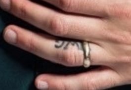
there could be many many reasons that he doesn’t wear it while touring/playing. it may be the case that he doesn’t like to travel with it for fear of losing it, especially considering his ring was upgraded recently ish it seems. see the pics below, left picture=2019 or so i believe, right picture=early 2023 from the hmlag shoot. as you can see the new ring has a different design, there’s some carving or maybe there’s even like diamonds in the band idk it’s hard to see fully, but it really could be the case that it’s a much more expensive ring, thus not wanting to travel with it because of the cost to replace if he lost it
there are also other personal reasons he may choose to not wear it: it could be for fluctuating finger sizes due to medical reasons or weight changes (i am not implying it looks like he gained or lost weight lol it doesn’t seem that way, but even small weight changes that are invisible to us can impact your finger size, or a high-sodium diet can contribute the fingers swelling more, so on and so forth), it could be the case that it’s become uncomfortable to play in (as an example, there’s that one video from 2013 or so of an acoustic performance where patrick removes his wedding band because of the slide sound it’s making on the neck of the guitar, so it’s not inconceivable that a wedding ring could get in the way/be uncomfortable for playing in), or SOOO many different reasons that he stopped wearing it that we may not know about (and that’s ok!!)
during their last show (or maybe one of their last shows? i can’t remember for sure but def a december 2023 show) he brought out this lil number which appears to be a silicone ring. and he only used this for one show and hasn’t brought it back since, but it just may not have been an alternative that worked for him. i know for example my uncle had a bad allergic reaction on his hands when he tried to switch to a silicone wedding band, so maybe something similar could have happened to joe with this silicone band, or just not liking the feel of it, etc
another piece of evidence that i think should soothe you as well, he was wearing his real ring during his christmas video, even if he wasn’t wearing his ring almost at all during 2023 tour :)
as well, i’m not going to include the pics (but you can find it easily on meredith’s reel lol), but marie was at andy and meredith’s wedding too, just another lil piece of evidence that im not concerned about the state of their relationship :)
lastly, its important to know that he has marie’s initials tattooed on the inner part of his ring finger (the m is covered up by his wedding band in these pics but i can’t find others where it’s more visible lol), so even when he’s not wearing his wedding ring, it’s like she’s always with him :-) and i bet that’s part of the reason that he doesn’t seem overly concerned with finding an alternative band, because functionally the tattoo still shows his commitment to her <33

aside from all of this even, im not worried about their relationship; joe has been head over heels for her from the moment they met, so i think they will be together forever and ever 💖 (and well god forbid if they do ever split i may have to cermet soup of side bc i love them so much…yes im a crazy insane joegirl yes i like rpf BUT ALSO yes i love marie and their relationship in general WE EXIST. do they need a third or perhaps another dog i can bark etc etc)
#hopefully this helps to ease your worries!!!#it’s kind of way more info than necessary LOLLLL but i just wanted to put all my thoughts in one place!!!!#and obviously i do not know them lol i could be wrong but i just am not worried personally :-)#anonymous#asks
11 notes
·
View notes
Text
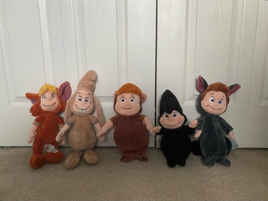
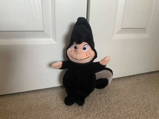
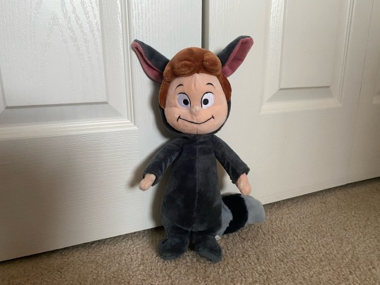
Well I guess now that the collection’s complete I can make a merch post about these beasts. Ominous in nature
Please excuse the lighting - hurricane Helene is on her way right now. More pics under the cut!
These dudes are from a 2013 series of peter pan plushes made by the disney store. Its a set of 15 plushes with pretty much all major characters from the original peter pan film! (16 if you count the twin twice). Pretty sure the set was made in celebration of the film turning 60 years old.
also all the prices I mention include shipping and tax fees! All plush received a sponge bath and air dry when I got them
I'll go over them in order of when I got them!
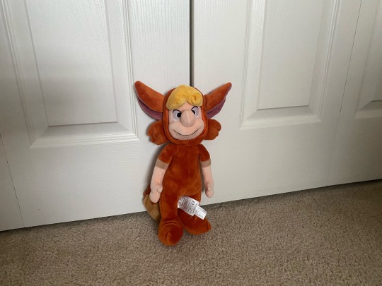
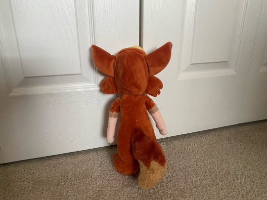
Starting with Slightly - the only one I didn't buy for myself. He was a gift in 2018 - the one i've had the longest. He's traveled outside of the country with me so he's a little roughed up on the back, but otherwise in good condition!
I think they did a good job translating his 2d design into 3d, my main gripe is that they opted for giving him a 1 piece suit instead of a 2 piece suit (the 1 piece suit is his return to neverland design) but thats a problem most Slightly merch has so its not a big complaint.
I really like just the design in general here, the color is great and i think his big nose is really funny. good stuff
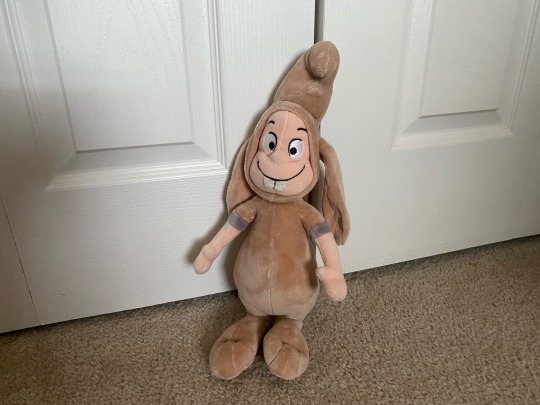

Next up is Nibs! Got him in May 2024 for about 29 bucks on Ebay which was a good price. Other than his tail falling off and needing to be sewn back on I've had no issues. Such is the nature of buying a 11 year old stuffed animal
To be honest he is my favorite plush design, his face is perfect and in general the plush is very faithful to his movie counterpart. His big haircut is doofy but Nibs' hair is inconsistent across all disney peter pan media (he's essentially the red headed step child of the lost boys in terms of merch and movie relevancy lmao) and its fun, no complaints here
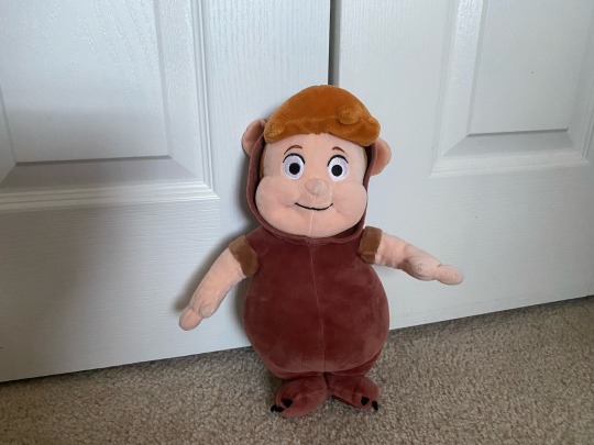
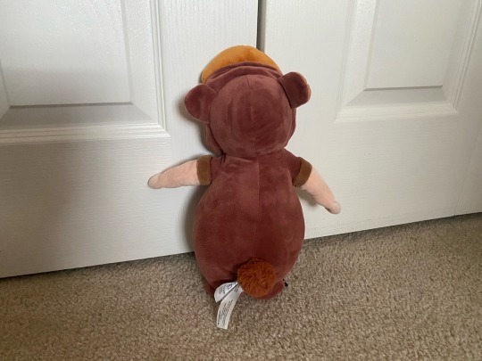
Then we have Cubby! Bought him on Mercari in August 2024 for 30 bucks.
Definitely the funniest looking of the bunch - that face. He's also pretty flat, not sure if that's just an issue with mine or if thats a problem consistent with all cubby plushes. Not a big gripe but it is funny and again a consequence of buying a well-loved stuffed animal online.
I swear he looks better from the side and the back - that front view is just hilarious. He's seen some things. Overall wonderful and whimsical
Up next is Tootles! I managed to get him still in the bag for about 46 dollars on Ebay in September 2024. Haggled the price down from 50 which was a score
He's the softest one I have, probably due to the fact that he was in a plastic prison for 11 years and untouched by sticky children hands.
The colors are great here and I love his round freckled face. Very cute and the tail is very nice, too

And lastly we have one of the twins! This one broke my wallet costing 80 bucks by the time all was said and done - ouch. Unfortunately thats a steal when compared to the prices for every other twin plush on the market right now. (my twin is the same one in the second listing on that post). Was the price worth it? Seeing as I have a first grade teacher salary and I'm fresh out of college - I'll let you decide. Let's just say theres no plans to get a second twin for the foreseeable future
This dude is great - very appealing colors. His big ass head and tiny feet are also great to look at. I like what they did with his hair - the twin's hair is also inconsistent in nature across disney peter pan media - but I think they struck a good chord with this one!
Overall I'd say yes it was worth buying, especially when all other prices hurt so bad, but still .... ouch.
And that's all I have to say! Overall having these dudes feels like a great part of my collection, I'm glad to have them :]
#185 dollars later. ow#sawyer.thoughts#nibs lost boy#slightly lost boy#disney lost boy merch#lost boys disney#cubby lost boy#the twins lost boys#tootles lost boy#disney plush
3 notes
·
View notes
Text
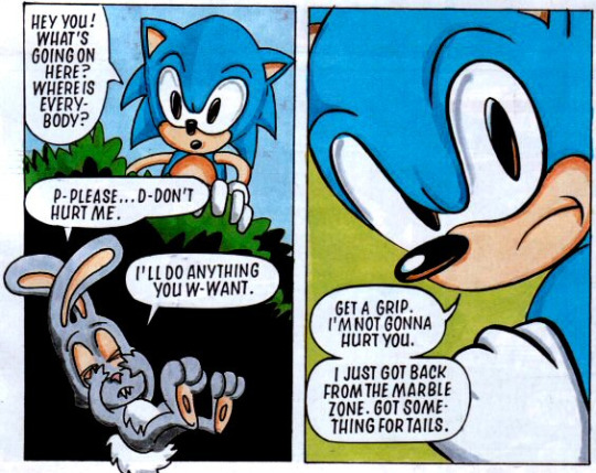
Still only one Sonic comic in this issue and we’ve got a different team working on it this time, with Mark Millar writing, Woodrow Phoenix drawing and John Aldrich lettering If I was to nitpick, the opening of this issue is slightly inconsistent with the cliffhanger of the first issue, where we saw a concerned Sonic rushing off to find Tails. Here, we see Sonic returning from Marble Zone to learn that Tails is gone. We get the usual StC Sonic lack of sympathy towards a rabbit who might be Johnny (he’s the right colour this time, but like in the last issue, it isn’t directly said), though Sonic does back down when maybe-Johnny tells him that Robotnik has kidnapped everyone again, including Tails. It’s also implied that the rabbit hasn’t met Sonic before, so probably not Johnny? Idk there are a lot of these little critters
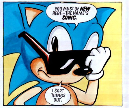
Sonic decides that in order to take Robotnik on, he needs a new pair of trainers (sneakers) and sunglasses. In Archie, they called this look Evil Sonic
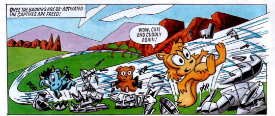
We get a few pages of Sonic smashing through badniks. I like the cow critter design featured in the above panel. I don’t think I’ve seen this design used anywhere else
But the real feature of the issue comes from the Tails reveal, who apparently decided to do the cyborg look a long time before Nine from Sonic Prime did a take on it
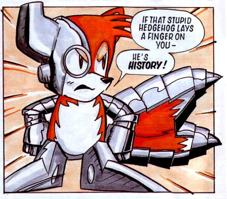
Sonic and Tails fight each other, with Tails expressing anger that Sonic always leaves him behind. My biggest critique of this issue is that it’s not entirely clear whether Tails has been brainwashed by being made into part-robot or whether he genuinely decided to turn on Sonic and side with Robotnik. I feel like the narrative is leaning more towards the latter, but that just doesn’t feel like Tails to me? These were early days, however
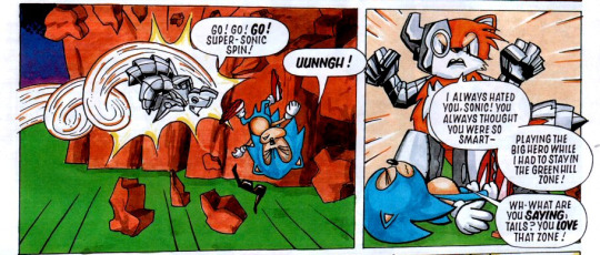
But when Robotnik turns on Sonic, Tails realises that what he’s doing is wrong and teams up with Sonic to fight Robotnik, smashing his armour in the process
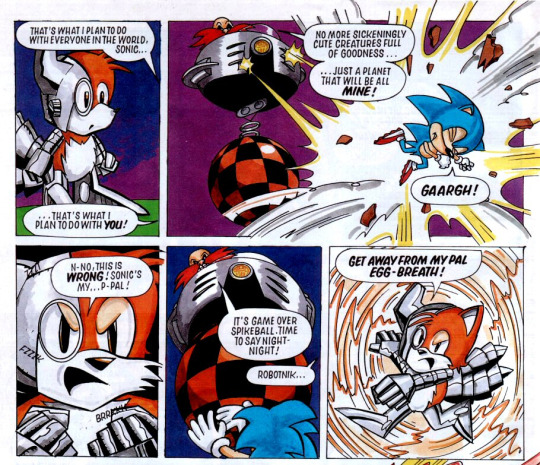
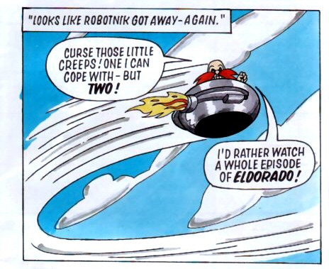
As Robotnik leaves, we get a glimpse into his TV preferences
With the threat gone, Sonic berates Tails for “getting turned into an evil robot” (So… he was brainwashed, then?), before revealing that his special shoes have been destroyed in the funniest panel of the issue:
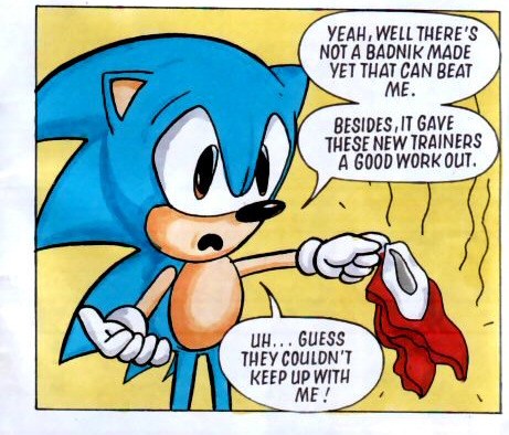
The story wraps up with Sonic walking Tails home and saying that he doesn’t need special shoes anyway. And that’s our introduction to Tails. It establishes the dynamic between the duo that will last for most of the comic’s run and sets Tails up as the younger sidekick who’s eager to prove himself to a hero who thinks of him as a kid, to say the least. I admittedly like StC Sonic and his harshness a lot more than most people do, but I’m saving talking about that until I’ve got a bit more of this read-through under my belt
Overall, I don’t personally think this issue was quite as strong as the first one was, but the few nagging inconsistencies didn’t stop me from enjoying it and I’m looking forward to seeing where the comic will go from here now that the main duo have been established
4 notes
·
View notes
Text
My Color Wheel
HOLY FUCKING SHIT I FINALLY GOT THIS DONE
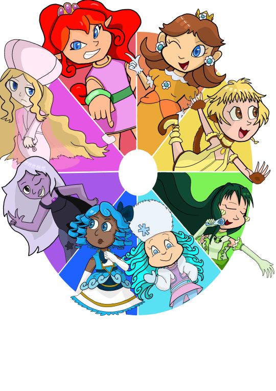
It's far from the prettiest color wheel, but I expected that it wouldn't be from the start, so I used it as an excuse to experiment with my art style a bit(that's why there are inconsistencies in shading, rendering, line weight, etcetera). I'm still glad that I did it despite the lackluster quality because I have a hard time letting myself be loose with my art. If I attempted to make this with my perfectionist mindset, it would've taken 3 times as long to finish without getting me any closer to what I want my art to look like. So if you're an artist that wants to try making a color wheel but are afraid you won't like how it turns out: don't be! Use the challenge to try out a certain brush, shading method, color palette, whatever! You might not love the final result, but you will get something out of the experience.
Before I end this post, I want to talk about the characters in this wheel and why I picked them[WARNING: LONG].
Flare: Tbh, I don't have a strong connection to Flare, she's not even my favorite Panel de Pon character. What I do like about her is her official artwork and character themes, the girl's got confidence, sass, and a banging critical theme. I also really wanted to draw a character from Panel de Pon because there's so much to love about the franchise despite lacking on official content (I'd be upset at IS for that, but I can't blame them too much when any original IP that wasn't Fire Emblem or Advance Wars didn't sell well).
Daisy: You don't need me to tell you who Daisy is. All I really need to say is that I love her for the same reason every other Daisy fan loves her. Saying Daisy rules because of her (relatively) bombastic personality is nothing new, but that really is why I like her so much. That's also why some people hate her, but that makes me appreciate Daisy more. I think it's great to have a character that people either love or hate in a franchise with simple characters.
Mew Pudding: Despite Tokyo Mew Mew aging like milk imo, I wanted to include a character from it because it was the 1st magical girl series I read, and I love magical girl shows SO much! I drew Pudding because she's my favorite girl in the group. As a kid, it was just because she's funny, but as an adult the juxtaposition between her role as a caretaker for a bunch of little siblings and the youngest member of the Mew Mews was pretty interesting. Dare I say, she would've been a better protagonist than Ichigo.
Rina: I couldn't hop off the magical girl train yet, especially since Mermaid Melody was my 2nd introduction to the wonderful world of magical girls. Most Mermaid Melody fans prefer Luchia or Hanon, but as long as I can remember my favorite was Rina. I never got a chance to re-read the series so I can't remember why, but knowing what I know about myself now, the reason might've been...formative.
Frosty Puff: Probably the most obscure character on this wheel, due to the triple whammy of being a minor character in one generation of a series most people don't care about. No disrespect to the Strawberry Shortcake fandom, I like looking at your posts here, but to the general public, Strawberry Shortcake stonks are pretty low right now. That didn't stop me from drawing Frosty Puff though, because of...well she...ok I admit it was just because of her design. As far as I know, Frosty Puff never got any meaningful characterization. But I was really hyper fixated on the 2003 Strawberry Shortcake era when I started this, and I wanted a character in cyan that wasn't showing up everywhere. Her in-show design doesn't have a drop of cyan, but her official doll's hair did so I merged the two.
Undine: If you don't know who this character is, that's fine :] but it also means you haven't read Sleepless Domain, and it's worth it just for her. Won't elaborate because there are a few twists and turns I don't want to spoil, but if you want to see more magical girl stories for a slightly older audience, check it out.
Amethyst: I drew Amethyst from Steven Universe because of the small arc she has involving Jasper. The 1st time I watched it, I really resonated with Amethyst for a reason I couldn't articulate. Something about her struggling with then coming to terms with the genetic differences between her and Jasper was surprisingly real, and I shared her frustration with Jasper being this seemingly unbeatable opponent...then I watched it again and realized some of the stuff Jasper said was REALLY ableist. That might have something to do with it.
Caitlin: And to top it all off, my favorite psychic user in the pokemon franchise. Won't go into it because this post got way too long, but I think her backstory makes her a certified badass.
#color wheel challenge#Flare#panel de pon#princess daisy#mew pudding#rina toin#frosty puff#undine wells#amethyst steven universe#caitlin pokemon
2 notes
·
View notes
Text
Dang, the final day of round one, it got here so fast! I gotta say, your capability to keep doing this every day for this many months is something I truly respect. Not many people have the capability to show such levels of dedication to a random hobby. I know I have missed out on a bunch of days during this round, while the other polls were running, and I apologize for that. I just didn't want to have to worry about so many polls constantly, while also having to keep up with my college studies. It's usually best not to have too much stuff that my brain would need to constantly be keeping up with xd But if anyone is interested on what my thoughts are about a particular room that I didn't address (…which are most of them, in retrospect), then feel free to ask me.
Oh, and I almost forgot - you didn't include Farm Arrays in the tags, hehe :D (but I choose to believe that was intentional because Farm Arrays is… you know, Farm Arrays) And now, let's get onto the last list of this round!
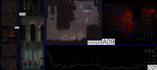
Personal room ranking:
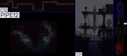
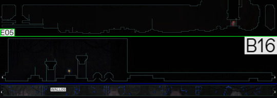
1 - Metropolis: cramped (9/10) 2 - Waterfront Facility: C01 (8/10) 3 - The Rot: A09 (8/10) 4 - Farm Arrays: D06 (7/10) 5 - Waterfront Facility: C12 (6/10) 6 - Garbage Wastes: PIPE12 (6/10) 7 - Five Pebbles: C06 (6/10) 8 - The Exterior: E03 (5/10) 9 - Shaded Citadel: C01 (4/10)
Extra comment: You might be wondering, is this a good note to close the round out on? And to that, I can only give a solid "Maybe?"
Admittedly, most of these are pretty decent. Cramped is my favorite, mostly because it's a room with a boring purpose, but a unique design, and I really like it when the devs do that. Just because a room isn't important, it doesn't mean that it has to be a carbon copy of some other rooms from the region, after all (but it absolutely can be, of course, I'm just gonna rate it too high in that case, like in the case of PIPE12 here). I don't think the name describes it very well, since this place doesn't look cramped at all, but you can't see the names in-game, so I can forgive that.
As for the others, a couple of them seem to be making it through, and I'd say pretty much all of them deserve it (and I'm going through them all, cus if there's one reblog that deserves to go even longer, it's this one). C01 is a great example of how to modify an already existing room. You can easily tell which specific Shoreline room this is, while the layout, aesthetic and general feel of it fits Waterfront Facility perfectly. One thing I'm slightly annoyed by is how this new layout makes grabbing the Jellyfish unlock very trivial, but considering the insane mobility of Artificer, Rivulet and Saint, Downpour players could have still very easily bypassed the challenge.
D06 is creative, but it does have some frustrating elements. As an overall design package, though? Yeah, it does work, especially with the rain's flooding mechanic allowing the shelter to be accessible from the bottom, if need be. I'm sure a lot of us have used that, and we all felt like a really clever scug when we did that :)
A09's idea is simple, but effective, throwing off the player by closing off the old path with the rot, while opening up an entirely new one with the collapse. This region does that a lot in general, but it's a great way to let players know that this'll be a lot more than just "FP, but with a higher number of DLLs, and inconsistent gravity". Proto DLLs not being placed annoyingly is also a plus.
And the last one to make it is…. C01? That's weird, cus I have an enormous love for Shaded, yet even I don't really about this room too much. It does fit in well, and it doesn't have anything particularly bad about it, but it's also one of those rooms that I wouldn't mind seeing removed. Its rightside parts are kind of neat, I guess.
And now, for the last and most certainly the least - E03, which didn't get a single vote XD I wanted to mention that one, because I actually really like it in campaigns where it has a DLL. However, I have visited it as Hunter. And I can safely say that I've never made a bigger mistake in this game. I honestly wouldn't be surprised if the Precipice and Waterfront Facility were made, just so that Spearmaster and Artificer can go around that godforsaken room. I sure did that, I have absolutely no regrets about it. So yeah, it's quite satisfying to see my feelings get validated like this.
Pick Your Favorite Rain World Room, Day 181.2
This is not single elimination! Every room with at least 10.0% vote will move on to the next round.
There is a hidden slugcat in one of the rooms (they can be in any color). If u can see it comment or reblog with where they are and if u are first, u get a cookie!
Credit for game screenshots goes to: Rain World Interactive Map, Rain World Wiki and me
Congratulations for day 180.2 winners!
6 notes
·
View notes
Text
v3′s art is comically terrible for a professionally distributed game in a series: a compilation
in this not-essay I will list all of the mistakes and problems I have spotted in v3′s art. don’t worry, it’s entirely for fun and I’m doing this on a whim, so please feel free to not take this seriously but also it’s hilarious and embarrassing how ridiculous this is like what happened did they speedrun the whole production or what
see, there are some things you can take as meta like “they made it bad on purpose to allude to the downfall of tv shows that have been on air for much too long” but I have a very strong feeling this is not the case due to the nature of some of these errors
disclaimer, the more I study this art, the more I fear that the artists were underpaid and underslept, so if this is in fact the case, I am so sorry to all of them but also I’m going to make fun of the art anyway
anyway let’s get started!

if you study this image for longer than 5 seconds, you will see that kaede is the only one fully shaded and keebo is literally just his normal sprite pasted into the image. every other character is just an ordinary ref, hence most of them facing the exact same direction with neutral expressions on their faces. it looks like a bad edit, and is probably one of the worst pieces of art in the game. it kind of gets better from here on, but my roasting will not.
with that out of the way, here’s the problem that officially bothers me the most and clarifies my viewpoint of “this is not meta and an actual lack of company communication”
this freaking cg, which seems normal at a glance, but some wiseass was like “oh, kaede is a girl, so obviously she’s going to be shorter than the Male Protagonist™” ah, that’s funny. because if you look at the character bios, kaede is, in fact, one inch taller than shuichi and not like 6 inches shorter as she is shown here.
also shuichi’s shoulder is disproportionate and horrendous and he looks vaguely like a jojo character, but I wasn’t even thinking about that until right now.
thanks guys, 50% of the fandom who has never bothered to check these bios thinks that kaede is like 5′3 (did the developers really put so little thought into her to the point where drawing her correctly in the game didn’t even matter??)
also I would like to point out that, even though this isn’t related to the art itself, yes, a character kaede’s size being only 117 lbs is unfeasible, but this applies to literally every character in danganronpa ever and it’s not new news that it’s unrealistic
update: someone in the tags informed me that in versions of the game that use centimeters, like the japanese version, kaede is actually shorter than shuichi, which just adds another thing to the list of weird decisions the localization team made for no reason. that said, after confirming this, kaede is 167 cm in the original, while shuichi is 171 cm, which are approximately 5′6 and 5′7 respectively, but one inch is still nowhere near as drastic as it is depicted above. (in spite of this, I would rather depict kaede as slightly taller, so I’m probably going to keep doing that.)
the journey continues!
bro if you want kaede to have shoulder length hair then stick to it to begin with
you can pretend this is at an angle all you want but they definitely committed the shorter kaede sin a second time
wait a goddamn second.
DO YOU SEE THIS
no………… it wasn’t kaede who shrank. it was shuichi who got taller
speaking of which, can we talk about how shady the perspective is in this elevator pic? look at shuichi and kokichi in comparison to kaede. kokichi, who is canonically 7 inches (edit: or 5, if you’re loyal to the original) shorter than kaede, looks taller than kaede. he’s growing too. what steroids are these gays taking

running into the room, electric boogaloo: I don’t think tsumugi is supposed to be the same height as kokichi
gonta… gonta you’re lookin a bit like a jojo character there
I love how kaito’s head looks kind of like it was pasted onto his body. why is he the same size as shuichi? shouldn’t he be high school bully size or something? his torso is teensy
ah yes, white angie.
I love this cg but why is shuichi’s right hand so much bigger than his left hand
I also love how this cg looks like they literally took pictures of trees and pasted them into the background, especially on the left. the shadows are so weird, especially closer to the ceiling, it’s difficult for me to believe they didn’t do exactly that.
return of Enlarged shuichi
puberty update: kokichi is now taller than shuichi in spite of shuichi never missing leg day. what crimes will he commit
I have to mention it, guys. this has to be one of the worst danganronpa cgs. kokichi’s facial proportions look atrocious. look at the way his face sticks out like his jaw is in the wrong place. his scarf is a pasted texture. that’s it. this moment was so iconic but the cg just looks so… so… off. like something is terribly wrong, but you can’t put your finger on it.
you know what? let’s get into that ‘pasted texture’ thing.
let’s imagine you’re an artist working on a professional game. you’re assigned to draw cgs of kokichi ouma, who has a checkered scarf from hell. sure, it will be terrible to draw, but you only have to draw it once at a time! plus, perspective is pretty important, right? can you be bothered? nah, actually. let’s just copy paste a checkered pattern into the cg, because I’m sure nobody will notice. it’ll blend right in with the other cgs that someone actually put effort into drawing his scarf in, right?
no. the answer is no and I very much noticed. this genuinely looks terrible and I would understand taking a shortcut like that in fanart or even an indie game but this is a full price pc and console distributed game
(an addition: look at kokichi’s TINY HANDS in that last one)
meanwhile, they straight up forgot to color in kokichi’s scarf in this cg.
dude. I forgot about whatever the hell this cg was. anyway look at keebo please just look at him
lovin kaito’s baby arms
real talk, maybe you could argue that he’s missing muscle because he’s deathly sick, but most of his cgs don’t line up with this, and his arms just look disproportionate to his torso size (granted this is a consistent problem across all danganronpa games and a lot of characters have this weird problem, like hajime, but also kaito is bigger than hajime so I kind of have higher expectations of him) maybe it’s his stupid goatee and the way he reminds me of yasuhiro?? it creates this illusion that he’s older than he is and so I keep expecting him to look more like an adult
oh, also rantaro is missing some of his accessories in that video he made–you know the one–but I don’t wanna go back and screenshot it
also you may have noticed that I’m skipping all of the monokub cgs because I literally do not care about them and I’m not even bothering to check and see if they have artistic mistakes in them
JIMMY NEUTRON???
hey um uh kaito you seem to be missing your neck
hey guys do you like my pregame fanart
so, that done, the sprites are also pretty terrible at times. they’re not as interesting to go through, however, and downloading the full sprite sets for every character and studying every single one of them will drive me insane, so I’ll just sum some of the ones I noticed up. I made things for kaede and shuichi before deciding I wasn’t going to get into it, so here are these.

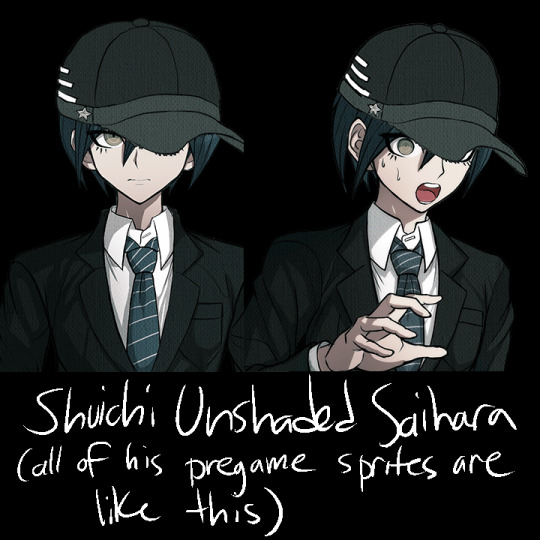
that said, other mistakes include kokichi missing his purple highlights in all of the sprites encompassing a specific pose, stray pixels all over the place on everyone, and everyone also has heavily inconsistent shading, but literally all I think about is how pregame shuichi is unshaded and two of kaede’s pregame sprites have glaring outfit change mistakes in them
anyway, thank you for taking the time to read my ridiculous ramble. in all seriousness, there’s this looming presence of some lack of communication in the development team, like with all the art and design inconsistencies, pieces and sprites that look rushed, stray pixels, and missing basic proportional stuff. these are the kinds of things that you supposedly have to pretty much have in the bag in order to get jobs in professional businesses, so it’s really weird to me that this game suffers from so many of these problems. it’s like they tried to make the art so much more crisp than the other games, but it fell on its face as they realized it was going to take longer to draw everything and they started to rush. it’s weird, because the coloring itself looks normal–it’s just sloppily drawn, and the proportions are a mess once put into the context of perspective. many of the cgs look like they were drawn by different people, and I’m still not over the fact that half of kokichi’s cgs have his scarf pasted in as a texture.
the moral of the story is that if you’re selling a game at full price that also happens to be in a series that has had 3 very good games in it already the stakes should probably be higher than this. v3 has been out for more than 3 years and it’s still $40 (did it cost more than that before? I sure hope not), and the overarching quality of the game is just not as high as the other games. I’m not saying that the other games don’t have any problems with their art at all, they’re just not as glaringly obvious and every artistic choice in those games feels intentional.
regardless, I had a blast roasting the art at 2am, so maybe you got a kick out of all this chaos.
#god I keep telling myself I'm gonna stop rambling about v3#v3 spoilers#drv3 spoilers#ndrv3#random stuff#but making this… it sounded so fun#danganronpa
692 notes
·
View notes
Text
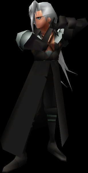
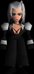
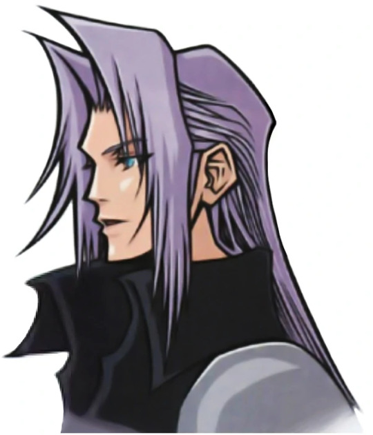
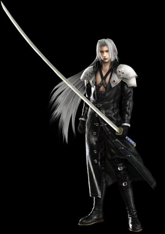
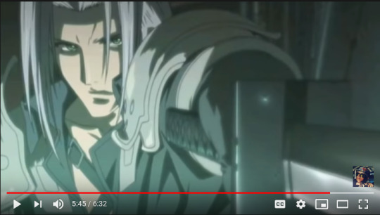
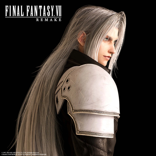
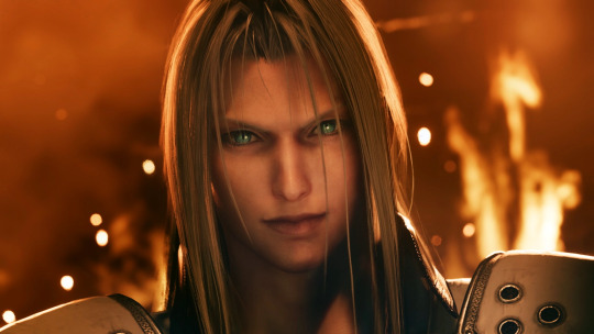
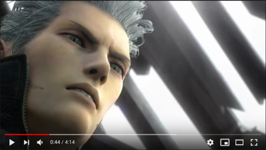
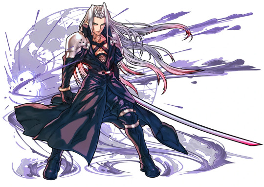
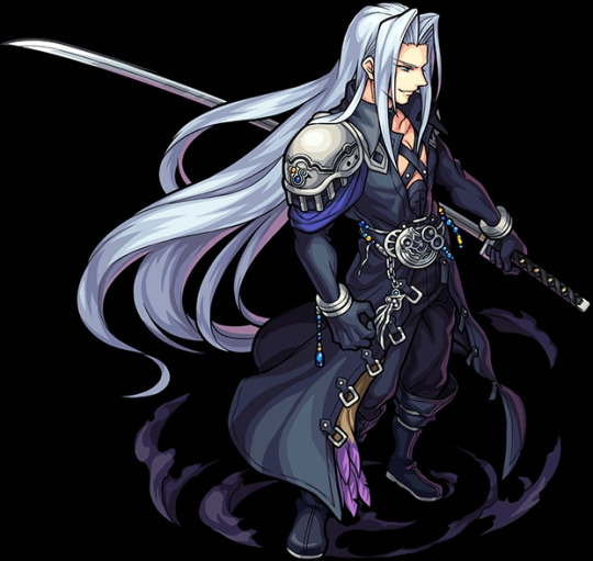
Sephiroth’s true eye color (among other things)
Ever since I got into FF7 stuff I’ve wondered about Sephiroth’s rather inconsistent eye color over the media he’s appeared in (which is a lot), and I think I finally have an answer for it, as well as answers for other slightly unexplained phenomena. Warning you now, this will be fairly long and full of spoilers for multiple games in the series, yet hopefully informative.
Sephiroth is best known for his green, cat-pupiled eyes, among other things, and that’s generally the accepted eye color for him in fan works and such. But his eyes are actually light blue, and not just mainly in spinoffs. There will be a TL;DR in about the middle of the post for one interesting point, and another at the end for the whole post in general.
Disclaimer: This isn't intended to be a "this is the right way to portray Sephiroth's eye color" gatekeeping thing, this is just an analysis of an element of character design that went way too deep and is breaking Tumblr as we speak hfsdgyfudgfsd
Evidence, theories and such under cut-- all 63 images (yes, you heard me, be warned) either come from various wikis as official art/screenshots/etc. or are my own screenshots:
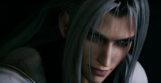
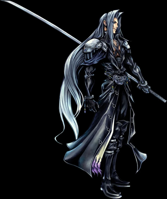
In Final Fantasy 7, where this mess all started, his iconic official art has green eyes:

But in all other art, models, etc. for the game, even the Ultimania scan, his eyes are light blue (or some sort of blue in general):

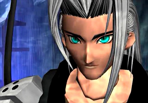
Of course, you could argue that Sephiroth’s official art also has blue eyes if you stare at it hard enough, but at first glance it’s more green than blue, and with the amount of green-eyed art I’ve seen, I’m sure many people have just accepted that his eyes are green and nothing more.
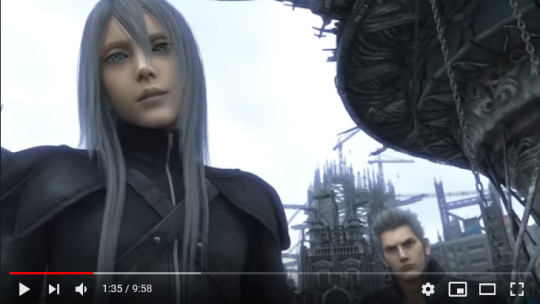
Several other games in the main series also portray Sephiroth’s eyes as light blue, sometimes borderline colorless depending on the lighting:
I particularly curse Advent Children for it’s washed-out aesthetic because in the darker scenes it completely masks Sephiroth’s real eye color. Thank the gods for HD screenshots.
However, there is a very interesting phenomenon that only seems to happen in Last Order, the 25-minute animated retelling of the Nibelheim Incident and Zack and Cloud’s escape 5 years after. No one seems to have noticed this yet, to my knowledge, so I’ll go through this as clearly as I can.
When Zack confronts Sephiroth in the reactor, the latter’s eyes are light blue:

It isn’t very obvious due to the mako glow tint and his face being in shadow, but I’d think green eyes would look different here, so they are light blue. They stay light blue for a while after this, until Zack begins to fight him and parries him onto the ceiling (anime physics...), resulting in this peculiar scene:
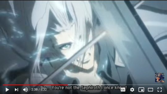

Light blue into green. Literally, you can see it happening in the actual video. This happens a second time when Sephiroth has Cloud skewed on Masamune, just more subtly:
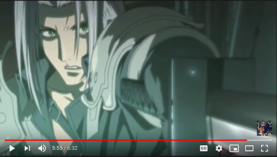
Again, light blue into green(er). Definitely something funky going on here. It goes back to light blue when Cloud tosses him away, though:

And speaking of Cloud... he, too, shows very obvious eye color change directly after this scene, as seen below:
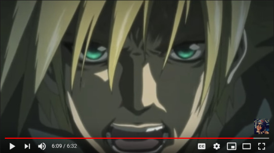
In the video they are visibly, animatedly glowing, it’s not just me discerning between two different flat shades of color. Keep in mind this is before he gets mako poisoned and Jenova-celled and whatnot, so this isn’t due to SOLDIER enhancements. What gives?
Here’s my take: it’s the Lifestream. People are made of Lifestream like everything else in in the FF7 universe, and it’s common knowledge that Lifestream/mako can do some pretty weird shenanigans. SOLDIERs are literally pumped full of the stuff and have seemingly superhuman abilities, and that’s just the lower-ranking ones. But the series has also placed a lot of emphasis on willpower, which Cloud post-experimentation struggles with due to the J-cells and stuff. A lot of people with particularly bright or “glowing” eyes have expressed an incredible amount of willpower, some of which include Cloud, Sephiroth (unsurprising), and Aerith:
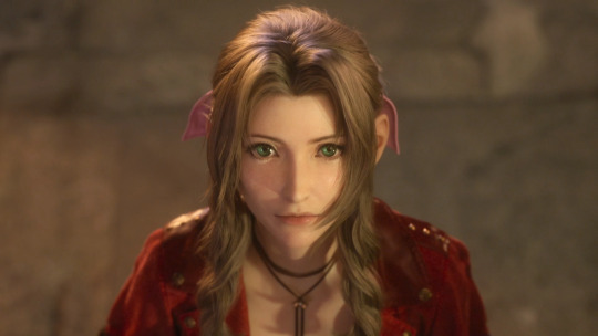
Aerith’s eyes have always been incredibly bright in the series, regardless of which game you reference. Remake especially makes this obvious, as it seems like every close-up shot of her makes her eyes the centerpiece regardless of lighting, setting, etc.:

Like, seriously, they almost seem to glow they’re so bright. But here’s the kicker: Aerith is a Cetra, and the Cetra, obviously, communicate with the Planet... or, in other words, have an incredibly strong willpower that influences things. It’s been stated before by various people and media that Sephiroth and Aerith are two sides of the same coin, but not quite like this, I think. Cloud shows a similar phenomenon in his close-up shots as well, though the artificial SOLDIER glow is most likely contributing to most of it:


Compare these to younger Cloud in the Nibelheim flashback, when he was more innocent and had no need for incredible willpower, artificial or not:

Going back to Cloud in Last Order, the point we can make about him in particular is that when he was stabbed, literally at death’s door, he drew on his inner Lifestream for the strength to toss Sephiroth away. People have wondered for years about how this moment was even possible besides Protagonist Syndrome, and this may be the answer.
If this is the case, then this could apply to anyone: Aerith, Sephiroth, Zack, hell even Tifa seems to have slightly glowing eyes in the Remake sometimes-- and sure, it may be just the game engine making sure we can actually see their eyes in key cutscenes... but it ties into canon lore and actually makes sense, so I’m sticking with that. It’s also not a coincidence that Aerith specifically has green eyes, too, since the Lifestream in general is green-colored and whatnot.
Midpoint TL;DR: people with lots of inner willpower can call on their own Lifestream to give them strength, resulting in “glowing” or even color-changing eyes depending on how much Lifestream/mako they have in them. SOLDIERs, for example, would fall in the latter category... the most extreme being Sephiroth.
Now that's we're back at Sephiroth, another interesting point is that his eye color in Remake is consistently light blue, or some blue variation depending on the lighting, with green centers, as seen below:
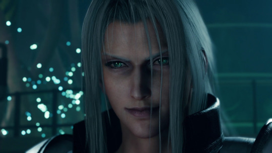
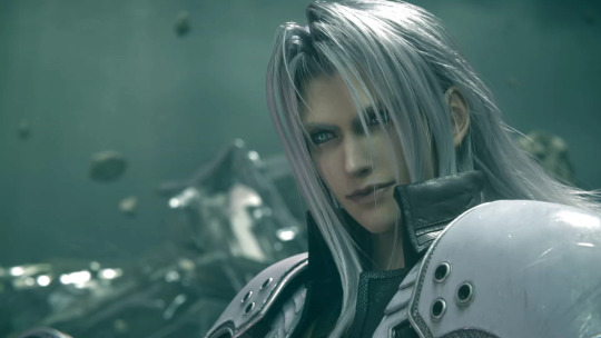

Cloud obviously shares the same eye color pattern by this point because it's implied that he has the same if not slightly more mako in him than Sephiroth, which very conveniently also equates to him having the same if not slightly more willpower than Sephiroth.
An honorable mention goes to the Remnants, since they, too, follow the light blue with green centers pattern, appearing to fluctuate between the two colors at certain times:

With all of that said and done, I’ll wrap this up by going through Sephiroth’s appearances in side games and other franchises as quickly as I can:
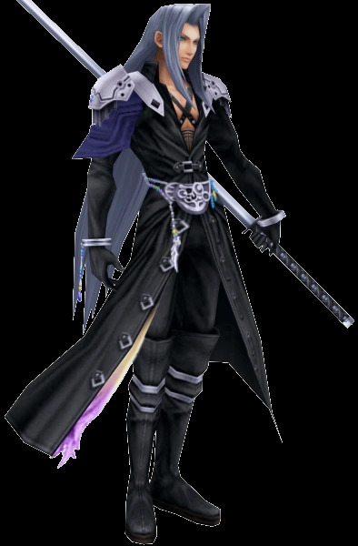
1) The Dissidia series (Dissidia, 012/Duodecim, NT, Opera Omnia) almost always portrays Sephiroth with light blue eyes in art, renders, and models, occasionally with a hint of green in them:


A very interesting exception is NT Sephiroth's Safer Sephiroth costume, which has completely white eyes in all three of its alts. Yes, it's basically just a cosmetic costume, but it's still worthy to note for comprehensive purposes:

2) World of Final Fantasy’s Sephiroth has light blue eyes:
3) Record Keeper Sephiroth’s sprites are very obviously based on the original FF7 official art where he has green eyes (yes, I checked the colors by hand, they're all in the greener sections of the color wheel):


4) The Kingdom Hearts series is particularly unique because it features a blue-eyed Sephiroth but with an explicit reason for it. Kingdom Hearts 1 simply says that Sephiroth is part of Cloud’s past, but Kingdom Hearts 2 literally has Cloud saying “I'll get him. This time we settle it. Me, and the one who embodies all the darkness in me.”, and then explicitly clarifying that it’s Sephiroth he’s talking about. Sephiroth even shares Cloud’s facial shape, which is particularly obvious in KH2 renders:


All other Sephiroth appearances in the KH series also feature him with blue eyes, except for any usage of material from other media.
5) Itadaki Street games feature Sephiroth with green eyes:

6) Puzzles and Dragons features a rare teal-eyed Sephiroth:
And finally 7) All other Sephiroth appearances in spinoffs and other media feature him with light blue, blue, or rare teal eyes, except for sprites, which are (most likely) reused from Record Keeper:


And that’s FINALLY a wrap. All my evidence for Sephiroth’s actual eye color in one place, and even a theory on why it can potentially fluctuate between that and the iconic green.
Actual TL;DR: Sephiroth’s eyes are actually light blue in 90% of his appearances, and the remaining 10% either comes from temporary green-ness or partial green-ness thanks to mako/Lifestream stuff, or spinoffs.
There is one small point I’d like to make at the end of this, and that is the remaining mystery of why Sephiroth’s pupils are even slitted and cat-like in the first place. That... is far more ambiguous in terms of evidence than the eye color. Some series, particularly the Kingdom Hearts series, have them as regular round pupils, while others sometimes if not most of the time give him the cat-like ones. I may make another in-depth analysis post trying to figure it all out, but for now I’ll say that it may just simply be a result of the Jenova cells he has or something along those lines.
If you made it this far down and didn’t just instantly scroll past my massive log of images and sundry, thank you so much for reading all of this! If you did just instantly scroll past, I don't blame you. I guess I'm in proper Sephiroth hell now, lol.
I hope you have a great day and that things turn out well for you fhjksdgfyhughuhyudfs
#final fantasy 7#ff7#if I tried to tag everything I mention in this post tumblr would probably die SO I'm only tagging the biggest and most relevant groups#final fantasy 7: advent children#last order: final fantasy 7#crisis core: final fantasy 7#before crisis: final fantasy 7#final fantasy 7 remake#dissidia final fantasy#world of final fantasy#final fantasy record keeper#kingdom hearts#itadaki street special#puzzles and dragons#sephiroth#cloud strife#aerith gainsborough#kadaj#yazoo#loz#sephiroth's eye colors#my text#can't believe how freaking LONG this is jfc#this is the most productive I've been in ages in terms of fandom
108 notes
·
View notes
Text
LGBTQ Manga Review - Fragtime (Complete Series)

I recall reading the first few chapters of Fragtime on Manga Cross and not being very impressed. I did not care for it much, as, other than the time stopping element, it was mostly generic and had a few too many unsavory elements. I was content to let it rest and be forgotten along with a hundred other girl-meets-girl school Yuri romances until Tear Studio and the people behind the excellent Kase-san and Morning Glories OVA announced an anime adaptation of the work, a full five years after it ended. Inevitably an English adaptation of Sato’s original manga was announced, and so here I am, somewhat reluctantly reading and reviewing the two-volume series. It may sound like I am pessimistic or already had my mind made up, but that is not true. I went into Fragtime with as open a mind as possible, and I am happy to say that I did find several favorable aspects that appealed to me. Sadly, the manga mostly lived up to my poor initial impressions from all those years ago.
Fragtime follows timid high school student Moritani Misuzu, who can stop time for three minutes a day. While using her power, she attempts to look up the skirt of one of her classmates, Haruka Murakami. To her horror, Moritani discovered that Haruka is the one person immune to her ability. The two form an unlikely friendship and spend those few minutes when all others freeze together. As Moritani’s feelings for Haruka grow, her powers begin to fade, throwing their time together in jeopardy.
At first, this story appears to have some promise, along with some obvious issues. The supernatural aspect of Moritani’s powers and its connection to her emotions and relationship with Haruka provide excellent possibilities and avenues to explore the series’ romance and characters. Sadly, Sato delivers an unwieldy story with unlikeable and inconsistent subjects, a poorly paced narrative, and far too many sleazy moments to excuse. This last point is the most prominent of all and will be a turn off for many readers, myself very much included.
Moritani begins the story by “upskirting” one of her classmates. It is later revealed that she reveled in exploring the time-frozen school to pry into people’s most intimate moments, many of which frankly do not happen in schools nearly as much as the story would like to believe. Following this event are multiple scenes with characters flashing each other their panties, or else stripping to whatever the opposite of readers’ delight is. These moments are not sexy, and while a few of them appear to have been attempts at comedy, they will elicit few laughs. These factors create an overwhelming blanket of immature perversion that stifles any enjoyment in the audience and characters.
Another egregious element is a plotline where Haruka is continually sexually abused by her teacher, something used by her to manipulate Moritani, then joked about, and never resolved despite being referenced a good half-dozen times throughout the manga. More than anything, this speaks to Fragtime’s inability to treat its characters with any respect or focus on a plot arc and complete it satisfactorily. For indeed, even if one undergoes the arduous task of shrugging off the uncomfortable fanservice, there is not much noteworthy content left underneath.
Fragtime’s highschool Yuri romance plot is pretty unextraordinary. Even though it did attempt to include a few interesting plot points, like when Haruka and Moritani begin dating partway through the series, it is not awful, but too often, these plots are picked up and then never resolved properly, such as Moritani struggle to avoid the ping-pong club, and her discomfort after finding out about Haruka’s boyfriend. Yet, there were some positives along the way, sweet moments between characters or satisfying actions taken by them. It is just hard to find one uninterrupted by an unwelcome twist or panty flash. The one unconditional plus I will give is that I really liked the ending. There is a fantastic scene of role-reversal where the usually quiet Moritani confesses all the mischief to her and Haruka committed to the class and reveals the truth of their relationship and her feelings for Haruka. Afterward, a stunned Haruka is forced into a crisis of character and her true self is seemingly revealed. It is appropriately dramatic and delivers a fulfilling ending for the characters. Sadly, these revelations and character arcs are not supported by the rest of the story.

A manga like Fragtime lives or dies by its characters. Readers will sympathize with likable characters met with appropriate challenges and growth, or else they will laugh with endearing figures who try their best despite their flaws. Sadly, Fragtime’s Haruka is neither. Haruka is instantly dislikable, manipulating Moritani upon their first meeting, and does little to improve. She often jumps between ignoring Moritani and controlling her, demanding that she only use her powers at her command. These traits are never addressed, and the whole time readers are expected to accept that she is an unreachable beauty, and we should love her alongside Moritani. She is hopelessly inconsistent, apparently changing personalities and acquiring new traits at the drop of a hat so that Sato can shoehorn a new element of drama into the convoluted romance. The ultimate motivation behind her character, how she tries to please everyone and do what they want her to, is contrary to half her actions, and everything we have learned about her up to that point, making the reveal in the penultimate chapter, which is well-executed, feel forced.

Even through all the misery, convolution, and smut, there were, thankfully, some great moments sprinkled throughout Fragtime, mostly from Moritani. I loved seeing Moritani in the moments when she struggled with jealousy and accidentally stopped time, or else was uncertain about how Haruka would react when she confessed something to her. It was really human and relatable, and if only she were not going around looking up girls’ skirts, she would have been an excellent character. It also helps that her journey is also much more believable than Haruka’s, as Sato mostly keeps her story and development moving at a steady pace.
Moritani is much more consistent than Haruka. She starts the series as a timid and quiet girl, using her ability to run from confrontation or frankly, any form of human interaction. Once she meets Haruka and the solace of those frozen minutes is taken from her, she is understandably confused and traumatized. She even has a few moments of growth through the series, taking more confidence in herself as she plants a pair of panties (yup this again) on Haruka’s cheating boyfriend’s head. It is almost enough to sell her eventual ending and deliver a complete character.

Finally, we come to the art, which is good though not extraordinary. Characters have distinct designs and are consistent. Backgrounds and details are well managed, and nothing ever caught my eye as warped or out of place. However, there is not much that jumps out either for its quality. Sato uses very basic paneling, which is easy to read by also just slightly dull. The time-stopping elements were crying out for some sweeping panels of objects frozen mid-movement, but we never got any such content. In fact, there is no noticeable change in the art during those movements when time is stopped, other than Misuzu and Haruka acting like a pervert and exhibitionist respectively. If the writing did not specify when time was stopped or started, readers would have no idea.
Fragtime has an interesting concept but neither the grace nor charm to pull it off completely. The story is meandering and clumsily tries and fails to incorporate heavy topics and complex characterization into a generic Yuri school romance. The characters, particularly Haruka, are mostly unlikeable and wildly inconsistent, and readers have to force themselves to cheer for them or event finish this two-volume series. Most of all, Fragtime leaves an unpleasant and unsettling feeling with all its sleazy fanservice and perverted set pieces, clearly attempting to cater to specific audiences while utterly misunderstanding how teenage girls, or frankly, sane human beings, act. Any silver linings in its more relatable moments and competent presentation are whisked away by a mixture of contempt and disgust. Sadly, I do not recommend this manga, although I do appreciate that Seven Seas published the whole series in one omnibus volume so that it takes up less space on my bottom shelf.
Ratings: Story – 3 Characters – 4 Art – 6 LGBTQ – 2 Sexual Content – 7 Final – 3
Review copy provided by Seven Seas Entertainment
Purchase Fragtime in paperback and digitally today: https://amzn.to/32mzVmg
Purchasing manga legally supports publishers and creator. YuriMother makes a small commission to help fund future content.
#yuri#reviews#fragtime#anime#manga#lgbt#lgbtq#wlw#girls love#gl#gay#queer#romance#lesbian#lesbians#lgbtq+
178 notes
·
View notes
Text
Long Way From Home: Chapter 8
Fandom: Thunderbirds Rating: Teen Genre: Family/Friendship Characters: Scott, Tracy Family
I’m back! Including this one, I’ve now got another five chapters written so we’ll be doing weekly updates again at least for the month of February. For those that haven’t been subjected to my chatting about it in discord or DMs, I write this particular fic in chunks that could almost be called arcs, before chopping it up into chapters, hence the sudden backlog. This section was only supposed to fill a small moment, not be an entire arc, but the boys disagreed with me on that so here we are.
Therefore, we have more playing around with the differences between the universes - particularly fashion, the TOS ideas of which are loosely based on the 1960s - a couple of familiar namedrops, and there’s a warning for a panic attack in this chapter, so watch out for that if it might give you trouble! I also know basically zero about Auckland, New Zealand, or correct communications between planes and airports, so sorry if there’s any inconsistencies here. Let’s just call it future advancements and an alternative universe!
<<<Chapter 7
The coastline of New Zealand looked more or less the same as Scott was used to when they finally arrived. The analogue dial of Other-Scott’s watch continued to taunt him, but if he had to guess, the journey had taken somewhere between one and two hours, and had largely passed in silence. Whether that was because Other-Gordon needed to concentrate on piloting, or simply because he was still holding up his promise of no more questions, Scott wasn’t sure, but he appreciated it regardless.
Being a passenger instead of the pilot was always an odd situation, and more than once he’d caught himself trying to shift imaginary controls in response to the clouds and air streams they passed through. If Other-Gordon had noticed, he hadn’t commented.
“Tango Alpha Ladybird to Auckland Air Traffic Control, requesting permission to land, over.” Beneath them, the city sprawled almost coast to coast, and Scott peered down, looking for familiar landmarks. Some of them were there, some of them were not. As low as they were flying – heading for the airport, no doubt – the Sky Tower should have been easily visible, but its distinctive shape was absent.
It shouldn’t have surprised him. Sky Tower was a telecommunications tower, and he’d already discovered that this universe didn’t use the same type of technology that he was used to, so its lack of presence made sense. But it had always been there, built sometime before the millennium and a major aspect of Auckland’s skyline. He’d flown past it many times, and even used it as an unofficial navigation point.
For it to be not there, either destroyed or never existed in the first place, reminded him that no matter how familiar some things might be, he really wasn’t home.
I don’t think we’re in Kansas anymore, was a line famously quoted from an old movie. Scott had a bit of a soft spot for the Wizard of Oz – old fantasy films in general – but he’d never imagined he’d ever be playing the part of Dorothy.
At least Dorothy still had Toto, he mused sadly. If only he’d taken Mini-MAX with him on that mission, then maybe he wouldn’t be entirely alone… if Mini-MAX would even have been able to operate without a network to link into. Most likely, he’d have had nothing but the inactive husk of the small bot. Scott wasn’t sure if that would have been better or worse.
“Auckland Air Traffic Control to Tango Alpha Ladybird, clearance granted for runway four-bravo, over,” the radio crackled, yanking him back to the present.
“Tango Alpha Ladybird to Auckland Air Traffic Control, copy that, over,” Other-Gordon acknowledged. Scott watched him adjust their angle of approach accordingly and kept his mouth shut as the landing gear engaged and they gently touched down onto the tarmac scant minutes later. Other-Gordon visibly relaxed as soon as they were safely down, taxiing his way carefully over to a hangar emblazoned with a large T.A. As they entered, Scott could see several planes inside of various sizes and designs.
The one thing they had in common was the T.A. on their tails, identical to the letters on the hangar, and Scott found himself wondering what it stood for. Other-Gordon had used the same two letters as a callsign, and he eyed the nearest plane – a much larger one than the Ladybird – as Gordon rolled them to a gentle stop.
“What does T.A. stand for?” he asked, suspecting that Other-Scott would know that and having no wish to get caught out and face awkward conversations. This was the sort of information he’d tried to get out of his doppelgänger, but either he’d thought he would already know, or it was so basic he forgot about it.
The incredulous look he got from Other-Gordon as the man paused his post-flight checks suggested it was the former.
“Tracy Aerospace,” he said. “Dad’s company. Doesn’t it exist in your universe? I thought you said you were a billionaire!”
“I am,” Scott grumbled, “and it does, but it’s Tracy Industries.”
“Right,” Other-Gordon said, going back to the post-flight checks. “Rule number one: no talking.”
“Wha-”
“You look like Scott but you don’t sound like my brother and that’s something folks’ll notice, especially around here. The fellas on the ground know Scott well, so you’ve lost your voice. That’s the story.”
That made sense, but how was Scott supposed to tell Other-Gordon what he was looking for if he wasn’t allowed to talk? He asked as such as the younger man finished up the last of the checks and undid his harness.
The aquanaut just shrugged. “What are you after? Underpants… what else?”
Scott chose to ignore the not so subtle dig; it was getting old, but no doubt Other-Gordon wouldn’t let it go until he’d got changed, and likely not even then.
“Casual shirts, jeans and sneakers.” He repeated the list he’d given Other-Scott earlier and watched Other-Gordon’s face at the word ‘jeans’. He didn’t look particularly pleased, but Scott wasn’t going to back down on those. “Should probably pick up a hoodie or two as well. Pyjamas and shoes, too.”
“There is no way Scott said yes to a hoodie,” Other-Gordon frowned. “Hoodie and jeans? Those are workshop clothes; do you fellas really wear those?” Scott bristled, and he raised his hands. “Look, I am all for getting items that’ll make Scott go crazy, but I don’t want to be murdered in my sleep because the media thinks he’s gone cuckoo, so give me a minute to come up with a reason that won’t wreck his public image for the next decade.”
Scott frowned, but before he could say anything else, Other-Gordon grinned and pushed at his wrist watch. There was a dial tone for several moments before the string of numbers was replaced by Other-Scott’s face. The other man looked concerned and a little suspicious. Scott supposed he hadn’t been expecting the call, and an unexpected call from a younger brother was definitely cause for concern – especially when it was a Gordon.
“Hey there, Scott!” Other-Gordon chirped in a tone that immediately had Scott on edge, even though it wasn’t aimed at him. The faux-innocent, sing-song voice meant trouble, and he felt slightly guilty for whatever chaos was about to fall Other-Scott’s way.
Other-Scott dropped all pretence of concern and frowned at him in full-blown suspicion.
“You’ve only just arrived,” he said slowly. “You can’t have got in trouble already.”
“You underestimate me, brother dear,” Other-Gordon scoffed, before pulling a sickly-sweet grin onto his face. Other-Scott’s expression went from suspicious to mildly horrified, and Scott couldn’t stand it anymore.
“Gordon,” he warned, loud enough for the watch to pick him up. While he was all up for pranks, he couldn’t quite bring himself to let his counterpart be on the receiving end of one he was involved in. It felt uncomfortably like pranking himself.
Other-Gordon huffed. “You’re no fun,” he sulked, before turning back to the watch. Other-Scott, Scott was pleased to see, had lost the look of horror and was back in the realms of confusion. “Say, Scott, how do you feel about being a trend-setter?”
And the look of horror was straight back.
“What?” Other-Scott demanded. “Setting what trend? I’m not a fashion icon, Gordon! Set your own trends.”
Other-Gordon hummed thoughtfully. “That’s a fine plan, Scott, except anything I buy will be too small for him to wear, which somewhat defeats the objective.”
Other-Scott made a noise of frustration. “I told you, Gordon. Anything that ends up in the media is your fault.”
“Did you say that knowing your clone here wants hoodies?” Other-Gordon asked, eyebrow raised. Other-Scott choked. “Because he does and I know better than to try and talk him out of it.”
“Hoodies?” Other-Scott looked bordering on mortified. “Dad would kill me.” Something that could be guilt coiled in Scott’s gut; no matter what his feelings were about Not-Dad’s existence, the idea of Other-Scott getting in trouble with him on his behalf didn’t settle well. Other-Scott shook his head. “I can’t believe I’m saying this, Gordon, but what’s your plan?”
“I figured we could pass it off as experimentation,” Other-Gordon shrugged. “But you’re not well known for that so it would cause a stir.”
“You’re right about that,” Other-Scott mused, and Scott shook his head.
“I guess I don’t need one,” he offered reluctantly – he wanted one, but there was mildly inconveniencing someone and there was ruining someone’s reputation.
“No.” Other-Scott shook his head firmly. “We’ll make this work.”
“Well, it’s your funeral,” Other-Gordon muttered, before a grin slowly spread across his face. “You know, fellas, I think I’ve got it!”
“Do I want to know?” Other-Scott asked dubiously.
“It’s simple,” Other-Gordon continued as though his older brother hadn’t spoken. “We all know you wouldn’t willingly wear one, so we make it unwilling. Scott, you lost a bet.”
Other-Scott ran a hand through his hair. “I suppose that would work,” he conceded reluctantly. Scott could see the logic – short term embarrassment at the hands of a younger sibling would barely interest the media, but still explained why he was still in possession of a so-called workman’s outfit. “But I’m insisting on custom made. You are not coming back with some cheap off the shelf monstrosity.”
“Wouldn’t dream of it!” Other-Gordon chirped in a tone that said he had been considering doing exactly that. “We should start moving now, though. Jones is coming over and I think he wants to know why we haven’t left the cockpit yet.”
“I can’t say I’m in a hurry to have you wrecking my reputation but you probably shouldn’t make Jones suspicious,” Other-Scott sighed. “Hey, wait – what is this bet I’ve supposedly lost, Gordon?”
“If you don’t know, Dad can’t yell at you for it later,” Other-Gordon grinned back at him.
“Gordon.”
“What, don’t you trust me?” the ginger asked, pulling a face of fake hurt. Other-Scott scowled at him.
“With my life, yes. Not with my dignity.” Scott could relate to that.
“We’ll see you later, Scott.” Other-Gordon didn’t bother responding to the veiled accusation before signing off, returning the watch to actually looking like a watch just as a young man crossed the distance between the neighbouring plane and the Ladybird. “Here we go, remember you’ve lost your voice and let me do all the talking.”
Scott had a sinking feeling that was going to be easier said than done, but obediently followed the other man out of the cockpit just in time for the man on the ground to stride over to them.
“Gordon Tracy, is that you piloting a plane?” said man called, shaking his head in amazement. “Why, I couldn’t believe my ears when they told me it was you of all people coming in to land that red beauty of yours!”
“Gee, laugh it up why don’t you, Jones,” Other-Gordon commented dryly. “I didn’t fly all the way here with the worst backseat pilot in the world to get flack from you, too, fella.”
The man – Jones – squinted at Scott and for a heart-stopping moment he thought the man had realised he wasn’t this universe’s Scott, before he burst out laughing. “Scott Tracy letting someone else pilot? Now I’ve really seen it all. Say, how you been, old chap?” He stuck out his hand and feeling rather like a deer in headlights, Scott took it for a firm shake.
“Ah, Scott’s not so good,” Other-Gordon intervened before the silence stretched long enough to be awkward. “He’s only gone and lost his voice, but there’s shopping to be done so yours truly got the short straw.” The ginger gave a theatrical wince. “Turns out not having a voice doesn’t stop a fella from backseat piloting like crazy. He insisted on checking over all my post-flight checks! I ask you; you’d think he didn’t trust me with a plane.”
Scott shot him a look. While no doubt if Other-Scott had really lost his voice that all sounded perfectly feasible, he thought the ginger was laying it on a little thick. Other-Gordon caught the look and rolled his eyes.
“Well Mr Just Because I Can’t Talk Doesn’t Mean I Won’t Be A Pain here seems like he wants to get this over and done with,” he told Jones. Not strictly inaccurate, Scott supposed, although that hadn’t been what he’d meant. Other-Gordon lowered his voice. “Truth be told, he doesn’t want to be here; lost a bet and doesn’t like the forfeit.”
Scott put a warning hand on his shoulder and Other-Gordon laughed. Jones joined in politely, almost as though he wasn’t certain what the joke was, or if he should be responding to it.
“I’d say that means ‘hurry it up, oh favourite brother of mine’,�� Other-Gordon translated. “Lock her down for me, would you? There’s a good man.”
“Yessir,” Jones agreed. “Your usual car’s been prepared for you. Mr Tracy said you didn’t want a chauffeur today?” A chauffeur? No, Scott absolutely didn’t want one of those – it was bad enough being piloted by a brother, or brother from another universe, as it happened.
“Not today, Jones,” Other-Gordon confirmed. “I wouldn’t inflict Scott in this mood on anyone,” he winked, and the man gave another awkward chuckle. “I’ll handle it all today.” Scott jammed his hands in his pockets impatiently. “See you around, Jones.”
“Likewise, Gordon, Scott.” The man nodded at both of them and Other-Gordon led the way through the hangar unerringly to where a classic vintage-looking convertible was waiting for them. With the roof down, he could see it was a right-hand drive – of course, New Zealand drove on the left; at least that was the same – so without prompting he let himself in to the front left seat and tried not to be too obvious about staring.
Plane controls might have been the same, but cars apparently weren’t. If push came to shove, he could probably figure it out – the car was at least an automatic, not stick-shift – but he was quite content to let Other-Gordon take the wheel. Hopefully he wasn’t quite as chaotic as his Gordon behind the wheel.
He wasn’t. At least, not by Scott’s standards. He was, however, still the fastest car on the road, overtaking other cars with manoeuvres just shy of being classified as swerves, with a delighted grin on his face. That, at least, was typically Gordon, and the ache that blossomed in his chest whenever any of the Other-Tracy family did something that reminded him of their counterparts – his Tracy family – made itself known again. Scott fought the instinct to clutch at his chest, instead clinging to the door with a grip far too tight for the situation.
Behind amber-tinted shades, equally amber eyes glanced over at his death grip, but Other-Gordon said nothing. Scott wasn’t sure if that was a relief or not – the younger man knew enough to know that these speeds wouldn’t phase him in the slightest, which meant he was drawing his own conclusions. Scott had no idea what those conclusions might be, and any desire to ask was quashed by the knowledge that that would open the topic up for conversation.
He’d chosen Other-Gordon to avoid more of that sort of conversation.
“What are we getting first?” he asked, turning his head away from the streets to look at Other-Gordon. With the wind whistling past their ears, the natural inclination was to raise his voice but he consciously kept his voice at normal levels. Other-Gordon should still be able to hear him, if with a bit of difficulty.
The ginger sent him an assessing look before the grin was back, and that look was too much like Gordon’s devilish grin for Scott to not know what he was going to say, despite the man not being his Gordon.
“You can’t stay in the same underpants forever!”
Scott groaned, the hand not gripping the door catching his face – ow, he forgot about the shades. He left it there, acutely aware that with any Gordon around in a non-professional setting, the facepalm was never far away.
“Okay, new underpants. Then what?”
Other-Gordon laughed, looping them around another car as the bulk of the city approached, before settling into something that seemed like he might, vaguely, be taking the excursion seriously. Whether that was due to Other-Scott’s threats – which he did seem to be wary of – or because he was actually mindful of Scott’s own wishes, he had no idea. If he had to guess, probably the former. Scott wished his Gordon respected his threats against causing chaos.
Then again, he’d never had a doppelgänger, let alone one subsequently left in the hands of his prank-loving brother.
“Francois Lemaire has a new men’s range out,” he shrugged. “Might as well start there.”
“Lemaire?” Scott asked, his voice strangled. Other-Gordon gave him a sharp look.
“He’s Tin-Tin’s favourite designer,” the younger man said. “She suggested him.”
Lemaire? Designer? Admittedly, Scott didn’t know what the rich airhead did when he wasn’t throwing himself in mortal danger and complaining loudly when they had to rescue him from his own stupidity, but he found it hard to believe that between birthday parties in the Mariana Trench and throwing himself into the coma of a comet he was designing clothes.
“Problem?” Other-Gordon asked, and Scott realised he was scowling. Taking a deep breath, he forced his expression to smooth out again.
“He won’t be there, will he?” he asked. “If he’s anything like the Lemaire I know, there is a high chance I’ll be losing my temper.”
“What’s wrong with Lemaire?” Other-Gordon actually sounded confused, which was enough for Scott to cling to the hope that maybe, maybe, the man wasn’t such an idiot here.
“Birthday party in the Mariana Trench,” he groaned. “Flying into a comet. Hunting mermaids.” And that was just the tip of the iceberg. “He calls us International Babysitting Service now.”
The hiss Other-Gordon let out implied the other man found that all as ridiculous – and insulting – as Scott did. “I guess that fella’s not your favourite human,” he observed. “We’ve not had those sorts of problems with him.” That was a relief. “I doubt he’ll be here, though. Fella lives in France.”
That was another relief, although Scott wasn’t going to relax entirely until they were done with the man’s shop. It would be just his luck that this universe’s Lemaire would be dropping by for a visit when he was there, and that was not a meeting he wanted.
“Then we might as well see if his range contains anything I want to wear,” he shrugged, realising that he hadn’t actually agreed or disagreed with Other-Gordon’s suggestion. The younger man groaned as he pulled into a parking lot tucked behind a large building emblazoned with Lemaire.
“You’re not going to be too fussy, are you?” he asked. Scott detected a tone of dread behind what was clearly supposed to be a rhetorical question.
“Not if they have decent clothes,” he answered, and Other-Gordon made another disgruntled noise as he killed the ignition.
“Sure. Now, remember: you’re my brother, you’ve lost your voice, I’m doing all the talking.” Scott rolled his eyes but nodded in agreement. “Underpants, shirts, jeans, pyjamas, shoes and a custom hoodie.” Other-Gordon still didn’t seem too happy about some of those things, even with Other-Scott’s blessing, reluctant though it had been. “Am I forgetting anything?”
Scott shook his head and Other-Gordon jumped out of the car, casually circling around to open Scott’s door before he realised the lever needed to be pulled, not pushed. What happened to doors opening at the touch of a button? He was really starting to miss familiar technology.
Maybe he could persuade Other-Gordon to let him pilot back to the island.
First, though, he had to get through this shopping trip so he could stop having to borrow Other-Scott’s clothes. Stepping out of the car, he followed Other-Gordon into the shop.
It was exactly the sort of ordered chaos Scott expected from clothes shopping. Mannequins flanked the entrance, decked out in what was presumably the latest fashions but looked totally bizarre to Scott, while a woman decked out in equally outrageous clothes – not Gordon-outrageous, but so much fabric outrageous – bustled forwards to greet them. Behind her, equally awfully dressed men and women were guiding around customers who just screamed ‘I’m rich’.
Scott was immediately reminded exactly why he did as much clothes shopping as he could get away with online.
“Monsieur Tracy, Monsieur Tracy,” the woman greeted them. “My name is Madeleine; how may I be of assistance today?”
Automatically, Scott opened his mouth to answer, but Other-Gordon jumped in before he managed to make a sound. “Scott’s looking for a new wardrobe,” he said smoothly, drawing the woman’s attention to him and away from Scott, who inwardly scolded himself for forgetting that he wasn’t supposed to talk. “Could we see your shirt selection?”
“Of course, Monsieur,” Madeleine replied. “If you would follow me?” She posed it as a question but began to walk further into the shop without waiting for a reply. Scott and Other-Gordon stepped forwards at the same time, following the woman through a maze of clothes and other customers before arriving in a booth lined with lavish couches. “Please, take a seat.” Madeleine gestured to one of the couches and Scott took the invitation. Other-Gordon settled down beside him and immediately reached out for what appeared to be a physical, gloss-paper, brochure on the table. He flipped through it for a moment before passing it over.
Scott accepted it and saw that Other-Gordon had already opened it to the shirts for him.
“Did Monsieur have a particular style in mind?” Madeleine asked after a moment. Not knowing the jargon as well as perhaps Grandma would have liked, and unable to speak without inviting awkward questions anyway, Scott shrugged.
“You’ll have to forgive my brother,” Other-Gordon jumped in before she could take offence. “The fella’s lost his voice.”
“Oh,” she gasped softly. “My apologies, Monsieur Tracy.”
Scott shot her a reassuring smile even as Other-Gordon waved off her apology. “Don’t worry about it. I’m here to work as a translator.”
Leaving Other-Gordon to keep the woman occupied in conversation, Scott leant back and flicked through the brochure, eyeing the various outrageous shirts – apparently this universe’s Lemaire liked to design clothes with far too much excess fabric – before finally locating something that looked simple enough. He’d still have to roll the sleeves up and worry at the collar until it sat comfortably, but it definitely looked like something he could wear comfortably enough.
He prodded Other-Gordon in the ribs; sharp amber eyes snapped over to him, wide in surprise for a split second before narrowing.
“You found something?” the younger man asked, after a pause that felt just a little too long. Scott nodded, belatedly realising he had no idea if that sort of thing was acceptable sibling behaviour in this universe. Realising he couldn’t clarify anything while he was pretending to have lost his voice, he pushed the thought aside to deal with later, and prodded at the picture on the page.
Madeleine made a motion to look over, and Scott swivelled the brochure so that she could see the one he’d chosen.
“A wonderful choice, Monsieur Tracy,” she beamed, while Other-Gordon made a sound that could be amused. He didn’t say whatever it was he was thinking, though, instead joining in the conversation when the woman asked how many and pulled out another brochure of fabrics and patterns.
“I dare say a few wouldn’t go amiss,” Other-Gordon told her – although Scott suspected it was a prod at him as well. He zoned out the rest of the conversation as he stared at the ridiculous variety of colours and tried to find the sensible blues. He had no desire to adopt Gordon’s sense of fashion, or John’s for that matter.
He suspected John might quite like some of the horrors he was hurriedly passing by. He’d never understood his immediate brother’s taste in clothes.
Finally, a nice plain blue, not too far off his favourite shirt at home, caught his eye, and after inspecting it to make sure there weren’t any hidden patterns he tapped at the glossy paper to draw their attention.
“The fella likes blue,” Other-Gordon shrugged at Madeleine as she pulled out a notepad and pen from somewhere and started scribbling down. “But Scott, are you really only going to get the one design? That’s a lot of identical shirts.”
Regretting zoning out the conversation about exactly how many Other-Gordon had decided he would be getting, Scott instead raised an eyebrow at him, a look his younger brothers all knew meant don’t try me. From the grin Other-Gordon gave him, he understood exactly what it meant, but was also as unimpressed by the warning as Gordon ever was. With some reluctance, because yes, variety was nice and he suspected Other-Gordon was actually telling him that buying many identical shirts was not an Other-Scott-like thing to do, he returned to the sample images and tried to find some others that didn’t look like something John would wear – or worse, something not even Gordon or John would be caught dead in.
Fashion was ridiculous here.
He was certain his choices were being memorised by the too-sharp ginger next to him as he dug out the designs he was willing to wear and had them scribbled down by an eager to please Madeleine, no doubt being added to whatever mental databank Other-Gordon was compiling about him. Maybe it would be worth dragging the differences between him and Other-Scott out of the aquanaut at some point on the flight back, if only to try and get a better understanding of what he was – temporarily, he hoped – going to be dealing with.
None of his training – Air Force, International Rescue or business – had ever covered what to do when faced with a doppelgänger of himself that wasn’t the Hood in disguise, and while Not-Dad was proving to be a problem, he didn’t have any plans to alienate the family. They were his only way home; that, he knew for certain.
“Will that be all, Monsieur Tracy?” Madeleine asked when he finally decided there was nothing else he could even consider wearing and shut the samples brochure. He wasn’t sure how many he’d selected in the end, but there was a satisfied look on Other-Gordon’s face, so he decided to call that torment to a close and nodded. Beaming what had to be a fake customer pleasing smile, she elegantly made her way to her feet, apparently not impeded by the ridiculousness of her dress. “Then if you’d like to follow me to the fitting rooms?”
What.
Fitting rooms?
Had some formal clothes snuck into his selection or something?
Other-Gordon nudged him seemingly accidentally as he stood up. Scott assumed that was another signal to just go along with it. Reluctantly, he found his way to his feet and followed Madeleine’s swirl of fabric, raising an eyebrow at Other-Gordon when the other man followed. He got a grin in return.
At least someone was having fun. Scott missed online shopping. He really hoped he wasn’t going to have to go through this rigmarole for every item they were buying.
The fitting room really should be called a fitting chamber. It was at least as big as his bedroom at home, if not bigger, with plush seats and an area designed to be screened off, presumably for changing. Hopefully, it wouldn’t be unusual for Other-Scott to use the curtains, because Scott was well aware how many scars he had from rescues, and while Other-Gordon had already briefly seen him shirtless he wasn’t sure Madeleine would be expecting that many scars on a lazy billionaire’s son.
“Please, make yourself comfortable while I collect the shirts,” the woman said, gesturing to the chairs. “I will only be a few moments.”
Then she was gone, and it was just the two of them in the room.
“You don’t get your clothes fitted?” Other-Gordon asked, quietly, a beat after the door slid shut. Scott took that as an indication that no-one would hear him if he spoke, and leaned forwards with a sigh.
“I normally shop online,” he grumbled. “Much less hassle.”
“On… Line?” Other-Gordon parroted the word with clear confusion in his voice, and Scott rolled his eyes, half at the other man, half at the world in general. He should have known that would be another difference.
“Different technology,” he dismissed. “You’re not telling me I have to go through this for everything, are you?”
“You’re getting a custom hoodie,” Other-Gordon reminded him. “And designer jeans.” Scott groaned. “But they won’t measure you for underwear.”
“You’re never going to drop that, are you?” It was so old it was ancient at this point, but from the grin on Other-Gordon’s face, that clearly didn’t matter to him. Amber eyes flashed with amusement before turning serious.
“Don’t forget the curtain,” he warned. “Scott’s scars aren’t the same as yours.”
“I wasn’t planning to,” Scott assured him. He probably shouldn’t be surprised that Other-Gordon had gleaned that from when he’d borrowed Other-Scott’s clothes, but hearing a comparison still startled him. “I-”
The door slid open and he cut himself off.
“Sorry for the wait, Monsieur Tracy,” Madeleine greeted, an entire hangar of shirts trailing behind her on wheels. “According to your previous custom, these should be of an approximate fit.”
Previous-? Other-Scott also shopped there? He supposed that made sense, even if he suddenly felt the pressure to absolutely not slip up, because Madeleine probably knew Other-Scott. That might have been useful to know earlier.
There was a lot he hadn’t been told before this trip, and he was starting to wish they’d spent a little more time talking before leaving the island. The sensation of being out of his depth was starting to make itself known again from where it had settled in the relative familiarity of the flight over.
“All looks that way,” Other-Gordon said suddenly, and Scott realised he hadn’t given any sort of response. He really had to get his head in the game. “So, which one first, Scott?”
Resisting the instinct to take a deep breath in front of Madeleine, he stood and gestured at the blue one he’d picked out first from the catalogue. She took it off the hangar for him with a large smile.
“Take your time, Monsieur Tracy,” she told him. “Come out when you’re ready.”
Scott barely made it to the curtained off area, drawing the thick material across and shutting himself away from the other two, before slumping against the wall and taking a deep breath. Now was not a good time to get overwhelmed. If it was just Other-Gordon-
No, he’d done more than enough breaking down in front of other people already. He took another deep breath, looking down at the shirt gripped in his hands. His hands were trembling, the bandages over his knuckles suddenly stark against his skin. Visible. How was he supposed to explain away bandaged knuckles when he was pretending to be a lazy billionaire’s son? Madeleine must have spotted it.
He tore his gaze away from the fabric and instead looked up at the ceiling, feeling the hat on his head dig in awkwardly as his head leant against the wall. More deep breaths, each shakier than the last, and somewhere in the back of his mind he realised he was headed for a full panic attack.
No. He couldn’t do that. Not with Madeleine a single curtain away. Other-Scott had an image to maintain and he couldn’t ruin it. He had to-
“Is everything alright, Monsieur Tracy?” Madeleine’s voice was close, too close. She could probably hear his messed up breathing, knew something was wrong, knew he was falling apart the other side of the suddenly too-thin curtain, and-
“I’ll check on him,” Other-Gordon said. “Scott? I’m coming in.”
He’d slipped around the curtain before Scott registered his words, amber eyes falling on him and widening for a split second. Then, like a switch had been flicked, his whole demeanour changed. It wasn’t the jovial man that had been teasing for most of their time away from the island, but nor was it the sharp, military-like edge he’d held when he was being serious.
Instead it was calm, reassuring, and with slow, obvious movements the shorter man was taking the shirt from his hands, folding the fabric over one arm. “Sit,” he instructed, quietly.
This was his International Rescue façade, Scott realised dimly as he sank down onto a stool he hadn’t even registered was there. Other-Gordon crouched down in front of him, gently removing the shades he’d forgotten he was wearing and making firm eye contact.
“Breathe in,” he said, voice still low. “Do you want me to count you?”
Scott took in another breath, inwardly wincing at how shaky it was, before exhaling again. Slowly, deliberately choreographing his movements, Other-Gordon rested a single hand on his knee. The touch was light, but grounding, and Scott’s next attempt at a deep breath was markedly less shaky. Another, and then another, with Other-Gordon almost silently guiding him with words too quiet to be heard the other side of the curtain.
Once he had enough of a grip of himself that panic felt no longer imminent, he leant back, tension bleeding from his shoulders.
“Better?” Other-Gordon asked, and he nodded, opening his mouth to speak before a raised eyebrow reminded him otherwise. “Should we call it? You can come back-”
“No,” Scott cut him off, clamping his mouth shut when he realised his mistake. He shook his head. If they left now, he’d have to come back later, and he wasn’t sure he could do that. He certainly didn’t want to have to face Not-Dad and tell him they didn’t finish because he panicked. Better to get it over and done with now.
Other-Gordon eyed him dubiously for a moment before sighing and pulling himself to his feet. “If you say so,” he said. “Let me give you a hand.”
Give-? The blue fabric still draped over the aquanaut’s arm caught his eye. Oh yes, he was supposed to have been putting it on. He didn’t want help getting changed, and certainly didn’t need it, but there was a look in amber eyes that said quite plainly that Other-Gordon wasn’t going anywhere.
Then again, if their roles were reversed, Scott wouldn’t be going anywhere either.
Deciding the best route was to ignore him as best he could, Scott shrugged the waistcoat off, before plucking at the buttons on the shirt he was wearing. To his credit, Other-Gordon didn’t try to actively help, only taking the clothes once he’d removed them and holding out the blue shirt for him to take.
“Monsieurs?” Madeleine called just as he was fastening the last button. “Is there a problem?”
Other-Gordon pressed the sunglasses into his hands and readjusted the hat on his head before slipping back outside.
“Nothing to be worried about,” he assured her. “Whatever he’s caught that’s gone and taken his voice gives him dizzy moments, too. Fella just had a spell, but it’s passed now.”
So now he was ill instead of just having lost his voice? Scott wanted to be amused, but in reality he just felt thankful that Other-Gordon was quick at thinking on his feet.
“Oh, I understand,” she said. Scott hurried to put the sunglasses back on and took one last deep breath before pushing the curtain back. “Monsieur Tracy, we can hold the items for you if you’d rather come back at a later date?”
Remembering in time not to talk, Scott waved her off with a small grin. It was forced; smiling wasn’t something he felt like doing but the last thing he wanted was to have to come back.
“He’ll be fine,” Other-Gordon assured her. “This won’t take long, will it?”
“Oh, not at all,” Madeleine hurried to promise, and Scott’s grin felt just a little less forced at that. “If you would stand here…” She gestured to a small step and Scott obeyed, watching as she bustled around him with pins, tugging at the fabric until it lay flat across his shoulders and hung just right. Compared to some fittings he’d had, it certainly didn’t feel like it took too long; after what had to have been only a few minutes, she was nodding her approval and handing him the next shirt to put on.
Other-Gordon followed him behind the curtain this time, not giving him the opportunity to refuse the company. Scott got the feeling he wouldn’t be letting him out of his sight again until they were back on the island, but where before he might have bristled at the lack of privacy, now he found himself reassured by the other man’s presence. If nothing else, it helped keep his mind on the task at hand as he peeled the pin-infested shirt away from his body gingerly and accepted the new one while Other-Gordon hung the first on a hangar.
The rest of the fitting went in much the same fashion, Madeleine working quickly but efficiently and Other-Gordon shadowing him in a way that should have been bothersome but was somehow comforting, and before long all of the shirts – eleven, apparently – were stuck through with pins and back on the rail.
“Is there anything else you would like to order, Monsieur Tracy?” the woman asked once Scott was once again dressed in Other-Scott’s borrowed clothes. She was clearly addressing him, but her eyes were on Other-Gordon, much to Scott’s relief. While he knew what he wanted, he didn’t know where he could get them. For that, he was reliant on the other man.
“Not today,” Other-Gordon answered. “When will they be ready to collect?”
“For you, we will have them done by Tuesday,” she replied. Scott realised he had no idea what the day was.
“Perfect,” Other-Gordon grinned, before fishing out a card from his pocket and handing it to her. She beamed and scurried off, presumably to take the payment.
Scott had absolutely no idea how much that had just come to.
Whatever the damage was, Other-Gordon seemed entirely fine with it, keeping his grin on his face as she returned with the card and a paper receipt, so Scott assumed it was within expectations.
Other-Gordon and Madeleine finalised arrangements for the shirts to be collected on Tuesday, leaving Scott with the sinking feeling he’d likely be stuck borrowing Other-Scott’s clothes for however many days away that was, before bidding farewell. Following suit, Scott offered his own nod of thanks and farewell before finding himself being subtly guided back out of the shop and towards the car by the ginger.
Chapter 9>>>
#thunderbirds are go#thunderbirds are go fanfiction#thunderbirds#thunderbirds fanfiction#tsari writes fanfiction#scott tracy#long way from home#gordon tracy
27 notes
·
View notes
Text
I need to yell about the Witcher 3 or I’ll explode and I’ve already accidently deleted this once.
The Witcher 3 is enormously sexist. I hate on principle anything that has hard and fast rules according to sex, especially in fictional settings, considering that sex is a spectrum and a social construct to an extent. But Witcher’s only being men makes even less sense since the reason given why is that women are weaker. Which again, is awful and incorrect.
Moreover, all the druids I’ve seen are men, all the Witchers are men, sorcerers can be anyone. Men literally can be anything in the Witcher. Whereas not only are women’s options severely limited but they must deal with societal sexism along with that.
Furthermore, the Witcher is SO white. Not only does it make the character design very repetitive and dull but it’s difficult to distinguish between NPCs sometimes. As well as the obvious racism of wanting to explore fictional racism with elves and dwarves but balking at being anti-racist in the game’s design.
I could also deal without the fat jokes. It really shows that if these white men creating this don’t find historical accuracy edgy or titillating – like including rape and gore – they ignore it. Because from the time periods they were borrowing from there would be less makeup especially in war times, people – including women – would be much hairier, and plus size people would be seen as conventionally attractive. Being plus size meant that you were of a higher class and had the funds to overindulge and not work, and the rich have the time to shape and indulge in the trends. So, they are envied and emulated and seen as more attractive like they are now. Also, there were more people of colour in Europe – the place inspiring this setting – than the Witcher itself has. So, it’s confusing that the modern representation of something is less diverse than the historical setting.
The writers being uninterested in anything that does not relate to them is shown in Ciri’s relationships in the game. Ciri can be practically naked surrounded by other near naked women but her only option for initiating any romance is with a man. She is bisexual but it does seem like the writers would rather ogle than give even representation. Not that her concrete stating that she prefers women isn’t representation. But is confusing when there are two siblings that you can only kiss the male one.
The lack of they/them pronouns is awkward in the dialogue, making it very stilted and grating. As well as actively taking away suspense. I never believed for a second that Uma might be Ciri. Giralt could talk about it all he wanted to, but he kept referring to Uma as HE. So, it was obvious from the beginning that he was the elven man she’d been travelling with. Making the twist instantly ineffective.
Side note, I despise that woman all wear heals constantly. It just looks so bizarre. I can deal with some stylisation, or slightly less than practical travel wear. But stilettos in a swamp? There’s no way a sane person would. It just doesn’t work at all and actively brings me out of the narrative every time there’s a close-up of them.
Also, it is a real cop out that the writers won’t allow their “big strong manly protagonist” wear high drag, just Yen’s pants when the boys are having a night together. If he’s so masculine a dress shouldn’t change that.
The romances are embarrassing. Why does Triss shoot herself in the foot and “friend zone” herself by calling Ciri her little sister? You are interested in Geralt, so even if you don’t want a mother like relationship with Ciri a sisterly one is not particularly appropriate. Do you want Geralt to see you like a child? Considering how immature you can be – which I’ll get to – you’d think you’d try not to make him see you in a paternal, platonic, or just patronising way. It’s confusing why she pretends to be drunk at the party. For one it is very desperate and cringy. Secondly it is very inconsistent with the character that was just confidently taking charge of this mission. Thirdly, you’d think she’d want to show she’d change from lying to him previously *cough* from the inane plot contrivance so the previous game could happen *cough* by being completely honest with him now.
Yennifer on the other hand seems too often come across as more sexual fantasy than fleshed out character. Yennifer’s character is also inconstant. I’m wondering if these men have ever spoken to a woman before. She is motherly, protective, determined, no-nonsense, confident in her convictions and knows her own worth. She’s flawed too, scoffs at people’s cultural and religious practices. Which I wish she grew more from; she could have shown faith in Vesimere from the beginning when it came to his ritual with Uma to show she regrets the garden and interrupting the wake and is trying to be better. Or maybe seeing the usefulness of what Vesimere did could have led to a tender conversation with Geralt about how this has made her see that maybe she should have done some things differently, found a different place to cast the spell, spilt some blood for the goddess. A flawed character is a well-made character but here is where she seems more object than person. When she gets unnaturally angry at Geralt for not wanting sex. Like how dare you do not want to play with the toy that we created. To compare it to another RPG game Dragon Age has its faults but at least the player is always given the option, and never punished for not wanting sex in a romance. Otherwise, I quite like Triss, she kind of necessarily pulls Geralt’s head out her ass but sometimes she is a bit too mean, nut usually with context it’s understandable, I think. Also the unicorn is just gross, like not to yuck anyone’s yum, but it’s nasty.
Also like if the general insensitivity and ignorance written into the game wasn’t there and there was more than two queer characters as far as I’ve seen, I would think that Elihal‘s portrayal could be nuanced in how gender and sexuality do not dictate gender expression. But considering the game as a whole their character feels very “look at this weirdo” “no homo”. Cowards.
The ableism is also just abhorrent. They would likely argue that the ableism featured is historically accurate - which I’m not confident that’s true - but then don’t have any representation of visible disabilities or just a variety of disabilities that would be historically accurate.
Also it’s just disappointing that you don’t get hang out with Triss and Kira at Kaer Morhen during the Uma quest.
3 notes
·
View notes
Photo

Tl;dr: The heavily revised physical edition Dreams of the Dying, my novel set in the Enderal universe, is now available for pre-order via Amazon via my website. Special early bird prices are $32.99 for the hardcover with an illustrated appendix, $12.99 for the paperback, and $2.99 for the eBook. It’s a prequel featuring Jespar, but, for reasons outlined below, opens up a new canon. Amazon.de has yet to pick up the listing for the physical editions, but they are incredibly slow—I’m working to get that done.
Hey guys,
This is Nicolas, the writer of Enderal speaking. As some of you may know, I’ve been working on an Enderal novel, Dreams of the Dying. First released as a web version, I spent the past year completely rewriting and improving the book, adding and removing chapters, revising characters arcs, and improving plotting, worldbuilding, and style. In total, I rewrote the web edition three times from cover to cover. Well, it’s finally time: Dreams of the Dying is now available for pre-order on Amazon!
The English version of Dreams of the Dying will release on October 20. A German (and perhaps Russian) translation will follow as soon as possible.
Please note that this is a rendering and that the actual hardcover looks slightly different, with same format but a matte dust jacket and a matte, laminated case. A big shoutout to Dominik Derow for the cover artwork, Johanna Krünes for her cover design, and Joyce, for her tips, patience, and help with this product shot.
Jaaros Oonai, magnate, visionary, and master of coin, doesn’t muse about whether the glass is half empty or half full—only about ways to fill it.
Jespar Dal’Varek, drifter, mercenary, and master of avoidance, doesn’t muse at all. He’d rather just drink the damn wine.
Two lives that could not be more different intertwine when a strange contract leads Jespar to the tropical island empire of Kilay, the wealthiest nation of the Civilized World.
The mission turns out to be as bizarre as it is lucrative: Jaaros Oonai, the country’s merchant king, knows something that could stop a catastrophe, but he has fallen into an inexplicable coma. Together with an ex-priestess and a psychic, Jespar must enter Oonai’s dreams and find this secret.
What should have been a fresh start rapidly turns into a nightmare, as Jespar slides into a spiral of disturbing dreams, political intrigue, and clashing ideals, where not only the fate of Kilay but his own sanity are at stake. It’s not long before he learns that only a spider’s thread divides the sleeping and the awoken.
And that there’s no greater enemy than one’s own mind.
The hardcover edition comes with an appendix that includes additional lore, such as an illustrated bestiary, a guide to Kilayan fashion, illustrations of the (re-envisioned) seven Light-Born, a short guide to the Makehu language, and much more.
Even though Dreams could be considered a prequel, I didn’t write this as an expansion or fan service but rather as my debut, and a book that stands on its own. This edition differs vastly from the web version, and, though it is up to you to judge, I’m a million times happier with it.
If you’re on the fence and would like to wait for reviews—here’s hoping I get enough—I fully understand. However, if you would buy the novel, you’d do me a great favor if you considered pre-ordering. One of the biggest challenges as an indie author is exposure; since Amazon registers all pre-orders as Day 1 sales, a lot of Day 1 sales would give me a chance to climb in the novel’s category and boost visibility for readers outside the Enderal community. To make this worth it to you, the book will sell for a special early bird price of $32.99 for the hardcover with the illustrated appendix, $12.99 for the paperback, and $2.99 for the eBook, as opposed to $37, $16, and $5. Just follow the link to my website and click pre-order—it will take you right to your local Amazon marketplace.
Unfortunately, Amazon.de has yet to pick up the listing for the physical editions, but they are incredibly slow—I’m working to get that done.
I’m aware the hardcover is in the upper price range, but it uses the best materials, and the illustrated appendix cost a lot to produce. It’s also the only edition where I make a more solid revenue, so see it as a way to support my work, if you wish.
If you’re a patron and pledged $110 or more since October 2018, I’ll be in touch a few weeks before launch to send out your signed hardcover copy right away. Thanks again for your support, Dreams became a far pricier project than I anticipated, and your patronage helped me immensely in covering the cost.
Lastly, a word of warning before you pre-order: For the paperback edition, I took the drastic step to separate Dreams and all future Enderal novels from the game canon. There are two good reasons for this. First, the Vyn games were created over 17 years, the earliest one being Myar Aranath in 2003. Fascinating as this idea may be, it also means that the lore of the Vyn universe was created by a myriad of different authors (the latest and current one being me when I joined the team in 2011). As a result of this, the lore of Vyn has always felt a little disjointed and inconsistent; I initially took these differences as challenges to conquer, but the longer I wrote, the more I realized how much these inconsistencies bothered me and how hard they made it to write the story and the universe I envisioned. Let me assure you that this decision wasn’t easy and does not reflect a lack of appreciation for the work of the previous workers. I stayed faithful to the lore whenever possible.
The second reason is a trickier one: Jespar. This character has been in my mind for nine years now, and I love him with all my heart. Still, the more I immersed myself in the story of Dreams, the more I grew aware of how incredibly constraining it was to write a story where the end is already written; because Jespar is alive in 8234 a. St. (1234 P.L. in new canon lore), you all know he will never be in real danger. Again, there is undoubtedly an intriguing challenge to writing such a “safe” story, but—similar to the lore, I increasingly felt like I was writing with fetters on.
So, what does this mean? Aside from the fact that anything can now happen, the consequences aren’t that drastic. Enderal is still Enderal, and Jespar is still Jespar, albeit thirteen years younger and at another point in his life. I changed and expanded details about his backstory, but his essential conflicts are still the same, only refined. Major changes include modifications to the Light-Born (their aspects, how they came to be, when and how they disappeared, and the societal consequences of that disappearance), the time frame of the different eras, and a complete rework of the magic system. Minor changes include dates, the spelling of names and locations (Kilay, not Kilé), and others details I tweaked for consistency and worldbuilding coherence.
And that’s about it. I’m aware and grateful for the love many of you have for this world, and believe me, I did my best to honor it; I just realized I cannot tell a good story with one arm tied behind my back. If it’s any solace, I can promise you that new book canon is ironclad – I’m pathologically obsessive about consistency and cohesive worldbuilding, but without a solid framework, that’s a recipe for frustration and disaster. See it as a different but nearby eventuality: details and fates may differ, but the soul of the world remains the same.
If all that didn’t scare you off, pre-order away! I also set up a Goodreads page for the book, so you can add it to your To-Be-Reads or even recommend it to your friends – this is an indie project by all means, so I’m grateful for every bit of support. Please keep in mind that the Goodreads is for the revised edition, not the web edition, so if you’re planning to leave a low rating, I’d be grateful if you waited to read the actual book in October 20. It’s a different experience.
Last but not least, a big thank you to everyone who supported me on Patreon, created fanart for Enderal, or just let me know they enjoyed this game and were looking forward to the novel. This novel was meant to be a 6-month stint but, boy, did it turn into something more. It sounds sentimental, but this last year has been rough personally, and your support and encouragement kept me going.
I hope this story will live up to your expectations.
Best,
Nicolas
Dreams of the Dying (Revised Edition) on Goodreads
My Newsletter
My Patreon
My Instagram
My Tumblr
My Facebook
#dreams of the dying#enderal#jespar dal'varek#sureai#vynblr#enderal forgotten stories#indie novel#horror#mystery novel#LGBT protagonist#cover art#artwork#gothic artwork#art nouveau
45 notes
·
View notes
Text
long post ahead. way longer than i thought it was gonna be.
So I found a bunch of official character design scans from the Soul Eater anime, and included were some height charts!

So I chose one of the height charts to calculate with, adjusted a few characters' standing places (Crona, Soul, Maka, the Thompson sisters) to make them more even with the others, and since there was a 150 cm mark, I knew what I had to do and got to work.
After adjusting the aforementioned characters, I first made some marks for 1 meter and 50 centimeters by measuring the pixels between designated points on the 150cm/0cm lines and labeled these points. Then I determined the approximate height of a centimeter in pixels and rounded that to both the nearest whole pixel and the nearest tenth. (I used the nearest tenth to calculate with) Then I approximated tops of characters' heads, accounting for typical anime hair volume, and made multiple points for characters with super spiky hair (to see how much the spikes add) and Lord Death (because I wasn't sure which point I should use).
Finally I took the difference between the head lines and what pixel of the image was my designated zero, and divided that by the number I calculated to be a centimeter's height in pixels to generate approximate heights. These heights were then rounded to the nearest whole centimeter. However, they seemed off.
Approximate heights ordered left to right, using 150cm mark as reference:
Black☆Star: 150cm/4'11" (169cm/5'6" including hair spike)
Lord Death: 203cm/6'7" at Point 1, 218cm/7'1" at Point 2, 256cm/8'5" at Point 3
Tsubaki: 166cm/5'5"
Stein: Ok according to this chart he's 194 cm/6'4", but in the NOT! production note he was 210 cm (6'10"). I'm gonna chalk this inconsistency up to differing character designers for the anime adaptations (Yoshiyuki Itou for the original and Satoshi Koike for NOT!) and no known release of character heights from Ohkubo. And I'll still be going with the 210 cm number for Stein's height as it's the only one that's known to have been stated by any staff member. (I double-checked my math and it still checked out within an acceptable margin of error, but there is still the possibility that I was off somewhere in rounding)
Medusa: 172cm/5'8"
Crona: 161cm/5'3"
Soul: 142cm/4'7" (15ocm/4'11" including hair spike)
Maka: 145cm/4'9"
Spirit: 194 cm/6'4"
Death the Kid: 150cm/4'11" (note: his shoes have a slight heel to them so I feel it's reasonable to estimate this despite him being slightly above the 150cm line) (In the NOT! production note he is listed as 158cm/5'2". This can be attributed to the same reasons as the inconsistency with Stein's height)
Patty: 145cm/4'9" with heels, 139cm, 4'7" without. (The NOT! production note lists her as 160cm/5'3")
Liz: 161cm/5'3" with heels, 155cm/5'1" without. (This is also inconsistent with the NOT! production note which lists her as 170cm/5'7". This inconsistency I'll chalk up to the same reasons as Kid, Patty, and Stein)
Sid: 196 cm/6'5"
So all the kids are just absolutely TINY in the anime universe if we go by the mark on this production image.
Here are set 2's numbers, which ignores that 150cm mark and bases the heights off what's in Stein's NOT! production note files, because I was curious as to what numbers that would show: (Note: Kid, Liz, and Patty's numbers may not match that production note because this is enough of a different point in the story that they may have grown) (all heights rounded to nearest whole inch/centimeter)

Black☆Star: 161cm/5'3" (182cm/5'11" including hair spike)
Lord Death: 219cm/7'2" at Point 1, 237cm/7'8" at Point 2, 276cm/9'1" at Point 3
Tsubaki: 180cm/5'11"
Stein: 210 cm/ 6'10"
Medusa: 186cm/6'1"
Crona: 174cm/5'9"
Soul: 153cm/5'0" (161cm/5'3" including hair spike)
Maka: 157cm/5'2" in combat boots (because let's be real those are definitely adding an extra inch or two)
Spirit: 210 cm/ 6'10"
Death the Kid: 162cm/5'4" (the 4 centimeter difference from the NOT! info can be attributed to NOT! being a prequel and Kid having grown since then, or a really big margin of error in my calculations)
Patty: 160cm/5'3" with heels, 154cm/5'1" without heels
Liz: 174cm/5'9" with heels, 168cm/5'6" without heels (see Kid's footnote)
Sid: 212cm/6'11"
These heights feel a little more statistically accurate to (mostly) American teenagers, (some were born outside the US but a majority of the kids were), though ranging on the tall side for a few.
However, one time a while ago my brother and I tried to calculate character heights based on the manga post-timeskip using that same Stein height from NOT! as a reference. I redid the calculations using the metric system (because I used the US Imperial system before and that one has way more opportunities for conversion errors) and got this: (it only contains a few characters because Ohkubo's paneling clearly never had full height comparisons in mind)
Transcription of heights incase my handwriting is unreadable for the characters in this image:
Stein and Spirit: 210cm/ 6'10"
Maka and Kim: 170cm/5'7" (Kim was stated to be 154 cm in NOT!, but considering the timespan and her age, it's perfectly feasible for her to have grown)
Black Star: 170cm/5'7" (177cm/5'10" with hair spike)
Kid and Azusa: 175cm/5'9"
Soul: 181 cm/5'11" (186cm/6'1" with hair spike)
Crona: 176 cm/ 5'9" (also because their neck is so long-looking, I measured that. It is roughly 13cm/5.12")
Jackie: roughly the same height as Crona, give or take a centimeter or two.
I was originally going to calculate Marie, but the proportion of characters shown wasn't enough in that panel to calculate. (with no designated zero, it's tough)
Even though the anime adapts pre-timeskip events, I was a bit suspicious of the height differences. Because there is absolutely no way Crona only grew 2 centimeters from pre-to-post-timeskip, especially if Maka grew 13cm. Look at their relative heights on both sides of the timeskip:

So I did a quick Google search on growth rates and compared what a few different websites say, which was that on average (in America, judging by the websites' lack of metric system usage), AFAB people grow around 2.5-4.5 inches per year during puberty (often being closest to 3 inches a year), while AMAB people grow 3-5 inches per year during puberty (often being closest to 4 inches a year). The timing of when these growth spurts occur varies by individual, but considering the canon age ranges of the Soul Eater kids it's safe so say most of them are in the peak growth spurt area.
Comparing these averages to the different sets of data I calculated, and considering inconsistencies such as Stein's height when going off the 150cm mark in that height chart, Crona's relative height to Maka across continuities, and Soul potentially having a growth spurt well over twice the average, I think it's safe to say that as long as the heights relative to other characters are consistent, go nuts.
In conclusion, it's likely that Ohkubo and the anime's character designers, or for that matter, the character designers between the original and spinoff's adaptations, may not have been in close communications when it came to consistency in character heights, even factoring for time differences.
if only Ohkubo or Studio Bones had completely released official character heights then I wouldn’t have calculated this mess
#soul eater#maka albarn#crona#crona gorgon#soul evans#soul eater evans#franken stein#black star soul eater#death the kid#tsubaki nakatsukasa#liz thompson#patty thompson#medusa gorgon#sid barrett#if my math is wrong please let me know
246 notes
·
View notes
Text
Fee+Bear 2/?? - Home (Henry Cavill fanfic)
This is a re-post from my other blog… I’ve decided to post my writing on a separate page, it’ll be easier to access like that.
I’ve edited this a little, but there might still be some spelling mistakes & grammatical errors. (English is not my 1st language!) So, if you see something that irks you, please tell me! :)
Word count: almost 1.8k
Warnings: brief mentions of sex, AND SOPPY SUGARY FLUFF.
This is a prequel of this, but there might be some inconsistencies in the Fee+Bear stories, as it’s more a collection of one-shots, so be warned!

The sun is shining outside London. For once, the weather is great, even if a bit cold. But after spending most of the day in the garden playing with the kids and the dogs, Sofia decides to retreat to her office, because the script for episode 6 is not gonna check itself. And it needs to be sent to twins John and Paul, the writers and showrunners, for their own corrections, with still enough time left to print the final version for the whole cast and crew.
There are a lot of people depending on her now: she’s not just the star, but also one of the executive producers of her new show. A show that she’s abandoned a lot for, that she’s invested a lot in. She was working hard for it before, and is working even harder now that the lock-down is finally over, to make up for lost time.
Work is a lot on its own, but she also wants to be there for Gigi and Noah. Carmen and Elena had moved to London with her, and she owed them a huge debt for that. Their presence allowed her to dedicate herself to rehearsing and filming during the week, but she insisted on staying at home on the weekends as much as possible. Her schedule was so full, she was sure no man would have wanted to be included in that constant chaos, but Henry was not any man. He worked hard too, but came to spent most of his free time with her and her kids, instead of partying or doing whatever he used to do before they got together. She had sworn not to rush back into a relationship so quickly after her divorce, but he changed her mind easily. From the moment he met the kids, blissful, happy moments were the norm in their home when he was around.
But right now, she has to work just a little to be able to enjoy the rest of the 4-day weekend they had managed to squeeze into their extra tight work schedule. (Just one more proof that Henry was committed to their relationship.) And the quicker she gets it done, the sooner she’ll be free of it. She knows that, but she’d pushed it to later several times already.
The room is cool, which Sofia welcomes after the overheating she endured in the garden. Even in shorts and a top, the intense playing made her blood boil. But maybe that was because Henry took of his t-shirt at some point… Of course, the cat had followed her, trying to escape the ruckus Kal, Kit and the humans made (the big one being the loudest), bothering his fifth nap of the day. Sirius knows that in here, he’ll find peace and quiet, and maybe some belly rubs.
Sofia grabs the small stack of paper that’s been sitting on her desk for almost two days now, a purple pen (her designated colour for corrections, the twins using blue and green), her phone and headphones, and goes to lay on the sofa, the huge Maine Coon in tow. As soon as she settles, her head resting on a big cushion at one end, facing the door, and her bare legs and feet on the other end, Sirius looks for the best spot: her belly isn’t large enough for him to curl up in a ball on, and there’s not enough space for his large fluffy body between her and the back of the couch.
Sofia lets out a slightly annoyed sigh. “Can’t you decide already?” The black feline lifts his majestic head and looks at her right in the eyes with those enormous green marbles of his, as if to argue that this is the most important part of his routine. She melts, as usual. “Alright, baby.” She lifts him up, kisses his forehead and pets him gently, long enough for him to purr for a moment, and places him on the armrest, above her feet. She knows that in ten minutes tops, he’ll get down from there to get closer to her, demanding attention, but at least, she’ll cool down before having to deal with him. She puts the headset on, turns on some heavy rock music, like she always does when she needs to concentrate, and begins to read.
She’s about halfway through her task, and Sirius has moved spot three times, when Henry’s head peaks through the door.
“What?”, she says, taking the headphones off.
“Can I come in? I have to make a phone call.”
“Sure!” She smiles at him. “And you also need to hide from my adorable but exhausting kids, don’t you?” She winks.
He sighs deeply. “I do love them, but they. never. stop.” After removing Sirius with the utmost care and putting him gently on the ground, he sits next to her. The tiger looks at him with disdain, making Henry recoil a bit, before searching for another position of power.
“It’s all your fault, Cavill!” She brings her legs closer to her upper body to give more room to the big man. “Don’t be so goddamn nice to them, and they’ll play with each other, instead of always asking you to entertain them!”
“I tried, but I can’t say no to them! Gigi always makes that sad puppy face, and I cave… Every time!”
“Superman defeated by a pouting 6 year old… Batman’s got nothing on my girl”, she mocks. “Ok, make your call and let me finish this, please! When I’ll be done, I can teach you how to fight off the Evil Curly Dragon and her sidekick, Deadly Birdie.” She puts the headphones back on, not waiting for her boyfriend to groan at her.
Henry calls a friend or one of his brothers, presumably. She turned the music down to a more acceptable level, and she can hear him laugh. She can’t help but peak out from behind the sheets of paper every now and then: he smiles, he frowns, he makes gestures with his hands, fully immersed in his conversation. She forces herself to concentrate on her work.
Minutes pass, she’s getting close to the end of the script. Sirius is now resting on top of the sofa’s back, close to her, his legs lazily dangling on each side. His butt is turned towards his rival for Sofia’s affection, showing his disapproval.
Immersed in her script, Sofia suddenly realizes that Henry’s hand is resting on her legs. Her bare feet were now pushing on his meaty thigh, as she was looking for warmth, subconsciously. She always had cold feet, and Henry was hot in more than one way. He starts moving up from her feet, slowly caressing the ankle, then up the calf, lightly massaging the muscle with the pulp of his fingers. She looks at him, ready to scold him for distracting her, but he’s still talking over the phone, apparently unaware of what his hand his doing. He’s gone a bit quieter, so she can’t hear what he says.
From the corner of his eyes, he sees her looking at him. His hand leaves her briefly, gesturing for her to take off the headphones.
“Mum says hello!”
“Hello, Marianne! See you soon!”
“You heard that? Yeah, maybe in…”
She puts the headphones back on, decided on finishing her task rapidly. But his hand is back on her leg. His whole palm is rubbing her calf now, going back down to her feet.
“God, this is divine…”, she thinks. Henry is very tactile, and she always welcomes his gentle touch. Thinking of it, they had barely shared a moment alone yet this weekend, just the two of them… They arrived really late on Thursday night, exhausted, so she just snuggled in his arms as they both fell asleep rapidly. The children had been all over them from early Friday morning. Only last night did they finally make time for some intimacy, but they were still tired, so they did what they had to do, and quickly called it a night. Maybe he was attempting something now… She couldn’t deny it was slowly putting her in the mood.
Until he touches her sole with his thumb, which makes her wiggle her toes at the tickling feeling. She puts the script down harshly, slapping it on her thighs. He silently apologizes, continuing his conversation with his mother. This time, his hand stays still on her legs, not going back to his delightful ministrations. And she feels like pouting at him just like her daughter, to make him start again. No, she has to finish work first!
A few minutes later, she sighs with pride and relief, closing the script and throwing it in direction of the desk. It bumps on it and falls on the ground, the noise making Sirius flinch and almost fall from his perch. She turns to face Henry, who’s looking at her, a grin on his face.
As soon as she takes her headphones off, he queries “Finished now?”
“Almost! I just have to scan it and send it to the twins!”
“Can you do that a little later?” He places his hand on her exposed thigh, his expression speaking without the need for words.
“Why would I wait?”, she replies, as innocently as she can, while he stretches his gorgeous body above hers, one of his knees placed between her legs. She can feel the heat emanating from his broad chest, flowing down to her stomach, and lower.
“Because your legs are cold, and I have to warm you up… Should we go to your bedroom?”
He dives his nose in her neck, his stubble scratching at her skin deliciously, his lips and tongue tracing a wet trail on her veins and nerves. They’ve been together less than four months, but he very quickly found all of her weak spots. Only four months, but things got serious between them even before they actually could start. After talking to each other almost everyday over the phone for several months, it did not feel like they were rushing into anything thoughtlessly. Maybe it was time for another step forward…
“Our bedroom?”, she asks.
He lifts his head from her neck and looks at her, not talking for a moment. She feels worried that he won’t agree. But he kisses her lips, and she kisses him back, her arms grabbing his neck while he wraps her legs around his waist. She pushes him gently with one hand, breaking the deep kiss, needing a clear answer.
“To our bedroom, then!”, he says, the biggest of smiles illuminating his face.
20 notes
·
View notes
Text
Mulan (2020): A Scathing Review
Or, an extremely long rant by two extremely mad Chinese girls.
Before we (@hotaruyy and @meow3sensei) watched Mulan (2020), we didn’t expect too much, since the director and screenwriters aren’t Chinese (even though they claimed to want to be more culturally accurate). But holy shit, this film didn’t even fulfill our exceedingly low expectations (and we’re speaking as people who didn’t mind the loss of the musical aspect because look at the Beauty and the Beast live action). Our review will focus on our critiques of the presentation of different aspects of Chinese culture in Mulan (2020).
The Chinese Aspect of the film was especially infuriating to us as a Chinese audience. Disney emphasises that many of the changes made to the film in comparison to the animated film were to accommodate backlash regarding cultural and historical inaccuracies from Chinese audiences, but what we saw on the screen showed otherwise.
On Set Design (By a slightly irritated Architecture student)
Mix and match of architecture from multiple dynasties, which removes a lot of the sense of realism and authenticity from the film
Tang-style architecture is used (and if we’re being specific, Tang with hints of Song Dynasty) in the Imperial City’s set, which one would assume depicts the time period in which the movie is set in. Identified by the wooden balustrades, relatively simple and small dougong, vertical lattice windows, wooden piles for waterfront, organic shapes in landscape architecture etc. (fig. 1)
fig. 1 - Scene in film
Understandably, information on architecture before Tang (618-907AD) is scarce, so I do think there was an attempt at referencing the original poem that was written during the Southern and Northern Northern Wei Dynasty 南北朝北魏 (386-581AD). Taking creative liberty here makes sense.
That being said, the film didn’t care for retaining a consistent style of architecture, resulting in a wormhole of a set that somehow spans five different dynasties. Only two examples will be listed to avoid an entire essay :)
Exhibit A. Mulan’s home in Hakka Tulou 客家圍土樓 (fig. 2) (roughly translates to Hakka Mud Towers), which originated in the Song and Yuan dynasties (960-1368AD), and started maturing in the late Ming dynasty. (Why use something that didn’t even exist when the Ballad was written and by doing so, physically place Mulan in Fujian?? Just put her in an ambiguous village like how the animation did??). Somehow Tulou started existing before the Hakka clan migrated down south :) To put it simply the presence of Tulou is a locational and historical bug. The jump from the Hakka Tulou to the Tang-styled Imperial palace (fig. 3, which is strictly speaking a hybrid of different styles but I’d argue still mostly Tang) in the opening scenes is only a taste of the amount of inconsistencies later seen in the film.

fig. 2 Scene in film - Hakka Tulou
fig. 3 Scene in film - the Imperial Palace
Exhibit B. This scene (1:20:14) showing Qing Dynasty architecture in what is supposed to be a Tang Dynasty setting, identified by more elaborately decorated dougong 斗栱 (fig. 4 a key feature in the structural system in Chinese architecture, referring to the interlocking structure that sits on top of each column; at least three different kinds of dougong from three different dynasties have been spotted in the film).

fig. 4 Examples of different Dougong in Ancient Chinese architecture (top left being a good example of Tang-styled Dougong)
An insignificant building is not supposed to have more glamorous and larger dougong than the Imperial Palace, not to mention the lack of decorative dougong at all during the Tang Dynasty.

fig. 5 Scene in film that features a building with dougong

fig. 6 Shenyang Imperial Palace built in the Qing Dynasty
An actual Qing Dynasty Palace (fig. 6), for reference, and a random scene from the film (fig. 5). Note the larger dougong both fig. 5 and 6 (the ratio of dougong to column is significantly larger) with more layers of interlocking segments, as compared to the Tang-styled dougong that we pointed out earlier.
On Costume Design
Blue fabric on people who are NOT ROYALTY/NOBILITY. Soldiers guarding the imperial gate would not be wearing blue shirts under their armour. There wouldn’t be such a big supply of blue fabric in the first place; blue fabric would absolutely not be mass-produced for soldiers.
Ancient Chinese people made blue dye from crushed butterflies, did no one care enough to consider the sheer amount of wealth it takes to dye blue fabric organically? Soldiers would very simply not be wearing blue fabric because of how expensive these colours were at the time. Artistic liberty is fine but at least make it make sense in a clearly hierarchical society??
The painful inaccuracies in Mulan’s costume in the matchmaking scene (fig. 7). Ah, the scene that managed to translate breathtaking Hanfu (and there are plenty of resources to take inspiration from) into a Western caricature of a Chinese Halloween costume.
fig. 7 Scene in film featuring Mulan’s Hanfu from the matchmaking sequence
There’s nothing wrong with taking artistic liberties for costumes with a historical context. For instance, exaggerating certain characteristics of the era the story is in, or modernizing certain features so that they align with the character’s more modern way of thinking to contrast with the traditional setting. Good examples that come to mind are the costume designs in Marie Antoinette (2006), or Nirvana in Fire (2015), which also happens to be a Chinese period piece set in a fictional, historically ambiguous era. Inspiration for its costume design is taken from the Han Dynasty and the Southern and Northern Dynasties, so its costumes combine clothing silhouettes from the two periods, and use different characteristics such as colour to reflect class and status, and to represent characters’ personalities. It does a really good job of creating a new style while still giving subtle visual cues to the audience.
But Mulan’s dress can hardly be called an interpretation of traditional Chinese clothing. This is something the animated film did poorly on as well, and this probably contributed to the costume design in this film as an adaptation of the cartoon. The fabric had a shiny sheen that cheapened the costume. Coupled with the strange silhouette of the Hanfu (especially the bottom part of the skirt), this further detaches the audience from any hint of authenticity. The pictures below can speak for themselves. If they’re aiming for ambiguity in terms of the dynasties as seen in the set, then at least make something that is visually pleasing??
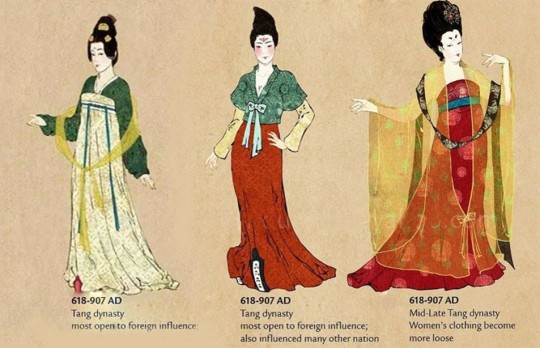
fig. 8 Evolution of Hanfu
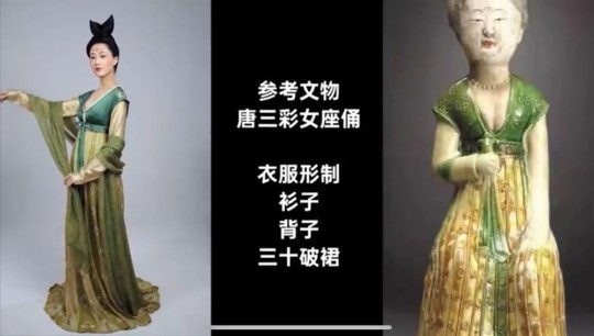
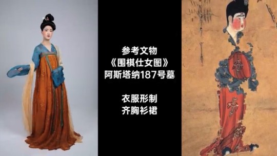
fig. 9 Tang Hanfu recreated with references from Tang artifacts (top: early Tang; bottom: golden era of the Tang period)
For whatever reason it seems like the extras in the background have more accurate costumes than the main character
And as a girl from a farming village why is she being trained like a noble lady??? A question I’ve had since the animated film…
The film wasn’t consistent when taking artistic liberties. Audiences subconsciously make visual connections to historical periods when watching a historical fiction film. It would be visually more cohesive if artistic liberties were taken on elements from one dynasty or by combining elements from dynasties with similar aesthetics, instead of jumping across centuries of very different stylistic approaches.
Basing the set design on the Tang Dynasty, but then including random shots of Qing Dynasty architecture of no particular importance (two very contrasting architectural styles); extras having Tang-style Hanfu, but Mulan not having one that's remotely close to any style of the multiple dynasties the film has taken inspiration from; alluding to the time period in which the ballad was written by painting Mulan’s forehead yellow 黃額妝 (which was poorly done but I digress), a style of makeup used by women of the Six dynasties and the Southern and Northern Dynasties (六朝女子), but everything else alludes to Tang or later. And finally, basing many things off the Tang Dynasty, but the Tang wasn’t in risk of invasion from the Huns or the Rouran??? We’re fucking confused :)
Small details like the ones we’ve listed above are visually off-putting; as an audience member I’m immediately thrown out of whatever universe the film is building due to the contradicting visual cues. If this was Disney’s and the director’s attempt at cultural accuracy, then it’s plainly insulting to the intelligence of their Chinese audience. (Respecting cultural concerns should not be Disney’s scapegoat for producing a bad movie.)
Ultimately, the film is based on a ballad and we wouldn’t say the points we’ve mentioned are considered common knowledge. So let’s treat it as a fictional era and put less significance on historical consistencies and authenticity. Let’s narrow it down to the crude representations (and misrepresentations) of general Chinese culture and society.
On Stereotypes
“Chi”: Why are soldiers receiving chi-related martial arts training, which takes years and years of elite, specialised training and experience? Ordinary soldiers don’t train their chi, they are not Wuxia 武俠 (roughly translates to martial arts chivalry). These people aren’t training for Jianghu martial art contests (江湖俠道的比武), they are training to kill for war, which does not require finesse at all. Even disregarding the lack of logic in training ordinary soldiers in martial arts (especially them teaching Taichi in the film), logistically it is simply not worth the economic and time cost of training entire regiments in martial arts only for them to be mostly killed off in battle. (Sorry, it’s difficult to explain wuxia and jianghu in a few words, but they’re super cool so please search them up if you’re interested!)
Many others on tumblr have commented on how chi itself is not the weird masculine "power" the film made it out to be, which is also very true (it's also actually very interesting so search it up if you want to!)
On Language as a Limitation
Clumsy translations of Chinese idioms and phrases that are just tragic comedy, e.g. 四兩撥千斤 being translated into “four ounces can move a thousand pounds”, which neglects the subtlety and gentle vibe of the original word choice while twisting the concept into something related to brute force or physics (but we guess this specific example is not entirely the screenwriters’ fault, since some English Taichi classes also translate it as that).
Replacing Chinese concepts and mythology directly with Western concepts such as witches, phoenixes rising from the ashes etc.
The single clumsy reference to the original “Ballad of Mulan” 雄兔腳撲朔,雌兔眼迷離;雙兔傍地走,安能辨我是雄雌?(translates to: when being held by the ears off the ground, male rabbits would have fidgeting front legs, while female rabbits close their eyes; who’s to tell male and female apart when the two rabbits are running side by side?) This line is an acknowledgement and compliment to Mulan’s intelligence and capabilities. It also challenges patriarchal beliefs of gender and women.
On Traditional Virtues (or the oversimplification of them, and a continuation of Language as a Limitation)
The film’s traditional values of 忠勇真 (translated as loyal, brave, and true in the film by using the most direct translations possible) and 孝 (translated as "devotion to family" in the film) seem to be a reference to the core values of Confucianism. We assume that the film is referencing these Confucian core values: 仁 (to be humane)、恕 (to forgive)、誠 (to be honest and sincere)、孝 (filial piety) and 尊王道 (to be loyal to the emperor). If the screenwriters were going to use traditional values, it is curious for them to choose only those three specifically, and to grossly simplify the actual values in their choice of Chinese characters (instead of using the conventional characters), then to grossly simplify them again in their English translations, and then to put them together in that order. The film also just briefly goes over the values by plainly listing them out in the form of an oath, thereby erasing the complexities of the values...
In a hilarious weibo post by 十四皮一下特别开心, they point out that the three values of 忠勇真 used in the film actually directly translate and correspond to the FBI motto of “Fidelity, Bravery, Integrity” :)
Let’s talk about 孝, the fourth traditional virtue engraved in the sword gifted to Mulan by the emperor at the end of the film. Over everything else, this is the original ballad’s central moral, and what we believe the film is also trying to evoke, so the weak translation diminishes the story’s message. The animation was smart in not directly translating it and instead demonstrates what it entails through the progression of the plot. The film does the opposite and translates it as “devotion to family”, when they could have just referred to it as filial piety. Care, respect, thankfulness and giving back to one’s parents and elderly family members. While obedience and devotion are part of what the virtue teaches, it's not supposed to sound like an obligation, it’s not something ritualistic, it’s just something everyone does as a “good” human being.
(And if the director and screenwriters were trying to diminish the role and significance of filial piety in the film on purpose because they wanted Mulan to appear “stronger” and “individualistic”, then… I really have no words for how painfully insensitive that is in terms of how white feminism does not and should not apply to or be imposed on other cultures.)
And here’s our list of Things That Also Pissed Us Off that other people on tumblr have talked about already, which is why we’re mentioning them without much elaboration:
On Feminism
We get that Disney was trying to make a female empowerment movie but they really missed the mark? Even with a female director, somehow. Stepping back and ignoring the Chinese aspects of the film, as a female audience this film was equally, if not more, hurtful
Mulan is only seen as “strong” because of her extraordinarily powerful “gift” of chi that led to her being physically more powerful than the men, especially in that scene where she lugs the two buckets of water to the peak of the mountain (which is in sharp contrast to how Mulan in the animated film is strong because she’s intelligent and is able to utilise teamwork and her strengths properly, and doesn’t let her understandable disadvantage in terms of physical strength trip her up)
All female characters are one-dimensional as fuck and are mere caricatures (though to be fair, the male characters aren’t treated much better) BUT PEOPLE, MULAN IS THE MAIN CHARACTER!! Her name is literally the name of the film!!! Maybe give her some character??? And what happened to wanting to produce good Asian representation in Hollywood???
The character of the witch was slightly more complex than everyone else, which, good for her, but then the screenwriters had her killed when she could easily have not been written with that conclusion to her arc?? Seems to us like some bullshit where the witch had to be punished in a narrative sense because she “succumbed” to using her powers (which are again dubiously chi-related) for “evil”, when instead she was merely trying to achieve as much as she could for herself in a patriarchal system designed to punish her
Plus the implication of writing the sequence of the witch sacrificing herself for Mulan is that Mulan is inherently more worthy of protection because she’s more “noble”, which, again, we call bullshit. Mulan achieved (impossible) success and validation in a patriarchal system because she played by their rules of what it means to be a masculine “warrior” and excelled, while the witch is scorned and punished within the story and also in a narrative sense because she doesn’t. Is that really what it means to be noble and good???? Does that really make Mulan superior to the witch?? (Honestly this plot point might have worked if there was more complexity written into the script, but unfortunately there wasn't)
Can’t believe they just threw away what could have been a perfectly complex and compelling relationship between Mulan and the witch because of shitty writing
The way Mulan lets her hair down and dumps her armour as an indication of her female identity (which is irritating to us on so many levels, as explained by various tumblr users)
On Production
Plot and character arcs have no emotional tension; they’re super rushed and super shallow; emotional beats are not hit properly (e.g. Mulan’s loyalty and friendship towards the soldiers, built up with one line from Honghui “you can turn your back on me...but please don’t turn your back on them” kind of bullshit)
The screenwriters would not know character depth or development even if it were shoved in their face
Blatant symbolism and metaphors (e.g. the fucking phoenix, and thank fuck it doesn’t look like a western phoenix) that make the film feel very… low.
Cinematography and editing: some very beautiful and compositionally interesting shots, but the battle scenes lack tension. The jump cuts disrupt the rhythm and intensity of the fighting; in combination with the overuse of slow motion, they drag the pace of the choreography and further slow down the rhythm of the scene. Exaggerated colour toning make certain scenes more fantastical than others, resulting in a mix of realistic landscapes in some scenes and highly saturated unnatural colours in others, which draws the audience in and out of the film’s universe. This is a shame because they actually took the effort to film in real landscapes.

fig. 10 Scene in film
Special effects: lack of blood in battle scenes (which, fine, they want it to be family-friendly) and Mulan’s suddenly clean face after she returns to her female identity visually puts off the audience (and links back to the issues surrounding the visual representation of her femininity)
And here’s the extremely short list of Things That We Liked:
That first fight scene between the witch and mulan when the witch brushes mulan’s hair away from her face with her claw while restraining her because that was gay as fuck and I am but a weak bisexual!!!
Donnie Yen’s action sequences lmao (they’re not even among the better ones he’s done so everyone go watch Ip Man for actually good action sequences and choreography)
Just listening to the soundtrack itself was great, loved the Reflection variations but I was simply too distracted by the other shitty things in the film
All-asian cast (thank fuck) with impressive actors and actresses (who should not be blamed for a shitty script)
TL;DR: This film is not worth your time or money. Inferior to the animated film (which already has a few questionable aspects). If you’re somehow really interested in seeing how badly Disney butchered Chinese culture (and to a certain extent the animated film), then just pirate this film. If you want to know what happened but can’t be bothered to waste your time watching the film, read this amazing and hilarious twitter thread by @XiranJayZhao, which we found right before we posted this review, and pretty much sums up our viewing experience as well.
Disclaimer: At the end of the day we're two girls from a predominantly Chinese society who are used to Chinese period films and dramas, watching Mulan (2020), a film primarily meant for Chinese diaspora and audiences in the West, with the Chinese market in Asia being just a secondary economic opportunity for Disney. We do realise that we aren't this film's target audience, and that we're not at all experts in everything we've discussed in this review. A lot of this is just us nitpicking, and all of it is just our personal (and very emotive) opinions from watching this film. Mostly we're just disappointed that the film was advertised to be relatively realistic and culturally accurate, but… wasn't.
Sigh.
Btw please feel free to ask us for recs of actually good, actually Chinese films and shows lmao.
Finally, all the love to our beta @keekry, for her many suggestions and hilarious comments!!!
#mulan#mulan 2020#mulan 1998#mulan live action#chinese culture#chinese architecture#chinese clothes#chinese costumes#chinese fashion#hanfu#mulan spoilers#long post#film review#disney#as a side note i have no idea why everyone thinks it's pronounced xian lang when in fact it's xian niang
16 notes
·
View notes