#i also loosely based this on a sketch of a character i found from a few years ago...
Explore tagged Tumblr posts
Photo

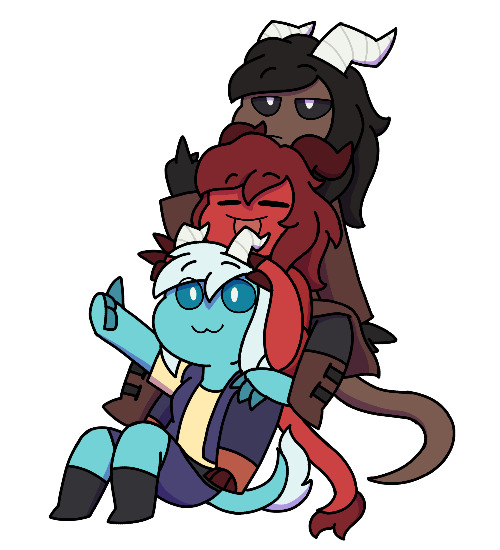
u ever see a guy and immediately think “i have to make a Guy like that”? thats what i did with this guy
#oc#original character#sketch#pareidolia tag#oc: måns#thats what ive decided his name is idk#i also loosely based this on a sketch of a character i found from a few years ago...
11 notes
·
View notes
Text
DVD Commentary: Out of Nowhere
I got a request from @doshiart for behind-the-scenes commentary from Out of Nowhere. @shamelessdvdcommentary
Give us some stats - (when you wrote it, word count, how long it took to finish, is it a one-shot/multi-chapter, etc) 86,511 words, 15-chapters. I wrote it between November 2022 - January 2024.
What was the initial inspiration for your story? I love murder ballads. I love graphic novels. So when I saw the book In the Pines at my local library, I snatched it up. This book takes old murder ballads and turns them into short stories, told in graphic format. My favorite one was "Where the Wild Roses Grow," based on the Nick Cave song.
I took some very loose elements from this story: A secluded property, a guy escaping from prison, a person protecting their family's gold. The prisoner wooing the gold protector in order to get close enough to rob them. Doesn't that scream Gallavich?
In the murder ballad there's, well, murder. The prisoner dies by the end. Boy, was I tempted to do that in my story.

What was your favorite scene to write? In each story, there's a scene that pops in my head early on that I base the whole setup around. It's the one that I'm gleefully waiting to write. For this story, it was the "cleaning guns" scene in chapter 7, when the sexual tension is high and Ian tantalizes Mickey as he works.
How did you come up with the title? My favorite murder ballad of all time is "El Paso" by Marty Robbins. There's a line in that song, "From out of nowhere, Felina has found me."
The placeholder title was "Gallagher Gold."
Are there any little moments or references you hope readers will notice? I made this note early on: "Ian has a high PHYSICAL IQ. Mickey has a high VISUAL IQ." I used that to make character decisions throughout. Ian was good with his body and his posture. He was good at carrying things and balancing things, climbing and shooting. Mickey was obsessive about patterns and puzzles and solving challenges.
Was there anything you struggled to write? If so, how did you overcome this? Chapter 13, oh my god. That's the hardest thing I've ever written. I was dreading it for months. It's a tense culmination of everything the story has been building to: love, betrayal, physical and emotional pain. The land gets torn up, and so does their relationship. I overcame it by taking lots of deep breaths and writing small chunks every day. I made sure that every sentence was exactly what I wanted to convey, without letting the prose take its own (lazier) path.
Favorite line in the story? “I’m not a fucking Viper.”
Did the storyline change in any way as you wrote the story? When I started this story, I was sure that I didn't want to do another long multi-chap fic. I outlined it as a 5-chapter short, maybe 30,000 words. Then the "what if" whispers started happening, and it grew to a full 15-chapter outline. Most of the chapters had very short descriptions. One was just "fun and games on the land." One was just "This wasn’t supposed to happen, Gallagher."
Other possible settings included: an abandoned church with a small cemetery, and old hospital, a forgotten amusement park. I wrote "somewhere old-timey that would have land."
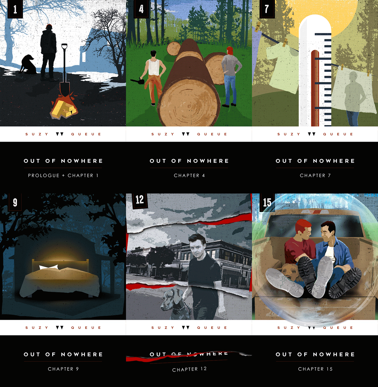
What are you most proud about in the story? (plot, characterization, dialogue, twist/cliffhanger, etc) The art! I had so much fun with it. I based the style off the old Penguin classics, like the Grapes of Wrath cover below. (Where they had the little penguin, I put the double-triangle Viper tattoo). I'm also showing my concept sketch for chapter 1 art.


Are there any ‘behind the scenes’ info you’d like to share? I hand-wrote the story first, and it filled two notebooks:

Here are some research shots on the land and the equipment:

I took this photo while I was working. Welcome to the inside of my brain:

Reading back the story now, is there anything you’d change or add? I was itching to dramatize more of Ian and Mickey's lives while they were apart. It would have been fun to have 5-6 chapters of them learning to be whole humans again. But ultimately, that wouldn't serve the story. I did a time jump instead.
Are there any ‘easter eggs’ in your story - e.g. references to other stories you’ve written, a trope you often use etc? The story is set in Fox River Grove. This entirely happened because @lalazeewrites introduced me to the town in their comments on Estate of Blood and Trust. So the events of EOBAT and OON are taking place in neighboring towns!

Did you have a beta or a friend who helped you as you wrote? @mzshko helped me figure out the best way to structure chapters 2 & 3. She was patient enough to read an alternate fully-written version of both chapters and tell me which option worked best.
Anything else you’d like the readers to know about the story? Three months into writing this story, I stopped and did a self-analysis because it wasn't igniting. I wrote, "Could it be that I haven't put enough of myself into it?" So I re-evaluated and dug deeper and made it as personal as I could.
I can't emphasize enough how interwoven details of my own life were in this story. I helped my dad install that big aluminum gate in the woods. I used 5-gallon jugs of water to brush my teeth and sponges to bathe. I washed clothes by hand and cooked on a propane stove. I hauled and stacked logs from fallen trees. I had a love/hate relationship with my family's land and ached to be back in civilization, like Ian. My dad used to tell me bedtime stories about escaped prisoners (Mickey?!) roaming the woods and killing small children.
This story is a love letter to my dad, who was dying the entire time I was writing. He passed away in May of 2024.

This is open to all writers! Pick your favorite story you’ve written or your most popular or the one you think deserves some more love! Or ask your followers to suggest their favorite fic of yours!
22 notes
·
View notes
Text
No Small Feat Art pt. 11 - Seige of the Tower of the Tomb
By request, I’m gonna show off some of the artwork for No Small Feat, a Midgaheim story my friends and I told through the TTRPG system Fabula Ultima. I drew a lot of characters and monsters for it, and my friends - in particular, @dragonzzilla, @scatha5, and @dinosaurana - helped line and color them so we’d have cute little sprites to use on our online battlemaps, which really helped sell the whole “we’re playing an oldschool turn based RPG” vibe that Fabula Ultima’s system is going for.
This is the final part, the end of No Small Feat! Obviously we're going to look at the final boss, but first, we have to talk about her flunkies.


Given that the Fabula Ultima game system is based primarily on JRPGs like Final Fantasy and Chrono Trigger, I felt that it was customary to make sure the heinous arch villain had at least one crew of goofy, lovable henchmen. A Sephiroth is not complete without the Turks, a Magus is not complete without Slash, Flea, and Ozzie, et cetera. So Maelys had a quartet of mercenaries in her employ, who very much were not in this for loyalty to her or her ideology, but rather because they needed the money and most people don't hire clowns in Midgaheim since they're a variety of cambion (half-demons). These ladies are The Jester's Jape, entertainers, carnies, thieves, and ne'er do wells. Their leader is Scarlette, the harlequin. their mage is Bianca, the Pierrot. Their muscle is Azurite, the Buffoon. And their wildcard is Obsidianne, the Mime. I introduced them a little later in the campaign than intended (both because I didn't have finished art of them and because it took a lot of revisions for me to be satisfied with their moveset as minibosses), but they made a lot with the screentime they were given, and hey, cambions don't have a built-in expiration date, so nothing's stopping me from using them again.


After befriending the clowns in their third and final encounter with them, our heroes mobilized to the top of the tomb tower where Maelys was waiting, having just graverobbed the last crown jewel and, with the aid of the seven princes of Hell itself, forged two false crown jewels to complete a crown of her own and become the new queen of the country.
Sadly for her, the forgeries didn't prove adequate.


As all the rivers of magic running through Engelsex convered inside her through the warped crown on her head, Maelys was overwhelmed by their power and twisted into a hideous shape that reflected her inner malice. Our heroes proceeded to beat the shit out of her, as you do when you've done all the sidequests in an RPG and got all the overpowered loot that comes with them.


But no good JRPG boss would only have ONE transformation, so of course Maelys crashed harder than a Resident Evil boos and turned into a nightmarish beast, one that was further warped to resemble two other monsters who had contact with the crown jewels - Kaboldt von Hubert's doppelganger, and the Ravening Beast. Our heroes summoned their closest allies - Leonie, George, and Jack - and also the Jester's Jape, why not, and destroyed the evil wannabe queen once and for all.
And so the day was saved, a new crown was forged, and a worthy successor was found for the throne. To know more than that, you'd have to watch the campaign, or, like, wait several years for me to transcribe it into a book if I ever get around to it. I might, honestly. I miss Leonie.
As a final treat, here are some loose sketches of character designs for the campaign, some of which never got the finished penncil treatment:

Figuring out Kaboldt's doppelganger look took a lot of experimentation.

Same goes for the Ravening Beast, who went through SO many designs before I settled on one that worked for me. One of his early designs got reused as Big Bubba Bugbear.


The jester's Jape went through a lot of concepts too.


I had loose ideas to give George, Jack, and Leonie costume changes for their cameos in the final boss fight, but didn't end up having enough time to finalize them. We get to see George in his non-dragonslayer armor, Jack looking a bit less frail, and Leonie sporting the dragon-themed armor the PCs gifted her at the end of the Menagerie arc.


Oh, and I didn't know where to put it, but at one point the PCs met, and later robbed, Leonie's dad, which meant I had to give him a character design. I tried to make sure his clothes were as tasteful as those that would be worn by a rich medieval merchant who had access to magic dyes.
There was also merchant character that was intended to be a one-off named Long Lankin that the players and I kind of fell in love with who I drew sketches of, but those got lost in my big computer hullabaloo this summer, so unfortunately I no longer have them to share. But I liked him enough that he'll probably show up in another Midgaheim story one of these days.
16 notes
·
View notes
Note
What's your usual process? Do you have a sketch layer and then a lineart layer or do you directly draw onto your sketch layer?
Here's the process for my last piece! I'm gonna try and explain my reasoning and add some art tips too.
I started out with an idea: a diver is playing hide and seek with a little mermaid and lots of little fish (I also had an older piece with the same concept).
Then I made some simple thumbnails.
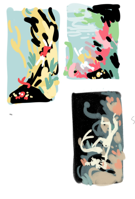
The third one was my favorite. I liked how the dark background and light characters made the characters stand out. The other two ideas were too busy with the colors.

Loosely sketching on top of the thumbnail. I knew the characters would stand out in white, so I paid attention to the flow of their silhouettes. I really like how I got it so that the shape of the diver leads the eye into the merguy, and then the tail of the merguy leads the eye back to the diver.
Next, going straight from the sketch to colors. I think doing this preserves the energy of the sketch, and also I hate doing neat lineart.

Base colors. Red underpainting to give everything a warm undertone.
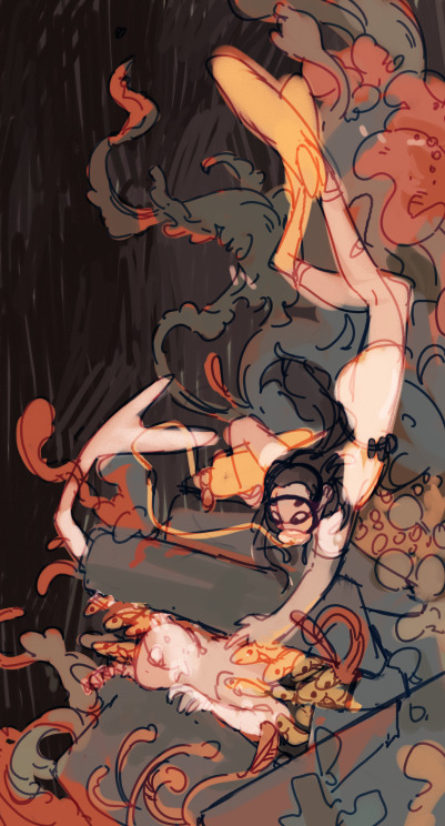
Blue, red, and a little green for the colorful corals. Yellow and light colors reserved for the characters to make them stand out.
Also changed the sketch layer to be blue, and set it as an overlay layer. I like how this makes it blend in with the colors.
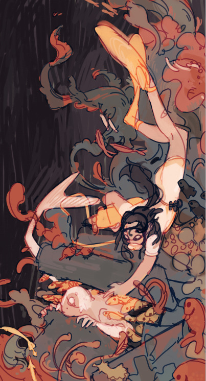
Adding the fishes and more details.
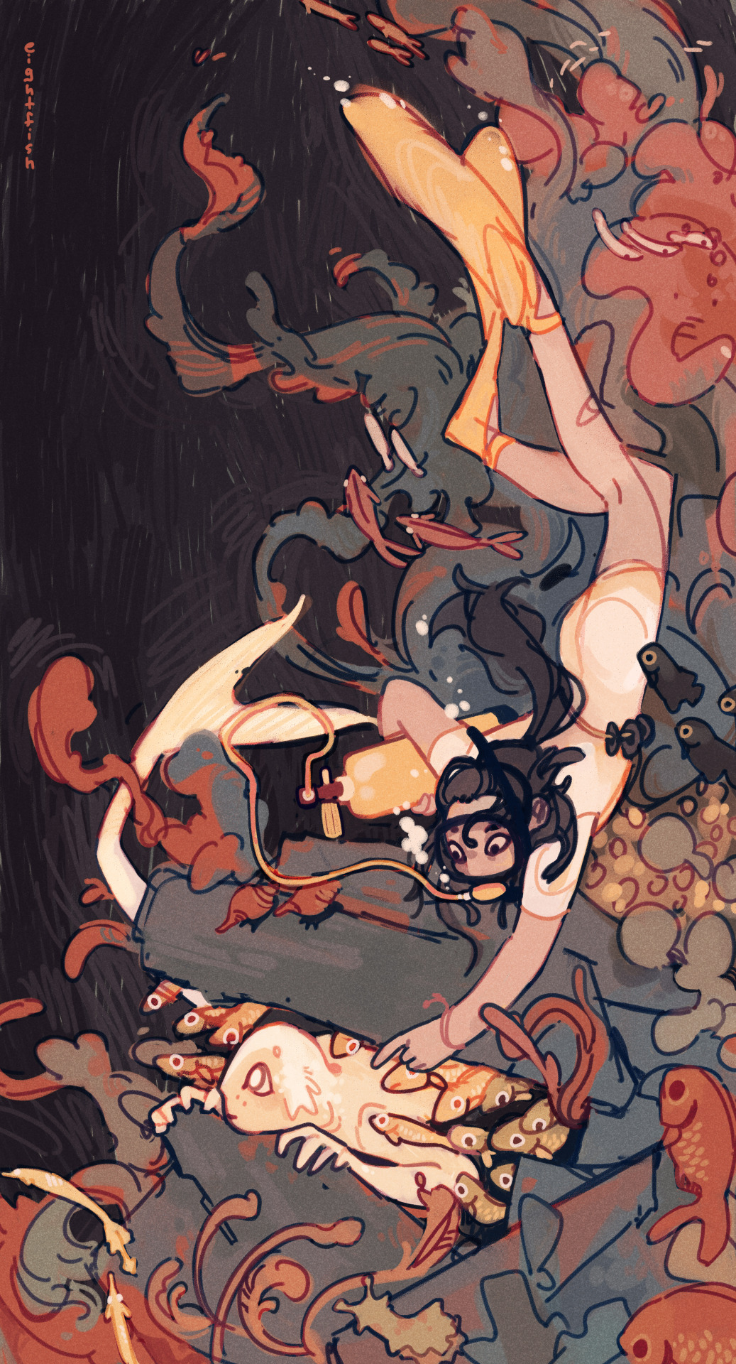
Then I merge all the layers together and paint on top of it to make sure everything is clear. Done!
I also added a simple texture (default watercolor paper texture in PaintTool SAI) as an overlay layer.
In general I have a fairly minimal process that doesn't use many layers or special effects.
I like drawing fast without thinking too much about anything besides how the piece is looking, and I like my pieces to have a loose and energetic feel. So I use one brush for everything, paint on mostly one layer, use only one or two sketch layers, and don't spend much time on rendering. It's just what I've found works for me and what I like to draw!
If I had to give a tip what helped me find my art process, I'd say experiment and spend more time on things that are important to you and you like doing, and cut out the things you don't like doing. So for me, that means spending more time on coming up with ideas and composition, and not spending time on lineart or meticulous rendering.
Hope this was interesting to read and feel free to send me any other art or comics questions anytime :)
116 notes
·
View notes
Text
Redesigns Redesigns Redesigns !
And a rename!
🪲☀️🪲☀️🪲☀️🪲☀️🪲

More info below + solo + sketches below cut!
Because I had redesigned cheddar I was looking back at my other two favorite girls, Riley and Boon, and found myself cringing at their designs. They were…okay! But not good anymore! Riley still looked like a sona despite her now being her own character and boon…boon was something else
🐜🐜 Riley Red 🐜🐜
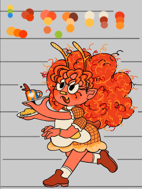
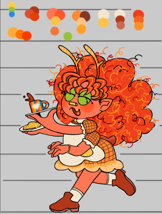
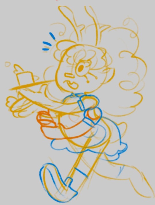
When redoing Riley I wanted her to look super sweet but is surprisingly rude despite her appearance (cliché diner server from the movies). So making her shorter and chubbier instead of mean and lean looking like previously got that part down, all that was left was the hair which was thankfully easy thanks to her design for @/evillillad metal au I realized she look good af with bangs! I also ,add it more everywhere because she only has time to fix her bangs before back to running food! (Also gave her a beaded bracelet that is the same colors as poppy’s neck feathers) (they are gfs cause I said so)
But otherwise Riley is still the same! Same mean lesbian that hates her green bean rival who makes absolutely rancid hot dog combinations across the street
Regarding her diner: still working on an overall design but 85% of the dishware was made by Wally Darling (and friends)! Riley commissioned him for it. The rest she bought from (unfortunately) Howdy!
If she has any merchandise it would likely be similar to those toy kitchen sets or a paint it yourself dish kit for kids
🌧️🌧️ Misty Gloom 🌧️🌧️
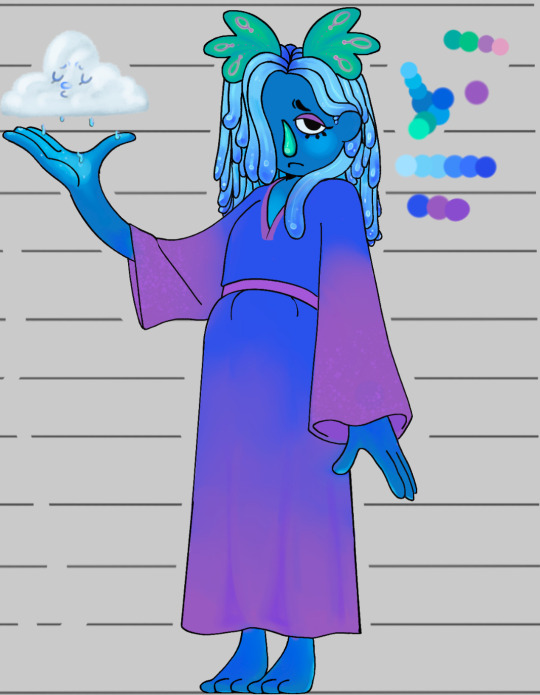
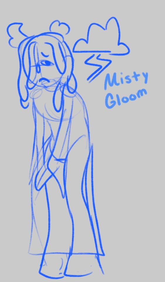
For Misty Gloom (Originally Boon Gloon) I wanted them to be something else entirely. I disliked their original designs because while it was fun at the time it got annoying pretty fast. They were originally made for nsfw but I never actually did it! So last night after smoking a bowl with my bestie I came up with the idea: Rain Monster. Rainbow monsters exist, so why can’t a rain monster? So I got to work on making them look as wet as possible- their horns based off sea lettuce and their hair made to look like jelly, I actually got happy with the idea! The bottom of their feet and the palms of their hands I wanted to make it look like and ombré similar to rainbow monsters (I would say they are distant cousins!) for the clothes Rain monsters usually wear loose fitting clothing so I made them wear a caftan dress that was popular in the 70s
Info regarding rain monsters: Rain Monsters are a lot taller than rainbow monsters. They have longer arms fingers and more unique horn shapes and colors (made to look like camouflage). Similar to rainbow monsters when it comes to flowers, rain monsters actually whisper to the clouds and help them collect rain. Think of it like caring for animals and farming! Once the clouds have collected enough water they guide them where to go as a way to keep everything balanced. Throughout the forest and towns they have rain water buckets which they collect after every storm. What they do with it is a mystery. Rain monsters, at least most, are a very reclusive group, often staying away from others that aren’t their own. Of course they will talk to you, but don’t expect them too be excitable like their cousins the rainbow monsters!
Misty would normally be slouched over but for height comparisons I made them stand up straight for this one!
Misty would probably not have any merchandise herself but her species overall the merch would be make your own horns kit or a rain collector bucket
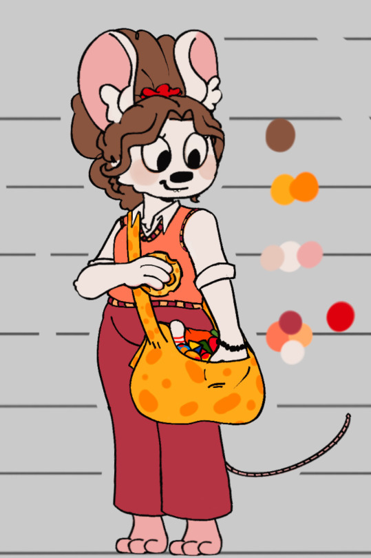
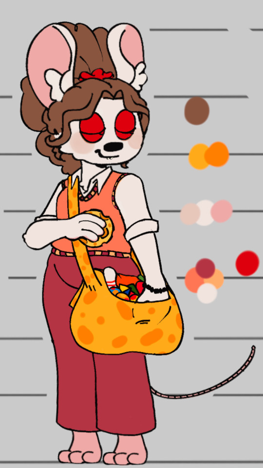
🐭🐭 Cheddar close ups 🐭🐭
#welcome home#welcome home oc#riley red#misty gloom#procreate#my art#rambles#puppet oc#oc artwork#oc concept#squish the goober#i started this yesterday and haven’t stopped till I was finished!#I have a few other characters to do#but for my most frequent flyers these three had to be first!#I wanted to make them look like they belonged in Wh somewhat#also fun fact with Misty’s hair is that it is based off the jellies that you would sticky#on doors but it’s more smooth and less sticky!#rain monster#puppet#welcome home puppet show#cheddar monterey jack#also cheddars height is more closer to Sally’s#and Misty’s height is taller than eddies but short her than howdy poppy Barnaby#bye bye!
37 notes
·
View notes
Note
How do you go about formatting your comics? I’ve always wanted to make a comic but formatting it has always been a struggle..
Also don’t forget to drink water and care for urself
Drink has been acquired! Grab yourself one too, it's "Vane might ramble too much" hours!
Keep in mind that my formatting is what works for me, so it might not work for everyone. I also use Clip Studio Paint (EX), so some bits might work for other programs, while some might not. I also can't for the life of me remember the difference between CSP Debut, Pro, or EX so I'm sorry if I mention features you might not have.
I'm gonna cut the post here, so it doesn't take up too much space on the dash :D
Alrighty! I'm not completely sure what you mean by format, so I'll just do a quick rundown of my process!
Script
I usually start with a script. It can be as loose or detailed as you want it to be, but mine usually are something like this:
Character A: "Says a word!" Description of scene or action
Character A: "Says more words!" Character B: "And more words are said"
I use gaps in the text to signify a panel break. So this would be two panels! Keep in mind your workload, and don't put in too many if you're not ready for it.
Sketch
After I finalize, or at least have a general understanding of my script, I get a canvas around the size that I think it'll be. I usually start out with about 1800x8000, but you can adjust it based on your needs.
I like to try and sketch out a rough idea of how I want the comic to flow. Using my script, I sketch out the panels and toss in where I think the text bubbles will go. Here's the latest Wanderer update as an example! (Yes I usually use the first draft sketches for the final product, don't worry about it lmao)
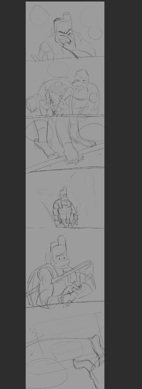
I do a sketch of the entire thing, which helps me resize as I need.
Panels
The panels were always the hardest part for me to figure out before I started working on Wanderer. Again, this is what works for me. It might not work for everyone, and this is also just how I set up this specific comic.
Let's get some boxes going. Go to the Frame Border option, and select rectangle frame.

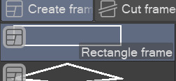
It needs to be on create frame!
Click and drag one giant box over your sketch. I'm using an excerpt from the above sketch for example! You can click the frame layer itself, hold ctrl down and adjust the width of the box.
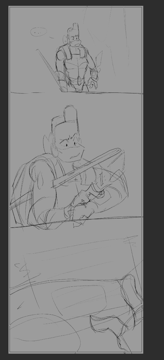
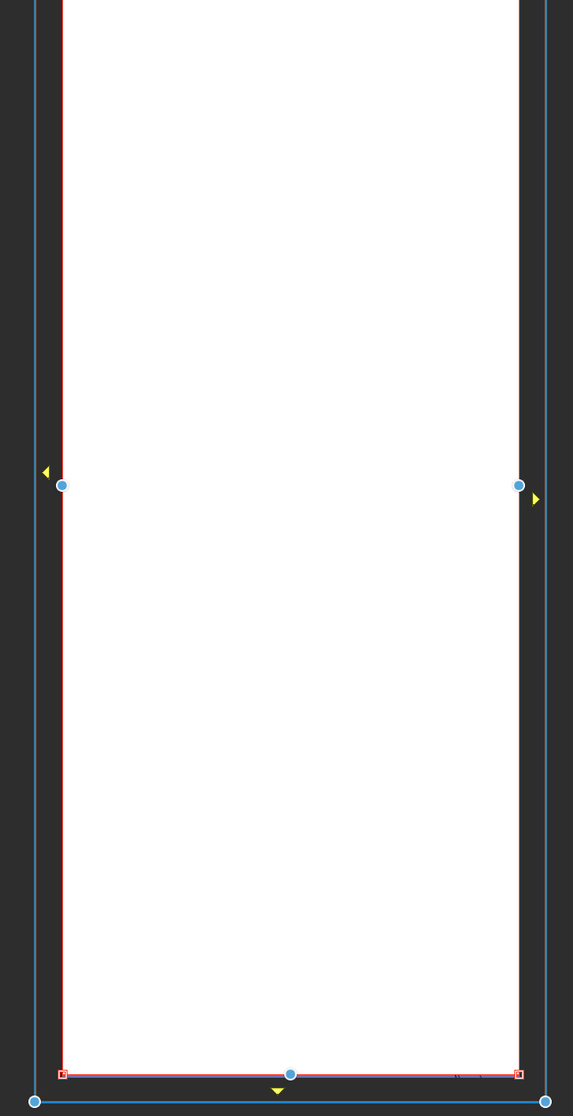
Delete this layer:

and move your sketch above the frame layer so you can see it!
Now we just split the panels up how you want them. Next to where you found the Create Frame option earlier, there should be a Cut Frame option. I personally use Divide Frame Folder, so everything is contained without bleeding through to other panels.
You can mess with these:
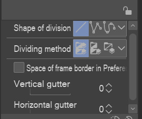
The "gutter" is just how much space is made between panels.
When making your panel splits, you can hold ctrl to snap to a 45° angle.
It might end up looking messy to the side, but each new frame folder will be like a new mini canvas for each panel. I find that color coding the layers helps me find which ones I need if I start getting too many.
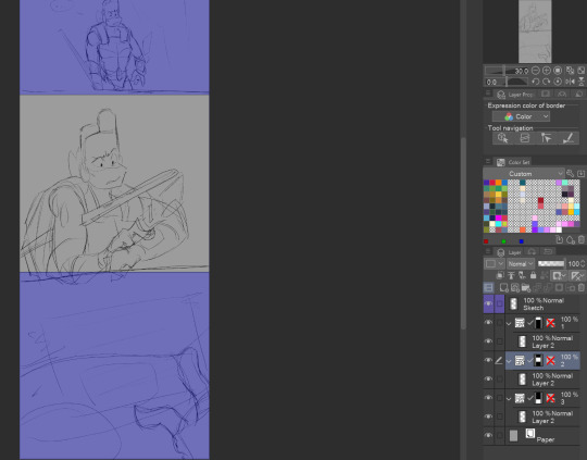
Here's a look at what it might look like based on what I've done for just this example.
And if we go to the actual file for the upload...
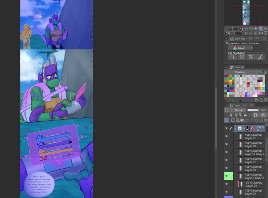
It keeps everything nice and organized, imo!
Okay, I thiiink that about covers it. Text boxes/bubbles and the such are easier to find tutorials for, so I'm not gonna cover those unless people specifically want those. But I'm more than willing to divulge... most... of my secrets haha.
As always if I need to clarify anything, just ask and I'll do my best to clear it up! Best of luck on your comic making adventures!
34 notes
·
View notes
Text
remembered some of my host design thoughts from 2020 just gonna straight up copy and paste them some grammar mistakes don't mind that too much
host design progress/thoughts/etc/etc
schmitty - when i listened to his (scared) tmp2 voicelines i imagined him (and did like 2 doodles) as a humanoid red quip. whether or not that's because me and my friends memed said quip a lot and i began assoisating the quip with schmitty might...idk be up in the air lol.
anyways i basically made him a human verison of the red quip and my human verison for him came later
cookie masterson - i think i listened to his F U easter eggs? and then boom. cookie, made his tie a ...cookie tie bc of his name lol
REDACTED - i think i listened to the tmp1 " voice reveals "? i forgot, man it's only been two months. anyways i know i based their look soley on something said on their tumblr page, " based raised in the woods ". and i made their " not shadowy " form not too long after
to quote myself: " well hes a serial killer or something right " . oh and i believe i made his shirt purple bc that color is sometimes associated with evil! woo. as for my first take on his Totally normal man in society he did not seem like a guy that could play off being a Totally normal man in society. he had fricking pink eye and was bleeding from his mouth and looked really sickly
todd - ah the funny internet man! my first design for him ..funky hair. i know i went through like 3 hairstyles for him and whether or not i wanted to give him shorts.
the 3 things that stayed through out all the designs are: shades, fire tie/fire on the pants and green crocs. now that i think about it his clothes are weird lol..
nate - soley based on his F U easter egg. " i'm pretty (fricking) expensive. " i also wanted to use a different head shape.
from my first sketch of him, nothing has really changed except for the stripes on his tie
guy towers - oh fgod my first reference drawing of him, the colors and design are pretty much the same now except i changed his shoes a bit and give him a short ponytail
idk hes the sports guy and sports people wear visors...yea
oh my gosh i think i gave guy a ponytail bc of some " au doodle/ the whereabouts of the ydkj hosts "
binjpipe - oh uhhhhhh ,is pink , hair shapes a b, she is the only character with a eye color (i guess bc i didnt really bother giving eye colors to any of my hosts)
my design for it has not changed, the onyl thing i added recently was circuits on her hands! bc . idk circuits are cool
schmitty but human - ohhey i found it, i imagined in his ydkj days hes just...pretty tired. hence gray hairs! and i know the tie i very loosely based on Funny Faster Funnier or wahtever it is
dr ro (hc name: dr.rangsey) - short science girl! idk i think the phrase " lab safety is mint colored! " fits her and thats something i thought about..and her colors are based on her game
again her design did not change much i think i just made the labcoat look better
hfelicia - ohhh i remember really wanting to make a design for her . i was like I GOTTA DO THIS.. and tentacles were a requirement. and a eyeball in her hair
one sketch i have is her with eyes on her arms which i believe i did put in, in her monster form . ok i just found when i got around to linearting and coloring, i realized her outfit was too similar to the mother in her game so i changed it (and ngl i was thinking of maid outfit kinda) i looked up vintage clothes and gave her something from that, and red shoes lol
guesspionage host (hc name: abigail s) - oh!! i doodled him on paper first, my final design is pretty different my gosh
my next sketch for him then has boots and a different head shape , uhh yea, eventually i made the shoes Not fricking big and i gave him some cool glove thing with...circuits! bc to quote on my reference page " epic shocking prank ". ngl that was mostly bc of gandra dee in dt17 bc she has nanobots or whatever on her hand and its pretty cool and i thought this host would be the kind to get stuff like that
and could be used for self defense i think? shocking hurts and its like ..opposite of binjpipes' kinda. his are on the palm while hers are on the opposite of the palm (??i dont know my human terms)
dandelion - design hasnt changed much either! and i hc him to be schmitty's brother so i uhh yea made them look similar somewhat. BUT MAN THE SHOES IN HIS FIRST DESIGN............not great. i added a bit more to his suit..jumpsuit? in my latest design for him! swaggy
buzz lippman - when i first heard him there were 2 things i know were needed - a tophat and yellow glasses
my first design for him isnt different from his latest deisgn, i jsut gave him a blue tie. blue as to tie into nate bc theyre cousins and i gave nate a yellow tie os yea
dixie - aww my first sketch for her was cute, i wanted something flowy, i made her somewhat angelic! and her dress has clouds ..and the thing around his waist and her cape are supposed to represent the millions of words made up! (vaguely bc no way am i gonna write words there) oh and the cape is kinda uhh like her wings persay!
civic doodle hostress and old man - AHHA my first doodle of old man was just a stick figure bc thats how hes shown in the ride. and i gave them both stick figure forms bc why not? EHAj i wasnt sure what colors to give to them at first so i used ms paint colors, AND OLD MANS BEARD WAS MADE OUT OF POMPOMS..God haa i didnt give him a beard at first when i finalized both of their designs
gene - referenced from his ingame look in sti, thought hed be a office guy so yep! and his pants have pixels similar to todd's sleeves , bc they are kinda a duo right
helen - awhhg she looks pretty anger in her first sketch and latest design...i thought of her color being green at first and man her skin color was more sickly
otherwise her hair style and form havent really changed. ohh there was a short time where i thought she was the ceo of binjpipe ..glad i didnt continue on with that thought, anyways stan helen bc she has to deal with 5 men sending each other to the bottom constantly </3 , or did so in teh ride
dot! - ah! my first digital sketch of her, really the two things that changed were her hairstyle and her pants. hairstyle is a thing thats stumped me several times lol, ooh her colors changed a bit too
ahh i wanted to give her a tuxedo shirt at first but i didnt 😔
bob - hairstyle REALLY stumped me with this one . and for my first digital sketch i quote myself " honestly keep seeing bob as bald " , then i saw the tvtropes page where it says he implies he has 80s hair or something and i was like " shit "
bidiots host (hc name: quant) - not much here, i based his suit on one i saw on a show we were watching in one of my classes. idk why i gave him a red gem thing tho, why not i guess!
dode - i know i looked up reference images for short hair! her design has changed p much the same the most ive changed were her colors
eventually i drew her ingame look :P
word spud host - literally a cardboard cutout, i think it was seriously inspired by box from inanimate insanity / a humanization of box that was a cutout cardboard and i thought it was nice
as for a serious design for them? maybe,
Ok um i guess the canvases are down here it goes august 2020 -> september 2020 -> started in 2021 minor edits here and then so this is most recent one 2023 -> december 2023
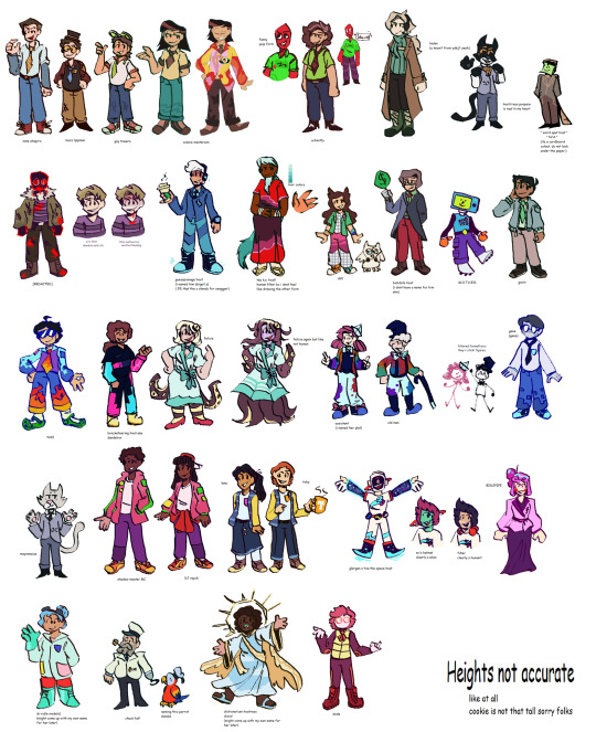
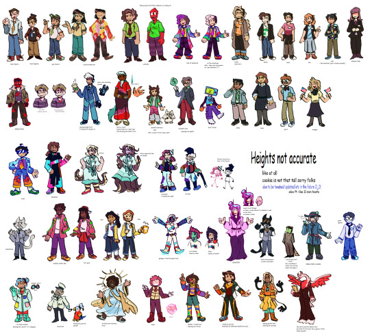
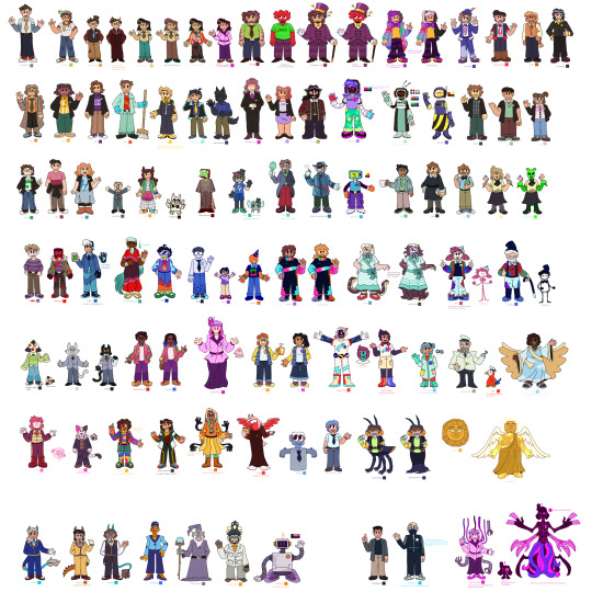

10 notes
·
View notes
Text
realized a post i wanted to make here didn't upload, so here you go:


first, here's some art for my tav, Alyraema Daevion'Lyr. I love how they both turned out even though the right one is obviously still a WIP (she will have clothes soon i swear)

a short a little comic. the picture i took didn't turn out as clear as i wanted it to, sorry about that. anyway, the little character is saying "Demisexuality/romanticism, I love you so much!" This is me. I'm the one in love with demisexuality/romanticism

I drew Kuromi in a cute little dress. also I drew Jaiden Animations' vtuber model because i thought it looked neat. used this to practice shading with colored pencils :3
also there's a bat doodle cuz i was bored

egg sheeran. that is all

little sketches i did for practice before making my friends' birthday presents.

little doodles i did because i was bored. two of the sketches are of my cat, Boba, because i love her so much <3
i also drew the magic conch shell from SpongeBob to practice still life (the room me and my friends hang out in at college has a magic conch shell and we ask it questions. it's fun :D)
i also drew little guys. one is high on weed because why not. the other is loosely based off of one of my good friends (who i may have a deep feelings for. no, i will not elaborate)

this was based off of an image i found on tumblr. it was a pretty neat image of vines on a lamp post that resembled some sort of creature. i unfortunately was not able to find it, but if someone is able to find it, please send me a dm and i will include it in a reblog of smth.

some practice with braids in two different styles. also a sketch of a bird statue i have in my room
i have some more sketches i may be willing to share if anyone wants to see more, but that is all for now. hope you enjoyed a look in my sketchbook!
#art#sketch#traditional art#bg3#oc#bg3 tav#demisexual#jaiden animations#kuromi#lilo and stitch#cinamoroll#sanrio
3 notes
·
View notes
Text

Where my Power Rangers fans at? This is a mini project that spawned out of a random sketch over the course of a couple days...
Power Rangers: Rainbow
(I wanted to call it Prism, but I recently found out an unadapted Sentai team was labeled as the Prism Rangers in PR lore. Anyways...)
This concept is based on multiple things, mainly magic, the colors of the rainbow, elements and gemstones. These Rangers come from Earth and realms beyond to fight an enemy seeking to conquer the world across dimensions. I don't really have that much lore figured out so I'll just briefly explain the powers of the individuals Rangers:
1. The Ruby Red Ranger

No team can function without a solid leader. Therefore, the Red Rainbow Ranger represents the element of Earth. Each Ranger is gifted a magical staff as the equivalent of their morpher, and this staff provides them varying levels of power to control their respective element. They can also cast a transformation spell upon their staff to become a specialized weapon. Red Rangers are often relegated to wielding swords, so I wanted something unique that still filled that niche. Red can summon a shovel that acts as a close combat weapon or a sidearm. Its main ability allows her to cause destructive tremors in the earth. I imagine this character as a roughly 19-year-old college student.
2. The Amber Orange Ranger

Like the rainbow, I wanted every other Ranger to function as a transition from one to the next. Quick spoiler: Yellow represents the element fire. So, my idea of a combination of Earth and Fire is Metal. As the second-in-command, Orange is tough as steel, and commands all metallic substances with his power. I had this loose idea of their weapons also reflecting their number in the team, so Orange can transform his staff into two, a hammer and a sword. Out of uniform, this character is probably one of (but definitely not thee) most different of the team because he is actually the 35-year-old metal/woodshop instructor at the college most of the characters attend. Besides the actual mentor figure (a talking rainbow dragon, did I mention that?) he often acts as a secondary mentor.
3. The Topaz Yellow Ranger

Yellow burns bright as the sun, so of course this Ranger commands the element fire. Typical of Yellow Rangers, he is a high-energy team player. Beyond being a Ranger, he is an athlete who mainly specializes in cycling (clock the shape of the helmet). This Ranger pushed me to think more outside the box with his weapon. He can conjure a three-barrelled device that functions as either a lantern or a flamethrower. I was thinking it could probably use a third function to remain on-theme, but I haven't come up with one yet... I imagine him to be 20-21.
4. The Emerald Green Ranger

Functionally the "heart" of the group, as green sits in the middle of the colors of the rainbow, this Ranger commands electricity. They keep the spirit alive! Again, I don't have much lore on these characters figured out. So far, this character is disabled (missing their left eye, wears an eye patch) and they're a tattoo artist. 21-years old. They have what I think is one of the coolest weapons of the group: a bo staff that collapses into a four quarter staff, but instead of being held together by chain links, it's electricity.
5. The Opal Cyan Ranger

There haven't been enough explicitly cyan Power Rangers for any kind of archetype to be applied to them, but mine is the youngest of the group, being a high school student who participates in a summer educational program at the same college. They represent the childhood amazement of superheroes, and for better or worse, they look at their work as a Ranger as a chance at having the best time of their life. They are a dancer who goes with the flow, seeking to experience all that life has in store. Maybe you've guessed, but they command the element of air. Their staff can transform into a weapon reminiscent of ribbons used in performance. This one can extend beyond its normal size like a lasso or a whip, and it can be used to conjure gale-force winds. 16-years-old
6. The Sapphire Blue Ranger

Blue, my favorite color! Surprise, surprise, she is the genius of the group. She majors in climate studies and seeks to be an environmental scientist. Her element is ice, an allusion to the archetype of Sentai Blue, who can be the cool, calm and collected types. I struggled with coming up with a weapon that represents the number six, so I just gave her a cool-looking pickaxe. But hey, if you look at the blade as a polygon, it does have six sides! 18-years-old.
7. The Amethyst Purple Ranger

The wild card of the group, this Purple Ranger hails from the aforementioned other realms before, presumably the same one the rainbow dragon comes from. Think of her as basically Wonder Woman or Nubia as a Power Ranger. She's a warrior who fights injustice and operates from a place of compassion. Functionally she is like the Pink Ranger of the team (although I have ideas for incorporating pink into the "special" Rangers for this team, haven't designed them yet). She commands the element of water, which can be gentle and healing, but also tempestuous and unrelenting. Her special weapon is a seven-pronged trident (probably not the right word cuz 'tri' is three, I know). Note the gold and silver blades, of which the silver are ejectable, harpoon-like projectiles. She's 22-ish.
Of my recent art, I'm genuinely most proud of this. As a newbie artist, you frequently look up every now and then and get a reminder of how much your skills have grown, and I feel like this marked a significant step in my journey. Again, this is hilarious to me because it all started as a random sketch. I had no intention of making the whole idea. Suddenly I found myself churning out each Ranger every two hours or so. It was fun. I wonder if I'll ever use them for a bigger project one day. Let me know if you like these 😁
#my art#fanart#art#comics#power rangers#super sentai#pride#pride month#artists on tumblr#digital art#digital illustration#digital drawing#digital artist
4 notes
·
View notes
Note
Any advice you might have for others who wanna publish but can’t seem to get their plots in order?
This turned into a lot o.o; sorry!
lol I'm not maybe the best to ask since it did take me more than 6 years to write a sequel to book I, but my advice would be to talk it through to someone else. Like verbally. Or maybe even to yourself! Explaining the plot (or something else important to the overarching story, like themes, motifs, or character arcs) can help me recognize things to work on. I talk to my partner a LOT!
Maybe the most important thing is to get things out of your head and onto paper (or a computer screen, as the case may be) so that you aren't trying to hold a lot of stuff in your brain that you don't need to be holding. Leaves room for the ideas and better organization. I'll expound on how I do that below.
I also like to zoom in and out of the story to help me keep perspective. When I feel like I need a closer emotional connection to it, I get real granular and write some dialogue, a dramatic scene or internal thoughts, or a description of some visceral physical thing, or maybe sketch some expressions or scene ideas. Might use it, might not. If I like something a lot, it may help me to know I need to move the story in that direction. When I feel too bogged down by stuff or directionless, I zoom waaaay out and write plot outlines or emotional arcs.
There are a few anchoring pieces that I build the story around. I take care not to forget them.
And of course I keep an outline of the story going, but I think it's important to keep things flexible. Why get hung up on putting things in a certain order or doing it a certain way when maybe it's better a completely different way? I've moved huge chunks of story all over the place. If it makes the story flow better or gives a scene a better emotional impact, then I do that! No rules, babey!
I think the thing that's hardest for me with this way of writing is not being able to share things as I write them, since I don't commit to anything. It makes it hard to stay motivated, because I'm not getting constant feedback and encouragement from people, but it makes the story easier to mold and form because I don't have to fit things to whatever I've already shared. If I write a big long chapter and two months later I want to completely scrap it in favor of something else, it's fine. There's no restrictions.
Oh btw my outlines are pretty loose and silly. I have a lot of stuff like this in them:


I also like to write out the various ideas I have to resolve conflicts so I can play around with them. I don't like to choose the easiest, cleanest options, I like to pick the options that balance sense with potential drama.
Example for the fight at the Motylek altar in book II chapter 9:
[MAJOR spoilers for book II below]
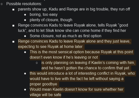
One other thing I found helps a lot is to have an exhaustive list of characters with their physical descriptions, ages, jobs, families, locations, basic personalities, and relevant beliefs in an easy to read format. I don't use all the characters I come up with, but it gives me things to springboard off of and helps me stay consistent. I made up and grouped dozens of Motylek villagers that I didn't end up using, but I had them ready just in case.
I've also found that drawing out the story in various visual forms helps me. For book II I drew all over a map where the characters were physically going and when.
[MAJOR spoilers for book II below]

I also like making visual aids for other aspects of the story. Below is a chart I made to figure out Ruyak and Kaelin's growing relationship in book II with its ups and downs. It roughly graphs Kaelin's confidence in Ruyak over time (it's not to scale, it's just based on significant factoring plot points)

This is just half the graph since the other half is book III stuff. You can see there are two horizontal lines I use for reference, the lower one is where Kaelin starts at the beginning of book II, the higher one is uh... something significant that happens later lol. You can see Kaelin's confidence actually started out higher before the start of book II and went down until Loske. This chart helps me keep track of where she's at while I'm writing so I can keep her behavior consistent even though I jump around a lot while I'm writing.
A thing of note: none of this stuff is set in stone when I make it! I changed things many times as I wrote, and added and removed things willy nilly.
I don't know if any of this is helpful or not! But it's what helps me, so... y'know.
11 notes
·
View notes
Note
helloooo you rbd the "ask me about my ocs" post from me so i am here to ask you abt them (even if you said youre not good at answering them. 😔🤝😔)
i would like to know... anything! about ur ocs :] but i know from experience vauge questions r hard to answer so maybe some trivia? like, howd you choose their names or designs. thatd be cool doesnt have to be the sol ones either !! or i think ur sol ones are also repurposed ones? so their original forms would be cool too. either way i would find it interesting :D
you are so nice to me
AND YOU KNOW ACTUALLY? NAMES & DESIGNS I WAS THINKING TO MYSELF JUST NOW "OH THEY AREN'T THAT INTERESTING" THEN I REMEMBERED NO? THEY BOTH HAVE NAME-AND-DESIGN STORIES? that I find funny anyway........
also i realise how long this is IM PUTTING IT UNDER A READ MORE.
the readmore fucking MOVED?
& ONLY cassius was repurposed . though like before SoL he was . essentially nothing . rotting in my beloveds toyhouse-folder w TWO images (NOW HE'S GOT THE MOST IN MY TH AT... 40...) because I didnt know what to do with him (and it's like... i don't wanna move him out D:) & then i made him in SoL and i think a neuron fired or something idk what happend . the moment I drew him w short hair it all went downhill i think . Anyway, so original cassius, he's named after (coughs) Cassius by Foals . I SAY THIS EVERY OTHER DAY I FEEL "LISTEN TO CASSIUS BY FOALS" (LINKED, THIS TIME.) BUT HE CAME ABOUT COS I SAW A TEMPT6T VIDEO WITH UHH

SOMEONE AS THE GEN 4 GUITARIST. AND FOR DAYS I WAS IN A STATE OF LIKE... ILLNESS? "I NEED TO NAME SOME OC CASSIUS" (....) "I WANNA MAKE THAT GUY AN OC" (....) oh mon dieu now there's a blonde guy in my brain . what the fuck . what the hell? who let him in dude dude dude dude what the hell . tangent but he even was in a band. at first. cos of course he was . a band, fun fact, based on AN OLD POKEMON BAND I HAD . WHICH I HADN'T TOUCHED IN YEARS . BUT cassius was based (i say based loosely) on a shiny minccinno/cincinno named "S I N" so that's fun & the bassist (i.e.) the only other one i . sketched (half-finished?) . i wanna say "oh haha he looks like alfie but with glasses on" but he doesn't . not at all ??? he would have had the same colour hair though. so that's like... the exact same character then
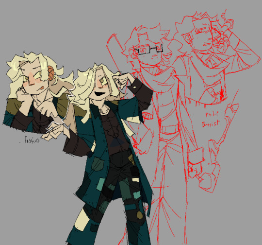

see. him? i wanted to put him here he hasn't seen the light of day in months . ok . where was i . oh yeah this was dropped pretty quickly cos i didnt know what to do with them LOL. now long-haired cassius has been repurposed AGAIN to be cassius' older brother in........the loathingverse! which is cool :-)
& even like i tried so hard to make him fit with the song back when but it NEVER worked and then he gets LOATHING'D AND NOW HE FITS? what the hell man
.
also alfie. alfie oh my god alfie can i say? can i start? do not look at me strangely for this but
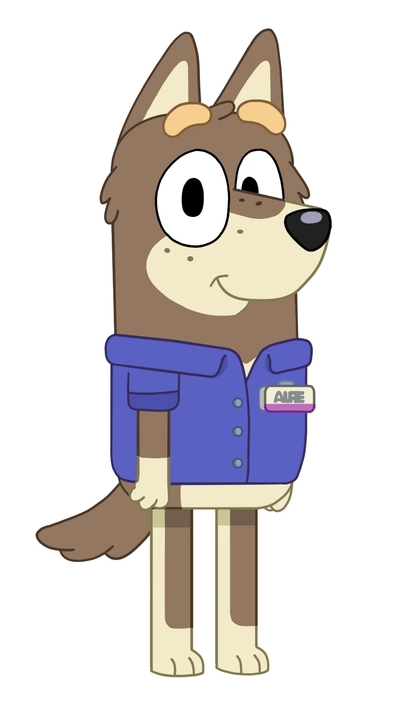
this was who he was based on. alfie from fucking blue y . i dont know how i found him nor why i wanted to make a character named alfie because of it but i did AND i needed a name for my achievement hunter (which i portmanteaued, horribly, into his last name) save file(s). So alfie achivunter it was.......... and AND THIS IS WHY HE'S LIKE. THE "DOG GUY". and thats why he looked like THIS at one point :
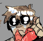

but i was making his ref & i was like. dear lord this looks atrocious . so im pretty sure i colourpicked from like . ron inside job or something (i distinctly remember being like "this sucks" "what if i made him look like ron instead" & i did) instead and now he looks NORMAL except NOW HE LOOKS LIKE CONNOR SCP CONTAINMENT AND RON INSIDE JOB???? like okay i feel mental every time i say this but like come ON . COME ON?

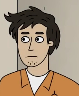

the Exact Same Man. ok???? i feel like a detective gone mental pointing to a board with red threads and photos like DON'T YOU SEE? IT'S ALL CONNECTED!!! THEY LOOK THE FUCKING SAME!!!!!!! THESE THREE LOOK EXACTLY THE SAME!!!!!!!!!!!!!!!!!
oh and fun fact alfie is short for alfred he really cannot win . have i said this before? i probably have
& one last thing I guess

these little dots beneath the eyes . it basically means he's got a little evil in him OR really, IMPOSSIBLE TO GET FORESHADOWING. unless you .... know...... the cosmosdex??? yeah. i thought itd fit AND right beneath ALL OF MY OTHER INSANITY. WITH AN ACTUAL LITTLE TRIVIA POINT? HUUUUM. OKAY?
#im normal#i dont know how i did this#i mean i do know. i . I WILL ADMIT#IVE WANTED TO TALK ABOUT THEIR DESIGNS FOR SO LONG.#BUT IT'S LIKE#OH#HOW WOULD I GO ABOUT THAT?#AND THEN I WENT ON THE TANGENT OF A FUCKING LIFETIME. TWICE.#though ive got like. so many repurposed-for-loathing ocs i think#at least 3 ...#i never talk about like . a whole lot of my ocs . only cassius & alfie & charlie sometimes#& charlie doesnt really HAVE a design story i just kinda made him#sorryyyyy for like delivering a pipebomb here#pipebomb of a response right to your notifications#really not keeping my word here#'im bad at answering questions' i swear i usually am#funnist thing about cassius is like. if it werent for the offhand spotting of the sprite once he wouldn't be blonde#i NEVER make blonde characters#theyre always like alfie's hair colour or like. black#OR GINGER? I GUESS?#hes my one blonde guy. hes so weird#i mean ok not including his family I DONT THINK THEY REALLY COUNT? ANYWAY? OF *COURSE* THEYRE BLONDE#anyway#ikea customer service#cyikess#sooooooorrryyyy i went on too long. oooooops#also extra sorry this might actually be unintelligible#this better not show up in any extra tags i will explode .#cassius mode#alfie mode
5 notes
·
View notes
Text
Rambling mostly.
I can't commit to a sketch / drawing so I'ma say this random fact while I try to get something interesting down.
Cross and Vill we're originally going to be a couple but this was scrapped really early on as it didn't make sense for the characters.
Also the found family relationships are like this. Cross and Evie are like Father daughter. Evie didn't really know her bio dad she knew him obviously but she didn't really know him. She also looks more like her mom.
Vill and Evie are like brother and Sister at least later on they become that. She actually encourages Vill to reach back out to his Moms. He is scared that they won't recognize him as last time they saw him was when he was being shipped off to training. So pre-cyborg, he's pretty afraid they won't love him anymore basically. I want to draw them receiving the letter and do a little bit with them. They already have names too by the way so does Evie's mom. In a mini comic I posted you can see Evie's mom's name on the box Vill's holding I don't know if anyone noticed that. But it's there. And I'll probably reveal Vill's mom's names later.
But yeah a lot of these character's stories involve healing from the past and trauma. I mentioned beliefly before I'm a victim of severe bullying and so yeah I know a bit about healing on your own. Like no therapy- I probably needed therapy but I'm doing better so it's good.
Also no Vill can't do shit with his hands. Those are literal knifes on a weird bendy tubes. His hips and neck can spin 360 degrees individually though. Just really hard to draw. Think a massive spinning Drill that's what Vill can do / was designed to do. He's like a mini helicopter blade. The oc of mine he was based off of loosely can also do that with her hips. His arms (Vill's) were originally gonna be able to extend but I don't know about that anymore I'ma say probably not anymore.
Also he canonically knew Float a bit before she was falafel and turned into metal. Enjoy that fact, I guess.
3 notes
·
View notes
Text
I was going through my art again and I found this drawing of some of my characters from another project of mine. I made this around June 2021, so it’s kind of old, but I think it still looks pretty good
I’m gonna try not to dump everything about them here, I have actual better references for them, but I might as well tell you some basic stuff
So their names, from left to right, are Cassidy, Rowan (yes I now realize that I now have two Rowans, but this guy was first and I called him that because he was red, so his name sticks), and Rasmus. They also make me think of cake, so alternate names for them in my head are Blue Velvet, Red Velvet, and Chocolate Cake
I based them off of Devil May Cry songs, specifically “Devil Trigger” for Cassidy, “Devils Never Cry” for Rowan, and “Bury the Light” for Rasmus. There are a couple others, but these guys are the main trio
These guys are basically a fictional race I called Capra, they’re basically humanoids that are loosely based on sheep and goats. They all have horns and have a relatively monochromatic color scheme, with either lighter or darker hair. Also they have tails
They also have powers, with Cassidy having lightning, Rowan having water, and Rasmus having fire. I know that’s probably not what people might get from those particular songs, but it’s what I got
The basic plot is that these three are tasked with dealing with a city that’s been overrun with monsters (they’re all monster hunters, each for their own reasons), and they’re meant to work together to get rid of the monsters and find the root of their appearance. What starts out as a simple task soon grows to be far more important than they first realized
Anyways, I’ll stop for now and go more in depth later. I’m actually at class right now and probably shouldn’t be doing this, but I can’t see what we’re supposed to be doing right now, so whatever
Anyways, hope you enjoy this little sketch of them
#it’s kind of similar to Devil May Cry#since that’s what I based them on and I never saw much reason to deviate#never had a proper medium their story would be told in#they were just characters I made while listening to the songs one day#and then eventually I came up with a semblance of a plot#there’s more to each character I just didn’t write it down#might do that tonight#also this is based on a draw the squad#original characters#my oc#cassidy#rowan#rasmus#Capra#character design#draw the squad#my art
3 notes
·
View notes
Text
Insert cool edgy text here I can't think of anything lmao ✧

This is still another old work, but I wanted to post this dipshit here while I remember. This is my splatoon oc Calypso! He's Agent 7 of the New Squidbeak Splatoon, though he had to be an off field agent for a while after a funky lil injury regarding his eye.
I've got a bunch of concept sheets that I had to make while I was making this fucker which I'll include under the cut! I'll go into a little bit of my designing process too.

This was the initial concept page, I usually will grab a bunch of clothes from my pinterest boards as a starting point and slap em on the canvas. The vibes I wanted to do this time round was a sort of mix between a traditional chinese style and techwear. The end result was not as much of a mix as I intended but I am definitely still happy with it!
My main focus when creating this baord was to make a loose concept of how I want the general flow of the outfit to be, which was tight fitted, with loose outer garments on top of it.

This was the first (and technically final?) draft, a semi clean sketch with colours. I flipped the original concept I had for the hair, when I realized that his scope from the weapon would be on the side without the cut bangs, which made less sense. I basically got enabled to give him heterochromia cause I love having that in a character, and decided to come up with a lore reason for it. So his inked eye isn't present in this final draft, as I added it in the lineart phase. He also gained many sparkles and scars afterwards.
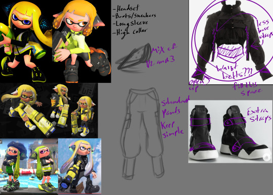
The hero gear was the easiest for me to design. At first I had NO idea what to do for it, but once I had found that coat on pinterest the rest of the outfit came together. I wanted to fit the vibe of many straps on bigger boots, and removed unnecessary straps from the coat to be more practical. I didn't have to work on this one for very long.
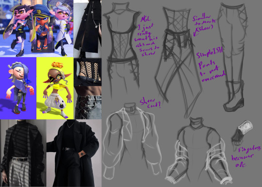
This was by far the HARDEST for me to design. I wanted a separate outfit that I call Agent Casual, basically what you always see Callie and Marie in instead of their hero gear. I took inspo from both the canon members of the squidbeak splatoon, as well as the Deep Cut idols to make this outfit. The concept mostly looks how the final does, but I did have to change the jacket many times before I was happy with it. The only reason I struggled so much was because I put so much effort into making his outfit base slightly buff and I wanted clothes you could see it through T-T
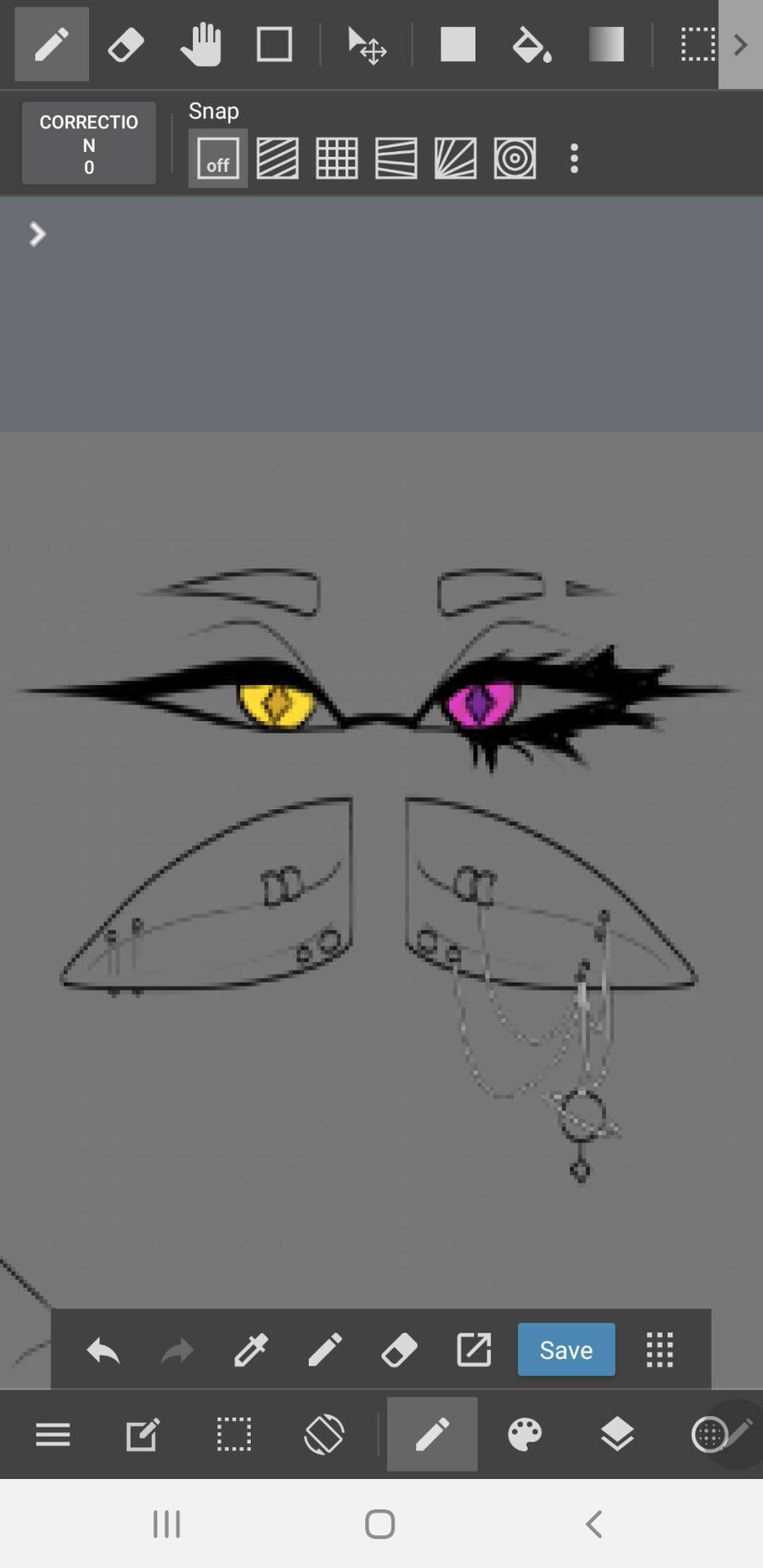
Live footage of me testing out the idea I had regarding his eye, but crunchy as fuck cause I was doing it on my phone instead of my tablet cause I was at dinner LMAO
Overall, I can say I'm very happy with how his design came out. Maybe I'll share more of his lore at some point?
#splatoon#splatsona#splatoon 3#splatoon oc#splatoon art#splatoon 3 oc#oc#oc art#character design#art#artist#digital art#digital artist
4 notes
·
View notes
Text
Initial Sketches
After deliberating with my tutor and coming to the conclusion that one individual, static character with a constantly changing appearance would be the most effective and meaningful way to convey my intended message, I got to work making a series of digital sketches that would form the basis of my ident. I took inspiration from the online 'dress-up doll' games popular in my childhood, where a base character could be limitlessly customised by dragging and dropping any combination of clothing, accessories and hairdos.
I began by drawing an outline of a head and bust, keeping it to just below shoulder level. This would allow me to portray parts of the character's clothing while keeping emphasis on the face - it was important that her face be the focal point to convey my message of limitless self-expression. This sketch also loosely shows remnants of my initial idea, which was to have moving patterns in the background behind my static character. This would later be developed upon and changed.

I then traced the outline of my initial sketch, leaving a blank slate that I could layer different looks and features on top of.


On top of the base, I drew facial features on a separate layer. I used some photos of myself as reference, then refined the sketch into a more semi-realistic, somewhat 'cartoonish' style. Making something less realistic and more stylised was a primary goal of this project for me, as I want this final year to be one where I find my creative voice and come into my own.
Six more layers were added in which I experimented with sketching looks for each of my chosen subcultures on top of my base. These layers could be displayed and hidden at my will, rotating through each look. I went through a wide variety of different concepts for each subculture, attempting sketching many different hairstyles and outfit ideas until I found one that a) I felt represented the subculture well enough and b) came across well in my chosen artstyle.
Below are a selection of these rough initial sketches, which will be developed and worked upon throughout the course of the project. The majority of these lack clothes, fully drawn hairstyles etc. but are very much a work in progress!


0 notes
Text

revised Rarity design! I drew my own sketch this time, I would have used a base but none had a pose I found particularly in-character for Rarity. I drew her in a pretty similar pose to the base I used on the last version, but I changed her body type to a more lank version in order to get the full effect of her long tail. I honestly wish I'd made the glasses chain longer bc I think it'd compliment the drawing more, but the length I ended up using is technically more practical. maybe I will draw it longer next time XD also don't mind the handwritten signature I didn't feel like grabbing my nice watermark
sketch here, the post explains the changes I made from the original design here
edit: this version of the post has the correct image, I can't believe I forgot the bracelet!
image description: a lanky unicorn pony with a black coat and loose-patterned curls of off-white hair, including a bun in her mane. her cutie mark is three blue diamond beads strung on red thread with some small gold beads and a needle at the end. she is wearing gold stylized horseshoes, a gold bracelet and gold armband, cat-eye style glasses with red frames on a chain of alternating gold and blue beads. end ID
1 note
·
View note