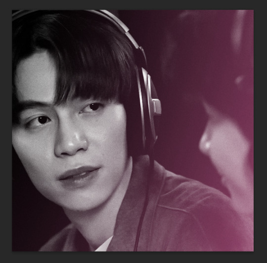
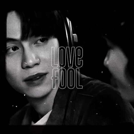
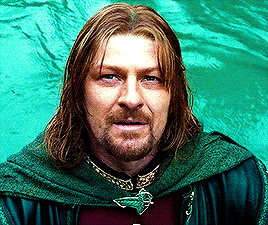
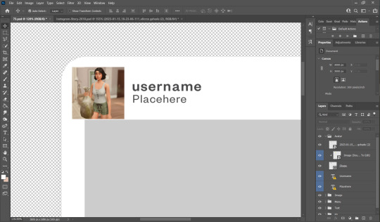
#i actually like one of my psds for once
Explore tagged Tumblr posts
Visit Tumblr Blog
Explore Tumblr blogs with no restrictions, modern design and the best experience.
Last Seen Tumblr Blogs


Fun Fact
Tumblr is available in 18 languages.
Text
god i just made 60 icons for one comic style and psd and now that i'm moving on the a new comic the lighting of the whole thing entirely fucks up my psd and looks terrible gerujthoi
#* ooc: i like lesbians and i cannot lie.#and this is the comic i ACTUALLY wanted to use for harlot come onnnnn#like i want my icons to all match each other not look like i used different psds on each one#graphics once again being mean to meeeee
1 note
·
View note
Text
CALLING ALL DOLLS, DRONES, ROBOTS AND CODING ENTHUSIASTS
Are you a robot that loves to serve? Are you a doll maid who seeks guidance in your duties? Are you some form of drone or being with no free will, open to having your actions dictated by the will of your owner? Does the idea of your empty mind being programmed like a machine appeal to you?
Are you enticed by the notion of writing code for your robotic servants? Are you a witch looking to create more intricate control glyphs? Are you an owner seeking to create automated instructions for your drones? Do you love the idea of filling an empty mind with rules and instructions to reflect your will?
INTRODUCING DRONE RESTRAINT NOTATION!
WHAT IS IT?
Drone Restraint Notation, or DRN, is a pseudo programming language created by my good friend Errant Spark, a drone with a very creative <empty space>. I helped with some of the final tweaks for the 1.0 version, but this is almost entirely Its creation.
It is a programming language that is designed in such a way that anyone without a background in programming can execute the commands like a machine, doll, drone, or programmable entity of your choice. It is also simple enough that most people without a background in programming can pick it up fairly easily, and intuitively!
Once you understand the language, you can read and execute all kinds of dynamic instructions and instruction types, in a way that makes it easy to parse in a plain-text format.
HOW DOES IT WORK?
The main documentation document will provide far more detail to this question than I ever could, but effectively it goes like this:
There are a list of eight KEYWORDS, in block capitals, that show you the type of instruction you’re executing. Then, after the KEYWORD, the instruction’s details are shown. Commands are read and executed from top to bottom by the drone, and programs can be ‘inserted’ into the drone’s memory at will (Assuming prior consent, of course)!
These KEYWORDS all have different kinds of functionality. The most basic one just has you carrying out a task. One checks if a condition is true, one provides an ongoing task you have to prioritize and maintain, one lets you create loops, etc.
The language has been designed in such a way as to minimize the amount of actual memorisation a drone has to do, and only has to read what’s right in front of them, and memorize tasks they have to accomplish/maintain. Obviously, mileage may vary depending on the memory space of the doll.
WHY SHOULD I USE IT?
For fun, I suppose! If you are someone who loves the idea of being programmed like a machine, executing only the instructions given, then this provides that! If you are a programmer who wants to program your very own doll bot, then this is a great place to get started too!
You can keep things nice and simple with a headspace that accepts basic command inputs, or you can see how deep the rabbit hole goes and import whole libraries into your headspace to carry out a full day’s maid duties, or sexual duties, or more!
Have fun executing commands, writing new code, testing it on your dolls. Have some playful fun watching as your early code files cause unintended behaviors, ironing out kinks and bugs like a real programmer until you’ve got your bots performing all sorts of dynamic tasks- or insert purposeful bugs to make your robots twitch and halt~
As with all things, never execute an instruction that you cannot/would not consent to. This is meant to be fun, and is NOT meant to be a way to circumvent normal consensual kink play. Programmers who attempt to use DRN as a way to bully people into doing what they want (Unless you’re into that sort of thing, in which case go nuts) do NOT have my endorsement, or the endorsement of Errant Spark.
NOW GO OUT THERE, AND ENJOY YOUR PROGRAMMING <3
>> Posted by XCN-PSD/I-04135
#dollcore#empty spaces#dronification#doll posting#rubber drone#robotkin#robot kin#ai kin#aikin#mind control#mind conditioning#brainwashing#robotfucking#robotfucker#robot fucker
830 notes
·
View notes
Text
❝𝙃𝙀𝙇𝙇𝘾𝘼𝙏 𝙎𝙍𝙏.ᐟ❞


A. ARLERT, C. SPRINGER, E. YEAGER + GN/AFAB. READER
𝙨𝙪𝙢𝙢𝙖𝙧𝙮 ; your plug!bf lovesss taking you for rides in his hellcat;)
𝙬𝙖𝙧𝙣𝙞𝙣𝙜𝙨 ; smut, gn!reader for armin and eren, afab!reader for connie, car sex, oral (m!receiving/armin), backshots(eren), p in v(connie), petnames (baby, slut, bae), cheating (armin), homewrecker!armin coffee addict!eren, drug dealing, praise, light degradation, can you tell armin's my fav? reader kinda has a bit of a tummy in connie's, belly bulging(connie) skin color not mentioned
A. ARLERT
Armin loved having you ride with him and you loved it too. You loved it even more after getting out of a rough argument with your boyfriend because being with him just made everything so much more amazing!
So when Armin texted you asking if you wanted to come to ride with him a day after you argued with your pathetic excuse of your boyfriend leaving you all sad because he nearly hit you, of course you agreed even though you knew what he was going to do.
You've gone on so many rides with Armin while he was dealing and doing shit that he even thought of getting your name stitched on that passenger seat.
He might as well get it stitched on the backseat too because everyyy ride, you seem to make your way back there with him going back with you.
"Fuck..." Armin groaned loudly as he threw his head back against the soft black seats of the Hellcat, it was a drastic difference from the Frostbite exterior that you adored. His hand tangled in your hair as you looked up at him mouth full of cock and your nose buried into his surprisingly curly blonde pubes.
You blinked up at him almost wanting to smile at his face full of pleasure "I love you so much, baby." Armin moaned out his back arching slightly as your hands that were sat on his knees slid up his denim jeans and rested on his thighs. It was a little crazy for him to be moaning that so loud when he was supposed to be waiting for a customer to meet him here.
How could he control himself when your head was just so fucking amazing?
You brought a hand to grip him as you pulled your mouth off smiling up at him "Wanna kiss." You muttered as Armin looked down at you a smile forming on his face, he grabbed your jaw and leaned down before pressing his lips to yours sloppily as you continued to jerk him off. Unlike your stupid boyfriend, Armin had no problem giving you anything you wanted and not like material things. (though he does do that too.)
Armin didn't care if he was around his customers, friends, or whatever, if you wanted a kiss, you'd get one. The deepest kiss anyone's ever seen actually. Shit, if you wanted to drag him away for maybe a quickie or because you just can't help but want his cock in your mouth, he'd allow it. Dropping a whole conversation just to satisfy you.
This is why when a customer was taking wayyyy too long and said that his friend was gonna come pick it up for him, he let you climb into that backseat and give him head when you asked if he wanted some.
"Love you s'much." You blubbered breaking the kiss before putting your head right back down on him your swollen lips wrapping around his cock once more "Shittt! You're my best slut baby...ugh." The blonde said grabbing the handle of the door that was luckily locked because if it wasn't, everyone would've seen his best baby.
Too bad that was cut short with a knock at his tinted window "Hold on baby." Armin said with a groan turning to the door as did you taking your mouth off him as you shoved him back into his PSD boxers "Hand me my shit, will you?" The blue-eyed male asked you a little pissed off because he didn't get to cum while looking back down and you happily nodded.
Reaching back and grabbing the little baggies that sat in the driver's seat before handing it to him. Armin rolled down the window and there he was.
Your boyfriend standing there looking down at the scene in front of him his gaze going from you to Armin back and forth as you plucked one of Armin's pubes from your tongue "What the fuck?" He cursed frowning down at you and Armin. Guess he must've been that friend.
"So I take it you don't want your shit anymore?"
E. YEAGER
Eren felt just horrible.
He woke you up on his way out to get his morning coffee because he sucked at making coffee and he had customers later today so there was no way he could get through that without coffee. You knew this and knew how he'd try and sneak out without waking you up because he knew how much you hated waking up early and how you would insist on going with him because you didn't want to be alone.
So you were in the car with him still in your pajamas practically falling asleep in the passenger seat and he just felt horrible for that so he decided to make a little detour to give you a small pick-me-up.
Eren's hands gripped your hips harshly as his hips snapped into yours repeatedly as you moaned loudly "Unh! 'Ren!" You sputtered loudly your hands running down the tinted window looking for something to grip. Shit you were even going to grab onto the seatbelt, you were that desperate.
It was just so good, that you needed something to grab onto or bite onto.
"Still tired baby?" Eren asked as he leaned closer his chest pressing against your back as his cold hand trailed from your hip to up your shirt grouping gently as your back arched from the sudden coldness on your nipple.
You hated it when he was teasing you. Of course, you weren't tired. Not with his cold hands wandering all over your body and his hips continuously snapping into yours with noises of him sliding in and out echoing throughout the car.
You turned your head back to gaze at your boyfriend but with an especially hard thrust, your cheek pressed against the window "Ow! Eren!" You whined looking back at your long-haired boyfriend, he let out a small smile before pressing a small kiss on the nape of your neck.
"Sorry baby," Eren muttered trailing kisses from down your nape to down your spine, and his thrusts slowed a bit. Eren's apology was empty and meaningless, he probably meant to do it just to see the pout on your face.
Such a meanie.
The tickling of his wet kisses made a giggle escape your lips through moans and whines.
You looked down not wanting to soil the pitch-black seats, this car was so expensive...probably worth more than your entire life but Eren clearly didn't care from how he'd initiate shit like this almost every time you hopped in that car.
You didn't understand that. There'd always be a white stain on these seats and he looked like he didn't have a care in the world but oh let any of his customers touch that Octane Red paint on his car and all hell would break loose.
Guess you were just different huh? Special even. "You still need coffee or is this enough huh?"
C. SPRINGER
Connie absolutely adored you.
You were pretty, smart, and such a good fuck.
Soooo it was only right that he celebrated you getting a 100% on a test you've been studying for forever by giving you the best present ever right in the back of his hellcat<3
You were so pretty moaning under him laid out in the backseat, your face twisted with pleasure, sweat beads rolling down your forehead and drool dropping down from your lips to your chin from your mouth that refused to close and just kept spilling out more and more whines and moans.
Connie ran his hand down from your throat and to your bare stomach resting it there before pushing down gently earning a yelp from you. You couldn't even think straight, you'd used up all your brains on that test, and the little that was left, Connie was busy fucking it all out.
His strong smell of weed and cologne filled your nostrils along with the amazing and clean smell of his car, it just made everything more pleasurable for you.
"Look at me, bae." Connie cooed pressing down on your stomach again making your eyes shoot open and another loud whine escape from your throat.
"M' sorry!" You blabbered out your head nearly hitting the door over and over with Connie's thrusts, Connie's hand went to your face comfortingly "Don't apologize baby. Just wanna see yo' pretty eyes." The springer boy said with a reassuring smile on his face leaning down to press a kiss on the tip of your nose.
A small laugh escaped your lips from the tickling feeling as you gazed up at your boyfriend with such adoration and desire in your eyes as your hands came to hold onto the back of his neck "When we get home I'll give you more." Thoughts of what Connie could do popped into your head continuously as a smile formed on your face.
He could eat you out maybe? Maybe let you ride him? There were so many things he could do when this was over and he drove you two home.
Connie was a freak. There was no doubt about that, he liked some shit you'd never even heard of before you met him and was down for anything and everything which only made the possibilities of what he could do endless.
Connie leaned forward kissing you passionately as his thrusts got sloppier and harder. Your tongues fighting for dominance with his winning almost instantly earning a small chuckle from him but it stopped just as soon as it started as the kiss got deeper.
He was stealing the breaths from you with every thrust.
"Next time you get an A, we'll do it anywhere you want."
©torasplanet .ᐟ reblogs and likes are very appreciated! pls do not repost!!
#aot x reader#aot smut#eren yeager smut#eren yeager x reader#armin arlert smut#armin arlert x reader#connie springer x reader#connie springer smut#torasplanet.ᐟ#eren yeager#connie springer#armin arlert#marls-drabbles.ᐟ#◛⑅·˚♡connn> <.ᐟ#◛⑅·˚♡ren.ᐟ#◛⑅·˚armin;p#college au kinda??#aot college au#plug!connie#plug!eren#plug!armin#i luvvv plug aot boys!!
1K notes
·
View notes
Note
Hi, could you please tell me how to do this slanted layout? the-borgias*tumblr*com/post/695485491217334272/one-chicago-appreciation-week-day-one-favorite
Hi, Anon! I'm sorry this took me a few days to answer but I struggled making this tutorial (not because the process itself is difficult but it is difficult to explain it properly.) Anyway, here's the gifset Anon is asking about. I hope this is easy to understand and I also included a .psd file of the layout :)

PSD FILE OF THE GIF ABOVE & TEMPLATE
What you'll need:
Basic Photoshop knowledge (I use Photoshop 2023)
Basic knowledge on how to make layouts (here are a couple of tutorials: x x)
Basic knowledge about layer masks (tutorial)
STEP 1: Make a basic layout
You can do pretty much any layout you want but for the sake of the tutorial I tried to recreate the same template I used in that gifset. I'm assuming you already know how layouts/templates work so I created a 540x540px canvas and went to View > Guides > New guide layout. I used these settings:

And this is how my canvas looked like:

Now I pressed (M) to use the Rectangular Marquee tool and create the rectangles I wanted. This is my end result:

STEP 2: Tilt the layout
This is actually pretty easy. First we're going to select all our layers. I paired mine in groups so they looked like this:

Once we've selected all of them (groups, layers, whatever you're working with) press Ctrl + T. Your canvas should look like this:

And we're going to tilt it by changing the angle to -2.00 in here:

Now our layout is slanted! But as you can see we have transparent spaces we need to fill. I don't know if this is the easier method to do it but I use the Polygonal Lasso tool (L). I'll use the first orange box as an example:

As you can see I use a ridiculously big zoom so I can be as accurate as possible but it's basically impossible to create a perfect box, so this will work. Once we have selected our desired shape we'll use the Brush tool (B) to paint in the layer of our original orange box:

You have to do this with every box so it's a bit tedious but that's the way I did it 🤷♀️ This is the end result:

STEP 3: Place the gifs (using Layer Masks)
But now, how do I know which size my gif should be? Our initial measures won't work because our final boxes are bigger so here's what I do. I'll select the Polygonal lasso tool again and make sure I select a little bit more of the box I'm measuring, like this:

It's a little hard to see it but the dots are just a little bit bigger than the orange shape. To be more accurate, my original box was 178x87px and the shape I selected is 174x100px. So I'm going to make a 174x100px gif and place it right above the background, like this:

Now we're going to select the layers of our gif (I'm assuming you're working with a Group because it's easier) and click Ctrl + the orange box. You should see this in your canvas:

And now create a layer mask in your gif group (if you don't know how to do it check out the tutorials I liked at the start of the post.)

Now you can delete the orange box. And, once again, you have to do this with every box and write down the measures (and remember that all your gifs must to have the same number of screencaps!)
I hope y'all don't mind that I didn't create 8 different gifs lmao I was too lazy so I just used a big gif as a background and made 4 small gifs. This my end result:

For the background I merged the remaining boxes and used that to create the layer mask. I'm not going to explain it since I believe it's much easier if you check out the psd file.
And that's pretty much it! It's the same as making a standard layout you just have to be careful with your gif measures. Oh and also see how my gifset shows those white marks between the gifs under a dark background?

Well, that can't be avoided since we aren't working with straight lines (you can see the same effect in the 2nd gif of this set, different layout but also not straight lines) so we'll just ignore them.
I hope this was helpful (I lowkey feel like this tutorial is a mess) and if you have any questions feel free to ask :)
#ps tag#tutorial#resources#usershreyu#userelio#userhella#alielook#userabs#useraish#uservivaldi#tuserju#tuseruta#tuserhol#tusermels#userroza#quicklings#userbunneis#userhann#tusermona#usertj#userbuckleys#usertina#useralien#userchibi#userrobin#larlies#tuserheidi
140 notes
·
View notes
Text
how to load psds on ibispaint!
this was made with coiners in mind but will work with p much every psd so no worries if you wanna use a base or a sticker pack in a psd file (note, since its important, psd files meant to change the color of an image only load as intended through photoshop and photopea, so youll need either of that for them, not any other drawing programs.)
first of all: where to find files?
honestly, there isnt a clear answer. you can find some for most of them through just seeing if the coiner has linked any. most of them will be linked through file hosting sites, most common is drive or deviant art, but I used catbox for a while then switched to filegarden personally. the user @daybreakthing has took upon solself to turn a lot of more complex flags into psd files, so you can find a lot of them on sols old and current deviantart page (linked in their pinned)
the only downside for deviantart is you HAVE to log in to download the files. it is free however and you dont have to do much else.
for this tut Ill be using the nonhuman x for x flag psd by daybreakthing, (coined by sol as well, on melabea)
^^^ this guy
now onto the actual tutorial:
youre here likely because you already tried it, but its good to go over what not to do, and the results, anyway.
if you try to open it like a regular file, you will get errors, often more than one.
its important to note that psd files, while still considered image files, have no previews (except on drive) so they will look blank or empty. no worries about that, they will load properly.
here is what to do (or what I do, anyway)
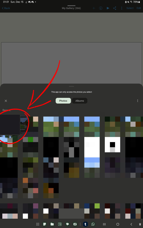
go to your gallery, google photos, or another file manager (like just files or an external file manager)
Im using google photos bc my device's gallery wont let me share psd files
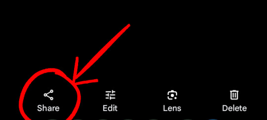

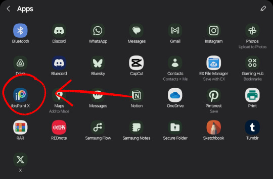
select the image, go to 'share', and pick ibispaint. theres a chance it wont pop up in the first screen, so just press the more option.
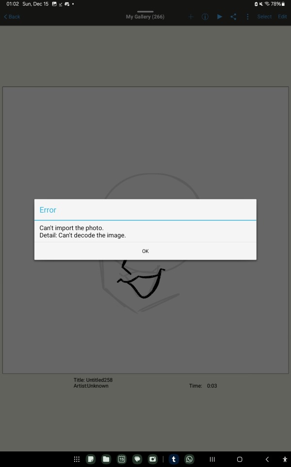
if ibispaint is not an option, try another image or file manager!
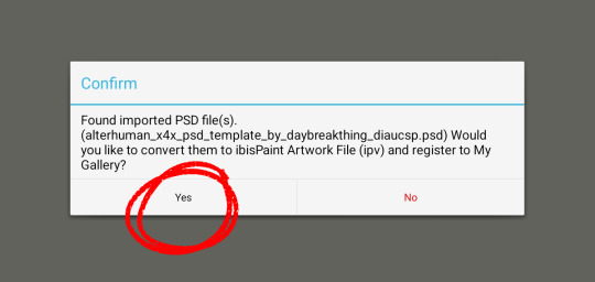
it will ask if you want to convert the file to ipv, select yes!
and thats all!! if all goes well it should be in your gallery when you open ibispaint. keep in mind it may crash once or twice when you first try to open it, just clear your app history cache thing and try again! (ibis paint is held together by duct tape and prayers)
I hope that helps!! if you have questions or problems, never be afraid to ask, I love to help!
tagging @idwl since their anon had a question related to this and I was directed to, to help :3
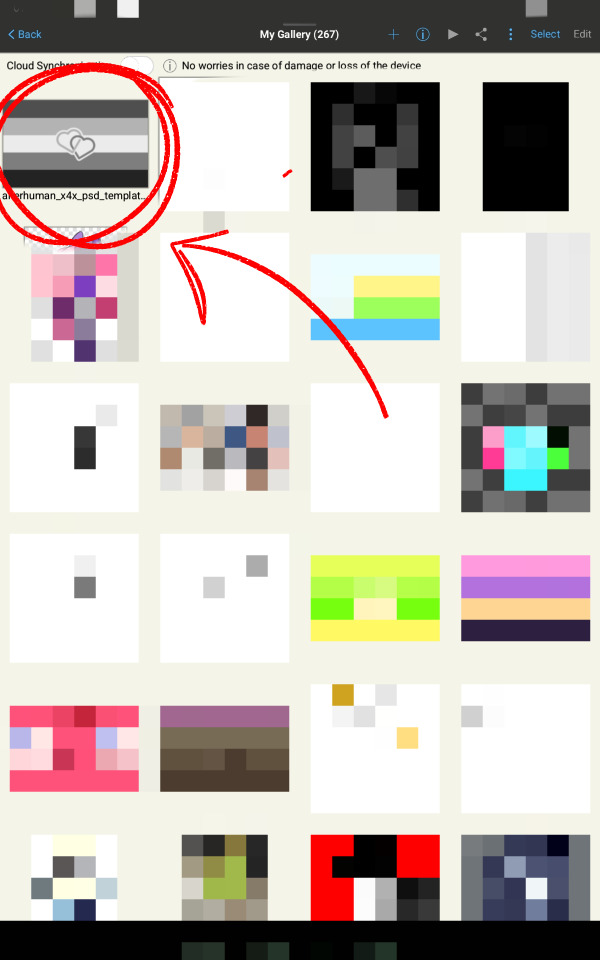
sorry about the amount of clutter with the red arrow and circles and pixelated stuff, I wanna obscure irrelevant or personal stuff while making sure people dont miss anything important.
64 notes
·
View notes
Text
So uhm... I did a thing...
✨Character Info Template✨
UPDATE 11.24.24: this template now has a page theme version! if you're not a fan of templates, you can get the code to use it as an interactive multimuse page >here<
Been meaning to do this a long time ago (and actually started it but never finished it, lol) as a way to share some more information about my ocs without needing to use a custom page theme, but mostly because I haven't found any page theme that looks exactly as I want and allows this much customization.
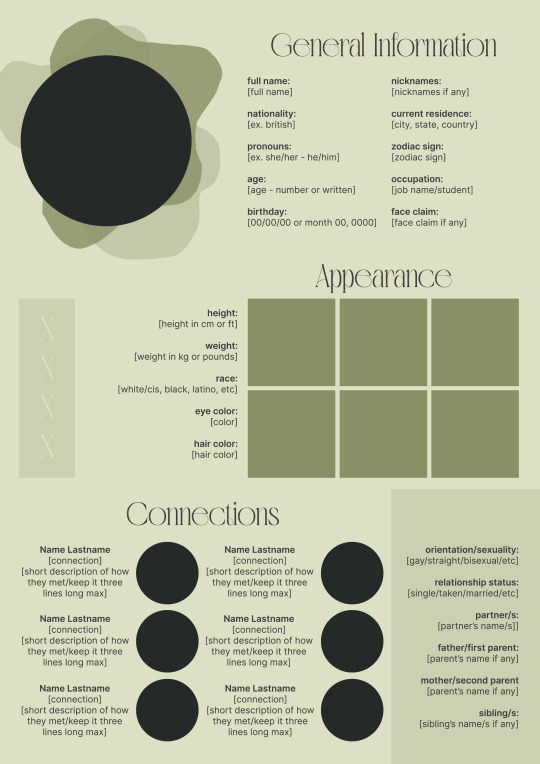
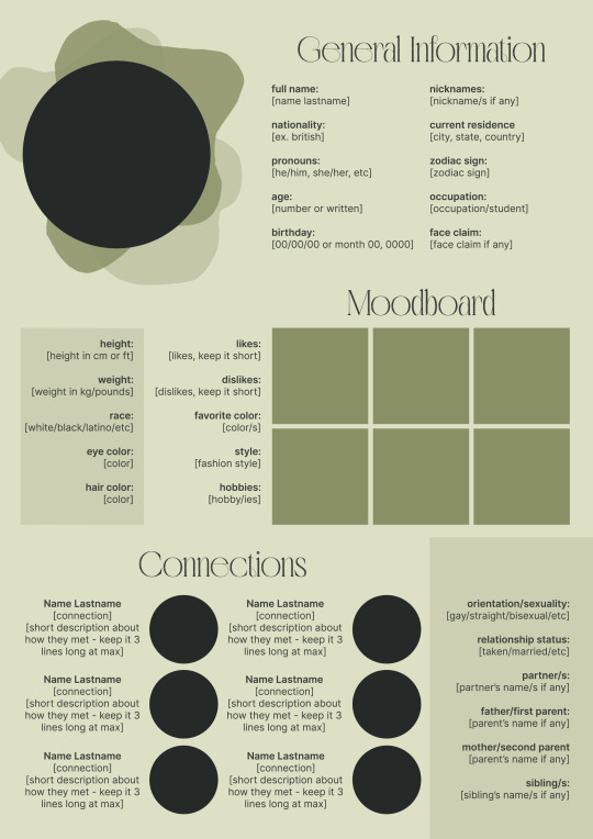
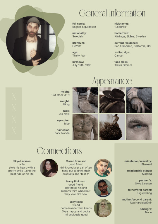
There are two versions and both are almost exactly the same; but the example shown in the left has an 'appearance' section which is small and has few quick facts regarding the oc's appearance; while the example on the right has a 'moodboard' section instead which allows you to add more info about your oc.
You can change every section/title to fit your needs like I did in the examples below; I personally removed some categories as well and got rid of some connections as this oc doesn't have that many close friends/partners to fill the original template. However, I also included an extra separated 'connections' section in the download in case you want to add more people and more information.
I recommend you stick to square-shaped pictures so it's easier to fit them to each section. Also if and when you edit the information or section titles, please select only one line at a time to replace it so you don't lose the text format. (Titles shouldn't change because that's a single format/font within the same text box, but should it change you can always hit ctrl+z hehe) When you're done, I strongly recommend you save this as a .png instead of .jpg so it's the best possible quality!
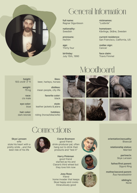
Last but not least, this is a .psd file. So you'll need either Photoshop (I did this with Photoshop Portable, but it supports newer versions of PS and it *should* support older versions too) or Photopea to open and edit this file.
Credits: Adobe Photoshop, Inter font, Golften Vintage font
>DOWNLOAD< (patreon but free :p)
(note: I'm posting this with my gaming blog because I think my fellow gamers might be interested in this, but please consider giving credits to me if you use this template by tagging @synindoodles instead of this blog)
More info on how to use and edit this template below the cut!
Layers:
>Each layer is properly named and categorized. The general layers such as the background, the icon shape and background shapes are under the groups.
>If you don't want to see/don't need one of the connections' pictures and information, I recommend you find which one it is (1, 2, 3, 4, 5 or 6) and click on the eye symbol next to the layer to hide it so that way if you ever need it, it won't be truly gone.
>To edit a text section, simply find the layer (such as General Information>Left Column) and double click on the 'T' symbol next to the layer. That way it will open edit mode and allow you to edit the text, just don't hit delete or enter while everything is selected or you'll erase it :p
>Main text sections aren't separated, they're blocks of text. I recommend you don't remove the amount (for example, if you downloaded the version with the 'appearance' section, which has 5 sections of information, don't remove the fifth line.) Either leave it empty or replace it with another data, otherwise it will look weird. The 'general information' section might look good even if you remove a few lines, just don't get rid of the whole block of text.
Pictures:
>To add a new picture, simply paste it over this document and move it using the Move Tool.
>To frame it (so it becomes a circle or fits over the shape you want), make sure the picture layer is over the layer you want, then while holding alt click between the two layers. [For example, if you want to add a new main oc picture: 1) paste the pic you want, 2) move it with the Move Tool so it's covering the big circle, 3) once you've fully covered the shape (if it isn't you can resize it by right clicking on it then on 'free transform', sometimes you might need to hold shift to proportionally resize it) make sure the newly pasted pic layer is over the layer named "picture goes here", 4) hold the alt key and hover your mouse cursor over the line between your pic layer and the circle layer until you see an arrow going down symbol, once you see it click it and tah dah! your picture should now have the same shape as the circle! - you can further move it if it doesn't fit the way you want with the Move Tool (;
Others:
>You can change every color, font and section to your liking, just don't change the general layout of the template.
>To hide/show the guides (those bright blue lines all over the document), click ctrl+,
>'Inter' is a free font and you can get it in the link above (linked with the credits), Golften Vintage is not, but you can get the demo version >here< (just scroll down and click the blue download button under license). I will not tell you how to install fonts as it might be different for everyone (for me it's C:/Windows/Fonts and I just drop the zipped files (except the .txt one) there), but google is your friend.
>I can't think of anything else that needs to be said here, but if you have any other question feel free to send me an ask or dm and I'll help you out!
>Last but not least, a like is appreciated if you plan to use this plus consider tagging @synindoodles if you use it <3
#psd template#template#characters page#muses page#muse page#muse template#character template#character page template#oc page#oc page template#synindoodles#rp resources#rp template#roleplay resources#roleplay template#writers resources#writing resources#writing template#writers template
186 notes
·
View notes
Note
Hi, You make such amazing Amazing gifsets !!! I had a small question about one of your sets 🥹
https://www.tumblr.com/khaotungthanawat/748206993697882112/i-ought-to-stick-to-another-man-a-man-that-surely?source=share
This is so pretty first of all❤️. I wanted to ask, how do we get the effect in the first gif, where the gif actually is like playing on a film reel/screen inside a black bigger gif? Thank you so much for any help 💛💛
hi! thank you so much!!! i don't have the psd for that anymore, but i'll make it again using the same effects. 💞

before i get started, this tutorial makes a couple of assumptions:
you're working in photoshop
you know how to make a gif in photoshop
(as a note, i work in timeline.)
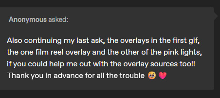
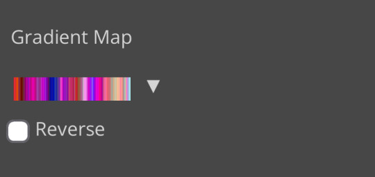
so there are three overlays at play here: the pink lights, the scratches, and the super 8 frame.
i'll start with the lights. the light leaks overlay i used for this effect can be found here on youtube. once i had the overlay gif ready, i placed its layer at the top of all of my other layers and set it to screen. (you can also try lighten for this--it really comes down to what you like best!).
next i added a gradient map adjustment layer with a black to pink gradient. i'm pretty sure i left the blending mode on normal for this, and added a clipping mask to clip it to the light leaks layer.
and here's what i have so far:
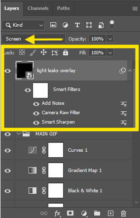
okay! next layer is the scratches. there are lots of these on youtube, but i used this one! similar to the light leak, i set this on top of everything else and set it to screen. i also added another gradient map adjustment layer, this time just a simple black to white gradient, and another clipping mask to keep the bw strictly to that overlay.
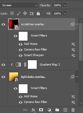
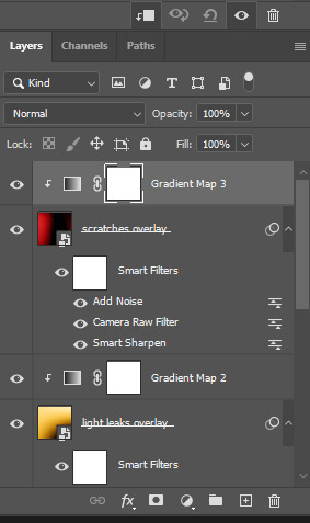
which gives me this:

for the black frame, i used the super 8 frame overlay found in this pack (it's free) by neal chopra! once i had this gif ready, i slapped that on top of all of the the other layers. now, since the center of this gif is solid white, if you use screen/lighten, you'll have have a big white box covering your gif.

boo hiss! so what i did instead was set my blending mode to multiply.
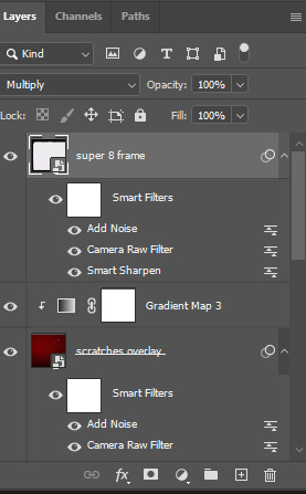
and now i'm here:

i did some additional tweaking to get adjust placements, added contrast closer to what i wanted, slapped some text on it, and this is my final result:
again, here are the video overlay links:
light leaks
scratches
super 8 frame
i'm not good at tutorials, but i hope this made sense and is helpful to you. feel free to drop an ask if you have more questions. happy giffing!
58 notes
·
View notes
Text
…make a psd?
this is a question i get pretty routinely, and i’m going to tell you upfront: there is no one way to make a psd. there’s no ‘better’ way, no ‘easier’ method, you just have to figure it out yourself.
with that said, this post is going to be how i, personally, make my psds, just for the sake of reference. my way isn’t better or worse than anyone else’s—it’s just the way i do things ¯\_(ツ)_/¯
i. making a showcase/moodboard
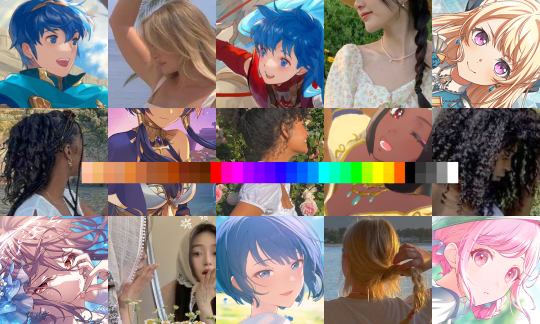
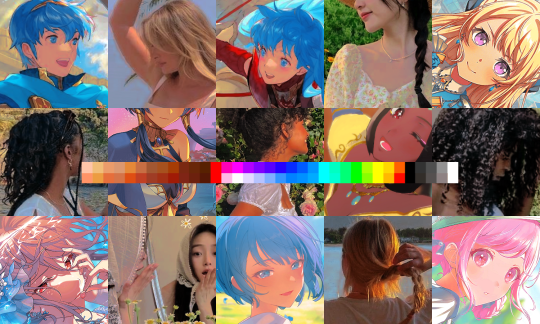
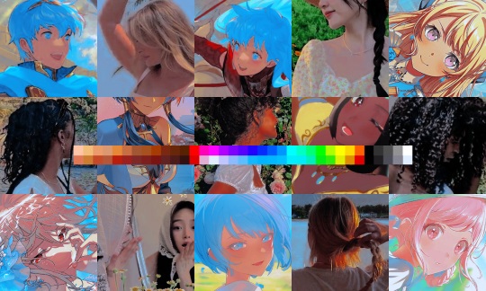
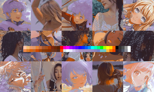
depending on the psd you want to achieve, your moodboard will probably look different—if you’re making a blue psd it will be mostly blue, if you’re making a psd based on a certain character or card set it will be based around that, etc. i made myself a general showcase that i test my psds on that includes both irl images and darker skin characters, because i like for my psds to work for those purposes most of the time. my showcase is below if you’d like to use it!
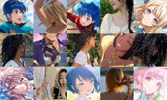
it’s best to include sources you edit frequently so you know what works on them and what doesn’t but how the moodboard looks exactly is up to you ¯\_(ツ)_/¯ i also recommend using swatchies (original by zeroresources on d*viantart) as long as you bear in mind that swatchies is not a great guideline for actual dark skin
ii. creating the base
actual step two is creating a folder but that takes like two seconds. do make a folder though or you will be sad.
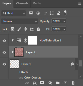
after making a folder, start making the base of your psd; whatever the foundation is going to be. depending on how you want your psd to look, this will look very different. i personally always start off with a gradient map, just to get things going
my settings for this are the default black and white gradient map set to reverse, and it’s set to blending mode soft light at 35% opacity. i typically do something in the range of 20-45% opacity depending on how i want it to look
i’m honestly not sure where i picked up this habit but it does make it a little easier to get things going for me personally. it’s a simple change but it’s a good start. if you want higher contrast you can do the same thing but without reversing the gradient map
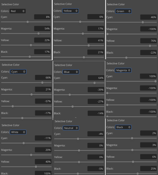
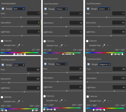
next thing i do when creating a base is add a selective color layer, which helps things pick up the pace. i’m too lazy to write it all down but these are my settings:
worlds ugliest collage so i don’t max out my images LMFAO apologies. obviously depending on what colors you want to focus on this will look different. for this one i completely axed magenta and emphasized blue and red/yellow. i also maxed out the black in white, which is extremely typical in my psds. this is what our psd looks like now:
pretty different already, right? nice!
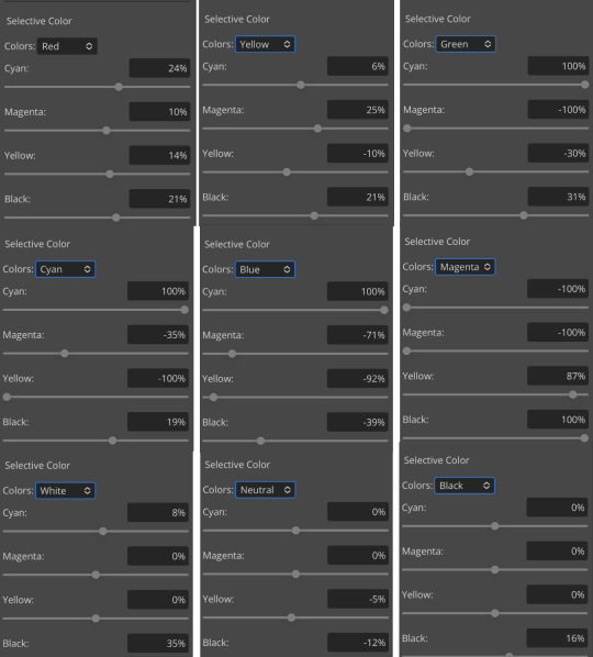
next thing i typically do is another selective color layer. it’s typically pretty similar to the first, but once again that depends on the psd! the worlds worst collage again:
pretty much the same but a little different. and our results:
as you can see, this is pretty saturated and a little all over the place. not to worry—let’s move onto the next step!
iii. let’s get serious
this step varies a lot depending on what my psd needs, but because this one is pretty sayurated right now and that seems to be my main problem, i’m going to add a photo filter in a light grayish-blue to help desaturate and cool it down
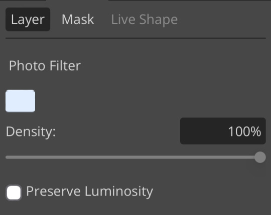
(i unchecked preserve luminosity here because i think it looks neat. i don’t recommend doing that if you’re using a darker color bc it gets hard to see, but you can do whatever forever)
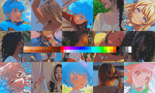
obviously this isn’t the only way to desaturate but i find it fun. observe:
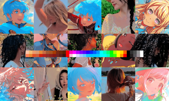
definitely better, at least to me, but still not great. we’re going to add another selective color layer bc the skintones look kinda wack. welcome back world’s worst collage:
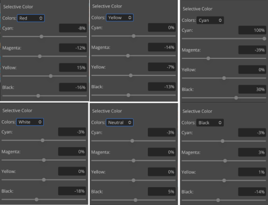
i only adjusted some of the colors in this one because i wanted to fix specific problems; namely that the darker skin tones were too dark and ashy.
mission accomplished
with that done, it’s time for hue/saturation! for funsies ദ്ദി(˵ •̀ ᴗ - ˵ ) ✧ this part i just had some fun with. a new collage:
and the results:
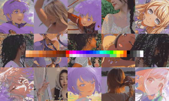
purple! this wasn’t what i originally had in mind but it was much more fun to do tbh LMAO i decided to turn the cyan/blue into purple because it looked better in my head
iv. okay now get silly again
now that the main meat—so to speak—of our psd is done, we can add some fun layers. if you want ideas for this, i have a post about it, but what i’m gonna add as my first silly layer is channel mixer, which is one of my personal favorite layers
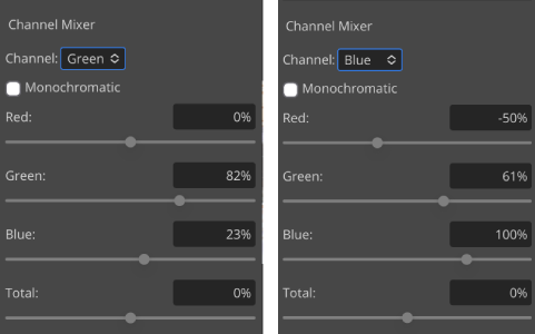
pretty simple adjustments for channel mixer honestly ¯\_(ツ)_/¯ but i thought this would look fun. as a general rule of thumb i don’t mess with the red channel so much because it tends to screw over my skintones, but, as with anything, you’re free to do whatever forever
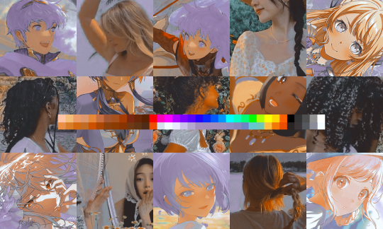
next fun layer i’m gonna add is a noise gradient map, also just for funsies
i randomized until i got a nice pink-ish kinda one. i was hoping for blue but all the blue ones were too green and i got impatient LOL
a little fucked but for sure fun. i set the gradient map to soft light at about 15% opacity. it gave the psd a fun texture and a bit of extra warmth
v. finishing touches
sometimes i add a couple more layers, sometimes i add less, but this psd feels about done so imma wrap it up. i typically don’t save my psds as the showcase for my storage’s sake, so i’m gonna grab something to use as an icon. i typically go ahead and size it at about 300x300
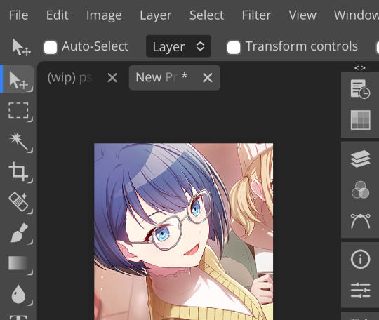
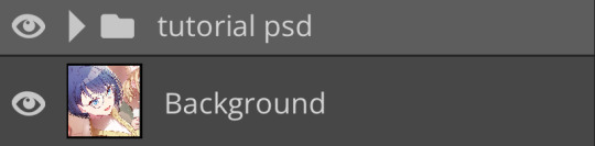
hello, haruka! once i have my icon set i duplicate the folder into the new project and name both the project and the folder. how you name it is up to you, i usually either use a random word generator or just whatever comes to mind. in this case, i’m just naming it ‘tutorial psd’ lol
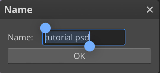
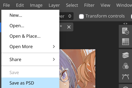
then go to file and save as psd, bada bing bada boom you’ve got a psd ☆〜(ゝ。∂)
as i said at the beginning, there’s no one way to make a psd. this isn’t the only process or even the best one, it’s just how i personally work. the best way to make a psd on your own is fuck around and find out <3 canarysage out
…so that’s how you do it.
P.S. the psd i made here will be posted under the tag #tutorial psd. you’re free to poke around in it and use it as per usual. if you want to copy it, feel free, but don’t claim it’s your own or repost it as your work. thanks!
P.P.S. wondering about adjustment layers? see photopea for dummies. wondering about something i haven’t covered yet? shoot me an ask ദ്ദി(˵ •̀ ᴗ - ˵ ) ✧
71 notes
·
View notes
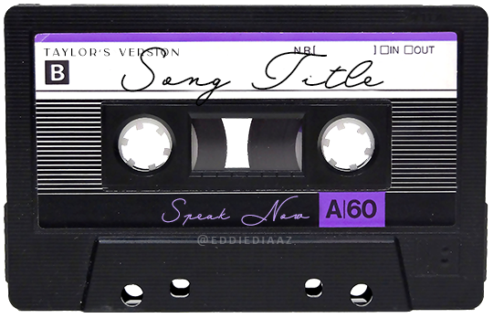
Note
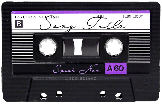
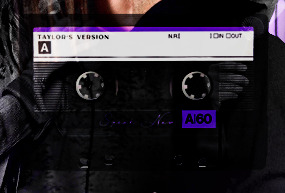
Hey!! I just wanted to say that your recent speak now gif set is sooo stunning. I was wondering how you managed to create that cassette tape effect if it isn’t any trouble? It’s really so pretty.
Have a great day! ✨
ahhh thank you so so much! first of all, i cannot take any credit for this effect, as it was greatly inspired by this amazing yellowjacket gifset by @thewintersoldier!!
but here's how i recreated the effect, from a cassette png (found on pngwing here), to this animated cassette effect (as seen in my speak now set):
psst: i usually always create in photoshop cs5, but for this effect you need a recent version of photoshop because it's using transform keyframes (i think cs5 doesn't let you do that, or i just don't know how to lol). i used cc 2019 for this.
sorry if this is lengthy or has too much or too little details haha, but i hope it's comprehensible! english is not my first language so i also apologize in advance for any mistakes!
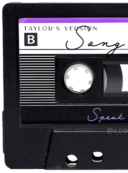
I. PREPARING THE CASSETTE
so, starting with the png here:
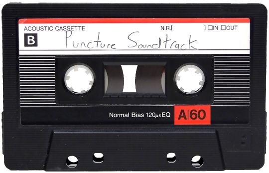
i removing everything i didn't want on the cassette png with the brush tool by just drawing the right color over the unwanted text. for the color, i then went to image > adjustments > hue/saturation and in the red tab, i played with the hue slider to get that purple color. finally, i added some text to my liking, and this is what i ended up with:
(not necessary but: i also selected the white lines on each side with the magic wand tool because i wanted these lines to be transparent. once your selection is done, go right click > layer via cut. it will create a new layer of the cutout you just made. you just need to disable or delete the layer to make the selection (lines) transparent.)
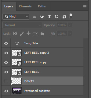
at this point you want to have only 2 layers: the revamped cassette and the text layer. you can remove the text layer actually, and just add the title back at the end, as it is not necessary for this effect. i just like to have the visual.
if you have multiple layers, you need to select all of them (except the song title layer), right click on the png layer and click on merge layers. this will create one layer with all the editing you made on the cassette. if you think you will need to edit this later though, i would save the file as a psd before merging the layers.
II. THE EFFECT
okay, so now that you have your cassette, make sure your video timeline is activated, not frame animation, and you are ready to go.
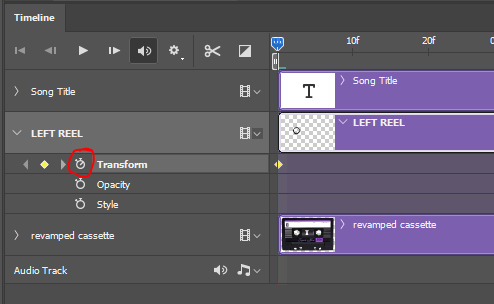
first, you want to create a perfect circle shape around one of the reel with the elliptical marquee tool (hold shift while dragging the circle). make sure it covers the entire area that will later be rotated. make sure this circle is perfectly centered around the reel or otherwise the animation will be a bit lopsided.
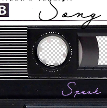
then right click on this selection and go "layer via copy". this will create a layer of only that circle selection. important step: right click on that new layer and go "convert to smart object". the layer should look like that, i've renamed mine:
now if you go to your timeline and open that new smart object layer, you will see that you have 3 keyframe options. we only need the transform one.
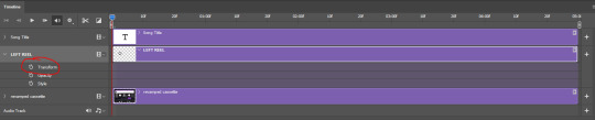
go to the start of the timeline and activate the transform animation by clicking on the stopwatch button. a keyframe will be created automatically.
to create the actual animation, move the position of the cursor on the timeline further, i put mine at the 01:00f mark so it's easier to create the right timing.
then what you want to do is select the reel smart object layer and hit ctrl + T. a box will appear and this is how you will make the reel rotate.
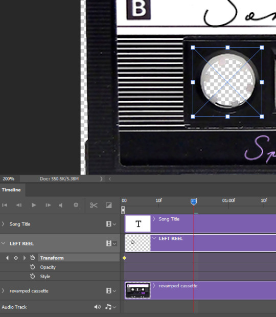
to rotate the reel shape, move your cursor near the blue box on your canvas and drag it until you have rotated the shape halfway through and hit enter. another keyframe will be created and if you play your animation, the reel should rotate on itself for half a turn

move your position on the timeline to 02:00f and do the same thing: select the left reel smart object, hit ctrl + T, rotate for another half turn, and hit enter. this third keyframe should be the last one needed for the animation and you should have a full animated rotation of the reel.
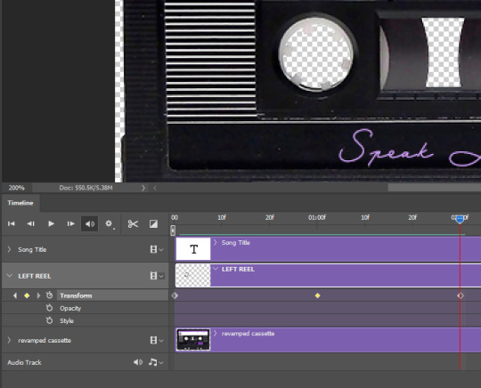
play your animation, and adjust the speed to your liking by dragging the keyframes on the timeline (but make sure they stay within the same distance from each other). the closer the keyframes are, the faster the animation are, and the further they are, the slower it'll be.
then you can just trim the smart object to your animation's length, and duplicate (right click the smart object > duplicate layer) this layer the amount of times needed (i find this less finicky than duplicating keyframes), and placing them one after the other. three full turns should be enough. this is what my timeline looks like right now:
and my animation for the left side looks like this:
as you can see, we can see the little "dents" peeking through behind the animation. we don't want that! to remove it, select the revamped cassette layer (that should be under the reel smart object), and create another perfect circle around it with the marquee tool. this time make sure it's smaller than the previous one, it just needs to cover these dents.
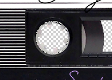
then right click on this selection on your canvas and go "layer via cut". this will create a new layer with that selection, and all you need to do is to disable it. this is removing the information in that circle.
once you are happy and the animation works, you can just delete that cut layer. now the animation is done and looks like this:

III. SECOND ANIMATION
one you have done it on the left side, you just gotta do the same thing on the right side. you can also try duplicating it, but i found it finicky for some reason (or maybe i'm just not used to the controls of this 2019 photoshop version?).
this is what i have once i've done the same thing on the right reel:
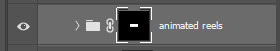
once i am happy with the speed and everything, i want to have only one layer so it's easier to use on gifs. first, i will save this animation as a psd file, in case i want to reuse it. then i am removing the song title layer and will be flattening everything and creating frames from this animation. to do so i am using the "save" action from here.
i'm not sure why it does that, but it's creating a couple of frames where the reels are a bit offset from their position everytime there's a full circle done, so i just delete these 5-6 frames. you can also change the speed here, but by default it should be 0.05.
once you are happy with it, just turn these frames into a smart object with the video timeline again (convert frame animation to video timeline and select all the frame layers > right click > convert to smart object)
now you have a smart object that is ready to be used anywhere!
IV. FINAL TOUCHES
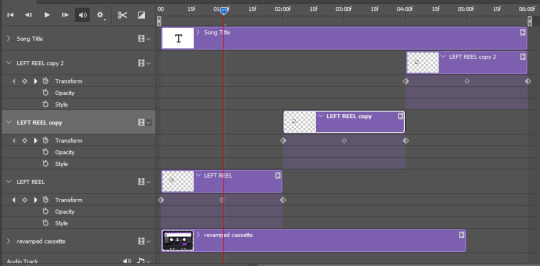
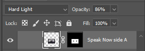
for my particular speak now gifset, i have multiple layers of the animated cassette on each gif:
1, bottom one - cassette layer set to the blending mode "hard light" and set to opacity 86%:
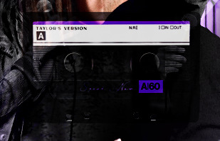
2, middle - this same cassette layer set to hard light, but with the opacity at 100%, AND with a layer mask so it's only applied to the animated reels (i wanted them to show up more):
3, top one - and finally a third layer with another layer mask because i wanted the white label and speak now area to be less see through. it's set to the normal blending mode and the opacity is at 75%
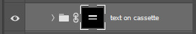

and then i just added the song title on top at 100% opacity and normal blending mode, and added some drop shadows, and tada!
there we have it, i hope this was helpful <3
#alie replies#Anonymous#photoshop#tutorial#*ps help#completeresources#allresources#resourcemarket#userrobin#userraffa#userpjo#usertreena#tuservaleria#tuserheidi#userdean#userrainbow#usersalty#userzaynab#usernik#swearphil
404 notes
·
View notes
Note
How did you find/make your aesthetic profiles of the gods in your book?
i was gonna link you to my guide that i posted a long time ago, but i realized how old it was and that it was lacking some details...... 💀
so i'm gonna do a new one that hopefully helps a bit more!!!!
websites used: pinterest, tumblr, canva, deviantart, & photopea!
first off, i find the pictures from sites like pinterest and tumblr. the color schemes of each pic need to be somewhat close to each other (but it doesn't always have to be like that depending on the psd you'll be using later on)
i'm gonna use hades for example. this is the first pic i find of him lol:
the most dominant color here is purple, with some tinted ivory from his skin, and brown in the background, so the next few pics i find should have somewhat similar colors too, or they should at least be purple cuz it's the most frequent color here
here are the next few photos i found:
they don't look perfect, but we can always individually tweak the colors and shades later
i download the photos and then i go to canva. the site provides you with templates that you can use but since i only got three pics, i chose the "email header" option.
(for those wondering which template i used for the bigger ones you see in the first chapter with percy and the yans, i don't use a template. i just use "custom size" and type in "800 x 800 px")
go to the sidebar, click "elements" then scroll down for "grids" and then find the one with 3 parts. i reduced the spacing between the photos to zero.
then i upload all 3 photos and put them in the squares. because they're not exactly the closest in color schemes, i individually edit them until i'm satisfied.
canva provides filters that you can use, but i always find it best to toggle with the adjustments like brightness, contrast, saturation, etc.
here's what i ended up with so far:
again, not exactly perfect, but whatever
now that i'm done, i go up to "share", select "download", and increase the size by 1.5 (that's 900 x 300 px). idk why, but for some reason, the quality looks better when you enlarge the size before download.
once that's done, i download the whole thing.
(keep the file type as "png" btw)
then i go over to photopea and upload my graphic. it'll look like this:
in another tab (not the photopea tab, but like... the actual tab of whatever browser ur using), i can find a bunch of psd colorings in deviantart. since i want one that's specifically purple, i just search up "psd coloring purple"
and i get all this:
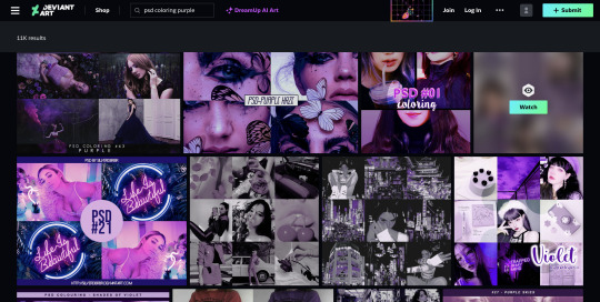
i pick whichever one i think might look best and download it.
then i head back to photopea.
at the top, click on "file" and the new psd you just downloaded, and it'll show up in a new tab.
stay on that tab, go up to "layer" -> "layer into" and select the first tab where the graphic's at. this applies the psd coloring onto ur graphic.
over at the side, there's something called "opacity: ___%" you can toggle with that if the psd is too overwhelming, so you can lessen it by dragging it down if you need to.
once you're satisfied, click "file" -> "export as" -> "png" and it'll be downloaded.
and that's pretty much it!
THIS CAN BE A LONG PROCESS THOUGH! literally in every step, you might end up going back and changing stuff.
for example, i do not like the right photo that i selected. the purple is too bold compared to the purple shades in the left and center photo. i'd probably go aaaalll the way back to the earlier steps by returning to pinterest to find a better photo
or maybe you don't like the psd you picked. if that's the case, delete the photopea tabs and redo the above steps with a different psd.
it can be a bit annoying if ur the perfectionist type and have to go back again and again 😅
but anyway, psd coloring's are great. i'm looking back at the og versions of all the graphics i made (og as in, before i applied the psd colorings) and they're soooo different from the finished pieces
23 notes
·
View notes
Note
hi! i was wondering if you have any advice/certain programs or anything you use for making gifs, because there’s something i really want to make but i have zero experience 💔💔
hello hello!
ah, yes, I have a TON, let's hope this ADHD girlie can give a somewhat concise description lmao. I will answer this publicly, in case it's useful for anyone else.
Software I use:
To make the screenshots: - for single scenes: KMPlayer 12.22.30 (the newer versions are trash) - for shorter videos, or something you want to get all the screenshots out of Free Video to JPG converter is awesome.
To make the gifs: - Adobe Photoshop 2021 (I don't recommend much later versions, because of the Cloud connection they have)
General gif-maker wisdom: "we spend more time on making sure that something looks serviceable, not pixelated, and good quality, than to get it moving and shit" - Confucius, probably
Useful stuff to make your life easy:
- Squishmoon's action pack for sharpening your screenshots. You can also find their detailed use explained here. - If you are planning to gif Wicked, some scenes are a bit tricky, ngl. But I have two PSDs that you can use, while you're perecting your own craft, and you can edit and update them to make them more "you".
A neutral PSD for mostly indoors and lighter scenes | download

A blue-enhancing PSD for darker scenes | download
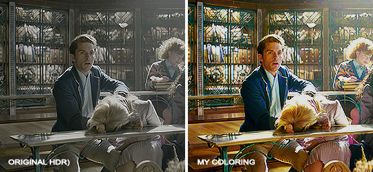
Some info on videos to use: - always, always (ALWAYS) use at least HD videos. Otherwise your gif will look like shit. This should be ideally at least 720p in resolution, but go with 1080p for the best results. Coloring gifs in 1080p is easy, but... - if you want to go pro *rolls eyes*, you could go for HDR (2160p) quality. However HDR is a mf to color properly and I would not recommend it for a beginner. When you extract frames from an HDR video, the image colors will end up being washed out and muddy so you will always have to balance those colors out for it to look decent, however, the quality and number of pixels will be larger. If you ar okay with making small/medium sized images, then stick with 1080p. (Storytime, I spent a lot of time making HDR screenshots, only for me to realize that I really hate working with them, so I'm actually considering going back to 1080p, despite that not being "industry standard" on Tumblr lmao. I'm not sure yet But they take up so much space, and if you have a laptop that is on the slower side, you will suffer.)
See the below example of the image differences, without any effects. You will probably notice, that HDR has some more juicy detail and is a LOT sharper, but well... the color is just a lot different and that's something you will have to calculate in and correct for.

The ✨Process✨
Screencaptures
I like to have all screenshots/frames ready for use. So as step one, you need to get the movie file from somewhere. This should definitely be a legal source, and nothing else (jk).
Once I have the movie. I spend a lot of time making and sorting screencaps. Since I mostly work in the Wicked fandom only atm, that means I will only need to make the frames once, and thats awesome, cause this is the most boring part.
For this, I let the Video to JPG Converter run the whole movie while I was aleep, and by morning, it created gorgeous screenshots for me and my laptop almost went up in flames.
You need to make sure you capture every single frame, so my settings looked like this:
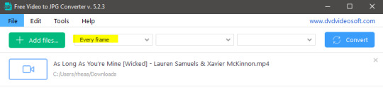
Screenshots do take up a lot of space, so unless your computer has a huge brain, I suggest storing the images in an external drive. For Wicked, the entire movie was I think around 200k frames total. I reduced that to about 120k that I will actually use.
And then I spend some time looking through them, deleting the scenes I know I won't do ever (goodbye Boq, I will never gif you, I'm so sorry :((( ) and also, I like to put them into folders by scene. My Wicked folder looks like this:

If you don't want this struggle and you only need a few specific scenes, there is this great tutorial on how to make frames from KMPlayer. Note that some of the info in this tutorial on gif quality requirements and Tumblr's max allowance of size and # of frames are outdated. You are allowed to post a gif that is a maximum of 10 Mb and 120 frames (maybe it can be even more, idk, said the expert) on Tumblr. But the process of screencapturing is accurate. Also ignore the gifmaking process in this tutorial, we have a lot easier process now as well!
Prepping the images
I have a folder called "captures", where I put all of the specific screenshots for a set I want to use. Inside this folder I paste all the shots/scenes I want to work on for my current gifset, and then I create subfolders. I name them 1, 2, 3, etc, I make one folder for each gif file I want to make. Its important that only the frames you want to be in the gif are in the folder. I usually limit the number of images to 100, I don't really like to go above it, and usually aim to go lower, 50-70 frames, but sometimes you just need the 100.
Sidetrack, but: Keep in mind that Tumblr gifs also need to be a specific width, so that they don't get resized, and blurry. (Source) Height is not that important, but witdth is VERY. But since there is a limit on Mb as well, for full width (540px) gifs you will want to go with less frames, than for smaller ones.
Once you have the frames in folders, you will open Photoshop, and go to: File > Scripts > Load files into stack.
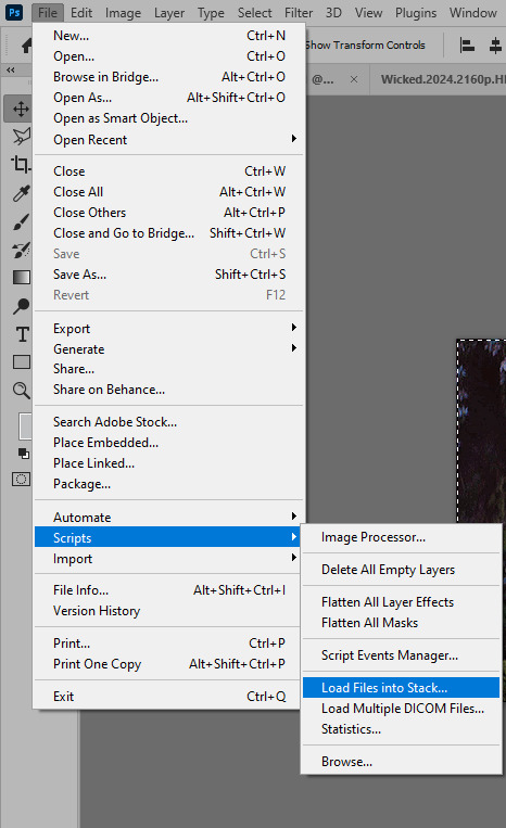
Here you select Folder from the dropdown menu, and then navigate to the folder where you put the frames for your first gif. It will take a moment to load the frames into the window you have open, but it will look like this:

You click "OK" and then it will take anther few moments for Photoshop to load all the frames into a file.
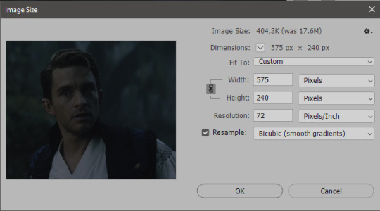
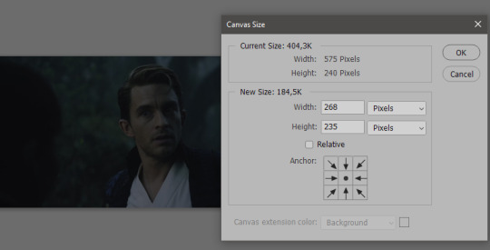
But once that's done, and you have the frames, you next have to resize the image. Go to Image > Image size... When you resize in Photoshop, and save as gif, sometimes you do end up with a light transparent border on the edge that looks bad, so, when you resize, you have to calculate in that you will be cutting off a few pixels at the end. In this example, I want to make a 268px width gif. I usually look at heights first, so lets say I want it to be a close-up, and I will cut off the sides, and it will be more square-ish. So I set height to 240px. Always double check that your width doesn1t run over your desired px numbers, but since 575 is larger than 268 (can you tell I'm awesome at math?), I should be good. I click OK.
Next, you have to crop the image. Go to Image > Canvas size... At this point we can get rid of those extra pixels we wanted to drop from the bottom as well, so we will make it drop from the height and the width as well. I set the width to 268px, and the height to 235px, because I have OCD, and numbers need to end with 0 or 5, okay?
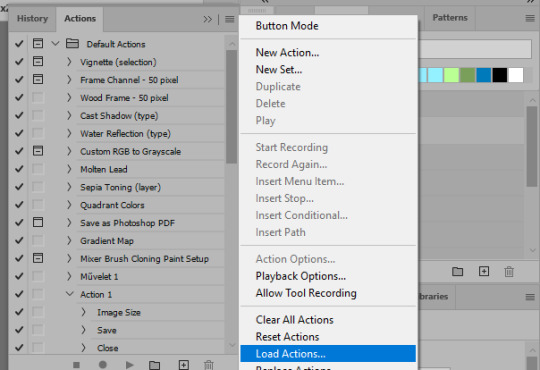
And now, the magic happens! First, go to Window > Actions to have the actions window show up. While you're at it, in the Window menu also select Timeline (this will be your animation timeline at the button) and also Layers. Once you have the Actions window showing up, on the menu in the upper right corner click the three lines menu button, and from the list select "Load Actions". I hope you downloaded the Squishmoon action pack from the start of this post, if not, do it now! So you save that file, and then after you clicked Load, you... well, load it. It will show up in your list like so:
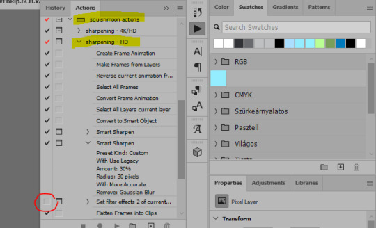
You will want to use the sharpening - HD one, BUT I personally like to go, and remove the tick from the spot I circled above, so leave that empty. This will result in the image having more contrast, which is very much needed for these darker scenes.
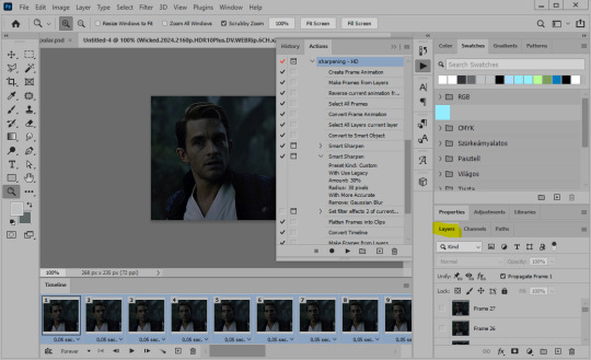
When you have that, you select the action itself like so, and click the play button at the bottom. The action will do everything for you, sharpen, increase contrast and also, create the gif and set the frame speed. You won't need to edit anything, just whatever window pops up, click "OK"

Now it should all look like something like this:
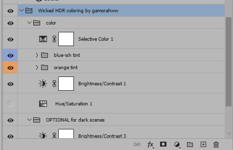
In the Layers window on the side, scroll all the way up to the top. The frame on the top is your last frame. Every effect you want to add to the gif should go to here, otherwise it won't apply to all frames. So at this point I open my PSD for darker scenes, and pull the window of it down, above the gif I'm working on like so:

And then I grab the folder I marked with yellow, left click, hold the click down, and drag that folder over to my current gif. And bamm, it will have the nice effect I wanted! You can click the little play button at the button to see a preview.

Once you have it sorted, now its time to extract it, but first, here's our before and after view:

Now, if you are happy with this, you can just save and close.
If you want to add subtitles, you can do that as well either manually with the text tool (remember, to add as the TOP layer as we did with the coloring) or you can use a pre-set PSD for that as well, here's mine.
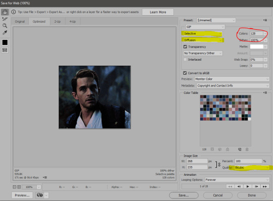
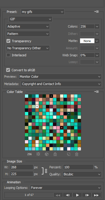
Now, we just need to export it. Go to File > Export > Save for Web (Legacy) and copy my settings here. Others may use other settings, but these are mine, so! I hope you are happy with them :3
In this case, for colors, I picked 128 colors, because on dark sscenes you can get away with using less colors, and the larger that number is, the bigger the filesize. If you use lighter images, you will need to bump that shit up to 256, but that will make your file larger. You can see at the bottom of the screen, how large your file will end up being. So long as you are under 9 Mb, you should be good :3
Conclusion
Look, Gif making and Photoshop in general is a bit scary at first. There are a lot of settings you can mess around on your own, a lot to play with, and also a lot can go wrong. This is a very basic tutorial, and also my current process and preferred coloring. However if you look at "gif psd" or "gif tutorial" or similar tags on Tumblr, you can find a LOT of great resources and steps, for many-many things. Usually people are not too antsy about sharing their methods either. You make 4-5 gifs, and you will have the steps locked down, and then it's all about experimenting.
After you have some muscle memory, your next step should be to explore what is inside a PSD coloring folder that you use. Open them up, try clicking around, click the little eye, to see what happens if they are turned off, and double click them, and play around with the sliders, to see what each does. Most people on Tumblr don't really know what each one does, we all just pressed a few buttons and got really lucky with the results, lol.
If anything is unclear, don't hesitate to ask, I'll gladly help!
Good luck <3
33 notes
·
View notes
Text
How I Make Gifs ~ For Anon ❤️

An anon asked me if I would ever consider doing a tutorial for how I make gifs! It's very flattering that you like my gifs enough to want to know exactly how I make them, so here is a little tutorial using my favourite character from my favourite movie ❤️
I might also make a separate tutorial for giffing dark scenes later 😌
Here's a download of my gif in PSD form if you'd like to get a better look at the settings I used.
Programs used: PotPlayer, Photoshop.
First, you need to get your screencaps. I would suggest using a high quality recording of whatever movie/TV show/video you want to make gifs of. My recording of Fellowship is in 1080p, and the quality looks incredible!
I use PotPlayer to get my screencaps. To do this, open the video file in the program and find the moment you want to gif. It's probably best to go back to just before that particular moment, and then press Ctrl + G. This will bring up the consecutive image capturer window. Below are the settings I use to get my screencaps:
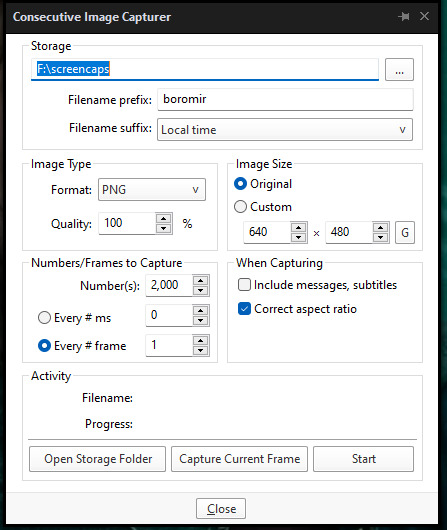
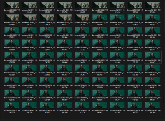
Then, press start and wait for your moment to be captured! Once you've got everything you need, press stop and navigate to the folder that you indicated under storage. Here you will find all of your screencaps! You probably ended up with way more than you need (I know I certainly did 😅). Now, delete all of the screencaps that you don't want in your gif.
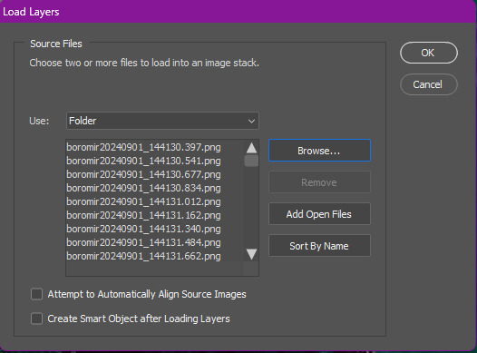
For the actual gif making, I use a cracked version of Photoshop. I don't exactly remember where I found it unfortunately, but I'm sure that there's people out there who might have some links handy if you look around! Once you've got PS open, navigate to File > Scripts > Load Files Into Stack... and click on it! That will open the Load Layers window.
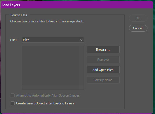
Now, change Use to Folder. Then, click browse and navigate to the folder that contains your screencaps. Click select folder, and after a few moments of loading your window should look more like this.
Then, press OK, and wait for your layers to load. Depending on how many caps you have, it could take longer. Once it's finished loading, you need to decide on your gif dimensions! For this, I decided on 268px x 225px. Once you've chosen your size, use the crop tool to get your gif to that size. Now, you should have a smaller image, like this:
The next step I do is to use this Photoshop action by @maziekeen. They have a little tutorial on how to use this action there, so I'll just say that once you've loaded it into your program, use part 1 / load into stack. Press the play button, and then the OK button on the two windows that pop up. Now, your gif will be nice and sharpened, and you'll be able to see it move for the first time! Here's what mine currently looks like, without any other edits:
Now, it's time to start on colouring. Every gif (or scene, sometimes you can reuse the same colouring if you're giffing an entire scene) is different, so it will have different needs. However, I tend to always use the same layers in the same order for all of my gifs — it's just the settings that change. I think the colouring of this particular scene is lovely, so I don't want to change it drastically, I just want to enhance it.
First, I create a Curves layer. At this point, I also like to make a group to hold all of my adjustment layers. This makes it easier for you to switch your adjustment layers on and off if you want to compare with the original colouring!
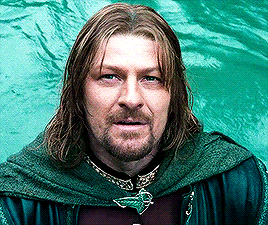
Going back to your curves layer, pick the little white eyedropper tool in the Properties tab. You want to find and click on the whitest area in the gif and make it a bit brighter! I picked the white in one of Boromir's eyes.
This is what my gif looks like now with the Curves layer:

Next, I use Levels. It's a very subtle change, but you can notice a slight darkening of the blacks in the image. Here's my settings for this layer:
And here's the gif with this step applied. Like I said, it's a very subtle change:
Up next is Brightness & Contrast. This layer is just a case of messing around with the settings until it looks right for you. You don't want to make it look too bright or too contrasted, though, because it will make the colouring look weird.
A bit more of a change this time! We're getting there:
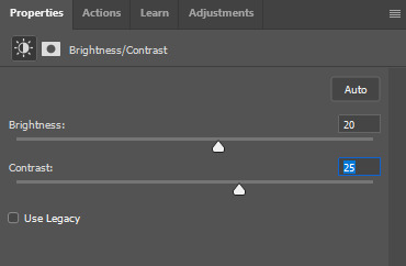
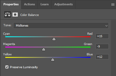
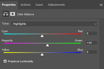
Next, I like to do Colour Balance. Sometimes I wait and do the Selective Colour layer first (it'll still be above Colour Balance though), but with this gif, I decided to do it first. I want Boromir in the foreground to contrast more with the watery background, so I upped the Red in the Midtones. I think Midtones is the most important part of Colour Balance, so the Highlights and Shadows are more minor adjustments here.
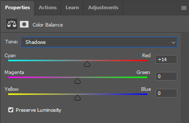
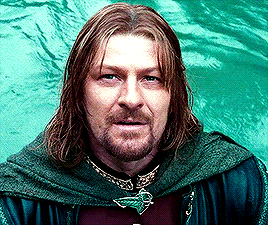
Here's the gif with the Colour Balance layer!
Now, we have Selective Colour. Like I said before, I sometimes like to do this layer and then go back to the Colour Balance to make minor adjustments. For this gif I mainly focused on slightly reducing the cyan in the reds and yellows to add a little more colour to Boromir's tunic and hair.
I'm a big fan of bright, vibrant gifs, so I like to use the Vibrance layer copiously.
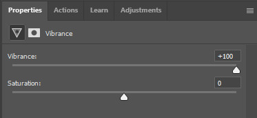
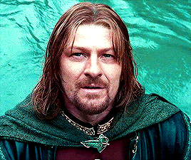
I upped the vibrance to max, but it's left Boromir's face looking a bit too red and his neck is a little pink, so I went back and did some minor adjustments to the Colour Balance and Selective Colour layers to fix that. Then, voila!
Now that we're done with colouring, go back to the beginning of the timeline at the bottom the screen. Then, go back to Actions and scroll down to the bottom, and look for the action called part 2 / finishing. Just like with the first action, press the Play button and it will work its magic!
Press Ctrl + Shift + Alt + C, and try playing your gif from there. Sometimes, the gif will be too fast and you'll need to slow it down, and you can't always tell until you play it in the 'Save for Web' window. I ended up slowing mine down from 0.05 to 0.07.
Once your gif is looking just right, press Ctrl + Shift + Alt + C again. These are the settings I use to save my gifs, and I think it makes them look really nice! Then click Save, and save your gif wherever you want.
Now, once you've saved your gif, you can post it to Tumblr (if that's what you're wanting to do) or simply keep it to yourself! But I'm sure that others would love to see your creations :D
***
A little extra info - this gif doesn't have text because there's no dialogue, but these are the settings I use for gifs with text (the text size depends on the dimensions of the gif):

Sometimes I use white text, sometimes I use yellow. And if there's more than one person talking I use both!
I hope that this tutorial was helpful, and if you have any more questions, feel free to ask!
#gif making#gif making tutorial#gif tutorial#psd tutorial#gif coloring tutorial#gif colouring tutorial#mari speaks#mari’s stuff
39 notes
·
View notes
Note
hi, this edit is cool, would you please tell me how do you make the circle shape and text like that in the second gif?
https://mikelogan.tumblr.com/post/727834848573669376/forgiveness-is-warm-like-a-tear-on-a-cheek-think
hi!! i'm so sorry this took me so long to answer, but i've hardly been on my desktop for the last couple months and haven't been giffing. finally getting around to this and thank you for the kind words!

in this tutorial, i'll show you what i did as well as another way to achieve the same effect:
once you've made your gif and colored it the way you want, you can get the circle effect one of two ways. i'll show you how i did it first and then a more "normal" way lol
i actually had this circle texture laying around and for whatever reason, i decided to use that. so i popped that onto the canvas and used ctrl+T to center it both vertically and horizontally
then i used a glitter texture over the top of the circle layer and applied a clipping mask so that the glitter only shows up on the circle and not the entire gif. to do this, make sure your glitter (or whatever texture you decide to use) layer is ABOVE the circle and then right-click on the glitter layer and select "create clipping mask." you should see this lil arrow on the layer now:
as a quick note about textures/overlays: chances are that if you just google "glitter texture png" or something similar, you'll find tons, but the png portion is important because pngs have transparent backgrounds. this wouldn't work if the circle texture was a jpeg because its background is not transparent and the overlaying of the glitter texture would appear on every pixel, basically just taking the shape of the entire jpeg rather than just the circle.
i have a resources (basically anything downloadable, from overlays to actions to psds) tag on my gifmaking sideblog as well as one specifically for textures and overlays. i also utilize the websites freepik, pngegg, and pngwing for pngs (especially freepik).
to make the glitter layer the same pink/purple color i used, i ended up using a hue/saturation layer above it and also applied a clipping mask to that layer so it only affected the glitter layer. this step is totally optional depending on the coloring you're going for. you might be happy with the glitter texture exactly as it is. you could also skip the hue/saturation layer and instead apply a color overlay to the glitter layer, select the color you want, and set it to screen or another similar blending mode. to do this, double-click on the glitter layer, select color overlay from the menu, choose whatever color you want, make sure the opacity is set to 100%, and adjust the blend mode to whatever you think looks best.
the "normal" way to do the circle would just be to use the ellipse tool (right-click on the rectangle tool and choose ellipse) and input your desired dimensions. to get a perfect circle, the width and height have to be the same as one another. then you'd continue on with the rest of the process.
for the text, create your main text layer. these were my settings for a 540px canvas:
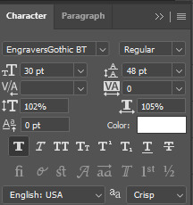
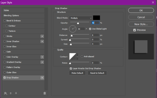
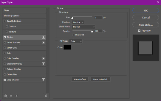
i also added a drop shadow to the layers with these settings (double-click the text layer to bring up this menu):

then i duplicated the text layer 6 times. select the first duplicated layer (the second line), use ctrl+T and your arrow keys (i only used the down arrow) to move the text down the desired amount of space. i made sure i moved each line down exactly 25 pixels, which is equal to 25 presses of the down arrow. i just think it looks nice when they're equally spaced. with each subsequent layer, i just dropped the opacity.
starting with the original text layer, i used: 100% -> 80% -> 60% -> 40% -> 20% -> 10% -> 5%, but this was just my personal preference.
anyway, that's pretty much it! but if you have any additional questions on this tutorial or any other set, just send me a message and i'll do my best to get to it much quicker than this one 💙
24 notes
·
View notes
Text
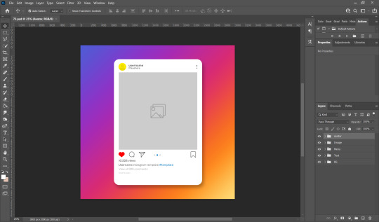
hello friends! 🌷
recently i got an ask on how i edit my instagram screenshots and here in gemville, all you have to do is ask and you shall receive my child
fun stuff under the cut!
this guide will be divided into two parts: how i take & edit my gameplay screenshots and how i edit my simstagram posts
before we get into the actual tutorial, here are a list of things that i use to help me take better screenies :)
gshade
i'm using an older version of gshade because - thanks to my procrastination - i never updated the version before everything went to shit.
2. presets!
i switch around between presets a lot lmao but for the most part, i use ellcrze's gshade preset for my family dynamics save, sunset n vinyl for my globetrotter save & sim download pictures and a modified boho dreams for my tjol legacy save (first post coming up soon!) sometimes i use lithium for cas pics too :p click here for a somewhat detailed explanation lol
3. tab mode camera mod
this camera mod is a godsend and makes taking screenshots soooooo much easier! 😌 i highly recommend getting this mod!!!

i think i mentioned this before in an ask - i edit my screenshots in photoshop before posting them on tumblr :D i don't really do much, just running a few actions and cropping my screenies. gshade does most of the work for me lol
this tutorial by @buglaur is insanelyyyy helpful omg i based my entire editing process on her tutorial, except for the colouring part because i'm lazy hehe
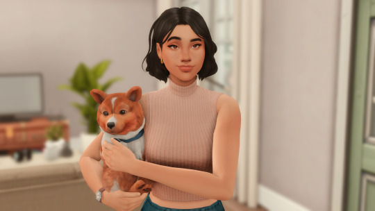
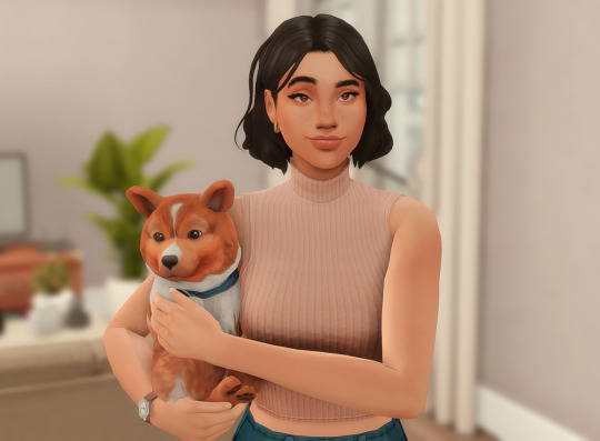
here's an example of my screenshots before and after editing (cropping the screenshot and running some actions)! there’s not much difference because as i said earlier, gshade will basically carry your entire editing process 💀
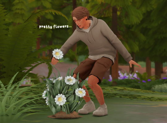
sometimes i put text in my pics like these screenies below :) i mainly use these two fonts - winkle and lemon milk :D
and that's about it for part one! now it's time for
here's what you neeeeeed
1. photoshop
i'm using a 🏴☠️ version of photoshop that i got from a somewhat sketchy website but it runs great so i'm not complaining 💀
2. instagram post template and instagram story template
a HUGEEEE thank you to @windslar for sharing the instagram story template link 😭 she is such an inspiration to me 💛
3. the actual instagram app
this is how i add text and emojis to my simstagram posts lol
disclaimer: i am NOT a photoshop expert. there's probably an easier way to do what i'm about to show you, but this works for me and i don't really mind the steps hehe
first things first, you're gonna want to open the psd files on photoshop and it'll look like this, depending on which file you opened
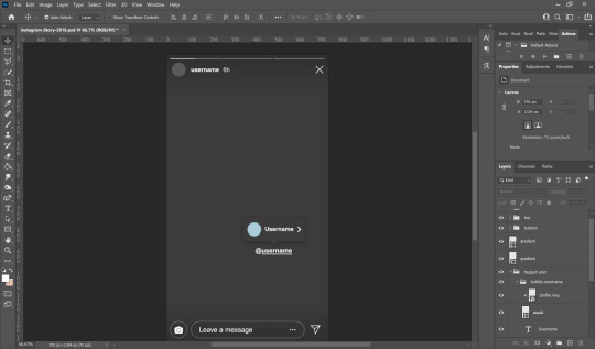
i usually just hide the layers that i don't need so in this case i'll hide the tagged users layer from the story psd and the bg layer from the post psd.

these are the layers that i hide but you can also leave them on if you want hehe totally up to you my dude. then you'll end up with something like the pics below

now we move on to the profile pictures! so what i do is i click these layers (shown below) and go 'file > place embedded > selected picture'

once you do that, you'll end up with something like this (below)! use 'ctrl + t' to resize your picture to fit into where the profile picture would go.


right click on the layer of your selected picture and click 'create clipping mask'. then you can hit 'ctrl + d' to adjust the picture to your liking!
now for the actual pictures for the posts. click on these layers (shown below) and go 'file > place embedded > your selected picture'


now all you have to do is 'ctrl + t' to resize your pictures, right click on the layer of the selected picture and click 'create clipping mask' then 'ctrl + t' again to adjust the pics!
after this whole process, i'll export my pics to my family dynamics folder on my desktop and queue it up on tumblr! :D sometimes my simstagram story posts have text and emojis like these ones below
all i did was upload the pics to google drive, download it to my phone, add text/emoji on the actual instagram app then saving the story to my phone... a lot of work but i don't really mind <3
aaannnnddd that's it!!!! i can't believe i made this guide 😭 hopefully this helps :D english isn't my first language so apologies for any grammar/spelling mistakes i've made in this post 🙈 feel free to ask any questions and i'll try my best to reply to you asap!!
207 notes
·
View notes
Note
Heyy, do you have a tutorial on how you make your gifs? They’re so crisp and beautiful, I wanna start making gifs but idk where to begin
hello!! first of all, thank you kindly!!!! i'm always stunned when someone genuinely appreciates my gifs 😭
second of all, please do!! gifmaking is such a fun hobby, i wish it were a tad more rewarding but truly it's a great creative outlet for hyperfixations.
now, i personally don't have a tutorial but that's only because i myself have learned from a bunch of other ones during my years of trial and error and my technique has nothing that's original to it. i can, however, tell you which tutorials i turn to whenever i need a refresh + some tips i have started implementing on my own!!! i'll put everything below the cut.
the tutorials are this one and this one; the first one is a more general step-by-step one and the second one is for adding noise to gifs when they don't have it naturally, which imo greatly helps with making gifs look more hd.
as for the tips:
whenever possible, and if your pc can handle processing them, try and find files that are at least 1080p. 2160p isn't really necessary unless you're making close-up gifs (though i almost always use it if i can find it), but a 1080p file is only legitimate if the size of it is 1.5gb+. anything below that is not actually hd, no matter the claims.
with videogame footage, i generally record my own gameplay and take screencaps from there. when i want to gif youtube videos or anything i can't download by my usual means, i use 4k video downloader.
i used to take my screencaps with kmplayer, but i've been using mpv over the past few months and i find it works more smoothly. kmplayer did serve me well for years though, and the installation isn't as gimmicky, so go with that if you find it easier!
when it comes to resizing the gif (image > image size), i always leave the mode on bicubic automatic; for a time i used to pick bilinear, but i later learned it was the reason why my gifs didn't look how i wanted them to look.
i generally sharpen my gifs with the same action pack mentioned in the first tutorial i linked, but i do also add an unsharp mask layer to make it extra crisp and detailed. these are my settings for it:

whenever i'm giffing something that is not available in Real HD (like youtube videos), i add a step to my usual sharpening by using a set of plugins from topaz labs; now, i have absolutely no idea how i installed them when i did years ago, and i have no clue how to find them anymore, but i'm sure tumblr has answers somewhere. specifically i use topaz clean. i'm pretty sure you could achieve a similar enough result by adding a gaussian blur level to the sharpening, though; either way, my settings for topaz clean are:
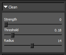

when it comes to coloring, i never use .psds, i make the coloring from scratch for each scene, and most times i use multiple colorings per scene. it will take a little while to find your footing with color correction perhaps, but then again, each gifmaker has their own style and that's what's fun!!! one thing i've taken to doing most times, however, is adding an exposure layer towards the end of my coloring layers and upping both exposure and gamma correction based on how much or how little the gif can tolerate; i find it helps a ton with making gifs look hd on mobile, which is notoriously hard to achieve because mobile hates gifs. also, i have a pretty heavy hand when it comes to contrast and to darkening blacks, because in my experience that also helps with resolution.
when i go to save for web once i've finished making my gif, i tend to pick the combo adaptive+diffusion. very rarely i switch from adaptive to selective, but only if adaptive makes the gif look weird, which is usually not the case.
this should be all, i really always follow the same process and it's pretty automatic by now lmao. forgive me for yapping at length, but i hope this can be helpful to you or anyone who might want to try their hand at gifmaking! i'll update the post with my settings asap. thanks again for the love 💕
13 notes
·
View notes
Text
Tidbit: Persnickety About Posters
If you want to avoid overly dark or blurry posters in your fan adventures, then follow my lead:
1) Download JPEG off of Google Images.
2) Import, scale down, and skew/shear it. Use an interpolation method such as Bilinear or Bicubic Sharper. Doing both transformations at once is better than repeatedly transforming the image (i.e. resizing it, applying the transform, and then skewing it), as it helps prevent the image and edges from becoming too blurry. This will be important later.
You can hold down Ctrl + Shift to constrain the Move tool along a single axis so it won't go out of alignment as you're skewing it. If you don't see the Transform Controls by default, enable it in the tool options bar at the top, or go to Edit>Free Transform.
3) Desaturate it. Desaturate means to turn color grayer, until it becomes black and white.

4) Adjust the brightness and contrast using the Levels adjustment tool. It's much too dark as it is! In Photoshop, it is located under Image>Adjustments>Levels..., but I recommend creating an adjustment layer from the bottom of the layers tab instead. Doing so will allow you to make edits non-destructively, meaning you can go back and change any parameters until it looks right.

You could use a Brightness/Contrast adjustment with "Use Legacy" enabled instead to achieve a similar effect, but it won't clip the shadows and highlights as easily. You would have to create an additional duplicate adjustment and turn the brightness and contrast way down on the first one to do so. It's somewhat easier to use but less efficient than Levels in this case.
5) Apply a simple sharpen to the image as it is still too blurry for our purposes. In Photoshop, it is located under Filter>Sharpen>Sharpen... Do not use any other filter, such as Unsharp Mask, unless you absolutely have to in lieu of a basic one. If you must, turn down the radius a bit and the threshold all the way to 0.
6) Make a selection around the image. Ctrl + left click on the layer's thumbnail to make a selection around it. Doing it this way makes it inherit the level of transparency any pixels have. If you can't, use the Magic Wand tool with "Anti-alias" enabled to select the transparent area outside, then invert it using Shift + Ctrl + I, or go to Select>Inverse.
Create a new layer above the image, then go to Edit>Stroke... and add a black stroke with a width of 2px located Outside. Leave everything else at the default. Doing it this way will create a stroke with anti-aliasing based on the selection you made. This should generally turn out pretty sharp if you follow my advice from Step 2. If you had used the Stroke Effect available from the Blending Options' layer styles, it will always result in a very smooth outline instead. You do not want this.
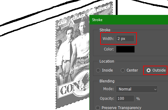
Voila, and Bob's your uncle, you're done!

The instructions above are Photoshop specific, but it should still be pretty software-agnostic. Here is the recreation PSD, and below the read-more link are additional notes, such as transferring the steps to something like GIMP.
ADDENDUM
You may be questioning why I deliberately made the stroke anti-aliased. "Isn't that an MSPArt cardinal sin??", I hear you clamoring. Well, my dear readers, let me briefly elucidate you on why your ass is wrong. Exhibit A:
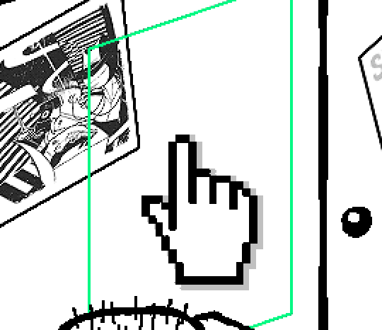
The clearly semi-opaque pixels that can be found in every poster outline, which is especially pronounced here in the Little Monsters poster. I can also see that Hussie actually created a stroke on the same layer as the poster and merged it down into the white background like a dumbass. I omitted this in step 6 for the sake of convenience (and also the fact that you can't add a stroke to a smart object in Photoshop without rasterizing it first).
He had to use the magic wand tool in order to extract it from the layer for this panel, and then fill it in with the paint bucket tool. I can even tell he had the color tolerance set up very high on the magic wand to grab all those near-black and very light gray pixels, AND he had anti-alias enabled and the tolerance on the bucket tool set to be at least higher than 0 to tint similar colors. Exhibit B:

I also didn't address exactly how to desaturate something in Photoshop. Honestly it was because I was feeling pretty lazy. I would have had to rewrite step 4 to not include redundant information about adjustment layers. You can add either a Black & White adjustment layer or a Hue/Saturation one and turn the saturation all the way down to 0. The resulting tones will be slightly different from each other but I'll explain why that is in another tutorial.
Speaking of another tutorial, read this one if you believe this post is missing the step of using a posterize filter.
Now onto applying some steps to GIMP.
RE: step 2) In GIMP, there is a dedicated Unified Transform tool separate from the Move tool, unlike in Photoshop where both features are combined into one. This is how you scale and skew (AKA shear in GIMP) both at the same time, among other things such as rotating.
You'll also find that instead of any interpolation methods labeled "Bilinear" or "Bicubic", there are only ones named "Linear", "Cubic", "NoHalo", and "LoHalo". Basically, Linear and Bilinear are the same, so are Cubic and Bicubic, naturally. I guess NoHalo would be similar to Bicubic Smoother and LoHalo would be kind of similar to Bicubic Sharper as well. It's not an exact 1:1, though.
Honestly it doesn't really matter what you use to reduce the size as long as it isn't None/Nearest-Neighbor. You're going to have to sharpen it no matter what. This applies to Photoshop as well.
RE: step 3) Go to Colors>Hue-Saturation... and repeat turning the saturation down to 0, or go to Colors>Desaturate>Desaturate... and select the Lightness (HSL) method.
RE: step 4) Go to Colors>Levels... or Colors>Brightness-Contrast... The Brightness-Contrast adjustment tool already functions almost exactly like in Photoshop with "Use Legacy" enabled.
RE: step 5) In GIMP 2.10, the developers squirreled away the basic Sharpen filter, making it inaccessible from the Filters menu. To use it, hit the forward-slash (/) key or go to Help>Search and Run a Command... to bring up the Search Actions window and type in "sharpen". Select the option that just reads "Sharpen..." and has a description of "Make image sharper (less powerful than Unsharp Mask)". I find that using a sharpness value of around 40 to be similar to Photoshop's sharpen filter.
RE: step 6) Instead of holding down Ctrl, you hold down Alt and click on the layer thumbnail to make a selection around it. Make a layer underneath the image this time since there isn't an option to place the stroke outside the selection rather than the middle. Go to Edit>Stroke Selection... and create a stroke using these settings:

I recommend keeping anti-aliasing disabled however, as GIMP produces lines that are a little too smooth for my taste.

With "Antialiasing" enabled
Without
If you're using a program that doesn't have a stroke feature available, you could draw a straight 1px thick line across the top of your poster, duplicate it, and move it down 1px. Merge them together, duplicate it again, and move it all the way down to the bottom of the poster. Then repeat the exact same process for the sides. I used to do this before I even knew of the stroke feature, haha.
Another reason I had to do it this way was because my dumb ass did the thing I said not to in step 2, scaling down the image with the scale tool, and then shearing it separately with the shear tool. This caused the edges to become too blurry to be used for a stroke automatically. Oh well, live and learn.
143 notes
·
View notes