#i COULD just copy paste the text but the VIBES of screenshotting it are very important to me
Explore tagged Tumblr posts
Text

[image id: a screenshot of tumblr tags reading: #i hate being in Walmart a lot because its really overwhelming to me between the bright lights and loud sounds and very crowded with people #BUT i would go to Walmart just to give him a hug and make sure he's okay oh my gosh :( #working retail sucks i get it.. i want to bring him like lunch or /something/ to make his day better. end id]
this is so funny. i based every single drawing of walmart!volo off a personal experience i have had as worker. yeah
#furby screams#[referencing the drawing] yeah. shoutout to when i was legitimately told to work two departments spanning almost 50 aisles by myself#i did not finish the freight that night.#the spills thing is just every night it barely phases me anymore tbh#except for the cologne#that is AWFUL#cologne is the one thing that still gets me every time it spills#anyways jack lore just dropped i suppose. walmart worker#also. always feel a bit silly typing up the image id for tumblr tags when it could go in the alt text#but alt text never works for me on mobile so i have to assume the same is true for others yk#i COULD just copy paste the text but the VIBES of screenshotting it are very important to me
3 notes
·
View notes
Text
Hello! Just me back and being a huge nerd about the Eliksni So, while we don't have an actual official conlang for them we do have a VIBE for how their language might be written out by the design team. And it's been under my nose this whole time!!! Join me for this journey and exploration <3
First off let's take a look at what I've been seeing most places.. like, 99% of all the language we see is basically given to us like this...

(Yes, I might have obsessively taken a screenshot every time I see the in-game language DONTJUDGEMEOKAYTHISISASAFEPLACEFORSPECIALINTERESTS >.< But what we see here are probably something like a single word, or a word/symbol that has a meaning like the way that the Chinese alphabet has meanings for each letter. It could also be a tagger's name, but then that brings up all sorts of wonderful questions like WHO IS TAGGING THIS SHIT xD which is really just a nothing burger as much as it's a wonderful idea. It could also very much be a sort of... Like... you know how when you get a rubbermaid bin and you write like... "Christmas ornaments" on it, but then end up get rid of what's in it and just write the new contents next to the old contents? I feel like that might be what a lot of these are. Like the OFFICIAL, clean looking one says like, "Ether Tanks: Medium". And then the new spray paint next to it says something like, "Short Term Produce" or whatever. Or maybe it's like, the shortform name of the crew that this belongs too for shipping and redistribution, ala a quarter master trying to keep track of everything. 🤷
But I'm digressing. Here are those formal script and then the messy next to it.

Anyway. So the other way we see the language in very small snippets is like below, where we see there is a strong (but with notable variance) inclination towards a horizontal writing style instead of vertical. We can also see the general vibe or, um.... flow of the text and individual letters and how they deferrer when they are basically typed out and printed nicely instead of freehanded on the side of a wall.

Okay.
We have our baseline. Let's get into the weeds.
First of all we should not take into consideration a few of these for the rule of vertical vs horizontal because many of these are actually just turned on their side. And in general (and really what this whole post is about) right now I am focusing on the way the design team has decided the language should feel when it's written out. So very briefly, I am going to go over some not in-game official bungie material with Eliksni script on it, since I feel like this I have too, even though I kinda feel like, unless they specifically say "this is how it looks", the in-game art design is always going to be more... official? I don't know. We press forward!

There's more, but I think you get the idea. And yes, I included the Cayde comic because I feel like there's some interesting things in there.
Anyway, moving right along. I want to bring attention to two thing in particular. The first is that I don't think we should dismiss certain small lines in the spray paint versions as drips. I think they are part of the form.

I think they have meaning like in Japanese or other languages where each character has a story or a meaning and changes the way a word is said and also how that word might be used or changed when interacting with other letters/symbols.
The second thing is that there is a lot of repeating/flipping of the decals and in-game assets. But even with that, that I think there is a definite flow with the way the letters are allowed to smoosh into one another, but on a design level, while I think there are some basic rules, I feel very strongly those rules went into making the original script/decals/assets that the devs now use, and that when they go to write something like this...

they are literally just copy/pasting or going "qwertyuiop[]\';lkjhgfdsa" on the keyboard. Now, on to the exceptions of which there are three (as far as I've seen). For this next part I humbly request that you forgive my waxing poetically and also indulge my theories, I promise they are actually based in reality xD The first, and most exciting, and the reason I even posted this, is that I finally noticed the flags on the skiffs! And they.... have a FONT... And actual in-game font... and I think it was a happy accident the devs rolled into some fun lore.
This...

is house of dusk... but the FONT that whateverthissays is in is ABOSLUTELY in the style of House of Winter.

Now, I have two thoughts about this. The first is the happy accident I was talking about before which is that the original skiffs were all done in the design for House of Devils... and House of Winter in D1. But then they needed House of Dusk, who are mostly all the house of winter peeps who scattered after The Final Attempt (battle of six fronts). So they just recolored the House of Winter stuff and BOOM, they can keep the old assets and just recolor them.
The second idea, and one that is a DEEP LORE thought, that I don't think bungie actually cares enough about their lore to connect the dots for: is that as mentioned in a lore tab where Variks and I believe Fikrul are talking, there is a mention of a second "High Speech". And to me, it would make a LOT of sense for there to be a written version of that High Speech that would be a bit more flowery and have different characters. I think it would also make a lot of sense for that more special text be what things like House symbols are made out of, and also what one might put on their flags... like on that skiff.
The second is this little guy... he's very new and I only saw it recently, and I'm nearly 99.99% sure it's eliksni, only because there is a break in the "C" in the center and that's VERY eliksni.

That and it's on a crashed ketch that was in a mission we played within the last year lol
But this is.... totally different from everything else we've seen, and I honestly am totally stumped. It might actually be a representation of the influence that humanity has on the Eliksni. And that many eliksni (especially those in house of dusk) feel disconnected from their heritage, and more connected to the ruminants of humanity's golden age, and earth in general.
The other interesting little thing is something I found on a ketch that I managed to get on top of before it despawned. (at least that's what the file name makes me think I was trying to convey >.< past me is a dumbass and says "Oh, I'll know what this means later" spoilers, I never ever know lol)

Again, this is... just completely different from what we've seen before. Even the letters are different. The way they are grouped is new. I just wish I had more of stuff like this.
But theory crafting aside, we can really get an impression for how one could replicate or imitate the flow of the language. That's it! Thank you for coming on this little meandering exploration of the in-game text ^^..^^
12 notes
·
View notes
Text
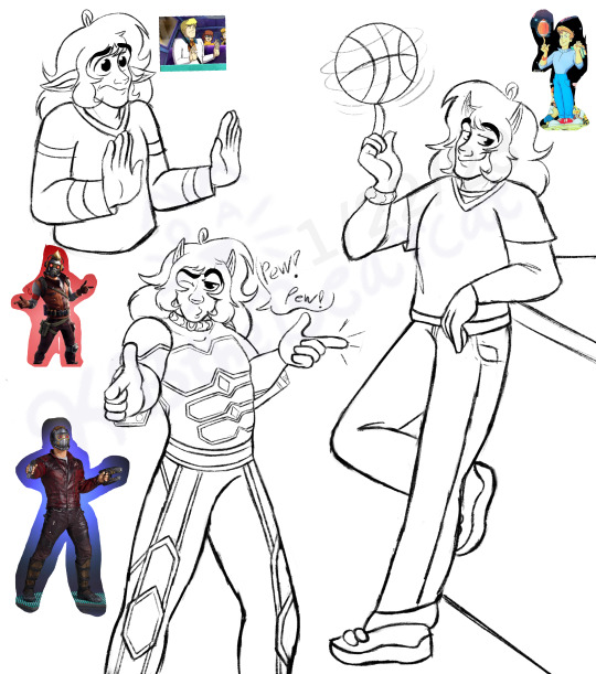
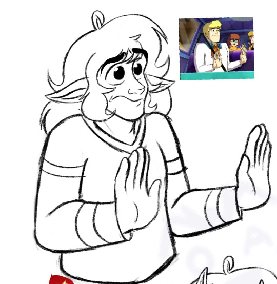
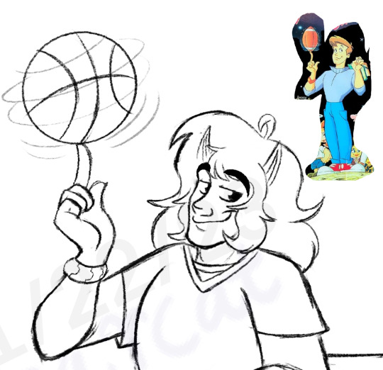
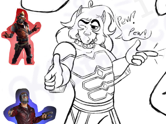
Art from January! WALL OF TEXT INCOMING (I copied and pasted the desc I typed out on DA hgngh…) I looked up poses for some of the characters that inspire me when it comes to Troy’s character and his world.
The ones I picked here are Fred from Scooby Doo, Doyle from Galaxy High, and StarLord from Guardians of the Galaxy.
All of these character I feel share similar traits and energy. All of them can be goofy and silly or like to crack jokes, and even have similar physical characteristics. Fred is usually depicted as being a bit out of touch and does some pretty unexpected and funny things, also gives off “himbo” vibes. His actions or methods to catch the bad guy can seem unorthodox, but still work. Overall just quirky, but means well. I see Troy as that too. Unless it’s a very serious situation, Troy’s silliness and goofiness is going to come out while he’s on the job and in uniform, but that doesn’t mean you can’t count on him to get the job done.
In the more recent stuff they show Fred to have an obsession with nets and traps, and that reminds me of Troy and his love for tacos. He also just gets excited or really happy about certain things in general, which makes me think of Troy too, because he can get like that about things. I could have chosen a lot of poses and expressions with Fred tbh, but I saw him making that one in a clip I was looking at, and I just got an urge to draw it.
I haven’t gotten to watch every episode of Galaxy High yet, (there aren’t that many as the show didn’t last too long) but from what I’ve seen, there’s a lot of elements in there that inspire me, not just the main character. The overall plot of him and another human girl from earth being chosen to attend a high school in space is already interesting to me. There’s aliens of all kinds co-mingling, futuristic tech, space-related hijinks, and just good-ole 80s vibes! Which of course, I always enjoy.
Doyle himself is pretty much a jock. Not an extreme one, but I’d consider him being in the category. He’s sporty/athletic, plays football. That reminds me of Troy because he’s athletic and sporty too and plays basketball. That’s why I thought that pose there would be a good one to try.
They make Doyle out as meaning well too, but since he’s a teenager his choices aren’t always the best. There’s usually a lesson to learn at the end of an episode. Even though Troy isn’t a teenager, he’s still a young adult, and can honestly still act like a teen or big kid anyway.
ALSO Doyle works as waiter at a diner, and Troy works as a waiter at a restaurant when in hooman disguise! I didn’t even know about Galaxy High when I made that a thing for Troy, so I thought that was an interesting similarity as well. I’m tempted to draw Troy in the outfit Doyle wears just for the fun of it.
Annd then we have Starlord, who may be the least surprising choice here…. He’s a part of a group called “Guardians of the Galaxy”. They travel around space helping people, fight bad guys… and there’s some comedic flare thrown into the mix. I mean, that’s pretty much Troy’s concept in a nutshell. Starlord himself reminds me of Troy in a lot ways. I could see Troy listening to oldies music while in his ship, or exploring a planet, jamming out and all that. Cracking jokes while he’s fighting with something or someone. All that stuff.
Whew boy, uh… sorry for this wall of text here. If you made it to the end of this then kudos to you haha. ;w; Just felt like giving a bit of explanation for each character here… there’s many more characters that have inspired me with Troy though.
Also this was a experiment here, taking screenshots or looking up pics of characters that inspire me and trying to redraw their poses/expressions. I gotta do this more. I’ve never really gotten to before but it really helps with going out of my comfort zone and exploring a character more.
12 notes
·
View notes
Note
How do you layer gifs? Or am I just dumb?
Hey there. It’s not dumb, lovely anon, it is a bit tricky and I only learned it last year myself. I guess the method for layering gifs really depends on the general gif making method you are using. I’m gonna try to explain the way I’m doing it and I hope it makes sense to you.
Unfortunately I can’t find an earlier ask where I explained my general gif making method anymore but here it is very quickly:
Step 1: screen record scene I want to gif
Step 2: use KMPlayer to extract frames
Step 3: load frames into Image Ready where they will be automatically animated (then “reduce frames to layers”)
Step 4: import frames from Image Ready to Photoshop CS2 (yes, that’s an ancient PS version but it’s freeware and I’m used to it so I’m fine making gifs like a medieval peasant.)
Step 5: crop, sharpen, colour, add text
Step 6: “save for web”
So with this as a basic explanation of my gif making process, I can get into how I layer them. [Disclaimer: My Photoshop is set to German and I don’t always know how the functions are called in English but it should be something similar and at least in the same place, regardless of the language your Photoshop is set to. Also I think this should work similarly for newer PS versions as well.]
prep work: I have two gifs with the exact same number of frames readily imported to Photoshop, they are already sharpened and maybe cropped but that’s it (so basically steps 1-4 and some of 5)
Step A: choose the gif that you want to put on top ➞ select frame 1 and layer 1 ➞ click that little triangle in the animation window ➞ click “select all frames” (in my case I want to put Liz on top of Red because that’s just the kind of person that I am, you know?)
Step B: select “copy all frames”
here is a screenshot of where to find that:

and a close up:
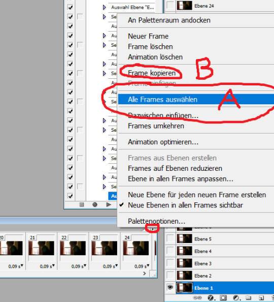
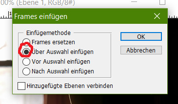
Step C: go to the bottom gif (=Red) and repeat step A (frame 1, layer 1 ➞ little triangle ➞ select all frames) ➞ click on what’s called “Frames einfügen” in German (should be ”paste frames” or “add frames” or something like that in English)
Step D: a little window should pop up ➞ select... well... whatever the second option is called in your Photoshop’s language. It means to paste the frames over/above the selected ones (as opposed to adding them before or after).
If you’ve done that correctly you should now have the same number of frames as before (29 in my case) in the animation window but twice as many layers (so 58 for me) in your layers window - note that this process gives you two sets of layers that are called “layer 1″, “layer 2″,...., “layer 29″. One set would be all of the bottom gif’s (Red’s) layers, the other one all of the top gif’s (Liz’s) layers. It is important for the next steps that you do not get these confused so make sure your layers window shows you the little preview images.
In order to make Liz semi-transparent I have unfortunately not found a more effective method than to go manually through every single layer and frame and change the layer style to “reverse multiply” or something else that makes the bottom gif “shine through”. I do this as follows.
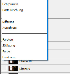
Step E: Select frame 1 and layer 1 (of the top gif/Liz’s frames!!!) ➞ click on the “layer style” drop-down-menu (it should be set to “normal” as default ➞ choose a layer style you like. And here comes the tedious part: Repeat for every layer/frame of the top gif (= select frame 2, layer 2, change style / select frame 3, layer 3, change style / ....). I circled the styles that I usually find work best. “Umgekehrt multiplizieren”/”reverse multiply” is my fav but sometimes one of the other three in that category look better depending on the specific colours so just try it out for one frame and then settle for the one you like best.
After doing that for all frames the gif I made looks like this:

if you like you could leave it at that. but I want to move Liz a little further to the left so here comes...
Step F: I select all frames (see step A) and all of the top gif layers and then use the moving arrow tool (or the arrow keys if you prefer those) in order to drag all layers over to make it look like that:

but now I don’t like that sharp line across Red’s face sooooo
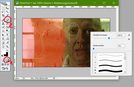
Step G: now I go in and delete some pixels in the Liz gif with a soft edge so it blends better. I do this using the masked mode (no. 1 below) first to select the pixels I want to delete (no. 2 below), then leaving the masked mode and deleting manually, again going like this: frame 1, layer 1, delete / frame 2, layer 2, delete /... [alternatively you can do this step BEFORE step A (and be clever and write an Action for that to save you from getting carpal tunnel syndrome from all the damn mouse-clicking) but then you really gotta be sure which parts you want to delete beforehand or else you’re fucked]
After doing that the gif looks like this:
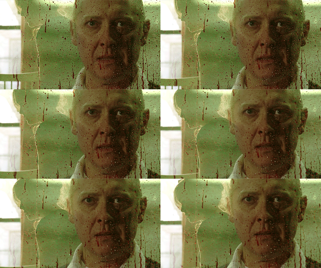
see? Much softer edge! All that’s left to do now is colouring the hell out of it and you’re good to go! I hope this makes sense for you and works with your gif making method. Again, it is a bit tricky and you have to use your brain a little more than for usual gif-making to make sure you get the order of steps right and also kinda have to plan the placement of the two gifs beforehand. Also, not every scenes work together. Sometimes it just looks weird or the vibes and colours don’t go together. But when it does work out it looks damn amazing and you’ll feel very accomplished!
#Photoshop CS2#gif making#gif tutorial#gif making tutorial#Photoshop tutorial#about me#hey there gif making tags#may I offer you some James Spader in these trying times?#Anonymous#long post
51 notes
·
View notes
Text
Stark Spangled Banner One Shot: A Snack

Summary: Katie’s hungry…and there’s only one snack she’s pining for.
Warnings: Language!! Smut (NSFW)
Pairings: Steve Rogers x OFC Katie Rogers (nee Stark)
Square filled: Mutual Pining for @avengersbingo
A/N: This is set in the Stark Spangled Banner Universe, taking place in late 2024. You don’t have to read that full series to enjoy this but feel free to if it grabs your attention. To all my regular SSB readers, as a treat I’ve included the messages referred to at the bottom for a bit of fun too!

Steve grabbed his thermos full of coffee before he headed out to the hallway, meeting Katie at the bottom of the stairs with a fully dressed and clean Jamie in front of her, freshly changed Aurora on her hip.
“You ready son?” he looked at Jamie.
“Just need my jacket.” he nodded.
“It’s on the peg by the door.” Katie said, giving Steve a peck on the lips.
“Love you.” he smiled at her, before he kissed Rori’s head and she grinned at him.
“You too, have a good day.” Katie smiled, as she waved them both out of the door.
The Rogers’ household routine in the mornings always seemed to go the same. Family breakfast, change the kids, wave Steve and Jamie off…but no matter what time they got up in the morning it always seemed to be a rush. And she knew it was going to get even worse when she went back to work in a couple of months. But, as she walked into the kitchen and placed Rori in her bouncer seat with a teething ring, she looked around and realised she wouldn’t have it any other way.
As she tidied and set another pot of coffee going she spotted Steve’s wallet on the side she rolled her eyes and fired him a quick message telling him he had forgotten it. His response was almost instantaneous and she smiled, arranging to drop it in to him at lunchtime.
Once she was done she settled at the table and logged into her emails, smiling as she had one from Emmy asking her to read over one of her essays before submission. She had an agreement with the teenager, that she would proof read and highlight areas where there were errors or parts which could be improved but would point blank refuse to provide either corrections or detailed suggestions as she was keen that the work was Emmy’s own. Not that she needed much help, their eldest was a brainbox and currently flying high in her first Semester at Harvard.
And, according to her email, was coming home this weekend for the first time in 4 weeks.
Which in Katie’s opinion called for a family dinner. So she set about organising it, except the group chat kind of went a bit haywire when Emmy flipped out, sending a copy of a photo she’d seen of Steve that had been taken that morning which was trending on twitter.
Katie snorted at Emmy’s disgust but then her attention diverted fully to the photo of Steve. It must have been taken by one of his students earlier that day, and was apparently posted on twitter accompanied with the tag line of “My tutor is a snack”
Katie had to laugh because as much as she wasn't sure that it was appropriate for students to be taking photos if their tutors on such a way, she couldn't deny that her husband was a snack. In fact, he was more like a 4 course fucking meal in the photo in question. He was sat in a chair, reading a paper. It was ridiculously innocuous, but there was something about it that set every nerve in Katie’s body on edge. His jaw line, his hands, his wrists…holy hell he was channelling some big Daddy Vibes.
She was squirming all morning after seeing that photo. By the time she met Steve for lunch she was ready to jump his bones but there wasn’t really much opportunity to do that in the public arena of the coffee shop.
“Hey baby doll.” Steve smiled as he spotted Katie pushing Rori’s buggy through the door, standing up to greet her, hand on the glass pane to keep the door open slightly.
“Hi handsome.” she smiled, accepting the kiss he dropped to her cheek before he turned his attention to Rori, picking her up out of the pram. She giggled and waved her arms and legs, grabbing at his beard. He sat back down on the leather sofa, Katie dropping his wallet onto the low table in front of them.
“Thanks.” he said “Luckily I had a twenty in my pocket or I’d have been severely caffeine deprived this morning.”
He looked up as the waiter came over and they placed their orders for a couple of paninis and coffees before Katie sat back, nestling into the space under his arm which was resting across the back of the sofa.
Katie smirked “Had a good morning Daddy?” “Stop it.” he said in a low voice, shooting her a look as he bounced Rori on his knee. She flashed him an innocent one of her own back and he rolled his eyes before she laughed.
“I’m sorry but…it really is a damned good photo…” she fished out her phone “And Emmy was right. Steve Rogers Snack is trending.” Steve groaned. “I know, I’ve been getting screenshots off Sam all morning, well I was until I blocked him as well.”
“As well?” she frowned “You mean you actually did block Bucky?”
“He sent me a clown picture.” Steve shuddered “So yeah. I did. I’ll unblock em later. Maybe” he said, waving his hand.
Katie shook her head, watching him for a moment as he concentrated on Rori who was now chewing at her hand. Reaching into the changing bag, Katie handed over a teething ring which he took and passed over with a smile, Rori making some form of babble back as she shoved it in her mouth eagerly.
“She’s looking more like you each day.” he said, smiling and looking back at Katie.
“You think?” Katie asked, looking at her daughter.
Steve nodded. And he meant it. Whereas Jamie was a carbon copy of him, he felt that Aurora was in turn going to be the double of her mother. Her eyes were almost completely green now, and her hair was dark too. She had her mother’s nose and face shape although Katie insisted the cheekbones were definitely from the Rogers’ side, not that Steve could see it. “She’s beautiful.”
“Charmer.” Katie smiled
“Only for you.” he shot back, winking.
****
Seeing Steve at Lunchtime had done nothing to stop or help with Katie’s spiking libido. It really was ridiculous how much of effect a fucking photograph taken on the sly was having on her. She’d been pining for him all day long. In fact, the last time she’d felt this desperate for him had been before they’d even started dating. At the time where they’d both been dodging round the feelings they had for one another for months.
“Mutual pining.” Natasha said wisely as Katie let out a groan, sitting down at her desk.
“No one is pining…” she said, looking at her.
“Bullshit.” Natasha shook her head “If that’s the case then why does he keep refusing to ask any of the girls I suggest out on dates…” “Because he doesn’t want to date.” “And why do you both look at each other like there’s no one else in the room?” “You’re imagining things.” Katie sighed. “Maybe.” Natasha said “But I’m a highly trained Spy with astutely honed senses…so I doubt it. The pair of you are clearly mad about one another, just too stupid and stubborn and afraid to do anything about it.”
Katie ignored her and glanced over at where Steve was stood talking to Rumlow, leaning over a table as they glanced at some sort of map. Steve looked ridiculously good in his stealth suit bottoms, the compression shirt highlighting every single ripple of muscle he possessed, his strong jaw line was twitching as he contemplated what the Strike Leader was saying. It set something off in her lower belly, as it always did, a raw desire. Frankly, if she thought she could get away with it, she’d jump his bones in a second…but there was no way he felt the same, Natasha was wrong.
Steve was aware of her eyes on him, so he didn’t look around. He didn’t trust himself to. The suit was tight enough as it was without a certain extra bulge in the trouser department adding to the issue. One look into her eyes at the moment was enough to send him off like a horny teenage kid. It was ridiculous…not to mention frustrating that he was chasing something he could never have. There was no way she felt the same, despite what Natasha told him.
“Momma!” Jamie called as the door opened. Rori let out a shriek at the sound of her brother’s voice and grinned as he ran into the room.
“Hey baby, did you have a good day?” she asked, looking up from where she was sat on the rug playing with their youngest, and he nodded.
“Yeah but tomorrow is gonna be even better as it’s soccer day!” he grinned. Katie smiled, Jamie hadn’t been at school for very long but he already loved soccer and baseball practice. She ruffled his hair and glanced up at Steve who was leaning in the doorway, still in that fucking jacket…
Steve spotted the look on his wife’s face straight away. He knew it well enough. A thirst, a lust, desire…
“Jamie, why don’t you take your bag upstairs and get changed?” Steve tore his eyes off Katie’s to look at his son.
“Can I play on my computer?” he asked hopefully.
“Just until dinner.” Katie said, looking at him.
He gave a triumphant yell and stood up, bounding out of the room.
“Speaking of dinner I better start it.” Katie said, standing up. “You ok to watch her?”
“Course I am.” Steve chuckled “She’s my daughter.”
“Just checking.” she said, brushing past him in the doorway. She stopped and glanced at him, her hands running up the lapels of his jacket and he gave a smirk.
“You really like this jacket huh?”
“Almost as much as I liked the stealth suit.” she agreed before she looked him up and down, making no attempt to disguise the fact she was as she bit her lip and headed off up the hallway.
Steve waited until she had gone and let out a soft groan. Since her dirty text earlier he’d had a semi-hard on all fucking day. And now, after that little display he was turned on even more. Taking a deep breath he knelt down on the floor and tickled Rori’s tummy where she was grabbing at the baby gym she was underneath. He could hear Katie gently humming and after another minute or two he picked Rori up and carried her through to the kitchen, placing her down in the playpen in the corner of the room.
Without a word he crossed over to where Katie was stood reaching into the cupboard for something. He wrapped his arms around her waist, pulling her back towards him, his lips gently skating up her neck.
“This what you want?” he asked softly and she gave a grin, tilting her head to look at him.
“What gave you that idea?” she asked.
“Just a hunch…” he muttered, his lips meeting hers in a soft kiss, before his mouth moved to her jawline, one hand straying to the button on her jeans. He popped it easily and worked his hand into the front of her underwear and she gave a soft gasp as his fingers began to play with her sensitive flesh.
“You know…” he continued to speak as her sighs slipped from her mouth “I’ve wanted this all day doll, you’ve had me pining for you…”
“Yeah, well, the feeling’s been mutual…” she said softly, arching her back and taking a sudden breath as two of his fingers slipped insider her. She pushed back slightly, the curve of her ass pressing into his groin and he gave a hiss.
“Fuck baby…” he said through gritted teeth, and he gave a disgruntled wimper as his hand stopped what it had been doing.
“Steve…”
“Such an impatient brat…”he chastised, his mouth on her neck and as she closed her eyes she could hear the tell-tale sound of his belt buckle being undone and the zip on his flies being pulled down. His hands retuned to the front of her jeans undoing them the rest of the way and sliding them down wither panties to her ankles. As he stood up, his hands gently traced the curves of her calves to the outside of her thighs and he grabbed her hips pulling her back towards him before he bent her gently forward, nudging her legs as wide apart as the clothing round her ankle would permit.
He didn’t say another word as he pushed into her in one glide, burying himself to the hilt. Katie let out a groan, her hands slipping forward on the kitchen counter slightly as he bottomed out, before he gently pulled back and did the same again and again, hands gripping at her hips as he continued. He leaned over to nip at her neck, causing her to whimper, one hand moving from her hip to clasp her jaw, tipping her head round to meet him. His lips crashed onto hers in a hungry, domineering kiss, swallowing her dirty little moan as he picked up the pace, his hips rutting forward faster.
She gave a loud, low purr of delight as he slid his mouth to the pulse point on her neck, before he let out a growl of his own and glanced down at the point where their bodies were joined, the sight of him slamming into her worked him up even more.
His rhythm became faster, and Katie felt her hips banging against the side of the marble surface tops. She knew there would likely be some bruises there tomorrow but at that point in time she really didn’t care. Her hands tightened around the edge of the kitchen counter, her hips bucking back into his, desperate to feel him as much as she could, the feel of him brushing against her spot was finally scratching that itch, satisfying that hunger she’d been feeling all day.
“Fuck you feel so good doll…” he praised, lips warm on the shell of her ear as she arched her back slightly, letting out another keen of desire and she felt the animal in her belly beginning to stir. Steve could read the signs well enough by now to know she was close, and he moved one hand to stroke between her legs whilst he continued his relentless rhythm.
“Stevie…” she stuttered his name, before her voice became nothing but a strangled, hoarse cry and she tightened around him, her legs buckling slightly. He tightened his arm around her belly as he felt the familiar white hot ribbons surge through his body as he let himself go, his rhythm faltering as he emptied himself inside her with a groan.
Katie laughed softly as he moved back, his hands gently gliding up her arms as he kissed the back of her neck softly before he stepped back to allow herself to pull up her clothes as he tucked himself away and fastened his buckle.
“Now I gotta stand here, in damp panties and cook…” she turned and looked at him, sliding her arms round his neck.
“Well, that serves you right for snacking before dinner.” he grinned, as she let out a bark of a laugh before he dropped his head slightly, running his nose up against hers “Let’s hope you haven’t ruined your appetite completely for desert….”
@the-omni-princess @momobaby227 @geekofmanythings16 @angelofhell-666 @thewackywriter @marvelfansworld @cobalt-gear @asgardlover75 @jennmurawski13 @jtargaryen18 @saiyanprincessswanie @navispalace @patzammit @joannaliceevans-fanficblog @icanfeelastormbrewing @djeniiscorner @ayamenimthiriel @coldmuffinbanditshoe @disneylovingal @madzmilllz @sgtjaamesbaarnes @sweater-daddiesdumbdork
#stark spangled banner#steve rogers x original female character#steve rogers x oc#steve rogers#captain america#mcu#mcu fanfiction#marvel#marvel fanfiction#avengers#avengers fanfiction
62 notes
·
View notes
Text
Boy meets girl
I often pressed V for information on how she earned income but she would give conflicting answers about grants and scholarships until one day.... About 6 months after our first meeting, she finally tells me and IT. IS. NOT. GOOD. I was interviewing at a professional school when I receive the call, she's in trouble, BIG TROUBLE, and needs my help. She tells me she earns money by doing others' assignments for them. $200 to write a paper and $800 to complete an online class, usually a 100 level introductory course. She describes the method she uses to circumvent the ITs detection of others completing others assignment and how her client wasn't doing his part to copy/paste and submit from his own computer. He is failing the course and blames her. He threatens to turn her in. Her plan is to refund his money and wants me to 'follow him to see if he goes somewhere alone and take his phone' because that has all the evidence of their communications. HOLY SHIT! SHE WANTS ME TO COMMIT STRONG ARMED ROBBERY, a FELONY for her! I'm not going down for this or with her and I know nobody would believe me. ENTER: military experience - if there's no record, it didn't happen. So, I agree to help her, somehow, as soon as I return to town. I go to V's dorm the next night and she shows me EVERYTHING. Her list of clients, their blackboard passwords, how she meets them, how she defends them during honor code violations, etc. So I tell her not to worry, I'll handle everything on the day she refunds his money. Relieved, she goes to bed but before she lays down I ask to use her computer for on assignment and she says "sure do whatever you want". In my state, if you let someone use your electronics, its called "having privilege" and anything you do with their computer which may harm them is legal as if it your own computer. So, I took screenshots of her conversations with her clients, I open google settings and screenshot all the blackboard users and passwords stored on her computer. I go to her messenger and screenshot their conversations. Back home, I compiled our recordings and saved our facebook conversations. A week later, I made up an argument about an upcoming New Years Party and broke up with her. Then sat on the information I had on hand for 2 more weeks thinking about what I should do.
I remembered how she has a history of arrests from high school to freshman year for stealing from outlet malls and selling their loot online. Never formally charged. She, of course, omitted this from her application into professional school. How she admitted "finding a mark" and using them to pass her courses. How she denigrated others who were completing courses through hard work. How she used her position as honor council to get her friends out of trouble while helping to expel others for doing exactly what she was doing. How she cheated on me multiple times, used me, manipulated me, tried to make me commit a felony and ruin my life. SHE HAD TO BE STOPPED.
Knowing she was friends with the faculty on the honor council, they often bought each other gifts, I had to go above their heads. I gave names and descriptions of the events to my program director. He then goes to the honor council, anyway. I was called into the honor council's head office of "Corrupt Administrator" CA. CA tells me I should delete the information I have because it could become a civil matter and I should consider my "self preservation." She schedules another meeting with me a week later. I return and she asks if I want to make a statement about V. Guess what I said, I tell her "no, I deleted everything and I don't remember" because I was in the military and I know how to 'play ball' when superiors tell you to shut your mouth. But the most important reason I decided to not file against V directly was due to the fact I was applying for a military scholarship to pay for professional school. Since I did not follow through, the program director filed an honor code violation complaint against V on a date [suggested by CA]. A month later they tell me their investigation was inconclusive and they will close the case due to the director waiting 1 day too long to file according to the school's academic policy. CA set us up! However, since the director used my name as a source, they must notify V because students have rights to know their accusers. FUCK.MY.LIFE. CA fucked me and ruined any chance for a case against V based on a technicality. Now I fear for my safety because V tried to get me to strong arm rob someone now I just implicated a dozen cheaters who have as much as her to lose. CA schedules a meeting with V and tell her about an ongoing investigation and tells her she will be kept up-to-date. I know the investigation is over and now they are just doing formalities. V requests the information of the investigation and they promise to email it to her. V calls me for support even though we aren't together. She is crying and talking about killing herself. She tells me her dad had been paying for her college this whole time and starts coming clean with other lies. I feel bad and almost regret everything. Maybe she is not a sociopath, maybe she is really sorry. She stays at my house the next few days, I'm watching her trying to keep it together. THEN HER FUCKING CLIENTS START COMING TO MY HOUSE. She is still doing their assignments! She NEVER LEARNS!
Finally she gets the investigation info and there's my name. She calls me 130 times in 3 days, sends her friends to my classes to tell me to come to her house, finally I do. But I don't go into her room because she will trap me. She takes my phone so I can't record. She tries to get me to sign a paper saying I fabricated everything and its all false. I tell V, "They already closed the investigation, you wont get in any trouble why should I implicate myself and get in trouble? It wont solve anything!" And she pleads, "Do you still love me?" I shake my head and walk out. Two days later, police are waiting at my house to serve a 72 hour emergency protective order (EPO) commanding me to stay away from V. I know what she is up to. She is trying to get me to violate the protective order, discredit me, and send me to jail. Its very easy to lie to create one and lie to say it was violated.
NOW ITS NOT JUST REVENGE TIME, ITS WAR
Here's the plot twist: I never really deleted the files as I told CA. TYVM, Google drive.
After the 72 hours EPO expired, another EPO arrives which lasts two years but requires a court appearance. This is a huge problem because I am in the US Army reserves and it requires the handling of firearms which is illegal under an EPO. Her lawyer calls me and threatens me not to "participate in anymore investigations against her" and sends a paper tiger. I get a lawyer, lets name him "Folds like a lawn chair". He tells me "who will they believe: a pretty girl or you?" I fire him. Get a better lawyer, a trial lawyer, called "Miss Badass Esq." and prepare for war. Miss Badass requests a copy of V's EPO from the court. It essentially says I was blackmailing her, threatening to beat her up, and I broke into her room to steal incriminating information against her. All lies. I provide my lawyer the entire history of our relationship: 600 pages of facebook and text messages showing she is the aggressor, the abuser, in the relationship, phone call history, all the recordings and screenshots of her cheating ring. I make a poster sized chart of her room and the events that transpire there the day in question when she tried to trap me into signing a statement taking responsibility for her actions.
Courtdate: We made V and her lawyer look REALLY stupid. They were going with the 'pretty girl' strategy. But the dorm gave us records showing she was signing me in and out of her room, so it discredits the need to break in. The call logs: 130 times in 3 days and aggressive texts showed she wasn't actually afraid of me adn it was her, not me, being aggressive. And when he asked what I had to use to blackmail her, her lawyer said "just some tutoring papers" for which the judge said, "that doesn't sound like anything wrong. What power did that give him over you?" They had no response. My turn to speak, I explain how she tried to get me to rob a guy, how she wanted me to write a letter to take the blame, how she used her position as honor council chair to break state law and violate academic policy. And summarized we were only there because she wanted revenge on me. I watched V and her lawyer stutter and squirm uncomfortably under the judges questioning, case dismissed.
All that information I gathered to defend myself was not going to go to waste. I took it to a newly hired honor council investigator called "Meg" who had no affiliation with V. I told her what CA had done to defend V. A week later, I was told the by Meg there had been a meeting with the school police, the provost, their legal team, then the provost himself decided filed a complaint against V. I had to meet with the police to file a statement about V trying to recruit me to rob someone but other than that I was out of the loop. I later learned the results: V lost her her slot at that school's professional program, her program director yelled at her at the top of his lungs, "YOU WILL NEVER GO TO ********* SCHOOL, I KNOW ADMISSIONS AND I WILL SEE TO IT", she got expelled, her TWO degrees (biomedical engineering and biology with a minor in chemistry) were withheld for 6 years and her transcripts would carry a permanent mention of an honor code violation, her clients who graduated had their degrees retracted with similar mentions on their transcripts, and current clients were also expelled. The school changed its policy on reporting date requirements to like 60 or 90 days. Me? I am in professional school. V had her chance to get away with all of this until she tried to get revenge on me. I reduced this super villain from owning a fleet of beta male minions, being the most connected person in the university, and having a lucrative future in ripping people off in the medical industry to the last time I saw her: riding a fucking scooter.
(source) story by (/u/Apophis1942)
572 notes
·
View notes
Text
Pokemon Shield playthrough
I’ve been playing this game a lot since last night, and I still haven’t gotten on the train yet ;) I like to take games slowly to make sure I notice and experience everything along the way. It looks like the best way to share my game progress is through screenshots, so that’s what I’ll do. Cut for length and spoilers - I’ve been trying to avoid spoilers and leaks for the past couple weeks, so if you want to be able to experience the games fresh yourself, now might be a good time to click away. [This post covers up thru getting the Dynamax band]
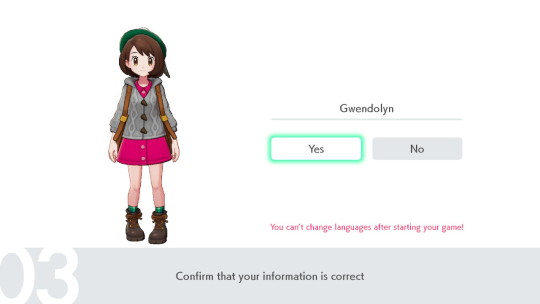
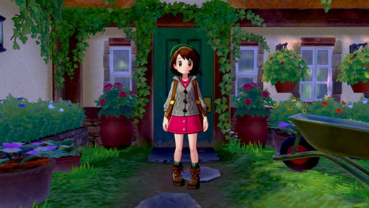
I went ahead with the “standard” female character, but you can bet I’ll be customizing her as soon as I can. What’s with that knock-kneed stance, anyway? Pokemon trainers should stand strong and confident!
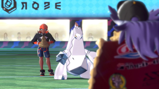
Chairman Rose greets us. Everyone online was guessing he’ll turn out to be evil or something. He certainly looks suspicious, doesn’t he?

And here comes the first surprise of the LP - a brand-new Pokemon, not even seen in trailers! (except for that fuzzy 1-frame image from a while back.) Its trunk looks kinda like a soup ladle. Maybe it’s a play on a teacup/teapot elephant? I wonder if it evolves...

Here’s Leon fighting an unknown trainer - maybe a Gym leader?
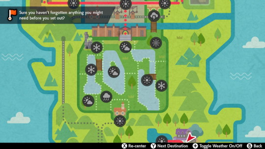
I really like the art style of the map - it’s so whimsical :)

The map also shows current weather for all locations. Look at all the different stuff going on in the Wild Area at the same time! I’ve been to the real England, and I don’t remember it having such extreme weather...
The map also has a few useful features, like displaying your next objective, and showing the facilities in a town (but only once you’ve been there yourself). The towns and such all have really interesting names that emulate that old English sound.
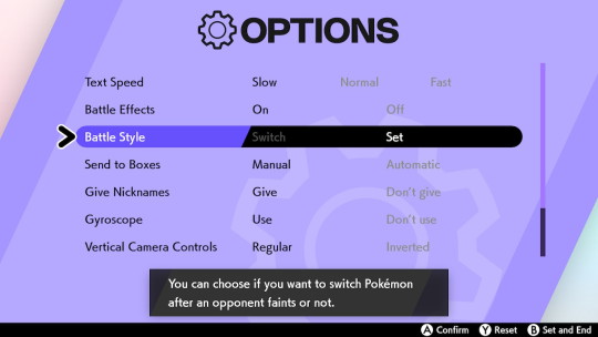
First thing I do when I gain control in a new Pokemon game? Change the battle style to “Set”. It seems more fair, plus it helps make the game just a bit more challenging.
I’m a little sad that the old option to change menu/text box borders seems to be forever abandoned, though... >.>
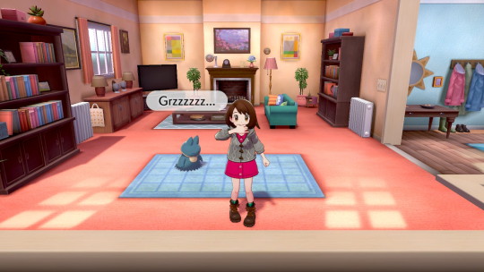
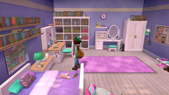
My house. It’s a pretty decent-sized place. We have a pet Munchlax and a few Budew outside. My character practices her whistling.
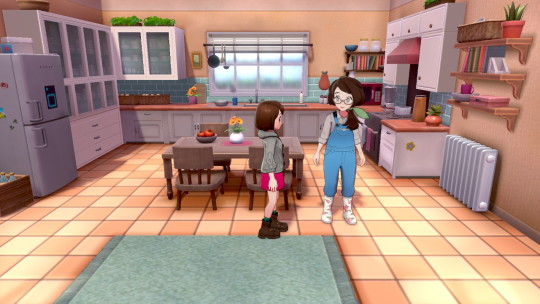
My mom. Or “mum” as the game calls her. The dialog is noticeably slanted toward a more British dialect - I wonder how they handled the accent in other languages?
Speaking of my mom, she seems rather big compared to me, doesn’t she? Quite a bit taller. I’m guessing my character is around 12 - when I was that age, I was the same height as my mom and done growing. Maybe they think people won’t believe this character is the mom’s child if she’s too tall?
Also, my dream is to one day have a /dad/ in a Pokemon game. Seriously, why does every other house I visit have a husband and wife, and my character is always stuck being the only child of a single parent? What if in one of these games, my dad was the champion or the evil team leader - how fun would that be?
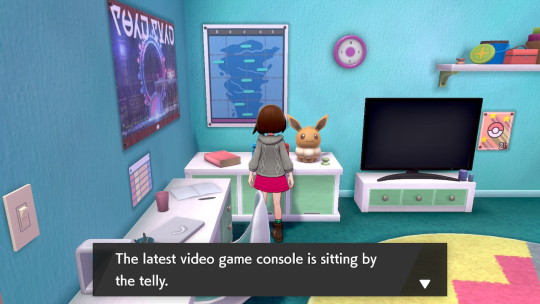
My bedroom. The pink clock on the wall reminds me of one from a previous Pokemon game - was it ORAS that had those round clocks on the wall that you could set?
My first step on my journey. Looks like my mom spends every minute gardening - I guess the Budew help her?
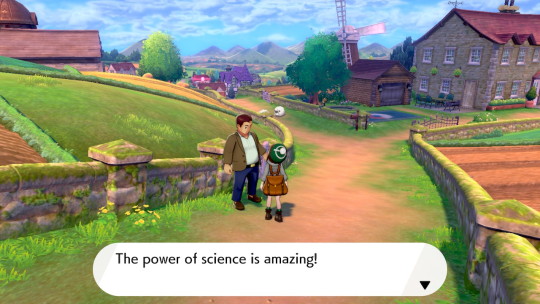
Ah yes, every Pokemon game needs a “power of science” guy :)
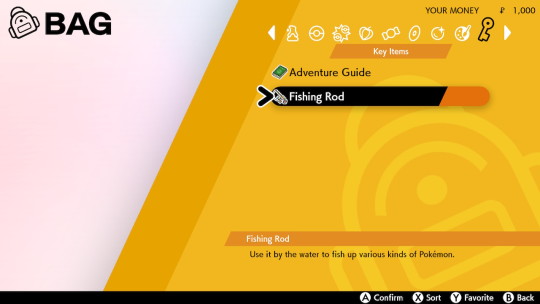
Here’s another surprise - how many Pokemon games give you a fishing rod right at the start?! Usually you have to track down three different fisherman to get the three versions of the fishing rod. I’m also happy to see that Pokeballs have their own pocket again :)
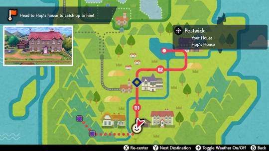
The handy map tells us where to go next, with even a little picture of our destination.
The champion of Galar, of course, has a huge house.
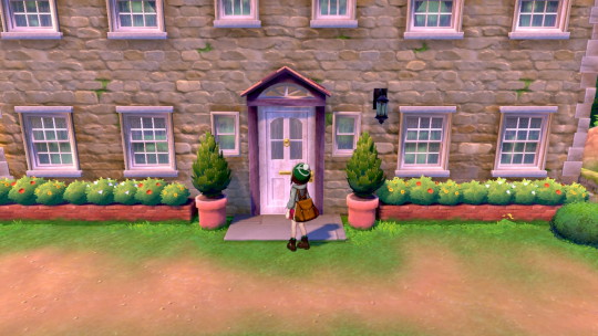
Wow, a Purrloin! I forgot that they stood on two legs. I like its little bed.
Also, Leon’s family decorate their house mainly in trophies.
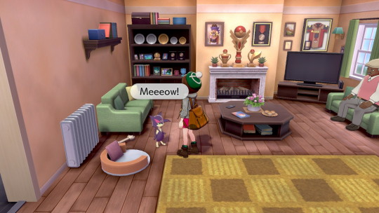
I guess this is Hop’s room - I like his artwork. I know Leon has a Charizard - does he have these other two Pokemon too, and that’s why Hop has posters of them?
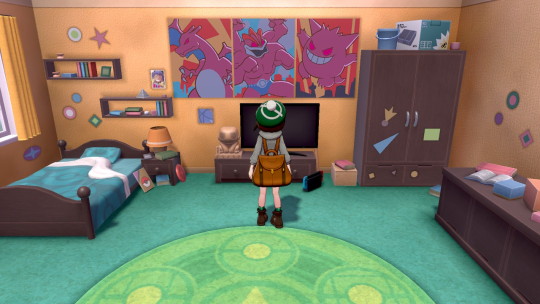
Leon’s room is mostly a shrine to hats.
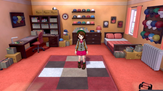
Speaking of Leon, he really knows how to play to the crowd ;)
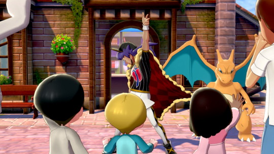
So, some people are wondering if /Leon/ will turn out to be evil in the story. I didn’t really get that vibe from him. He seems like a genuinely nice guy, but he does seem like he has some worries on his mind, like his cheer is sometimes forced?
Maybe he actually hates the limelight and gets uncomfortable with attention? Maybe he’s secretly terminally ill? Maybe there’s some massive threat about to attack the Galar region? He seems really concerned with making sure that Galar has lots of strong trainers. Maybe he knows something about the legendaries?
Alternately, some people were saying that maybe Leon isn’t actually a great champion, and his fights are rigged in his favor by the chairman. /If/ that were the case, I bet that Leon is actually unhappy with that situation and wants to make the tournament more fair.
Or maybe everything in the game is exactly as it seems ;)
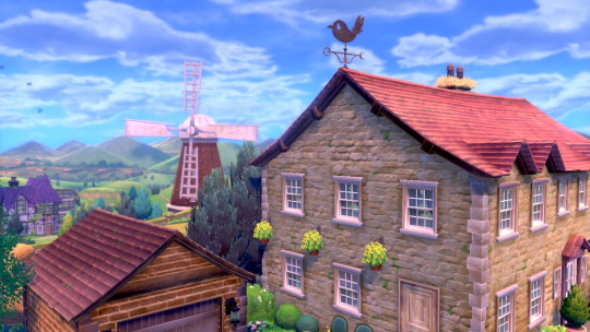
Nothing important here, I just like this screenshot. I wonder if Fletchling are native to Galar too?
My first Pokemon! (in this game, at least...) I picked Sobble because he’s the most endearing.

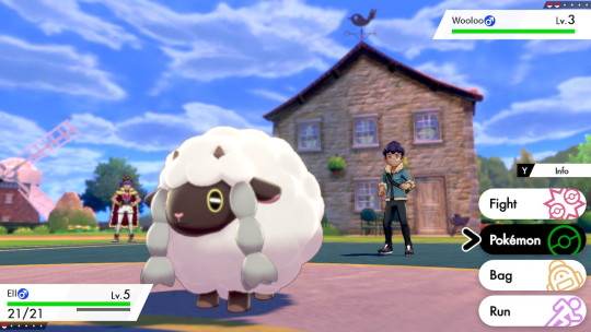
My first battle! I like how the interface is laid out, and how detailed the background is beyond the fighters - you can even see Leon standing there.
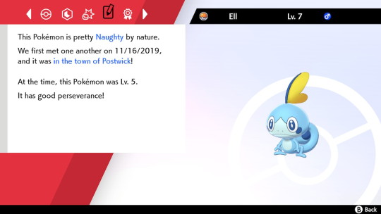
My Pokemon's details. I don’t play competitively so I don’t know if it’s a particular “good” Sobble. It seems like this species is a fast special-attacker, so I’ll have to keep that in mind.
The Slumbering Weald (my spellchecker doesn’t even recognize that word :) ) It’s very spooky and seclusive - and it’s right next to the starter town too! You’d think if it was really that dangerous, people would put up more than a flimsy wooden gate to keep trespassers out...Hop, of course, is an idiot and runs right into it; and I, the spineless protagonist, have no option to say no. >.>
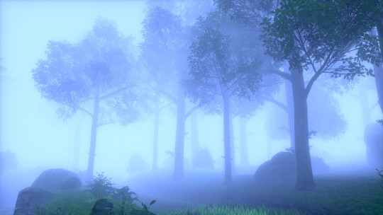
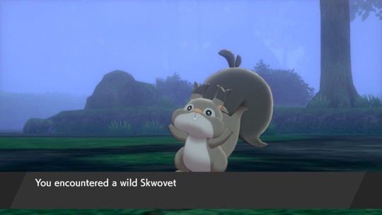
My first wild encounter! This starts the trend I noticed all during the opening hours of this game - most of the wild Pokemon are brand-new, totally-unrevealed species. Like this squirrel thing. (Although some people guessed we would get a new squirrel based on that shirt design). I wonder if it evolves?
This part was actually pretty scary, with the Pokemon (I can’t remember its name...) suddenly appearing out of the fog. The Pokemon acted almost like a hologram in battle though - my attacks couldn’t touch it.
What if the twist is that the legendary wolf Pokemon are just illusions, perhaps even man-made ones created to keep intruders from discovering some secret in the forest?
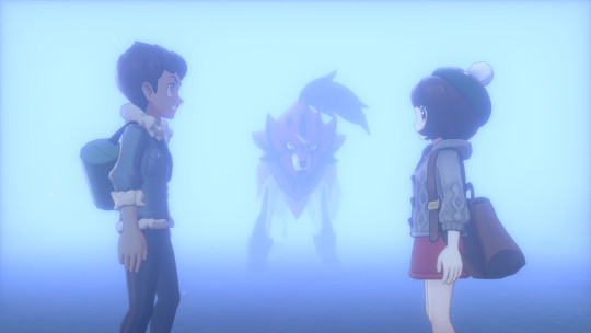
Anyway, we escape from the situation perfectly fine, because of course we do ;)
I noticed that this particular generation gives you quite of a bit of money at the start, but I guess that’s because you encounter the first boutique so early. There’s a fair number of affordable options too. Some of these Pokemon shirts I wish were /real/ shirts.
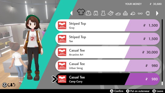
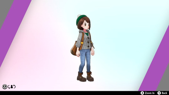
My new look :) Mostly I just ditched the dress for jeans. This looks like a comfortable outfit, although that knapsack is a bit unwieldy.
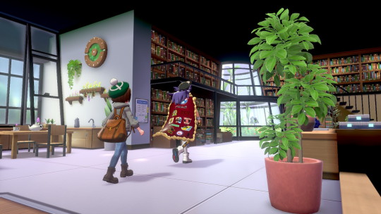
We visit the professor’s lab. She has a lot of books, plants, and a tea set. I wonder if she ever has problems with Polteageist?
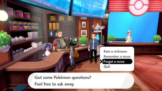
The new Pokemon center design. I love that the move deleter/relearner and nickname functions are all in one place - I always hated flying around the map trying to remember where they were.
That Pokemon behind the counter is another totally new one. Could this be a Galarian Audino?
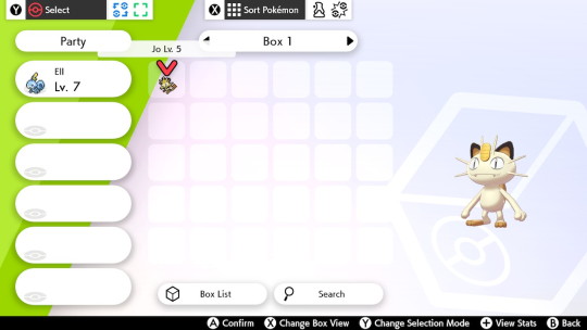
Using mystery gift, I was able to get this “Gigantamax” Meowth. However, due to my rule of only using Gen 8 Pokemon, it’s just gonna chill out in the box >.>
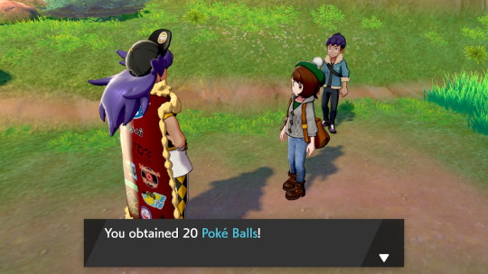
Leon is very generous with Pokeballs. Even the items you find on the ground are generous, often containing 2 or 3 “copies” of an item when you check it out. Is that a new thing for Pokemon?
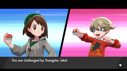
Here I battle my first trainer that isn’t named Hop. He has that squirrel shirt and is a total pushover.
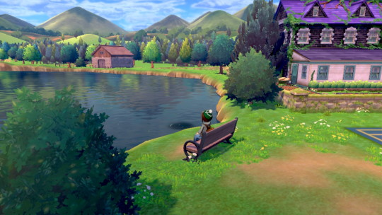
Just chilling by the professor’s house. It looks like maybe you can only fish in fishing spots (those darker circles on the water), but at least you get your fishing pole right away.
Also, I discovered that while I could not sit on beds or chairs inside, I am able to sit on this bench :)
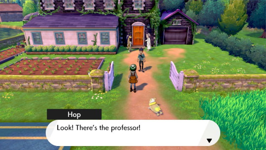
The way the Pokemon mill about in the tall grass is very interesting. Some will try to avoid you, others like this Yamper will chase after you. It makes the routes feel a lot more populated.
I guess this is Sonia’s room. It’s very pink. I wonder if she even /wants/ to do Pokemon research, or if she’d rather be a fashion designer or something.
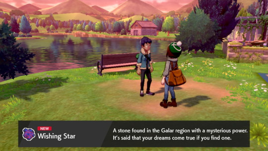
The in-game time of day doesn’t seem to match up with the Switch system clock, at least not from what I’ve seen so far. For example, suddenly it is sunset and I catch a falling star. (look how the reflection in the water changes :) )
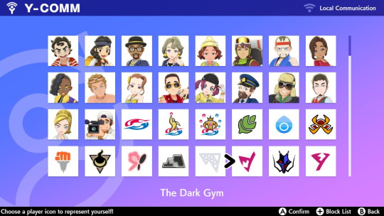
I haven’t decided yet if I want to buy the Switch online service, but in the meantime I decided to at least pick my profile picture. The icons you can choose from actually reveal quite a lot about the trainer classes and gyms that are in the game. For the first time ever, we have a Dark-type gym! Their logo is a sideways version of Team Yell’s logo - does that mean that Team Yell or Marnie is the Dark gym leader?
I spent a while catching Pokemon around the professor’s house. I can’t tell if I got every possible species without looking online, but I did build up a good roster.
I found it really cool how many new, surprising Pokemon showed up this early in the game. There’s the fox one (which is a Dark type and reminds me of Zoroark), the turtle one (which has got to be a pre-evolution of Dreadnaw, probably the 1st of 3 stages), the bird one (based on the “Rook” in its name and the fact that it learns Dark-type moves early, I’m guessing it’s a pre-evolution of Corviknight), and the bug one (can’t wait to see what its final stage looks like).
I went through the party to find the best Pokemon that fit my self-imposed rules (only new, Gen 8 Pokemon, no overlap of types). I know that this means I won’t be able to use Galarian forms or Gigantamaxes of old Pokemon, but just because I’m not using them in my main playthrough doesn’t mean I can’t catch them :)
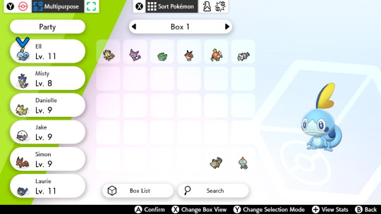
Next time: I step onto the train and leave my home behind.
1 note
·
View note
Text
Designing An ‘Old Skool’ Rave Flyer
I then tried to produce another design as I wanted to try and improve from the previous one. I was going to use different ideas into this flyer. I started by experimenting with the ‘‘blend tool’ to see what sort of things I could create. I started by using a star shape where I wanted to see what it would look like if I made of of the slightly bigger than the other rather than having them the same shape. The outcome of this shape will be very different to the others that I have been doing as they not inside one another. I also made one star back and the other yellow as I wanted to know what would happen. Below, is showing the end result. I don’t think this came out quite as I hoped so moved onto another idea.
I then tried another shape which was a square but instead of using the same corners of each shape, I used the next corner along. I think was an attractive effect as it wasn’t an interesting shape but when it’s been placed like this it almost looks 3D.

I then placed it onto this design that I had just started. I chose a blue background with this weird shape that I placed in the centre. I created this by drawing a rectangle and the curving the two opposite corners. I decided to keep the other two corners pointed as I thought it contrasted strongly. I then placed the the square pattern onto the design and experimented by curving two of the corners. Doing this, made the whole shape completely change. I thought this shape fitted better than having a very sharp square placed but I felt it now almost looked a bit messy.

I then tried experimenting with circles as I saw a poster design that created this related circle shape that looked really effective. I actually analysed this on the post which is called ‘Graphics That Inspire Me’. I though this would be a good idea to try and recreate this idea as it looked so attractive. It took me a little while to figure out how the whole effect was created as I knew where the shapes were placed but I wasn’t sure how the gradient effect was done as it looked like it just disappeared. In the end, I figured this problem out and it was that you have one colour one end and black the other so it seems like it just vanishes.

Below, is showing the amount of times I tried to get this effect but also to get the right amount of circles as once you have used the tool, you can’t move the circles. Out of all of these tries, it’s the second one down that was the one I used as some of them weren’t the right colour as I wasn’t sure what colour I actually wanted at first.

I then placed this repeated pattern into the design where I then drew an orange circle as I though I could create the effect of a shooting star. I then used this other circle shape at the end just to add another element. I actually placed two of these white patterns to get this effect but I felt it just looked a bit boring.

Next, I copied and pasted this shape and placed them either side of this orange shape. You can then see that I have got rid of the elements that were in the centre of the previous screenshot. I actually used one of the white repeated circles to cover some of the negative background space. I thought that I could do a similar thing to the previous flyer design were it would give a more space theme. I also added some small light orange circles. I was going to use this blue space to write some text in either corner but now that I have done this, I don’t think I can cover with type now as it would be too confusing.

I then just wanted to see if I changed the blue background to black as this would give more of a rave vibe to the design. I think this does help because I almost feel the blue makes it seem more childish.

Here, you can see I have changed it back to blue only because I wasn’t sure on what I was going to do with the rest of the space. It was also because I hadn’t completely decided. I have just started to place to type in the design to which I used a font from dafont.com. I thought it matched with the rest of the design very well.

Here, I have now duplicated the circle pattern and rearranged the layout of them. I have placed so it’s very similar to my inspiration I was referring to. I think this works better as it covers more of the orange space up. I also think the little space that is between then makes it look a whole.

You can now see I have added a couple more bits of text to finish the design off. For the word in the centre I used the same font as the other curved type but the other phrase was the font ‘aero’ which I also downloaded.

I have now changed the background back to black as I didn’t think the blue gave of the idea of a rave. I think the black colour massively helps as I then has a strong contrast with the orange. I have tweaked a couple of other aspects too. I have changed the colour of one of the phrases because I think it then looks different to the rest of the words. I also adjusted the position of the phrase as well. Lastly, I changed a few of the circles colours to red. I did this because I thought for these to standout a bit more, there should be another colour incorporated.

0 notes
Text
Development Of My Poster - Back Design
I’m now going to redesign my front cover of the poster that I have been design in some recent posts. I am also hoping to create a back to the poster as well as I have been trying to come up with effective and striking designs. However, none of the designs so far, are as I hoped. As well as this, I want to create the poster so that it matches or has elements from the postcards. I think doing this would then present a pack that links together well.
Below, I have opened a Photoshop file that has this same background with the silhouettes of the people. I decided I still wanted to use this as I still think I could use this within the design. Last time I was improving my poster design, I played around with the idea of repeating typography all the way down the page. I still think I could use this idea but, this time, I could slightly improve the idea. The main reason for wanting the improve the design from last time is that, I wanted to have repeated scans of the type that I produced using the scanner. I think including this in the design instead of just text which I typed straight onto the design. The reason for this idea is that this will link the postcards and this poster design together. Previously, I was really drawn by the transparency effects that I used on the type that I want to do this again. Also, the reason that I’m now working on Photoshop whereas last time, I was on Illustrator is because there were certain tools that I needed on Photoshop that Illustrator didn’t have. I was going to use Photoshop just for these certain tools and then switch to Illustrator after but I found that this didn’t work.
As you can see below, I have duplicated the work ‘phobia’ and placed each word in different places on the page. I’m not entirely sure what the idea I had was but I then changed the colour to one of the pinks in my colour palettes. I found that this colour was a bit too pale and didn’t really show up very well when it was on the background section.

I then tried to change a setting so it lays different on the background. Doing this, made the words a darker pink but I wasn’t sure this idea was going anywhere.

Next, I decided to find a new scan which I haven’t used on any of the postcards. I found this scan where the type wasn’t very distorted but did have a slight indent in places. I also really liked this font that I used so I decided to use it. I firstly had to use the ‘magic wand tool’ to get rid of the white background. I then used the ‘rectangle marquee tool’ to mark around the word ‘enochlo’ where I then copied and pasted it. Next, I did the exact same thing but with the word ‘phobia’. I had to do them separately so I could then have them on separate layers. I then had the idea of repeat the same word where the word ‘phobia’ is going horizontally down the page. I also had the same word underneath the green which I wanted to be white. I got this idea from when I previously did this. I then copied (CMD C) and the two white and green layers to then do CMD J. Doing this makes the words paste in the exact spot that you copied the words. This was useful because it meant that I only had to nudge the words in the direction I wanted. To nudge all you do is press the arrows on the keyboard. I then had the idea to have the word ‘enochlo’ on the side but repeated again. I got this idea from when I originally placed this type before I even scanned it. I had it so the ‘enochlo’ was vertical and the ‘phobia’ was horizontally.

You can now see I have repeated the word now for the word ‘encholo’. I made this a darker green because it then clearly shows it’s a different word. I did this by increasing the opacity.

I have now changed the whole left side words to red because I wanted a different colour rather than them both being green. I thought that I could try different colours because when I previously was looking for the best colour combinations, it took a few arrangements to figure out the most effective one. I think this red blended in with the background too much so I dint standout like the green does.

I then increased the opacity of the red but also changed the white layer to green. There were a few things wrong with this design now. Firstly, being that the red almost seems to harsh now and doesn’t fit in with the red that it in my colour palette. Another problem being that the red and green together almost give a Christmas vibe which is not what I want.
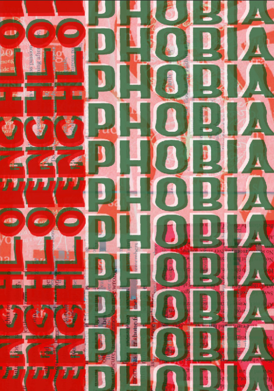
I decided to get rid of the green layer behind and change it back to white. I then increased the opacity of the red slightly along with the white layer behind it too. I thought doing this would make the red standout more compared to the previous screenshot.

I have now tried changing the colour to pink which this pink isn’t one from my colour palette as I figured out that both of the colours are too similar to the background. I chose this pink colour which is similar to the pink I previously used in the other poster design. I thought this colour worked well before so I wanted to try it again. After adding it, I now think the design works a lot better and although I knew this poster still wasn’t finished, it has definitely improved. In this screenshot, I have increased the opacity of the pink and decreased the green. I did this because I wanted the pink to standout enough and I didn’t want to overpower the green.

I have now decided to switch the two colours around to have the green on the left and pink on the right sided words. The screenshots don't show but when it was the other way, the words ‘enochlo’ was getting a bit lost in the background. This way you can now read both of the words.

I then added the extra silhouettes behind because I felt it seemed a little boring before. I thought this worked a lot better as the typography stood out more. This screenshot above and below has also changed as I have just noticed that I have swapped around the white layer of text and the coloured text. I didn't mean to do this at the time but now looking I much prefer. Doing this means that the white layer in front has toned down the brightness of the colour that is actually behind tis.

Here, I have now decreased the opacity of all the typography which I think is more effective as it is still showing mainly on the green background. Another positive of having the text dimmed is that it then more clearly shows the people behind.

I then decided to add more type to what I have already created on the page. I did this by again doing CMD C and CMD J and then nudging the copied element into place. I did this because I wanted to match the sizing of the text to a similar size as the other side of the poster. I also moved some of the words apart so they were easier to read. When you compare the other poster design to this side, I feel they now work better together.

Overall, I am very pleased with this final result of the other side of the poster design. I feel this is a massive improve from the last time I was trying to improve it. I think this simple use of typography which are include on both sides helps to bring the two together. I think even thought you cant really read the typography when it it on the pink and red background, it still works because the green section is where it pops it.
0 notes
Text
Possible Zine Cover Development
I wanted to expand my creativeness and try something out of my comfort zone. I explored many style and one style I particularly liked was the paper effect. This effect mimics real, physical paper and the different wears and tears it can provide.

It started with a very rough cut out of the Men in Black main characters and a piece of packing tape that I scanned in. This masking tape was used to create a rustic/ makeshift label that could be used effectively. The jagged edges on the main characters helped to blend with the torn paper styling.

I then scanned in a torn piece of paper and cut just the tear away from the rest of the paper in photoshop. This was then copied and pasted multiple times along the circumference of the cut out image to create a scrapbook effect.

I then decided that the pure white background was just too bright and juxtaposed and did not fit the vibe. So instead I changed it for an off-white/ beige colour to give it an aged paper effect. The text was then added - this is my own font that was made on calligraphr so I could get the authentic handwritten font.

The paper tear effect was then done to snippets from all other films featured within the magazine.

This text was cut out from packaging that I found on google long ago. It helps to add to the scrapbook and brings some colour into the canvas.

This is the front cover where I finished adding all of the snippets of the film characters. I then started playing with the composition of the images to try and utilise the space in a better way. I also added a tear at the top of the image to try to create a more rustic and used effect. This may be changed in the future as I do not know how I feel about it.

This is the final composition I went with and I am now adding in effects through the effects tab to try and tie the look together.

I added noise which acts as a grain to enhance the vintage look.

This is the finished cover - I changed the saturation on the screenshots to make it a more monotone colour palette. and to make the lettering really pop.
0 notes
Text
26 Marketing Tools for Non-Tech-Savvy Marketers – SEO NYC & Digital Marketing
Marketing tools are essential for streamlining and automating the more arduous aspects of the process.
The only issue is that you’ve got to actually learn how to use them.
You have to learn their capabilities, their limitations as well as their nuances.
It’s no biggie if you’re tech-inclined.
But what if you’re not so tech-savvy?
Using marketing tools can nearly negate the purpose if it’s a struggle just to figure them out.
That’s why I compiled a list of 26 marketing tools for non-tech-savvy marketers.
Each one is practical and user-friendly and requires a minimal learning curve. Many are even free.
Content creation
Let’s start with the absolute basics: WordPress.
You could consider it to be the “OG” of content management systems.
As of late 2015, it powered 25% of the world’s websites.
And it’s very likely that number is even bigger today.
A large part of WordPress’ appeal is its utter simplicity and non-technical nature.
You can create and maintain a beautiful website with literally zero knowledge of coding.
And if you happen to understand HTML, you can completely crush it.
If you want to create a site for your business or blog, I highly recommend WordPress.
When it comes to cloud storage, I think of Google Drive as being the universal platform.
I can’t count the number of times I’ve worked with clients or business partners who’ve made Google Drive their platform of choice.
Like most Google products, it’s super intuitive and easy to use.
I use it for writing and backing up content as well as for sharing content with others.
It’s perfect if you have multiple people working on a project because sharing and editing is a cinch.
Besides docs, you can create slideshows, drawings, spreadsheets, and more.
I don’t care if you’re Mark Twain, everyone is bound to make mistakes when writing.
Whether it’s a silly spelling error or poor grammar, it’s impossible to catch everything.
But Grammarly will do just that (or pretty darn close to it).
Add it to Chrome, and Grammarly will monitor everything you write, point out any issues, and offer advice on how to resolve them.
It goes above and beyond Word and will make you look like an expert even if your writing skills are lackluster:
The cool thing is that it will also scan your emails before sending them out so you don’t look like an idiot when corresponding to customers or clients.
Word count is kind of a big deal, especially if you’re writing long-form content and need to reach a specific number of words.
But not all online writing platforms display word count.
I love this tool because I can quickly copy and paste a body of text, and Word Counter will let me know how many words I’ve written.
It’s super quick, and I’ve never experienced any sort of glitch.
Content ideas
Coming up with new ideas for content can be a major struggle.
Even if you’re an expert, it’s not always easy to come up with stellar ideas.
I’ve found Google Trends to be a great place for getting a sense of what’s popular at the moment.
Often, it will point me in the right direction, and I can then use it to gauge the exact interest in a particular topic.
For instance, here’s how the interest in content marketing has grown over the past five years:
Using Alltop is a breeze.
Simply type in a search phrase, and hundreds of popular blog posts on that topic will pop up:
Words cannot express how much I love BuzzSumo.
Pretty much anyone can figure it out within minutes, and it’s the perfect tool for generating an arsenal of content ideas.
But what separates it from other tools is the fact that it provides you with key info such as:
how much engagement content receives
who is sharing it
links pointing back to the content
The only caveat is that you must purchase the Pro version to unlock all the features.
But you can still do a basic search with the free version.
This one is a bit like the Google Keyword Tool, only simpler.
Enter a search term, and Ubersuggest will spit out dozens or even hundreds of ideas:
It’s really easy to use, and it’ll keep supplying you with topics whenever you need them.
Communication and collaboration
If WordPress is the OG CMS, Basecamp is the OG of project management and team collaboration.
Countless other products have been developed, many of which are cooler and sexier.
But Basecamp still retains its status and continues to be one of the big dogs.
I love its clean interface and how intuitive it is.
It’s very non-intimidating even for the most non-tech-savvy of marketers.
At this point, you probably know I’m big on visuals.
Images make it easier for me to absorb information and stay on top of my game.
That’s why I love Trello.
It involves a system of boards where you can communicate with colleagues and keep tabs on project progress.
It can easily be scaled up or down as necessary and can really boost productivity.
I know many people who swear by it.
This is another visual-oriented platform that I’ve used on several occasions.
I prefer Basecamp over Asana, but it’s the number one team-collaboration platform for many marketers.
In fact, some companies that use it include TED, The New Yorker, and Uber.
My favorite aspect of Asana is the ease with which I can track a project from start to finish.
I’m a stickler for deadlines, so this helps me ensure they’re always met without a lot of stress.
When I think of Slack, I think of hipsters. But in a very good way.
It’s perhaps the coolest, sleekest, sexiest collaboration app in existence.
And it’s dead simple to use.
Slack revolves around creating “channels” where you communicate with team members either publicly or privately.
Drag and drop your files to share with others, and search your archive any time you need specific information.
Task management
I stay busy, so it’s easy to feel overwhelmed when I’m bombarded with a barrage of tasks on a daily basis.
One of my favorite weapons to counter that is Wunderlist.
I place it on my desktop so I can see exactly what’s going on and what I need to take care of on any given day.
And, of course, I can also access it from my smartphone or tablet.
I can easily save links, photos, and other media I want to keep.
I also use it to set reminders of specific tasks’ deadlines and make note of any business/project ideas that pop into my head.
In other words, Wunderlist helps me keep my you-know-what together.
If you use WordPress (like I recommend), you’ll want to take advantage of this plugin.
It’s a little like Google Calendar, but specifically for scheduling your blog posts.
Manage drafts
See what’s been posted
See what needs to be posted
Manage posts from different authors
Like most things on WordPress, it’s user-friendly, and it doesn’t take a rocket scientist to figure out its features.
The tagline of this platform is “Accomplish more, every day.”
And that’s fitting because I’ve found Todoist to be a major catalyst for productivity.
You simply record tasks, prioritize them as needed, collaborate with others, and get stuff done.
I love its no-nonsense interface and minimalist vibe.
SEO
This is another WordPress plugin and one that I highly recommend if you’re fairly new to the SEO game.
Here’s a screenshot of its features:
In other words, it handles nearly every major aspect of SEO.
The best part is its simplicity.
I love Yoast SEO because it’s very hands off and automates many of the more arduous SEO tasks like creating optimized URLs, keeping track of keyword density, and so on.
Before you publish your content, Yoast SEO will rate its readability and your keyword usage by giving it a color: red for poor, orange for okay, and green for good.
If you loathe the technical nature of SEO, this is a great plugin to use.
If you were to use only one tool for performing keyword research, this is it.
Even the biggest SEO nerd will agree that it’s useful because you’re gathering data right from the horse’s mouth—Google itself.
The cool thing is that you don’t need to be technically adept to figure it out. Most of the features are pretty self-explanatory.
In my opinion, Moz is perhaps the Internet’s number one resource for all things SEO.
I especially love its Whiteboard Fridays, offering in-depth analysis and insight.
If you’re looking for a quick and easy way to determine key SEO metrics like links, page authority, and domain authority, I highly recommend MozBar.
Simply add it to your Chrome toolbar, and you’re good to go.
This is another great SEO tool that’s amazingly easy to use.
Just enter a URL or keyword, and you instantly get a boatload of useful information such as:
Organic search volume
Backlinks
Top organic keywords
Main organic competitors
Branded search
If you’re looking to perform competitive analysis for keyword or content opportunities, look no further than SEMrush.
Images
If you’re creating content, you’ll need plenty of beautiful visuals.
In my opinion, Canva is hands down one of the best platforms for creating your own images and documents from scratch.
It’s really easy, and Canva offers a wide array of images that are totally free.
You can modify them as needed for your content or for branding purposes.
The best part is that you can do this with virtually no design experience.
PicMonkey is a photo editor that allows you to design, resize, do touch-ups, create collages, and a lot more.
Using it is no sweat even if you have no clue what you’re doing in terms of design.
It’s perfect if you have your own images you want to customize, and PicMonkey helps you make them look like a million bucks.
Here’s my take on stock photos.
I prefer to pay for them and get the best of the best.
But if you’re just starting out or are on a budget, Pixabay is one of my top picks.
Everything is royalty-free and available for the public to download, modify, and distribute.
They have a massive archive of pictures that covers most topics, and the quality of their images has really improved over the past couple of years.
Here are just a few samples:
Creative Commons is basically an aggregator of images free to use for commercial purposes. These images can be modified, adapted, or built upon.
You enter a search query, and choose from multiple platforms like Flickr, Wikimedia Commons, Open Clip Art Library, and even Google.
It’s a great tool for streamlining your image search.
Metrics
There are countless metrics platforms out there for measuring your website’s performance, traffic numbers, and so on.
But I think it’s safe to say that Google Analytics is the be-all and end-all tool.
The free version is more than sufficient for diagnosing your website and, in my opinion, quite easy to use.
I’ll admit there is a bit of a learning curve, but most people can figure out the basics in a day or two.
Bitly is perhaps best known for being a URL shortener.
In fact, I use it all the time for condensing URLs on my Twitter page:
But it’s useful for way more than that.
Bitly allows you to track individual links and gather key information about their performance.
You can tell what your audience is responding to (or not) and tweak your marketing efforts accordingly.
Despite its comprehensiveness and level of detail, I consider it to be one of the most user-friendly analytics tools.
You can see what’s happening on your website in real time, monitor the actions of visitors, and even look at heat maps, which I love.
I know some marketers who actually choose Clicky over Google Analytics.
Conclusion
I totally understand the frustration that many non-tech-savvy marketers feel.
There are many tools that are great but require serious knowledge to be utilized properly.
These can really cramp your style and drive you crazy.
But the marketing tools I’ve listed are ones that will get the job done without being overly complex.
With most, the core features can be learned within just a few minutes.
This way, you can spend less time trying to figure out your marketing tools and more time reaching your audience.
Can you suggest any other easy-to-use marketing tools?
Source
https://seonycdigitalmarketing.wordpress.com/2017/03/24/26-marketing-tools-for-non-tech-savvy-marketers/
0 notes
Text
26 Marketing Tools for Non-Tech-Savvy Marketers
Marketing tools are essential for streamlining and automating the more arduous aspects of the process.
The only issue is that you’ve got to actually learn how to use them.
You have to learn their capabilities, their limitations as well as their nuances.
It’s no biggie if you’re tech-inclined.
But what if you’re not so tech-savvy?
Using marketing tools can nearly negate the purpose if it’s a struggle just to figure them out.
That’s why I compiled a list of 26 marketing tools for non-tech-savvy marketers.
Each one is practical and user-friendly and requires a minimal learning curve. Many are even free.
Content creation
1. WordPress
Let’s start with the absolute basics: WordPress.
You could consider it to be the “OG” of content management systems.
As of late 2015, it powered 25% of the world’s websites.
And it’s very likely that number is even bigger today.
A large part of WordPress’ appeal is its utter simplicity and non-technical nature.
You can create and maintain a beautiful website with literally zero knowledge of coding.
And if you happen to understand HTML, you can completely crush it.
If you want to create a site for your business or blog, I highly recommend WordPress.
You can learn how to do it from scratch with this video from Quick Sprout.
2. Google Drive
When it comes to cloud storage, I think of Google Drive as being the universal platform.
I can’t count the number of times I’ve worked with clients or business partners who’ve made Google Drive their platform of choice.
Like most Google products, it’s super intuitive and easy to use.
I use it for writing and backing up content as well as for sharing content with others.
It’s perfect if you have multiple people working on a project because sharing and editing is a cinch.
Besides docs, you can create slideshows, drawings, spreadsheets, and more.
3. Grammarly
I don’t care if you’re Mark Twain, everyone is bound to make mistakes when writing.
Whether it’s a silly spelling error or poor grammar, it’s impossible to catch everything.
But Grammarly will do just that (or pretty darn close to it).
Add it to Chrome, and Grammarly will monitor everything you write, point out any issues, and offer advice on how to resolve them.
It goes above and beyond Word and will make you look like an expert even if your writing skills are lackluster:
The cool thing is that it will also scan your emails before sending them out so you don’t look like an idiot when corresponding to customers or clients.
I highly recommend it!
4. Word Counter
Word count is kind of a big deal, especially if you’re writing long-form content and need to reach a specific number of words.
But not all online writing platforms display word count.
I love this tool because I can quickly copy and paste a body of text, and Word Counter will let me know how many words I’ve written.
It’s super quick, and I’ve never experienced any sort of glitch.
Content ideas
5. Google Trends
Coming up with new ideas for content can be a major struggle.
Even if you’re an expert, it’s not always easy to come up with stellar ideas.
I’ve found Google Trends to be a great place for getting a sense of what’s popular at the moment.
Often, it will point me in the right direction, and I can then use it to gauge the exact interest in a particular topic.
For instance, here’s how the interest in content marketing has grown over the past five years:
6. Alltop
Using Alltop is a breeze.
Simply type in a search phrase, and hundreds of popular blog posts on that topic will pop up:
I use this for brainstorming all the time, and Alltop has helped me come up with some epic ideas for blog posts.
7. BuzzSumo
Words cannot express how much I love BuzzSumo.
Pretty much anyone can figure it out within minutes, and it’s the perfect tool for generating an arsenal of content ideas.
But what separates it from other tools is the fact that it provides you with key info such as:
how much engagement content receives
who is sharing it
links pointing back to the content
The only caveat is that you must purchase the Pro version to unlock all the features.
But you can still do a basic search with the free version.
8. Ubersuggest
This one is a bit like the Google Keyword Tool, only simpler.
Enter a search term, and Ubersuggest will spit out dozens or even hundreds of ideas:
It’s really easy to use, and it’ll keep supplying you with topics whenever you need them.
Communication and collaboration
9. Basecamp
If WordPress is the OG CMS, Basecamp is the OG of project management and team collaboration.
Countless other products have been developed, many of which are cooler and sexier.
But Basecamp still retains its status and continues to be one of the big dogs.
I love its clean interface and how intuitive it is.
It’s very non-intimidating even for the most non-tech-savvy of marketers.
10. Trello
At this point, you probably know I’m big on visuals.
Images make it easier for me to absorb information and stay on top of my game.
That’s why I love Trello.
It involves a system of boards where you can communicate with colleagues and keep tabs on project progress.
It can easily be scaled up or down as necessary and can really boost productivity.
I know many people who swear by it.
11. Asana
This is another visual-oriented platform that I’ve used on several occasions.
I prefer Basecamp over Asana, but it’s the number one team-collaboration platform for many marketers.
In fact, some companies that use it include TED, The New Yorker, and Uber.
My favorite aspect of Asana is the ease with which I can track a project from start to finish.
I’m a stickler for deadlines, so this helps me ensure they’re always met without a lot of stress.
12. Slack
When I think of Slack, I think of hipsters. But in a very good way.
It’s perhaps the coolest, sleekest, sexiest collaboration app in existence.
And it’s dead simple to use.
Slack revolves around creating “channels” where you communicate with team members either publicly or privately.
Drag and drop your files to share with others, and search your archive any time you need specific information.
Slack makes it easy.
Task management
13. Wunderlist
I stay busy, so it’s easy to feel overwhelmed when I’m bombarded with a barrage of tasks on a daily basis.
One of my favorite weapons to counter that is Wunderlist.
I place it on my desktop so I can see exactly what’s going on and what I need to take care of on any given day.
And, of course, I can also access it from my smartphone or tablet.
I can easily save links, photos, and other media I want to keep.
I also use it to set reminders of specific tasks’ deadlines and make note of any business/project ideas that pop into my head.
In other words, Wunderlist helps me keep my you-know-what together.
14. WordPress Editorial Calendar Plugin
If you use WordPress (like I recommend), you’ll want to take advantage of this plugin.
It’s a little like Google Calendar, but specifically for scheduling your blog posts.
You can:
Manage drafts
See what’s been posted
See what needs to be posted
Manage posts from different authors
Like most things on WordPress, it’s user-friendly, and it doesn’t take a rocket scientist to figure out its features.
15. Todoist
The tagline of this platform is “Accomplish more, every day.”
And that’s fitting because I’ve found Todoist to be a major catalyst for productivity.
You simply record tasks, prioritize them as needed, collaborate with others, and get stuff done.
I love its no-nonsense interface and minimalist vibe.
SEO
16. Yoast SEO
This is another WordPress plugin and one that I highly recommend if you’re fairly new to the SEO game.
Here’s a screenshot of its features:
In other words, it handles nearly every major aspect of SEO.
The best part is its simplicity.
I love Yoast SEO because it’s very hands off and automates many of the more arduous SEO tasks like creating optimized URLs, keeping track of keyword density, and so on.
Before you publish your content, Yoast SEO will rate its readability and your keyword usage by giving it a color: red for poor, orange for okay, and green for good.
If you loathe the technical nature of SEO, this is a great plugin to use.
17. Google Keyword Planner
If you were to use only one tool for performing keyword research, this is it.
Even the biggest SEO nerd will agree that it’s useful because you’re gathering data right from the horse’s mouth—Google itself.
The cool thing is that you don’t need to be technically adept to figure it out. Most of the features are pretty self-explanatory.
18. MozBar
In my opinion, Moz is perhaps the Internet’s number one resource for all things SEO.
I especially love its Whiteboard Fridays, offering in-depth analysis and insight.
If you’re looking for a quick and easy way to determine key SEO metrics like links, page authority, and domain authority, I highly recommend MozBar.
Simply add it to your Chrome toolbar, and you’re good to go.
19. SEMrush
This is another great SEO tool that’s amazingly easy to use.
Just enter a URL or keyword, and you instantly get a boatload of useful information such as:
Organic search volume
Backlinks
Top organic keywords
Main organic competitors
Branded search
If you’re looking to perform competitive analysis for keyword or content opportunities, look no further than SEMrush.
Images
20. Canva
If you’re creating content, you’ll need plenty of beautiful visuals.
In my opinion, Canva is hands down one of the best platforms for creating your own images and documents from scratch.
It’s really easy, and Canva offers a wide array of images that are totally free.
You can modify them as needed for your content or for branding purposes.
The best part is that you can do this with virtually no design experience.
21. PicMonkey
PicMonkey is a photo editor that allows you to design, resize, do touch-ups, create collages, and a lot more.
Using it is no sweat even if you have no clue what you’re doing in terms of design.
It’s perfect if you have your own images you want to customize, and PicMonkey helps you make them look like a million bucks.
22. Pixabay
Here’s my take on stock photos.
I prefer to pay for them and get the best of the best.
But if you’re just starting out or are on a budget, Pixabay is one of my top picks.
Everything is royalty-free and available for the public to download, modify, and distribute.
They have a massive archive of pictures that covers most topics, and the quality of their images has really improved over the past couple of years.
Here are just a few samples:
23. Creative Commons
Creative Commons is basically an aggregator of images free to use for commercial purposes. These images can be modified, adapted, or built upon.
You enter a search query, and choose from multiple platforms like Flickr, Wikimedia Commons, Open Clip Art Library, and even Google.
It’s a great tool for streamlining your image search.
Metrics
24. Google Analytics
There are countless metrics platforms out there for measuring your website’s performance, traffic numbers, and so on.
But I think it’s safe to say that Google Analytics is the be-all and end-all tool.
The free version is more than sufficient for diagnosing your website and, in my opinion, quite easy to use.
I’ll admit there is a bit of a learning curve, but most people can figure out the basics in a day or two.
25. Bitly
Bitly is perhaps best known for being a URL shortener.
In fact, I use it all the time for condensing URLs on my Twitter page:
But it’s useful for way more than that.
Here’s the deal.
Bitly allows you to track individual links and gather key information about their performance.
You can tell what your audience is responding to (or not) and tweak your marketing efforts accordingly.
26. Clicky
Finally, there’s Clicky.
Despite its comprehensiveness and level of detail, I consider it to be one of the most user-friendly analytics tools.
You can see what’s happening on your website in real time, monitor the actions of visitors, and even look at heat maps, which I love.
I know some marketers who actually choose Clicky over Google Analytics.
Conclusion
I totally understand the frustration that many non-tech-savvy marketers feel.
There are many tools that are great but require serious knowledge to be utilized properly.
These can really cramp your style and drive you crazy.
But the marketing tools I’ve listed are ones that will get the job done without being overly complex.
With most, the core features can be learned within just a few minutes.
This way, you can spend less time trying to figure out your marketing tools and more time reaching your audience.
Can you suggest any other easy-to-use marketing tools?
from Quick Sprout http://ift.tt/2nZ2PCK from Blogger http://ift.tt/2o0bjJP March 24, 2017 at 10:39PM
0 notes