
Don't wanna be here? Send us removal request.
Statistics
We looked inside some of the posts by lminnsmars and here's what we found interesting.
Average Info
Notes Per Post
0
Likes Per Post
0
Reblog Per Post
0
Reply Per Post
0
Time Between Posts
12 hours ago
Number of Posts By Type
Link
1
Text
16
Last Seen Tumblr Blogs


Fun Fact
In 2020, 44% of users from Denmark used Tumblr daily.
Link
Above is the link to my evaluation for my multiverse project. Although, this project was quite short, I found I learnt many new skills along the way.
0 notes
Text
Presenting My Designs Using Mock - Ups
Here, I will be presenting the rest of my work in the mock-ups I have so I can show of my work a bit better. One thing about these mock-ups is the shadows and background, that you can choose is a really effective addition to the final outcomes.
When I was placing my sticker in the mock-ups, I found a couple of things happen which I didn't realise I did. The first is that the sticker had a white stroke that I was unaware of, which means when I placed it in the mock-up you could see this line going all the way around the sticker. This looked very effective and almost created a sense of cheap to the outcome. But I realised the problem and changed it. This meant I had to save it again as a PDF. After this, I noticed another problem which seemed to be there was white dots on the disc. I quickly discovered this was the stars that I had placed on the black sticker had slightly gone of the design. Again, I had to correct this, by deleting the stars outside the design and saving it as a PDF.
Below is the piece that I was previously creating but this is now the final outcome. I think the purple colour I chose worked very well as when you look through all the mock-ups, they all look very attractive. As well as this, I thought to use the same colour for every mock-up as I prevsioluy fond in my last project that having completely different colours, causes a messy and unprofessional look.


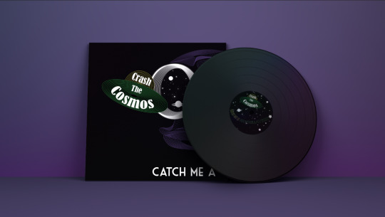
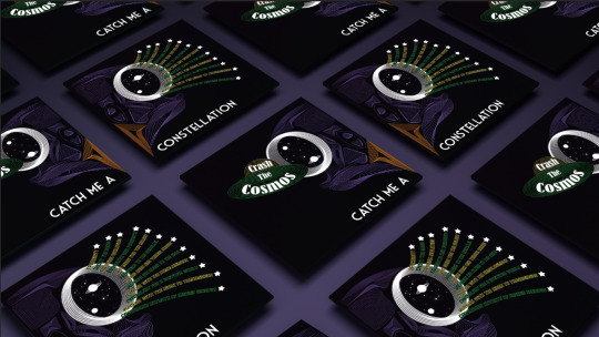


As a result, I feel these mock-ups have composed my work so that they are shown as a high standard and have helped me to have a sense of pride in this outcome of work.
0 notes
Text
Presenting My Designs Using Mock - Ups
Now that I have finished all my final outcomes, I will be completing and showing of my work in some mock-ups that I have downloaded. To place my work into these mock-ups, I firstly downloaded them, which I did by clicking the third icon in the top right hand side bottom. This then downloads them where you can click on the little icon that appears at the bottom of the screen.

This will open them up in Photoshop. As you can see, there is already work placed onto the design and this is where I will replace it with my work. To do this, you need to double-clicked on either your label or cover layer.

This will then bring up a new file, to which you need to get rid of all the things that are currently on the page.

At this stage, you will now need to go and save your album cover and record sticker as a PDF. To do this you just go ‘file’, ‘save as’ and when it brings up a tab change the Illustrator file to PDF. This will need to be done to both of the files you have. Once you have done this, you can get this page back up to which you will go into ‘file’ and ‘place embedded’. Next, you need to find your file that you just saved. This needs to be the right one, for example, you clicked on the sticker, meaning you need to place your sticker.

Next, you would resize the sticker, to touch all four of the sides of the square.

Then, click the cross where it will come up with this tab shown below, and you need to go click ‘save’. Doing this will place your sticker into the mock-up.

As you can see, the sticker has now been placed into the design. To get the cover on, you will need to click the other layer named ‘cover’ s this is the one you didn't click earlier.

This is the end result of placing my work into the design but I can still chnage the background colour to whatever I want. To do this, you need to double-click on the layer named ‘dark layer’ as this will then bring up a colour palette for you to choose from.

I wanted to use a similar colour to one of colours I used in this design. I started by choosing the green colour to which I did this by just dragging my mouse of the colour palette and the ‘eyedropper tool appears’ so you just need to click on any part of the piece. I felt this green didn't seem to fit. I think this could be as there isn't much of this colour featured on the design so it almost looks a bit random.

I then used the ‘eyedropper tool’ again to see that the purple colour would look like. I thought that this colour would be one of the worst colours to pick as there is already quite a lot of purple included in the design but I was actually surprised that it didn't look as bad as I thought. However, I didn't think this shade of purple worked as it is quite a dark shade and along with the dark album cover and sticker it didn't standout.
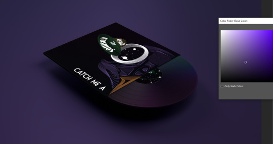
I then just moved the colour slightly over so it now a lightshade. I felt this worked so much better as it brightens up the whole design and really catches your eyes. I also think that my design being in a mock-up has given me a very clear idea of how professional the piece I have created looks.

As a result, I will now continue to add my designs to the rest of the mock-ups I have.
0 notes
Text
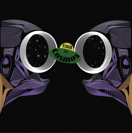
Designing My Final Record Sticker
My last design I will need to create is a record sticker, to which this is the thing that goes in the centre of the record so it tells you what the band and album name is. These normally reflect the album cover as people can then recognise the record just from looking at the design of the sticker.
Before I even started designing, I knew I wanted to have a black sticker with the stars from the eyes of the owl. This is because the stars weren't a massive part of the design in the cover so I now have the chance to use them so they standout more. I also noticed it’s almost like you’re looking into the eyes of the owl as the animal’s eyes were a circle shape and had this design inside.
To create the sticker, I have drawn a circle using the ‘rectangle tool’ on a plain A4 page that I just opened up. It doesn't really matter what size the sticker is but it does have to be big enough that I can easily see the design I’m creating and so that when I decrease the sticker to fit into the mock ups that it won’t go blurry. I then added a black fill. I opened back up the album cover where I copied and pasted the stars into my new page. I moved the stars in very different positions than the eyes as this shape was different to the eyes. I also placed the two planets in as well as I think this really does help to show the idea.

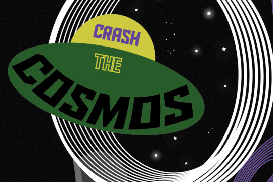
Again, I duplicated some of the elements from the album cover and tried using them here. I took the spaceship with the band name as this is one of the main elements that standout from the design but this also shows the name of the band. I did take the owl skull too but almost knew before I even tried placing it, that it wasn't going to work, for a few reasons. One is that there was no need for it to be there was it is quite clearly on the cover but also because I had to decrease the size of it, the lines don't even show anymore.

I then decided to add type to present the album name, to which I chose for it to not be the same font or colour. This is because having another lot of white text will look very boring and also the font won’t be interesting enough either. Here, you can see I have curved the type around but I haven't done it sure it goes around with the edge of the shape as I feel this would look like the same as a lot of record stickers. So, I curved it but not enough to follow the direction of the circle. I have also placed the spaceship just underneath the type as well.
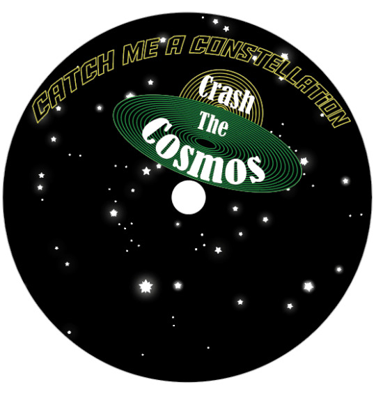
I then tried a different arrangement with the spaceship at the top of the design and the type at the bottom. This meant I had to curve the text the other way. Again, I didn't curve it to fit around the circular shape and have actually curved it even less this time.

I then got the idea from looking at the previous screenshot that I could create the look of shooting star like I did with the songs, so I added a star on the end of the name. I thought that placing it this side will look more realistic because to me it curves more at the start of the text.
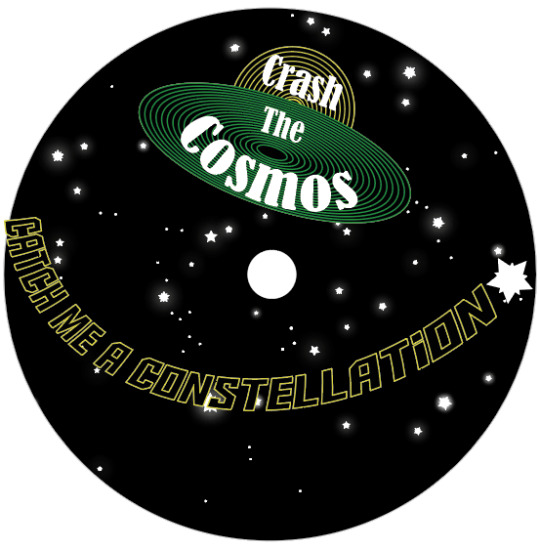
Next, I thought to add the planets back in as the reason I even took them out was because I didn't know where I was going to place everything.

The last step was to get the type so it all fits in this circle as it was previously slightly sticking out. To do this, I just went back into ‘object’, ‘distort envelop’ and ‘make with warp’. I then ever so slightly changed a few of the settings.

After that, I just changed the last word to a green stroke instead of yellow as I felt this would then reflect the album cover as I placed this word on the back cover. I think this last finishing touch helped to balance out the number of colours so there was no longer too much yellow included.
Overall, I’m actually very happy with this outcome as it accomplishes the look of linking with the album cover, which was my main aim of creating this sticker.
0 notes
Text
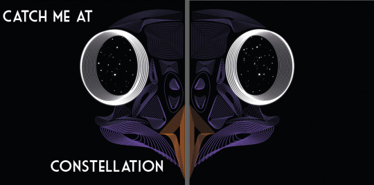
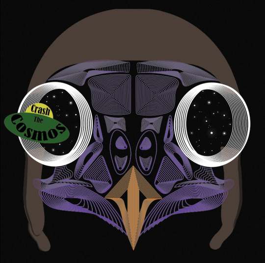
Finalising My Final Album Cover
I’m now going to focus on the back cover as I haven't properly thought about how I’m going present the songs. I had the concept of showing the songs coming out of the other eye, so the spaceship is going in on the front cover and songs coming out on the other side. Below, I have started by writing the names out and rotating them so they create the look of appearing from the eye. Here, you can see they are in a white fill but this was only so I could see what I was writing as I didn't want to misspell any words.

I then used the ‘eyedropper tool’ as I wanted to see it would look like in the orange from the beak. I thought I could use this colour as its only one area of the design with this colour. I also felt just adding a stroke of colour would give it a bit more interest. I did try adding it as a fill only too, to which, it didn't seem as engaging. I do feel like the does improve the piece, but I’m not sure that the orange really works. I almost feel like it should only be the beak with this colour as this object will then standout more.

I then chose the same yellow colour as the spaceship, to which I think it achieves a better effect as it now relates to one of the colours from the other eye.

I then added stars to end of each song as I wanted to achieve a shooting star effect. I didn't add a outer glow to this as I felt it didn't really need it. This is also the reason for placing the songs spreading out as I was trying to get this across to the viewers.

I then thought to match this the spaceship I would combine green into some of the songs too. I feel this looks really engaging as there is now a darker colour mixed with the bright yellow. I think this because the yellow on its own seemed so bright that it wasn't very easy to read and because of close the songs are to one another too.

Now thinking back to placing the type in a place that would work. I have tried placing it so half is at the top and half at the bottom but still splitting it up. I think this looks quite eye catching, although the front page looks very much like it has a lot of negative space which I definitely don't want on the front cover.

I decided to arrange it back to I originally planned it to be. I do think this is the best possible place as fits well with everything else.

Although, from looking at the last screenshot, I realised that the type of the songs certainly needs to change direction so it spreads out on the page a bit more. Below, I have slightly rotated all the songs and feel this works a lot better. As well as this, I have placed two planets in the eyes as I think this creates a more realistic look but also will make the viewers immediately assume its representing space.

I thought I was very pleasured when I got to this point but I realised that normally a shooting star will slightly curve but I haven't shown this as my text has just been presented a straight out. I wanted to just see if curving it will improve the piece anymore so to do this I went into ‘object’, ‘distort envelop’ and ‘make with warp’. I started by curving the names at the top, where I had the ‘style’ on ‘arc’ and the ‘bend’ on -15%. I then very gradually decreased the bend number as I went down and when I got to the type being straight, I started going to other way, with the last song being at 15%. I think the result of doing this created a more 3D look as it actually looks like the type has just come out of the eyes.
In the end, I have finally come to a conclusion that this is going to be my final font and back cover as I’m very pleasured with it and don't think it can be improved in anyway. I feel this last adjustment has truly improved the design and I also think the idea of curving it, has made the text cover even more of the black background than before.

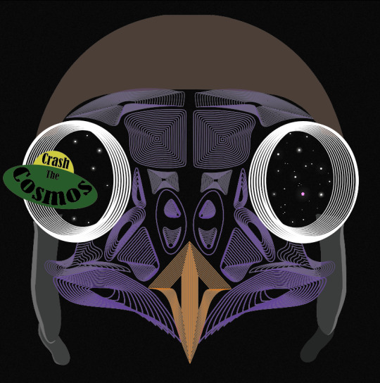
There is then the front cover which I feel looks very engaging and I'm really happy with the unusual idea of splitting the owl skull as both of sides now work so well together to perform an astonishing design.

0 notes
Text
Designing My Final Album Cover
This post is now showing where my ideas have really developed and seem to be getting closer to an outcome. When I was prevsioluy thinking about composition, the idea of having two halves split up, then lead to having one half on the front cover and the the other on the back. I placed them so when the viewers turn over the vinyl, the owl will follow. This gives a more 3D feel to the piece. Another reason for doing this is that, the type in the spaceship seemed way too small compared to the rest of the design and was almost getting lost. When looking at this screenshot below and the previous post, I have slightly adjusted one element of the design. This is the white eyes, as I have now added a glow to then to make then pop even more.

Here, I have now brought back the spaceship into the design, where I have increased it in size as I now have more negative background space. At the time, I just thought to place the bands name there for now and move onto the album name as I haven't even tried placing that in yet.

I wanted a simple font and arrangement when it came to band name as I felt that I already had enough going on, on the page. My first idea of having the type reflect the owl skull, meaning that I would have half the text on one side and the other half on the back cover. I started with the same font that is presented in the spaceship (which is called ‘Aldo the Apache’). I chose for the type to be white as I thought this would definitely standout from the black background. I decided on splitting the text like this as the last word is quite long meaning it was the same length as the other three words on the front cover. The only problem with having the type like is that the viewers might not understand on my ideas of how I have arranged it. I found this font way too bold, where the thickness of the letters were too much.

I then found this font that I had prevsioluy downloaded, called ‘Market Deco’. I felt this was a lot less in your face and to me looked very professional. I placed it in the same position as the previous screenshot. I thought this was a very simple way of arranging it, but it worked nicely.

I then moved it to the top of the page. I think it looks fine here but when I add the spaceship, it might seem like there's a lot of empty space around the bottom.

Here I tried placing all of the text on the front cover, to which I split the type up even more than before. I made each of the words go underneath the other, with the last word being quite far down the page. to me, the fact that the two words ‘me’ and ‘at’, both only have two letters, seems to make that section not quite what I hoped. If the second word was three letters long, then it would have been a gradual decrease in letters.

I kept with the idea of having the whole album name on the front page, where this time, I placed half at the top and half at the bottom. To me, I think the word ‘constellation’ looks a bit weird in the position as it isn't in the centre of the page nor at the sides.

I decided to improve the design by moving ‘catch me at’ to the left and ‘constellation’ to the right side of the page. I think this outcome could work well as the spaceship would then be added to the section in the centre, meaning there would be less negative space.
I then did just had the idea of placing the type back to where it first was, where I thought to copy and paste on the circles from the eyes and increase it in size. I arrange it at the start and end of the name. I don't think it looks that bad but I definitely don't think its worth keeping as it doesn't really mean anything.

After experimenting with all the different possibilities I could have, I ended up choosing the first position which was simply just having the type at the bottom of the page with half on the front cover and half on the back.
I then brought back the spaceship to see the final result, but I felt the spaceship looked quite childish. I did think this when I first created it and introduced it into the design but thought that if I added a few more elements it wouldn't look so bad. To me, this is what I thought but I asked for someone's opinion and views, where they said that they liked both. They said they liked the solid colour of the spaceship in the first design as its very simple and they like the clash between the lines of the owl and the solid colour.
I decided to chnage it just to see what the effect it would create if I changed it. I changed both of the shapes so they have a stroke but no fill, so I just clicked on the little arrow. I then used the ‘blend tool’ again to create the same line effect as the owl. I thought that if I do this, it would then match with the skull. Below, is showing what it now looks like and to me, I was really attracted to it, as it now doesn't look childish, and it still shows the yellow and green colours very well. But changing this, meant I had to change the colour of the type as black wont have shown up against this. I feel the text, just being white certainly stands out too.
I asked the same person for their opinion of this design now that I had changed it, to which they said they also like this one too as it gives a different effect but they both good in their own way.
The fact that both of them were effective meant that which ever one I pick, would have worked, but for me, I much preferred these line blend shapes.

0 notes
Text
Designing My Final Album Cover
I then tried using the owl skull I drew that was inspired by Patrick Seymour. I previously mentioned that this piece of work is probably my most successful piece from the last 2/3 weeks of work.
Here, I started by placing a black grainy background which I did by creating a square using the ‘rectangle tool’. I then duplicated this to which, I layered it over the top of the original one. I then went into ‘effect’ and ‘effect gallery’, where I chose the ‘grain’ which you can find under ‘texture’. I then played around with the settings as I wanted to still keep the shape being a dark as possible as this would then mean a stronger contrast between the owl skull. I only wanted a slight grain as this would then give a little bit more interest to the whole piece. Once I was happy with the effect, I clicked ‘ok’ but then went the opacity setting at the top of the page. I wanted to decrease the opacity of this textures shape so then the black shape I originally placed can somewhat show through. Doing this would give an overall darker effect, while still showing the grain.
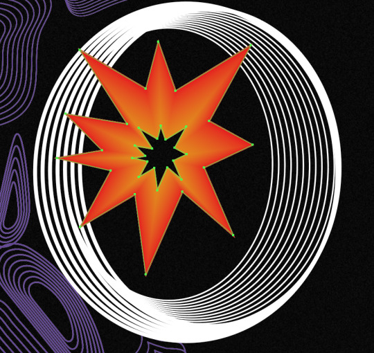
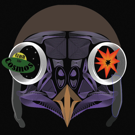
After this, I simply just opened up the file from when I drew this owl skull and copied and pasted it, onto this new page. I positioned this in the centre of the page. I then had the idea to use the eyes to capture the viewers attention as I think this part is the most striking. As the theme is multiverse, I thought of showing stars in the eyes with a spaceship flying into one of the eyes. For the other eye, I felt that I could almost show the impact of the spaceship going through the eyes. To represent this, I had the idea of showing an explosion.
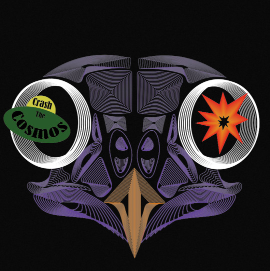
To create the explosion, I knew straight away at how I could produce this. I used the technique that I have recently learnt which is when I used the ‘blend tool’, but this would be a very basic method out of all the other things I created, as I wont do anything special when blending. To get this effect below, I used the ‘pen tool’ to draw the spikey effect for the look of the explosion, where I then copied and pasted this shape and decreased its size. To do this I just held down ‘shift’ and ‘alt’. When drawing the shape, I chose to create a very simply looking explosions I want the viewers to be able to see what it is at first glance. Then, I chose the larger shape to be a red colour and the centre shape to be orange. Next, I selected the ‘blend tool’ and just clicked on the two corners. I double-clicked on the this tool in the settings, where I was playing around with the number of steps as I felt that I didn't really want any of the lines showing. I can’t quite remember what number it ended up being, but it was definitely a higher number than I have been previously choosing. This is the end result of this, to which I think it achieves the look I was hoping for as it is very simple but I felt it needed to be.
I then created a simple looking spaceship too. I thought to have the band name in this so the type is almost apart of the design. As you can see, I have curved the word ‘cosmos’. I got this idea from one of the scans I did when I was distorting type. I was going to use the actual scan itself but found it could look a bit messy so I just created the same effect but digitally. To do this I went into ‘object’, ‘distort envelop’ and ‘make with warp’. But before I even created this type, I produced the spaceship first. Again, I went very minimal, and used the ‘ellipse tool’ to draw a perfect circle (holding down ‘shift’) for the top part and a circle where I stretched it further out sideways so it created this flying sorcerer effect. My inspiration for drawing it like this, was from old images or drawings from how people used to draw them. I found in old designs, they would be shown in a very simple way. I then show use the two colours, yellow and green. At the time, I thought these colours work so well together and reminded me so much of colours that would have been put together quite often in the past. When it got to creating and positioning the type into the spaceship, I went through all of the past fonts I have used in this project. I saw this font I used when distorting type using the scanner. I felt it looked very attractive. It doesn't scream sci-fi or space, but I was fascinated at how effective it looked. The font is called ‘Bernard MT Condensed’. I felt it gave a sense of professionalism but it wasn't boring nor anywhere near hard to read. I arranged the type do the first word was in the top section of the space ship and the other two words were in the bottom area. I made the word ‘the’ a smaller size than the other words. This is because it is less important and doesn't need to be the first word that catches the viewers attention.
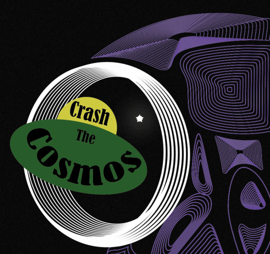
Next, I decided it was time to add the stars which I was going to place in the eyes. I thought adding this element into the design would really help to give the effect to the end result as these objects will show the viewers what their looking at. My inspiration for this was one of the poster designs in my Pinterest board (https://www.pinterest.co.uk/Libbym220/multiverse-ideas/) as the stars easily stood out as the object they the artist was implying them to be.
Below, is the poster I was referring to when creating my own stars. When I looked more closely at how they created them, to me it looked like they have drawn a normal star and then copied and pasted it and slightly rotated it but this new shape has been decreased size. There had then been a glow effect added as well.
This method of how I thought the object was created was exactly what I did to produce my own. Once I had assembled the shapes, I went into ‘effect’, ‘stylize’ and ‘outer glow’. This then brings up a tab, to which I just played around with the settings until I was happy. I started by changing the colour to white as this will then match with the start shade. For the first star, I made the opacity quite high and the blur low. Doing this means the star will be quite bright and the glow won’t be very gradual.

I did generate some more stars which were different to these settings. I copied and pasted all the different ones and arranged them in different places. I also added some very small circles in the design too, as this will then cover more of the negative background space.
As well as this, I added this flying helmet/hat to the owl as I had the idea that this would then relate to the of flying the spaceship. When I was looking for images to use to then trace, I found it very hard to find one where the helmet is from the front as most of the images were from the side. I did eventually find one. I traced the main features of the design where I could have added the goggles as well but felt this wasn't really necessary and could cover some of the owls face.
Here, you can see I have now taken away the explosion from the right hand side. I then added stars to it instead. I did this because I found it didn't really improve the design and almost looked a bit random.
I then wasn't too sure on the hat. I couldn't tell what the problem was so I tried changing the colours so the hat was all one colour. here, I have swapped the bottom section to brown but immediately knew this made it worse. I think its the brown and purple that wasn't working.
I then tried this silver colour to which I think it looked a lot better.

When looking at the screenshot above, I still thought something wasn't right as it almost seemed a it boring, all of a sudden. I thought that it might have been the black type so I tried to add some more interest to this by changing colours and adding just a stroke. As you can see, I have also changed the font as well. This one is called ‘Aldo The Apache’. This gives me a sense of space a bit more so I thought this could add to the design.
Although when I zoomed back out to look at the whole piece, it still didn't seem right. I decided to change it back to the original font and style, to which I had the idea of moving the composition of the owl. I thought as this owl is the exact same on both of the sides it could look interesting to place half the owl on one side of the and the same on the other side. Doing this, meant that the eyes were right next to one another. I slightly moved the spaceship so it now looks like its come from one of the eyes and going through the other. At this point, I can definitely see my ideas of how to arrange the elements are improving. I felt I was getting to a point where I was getting exited on how the end result was going to turn out.
0 notes
Text
Starting My Final Album Cover
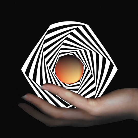
I then wanted to try creating something with the idea of using orbs as I was really pleased with how they ended up looking like as I was definitely not expecting it. Here, I have again, kept the black background. The reason for this, is because I think it helps to give a space/multiverse effect. I then went through the method of creating an new orb, to which I chose very weird colours this time. I decided on this orange/red main colour to which I then used the ‘lasso tool’ to select this large chunk of the circle. I chose this lighter orange to go here, along with a very small area of black on the bottom of the shape. I added this black as I thought this would give a sense of a 3D shape. I created this orb very quickly, just thinking that it could give me an idea of what the end result could look like if I used an orb.

I tried placing this work from when I created my op art digitally. I copied and pasted this shape multiple times to then potion it on top of the circle. I thought of doing this because it looks a bit like mountains. However, this idea isn't very related to the theme so I decided to move on. I also couldn't see what else to do with this idea.

I then had this really unusual idea of using the scanner but instead of typography like I have been doing, using my hand to extend it. I thought that I could then add a gradient or some kind of interesting colour combination to my hand with a black background. While using the scanner, I realised that this idea was a bit harder than I thought, as I had to have my hand close to the glass for the scanner to be able capture a clear image. Beneath, is showing where I have just placed my hand on the screen where I have then moved my hand to make my fingers look longer.

I then tried moving the potion of my hands. When I first saw this image, I had the idea of making it look like I was holding something as my hands were in the perfect position.

I thought of using the orb which I prevsioluy thought wasn't going to work. I sized the shape down the size where my two fingers look like there holding it. I then roughly cut the hand out as I thought I could blur it into the background as the hand itself was already blurry so this would make the hand gradually fade. For some reason, I didn't peruse this idea any further.

Instead, I thought to use the orb again with another of the op arts I prevsioluy created. I simply just placed it not the centre of the optical illusion. At the time, it seemed like a good idea as I thought to keep it simple, but I think this idea was just too simple and looked very boring.

I then used the concept of the hand where I positioned it in a slightly different place. I thought to improve the previous idea and make it look like like my hand is holding the artwork. It took me a few scans to get the right image but I finally had two which seemed like they could work. Below, my fingers were sitting in a high position which would mean that there would be less of the work showing.

Next, I slightly moved it so my fingers were sitting further down. This scan was going to work the best as I can make the artwork look like its just sitting in my hand.

I cut this image out using the ‘pen tool’ and arranged it so my hand was coming from the side of the page. This was the only way it was going to work as the end on my hand was very close to the edge of the page. I think this could have looked a bit better if I added a colour but I knew there wasn't much point as the fingers looked really blurry.
0 notes
Text
Starting My Final Album Cover
Now that I have experimented with new techniques and skills, I will be coming up with an album cover design. This means I will be producing a front and back cover to the vinyl, along with a record sticker as well. The real measurements for vinyl covers are 30cm x 30xcm, to which I will use these so my cover ends up looking as realistic as possible.
I started by opening up an Illustrator page (which was 30 by 30cm). I was also looking back at all the work I have created over the last 2/3 weeks. I thought doing this would help me to notice my strongest pieces of work. To me, this was ‘experimenting with op art, ‘creating orbs - digitally’ but I felt over everything, the digitally draw owl skull, I drew was the most effective. I was really proud of this outcome as it looked so unusual and interesting. I decided the best option to get my thoughts going for ideas, would be to start placing different pieces of work, that I have already created in the past. I could then position them and it might help for my ideas to develop further.
Below, I have started by creating this op art, where I used a polygon and repeated the process that I have already learnt before. I didn't add a shape around the edges, as I thought having the piece going off the page would look more effective. I wanted to to be a vibrant pink as this would then standout from the black background I placed behind. At the time of doing this, I really had no idea on what I was going to do this piece as I thought that if I just try placing different things onto the page, it might trigger an idea.

I then added a stroke, to which I felt the colour orange would work well as this would compliment the black and pink well. I also thought to make the stroke slightly thicker than , so I changed it to 3 as 1. I thought this would have more of an impact of the viewers.

Next, I placed a gradient where I kept with the orange but also included a yellow. Although, I wasn't sure about this as it almost lost the striking effect. As well as this, I ended up having no ideas come into my head from doing this so decided to stop adding to this design and create a new page so I could start fresh.

I wanted to use another element from my previous work so I thought on using a basic shape from when I was blending shapes. I thought to keep it simple and have something very clear to see. I chose to keep this black background but where I then placed this shape that I had already created and position it in the centre of the page. I chose to do this because I remember from looking at certain album covers, some keep it so its very minimal. I also think the black background really helps to keep the design looking very clear, which is because the white lines and yellow have such a strong contrast. As you can see, I have then placed yellow shape in the centre where there would just be an empty gap. I thought a bright yellow would achieve the look I was hoping. When I first created this line blend shape, I mentioned of an idea that I could show a completely different world in the hexagon gap, but now relooking at this idea, I didn't think was going to work very well as the gap isn't very big.

Here, I have then tried adding another element from my previous work where I chose the distorted orbs. I thought I could show the look of them falling down the triangle shape. Below, you can see I have stared placing the three different shapes down one side, but straight away knew this wasn't going to look interesting enough.

Overall, this post is just showing the ideas I first had, but non of them ended up being very successful so I then moved on.
0 notes
Text
Experimenting With Op Art - Illustrator
I will now be taking my the most effective designs from the previous post where I will be placing a gradient onto them so that it can hopefully, attract even more attention.
When I was first going to add a gradient to this shape below, I thought I could just open up the gradient tab and create the gradient but I discovered that you have to click this button at the top of the page to be able to do this. In this screenshot, you can see this button has now turned a dark grey, where the shape has now got the blue lines over it too. This means the gradient will work now.

I started by chose the colours, purple, yellow and red. However, I wasn't sure this was going to look very effective once it has been placed into the rest of the design because the colours will disappear. This is because the shapes are overlapping one another.

I then decided to get rid of the red colour and change the ‘type’ so that the colours will come from the centre rather than each colour being on each side. I thought to do this as it should have a better overall look, once the shapes have been put together. With this type of gradient, I find it quite hard to figure out where to position the colours on the bar below. As you can see, the yellow is taking up most of the bar space with only a little bit of purple but I feel like that bar doesn't really reflect what it has actually done to the shape. However, I was happy with this overall look so I then decided to put it together with the rest of the pattern. By this, I just copied and pasted the change, and positioned them back to how it originally was. Looking back, I could have just saved the gradient and just placed it onto the rest of the design.

This screenshot beneath is now showing the effect its creates once placed together. Although, I think this layout does achieve the look I was hoping for, I actually feel like the black stroke was a lot more striking. The reason for this that, I don't think the gradient has improved the overall effect anymore.

I did then try duplicating this outcome from above. The layout of the colours on the shape, meant that the layout beneath this extra one I have added, only looks like its purple but its because of the position I have then placed the new layer over the top. I also discovered that it makes the new layer look like it has a lot more yellow featured on it, but this is again as the yellow from behind is showing through the gaps.

I then moved onto another of my shapes where I decided to use this unusual triangle shape. I have placed a gradient where the colours this time are, yellow, red and pink. I chose the red to be in the centre of the other colours because this would then hopefully show a more gradual chnage in colours. I used this type of gradient this time as I wanted to try this one, as it didn't seem to work previously.

I have now copied and pasted this shape above and have positioned it where I found it really interesting. From doing this, I have discovered that when I laced all the individual shapes together that they had actually all joined together to show the gradient but instead on the whole shape. An idea, I thought to add to this design as I want to see what would happen, is that I experimented with the transparency setting. I went through all the settings I have used in my past work.

This screenshot is showing the ‘colour burn’ setting to which it has slightly changed the centre. Before, the middle section was a bit messy with all the different colours showing through and the different shapes too but this has helped to brighten the red colour and make the lines less confusing. I did go through all the settings and felt this was the best option as this option has really enhanced the whole outcome.

I then chose to improve on one more of the previous outcomes, to which, I decided to use this same shape as before but to create a different pattern. I chose these three pastel colours, blue, grey and green. At the time, I wanted to entirely switch up the end results for this piece.

I then arranged hem together where I didn't have the design with the gaps as I felt this wouldn't be as striking as covering it up. I though this outcome ended up accomplishing an eye catching piece. As well as this, I have just noticed something about the gradient again. It is that the gradient actually moves when you look at each of the shapes individually. I didn't notice this when I first completed this design. I feel like it could have a more engaging effect on the viewers if I could control this.
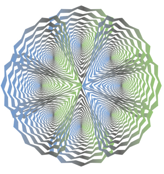
Lastly, I wanted to add another set of colours to the piece as I thought that if I changed four of the shapes from the previous result then it could more vibrant with the amount of colours. I thought to have the exact same type of gradient and with the grey in the centre but chnage the two outer colours to something different. I chose a pastel orange and pink/red.

I have now placed them into the design where non of the opposite colours are touching each other. I felt this would make the piece standout a bit more. As you can see, this new set of colours are overlapping the old set but I did try swapping this around, but found it didn't really make much difference.

Overall, I’m very pleased with the final results that came out of this experiment. I think the colours and gradients worked very well with the design itself.
0 notes
Text
Experimenting With Op Art - Illustrator
I’m now going to use all three of the shapes I’ve just created to now produce them into a more striking design. To do this, I will simply just be duplicating the original shapes to then arrange and place them to hopefully make them more eye catching. I’m doing this for two reasons, One is that I was slightly disappointed with how the overall look as they weren't very impressive. Another is that I feel I can extend and take these shapes further.
Below, I started by copying and pasting this shape that I had only just created, where I used a polygon and a circle. To accomplish this design, I have simply just duplicated the shape once and positioned it the opposite side. I have then just selected both of these shapes and duplicated this. I have then just placed to cover the two gaps on each side.

To achieve this design, I have simply just copied and pasted, the whole design from above, where I have slightly rotated it 90 degrees. I feel like this outcome looks a bit messy as you cant see so many of the details of the lines. As, especially in the centre section, the lines are all going different ways.
This is now the shape where I used a polygon and a triangle to complete the design. Again, I have just copied and pasted it several times where the main triangle is pointing outwards. While experimenting with these shapes, I discovered that there is so many different ways you can position these shapes. I could have tried the other way round of the triangle shape so the point was in the centre. Although, I felt it would look more striking with a more interesting outer shape as this is now showing a diamond shape. When it shows the lines combining in the centre, its engaging because you can exactly se each line this time. The reason for this is because there is less lines at the bottom of this shape compared to the previous.

Here, I have used the two basic patterns which I have only just produced and I have arranged them so that the triangular shape is smaller then this other design. I felt this performs a more unusual outcome as you can see the shape within this larger one.

Here, I have now used the last shape which I haven't yet placed in any of my designs. Before I even started, I could tell that I would be able to experiment with this shape quite a lot as it had more eye catching features. Firstly, I created the same effect where I just place four of the same shapes and rotated them 90 degrees so that I ended up with outcome. To me, this design came out a lot like the other triangular shape but this just going to be because they are similar in shape. Although, this shape has more detail at the bottom so the next layout I tried was were I paced them the other way around.

I have now placed four of the same shape so it is now the other way around. Already, I can see a massive difference as the different lines are now very visible and are in fact the first thing that caught my eye. But because of the shape being a triangle, there are still quite a few gaps either side.

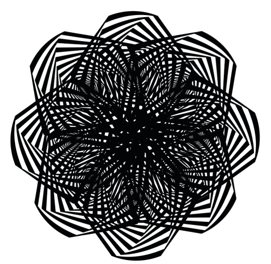
So to solve this, I decided to copy and paste these four shapes above and rotate them again so they will fit into place. I feel this outcome is definitely the most successful layout that I have produces so far as it creates and shows loads of interesting and unusual shapes when you look at the whole design.

I then juts wanted to try one more idea I had which was to duplicate this design above and place the exact same design over the top but as a smaller version. I feel this attracts your eyes even more. This layout actually reminds me of the snow looking design, I used to create, where you would use paper and fold it and cut in random places. This would then reveal this really unusual pattern. As well as this, I don't think there's too much black in the centre either.

I then produced one more composition, where I have used the first layout that I created with this interesting triangular shape. The only adjustment I have made was that copied and pasted it and then rotated it 90 degrees. I think this overall design shows this almost messy look where it then becomes a lot clearer when the shapes come out further from one another.

Overall, I feel this idea has completely changed the look of the overall shapes and has definitely brought a lot more attention.
0 notes
Text
Creating My Own Op Art - Illustrator
I will be creating my last optical illusion where I will be using the same shape as before but placing a circle as the outer shape. Now looking back, I have actually used pretty much the same shapes but I have just swapped them around. At the time, I didn't realise this and it now makes my overall work look quite boring as I haven't really experimented with all the other shapes I could have used.
Below, I have created the illusion on the polygon shape to which I will next be drawing a circle over the top.

Here, I have drawn the circle so that it fits the size of the shape beneath. Although, one thing I have realised is that I have always been drawing the overlapping shape so that it goes right to the edges of the original but I feel if I draw it smaller it might have a completely different effect. As I think my shapes that I have created all look very squashed so if I present them with more space around the edges, it could work better.

This is the final design. This screenshot of the overall shape, has ended up looking exactly like what I prevsioluy said, that it looks squared. There can be a few reasons for this, one is that the overlapping shape I’m drawing on, is too big or that the shapes just don't go well together. By this, I mean that when I originally drew the square and circle, this shape achieved a much better effect than the ones I’ve been creating

0 notes
Text
Creating My Own Op Art - Illustrator
I then decided on producing another shape to which I used a more basic shape but I felt it was still interesting enough to create a engaging end result. I chose to use the ‘polygon tool’ to which it only has 6 sides. Again, I went through the method and felt it was still going to impressive with, even though it has les sides.

I chose to use a triangle again. I drew it in the centre where I was then going to see the result sin a few more steps.
Below, is showing the final outcome. I think it looks quite similar to the previous design but this because I have used the same shape for the outer section. At the time, I was also a bit let down at the results. I feel if I was too leave this shape like this, I would have disliked this work but I ended up thinking of another way of presenting these end results. I repeated the technique of playing the shapes in interesting ways. I thought of the idea of combining the ‘blend line shapes’ post but using it for this work.

0 notes
Text
Creating My Own Op Art - Illustrator
Now that I have a basic understanding of how to create an op art style illusion, I want to experiment with the different shapes and gradients, I can produce. I started with creating star shape with around 16 points. I create this by going into the ‘star tool’ and clicking in a random blank space on the page. This then brings up a tab to which you can type in the number of points you want. I then repeated the exact same process to which I brought up this tab again, and chose the same numbers for everything. When I got to the number of ‘copies’, I felt the pattern that appeared behind the tab looked really interesting so I proceeded to the next step.

You would then chnage the stroke and fill around so there is now a black fill and no stroke.

I then selected the ‘exclude’ button, to which, it presented this design below. I think this looks really striking as there as so many points to which are gradually twisting into the centre.

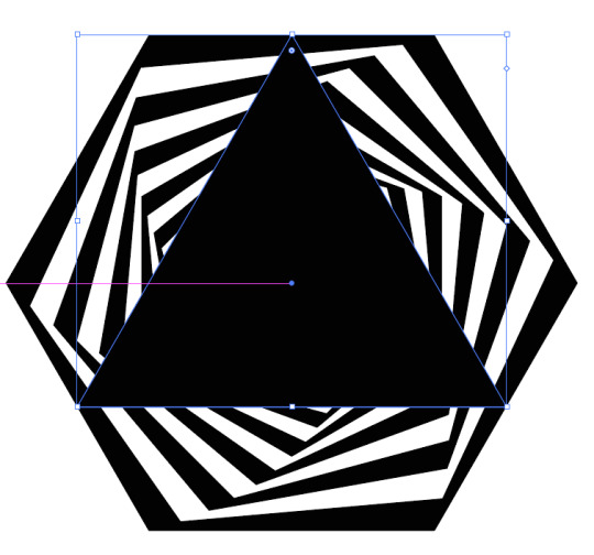
I then kept going to now change the outer shape. I wanted to experiment with a triangle as I has no idea on the outcome it would present. To do this, I created a triangle by going into the ‘polygon tool’ and clicking a random blank space to which I changed the points to 3.

I then made sure this shape was showing at the front of the page, to then select all the shapes on the page (’select’ and ‘all’).

The last step to complete this design, would be to go onto ‘object’, ‘envelop distort’ and ‘make with top object’.

After completing this process, I manged to create this outcome. When I first created this, I was very disappointed with the results as it was not what I was hoping for. Although, in a more resent post, I have shown what I accomplished with this shape. I used a gradient but also experimenting with copying and pasting the shape.

0 notes
Text
Creating My Own Op Art - Illustrator
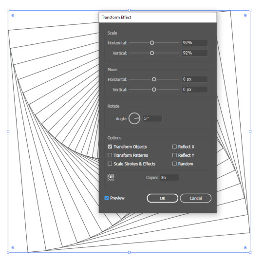
I now feel I understand on how to create some effective op art pieces by hand but I now want to learn to produce it digitally. I’m going to start with a simple shape, as I feel this will be the easiest way for me to understand the method on how to create it. The first thing you need to do is open up a new page. When doing this, I needed to create a custom size for which, it was 1200 px for the width and height. After this, you will need to select ‘create’ to open the page up.
Now that I have my page open, I will start by simply drawing a square which you can do by going into the ‘rectangle tool’ but holding down ‘shift’. You need this shape to have no fill and a black stroke. Once you have done this, you will need to go into ‘effect’, ‘distort & transform’ and ‘transform’. This will then bring up a tab to which you will be changing a few of the options. As shown below, you need to change, ‘horizontal’ and ‘vertical’ to 92% for both. Next, you need to chnage the ‘angle’ to 5.

The last thing you will need to alter is the number of ‘copies’, which is at the bottom of the tab. I changed it 36, but you can choose whatever number you would like as this number depends on how many times this square will repeat itself. Once you have typed the number in, you should see your square behind this tab completely chnage. If this doesn't happen, then you just need to click on ‘preview’ and then click in again, so that the box shows blue. The select ‘ok’.
The next step, would be to select your shape, and swap the fill and stroke so that the fill then turns black and there is no fill. You can do this by simply just clicking the little arrow next to the fil and stroke on the left hand side. Now, go onto ‘object’ and ‘expand appearance’. Doing this will bring up these blue lines around the shape.

Next, you need to click on ‘exclude’ which you can find on the right hand side settings. It will be under ‘pathfinder’ and should be the last setting in that row. Doing this, then presents this black and white effect which is the optical illusion.

This is now the result of creating a basic optical illusion where I used the the square shape. However, I can still take this process a few steps further, to which I can chnage the outer shape to something else, for example, in the next step, I will be using a circle.
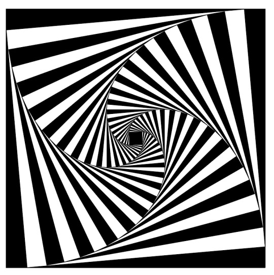
To do this, I will need to draw a circle over the top of this illusion that I have just created. To create this shape, you will need to go into the ‘ellipse tool’ where you will then need to find the centre of this square shape and hold down ‘shift’ along with ‘alt’. Doing this allows you you draw the circle exactly in proportion but also so that the circle will come out from the point you started drawing at (the centre). The shape can stay as having the black fill with no stroke. Next, I right clicked and went into ‘arrange’ and ‘bring to front’. Now go into ‘select’ and ‘all’. The final step, is to go into ‘object’, ‘envelop distort’ and ‘make with top object’.

Doing this should now leave you with the overall design looking like this. As you can see, it has the circular outer shape with the square pattern inside. But you can take this one more step further, where you can use a gradient onto the design. This means I will be changing the black to any colours I want.

To do this, you need to open up the ‘gradient’ tab which you can do by going into ‘window’ and ‘gradient’. You then need to select the top left box which will then start your gradient. I then chose my colours by going into the fill box beneath the larger box. Once I had chose my first colour, I dragged in the bar where it then places it in. I then went back into the colour chart where I again, chose another colour. As you can see, the two colours I chose were this very light orange and a purple.

Overall, I feel this outcome looks very striking, but next, I want to repeat this process where I will then go onto more interesting shapes as I’m fascinated on what other illusions I can create.
0 notes
Text
Creating My Own Op Art - Hand Drawn
I will now be creating another of these optical illusions where, it will be a different style of art this time. To start, you will need the exact same materials as last time. I firstly, measured and marked the centre of one side of the page (which is 12cm). While still on the same side, you ned to mark at 6cm and 18cm too. You will ned to repeat this process on each of the four sides. Once you have done this, the next step is to connect to centre marking on each side to the opposite side of the page. For this you will need a ruler and pencil to get an accurate design. You then need to connect each corner to the opposite corner again. When following this process, I noticed at this point that I was repeating some of the same steps as last time, but it will chnage as I’m creating a different outcome. Next, you ned to use the markings, that you previously made, to connect them together again, where you need to make sure your line is passing through the centre. This means you are creating four more line to the design. You now want to create 10 markings on each side of the page, which I worked out that 24 divided by 12 is 2. This means you need to mark each 2cm on the page and repeat this for the other three sides too. You now want to move onto connecting these marking together where I have started doing this below. For this you just ned to line up both of the markings on the side of the page. When connecting them your lines only need to go through three of them from the centre which is what the image below is showing.
Here, I have used a fine liner to go over the lines I have currently made in the last image. Although, I did add the rest of the lines for the rest of the design.
You now just want to finish off the rest of the lines, using a fine liner. You design show look like this.
The next step, is to start shading in all the gaps to which you need to again, remember to leave a white gap for every black shade. Here, I have done the same thing as last time, which is to colour the majority of the space and leave the trickier places to the end.
This image is now showing where I have shaded in to all the gaps and I’m now just going back over the edges to complete the overall effect.

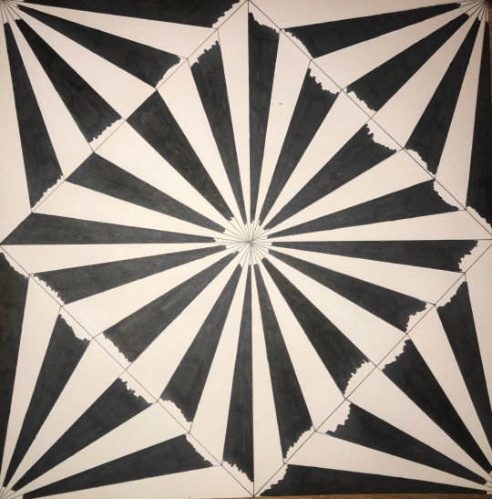
I have finally completed the piece to which I think it looks really striking to the viewer, although I did accidently go over the line in one place when I was shading the design in, but now looking at the overall piece, it isn't noticeable at all.

0 notes
Text
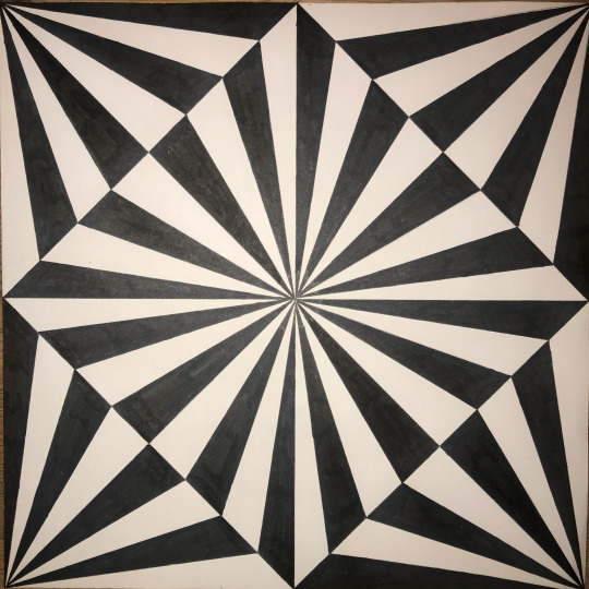
Creating My Own Op Art - Hand Drawn
Now that I have researched about Bridgette Riley, I am going to create a piece of work that is inspired by her style of work, which is op art. I will start by creating mine by hand, on paper.
Firstly, I gathered all the resources I will need to create this piece of work. I need, a ruler, pencil, a black fine liner, a felt tip pen and a blank sheet of white paper. With the paper, I found using an A3 size will work the best.
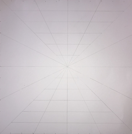
Now that I have everything, I started by measuring out 24cm on my A3 paper as I needed to create a square. In the guide, I was following, it said to measure out 30cm each way but I found that this size of paper wants big enough in width so I had to size it down to a number that I could fit on my page. The reason for choosing the number 24, is because this is an even number so it will make the rest of the process a lot easier.
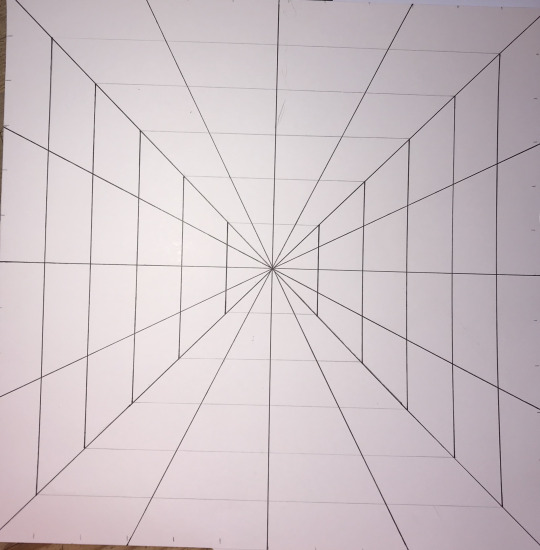
Now that I have my plain piece paper measured out, I can start. I firstly had to measure 12cm and mark it for each of the sides, using a pencil. The reason for the number 12, is that this is half of 24. Next, I would need to draw from one corner of the square to the other, making sure you get it as close to the corners as possible. For this you would need a ruler and pencil. You then need to do the same for the other side, where you should now have a cross presented on you page. After this, you then need to use the markings from earlier and draw from one side of the page to the other. For this, you just need to line up the two markings from each side and repeat this step one the other side too. To then create these triangles in the corners of the page, you now need to connect two of the sides up where you will need to do this for each side. This means you are drawing these one four times. Your page should now look like the image below.

Next, you want to create 6 markings on each side of this diamond shape you have now created. To work out how many cm’s between each gap, meant I needed to do 17 (as this is the width of one side of the diamond) divided by 8 as there would be that many gaps when you draw on 6 markings. The result of this is 2.125. This means I would need to draw a marking for every 2.1cm. You then need to do this for every side (4 sides). Now, you need to join each marking up using a line across the page. To do this you ned to line your ruler with the opposite marking. This means you need to make sure your line will go through the centre of the page as if it isn't, this means you haven't got the right marking. Once you have finished this, your diamond shape should have all the markings connecting to one another. The next step is to them use the lines you have just drawn to fill in the gaps around the corners of the piece of paper. By this, I mean you simply just need to pick a point where you need to line this point up with the corner of the page. There are four sides so 6 lines from each side should join to the corner. This should then be repeated for each one. After this stage, you should end up with the design looking like this.

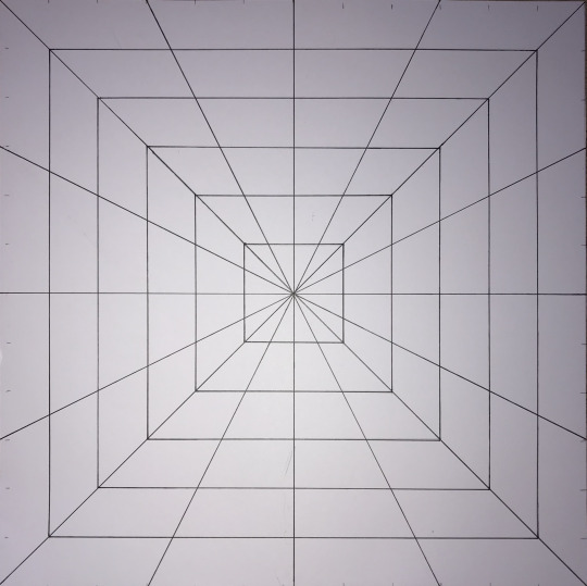
Now that you have drawn the shapes needed to create this optical illusion, you now need to go over all the lines you have just create with a fine liner. I could have drawn these lines in pen when I was first crating them, but I wasn't entirely sure what I was doing so I felt it was the best option to use pencil, just in case I make a mistake. Once you have done that, you now need to finish the piece of by colouring the design in, using a felt tip pen. You pen preferably needs to have some sort of point as it could be quite hard to go round the edges of the design otherwise. To speed up the process, I shaded in to the sides, where I could the complete this later on. When you are shading in you need to remember to miss a space and leave it white as this will then create this illusion.

Below, is now showing where I have shaded in the majority of the space and I’m just going back over all the sides that I missed.
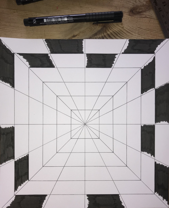
When I got to the centre of the page, I had to use the fine line to shade it in, as the felt tip, was too thick, that it would have gone over the lines. This is now showing the completed piece, to which I’m very pleased with it as I think this end result looks very striking. I think the pen I used also massively helped to have that bold black colour. The reason for this that I have found that some pens can go very blocky when you colour over the colour you have just placed onto he page but this didn't happen here. I also thought that the thick paper that I used helped the ink to accomplish an engaging piece.
0 notes