#humanistica
Explore tagged Tumblr posts
Visit Tumblr Blog
Explore Tumblr blogs with no restrictions, modern design and the best experience.
Last Seen Tumblr Blogs


Fun Fact
Tumblr has been banned in Indonesia for providing people with access to pornographic content.
Link
2 notes
·
View notes
Text


(Source: Malory and the Common Law by Robert L. Kelly, Medievalia et Humanistica)
#le morte d'arthur#queen guinevere#king arthur#sir lancelot#arthuriana#arthurian legend#arthurian mythology#arthurian legends#thomas malory#medievalia et humanistica#medieval law#arthurian law#english law#medieval history
51 notes
·
View notes


Text

fere-humanistica revival
illustration is figure 1., «Text page from Die Nachtfeier der Venus. Printed by Officina Serpentis. 1919.», from «Tendencies in Geman Book-Printing since 1914» by dr hanna kiel [The Fleuron, no. iv, at the office of the fleuron, london, 1923, p81]. dr kiehl tells us: «The ‘Officina Serpentis’, established in 1911 by Tieffenbach [eduard wilhelm tieffenbach], is comparable to the Vale Press, being almost entirely a reflection of its founder’s personality. He is his own publisher, type-designer and printer. In contrast to other German book-artists, he has been influenced more by the Kelmscott Press than by the Doves. His own type is based upon that used for Schoeffer’s Bible …» [ibid., p75]. ‘schöffer’s bible’ refers to the first Latin Bible printed by fust & schöffer, mainz, 1462, which was set in types cut by peter schöffer: these types were a further essay of an earlier cut by schöffer and first shown in the fust & schöffer edition of durandus [Rationale Divinorum Officiorum, mainz, 1459]. [cf. harry carter, A View of Early Typography, at the clarendon press, oxford, 1969, p33.] of the model for the durandus types a.f. johnson says: «The letter shares some Renaissance characteristics and others of the Middle Ages. Hence it has been called Fere-humanistica or Gotico-antiqua. … The hand is gothic but with considerable roman tendencies. It was the formal book-hand of the earlier Italian humanists of the fourteenth century, and in particular of Petrarch.» [a.f. johnson, Type Designs, grafton & co., london, 1959, p11].
for more on petrarch’s script vide ‹mano del petrarca›.
for more on peter schöffer vide ‹not schöffers roman›.
2 notes
·
View notes
Text
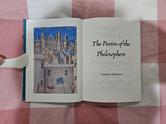
The Purim of the Philosophers by Jonathan Edelstein


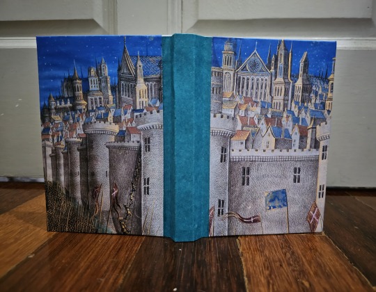
Jonathan Edelstein has cropped-up in this blog for several times now, and not without good reason. I knew him from almost a decade ago on an internet forum and his stories - short and long-form - have captivated me by their depth and ingenuity.
So no surprise, I decided to bind yet another short fiction of his. After my first two binds of his work, I actually made a promise to myself to bind two more stories of Jonathan's before the year closes out.
One of them was Of Letters They Are Made, and the other is this: The Purim of the Philosophers.


Set in an alternate France where the Albigensian Crusade went unfinished, the Languedoc is its own kingdom, and the political situation is still explosive, The Purim of the Philosophers tells of a Jewish official sent by the Languedoc king to the city of Marseilles to quell tensions between the Jewish communities, all while the French north is gearing up for another war with the south...
Now, while this all sounds fascinating, I doubt I will remember all the background context in 20 years' time. That was why I decided to write a preface to explain the bewildering history of the region, balancing out the need to explain history with the constraints of a small page.
To be honest, I think there is enough historic oddness about southern France to make an original compendium, but I digress.
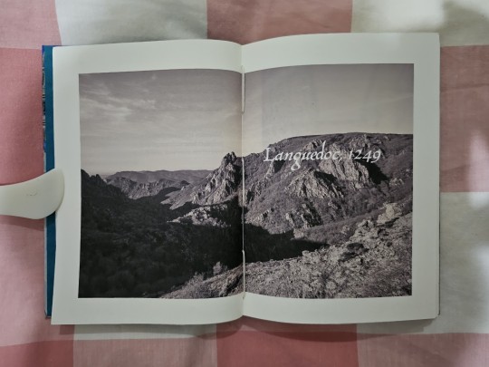
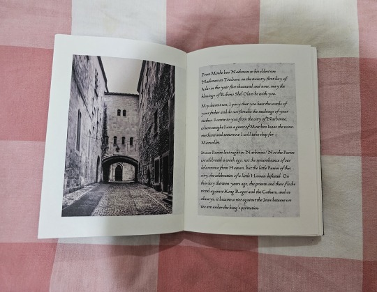
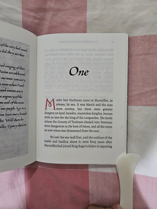
As with previous binds, I have a love for filling in pages with images that capture the feel and mood of the story, and this bind is no exception.
Additionally, parts of the tale is told in the form of letter correspondence between the Jewish official and his son, which I formatted using the 1475 Humanistica Cursiva font. I love the old-timiness of the letters so much that I eventually used it for multiple other things in this book, including the chapter headers and title strip.
The main body text is Alegreya, with a large drop cap of Harrington colored red to give an impression of illuminated manuscripts.

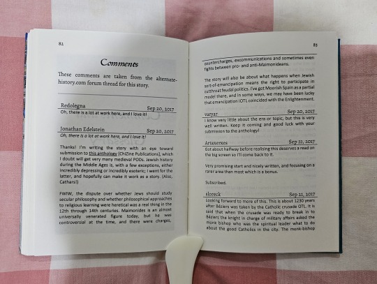

And as always with me, I added-in a comments section to preserve what people thought and discussed of this story when it was first published on alternatehistory.com.
But after all of that, I still feel like giving the background stuff of this tale more justice. So with some consultation from the author, I put-in two more sections denoting the main characters of the story and their real-life counterparts, as well as minor Jewish, French, and Occitan terms that were sprinkled throughout the book.
I have to say, it was quite an experience Googling up which terms meant what to a faith that is not really known to the general public east of India. I think I learned more about Judaism in the last 3 weeks than I ever had in the last 5 years, or even 10!
All in all, this bind was one of the more easier ones to make. I would have made this quicker if not for stuff at work and home delaying progress for a bit. I so wish I could make more than 1-2 books a month, but better to have those 1-2 books than no books at all.


#my bookbinds#bookbinding#fanbinding#jonathan edelstein#The Purim of the Philosophers#alternate history#short story
123 notes
·
View notes
Text
El "De Laconismo Syntagma" de Ericio Puteano
Ericio Puteano (1574-1646) , Cristóbal Macías Villalobos y Enric Mallorquí Ruscalleda ( (Edición, traducción y notas) 1ª edición impresa, 2025. ISBN 978-84-9127-309-7. 126 págs. Colección Grammatica Humanistica (Textos y Estudios); 17. P.V.P. 15,00 euros El laconismo nace en la Antigüedad como un estilo oratorio basado en la peculiar forma de hablar de los laconios, lacedemonios o espartanos,…

View On WordPress
0 notes
Text


Tanquel l'any 2024, amb orgull per la feina feta i energia per seguir endavant. Sant Cugat, és la força creativa i espiritual de la tranformació humanistica d'aquests nous temps. Aquí en una casa de poble de 1940 tenim un espai per l'art del nostre temps.
Que el 2025 sigui igual de fructífer i ple d'art!
1 note
·
View note
Text
0 notes
Text
This is the first, and so far only, reference I have seen to this! It's a nebulous supposition on Kristeller's side, to be fair, since it's based off a single line in a letter and there seems to be no clear proof if it actually occurred.
However, I choose to jump on Kristeller's boat with this one and believe that Ficino went in 1469. He had a grand time drinking wine and being nerdy with the secretarial staff of the church.
Have to add it into my timeline on him: 1469 - Rome????? TBD TBD
--
The above excerpts about the letter are from: "Marsilio Ficino and the Roman Curia," Paul O. Kristeller, Humanistica Lovaniensia, Vol. 34A, Roma Humanistica Studia (1985), pp. 83-98
I'm also currently reading: "The Scholastic Background of Marsilio Ficino: With an Edition of Unpublished Texts," Paul O. Kristeller, Traditio, Vol. 2 (1944), pp. 257-318
--
The Scholastic background is a discussion of a new text PK found and I'm just like... frothing at the mouth/tearing out hair because Marsilio de Diotifeci Ficino of Figline val d'Arno God Damnit I cannot nail down everything you wrote!! It's annoying!!
Excerpt from the essay:

it's apparently very much a nursery piece, which I find adorable, and very Aristotelian. Which makes sense, considering his scholastic background at the University of Florence.
I'm just like, shaking him: Make Me A Complete List!!
Ficino: but my early writings were hardly worth reading. I shan't share them.
Me: ahgdaljkshgjklahgjkldfgldfg
--
we are all very normal about the small gay Florentine magician priest philosopher!!
the traditional list of texts of shit Ficino wrote is incomplete sdlkfjlkgj;sldgfnrt
gonna go crazy this man is killing me
also he might have gone to Rome in 1469 - there's a letter that Kristeller got his hands on where Ficino references going to Rome and expects to return to Florence shortly
(I might have.. ,, the latin version somewhere in one of the Kristeller compendiums. must dig for it and see)
and it's like fucking hell godsdamnit this man
is killing me
ugghghh
THOUGH - I love that this turns a lot on its head in terms of the traditional through-line of all biographical summaries of his life wherein its stated that he never left Florence and her environs
--


10 notes
·
View notes
Text
Should I attend the webinars about ghosts, demons, and black magic in Latin literature?
#like.#I hate webinars#but this sounds so cool????#It's by the Schola Humanistica in case anybody's wondering#t e m p t e d
33 notes
·
View notes
Text


A new project to share! When I read An Affirming Journal, by EDWARD “BLACKBEARD” TEACH, Currently Aboard the REVENGE in the Year of Our Lord 1717, Having Commandeered Her from STEDE BONNET, Gentleman Pyrate, by imperfectcircle, raven (@singlecrow), soupytwist, and tatteredbookmark, I knew I had to bind it.
See, I am a font fiend, particularly for historical fonts. I have a whooooooole bunch that I downloaded from KPS Fonts, which I hardly ever get to use because they're like ... too authentic. Most of them are unreadable paleographic ancient/medieval handwriting!
The fic itself is also delightful. The premise is that Stede had one of those "affirmation journals" pre-printed with inspiring questions to help you discover your best self and all that and filled it out, and then after he left Ed went through it with Lucius, having Lucius enter Ed's answers and his commentary on Stede's (while Lucius leaves his own commentary on Ed's). So it's funny AND heart-wrenching in turns.
The authors formatted the fic with different normal fonts, so I felt a bit guilty about changing them, but it was just a perfect opportunity to be weird with barely-legible paleographic text. For the pre-printed journal questions and titles, I went with 1782 Thurneysen, a very legible but still clearly 18th century typographic font with the long S for maximum historicity. Stede's handwriting is 1739 Bickham, a very elegant cursive. Lucius's is 1475 Humanistica Cursiva, which isn't really as good as Lucius's handwriting looks to be on the show, but ... I had to give Stede very pretty writing and I needed the distinction to be clear at a glance. Humanistica Cursiva also has the long S and it is pretty readable. Ed himself only writes a little bit, but he presented a challenge because I needed something else distinct but also legible but also a handwriting font - in the end I went with 2000 Bastarda, which is not a genuine historical font but a cleaned up version of lettre bâtarde/lettre bourguignonne, a late medieval script style that combined elements of Gothic Textura (blackletter) and calligraphy.
(Not much to say about the binding, it's a basic pamphlet bind with a single signature and a cardstock cover, the stitching covered with washi tape.)
Please go read the fic if you haven't already!
148 notes
·
View notes
Photo

“Thys is the Rownde table of Kyng Arthur” — The Round Table at Winchester Castle
“Thys is the rownde table of kyng Arthur” begins the inscription at at the centre of the expansive object, suspended high in the Great Hall of Winchester Castle. The object — a tabletop 18 feet in diameter, originally about three-quarters of a tonne in weight — is a familiar reference point in Arthuriana. From the late Middle Ages, it attracted the attention of a range of chroniclers, courtiers, poets, scholars, and publicists. It was mentioned by the English printer William Caxton in his preface to Malory’s La Morte d’Arthur (1485) as one of the great English monuments that verified the historical existence of Arthur.
Arthur’s imperial associations played a fundamental role in his legend since the 12th century, when Geoffrey of Monmouth described Arthur’s “dreams of a promise that his descendants will be sovereigns of the whole world.” The original table may have been constructed at Winchester in the 1270’s at the behest of Edward I following his conquest of Wales and his ambitions for the conquest of all Britain. The Table may have been hung in the Great Hall in the mid-fourteenth century by Edward III, as his plans for a new Round Table fellowship at Windsor evolved into the founding of the Order of the Garter.
The Table gained further significance over a century later upon the birth of Henry VII’s eldest son, Prince Arthur, on 19 September 1486. Claiming descent from Arthur via Britain’s eponymous founder, Brutus of Troy, Henry saw to it that the birth and the christening of his heir would take place at Winchester, where King Arthur’s own Round Table was located. It was later painted over for the first time in the early sixteenth century by Henry VII’s successor, Henry VIII.
At the centre of Henry VIII’s Table is the composite Tudor Rose: an expression of national consolidation and the unity of the houses of York and Lancaster, personified by Henry VIII himself.

The array of expanding green and white band bands — the Tudor livery colours — is dominated by the imposing figure of Arthur, with one hand possessing a sword and the other controlling an orb of sovereignty. Notably, not only is Arthur portrayed wearing a contemporary imperial crown on his head, but the very face of Arthur resembles that of Henry VIII himself. By invoking his authoritative royal predecessor, Henry attempted to legitimise his rule and his drive for imperial power.

The Table had its detractors, to be sure. In 1534, the same year that the Act of Supremacy was passed cementing England’s split from Rome, the Urbino-born humanist Polydore Vergil published his Anglica Historia. It gave a critical reading of British history, shedding doubt on the Brutus foundation myth and considerably down-playing Arthur’s historical significance.
Whatever its relation to an elusive King Arthur, the Winchester Round Table has for hundreds of years been a fixture of the Arthurian establishment.
Sources: Jon Whitman, ‘National Icon: The Winchester Round Table and the Revelation of Authority,’ Arthuriana Vol. 18, No. 4 (2008); Mary Bateman, ‘“The Native Place of that Great Arthur”: Foreignness and Nativity in Sixteenth-Century Defences of Arthur’ in Arthurian Literature XXXV (2020); David Carlson, ‘King Arthur and Court Poems for the Birth of Arthur Tudor in 1486’, Humanistica Lovaniensia Vol. 36 (1987)
130 notes
·
View notes
Text


(Source: Malory and the Common Law by Robert L. Kelly, Medievalia et Humanistica)
#queen guinevere#sir lancelot#sir agravaine#king arthur#sir thomas malory#arthuriana#arthurian legend#arthurian mythology#arthurian legends#le morte d'arthur#medievalia et humanistica#medieval law#english law
7 notes
·
View notes
Photo

first oxford page
collotype facsimile of the «First Page of the First Book Printed at Oxford on Dec. 17, ‘1468’ (1478?)», plate ii in A Chart of Oxford Printing ‘1468’–1900 by falconer madan [the bibliographical society, 1904; printed by horace hart at the oxford university press]. printing had yet to be introduced into britain in 1468—caxton first printed on english soil in 1477; the bibliographers give good argument for 1478 as the correct year [ibid., p38]. the page illustrated is from Exposicio Sancti Ieronimi in Simbolum Apostolorum. oxford’s first printer was apparently from cologne; his typeface of the variety often termed fere-humanistica; harry carter reliably informs us: «… the first typeface used at Oxford corresponds exactly in all but six of the single lower-case letters and five of its combinations with one used by Ten Raem at Cologne, and yet pages set by the two printers have a different look. I think is [sic] is because Ten Raem used some 25 combinations that the Oxford printer did not, and the Oxford man had about 17 that were peculiar to him, and this affects the intervals between letters and makes them look unlike. But there need have been only one set of matrices for both.» [A View of Early Typography, at the clarendon press, oxford, 1969, pp 20-1].
18 notes
·
View notes
Note
expecta... tunc legisne aut dicisne latine quod res humanisticas ("classicos") studuisti? edepol!
don’t do this to me bro it’s been over a year since i read any latin jdkfgh even back then i didn’t actually like latin, i just took it bc it was required for the major but it was really the roman history classes that i was interested in and not the language! in hindsight i really should’ve just majored in history and done a minor in classics but too late now
#if i could go back in time i'd do a double major in history and italian and a minor in classics#doesn't it suck when you don't realize your other academic interests until senior spring when it's too late to change?#answered#Anonymous
4 notes
·
View notes
Text
La embriaguez en la sociedad del Renacimiento
De los textos médicos a los textos escolares Gregorio Rodríguez Herrera, Catedrático de Filología Latina en la Universidad de Las Palmas de Gran Canaria (edición) 1ª edición impresa, 2024. ISBN 978-84-9127-278-6 (edición impresa). 107 págs. Colección “Grammatica Humanistica”. Serie Estudios; 3 Edición impresa: P.V.P. 15,00 euros – 5% descuento en la Librería Virtual de la UEx: 14,25…

View On WordPress
0 notes