#how to use the fucking eraser in photoshop....... thing is... i also draw. i KNOW what program tools look like. i KNOW ppl draw in PS.
Explore tagged Tumblr posts
Visit Tumblr Blog
Explore Tumblr blogs with no restrictions, modern design and the best experience.
Last Seen Tumblr Blogs


Fun Fact
In 2020, 27% of US Tumblr users had an annual household income of over $100,000.
Text
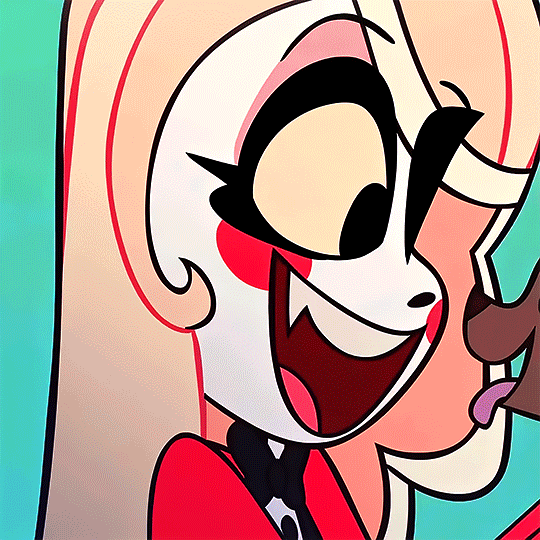
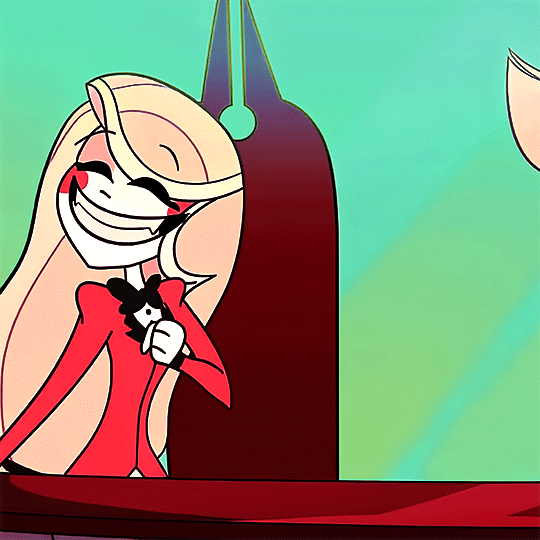
CHARLIE MAGNE from HAZBIN HOTEL (2019): Pilot - "That's Entertainment" ↳ "So, I've been thinking: Isn't there a more humane way to hinder overpopulation here in Hell? Perhaps we can create an alternative way to change souls through... redemption?"
#hazbin hotel#hazbin hotel edit#hazbin charlie#charlie magne#hazbin edit#requested#hazbin hotel pilot#that's entertainment#charlie#my gifs#god ain't she the cutest little thing!#not gonna lie i get a bit emotional seeing her do The Pose during ''wonderful fantastic new hotel''#it's the same pose she does in the S1 poster :')#okay actually im back here to say some things in the tags:#holy almighty LORD these gave me so much grief to color in a way i thought looked nice#specifically the one of her in the news chair. sorry i was NOT gonna let that hideous highlighter green color assault all your eyeballs.#did i lose nearly two hours of sleep getting it right because i still have no idea what i'm doing? yes. worth it? YES. ohh yes.#i liked the seafoam look so i made the cloud sequence match :] or at least tried to#there WAS supposed to be another one of her in the news room but i just hated how it kept turning out so i scrapped it.#coloring the main series was one thing to learn but the PILOT? never has it been so obvious to me just how much more bright and vibrant#the colors got during the progression of the world design. also. if by any chance one of those cool and experienced#gif makers happens to see these tags and wants a good laugh: i've been doing this for how many months now? and just last NIGHT figured out#how to use the fucking eraser in photoshop....... thing is... i also draw. i KNOW what program tools look like. i KNOW ppl draw in PS.#i'm just a really silly fuckin goose!! TEEHEE FUCKING HEE I GUESS!#so for months i've been like ''god i wish i could just erase this part from the layer'' and looking at the eraser tool and just being like#''nah it's probably different and weird i'll just stick to what i know'' -> said boo boo the FOOL#see i could be in the club but i'd rather be aggressively neurodivergent about the silly queer demon cartoon that altered my brain chemical
143 notes
·
View notes
Note
hi kyle, please explain your process of making graphics! <3
hi anon! I definetely will, I'll walk you though how I get to a graphic like this:
(warning, half of my process is just 'throw it at the wall, see what happens' so like, idk how easily explainable it is.)
first off, I get all my inspiration from pintrest, instagram graphics artist and random stuff I find. inspiration is everywhere and I always keep a notebook with me where I draw/write what I come up with.
all my photo's are from pinterest and google, I dont sell these, if you're going to please make sure the photo's you're using are free use.
all my fonts come from dafont.
the program I use is photoshop.
now, I'm going to break up my editing process into 7 parts.
inspo
images
editing
colouring
font
colour blocking
textures
hopefully it's clear enough
gather inspiration.
so I really like this and this edit I made before and they're pretty easy so I wanted to make a new one.
but normally if I wanna make an edit I scroll through my poster/edit inspo pintrest board which you can find here.
normally if I dont have such a clear way I want to go I'd make some sketches to see what works and how to get the idea out of my brain.
2. gather images.
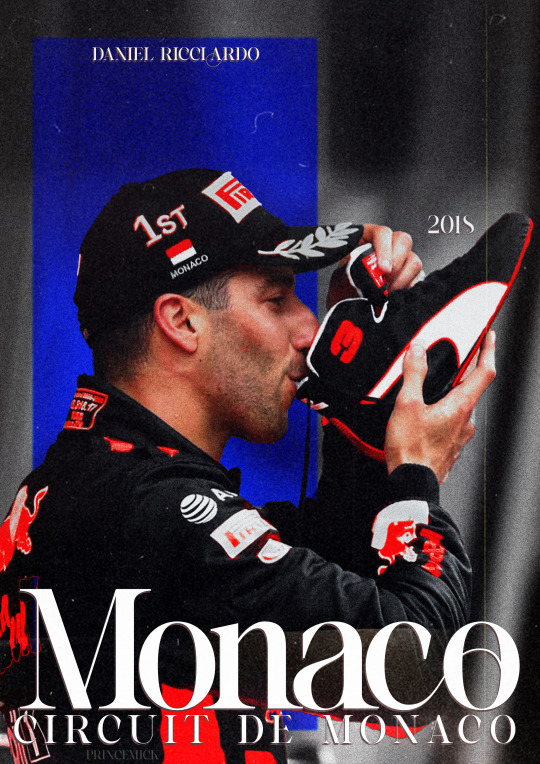
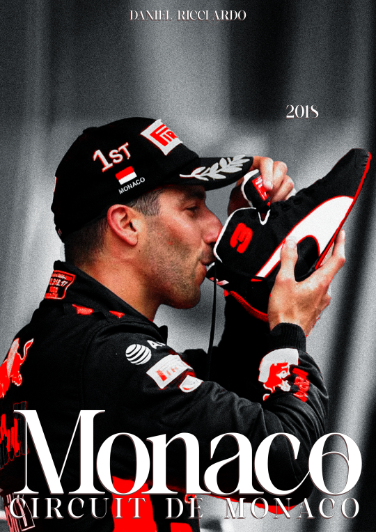
I wanted to make a Danny one so its not to hard to find stuff as I have a specific search for this edit but I also have a growing archive of folders of drivers full of pictures ive found over time that I'd normally go through to find good stuff.
when you use google please remember to click on 'tools' and select 'size' and big otherwise you'll cry because of the bad quality
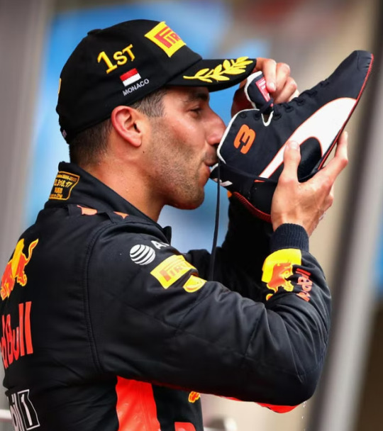
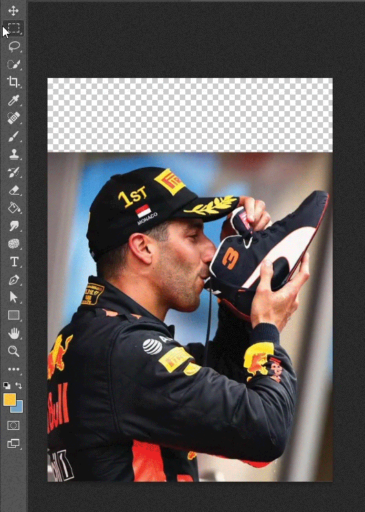
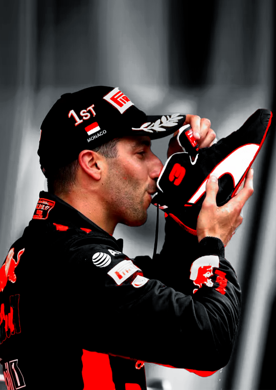
this is the picture I wanted to use for the danny edit.
I thought this would work well because it has depth and so will show the colour blocking well, it also has the flag and the shoe which is clearly recognizable.
3. trow it into photoshop baybee.
this is going to be hard to explain but I basically jsut fuck around. most of the time I kind of know what I want to do and the way I want to go but one of the first steps is always to raserize the layer.
I also make sure to copy the original picture for later so you have the same picture twice
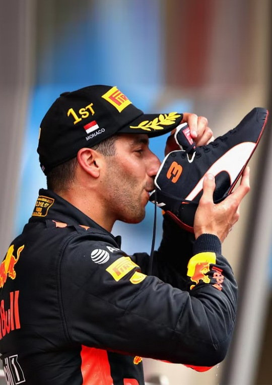
I do this so i can be lazy and go to quick actions and remove the background because then, I get this.
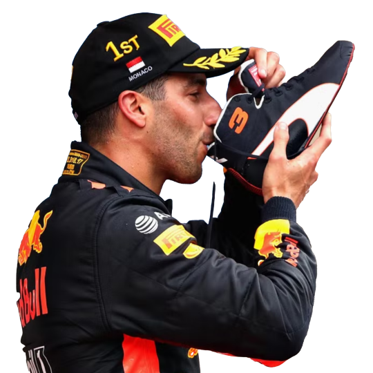
without basically any work. (it's almost never perfect so after I let photoshop do it's work I fix up the parts that need it.)
this is what your layers should look like fter.
that lil black and white thingy is really useful and if you select that and go over it w the erase tool it doesnt permenantly change anything.
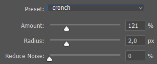
next thing I do is smart sharpen to spice it up, here is the sharpening settings I use.
a small problem with this picture is that it's to small for an A4 size (which is what I'm making it on) so I need to extend the background a little. which I do in the laziest way.
I select the most of the top of the picture I can and copy paste + extend it out. like this:
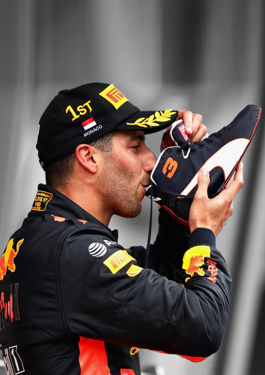
then, for this edit, I'm gonna add a black and white filter to the background so everything behind daniel is in black and white with an adjustment layer. I do this to keep the focus on our subject and remove any and all focus from the bg.
I also add a guassian blur to the bg to once again, keep the focus on daniel.
this is the before and after of that.
now, kinda boring right? yeaaah so now onto
4. colouring
first off CLIPPING MASK IS YOUR BESTIE!!!. if you right click on the adjustment layer and click on clipping mask it will ONLY grab the picture right below it, this way it wont affect everything else you've added to your edit.
anwyay. this is the fun part, and the only way I can explain it, is fuck around, see what you wanna do and what works.
I always add, levels, curves etc to just deepen the blacks and add some contrast. heres the before and after of that.
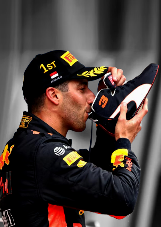
for this edit I kind of wanna focus on the contrast of blue and orange, kinda like the seb one but a lil different so what I'm gonna do is add hue/saturation and remove the yellow and blue from the picture.
you use this adjustment layer by grabbing the little hand and selecting the colour you want to change.
so I'm gonna play around and remove the blue and yellow from this picture. here's the before and after of that.
now I'm going to add selective colour, i wanna up to an extreme the reds in the suit. this is kinda hard as you'll obviously grab his skin with that too so I'm gonna use that black little mask on this too, it already exists when you add an adjustment layer
it's that little white box, if you select that and ue the erase tool you can basically remove that adjustment layer in places you want to, this is what it looks like on my layers and on the picture.
I want to upp the red even more then this so I'm gonna copy paste that layer two more times and THEN add a non erased selective colour and play around with the depth of the skintone until I'm happy with it.
now I'm almost happy with the colour, I want it to be a bit more blue so I'm gonna go to 'colour balance' and play around with that a little more.
this is the before and after of all that
then I'm done with the colouring on the picture itself. I'm also gonna put all my adjustment layers into a folder to make my layers less busy
I'm also going to add noise to both the BG and front picture. it just gives a bit more texture and grain that I like
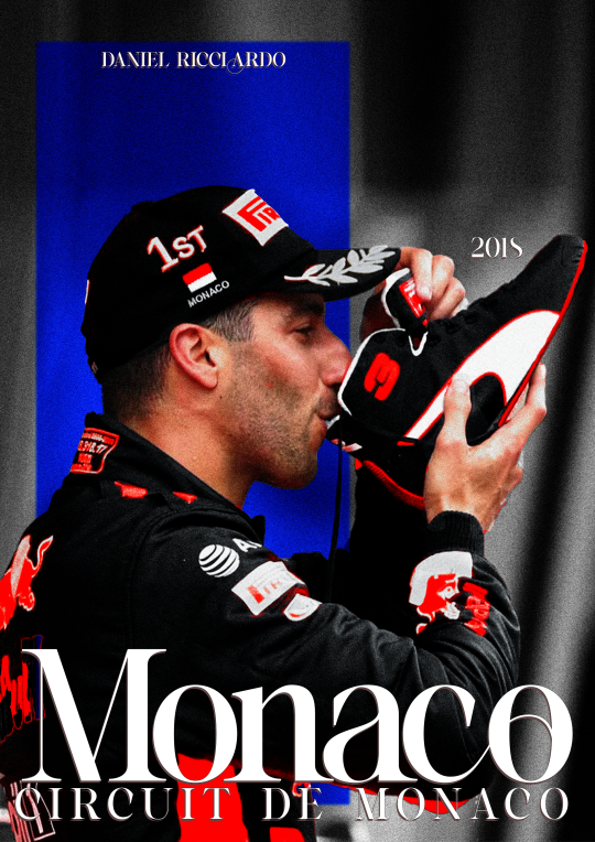
5. typography!
now the stressful part lol.
I know what I'm gonna add so that makes it easy. the name of the race, place and year. this is hard to explain, I know where I'm gonna put everything because off the other edits so it's just about finding a good font.
for this I'm not gonna fuck around with shapes and text layers and adjustments etc. if you want me to explain that please ask away that's just a whole other 5k worded essay.
I know what kinda font I wanna use at first already these choices have to do with a few things which is basically one questions I ask myself:
is there a vibe that already exists around the race and/or win and how do I translate that into the font? (is it fancy, cool, magical, incredible, bold etc etc)
here's an example of how a font can change the vibe
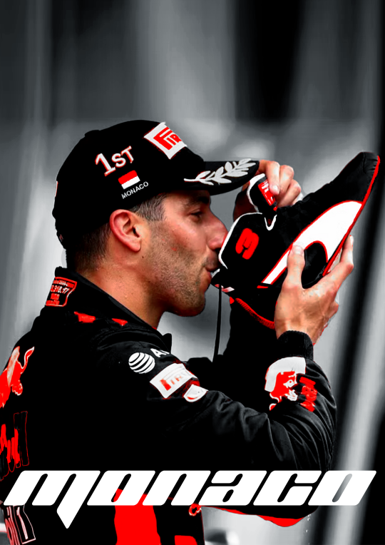
so the vibe I want to go with for this edit is fancy smansy n stuff so I'm thinking of flowly maybe 1930s vibes this is the font I ended up with
I'm still gonna move the place around but the idea if there.
(I change and play around with my text a lot so, again, ask if you want me to go deeper into this)
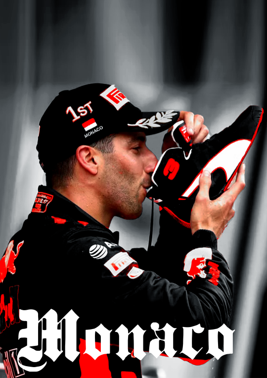
6. colour blocking
now for this edit I'm going to add a box of colour, I do this if I want to add a bit of an oomph and contrast to it, I like what I have now but I want to add some contrast to make the colour and him pop even more.
this is petty easy I'm basically just going to add a colour box behind him, I'm gonna do blue as well, thats the opposite of red on the colour wheel AND its the other colour red bull is associated with, also colour theory and all that etc.
I'm also going to add gaussian blur and noise to add some texture and use and overlay. heres the diff in with and without that to show the use of it.
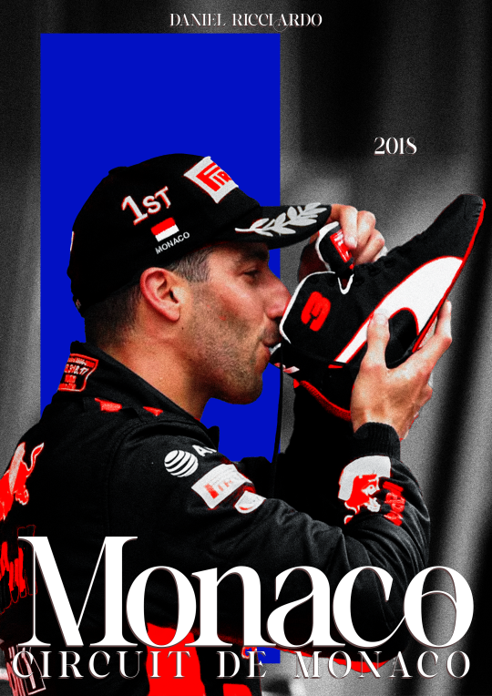
at this point I'm also going to move the text around (as you can see) to make it fit better with the added box
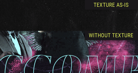
7. texture
the moment where it starts feeling like its finished.
for this edit I kinda want to add some photo texture and more grain. here are the textures I used:

I added these and put it on a screen overlay layer and added some adjustement layers to tweek the last few things.
you can find different textures on google, pinstrest and some awesome artists have texture packs you can pay for w just a few bucks. for these, again, if you're going to sell your work MAKE SURE ITS FREE FOR USE!!!
THATS it!
I add my watermark and maybe fix a few little things but thats all and then I'm done, I reccommend playing around and seeing what works for you.
enjoy and have fun <33
33 notes
·
View notes
Photo
so @okelli said they wanted a more in depth tortilla so ya gorl is here to deliver. here you go. click this link. that's it. that's the tutorial.
ok i'm done trying to be funny. i've chucked this in here under a cut, but please keep in mind, this is not a professional tutorial. i am in no way an artist/professional/the be all and end all/guru/god; this is just my editing process. so you don't need to follow it exactly to the t. you're more than welcome to change any processes and do your own thing. i know there are some more technical and frankly better tutorials out there by other simblrs that go really into details and what have you which are really helpful (and i do encourage everyone to go check them out), but please keep criticisms close to your heart bc i reiterate; i have no fucking clue what i'm doing. but let's get started bc this bitch gon be long.
what you're going to need:
photoshop or some other editing program. i personally use ps cc 2019, however gimp will probably also work
reshade; however whatever version you use is up to you. again, i use 4.6.1.
google is your best friend and mine
a screenshot of your choosing w some slick lighting
a lot of patience
for images where the resolution isn’t clear, click here for full size.
step one:
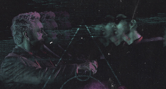
open up your screenshot in your editing program of choice. i have picked this screenshot for the purpose of the tutorial bc of the spicy lighting. also did i spend an hour building this for the purpose of this tutorial? i cannot confirm or deny these suspicions, but we're usin it ok. for this picture i used @intramoon‘s alethiology reshade preset bc it’s my fav atm. you can find it here.
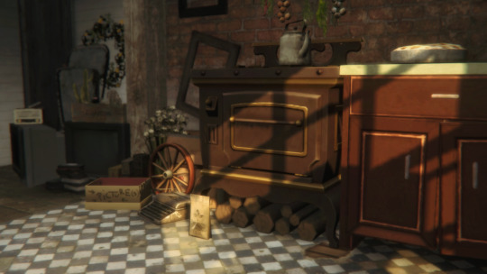
step two:
apply your colourgrade. i used the sonder actions by again @intramoon bc this tutorial is sponsored by asia. i’m not going to go too in depth here, bc this differs from screenshot to screenshot. i’m only mentioning it bc it’s fairly important to the next step. adding the colourgrade turned my screenshot from what you see above to this.
as you can see, the colours are now slightly more muted and there’s more of a green hue to it.
step three:
depending on the colour scheme you’re going for with the screenshot, you’re going to want to pick a colour that compliments it. since my screenshot is still quite warm toned, i chose #fff4d8 which is a pale yellow. you’re going to want to take this onto a soft brush (they come with photoshop so if you’re new to using ps, it’s a default, you don’t need to download anything). i’ll include a screenshot of what it looks like.
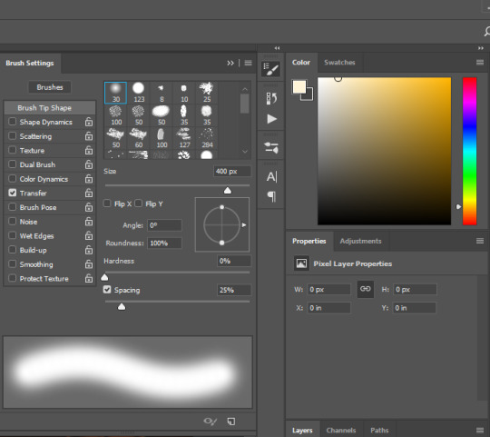
before painting anything, what you’re going to want to do is create a NEW layer. you can do this by either pressing shift + ctrl + n or by clicking layer in the menu bar up top, selecting new, and then new layer.
on your new layer, with the colour and brush selected, what you’re going to do is paint over the areas that are already highlited by ea lighting. for example, my screenshot ended up looking like this.
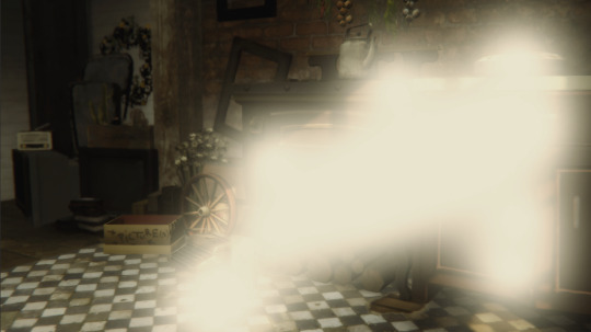
looks pretty messy, but that’s ok bc we’re going to change the blending mode to overlay as seen below. obviously this made the lighting look slightly too intense. dw this is not how we leave it.
i also change the opacity to suit the image. i set my opacity to 50% and this is what it ended up looking like.
i added in an extra step that i only use occasionally for this tutorial, and basically that extra step is going in with a soft WHITE brush and taking it to the areas that look extra glowy - i.e. the typewriter, the pie and the counter handle. this is what mine looked like. this needs to be again done on a new layer, so make sure you ctrl + shift + n or select a new layer in the menu bar.
again changing the layer to overlay, and changing the opacity. this is what my settings looked like.
again, please refer to the full size image folder, however for those lazy like me; opacity is at 65%
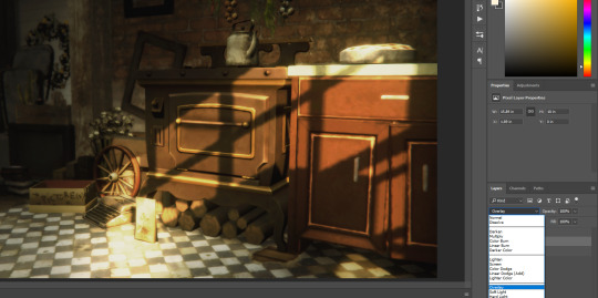
step four:
on your main layer of lighting overlay (if you didn’t add more like i did it should be your only one), you will want to add a layer mask. this can be done by clicking this little button here

once you’ve done that, it should add a white box on your layer and look like this

because the colour has lightened some of our shadows, and depending on how deep you want your shadows to be, you’re going to want to click onto the white layer mask and with a soft brush set to the colour black, you’re going to want to draw over the shadowed areas that you want to deepen again.
for reference these are the areas that i went over. and my layer mask now looks like this

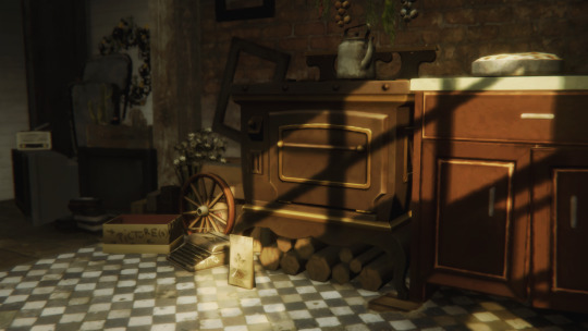
step five:
creaTE A NEW LAYER!!!!!! this time we’re going in with shadows. pick a dark grey colour (or black, your choice. i prefer dark grey), i used #1c1a18 and paint over the areas where you want to deepen the shadows further again.
this is what mine looked like
set that to soft light and change your opacity (don’t use overlay this time, it’s too harsh on the picture).
my picture now looks like this:
subtle changes make a world of difference.
step six:
FIND A LIGHT RAY!!!! i mentioned in the ask i published that i particularly like using this one i found on google, and i did use it for the purpose of this tutorial as well.
pop her on your picture and change the positioning. positioning can be changed by pressing ctrl + t and either flipping/rotating (which can be done by right clicking on the texture and selecting flip horizontal etc) and dragging the corners. if you’re dragging the corners to make the texture smaller, maKE SURE YOU’RE HOLDING SHIFT DOWN WHEN YOU’RE DRAGGING SO THE DIMENSIONS STAY THE SAME. with the positioning, make sure you’re putting the light areas of your texture where the light source is coming from. it’s really important to have a basic understanding of light and shadows. i flipped mine horizontally and made the texture smaller as well as rotated a little.
set her to screen and change you’re opacity.
boy i’m sounding like a broken record lmao, but my picture now looks like this.

starting to look kinda nice right?
step seven:
download this video. open it up in photoshop and make sure you have your timeline window on. if you don’t and don’t know how to change it, up the top, select WINDOW and make sure there is a tick next to timeline which is near the bottom of the drop down. once you’ve done that, click ANYWHERE along the little timeline that has shown up and it gives you a frame for the dust texture. it should look something like this. (the red is bc that little blue and red guy is important)
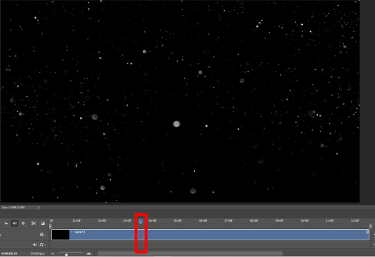
press ctrl + a on your keyboard to select all and copy that motherfucker. past her on your screenshot, set her to screen and play with her opacity again.
if you’re unhappy and feel like it’s too busy, you can go back and add a layer mask and using that same soft black brush, erase problematic areas the same way we did in step four. mine ended up looking like this.

NOW THIS PART IS OPTIONAL!!!!!
using the colour fill or paint bucket tool, i went in on another new layer with another pale yellow (#e4dcb1) and filled in the whole image. i set that to COLOUR and put it on a clipping mask RIGHT ABOVE the dust texture. you can add a clipping mask by right clicking and selecting set clipping mask. it now only applies to the layer directly below, which is our dust layer. i only did this because the white was too harsh (lol) and i wanted the dust to blend a little better with the surroundings.
finally step eight:
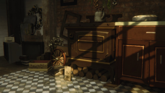
again optional, but if you like the vintage look like i do, select the layer with your screenshot and using the noise v2 action by @intramoon (hi again asia) in this set, add some noise. it creates a duplicate layer, which you can then play with the opacity of to set to your desired strength.
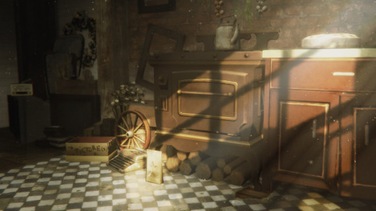
once you’ve done that, you’re basically done!!! this is what my screenshot ended up looking like by the very end.
that concludes our spicy lighting tutorial. i hope you were able to do better than i do on a good day. enjoy!!!!!! if there are any parts that you need clarification on, please feel free to yell at me and i’ll see if i can help lol
#ts4 tutorial#s4 tutorial#editing tutorial#the sims 4#s4#ts4#ts4 screenshot#s4 screenshot#ts4 edit#s4 edit#i tried#it's long#i got lazy#i'm sorry
819 notes
·
View notes
Note
I love your art so much! you have such a cool style. the Falnorian fashion is really interesting, I was curios about the fabric patterns, would you mind sharing how you did it?
Sure! That project was a process of experimenting with the way brushes were textured in order to emulate the feel of different textures of cloth, but there’s also a couple places where I more explicitly crafted textures/brushes/etc. I’ll go through and show you the brushes used and any additional techniques that were relevant under the cut!
So a lot of this is just flat out instructions for how to do a thing in Photoshop. If you use different software, you may or may not have all the same layer settings and options. I don’t know how to post the brushes I use to the internet, but google around--there are a lot of cheap or free cool brushes for most drawing software. These are the ones I’ve accumulated over the ages.
Also I was gonna do all the outfits but I found I was repeating myself a lot, so you only get the ones with the most to teach you, which is like four of them.
An overall note- I worked in a CMYK file format which limits the available colors and in some cases majorly changed what colors looked like under relevant effects or when changing layer settings. I don’t generally recommend this unless you need your work to be printable because it constrains your palette, but there are definitely some things that are easier to make look cohesive with those kind of automatic color constraints, so. It’s a mixed bag.
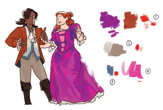
This is one of my favorite texture brushes. It jitters color, and it has some fun texture to it that can be very different depending on how heavy you set the pen pressure and how long your strokes are. I used it as a baseline for both her dress and his coat and boots, to provide texture and also give me a set of varied colors to move around and blend and work with. I spent a while on her dress blocking out color more specifically from the set that brush provided before bringing in new ones. It’s fun too because when I do texture with it it feels kind of multicolored and blended.
His pants, and probably one of the most common brushes for the Western set. It’s got a somewhat more roughspun texture while also being able to go to just being flat and cover a decent amount of space between for light texturing.
A simple square brush which varies opacity by pen pressure, for shading him.
A mostly flat oval brush that I used for highlights on her clothing. Same deal--the opacity is determined by pen pressure. Helped smooth things out a bit, and with very bright lights helps make the cloth feel more reflective and satiny.
(It should be said I know nothing about fabric and satin just seems like the ting with that kind of reflectivity--I have no idea what the fabrics in my reference images are, they just look reflective and crinkle in certain ways.)
This is a brush that jitters saturation and brightness in a tad that looks a bit stripey, and I like it for his vest and their shoes because it feels a little rougher, and sometimes a bit knitted or wooly.
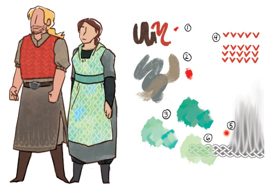
The base texture of both their main pieces of clothing is the same as brush number 2 from the last one, but this time with two colors overlapping one another to give it more depth and make it feel a bit rougher and thicker as material.
So this is brush 1 from the last set, but I’ve made it one color (the light green), copied it and changed the hue to a bluer shade, and then placed the two exactly one over the other, setting the bluer version to Vivid Light in the layer settings. Then you just futz around with the specific color and opacity til you’re happy with it.
The vest pattern is easy. Draw a row of shapes. Duplicate several times. Arrange in rows. If you need to, you can rotate rows a tad to get them to look good when they line up.
I have a celtic knot pattern. For his clothing I set one row of the pattern at the bottom, lowered the opacity, and used a soft brush with the smudge tool at 80% or 90% to pull the color from the top up over more of his clothing.
For hers, same deal but instead of using the smudge brush I set the layer to being some kind of color burn or linear burn in the layer settings and set copies of it in a line so it looks like a repeating texture.
You know all of these by now, they’re the ones that keep coming up and from now on I’m not going to talk about them anymore.
This brush looks like trees! And also I use it for weird cloud patterning on both these guys and the Lakeshore pair.
I made a brush that is dots! It is just a circle with the spacing settings turned up so that there’s distance between them. The dots brush is a fucking lifesaver. It can look like beads or coins or be converted into other patterning. It’s great. A+ don’t know why I didn’t do this earlier.
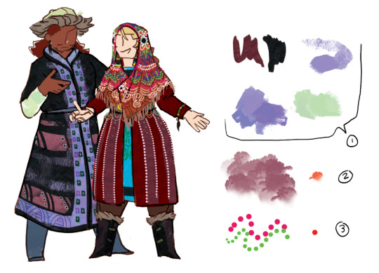
The last thing I have for you is mostly about layer settings, which I am very poor at explaining, so sorry about that.
I used a watercolor looking brush thickly for the Greyfen to give the cloth a kind of slightly iridescent silky vibe. How the colors work in the other points.
The difference between the blue stroke in the above version and the below version is that the bottom one is on a layer set to Pin Light. I’m not sure exactly what pin light does, but it tends to produce colors that kind of combine the feels of the relevant colors? It’s definitely one to use when you’re trying to make things shade in a way that feels iridescent.
The difference between the purple stroke above and below is the one below’s layer is set to Vivid Light. Vivid light tends to produce brightly saturated colors and I kind of have no idea how it works either. Just futz around with the hue of the Vivid Light layer until you like how things look.
Lastly, the bottom line of dots has been set as a Clipping Mask over the two stroke layers. Because of this, it only shows up where it overlaps those strokes, and I think takes on their properties? So it’s operating like it’s Pin Light over the Pin Light layer and making that weird gold color and acting like vivid light on the vivid light layer and making the yellow green. The Clipping Mask is your best friend because it saves you a lot of erasing and lets you make things transparent along with or otherwise fall in line with whatever they’re attached to.
I hope this was helpful and I’m sorry if it was confusing. Thank you again for your support and your interest!
34 notes
·
View notes
Text
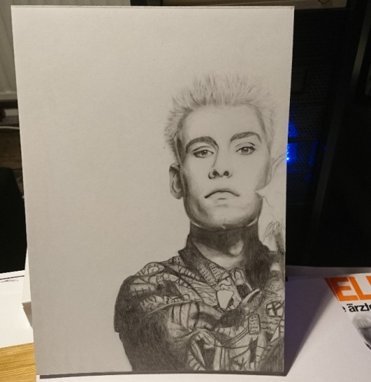
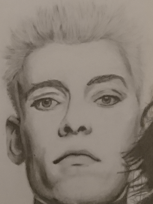
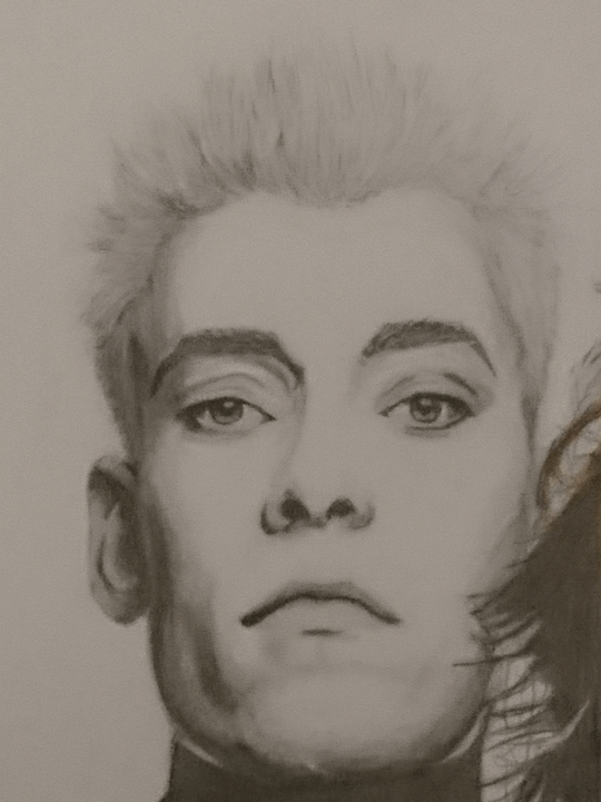
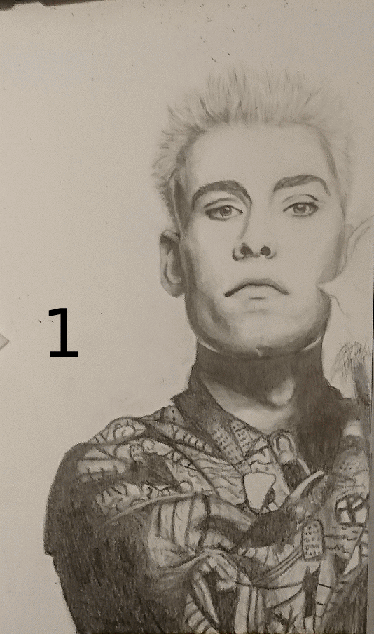
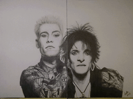
Madness draws: Behind the Scenes of the latest Farin&Bela pencil drawing.
Aka the one that’s also my icon, even when that was a big risk to take because normally I start hating the photos I have once drawn, especially if I have failed miserably. This is how the drawing itself turned out:
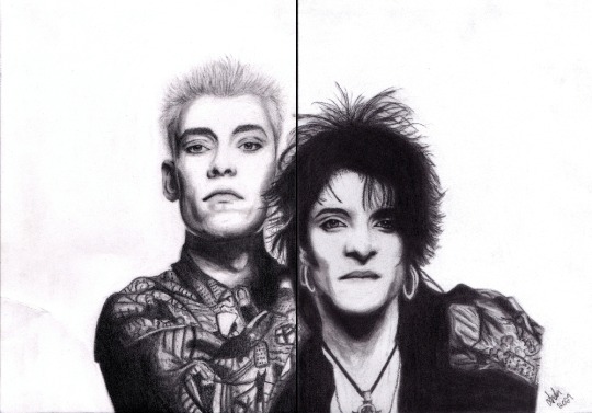
ATTENTION: The original post about that drawing, with better image, behind this link.
This post is solely about the process itself with lots of pictures and also plenty of gifs, because I promised to do one if people would like to see that and I got some comments saying that they’re looking forward for that. So, here’s now that post!
For starters I have to apologize for the terrible quality that is the photos. I used my phone camera only and never thought about posting them, I just took them as a reference for myself and to show the progress to a friend and only after finishing the drawing I noticed that the angle of the camera causes a huge impact on the perspective of the drawing, so I sometimes might have done useless work when I thought some perspective was wrong when it was actually the photo that was wrong and not my work! I mean, take a look at these photos of the finished piece:

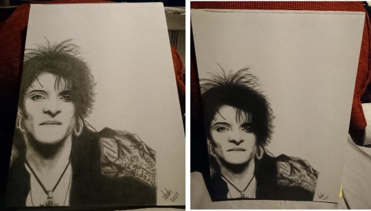
You see that? I realized this when I took maybe the second photo of the Farin sheet and looked at it and couldn’t believe my eyes because I didn’t remember drawing his torsto THAT small! And then I looked at the drawing and was like “wtf???” because it looked nothing like in the photo and then it hit me...
Also, another thing that I learn was that I might need to pay more attention to the perspective of the whole thing also because when I draw, I sit at the table so I am constantly seeing the drawing from my perspective instead of looking at it from above so that’s probably also going to affect the way I draw. I try to keep that in mind in the future so I can avoid redrawing things again and again just because my perspective is different than the reference photo’s.
Also the giant forehead of Farin’s in the photo on the right might have caused me to laugh a bit too much but anyway, let’s continue~ Or more like: let’s start for real this time.
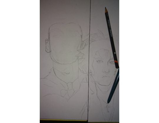
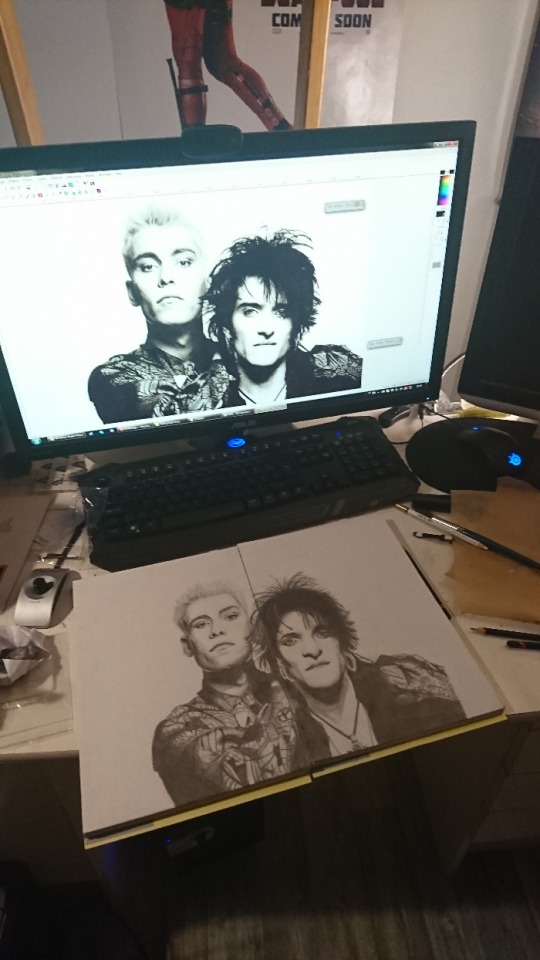
Here’s the reference photo to y’all:

What I did in photoshop was to draw a line between them to see how I can divide the photo on two A4 papers. I had been thinking about this photo for some time already because it’s one of my favorites (but now I just feel cringy looking at it after I have drawn it... goddamnit!), and I got this idea that I could try drawing it on two papers in case I fuck up so I can start over or try again without having to do twice the work! Which was actually a good decision because this was the first version of Farin:

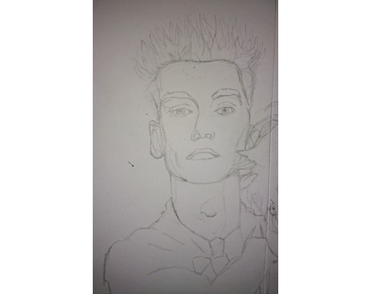
And it was awful. I also realized I had never drawn Farin’s face from he front. I have drawn him before from the side a few times but maybe once it came out actually good so that was why I decided to do the 2 paper method - because I knew it was not going to be an easy job! Bela is relatively easy to draw so I knew already that I would not have too many problems with that one.
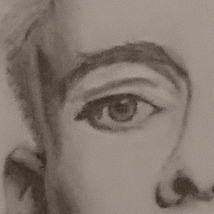
I struggled with Farin’s eyes the most, at first.
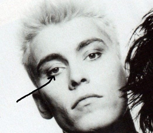
It took me a while to figure out how to do that white line in his lower lid. Keep in mind that this was my first face portrait in over 10 years so I was very, very rusty and I just didn’t remember how to draw like anything anymore. (The photo is tilted because Bela’s face is a bit tilted and my hand can’t draw anything that is not straight [lol] so I have to rotate the photo in order to even draw the sketch of Bela’s eyes.)
So I took my sketchbook and tried to do some eyes...
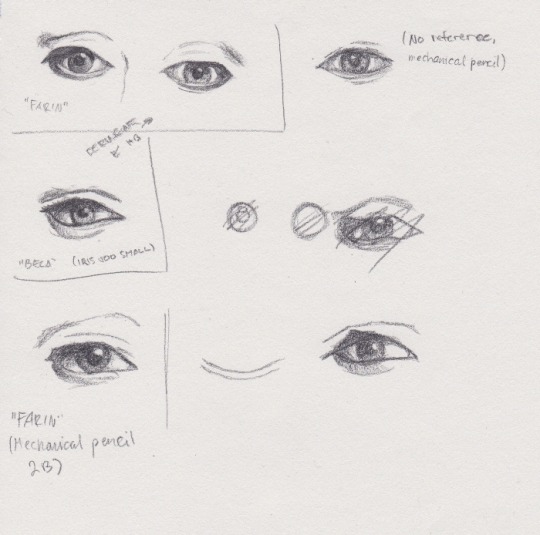
I was still struggling so much here until I remembered about blending. And I didn’t have my hopes high but grabbed the eyeshadow applicators (my fave tool for blending) anyway, and switched to my other sketchbook in case the paper was the issue and:

Blending. It was all about blending! So with that in mind, I realized I can continue and I don’t need to do these in my old way, everything doesn’t have to have a lineart done but some of the job is done not with the pencils but with the eraser.
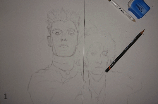
Anyhow, the previous Farin looked really bad and was too big as well so I just discarded that and started a new sheet because the old lines were not coming off properly anymore. I don’t remember if this is the old face or new but I think this might still be the old one:
Yes it definitely is the old because look at those lines! This is the new sheet:

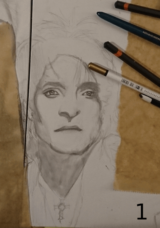
And in the photo you can see one of my pencils - I use Derwent Graphic pencils, it’s a 12 pencil set with very soft pencils, starting with H, F and HB and ending to 9B. With this one I used F, HB, B, 2B, 5B, 7B and 9B. The white pencil is actually my new love aka the eraser pencil Koh-I-Noor Hardmuth. It’s amazing, I recommend! I just didn’t order 10 new ones this other day. I actually used about 1,5 full eraser pencils on this drawing alone so that’s why 10.
Here’s a “little” gif of the process on Farin:
I felt crazy when I went for the shirt, and I felt like I was going crazy MEANWHILE drawing it but in the end I did it and I’m super proud of it!

Below is the reference photo, it was pain in the ass to follow all those lines with my eyes and try to find what was I drawing and where was I but I think I did good. That was a fun challenge.

Okay so, when I was done with the new lineart, I decided to go for the shading and blending because that’s what really makes the drawings to pop. I started with the left (his right, my left) side of Farin’s face because I’m right-handed, and in the first photo I had done just the left (right) eye and mouth and nose, but in the second there’s also the other eye done already:

Keep in mind this was not the last time I drew the eyes. Not even close.
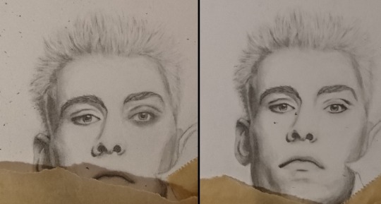
Something was off with the right (left) eye so I had to do that one again and I noticed that when you blend but haven’t erased and cleaned it yet, it looks like a black eye :DDD So here’s the before and after images of that cleaning. (Cleaning = I draw, blend, erase, draw and blend more when needed and then erase again, and repeat this as many times as I need until it starts to look ready to my eye.)
So here Farin was “finished” but if you still remember the final piece or compare it to it, you might notice it looks quite different. And you’re right. But more about that later, because at this point I started to work on Bela.

It actually started really well - I also had to do the whole lineart again because it did not match the size of “finished” Farin. I don’t remember if this is the first or second eye but when I had drawn his eye for the first time, I noticed it was not in line with Farin so I had to redraw it. A gif of the progress:
What’s that brown paper I’m using, you may ask? Well I noticed that people have some sort of paper on top of their art to keep it from smudging and I have no clue what that is so here’s my poor artist recommendation: baking paper! I tested it and it works (if you just remember to keep it under your hand, that is...) so that is, in fact, baking paper! :DD
I have drawn Bela’s face a few times before and he’s just so much easier to draw. In fact I used 4-5 days on Farin but I managed to start and finish (this version of) Bela just in one day. And that means that out of 12 hours (because I literally used the whole day for drawing) I used maybe like... 5h or something on Bela. That’s how much easier he really is to draw.
I don’t know wtf is wrong with Farin’s face but he’s extremely difficult to draw and I’m not the only one who has been saying this. I guess he just looks so regular but still unique enough to be difficult to draw. Bela then again has features that are very unique and very... caricature-like? I mean that just by drawing his nose or chin you can make a comic book Bela look exactly like himself, and with more realistic style his eyes already do a lot, but Farin’s really the opposite. My comic book version of Farin is literally the most basic version I can draw, it’s how I draw those characters and the only thing that makes him look himself is the hair, and his nose in a side profile. So I think that’s why it’s so difficult to draw him because he doesn’t look too regular but still regular enough to make is a very challenging task to do properly.
So yeah, the same day as I started working on Bela, I was also “finished” with the drawing:

Also look at how different it looks like from this perspective:
With the reference photo open in photoshop and I don’t understand how Bela looks more like himself in my drawing than in the photo. Also when I showed the WIP to my brother, he said that I somehow had succeeded at making Farin look more like Farin than what he does in the photo even. It’s weird.
But we were still far from finished. I was going to use the fixative on this soon but it just kept snowing the whole week so I couldn’t so every time I walked past the drawings, I stopped to fix this and that. For days I kept telling myself “I’m done, I can’t do more than this, I can’t do better than this.” and considered the drawing finished but still kept fixing things. Every time I was “done” with the other drawing, I saw something to fix in the other one and once that was done, I felt like the first one wasn’t as good and had to fix something from it too. And that led to a cycle where the other drawing was always better than the other and the worse one needed to be fixed. In the end I was hating the whole process and myself and my skills and I was already ready to abandon this whole thing and call it a day and never ever show it to anyone “because I cannot draw”. The photo above, here’s a list of things I redrew after that:
Bela’s eyes, the right (left) one at least twice.
Bela’s nose.
Bela’s mouth a couple of times.
Farin’s eyes x588045028520
And a list of things I kept fixing and fixing:
Bela’s chin.
Bela’s neck shadows.
Bela’s hairline.
Farin’s whole face was tilted so I tried to fix that.
Farin’s face was too wide, which meant also partially redrawing the ear.
Farin’s hair was too long and wide too.
Farin’s nose.
Farin’s mouth might be the only thing I drew only once and I’m actually still extremely proud of how it came to be. I did the lips solely with blending so that was super exciting to notice how I can use it for drawing and don’t need the pencils for everything!
During Bela’s eyes and nose and mouth especially I was hating myself so much and I felt like I was taking the risk of ruining the whole thing and a few times I was certain that was what I had just done too, until I somehow was able to save it again. But because of that, I wasn’t able to make Bela’s mouth any lighter anymore, the color wasn’t just coming off the paper so had to use what was there and make it look like it’s how it’s supposed to be, too.
Here’s a gif about those changes on Bela - the first one has the old eyes and nose, the others have minor changed on the nose and mouth:
(The blacks probably don’t get any blacker in reality, I did add more color to it all the time but mainly it’s just the lighting and my phone camera changing the brightness.)
I did the final details on his nose without even using the reference photo anymore. The photo didn’t seem to make any sense anymore at all so I was just using my mechanical pencil and the blending tool and eraser to make is look better. To my eye it looked more like a very flat nose with a big tip of the nose and he doesn’t have a flat nose and I tried to get rid of that illusion. I still feel like it makes him look bit weird but I’m not entirely sure how. Maybe it was because of my improvisation, idk...
So, Bela was then finally finished for the last time. In the Farin piece his left (right) eye had been bugging me the whole time and I didn’t want to touch it but still I felt like I have to do something about it because it was bugging me way too much. I then figured I could draw the eye line by line and take a photo of it each time to see if it looks right already or not, maybe I could then avoid doing all the phases before I was sure what to think about it. I mean, now the only way to see if it was correct was to draw e.g. an eye from start to finish, I couldn’t see from just the lineart or unblended eye if it was in the right spot etc. And here’s that progress on a gif:
The gif about only the eye would look so nice if Tumblr didn’t make the gifs so HUGE - this one is actually only 300px or 400px or something:
Apparently I also wasn’t happy with the other eye because:
But good thing is: I really enjoy drawing eyes. I love seeing them to “come alive”, my favorite part was to eraser a bit of the color on the iris to make them look like they are actually shiny! It feels like something so small to do and yet it makes a huge impact on the drawing!
And here’s yet another gif of the whole Farin sheet with all of the changes, including the last changes that made his head narrower, and less tilted and more in line. Look at the left side of his head especially to see that:
I can also see his nose changing between the first few photos. I keep forgetting about that but yeah, I also fixed that a little at some point.
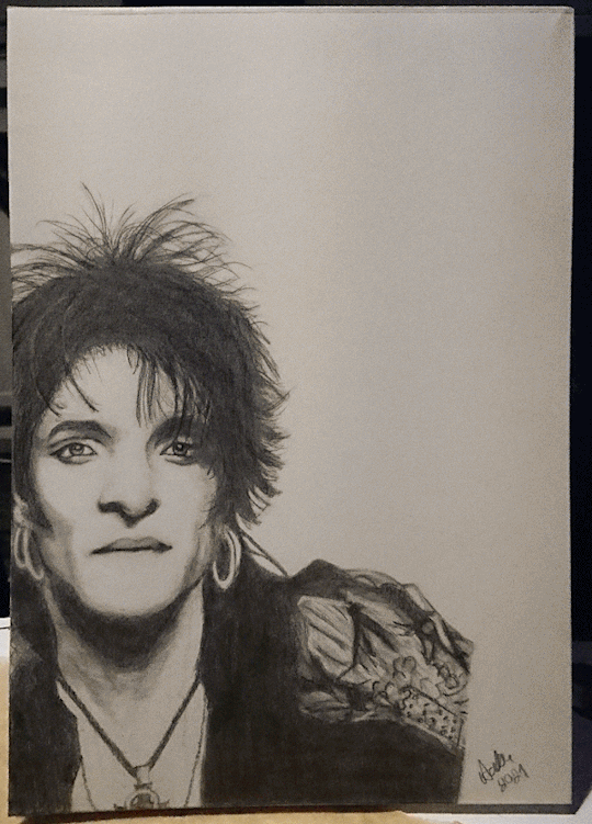
And last but not least, the whole drawing in some sort of a timelapse gif:
Last two are the same but just a photo and the scan of the finished drawing. I still keep seeing things I would do differently but no can do, I already used fixative on it, also to keep myself from obsessing with it any more :D And to use it as a study of some sort. I have never been able to draw a perfect pencil drawing and this isn’t one either. I probably never can draw perfect drawings from references.
I do enjoy the whole shading and blending process, so much so that when I was editing these photos, I just wanted to start drawing something so bad but I also figured that I start to lose motivation when I get to the point where everything should be finished but I just can’t make it perfect. Like the current WIP I have, all I should do is to get the proportions and perspective and the lines of their faces correctly and I would be ready but it feels more like a superpower some people possess and I’m not one of those. I don’t know what is it but I just feel that I cannot see. I don’t know how to explain it, but I can’t see what I try to do and somehow keep drawing everything the wrong way. Just like in this post’s drawing too. There’s still things that are wrong and I know what it is but I don’t know how to solve it. My hands just don’t listen to me and they can’t do what I think they should. I also think the reason I cannot draw perfect copies of photos is because you can always see my “handprint” in them. If I copy a photo, it will look like a photo and not like a drawing made by me. So I believe that in my drawing there’s always a part of me visible and I’m not entirely sure if it’s a good thing or not. On bad days it’s not a good thing, obviously. On good days? Well I guess it’s good then because it just means I have my own style which I really should appreciate. But I wish I had my style only when I want it to be visible, but I can’t control it. Just like I cannot write text by hand that would look like it was written with a computer, so I guess I should just try to get used to it, no matter how much it’d bug me sometimes.
14 notes
·
View notes
Text
I went to school with a trace ‘artist’
She would get tons of praise from all the teachers and have time to go party.
One day my favorite teacher complimented her traced work and said it ‘made him like digital art’ because it was so so much ‘better’ than anything anyone had ‘done’ in class. She was very much an A student at the time.
One day I tried to work in the digital labs, even though it was like a guaranteed F to turn in something that was digital if you were not Her, and I sat behind her to... Well, creep on her process.
And she went to google, picked a picture, put it in photoshop and went to town tracing. She didn’t even use her own reference or go to a free-site. She would even just make an image opaque, stick it in there, and paint over it- using some of the old photo or painting to boost her own.
And then I realized I had never seen her draw in person. She didn’t take live drawing classes. And this girl was like, top of the class. And I went to a school that was very hard on students who didn’t conform to traditional students, so it really fucking hurt to have to redo assignments from digital into traditional while she was... Well, allowed.
And here’s the thing, she wouldn’t tell anyone her actual process. She’d pretend it was too hard to explain if anyone asked vaguely directly, or would go “I love painting in digital!” No one would ask they just literally complimented her every time we were supposed to critique or ‘dive in’ as a class. It was maddening.
One day long after I had been kicked out and she had graduated with flying colors, I confronted her and told her how much it hurt me to go to school with someone like her-- and how much I wished anyone would stand up to her and at least tell her to BE HONEST about her work because she made it so much harder on people who sat redrawing and erasing for hours and hours only to be told their work had to be redone for a grade, or was a failure.
And then I realized I had had that power all along, and it didn’t matter how I felt; but it was *still valid*. It’s okay that she literally did better than me for years because that’s just how life is. People take short-cuts. I don’t have to. It isn’t worth dying of anger over.
Also she hasn’t posted art since she married this one popular dude from school... who religiously only works traditionally... I wonder if he knows she used to trace? Probably.
2 notes
·
View notes
Text
Editing tips, I guess?
Hey uhhhhh, so I've gotten lots of new followers over the past few weeks and wanted to do some kind of thank you?? Also, I have seen a fair share of "omg HOW" in the tags on my edits (which??? always make my day?? my week??? my life????)
Anyway, I thought I'd share some of my ~techniques with y'all? So here goes:
(lmao this got really fuckin long so cuuuuuut)
1. Make EVERYTHING a Smart Object
Okay, maybe not EVERYTHING, but seriously. Do it. It will save ur editing life. You ever shrink something down and then an hour later change your mind and decide you want it bigger? If you're not using a smart object, it’ll get blurry when you scale it back up and you’ll be fuCKED!
To make a layer/group a smart object, just right click on it in the layers panel and select "convert to smart object". This makes Photoshop store the layer's original data in a separate space for safe keeping (an embedded .psb file, to be exact) -- so you can shrink it and enlarge it as many times as you want without any lossiness.
As soon as I paste/place a screencap, texture, or whatever into my document, the first thing I always, ALWAYS do is convert it to a smart object!!
Why, you might ask?? Continue to item No.2 :)))
2. Harness the POWER of Smart Objects!!
The reason I am obsessed with Smart Objects is because I am obsessed with making any edits as non-destructive as possible. If you use “Image > Adjustments > Levels/Selective Color/etc” on a regular layer, that’s a destructive edit. Same goes for any Filters (such as blur/sharpen) and transforms (Warp, distort, perspective). You lose the original data that was there and the only way it can be undone is with ctrl+z. Might not seem like a huge deal at first, but if you keep chugging along for an hour and decide, “hmm, maybe i went too hard on that levels adjustment after all...” your only options are deleting the layer and starting over, or uh... hoping it’s still in your history panel.
However, it's really easy to avoid destructive edits when you use smart objects!! Because all those adjustments, filters, and transforms become “Smart Filters”. Smart Filters have all the non-destructive advantages of performing these adjustments via adjustment layers, but have the added bonus of ONLY effecting the layer they’ve been applied to, instead of cascading down and effecting all the layers beneath. (Which can be a good thing sometimes, but that’s a whole other topic)
Smart filters are attached to their ‘parent layers’, and can be hidden, deleted, or modified (by double-clicking their names) at any time:

Can I hear a wahoo???
Other cool things about Smart Objects:
You can copy a Smart Filter with all its settings to another layer by alt+click+dragging it over
You can change the order in which Smart Filters are applied by clicking and dragging them around
You can edit a smart object independently/in a sort of 'isolated' mode by double-clicking on its thumbnail!! I like to use this for edits that are specific to a given screencap-- like cutting out the background and any initial adjustments, like levels and selective coloring. Once you’re done editing the contents of the smart object, hit ctrl+s and it will automatically update in the main document!
But really, the biggest thing for me here is psychological. I know I’m much more willing to try things and experiment when I know that I can easily go back and tweaks things at any time. Otherwise, I’d stick with adjustments I don’t really like all that much simply because it would take too much time/effort to redo them.
3. Don't even THINK ABOUT using the eraser tool or I will STOMP YOU to death with my hooves!!
Use a layer mask instead. Please I am begging you. It all comes back to making your edits as non-destructive as possible. If you erase something, it's gone forever. When you mask something, you can make changes to which parts are visible/not visible as often as you want.
For the newbies or the otherwise unacquainted, a mask is a greyscale ‘map’ attached to a layer (or layer group) that controls its opacity. Black areas give the layer 0% opacity, white areas will give it 100% opacity, and you can use shades of grey to achieve partial transparency. You ‘draw’ on these layers with the your trusty brush and paint bucket tools.
You can create a mask by selecting a layer and then clicking the little mask icon at the bottom of the layers panel (it’s the one with the little circle inside the box). Draw black on the parts you want to hide, and if you erase too much on accident? Just paint back over it with white!
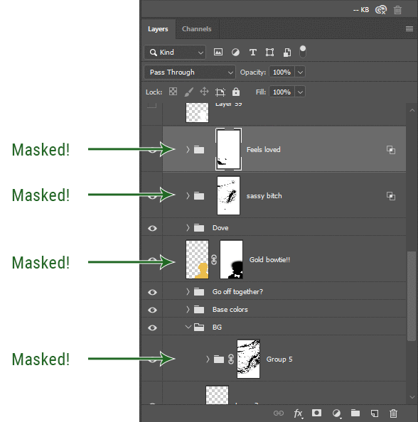
I love masks, and sometimes i will throw an already masked layer inside a layer group and apply a second mask to said group. This way I have two masks that can be edited independently from each other. Like layer mask-ception.
So anyway, yes. Eraser tool? Don’t know her.
4. Try using channels to create masks!
This is a technique that works REALLY well for cutting out complex shapes, such as wispy hair (or feathers!) -- provided there's strong contrast between the subject and the background, and the background isn't too busy.
This is also a fantastic method for capturing alpha transparency. For example: If you have a neato paint stroke/splatter/watercolor texture you want to use as a mask, but has a solid background that’s getting in the way of things. This method will capture all the semi-opaque areas flawlessly!!
While editing your image (which you had better have made into a Smart Object!!!) do the following:
Switch from the "layers" panel to the "Channels" panel.
Toggle through the R, G, and B channels, and decide which one has the most contrast for the areas you are trying to mask.
Ctrl+Click that channel's thumbnail. This will create a selection marquee.
Switch back to the layers panel
Click on the target layer/group (the one you are trying to mask)
Click the mask icon at the bottom of the panel (the one with the circle inside a box)
Release the selection and invert the mask if necessary
If you're using this method to cut out a subject from its background, you probably won't want alpha transparency. In this case, select the mask thumbnail and use a levels adjustment on the mask itself to bump the contrast until you have more of a cutout effect!
It sounds like a lot of steps, but it’s really simple! So I made this handy GIF: (click to view from beginning)
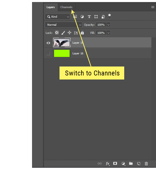
Sometimes you won’t want to use this method for the entire image, but just a specific part. For example, if you’ve cut out a character with some other method (magic wand, manual brushwork), but are having a hard time with their hair in particular. Use this method to create the selection, but instead of converting the whole selection into a mask, use the brush tool to apply the mask only where you need it! You can invert the selection itself with shift+ctrl+i.
5. Outlining text
The font I used here is Salomé, which is actually a solid typeface with no outlined version. But you can make virtually any font into an outlined version if you so desire!
There's two possible methods here, actually:
The Easy Way:
Add a stroke layer effect to the text layer (by selecting the layer, clicking the little “fx” button at the bottom of the layers panel, and choosing “Stroke...”)
As far as settings go, aligning the stroke to the inside usually yields the best result/maintains the integrity of the letterforms.
Make the color of the text itself match the background.
If necessary, use the lighten/darken blend modes to create the illusion of transparency.
If you need true transparency (which I didn't until I decided I wanted to apply a gradient over the text), you'll have to try something else-- The Also Easy But Less Than Ideal Way:
Right click the text layer in the layers panel and select "convert to shape".
Now you can edit the fill/stroke the same way you would any other vector shape.
Again, you’ll want to set the stroke alignment to ‘inside’. For vector shapes, those settings are a little hidden. You’ll wanna open up that little dropdown in the toolbar with the line in it, and click “More Options”.
This is semi-destructive, so if you're working with a lot of text you might have to edit later, consider duplicating and hiding those text layers first so you'll have a 'backup' of it.
And while I’m on the topic of text...
6. Try breaking up your text layers!
I know a lot of people like to draw a neat little text box to put their text in, and then they center it all nice and neat and probably use a small font size to make it subtle and stuff... and that’s cool. Everyone’s got their different styles and things they like to emphasize in their edits and there’s absolutely merit to that sort of thing (case and point: the bulk of my dear @herzdieb’s work), but. Listen.
I love typography. I love a good typeface. The stroke widths, the letterforms, the ligatures, the serifs... I get like, horny on main for a good typeface. I like to make the text on my edits BIG, so that those details can shine. I also like doing interesting things with the text. Jumbling words/letters around, distorting them, deconstructing them and just... letting the text really ~interact with the rest of the composition instead of just kinda politely floating on top of it.
I’m not saying you have to do that kinda stuff. Or that I think neat little floaty text boxes are boring, or lazy, or whatever. It’s just... personally, I get really inspired by type. Fun type treatments are one of those things I LIVE FOR, something of a ~signature of mine, and I encourage everyone to just... try it? To use text as more of an integral Design Element and less of a... idk. A caption?
So if you have a quote, or even just a word... put each word (or letter) on its own text layer. And then: make ‘em different sizes. Make the words so big they don’t fit on the canvas. Rotate each one at a fun angle. Scatter them around. Go nuts. Use masks to chop parts of the letterforms off. Make ‘em overlap. Just have at it. Or, as the kids these days are saying: go absolutely fuckin feral.
If that really just isn’t your style, or doesn’t work/make sense for the edit you’re doing, fine. Delete all the layers and just do a text box or whatever. But. I’m tellin u.
Give it a try.
At least once.
Just... a lil taste.
7. Understand the difference between lighten/darken vs screen/multiply
For a while in my photoshoppin' youth, my understanding of these blend modes basically amounted to "darken makes things darker, and multiply makes things really darker", and vice versa for lighten/screen. But there's an important difference between how these blend modes work, and if you understand them, you can use them more... strategically? I guess?
Darken and Lighten are kinda misnomers tbh, because they technically don't really darken or lighten anything. What they actually do is make it so that only the areas of the layer that are darker or lighter than the content of the layers beneath them are visible. This produces some pretty nifty layering effects that you can't achieve with screen and multiply.
Here’s an example: (if you’re reading this on a phone with the brightness dimmed down you probably won’t be able to see the differences)
Without any the texture applied, you can really see the noise/graininess of Crowley’s jacket in the screencap. You can also see the ‘seam’ where Crowley fades into the background-- the jacket is a green-ish black, while the background it’s fading into is more of a purple-black.
With the texture set to ‘Screen’, the whole image becomes lighter across the board. Crowley’s jacket gets lighter, and so does Aziraphale’s jacket and the pink cloud thing. This does little to nothing to obscure the poor image quality and disguise that ‘seam’.
But with the ‘Lighten’ blend mode, ONLY the dark parts of the image appear lightened, and not only do they appear lightened, but they get kinda equalized. Notice how the patchy jpeg artifacts on Crowley’s jacket disappear, how that color seam smooths out, and how the brightness of Aziraphale’s jacket and the pink cloud doesn’t change at all.
This isn’t to say that lighten/darken are better and that you shouldn’t use screen/multiply. They each have their uses. But most often, I find myself using lighten/darken because the way they work is honestly really helpful? And just cool af?
8. Masking individual frames on gifs
If you ever feel like torturing yourself by making a gif that has frame-by-frame masking, my advice is don't try to mask each frame from scratch. You'll get patchy/wobbly results from the masks being slightly different on each frame.
Instead, mask the first frame, then alt+click and drag that mask onto the next frame. Make any minor adjustments to the new mask as needed, and repeat for each frame. This saves time and more importantly, keeps the masking consistent on areas with little to no movement, which makes a HUGE difference in how smooth the final product will be.

If you look at the edges of the animation, they’re nice and steady and consistent. It’s only the parts that have a lot of movement (like the back of his neck) where you can see any ‘ghosting’/wobbly-ness happening.
Sometimes the mask will move when I copy it to the next frame. Like, for the whole document. It gets nudged 20 pixels down or to the left or s/t every time. I have yet to figure out why, but I’m betting it has something to do with shooting myself in the foot with the frame 1 propagation settings at some point during editing?? ANYWAY, when this happens, just unlock the mask from its layer (click the little chain icon between their thumbnails) and move it back into place.
In these cases, I also like to pick a spot with a hard edge (such as the shoulder in the above gif) as a reference point of where it needs to be moved to. It kinda sucks having to do this for every frame, but you already signed up for some suckage when u decided to mask every frame of a gif, so I mean... 👀
9. Don't be afraid/too intimidated to do manips as needed!
Manips can be tricky if you're really striving for realism. There's light sources and color grading and perspectives to reconcile!! But when you're doing an artsy Edit with a capital E, odds are those kinds of discrepancies will be thoroughly camouflaged by all the levels, black and white, etc adjustments you're doing!
Something I run into often is, "I like this screencap, but the top of their head/hair is chopped off :(" But if I go back through all the screencaps from the scene, there's usually another frame where the camera is planned/zoomed out enough that I can steal the rest of their head/limb from it! And since it's from the same scene/shot, the lighting and color grading should already be a perfect match!
A super simple example:
So I wanted to use this picture of David and Michael for this edit, but 1) They’re standing on the wrong sides for their characters, and 2) part of David’s arm is covered up by Michael’s.
Of course, the easiest course of action would be to just mirror the photo so they’re on the correct sides, but 1) mirroring faces tends to yield wonky results, and 2) that still wouldn’t give me a perfect, free-standing cutout of Crowley to place wherever I want in my composition (as opposed to being forced to awkwardly position him off the edge of the canvas to hide the fact that the other arm is missing)
Fortunately, it only took all of like, two (2) minutes to draw a crude selection around his good arm, copy and paste it into a new layer, flip it around, and add any necessary masking to get the shape right.
My point here isn’t to teach y’all how to do manips, or to pass this off as an impressive example of one. Because it’s really, REALLY not. My point here is to demonstrate that even something as tiny and simple as this can really open up your options for what you can actually do with an edit/composition.
So next time you’re feeling limited/inconvenienced by the crop of a screencap, just... you know. Consider whether or not it’s worth attempting a quick and dirty manip to fix it.
Another Example:

Sometimes you’re torn between two screencaps. You like one element from Screencap A but also want some other element from Screencap B. What to do? Just frankenstein ‘em together. Layer one on top of the other, get them lined up, and mask out the necessary parts.
It’s easy to get hung up on stuff like “Uh... should Crowley’s shoulder be doing that?” but let me assure you that like... the people looking at the final product are none the wiser to your butcherwork and will not notice. Especially if you’re going to add a bunch of contrast and color adjustments later on. (in fact, sometimes I’ll apply those adjustments first so I’m not distracted by any discrepancies that are going to come out in the wash anyway)
“I dunno... 🤔🤔 doesn’t seem anatomically correct... 🤔🤔🤔🤔” thought no one.
Point is... point is... dolphins you can get away with a LOT more than you think you can. Don’t let the desire to make these kinds of manips perfect get in the way of just... making them good enough. The bar isn’t that high, I promise.
10. Know what inspires you
What types of edits get you EXCITED? What kind of work do you see on your dash and go, "oh, I'm reblobbin' THAT!!1!"
I know for herzdieb, she's all about emotional pieces. She likes matching words/lyrics/poetry to on-screen moments and punching you in the feels with both. She hears a song, or reads a poem, and the lightbulbs go off for her, and she does her thing.
As for myself, I just live for the aesthetics of an edit. The colors, the fonts, the composition. I almost never know what text/screencaps I'm going to use when I start an edit. I just see a font I like, or a color palette, or a texture, and think, "I wanna use that!"
And once you know what inspires you, collect that inspo! I hoard textures and fonts. I have them organized into neat lil folders. When I wanna make an edit, that’s where I start. I just browse through them all until one or two start calling my name. Herzdieb collects songs and quotes and poems. Maybe your thing is color palettes, or aesthetic-y photos. Or whatever.
The point here is make the kinda stuff you like/want to see. Not the kinda stuff everyone else is making or the kinda stuff you notice gets the most notes.
11. Be able to let go of things that aren't working
I often begin an edit with a rough idea of the style, colors, or layout I'm going for. And I almost always end up doing... something totally different.
So don't get too fixated on what your initial ideas are. Be open to experimenting and just let the edit be what it wants to be. If something looks nice, do it. If it doesn't, don't try to force it just because, "well, I was inspired by this piece that did xyz and I wanna try it too".
When you see a certain effect that inspires you, just keep it in mind as a possible solution for the next time you make something-- don't make it into a benchmark, or some imaginary 'goal' you have to meet for This Edit You Are Working On Right This Moment. In fact, sometimes the elements I end up ditching are the very ones I started with, that initially sparked my inspiration. And that's okay. Inspiration can be a moving target, and if your vision for something changes, let it.
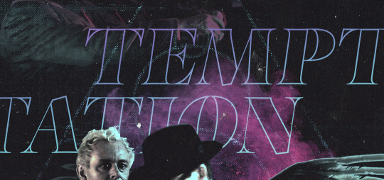
You wanna know what inspo reference I was looking at when I started that “Temptation Accomplished” edit?
Fucking this: https://search.muz.li/YTdiNjkwN2Rh
You might be thinking, “how the fUCK was that the inspiration??!! Your edit looks nothing like that at all!” ...and you would be 100% correct, and that is 100% my point. I spent a good hour or two trying to incorporate that cutout text layering effect before finally accepting the fact that it just wasn’t working for the edit I was making. And it wasn’t until then that it actually started to come together.
12. Be patient, and take the time to explore all your options!
I’m not gonna lie, y’all. I spend hours on my edits. I usually complete them over the course of 2-3 days/sittings. I rarely have a plan. 99% of the time I'm just throwing things at the wall and seeing what sticks. When I get stuck (when, not if), it helps to step away from it and come back later with a fresh perspective/set of eyes.
Every single edit I've posted, I have at some point felt like giving up on because I thought it looked like garbage (and not just because I was being self-deprecating/doubting myself, but because at those points, they simply weren't finished/something about the composition just wasn't working for me)
Work through those moments, and if necessary, take a break/sleep on it. It's always after I've exhausted my early ideas that the really good ones start to come to mind!
Here’s how the character poster edits I did progressed:

In Classic Me™ Fashion, I literally started off with just... textures I liked, and a font that I liked. Now, there were obviously a lot more ‘steps’ involved in both designs, but hopefully at the very least this gives a sense of how things get from point A to point B.
So uh... thanks 4 comin 2 my TED talk. I hope u learned at least one (1) cool new thing or maybe just feel vaguely inspired by this rambling mess?
157 notes
·
View notes
Photo

HELLO EVERYONE ok i’m finally doing this after like 84 years lmao
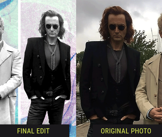
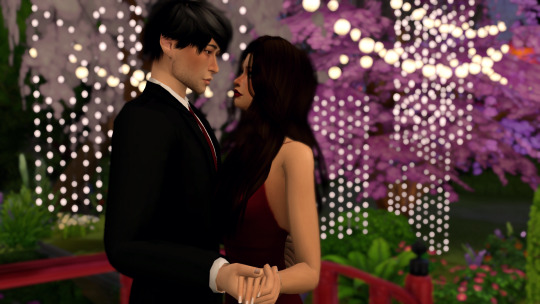
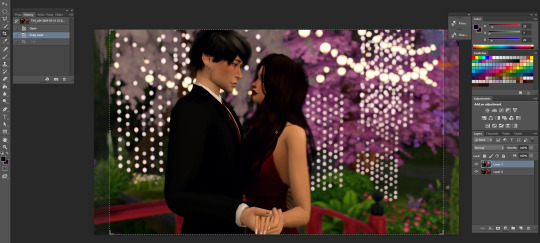
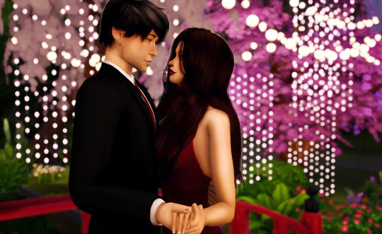
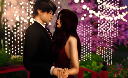
SO yeah several people in the past few months have asked me about my editing process and i said that i’d hopefully do it after gen 2 stuff and since i’m taking a break from gen 2 and wanna stall bc returning to gen 1 will be painful, ya girl got her ass to go through with it. keep in mind, this tutorial is for people who already know the basics of photoshop. if you don’t there’s many tutorials online that’ll help beginners. i’m gonna be editing a pic of val and chance all dressed up and ready to crash a prom to get lit with their homies maggie and eli
*rosanna pansino voice* LET’S GET STARTED
so i use reshade and i believe the version i have is 3.0.7 or something idk but it’s 3.0 and i switch between 3 presets that are my own. the one i use the most started with pickypikachu’s cinematic preset as a base.
now, i know not everyone has reshade, but there’s still a way you can mimic the DOF effect with photoshop. when my stubborn ass edited everything myself all i did was duplicate the photo, apply field blur and adjust the bokeh lighting, added a layer mask and with a brush using the color black, i “colored” in what i didn’t want to be blurry and BOOM ya got that DOF goodness
so for DOF i use either the marty mcfly shader or the matso shader and even both, like in this case. i also love that sweet mxao bc ooh yess them SHADOWS. but unfortunately bc i’ll never ever let go of alpha hair and you’ll have to rip them away from my cold dead hands, ya get this shit.
the dof and shadows cutting through the hair making it look ugly and blurry and just all around BLECH

so when taking screenshots, i take two photos. one with the dof and mxao and another without those shaders
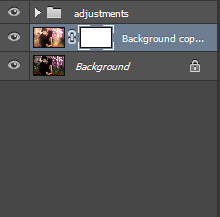
now i open both pics in photoshop and layer the photo with the effects over the one without
ok this is totally optional and you don’t have to do it but i like to crop my photos and the preset for my cropping dimensions is 1150 x 705 bc that’s what i’m going to resize my photos to (w/ 300 resolution). again, totally optional, you don’t have to do this part but i do.
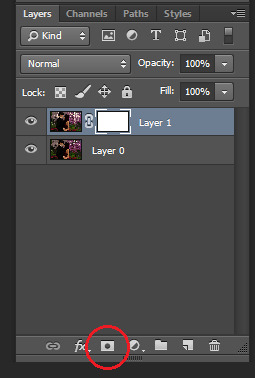
so now i add a layer mask to the top layer
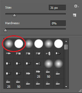
next i select the brush tool and choose whatever brush i wanna use. i usually switch between these two brushes depending on what i need at the moment. and make sure the color you’re painting with is black.
and now just “paint” over the ugly parts to erase them. depending on your photo this can sometimes take a while, but hey ya get that dof and beautiful alpha hair. i also take this time to erase some of the blurriness that forms around my sims from the dof effect


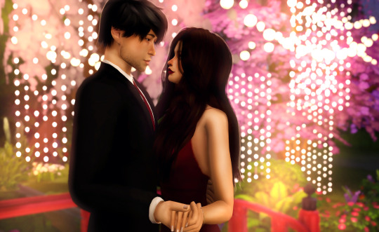
right click on the layer and select “merge down” and i’m left with this. obviously, you see some parts that aren’t blurred anymore but i just fix it with the blur tool at 100% opacity, zoom in on the unblurred edges and blur them in with whatever brush i choose. i personally choose the one with hard edges and i make sure the brush size is very very small. this part’s also a lil time consuming so ya gotta be patient.
doesn’t that look better? now it’s time to get to the actual editing lmao. first, click layer > background layer to make it a background. this is necessary for me bc of the photoshop action i use.
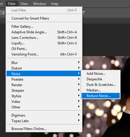
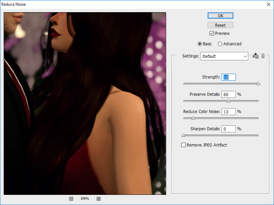
so in order to give my pics that “crisp” look, i first reduce noise and these are my default settings

then i do topaz clean
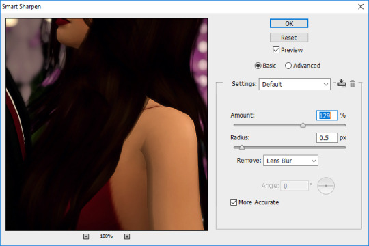
then smart sharpen
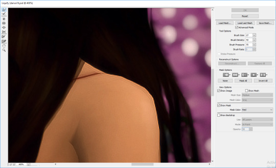
then i use the liquify tool bc sometimes there’s jagged edges on the shoulders, elbows, chins, etc. that i wanna smooth out. i also use this to adjust facial expressions, like for this i wanna make the smiles curve up a lil bit more bc chalerie are in love and happy

now this is the part where i kinda nitpick bc i’m a perfectionist lmao like i clean up some lines on val’s arms and fix that weird spot on the collar of chance’s shirt, all that small stuff people wouldn’t notice but I DO so i fix it

alright now it’s time for me to draw hair! again, this is optional and i understand not everyone has a tablet or likes drawing hair so skip this if it ain’t your thang. first add a new layer for the hair.
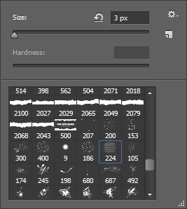
i like to add extra hair to make it more full or fix clipping and “highlights” to kinda emphasize the lighting effects i’ll do later and i usually go with a lighter color of the hair for the highlights OR i do the color of the lighting. in this case i’m just going with a very light brown color. this brush is from this set by castrochew and i have the opacity at 100% and size at 3 px.

this is what it looks like after i draw all the hair. and for the highlights i always reduce the layer opacity to 50-60% or even less than that depending on how subtle i want them to be. after that, i merge them all down.

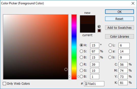
now it’s time to do all the shading and highlighting. make sure you do it all as separate layers, too. even tho i use mxao it still doesn’t do enough for me, so i always add shadows and i recommend you use dark brown for the shadows as black is a a bit too dark especially when you’re adding shadows around the faces. like y’all don’t want it to look like your sims put mud on their face. trust me guys i contour my face.

now take a hard edge brush and draw where you wanna add shadows

apply gaussian blur and erase any excess “shadows” then reduce the layer opacity to your liking. now keep doing that in other areas where you wanna add shadows. it all depends on the picture and i really just use my general knowledge of how lighting and shadows work. remember, make sure each shadow and highlight you add is a separate layer!
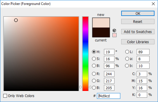

for highlights, use a light color, a soft edge brush, change the brush opacity to 60% and change the layer mode to “soft light”. like with the shadows, just paint whatever you wanna highlight, gaussian blur, reduce layer opacity, etc. then after you’re done shading and highlighting, merge all the layers down.

then to enhance the highlights even more i use the dodge tool with the exposure at 25% and paint over all the highlighted areas

so this is how it looks after i did all the time consuming stuff and now it’s time to play with COLOR YEAHHHHHH
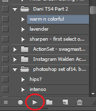
this is the action i’ve been using forever and it’s a ride or die, always got my back, never fails me, always there when i need it. all i gotta do is click on that and press the “play” button and everything’s beautiful and colorful and all my problems seem to go away and suddenly the your lie in april soundtrack is playing the background
but most of the time i untick the “curves” layer from the action as it can be too bright for me and i just adjust the curves of the image to what i prefer.
now it’s my favorite part! time to add that good-ass LIGHTING and since i went crazy with the lights for the background, it’s gonna be fun to do this one hehehe. ok so first duplicate your image and then choose the color of the lighting you want. for this pic, i want the lighting to be a nice light warm yellow/orange color

now for the brush mode, choose “linear dodge (add)” and change the opacity to 35%-45% or hey even higher if ya wanna go bright as fuck. and get a soft edge brush and make it big. like fucking BIG. you see the size i put it at? yeah, make it big bc we want that beautiful shit EVERYWHERE
YEAH DAS DAT SHIT I LIKE. keep painting over areas ya wanna see glow and even paint over the same area twice to make it brighter. hell, don’t just stop at one color. add other colors of light if ya want. add some pinks or blue or purple, adjust the brush size, go crazy. BLIND EVERYONE.

buuuuuuut with all the sweet lighting, it tends to make your pretty pic look all washed out and also lighting doesn’t always work that way. and that’s why i told y’all to duplicate your image bc we’re gonna add a layer mask again and with a soft edge brush you gotta erase some of that lighting. change the brush mode back to normal, put the opacity at 100% and make sure your brush is black and get rid of what you need to. but what’s good about this is you don’t have to be perfect and it’s ok if there’s still some lights on your sims bc now it looks like the light is shining on them awwww. now merge that layer down
now color balance! i like to enhance the red, magenta, and blue most of the time but as always it all depends on the photo and what your preference is.

all that’s left to do now is change the image size. i change the resolution to 300 ppi (it doesn’t really do anything but like it’s become a habit of me to do it so i do it idk) and make sure if you’re making your image smaller, you apply “bicubic sharper” so your image stays sharp when you change the size

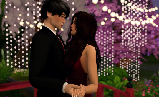
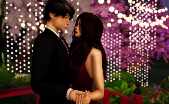
AND THIS IS THE FINAL PRODUCT.
so this is my editing process and i hope some of you learned some stuff from this. also please keep in mind that i also encourage y’all to do your own spin on things when you edit. i’m all for taking tips from others and learning cool new tricks but develop a style that fits YOU. eventually you’ll find it and i know that you’ll end up creating something amazing that shows how unique and lovely you are.
anyways, i’m so glad i finally got this done. love you guys 💖💖💖
#the sims 4#sims 4#ts4#simblr#tutorial#aliya's editing tutorial#giving it that tag so i can make a link on my blog#i really hope i explained things well#like i don't do tutorials#but here ya go#now i gotta edit the other photos for this photoshoot byyyyeee
91 notes
·
View notes
Text
Inferior 5 #1
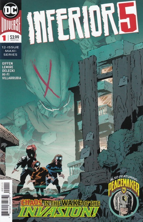
Hopefully this will be like when Giffen made the Legion of Super-heroes super fucking dark.
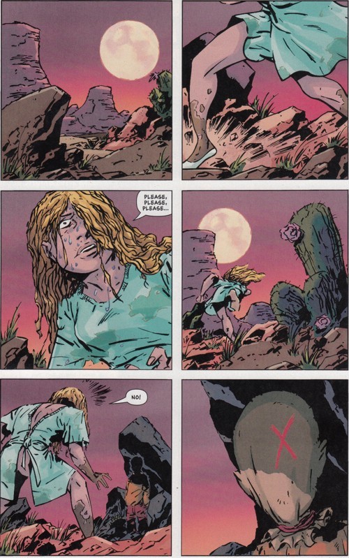
How many dicks can you find, kids?!
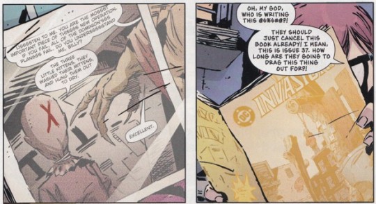
"How many dicks can you find, kids" is the least quotable line I've ever written. The Kamandi just out of surgery cosplayer winds up getting exploded by the kid in the canvas sack face mask. You know the kid is bad news because he can make people explode with his mind. Although if you ran into him in the desert, you wouldn't know that immediately so I should have stated the other ways you can tell he's bad news so as to maybe avoid exploding. First off, he's a kid out in the desert alone. Kids by themselves are creepy. Plus he's wearing a canvas bag on his head. Canvas is always a warning sign that you might be dealing with cannibal hillbillies, especially when it's covering an almost certainly mutilated face. Also, the kid's canvas bag mask has a big red X on it. Anybody who's been through the American educational system has a strong aversion to red X's. Also spooky: the kid recites nursery rhymes. When you hear one of those, you know you're either about to die or laugh hysterically because did you hear how the Diceman said "cock" instead of "clock"?! How did we never stop laughing in the Eighties?! Oh, one more clue that not all is right with this kid: he lives in Dangerfield, Arizona. That's almost as big a red flag as some sweaty, long-haired kid in overalls from Back Swamp, North Carolina. The story picks up with some nerdy kid (probably Merrymaker since he's the big virgin of the group) whining about how his dad died in The Invasion of Metropolis (what was that? Is that a reference to the beginning of The New 52 when Darkseid attacked Earth? Or is this a reference to the Invasion by the Dominators which was compiled in three way-too-long comics?). After the Invasion, he and his mom moved to Dangerfield, Arizona. Because who wouldn't feel safer in a place with a name that causes constant anxiety over a place where the greatest hero in the world lives?
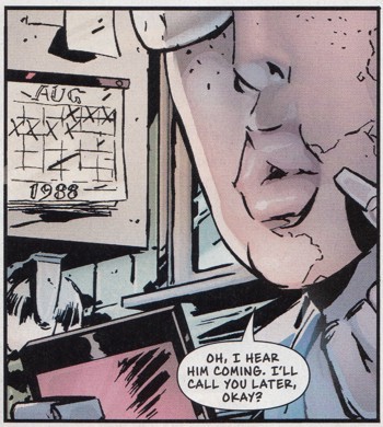
According to the date on this calendar, the Invasion mentioned was the Dominator one which created the Meta-Gene explanation of superpowers which we recently learned was a computer jargon shortening of the term "metal-gene."
The calendar isn't the only proof that this invasion was by Dominators and not Parademons! By turning the page instead of trying to ferret out what's going on by examining every panel carefully and spending an inordinate amount of my short lifespan trying to guess what's about to happen instead of just fucking turning the Goddamned page and letting the writers explain it to me, I discover the Dominators are leading an invasion of Earth Number This Is Fucked Up. At least I think it's Earth Number This Is Fucked Up because the invasion seems to have worked. Superman is dead and most of the other heroes have been placed in a space gulag. Plus that kid in the canvas bag marking X's on houses seems to play an important role in the Dominator's invasion force.
Unless this is all just a comic book on Earth Number Main Earth?
Maybe I should turn some more pages! But first, I just need to Google "Lisa Loeb's boobs." The kid complaining about the Invasion comic book is named Lisa (no relation to Lisa Loeb's boobs) and she points out to the suspiciously bloody comic book seller with a light sensitivity named Vlad that the Invasion really happened. So I guess DC is simply profiting on everybody's pain and misery. I bet just to make the series even more painful and miserable, DC hired Scott Lobdell to write it. Justin, the whiny kid from Metropolis, is being observed by some outside observers (as opposed to inside observers which would be, I guess, parasites?). He heads downtown where he's about to make contact with Dumb Bunny and Awkwardman! Except he doesn't. Man, I should probably read more than two panels at a time before writing anything. It would save everybody a lot of wasted effort, me with writing sloppy synopses of comics and the three people reading this having to fucking read this. But then I don't have any responsibility to anybody to make these "reviews" shorter. It's not my fault if somebody wanted to Google "Lisa Loeb's boobs" but found they didn't have enough time because they were reading this shit. That's their own fault for not prioritizing their desires! Googling "Lisa Loeb's boobs" was so important to me that I did it in the middle of this review! Come on, people. It's the modern age! You can view Lisa Loeb's boobs any time you want (through clothing, that is. I'm not advocating for searching for nude pics of Lisa Loeb's boobs which probably don't exist anyway and if you think they do, it was probably just Lisa Loeb's head photoshopped onto a naked torso). Lisa has been uncovering clues to the weirdness of Dangerfield, Arizona because she dresses like Velma. Unless she dresses like Velma because she searches for clues the way her hero, Velma, searches for clues. I don't know enough about Lisa's backstory to say. It's possible Lisa isn't even aware of Velma and it's just Giffen spending some easy pop culture capital so readers associate Lisa with Velma and understand her more simply by looking at her image.
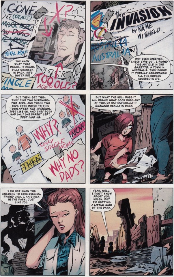
Here are a bunch of the clues she's uncovered that I didn't want to try to parse through my digressions and fascination with Lisa Loeb.
Billy Shanker, the kid with the canvas bag who says things like, "Oh! The three little kittens! They fucked their mittens! Oh! Look at the way I hold my cigarette! Boom!", murders Justin's mom and takes her corpse to some guy in a hazmat suit that might be a Dominator but also might be, seeing as how Giffen is writing this, Ambush Bug. Man I hope it's Ambush Bug! Justin returns home to find his mother gone and the interior (five?) of his house covered in red X's. Oh no. That's a really bad sign! Not one black check mark in the bunch! Some people might think Keith Giffen isn't the best artist in town because he's a writer and his art isn't for everybody. Plus he never puts any thought into his panel layout and just goes the same size boxes every time (sometimes in the six variety, sometimes in the nine). I happen to love his art so I'm not one of those people. But in keeping with a guy whose art isn't what people would call great (although those people usually love mainstream great garbage art like John Romita Jr or David Finch or Tony S. Daniel), Jeff Lemire draws the back-up story. I don't think that was an insult at Lemire's expense. If it was, I'm sorry because I was really just trying to insult John Romita, Jr and David Finch and Tony S. Daniel. The back-up story features Peacemaker whom I only remember by look. According to the Who's Who, Peacemaker is a guy who loved peace so much that he realized sometimes he'd have to use extreme violence to ensure it. Also he suffered a head injury during Crisis on Infinite Earths which seems like a weird thing to mention in the Who's Who. "Trillions of lives were extinguished during the multiversal extermination event! Billions and billions of worlds destroyed! People's pasts erased in the blink of an eye! Supergirl and Flash and some other people nobody remembers killed! And Peacemaker suffered some head trauma." I suppose it's important to the character. Maybe it was meant to make him more extreme so he'd be relevant in the post-Crisis era. Peacemaker is on a mission for Amanda Waller to find some super weapon that the Russians want. His search leads him to a bunker with a dead Dominator, a mysterious capsule, and a map leading him to Dangerfield, Arizona! Inferior 5 #1 Rating: B+. I'm a sucker for Giffen stories and Giffen art. And Giffen stories backed up by Lemire's writing are probably even better. This one was pretty good so consider it evidence that my previous statement is almost certainly correct. One thing I like about Giffen is that he doesn't mind writing things that can be confusing on their first (or even second!) read through. He tells the story, makes the jokes, slowly unveils the plot, and to hell with anybody who doesn't want to invest a little time in making it all out. Seems to me, a lot of modern comic book readers could learn to love ambiguity. But they're all so desperate for the interior monologue of the main characters so they know exactly what to think after reading something. They're so coddled that they think subtlety is when a story explicitly shows them what's happening without the main character also explaining it in a monologue as they experience it. They wouldn't recognize subtlety if it...well, I mean, it's subtlety. It should be hard to recognize so I don't know how to finish that statement. Now go read Inferior 5 and hate me for recommending it when you're finished.
2 notes
·
View notes
Text
DTP Interview #6 Elbenherzart
Hello to all our friends and followers of Daily Thranduil Project!
Today it’s @elbenherzart‘s turn for our fandom interviews. She is a really talented professional illustrator, who has produced many beautiful artworks inspired by the world of Tolkien. She works with traditional media as well as with digital ones and has a lot of other creative talents, like sewing awesome cosplays. I hope you are curious to find out more about her, so without any further delay, I present you here with her answers to the questions we had asked her:
General Questions:
Username(s) we can find you under:
Either ElbenherzArt or my real name, Christina Kraus. :)
What Media do you create?
For digital paintings I use Photoshop and for my traditional stuff mostly inks or ballpoint pens. I almost never use pencils, because I find myself erasing all the time.
Are you self-taught or did you go to art school?
I am mostly self-taught. Tho I have a bachelor degree in Intermedia Design. This gave me a few design and composition fundamentals I can apply to my images, but didn't teach me to draw or to paint. Also I have a lot of other professionals as friends who help me with critiques and reflection of my art. I always wanted to go to Art School but the programs in Germany are pretty shitty for it. All you learn is like drawing with a pencil bound to a stick, drawing with your not-drawing hand or drawing with a blind fold. It's complete garbage and I envy people who can afford programs such as the Swedish Academy of realistic Art where you actually learn useful drawing and painting fundamentals instead of fooling around.
Which artists have influenced your style?
That is a tough question. I admire a lot of artists but I guess my digital work is mostly influenced by Magic-the Gathering or Dungeons & Dragons artists, since this is the direction my work is heading too.
Which are your favourite artists?
I'd say Peter Mohrbacher, Jana Schirmer, Cynthia Sheppard, Jason Rainville...but hell, there are a lot. I can't pick a favourite.
Where can we find your work?
On my website, Tumblr, Instagram, Twitter, Facebook, Deviantart, Artstation and on Behance.
What would you say you are best known for in the fandom?
I'm not even sure I'm known for anything in this fandom. XD But the work I did based on the Silmarillion so far sells the best on Conventions and I get the most comments on it.
Do you have a favourite pairing?
Yes of course, but it's kind of controversial I'd say. ;)
Do you have a favourite creation of yours you are especially proud of?
I'm kind of proud of my latest piece, Celebrimbor's Smithy. It was a tough one, since interior scenes are very hard in general for me. The work on this piece took a whole month with a few breaks of course.
Do you have a favourite fictional character, besides Thranduil of course?
That would be Kylo Ren/Ben Solo from the Star Wars Universe.
What other fandoms are you part of?
The Star Wars Fandom, tho I'm barely active there. I have a Tumblr blog dedicated to it, but I mostly just reblog stuff and did only one Star Wars related painting so far. The fandom is kind of toxic with its stupid ship wars and anti culture going on.
Do you do commissions?
Yes. :)
Any advice/words for others in the fandom?
That is such a general answer, but stay true to yourself, do what you love and don't give others shit over characters/pairings you don't like. Treat people the way you want to be treated. Be kind and respectful, you don't know what people are going through.
If you are an artist, or want to be one; only self reflection, critiques and hard work will get you moving forward. You need to be able to see your own flaws. For that you need to seek out people who can give you an honest opinion about your art. (Not your friends or family.)
Vanity is the downfall of every professional artist. You can be proud of your work, but never vain.
(You can always ask me for porfolio reviews or advice if you want by way. :))
Personal Questions:
Favourite Book?
The Silmarillion.
Favourite movie?
Currently Star Wars-The last Jedi.
Do you have a pet peeve?
Littering. When I see people throwing their trash onto the walkways or streets I get furious. Take it to the next trash bin or home! It's not difficult.
What country are you from?
Germany!
Who do you think you might have been in a past life?
Probably a cat. Sleeping and eating is all I want to do. :)
What do you like to do in your spare time other than create the media you work on?
When I'm not drawing or painting I'm either binge watching series on Netflix (currently Outlander <3) or I'm with my friends/boyfriend. Sometimes I write Fanfiction, but mostly I'm reading it. I also try to travel as often as possible and sew my own costumes when time allows it.
When did you join the fandom?
I think back in 2007. Not really sure actually. Definitely more than 10 years ago.
Follower Questions:
@floranocturna asked:
You are a very versatile artist and I have been admiring your very cool cosplays already for a while, especially your Celebrian and Celeborn are amazing! Do you sew all the cosplays yourself?
Thank you and yes, I sew them usually by myself :).
What inspires you to cosplay a specific character?
Honestly it's mostly the robes. If I like the aesthetic of a character, I want to cosplay him/her. XD Of course I also have an eye on the character and need to like him/her.
You are very ardent about being vegan. Will you tell us a little bit about your reasons and why is it important to you and should we maybe all think about how can we help to preserve nature instead of destroying it?
This is a loaded question and I'm unable to answer it with just a few words. Feel free to ignore this text if you are not interested.
As I learned that raising livestock for meat, eggs and milk generates 14,5% of global greenhouse gas emissions, the second highest source of emissions and greater than all transportation combined and that it's the leading cause of deforestation, biodiversity loss and water pollution, I knew that I had to act and change my diet, because I simply couldn't live with that knowledge and not doing something about it. And of course the killing of millions of sentinent animals every single day. The meat industry is the most powerful industry in the world and they try literally everything to make us continue to buy meat, to make it cheaper and to leave people in the dark about the consequences for our planet and our health. Here the Pharmaindustry comes in. The meat industry is their biggest customer (80% of their money is made from antibiotics they sell to farmers and animal factories) and sponsor, feeding billions of pills to animals each to day to alter their flesh. It's all about money, control and very fucked up. Like always.
If the grain that is used to feed our first world country livestock would be given to people in Africa or other third world countries where children starve to death, no one on this planet would need to suffer from hunger anymore. It's all pretty messed up and a paradox.
The only way of preserving nature in the long run is going vegan actually. I know that a lot of people don't like this thought, but that's mostly because they are misinformed (I was too, everyone is in the beginning) and fear either deficiencies or they think they can only eat vegetables and fruits. But that's not true. There are so many vegan dishes and sweets out there people are not even aware of. Oreos for example are completely vegan. A lot of junk food is. Cake, Ice cream and chocolat can be vegan too. It's all just a matter of replacing the eggs and there are plenty of alternatives. When people think about going vegan, they think about all the things they can't have anymore. Instead, think of the things you gain from it. You support the environment, save lifes and it's beneficial for your health. You are less likely to get cancer or diabetes. You don't have to give up your beloved sweets or junk food. I mostly eat the same things I ate before, just with egg replacement and almond or oat milk instead of cows milk. The only thing you have to keep in mind is B12. I take a pill everyday for it and you should too if your are vegan. If you do that you are completely safe and won't suffer any deficiencies if you live on a wholesome diet.
This wall of text may imply that I try to preach or what ever, but I simply state facts. It's up to everyone if they choose to act or not. I don't judge people for not going vegan. It takes a bit of effort, research and people will judge you for it. If you want to have more information I recommend the Netflix documentaries „What the health.“ and „Cowspiracy“. They are all based on researchable facts and explain a few statements I've given here. Also you might want to take a look at „Why we love dogs, eat pigs and wear cows“.
@beelovesbutterfly asked: First of all, thank you for sharing your lovely artwork. What is your favourite art medium?
@themirkyking asked: Which method of creating do you prefer? Digital or traditional, and why?
For my personal taste and fun I prefer traditional mediums. It's much more relaxing than digital art where I have to stare at a screen all day. Also I love the smell of paint and texture of paper. But for client work I definitely prefer digital since it's easier to change mistakes and I'm able to finish something faster. What makes the pay a lot better.
Thank you so much Christina for taking the time to participate in our series of fandom interviews for @dailythranduilproject. It was a pleasure having you!
Please check out Christina’s blog and her page at DeviantArt for all her awesome artwork! And if you happen to be in Cologne on May 12/13th 2018 you can go and visit her booth at the RPC Germany!
@floranocturna ^^
45 notes
·
View notes
Text
Five Things I Do While Painting in Photoshop
Making little vids about my process has been super helpful for me to understand my shit and get better. Maybe it can be for you as well? Below I elaborate on my minute vid posted originally in my Instagram feed.
Set Up
I know a lot of people who like to save a million versions of separate layers of things. I guess you could call me a minimalist because I cannot be bothered to hold on to the past. In this file I have merged the grey-scale drawing into one single layer. Next I create two layers for color. One has the Multiply blend mode activated and the other is in the Overlay blend mode. From there I play around with the color until I get what I like—just like IRL painting. Starting off gradually I eventually get super detailed but I haven't agonized over every choice made in the drawing.
As I go I combine the layers using the best trick ever. Hold down "ctrl", "alt", "shift", and "E" (I dunno what this is on a Mac—sorrrrryyyyy). All of your layers will be merged into a single layer NO MATTER WHAT BLEND MODE THEY ARE IN. Here is the full scoop on this tip from Photoshop Essentials. I use this trick all. Damn. DAY.
The Goal
The rest of the image is built off of the basics I lay down early. I can add things and make adjustments but if the foundation sucks then the image is garbage and I'm left tinkering with something that can't be saved.
Brushes
When I was learning how to paint in Photoshop I heard a lot about Kyle Webster on Insta and at Adobe Max and basically any-fucking-where anyone talks about a damn Photoshop brush that isn't mentioning Syd Weiler. I impulse bought a mega pack (and sixteen million other packs) of his before Adobe brought him on board (like... right before it came with your Adobe CC subscription).
I now use two of those brushes (yeah I know). Both are from the PaintBox. The first is "Big Wide Softy" which is super bitchin' for blending and building trees and clouds as fast as humanly possible. The other is Bristle 3 for drawing and painting things out. Otherwise, I'm using the lasso tool and paint bucket or shaping things with the smudge and eraser tools.
For me, finding the right brushes was similar to finding a favorite medium in the real world. We each draw differently in the same way that we all have different handwriting. Play around with things and go from there—and don't spend a million dollars on a ton of things you will likely never use.
The View
Go to Window, Arrange, and at the bottom of the menu is "New Window for {blah blah file}". Then Go back to arrange and select the view that works best for you (I do 2-vertical). That way you can have a bird's eye view of your work while you are also zoomed in real close. If both windows are rotating at the same time there's a box you can uncheck "Rotate All Windows" in the toolbar when Rotate function is active.
Take one thing off
I've started the use the Olly Moss trick of putting your "finished" WIP on your phone screen. When you look at it randomly during the day you will see what is so wrong or so right, so fast...
Music "Kawaii" by Frequency Decree from Nul Tiel Records, used under Creative Commons Attribution-NonCommercial-ShareAlike License
#photoshop#painting#figure#digital art#tarot#tarot deck#ki11erpancake#bridge witches#kyle webster#syd weiler#olly moss#digital painting
7 notes
·
View notes
Text
shitty parallel paradise translations ch 101-104
Shitty Parallel Paradise Translation Chapter 101 to Chapter 104
a duwang quality parallel paradise translation transcript draft from chapters 101 to the first few pages of chapter 105. My brother asked me to do it but I really can't put that much effort into something I don't really care. This was sitting on my computer so i thought I'd put it here even if it is half-assed but if this gets enough likes or reblogs or DM's I'll do it more seriously and give the translations to the group who's doing it (or whoever wants to clean this up and typeset this I can give u photoshop if u want). Scans are from rawdevart.com don't go to the other one because that one is full of ads.
notes: I've never read parallel paradise so I don't know how the characters sound. It's a draft so there's lots of brainstorming words and sentences.
Enjoy the duwang. Namazu out.
Chapter 101
The dreaming maidens target is…?
The dreaming maidens spearhead is aiming towards?
I can't stay as a dreaming virgin?
Peko is looking this way like she doesn't want to get along.
Peko!!
You're here aren't you!!
Come out here!
Tch,
Peko's stupid but she's skilled
Accompany him to sandorio
Go together with him until sandorio please.
I think it would be enough with ruumi and amane though
It probably is but…
Even though peco has talent, she's not a guardian/has no guardian (?)
And therefore she doesn’t know the world outside/outside world.
Because of that I would like to use this chance to give her some experience.
About this world's absurdity (不条理)
You can make her carry your stuff (make her a porter?/carrier?)
Please bring her with you
Carry your stuff!?
…alright.
Peko once you're ready we're moving out.
Tch
Argh dammit
I can't take this!/I can't do this
Me as a stuff carrier you say!?/me carrying stuff you say!? This genius me!!
For this ugly guy!!
Yes yes ill do it ill do it I'll get ready!!
It's misaki sama's orders so I'll obey it!
But I definitely won’t listen to this guys orders you hear!1
I can't believe this humiliation/disgrace!!
On second thought, can I refuse/
Please can you do something about it…
Well then we'll be going
Yeah, be careful
You'll overthrow the (deep jealousy god)(?),
And I believe you will erase the (hougetsu) from the humans
Yeah
Where's peco
She's waiting outside
I see, peco's a unicorn huh
Hng
Kia, what happened to your face?
I got kicked by a unicorn. It was a shock.
Even though I've been taking care that much care of it all this time…
Aahhh…
Unicorn's hate non-virgins so…
I put a saddle on a bicorn.
Arai 荒いrough rude wild
Kisei nature
Odoroki
I am surprised that it was this easy to put a saddle on a bicorn despite such wild nature.
Its because Bicorns like non-virgin girls
Yota-dono
Once the battle is over, I want you to definitely come back.
Because you want to copulate?
Because I like you.
I'll come back.
For sure.
This time, il come back to this city…
Is When I've triumphantly return from defeating the (god of deep jealousy ?)
Well, let's go!!
Taa
uWaa!!
Too fast too fast!!
Is it alright if we go this fast!?
If we're going the same as a unicorn it's totally fine!
Okay
Let's set up tent here
Wow we've progressed quite far in one day…
Yes
At this rate It might not even take 7 days to reach sandorio
Peco how about you come here and eat together with us
I'm good
I am the sole luggage carrier here
So
I very well can't partake/join in with hero-sama and the guardian-dono
I will go and patrol around the edge of the vicinity
Everyone else please go ahead and go to bed before me.
If something happens be sure to call me immediately!
Huuuh?
Don't make fun of me
There's no way I would depend on someone like you ba-ka
It’s dangerous alone!
Don't mind me
I have confidence in my skills so
What the hell is up with her
She was always a strange child but
It seems like she got even more worse during the period we didn't meet.
The human man that she admired turned out to be yota I wonder if she was greatly disillusioned…
Shut up!
Tch
Who was it, who was the one who said lets set up the tent at a place like this!?
Parallel paradise 102
I want to penetrate! A maidens policy!
Fufufuffu huhuhuhuh…
It's one of me vs 9 of them huh
It's definitely not enough you know
Okay that’s 2
From here on it's the debut of my specially made reverse KARU personal knife!
That makes four
Fufufu if I used this then the KARU are like walking tofu!
Nope nope
Your presence is totally not erased so
Okay 7
Now
Theres only you know
What will it be?
Bui-ru
You can go and call your comrades if you want?
Since im here anyways I'll exterminate all the KARU in the area
Geez, misaki-sama too
Whats up with the 'I want to show her the absurdity of this world"
Even though I am so much stronger than it.
For real?
Sorry…
As I thought
The world is wide…
Tch
The probability of hitting its weak point is 1 out of 4…
No good huh!
Don't fuck with me!'
What the hell is this
Just by one punch I cant move my body anymore…
"call me as soon as there's something!"
If I call now,
I wonder if that hero-dono will come and save me…
There was no point in trying that hard to train in martial arts
No matter how much you train the body it'll be the end if you get punched once.
I'll just be used for these guys sexual desires and die…
To think that…
I was this weak
Save me…
Pp chapter 103
Looking down from above, a peeping danger!?
s-save me…
You're late to call
Baka
You okay?
Why did the KARU run away?
I don't know the reason but
For some reason when they hear my voice the KARU run away,
Whats up with that
That kind of thing is cheating right…
Well
That's why when you're with me you won't get attacked by the KARU
As I thought… I hate you…
Men… are too unfair…
even though I couldn't defeat that stupidly big KARU no matter how hard I tried.
You're right
That's not true
Ru-mi -sama
If youta was bad man then I think he would've used his powers for his own self interest
He is the only man in this world after all.
And besides if you copulate with a man you won't die of moon destruction when you turn 20.
Eh?
If those are the circumstances then we definitely can't go against yota.
In exchange for extending your life he could make all the women in this world do whatever he wants
Every single day copulating with lots of women.
I won't do that
That's right, yota won't do those kinds of things
Even though If he wanted to he could've done countless horrible things.
Forget about trying to use us.
He's putting his life fighting to free us from the destroy moon.
It's very fortunate that this world's only man is yota Is what I think.
It was written in a book in sindoria/
That's unusual
Amelia spoke
3000 years ago the man who appeared…
Brought this world into the brink of atrocity
He did as he liked with all woman
And made them into toys to satisfy his urges
Took their value has humans
he left them along the sidewalks
Laugh at their pathetic forms.
And brought a period of treachery.
Akugyaku no kiri wo tsukushita to
See as I thought its good we got yota
Was it truly like that
Even I, if I stay in this world forever that could I also…
So peko
Don’t you have anything to say to the hero-sama that saved you?
So the KARU will just run away when you use your vice,
So just by using your voice you make the KARU run away, pretty nice position you got there that you can experience the glory of a hero so easily like that
You
I hate you even more now.
Lets go and sleep now
Ahh!
What's wrong what's wrong?
The unicorn!!
The unicorn ran away!!
Did you tie it up properly…
I did… tie it up I think…
It might have ran away from the giant karu's howl yesterday
Can this bicorn ride 4 people?
If it's this big then it should be fine, the problem now is…
Peco, try and touch the bicorn
Ehh…
Ouch!
As I thought it would not let a virgin ride it huh///
Yota…
Well… it cant be helped huh.
We can't just leave peco here and we can't just walk either.
Peko take of your underwear and face your ass here
We're copulating
Huh!?
If you're a non-virgin you can ride the bicorn
Hurry up and take it off
If you hate me that much then let's copulate in the agreed way and business like way
Chapter 103
I'll copulate with you
Haa
I'll do it how you want it professionally
Hurry up and take of your underwear and face your ass here
Just with one prick you'll be able to ride a bicorn.
Know your place
(mi no hodo wakimaenasai)
Huh?
(Peco, her only option left is)
If I have to copulate with you then I'd rather die right here right now.
In the first place I didn't have any business anyways, I'lll just go and head home alone.
If I have three days then I can walk back to mi-su so don't mind me please go on ahead without me
I've already learned plenty how wide the world is.
Even if I put in effort its useless
To lose to a man just by way of him existing is
No matter what dangers I face, it's better than procreating with a man who feels like a hero just for existing.
You know what peco
Then why is your pleasure fountain overflowing?
Eh!?
I get it peco…
We also walked the same path so…
You're getting excited imagining opulating with yota right?
You're wro-!
You should just give up
I know you know?
That peco draws lots of naked
Wai-!?
Why!?
It's famous.
That there are lots of pictures of naked men hanging in the room
Didn't you know?
You're interested in men aren't you
It can't be helped
It's alright
I'm sure it's the same for everyone so
It's not something to be ashamed about
You'll get it if you copulate with yota
To be honest
I am interested about copulating
But…
But…
I thought that men would be more beautiful but…
But… this…
For them to be this rugged and bony and an ugly being like this is…
Give it back…
Give back the beautiful men that I imagined
Give it back…
I've been denied whole heartedly while in tears
If you really don't want it, it can't be helped but…
If you have even a little bit of interest in copulating then please
I don't want to leave you here all alone.
At least…
Inside the tent please…
Oh my oh my
Hurry up and get it over with it already
If you look at her closely even though she's cute what an amazing smell
Well it's not like she's taken a bath yet
Even though you look like you really hate it your pleasure fountains bursting you know
Even though I haven't even touched you yet you're already really excited aren't you
Shut up!
What is this what is this?
Good it's come out already the non-virgin mark
With this it's settled then
Let's ride the bicorn and head off to sandorio.
But… if you want to apologise for all the rude things you did regarding me then I’ll continue copulating with you (?)
What will you do
She said lots of conceited things already…
Let's mess with her a little
Will she fall
Or perhaps she'll endure it
Tears
Eh!?
Hero-sama
Hero sama…
For not knowing my place and all the incalculable rudeness
I am sincerely very sorry
Oh Please bless this wretched pervert with copulation…
You didn't have to fall that far!
What's with you
Kuaah
I… I'm a pervert who loves men!
Always!
I'm a pervert who always imagines copulating with men!!
I didn't know!
That men were such strong beings like this!!
It's totally different
Than women!!
Thank you
Huh?
It's not something you have to say thanks for
No
Yesterday
For saving me
Aahh
105
Even with for people riding it this bicorn seems to be totally fine
Yeah! Because it's this big!
Before,
They say the humans of this world came out from that castle right
Yeah
Everyone was born in the castle and leaves the castle to start living in their own cities/towns
You leave the castle between when you become old enough to be self-aware or not so there are only hazy memories.
In this world without men, girls being born from a castle…
If you think about how it is, inside that castle it's like there's something pretty nasty about it inside…
Who on earth lives in the castle
The empress
Nobody has seen her face though
The empress has already lived for thousands of hears and protects this country
Eh?
Isn't that?
Could it possibly the witch?
But here,
Whether you can say bad things about the ruler of this land…
Well then let's head off
What a creepy forest
The shortest course would be through here right
We can't go fast here so it's also an opportunity to let the bircorn rest.
Please save me!
Uwah!
Kobold
What are these guys?
Kobold loves young girls and metal
They're aiming for our weapons
Peco?
Small fry…
As expected her martial arts is ruthless/can’t be excused
Are you alright?
b-big sister thank you…
It was scary…
She has an unexpectedly kind face huh
Everything is alright now
Peco had a little sister
They were killed though
Hey ru-mi sama
I want to take this child all the way to the city
That's impossible
Why?
I mean that child can't ride a bicorn right?
Wai-!
You planning on copulating with a child this young!?
I wasn’t!
Oh alright!! Then I'll walk and drop her home to the city myself!!
You guys can go on ahead first!
Like I said it's impossible peco
You definitely can't walk in the outside world alone.
LUMI=sama…
Aren’t you underestimating me a bit too much?
Just because I was saved once yesterday…
It's alright
There's an easy solution so
Eh?
Amane
I feel a bit sorry for them but this way it's settle
Let's hurry and move on
Peco look closely!
That childs a ghoul
Ghouls turn into people to let their guards down and then attack and eat them
Even if you cut of their arms and legs they’ll regenerate but their stomach is their weak point.
I'm sure it teamed up with the Cobolt to attack people.
The Cobolt for the metal and the ghoul for the human meat
How di did you know?
Ghouls have a special smell
The smell of human corpses
The ghoul made you let your guard down So I apologise I ended up saying it in such a roundabout way
But with this you understand now right?
I understand you have confidence in your martial arts but you can't walk the worlds outside of the city with just that.
I think that's why misaki wanted you gain experience.
See, look peco
Aren’t you glad you didn't have to go back to mi-su alone?
If you didn't mate with me you would've been dead by now.
Shut up
Why don’t you go die instead!!
Die you!!
Pp 106
The weather has been fine all the way…
At this rate we should already be arriving at sondorio!!
Just a bit ore nishina…
I defeated garia and I obtained the card that will free you from the cold sleep./ that will release the cold sleep
Once I get to sandorio I'll awaken nishina…
And then…
What on earth happened to her,
Why did she become the "wtich of deep jealousy"
Everything that I don’t know I'll hear from her!
Ah
It's sandoria!
Eh?
What's the matter amane?
What the? It's/something burning?
You're wrong
It's a beacon/signal fire right?
Does that mean something happened in sandoria?
What, is that…?
That’s…
What on earth happened?
We haven't met in the while huh
Kaduchi
Banyuu
Nakuta sama… what on earth does this mean?
It's proof of my resoution
0 notes
Note
So if you don't mind me asking, how do you do your linework? It's really neat and tidy.
Oh my god I wrote a big long reply to this and then accidentally closed the tab, what did I do to deserve thisGuidelines and tips I use for myself:-While some people are already perfectionists and shouldn’t be encouraged to Obsess, if you’re a habitually messy liner it can help to not settle for your first attempt. Sometimes you will end up spending less time if you just bite the bullet and redraw a line, or a limb, or even an entire composition.-Being alert for unintentional tangents is a very good idea because they can fuck up somebody’s perception of even an otherwise very beautiful drawing. Better to catch them early than have to suddenly work around them when you thought you were almost finished.-If you want just a single curve, try to draw it in a single stroke instead of many tiny ones. -If you can’t do that for whatever reason, or if you need to correct a line that’s almost but not quite right, big canvas + zoom is your friend. Even messy lines that have been erased and scribbled over and reshaped can look nice if the mess is all buried at 300% view (and then you export the drawing to be even smaller!)-Practicing and using reference will often improve lineart intuitively. If you know what the thing you want to draw looks like, you can more easily figure out where to put the lines to give the impression of its shape properly.Also:-Find a drawing program you like. I drew in photoshop for years and I hate its default brushes for lineart. It’s also not designed for drawing specifically, so it lacks a lot of cool and useful tools that dedicated drawing programs often have.-I bought one of those artist’s anti-fouling half-glove things and it’s great. It reduces the friction of my hand against the tablet, which allows me to draw more easily with my whole arm instead of my wrist. Better lines and less pain. A++ would reccomend.
5 notes
·
View notes
Text
A Quick Almost-Tutorial on My Digital Drawing Process
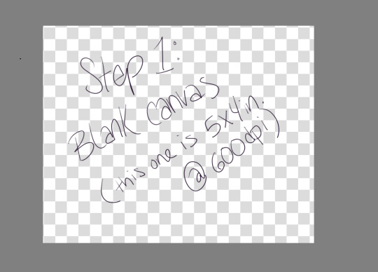
Step 1: Make a blank canvas. My preferred program is Krita, so I open that and make a canvas. I usually do 5x4 inches at 600ppi because when I save PNGs I can upload them to tumblr and the quality is still pretty good.
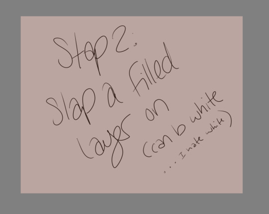
Step 2: Slap a filled layer on that shit. I hate white, but I know a lot of people just use it because it’s easy and also like paper. I tend to go wild with color, and also if you have a colored background already it makes backgrounds easier.
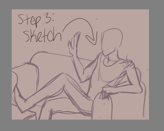
Step 3: Sketch. Use a decent sized brush, but make sure you can still scribble some details (like fingers) if you need to. I use a 27 pixel brush to sketch, just because I can. USE REFERENCES. Think about composition, but not too hard. Then lower the opacity so you can trace over it and still see.27 pixel brush to sketch, just because I can. USE REFERENCES. Think about composition, but not too hard. Then lower the opacity so you can trace over it and still see.
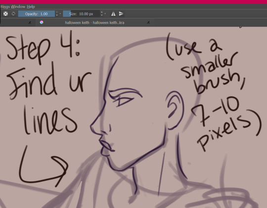
Step 4: find your lines! Sometimes I do this twice, where I use like a 15px brush to get more detail, and then a 7px brush to do my final lines. I don’t use solid black, usually--this one is dark purple. Idk, mang, I just have a hard time with black and white.
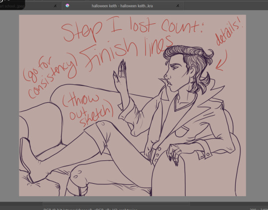
Step 5: Finish your lines with some detail and throw out the sketch (or like... turn the visibility off). If you’re just learning with your tablet, my advice is to focus on consistency. Try to get your lines to all have the same smoothness, opacity, thickness, etc. You can worry about varying line thickness when you have nice, clean lines. ADD CLOTHING FOLDS. ADD BUTTONS. ADD SOME TEXTURE IF YOU WANT TO.
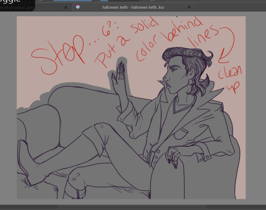
Step 6: Put a solid color behind your lines and clean it up. This is going to make it so that you can put color on top and NEVER GO OUTSIDE THE LINES. LMFAO you don’t have to do this, but I usually do because... erasing............ is hell. I do figures in one color, and furniture in another. Separate layers!!!!!
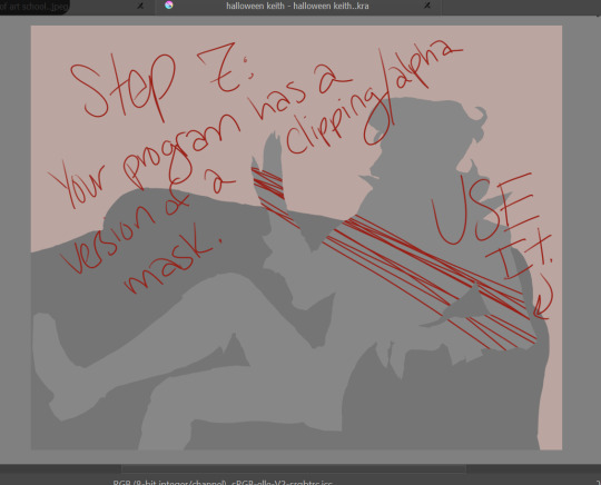
Step 7: Your program, whatever it is, probably has a version of a clipping mask. Krita technically has an alpha channel toggle that does the same thing. It just means that you have a layer/layers on top of your solid color that will ONLY draw where that color is. You can look up tutorials.
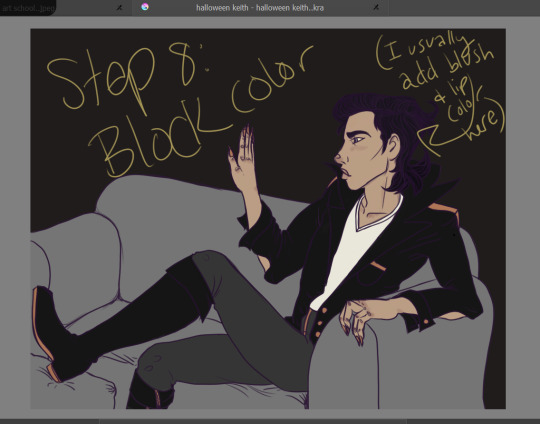
Step 8: Block out your color. I do each color on a new layer. It’s easy to add some variation on the skin here, ie fill in the lips and add some blush. Don’t worry if you can’t really see the lines on top of dark colors! All that detail will come back later.
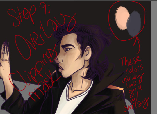
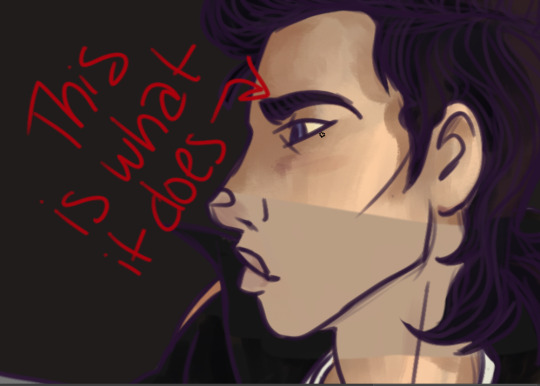
Step 9: Make another clipping mask layer on your color (I usually do it all at once instead of color by color because FAST). Change the blending mode to OVERLAY. Then find your highlights and shadows! A light peachy color will usually look good for the light parts, while a dusty purple looks good for the shadows. Start bringing back the detail! This method really brings life to your colors, so you don’t have to worry about having dull colors. It makes the light parts warmer and the dark parts cooler, which, if you know color theory, makes shadows seem more real.
Here’s where you gotta start worrying about blending. If you’re using photoshop, you have to do it all manually lmfao. The overlay thing might be hard to grasp at first if you have to do all your blending soooooo carefulllyyyyyyy. That’s the reason I use Krita--it has brushes that do my blending for me and make it super easy. This part is the most like actual painting, and not everyone gives a shit. This is optional. You can honestly do cell shading here.
If you want to, however, you can add all your texture here.
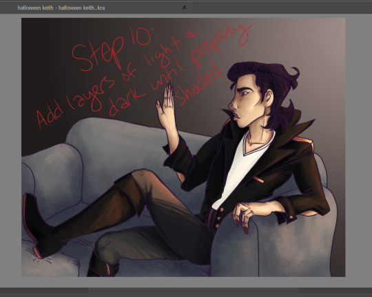
Step 10: You can add more than one layer like this. Add layers of light and dark until it’s properly shaded. See how the detail on the jacket and boots are back? The hair is still flatish, but I wouldn’t worry about that yet. Just think about which way the shadows go, and how much depth you need for your figure to look like they actually exist in their environment! Periodically step back and look at the whole thing to make sure you’re doing it all evenly, instead of focusing on one small area and overdoing it.
You can add a LOT of texture while you do this. The couch here is just light and shadows done with a sponge brush. Fuck around with blending modes, they’re pretty cool.
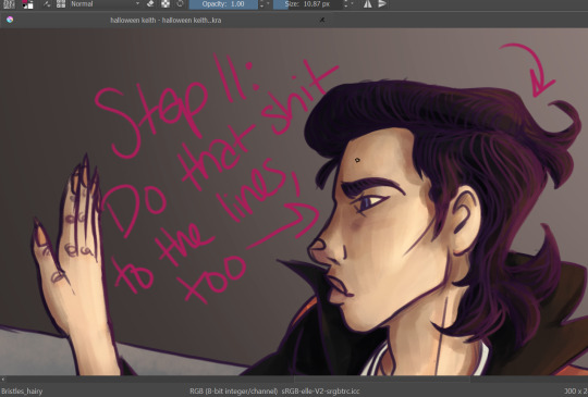
Step 11: You can do the light/dark overlay clipping mask thing to the lines, too! It’s subtle, but it has an effect. Add light where your light source is, add dark on the opposite side.
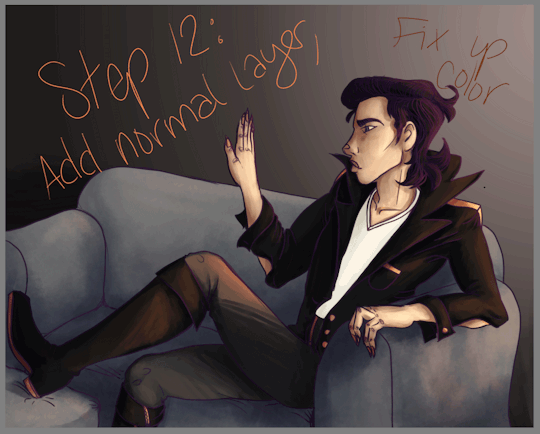
Step 12: Another subtle thing, but now is the time to fix up the color! Add another normal layer, and just use the eye dropper tool to blend your colors until it’s as smooth as you want it. You can also fix up anything that didn’t take too well to the overlay (like that white shirt... sigh). Sometimes super light/dark/bright colors won’t change when you have an overlay layer, so you’ll need to do those by hand. Just eyedrop the color, and nudge it a little up/down on your color picker chart--if you want to be consistent, nudge it a little toward the purple spectrum if you go darker, and a little toward orange if you go lighter. Not much! It’s a subtle difference. You’ll be able to see if it looks waaaaaaay too orange.
Also, if you have a layer that you think comes on a little strong, you can always take down the opacity! REMEMBER THAT!
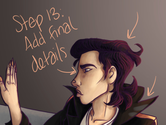
Step 13: Add those final details! The little eye shine, the last hair texture, any other points of visual interest... freckles... etc... add those here. You can do it either on top of the lines or under--i usually just add it on top because heck, it’s easy.
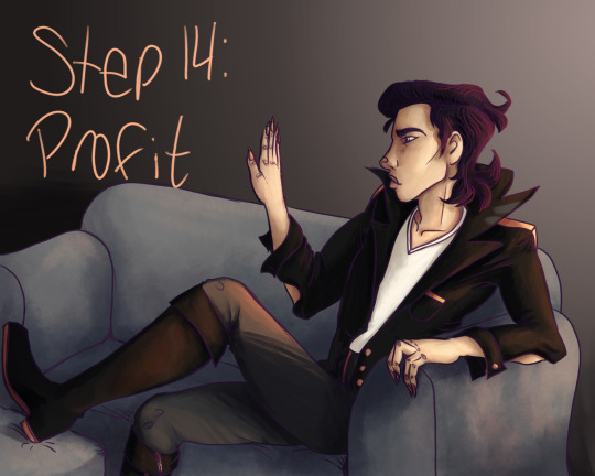
Aaaaaaand... you’re done!
Pretty cool, eh?
49 notes
·
View notes
Note
Do you have any art tips?
Uhhhhhh Funk im not The Greatest Artist ™ but I’ll try to bestow some Wisdom on you. Keep in mind Art is Subjective and I’m no expert and all that so take everything with a grain of salt but that being said I’ll try to give u Tips and Tricks
-listen so if you have a boring class at school just draw in it. School is great because you have 1. Access to paper at all times 2. Incredibly boring lectures. If you have a study hall that’s the Drawing JACKPOT. Basically what I’m saying is practice all the time when you have energy but like that’s such boring art advice. It’s important but “practice! uwu” is like what people with Natural Art Talent say when they didn’t have to figure everything out from the ground up so it’s kind of aggravating
-There’s gonna be people better than you. Chances are you have a friend who’s better than you because this is Tumblr we all draw. Try Not To Compare Yourself ™ which idk how to do but it’s bad don’t do it
-unless you find a terrible person with worse art than you in which case FUCK DUDE COMPARE YOURSELF TO THEM! THEYRE HORRIBLE AND THEY CANT DRAW FOR SHIT LOOK WHOS LAUGHING NOW!
-“work until your idols become your rivals” is absolute bullshit because your idols are working at it at the same time you are. You fool. You imbecile. I feel like this works better for writing when your idols can become irrelevant or straight up die between you being an aspiring author 8 year old and a tired 30 year old who just wrote The Great American Novel ™ or just kind of. Leave the fandom if you’re writing fanfic. Anyway
-ok that’s all the preachy shit, time for Real Art Advice ™. Keep in mind I do digital cartoony shit with Strong Lineart and cel shading for the most part and I pretty much only draw people so my knowledge is limited to that. if you wanna be a professional artist maybe do other things and Expand your Abilities ™
-Ok first off if you’re using Gimp or Photoshop please love yourself and download Firealpaca or illegally torrent Paint Tool Sai or something. I swear by Firealpaca it cured my depression but like. Photoshop is Trash for drawing. Get Firealpaca it has Line Correction ™
-Keep Line Correction ™ at like. A 5 when you’re sketching and at a 19 (the maximum) when you’re lining, coloring, shading, highlighting, doing literally anything that isn’t sketching
-Sketching digitally can be hard if you’re used to sketching on paper and I find it easier to do a sketch on paper, take a picture of it on my phone or scan it, and line/color it digitally. You do you and figure out what works best
-speaking of which I refused to use sketchbooks until I was Worthy ™ of not drawing on notebook paper and uhhhhhh that’s dumb just get a sketchbook they cost a little more than a notebook at Target it’s not super expensive. Although if you’re not financially in the position to buy a sketchbook anyway, just hoard notebooks from school that you didn’t use much. Bam, that’s your new sketchbook
-the Head Circle Cross Thing and the Spheres For Shoulder, Elbow, and Wrist Thing are good and important and will save you
-hands are hard so use references but bullshit your way through it. eventually they’ll look good (I haven’t gotten there yet)
-HAVE FUN WITH NOSES OH MY GOD. Noses are super fun and cool because there’s, like, infinite variety with them, they can be as long or short, thin or thick, rounded or pointy as you want, you can make them be, like, triangles or circles or more squareish or diamond-shaped, the base of the nose can be about as high or as low on the face as you want, you can make the nostrils prominent or not really there at all, they can add another Layer to a character’s design, oh my goodness noses are so fun. They’re like, severely underrated and oh my god I could gush about how fucking fun noses are
-same with facial expressions. Where you put the pupils and how big they are, how much of the eye is covered by eyelids, the way the eyebrows are, the mouth, tons of other shit. There’s loads of variety and so much you can do and honestly having fun with the facial expression is The Best Part. There’s tons of Face Art Chart Memes floating around, you know the ones, save it to your phone/computer and practice those on your own time it’s fun
-if you don’t know how to do something, avoiding it won’t help you. Just kind of draw around with it in your sketchbook or in a “I’m not posting this” file until you feel confident enough to do it in your Real Projects ™.
-Ok for lining did you know..… it isn’t illegal to erase parts of the lineart to clean it up.… just be careful and draw it back in to the best of your abilities if you erase too far and use a smaller eraser brush/lining brush for this… I know it’s tedious nobody likes lining it’s okay you can do this put on some good music
-use mcfucking references
-eyedrop character’s official colors but adjust said colors based on the color of your background to make them look less funky is my general rule for clothing, I usually pick the hair/skin by myself or from something I’ve already drawn though
-for flats, make sure your lineart is all closed off and there aren’t any “holes” cuz that’ll mess up your coloring
-so how I do flats is I use the magic wand tool to select whatever I want to color, expand selection 3 pixels (in firealpaca you can set it to do this automatically), pick the color I need, turn up the brush to as big as possible, and color it in. It saves the time you’d spend with cleaning up where the color gets outside the lines
-you can do the flats on one layer, but I personally like to do every Object on a different layer so when I do shading, I know what goes on top of what
-if a color is darker than the lineart it looks ugly so pick your line color with caution (or just use black! Unlike shading black lineart tends to go with pretty much everything)
-SHADE YOUR GODDAMN ART. Like, what makes people go “wow holy shit that’s good!” is the shading + highlights, don’t be lazy ya fuck.
-I’d take a break before shading to Refresh Your Eyes ™ but also I constantly forget this is a good idea
-don’t shade with black oh my god. Unless you’re doing Strong Punchy Dramatic Stuff or monochrome black and white stuff, don’t shade with black, and if you’re doing that it’ll probably be drawn into the lineart. Don’t shade with black please we can tell you’re doing it and it looks bad
-highlighting with white isn’t too bad though, especially with the eyes, but it might look too strong in some places
-As a general rule, shading is darker and more saturated, highlighting is lighter and less saturated. Whether it gets warmer or cooler depends a lot on what color or thing you’re shading or what you want the feel of the picture to be and I’m not 100% sure how to do it myself so uh. Trust your gut and change the color if it looks wrong I guess.
-where exactly the shadows or highlights fall depends on lots of things, just kind of. Look at how things work irl maybe? This is the kind of thing that you just have to practice, and it’ll look like shit until suddenly it doesn’t sorry I’m not sure what to say
-One Medium Sized White Dot on a layer above the lineart where the pupil borders the Iris (or the whites of the eyes if you’re like me and you make the pupil and Iris one thing) works for a glint in the eye that makes a person look less dead and more cute. How big you’re gonna make it depends on how adorable you want the person to be
-SMOOTH BORDERS FOR THE SHADING ARE REALLY IMPORTANT IF YOURE DOING CEL SHADING which is why firealpaca is my best friend thanks line smoothing. If you’re doing like. Soft shading or painterly shit or other kinds of shading it’s less Super Important but like. Still be sort of neat. Unless being really messy and sketchy is what you’re going for but even then you still need to be sort of careful
-for simple backgrounds, it’s like. Easy to make it interesting. Add polka dots to the background or a big old square or a gradient or a cloud filter or something the possibilities are endless. Another option is to straight up make it transparent and write a secret message in white on the side. But uhh never do a blank white background at the very least fill it with a solid color
-ok style is kind of hard because I never had to struggle to find my style? I just “drew in my handwriting” so to speak and then if along the way I realized something looked shitty I just changed how I drew it slightly? I guess a thing you could do if you’re in tune enough is look at the styles of things you do like and things you don’t and figure out why you do and don’t like it. “I like how *2010s cartoon* does Eyes!” great take that general concept. “I hate how this shitty yaoi has enormous hands!” great then don’t do that. It’s all Personal Preference my dude style is Your Own Thing
-notes aren’t everything but fuck do they feel nice. Self reblogs are fine but don’t overdo it, I’d say reblog it Twice to account for time zones and tag it as self reblog so as to not be a dick
This got long whoops. That’s all I can think of but I hope this helps it’s All I Know
4 notes
·
View notes
Text
Surface Pro 4 initial review reactions n stuff
Model: Surface Pro 4 i5 8gb
Drawing Program: Krita
Pros: Does everything I figured it would
Main Con: Screen size, awkwardness for longterm use
Other: pen pressure different, had to change settings in Krita
Conclusion: DEFINITELY GET THE TABLET PRO APP But basically if you’re deciding between a laptop, or cintiq, and you don’t need to do crazy heavy work I would highly recommend.
Long version:
Reasons I bought it: I lacked the ability to draw on a screen, but I also don’t own a laptop. I wanted to be able to work on art in more places than my desk but I also do design work for a Real Job and school and I wanted to be able to do those things with my boss and at school, and all the good things that are portable. The Cintiq companion doesn’t let you use photoshop away from your computer and the mobile studio is both expensive and bigger and more awkward and likely more powerful than I need. (i don’t do 3d work. 5zillion levels of pen pressure is overkill Wacom tone it down). After seeing decent reviews of the Surface for drawing and determining that it does work with Krita I decided it would be a good compromise between a decent laptop and a fancy drawing tablet.
I get that good irs tax return so I bought my long dreamed for surface pro last week and I’ve been using it for the last few days. Overall, I really like it even though it’s still a little awkward for me to use it. Once I figured out how the fuck to make the pen pressure work (not even really sure how i did it, pretty sure was an act of God) it runs Krita great, faster than my pc even (Probably because I have nothing saved on it yet)
The main issue with using Krita is how fucking tiny all the icons are, like u need to really fucking concentrate, use your dex bonus for aiming, and roll higher than 15, to click on the little eye button next to a layer. Pretty sure theres nothing to be done about this. Second main issue is not having a keyboard (the keyboard cover is 100 bucks? #ThanksMicrosoft) A mouse would probably be useful as well but i bought the thing for portability.
ANYWAY when trying to figure out how to make the pen pressure work, the Krita documentation very nicely pointed to the Tablet Pro app which has a tool called Artist Pad which adds customizable keyboard shortcuts to the screen similar to the buttons on the side of cintiqs. Figuring out the set up was a little confusing, but thankfully there’s plenty o’ tutorials on the Google and from digging around in the settings I discovered they even recently added a preset specifically for Krita! Thank god cuz I didn’t want to spend an hour making my own. It’s pretty good for my workflow as is, but it could use some more buttons. Theres a button for undo (of course), new layer, switch back to brush (clicking b), ctrl, shift, eraser mode, arrows to cycle through layers. There are a few more but those are the main ones I use. I’m on the trial of the app right now but I will likely end up buying it because it’s so dang useful, and I don’t want to always have the keyboard in my lap even after I get one.
So, about the pen pressure. It didn’t register in Krita. I downloaded the drivers the documentation said to, tried both versions, still didn’t work. Uninstalled Krita. Downloaded the portable version of krita. Didn’t see a different. Left it there, reinstalled the regular version. Also downloaded photoshop (some one in a forum said doing this made the win drivers work for some reason) after the last two steps it magically worked. Think I ended up with 64bit win driver installed. Not sure if photoshop did the trick, or having both versions of Krita. There’s nothing on the krita website that says which one you should download or the difference, think one just isn’t the installer sooo?? Regardless, I’m just glad it works now.
That being said, the pen feels a little “harder” than what I’m used to pressure wise. Meaning I have to press down harder to get darker lines, and I’m used to sketching pretty lightly. And you can’t calibrate the sensitivity in the system settings like you can for wacom tablets. I’m not sure if this is a function of the pen it’s self being less sensitive or just different than my personal settings for intuos or even just how it’s mapped to Krita. Ultimately, it’s not a problem because I can change the sensitivity in Krita (thanks Krita ur da best). All I did was go in configure krita>tablet settings then move the low end of the curve up the y axis so that it’s more opaque for less pressure. (This makes sense if you’ve seen the settings thing trust me)
Surprisingly, I also found my lines to a be a little wobblier even though I have over all more control on where they go. I ended up turning on the stabilizer for line art (tool settings. unchecked delay, set to 100 or so). But that’s fine because my line art looks better now B) don’t need the stabilizer for painting
Other general things: the thing gets warm pretty fast specially if it’s plugged in. I ended up turning off the login pin thing because it’s too annoying, but it still tries to recognize my face even tho i can just swipe the screen away?? the fan turns on pretty quickly as well. The little kick stand is really great and sturdy. How ever I find myself wishing I had it on a desk or stand or something to make it face height so I don’t have to hunch over. That’s just a function of the size I know, but it’s really the only uncomfortable thing about using it. So if you’re already a cool kid who has a big ass cintiq and you’re used to it, using this little baby probably won’t replace your workstation. HOWEVER it’s a very functional tool, and infinitely more portable than any cintiq product. ALSO it can actually plug in and be used like a second monitor, so other than the size difference, it’s like having a cintiq that is also it’s own computer. (note: I haven’t tried this yet cuz u need another chord but it is A Thing. Will update if I do)
So I think that’s it! Overall I really like drawing on it. Makes me feel fancy. Does anyone else use a Surface to draw? Let me know if you have any tips!
2 notes
·
View notes