#how to remove background in Photoshop
Explore tagged Tumblr posts
Visit Tumblr Blog
Explore Tumblr blogs with no restrictions, modern design and the best experience.
Last Seen Tumblr Blogs


Fun Fact
Tumblr was created by web developers David Karp and Marco Arment.
Note
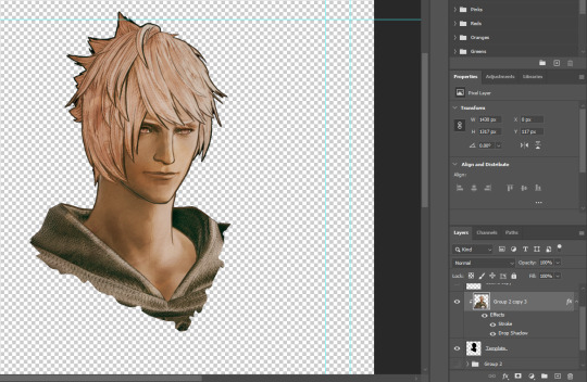
How do you make the transparent vg gifs?
I used this website! Load your gif, set the background color to the color you want to remove and then play with the percentage until you get the shade you want gone (if the bg is one shade of green, then 1% will do the trick, if it's multiple shades of green, you'll need to go higher). Also turn off and on the Alpha Channel Preview to make sure you're not deleting any pixels of the character
BIG warning tho, I used this on gifs that had a very simple background, with one specific shade of violet and another specific shade of yellow, so I was able to colorpick the code of both and then set the percentage at 1% to only target those colors (I had to do this with one color, then save the gif, then load it again and finally delete the remaining bg color)
If you are working with something more complex, it will be more difficult, and you'll probably need to do some color adjustments in Photoshop to make the background colors different to the character's (for ex, if you want to delete the background of a gif with Mario in it, you'll need to make sure the bg doesn't contain red, orange or blue)
Otherwise you can remove the background with Adobe After Effects or do it in Photoshop frame by frame, but obvs that takes more time. Couldn't find anything more efficient than these methods sadly :(
#asks#ysiposting#i thought i would be able to do it fast with photoshop but alas...................#and the tutorials i saw on tumblr used the frame by frame method#if anyone knows how to remove backgrounds from gifs more efficiently please do share your secrets 🙏
8 notes
·
View notes
Text

i've been inspired and i'm starting a collection. old one/dasein masshole posting is my new niche.
#dasein masshole energy#<that's gonna be the tag#anyways. he's just like me fr.#i wish i actually knew how to photoshop and wasn't just using canva and lunapic background remover#w101#wizzy101
85 notes
·
View notes
Text
Final installment: Becky and Emma face off in the center of town. A lone tumbleweed blows through. Their fingers dance around the trigger, ready to pull at any sign of movement. Our heroes still remain unaware, they swear they see stars in each others’ eyes.

continue under the cut
But, oh no! At the sign of trouble brewing between the cowboys, the townspeople arrive with their own artillery. Picking sides of the duel, they wildly aim around. No one to be trusted. Our heroes take notice and redraw their own guns, now well aware of the danger. Who’s to make the first move? Do they want peace or an all out war?

Bullets suddenly wiz by. But, like our lovers from the start, they all decide to miss their shots as well. (Except for the hit out on the varmint in the center of the square, who didn’t really know what he was doing.) As the dust settles and they all realize that none of them decided to seize this moment. They start to put away their weapons.

As a new age washes over this tiny western town, our heroes decide that, even though, this town is big enough for the both of them, they want more adventure. Leaving the townspeople behind, they saddle up their horses that they definitely always had and begin to ride off.

Now, our heroes ride off into the sunset. The future may be uncertain, they may not know what’s to come. But, there’s still one thing for certain. They have each other and their love won’t be shaken.
(never thought i’d make truly awful western fanfic with bad jpegs, but here we are. i really know how to use my time well. i did have fun putting them in silly hats tho. wow, this is dumb, but i had fun)
i realized i now have both a steph and grace png of them holding guns! so, now they're in a duel

i love playing around with images like dolls
#grace chasity#stephanie lauter#hatchetfield#emma perkins#becky barnes#lautity#truly one of the dumbest things i’ve made. but it was silly#there’s no joy quite like putting a png hat onto the characters you like#i like to thank the snipping tool for my screenshots. inkscape (a free program similar to photoshop) for allowing me to put this together#also the pen tool for allowing me to poorly remove the background from each screenshot. it was way too tedious#anyway. no idea how this post got traction. like at all#if you’re seeing this reblog i hope you enjoyed#i now know everyone that has held a gun in hatchetfield#eddie is there bc he actually fits the environment#i also had to kill ted when i found those shots of him with a gun. i had to okay?
408 notes
·
View notes
Text
Neck joint and color correction technique
youtube
#color correction#neck joint#neck joint service#photoshop neck joint#neck joint photoshop#neck joint and color correction technique#color correction service#ghost mannequin technique#how to neck joint in photoshop cs6#neck joint photoshop tutorial#color correction image#color correction tutorial#color corrections#photoshop color correction#color correction photoshop#color correction tutorial in photoshop#symmetrical neck joint service#background remove#youtube#beauty#hairstyle#remove background#Youtube
0 notes
Text
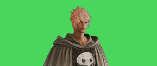
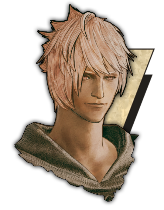
FF14 Battle Portrait Tutorial
For the past few weeks I was trying to find a way to recreate the battle portrait from FF14 as there was a few characters that I want to see in that style but don't officially have one yet. I think I got it down more or less (see image below) so I thought it's a good time to share what I did.

First of all, I made a few files that would help make life a little easier. They can be grabbed here .
Note: I did use Reshade to do a bit of work at the screenshot stage to help speed up the process but the same effect can be recreated in Photoshop with a vanilla screenshot. There are a lot of tutorials on how to do comic/cartoon effect in photoshop and those would make good bases to work off of.
Step 1: Take the screenshot with the PortraitBase Shader on. I usually take two screenshots. One with "Comic" on and one with it turned off. This is so that I have more to work with if needed.

Step 2: Drag all the screenshots into photoshop and remove the background. In photoshop, arrange the layer so that the screenshot with the Comic lines visible is on top of the one with the effect off.
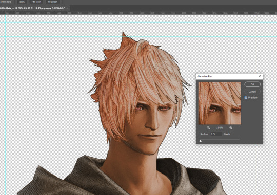
Step 3: Duplicate the the layer with the "comic" effect and apply Blur->Gaussian blur (radius 0.5)
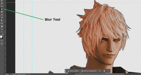
Step 4: Take a look at the hair. In Eric's case, It still doesn't look blur enough to me so I used the blur tool and blurred it a bit more
Step 5: Create a new layer above the layer in the previous step and use the brush tool to start outlining the edges. Where to outline is up to you but the idea is to make edges defined so that it looks more like a drawing.

Step 6: Duplicate the outline layer and then hide that layer. Step 7: Merge everything under the outline layer. Step 8: Drag and drop the "Texture.png" into the project and Clip it to your character layer. Set the blending of the texture to "soft light". Step 9: Drag and drop the "stroke Texture.png" into the project and Clip it to your character layer. Adjust the size till you are happy then set the blending to "overlay". Step 10: Adjust the opacity settings of both texture layers until it looks good to you.
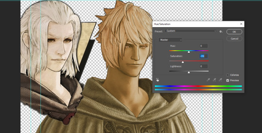
Step 11: Click on your character layer and go to image->Adjustments->Hue/Saturation (note: you will see I dragged in the official Hades portrait as a point of reference to work off of). Adjust the saturation till you are happy.
Step 12: Go to image->Adjustments->Color Balance and adjust the color till you are happy. In this example, since Eric is also wearing the Sophist robe, I tried to match that color to Hades' Sophist robe color.
Step 13: Once you are happy, drag the "Template.png" into the project and scale that to the size you want. Make sure it is completely covering the character. If it's not, you can just use paint more of it with the brush tool to extend it till it covers everything.

Step 14: Hide the "template.png" layer and select your character layer. Use the magic wand tool to select the outside of the character.
Step 15: With the selection still selected, click on the "Template.png" layer and press delete on your keyboard. You should now be left with a blank in the shape of your character.

Step 16: Drag the"Template.png" layer to be below your character layer. Then click on your character layer and clip it.
Step 17: Click on the "Template.png" layer and add a 2px stroke and shadow to it.
Step 18: Drag "Back_Deco.png" into the project and place it behind your character. Scale it till you are happy with it.
And that's it! Now you can recreate portraits for any NPCs that you want (in theory). A lot of it is also fine tuning to what you want but this should at least give you a decent base to work off of :)
971 notes
·
View notes
Note
ok i have to know
HOW do u make the egdes so… perfect?? like not a pixel of the original image/white pixels appear on the sides of the pngs. and u do it so fast???? how???
I usually just drag the image into remove.bg, it's free and pretty good!
When I want to make high res pngs I use photoshop. I don't know if it's the most efficient way, but this is what I do: 1. drag image into PS, 2. use the automatic eraser tool on the image background, 3. make a new layer with a colored background and place it before the layer with the image (to see any areas that are not yet transparent), 5. switch back to the image layer and use the regular eraser tool to clean up the edges and any stray pixels, 6. remove the layer with the colored background, 7. save as png.
271 notes
·
View notes
Text
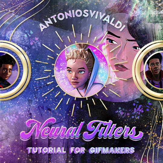


Neural Filters Tutorial for Gifmakers by @antoniosvivaldi
Hi everyone! In light of my blog’s 10th birthday, I’m delighted to reveal my highly anticipated gifmaking tutorial using Neural Filters - a very powerful collection of filters that really broadened my scope in gifmaking over the past 12 months.
Before I get into this tutorial, I want to thank @laurabenanti, @maines , @cobbbvanth, and @cal-kestis for their unconditional support over the course of my journey of investigating the Neural Filters & their valuable inputs on the rendering performance!
In this tutorial, I will outline what the Photoshop Neural Filters do and how I use them in my workflow - multiple examples will be provided for better clarity. Finally, I will talk about some known performance issues with the filters & some feasible workarounds.
Tutorial Structure:
Meet the Neural Filters: What they are and what they do
Why I use Neural Filters? How I use Neural Filters in my giffing workflow
Getting started: The giffing workflow in a nutshell and installing the Neural Filters
Applying Neural Filters onto your gif: Making use of the Neural Filters settings; with multiple examples
Testing your system: recommended if you’re using Neural Filters for the first time
Rendering performance: Common Neural Filters performance issues & workarounds
For quick reference, here are the examples that I will show in this tutorial:
Example 1: Image Enhancement | improving the image quality of gifs prepared from highly compressed video files
Example 2: Facial Enhancement | enhancing an individual's facial features
Example 3: Colour Manipulation | colourising B&W gifs for a colourful gifset
Example 4: Artistic effects | transforming landscapes & adding artistic effects onto your gifs
Example 5: Putting it all together | my usual giffing workflow using Neural Filters
What you need & need to know:
Software: Photoshop 2021 or later (recommended: 2023 or later)*
Hardware: 8GB of RAM; having a supported GPU is highly recommended*
Difficulty: Advanced (requires a lot of patience); knowledge in gifmaking and using video timeline assumed
Key concepts: Smart Layer / Smart Filters
Benchmarking your system: Neural Filters test files**
Supplementary materials: Tutorial Resources / Detailed findings on rendering gifs with Neural Filters + known issues***
*I primarily gif on an M2 Max MacBook Pro that's running Photoshop 2024, but I also have experiences gifmaking on few other Mac models from 2012 ~ 2023.
**Using Neural Filters can be resource intensive, so it’s helpful to run the test files yourself. I’ll outline some known performance issues with Neural Filters and workarounds later in the tutorial.
***This supplementary page contains additional Neural Filters benchmark tests and instructions, as well as more information on the rendering performance (for Apple Silicon-based devices) when subject to heavy Neural Filters gifmaking workflows
Tutorial under the cut. Like / Reblog this post if you find this tutorial helpful. Linking this post as an inspo link will also be greatly appreciated!
1. Meet the Neural Filters!
Neural Filters are powered by Adobe's machine learning engine known as Adobe Sensei. It is a non-destructive method to help streamline workflows that would've been difficult and/or tedious to do manually.
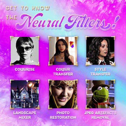
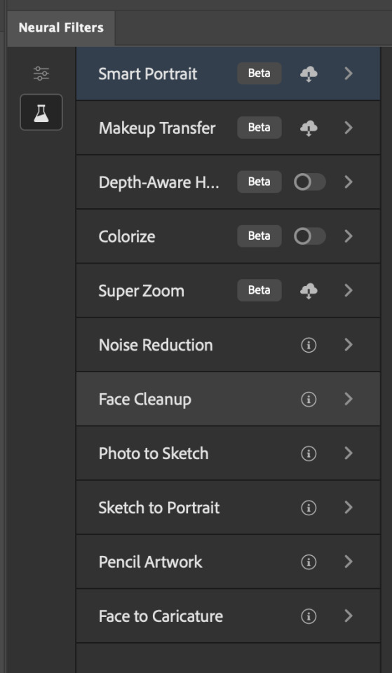
Here are the Neural Filters available in Photoshop 2024:
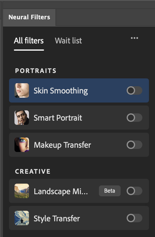

Skin Smoothing: Removes blemishes on the skin
Smart Portrait: This a cloud-based filter that allows you to change the mood, facial age, hair, etc using the sliders+
Makeup Transfer: Applies the makeup (from a reference image) to the eyes & mouth area of your image
Landscape Mixer: Transforms the landscape of your image (e.g. seasons & time of the day, etc), based on the landscape features of a reference image
Style Transfer: Applies artistic styles e.g. texturings (from a reference image) onto your image
Harmonisation: Applies the colour balance of your image based on the lighting of the background image+
Colour Transfer: Applies the colour scheme (of a reference image) onto your image
Colourise: Adds colours onto a B&W image
Super Zoom: Zoom / crop an image without losing resolution+
Depth Blur: Blurs the background of the image
JPEG Artefacts Removal: Removes artefacts caused by JPEG compression
Photo Restoration: Enhances image quality & facial details
+These three filters aren't used in my giffing workflow. The cloud-based nature of Smart Portrait leads to disjointed looking frames. For Harmonisation, applying this on a gif causes Neural Filter timeout error. Finally, Super Zoom does not currently support output as a Smart Filter
If you're running Photoshop 2021 or earlier version of Photoshop 2022, you will see a smaller selection of Neural Filters:

Things to be aware of:
You can apply up to six Neural Filters at the same time
Filters where you can use your own reference images: Makeup Transfer (portraits only), Landscape Mixer, Style Transfer (not available in Photoshop 2021), and Colour Transfer
Later iterations of Photoshop 2023 & newer: The first three default presets for Landscape Mixer and Colour Transfer are currently broken.
2. Why I use Neural Filters?
Here are my four main Neural Filters use cases in my gifmaking process. In each use case I'll list out the filters that I use:
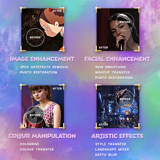
Enhancing Image Quality:
Common wisdom is to find the highest quality video to gif from for a media release & avoid YouTube whenever possible. However for smaller / niche media (e.g. new & upcoming musical artists), prepping gifs from highly compressed YouTube videos is inevitable.
So how do I get around with this? I have found Neural Filters pretty handy when it comes to both correcting issues from video compression & enhancing details in gifs prepared from these highly compressed video files.
Filters used: JPEG Artefacts Removal / Photo Restoration
Facial Enhancement:
When I prepare gifs from highly compressed videos, something I like to do is to enhance the facial features. This is again useful when I make gifsets from compressed videos & want to fill up my final panel with a close-up shot.
Filters used: Skin Smoothing / Makeup Transfer / Photo Restoration (Facial Enhancement slider)
Colour Manipulation:
Neural Filters is a powerful way to do advanced colour manipulation - whether I want to quickly transform the colour scheme of a gif or transform a B&W clip into something colourful.
Filters used: Colourise / Colour Transfer
Artistic Effects:
This is one of my favourite things to do with Neural Filters! I enjoy using the filters to create artistic effects by feeding textures that I've downloaded as reference images. I also enjoy using these filters to transform the overall the atmosphere of my composite gifs. The gifsets where I've leveraged Neural Filters for artistic effects could be found under this tag on usergif.
Filters used: Landscape Mixer / Style Transfer / Depth Blur
How I use Neural Filters over different stages of my gifmaking workflow:
I want to outline how I use different Neural Filters throughout my gifmaking process. This can be roughly divided into two stages:
Stage I: Enhancement and/or Colourising | Takes place early in my gifmaking process. I process a large amount of component gifs by applying Neural Filters for enhancement purposes and adding some base colourings.++
Stage II: Artistic Effects & more Colour Manipulation | Takes place when I'm assembling my component gifs in the big PSD / PSB composition file that will be my final gif panel.
I will walk through this in more detail later in the tutorial.
++I personally like to keep the size of the component gifs in their original resolution (a mixture of 1080p & 4K), to get best possible results from the Neural Filters and have more flexibility later on in my workflow. I resize & sharpen these gifs after they're placed into my final PSD composition files in Tumblr dimensions.
3. Getting started
The essence is to output Neural Filters as a Smart Filter on the smart object when working with the Video Timeline interface. Your workflow will contain the following steps:
Prepare your gif
In the frame animation interface, set the frame delay to 0.03s and convert your gif to the Video Timeline
In the Video Timeline interface, go to Filter > Neural Filters and output to a Smart Filter
Flatten or render your gif (either approach is fine). To flatten your gif, play the "flatten" action from the gif prep action pack. To render your gif as a .mov file, go to File > Export > Render Video & use the following settings.

Setting up:
o.) To get started, prepare your gifs the usual way - whether you screencap or clip videos. You should see your prepared gif in the frame animation interface as follows:

Note: As mentioned earlier, I keep the gifs in their original resolution right now because working with a larger dimension document allows more flexibility later on in my workflow. I have also found that I get higher quality results working with more pixels. I eventually do my final sharpening & resizing when I fit all of my component gifs to a main PSD composition file (that's of Tumblr dimension).
i.) To use Smart Filters, convert your gif to a Smart Video Layer.
As an aside, I like to work with everything in 0.03s until I finish everything (then correct the frame delay to 0.05s when I upload my panels onto Tumblr).
For convenience, I use my own action pack to first set the frame delay to 0.03s (highlighted in yellow) and then convert to timeline (highlighted in red) to access the Video Timeline interface. To play an action, press the play button highlighted in green.

Once you've converted this gif to a Smart Video Layer, you'll see the Video Timeline interface as follows:

ii.) Select your gif (now as a Smart Layer) and go to Filter > Neural Filters
Installing Neural Filters:
Install the individual Neural Filters that you want to use. If the filter isn't installed, it will show a cloud symbol (highlighted in yellow). If the filter is already installed, it will show a toggle button (highlighted in green)
When you toggle this button, the Neural Filters preview window will look like this (where the toggle button next to the filter that you use turns blue)

4. Using Neural Filters
Once you have installed the Neural Filters that you want to use in your gif, you can toggle on a filter and play around with the sliders until you're satisfied. Here I'll walkthrough multiple concrete examples of how I use Neural Filters in my giffing process.
Example 1: Image enhancement | sample gifset
This is my typical Stage I Neural Filters gifmaking workflow. When giffing older or more niche media releases, my main concern is the video compression that leads to a lot of artefacts in the screencapped / video clipped gifs.
To fix the artefacts from compression, I go to Filter > Neural Filters, and toggle JPEG Artefacts Removal filter. Then I choose the strength of the filter (boxed in green), output this as a Smart Filter (boxed in yellow), and press OK (boxed in red).
Note: The filter has to be fully processed before you could press the OK button!
After applying the Neural Filters, you'll see "Neural Filters" under the Smart Filters property of the smart layer

Flatten / render your gif
Example 2: Facial enhancement | sample gifset
This is my routine use case during my Stage I Neural Filters gifmaking workflow. For musical artists (e.g. Maisie Peters), YouTube is often the only place where I'm able to find some videos to prepare gifs from. However even the highest resolution video available on YouTube is highly compressed.
Go to Filter > Neural Filters and toggle on Photo Restoration. If Photoshop recognises faces in the image, there will be a "Facial Enhancement" slider under the filter settings.

Play around with the Photo Enhancement & Facial Enhancement sliders. You can also expand the "Adjustment" menu make additional adjustments e.g. remove noises and reducing different types of artefacts.

Once you're happy with the results, press OK and then flatten / render your gif.
Example 3: Colour Manipulation | sample gifset
Want to make a colourful gifset but the source video is in B&W? This is where Colourise from Neural Filters comes in handy! This same colourising approach is also very helpful for colouring poor-lit scenes as detailed in this tutorial.
Here's a B&W gif that we want to colourise:

Highly recommended: add some adjustment layers onto the B&W gif to improve the contrast & depth. This will give you higher quality results when you colourise your gif.
Go to Filter > Neural Filters and toggle on Colourise.
Make sure "Auto colour image" is enabled.
Play around with further adjustments e.g. colour balance, until you're satisfied then press OK.
Important: When you colourise a gif, you need to double check that the resulting skin tone is accurate to real life. I personally go to Google Images and search up photoshoots of the individual / character that I'm giffing for quick reference.
Add additional adjustment layers until you're happy with the colouring of the skin tone.
Once you're happy with the additional adjustments, flatten / render your gif. And voila!

Note: For Colour Manipulation, I use Colourise in my Stage I workflow and Colour Transfer in my Stage II workflow to do other types of colour manipulations (e.g. transforming the colour scheme of the component gifs)
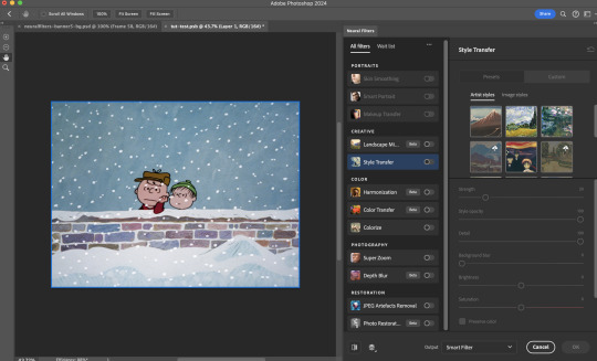
Example 4: Artistic Effects | sample gifset
This is where I use Neural Filters for the bulk of my Stage II workflow: the most enjoyable stage in my editing process!
Normally I would be working with my big composition files with multiple component gifs inside it. To begin the fun, drag a component gif (in PSD file) to the main PSD composition file.
Resize this gif in the composition file until you're happy with the placement

Duplicate this gif. Sharpen the bottom layer (highlighted in yellow), and then select the top layer (highlighted in green) & go to Filter > Neural Filters

I like to use Style Transfer and Landscape Mixer to create artistic effects from Neural Filters. In this particular example, I've chosen Landscape Mixer
Select a preset or feed a custom image to the filter (here I chose a texture that I've on my computer)
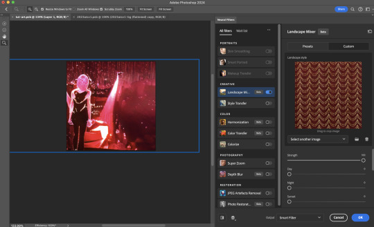
Play around with the different sliders e.g. time of the day / seasons
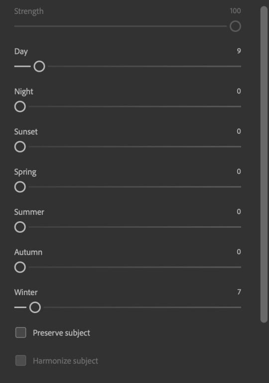
Important: uncheck "Harmonise Subject" & "Preserve Subject" - these two settings are known to cause performance issues when you render a multiframe smart object (e.g. for a gif)
Once you're happy with the artistic effect, press OK
To ensure you preserve the actual subject you want to gif (bc Preserve Subject is unchecked), add a layer mask onto the top layer (with Neural Filters) and mask out the facial region. You might need to play around with the Layer Mask Position keyframes or Rotoscope your subject in the process.
After you're happy with the masking, flatten / render this composition file and voila!

Example 5: Putting it all together | sample gifset
Let's recap on the Neural Filters gifmaking workflow and where Stage I and Stage II fit in my gifmaking process:
i. Preparing & enhancing the component gifs
Prepare all component gifs and convert them to smart layers
Stage I: Add base colourings & apply Photo Restoration / JPEG Artefacts Removal to enhance the gif's image quality
Flatten all of these component gifs and convert them back to Smart Video Layers (this process can take a lot of time)
Some of these enhanced gifs will be Rotoscoped so this is done before adding the gifs to the big PSD composition file
ii. Setting up the big PSD composition file
Make a separate PSD composition file (Ctrl / Cmmd + N) that's of Tumblr dimension (e.g. 540px in width)
Drag all of the component gifs used into this PSD composition file
Enable Video Timeline and trim the work area
In the composition file, resize / move the component gifs until you're happy with the placement & sharpen these gifs if you haven't already done so
Duplicate the layers that you want to use Neural Filters on
iii. Working with Neural Filters in the PSD composition file
Stage II: Neural Filters to create artistic effects / more colour manipulations!
Mask the smart layers with Neural Filters to both preserve the subject and avoid colouring issues from the filters
Flatten / render the PSD composition file: the more component gifs in your composition file, the longer the exporting will take. (I prefer to render the composition file into a .mov clip to prevent overriding a file that I've spent effort putting together.)
Note: In some of my layout gifsets (where I've heavily used Neural Filters in Stage II), the rendering time for the panel took more than 20 minutes. This is one of the rare instances where I was maxing out my computer's memory.
Useful things to take note of:
Important: If you're using Neural Filters for Colour Manipulation or Artistic Effects, you need to take a lot of care ensuring that the skin tone of nonwhite characters / individuals is accurately coloured
Use the Facial Enhancement slider from Photo Restoration in moderation, if you max out the slider value you risk oversharpening your gif later on in your gifmaking workflow
You will get higher quality results from Neural Filters by working with larger image dimensions: This gives Neural Filters more pixels to work with. You also get better quality results by feeding higher resolution reference images to the Neural Filters.
Makeup Transfer is more stable when the person / character has minimal motion in your gif
You might get unexpected results from Landscape Mixer if you feed a reference image that don't feature a distinctive landscape. This is not always a bad thing: for instance, I have used this texture as a reference image for Landscape Mixer, to create the shimmery effects as seen in this gifset
5. Testing your system
If this is the first time you're applying Neural Filters directly onto a gif, it will be helpful to test out your system yourself. This will help:
Gauge the expected rendering time that you'll need to wait for your gif to export, given specific Neural Filters that you've used
Identify potential performance issues when you render the gif: this is important and will determine whether you will need to fully playback your gif before flattening / rendering the file.
Understand how your system's resources are being utilised: Inputs from Windows PC users & Mac users alike are welcome!
About the Neural Filters test files:
Contains six distinct files, each using different Neural Filters
Two sizes of test files: one copy in full HD (1080p) and another copy downsized to 540px
One folder containing the flattened / rendered test files
How to use the Neural Filters test files:
What you need:
Photoshop 2022 or newer (recommended: 2023 or later)
Install the following Neural Filters: Landscape Mixer / Style Transfer / Colour Transfer / Colourise / Photo Restoration / Depth Blur
Recommended for some Apple Silicon-based MacBook Pro models: Enable High Power Mode
How to use the test files:
For optimal performance, close all background apps
Open a test file
Flatten the test file into frames (load this action pack & play the “flatten” action)
Take note of the time it takes until you’re directed to the frame animation interface
Compare the rendered frames to the expected results in this folder: check that all of the frames look the same. If they don't, you will need to fully playback the test file in full before flattening the file.†
Re-run the test file without the Neural Filters and take note of how long it takes before you're directed to the frame animation interface
Recommended: Take note of how your system is utilised during the rendering process (more info here for MacOS users)
†This is a performance issue known as flickering that I will discuss in the next section. If you come across this, you'll have to playback a gif where you've used Neural Filters (on the video timeline) in full, prior to flattening / rendering it.
Factors that could affect the rendering performance / time (more info):
The number of frames, dimension, and colour bit depth of your gif
If you use Neural Filters with facial recognition features, the rendering time will be affected by the number of characters / individuals in your gif
Most resource intensive filters (powered by largest machine learning models): Landscape Mixer / Photo Restoration (with Facial Enhancement) / and JPEG Artefacts Removal
Least resource intensive filters (smallest machine learning models): Colour Transfer / Colourise
The number of Neural Filters that you apply at once / The number of component gifs with Neural Filters in your PSD file
Your system: system memory, the GPU, and the architecture of the system's CPU+++
+++ Rendering a gif with Neural Filters demands a lot of system memory & GPU horsepower. Rendering will be faster & more reliable on newer computers, as these systems have CPU & GPU with more modern instruction sets that are geared towards machine learning-based tasks.
Additionally, the unified memory architecture of Apple Silicon M-series chips are found to be quite efficient at processing Neural Filters.
6. Performance issues & workarounds
Common Performance issues:
I will discuss several common issues related to rendering or exporting a multi-frame smart object (e.g. your composite gif) that uses Neural Filters below. This is commonly caused by insufficient system memory and/or the GPU.
Flickering frames: in the flattened / rendered file, Neural Filters aren't applied to some of the frames+-+
Scrambled frames: the frames in the flattened / rendered file isn't in order
Neural Filters exceeded the timeout limit error: this is normally a software related issue
Long export / rendering time: long rendering time is expected in heavy workflows
Laggy Photoshop / system interface: having to wait quite a long time to preview the next frame on the timeline
Issues with Landscape Mixer: Using the filter gives ill-defined defined results (Common in older systems)--
Workarounds:
Workarounds that could reduce unreliable rendering performance & long rendering time:
Close other apps running in the background
Work with smaller colour bit depth (i.e. 8-bit rather than 16-bit)
Downsize your gif before converting to the video timeline-+-
Try to keep the number of frames as low as possible
Avoid stacking multiple Neural Filters at once. Try applying & rendering the filters that you want one by one
Specific workarounds for specific issues:
How to resolve flickering frames: If you come across flickering, you will need to playback your gif on the video timeline in full to find the frames where the filter isn't applied. You will need to select all of the frames to allow Photoshop to reprocess these, before you render your gif.+-+
What to do if you come across Neural Filters timeout error? This is caused by several incompatible Neural Filters e.g. Harmonisation (both the filter itself and as a setting in Landscape Mixer), Scratch Reduction in Photo Restoration, and trying to stack multiple Neural Filters with facial recognition features.
If the timeout error is caused by stacking multiple filters, a feasible workaround is to apply the Neural Filters that you want to use one by one over multiple rendering sessions, rather all of them in one go.
+-+This is a very common issue for Apple Silicon-based Macs. Flickering happens when a gif with Neural Filters is rendered without being previously played back in the timeline.
This issue is likely related to the memory bandwidth & the GPU cores of the chips, because not all Apple Silicon-based Macs exhibit this behaviour (i.e. devices equipped with Max / Ultra M-series chips are mostly unaffected).
-- As mentioned in the supplementary page, Landscape Mixer requires a lot of GPU horsepower to be fully rendered. For older systems (pre-2017 builds), there are no workarounds other than to avoid using this filter.
-+- For smaller dimensions, the size of the machine learning models powering the filters play an outsized role in the rendering time (i.e. marginal reduction in rendering time when downsizing 1080p file to Tumblr dimensions). If you use filters powered by larger models e.g. Landscape Mixer and Photo Restoration, you will need to be very patient when exporting your gif.
7. More useful resources on using Neural Filters
Creating animations with Neural Filters effects | Max Novak
Using Neural Filters to colour correct by @edteachs
I hope this is helpful! If you have any questions or need any help related to the tutorial, feel free to send me an ask 💖
#photoshop tutorial#gif tutorial#dearindies#usernik#useryoshi#usershreyu#userisaiah#userroza#userrobin#userraffa#usercats#userriel#useralien#userjoeys#usertj#alielook#swearphil#*#my resources#my tutorials
515 notes
·
View notes
Text
Photoshop Tutorial #1 - Change Background & Add Reflections
Before & After


You will need
Photoshop
Internet Access
I was inspired to make this tutorial after facing a dilemma in my game. I wanted my sims to swim in Brindleton Bay, but, shock horror, the water there is not swimmable. Luckily, I know how to change the background of my screenshots to make it appear as though it is - and I'm going to bring you through the process of how!
Starting off, in game, I brought my sims to Tartosa and got my desired shot. Then, heading over to Brindleton Bay, I got some shots of the horizon that I wanted as a backdrop.
Here's a picture I took:

Okay! Let's open up Photoshop!
For reference, I have Photoshop 2024, but most if not all of the features I've used should be included in older versions too.

Here's our image! Now I'm selecting the Background layer in the layers panel and press CTRL J twice to create two duplicates.
I'll turn off the bottom two layers for now, (by clicking the eye button, for newbies) and go to the properties panel. this should be on the right hand side, above the layers panel, but if it isn't, simply go into window > properties to switch it on.
With the layer selected, I click remove background and voila! Photoshop has... er... done her best to remove the background (she sometimes gets it wrong, but at least it's a help)
You'll see that a layer mask has been created. (circled in image).

If you haven't used layer masks before, the only important thing to know is that black will erase and white will add.
So with my brush tool (shortcut B) selected and set to black, I can go around the image and erase all of the parts I don't want.
If you have a steady hand and a tablet/cintiq you can do the same job a little quicker with the lasso tool (shortcut L) by selecting any unwanted area and simply pressing delete
Once I've removed all that needs to be removed, I see that there's a little slice of her hair that needs to be added. I can change the brush colour to white and paint it in.
Done! Easy!

Okay, let's switch off this layer for now, and switch on the one beneath it.
This is the layer I want to make look like the Brindleton Bay sea. So I'll make sure to pull an image of the water up as reference for colour.
This time I'm going to create a layer mask using the polygonal lasso tool
It's easy.
Find the lasso tool in the tool panel on the left of screen (the third icon from the top - or by pressing L on your keyboard)
Left click & hold, and a menu will pop up. Select the polygonal lasso tool.
Click around the area you'd like to mask, in my case, the sea. Tip: if you hold down the shift key while clicking, you will be able to create perfectly straight lines.
Click on the layer mask button at the bottom of the layers panel (pictured)
Everything except the selected area should disappear!

A small thing here, but I don't want the reflection of the rock in the water in my picture. I'll select the layer (not mask), take the eyedropper tool (shortcut i) with the sample set to all layers, and use a soft brush (B) to paint it away.

Next I'm using adjustment layers to edit the colour of the water, to try and make the blue turquoise paradise look more like the horrible green bog water of the bay.
You'll find these next to the mask button in the layers panel.
For my picture, I'm using hue/saturation for the colour and levels for the light. you can fiddle around with any of the adjustment layers to find what works for you.
I've shown the adjustments I've made for my specific scene below, just for reference.
When I'm happy with the colours/lighting, I select all adjustment layers (shift + L click to select multiple), then right click and choose create clipping mask. This is to ensure that the adj layers don't affect any other parts of the image, just the area I want it to.
And there! My water is looking sludgy, just like I wanted.

Okay! I've decided that I'd like some texture in the water. It always annoys me that sims water looks so flat. So here's where Pinterest enters the story.
I like Pinterest because unlike Google, the majority of the images are not watermarked. You're also slightly less likely to find AI slop.
I wanted some water ripples, so I searched for something like Water Texture, found one I liked, and dragged and dropped it into my photoshop file.
From here, I transformed it (CTRL + T) by resizing & rotating the bounding box, then grabbing the corners while holding CTRL to create some kind of perspective that works for the image.
I didn't bother bringing it all the way to the horizon, because I intend to fade that out with a gradient anyway. I had to sacrifice the bottom of the image for the sake of correct perspective, but that's fine. I will crop that out later.
With the texture layer selected, set the blending mode to soft light. It blends nicely!

Now! Another layer mask! These are our friends
With the texture layer still selected, I create a layer mask.
This time, because I had nothing in the image selected first, the layer mask will appear white. That just means nothing has been masked yet.
With it selected, I find the gradient tool (shortcut G) if you press G and the paint bucket tool is activated, simply navigate to the tool panel on the left of the file, hold the paint bucket tool down and select gradient.
I'll change the colour to black, and make sure I have the foreground to transparent gradient selected.
Other settings are pictured.

I'll drag the gradient over the area I want to mask. In this case, the top of the water texture to make it appear as though it's fading away towards the horizon.
(Doubly make sure you've selected the mask, not the layer while performing this action.)
Looking good!
Time to drag the layer above your adjustment layers and create a clipping mask again.

Alright! Let's do the background.
I'll drag that image of Brindleton Bay that I took earlier into the file.
I want to place it below my sea layer, and above that original background layer (I am going to leave that untouched for insurance reasons)
Then, using the move tool (shortcut V) I'm simply going to move it to the correct place. Basically I just want the horizon lines to match up.
Tip: hold the shift key to drag an image in a straight line.
Enter to confirm.
You can see that the sky is now unfinished, but it's such an easy fix. I'll just select the sky colour with the eyedropper tool, then use the paint bucket tool & brush tool to fill in the sky.
Done!

Now - note that the sea doesn't quite blend in with the background. To fix this, I'm going to take my eyedropper tool (shortcut i) and select some of that dark green colour beneath the mountains.
I will create a layer (+ button on the base of the layer panel) and drag it above that sea texture layer I created earlier.
Then I'll create a layer mask to clip it to the sea.
I'm grabbing that gradient tool again (G) and creating a nice gradient on the horizon.
The horizon line is a little sharp, in my opinion, I want it more faded. So, using a soft brush (B) and that same green colour, I'm going to create a new layer & place it above that green gradient, this time I'm not clipping it.
Holding down the shift key, I'm going to draw a straight line right across the horizon. This helps to blend it all together a bit better.

Now! for Reflections!
Firstly, I'm going back to that sky layer with the Brindleton Bay mountains, and I'm going to duplicated by pressing CTRL + J
I'm dragging it above the sea layer, but below all of the other clipping masks. This will automatically create a clipping mask for the new layer.
Next, I'm going to edit > transform > flip vertical
With the move tool (V) I'm moving the image upwards so that the horizon lines meet and it looks like the lighthouse and mountains are reflecting in the sea.
Note: make sure auto select is off while using the move tool on a layer that lies beneath several others.

This leaves a little bit of a mess on the bottom on the canvas, which can be fixed by creating a layer mask & the gradient tool set to black, and dragging a gradient over the bottom of the image until it blends nicely into the sea.

With the mountains reflection done, I'm going to move onto the people.
I'll turn that top layer that I worked on earlier back on.
Then I'll duplicate it (CTRL + J)
Right click on the layer mask of the duplicate and select Apply Layer Mask from the dropdown. This simply bakes the layer mask into the image. Usually I try to edit non-destructively as much as possible, but in this case it's fine to destroy.
I'm going to rename this layer Reflection
With that new, reflection layer selected, I'll go to Edit > Transform > Flip Vertical, just like before.

I want to add a little water/shimmer effect to their faces, so I'm going to Filter > Distort > ZigZag
I'll just mess around with the settings here until I find something I like.
This is optional, obviously, I've done reflections in edits without doing any of this, but it just adds something a little extra to water scenes, I think.
Here's a time I didn't do that.

anyway, my sims are looking a bit crazy now, but it's fine, because I'm going to, you guessed it, add a layer mask and gradient.
But first, using the lasso tool (L) I'm going to draw around one of the characters and drag her into place. I can move the bounding box around a bit to make her shoulders meet in the right place.
Then I'll do the same for the other character.
Tip: Hold CTRL while moving, warping or resizing something for a smoother, more precise experience.

Now, I'm doing what I said I would, and I'm creating that layer mask. We know how to do it by now, right?
Make sure everything is deselected first by pressing CTRL + D
Create layer mask
Select Gradient (G) set to black
Drag gradient over bottom of reflection (If you ever need more precise gradients, you can select the round gradient at the top of the file. I needed it to blend the reflection on the right more, because the characters are not at an even height.)
In the Layer panel, change opacity to 20% (or whatever you like) and hit Enter to confirm

Using Crop (shortcut C) I'm going to crop my image, cut off that pesky strip at the bottom and just basically make the framing of the picture a little bit nicer.
And viola!

I could edit this image more, throw in bounced light, splashes etc etc but I'll leave it like this.
The only thing I will add in is a little lens flare to indicate sun, so again, I'm taking to Pinterest and searching for one that works.
Tip: make sure the background of a lens flare image is completely black. Otherwise it will be harder to use.
Below is the one I have chosen.
I'm simply changing the blending mode to screen, moving it and resizing it with the transform tool (T), and fiddling with the opacity until I'm happy.

That's it!
I made a video running through this whole process, with all of my shortcuts in the bottom right hand corner so that you can see exactly what is happening.
youtube
If there are other tutorials you'd like to see in future, please let me know!
And I'm more than happy to answer any questions!
Good luck <3
#sims 4 tutorial#editing tutorial#sims editing tutorial#sims 4 edit#photoshop editing#photoshop tutorial#sims 4 community#simblr#Youtube#sims 4 photoshop tutorial
183 notes
·
View notes
Note
hi! would it be possible to post a tutorial of how you created the shapes in this set /post/753222419295158272 thank you :)
sure I made the gifset a while ago so don't have the psds saved but i decided to make a new gifset with a similar shape effect and show you how i made that :)
tutorial below the banner/cut

first start by making and colouring your base gif as you'd like. for the example i'm making today i'd like a pink gif.
for simplicity i'll put all the colouring layers in a group so it is easier to see what's going on with the shapes, but this is not a step i usually take.

once you've got your base gif ready search for the image/shape you would like to appear on your gif. in this case i searched for glinda's crown :)
make sure the image has no background and save it. if needed go to https://www.remove.bg/ and remove the background from the image then save it.
open your saved image in photoshop and drag it onto your gif. typically i drag it on the gray area outside the image canvas so it will land in the centre of the canvas.


if the image is too big resize it by using the transform function (ctrl +t)

right click the image layer and go to "Blending Options" (you can also do this by double clicking the layer (but not on the layer name as this will prompt renaming the layer)


go to color overlay and change the colour to white with blend mode normal and click ok

convert the new image layer to a smart object by right clicking and selecting the relevant option

change the blending mode of the new smart object to 'difference'

go back into blending options now and change the color overlay to the desired colour with the blending mode set to 'color'

at this point you can also add a stroke and drop shadow


this results in the below result

i noticed a bit of background missed from remove.bg

so i now add a layer mask and mask over the errant mark


and that's the basics of how to make a shape like the one in the gifset you linked. you can now add any text or other embellishments you may like.
a few other tips:
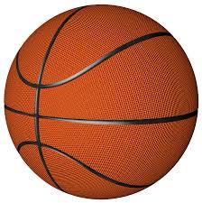
play around with your stroke settings, i did this a lot when making the so highschool gifset (e.g. i think the basketball one used the centre option)
the stroke option will outline what doesn't have a solid fill. to get each part of the basketball outlined like it is in the gifset i used an image like the first one below where the lines on the ball were also transparent to get the strokes i wanted (if that makes sense). if the whole image was solid, like the second image the outline would just be a circle basically.

in most cases the method i showed here is the best method, but for the so highschool book image i did something slightly different where instead of doing a straight smart object i also duplicated the shape on top with all the details left in. i applied the same effects to the bottom layer as above and on the duplicated layer also set that to difference and added a color overlay like the above


gives a result like this:

you can tweak how this looks a bit by using a selective colour layer clipped to the top layer. i wanted a bit more definition on the hat so i ended up with this after tweaking the neutral and blacks channels

overall my advice is to experiment and see what you like as that is what i basically do :)
#asks#resources#ps help#usergif#allresources#yeahps#completeresources#resourcemarket#dailyresources#tutorials#photoshop tutorial#*mine#i hope this helps/makes sense
66 notes
·
View notes
Text
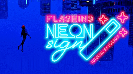
HOW TO: Make Animated Neon Text
Hi! No one asked for this tutorial, but this is one of my favorite typography effects as of late — so I thought I'd share how I do it. You can see this effect in the first gif of this *NSYNC Celebrity set and the last gif of this Anthony Bridgerton set. Disclaimer: This tutorial assumes you have a basic understanding of gif-making in Photoshop. It's also exclusively in Timeline and uses keyframes for the fading effect seen on the blue text.

PHASE 1: PREP YOUR BASE GIF
1.1 – Choose a dark scene. This effect looks best contrasted against a dark background. You can definitely do it with a bright background, but just like a neon sign irl, you only turn it on in the dark/at night — so keep that in mind!
1.2 – Determine the length of your clip. Depending on how much you want your text to flash or fade in, you'll want to make sure you have a scene long enough to also allow the text not to flash — reducing the strain it takes to actually read the text. For reference, my gif is 48 frames.
1.3 – Crop, color, etc. as you would. New to gif-making? Check out my basic tutorial here!
PHASE 2: FORMAT YOUR TEXT
Before we animate anything, get your text and any vectors laid out and formatted exactly as you want them!
2.1 – Finding neon sign fonts. It's easy as going to dafont.com and typing "neon" into the search bar!
2.2 – Fonts I used. Neon Glow by weknow | Neon by Fenotype | Neon Bines by Eknoji Studio
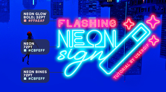
And to not leave my fellow font hoarders hanging, the font for "tutorial by usergif" is Karla (it's a Google font) 🥰
2.3 – Group your text layers. (Conditional) If you plan on having multiple text layers like I did and you want them to appear connected (like how the last letters of "NEON" and "sign" intersect with the wand icon), I suggest putting the layers into groups according to color (the shortcut to group layers is Command+G). If you don't group your text and just apply the outer glow settings to each individual layer, you'll end up with something like this:
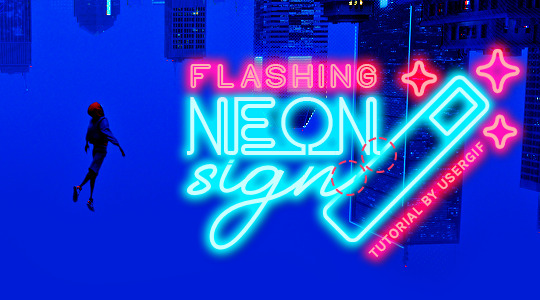
—where you can see the glow overlap with the line, instead of the smooth connection you see in my final example gif. I'm using 2 colors for my text, so I made a group for red and a group for blue.
2.4 – Apply Outer Glow. Right-click your text layer (or your group if you have several layers) and select "Blending Options" to open the Layer Style menu. Check "Outer Glow" and feel free to play around with the settings until you like the way your text looks!
Your outer glow color should be darker and more vibrant than the color of the text itself. The text should be within the same color family but much brighter and, sometimes, almost white (see Step 2.2 again for my text colors).
Here are the settings for the Red Glow (the glow color is #FF3966) and Blue Glow (#00F0FF):
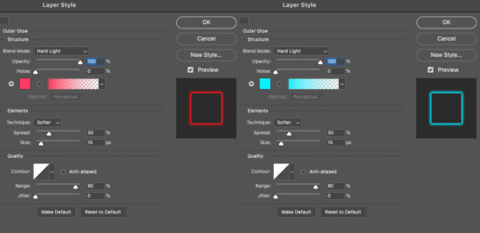
These aren't always my exact settings but they're pretty close to my standard. I always set the blend mode to Hard Light and usually have the opacity at 100%.
For every gif I use this effect on, I like to play around with Spread and Size. Spread will make the glow look denser and "expand the boundaries" (source: Adobe) and Size will diffuse the glow and blow it out so it covers a larger area (Adobe says it "Specifies the radius and size of blur").
2.5 – Duplicate your text layer/groups and remove glow. We're only going to be animating the glow on our text, and since doing this affects its opacity/visibility, we want to preserve the base text by creating a duplicate.
I just hit the Command+J shortcut to duplicate my groups and delete the Outer Glow effects, making sure that the "No Glow" version is above the "Glow" version:
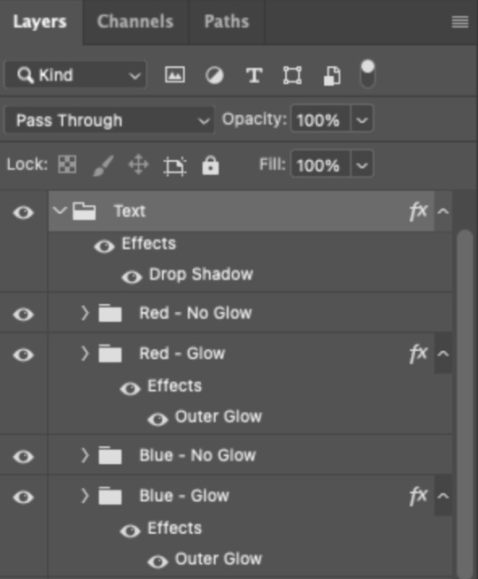
I also put all these groups into one group called "Text" for organization and so I could apply a drop shadow to all the elements for better visibility.
PHASE 3: CREATE THE FLASHING EFFECT
This is for the effect you see on the RED text in my gif!
3.1 – The 0.03-Second Rule If you've read any of my animation tutorials before, you're probably already familiar with this rule. In my experience (and for reasons I can't explain), Video Timeline pauses every 0.03 seconds (try clicking the forward button a few times, you'll probably find a "duplicate" or paused frame). So, keep all your layers a duration of 0.03-second increments (e.g. 0.06 or 0.09 seconds can also work) and align them on the Timeline at 0.03-second intervals. If you don't follow this rule, you'll get duplicate frames when you export, resulting in a choppy final gif.
3.2 – Trim and arrange your text layers. Only on the layers/groups WITH the Outer Glow effect, trim them into several segments of varying lengths where the glow will be "on" (visible) and leaving spaces where the glow should be "off."
Typically, I'll have a mixture of 0.06 and 0.03-second text. That's when the glow will be visible. Between each "flash" of visibility, I've got a 0.03-second blank space, baby *pen clicks* and I'll write your name:
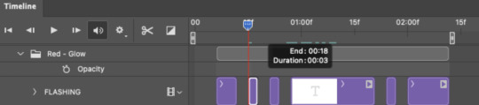
The layers shown above are arranged with a few flashes and two long segments of no flashing. This is the order and duration of each segment shown above (purple = visible segments):
0.06 blank, 0.06 visible, 0.03 blank, 0.03 visible, 0.03 blank, 0.03 visible, 0.03 blank, 0.24 visible (the long bit where "FLASHING" doesn't flash at all), 0.03 blank, 0.03 visible, 0.03 blank, 0.12 visible
(I only did this for the text that says "FLASHING" to give it a glitching effect. The other red text keeps the glow visible starting at the first long segment.)
PHASE 4: CREATE THE FADE-IN EFFECT
This is for the effect you see on the BLUE text in my gif!
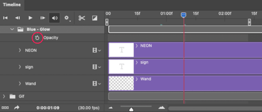
4.1 – Animate using the Opacity Keyframe. Again, we're only touching the layers/groups WITH the glow effect. If you only have one layer of text, you'll find the Opacity Keyframe by clicking the film reel icon:
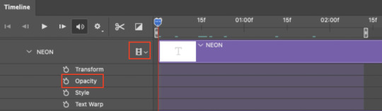
If you're working with groups like me, you'll find it in the Timeline panel under the group when it's expanded:
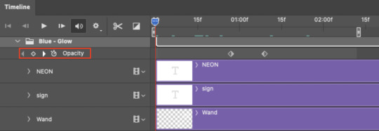
As you can see, I already added my keyframes (lil diamond babies). And luckily, it's super easy to do!
4.2 – Add the ending Keyframe first. We're starting at the end because our layers/groups are already at 100% opacity. Drag the playhead (the blue arrow attached to the red vertical line) to a spot where you want the glow to be 100% opaque — this is where the glow will be fully "on" or visible. [Again, follow the 0.03-Second Rule. You will get duplicate frames regardless when using keyframes (this will be explained in the note in Phase 5), but abiding to the rule will mitigate the amount of dupes you get.]
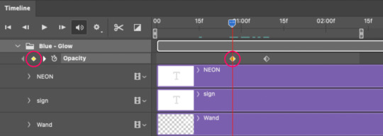
Then, click the clock icon by "Opacity" to place a keyframe:
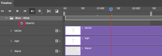
4.3 – Add the starting Keyframe. Go backward from the ending Keyframe you just placed (I went back 0.12 seconds — but you can play around with the duration of the fade, just keep it a multiple of 0.03):
And drop another keyframe, this time by clicking the diamond icon by "Opacity":
4.4 – Reduce the opacity on the starting Keyframe. Keeping that keyframe you just placed selected, go to the layers panel and reduce your layer's/group's opacity to 0%:
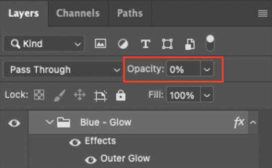
Now, this Outer Glow will slowly fade from 0% to 100% opacity.
And just for a visual aid, here's where my fade-in keyframes are in relation to my flashing segments:
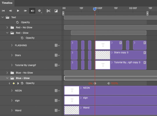
To refresh your mind, the 0% Opacity Keyframe starts when "FLASHING" is visible for 0.24 seconds (the first long segment of visibility).
With these keyframes, you'll get a smooth fade-in à la ✨light switch with a dimmer✨
PHASE 5: EXPORT
Yay, we're finished! Convert from Timeline back to Frames and export your gif!
NOTE: If you only did the flashing effect and followed my 0.03-Second Rule, you shouldn't have any duplicate gifs. BUT if you included the fade-in effect using keyframes, you WILL have duplicate frames. 'Tis the nature of keyframes. 🤷♀️ I had 4 extra frames where the fade-in starts, which I deleted. So, as always, I recommend checking your frames when you convert from Video Timeline back to Frame Animation — and manually delete any duplicate frames.
Sorry this tutorial is so long 🙈 I over-explain so you're not just mechanically copying steps, but understanding the WHY behind each step! Thanks for bearing with me
If you have specific questions about this tutorial, feel free to send a message to usergif and I'll try my best to help! :)
More USERGIF tutorials • More resources by Nik • USERGIF Resource Directory
#typography#gif tutorial#completeresources#usershreyu#useryoshi#userelio#userzaynab#userives#usertreena#usercim#userrobin#userkosmos#usersalty#userhella#alielook#uservalentina#uservivaldi#*usergif#*tutorial#by nik#flashing gif
809 notes
·
View notes
Text
So uhm... I did a thing...
✨Character Info Template✨
UPDATE 11.24.24: this template now has a page theme version! if you're not a fan of templates, you can get the code to use it as an interactive multimuse page >here<
Been meaning to do this a long time ago (and actually started it but never finished it, lol) as a way to share some more information about my ocs without needing to use a custom page theme, but mostly because I haven't found any page theme that looks exactly as I want and allows this much customization.
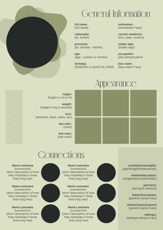
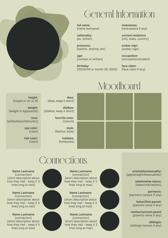
There are two versions and both are almost exactly the same; but the example shown in the left has an 'appearance' section which is small and has few quick facts regarding the oc's appearance; while the example on the right has a 'moodboard' section instead which allows you to add more info about your oc.
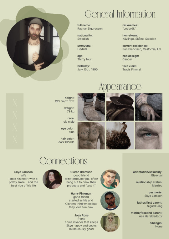
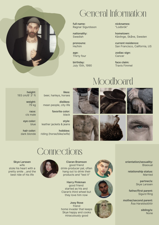
You can change every section/title to fit your needs like I did in the examples below; I personally removed some categories as well and got rid of some connections as this oc doesn't have that many close friends/partners to fill the original template. However, I also included an extra separated 'connections' section in the download in case you want to add more people and more information.
I recommend you stick to square-shaped pictures so it's easier to fit them to each section. Also if and when you edit the information or section titles, please select only one line at a time to replace it so you don't lose the text format. (Titles shouldn't change because that's a single format/font within the same text box, but should it change you can always hit ctrl+z hehe) When you're done, I strongly recommend you save this as a .png instead of .jpg so it's the best possible quality!
Last but not least, this is a .psd file. So you'll need either Photoshop (I did this with Photoshop Portable, but it supports newer versions of PS and it *should* support older versions too) or Photopea to open and edit this file.
Credits: Adobe Photoshop, Inter font, Golften Vintage font
>DOWNLOAD< (patreon but free :p)
(note: I'm posting this with my gaming blog because I think my fellow gamers might be interested in this, but please consider giving credits to me if you use this template by tagging @synindoodles instead of this blog)
More info on how to use and edit this template below the cut!
Layers:
>Each layer is properly named and categorized. The general layers such as the background, the icon shape and background shapes are under the groups.
>If you don't want to see/don't need one of the connections' pictures and information, I recommend you find which one it is (1, 2, 3, 4, 5 or 6) and click on the eye symbol next to the layer to hide it so that way if you ever need it, it won't be truly gone.
>To edit a text section, simply find the layer (such as General Information>Left Column) and double click on the 'T' symbol next to the layer. That way it will open edit mode and allow you to edit the text, just don't hit delete or enter while everything is selected or you'll erase it :p
>Main text sections aren't separated, they're blocks of text. I recommend you don't remove the amount (for example, if you downloaded the version with the 'appearance' section, which has 5 sections of information, don't remove the fifth line.) Either leave it empty or replace it with another data, otherwise it will look weird. The 'general information' section might look good even if you remove a few lines, just don't get rid of the whole block of text.
Pictures:
>To add a new picture, simply paste it over this document and move it using the Move Tool.
>To frame it (so it becomes a circle or fits over the shape you want), make sure the picture layer is over the layer you want, then while holding alt click between the two layers. [For example, if you want to add a new main oc picture: 1) paste the pic you want, 2) move it with the Move Tool so it's covering the big circle, 3) once you've fully covered the shape (if it isn't you can resize it by right clicking on it then on 'free transform', sometimes you might need to hold shift to proportionally resize it) make sure the newly pasted pic layer is over the layer named "picture goes here", 4) hold the alt key and hover your mouse cursor over the line between your pic layer and the circle layer until you see an arrow going down symbol, once you see it click it and tah dah! your picture should now have the same shape as the circle! - you can further move it if it doesn't fit the way you want with the Move Tool (;
Others:
>You can change every color, font and section to your liking, just don't change the general layout of the template.
>To hide/show the guides (those bright blue lines all over the document), click ctrl+,
>'Inter' is a free font and you can get it in the link above (linked with the credits), Golften Vintage is not, but you can get the demo version >here< (just scroll down and click the blue download button under license). I will not tell you how to install fonts as it might be different for everyone (for me it's C:/Windows/Fonts and I just drop the zipped files (except the .txt one) there), but google is your friend.
>I can't think of anything else that needs to be said here, but if you have any other question feel free to send me an ask or dm and I'll help you out!
>Last but not least, a like is appreciated if you plan to use this plus consider tagging @synindoodles if you use it <3
#psd template#template#characters page#muses page#muse page#muse template#character template#character page template#oc page#oc page template#synindoodles#rp resources#rp template#roleplay resources#roleplay template#writers resources#writing resources#writing template#writers template
192 notes
·
View notes
Text
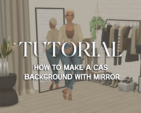
Tutorial: How to Make a CAS Background With Functional Mirror
Overview
This is something that has been highly requested so I hope this tutorial will be helpful for the sims 4 cc community!
This tutorial will have 2 parts for creating 2 different types of CAS "room" backgrounds. Part 1 (The Easy Way) uses a template I created for you to use your own 2D images/screenshots with a simple rectangular mirror. Part 2 (The 3D Room) will result in a better quality background, but it’s not a beginner friendly project so I don’t recommend trying it if you’ve never made any cc before. I will not cover the basics of cc making here, only what’s relevant to making a CAS bg using my template specifically. The Sims 4 Studio forum has a ton of great tutorials for everything else.
In my own research & experimentation, I noticed that (as far as I can tell) EVERY other CAS room with a functional mirror seems to be derived originally from LittleDica's CAS room [link] I want to acknowledge credit to LittleDica for their CAS background which I studied as a reference. But to be clear this tutorial and my templates are NOT derived from another creators' work; I created mine from scratch and it took a lot of time and effort. My version is much more simple and more compatible with Sims 4 Studio because there are no extra mesh groups or diffuse maps. I also made a great effort to make the reflection in the mirror more realistic for the size of the room. I hope you will be able to use this resource to create your own beautiful CAS backgrounds! ♥
Also in case you missed it, you can download my CAS background used in the preview [here] (it is slightly different from the template package.)
Requirements:
Sims 4 studio
Image editor (Ideally photoshop)
my templates (attached below)
—————
Part 01: The Easy Way
The easiest way to create a CAS background with mirror is to use my attached templates.
The PSD template is the best option, but for those of you that don’t have Photoshop, there is a PNG version as well.
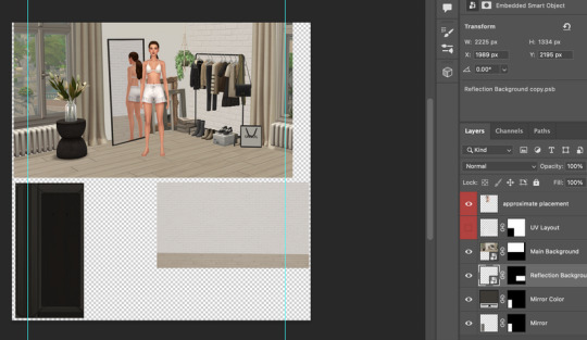
You will need 2 images; one for the main background, and one that will be reflected in the mirror. The large top area is the main background, and the smaller rectangle at the bottom is what will be reflected in the mirror behind your sim.
In the image editor, paste your images and resize them to fit into the outlined areas.
For framing your screenshots, it’s important to understand that the mirror is actually just floating in space in front of a flat background. That means you’ll have to fake the perspective a bit and that may require some trial and error to get right. I recommend taking multiple screenshots at a variety of angles so you have options to work with. Use the model sim as a guide to help you with placing your background image. (Don’t forget to hide the model sim and UV layout when you’re done!)
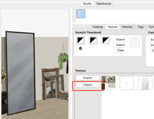
Save as .PNG or .DDS and import it into the template package in Sims 4 Studio.
That’s it! My goal was to make it super easy for you. Remember to only use one CAS background in your mods folder at a time since it's an override. Also note that it is not compatible with 'cas blob remover' since the instance for the dropshadow is now used as the mirror.
TOU — PLEASE READ:
I give permission to the Sims community to use my template files and modify them as needed to create your own CAS backgrounds. This took months of work, researching and experimenting, so please respect the effort I put into creating this resource by agreeing to these simple terms:
Don’t re-upload my files. Don’t claim my work as your own. If you use my templates for your cc, please share credit with my username (Lijoue) and link to my Patreon page. If you make any money from cc created with my templates, please consider making a donation via my Patreon. It is greatly appreciated.
download template files here
Part 02: The 3D Room
to be continued…
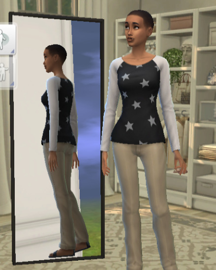
This part will take more time to finish because there’s a lot more steps involved in creating a 3D CAS room. In the meantime, the template should be enough of a starting point for those of you that already know how to make cc objects, since I already handled the hardest parts. Just understand that the mirror reflection is not automatically calculated, meaning that if you move the mirror in the mesh, you will need to change the Mirror Plane Normal and Mirror Plane Offset in S4Studio Warehouse to match the new angle or position. Otherwise it may look unrealistic or worse, it could reflect the eerie wasteland world that the CAS room is set in. (pictured below)
#sims 4 creator#sims 4 tutorial#the sims cc#ts4 maxis cc#maxis match cc#sims 4 maxis match#ts4 tutorial#sims 4 studio#ts4 custom content#ts4 cc#cas backgrounds#sims 4 cas
193 notes
·
View notes
Text

ANIMATED TEXT TUTORIAL: ★★✩✩✩ Difficulty: Beginner/Intermediate
This is a step by step tutorial on how I did the text for my Pink Venom swinging text.
We are going to be making this text:
Before I start, you WILL need Adobe After Effects, but I will show you step by step how to achieve this.
Tutorial below the cut!
✔ Step One: Composition Open After Effects and create a new project, then a new composition making sure the composition matches your gif settings. (ex: 540 x 540, 2 seconds, 30 fps)


✔ Step Two: Creating Our Text Add a new text layer. It should be the same as Photoshop, you can just select the text tool and write what you want. Customize the text to say what you want and change the font and size to your liking.


We should have something like this:

✔ Step Three: Adding Our Animation There should be a box that says "Effects & Presets", in that box you can search for effects. Search for "Explosion". It will be under Text > Miscellaneous.

Select the first one and you can either drag it on top of your text layer or just double click it with your text layer selected. Sliding the time, we should have something that looks like this:

✔ Step Four: Adjusting the Animation With your text layer still selected, press "U" on your keyboard. This will open our key frames for the animation.

It's a lot to look at but don't worry, we will only be focused on Amount and Opacity, and I will make this as easy as possible for you. On the Opacity setting, click on the little time clock. This will remove the keyframes. Make sure your opacity is set to 100%.

Next we are going to adjust the amount so that it explodes INWARD instead of OUTWARD. Find a good spot where the letters are out and add a new keyframe the same way you would on Photoshop.
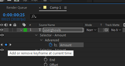
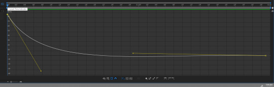
Now swap the two keyframes so the explosion animation is reversed. Next we are going to remove the scale keyframes. Click on the second stop watch for the second amount parameter, and make sure that one is set to zero.

We should be left with only ONE thing that is keyframed. And the keyframes should look like an hourglass.

You can stop now and leave it or we can make it a little smoother and more fun looking.
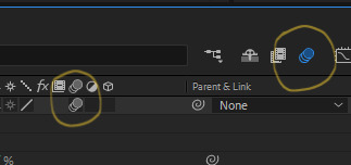
✔ Step Five: Editing the Graph & Adding Motion Blur To add a motion blur to our text, we just need to select the three little circle stack on our text layer. Also double check that the same symbol is highlighted blue up top.

Now we have motion blur. Next we are going to adjust the graph. To open the graph select the little graph icon and then select our keyframed buy clicking on the amount parameter.


Now our graph should look like this:
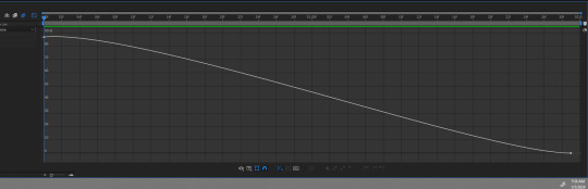
Select one of the dots and two little arms should pop up and we can drag those around to adjust the graph (the speed of our animation). Adjust to your liking, but to make it look like the text in the tutorial, my graph looks like this:
With my graph, the animation looks like this:

Now all the hard work is done!
✔ Step Six: Exporting Now to export our video so it can be turned into a gif: Go to File > Export > Add to Render Queue

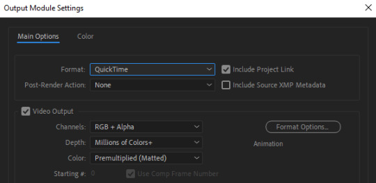
We should be at a menu like this:
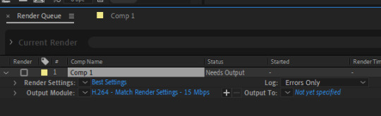
Click on the part that is blue next to "Output Module" and another box should pop up. For format: change to "Quicktime" For Video Output > Channels: select "RBG + Alpha" (this will ensure our background is transparent)
Select "OK" and then under "Output to" select where you want the video to save.
Now all you have to do is Render.
Once that finishes, YOU'RE ALL DONE!
Import video to frames as you usually would in Photoshop, just don't change the frame delay.
Treat it like a normal text layer/smart object.
As usual, you can play around with all the animation settings to get the look you want, this is just the basics for the main animation.
It looks like a lot but the difficulty is minor once you get the hang of the steps.
Any questions you have during the process just DM me! ★
150 notes
·
View notes
Text
Save your sims' love story: photo frames, templates, and couple questionnaires 🧡💛❤️
Relationships are full of warm moments that you want to cherish forever. The first meeting, funny conversations, shared photos – all of these become part of your story. And if traditional albums and posts feel too ordinary, templates are here to help! They allow you to beautifully preserve memories, share your couple’s journey, and even plan special events. Choose the one that best represents your story and create something truly meaningful!

Most of these templates are available only in English. For convenience, you can upload the image to Google Translate. You can also edit any template by covering the original English text and adapting it to any language that suits you and your audience.
Meet My Couple by @misspepeshi

This challenge was created for Valentine's Day and quickly gained a lot of participants. After all, who doesn’t love sharing stories about their favorite couples? But there’s nothing stopping you from using these wonderful templates anytime! With 10 different color options and plenty of ways to customize them – stickers, text, decorations – you can make each one uniquely yours. Above, you can see an example of a template designed by the author.
Download here
Sims Templates for Photoshop by @areleksiyamoonlight

These Photoshop templates are a perfect way to capture your special day in style. Polaroid shots, film strips, and other creative designs will make your photos look even more special. It’s not just a collage – it’s a visual story of your relationship. Add some sweet details and heartfelt words, and you’ll have a stylish poster or a beautiful page for your album.
Download here
Photomatic (Self Photo Studio) Template by @simmanhi

Photo booths at festivals and fairs always create a fun atmosphere. Why not bring that energy into your couple’s photos? This template helps turn your playful snapshots into a stylish retro photo booth strip.
Download here
Valentine's Dump by @playwithsyd

"Will you be my Valentine?" Of course, yes! And now it’s time to decorate your home with beautiful memories. This template is designed as a digital photo frame, where images change in a slideshow format. A perfect way to preserve your sweetest moments.
Download here
Crush chart by @00-v2
Love stories begin in different ways, and this template is a great way to capture that. It’s an unusual choice for this collection, but why only talk about established couples? A crush template can be the starting point of your sims' love story. Fill it out from each sim’s perspective to see how it all began and what they were looking for in a future partner.
Download here
Compact Ship Template for Photoshop by @marissources

Love interactive designs? This template is perfect for those who want flexibility in their layouts. It consists of multiple modules that can be customized however you like. Want to focus on photos? Easy. Need more space for text? That works too. Be sure to check the link to see a video showcasing the different module options.
Download here
Get to know my OTP by @oakwolves
This template requires no Photoshop skills at all! Simplicity and romance are its biggest strengths. There’s no need to write long descriptions, just add symbols of your love, such as a shared song, special dates, or your favorite photos.
On the left is the original template, and on the right is a simple example of how you can fill it out. Don’t limit yourself to a white background or pre-written prompts: let the blank template inspire you to create something uniquely yours. It has a transparent background, so you can experiment with colors and layouts, easily removing or rearranging elements.
Download here
Ship aesthetics by @dacquoisettes
This is the fastest way to introduce your couple, because it’s almost entirely made of pictures! You can create a ship in not just five minutes, but in a single minute. We’ve shown you an example of how to make it cute and vibrant: just pick fun images to represent your sims and, of course, don’t forget to add their photos! You can easily find images and decorate your couple’s profile in Canva or similar apps.
Download here
Wedding Ship Meme by @heyneon
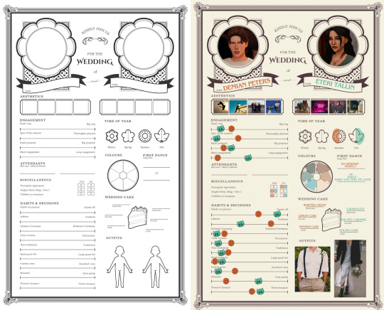
Planning a wedding? Then this template is for you! It helps you beautifully share the details of your upcoming celebration, and its transparent background makes it easy to customize. There are versions not just for couples, but also for groups of three or four people. In fact, you can use it for any event – friend gatherings, family celebrations, and other meaningful occasions.
Download here
Other couple templates
Sometimes, you just want to share fun details about your relationship by filling out a simple questionnaire. Who said "I love you" first? How did you meet? What are your favorite traditions? Below, you’ll find several more couple-themed templates that let you highlight key moments and fun facts about your relationship.
Understand my ship template by @gibbarts

Download here
My ship in 5 minutes by @moontruffles

Download here
Relationship in 5 minutes by @snowwoofxd

Download here
Your [ Them <3 ] Ship by @causticflower
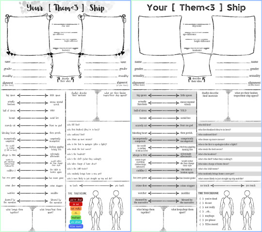
As the creator mentions, the template comes in two versions: one is visually detailed, while the other is simpler and easier to read. Pick the one that suits your style best!
Download here
🌱 TheSimsTree
❓ Support 🌸 Our Blog
#thesimstree#sims4legacy#sims#plumtreeapp#sims date#sims community#showusyoursims#sims ideas#maxismatch#legacy challenge#ts4 legacy#sims 4 legacy#simspiration#simsblr#sims blog#ts4cc#simstagram#simsfamily#sims4stories#simstree#thesims4#the sims#sims 4 gameplay#sims templates#valentines day#couple templates#sims photo
20 notes
·
View notes
Text
A friend of mine was telling me her recent encounter with an actress who was super nice to her fans, and it reminds me of my first time meeting Stephanie Beatriz at Twin Cities Con last month. She was so funny, easygoing, sincere, considerate, and dedicated as a person.
See longer and more detailed descriptions of my experience that day below:
Stephanie was one of the earliest guests that arrived at her autograph table, just a few minutes past 10:00 am, when the exhibition hall opened for the day. There was a bit chaos of the lining arrangement, as the VIP holders got lined up right in front of the autograph table and leading towards the check-in table in the back. Stephanie was confused by the situation and asked a fan in my front about what was happening. After they explained in detail, she joked that they should be in charge. Her voice was already sounded very deep and a bit hoarse, unlike her usual high pitch.
When the line finally went around and back to the autograph table, I saw her kind of frowning at her autograph for one of the first fans (the fan probably said something about the outcome was good) and she made fun of herself, “why am I being so judgmental about my own autograph?”
When it came to my turn, I remember telling her that I just became a fan since Hazbin Hotel but I caught up on Brooklyn 99 later on. Her eyes lighted up and asked me what I thought of the show, and like many fans, I told her that I loved it and now it was my comfort show, and that was why I put together my costume with the elements of both Vaggie and Rosa Diaz. She was delightfully surprised when she registered my full costume, and then I pulled out the prop knife from my belt below the table (you know, like the way Rosa pulled it). She laughed, “ Yep, gonna pull it out of nowhere.”
I’m not going into details of her solo panel and the Hazbin panel, as I have posted all my records of the solo one, and the latter one was posted by someone else on YouTube. I will just note that her voice got more and more hoarse during the back-to-back panels, a lot worse than when I got my autograph. FYI, she said in her More Better podcast recently that she had been sick since she returned from Toronto, which was just a couple of days before this convention. Also, initially her name was not listed for the Hazbin panel in the program, but it was announced right before the panel that she would return for this panel as well.
After the panels, I headed back to the exhibition hall to wait for my turn of photo-ops with Erika Henningsen and Stephanie. Have to say, Stephanie is really tall in person. And Erika was very kind to offer to hold the spear as I was in the middle.
For the one photo taken solely with Stephanie, I asked her if she could hold my prop knife, and in return, she asked me if I wanted to act tough together. After I thanked her and leaving, she said, “you are going to love this one.”
Of course I love how it turns out. A bit background is that all props were inspected outside the exhibition hall and zipped with a hot pink cable tie when passed the check. So I had this long ugly ass zip-ties on both handles of my prop knife and spear. It was easy to get the zip-tie off the spear because the handle was detachable, but not the knife. And I did not have scissors with me. When I handed Stephanie the prop knife, I thought I would need to remove the zip-tie in photoshop later. But Stephanie was so observant and considerate that she hid the zip-tie with her hand by holding on the tip of that handle! Compare the photos above and you will see it. I felt warmth in my heart when I got the print and realized what she did for me.
When I brought the printed photo for the second autograph, the waiting line was insanely longer compared to it in the morning. I was probably in line for more than an hour and a half. One of the volunteers there told me that Stephanie’s line was the second longest of this day, with Hayden Christensen’s being the longest.
I remembered Stephanie’s voice was very much gone when I finally got my turn around 7:00 pm. I handed her the print and she commented, “Look how tough we were.” I told her that I really appreciated her being here today even so with her voice like that, because I was moving to Canada very soon. I further explained that the US immigration process took too long so I opted for another option. She made a 👎 sign, agreeing that American immigration sucked. She also asked me which city I was moving to, and when I replied Toronto, she said that Toronto was the best city in Canada and she loved it there when she shot Twisted Metal Season 2. Finally I thanked her again and she said it was nice meeting me.
The exhibition hall was supposed to close at 7:00 pm, but I heard that she stayed beyond 8:00 pm to finish with all the fans in line, which she did not have to, actually. A volunteer told me on the day before that it was up to the guests how long they decided to stay for the signing. Also, there were guests who pulled out due to sickness or scheduling right before the convention, but she not only showed up but spent the entire day talking to fans, even though she was obviously sick and lost her voice. I mean, this woman really is a super human being, and deserves all the love and praises.
#stephanie beatriz#she was amazing that day#twin cities con#tcc 2024#twin cities con 2024#photo op#autographs#vaggie#hazbin hotel#rosa diaz#brooklyn 99#cosplay#celebrity encounters#erika henningsen#long post#my posts
22 notes
·
View notes
Note
your icons are soooooo so cute honestly!!! i wanted to ask if there's any way you can make a tutorial on how to make them? of course if you want, if you don't want to, that's okay :)
Hi! I really appreciate that you like my icons, thank you so much! 💖💖💖🥹
It's been a long time since I've done a tutorial so I hope I can explain it well haha
So I will explain how i go from the original picture and the final icon below:
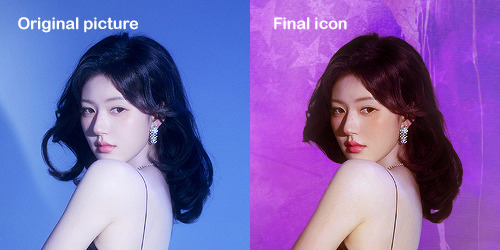
I'm using Adobe Photoshop 2024 but you can use other versions too!
First, I create a 250x250px document and apply a random color fill layer to be the background color of the icon, you can do it by going on Layer > New Layer Fill > Solid color (the color in this moment doesn't matter because I change them later according to the picture I choose to edit).
Then I place the picture I want, adjust the size to make the subject on the center and apply some smart sharpen:
I apply some adjustments to try to color correct if the original picture using Levels, Selective Color and Color Balance to get something like this:
If you want to know the exact adjustments settings I used on this picture you can download the psd here.
To remove the background, I do the hack where I go to the Properties panel (Window > Properties) and click on the "Remove background" option. It's not always that I will get a perfect result but I think it makes easier for me to adjust the little details such as hair and accessories, etc. And I do that using the Lasso tool (shortcut L).
Now, with the background removed I pick a color that I think will match the icon in the Color Fill layer that I created before. To make the background more "fun" I like to add a Gradient Fill layer (Layer > New Layer Fill > Gradient) with a color that might go well with the one I picked earlier to make a smooth and light gradient.
My result until now:
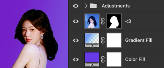
Now it comes the fun: adding textures! I like to add some textures to make the icon more lively and I usually download them on deviantart or on resources websites. You can download some cool textures here, here and here. On this part I really test a lot of textures with different Layer blending. There are a lot of different blending options so you can try as much as you want.
Other thing I like to do is add a clipping mask above the subject layer when I want to color something specific in my picture such as the hair, the clothes or even applying some "fake" blush on the cheeks. I do this adding a new layer, then using the shortcut option (or alt) + command (or ctrl) + g to make it a clipping mask and then using the Brush layer to color what I want. For the blending mode I usually use Soft Light and sometimes Color if I want the color to really stand out.
And in the end I will have something like this:
And my layer tab will be like this:
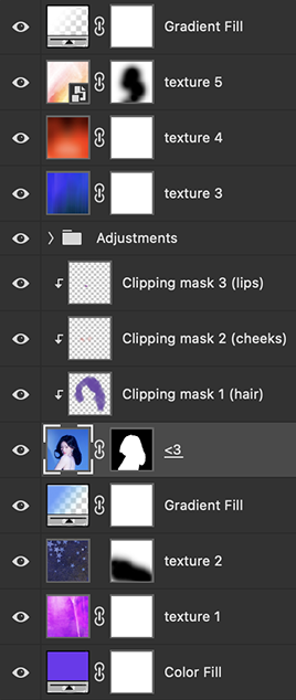
For using on the dashboard I usually resize it to 100x100 to make it look more sharper and defined but it's really a choice, you can already start making your icon using the size you want, I just prefer doing on 250x250px because i'm used to.
To save it I use the shortcut shift + option (alt) + command (ctrl) + s to save it for web with these settings:
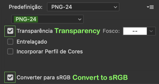
And that's it! Sorry for not going to deep in each step but I guess you can get the feeling when you try making your own icons! Is really about trying different methods and things until you became satisfied with your result.
95 notes
·
View notes