#how to make logo in photoshop
Explore tagged Tumblr posts
Visit Tumblr Blog
Explore Tumblr blogs with no restrictions, modern design and the best experience.
Last Seen Tumblr Blogs


Fun Fact
There were a total of 171.5 billion posts on Tumblr in 2019.
Text
Professional brand logo design.
It was created by adobe illustrator And Photoshop. Hope you like it.Professional quality Work Give you and support. Thank you Ahshan Habib
#logo design#logo design tutorial#how to design a logo#logo design process#logo design illustrator#design a logo#logo#professional logo design#graphic design#will paterson logo design#brand design#logo design ideas#logo design technique#photoshop logo design#design#logo design tips#illustrator logo design#how to make a logo#logos#design process#professional logo design illustrator#monogram logo design#how to design a personal brand logo#ahshanhabib
1 note
·
View note
Text
youtube
#Atzohaib#Zohaib#AtZohaib Youtube#AtZohaibYT#sabasahi#saba#atsabasahi#atsaba#how to create restaurant & food logo#restaurant branding#restaurant logo design photoshop#how to make a restaurant logo#restaurant logo inspiration#how to create restaurant logo#organic food logo design#food logo images#hotel logos#text logo#food truck logo#kitchen logo animation#chef logo design#restaurantlogo#Canva#logodesign#tutorial#graphicdesign#restaurantbranding#branding#designskills#stepbystep
0 notes
Text
Modern U letter design in Illustrator
#letter design#photoshop art#illustrator design tutorial#logo design#tutorials#how to#bangla tutorial#how to make logo
0 notes
Text
So y'all have seen the Williams F1 Logo before, yeah?
well get ready, becaues I am about to ruin your day!
where does one even begin with this. i am sorry in advance. -just a poor learning graphic design student, who simply tried to enjoy their saturday evening
The Logo
For anyone that doesn't know, here's the Williams F1 Logo. Entirely unedited, copied straight from Wikipedia:

Now like many fans, I actually quite enjoy this logo. I like the modern, sharp edges of it and it's simple yet intriguiging design. It's memorable, while also easily recognizable as a W. I also really enjoy the colour choice (this, however, is entirely a personal preference.)
(entire rant under the cut. please keep reading this took years off my life span.)
How did we even get here?
Let's start at the beginning. How did we even get here? Well I, a poor poor learning graphic designer, was watching this lovely video from Mr. V's Garage about bad F1 Logo's over the past 35 or so seasons. Very interesting, I can only recommend it (but you don't need to watch the video to understand this post)!
Now, to cleanse the palette at the end of the video, Mr. V included a top 10 GOOD logos from this time span, it was very kind of him.
On P4 of this "Good List," Mr. V placed the current Williams F1 Logo, as pictured above. At first I vaguely agreed with this, believing that he probably simply hadn't noticed one of the things that's been bothering me about that Logo since the first time I saw it up close.
The first sign of Trouble
So, what is this mystery issue, you might ask?
It's simple really. You don't necessarily notice it at a first glance, but something about that logo seems off. Taking a second longer, you may notice it yourself.
No, I mean it, take a minute and go look at the logo. It looks wonky as hell, doesn't it?
Well I can tell you the first thing that I personally noticed. The arms of the W aren't in line with the bottom half, see:

(Graphic by @girlrussell who was so kind to let me use it, as it is way prettier than the one I made)
It's a crooked W. There is no good explanation for this. The rest of the font is perfectly fine, geometrical shapes.

Anyway, the good person that I am I went to point this out to my partner ( @leftneb ) who proceeded to inform me that he, infact, was not aware about this and was, quote, "never going to unsee that."
Now, the good FRIEND that I am, I, of course, proceeded to rush into our broader F1 friendgroup to make them suffer for eternity.
What's the logical next step to take? Of course, fix the logo in Adobe Photoshop, you know, as a joke.
(Disclaimer at this point, I am not necessarily the biggest fan of Williams Management Team. I enjoy ALL their drivers this season. I do NOT enjoy James Vowels. Be warned.)(Also I am aware that he probably did not have an influence on the logo)
Trying to fix it. Oh god, I was so innocent back then
Trying to fix the logo in Photoshop is the worst mistake I could've made. THE worst path to take. I could've just giggled about making my friends suffer (which I succeeded in, by the way) and moved on. Instead I ruined a perfectly good Saturday evening, and for what? I don't know anymore.
Anyway, how was I gonna go about fixing the logo in the simplest way possible? Simplest way I could come up with: slap the thing in Photoshop and put two, mirrored boxes at each side to make the sides line up. Small issue, how do I make the thing actually even? Fix: line them up at the intersecting point with the bottom tips of the W.
Here's the result:

Hey, anyone care to explain to me why in THE LORDS NAME the arms are different sized? I mean, surely they weren't before. Surely, certainly, I must've messed up.
I double, I tripple checked. I made sure everything was lined up and made sense. But no.
It just couldn't be. Something was uneven in this logo, something even deeper. Something I could not have predicted when first taking a closer look. It was at this point I realized I had messed up. What rabbit hole had I stumbled across? Certainly, it couldn't get much worse.
And that's when I noticed.

(pictured above; my genuine reaction)
There's MORE? (oh god, the top isn't lined up)

I couldn't believe my eyes. This is the PINNACLE of the sport, and THIS was the logo of one of the competing teams? I mean, yeah, we have a Visa Cash App RB or a Kick Sauber or even a MoneyGram Haas which are all terrible logos, but at least they're CLEAN. (this has not been checked. If anyone wishes to ruin a nice Saturday evening, feel free to check them and tell me how wrong I was in the previous statement!)
But you can see that there is no end in sight for this post. I'm sure you're as scared as I was at this point. By now we were sitting in VC, discussing the horribleness of this logo. I had long informed my irl's about this, who take said design classes with me. And it was one of them who pointed out the next thing that had been bothering me, but I had not been able to put a finger on up to this point.
thE DISTANCE, HOW DID THEY FUCK IT?

I'm afraid I have to confirm your fears.
Yes, those lines are the same length. According to Photoshop, they're on the same level as well, so no flunking with angles.
The gaps of the arms to the main W are not the same. They're differently sized gaps.
It was clear to us, this logo is inherintely flawed. They're subtle issues, but once you pay attention you start to notice things. It all looks slightly wonky and off centre. And eventually, you get paranoid, and start comparing other angles and sizes. And you will keep finding things. This has ruined my life.
HOOOOOW

Honestly, I don't even know what to say. Yes, yes sadly those lines, too, are the same length. Just copied over from one side to the other and layed over on the same height. I admit, they're not layed over perfectly. I was honestly holding back tears at this point. But the point still stands, you can clearly see a difference in width.
Honestly, the only way I can explain it is that at some point there was a mess up of distance or proportions and whoever was designing the logo couldn't pin it down and tried to restore the visual balance by making manual adjustments. And in all honesty? They kinda did a good job, if that's what's happened. I mean, you notice the crookedness of the arms, and then maybe the difference in height, but the rest you probably will not notice if you don't spend too much time staring at it. (like some of us) And even those issues clearly aren't noticeable to the vast majority, considering I had to go point it out to a group chat for my friends at least to notice.
what the fuck is THAT?
Now, the thing about doing this investigative work of prooving a team you dislike is worse in more aspects than you previously thought, is that you do a lot of zooming in. And zooming in means you might notice bits that yours eyes simply overlooked before, because they were too small.

Here you can witness the top of the middle point, that, for whatever reason, really wants to touch the top border of the Logo. I'm relatively certain that's the highest few pixel in the entire graphic, considering earlier chapter "There's MORE?" I have no idea why it looks like that or why they thought it was necessary for it to not end in a clean point.

I just actually have no idea how to even describe what is going on on the top of the left arm. That left hand side, again, touches the side and is therefore the most-left-pixel in the graphic. I, once again, have no idea the purpose of this. However the RIGHT hand side also makes no sense, as it is the most prominent corner in the whole logo. There's pointed corners, and rounded OF corners, but nothing that is trying to form it's own colony in a distant land that hopefully isn't this god awful logo. I hope that blob gets away. I really do. You go king.
i'm loosing my mind
Anyway, the only reason I could come UP with those weird "reachy-outy-bits" was to establish the dimensions of the logo? But if that was the case, I don't understand why they managed to keep all the other potentially border touching corners clean?


Like, look. Those are clean, sharp corners with some clearance off the borders. I have no clue why they managed it here but not with the others.
guys. please.
Backtrackig a little bit, going back to the positioning of the arms.

Do I need to mention that those lines are both the same length and the same (mirrored) angle? I really hope I don't, because I don't think I could be making this shit up. Like, once you roughly know what you need to look for it just kinda becomes easy to find.
As said before, I genuinely do think that most of these issues happened in a chain-reaction. For example, the distances between the main part and the W wouldn't be as noticeable (and they do get noticeable once you start looking at it) if the angle wasn't fucked. And guess what, there's more fucked angles here! Which ALSO influence this specific area of the logo!
this is just embarrasing for you.

something something same line copied over and mirrored etc etc
It's not as visible but the angles defintely don't line up here as well. As mentioned before, these issues for the most part all influence each other. It doesn't really excuse the issues, in my opinion as a designer, because a big company like this shouldn't have these sort of issues in their logo.
So let's review;
to sum it up,

i cannot even BEGIN to explain to you how big of a fucking JOKE this FUCKING logo is. because, i thought to myself, to round the post out, hey, why not show ALL the issues i pointed out in one picture? that would round it out quite nicely, wouldn't it?
Yeah well, this logo sent STRAIGHT FROM HELL just could NOT let me rest. I had only done the lines visualizing the crooked arms in PAINT up until this point, i.e. I had only pulled both up individually. To make a nice "rounding out" picture I still had to add them into PHOTOSHOP. so i did. i pulled up the line. i mirrored the line.
THE ANGLE IS FUCKING DIFFERENT
none. and i mean NONE of my friends had noticed this before. i need you to understand that we looked at this thing with FIVE pair of eyes, and NONE of us noticed that until i thought to myself "Oh I still need to add these specific lines to have ALL the issues I pointed out in my SILLY TUMBLR POST in ONE image" and i get THAT FUCKING SURPRISE
I was PLANNING to round the post out with a statement on how obviously this isn't a serious post. Here, I even had it all written out already because I accidentally started writing it in the last paragraph:
Of course, this is nitpicking, and it's not that serious. I'm aware of that. AS MENTIONED most of these would not be noticeable if we hadn't gone specifically looking for them.
yeah, well, fuck that. i just spent two hours seething about this logo. i'm ending the post on this instead.

#i am ENRAGED#i managed to actually calm down about it#yk. just typing away#and then i just try to ROUND OUT THE POST#for fucks sake#anyway i know i'm posting this at an hourrendous hour#if you read all the way. reblog? maybe#pretty please#williams f1#williams formula 1#williams racing#formula 1#f1#also apologies for any spelling mistakes i do NOT have the nerve to go back and proofread this
953 notes
·
View notes
Note
hii! i absolutely love your work. i've been getting into trying to make borders myself, and i was wondering if you had any tips on where to find good pngs or do you create everything yourself? i feel like my luck so far hasn't been great but maybe i just don't know how to search for it correctly!
Hello, nonnie! I'm so glad you enjoy my work; thank you for your kind words. ( ˶ˆᗜˆ˵ ) And oh my gosh, it's so nice to see a new GFX creator in the making! One of us, one of us, one us. ~ Welcome to the wonderful world of editing, hehe!
I've compiled a list of websites that I use for my graphics, but please do let me know if you need anything else and I'll be happy to assist!
For general assets, as well as inspiration, I generally use these websites: behance (which is pretty much the industry standard when it comes to graphic design in general, they have cool studios or experienced designers that post their works and/or assets), booth (an independent japanese resources hub with many free and paid assets), huanban (an independent chinese resources hub, same proposal as booth), abdz (mostly focused on typography and branding), dribble (more focused on web applications and design) and envato (templates).
Since I'm colourblind, I'm not always confident about how to compose colours together. So whenever I'm in doubt, I use coolors (to get palettes from images and browse through palette ideas) and colorhunt (which gives ideas for palette themes and motifs).
I love typography a whole bunch, but sometimes it's hard to find that one right font for your project. Whenever I need to look for something else, I always run to these websites: google fonts (when I'm on a budget and want to use 100% free fonts, including for commercial use), 1001fonts (to quickly find fonts based on themes, it has a great tag system), dafont (a big classic huge dabatase of custom fonts), befonts (for more industry standard-leaning fonts) and kerismaker (for those magazine looks). When I want to identify a font used on an image and where I can download/purchase it, I use myfonts and font squirrel. They even give you similar options for free, too!
Suppose I'm specifically searching for illustrations/PNGs I can use on my upcoming project. In that case, I'll either go to flat icons (for websites, applications or presentations), vertex (for 3d icons and/or general vectors), graphic burger (for logo making), cleanpng (for I want a tree PNG and do not want to clean it myself, for example), pngtree (same idea as the previous one, you just search for a word and will see all PNGs related to it) and pngall (self explanatory).
Regarding backgrounds, textures, and photography in general, I rely on websites like pixabay, vecteezy, 3d ocean, morguefile, freepik and isorepublic. They have high-quality photos and videos that you can use on your projects. However, if I specifically need mockups or patterns, I turn to unblast, pacage and ava.
Besides those, you can always search for things on Deviantart and Twitter! Though I do not use those much, I think Instagram and Threads also have pages dedicated to sharing resources. Discord can be a nice place to search for graphic design servers, too.
However, if I cannot find specific resources for a commission/project for whatever reason, then I will make them myself. Be it through photography, drawing or anything else I can get my little hands on.
For the more technical/applications side, the programs I use for my graphics and edits are Adobe PhotoShop 2020, Adobe After Effects 2020, Adobe Illustrator 2020, Clip Studio Paint (for when I need to draw or polish something for specific projects/commissions), and HandBrake (for when I need to make screencaps). My drawing tablet is an oldie, Wacom One.
Hopefully, this can be a nice starting point for you! Please feel free to reblog and/or like this post if you'd like to save it for whatever purpose. ~ I hope you enjoy this journey ahead, and if you need anything else, let me know! You got this! ദ്ദി ˉ͈̀꒳ˉ͈́ )✧
#♡: answered! *#graphic resources#gfx resources#roleplay resources#rph#rp resources#editing resources#carrd resources#editing
79 notes
·
View notes
Text

Continuing to fire on all cylinders to make this Sky 🤝Mononoke collab a reality! 🐲⚖️🌊
Process GIFs and artist commentary below the cut. ⬇️
Left: Process GIF Middle: Just the background, cos I really like how it looks! Right: Illustration without the collab logo
And here are my notes on my inspirations and references. There's a lot of 'em, so instead of embedding relevant images one by one I put them in a callout sheet! For accessibility, I also included transcript (with bonus ramblings) below each sheet.

Ofuda circle modeled in Google Sketchup 2017, then lightly transformed in Photoshop to flare out. I tried my best to hand-draw these, but it the results came out really clunky and stiff. I figured if Mononoke shamelessly utilizes 3D in their show, I can too!
Krill and sky kid composition roughly inspired by the Ayakashi DVD cover illustration. On the surface level, the krill's black-and-red color scheme mirrored that of the bake-neko. Not to mention, in the world of Sky, the krill would be the best fit of a mononoke-like entity. The red background is also a nod to the red skies seen during a shard eruption in Sky.
Sky kid gesture based on the Festival Spin Dancer's Tier 3 poses and the Medicine Seller's iconic pose in the Zakishiwarahi episode as inspiration. This was the idea which springboarded this illustration into existence. I wanted to do my take of the Medicine Seller's pose, but in a more dynamic manner: rotate the pose to a profile position and set the ofuda in a diagonal, flared out arrangement.
Cape inspired by tenbin design featured in the 2024 Mononoke movie. This one's an interesting one - I wanted the cape to be a stiff material that doesn't "flap" when in flight - similar to the Aurora wing capes. It ended up looking like a kite of sorts, which I'm not entirely opposed to! I haven't had the opportunity to showcase the back view of this cape design, but I envision it having some mechanical aspects to it - the "wing" which are flared out in this illustration fold in like moth wings, and a little bell is attached to the "tail" part and it jingles a little whenever the sky kid flaps!
Bandana is based on the Scaredy Cadet's hairstyle from the Season of Assembly. Mask design utilizes the 2023 Days of Style mask and the Nintendo Pack mask as bases. Pretty self-explanatory. I basically went onto the Sky wiki and found the cosmetics that most closely matched what I was looking for. Then if necessary, I went to the Office space to do photoshoots to get the appropriate camera angles for them all.
Seasonal pendant inspired by the classic Medicine Seller's necklace and the eye motif featured in the 2024 Mononoke movie. Possibly the only one-to-one homage to the classic Medicine Seller design here, but his garnet necklace was too good of a match to the seasonal pendant. A side tangent: does the new Medicine Seller possess a necklace, let alone a mirror? So far all the shots of him don't feature it. Fascinating.

Dark dragon krill anatomy references a custom figurine crafted by @/escaflowne_n07 on Twitter. Until I found this, I was honestly at a loss finding reference for this - be it on the internet or during in-game photoshoots. The lighting on the krill in-game focused on its menacing silhouette rather than its structure. And not to mention, getting a close-up shot almost always set off the dark creature's aggro. I have no idea how this guy found the references to put this model together - well done!
Mantas, elder constellations, and sun dog references murals in the Cave of Prophecy. Krill aside, the overall illustration was leaning a little too much towards Mononoke so I tried finding opportunities to insert more Sky into it. Added bonus is that now there's storytelling in the background: during a shard eruption, a giant krill rises from the frothing waves of dark water to hunt down a flock of mantas.
Clouds behind the sun dog reference the ones featuring heavily in the Umibozu episode. This illustration has a lot of ocean theming, so I figured this would be appropriate.
Rendering style of the background is lightly inspired by the 2007 Mononoke illustration. Mainly having a 2D inked style to contrast with the more polished render of the sky kid. Funnily enough, this was a tertiary inspiration, which lead to the discovery in the next point!
Dark water waves and sun dog composition heavily references Hokusai's "The Great Wave". The waves were modified to be bottle-green of the Golden Wasteland's dark waters. The sun dog is in the spot where Mt. Fuji is in the original composition. these were all hand-drawn by the way! I merely emulated the style of the source material. As a side note, I also borrowed the spotted sea spray rendering for the krill's red spotlight.
Background pattern taken from the ofuda design featured in the 2024 Mononoke movie poster. Mainly to add some gritty texture to the sky. I worked pretty hard to replicate this ofuda design as a high-res asset so I wanted to use it more!
#モノノ怪#mononoke 2024#mononoke 2007#kusuriuri#medicine seller#thatskygame#sky cotl#sky children of the light#thatgamecompany#thatskygame fanart#sky cotl fanart#crossover#purplealmonds#2023#🔕
515 notes
·
View notes
Text
WAD: Cover Art
dan is still working on selling the distribution rights for We're All Doomed! so i decided to make some DVD/Blu-ray disc jacket art!
this is my attempt at a traditional jacket design! none of the images used are mine, but i did create the concept and design:
as i was making the first one for myself, i was struck by the fact that 'well, it's for me, so it doesn't have to look like a stereotypical jacket cover' which led me to be more artsy in my approach for the next one:
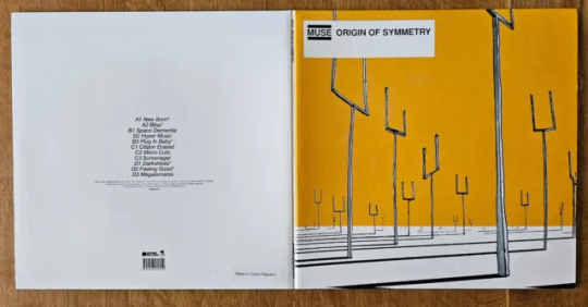
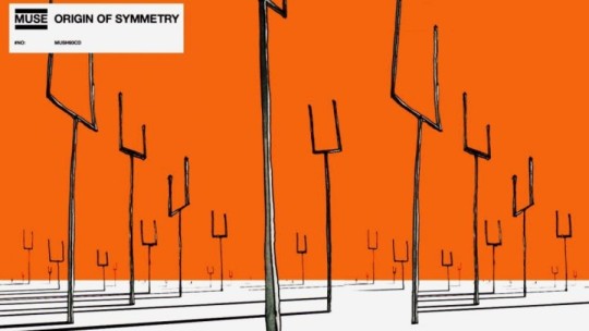
i was really enjoying the creativity and space to explore, so i went looking for more inspiration for a third design. this led me to dan's favourite Muse album: Origin of Symmetry, which i paid homage to:
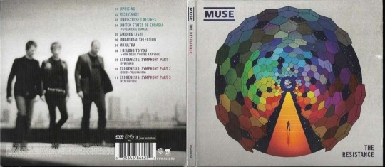
after the first Muse album, i looked at their catalogue to see if there was more inspiration there. i was just thankful dan's favourite was easy stylistically to mimic, unlike say, 2009's The Resistance...
thank you @danielhowell for the inspiration!
nerdy stuff & reference pics below the cut!
General notes
i don't know how to use photoshop! i entirely brute-forced my way through the whole project, and the only tutorial i looked up was for the gradient text in the 4th cover
this wasn't even the original project i was working on! you'll eventually get to see that though
and this one also inspired art for the disc itself so stay tuned 👀
i will do anything for authenticity so these are Full of intentional details
matching fonts is a nightmare
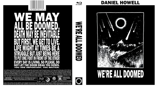
the traditional cover
took the longest, as it was the first.
the barcode numbers are the date of the first video he uploaded on dinof, and the last tour show date (in m/d/y)
i changed 'iceland' to 'poland' on the front cover, as he never actually went to iceland, and poland wasn't ever on the list even though he did go there
the orange may look a little off-center in the front, but these designs need to include space for a spine between the front and back cover, i promise it's right 😂
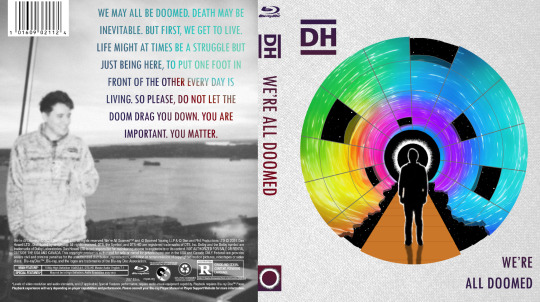
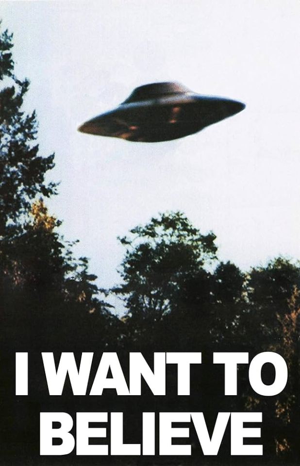
the black and white cover
inspired by the 'i want to believe' aliens poster
the cover art comes from his metal band merch shirt design
i had to manually shrink the text, line by line, and ensure it all lined up on the back!
i even made the logos on the back greyscale
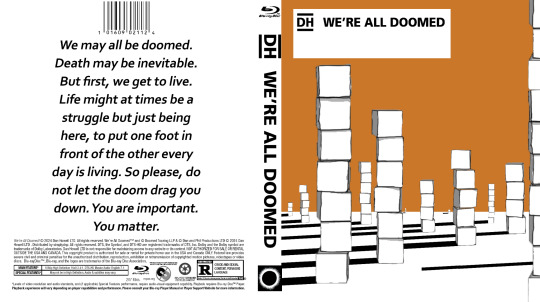
the Muse: Origin of Symmetry cover
a shockingly perfect style for a WAD cover. i'm so glad i used the cubes, even if they couldn't be orange.
there's some versions of the art online where the sky is even more orange and it baffles me how i haven't seen any parallels like this before
the Muse: The Resistance cover
this cover was never supposed to see the light of day! i meant it when i said i was grateful i didn't have to try to adapt this complex design... and yet, i tried anyway.
i did all the grid lines by hand, including the jagged/broken edge parts, shading each section, and then drawing every star.
the hardest part was getting the gradient on the back text to cooperate. photoshop's gradient settings are surprisingly limited
gotta shout out @amazingphil for being the reason i knew what this cover looked like--it's the only muse album i knew the art of before embarking on this quest!
obligatory sob story:
i've been extremely and suddenly ill for 6 months. it is difficult to function moment to moment, but especially in doing little things just for me. this is the first and only art project i've been able to feel inspired to not only work on, but to finish, and despite the pain and long hours, i enjoyed every minute of it. thank you, dan, for creating this space for me to explore, and thank you, everyone here, for being wonderful support during this time 💞
#it's finally here!! i hope you all love them as much as i do#dnp#c.text#dan and phil#daniel howell#phan art#hey phil look at this#we're all doomed#wad#c.art#word#heydanandphil
345 notes
·
View notes
Note
What happened to up the divorce watch? What did I miss?!
Nothing concrete - it's just vibes.
The LA fire charity papwalk was on January 10th. Today is February 21st - that's 6 weeks, to the day. And during these 6 weeks, there was:
The disaster tourism papwalk (Jan 10th) with instantaneous criticism
Delaying her show (the announcement was on Jan 12th)
Clapping back at the criticism from the disaster papwalk (releasing additional footage, saying other celebs were there too, doing a second disaster tourism papwalk to give her donations away)
Rumors about reshooting and reediting the show to clap back at criticism
Vanity Fair
Friends promoting them in magazine interviews
Clapping back at Vanity Fair
The Sussex 2023 Christmas card photo getting leaked which also has the best, clearest look at Lili's face since 2022 (which also led to more accusations/controversy about photoshopping the kids)
The manic Billie Eilish swag video
Way over-the-top PDA from Invictus Games
Leaving Invictus Games early and making a fuss about leaving early
Way over-the-top Valentine's Day post (which makes me think she left Invictus early to be able to post that photo and message)
the Valentine's video making breakfast with the kids
The kids being part of her social media now
The re-re-re-rebranding
Another manic confessional video
Gossip that Charles is butthurt Harry's Birmingham Invictus will overshadow Camilla's 80th birthday and Harry doesn't care
Outcry/criticism about the re-re-re-rebrand
Accusations of plagiarizing her logo/insignia
Accusations of stealing the copyright of the company name
The mood board that has old photos from her old, defunct Instagram, internet fan art, and kid crafts, which is being interpreted as a clapback to criticism about the re-re-re-re-rebrand
Again...it's only been 6 weeks. This is a lot of stuff going down...a press tsunami-like amount of stuff going down, some might say.
While Meghan doesn't have the scale of attention and fame that she did back in 2017 - 2018 when the press tsunami of Fall 2018* was hitting her at all sides from all sides at all times, she still has a kind of notoriety that gets her a lot of attention and she has enough...staying power, I guess, if you will, that the volume of criticism can overwhelm her, the same way it did back in 2018.
Think of it like a wave pool. Everything Meghan does makes waves but every once in while, a big wave comes along that knocks everyone down. It's not a press tsunami because it's not coming at her from all sides at all sides at all times, but there's enough being thrown at her in repetitive succession that she can't handle it. And not only does she have difficulty handling all this criticism herself, she doesn't have the kind power to compel others to defend her the way she did back in 2018 - so she truly is handling her own defense.
And when Meghan has to defend herself, her MO to escalate her activities to distract us from other stuff that's happening. So the more she posts on social media, the more these confessional-style videos come out, the more it feels like she's trying to keep us further away.
So for me right now, it feels like a lot of distraction. Her behavior is more over the top than we've seen recently. She's featuring the kids on her social media, which should raise flags given how intensely protective they are of the kids' privacy. She and Harry have always been overly-PDA, far more than most celeb couples are, but kissing and hugging and being overly touchy the way they were at the Invictus opening ceremony feels like an overreaction to deflect 3 months of divorce rumors.
Now granted, it has been 8 years since Meghan was on social media and - speaking only for myself - I didn't follow her and I didn't give her any attention back then so I don't know if the way she is in these videos now (i.e., manic, hyperactive, fidgety) is how she was 10 years ago. This may very well be her normal and if that's the case, then with time I'll probably downgrade it back to Level 2.
But this behavior from Meghan is not how she's been acting since 2017 - she's usually more composed, more practiced, more in control of herself - which makes me wonder that there's something else going on. In my experience, when someone has such a huge personality difference like this, they're overcompensating and they're hiding something.
Again, let me remind you: I don't know if this is how Meghan was before the BRF pulled her into their orbit. I'm just saying that this version of her, this character (if you will) is different in a smoke, shadows, distraction kind of way because there's way more at stake now than there was back in 2018.
So for me that means upping the stakes on Divorce Watch for now.
*Criticism for pregnancy announcement at Eugenie's wedding, overshadowing the Aussie tour with relationship PR and all the missteps/snafus in her behavior/attitude, getting booted from KP, getting booted from the Royal Foundation, she made Kate cry, the staff leaving one after the other after the other, start of bullying allegations, Angela Kelly, tasting egg
59 notes
·
View notes
Text
𓈒༷♪˚.✧ How to make a mockup like this for smaus, ocs, etc. (step-by-step tutorial ☆ no Photoshop, easy, free) (requested by @lovebittenbyevans) ✿
guys this took me two hours to make and you could probably get this done in like, 30 minutes :) I hope this is coherent <3 Please look back this image for comparisons, if my explanation is not well explained, etc.
first of all, if you dont already have one, make a free canva acount. once you're signed in, hit the purple "create design" button on the sidebar. A pop-up will appear with different design template options. For this design, we want the dimentions to be 1080 x 1080, so you can either make a custom size or choose the instagram post (square) template by either searching or scrolling through the list.

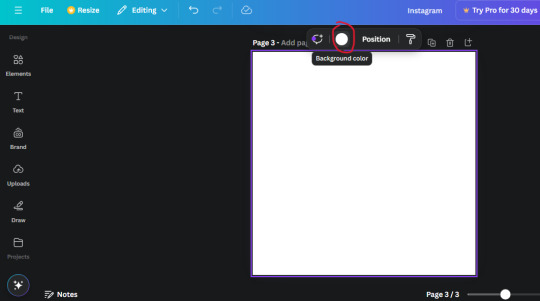
2. Now you have a blank page. Zoom in with the slider at the bottom of the page if you need to (Mine is currently zoomed in 41%). Click on the page and change the color to an off black (hex code #111111).
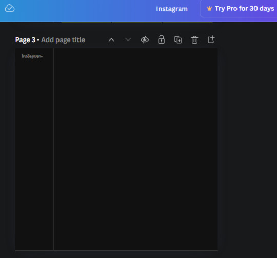
3. Now that the color is changed, click the "elements" tab and search "line". Click the shape and it will add it to the page automatically. These line are particularly hard to navigate and hard to get it at the right angle and length so this part might take a little longer than the rest.
4. stretch it from top to button and turn in a 90 angle so its straight on the left side of the page. Change the color of this as well to a grey tone (hex code #2F2F2F).
5. Now we'll add the Instagram logo. Click the "text" tab then click the purple "add text box" button. Write "Instagram" in the box and change the font to "apricots". This is the closest font I could find that resembled the logo font but if you find a better one, feel free to use that instead. Make the font size 19.3 (you can do this manually or do it in the text options). Change the color to grey color (hex code #707070). Add it to the upper left corner of the page like this:
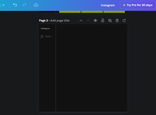
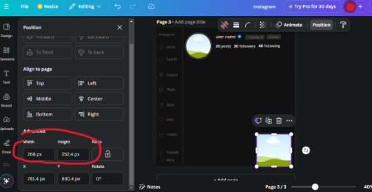
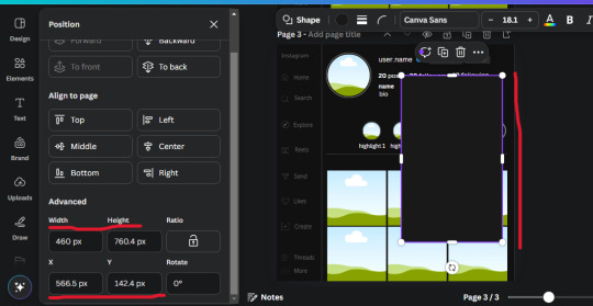
6. now we're adding icons and a menu inside the border we just made. Click the "elements" tab again and search for "instagram home icon" and add the element by sketchify to the page. Click the home icon, an options icon with pop-up above the page. Look for the "Position" button and click it. Scroll to find the advanced options and you can manually type in the width and height at 26.6 and 28.7.
Move it inside the border, under the logo (photo below). Change the color again (the hex code is #707070).
7. Open the text tab and add a text box. Change the font to Canva Sans and write "Home" in the box. Change the font size to 18.1 and align with with the house icon. It will look something like this,
8. Go into the elements tab again and search "instagram search icon". Scroll until you find the one by sketchify and add it to the page.
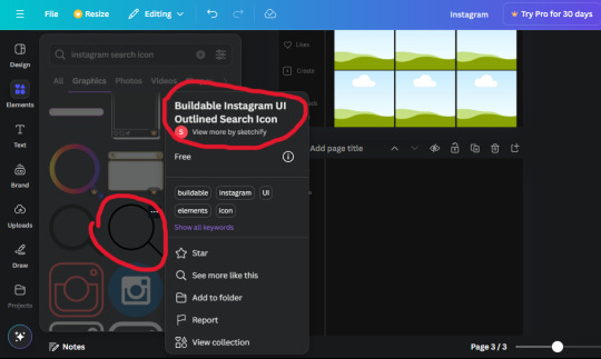
9. Shrink it so the W and H is at 36.6 and 31.3. Move it below the home icon until a purple "67" pop ups and aligns under it. Change it to the same color as the Home text and icon (#707070). Go ahead and Duplicate the the "Home" text box and clicking it and a pop-up will show up then edit the text so it says "Search" and align with the searcch icon we just added.
10. You know the drill. We are continuing to search up more icons in the "elements" tab. Search "instagram compass icon" and choose the one by sketchify (are u seeing the pattern?). Add it to the page and change the width and heigth to 33.1. align it under the search icon just like how we did before and change it to the say colors as the other icons.
11. Do the same as before and write "Explore" in a text box and align it with the icon. We're doing the same thing for all of these.
We'll be using the same search prompt for all of these icons so just change the type of icon you're looking for like we've done before hand. Next look for the Instagram reel icon and add the outlined one by sketchify and change the W and H to 31.2 x 30.9. Change the color to the ones we've used before, align it underneath the icons above and add your text ("Reels").
12. The next icon is an outlined, "sent" one. W and H is 31.1 x 27. The text will say "Send". Then an heart outline by sketchify; W and H is 34.2 x 29.1 and the text is "Likes". Next is the "create" outline icon by sketchify, W and H is 36.8.
(p.s if you are struggling to align the icons and text correctly, shoot me a message and I'll send you the X and Y positions ;D)
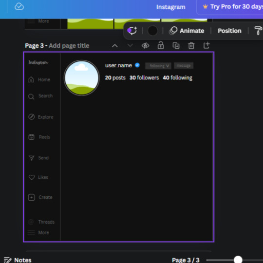
If you followed it through, it should look like this,
13. Now onto step 13, we'll be adding the Threads logo. You don't have to add this but to make it look more like the actual website, I will be adding it. Open the "text" tab and add a text box. Write an "@" symbol in the box and change the font to Nanum Sqaure and the size to 24.9. Add in the bottom corner below all the icons we just added to our page. We need another text box now (Color is still #707070), write "Threads" and align it to the "@" symbol.
14. We're adding another icon now. Search "Instagram menu icon" and find a wireframe menu icon by sketchify. the W and H are 42.5 x 24.6. Add a text box that says "More". It will look like this:
We are a quarter way done now :D
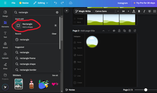
15. Search in the elements tab "circle frame" and look for the one with a little border around it.
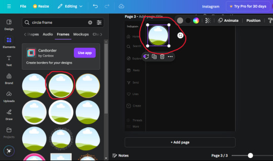
At first, the circle will be green and inside the circle will be white. Change the white to color of the background of the page (hex code #111111) then change the green to a grey color (#8D8986).
16. Add a new text box, change the font to Canva Sans and the size to 22.8 and the color is white. I just wrote "user.name" in the box. the W and H will be 153.3 x 35.7.
Enter the "elements" tab and search for a blue checkmark and find the icon by Victor Aguiar. The W and H is 28.1 by 28.
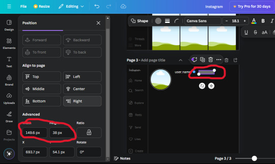
17. Search in the search box for a rectangular shape and add it to the page. Place it next to your username and checkmark icon and make the W and H to 149.6 x 38. Add another and place it next to the other rectangle shape. the W x H is 111.4 x 36.7.
Change the color of both boxes to #2F2F2F. Add a text box and write "following" then change the W and H to 82.6 x 21.8 and fit it inside the first box. Add a second text box and write "message" in it then change the W and H to 77.8 x 21.8. Change both text colors to #7A7A7A

18. Add another text box. Write "<" and turn it upside down and place it beside the "following" text inside the rectangle. Adjust the size as you need to. I also like the round the corners to around 8 so its not so pointy and square.
19. Add 3 new text boxes. Write the amount of posts, the amount of accounts you're following and the amount of followers your have. Write "20 posts", "30 following" "40 followers". Bold the numbers and change the text W and H to 116.4 x 32.7. These are just place holders that I use.
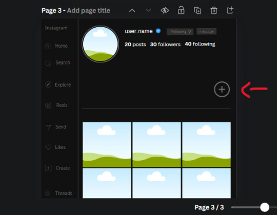
20. Open the "elements" tab again and search "frame". Choose the first one.
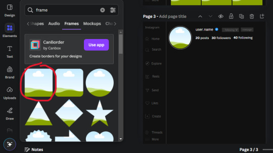
We want the height and width to be 268 x 252.4. Place it at the bottom of the page but we want some space between the frame and the page.
Now we'll duplicate the frame we just placed (the icon between the comment and trash can on the pop up above the frame). Place it next to the previous frame but we want to leave a bit of space between them like this:
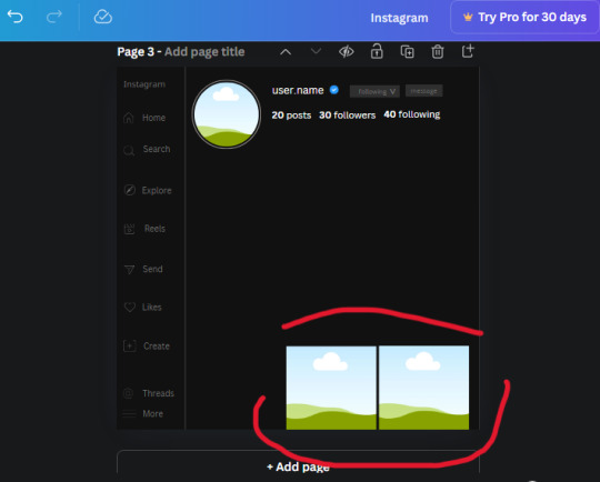
If its a little wonky, don't worry. You can always adjust it so it looks right.
Duplicate the frame again and place it next the second frame you just placed, same distance between. Make sure they're even. Now we have a row.
Select all three frames and duplicate them. Move them above our original frames but leave a little space between them.
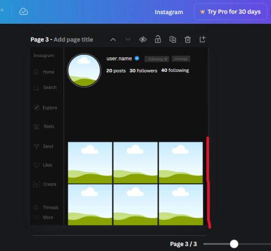
Again, if they're uneven, adjust them as you need to.
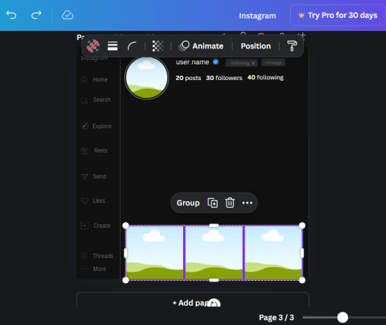
21. Select the line again from the elements tab. Stretch starting from the top frame to the last frame and make the color grey (#2F2F2F).
Because the line is stupid hard to navigate, use something like a text box to mark where you want it to end like this:


Delete the text box and the line with be where we want it.
22. On to the highlight reels. Seach for "add button" and find the one by Barudak Lier.
Change the heigh and width to 81.1 and move it above the border.
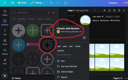
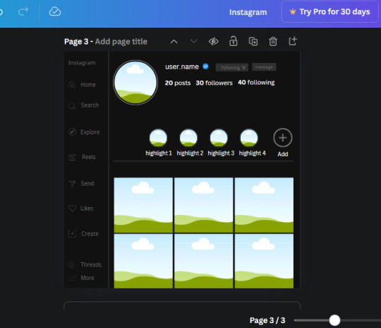
Search for circle frames now and add this one to the page (The same one we used for the pfp), change the width and height to 85.4 and move it next to the add button. Since this is a generic, blank template, I add about 4 of these highlight frames but you can do however many you want. You can change the border color to a gradient or leave it grey.
Add a text box now. The font will be Canva Sans, the size will be 18.1 and the color will be white. Change the text to "Add" and place it under our add button. Make more of these text boxes to place under the circle frames. Depending on which frame its under, write "Highlight 1", "Highlight 2", etc. etc. or you can give them different names and such.
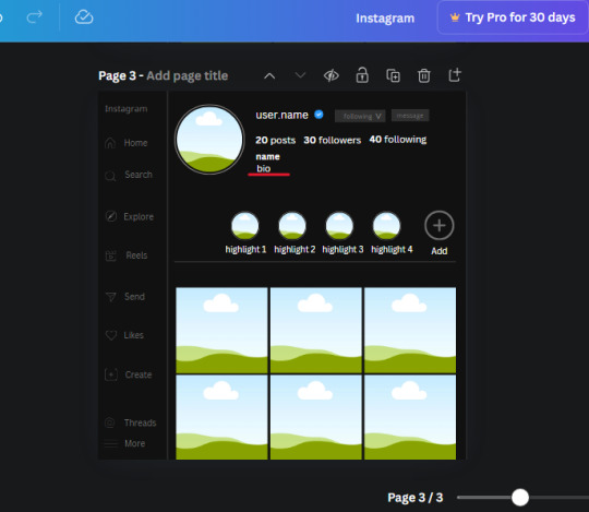
23. Add another text box, write "name" and bold it, change the size to 19.1 and the W and H to 69.2 x 28.8. The font will be Canva Sans and the color will be white. It will go under the amount of posts, followings and followers.
Add another box. The font is Canva Sans, font size to 20.1, the W and H is 40.8 x 31.3 and the color is white as well. This is our "bio". Place it under "name".
Yay!🎉🎉🎉 You're halfway done!
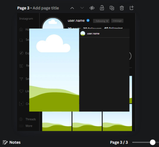
24. Search for a shape in the elements. Look for the rectangle again and add it. Change the width and height to 460 x 760.4 and the color to an off black/grey color (#191919), placing it like this:
Get the same kind of square frame we used before to make the profile grid and make it the same size as the rectangle we just added. Place right up against the rectangle like it's its other half. Add another line like before and span across the upper half of the black rectangle as a border then add a circle frame inside the border.
Add a text box, "user.name" and align it with the frame. The text is white and the W and H is 111.5 x 25.9
25. Add more circle frame along the inside of the rectangle to resemble the comment section. Make sure the W and H of the frames are 46.1.
Add more text boxes that align with the frames you just made and write "username" again and bold them. Add even more text boxes that align with the usernames and write "comment". These are place holders for when you decide to use this template.
Add another rectangle on the lower part of the rectangle and make the color black. and search for "instagram heart icon", "instagram comment icon" and "instagram send icon". Make sure the lines are thick. Find the heart icon by sketchify, and the the comment and send icon are by Mirazz Creations. Make the lines white and make sure the W and H are the following:
Heart icon: 38.7 x 32.9
Comment icon: 35.2 x 35. 8
Send icon: 35 x 32
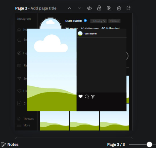
Next, look for "instagram bookmark icon" and find the one by Adricreative. Change the color to white and the W and H to 29.7 x 40.2. Move it to the other end of the rectangle.
26. Now add three circles frames and change the W and H to 37.2. Move them below the heart icon and have them overlap each other some. Then, add a text box and write "liked by username and 1000 others". Change the font size to 13.6 and change the font to Canva sans. the color will be white. Align this with the three overlapped frames.
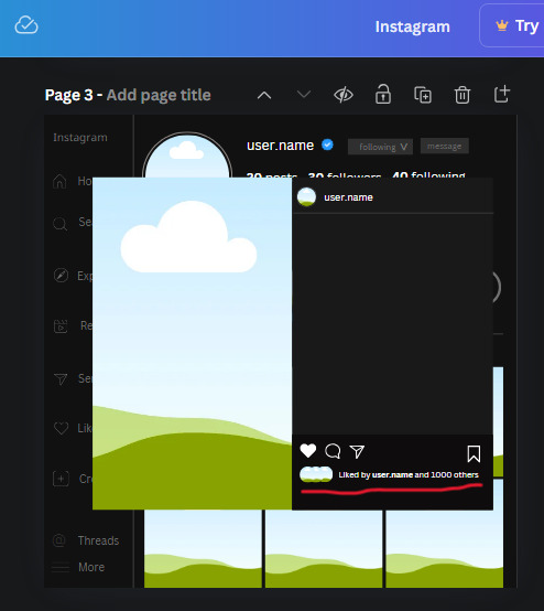
27. Look in the elements tab for an emoji icon and choose the one by Soni Soukell from Noun Project. The W and H will be 32.8 and the color is white.
Now add a another text box and write "Write a comment". The color will be white, the font size will be 14.2 and align with the emoji icon you just placed.
Search for "next arrow button" by Pixeden and make the W and H 42.8 then add it to both sides of the post.
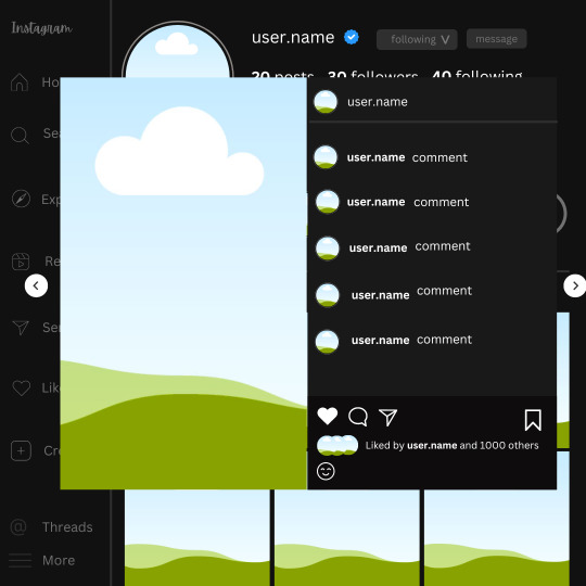
And you're all done with your template! All that is left to do is fill it but before doing that, duplicate the page so you always have an extra blank mockup if you want to use it again.
To fill the frames, upload an image (or use a Canva stock photo), drag and hover it over the frame and it will fill the frame.
Hope this was helpful and you you successfully made one :D <3
#requests#text#smau#template#mockup#moodboard#instagram#instagram moodboard#instagram mockup#graphic design#canva#psd#free tutorial#tutorial#instagram au#social media au#free psd#photoshop#resources#fanfiction resources#graphic design resources#graphic design tutorial#psd tutorial#photoshop tutorial#au#au ideas#mockups#digital design#digital design tutorial
131 notes
·
View notes
Note
Apart from the old trial-and-error method, are there resources that you would recommend for the aspiring megadungeon architect?
Either tools for the mapmaking or books/articles for guidance on the matter.
I talked a little bit about resources on the subject here, and I still feel like there's not a great single resource on how to build a megadungeon that I would recommend. There definitely are some good articles, though.
I'd say the most essential in my view, and one you're likely aware of, is Jacquaysing the Dungeon. This is a great reference on building non-linear dungeons that are interesting to navigate, which adds so much to a megadungeon. The Alexandrian's other stuff on dungeons are also worth reading for the most part. For example, his series on Re-Running the Megadungeon is a solid demonstration of megadungeon practice for new or unpersuaded GMs.
Most of the great articles I've read on dungeon design are from OSR blogs. Some of those have been lost, since so much of that was on Google+, and in general I'm reticent to link to OSR blogs because of the issues in that space. But I'll link a couple that I really like that serve as a good starting point, and its pretty easy to sort of navigate the web of blogs from there.
One I quite like is the dungeon checklist from goblin punch. At a glance I think it feels a little basic, but whenever I go back to it I find something I've missed in my current dungeon and that sparks my creativity for another round. Another is this article from false machine, which I find extremely evocative and great at getting me to think about the dungeon as a real, tactile place. Neither of these is essential, but I just think they're neat, and a good place to start wandering the webs of OSR blogs and seeing what speaks to you for anyone new to that space.
For mapmaking tools, I personally just use GNU IMP and some of Dyson Logos' photoshop brushes because I ain't got time for all that hashing. But I remain a big advocate of doing mashups of other maps, using geomorphs, or random generators if you don't want to sit there and tediously map stuff out personally.
Sorry, this ask took me forever to get to, and aside from personal reasons, the other reason it took so long is that the answer is kind of just "no, I don't know of many good megadungeon resources." I think part of why I've been so motivated to write on the subject in the past is that I think so much of the existing advice is vague, scattered, or kind of just sucks and misses the point. And I'm sure there's a lot of good stuff I just haven't found. But nearly all the good stuff is for making good dungeons, and then the megadungeon advice is "do that but bigger" which I think is actually bad advice. Like it's bad advice in the same way that you can't just extend techniques on how to run an engaging battle into techniques on how to run an engaging war.
So, consider this an open call for anyone in the comments or reblogs to link any megadungeon resources they think are useful. Hopefully other people have more than I do.
39 notes
·
View notes
Text
A year in illustration, 2023 edition (part two)
(This is part two; part one is here.)
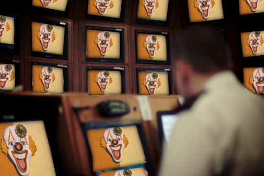
The West Midlands Police were kind enough to upload a high-rez of their surveillance camera control room to Flickr under a CC license (they've since deleted it), and it was the perfect frame for dozens of repeating clown images with HAL9000 red noses. This worked out great. The clown face is from a 1940s ad for novelty masks.
https://pluralistic.net/2023/08/23/automation-blindness/#humans-in-the-loop

I spent an absurd amount of time transforming a photo I took of three pinball machines into union-busting themed tables, pulling in a bunch of images from old Soviet propaganda art. An editorial cartoon of Teddy Roosevelt with his big stick takes center stage, while a NLRB General Counsel Jennifer Abruzzo's official portrait presides over the scene. I hand-made the eight-segment TILT displays.
https://pluralistic.net/2023/09/06/goons-ginks-and-company-finks/#if-blood-be-the-price-of-your-cursed-wealth

Working with the highest-possible rez sources makes all the difference in the world. Syvwlch's extremely high-rez paint-scraper is a gift to people writing about web-scraping, and the Matrix code waterfall mapped onto it like butter.
https://pluralistic.net/2023/09/17/how-to-think-about-scraping/
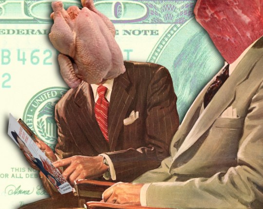
This old TWA ad depicting a young man eagerly pitching an older man has incredible body-language – so much so that when I replaced their heads with raw meat, the intent and character remained intact. I often struggle for background to put behind images like this, but high-rez currency imagery, with the blown up intaglio, crushes it.
https://pluralistic.net/2023/10/04/dont-let-your-meat-loaf/#meaty-beaty-big-and-bouncy

I transposed Photoshop instructions for turning a face into a zombie into Gimp instructions to make Zombie Uncle Sam. The guy looking at his watch kills me. He's from an old magazine illustration about radio broadcasting. What a face!
https://pluralistic.net/2023/10/18/the-people-no/#tell-ya-what-i-want-what-i-really-really-want
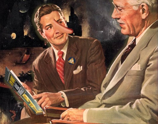
The mansplaining guy from the TWA ad is back, but this time he's telling a whopper. It took so much work to give him that Pinnocchio nose. Clearly, he's lying about capitalism, hence the Atlas Shrugged cover. Bosch's "Garden of Earthly Delights" makes for an excellent, public domain hellscape fit for a nonconensual pitch about the miracle of capitalism.
https://pluralistic.net/2023/10/27/six-sells/#youre-holding-it-wrong
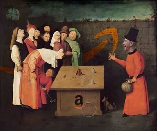
There's no better image for stories about techbros scamming rubes than Bosch's 'The Conjurer.' Throw in Jeff Bezos's head and an Amazon logo and you're off to the races. I boobytrapped this image by adding as many fingers as I could fit onto each of these figures in the hopes that someone could falsely accuse me of AI-generating this. No one did.
https://pluralistic.net/2023/11/06/attention-rents/#consumer-welfare-queens

Once again, it's Bosch to the rescue. Slap a different smiley-face emoji on each of the tormented figures in 'Garden of Earthly Delights' and you've got a perfect metaphor for the 'brand safety' problem of hard news dying online because brands don't want to be associated with unpleasant things, and the news is very unpleasant indeed.
https://pluralistic.net/2023/11/11/ad-jacency/#brand-safety

I really struggle to come up with images for my linkdump posts. I'm running out of ways to illustrate assortments and varieties. I got to noodling with a Kellogg's mini-cereal variety pack and I realized it was the perfect place for a vicious gorilla image I'd just found online in a WWI propaganda poster headed 'Destroy This Mad Brute.' I put so many fake AI tells in this one – extra pupils, extra fingers, a super-AI-esque Kellogg's logo.
https://pluralistic.net/2023/11/05/variegated/#nein
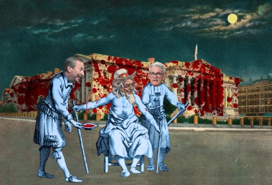
Bloodletting is the perfect metaphor for using rate-hikes to fight inflation. A vintage image of the Treasury, spattered with blood, makes a great backdrop. For the foreground, a medieval woodcut of bloodletting quacks – give one the head of Larry Summers, the other, Jerome Powell. For the patient, use Uncle Sam's head.
https://pluralistic.net/2023/11/20/bloodletting/#inflated-ego
I killed a long videoconference call slicing up an old pulp cover showing a killer robot zapping a couple of shrunken people in bell-jars. It was the ideal image to illustrate Big Tech's enshittification, especially when it was decorated with some classic tech slogans.
https://pluralistic.net/2023/11/22/who-wins-the-argument/#corporations-are-people-my-friend
There's something meditative about manually cutting out Tenniel engravings from Alice – the Jabberwock was insane. But it was worth it for this Tron-inflected illustration using a distorted Cartesian grid to display the enormous difference between e/acc and AI doomers, and everyone else in the world.
https://pluralistic.net/2023/11/27/10-types-of-people/#taking-up-a-lot-of-space
Multilayer source images for your remixing pleasure:
Scientist in chemlabhttps://craphound.com/images/scientist-in-chem-lab.psd
Humpty Dumpty and the millionaires https://craphound.com/images/humpty-dumpty-and-the-millionaires.psd
Demon summoning https://craphound.com/images/demon-summoning.psd
Killer Robot and People in Bell Jars https://craphound.com/images/killer-robot-and-bell-jars.psd
TWA mansplainer https://craphound.com/images/twa-mansplainer.psd
Impatient boss https://craphound.com/images/impatient-boss.psd
Destroy This Mad Brute https://craphound.com/images/destroy-this-mad-brute.psd
(Images: Heinz Bunse, West Midlands Police, Christopher Sessums, CC BY-SA 2.0; Mike Mozart, Jesse Wagstaff, Stephen Drake, Steve Jurvetson, syvwlch, Doc Searls, https://www.flickr.com/photos/mosaic36/14231376315, Chatham House, CC BY 2.0; Cryteria, CC BY 3.0; Mr. Kjetil Ree, Trevor Parscal, Rama, “Soldiers of Russia” Cultural Center, Russian Airborne Troops Press Service, CC BY-SA 3.0; Raimond Spekking, CC BY 4.0; Drahtlos, CC BY-SA 4.0; Eugen Rochko, Affero; modified)
201 notes
·
View notes
Text

Professional brand logo design.
#brand logo#logo design#logo design tutorial#how to design a logo#logo design process#logo design illustrator#design a logo#logo#professional logo design#graphic design#will paterson logo design#brand design#logo design ideas#logo design technique#photoshop logo design#design#logo design tips#illustrator logo design#how to make a logo#logos#design process#professional logo design illustrator#monogram logo design#how to design a personal brand logo#ahshanhabib
0 notes
Text
youtube
#Atzohaib#Zohaib#AtZohaib Youtube#AtZohaibYT#sabasahi#saba#atsabasahi#atsaba#how to create restaurant & food logo#restaurant branding#restaurant logo design photoshop#how to make a restaurant logo#restaurant logo inspiration#how to create restaurant logo#organic food logo design#food logo images#hotel logos#text logo#food truck logo#kitchen logo animation#chef logo design#restaurantlogo#Canva#logodesign#tutorial#graphicdesign#restaurantbranding#branding#designskills#stepbystep
0 notes
Note
hi kelli i love the gif set you made for jimin's birthday especially the "choose your album" one. is it possible you could give a tutorial or show how you made the effect? or the imessage one too its so cute!! only if you want!!
thanks anon 💛🥺 that's the first gif i started with when i started making the set because i wanted to make sure i could execute it well lol. i can break it down and show you how i made those, but i won't call it a tutorial since it might be messy lol. i also didn't come up with the concepts, so please note that i took inspo from gifs in sets like this, this, this, and this. since i didn't have any templates for these overlays, i referenced those as a guide for making my own.
i'll put this under a read more because it might be long.
we'll start with this one!!

there are three main things going on in this gif that i'll focus on: a playlist overlay, a cross-fade transition between mutliple elements (background gif, album logos, and years), and the "selected album" switching in conjunction with the transition.
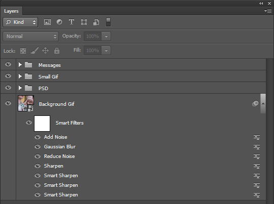
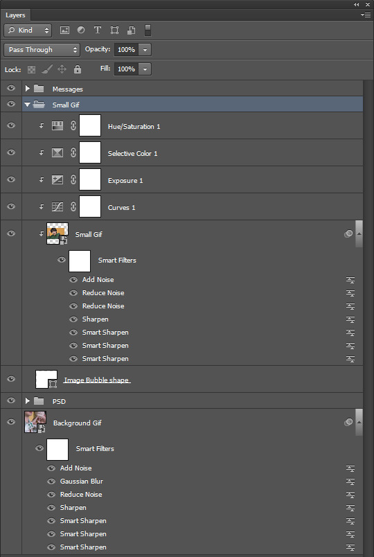
i like to organize all my layers into groups and label them so i can find everything easily if i need to make adjustments, so here is what my layers palette looks like for the finished gif.

i'll break down everything starting from the bottom since that's how you build things in photoshop.
the background gif is two gifs with the same amount of frames and similar camera movement because i thought the transition would look cool if the shot was circling around jimin in both gifs. i applied my sharpen and noise settings to each gif's smart layer, then put them both on the same timeline track. next, i dragged the cross fade transition with the fastest speed (0.25 s) onto the timeline between my gifs.

then i added a few adjustment layers to make it black and white with some contrast and grouped those into a folder labeled as "b&w psd" to keep it organized.
now time for the overlay group!
starting with the "player" folder first, here's what's inside.
two smart objects and a text layer.
the "square outline" layer is essentially just a square that i selected with the marquee tool, then applied a new color fill with the fill at 0% opacity. then i added a 2px white stroke to it, which left me with just an outline of a square. i converted that to a smart object.
the "arrows" layer, i just used the eclipse shape tool (no fill, 2px white stroke) and some custom shape arrows inside. i duplicated those shapes, flipped them, then positioned each skip button where i wanted them before coverting them both to a single smart object as well.
then i added my "choose your album" text at the top of the square, selected around it with the marquee tool on the "square outline" layer, and applied a layer mask to erase where the outline cut through it. i made this all as centered as possible and made these three layers the same length as my background gif on the timeline.
onto the "abums" folder, here's what's inside.
i made two 100px by 100px square shapes and positioned them along the bottom line of the big square outline with equal distance between the center and the corners. all i had to do was resize images of jimin's album covers atop each shape. i also clipped levels adjustments to both covers to make them pop.
the "album outline" layers are just duplicates of the square layers with a 2px stroke in alternate colors per that album's color scheme. i referenced album images and used the eyedropper tool for accurate colors.
to make the strokes visible at different times, those two layers are trimmed on the timeline at the very center of the cross fade transition on the background gif to emulate switching between albums. TECHNICALLY, no, i didn't need to keep the shape layers and i could have deleted them after i positioned the covers + added the stroke to a duplicated cover image instead, but i liked having them as a guide.
anyway it looks like this:
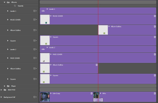
next, came the album title logos and extra text! here are the "logos", "outlines", and "years" folders open.

these are all in seperate folders because i stacked each title logo and it's outline back to back on the timeline in order to add the cross fade transition to them into each other along with the background gif. i thought it would look too abrupt if the logos changed without the same transition.
so i found large png files of each of jimin's album title fonts, made them white, and positioned them in the center. i set the blending modes on each of them to "exclusion", then applied a color overlay set to "color" in those same colors i used for the album cover outlines. i then duplicated the logos and changed the fill to 0%, added a 1px white stroke around them and then nudged them a few pixels away from the real ones for that depth look.
i also added the years each album came out too. i trimmed and stacked them accordingly on the timeline and added the same transition between them all as the one on the background gif.
here is what it looks like on the timeline:
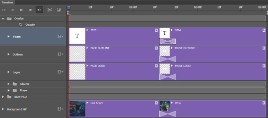
then i converted to frames and saved at 0.05 speed and i was done!
as for the imessage gif...
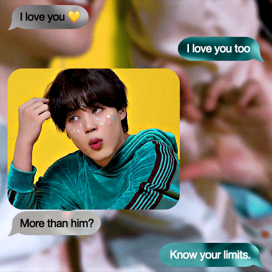
here's what my layers palette looked like:
i made my background gif blurry so it wouldn't distract too much from the smaller gif and the messages, but i still needed it to look clear. i really lucked out with that shot of jimin against a yellow couch with teal detailing on his sleeve because look how well it matches the color theme!!! AND he's making a hand heart??? score.
anyway, it was mostly about spacing all the imessage bubbles so everything was nice and equal. i didn't think i could make the bubbles look good if i made them manually with the shape tool, so i just searched for imessage bubble pngs online at differing lengths and made the ones i used white before converting them to smart objects. i resized them all to 48px in height and positioned them with 15px gaps between each other (10px from the top and bottom edges of the gif, 15px from the sides). i set them each to "exclusion" and added a color overlay to them set to "color" and chose which teal or gray color to use.
then i added my text on top of them.

the "small gif" folder is just a 280px high rounded square shape with my gif and adjustment layers clipped to it. there's a smaller 3px gap between the small gif and text below it just like an iphone displays images sent with text. i completely scored with this gif too since he's already against a yellow background and he's wearing green, so all i needed to adjust were the tones of those colors to get it as close as i could to the muse colors.
that's pretty much it!!! i hope you found this interesting or fun to read. thank you for liking the set and being curious how i made some of it <3
again, i can't take credit for these concepts. i only tried to recreate them to the best of my own abilities.
37 notes
·
View notes
Text
im redoing the hammond house entirely bc i was making it while still new to hd3d. i made it like 5000 sqft somehow??? that plus all the little details i threw in there were making it lag so bad. it also wasnt accurate to what i had in mind.
so far ive got an accurate Garage Card Table Desk. stupid carpet floor mat on concrete and all!

aaaand some basement :3 ft needles piano and an entertainment center that i spent wayyyy too much time on. there arent any premade, so this is literally some kitchen cabinets and just a bunch of Rectangles. i think it looks kinda swag


i resized it a bit before taking the screenshot, so you could feasibly fit vhs tapes up top. we should bring these things back i miss them lol
more details on how i made some of this below :3
im gonna start including these just bc i cannot stress it enough. i am so not using this thing right 😭 my ass will cobble a bunch of shit together instead of just using blender. theres smth wrong w me ^_^ (autism) ((and im stubborn))
the tarnacop monitor is just the same tv resized! with the stand made invisible. and two decorative boxes for the stand. the colors for the wheels are the same as the like. outside of the tv. so unfortunately you can see the wheels under the table but whatever LOL. oh well.
i just now realized i couldve just used my weird little photoshoped tarnacop for the tower itself but uhhh oops. its once again a heater that i resized (like when i remade my own setup) and the logo is just a painting. the keyboard is from a desk w a computer. just made everything except the keyboard invisible. the mouse is just some oblong football shape thingy i squashed down in there.
the ps1 is a rectangle i think? and then a painting for the ports on the front. i spent so long getting it to look right that i forgot to change the color. bc if rainer had the drive to make fucking PETSCOP the man had the drive to get his hands on a homebrew ps1. and theyre black. oh well.
#eyes#hammond house#petscop#my coworkers will be like what hobbies do you have#and i lie with my whole chest every tiem#they cant know ive spent 257.5 hours making houses for characters#they dont even know what petscop is and i fear they will not survive if they open the floodgates and ask
20 notes
·
View notes
Text

Will it be one of the only times i will Post on here? Maybe.
Anyways: OC Owned by @pampanope.
His name is: 7-11 hence why he got out on the 7-11 Logo :3

That's also how it all started btw. For how this came out.
Thenikly could have just Photoshop it. But no. Drawing✨✨ owo
Will be probably one of the only Post i will make on here o3o
28 notes
·
View notes