#highlights apex
Explore tagged Tumblr posts
Text
Nightwing #110 (part 1/2)
this entire issue was so good — A+ cover


Jon 😭🫶

Mr. Mittens is so good


Jon’s face when he sees Damian getting beat up but Nightwing told him to stay put 😭


Cat behavior
#RentaBat Highlights#dc comics#nightwing 110#titans beast world#apex ava#dick grayson#nightwing#jonathan kent#jon kent#superman#supersons#damian wayne#dc robin
96 notes
·
View notes
Text


a drawing of crypto I made with highlighters today, and a sketch of catalyst I did awhile back that I forgot to post. both are redraws, where crypto is a redraw of his game select banner, and catalyst is a redraw from her official art. :3
#highlighter art#crypto apex#apex crypto#crypto apex legends#apex legends crypto#catalyst apex#apex catalyst#catalyst apex legends#apex legends catalyst#traditional art#sketch#digital art#digital sketch#fanart#apex legends#apex fanart#apex legends fanart#my art#breadsticckk draws#artists on tumblr
49 notes
·
View notes
Photo

Sunday Samurai Session "Like a Dragon " Playthrough Apex After Vibes Forever Present Happy Sunday Young Goddesses and Godz Twitch.tv/leosungodbodyz Swing by and show love If I don't see you remember protect your energy because if you don't no one will ... #smallstreamer #musician #vibes #artists #420friendly #420gamer #blackgamers #indie #creatives #hiphop #highlights #likeadragon #ishin #apex #ally #sapiosexual #gametherapy #twitchaffiliate https://www.instagram.com/p/CpanUOQLgvp/?igshid=NGJjMDIxMWI=
#smallstreamer#musician#vibes#artists#420friendly#420gamer#blackgamers#indie#creatives#hiphop#highlights#likeadragon#ishin#apex#ally#sapiosexual#gametherapy#twitchaffiliate
4 notes
·
View notes
Text
https://www.twitch.tv/miukanna/v/1929533268?sr=a&t=19s

My friend @mlekomiel and me WON THE VIDEO GAAAAAAME
1 note
·
View note
Text
#apex rogue#apex rogues#apex rogue twitter#rogue apex#rogue st pro vs apex#nrg rogue apex#rogue apex highlights#nrg rogue apex settings#rogue company ps4#nrg rogue apex highlights#rogue apex legends#rogue apex montage#apex legends rogue#rogue company#rogue ash apex legends#rogue apex legends highlights#rogue company pc#apex legends twitch rogue#new rogue company#rogue company best weapons#rogue company ps4 gameplay#rogue company game
1 note
·
View note
Text
#rogue apex#rogue st pro vs apex#rogue apex highlights#rogue company ps4#rogue apex legends#rogue company tips#rogue company#rogue ash apex legends#rogue company pc#rogue company pro#rogue company highlights#new rogue company#rogue company best weapons#rogue company ps4 gameplay#rogue company cloh#cloh rogue company#rogue company best#rogue company game#rogue company beta#rogue company xbox#rogue company kills#cloth rogue company
0 notes
Text
#rogue apex#rogue st pro vs apex#rogue apex highlights#rogue company ps4#rogue apex legends#rogue company tips#rogue company#rogue ash apex legends#rogue company pc#rogue company pro#rogue company highlights#new rogue company#rogue company best weapons#rogue company ps4 gameplay#rogue company cloh#cloh rogue company#rogue company best#rogue company game#rogue company beta#rogue company xbox#rogue company kills#cloth rogue company
1 note
·
View note
Text
#rogue apex#rogue st pro vs apex#rogue apex highlights#rogue company ps4#rogue apex legends#rogue company tips#rogue company#rogue ash apex legends#rogue company pc#rogue company pro#rogue company highlights#new rogue company#rogue company best weapons#rogue company ps4 gameplay#rogue company cloh#cloh rogue company#rogue company best#rogue company game#rogue company beta#rogue company xbox#rogue company kills#cloth rogue company
1 note
·
View note
Photo

https://youtu.be/0svPKTTjKJE
New chick the link video!
#Terengineer#Apex Legends Mobile#Apex Mobile#Apex Legends Mobile Gameplay#Apex Mobile Gameplay#Live#Stream#Highlights#Final#Day#Gameplay
0 notes
Note
Your art is extremely inspiring. Do you by chance have any tips for creating reflective highlights and their placement? It’s something I’ve been trying to figure out for so long and it’s just not computing in my brain. 🫠
First of all, thank you! Ahh I'm not as descriptive with words, so let me give you a quick rundown.
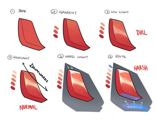
Once you have your base and all is good to go, you create the gradient in the direction of where your light source is (up -> down in the image). The direction will always depend on angle or 'curve' of the metal/material you're trying to work with. Up top, I did a downwards reflection since my shape is more diagonal, rather than uniform and straight. There are times you'll have a round shape, in where this time you'll go ahead and create the highlight at the apex of it. Next, you have to decide what KIND of highlight you'll be using. I usually work with multiple lighting layers, but for this example I'll only show 3. The DULL lighting is just regular low lights that show the texture as reflective, but is most likely AWAY from a light source and/or is reflecting off something that doesn't have much shine. The NORMAL is your regular highlights that is usually just a lighter shade than your base. Since most if the time it just follows your low light(think of it as the intensity of the reflective light source), you can just place it on top of the DULL lighting. The HARSH lights are only portion that are directly in front of the light source OR are the most intense parts of it. Think of it as extreme sunlight etc, and it goes apart from your regular highlights. Lastly, you can add more color to you material by taking in other reflective surfaces, specially those with different color. I added the blue as an example and just color the panel that directly faces it.
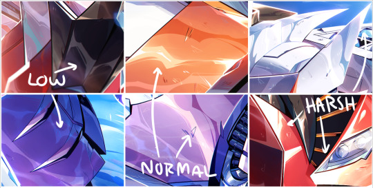
I added a few example of lighting from my works so you can kinda see what I'm talking about. They might not seem as different at first, but the placement really makes a difference once you start finishing your rendering. I'm not great at explaining sorry, but I'll try to do another stream and walk people step by step? Would that be ok? Hope this helps a little!
3K notes
·
View notes
Text

wow me drawing Another headshot? more likely than you think!
#crypto apex legends#apex crypto#crypto apex#tae joon park#taejoon park#apex legends fanart#fanart#highlighter art#highlighter#my art#traditional art#traditional artwork#breadsticckk draws#artists on tumblr
6 notes
·
View notes
Photo

Vibin 2 Diamond: Plat Pushin S.o.h.l Squad Samurai Specialist Seing by and show love Twitch.tv/leosungodbodyz If I don't see you remember protect your energy because if you don't no one will... #smallstreamer #twitchaffiliate #apex #apexcommunity #420gamer #tequila #apexhighlights #Recon #ally #crypto #Recon #indie #creatives #hiphop #highlights https://www.instagram.com/p/CpQUEGMO_Xf/?igshid=NGJjMDIxMWI=
#smallstreamer#twitchaffiliate#apex#apexcommunity#420gamer#tequila#apexhighlights#recon#ally#crypto#indie#creatives#hiphop#highlights
2 notes
·
View notes
Text
"Irish conservationists report that the magnificent osprey has successfully bred in the wilds of the Emerald Isle for the first time in almost 250 years.
Worldwide, ospreys are doing great—listed as “Least Concern” by the IUCN who add they are increasing in population. However their massive brown and white wings have been absent from Irish skies for two centuries after being hunted to extinction.
The last recorded osprey to nest in Ireland was found in 1779, writes the Ireland-based conservation group Golden Eagle Trust on Facebook.
Visiting ospreys sometimes stop on the island to rest, but almost since the signing of the US Declaration of Independence, no pair has ever deemed it a safe environment to raise young.
A nesting pair (ospreys mate for life) was discovered by experienced birdwatcher Giles Knight, the Environmental Farming Scheme Advisor with Ulster Wildlife, a conservation non-profit.
“Along with my son Eoin, I have watched the adults return to the same site since 2021, so you can imagine my excitement the moment that I saw three chicks and two adults this year,” said Knight in a statement. “It was a rub-your-eyes, once-in-a-lifetime moment; an absolute highlight of my 30-year wildlife career—like finding long-lost treasure.”
“With at least two of the chicks fledging this season, this is a huge conservation success story and indicates a healthy wetland ecosystem with plenty of suitable habitat and fish to bring this apex predator back to our skies and plunging into the Fermanagh Lakelands. Truly the return of a living countryside!” ...
The old Gaelic name for osprey was “Iascaire Coirneach”, meaning “Tonsured Fisherman”, possibly related to how its black eye band and white crown give it the appearance of the semi-bald tonsure typical of medieval Christian monks, the Golden Eagle Trust wrote on Facebook in a celebratory post.
“Now these birds are back in Ireland and breeding successfully, it is critical that they are left in peace so their numbers can continue to grow by returning year on year to breed,” Knight added in the statement. “We believe and hope that this could be the start of a raptor dynasty.”"
-via Good News Network, August 27, 2023
#ireland#osprey#birdwatching#wetlands#conservation#biodiversity#ecosystem restoration#baby birds#baby animals#good news#hope
4K notes
·
View notes
Text
Fantasy Guide to Interiors
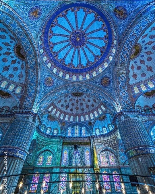
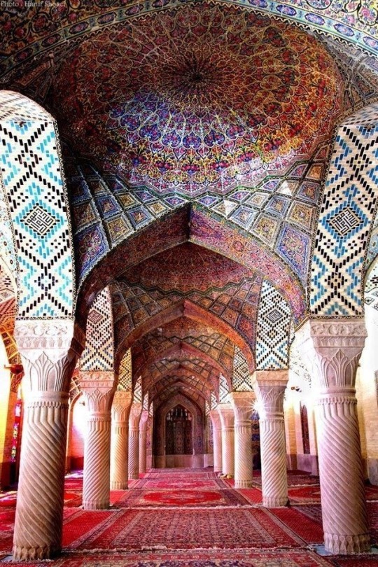
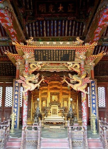
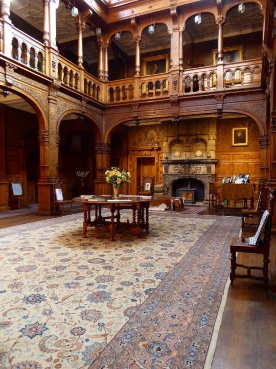
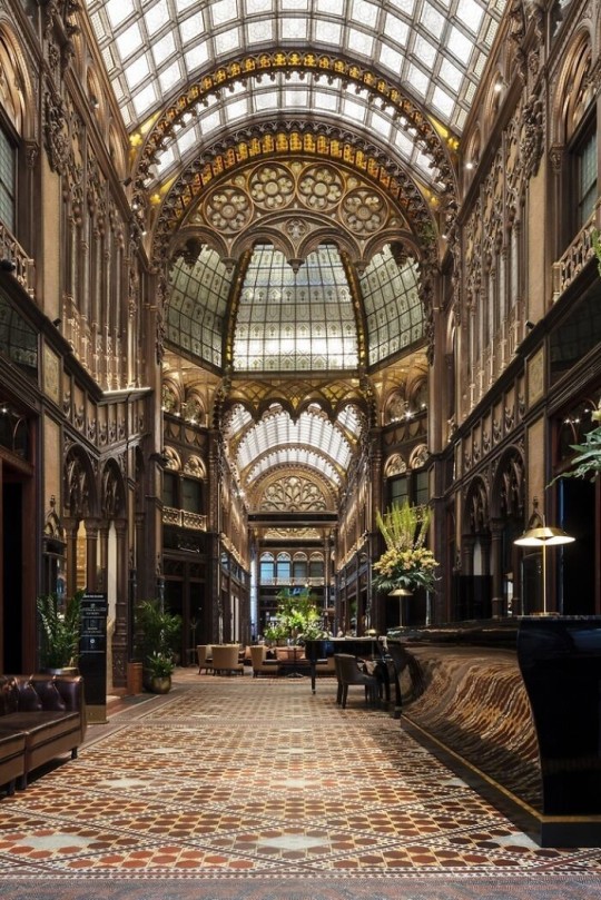
As a followup to the very popular post on architecture, I decided to add onto it by exploring the interior of each movement and the different design techniques and tastes of each era. This post at be helpful for historical fiction, fantasy or just a long read when you're bored.
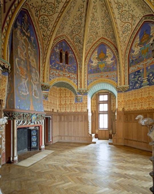
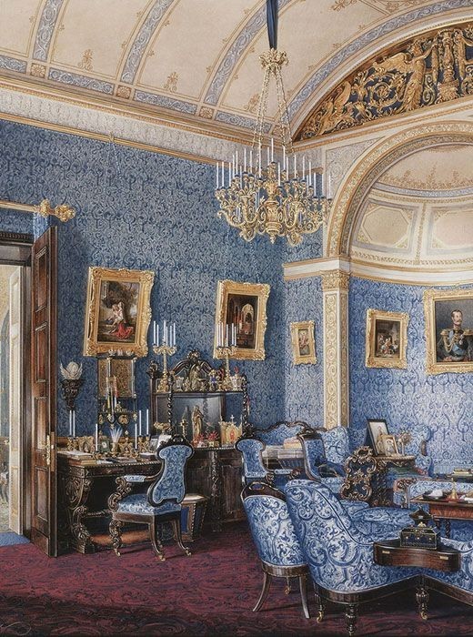
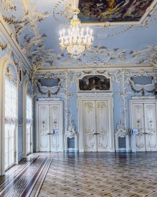
Interior Design Terms
Reeding and fluting: Fluting is a technique that consists a continuous pattern of concave grooves in a flat surface across a surface. Reeding is it's opposite.
Embossing: stamping, carving or moulding a symbol to make it stand out on a surface.
Paneling: Panels of carved wood or fabric a fixed to a wall in a continuous pattern.
Gilding: the use of gold to highlight features.
Glazed Tile: Ceramic or porcelain tiles coated with liquid coloured glass or enamel.
Column: A column is a pillar of stone or wood built to support a ceiling. We will see more of columns later on.
Bay Window: The Bay Window is a window projecting outward from a building.
Frescos: A design element of painting images upon wet plaster.
Mosaic: Mosaics are a design element that involves using pieces of coloured glass and fitted them together upon the floor or wall to form images.
Mouldings: ornate strips of carved wood along the top of a wall.
Wainscoting: paneling along the lower portion of a wall.
Chinoiserie: A European take on East Asian art. Usually seen in wallpaper.
Clerestory: A series of eye-level windows.
Sconces: A light fixture supported on a wall.
Niche: A sunken area within a wall.
Monochromatic: Focusing on a single colour within a scheme.
Ceiling rose: A moulding fashioned on the ceiling in the shape of a rose usually supporting a light fixture.
Baluster: the vertical bars of a railing.
Façade: front portion of a building
Lintel: Top of a door or window.
Portico: a covered structure over a door supported by columns
Eaves: the part of the roof overhanging from the building
Skirting: border around lower length of a wall
Ancient Greece
Houses were made of either sun-dried clay bricks or stone which were painted when they dried. Ground floors were decorated with coloured stones and tiles called Mosaics. Upper level floors were made from wood. Homes were furnished with tapestries and furniture, and in grand homes statues and grand altars would be found. Furniture was very skillfully crafted in Ancient Greece, much attention was paid to the carving and decoration of such things. Of course, Ancient Greece is ancient so I won't be going through all the movements but I will talk a little about columns.
Doric: Doric is the oldest of the orders and some argue it is the simplest. The columns of this style are set close together, without bases and carved with concave curves called flutes. The capitals (the top of the column) are plain often built with a curve at the base called an echinus and are topped by a square at the apex called an abacus. The entablature is marked by frieze of vertical channels/triglyphs. In between the channels would be detail of carved marble. The Parthenon in Athens is your best example of Doric architecture.
Ionic: The Ionic style was used for smaller buildings and the interiors. The columns had twin volutes, scroll-like designs on its capital. Between these scrolls, there was a carved curve known as an egg and in this style the entablature is much narrower and the frieze is thick with carvings. The example of Ionic Architecture is the Temple to Athena Nike at the Athens Acropolis.
Corinthian: The Corinthian style has some similarities with the Ionic order, the bases, entablature and columns almost the same but the capital is more ornate its base, column, and entablature, but its capital is far more ornate, commonly carved with depictions of acanthus leaves. The style was more slender than the others on this list, used less for bearing weight but more for decoration. Corinthian style can be found along the top levels of the Colosseum in Rome.
Tuscan: The Tuscan order shares much with the Doric order, but the columns are un-fluted and smooth. The entablature is far simpler, formed without triglyphs or guttae. The columns are capped with round capitals.
Composite: This style is mixed. It features the volutes of the Ionic order and the capitals of the Corinthian order. The volutes are larger in these columns and often more ornate. The column's capital is rather plain. for the capital, with no consistent differences to that above or below the capital.
Ancient Rome
Rome is well known for its outward architectural styles. However the Romans did know how to add that rizz to the interior. Ceilings were either vaulted or made from exploded beams that could be painted. The Romans were big into design. Moasics were a common interior sight, the use of little pieces of coloured glass or stone to create a larger image. Frescoes were used to add colour to the home, depicting mythical figures and beasts and also different textures such as stonework or brick. The Romans loved their furniture. Dining tables were low and the Romans ate on couches. Weaving was a popular pastime so there would be tapestries and wall hangings in the house. Rich households could even afford to import fine rugs from across the Empire. Glass was also a feature in Roman interior but windows were usually not paned as large panes were hard to make. Doors were usually treated with panels that were carved or in lain with bronze.
Ancient Egypt
Egypt was one of the first great civilisations, known for its immense and grand structures. Wealthy Egyptians had grand homes. The walls were painted or plastered usually with bright colours and hues. The Egyptians are cool because they mapped out their buildings in such a way to adhere to astrological movements meaning on special days if the calendar the temple or monuments were in the right place always. The columns of Egyptian where thicker, more bulbous and often had capitals shaped like bundles of papyrus reeds. Woven mats and tapestries were popular decor. Motifs from the river such as palms, papyrus and reeds were popular symbols used.
Ancient Africa
African Architecture is a very mixed bag and more structurally different and impressive than Hollywood would have you believe. Far beyond the common depictions of primitive buildings, the African nations were among the giants of their time in architecture, no style quite the same as the last but just as breathtaking.
Rwandan Architecture: The Rwandans commonly built of hardened clay with thatched roofs of dried grass or reeds. Mats of woven reeds carpeted the floors of royal abodes. These residences folded about a large public area known as a karubanda and were often so large that they became almost like a maze, connecting different chambers/huts of all kinds of uses be they residential or for other purposes.
Ashanti Architecture: The Ashanti style can be found in present day Ghana. The style incorporates walls of plaster formed of mud and designed with bright paint and buildings with a courtyard at the heart, not unlike another examples on this post. The Ashanti also formed their buildings of the favourite method of wattle and daub.
Nubian Architecture: Nubia, in modern day Ethiopia, was home to the Nubians who were one of the world's most impressive architects at the beginning of the architecture world and probably would be more talked about if it weren't for the Egyptians building monuments only up the road. The Nubians were famous for building the speos, tall tower-like spires carved of stone. The Nubians used a variety of materials and skills to build, for example wattle and daub and mudbrick. The Kingdom of Kush, the people who took over the Nubian Empire was a fan of Egyptian works even if they didn't like them very much. The Kushites began building pyramid-like structures such at the sight of Gebel Barkal
Japanese Interiors
Japenese interior design rests upon 7 principles. Kanso (簡素)- Simplicity, Fukinsei (不均整)- Asymmetry, Shizen (自然)- Natural, Shibumi (渋味) – Simple beauty, Yugen (幽玄)- subtle grace, Datsuzoku (脱俗) – freedom from habitual behaviour, Seijaku (静寂)- tranquillity.
Common features of Japanese Interior Design:
Shoji walls: these are the screens you think of when you think of the traditional Japanese homes. They are made of wooden frames, rice paper and used to partition
Tatami: Tatami mats are used within Japanese households to blanket the floors. They were made of rice straw and rush straw, laid down to cushion the floor.
Genkan: The Genkan was a sunken space between the front door and the rest of the house. This area is meant to separate the home from the outside and is where shoes are discarded before entering.
Japanese furniture: often lowest, close to the ground. These include tables and chairs but often tanked are replaced by zabuton, large cushions. Furniture is usually carved of wood in a minimalist design.
Nature: As both the Shinto and Buddhist beliefs are great influences upon architecture, there is a strong presence of nature with the architecture. Wood is used for this reason and natural light is prevalent with in the home. The orientation is meant to reflect the best view of the world.
Islamic World Interior
The Islamic world has one of the most beautiful and impressive interior design styles across the world. Colour and detail are absolute staples in the movement. Windows are usually not paned with glass but covered in ornate lattices known as jali. The jali give ventilation, light and privacy to the home. Islamic Interiors are ornate and colourful, using coloured ceramic tiles. The upper parts of walls and ceilings are usually flat decorated with arabesques (foliate ornamentation), while the lower wall areas were usually tiled. Features such as honeycombed ceilings, horseshoe arches, stalactite-fringed arches and stalactite vaults (Muqarnas) are prevalent among many famous Islamic buildings such as the Alhambra and the Blue Mosque.
Byzantine (330/395–1453 A. D)
The Byzantine Empire or Eastern Roman Empire was where eat met west, leading to a melting pot of different interior designs based on early Christian styles and Persian influences. Mosaics are probably what you think of when you think of the Byzantine Empire. Ivory was also a popular feature in the Interiors, with carved ivory or the use of it in inlay. The use of gold as a decorative feature usually by way of repoussé (decorating metals by hammering in the design from the backside of the metal). Fabrics from Persia, heavily embroidered and intricately woven along with silks from afar a field as China, would also be used to upholster furniture or be used as wall hangings. The Byzantines favoured natural light, usually from the use of copolas.
Indian Interiors
India is of course, the font of all intricate designs. India's history is sectioned into many eras but we will focus on a few to give you an idea of prevalent techniques and tastes.
The Gupta Empire (320 – 650 CE): The Gupta era was a time of stone carving. As impressive as the outside of these buildings are, the Interiors are just as amazing. Gupta era buildings featured many details such as ogee (circular or horseshoe arch), gavaksha/chandrashala (the motif centred these arches), ashlar masonry (built of squared stone blocks) with ceilings of plain, flat slabs of stone.
Delhi Sultanate (1206–1526): Another period of beautifully carved stone. The Delhi sultanate had influence from the Islamic world, with heavy uses of mosaics, brackets, intricate mouldings, columns and and hypostyle halls.
Mughal Empire (1526–1857): Stonework was also important on the Mughal Empire. Intricately carved stonework was seen in the pillars, low relief panels depicting nature images and jalis (marble screens). Stonework was also decorated in a stye known as pietra dura/parchin kari with inscriptions and geometric designs using colored stones to create images. Tilework was also popular during this period. Moasic tiles were cut and fitted together to create larger patters while cuerda seca tiles were coloured tiles outlined with black.
Chinese Interiors
Common features of Chinese Interiors
Use of Colours: Colour in Chinese Interior is usually vibrant and bold. Red and Black are are traditional colours, meant to bring luck, happiness, power, knowledge and stability to the household.
Latticework: Lattices are a staple in Chinese interiors most often seen on shutters, screens, doors of cabinets snf even traditional beds.
Lacquer: Multiple coats of lacquer are applied to furniture or cabinets (now walls) and then carved. The skill is called Diaoqi (雕漆).
Decorative Screens: Screens are used to partition off part of a room. They are usually of carved wood, pained with very intricate murals.
Shrines: Spaces were reserved on the home to honour ancestors, usually consisting of an altar where offerings could be made.
Of course, Chinese Interiors are not all the same through the different eras. While some details and techniques were interchangeable through different dynasties, usually a dynasty had a notable style or deviation. These aren't all the dynasties of course but a few interesting examples.
Song Dynasty (960–1279): The Song Dynasty is known for its stonework. Sculpture was an important part of Song Dynasty interior. It was in this period than brick and stone work became the most used material. The Song Dynasty was also known for its very intricate attention to detail, paintings, and used tiles.
Ming Dynasty(1368–1644): Ceilings were adorned with cloisons usually featuring yellow reed work. The floors would be of flagstones usually of deep tones, mostly black. The Ming Dynasty favoured richly coloured silk hangings, tapestries and furnishings. Furniture was usually carved of darker woods, arrayed in a certain way to bring peace to the dwelling.
Han Dynasty (206 BC-220 AD): Interior walls were plastered and painted to show important figures and scenes. Lacquer, though it was discovered earlier, came into greater prominence with better skill in this era.
Tang Dynasty (618–907) : The colour palette is restrained, reserved. But the Tang dynasty is not without it's beauty. Earthenware reached it's peak in this era, many homes would display fine examples as well. The Tang dynasty is famous for its upturned eaves, the ceilings supported by timber columns mounted with metal or stone bases. Glazed tiles were popular in this era, either a fixed to the roof or decorating a screen wall.
Romanesque (6th -11th century/12th)
Romanesque Architecture is a span between the end of Roman Empire to the Gothic style. Taking inspiration from the Roman and Byzantine Empires, the Romanesque period incorporates many of the styles. The most common details are carved floral and foliage symbols with the stonework of the Romanesque buildings. Cable mouldings or twisted rope-like carvings would have framed doorways. As per the name, Romansque Interiors relied heavily on its love and admiration for Rome. The Romanesque style uses geometric shapes as statements using curves, circles snf arches. The colours would be clean and warm, focusing on minimal ornamentation.
Gothic Architecture (12th Century - 16th Century)
The Gothic style is what you think of when you think of old European cathedrals and probably one of the beautiful of the styles on this list and one of most recognisable. The Gothic style is a dramatic, opposing sight and one of the easiest to describe. Decoration in this era became more ornate, stonework began to sport carving and modelling in a way it did not before. The ceilings moved away from barreled vaults to quadripartite and sexpartite vaulting. Columns slimmed as other supportive structures were invented. Intricate stained glass windows began their popularity here. In Gothic structures, everything is very symmetrical and even.
Mediaeval (500 AD to 1500)
Interiors of mediaeval homes are not quite as drab as Hollywood likes to make out. Building materials may be hidden by plaster in rich homes, sometimes even painted. Floors were either dirt strewn with rushes or flagstones in larger homes. Stonework was popular, especially around fireplaces. Grand homes would be decorated with intricate woodwork, carved heraldic beasts and wall hangings of fine fabrics.
Renaissance (late 1300s-1600s)
The Renaissance was a period of great artistry and splendor. The revival of old styles injected symmetry and colour into the homes. Frescoes were back. Painted mouldings adorned the ceilings and walls. Furniture became more ornate, fixed with luxurious upholstery and fine carvings. Caryatids (pillars in the shape of women), grotesques, Roman and Greek images were used to spruce up the place. Floors began to become more intricate, with coloured stone and marble. Modelled stucco, sgraffiti arabesques (made by cutting lines through a layer of plaster or stucco to reveal an underlayer), and fine wall painting were used in brilliant combinations in the early part of the 16th century.
Tudor Interior (1485-1603)
The Tudor period is a starkly unique style within England and very recognisable. Windows were fixed with lattice work, usually casement. Stained glass was also in in this period, usually depicting figures and heraldic beasts. Rooms would be panelled with wood or plastered. Walls would be adorned with tapestries or embroidered hangings. Windows and furniture would be furnished with fine fabrics such as brocade. Floors would typically be of wood, sometimes strewn with rush matting mixed with fresh herbs and flowers to freshen the room.
Baroque (1600 to 1750)
The Baroque period was a time for splendor and for splashing the cash. The interior of a baroque room was usually intricate, usually of a light palette, featuring a very high ceiling heavy with detail. Furniture would choke the room, ornately carved and stitched with very high quality fabrics. The rooms would be full of art not limited to just paintings but also sculptures of marble or bronze, large intricate mirrors, moldings along the walls which may be heavily gilded, chandeliers and detailed paneling.
Victorian (1837-1901)
We think of the interiors of Victorian homes as dowdy and dark but that isn't true. The Victorians favoured tapestries, intricate rugs, decorated wallpaper, exquisitely furniture, and surprisingly, bright colour. Dyes were more widely available to people of all stations and the Victorians did not want for colour. Patterns and details were usually nature inspired, usually floral or vines. Walls could also be painted to mimic a building material such as wood or marble and most likely painted in rich tones. The Victorians were suckers for furniture, preferring them grandly carved with fine fabric usually embroidered or buttoned. And they did not believe in minimalism. If you could fit another piece of furniture in a room, it was going in there. Floors were almost eclusively wood laid with the previously mentioned rugs. But the Victorians did enjoy tiled floors but restricted them to entrances. The Victorians were quite in touch with their green thumbs so expect a lot of flowers and greenery inside. with various elaborately decorated patterned rugs. And remember, the Victorians loved to display as much wealth as they could. Every shelf, cabinet, case and ledge would be chocked full of ornaments and antiques.
Edwardian/The Gilded Age/Belle Epoque (1880s-1914)
This period (I've lumped them together for simplicity) began to move away from the deep tones and ornate patterns of the Victorian period. Colour became more neutral. Nature still had a place in design. Stained glass began to become popular, especially on lampshades and light fixtures. Embossing started to gain popularity and tile work began to expand from the entrance halls to other parts of the house. Furniture began to move away from dark wood, some families favouring breathable woods like wicker. The rooms would be less cluttered.
Art Deco (1920s-1930s)
The 1920s was a time of buzz and change. Gone were the refined tastes of the pre-war era and now the wow factor was in. Walls were smoother, buildings were sharper and more jagged, doorways and windows were decorated with reeding and fluting. Pastels were in, as was the heavy use of black and white, along with gold. Mirrors and glass were in, injecting light into rooms. Gold, silver, steel and chrome were used in furnishings and decor. Geometric shapes were a favourite design choice. Again, high quality and bold fabrics were used such as animal skins or colourful velvet. It was all a rejection of the Art Noveau movement, away from nature focusing on the man made.
Modernism (1930 - 1965)
Modernism came after the Art Deco movement. Fuss and feathers were out the door and now, practicality was in. Materials used are shown as they are, wood is not painted, metal is not coated. Bright colours were acceptable but neutral palettes were favoured. Interiors were open and favoured large windows. Furniture was practical, for use rather than the ornamentation, featuring plain details of any and geometric shapes. Away from Art Deco, everything is straight, linear and streamlined.
#This took forever#I'm very tired#But enjoy#I covered as much as I could find#Fantasy Guide to interiors#interior design#Architecture#writings#writing resources#Writing reference#Writing advice#Writer's research#writing research#Writer's rescources#Writing help#Mediaeval#Renaissance#Chinese Interiors#Japanese Interiors#Indian interiors#writing#writeblr#writing reference#writing advice#writer#spilled words#writers
3K notes
·
View notes
Text
❥ facesitting. (laios touden x reader)
rating. nsfw.
content. facesitting (reader on laios), fingering, a little ass play. reader has a vagina but no gender specific terms are used.
word count. 1.4k
an. this is not proofread *silly anime girl pose* enjoy it nonetheless. ive been asked a TON for Laios and facesitting so. this is for all y'all out there. also im trying something new...reader has no specific dialogue (for the sake of being more immersive), so let me know how that works for your experience reading!

Laios is hungry. Starving. Absolutely famished. There’s only one food that can quell his longing, and by the grace of whatever deity favors his unworthy self, the object of his desire lays a few mere inches from his mouth.
Your knees rest on either side of Laios’s head, digging divots in the mattress. Each passing second, you can feel warm breath pass over the space between your thighs, causing you to shiver. You’ve spent enough time dry humping this lovely slab of a man, he owes you a proper orgasm after wasting himself inside his briefs. You position yourself a bit more comfortably on the man, lowering yourself onto him.
Faced with the view between your inner thighs…Laios can’t help but lick his lips. The soft flesh before him is covered in a coating of curly fur. Shiny wetness between them highlights your slit, its surface causes him to reminisce of the slimes he’s encountered in the dungeon. He reaches out to scoop a bit onto his index finger and smears it between his thumb so he can admire the way it coats his fingers and stretches between them. The sight before him never fails to make Laios’s jaw slack open. It’s gorgeous. You’re gorgeous.
For once in his life, Laios knows better than to say something out loud. But you remind him of his most favorite thing in the best way possible— a monster. And you’re his beloved specimen by far. The appearance changes to your discretion. The flavor always unalike what it was once before. He’s always itching to get a taste. The hunger inside him never dissipates when it comes to you.
He leans forward and gives a tentative lick, due to a blend of nerves and excitement. The gentle sigh you heave out makes him smile.
You always have a unique taste. Laios would describe it as tangy, but with certain undertones that make it more of an umami flavor—no, experience. He wonders what you’ve eaten today. Must’ve been something out of the ordinary. Your flavor is a bit more pervasive than usual. He’ll have to get another taste. And another. Mulling it over bit by bit seems to occupy his mind.
You feel his tongue lick a stripe up you, the tip just barely parting your slit. You whine a bit, pushing yourself further into his face. Laios doesn’t mean to tease, you’re aware of that. He always has to take his time to savor you. But you’re growing impatient. You don’t want him to wait—you want him to devour. Show your slit the same lack of discretion he does with the variety of questionable dishes he adores making.
Thankfully, he seems to get the message. Laios hoists his arms over your hips, pressing his warm lips to the expanse of your inner thighs and groin as he starts to sink your weight down onto his jaw. The apex of his broad nose rests against your clit as he takes a deep inhale of your scent, and you can see him roll his eyes back when he does. He swears it drives him mad, and in an entirely biological sense it does. (He’s given you quite the information session on the pheromones your body produces and how it activates his senses on a hormonal and physical level.)
“You smell so good…” He mumbles. He’s not lying. There’s a line a drool streaming from his lips.
Warm, moist breath coats your skin as he sighs out a pleasured exhale. Now, his tongue ventures out his mouth with purpose. It slowly trails your insides as he maps out the part of your body he’s come to love so much. Instinctively, you twitch against him, your noises cutting the silence of the room—save for Laios’s deep breaths and pounding heart.
The way his tongue feels against you is always a delightful experience. It’s soft and warm…you think if you concentrate you can feel each one of his tastebuds as he attempts so sap you of as much of your taste into his mouth. Laios isn’t shy in the slightest as he licks between your labia and up to your clit, giving the bundle of nerves a slight suck and grinding the underside against the flat of his tongue before moving back down again just to repeat the motion. He eats you like a man starved, but with enough tact to showcase he’s not doing it just for you—but for himself as well. It's almost selfish, in a way. Eating you out is an extreme turn on for him.
Tasting you is like having a bite of his favorite dish. He wants more. Needs more. Thick, calloused thumbs move to open your lips apart. He has to taste everything you have to offer. The cool feeling of Laios’s sharp exhale makes you shiver with anticipation.
Ever the experienced eater, Laios applies the same tactics he used eating the Living Armor a while ago onto your clit. As much as he loves exploring and flicking his tongue over ever part of you, he knows it’s important he focuses attention on that nub especially. He’s sure to lavish it with attention in between his ventures down to gather your slick into his mouth, swallowing it with a pleased groan as you tremble before him. One of his thumbs impales your hole, followed by another, as he stretches you out ever so slowly. The sight of you so open before him makes Laios swallow audibly.
“You taste even better than you smell.” Laios’s voice is gravelly. You’d swear he’d been hypnotized. “I just—.” There’s an audible shudder in his tone as he whines. “Love you…”
His brows furrow in concentration as he pulls you flush against him. You’ve always been a bit hesitant to put your full weight on him, which makes Laios roll his eyes internally. He’d gladly let you break his neck and then some if it means you’ll grind against his face like an animal in heat while he laps up your juices. His thumbs leave you, now being replaced by his warm tongue diving in your hole. He rocks you against his face as you’re fucked thoroughly on his appendage, your clit bumping the point of his nose every now and then. It’s a phenomenal feeling. Your walls flutter and clench around him as your orgasm starts to build.
Laios lifts you for just a moment to catch his breath, but also gather some slick onto his wet thumb and spread it along your asshole. He lowers you back down again, not before rimming the surface of your ass to spread a plethora of wetness, then lets the tip of his thumb glide over the muscle and gently penetrate you from behind as well. He’s sure not to go too deep, just enough to add a little bit more your experience. If he could eat your ass and pussy at the same time, he’d more than gladly do it. The rhythm he fucks you on his face matches the pathetic way he humps the air. Despite being spent already, he can’t help but do so.
Not much time passes before you start to feel close—that all too familiar feeling of warmth spreading from the base of your spine to your groin. Your brows furrow as you catch your lip between your teeth. As if on instinct, your thighs start to slowly begin to encase Laios’s head as your breathing starts to become labored. You’re almost there. Right on the edge. Laios can tell from your body language. He hums in delight as you shudder, now grinding yourself on his face and rubbing your clit against his nose as your orgasm starts to rear its head.
One of his hands stalls you for just enough time to allow Laios to catch your clit in between his lips. He lets the flat of his tongue stroke the underside of it before beginning to suck at at—and that’s what does it. You come undone with a cry of his name onto his face, noises of pleasure and curses spilling out your mouth as you do so. Laios happily licks at you as you do so, coaxing you through your orgasm. You have to physically remove yourself from Laios’s face as the pleasure becomes too overstimulating. If you didn’t, Laios would keep going until you’re numb.
As you flop over onto the sheets, Laios quickly moves over to kiss you. You can taste yourself on his tongue—that same distinct flavor he’s obsessed with. You’re not sure why he’s infatuated with it. But you let him have it. There’s plenty weirder things he could be tasting—or honestly, has tasted. At least you can be sure you’re definitely number one in his culinary experience.
455 notes
·
View notes