#help my artstyle is always changing
Explore tagged Tumblr posts
Text

Idk why my artstyle always changing-
#help my artstyle is always changing#braces dazai#freckles chuuya#bsd#bungou stray dogs#bsd fanart#bsd chuuya#bsd dazai#soukoku#skk#skk fanart#soukoku fanart#dazai osamu#chuuya nakahara#fanart#digital art
149 notes
·
View notes
Text
i think it’s very disappointing how much i see mae drawn skinny. the majority of nitw art i see depicts her as such, despite her describing herself as round in game. it’s a dialogue option that you literally can’t miss since the mirror scene is unavoidable
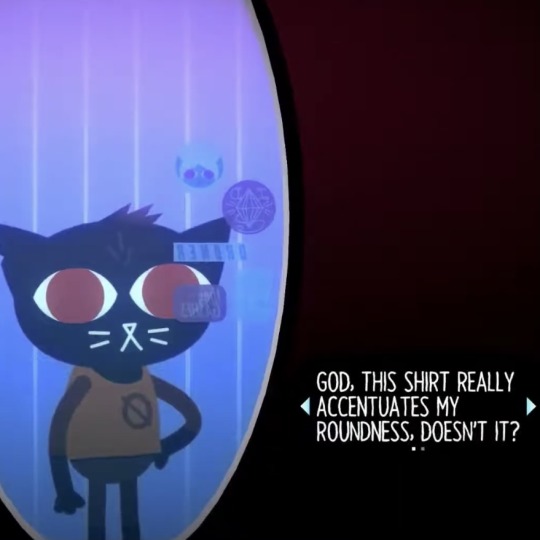
you can choose the other option, but you still see this one regardless of what you pick. mae is ROUND. this means she is NOT skinny. i guess some would argue that because her arms and legs are smaller that she is, but that’s literally just because of the game’s artstyle. EVERYONE is depicted that way, so it doesn’t change the fact that she is fat
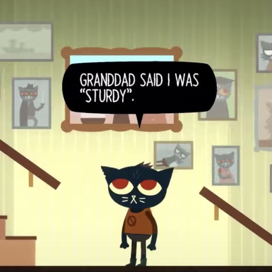

another piece of dialogue describes her as “sturdy.” being a chubby person myself, this is literally what my mom called me when i was little. it’s really upsetting to see a character i love and relate to so much misrepresented this way when she is canonically built like me. it’s already rare to see good representation of fat people, so erasing the ones we get doesn’t help
next time you draw mae please try to keep this in mind. and to everyone who draws mae chubby already, i love you forever and always. thank you
#night in the woods#nitw#nitw mae#mae borowski#original#i put off posting this for awhile. but i reblogged a post about the same thing so it gave me a bit more confidence to talk about it
7K notes
·
View notes
Note
Hi! I’m working on an original character project that I want to include a lot of casual representation in (“casual” meaning that the characters don’t need a justification for being disabled/fat/POC/etc, they just are because people can and do exist that way in reality!)
I was wondering if you had any suggestions for finding resources for drawing facial differences(and maybe other visible disabilities), especially in a cartoony style. I’ve looked through the Facial Equality Week tag but would like to see more examples, and since my art is so… goofy, for lack of a better word, I would love any help I can get in integrating differences without being offensive or upsetting.
Sorry if this is a bother, and thank you for all that you do!
Hey!
I'm not aware of any guides for drawing facial differences specifically (or at least, good ones. There's 1 billion tutorials telling you that scars are just a Singular Line, always, but that's not... correct), but perhaps someone in the notes could help out?
For my own advice, you could check out this old post I made. Because you mentioned your art being cartoony, I would specifically urge you to not overexaggerate facial differences the way they often are. A prime example would be how a lot of cartoons portray strabismus;
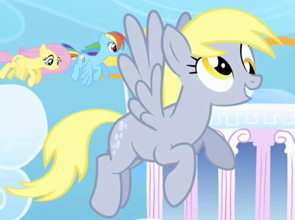
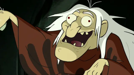
It's just a funny gag to them rather than, IDK, how some of us look like. Not to mention that one of these is also a mockery of intellectually/developmentally disabled people with "Derp" in the name, but that's beside the point here.
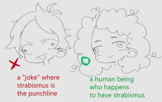
It's the whole "the character is crazy/stupid/wild/whatever and that's why they have it" that's the problem with how it's often shown. You can also see it in how characters who don't even normally have it will be shown with it for a scene where they're saying something nonsensical, etc.
Another example that's nowhere near as rampant is the split-face thing with various facial differences being used. Mostly vitiligo but sometimes also facial palsy. I'm talking about this weirdly perfectly halved face that looks extremely different on each side, often used to imply that a character is two-faced but mostly just signals that the author doesn't know how vitiligo looks like.
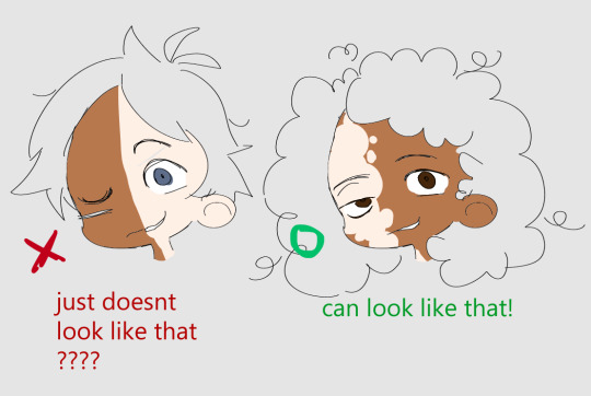
[note: vitiligo also shows up on lighter skin. I wanted to make sure it's visible here for tutorial clarity purposes.]
This one is just weird because it straight up doesn't look like that. I have no idea where it came from, but it should go back there. Facial palsy doesn't make someone look like the antique comedy/tragedy theater mask.
Unless I'm forgetting some other annoying cartoon trope, these would be the big ones that you should stay away from.
Outside of that, it's really on a case by case basis on how a specific FD should be drawn because they're so different. A birthmark can just be a differently colored patch of skin, but a craniofacial difference would require some more changes to be included. Alopecia is well, lack of hair, and can be done very easily but ectrodactyly can be more complicated to show properly because of the limitations of a cartoony artstyle when it comes to hands. And while I do think it would be great to see more of those facial differences that tend to not be included in art at all, there's nothing wrong with deciding to go for the things you can represent more faithfully, especially if you're just starting.
I will say that if you're making an honest attempt at being respectful and trying to get it right, most of us will still be excited to see your work. Even if it's not perfect or has some inaccuracies. I will take a "'yeah more or less' correct with a happy, human character" over a "Very Technically correct but tagged as #tw burns and with blood splattered on them" any day.
Lastly, I wanted to share some art featuring characters with facial differences (and other visible disabilities) that are done in a cartoony, or at least somewhat simplistic artstyles (I'm using both terms very widely here) - maybe it will give you some ideas.
Man with Treacher Collins syndrome (also one of the first pieces online where I saw a character with an FD portrayed in such a lovely way. A fav of mine.) Girl with Pfeiffer syndrome Too many characters to count Woman with burns Woman with a limb difference Multiple characters again Animation featuring people with Down syndrome [youtube] Multiple characters, including a girl with neurofibromatosis, a burn survivor, a girl with a cleft lip and another with TCS [twitter]
If you have a more specific art question ("how do I draw a person with XYZ facial difference?") you can send me an ask on @saszor. I prefer to stick to the writing theme on this blog but would still like to help if you need it.
Hope this helps,
mod Sasza
Edit: apologies for the lack of alt text on one of the images, it has been fixed.
726 notes
·
View notes
Text

I don't know how I drew the first one really. All I remember was feeling so upset and projecting and the next thing I know, Damian's suffering in front of me. Good thing I also drew him some great friends to help him pull through! Really wanna do more of his crew. They're all color coded and everything! UGH!!! SO CUTE!!! Why must I be so busy? TvT As always, I often challenge my own artstyle, so their designs may change from time to time as I wasn't completely satisfied, but I'm happy to at least finally have them out there for y'all. -Bubbly💙

#spacebubblearts#dc#fanart#my art#damian wayne#robin#angst#sort of#don't take it too seriously#I just read something sad and this happened#colin wilkes#suren darga#mia maps mizoguchi#jon kent#maya ducard#kathy branden#doodles#supersons#super sons#son of the bat#son of batman#batman#batfamily#wayne family adventures#i can't just be fluff all the time#based on that one time damian talked about having everyone else but himself in his mind#made me sad#gotham#vigilante#damian al ghul
219 notes
·
View notes
Text
Team Natsu Magic HC
So I was rewatching the gmg arc, and something I really appreciated about the artstyle was how they made the celestial spirits glow compared to humans at nighttime, and it got me thinking of how Lucy's magic makes her fit right in with them but also look normal with the rest of her team, and it kind of spiraled from there so accept my brain rot pls.
Lucy
As I was saying above, Lucy's skin & hair faintly glows in the starlight/moonlight. It's not that noticeable when she's standing next to other humans, but when she's with her spirits at night, she looks like she belongs with them.
Lucy is covered in light freckles, and occasionally they will move across her skin like shooting stars, or random lines will faintly connect like a constellation. It occurs more when she's around her immediate family or spirits. Team Natsu has a game where as soon as they see it they treat it like a shooting star, and everyone makes a wish. Lucy didn't notice it until they started doing it, and was freaked out about the freckles for a little bit.
Lucy practices what we would consider practical witchcraft, she has an altar set up in her apartment that she changes every time a new zodiac season starts. Even though she knows her spirits and has close bonds with them, she does this to feel close to other celestial spirits when they meet. She is also superstitious, and on nights when the team is safely asleep in her apartment she will put lines of salt across entry points in her apartment to ward off evil.
Natsu
Natsu is always warm. Always. I know this is something that is exhausted but that boy wears crop tops and shorts constantly, and also loves walking around barefoot. He only wears the duster every once in a while, and team Natsu considers it bad luck when he does, because Fairy Tail always gets into conflicts when he does.
Natsu can use his hands like a heat gun, which is useful for when Lucy has to repaint her apartment when things get covered in scorch marks. Natsu finds it boring but Lucy threatens to not make him dinner if he doesn't.
Like Gajeel and Cobra, when Natsu starts to get really angry his skin starts to harden, and it looks like scales are emerging from under his skin. Watching them fully break through the skin when he uses dragon force scares the shit out of his enemies.
When him and Lucy eventually settle down and have kids, he has Gray, Wendy and Ezra help him gather scales from his dragon force to make a scarf for their children. Lucy and Erza get into knitting, and eventually drag Wendy and Gray into it too, and the entire team helps make the next generations scarves.
With his dragon senses, Natsu is fully tuned into his teams scent. He knows the scent of their favorite food, their blood, their hygine products. While he does know the rest of the guildmates general smell Natsu has fully committed his closet families smell into his brain.
Erza
Erza has to set a time every month where she sits down and repairs her armor and sharpens her swords. Before the team fully started leaning on each other the entire process would take her like 5 days, but with Lucy sitting down and asking Erza to teach her how, eventually the rest of the team started helping her. Lucy hosts it at her apartment, and they make a weekend out of it. Eating greasy food, talking shit on their enemies and discussing the latest guild goss, they manage to knock out Erza's monthly chore in two days.
Erza has to keep a mental inventory stock at all times. With how much swords that break during battle she has a revolving number in her head at all times, it's exhausting at times when she can't stop thinking of it before she goes to bed.
Team Natsu has managed to learn to glance at Erza when she's reequipping and from a single second can guess which armor she's getting into, and they're able to adjust their battle strategy/team work without speaking.
Gray
Gray will have steam coming off of him constantly when it's warm outside, and on those days no one blames him for his stripping habit.
At this point the entire team is used to seeing him naked and they don't mention it if they are at one of their apartments, but they all have an extra pair of clothes for him in their travel packs when they are out in public.
Lucy will gravitate towards him when it's hot outside, the mist feels nice, and as they got closer it's common for Gray to have a hand on her ankle/ shoulder to help cool her down. Wendy and the exceeds pick this habit up as well.
On the colder days Grays skin actually hardens, think of how Twilight described the vampires skin, and it will also sparkle lightly.
In his off time Gray participates in ice carving competitions, but he will have to travel to go to them. He is banned from participating in any of Magnolias since he always wins and it has started more than one fist fight.
Wendy
Wendy is very sensitive to the weather, and can usually tell when a huge storm is coming before it hits Magnolia. She has helped save lives by warning the town of incoming deadly weather events, and helping them prepare for it.
Wendy moves silently, her footsteps are as light as air. While Team Natsu is used to it, she constantly scares other people in the guild and she feels bad about it, while the rest of the team finds it hilarious.
While her nose is not at the level that Natsu's is, she has gotten over her pride and has asked him to train her, and she is slowly picking up her team mates smell.
Natsu and Wendy curl up together on long train rides, usually both resting their heads on Lucy's lap. Wendy can't explain it but that woman makes the worst of the aches go away.
As Wendy starts getting more powerful she gains the ability to generate thunder storms and tornado, she also doesn't need Carla to fly. She doesn't use the ability though unless she's in dragon force, she doesn't care if she can fly on her own. Her and Carla are a team dammit.
#fairy tail#team natsu#lucy heartfilia#natsu dragneel#wendy marvell#gray fullbuster#erza scarlet#fairy tail headcanons#fairy tail 100 yq#please tell me this makes sense#My brain rot is consuming my life
228 notes
·
View notes
Text
ty! \(^_^)/ feelin good so ill try answer in detail for ya!!!!
most of the time i just do basic cell shading. here ill explain my rendering process after i choose my base colours, ill try keep it short & sweet!! nvm warning buckle up its really super long.
flat colours -> fully shaded!!


⭐️Picking shading colours!
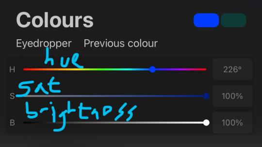
usually it's just the base colour with +saturation OR a hue shift! i dont really lower brightness.
This is what i mean by HSB, i never use the colour wheel i prefer the sliders!!!
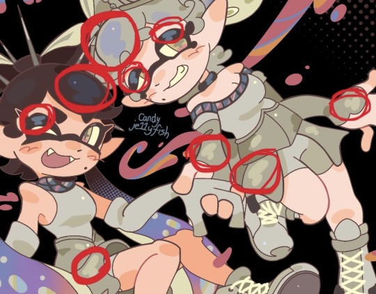
i like my art to look super colourful so i do things like shading pink with blue instead of with a darker pink or red, as shown in the above callie piece.
examples ft lumity:
skin: i always keep it very simple & cartoony! over the nose, below the eyes, the neck & sometimes the tips of the ears is where i'll put shading
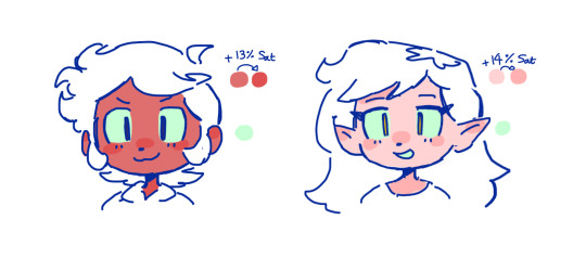
hair: as u can See, it's not darker than the base colour at all!! for dark hair like luz's, i brighten & saturate the colour, and for light hair like amity's i just shift the hue a little!
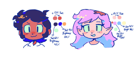
⭐️more kewl tips:
colourpick from yourself!!!! instead of making a new colour for everything, try using a colour u already have down!!!! like below: by limiting my colour palette, it looks more harmonious
really messy image but i hope u get what i mean. also the "off white / black" thing is a separate choosing base colours thing!! i can expand on that if anyone's interested 😙

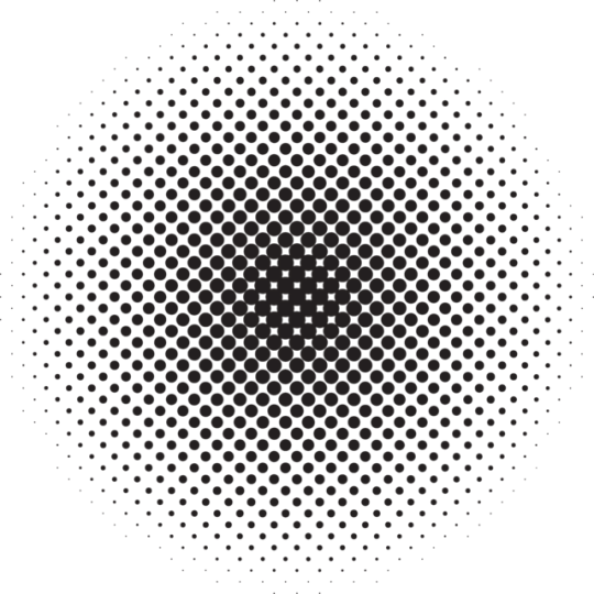
shove halftones in wherever they fit. here are the 2 pngs i use!! there a rlly good alt to gradients, i used a LOT of them in that callie piece!!! clipping mask over where u want it & alpha lock to change colour.

⭐️here's a WHERE i put the shading:
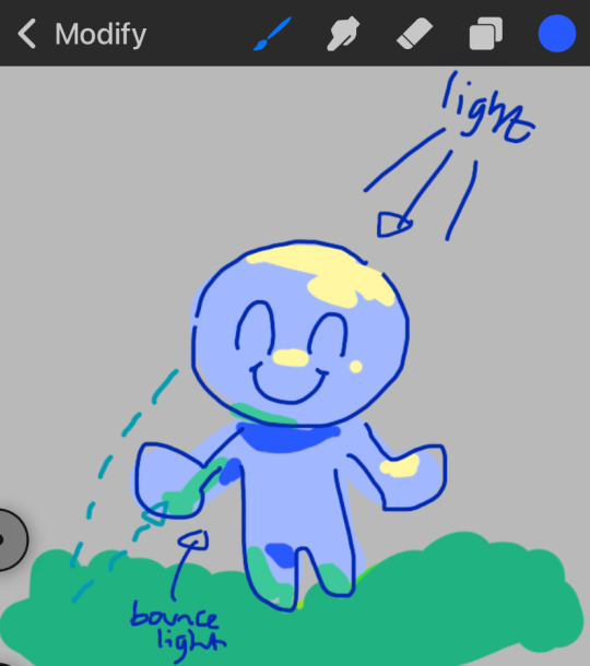
look st the environment ur guy is in!! pick where your light source is coming from & look where that light will hit and where it is blocked by something.
bounce light: the sun's light is also shining on the grass! so powerful the green reflects right back!
this is kinda more realistic lighting now.
i kinda just put a circle wherever theres a corner!
and i put that Beautiful Shape a lot wherever. i change it a little depending on the character, sometimes its triangular or squarey but thats the base shape! i dont even know what its called but i love it.
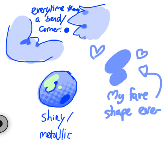
look at this hello weird shape guy!!!
actually, my grandfest art are probably some of the most detailed art i have! u can see urself where i put shading & stuff - they do have more desaturated colour palettes though:

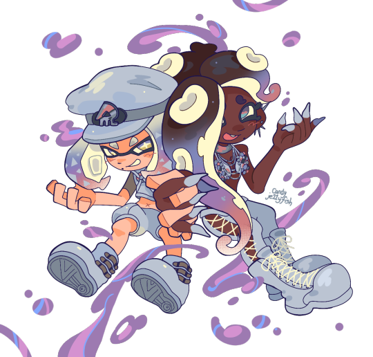
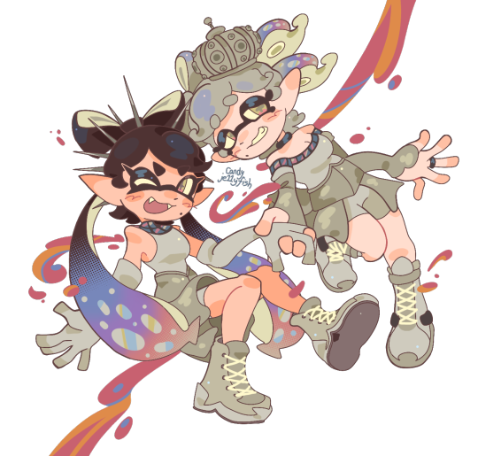
& here are some additional examples ^_^ flat colour -> shaded -> multiply layer -> lighting
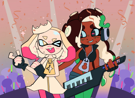


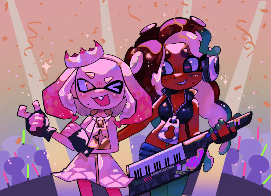
in this one u can see the hand & leg at the back are completely in shadow too :)

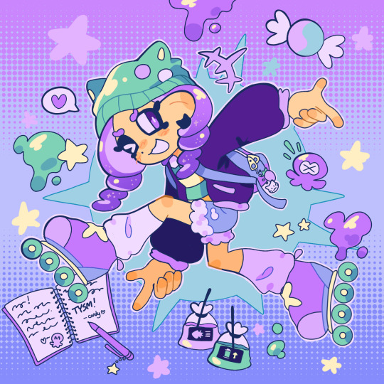
anyway i think that's kinda it? i dont really know how to explain it, i just do what feels & looks right to me??? remember that im Not an expert & this is just how i do things :)
i will always repeat my no1 tips tho: keep drawing!!! and copy ur fave artists!!!!!! it really will hell u find what u like!!!!!!!!!!!!
i hope this post helps a little & answers ur question😇 never be shy to ask me anything cuz i love answering & chattin w u guys!!!!
EDIT: just saying these arent set rules or anything!!!! u can see just how many times i Dont follow my own advice LOL. my artstyle is super inconsistent, i rarely draw things the same every time
202 notes
·
View notes
Text

Important asks and answers for you 🌺
How do we know we are in the SATs?
Lies and false perspectives.
How to "reprogram" my subconscious mind?
What is the void? What does it look like?
The void with sleep paralysis.
How to fix the inability to breathe when entering the void state.
Signs you're in the void.
Ways of entering the void.
What if my results don't start to show?
Differences in all the states before sleep.
Why do I snap back in reality when entering the void? What do I do when I'm very close?
Trying to manifest health issues away, how?
How does an animated reality look like?
Miracles are manifestation.
I still wake up in my CR, now what?
I can't enter the void no matter how much I "try" for it, and I overthink, now what?
Is the void state backed up by science?
Can we try the void during the day?
Time traveling with the void.
I want this I want that, but the void won't work for me! What do I do!
The "best" method for the void.
Tips for revising.
Doubts and narrow minded people.
Race change when shifting.
I feel like i could never enter the void.
When i manifest good, bad follows, why?
How not to fall asleep when trying for the void state.
Distractions and noises when trying for the void.
Is the multiverse a lie? why does something exist in your reality and does not exist in mine?
Biggest mistake when shifting or trying for the void, yearning.
The void oversimplified bc that's all you need.
Solipsism and my opinion.
Toxic positivity, i'm burnt out.
Can i manifest things in my CR through the void?
how many time i've entered and how long does it take me to reach the void state? (currently)
i hate doing xyz, should i still do it to enter the void?
Anxiety when entering the void, what if something happens?
robotic affirmations for the void.
Feel like shifting to another reality is harder than manifesting?
I feel like my desires are impossible when robotically affirming, is that okay? will it effect me?
If i don't do "xyz", then what will help me enter the void/shift??
What does "the void is within you" means?
Can i still be insecure and against my beliefs and get my desires from affirming? or do i have to embody? (...)
How to stay motivated when shifting? bc i'm too impatient.
I like my S/P sm, but he does not like me back, now what???
Difference between hypnagogia and the void.
Nothing works for me.
Coco how did you manifest your artstyle?
Tip to visualize the void.
some awake methods for shifting/ void state that i love.
I feel like the void is a "magic pill".
Can you manifest seeing an object INNN THE VOID?
Void through Hypnopompia (when you just wake up)
Is the void real. (omfg-)
Does manifestation work out of thin air, or by situations?
I'm scared nervous thoughts will manifest itself.
How to know i'm in my DR already to open my eyes?
I did everything, seriously, and i'm so burnt out, help!
Void state vs void dream.
Bad self concept, here's how to change it.
what makes Race-changing a fetish?
Difference between intentions and affirmations.
Complications in realities, just mine or others?
I love daydreaming, but why shifting feels harder than daydreaming?
How to shift with daydreaming.
How can we even find a method that feels comfortable for us?
What happens to us when we shift? what happens to our CR self?
I'm in the void, but it's not the void.
Can i affirm for something while already deciding to manifest that thing through the void???
I tried and i tried and i tried, i get close but never enter (pls-)
Difference between SATS and hypnagogia.
If i don't manifest under a certain time, am i doing something wrong?
I need to enter/ shift ASAP.
Why do most bloggers deactivate? and why are they still here?
Can i go back in time?
Why does it take effort to shift from CR to DR while it takes no effort to shift back from DR to CR.
Same advices... "i can't enter", just read this if you think you've heard the same things from bloggers.
What is the void? explained to a baby shifter.
I ALWAYS FALL ASLEEP UGH, here's some rare tips.
ASKS IN A BUNLDE : PART 1
87 notes
·
View notes
Note
A really distinctive feature of your art style is the white outlines you put around things. It gives it a very shiny and polished look, and makes shapes distinct from each other. How did you develop this technique? Would it be weird to you if I started using it in my own art style, as someone who's always trying to make everything look bright and shiny?
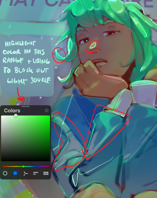
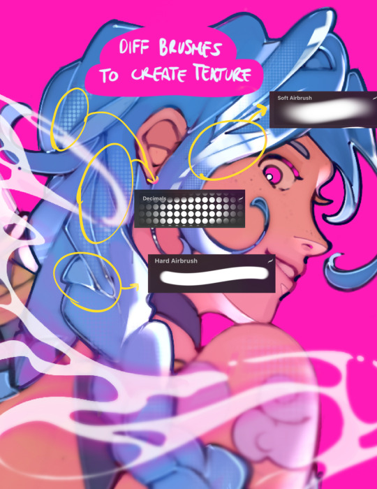
hey !! yeah so this actually started as an accident, I used to do lighting by placing a hard light layer w/ pink over lit areas and accidentally changed it to an add layer once. i liked how it looked so i started using that to highlight things and eventually saw that it rlly works for defining shapes, esp w/ hair and clothes
i usually like to think of it as a way to outline where light and shadows meet to create contrast w/ a base tone. i also like using different brushes and colors to make certain parts of a drawing more interesting (for me, the most boring part of my style is the hair and clothes. adding lighting there helps uplift it)
absolutely feel free to take inspiration, i think building an artstyle should be taking the parts you like from other artists so i would be honored :) here are some tips and what i generally follow while doing this. good luck !!
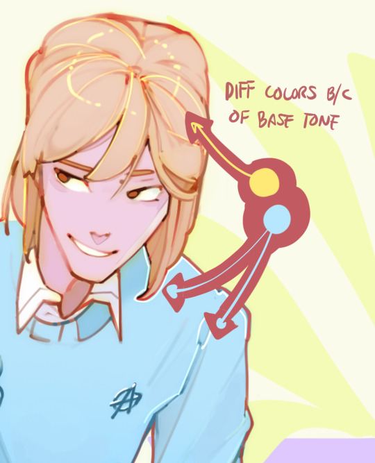
#ask koko#thanks for asking !!#when in doubt though i will usually use very light pink as these highlights. its not a normal layer but an “add” layer in procreate#like color dodge or screen but stronger (probably 1-2 of these in another app would also work)#highlights#art advice#maybe ??? i dont feel qualified to give advice
79 notes
·
View notes
Note
Do you have any tips for drawing? Also I hope you have a good day
Giving tips is hard for me because I mainly have a yolo mindset during drawing, but I made a little explanation about how I draw stuff; I hope it helps!


My biggest tips to drawing are probably ones you've heard before; A LOT of practice and be really fucking stubborn.
Ive been drawing all my life and with every drawing I feel it come easier and easier, I learn by looking at others art and borrowing aspects of their art which I love most; how some draw ears or noses or do shading... Your artstyle is a patchwork of the things you adore. If you dont like an aspect of it, you have the right to change it.
And keep in mind, even if people claim it; art shouldn't have rules. If you want to use black for shadows or draw highly detailed folds on a cartoon character despite it not matching the style, DO IT.
Art should be fun. Dont let others suck the fun out of drawing.

I tend to hate my old art a lot, but I've consciously kept it up no matter how hard I cringe at it. It's what helped me get to where I am. They are a part of me and have given people joy. Dont be afraid of mistakes.
Also, my whole profile shows that you shouldn't be afraid to go back and change things. I've made like 5 different designs for each character, and they constantly change even now. I made Narinder's old design because I didn't have the skill yet to draw him how I wanted, but now I have! Just stay persistent, and eventually, you'll reach the point you want to be at.
Poses have always been hell for me, but look! I did the thing!
So yeah,
be persistent, practice, and BE SHAMELESS
#artwork#art#tutorial#art tips#kinda#i hope this somehow helped#im not great at giving advice about art#cult of the lamb#cotl#reallyBURNTrambles
54 notes
·
View notes
Text


It's that time again—our Creator of the Month event is back in full swing!
Our April Creator of the Month is @cursedbycain! 🎉 Please join us in giving a big round of applause to Aditi for her incredible creativity and contributions—this spotlight is so well deserved! 🌟 To help you get to know her better, we’ve put together a short interview where she shares a little bit about herself and her work ✨! Welcome to the COTM hall of fame, Aditi! We’re so excited to celebrate you this month and beyond! 🫶
💬 1) INTRODUCE YOURSELF! Tell us a little bit about who you are—not just your name, but what inspires you, what you love, and how you would describe yourself beyond your creations !!
🎤: I’m Aditi! I’m in my 20’s and I’m Indian Canadian! I am a chronic gym rat and probably the most annoying morning person you will ever meet. I love all things makeup/fashion/skincare and of course, Cain is basically the loml, despite being a blonde. My main inspiration is of course my loves Elle and Agatha (@kazu-naito and @agattthaa respectively). I make a lot of things either for them or because of them and I could probably talk about them forever so I’ll cut myself off here! There isn’t much else to know about me, pretty much all I do is gym, study, write, and clean. My friends like to refer to me as “insane” but i prefer “organized” so if that doesn’t sum it up, I’m not sure what will.

💬 2) WHEN AND HOW DID YOU FIRST DISCOVER ROMANCE CLUB? What drew you in, and what made you stay? Were there particular characters, stories, or moments that left a mark on you?
🎤: So my first interactive romance game was actually the Love Island game, and because of my interest in that subreddit, Reddit suggested the Romance Club sub! So I downloaded the app, started a story, instantly disliked the artstyle, and then forgot about it for a month! Then I tried it again and started with KFS for the Indian culture, fell absolutely HEAD over heels for Ram, and I was hooked! Funnily enough, I started playing during a diamond rush and thought the free diamond choices was some crazy glitch. But finding out that they have these events was so incredible that I couldn’t stop playing.

💬 3) HOW LONG HAVE YOU BEEN CREATING? Can be both RC related and in general! what first sparked your passion for it? Think back: when did you realize you wanted to create—whether it was writing, art, or something else?
🎤: In general—we’re coming up on probably 6 or 7 years? I have ALWAYS loved reading and when I discovered fanfic and how much I loved reading fics, I started to constantly come up with ideas and send them to people in asks (this has not changed) and eventually I would think—well instead of sending requests for other people to write things…why don’t I just write it myself? And then I did! I’ve been writing on and off since then, for various fandoms and people and I’ve always loved the outlet it gives me! For RC—I am quite new to the fandom in all honestly, I started playing right around the Feb update and I didn’t start making content until late March/beginning of April! I love participating in fandoms and this one is a bit smaller than I am used to, which meant not nearly enough fics to satisfy my insane urges, so I figured I would write some!! So technically I’ve been creating for a month but wow, it feels so much longer.

💬 4) DO YOU REMEMBER YOUR FIRST EVER CREATION? Again, can be RC related or in general! What was it, how did it feel to bring it to life, and looking back now, how do you feel about it?
🎤: I have a vague memory of my first fic, but it is so horrible that I’m gonna talk about my first RC creation instead! I started with a CainLane fic (who could’ve guessed) after yapping in Elle’s inbox about them for a month! I sent her an anon about the idea around the end of March, and then I wrote it! It was basically a fic about Lane being trapped in Baal’s domain and her small interactions with Cain! It was a random idea that came to me, and writing it was actually really satisfying! Characterizing Cain was slightly challenging since it was my first time writing him, and I hate writing things that are OOC, but after some satisfying workshopping, it turned out quite nicely! I hadn’t written fanfiction in about a year, and it shows in that fic, but honestly I still like the way it turned out!

💬 5) IS THERE A PIECE OF ADVICE YOU WOULD GIVE TO YOUR YOUNGER CREATIVE SELF? Or readers in general?
🎤: This is gonna sound so cheesy, but have fun!! I used to literally burn myself out trying to stick to scheduled fic postings and crazy challenges, and writing would almost feel like a chore? Don’t let that happen to you. Above all, creating should make YOU happy. Even if something gets no notes, if you’re proud of it and creating it made you feel good, it’s a win. Everytime my friends mention their “flops” (oh yeah I’m calling you out) I wanna shake them because it really does not matter! NEVER let that kind of stuff discourage you. Focus on creating things that fulfill YOU and not others, because as wonderful as external validation feels, internal validation is so much more important.

💬 6) CHOOSE 3-5 OF YOUR FAVOURITE WORKS AND RAMBLE AWAY! We want all the behind-the-scenes thoughts: What do these pieces mean to you? What inspired them? Were there any struggles you faced while creating them? What emotions or memories are tied to them now?
🎤: Giving me permission to yap is so dangerous of you guys, alright lets do this! In no particular order:
Haircut - Cain x Lane — This fic holds a very special place in my heart because domestic fics are my absolute favourite. I also consider this to be my first proper CainLane fic since it’s in third person and more in character. Like many of my fics, it was inspired by something Elle said about how hilariously well groomed they are in HSR. It was such a funny idea, giving an immortal angel a haircut in the middle of a literal apocalypse that I just really wanted to bring it to life! Sometimes I find it hard to characterize Lane in relaxed moments like this, since the poor girl is always so stressed but it fell into place quite well! I also LOVE to incorporate found family moments of the squad into my fic and I pictured the ending of this one a lot. This fic is still so comforting to me and I honestly love it.
Rooftop - Cain x Lane — You know, you might as well call this interview an ode to Elle with the way she’s inspired all of my stuff. Once again, this is all her doing. I was halfway through my treadmill routine when I checked tumblr and saw her message and damn near fell off. No good morning message, just “lol, imagine lane finds cain crying alone and he immediately puts the mask back on when he notices”. There was nothing funny about this, I cannot believe she started this with lol. Anyways, I had already been left wanting by the rooftop scene in the update (seriously, we couldn’t get a kiss or something?), so I figured I would, in fact, write the loml crying because well, everyone needs a good cry. This was my first time writing Cain being vulnerable, and it took some workshopping. He’s such a guarded character, and crying felt almost OOC for him, so I wanted to make it feel right, which I think I managed! This one really does mean a lot to me. I really enjoy writing vulnerable moments like this, especially with Cain. As Agatha likes to say, he’s just a doll Elle likes to poke and I have joined her in said poking.
Eternity - Cain x Lane — Okay this is just embarrassing now uh this is ALSO inspired by Elle. She told me to make him cry again and I said “well, give me a reason” and she did, and I wrote it in less than two days. So this is probably the best fic I’ve ever written. I wanted to extend the scene where Cain visits her in s2 and sleeps on her lap, and just flesh it out. Elle, of course, brought up Lane’s mortality and how Cain would think about that and his feelings about it. Of course, the thought of this made me cry, and then I wrote him crying. I’ve never written a fic this descriptive and like flowery. It made me really nervous, but I loved the way it turned out. I probably edited it over 10 times to get all the metaphors and feelings of pain in there. Cain is a really complex character, which is part of the reason I love writing him, but it also means I am always doubting my characterization of him. With some lovely help from Agatha, I managed to work out his crying in a rather beautiful way, if I do say so myself. I honestly find myself rereading this fic whenever I’m particularly in a sad mood and just want to wallow a bit. The ending always makes me feel better though, and I always come back to it.
Unlocked - Yan x Lane — This is probably one of the fics I reread the most. I may be a dmitryan truther but don’t get me wrong…Dmitry can’t handle all that and I can! I honestly just love Yan, I think he’s such a sweet character and I just really wanted to expand on this small moment we got in the update. In a book like HSR I am always cravingggg these happy moments so this was a very self indulgent fic. The premise of this one was very random tbh, I kinda just let it come to me as I was writing. Normally I have a vague plot when I start a fic but with this one I was just like, well he’ll get in there and figure it out. I wanted there to be some smut but it didn’t feel right in the context of the scene. I was also very nervous writing this one because there are no YanLane fics on here, so I was really going in blind. Normally, I like to read a few fics to see how other people characterize who I’m writing about before I do my take. I was honestly surprised this did well, I didn’t realize YanLane was popular at all. But more importantly, I really like it! It’s a very comforting soft fic for me to reread.
Hate me harder - Cassiel x Audrey (18+) — Okay a wonderful change of pace here, this one was for Agatha not Elle! She tolerates so much CainLane from the both of us that I had to write this for her. She made a post about how Cassiel and Audrey should have slept together in season 1, and I was just very inspired by it? I think that’s my favourite thing about writing, if I want something to happen, I can just write it happening. The scene in the hallway where he tells her, “I’m gonna lock you in a closet” was genuinely so funny to me. They have such good chemistry in that first season, I love a good enemies to lovers moment. I hadn’t written full smut in a long time so I actually had to go back and consult some of my old smut fics and jog my memory a bit! But the banter during the sex was actually really easy to write, I really enjoyed that part of it. I don’t reread this one as often but I do really like it. I hope to write more for them but their dynamic doesn’t come to me as easily as CainLane and YanLane, which is probably because I’ve played HSR almost ten times now. But ABH is definitely a banger for me so I’m excited to see the ending and write some more Audriel.

🌟 Thank you so much for joining us, Aditi, and for sharing your incredible creativity with us! Your work has truly enriched the RC fandom, and we’re so grateful for everything you’ve contributed. Keep creating, inspiring, and making this community even more amazing! And a huge thank you to you, the reader!! You help us keep the catalog going strong. We appreciate you being a part of this amazing journey! 💛
45 notes
·
View notes
Text

Transferred student AU × Female SKK AU
#tried new artstyle#i come back#skk#bsd#bungou stray dogs#bsd fanart#bsd dazai#bsd chuuya#soukoku#skk fanart#fanart#digital art#female dazai#female chuuya#help my artstyle is always changing#female skk
89 notes
·
View notes
Note
Hi!! i just discovered your account and all your beautiful art and i felt in love with it, how, HOW do you make comics that feel so close, so alive? And your artstyle looks so simple but so charming, i would like to know how is your creative process and how you get inspirated to do such wonderful work
First off, THANK YOU SO MUCH FOR YOUR KINDS WORDS; I’m so glad you like my work and I am so flattered.
With my comics, they feel that way because they are emotionally honest due to my excruciating and inescapable earnestness. The earnestness doesn’t serve me well irl, but with the comics it does wonders LOL
For my creative process, I started taking myself SO seriously with my initial planning and I feel like it’s really been paying off, especially with this project. I write my script, make thumbnails, sketch, line work, color, and finish with inserting text bubbles and dialogue. Breaking the process into phases makes it less intimidating and helps me be more patient with myself/not give up.

For inspiration, I had thought this up for a music themed hetalia zine, but the comic was too long for the project ;u; I’d wanted to make something that got to the heart of what music/creative pursuits are all about which made me think of a story about Philip Guston (an American painter) who radically changed his art style from realism to a more cartoon-ish style after the atrocities of the Vietnam War. Guston said he’d initially considered giving up art altogether because it all seemed so pointless and absurd, but he felt ‘silence was betrayal’ and decided to capture the absurdity of evil in his paintings instead. I always think about that choice when I look at his paintings... Thank you for the thoughtful ask, anon!
29 notes
·
View notes
Note
How did you develop your artstyle and what is it effected by?
(anon clarified tht they meant inspired by) its gone through so many phases but through all of it you can kinda see just how much i take from the things i love. cartoons have always been an anchor in my life and as i get into things i take little pieces from them and end up with a frankensteins monster of all my favorite cartoons and comics and people
my style isnt shy at all on the stephen silver influence (i regularly go through his book "The Silver Way" whenever i feel like im falling back into bad habits) but genndy tartakovsky, lauren faust, basically the people making the cartoons i was watching were huge motivators
later on other artists like kelly ficarra, anne hero, and robert valley came heavy into play, along with all of my awesome artist friends. getting into comics has also had a huge impact on the art i make and the direction i want to head with my style.
i see something i think is cool and try to see if i can figure out the how and the why, and if i like it then it stays.
KNKL was also my crutch when i was younger and couldnt figure out how to learn and get better and was so frustrated that i couldnt draw as well as the people i admired, but this video really changed the way i go about taking inspiration. A lot of the older videos on the KNKL channel are so helpful, especially the KNKL thoughtfuls.
ill be honest i have no idea what the hell that guy is doing right now i just checked his channel and got scared. BUT THE OLD STUFF IS GOOD.
but yes i just see something that makes me go a little crazy and im like how can i do that and then i go crazy trying to figure it out and then i keep it 5ever
#asks#everyone gets an anime and steven universe phase it comes free with your drawing program#anime...come back...#anonymous
23 notes
·
View notes
Text
Someone once told me in the comments that they can’t draw because it always turns out like crap.
Boi, have you seen my blog??? Look how often my artstyle changes every couple months, sometimes it’s inconsistent but there is improvement. And again, it’s only a couple of months difference, so it’s often jarring for some if you know where you’re looking!
Not to mention of the unfinished doodles and sketches y’all don’t get to see posted publicly. It’s also sort of one of the reason why I don’t post often cuz I feel like my art isn’t good enough, other than being lazy or irl stuff
So if you think your drawings are like crap now when you only just started, OF COURSE it’s going to look like that, mate! You just started!
But if you think your drawings still look like crap after years of drawing, question yourself how much actual effort you put into that drawing:
Did you look at references? Either it posing or inspo?
Follow art tutorials! In today’s modern use of internet, you can find free art lessons online
Take the time to sit down and practice what you have learned? Even doodling and unfinished sketches help a lot if you’re short on time! I’m literally an example of this lol
I fear that this user will think that artists are gatekeepers and end up using AI, but seriously isn’t the case and it shouldn’t be.
And it has to be said, please don’t compare your art with others, we all started from somewhere. Don’t expect yourself to reach the same skill level as someone who has years of practice or had the resources to learn art early on.
Art, as everyone knows the quote by now, is subjective, but it only just comes down to how much you’re willing to practice on!
- CJ the Opossum
Sorry for the rant, was just reminded of the user’s comment when looking at my old doodles. So here is a little bonus if you stayed and read. If not, at least something worthwhile


This is detective Frisk and Lust Sans AU created by the user @feelisia 🐑 🩵
#frans#sans x frisk#frisk x sans#fransart#my art#undertale frans#frans au#fanart#cj the opossum#ai is not art#art improvement#art advice?#cj rants#frans doodles#not my au#detective frisk#lust sans#muscular frisk with abs
43 notes
·
View notes
Text
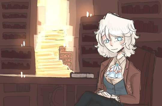
Welcome to the library.
Faust hopes you find your book in this place.
Hm? No, no, nothing is amiss, Faust assures you. This is how it has always been here, and how it will always be, ever since I created the library.

CHARACTERS UNLOCKED:
Faust and Heathcliff
List of characters
Current Chapter:
1. Eat you alive
List of chapters

BLOG INFO:
//well hi there! This is a blog for my swap au between ruina and Limbus company! I thought it’d be fun to make a blog for it!
//this is specifically an interactive story askblog, meaning we’re starting at the beginning of ruina, and through asks, we’ll unlock new characters and such!
//artstyle may differ between posts. This is simply for ease of drawing. My main style (that you see in this post) will be reserved for comics, whereas my simpler style will be used for most asks.
//Please read below the read more if you want to ask, just so you have more info! Have a fun time here :)
Interactive askblog? What's that?
Basically, you all help progress and change what happens in the story! This isn't only done by unlocking characters, but by also deciding what occurs in the story, and how character relationships may change.
Sending asks:
Don’t be afraid to get silly! Though this blog is trying to get through a story, I don’t want it to be 100% serious.
Please don’t spam asks trying to send Heathcliff books. They get lost in the post. And the system doesn’t work like that! Try to get him thinking about a certain topic
Have a canon char or oc or even an abnormality you want to interact with us with? Send them in! You can either send them in to fight, or just to ask questions, either works!
Story progression
As seen on the characters post, you need certain things to unlock new characters. A new book, and for Heathcliff or Faust to talk about a certain thing. Chapters progress every time a new character is unlocked. They don’t really mean much else, and are just there as a way for me to track things.
I’ve tried not to make progression quests hard, but if you need a hint, I will provide one.
Characters
“Whose swapped with who??” You’ll have to stay and find out. I’m not revealing.
“This character works better swapped with this character though...” though I did base off of personality or story similarities, most of these swaps don’t actually impact the characters themselves, so it doesn’t matter who they swapped with in the end, I think.
Also, characters maayyy be a bit ooc, as I'm not too well versed with all of them. I'll get better, I promise <3.
//That is all for now! I will probably update this eventually however
// Most asks will be answered with a piece of art, bigger asks may get lil comics of art, and small asks that I can't draw for will just be text. Though I aim to have at least 90% be art. so answering may be slow, I apologize
//Normal blog rules and all that. Be nice, be respectful, no NSFW... yknow?
//This blog is also ran by the same person (me <3) who runs @dieci-association .
41 notes
·
View notes
Note
I love your artstyle!! Do you have any tips for drawing?
thank you so much! i'm really happy you like it!!💗 as for tips, what i would say would change drastically depending on what kind you're looking for, but some very general ones:
draw what you love and want to see most, regardless of whether anyone else wants to see it. if you don't enjoy what you're drawing it'll never come out as good or genuine as something your whole heart and soul is in. i mean you'd think this would be a no-brainer but sometimes i've had to sit back and ask myself 'if no one was ever going to see this except me, would i actually spend time drawing this?' and i was surprised by the answer
that said, it is also completely valid if your motivation for drawing is to draw for other people! there have been plenty of times where i was too artblocked to draw my own ideas but was still able to draw commissions or gifts and enjoyed it simply because making other people happy with my art makes me happy.
don't get too caught up in having a consistent art style. in my experience this 1000% hinders you
having your sense of anatomy degrade over time without you noticing because you keep drawing the same types of characters is a very real thing! if this is a concern to you be sure to draw a variety
follow a billion artists that you like the art of and you will have endless inspiration injected directly into your brain every time you open social media
my favourite practical tip for those who draw at a desk: keep a small mirror next to you at all times. absolute game changer for quickly referencing hands
if you're drawing digitally, make the canvas huge! in my experience this lets you draw messier/faster and you can't tell at all when you zoom out. if you tend to get stuck spending unnecessary amounts of time micromanaging pixels (me💀) keep it zoomed out while drawing
related to the above point, messy drawings can have far more expressiveness in them than neat and polished drawings. nowadays i never do lineart and go straight from 'barebones stickman pose' to 'varying-levels-of-coherent sketch' and use that as my lineart. sweet freedom from the sketch-looks-better-than-the-lineart phenomenon
if your goal is to improve, then you really do have to scrutinize your art, figure out what you're not satisfied with, and commit the time to focusing on it. 'practice makes perfect' kinda rubs me the wrong way because of how much i've seen it interpreted as 'just draw everyday and you'll magically improve' but genuinely it won't get you very far if you don't actively think hard about what you're trying to improve and take the steps to do it. is this a hot take idk. also hand in hand with this, not every artist is trying to improve and you shouldn't feel bad for this! maybe you just wanna make a little headshot doodle of your fave blorbo and that's your only drawing goal ever. awesome. maybe you know your art has flaws but it's passable enough to convey what you want and you're perfectly satisfied with that. (this is the stage i'm usually at). also awesome!
don't hesitate to draw something because you think it's out of your skill level. the worst that can happen if you draw it is that it comes out terribly but you learned something and can always redraw it better in the future. the worst that WILL happen if you don't draw it is that you'll never draw it. and then it will sit in the back of your brain haunting you for years. it's not like i'm speaking from experience or anything aha
look up 'hand stretches for artists' and do them if you draw a lot unless you wish to summon the wrath of the carpal tunnel demons
of course, these may not necessarily work for you, and most importantly(!) these are coming from the perspective of someone who is primarily a hobbyist. some of this won't be practical for people who need to build an audience, maintain a consistent style for work, etc. these are just things that have personally helped me over many years of drawing :)
104 notes
·
View notes