#he looks pretty different but still Similar to his og design!
Explore tagged Tumblr posts
Text

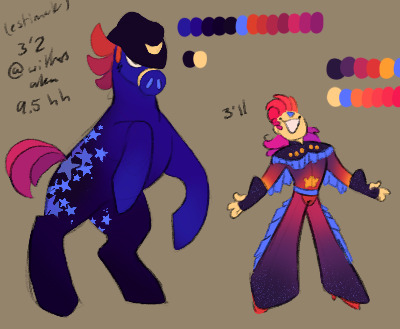
i don't think i posted doodles of Sundown Summer's loyal steed! he's a starry appaloosa. a... starpaloosa. constelloopa. appastella. he has a body count written in blood
#fun fact his character is Years older than sundown#he was originally a bounty hunter who happened to be a weird cartoon horse#i wonder if i can find any of his original doodles in an old sketchbook...#he looks pretty different but still Similar to his og design!#nah thats a lie. thats a blatant fucking lie lmao#he's kept the hat & the eye and the mane/tail#the sideburn is a new development#i like this spruced up design better! he has more Character to him!#scribble salad#forced idiots <3#oc#original character#they love each other very much <3#wlw mlm solidarity to the max#if anyone looks at sundown wrong he Will stomp them to death with his hooves#they were quite literally made for each other!#honestly someday i want to do a animatic for them w/ centaurworld's 'i was searching for you' song#bc Yeah. i have a scene in mind for them where that pretty much happens#oh to have a loyal gay murderous horse by my side...#man im so happy with his colors and overall design#not sure with sundown's colors but hmmmm its good enough for now#ill workshop it#he was almost a lighter blue w/ a black blanket and white stars#but i took one look and my brain went That Is Yeehaw Princess Luna so uhhhh this is better!
262 notes
·
View notes
Text
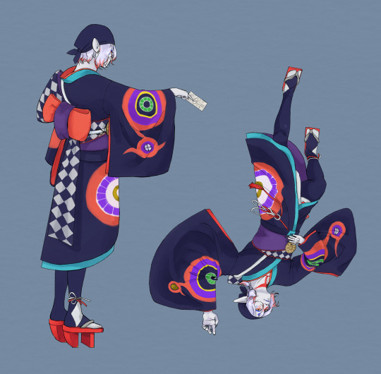
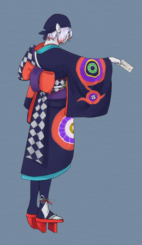
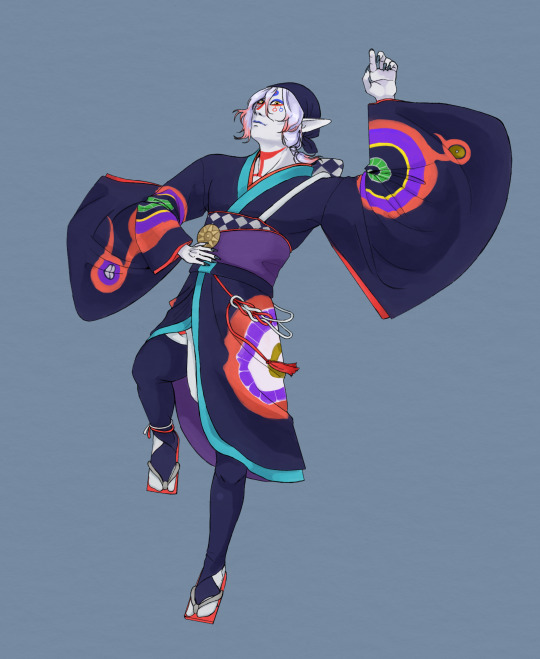
people: omg we finally get to see hyper! me: omg we finally get to see more angles of kusuriuri's clothes! observations and (A LOT OF) ranting under the cut:
1.)

The inside sleeve design has been revealed! It's pretty similar to the outside design but instead of that four-petal design, it's a gold circle. Also, it looks like the large eye is shared by both sides, but based on how the sleeve looks in other images, it must be really really big..... I guess they can get away with it lol. Like, if you laid out the sleeve fabric, I think it would look like this:

2.)
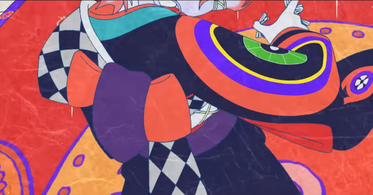
THE BACK OF HIS OBI. What the hell kinda knot is this actually... like, does anyone here know about obimusubi because I'm not very good at knots but if it comes down to it I will learn how this works. I already thought this based on the promo art but it seems like his obi fabric is double-sided, with purple on one side and the check pattern on the other, with a red trim. That lighter salmon color in the knot seems to be a different fabric, maybe an obiage? It's not tucked into the front so I'm not sure if that's the right term, but in any case it's some kind of extra fabric. If the purple and check are really one piece of fabric, then the knot is like... a hitch? It's some kind of one-loop bow, and it's quite bulky so he might have an obimakura in there. Whatever it is, it's considerably more elaborate than OG Kusuriuri's obi, which was that red brocade just tied into a large crooked bow. Who is helping movie Kusuriuri get dressed in the morning? (I'm sure he can do it himself and I commend him for the dedication to the aesthetic lol).
3.)
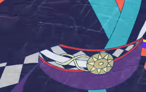
His mirror is now kept looped around this thick cord that kind of comes out of nowhere and disappears into his obi. First of all, how is the mirror staying up like that since the string is only looped once. Second, the thick white cord looks the same as the one that comes out of the left side of his obi and loops around his back, but I'm not sure how they would connect. Logically, they probably are the same cord and it goes through his obimusubi somehow. 4.)
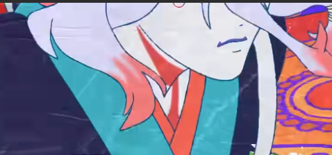
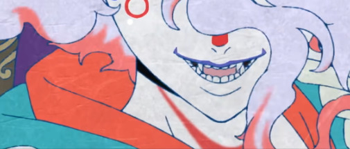
This one was actually noticeable in the very first trailer as you can tell, since the second screenshot is from that trailer, but I somehow never noticed it until now. Kusuriuri has neck markings now! In a different frame I caught a glimpse of the part that goes into his collar, it looks like a circle, though it's not visible in either of these screenshots. But from the first screenshot and some other frames I saw, it looks somewhat off-center. I wasn't sure if it was just a weird frame at first, but it looks consistent the few other times (time?) that part of his neck is visible. It looks like the strip of red that leads down to the circle curves off to the left rather than going straight down the center. I didn't realize this before but his neck is actually concealed in most of the promo images.
5.)
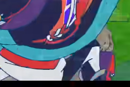
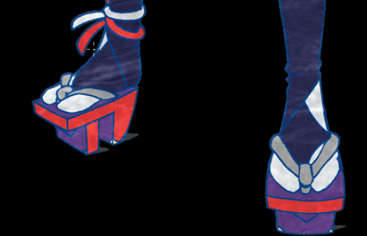
A better look at the back of his socks, plus two things that were visible this whole time but I didn't notice: first, his black leggings have this folded layer you can probably see on top. I'm not sure how to describe it and I don't know exactly how it works. It seems weird to me that he would have three sock layers (outer black, inner black, white), so I think the two black layers are probably still part of the same sock. I'm just not sure exactly what's up with it. Secondly, his geta have metal corners on the teeth! I don't think I've seen that on real geta, so maybe it's just a random detail, but if it's a thing on some real geta, I wonder if it's to keep the wood from wearing away there. Also another think I'm just noticing, there's a reinforcing wedge of wood under the front part of his geta that overhand the front tooth. You can see it a little in the second image.
Overall, that's all the new design stuff I noticed. Since I just drew him twice and spent like all day thinking about this, I've realized his design is way more elaborate than the original one. He has a bunch of little doodads, like the ties around his ankle or that decorative tie that comes out of his ohashori:
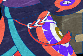
which still bothers me because I've never seen the back of it. Where are those strings going. And how is it secured in the first place? is it tied or pinned underneath his ohashori, like on the tie under the obi (not sure if there's a name for it)? What is it? Why does he have this here?
These details as well as things like the corners and wedge on his geta, the red trim on the obi and the check pattern, and his elaborate eye make up are all design elements that could never really have worked for a tv show. It's impressive to me even that OG Kusuriuri had that hand drawn brocade texture and the designs on his kimono that he did. It's the type of thing animators usually avoid, lol.
I like the movie design visually, but my god is it a pain in the ass to draw. Due to the aforementioned details of course and the wider variety of colors. Oh yeah, my last (for real) observation is that this Kusuriuri looks a lot less human than our OG friend. His skin is entirely whitish-grey, and he has that white/purple and red hair, and now he has markings on his neck instead of just on his face. (Unrelated but I feel like they made his lip tattoo less prominent and it makes me sad because it's one of my favorite things about Kusuriuri's design). But Hyper, from that very small glimpse we caught of him, looks more mundane than the original. I think it's the combination of his black hair and his markings being red instead of gold. I wonder what the rest of him will look like.... It was interesting to me that his face is drawn differently from Kusuriuri. In the TV anime, they have the same face shape and features, but their hair and coloring is different. And OG Hyper had a slightly different version of Kusuriuri's clothes. We can't see this new Hyper's clothes, but his face is more square looking. He looks like a different person... interesting lore implications.
Okay, I really must stop there.
354 notes
·
View notes
Text
Shout out to the person who noticed Steph was the only one in heels and said Dick would totally wear heels. You didn’t know it but you were ahead of your time (it was always my plan to put discowing in heels).
Steph originally wasn’t going to get heels but then I got the idea to add the wings and I fell in love but I think the in universe reason is she wanted them for the drama and she was extrapolating design elements from Batgirl’s og outfit and Batwoman. I was going for like a gothic princess sort of vibe which turned out a bit more Fischl from gi than I intended, but I think that actually suits the vibe pretty well.
Another shoe detail: Jason’s shoes are meant to be slight platforms to match his desire to be tall and imposing.
This is a side tangent but I want to talk about it. For this au I’ve been trying to strike a balance between feminine and “would this character actually wear this?” Now the answer is mostly no. The outfits by nature are impractical as hell bc that’s how magical girl media is, so the question I’ve been asking is more “would this character feel comfortable in this outfit?” I want each look to be equally feminine which means I’m hyper conscious of not making the women more feminine than the men. Magical girl designs are hyper fem by default so my goal is to basically make everyone relatively the same amount of fem.
However, I’m also trying to take into account personality. This is where I might lose some people but hell it’s my au. So why are Jason and Cass the only ones so far with real skirts? This is totally my headcanon but I think they’re the only ones who would benefit from skirts:
Dick would be fine with wearing a skirt but I think he’s ultimately neutral about it. He would totally do it though if someone asked and would be fully aware of how nice he looked.
I don’t know if I’d say Tim would like wearing skirts so much as he doesn’t care. He’s more concerned with practicality.
Steph doesn’t have any issues with skirts but I think as a part of her uniform she would feel stifled. As as I said previously I think part of her look is based on Bats she would’ve looked up to but also partly it was secret wish fulfillment for that little girl who would’ve loved to look like a kickass mary sue demon princess from a y/a novel.
Duke in my opinion wouldn’t see the appeal. I think he’d be similar to Dick but just a little more shy about wearing one. I gave him a little ruffle though bc I thought it was cute.
Babs is fine with skirts but tends to prefer pants.
Cass is a bit different because I think wearing something frivolous is so novel to her. I wanted her outfit to be a blend of her canon design and her appreciation for dance. I tried to contrast her more practical elements (like her pants and armor) with the soft things I think she would enjoy (like a flowy skirt.) I still have ambition to go back and design a Black Bat outfit for her but I haven’t quite figured out the direction I want to take with it.
Jason on the other hand— this also very much in hc territory— I think didn’t know how much he would enjoy a skirt until he got to wear one. Stepping away from the universe for a sec; Jason is the most masculine design fundamentally which means that in order to match the vibe I would have to make him the furthest from his canon design. I’m really not trying to make a statement or subvert things by putting men in skirts bc it’s supposed to a silly au with aesthetically pleasing designs. I like feminine things and it shows in my work however I don’t see clothing as naturally gendered. That’s my little context psa back to my point. I think Jason is the most likely to wear a skirt and actually feel empowered by it. At first I think he was embarrassed by it but the outfits choose you so he just went with it out of necessity. And through that he found he really thrived in the juxtaposition between his intentional imposing figure and this unashamed femininity. He’s a drama kid at heart and fr what’s more dramatic than an ill-advised fit that serves. The skirt to him feels like a costume that helps give him the confidence to be Red Hood or ig… Red Bow. (Which is sorta how I think of the red helmet in canon but I also do believe that Jason and Cass would have the most fun wearing a skirt.)
I haven’t decided if Bruce will get a skirt or not but if he does just know that my reasoning is that his artifact was humbling him. Like you take yourself too seriously calm down with the brooding. He would use the skirt as a way to conceal more weapons.
(I think Kon would love wearing skirts but in this au because he built his own outfit I think he was trying to seem impressive and edgy and distinguish himself from Clark. I also think, despite enjoying skirts, he would have to work up the courage to wear them in public and never as Superboy because he would be too conscious of his image.)
Anyway I don’t claim to always succeed with my intentions coming through in my work but this is what is running through my head.
#dc#txt#magical girl au#somehow this turned into me just giving my hc’s on the bat family in skirts#do you wear skirts? have you worn skirts? when will you wear skirts?#<- me interviewing the batfamily
97 notes
·
View notes
Text
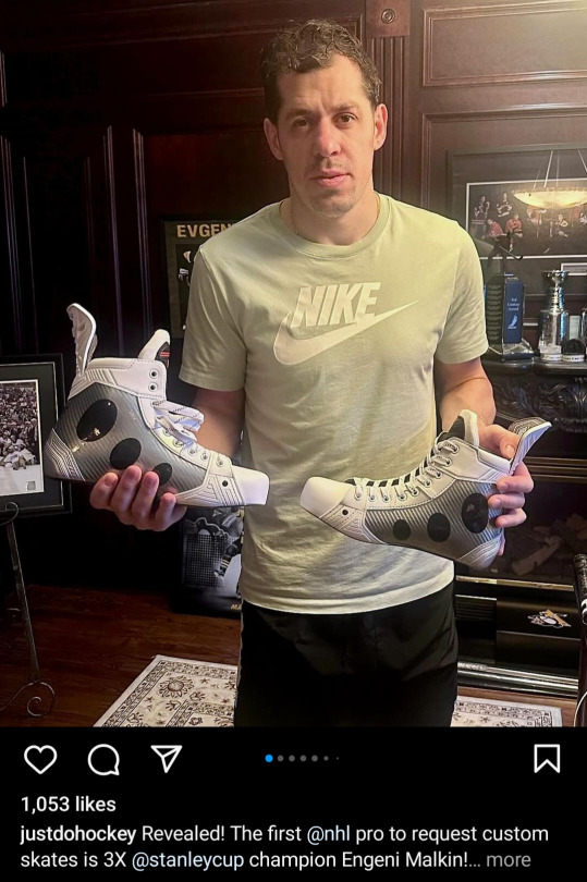
Okay geno looks unenthused and half asleep like he rolled out of bed to take this photo. But. AHHHHHHHHHHH!!!!! Excuse me while i fangirl over skates

Fucking! Look! At! These! Im in love they're so cool.

Having stared at geno's skates for way too long, i can see how these are still a very similar base structure but with a feds white n*ke overlay and its designed so well. Like its still geno's, but with a nice homage.

Like the basic pieces and lines of it are almost the same as his old skates (and very different from feds og white skates) but the changes are so pretty.
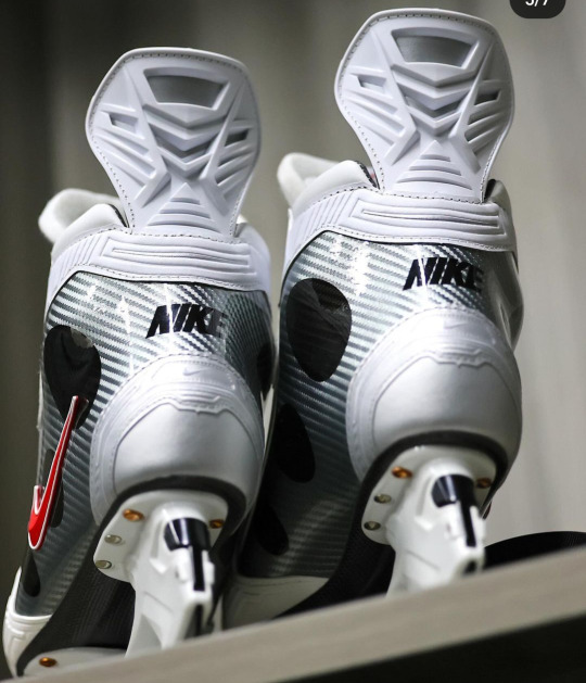
IM So CURIOUS IF HES ACTUALLY GONNA WEAR THESE NEXT SEASON

Also the weird little detail of the random copper bolt? Was that a feds thing? Its great. WHY COULDNT GENO HAVE DONE THIS BEFORE I SCULPTED HIS DAMN SKATES. Thanks 'im regular' geno.
Edit: i forgot to include this part:
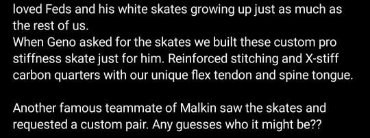
Are sid's stuck on the bench cause skate problem days behind us???
#Malkin#The only thing i miss is the checkerboard#I just like the checkerboard pattern better than stripes#But i admit that the stripes look better with the design
97 notes
·
View notes
Note
how do you come up with your designs for mcyt’s? theyre so creative and cool so i thought id ask
THANK YOU AND THANK YOU FOR THE QUESTION
now entering yap city tihs will be a long post
my steps are basically
voice
personality
og look of minecraft skin/branding
player movement
other ppls fanart (if any)
things that happened/cultural associations
i start with a bunch of random sketches to get the feel of the person.. that's why so many of my early posts were doodle pages. to me, character design is more based on what the person is like rather than what they look like. i think a lot of people do that
I do this with all of the above and shape language, but in bigger art pieces outside of lineups i also use color and perspective (as in youll see more of someone like spepticle in large, sweeping scenes while someone like zam in closed, heavily perspective-based ones) to indicate personality. ill change designs when suited for this too (spoke with or without a gas mask, vi with or without a mouth, etc etc)
my first iteration of lifesteal designs heavily relied on the look of the skins and were gradually tweaked over time. my most prominent example of this is my spoke design, so i'll use him at least once in the examples for continuous comparison.
i watch a couple of each person's videos first, understand their voice, personality, and what they do, then focus on them in other people's videos too to get a full story, their movement, and what others think of them (helps with personality and things we might not see). streams are the most helpful because they're less biased and you see so much more of their antics. huge stream fan.
i get into the how after this
this process doesnt go in order for some designs and others have a more prominent focus on particular parts of the process that override or effect other parts
Voice
starting off with not spoke here's a problem i encountered when designing wemmbu
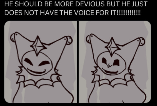
I based him a lot off of spoke and ashswag due to not knowing much about him besides the fact that he schemes (spoke&ash-esque) and he doesn't move his character around too much when talking (ash behavior). he didn't match the left one because his voice doesn't have the dramatic, flamboyant fratboy flair that spoke has, so I shifted it to be more friendly yet still dangerous with curved square shapes rather than triangles. i made his scheming, diabolical nature more evident through his clothing that's pretty jester-like and sharp, but with a smoother middle that spoke doesn't have (and to match his eyes).
voice also impacts character height. i dont know how to describe this. mapicc and zam are similar heights because their voices are similar, same goes for parrot and vortex, but leo and vitalasy are close to the same height (due to vitalasy's huge fuckass ears) despite having wildly different voices, with leo's bold text voice and vitalasy's higher-pitched jumbled kinda speech they still take up the same "amount of space" in conversation. they stand out. and even though spoke's voice also stands out an incredible amount he is still only slightly taller than average. this is where personality overrides voice in my designs.
Personality
spoke is sharp in every sense of the word, but is also able to mold himself around to get what he needs.

my first attempt at him was pretty lackluster. i didn't know much of him at the time, only his wither video, and thus understood him mainly through his association with parrot. he seemed a lot more evil and more serious at first glance. like woah! fully fledged mouth and nose?! not anymore.
i cover certain expressive parts to also depict more of their personality in some abstract, holistic way. after watching streams and whatnot, spoke doesnt actually speak (excluding his random sounds and yips or whatever he does) too terribly much, except when the spotlight is on him or he's trying to get something. so, i tweaked his design to encompass that when i understood him better.
i take away his arms to allow his hands to stand out more (character movement thing, he moves around a lot when no one is paying attention to him, punches the air when ..not talking but making a point ig. he's a big fan of hovering menacingly), i give him a slinky-like outside skeletal structure to both capture his affinity for withers (i made him a wither thing because of the wither sounds in his video.. and the withers in general) and to give him the feeling of more freedom with his movement.
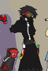
i also just really like gas masks so. basically, spoke is someone that hides away until he chooses to stand out. thank lord heaven he looks like some shadow creature.
later on i gave him more magenta highlights, especially in the wormhole era because 1. magenta wasnt heavily included in his rainbow look, making it stand out on his whole being, and 2. because magenta is really really cool and people should use it more.
og minecraft skin/branding
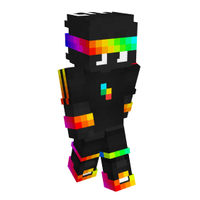
hi spokeis here. this will be quick because his branding is so heavy. lightning, rainbow, black. boom. character. withers and white eyes? easy. causes a lot of anarchy? again, lightning and withers.
planetlord on the other hand is someone i greatly differed from the og skin and branding. i saw the design in a vision idk. i shift his colors all the time in different pieces but i use more of his pfp colors now because there's too many purples in this world. his branding, personality, and voice all connect very well. a bit misleading, he's a bit of a weasel.
Movement
i never used to look into movement, but pvp styles and conversational movement of lifesteal is intriguing. unfortunately it was only something i started paying attention to during the end of s4 because vitalasy's movement was so interesting. he's a big fan of getting in people's faces.
ill be real, i didn't really notice spoke a lot during things because he was almost always never alone, and when he was it is always at a distance or you knew he had people to back him up.
spoke's movement isn't actually too abnormal. he's goal oriented and tends to always be doing something, and when he does he finds the most efficient way possible. pretty basic. his design choices are based mainly on voice and personality.
someone like mapicc on the other hand has very particular movement. he spins around people when fighting and gets right up in their face (in nethpot pvp mostly), so i made his clothing tighter to the skin with looser parts to accentuate that movement: practical clothing for close combat battles. it was also noticed (by the lord) that he tends to look straight forward instead of the slightly down that most players do.
zam fights differently, but i made him with the og branding (he's princezam) and what he does in mind. his body language in my art is more indicative of his personality.
Other people's fanart
shoutout the community, a notable amount of ideas were from the mid-late 2022 lifesteal community.
dog leowook and leather jacket mapicc were from gen, jackalope rek from aoi i think, "croptop" jacket spoke from saints-blade, snail terrain from navy-leader, tv ashswag from kish, sock puppet red definitely from someone i dont remember, 4 armed squiddo from seri, and old cartoon jaron was from bucket
Things that happened/istarted talking about cultural inspirations
spoke and his connection to godhood influenced his redesign greatly. this section affects what the character wears most of the time.
i give both spoke and vitalasy painted palms (alta) due to their connection with godhood and destruction, with spoke in particular reminding me a lot of Kali Ma, thus i gave him a skirt (due to nppp too). vitalasy's clothing is based on Indonesian cultural clothing. wemmbu's also takes inspiration from Indonesian and Bhutan cultural clothing.
indigenous cultures inspired some designs too (i do a lot of ethnographic anthropology work with some of the tribes i base the clothing off of), with woogie having Yupik and Inuit inspiration. polar bear = cold climate in my head. and leo has Haida and Yunnan (minority Chinese providence, not a tribe) inspiration.
bacon's... not bacon strip design's clothing was based on Bangladeshi clothing (im Bangladeshi, i also added alpona patterns to ash's design), nomadic cultures, and some german pilgrim thing?? idk not my best design. i specifically looked for nomadic inspiration because of his willingness to flee at any moment lol. i didnt do this for rek despite his fleeing reputation because i dont watch rek content too much and he already had hybrid traits that took care of that presentation.
poafa's design is a goat because of the medusa trials where he was used as a scapegoat. makes sense i think. his horns are from past associations with jepex that infected mapicc as well (devil trio s1). zam's design is very much from s3 empire and s4 castle.
planet's design changed slightly, mostly rounder shapes, but also the number of "spikes" on his scarf, now stuck at three because of 3ht.. and easier to draw than five. minutetech has a bow instead of a bowtie from jumper due to s5 happenings. the gem on his crown has wemmbu's highlights from his gem's main color.
roshambo's design was also heavily influenced by medusa where i gave him a snake body. in my art that depicts before medusa events he doesn't have the snake body, and same goes with before s4 spoke where i draw him with full pants. in some sketches ive depicted mapicc with a muzzle only after the destruction of s4 spawn due to quix's mapicc dog influence shoutout.
mapicc and ro have matching things that persist seasons (mapicc periwinkle collar, ro red painted ring finger... head finger?), as did subz and vitalasy with matching shoulder pads (beginning of s4 subz had a bandana and vitalasy had a bell that traded between them through artworks of mine) Vitalasy also gained sun and moon earrings. mid and 4c have matching hoods/cloaks ^_^ marriage or something.
hope this made sense and covered everything you could have ever wanted forever... feel free to ask me questions i love explaining processes
110 notes
·
View notes
Note
I've noticed that in various wips both Kon and Match have been the "younger" brother -- is there actually much of an age difference to them, or is it just both of them wanting to be the older brother? Either way, I am very here for your clonecest agenda, 10/10 A+ thank you!!
ngl I am thiiiiis close to doing a clonecest-themed WIP Wednesday (or WIP Not-Wednesday, maybe, hah), I am so so SO tempted by that idea. Like I'm sorry, I am just WAY too into the clonecest lately, haha. I have so much unpublished Match/Kon right now, like why do I have so much of that.
( I mean I KNOW why, but still, it is SO much. like . . . so, so much. I mean, it is in the realm of like, 30k at this point, jfc self hahaha. )
But yeah, the thing with Match vs Kon as the "younger" brother is a continuity thing, I guess? In the comics--at least in the OG run--Match was cloned from Kon within like the first . . . idk, six months to a year or so or his life as, like, the first run of a line of custom metahuman soldiers (back when Kon was technically just human and did NOT have any actual Kryptonian DNA, much less any of LEX'S DNA) that the Agenda was trying to design and mass-produce for, like, actual SALE. So in the comics, Kon is older and is Match's literal genetic template, but in the animated show, Match was cloned from CLARK as a first attempt at cloning Superman that was made before Project Kr produced Conner, and therefore is the older one--just in the cartoon he couldn't, like, actually be stabilized because said DNA was incomplete and unlike Conner, he doesn't have any human DNA to stabilize his build. And also in the comics, the process that the Agenda used to rip Kon's DNA to make Match actually UNZIPPED his DNA, and repairing it got Kon stuck at physically sixteen for a while, but comics!Match was aging normally during that time, so technically he's at least slightly physically older.
Also like . . . YJA!Match and comics!Match are VERY different, personality-wise. And looks-wise. And . . . everything-wise, basically, hah. Like their only real similarity is the name "Match", pretty much. So that's a thing too!
Personally I usually write more comics-based fic, so in most of my stuff Kon is LITERALLY a little older than Match while Match is PHYSICALLY a little older than Kon, adjusting for, like, interdimensional/time-travel/reality reboot/etc nonsense.
35 notes
·
View notes
Note
I love love your recent comic about JJ and pepper, will JJ ever realize his feelings for pepper?? Oh and JJ and pepper really remind me of jonathan and dio, i even thought they were their fursonas at first 🤧
I DON'T THINK, I CAN ANSWER THAT
pepper and JJ's "romance problems" arn't really importent current lorewise, and whatever related to it will happen AFTER the "fish market" lore so i will keep quiet for now 🤫
--------------------
also (the main reason why im answering this question), OH BOY DO I HAVE A STORY ABOUT THAT
OK SO, jj looks like jonathan from JJBA cause...design wise, he have went through the jonathan kinsona phase

i had JJ (originaly named "piper") since 2019, and between the time he have went through a LOT of design changes
i should mention that at time time, he has been a part of a [specific CS] * i will not adress them in name as i've left the species with a bad taste in my mouth and do not want to be involved with them again
around 2020 when i was INSANLY into JJBA, i found out there was a "jjba (CS)kinsona gang" chat within the species group, and while talking with some people there, i was like "haha won't it funny if i redesign my guy into a jojo character that'll be insane" and i did just that
sadly the small group kinda crumbled cause CS is all about trading and most of the "kinsona characters" got traded and redesigned 😔 i still kept JJ intending to redesign em again.
then, in 2021 when i had beef with the said [CS] and decided to leave, i sold out most of my said CS characters, but kept JJ due to sm fond memorys on him
but i didn't want him to keep being just a "jonathan kinsona". so after a species change, giving new lore and doing bunch of redesigns, the JJ we all currently know was born into the world
---
while being redesigned to his current looks, i put a lot of his previous design+ his cousin(shark)'s design elements and i feel like he turned out pretty well
definatly still have a sort of a resemblence, but different just enough 🤌
it actually seperates the characters more in his outgrows neck/back fluff ver, but (for now) he likes to keep it clean


------------------------------------------
pepper is also a pretty similar story

his OG design was based on speedwagon and when in my JJBA CS phase i was like "wait, wasn't there a SW inspired design??" and managed to grab em
however i don't think he gets the same recognition as JJ cause
i actually don't think his OG design resembles the character that much
i officially got him (ended my trade) when the said "JJBA CS gang" started to crumble, so i almost immidetly did a 180 on his design and used him for different lore purposes
people tend to skip part 1 so they have no idea who speedwagon is (😭)
and considering how i NEVER get comments on his connection with him but constently hear about how he look like
• dio (part 1)
• DIO (part 3)
• striker (helluvaboss)
i think i've done a pretty good job on his redesign 😂💅
#ask#actually so glad i didn't get rid of these two in the said CS purge cause when achii stepped into the lore evenyrthing just clicked like 🤌#i would appreciate if people to not compare the metioned characters with them please 🙏 didn't went through all that for nothing
177 notes
·
View notes
Text
Hazbin redesigns
I tried to make their designs more varied in colour and actually resemble what they're supposed to be.


I gave Charlie more goat features like the nose, hooves and horns (she also has goat ears but they get covered by her hair). I also tried to incorporate the fact that she's supposed to be a doll with her joints and face paint. Her outfit stayed pretty similar to how it is in canon because I don't mind her being red when the rest of the cast isn't and because it looks cute.
Vaggie also looks more like a moth now. She has lot's of scars because of her background (she isn't an ex-exterminator in my version but im still figuring some stuff out there). She wears casual clothes because she desperately needs a rest. I also gave her a more stocky build.
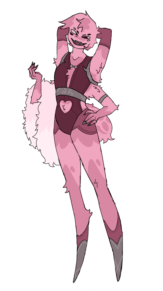
For Angel I focused on a very pink colour sceme (because I like pink). I didn't have lots of problems with his original design, mostly that he doesn't look like a spider too much. I made him fluffier and gave him different teeth (which look more spidery imo) also gave him a spiderbutt because I genuinely don't know why they didn't do that in the original show.
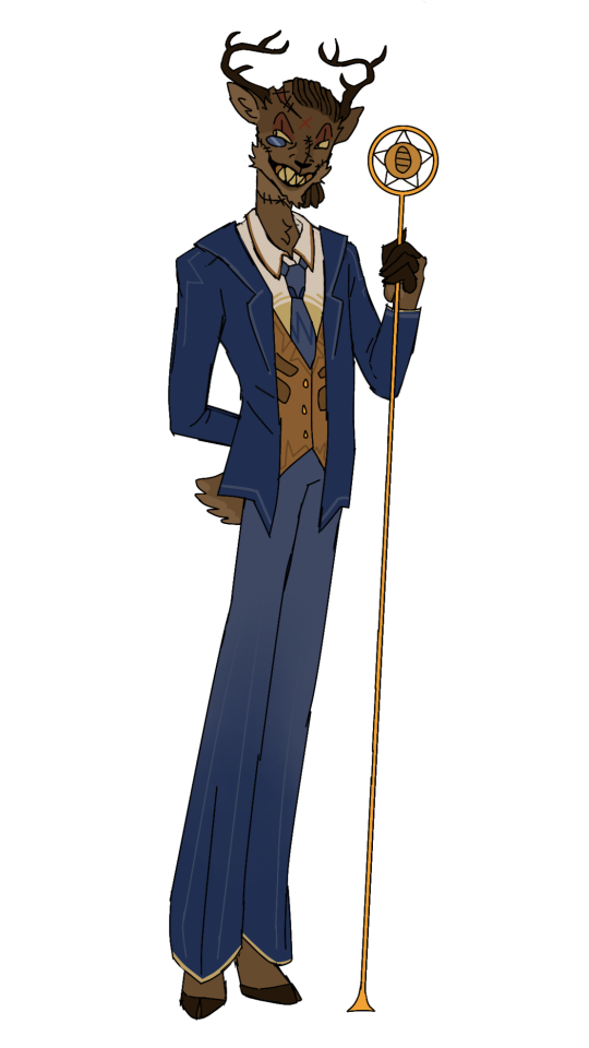
I made Alastor actually look like a deer because he doesn't look at all like one in his og design. Also no more red since red is typically associated with danger and I wanted him to look like he could manipulate demons into giving him their soul by being charismatic (still wanted to make him look creepy ofc). Blue and gold are typically associated with Angels in this show and I thought that'd be a nice change for his colours. The stitches in his face are were the black tentacle things come out of when he is in his demon form.

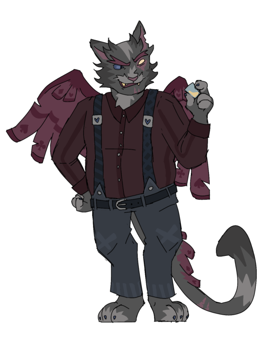
I don't have a lot to say about Nifty. She is a bug now, specifically a fly. She also isn't red anymore because flies are green and because it fit with her wanting to clean stuff (since green is often connected to dirt or garbage). I gave her cleaning gloves and tried to make her look more like she could be from the 50s with her dress and hair. She has golden accents to connect her with Alastor.
Husk's design is all over the place but his redesing is probably my favorite one. I gave him a bigger build because someone who pretty much only consumes alcohol all day wouldn't be that skinny. I also tried to make him look older and more rugged. His colours were really obnoxious so I toned them down as well as the owl aspects of his design. I gave him an actual outfit since the one he has in the show confuses me and looks a bit silly.

These are designs for my AU of Hazbin Hotel which im currently figuring out. There's a lot more I could say about some of these designs but I kept it shorter here.
I also finished my Pentious and Cherry Bomb redesings, which I'll probably post a little later. I also already have ideas for the Vee's but I havent fully drawn them yet. Feel free to give suggestions/ask questions about my redesings/rewrite.
#hazbin hotel#hazbin hotel redesign#i dont support vivziepop#hazbin hotel critical#hazbin hotel redraw
58 notes
·
View notes
Text
weirdcore tower character designs part 3! 👁️🗼
surprise surprise! this batch is a two-in-one!

Thingies are the toppins of weirdcore tower, based off of different objects commonly associated with weirdcore. they are Flower, Mushroom, Smiley, Meat, and Moon. moon is inspired by mac tonight from mcdonald’s
Thing Terrors are the toppin monsters of this au. they reside at an abandoned kids party venue which has games, indoor playgrounds and live performances where the terrors performed. the venue also serves food such as pizza, popcorn and juice, often having weird toppings/ingredients like eyes and teeth. more info on specific terrors: the meat terror is a decapitated butcher with his head replaced with a slab of meat. the decapitation was a HUGE part of the downfall of the kids party venue. the moon terror’s reference to mac tonight is much more evident. instead of shouting DINNAH! he shouts PARTEH!

the fakes and bruno are pretty much the same. clones like them can be glitchy in terms of speech and acts. how much they glitch depend on how stable the clone is. they can do any glitch you can think of that happens in video games. if a clone turns scary, their voice may sound deep and demonic, and/or their eyes bleed out black, and they become glitchier
fake peppino is the same strange goopy frog-acting being as his original version, but despite how he looks, he’s not quite the friendly guy that a lot of fans make him out to be, he’s actually quite terrifying. i imagine him to have a similar goal to RecD’s interpretation of him: HE WANTS PEPPINO ON THE PIZZA. as he’s unstable, he’s glitchy, but not as glitchy as fake ria. like seen near the end of RecD’s PTNE lyric video, he always makes pizza with strange things. PIZZA IS INEVITABLE. YOUR SKIN IS STUFFED CRUST.
the other bruno, can simply be referred as just bruno, this is not the same bruno that was peppino’s mentor. i have a hc that the version of bruno (ill refer him as the real bruno) you see after escaping from fake peppino is the mentor of peppino and passed the torch to him. no one except pizzahead knows what happened to him, which he was used to make fake peppino. in this au, it’s almost the same case, but it’s something very strange and unexplainable on what happened to him. the other version of bruno never actually existed in the waking world as was made by pizzahead’s equivalent (i won’t show him yet) as a pure mockery against peppino and the real bruno, as a caricature showing a message that peppino and the real bruno will never be as perfect as the other bruno. he appears at a liminal abandoned pizzeria still named “Peppino Pizza 2,” as a mural on the wall and an outdoor window. and yes he can still turn scary and become glitchy when he’s like that
fake ria (who’s still not canon, she’s basically never gonna be a canon character) is the same extremely unstable, extremely hostile lizard-acting being. she is one of the most unstable clones, so she is extremely glitchy. just like her og version, she hates pizzahead’s equivalent for not making her as good as fake peppino or bruno. she has the same distorted voice, and her pitch varies even more, her pitch can slide a lot here too
be warned, they are actually not as friendly as they look…
and that’s it for this part! i already know what pizzaface and pizzahead’s equivalents will look like, but i have yet to think of stuff for mr stick, peddito, the doise, pillar john and gerome… maybe i can do bonus characters after i do said characters, such as maurice! see you in the next part!
#pizza tower#pizza tower au#weirdcore tower#fake peppino#fake ria#bruno#toppins#toppin monsters#my art#sketch#my oc#wt!fake peppino#wt!fake ria#wt!bruno#thingies#thing terrors#cw blood#blood cw#tw scopophobia#scopophobia tw
24 notes
·
View notes
Text
jellicle lineups; part 3/4
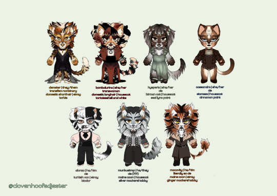
LETS GO PEOPLE!! LETS GO !! sorry for taking so long to get around to this one !
demeter | 🔒 🍰 🌇
DEETER
ive seen a lot of complaints about demeters design being toned down over the years so i decided to bring some of the bolder design choices back for mine. mullet demeter is REAL now ! honestly i couldve done more w/ their makeup but shhh its ok....
i tried to push the gold in their design by making the eyeshadow really obvious and giving them gold lips. enjoy their lacy dress too... i tried to design something which they could dance comfortably in
demeters newer 3 words (nervous, sensual, secretive) mean everything to me. love them so much. i think theyd be 29 in human years
bombalurina | 🌹 🍓 🛼
so i totally based her hair on that concept art for drag queen bomba. the bob is too cute ! i had a blast doing her design for the most part. i struggled w that makeup and the color of her dress but its ok.
i also tried to give her something she could dance in—just like. imagine the length of the dress a little shorter. im not going back and fixing it
i based her color palette/patterns directly on her concept art because tbh, i dont love blond/ginger bomba ! so black/white/red hair bomba it is
i think she would be 27 in human years
hysperia | 🪴 ⌚ 🍡
this is my version of exotica, renamed hysperia, because i do not love her og name. its not fun. the name hysperia is taken from an ensemble kitten character from the og london production
i also based her design on a multitude of things, asides from her 2 costumes in 98—like some nbq/greycat designs since i feel like that design not becoming a common ensemble character was a waste. A WASTE I TELL YOU! ive also based her fur length on warsaw victoria because oh my godddd that design is so good. peak
her neck bow is a nod to the 2019 movie... the macavity girls w/ those bow collars. they were onto something there
she would have a much more prominent role than the few times she cameo'd in 98, still retaining the elegant/shy personality she shows in the film. shed be 29 in human years
cassandra | 🪐 ♠️ 🥯
i originally made her makeup a lot closer to her replica designs but decided to go for something a little different based on a makeup look i saw on pinterest LOL. so like. enjoy her slight earthy gothic vibes. i also didnt struggled too much on her outfit since i came into this knowing that i wanted her to be wearing something formfitting and bejeweled. a little circus-y too
more people have got to play up her disdainfulness. she'd be 26 in human years
alonzo | 🎹 🍢 🎳
once again, another design pretty similar to his standard replica one. i just tried to make the black patch on his face a little greyer and with some white detailing. because tbh every alonzo with white mascara makes me go crazy its so cute
i also tried to make his head fur/bangs a little distinctive—inspired by a random pic from a production i dont know the name of
enjoy his little cute fit too. pinklonzo. pastelonzo
that one gif of him pantomiming eating a playing card IS canon to me. he'd be 28 in human years
munkustrap | 📼 🥧🎙
verrrry similar to standard replica munks makeup-wise ! however, fur wise.... say hi to mulletstrap. to manestrap. 2 me he is tuggers brother so he gets that. i have no justification for the mullet other than idk, looks good, is funny, and the oslo 1985 production was right to give him one. also he and demeter can match now
i do like when theyre seen as something of a prince... so say hi to the gothenburg and opera populaire-esque epaulettes. theyre cayoot. they also get warsaw munks Big Pant Vibes
give this man a break. hed be 30 in human years
macavity | 🔥 🥂 🎯
he was actually one of the first cats i made design notes for when i started hyperfixating on this musical like.... two months ago. i really tried to mix elements from a bunch of different designs 4 him.... and sorry yall hes a deut brother too. im predictable
the manginess, mane, more ginger-y head fur, tugger-ness and the mouth markings from the 2016 revival... the big big hair, white fur and general makeup from his replica design... and the stylings of il sistina mac with the fitted coat. he also gets unique eyelashes like tugger—this time white instead of gold. he also gets that ominous magic cat eye shading
i think he would act a lot like 2019 mac... suave. but also not as dorky and desperate as he is in that movie LOL. he'd be 33 in human years
ONLY ONE MORE LEFT..... THE OLDIES........ MAYBE... I MIGHT MAKE DESIGNS FOR SOME OF THE SWINGS TOO LOL
#cats the musical#cats musical#sfw furry#character design#chibi#my art#demeter#bombalurina#hysperia#exotica#cassandra#alonzo#munkustrap#macavity
77 notes
·
View notes
Text
I did a redesign for Sir Pentious! (Opinions below)
I really enjoy this silly goober, no natter how good or bad I think the show is, but my god...the og design...I feel really negative about it. Something just feels so frustrating when I look at it!

So here's some of my thoughts:
Considering his role in the show as more of a comic relief (though he's truly trying to redeem himself and takes it more seriously than, for example, Angel Dust), I wanted to give him a softer shape. Something to indicate that he's not really a threat to anyone, given how easily he's beat by Cherri Bomb (thats her name, right?)and, of course, Alastor.
I also gave him a bit different clothing, so instead of a suit he's wearing a vest. I think it looks better on him, as well as underlines the fact that he's an inventor (along with his visible goggles and a differently shaped hat). Bowtie became a simple tie and I gave him gloves! I don't find the "claws" thing about the designs cringe since animating fingers like that is probably more simple, but the fact that the patters of different characters are same recolored stuff definitely is!
Then, of course, I gave him a snake face with his fangs out. Because despite his goofiness, he's still supposed to be a demon (or, well, a sinner, more specifically).
What I REALLY dislike about the og design is the fact that he has a lot of eyes which are the same color!!!! I feel like it makes the design a little heavy and hard to look at, at least for me. So I left him with normal eyes, as well as giving him (somewhat of) an eye pattern on his hood. I also left the eye on the hat, but it's not really his, rather just a useful hypnotic device in the shape of an eye!
--
What I dislike about the og, is the color scheme and the similarity of the design with other "sexy handsome" characters (though, in this regard he is a little more unique)
I mean sure, he fits with the world in terms of colors. But that doesn't mean the colors arepicked great! I'm a big enjoyer of 1 character = 1 color thing. It makes you realise how different the cast is! However, when 1 color is associated with muktiple characters, it's pretty hard to see their differences and what makes them their own self. Sir Pentious looks like yellow Alastor, when he's supposed to be just himself!
If I haven't watched the show and only knew one character - Alastor (for understandable reasons), I'd think they're somehow related. Friends, enemies, boss - employee, equals as overlords - that kind of stuff. I'd never guess Sir Pentios acts differently. I'd just assume they have same character traits or same motives! I'd never be able to tell actually tell the difference!
That's not how you get people to watch your show! You're not supposed to offer them a cast of similarly looking characters and then say "oh, well, they're actually all very different! You just have to watch it to find out!"
No! You have to visually tell them "They're very different, but they're together for a reason. What reason? Why don't you watch my show? Wink wink"
That is how you do it!
Overall, I hope you guys can give me some thoughts! I'm not a professional, of course. And I'm not telling anyone that they have to abide by what I say. It's simply my opinion and hiw I feel about it. If you like Viv's designs, then that's great! Hope you have a great day!
113 notes
·
View notes
Note
Might I offer a pretty turian I spotted in my play through of me3 who has lingered in the back of my mind ever since.

The dual-colored face paint really stuck with me, after having seen the same patterns in the same colors over and over in me2. At first I thought it was a graphics bug that my game had given me but I wasn't complaining at all, there was a different turian model on my screen after so long.
If I remember right, he was either arguing with the shopkeeper/bartender or checking surveillance systems nearby that kiosk where we meet up with our virmire survivor post citadel attack.
A turian so pretty I just had to spend hours studying his face paint in an attempt to replicate it. I found a clearer picture online that confirmed, yes, it is multicoloured and not a glitch
Left is extracted from the OG pic version.
Right is what I drew based on what i imagined the original symmetrical design to be.


I kept the wavy lines under the assumption that it's inspired by flower petals. I wanted a transparent bg, but the checkered design would've gotten lost with the tumblr bg.
My absolute favourite turian face paint design is this guy in here

Something about seeing hot pink on a guy makes me weak in the knees. Even though turians don't hold the same gender/colours associations humans do, to my ape brain, still makes him appear ten times more confident in his masculinity.
Finding out turians can use multiple colours in their face paints makes me wonder if it's like the human equivalent of country flags but for clans? Since a lot of the designs are similar in certian areas–those two top flower petals are found in 3 different designs....it could also be the Mass Effect devs copypasting to cut corners.
Either they're used as a symbol of something, maybe indicating a clan belongs to aristocracy, or it's just a common design in turian culture. Much like humans love rectangles and straight lines in their flags, turians love wavy and flowery/nature inspired ones? Nihlus markings almost look like the outline of a butterfly wing.


#off topic but while drawing on Nihlus pic I was listening to music and “lovely liar” by stevie howie came—#—and I literally froze staring at nihlus pic bc oh my fucking god has he always been this hot??? (hint: yes!) and the lyrics weren't helpin#Jealous ex Nihlus HC when????#I want that man so badly#Why did the song vocie fit him so well#God and the attitude–only him can get away with addressing shep as his inferior bc you were in fact his inferor before! his trainee!#He will always be above you and that's very hot#anyway#☆nihlus#☆character study#☆turians#☆art
21 notes
·
View notes
Text
I finally finished good old Harry Hook, Now he’s Harry Killian Hook after his dad.
The reason I designed his father first was mostly so I could make them look similar. I suppose I still could have done that with Harry first but shut up I do what I want.

You’ll take notice that Harry looks WILDLY different from his usual self. His nose is slightly hooked and he has curly hair with an eyebrow slit like his father. He also has his dads random ass moles sunken eyes with long lower lashes and a little stubble. He has cuts on his face from training crocodiles. There are some way worse ones when he’s shirtless (he loves it tho, mans is a glutton for pain and suffering even his own💀🙏) I’m gonna withhold what he trained them for at this point in time💀💀💀. I also wanted him to look a little less goofy, he’s a pretty destructive dude and OG Harry is too Camp for me to see his exact likeness doing all I plan for him to do.

He and his dad look very similar which adds another reasoning for people fearing him. His fit is also very different from his usual punk leather, capri pants for some reason??? And absolutely disgusting white hoody shirt thing with fingerless leather hand things.
This is because Carlos refuses to style him any other way 💀. As a part of my au Carlos is now a fashion designer like his mother. His mother used to style Killian before he left for Neverland and in this Au Carlos loves and is obsessed with his mom 💀. So from a young age he’s always told Harry he’d be his stylist in the future when Harry was in power. Harry pays Carlos well and they are actually friends. ( Mal hates how close they are because she believes Harry could use Carlos to take over her turf, and Jay is jealous because Harry is HIS arch enemy or something, he doesn’t know what his problem is)
This Harry is a really rough person to handle, there are a lot of gangs on the isle but there is a separation. The sea gangs and the land gangs rarely get into it and mostly scuffle within each other. Mal and the rest of the core four rule over the most expansive land gang and Harry takes over his father’s old turf and expands it rather quickly. His dad’s gig was illegally giving transport to Auradonians who want a night of fun on the isle, it’s very profitable. He actually mirrors his father a lot, Killian would take down entire ships all alone so that his crew would know that mutiny would lead to so much destruction that there would barely be a crew to lead. Harry follows suit but received so much letal training from so many different people ,as his dad let him come on every trip he took to pick up his “imports”, that he’s much deadlier then his father.
Mal in my au is more like the dark fae/ Demi god that she was implied to be and is therefore heavily reliant on her powers. Harry scares her a little as she can’t understand how someone seemingly so powerless could strike so much fear. Carlos tries to tell her that Harry doesn’t gaf about physical land and his passion is the vast expanse of the sea but she becomes paranoid and shit happens 💀💀💀. Here’s a little scene of that real quick:
Carlos was exasperated. Harry was particularly interested in leathers and tight pants now and it was just awful. The poor dear had no clue it made him look like a disfigured hooligan. Not that Carlos was adverse to furs of course, Harry had given him so many exotic samples over the years… BUT GOD DAMMIT. The way Hook intertwined the two styles made him want to chuck up his lunch. He headed towards his room hoping to settle into a peaceful use of the remainder of the night, testing out some of the fabric and fur samples the Captain had gifted him. Mal made it quite clear it wouldn’t be so easy for him. “We need to talk Carlos.” He knew of only one topic that made her face contort that way. Better to feign ignorance, Mal didn’t like for him to be more clever than her typically . “ What of Darling… and do make it snappy, I’m so dead tired… I’ve been with my dearest client all day. Bless his heart he’s just so very awful with dressing him self the poor dear.” With a huff of her nose she began her rambling. “ About that, “dear client” of yours Carlos, Harry?. You need to stop seeing him.” “ HA!” Carlos couldn’t believe she was back on this tryst of hers with full force so soon, normally she would back off this hard for at least a month or two. “ Surley darling you must mean another dear client! Why Mal I almost believed you meant HARRY HOOK. My closest and most oldest clientele, my dear friend, my most generous patron! No, No darling you just can’t mean Captain Harry Hook, it’d almost sound as tho you meant to take away my most profitable source of revenue and resources~.” Mal was shifting on her feet, sometimes Carlos longed for others to see how vulnerable this king pin was, how nervous and unsure… but then he’d have no where to go and he refused to travel the seas with Harry on the daily day to day. He was much too expensive to upkeep and he wasn’t sure if Harry could stop his crew from murdering him eventually. “ You rely too much on hi-“ “RELY” Carlos scoffed, “ I said Harry was my MOST profitable, NOT my ONLY, anyone would be a fool to drop him as a client.” Mal was glowing with her “anger” now it wasn’t very frightening anymore. “ HES USING YOU TO GET TO ME AND ALL IVE WORKED FOR. Don’t you remember Jake? IZZY?? CHUBBS???? He’s cold and heartless. He’ll take over my turf… and then the whole Isle of the Lost! He’s a danger to our existence and YOU are always consorting with him!! Has he brainwashed you!! What have you told him about us?! HE COULD DESTROY US AT ANY MOMENT!!!” Carlos was exhausted, Mal was falling further into the pit of anxiety that comes with power. Harry avoided that pit rather admirably in Carlos’s eyes. He was so sure of what he wanted as far as power goes and Carlos just PRAYED that Mal would understand that. “ Mal… Harry is a PIRATE he doesn’t care about you beyond you leaving the Shrimp alone and never invading him. Something I disadvise HEAVILY for you to do. He WILL wipe you out if you don’t get ahold of yourself and THINK critically for once!” He breathed out once to calm himself before continuing. “ Mal- Darling, you’ve had me run the analytics of many a situation… I have personal experience with Harry and his behaviors and desires. He is a… very calculating pirate. The Sand Weaver incident occurred at a very strenuous time in Hooks life, he was VERY intentional during that time. All that he wanted ,truly, was planned for over those four years. Harry loves the sea, if he wanted to he would have infiltrated Villanend back then. He didn’t.” He could see the cracks in Mals resolve. It was looking as though he could get to those fabrics after all. “ I don’t like that he has such easy access to a member of my crew- my family…” This development was new to the norm of these conversations with Mal “Darling, I’m all he has left. Ive always wanted to style and now we’re both fulfilling what we wanted as children. Hook is no threat unless you MAKE him one.”-
END ( I’m running outta time lemme know what you think)
#harry hook#harry hook descendants#disney descendants#descendants#rise of red#original art#digital art#digital illustration#james hook#fanfic#Harry hook fanfic#disney#disney fanfiction#disney channel#descendants 2#descendants fanart#descendents fanfic#descendants fanfiction#captain hook#carlos descendants#carlos de vil#mal descendants#fanart#long post#Harry hook edit#headcanon#alternate universe#pirates#captain#mal
23 notes
·
View notes
Text
Artbook stuff!
Dev comments under the profiles of Alain, Scarlett, Lex, Chloe and Joseph!

Interesting notes about Alain, especially the "he's trying to be a character he is not".
I've seen people complain that Alain is a goody-two shoes milquetoast protagonist, but it's implied in the game that his "princely" persona he's showing to everyone is something he and Jospeh cultivated, og/real Alain can be seen with Lex, Chloe, Joseph and sometimes with other characters too (crying in front of Virginia, wondering if people care about him as the Prince or him as Alain with Leah or being too enthusiasmed to help Morard in his theater play!).
It also plays with the different routes/choices the game gives to the player - Alain can do the princely thing, listen to Joseph and liberate the world before getting his revenge... or he can ignore everything (even Scarlett!) to charge at Galerius - ignoring Joseph's efforts to teach him and make him grow in "correct" prince - and actually, well... trigger a bad end lol.

The notes for Scarlett aren't anything remotely as interesting as Alain's.
Strong-willed or reliable wouldn't be the first characteristics I'd associate to her, given how late the Albion plot happens, and I wonder if they're mentionning the conversations she has with the angels, because the "i'm jealous other women are looking at Alain" schitck grows old very very fast.
I still found it wholesome how the devs thanks the staff for making her a character in this game lol

Lex's design was from a former game designed 15 years ago, I knew he had a "protag haircut" , perfect with the "shonen mc traits".
But making him in the sympathic and good-natured bro of the Lord who's struggling to deal with his "prince/real me" persona is nice, and I really like how Lex, for a random fisherman's son, has lines and small plot custcenes with nearly every important character, hell has rapport convos with a lot of people!
For the "Lord's childhood's best bro", he's really an interesting twist on similar characters who follow the same trope.

"I wanted to make her look brave and courageous, so I gave her the impression of a puppy"
I love this, it's the best description of a puppy I've seen in years lol
Chloe underestimates herself a lot, but as seen in the Ridiel paralogue, she's really someone interesting with her own outlook on the Liberation Army : even if she dies like fodder, her efforts won't be in vain because she knows the army will succeed she will have participated in that, or even inspire people around her.
NGL, her "Ganbatte" thing also made me smile lol, loldiers (her class) are pretty support oriented and it's nice that gameplay and narration wise, she does her best to support everyone!

Jeigan Joseph!
TBF, I always found that he reminded me of someone, even if I couldn't quite put it, I wonder what was the "spanish film" they're mentionning lol.
Alain being amazed/inspired by the figure of Joseph running away with him on his steed really does a throwback to Leif'n'Finn from FE5, complete with the "he's basically his lord's foster father and it troubles him a lot, their relationship is complicated but precious".
#unicorn overlord stuff#artbook stuff#I love hearing/reading the dev's thoughts on the characters#well they're not often as interesting as the ones under Alain or Joseph's profiles but...#it's still nice to hear more about them or at least what went through the dev's heads when they developed those characters
8 notes
·
View notes
Text
ᴏᴄꜱ - ᴛʜᴇɴ & ɴᴏᴡ
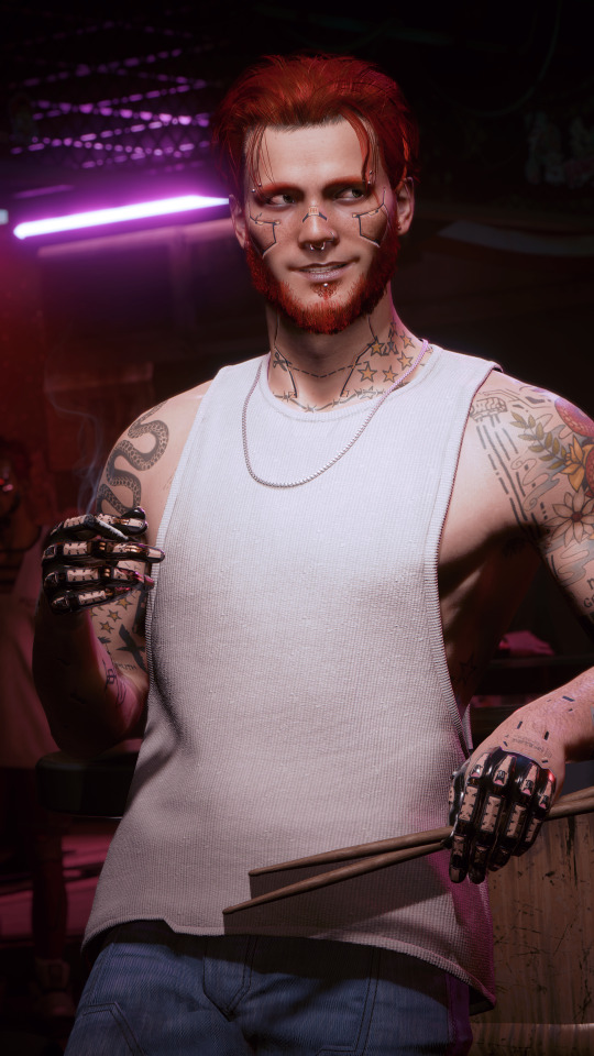
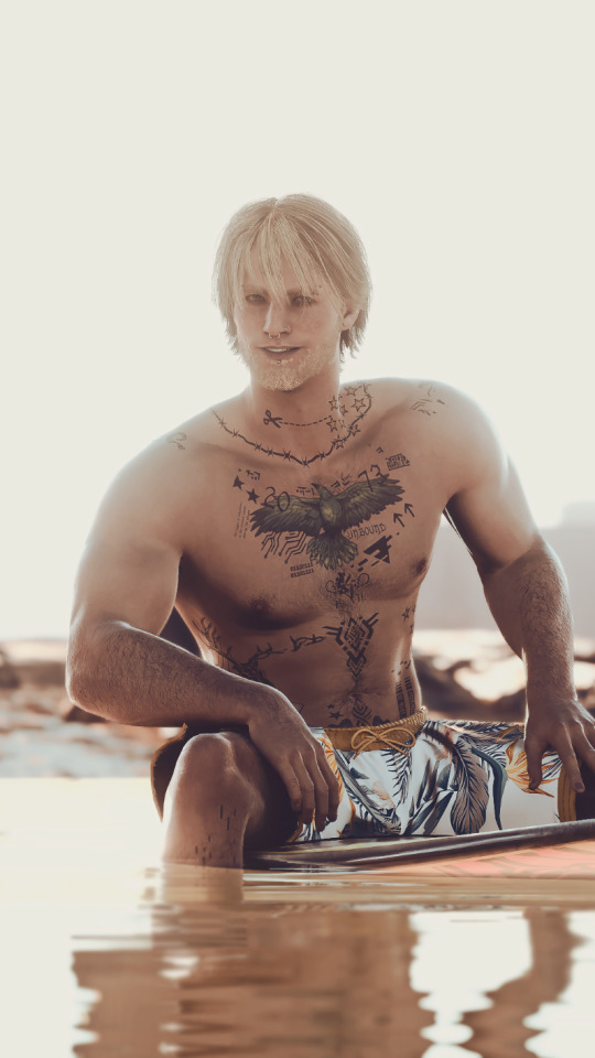
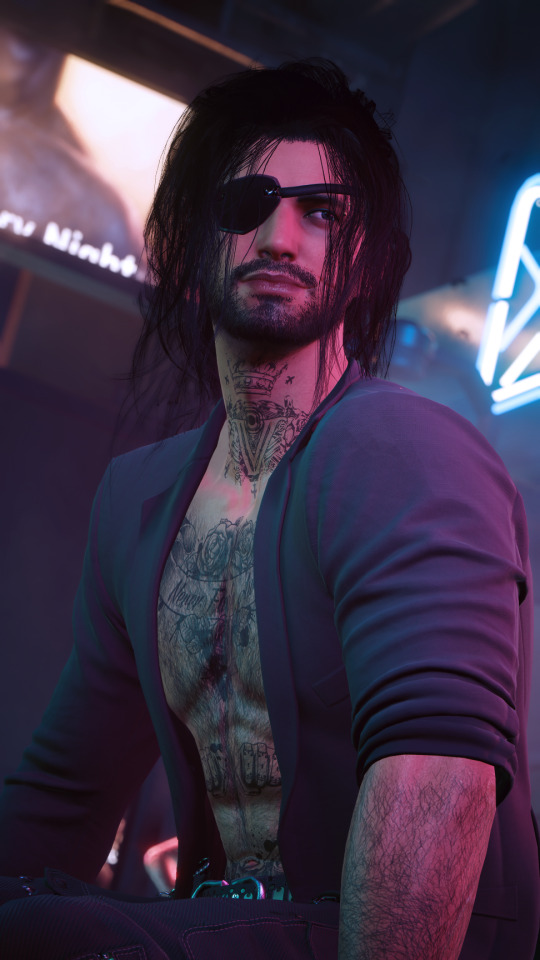
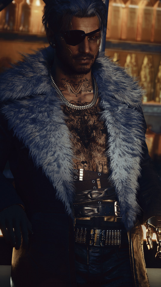
Saw a buncha chooms doin this lil trend and remembered that I had an old draft doing this very thing! Spiffied it up with even newer shots of my babes and it really makes me realize how far both me and my OCs have come :]
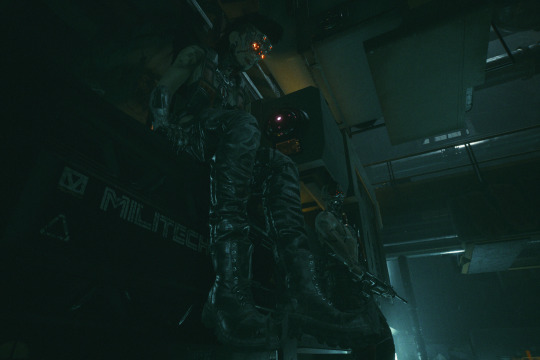
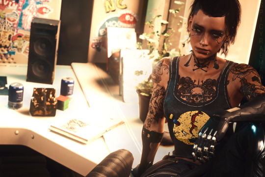
March 25, 2022 || June 24, 2023
The shot on the left is legit my very first oc shot in cyberpunk. Id taken some landscape shots before this but this was where the blorbo brainrot started. Vons definitely come the farthest in terms of design, from big beefy maelstrom to like.. wet rat white boy energy I guess lol. She still got a long way to go though, probably gonna be working on her forever, she's my favorite little passion project😌
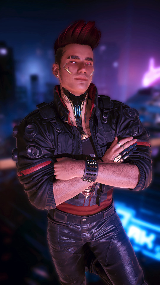
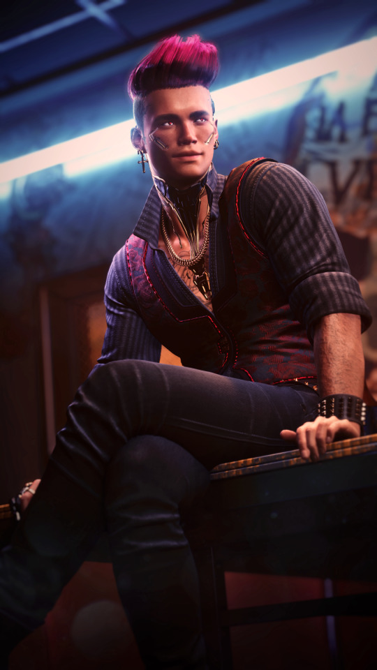
June 2, 2022 || June 2, 2023
Didn't even realize these were exactly a year apart till I checked the dates!
Luis is basically the exact same as when I first made him, just the perfect design from the moment of creation😌He's the OC that really started my VP journey, I made him just to take pretty pictures of and learn the ropes. Glad I finally have the skills to show off his full beauty!
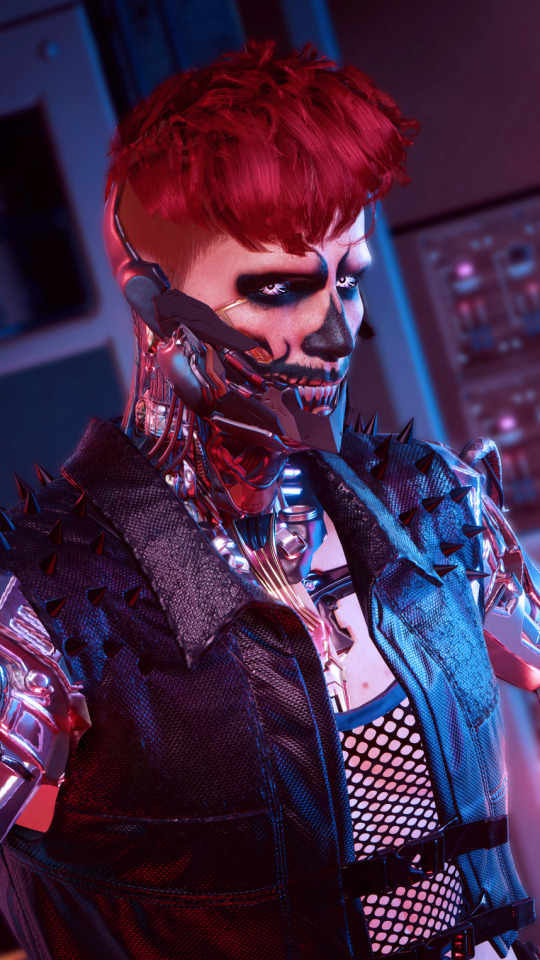
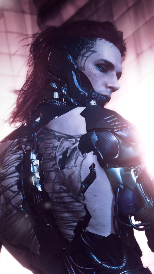
September 12, 2022 || June 14, 2023
Lynk's design is one that feels both entirely different and very much the same to me. Same overall vibe and style, but more refined I suppose. Less scrungly mess of wires and more sleek and sharp borg. Really love their current design now, still wanna make 'em custom tattoos but it gonna be a while till i'm at that modding level!
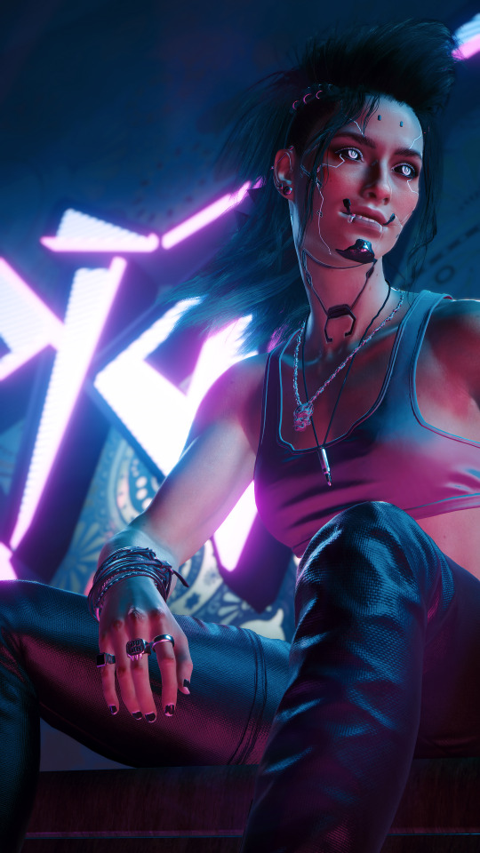

December 12, 2022 || June 1, 2023
Dallas was a design first backstory second kinda OC. I love her old design, think all the cyberware and makeup are really cool, but as I fleshed her out it just wasn't Dallas. Found myself in a comfy spot with her now though, even ended up making her her own custom complexion!
December 5, 2022 || July 9, 2023
Technically there's an even farther back design I could use for Sunny but it's so different I can't even consider it him. His old design looks so similar yet so very different its kinda weird😅Sunny's design now is probably the one I'm most content with, I might try and add back his arm tattoos but until then he's pretty much perfect.
December 8, 2022 || April 23, 2023
When I first made Midas my main goal was a dark moody playboy, which definitely stayed the same just in a radically different way. His OG personality was a playful and dramatic womanizer which I loved but I needed a straight man in this group of idiots and he had to be it. So instead he became a mysterious and gruff guy that has ladies falling over him whether he likes it or not, also he's a vampire now.
#cyberpunk 2077#oc: luis vasquez#oc: vrmn#oc: lynk#oc: dallas#oc: sunny taylor#oc: midas#crazy to see how far all of them have come#and fun to imagine how theyll change now that ive dipped my toes into modding
65 notes
·
View notes
Text
FIONNA(My Take) - PART I
I keep seeing all these takes and complaints about Fionna's body type. So to destress, I'll just put my own take here. These are from observations, research, etc. as well!
First I'll put out some screenshots of how Natasha draws Fionna.
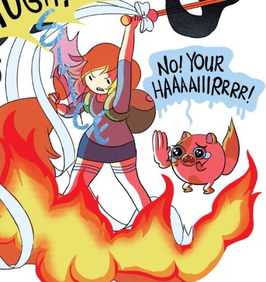

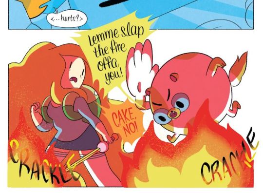


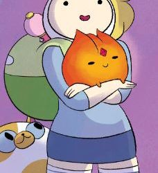


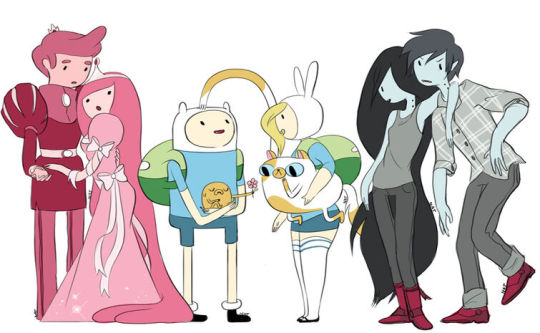

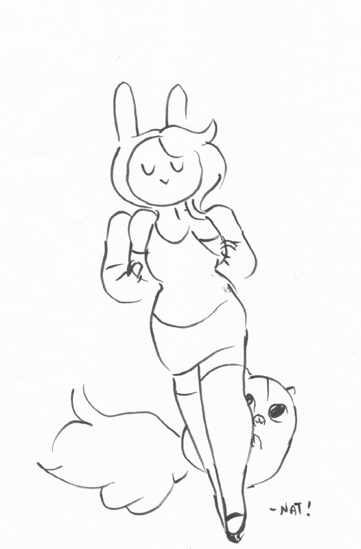

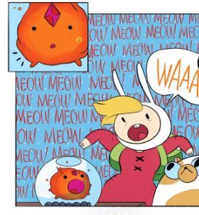
If you're wondering why her waist goes in despite being chubby; Thats because she's pear/ plum chubby. Notice how compared to the other Plus characters, her upper body is thinner and its much closer to the thin characters upper builds, albeit she has slightly thicker arms and broader shoulders (implying some of the chubbiness went there too).
Now notice how her lower body is closer to the plus characters lower builds since the skinny AT characters are shown to have noodly legs. NOODLY = NORMAL AVERAGE LEGS
That's why her waist is still small(her upper body is much smaller than her lower in comparison to the other Plus AT Characters), and also why her chubs only show when she bends or sits, because most of the "chubbiness" is below her waist and some on her shoulder and arms so they don't look noodly.
This is how Natasha and the crew draw Fionna as well,(its pretty obvious when you observe enough to see) and you can tell how her body construction is different from the other plus characters. She's meant to be a different chubby body type.

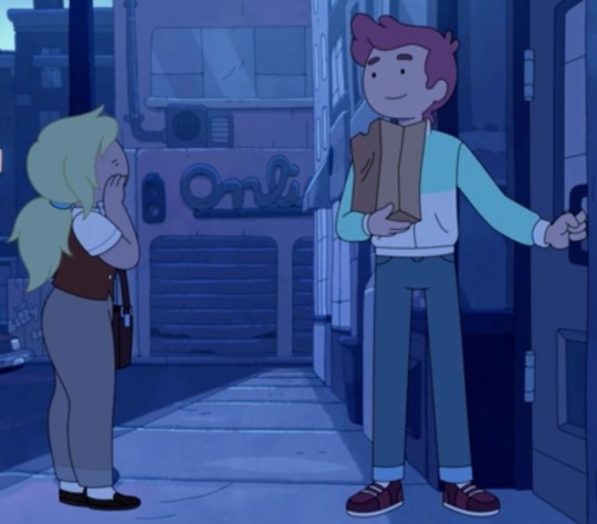
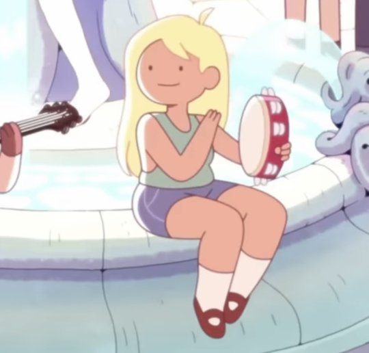
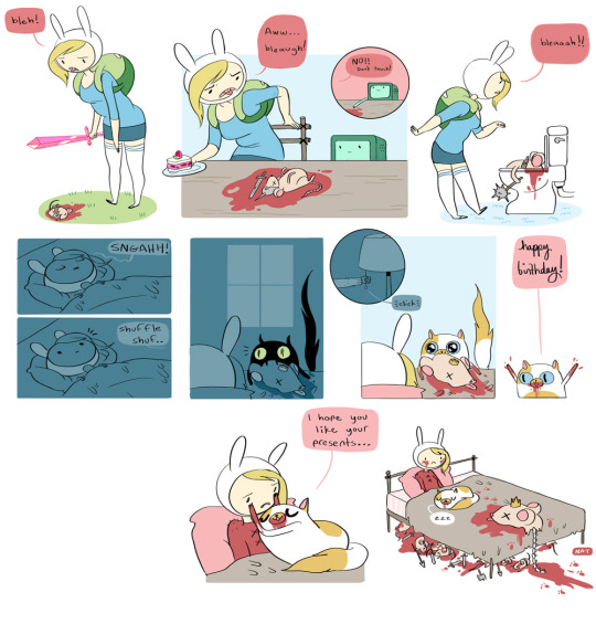
Her stomach chubs are mostly noticeable only when she bends or sits. These are some plus characters in comparison to her as well.
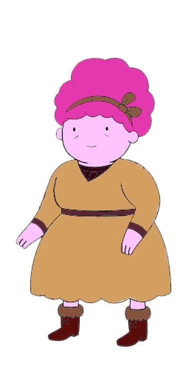

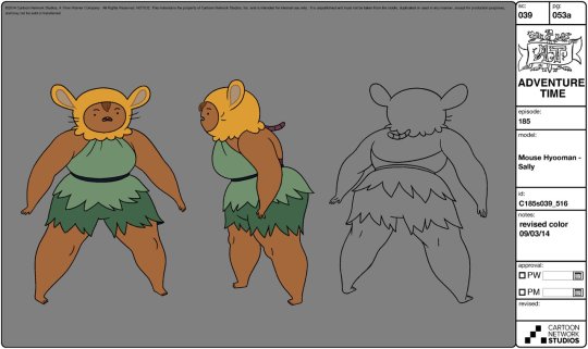
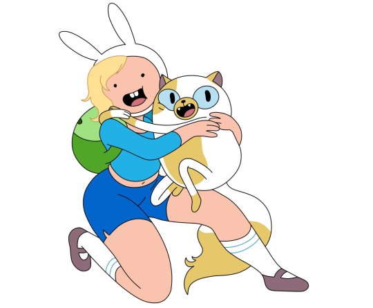
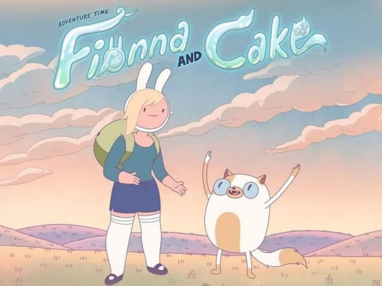
Finn and Fionna are not an actual variant of each other. They contrast each other, adult finns build(both farm and OG) are inverted triangle while fionna is triangle/ pear. Natasha mentioned how Fionna was merely inspired by Finn but is not an actual Finn genderbend. This info was also implemented when Prismo mentioned how he had subconsciously inspired Fionna and Cake from Finn and Jake.
Women tend to develop at the ripe age of teenage years(12/14 above), most of my fellow teens at the time did so, including myself.
Even I gained a chest in 5th grade, I was 9-10 at the time.
Curves shouldn't even be sexualized in the first place to begin with, theyre naturally there, whether its very noticeable or just slight. Even with thin characters like PB and Marcy, their curves were still there.
For Fionna who is pear/ triangle shaped chubby, the curves would of course be more noticeable because of this body type.
Fat distribution works differently for both sexes(you can search that up via Google)
Fionna is Bunny-inspired, merely an OC of Natasha who is inspired by Finn. She is not a version of Finn. (Ex; Peridot was inspired by Invader Zim)
Fionna being bunny inspired, has bunny-like features. Bunnies are built with strong thick legs or lower bodies as their defense.
If people are complaining about her design. Think of Flame Princess, her build is closely similar to Fionnas, and yet her gender-bend Flame Prince is built differently as well.
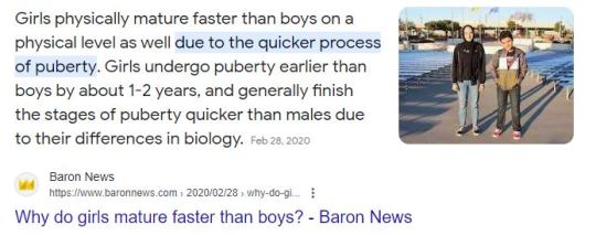
Young Fionna was already 14-16 at the time of introduction. At this age, most girls are already closely physically matured. (Highschool already proves that if you observe the girls ages 14 and up, some even develop at an early age believe it or not)
Fionna simply matured earlier as women mature earlier but then their maturing stops at a certain point. While men mature slower physically but then suddenly gains a growth spurt later in life so while their growth is stunted at first, it happens fast when theyre at a certain age.
Like how Finn would look the same till 16, only taller, but most likely after his growth spurt, he becomes the finn we see in the spin offs, combined with his adventuring lifestyle.
Fionna looks the same, just with a thicker mass, because her growth happened early but stopped after she'd reached the physical maturing endpoint for women.
Different body types exist. AT had these, it just so happens that most of the recurring characters were thin, like PB and Marcy.


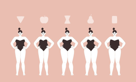

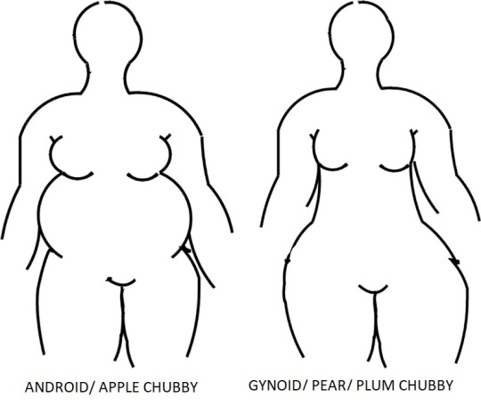
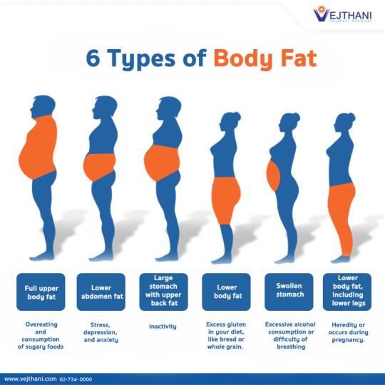
The similarity with Apple Chubby is that both still gain some fat on their shoulders and arms because again, any type of chubby still has distributed fat in this area cause they're still slightly overweight. The difference is that; Besides their arms and shoulders, other parts of the body fat distribution went elsewhere. For Apple, it is most apparent on their waist and stomach, then a little on their legs, etc.
For Pear, there's a slight stomach chub that is apparent when one bends, kneels, or squeezes. But the majority has been distributed below their waist(Hips, leg, thigh, etc).
22 notes
·
View notes