#have to try and reblog
Explore tagged Tumblr posts
Text
#'who was this about' dont worry <3#EDIT hi i didnt realize this would get notes LOL. um everyone reblog with what character ur thinking of because im NOSEY i WANNA SEE#edit 2 to everyone trying to guess what the character i made this for was. youre all wrong. this was about kamen rider#youd think lupin because of my profile picture but alas i have other interests as well...#anis gaymer moments
71K notes
·
View notes
Text
i have such a love for characters who descend into madness or villainy out of deep, deep empathy. characters who fundamentally cannot cope with the cruel realities they find themselves in and blow up about it in spectacular fashion. fallen angel type characters with tears of outrage in their eyes. characters who break before they bend, and break so badly they splatter blood all over their noble ideals. every variation on it gets me so good
#getou suguru#kaneki ken#abyss twin#i know there are others who im not thinking of rn#feel free to reblog with more examples#aphelion.txt#tropes#WAIT I REMEMBERED MORE#jaina proudmoore#dimitri alexandre blaiddyd#phosphophyllite#i just spent like half an hour trying to find this on tv tropes but it must be. Too specific of a thing i have in mind bc#I just kept finding similar and related but too broad categories#despair event horizon. fallen hero. well intentioned extremist. etc etc etc#like specifically i'm talking about when the character's EMPATHY is the CRUX of the problem. sosooo crunchyjuicytasty#edit:#also just know that i am reading every tag on this post#and enthusiastically scribbling down the names i dont recognizr#so i can check out their series later#edit 2 wow this post blew up 🫡 godspeed fellow villain likers#the amount of people tagging this as 'me lmao' is concerning to me#wwx#how did i fucking forget this was also yllz era wwx
39K notes
·
View notes
Text
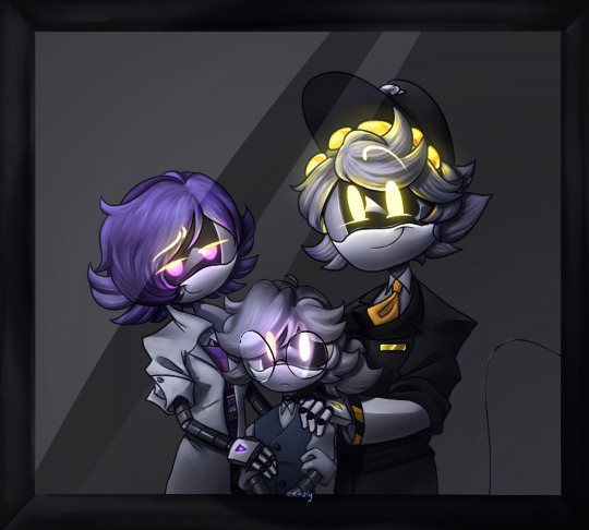
Family Photo
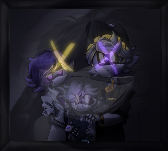
How Unfortunate
Plain renders/Close ups Under⬇️
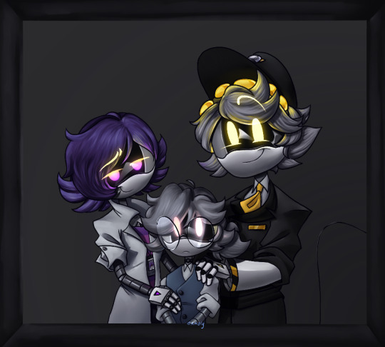

Plain renders
01001001 00100000 01100001 01101101 00100000 01101111 01101110 01101100 01111001 00100000 01110100 01101000 01100101 00100000 01100110 01100001 01100011 01100101 00100000 01101111 01100110 00100000 01100001 00100000 01100100 01100101 01101101 01101111 01101110


Close Ups
#If you couldn’t tell there’s some hidden messages here#Have fun editing the image to try and find it if you want#I’ll reblog anyone who finds it#murder drones#md#md au#the new dawn au#md au lore#nuzi#uzi doorman#serial designation n#oc: kimber#nuzi fankid#kk’s art#digital art#digital illustration#digital drawing#digital painting#art
1K notes
·
View notes
Text
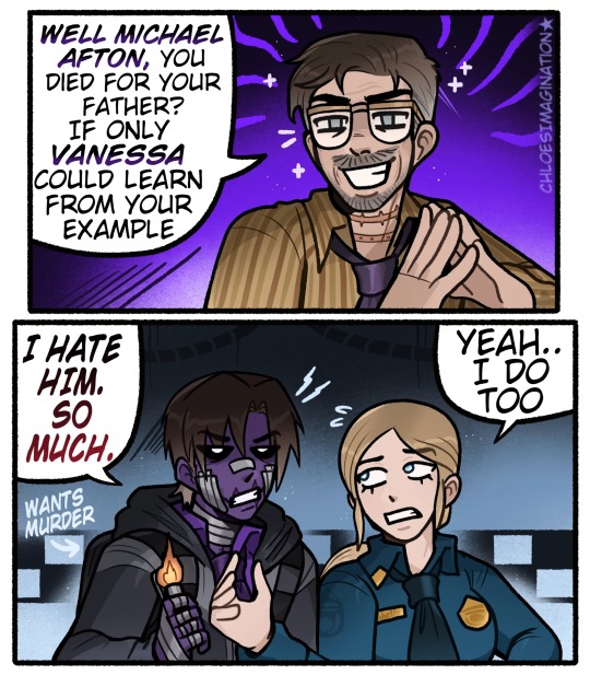
Michael doesn’t like his father in any FNAF universe..
#myart#chloesimagination#reblog#william afton#michael afton#vanessa afton#fnaf vanessa#vanessa shelly#steve raglan#fnaf#fnaf movie#fnaf 3#fnaf fanart#five nights at freddy's#Michael would HATE movie William#I think that’s an accepted assumption BAHA#Shocker all William’s suck 🔥#I always got the impression William sees his family members as pawns#so movie William meeting Michael would immediately try to manipulate him#though of course Michael wouldn’t have any of it#pulling the lighter out only one way to get rid of this man#Vanessa also expected her father to say something like this#BOTH of you get him!!#I haven’t drawn William enough maybe I’ll do it more soon!
3K notes
·
View notes
Text
Apparently much-needed reminder that reposting artists' art (by saving the images or screenshotting them and reuploading them yourself) on other platforms without the artists' expressed permission and without credit is theft and an insult to their passion and craft. You are profiting (in views, in attention, in feedback) from someone else's work and ideas, who do not get that feedback for sharing their creation.
If you are an art reposter, you are a thief and I have no respect for you.

#learn basic internet etiquette i am begging but also holding a knife. yes i'm mad. more about others than myself.#do you know how many artists i have seen leave social media because their art started being reposted all over?#tip: way too fucking many#i've had many people tell me about people reposting my art on tiktok#no one ever asked to repost my art on tiktok. ever. they just save super fried bad crunchy jpegs of my art and repost them#they get 20k likes and don't even bother naming me#also a reason i started signing my name more legibly and why my blog web address is always there but apparently no one can even read that#a few people got an ok for translations on other platforms though#i'm going to be annoying with this post and reblog it a few times to try to catch the people who apparently need to be told#tiny skk adventures#nawy's comics#nawy's doodles#apparently those are reposters' favourites so here look at this
5K notes
·
View notes
Text
Happy 2025, everyone! May the Arcane brainrot continue to live on 💙

#personal tag#i am currently on vacation and will sadly be extremely busy this coming 2026 but i'll still try to make things here and there <3#will prolly post something when its midnight where i live too haha#im so glad i was super chill and relatively free when s2 came out LOL#thank you to everyone who has continued to support reblog and like my silly lil gifs! may arcane live in our heads rent free!!!!#(even if the show has officially ended haha)#here's hoping for a couple of spin offs!#this show will forever be my favorite show and will always be special to me <3#i hope the love will continue so i can keep making gifs! 💙 have a great new year everyone!
693 notes
·
View notes
Text

I *need* to get pregnant by him.
[First] Prev <–-> Next
#poorly drawn mdzs#mdzs#lan wangji#wei wuxian#Ah yes. The classic MXTX 'trapped in close quarters' scene.#Two guys 1 cm apart. Trying so hard to make this as gay as possible while still saying no homo.#The sheer baby fever in this episode was bonkers. The teasing in this scene is probably the most you can physically feel LWJ shaking#WWX is right that it is very funny to watch LWJ fluster. Alas he is just digging his grave.#All this flirting is also so...so much funnier after the Lan Xichen talk. He *just* told WWX to look after LWJ's gentle heart#And now he's trying to give him repeated heart attacks.#We needed a funny goofs episode after all the emotions these comics have been going through.#Remember that 1 reblog = one prayer for LWJ. Send him strength.
1K notes
·
View notes
Text
So y'all have seen the Williams F1 Logo before, yeah?
well get ready, becaues I am about to ruin your day!
where does one even begin with this. i am sorry in advance. -just a poor learning graphic design student, who simply tried to enjoy their saturday evening
The Logo
For anyone that doesn't know, here's the Williams F1 Logo. Entirely unedited, copied straight from Wikipedia:

Now like many fans, I actually quite enjoy this logo. I like the modern, sharp edges of it and it's simple yet intriguiging design. It's memorable, while also easily recognizable as a W. I also really enjoy the colour choice (this, however, is entirely a personal preference.)
(entire rant under the cut. please keep reading this took years off my life span.)
How did we even get here?
Let's start at the beginning. How did we even get here? Well I, a poor poor learning graphic designer, was watching this lovely video from Mr. V's Garage about bad F1 Logo's over the past 35 or so seasons. Very interesting, I can only recommend it (but you don't need to watch the video to understand this post)!
Now, to cleanse the palette at the end of the video, Mr. V included a top 10 GOOD logos from this time span, it was very kind of him.
On P4 of this "Good List," Mr. V placed the current Williams F1 Logo, as pictured above. At first I vaguely agreed with this, believing that he probably simply hadn't noticed one of the things that's been bothering me about that Logo since the first time I saw it up close.
The first sign of Trouble
So, what is this mystery issue, you might ask?
It's simple really. You don't necessarily notice it at a first glance, but something about that logo seems off. Taking a second longer, you may notice it yourself.
No, I mean it, take a minute and go look at the logo. It looks wonky as hell, doesn't it?
Well I can tell you the first thing that I personally noticed. The arms of the W aren't in line with the bottom half, see:

(Graphic by @girlrussell who was so kind to let me use it, as it is way prettier than the one I made)
It's a crooked W. There is no good explanation for this. The rest of the font is perfectly fine, geometrical shapes.

Anyway, the good person that I am I went to point this out to my partner ( @leftneb ) who proceeded to inform me that he, infact, was not aware about this and was, quote, "never going to unsee that."
Now, the good FRIEND that I am, I, of course, proceeded to rush into our broader F1 friendgroup to make them suffer for eternity.
What's the logical next step to take? Of course, fix the logo in Adobe Photoshop, you know, as a joke.
(Disclaimer at this point, I am not necessarily the biggest fan of Williams Management Team. I enjoy ALL their drivers this season. I do NOT enjoy James Vowels. Be warned.)(Also I am aware that he probably did not have an influence on the logo)
Trying to fix it. Oh god, I was so innocent back then
Trying to fix the logo in Photoshop is the worst mistake I could've made. THE worst path to take. I could've just giggled about making my friends suffer (which I succeeded in, by the way) and moved on. Instead I ruined a perfectly good Saturday evening, and for what? I don't know anymore.
Anyway, how was I gonna go about fixing the logo in the simplest way possible? Simplest way I could come up with: slap the thing in Photoshop and put two, mirrored boxes at each side to make the sides line up. Small issue, how do I make the thing actually even? Fix: line them up at the intersecting point with the bottom tips of the W.
Here's the result:

Hey, anyone care to explain to me why in THE LORDS NAME the arms are different sized? I mean, surely they weren't before. Surely, certainly, I must've messed up.
I double, I tripple checked. I made sure everything was lined up and made sense. But no.
It just couldn't be. Something was uneven in this logo, something even deeper. Something I could not have predicted when first taking a closer look. It was at this point I realized I had messed up. What rabbit hole had I stumbled across? Certainly, it couldn't get much worse.
And that's when I noticed.

(pictured above; my genuine reaction)
There's MORE? (oh god, the top isn't lined up)

I couldn't believe my eyes. This is the PINNACLE of the sport, and THIS was the logo of one of the competing teams? I mean, yeah, we have a Visa Cash App RB or a Kick Sauber or even a MoneyGram Haas which are all terrible logos, but at least they're CLEAN. (this has not been checked. If anyone wishes to ruin a nice Saturday evening, feel free to check them and tell me how wrong I was in the previous statement!)
But you can see that there is no end in sight for this post. I'm sure you're as scared as I was at this point. By now we were sitting in VC, discussing the horribleness of this logo. I had long informed my irl's about this, who take said design classes with me. And it was one of them who pointed out the next thing that had been bothering me, but I had not been able to put a finger on up to this point.
thE DISTANCE, HOW DID THEY FUCK IT?

I'm afraid I have to confirm your fears.
Yes, those lines are the same length. According to Photoshop, they're on the same level as well, so no flunking with angles.
The gaps of the arms to the main W are not the same. They're differently sized gaps.
It was clear to us, this logo is inherintely flawed. They're subtle issues, but once you pay attention you start to notice things. It all looks slightly wonky and off centre. And eventually, you get paranoid, and start comparing other angles and sizes. And you will keep finding things. This has ruined my life.
HOOOOOW

Honestly, I don't even know what to say. Yes, yes sadly those lines, too, are the same length. Just copied over from one side to the other and layed over on the same height. I admit, they're not layed over perfectly. I was honestly holding back tears at this point. But the point still stands, you can clearly see a difference in width.
Honestly, the only way I can explain it is that at some point there was a mess up of distance or proportions and whoever was designing the logo couldn't pin it down and tried to restore the visual balance by making manual adjustments. And in all honesty? They kinda did a good job, if that's what's happened. I mean, you notice the crookedness of the arms, and then maybe the difference in height, but the rest you probably will not notice if you don't spend too much time staring at it. (like some of us) And even those issues clearly aren't noticeable to the vast majority, considering I had to go point it out to a group chat for my friends at least to notice.
what the fuck is THAT?
Now, the thing about doing this investigative work of prooving a team you dislike is worse in more aspects than you previously thought, is that you do a lot of zooming in. And zooming in means you might notice bits that yours eyes simply overlooked before, because they were too small.

Here you can witness the top of the middle point, that, for whatever reason, really wants to touch the top border of the Logo. I'm relatively certain that's the highest few pixel in the entire graphic, considering earlier chapter "There's MORE?" I have no idea why it looks like that or why they thought it was necessary for it to not end in a clean point.

I just actually have no idea how to even describe what is going on on the top of the left arm. That left hand side, again, touches the side and is therefore the most-left-pixel in the graphic. I, once again, have no idea the purpose of this. However the RIGHT hand side also makes no sense, as it is the most prominent corner in the whole logo. There's pointed corners, and rounded OF corners, but nothing that is trying to form it's own colony in a distant land that hopefully isn't this god awful logo. I hope that blob gets away. I really do. You go king.
i'm loosing my mind
Anyway, the only reason I could come UP with those weird "reachy-outy-bits" was to establish the dimensions of the logo? But if that was the case, I don't understand why they managed to keep all the other potentially border touching corners clean?


Like, look. Those are clean, sharp corners with some clearance off the borders. I have no clue why they managed it here but not with the others.
guys. please.
Backtrackig a little bit, going back to the positioning of the arms.

Do I need to mention that those lines are both the same length and the same (mirrored) angle? I really hope I don't, because I don't think I could be making this shit up. Like, once you roughly know what you need to look for it just kinda becomes easy to find.
As said before, I genuinely do think that most of these issues happened in a chain-reaction. For example, the distances between the main part and the W wouldn't be as noticeable (and they do get noticeable once you start looking at it) if the angle wasn't fucked. And guess what, there's more fucked angles here! Which ALSO influence this specific area of the logo!
this is just embarrasing for you.

something something same line copied over and mirrored etc etc
It's not as visible but the angles defintely don't line up here as well. As mentioned before, these issues for the most part all influence each other. It doesn't really excuse the issues, in my opinion as a designer, because a big company like this shouldn't have these sort of issues in their logo.
So let's review;
to sum it up,

i cannot even BEGIN to explain to you how big of a fucking JOKE this FUCKING logo is. because, i thought to myself, to round the post out, hey, why not show ALL the issues i pointed out in one picture? that would round it out quite nicely, wouldn't it?
Yeah well, this logo sent STRAIGHT FROM HELL just could NOT let me rest. I had only done the lines visualizing the crooked arms in PAINT up until this point, i.e. I had only pulled both up individually. To make a nice "rounding out" picture I still had to add them into PHOTOSHOP. so i did. i pulled up the line. i mirrored the line.
THE ANGLE IS FUCKING DIFFERENT
none. and i mean NONE of my friends had noticed this before. i need you to understand that we looked at this thing with FIVE pair of eyes, and NONE of us noticed that until i thought to myself "Oh I still need to add these specific lines to have ALL the issues I pointed out in my SILLY TUMBLR POST in ONE image" and i get THAT FUCKING SURPRISE
I was PLANNING to round the post out with a statement on how obviously this isn't a serious post. Here, I even had it all written out already because I accidentally started writing it in the last paragraph:
Of course, this is nitpicking, and it's not that serious. I'm aware of that. AS MENTIONED most of these would not be noticeable if we hadn't gone specifically looking for them.
yeah, well, fuck that. i just spent two hours seething about this logo. i'm ending the post on this instead.

#i am ENRAGED#i managed to actually calm down about it#yk. just typing away#and then i just try to ROUND OUT THE POST#for fucks sake#anyway i know i'm posting this at an hourrendous hour#if you read all the way. reblog? maybe#pretty please#williams f1#williams formula 1#williams racing#formula 1#f1#also apologies for any spelling mistakes i do NOT have the nerve to go back and proofread this
939 notes
·
View notes
Text
there's something deeply gutting about being a writer right now. watching studio execs brag about starving people like you out of your very house just to not pay you anything above the pennies you currently make. watching some people cheer over AO3 being targeted for a DDOS attack. the complete lack of profitability of writing commissions or writing in general in transformative spaces, especially in contrast to fanart. the pivot of so many social media platforms to be video and image based near-exclusively.
I don't know. it just makes me sad to know that the hobby that kept me alive while growing up homeschooled with dial-up internet and local antenna TV... is only ever gonna be a side job with minimal engagement. I know this site is good about supporting libraries and the concept of books but, do me a favor? Reach out to a writer friend you know. Leave a comment on your last five read stories on your favorite website.
Tell us you care.
#maybe that's why I've been so stalled on my novel#I keep trying to convince myself there's a POINT to it#but I look at how BRUTAL the publishing industry is and how I can't even consistently break ten reblogs on writing I post here#and I just. it hurts. and I have other hobbies I could fall back on!!! I could do art and cosplay and cater to the immediate engagement!!#but writing is my LOVE and my PASSION and I just wish. I wish the current climate CARED about us#TALKED to us the way we talk to cosplayers and artists and the chocolate guy#UGH. Wednesday blues hitting me NASTY today
6K notes
·
View notes
Photo

#artists on tumblr#furry artists on tumblr#reblogs welcome#reblogs encouraged#charmaine#a style experiment to try and imitate the pc-98 tech limitations#super fun#I'm not smart enough to guarantee perfect accuracy but folks have liked it thus far :D#furry#anthro#anime#cute#pc98#retro#pixel#pixel art#dog#dog girl#angel#angelcore
624 notes
·
View notes
Text
Give me more lesbians who date men too, who aren't MISERABLE and forcing themselves to do so because of compulsory heterosexuality. Give me more lesbians who ARE men: cis, trans, somewhere in between, both, neither. Give me gay men who also date women happily, who are women themselves to whatever extent. Give me queerplatonic relationships between a gay guy and a lesbian. Give me a lesbian and a gay guy who are friends with benefits. Give me multigender turigirls and lesboys. Give me an individual who is polyamorous and aroace, more gaybians, more nondysphoric trans people, more she/her guys and he/him women, more it/its and nounself users, more queer teens who go by Arson. I could go on and on, but to sum things up: give me the sides of the queer experience that are hidden even by other queer people. Show me the box breaking, the line crossing, the beautiful complexities that arise from being queer. Give me the 'cringy' identities. Give me the historical identities that people are trying to erase. Preserve what they're trying to snuff out.
#'oh but it's confusing!' good. queer identities don't have to make sense to nobody but the individual.#stop trying to dickride cisheteronormativity#embrace queerness. only then will you find peace as a queer person#lesboy#turigirl#mspec lesbian#mspec gay#nounself#she/her man#he/him woman#queer#transgender#lgbtq#xenogender#polyamorous aroace#turned off reblogs for the time being because I am currently being harassed
1K notes
·
View notes
Text

#was looking for some fics with these two#I imagine this is one of their first interactions and Hunter is already fed up with Darius#but Darius is just trying to get to know the successor of his mentor and check if he's at least a little bit capable of doing his job#he's also a little weirded out by the similarity between these two#basically I imagine Darius gave him a couple of vibe checks that Hunter had failed#and Hunter takes it as questoning his place in the coven#god darius design is so pink and awful#it's so jover uni starts tommorow#it's like the most boring drawing ever but I'm just still in my I have to get better at backgrounds era#and also if I'll draw 100 awful things I get a decent one eventually#it's like inktober but lasts your whole life and devours your soul in the process#no caption just pure tags now I understand those few people who keep reblogging all my tags cuz I give all the fucking context there#there's probably like 10 things I would spot tommorow that would fix the drawing a whole bunch but I just ...don't want to ig#the owl house#sheerak#the golden guard#darius deamonne#hunter toh#toh hunter#hunter deamonne#toh fanart#the owl house fanart#dadrius#not yet but#you guys most fellow toh fanartists moved on and fanart fiona and cake but I keep brainrotting the same stuff over and over#good old toh trashpile
3K notes
·
View notes
Text
Palestinian fundraisers to donate to
Second list of fundraisers
Third list of fundraisers
Fourth list of fundraisers
Hello all, here are some Palestinians who have currently reached out to me to share their fundraisers. I put together all posts in one so I can boost them all daily.
Please take a moment to read their stories, share and donate if you can.
Some conversions for Swedish krona (SEK) as some GFMs use it: $1USD = 10.36 SEK $1CAD = 7.61 SEK €1 = 11.43 SEK
@karamostaz22 | GFM Link | Vetted here
@amalpalestine | GFM Link | Vetted here #71
@lawyer-adhamayyad81 | GFM Link
Note: Unvetted by reverse image search comes back clean
@wajihmadi | GFM Link | Vetted by association
@yousefalyazji and @monayazji | GFM Link | Vetted here (#87)
@nourasissue4 | GFM Link | Vetted here
Note: Blog updated as previous blog was terminated
@dutifullymykid | GFM Link | Vetted by association here
@mohammedmoner | GFM Link | Vetted here (#26)
@haneenmohamaad | GFM Link | Vetted here
@ghadanabilfamily | GFM Link | Unvetted but shared by vetted account
@baraaalshrafa | GFM Link | Vetted here (#911)
@ahmadgaza1 | GFM Link | Vetted here
Note: Unvetted, but reverse image search comes back clean
@emanabosedo | GFM Link | Vetted by association
@helpamalm | GFM Link
Note: Unvetted, but reverse image search comes back clean. Blog is currently unavailable (9/30), but GFM is still available
@hebamohammedsy | GFM Link | Vetted here (#171)
@familygazaamal | GFM Link | Vetted here (#55)
@ashourmohammed | GFM Link | Vetted here
@hanangazaa | GFM Link
@hashem19798 | GFM Link | Vetted here
@mariam2013y | GFM Link | Vetted by association
@osamabasilps | GFM Link | Vetted here
note: the blog in 90-ghost's reblog is osama's previous blog, but the gfm is the same)
@moh-gaz & @farah-mohanad | GFM Link | Vetted here (#42)
@faroha2001 is another one of their blogs
@mohamedjshamia | GFM Link | Vetted here (#82)
@abdalhadiaburas | GFM Link | Vetted here
@sameergazafamily | GFM Link | Vetted here
note: Sameer had a previous tumblr that was deactivated, this is his new Tumblr
@savepalestineinfamily19 | GFM Link | Vetted here
@abedallhferwanagaza & @olaferwana| GFM Link | Vetted here
@ahmadwaleed5 | GFM Link | Vetted here (#167)
@amalblogsworld | GFM Link | Vetted here
Note: The blog in the vetted link is another one of Amal's blogs, but the GFM link is the same
@hazemsuhail | GFM Link | Vetted here (#75)
@husamfarht | GFM Link | Vetted here (#248)
@hyamshehabnew | GFM Link | Vetted here
@burningnightgiver | GFM Link | Vetted here
Note: the new blog is here
@abdelmutei | GFM Link | Vetted here
@aya-alanqar | GFM Link | Vetted here
Note: The blog on 90-ghost's link is another blog of Aya's, but it's the same fundraiser
@ahmadresh | GFM Link | Vetted here
@mohammedatallah | GFM Link | Vetted here
@saveyouseffamily | GFM Link | Vetted here
@hanaa-yousef | GFM Link | Vetted here (#246)
@falestine-yousef | GFM Link | Vetted here / more info
#updated for 9/4 and added more people who have reached out#i'll add people on here as needed or make a part two#i will be linking this post on my pinned and any other future posts#i'll try to update the amounts as often as i can!#i put it together on one post because i can't update#if i reblogged it with a new response#i will also update if any get vetted#palestine
969 notes
·
View notes
Text
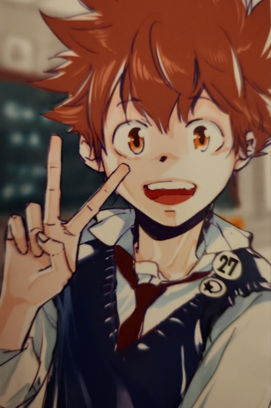
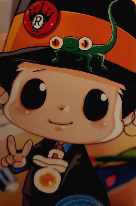
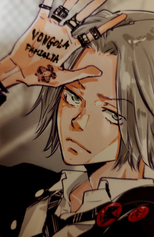
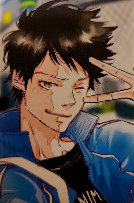
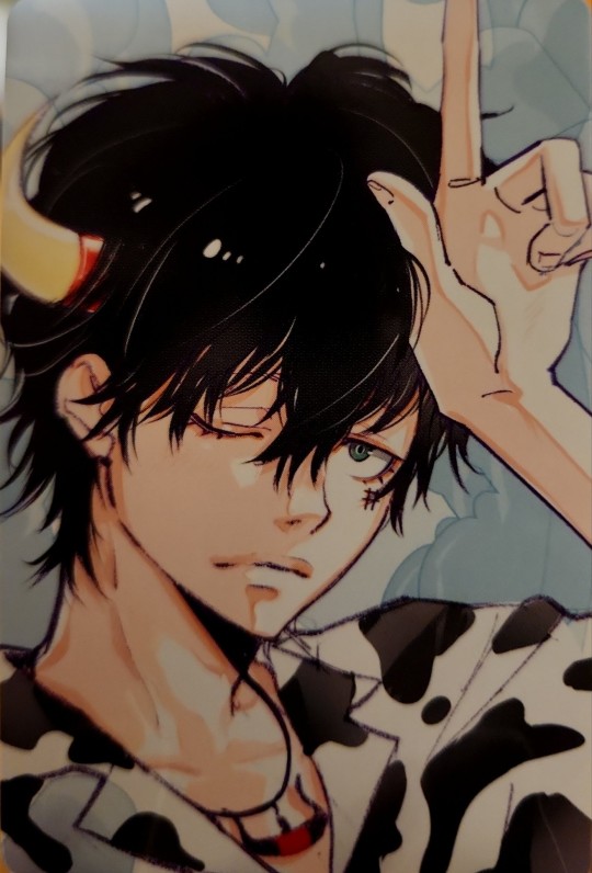
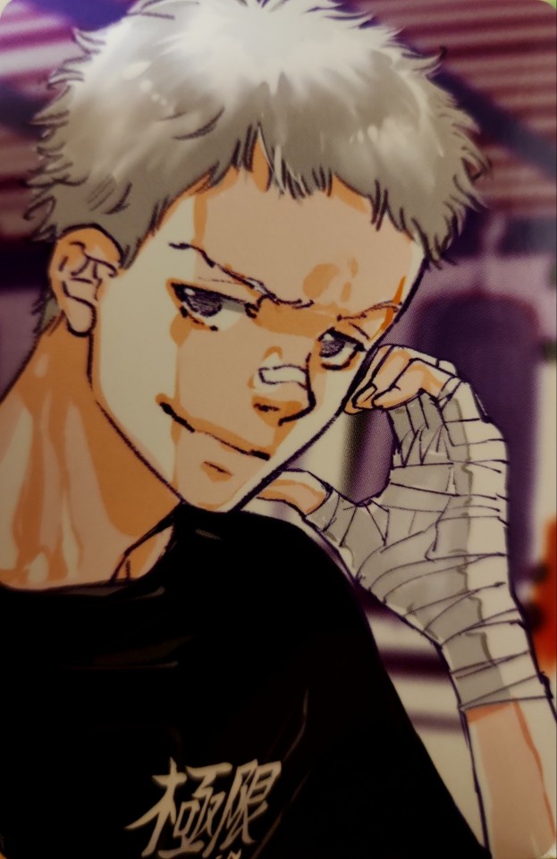
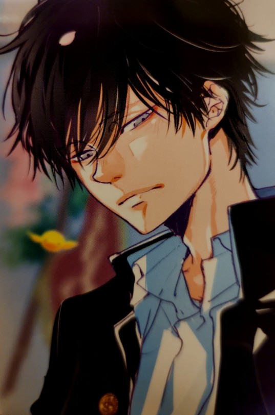
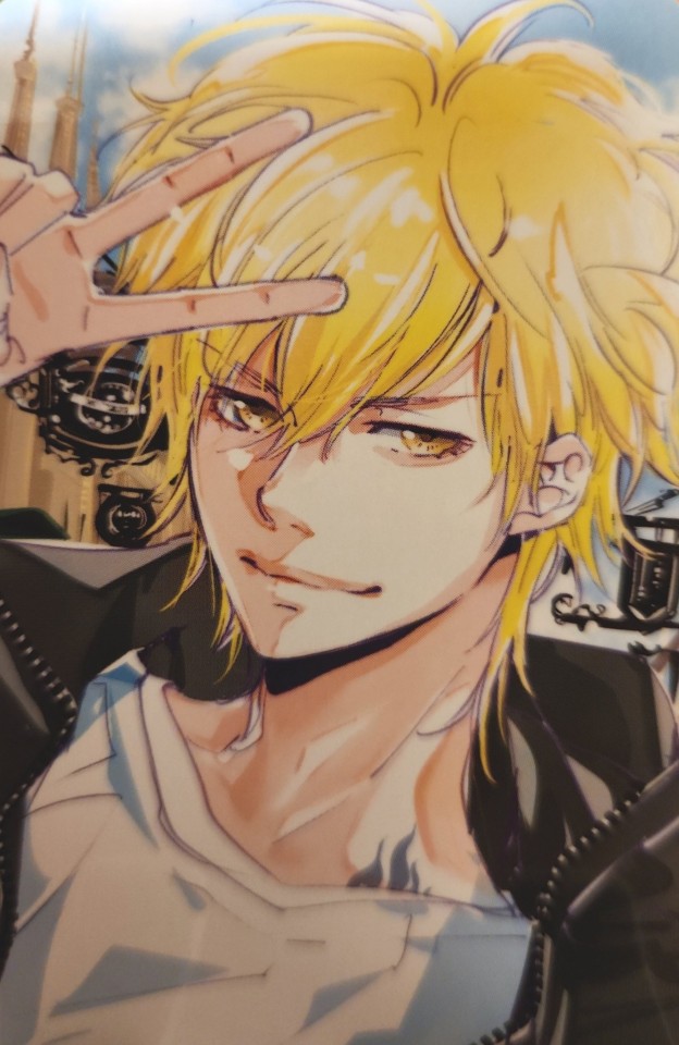
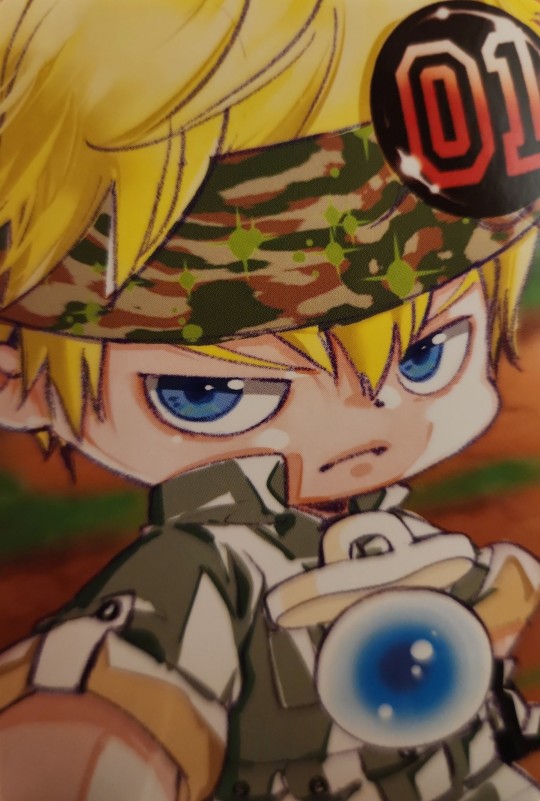
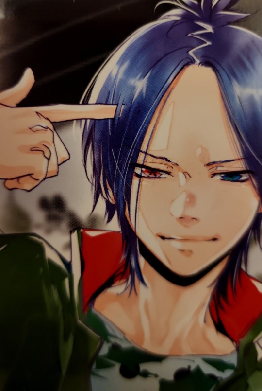
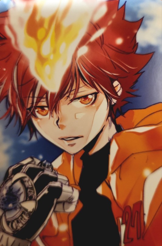
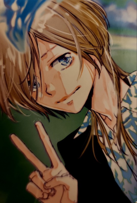
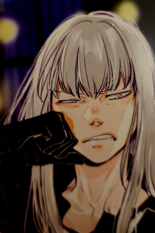
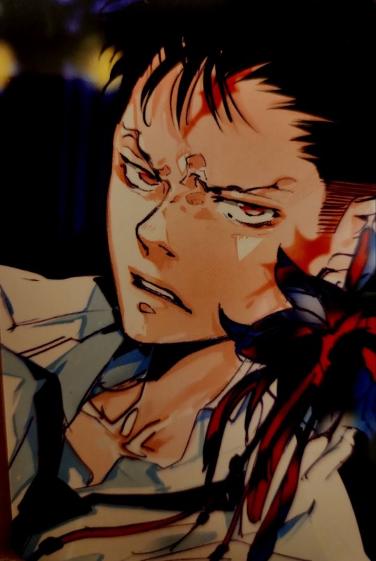
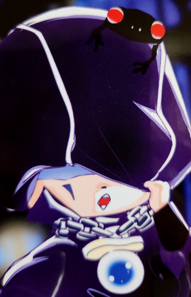
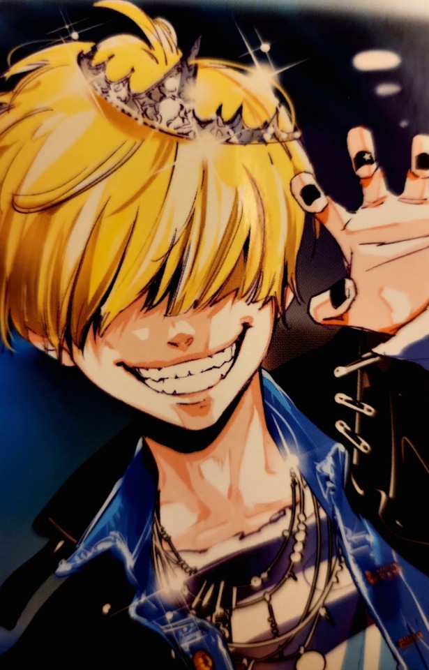
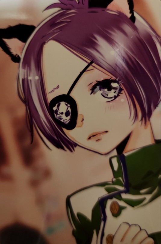
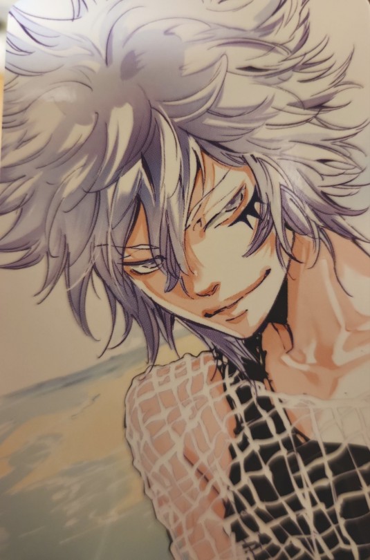
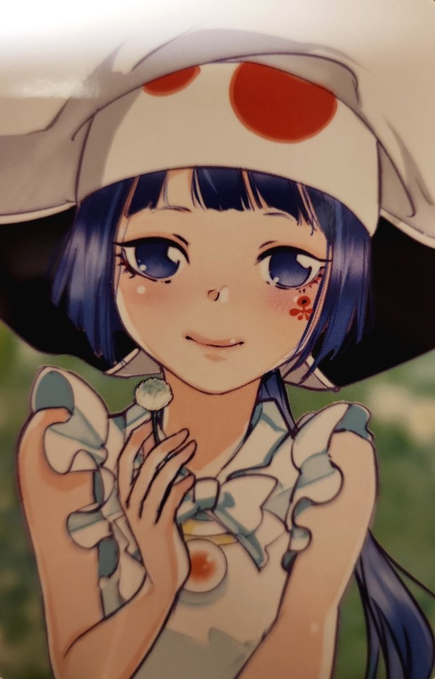
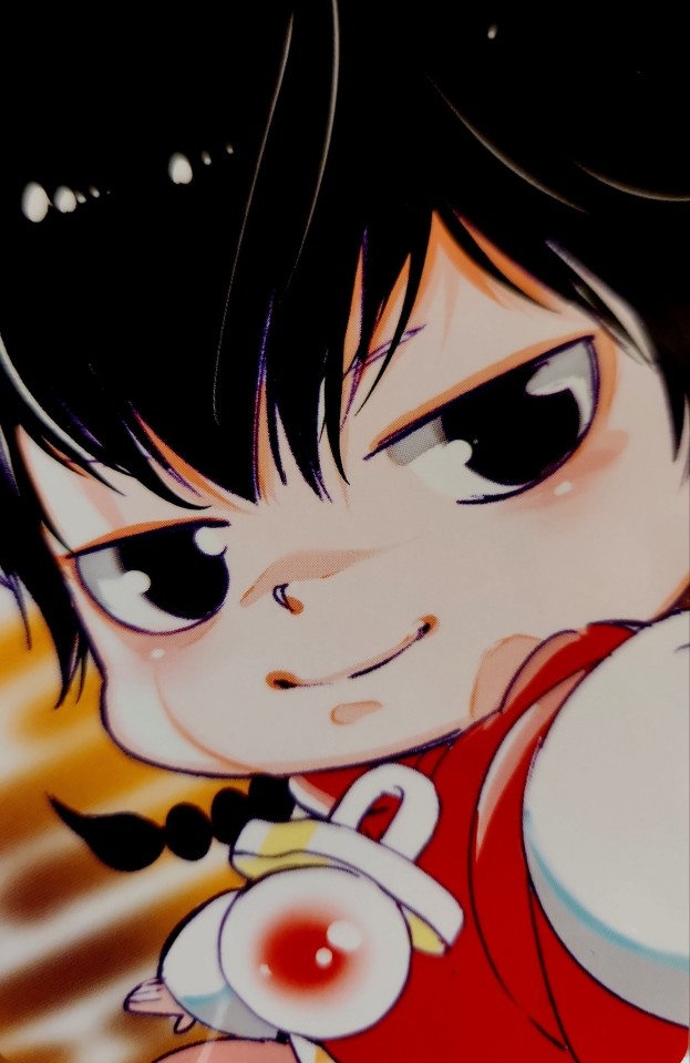
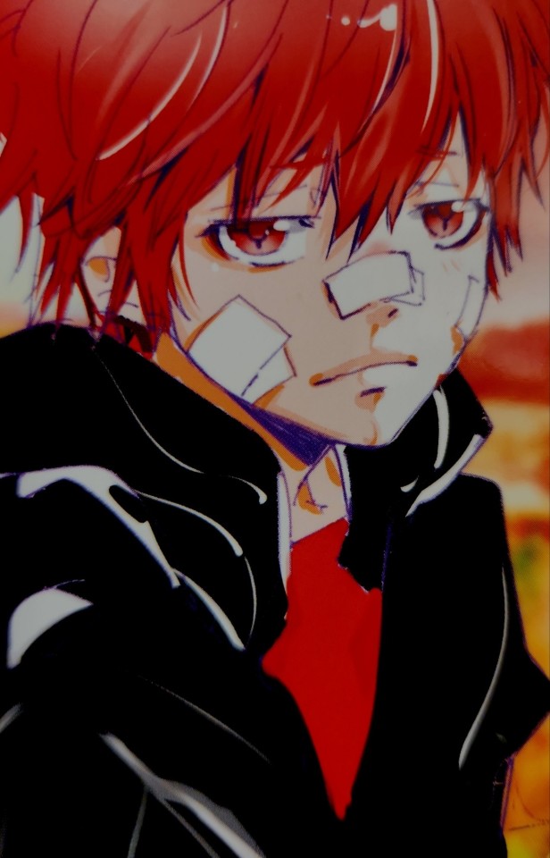
2024 Akira Amano 'The Characters' Exhibition bonus 'Selfie-style' cards.
[ID: Official art of multiple characters from the manga and anime Katekyo Hitman Reborn.
They're all drawn as if taking a selfie, most of them smiling and/or doing a peace sign or another playful gesture with their hand.
Reborn, Colonnello, Viper and Fon are in their cursed forms, with Viper pulling their hood down, trying to hide more of their face.
Gokudera waves at us, with "Vongola Famiglia" written on his palm and the Vongola's emblem drawn on it too. Lambo is in his Ten Years Later version, Tsuna's shown both in his normal state and in Hyper Dying Will mode, Basil is in Hyper Dying Will mode too and Chrome's wearing cat ears.
Squalo and Xanxus are scowling. /End ID]
ID courtesy of @hopeswriting.
#Akira Amano Exhibition#Katekyo Hitman Reborn#Tsunayoshi Sawada#Gokudera Hayato#Yamamoto Takeshi#KHRel#((I don't have a scanner so I just did my best with a scanning app and ye. Forgib))#((Just accept this for what it is. Maybe i'll find access to a good scanner and try again someday bc I sure as hell aint doing it at work))#((I own all of these cards so I tried to take pictures and did try to adjust lighting to be closer to the card itself))#((I'm not good at graphics so forgive me))#Reborn#Lambo Bovino#Ryohei Sasagawa#Hibari Kyouya#Dino Cavallone#Colonello#Rokudo Mukuro#Basillicum#Superbi Squalo#Xanxus#Mammon#Belphegor#Chrome Dokuro#Byakuran#Yuni#Uni#Fon#Enma Kozato#((Did I just spent a long time on this when I could've been writing instead? No comment))#(Okay to reblog)
457 notes
·
View notes
Text

i found a bad post i made months ago in the privacy of my own home and now i need to air it out in public because it's getting mildewy and moths are eating it
#i realise having light as my icon doesn't help me out here but i have to preserve the post in its true form#rookposting#anyway this was the bad post i was referring to in that other post. this is the fandom au it would be#im not going to write this. i refuse to write anything that would make me learn more about omegaverse than ive already learned against my w#ill. on principle#death note#i dont want to tag this one because i dont want it to show up but unfortunately i want my blog to be organised.#im making myself very vulnerable in posting this do you all understand. i mdoing it for the bit#eta: i cant stress enough that this post was not me trying to write like light yagami#this was my real brain process that i went through at work#eta2 reblogs are off stop talking about the bible#not everyone grew up religious i am not loving being insulted for not jumping to the bible
537 notes
·
View notes
Text

Hi friends. We finally made Pochita her gofundme. Any small amount helps even a buck or two. This is gonna be a long journey to help her live anything resembling a normal life again so i'm really grateful for all the support we've received at this time. if you can't donate please just send her psychic love 💗🙏 Thankyou so much 🐾
#pochita#Sorry if i have to reblog this a lot i swear im gonna try rly hard to get back to my usual blogging too#its just crazy right now life is crazy
677 notes
·
View notes