#had lots of fun with the colors and my consistency with character design is finally improving 1%
Explore tagged Tumblr posts
Text

make it up as we go along (noremma sketch dump)


#hey everybody it’s my quarterly drawing of Emma in a skirt#technically it’s a skort bc I’ve been wearing them a lot lately and i feel like she’d be a fan. I know her personally.#gnawing on the bars of my enclosure !!! Noremma#had lots of fun with the colors and my consistency with character design is finally improving 1%#sweet sleepy beepies they just need to rest and ofc the nightmares aren’t as bad when they’re together#post canon noremma… beloved…….#nikki draws#the promised neverland#emma tpn#norman tpn#noremma#emma x norman#norman x emma
26 notes
·
View notes
Text


Nicktoons unite main 4 in their respected styles ( minus jimmy neutron i'll explain more below)
i feel very mixed about these but it was still fun either way studying all of these cartoons respected styles. the final does make me happy, seeing all of them together ^__^ 💞
below i will explain my thought process working with each style so get ready for a wall of text:
first before anything you may be asking: why no jimmy neutron style!? it's because i tried and gave up! i was starting the rendering process for timmy and i hated it so i just didn't continue! no point of making myself miserable for something thats harmless fun style studies. but have these as a little treat:


Fairly Oddparents style: the easiest style to work on and research for, fop style is not that complex. i should also add i didn't draw each style in one sitting i drew each character together and then edited them all, so that might be the reason why some look better then others, i just got good. but i'm saying that because the character i started with was spongebob! specifically because i was tired of ppl thinking dp style and fop style are the same and how spongebob would look the same in both styles, just a flat square. which is wrong! fop style is very different! i would prob describe it as a flat paper style. has sharp and rounded thick lines. the main source of research i used for it was the designer for fop was Ernie Gilbert. he has designed a lot of iconic characters for the show and i highly would check out his work, this is his website
Danny phantom style: now this one was tricky, prob the hardest one to figure out and i honestly don't think i really DID figure it out. the possible reason is i am still trying to go through the show atm myself, but i'd doubt it. they all just look off to me, just a little. which no need for me to work myself in a circle trying to make it "perfect". im no professional character designer! especially not Stephen Silver.
Spongebob Squarepants style: this one was tricky but in the opposite way to dp style, where i didn't know what to reference! to start off the show is mainly nonhuman characters, so finding character refs were hard. the refs i did use were the mermaids and the superheros, so i used that for timmy. but in the middle of working on jimmys i was watching a video of someone ranking every single spongebob ep and TURNS OUT in the later seasons, i think season 13, there were human designs! (technically elfs but whatever).


and weirder thing is how they draw patchy but im not going to get into that. i am assuming that style is for characters that are supposed to be real life humans up on land in that universe (but why not just use real life humans? idk, maybe tom kenny is getting to old for the role). BUT ANYWAY, i used the elfs for a main source for jimmy and danny, they turned out a lot better then the timmy in my eyes. i wanted at least one of them to have the black eyes but they all have bright blue eyes and the show usually always colors blue eyes. i get ahead of myself cause there was a lot more factors i still had to figure out. like the line art. the show doesn't have a clear line style like dp or fop, its just relatively consistent medium lines. so i just went with more recent show stuff then older stuff since it's HD.
ok but thats basically it, i can prob go on more but i'd feel no one gaf. i made these for fun and it was fun making them! i love all of these shows a ton so it was nice looking up the designers and artist for these shows. support the artists!!! fuck bitch fartman!!!!!
#nicktoons unite#nicktoons#nickalodeon#spongebob#spongebob squarepants#danny phantom#danny fenton#jimmy neutron#jimmy neutron boy genius#timmy turner#fairly oddparents
360 notes
·
View notes
Note
I dmand EVERY picture of CJ you had drew!! Pretty please
Considering I'm super disorganized about my art and don't post everything I draw (sometimes it stays just in my server or among friends, or I just don't show anyone because it's unfinished/I'm unsatisfied), I'll have to find a lot of stuff that I've forgotten about.
Actually, I can just show some stuff that I *haven't* posted! (Everything else I ever have should be here.) Some of this stuff is Krow before I added the white hair because I didn't have that idea until around April.

^ Appropriately titled "Krow Smug Bitch". Everyone has fun with the cowboy AUs so why can't I?

^ He got nervous about seeing Usagi/Yukito I suppose

^ This one is interesting. Originally it was supposed to be just Krow as a magical boy, but then it turned into a bit of a mythology AU. He's the son of Yatagarasu the Three-Legged Crow from Shinto myth. Wasn't quite sure about everything... this was probably the result of watching too much Kamichama Karin as a kid lol

^ For fans of Transformers - TFP Optimus Prime with good ol' canon CJ! I feel like they would get along. Something about that red-and-blue leader drew him in I guess.
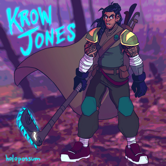
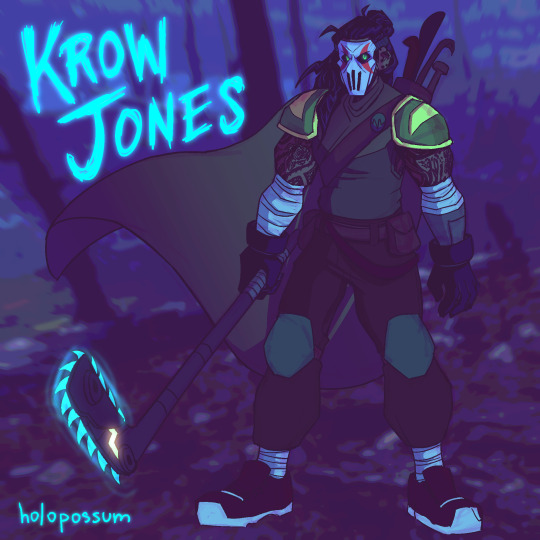
^ This was actually my first pass at an older version design of Krow. This was a complete piece too, but I was unsatisfied within a week or two. You can still see that I kept some things, notably the piercings, beard, and the idea of tattoos, as well as the Leo-inspired shoulder pads. The tattoo designs changed and so did the armor color, but it was an interesting first try at the older design.

^ A second attempt and older Krow, I was getting closer. (Still love the fashion on this though.)

^ The point I realized that I can't draw this man thin and have to start drawing him beefier and more filled out more consistently because it would be a crime against god or something. Was still finalizing his tattoos at this point and playing around with the idea of white hair. Considered the idea of the Hamato crest tattoo near his heart before nixing it because it's too cheesy and the Hamato tattoo is something a lot of people do for older/future character designs.

^ Ninpo weapon design for Older Krow! Yes he has a cyan scythe (really more of a kusarigama since it has a chain and weight at the end). Yes it's cool as fuck. No you can't touch it.
He's basically a reaper and it plays into his whole aesthetic as a crow, which symbolizes an omen of death. Crows are also often seen with scythe and scarecrow imagery because they're related to harvests.
I don't know why I never posted this, it *looks* finished... I think there was something off about the anatomy and I intended to fix it and then forgot and ugh. But anyway! There you go.

^ A height chart for younger Krow and Yukito that I never quite finished. But it's interesting to see them to the actual scale that I imagine them to be - Krow is 5'6", and Yukito's height is reversed since he's 6'5". Since both are around 19 when they meet, they're at their full adult heights here. Long live your short king!

^ Older Krow with lightning gloves. Which doesn't make sense actually because his gloves are electrical insulators to keep himself from getting zapped from one of his attacks. But who cares about that! It's cool!

^ Scythe sketch. Just trying to get a feel for the vibe of how he wields one. His cape/cloak plus the scythe probably gives opportunity for some really cool directional flow to occur.

^ Something I doodled just the other day. Old Krow but more cartoony and goofy. Love this silly guy!
I'm sure there's many more that I've missed, probably lots of half-finished sketches and doodles, but this is a lot of what I've found.
#this is a lot more than i thought it was!#snipersiniora#rottmnt#rise of the teenage mutant ninja turtles#rottmnt casey jr#rise casey jr#casey jones jr#casey jr#krow jones#holopossums#holopossum answers#long post forgib#super secret 2024 cj/krow art stash
60 notes
·
View notes
Text
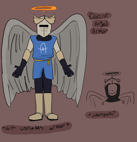
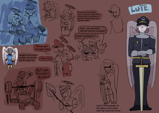

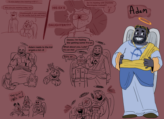
THE HEAVEN CAST!!!!! WHOOOOOOO!!!!!
So first off, we got a redesign for the Exorcist Angel armor. I wanted to keep the colors light so they stand out when in Hell. I was also hugely inspired by Crusades armor, since the Crusades fought for religious territory, I thought taking inspo from there made sense.
Then we have Lute, Emily, Sera and Adam's designs. I'll explain it all under the cut if you're interested!!!
LUTE!!!!!!!!!! Sorry guys but she's basically a different character with the same name at this point
So I think that Lute was like a mentor figure to Vaggie, she was the closest thing Vaggie had to a (sorta) mom but it's defiantly like a student-master relationship.
I think that Vaggie trusted and cared for Lute deeply, she devoted all her time and energy into training in order to make not only Heaven better, but to make Lute proud. Lute was a HUGE driving force Vaggie's martyr complex.
But they were close!!!! The care wasn't just once sided, I think Lute did love Vaggie. I think they both care for each other SO much, that's why it will hurt SO MUCH when it's LUTE as the one to de-wing and banish Vaggie. She LOVED her, she TRUSTED HER!!!!!
Trust that I will be delving deeper into this in the future ✊✊✊
So Emily and Sera's designs and roles in the story are pretty much the same, I liked them in canon! They were fun and offered an interesting addition to the show!!!!
The main thing I chose to change was basically their hair and skin color tbh. I understand what the show was TRYING to do, w the fact that they're supposed to be black (and apparently those are supposed to be dreads in Sera????) but.......... It wasn't good.
With their canon skin color, I know a lot of angels have gray skin but to me, it looked like the designers didn't know whether to make Sera and Emily (especially Sera) gray or flesh colored, which then resulted in them trying to meet it in the middle and left us with this,,,, really ashy looking black skin in some shots which I didn't like.
I decided to just make them a darker gray so they can both be seen as black and also keep consistent with angels having gray skin :)
ALSO THAT ONE DOODLE WITH EMILY LOOKING AT CHAGGIE, I PROMISEEEEEE THAT SHE DOESN'T LIKE EITHER OF THEM LIKE THAT, I JUST DID IT TO BE FUNNY!!!!!!!!!!!!
(I think the ship is cute but personally, it's not for me ^^)
And finally..... ADAM!!!!!!!!!!!
So like Lute, Adam is basically a completely different character with that same name just slapped on.
I REALLY didn't like him in the show to be honest. I think we was an enjoyable character at times but he's totally like my second to last fav character (with my LEAST favorite being Lucifer LOL). I think it was an interesting take on Adam definitely!! To see him so cocky and full of himself bc of his title but....... It was just very...... Viziepop with the whole "original dick" thing......
Adam is the literal FATHER of humanity!!!? He is EVERYONE'S FATHER!!!!!! I don't understand the point of making him mean aside from the fact that he's supposed to be an opposing force in the show, but even then, just because he's the opposing force, doesn't mean he's gotta be a huge jerk!!!!!
I think it could be more interesting and add more nuisance to the story is Adam WAS this sweet, caring guy who, like the protagonists, is only doing what he thinks is right!
I'll delve more into Adam in my next post BUT everything he does is out of his trust in God and the Seraphims, he trusts them wholeheartedly and despite the fact that the Sinners of Hell were once his children too, he does what he must because his flaw isn't that he's egotistical or an asshole, it's that he cares and trusts with his entire being.
He's also best friends with Kris Kringle
#my art#hazbin hotel#lute hazbin hotel#hazbin hotel redesigns#sera hazbin hotel#emily hazbin hotel#hazbin hotel adam#tw hazbin hotel#hazbin hotel exorcists#hazbin hotel rewrite#hazbin motel
155 notes
·
View notes
Text
Jake's Halloween Night Series fun/random fact and details
All of the plants in Reid's house are plastic except for the ones in his room, which are wilted and dying. Reid tried to copy Grin in different aspects but he lacks a "green thumb" and all the plants he takes care of end up dying.


2. Most horror movie references in the game were intentional: The yellow raincoat from IT, the door breaking for The Shining, the lake to Friday 13, etc. The key in the bathtub was an accidental reference, at the moment of designing the puzzle I forgot that's one of the keys in the Saw movie.


3. All the party guests in CHN have names of horror characters except for Catrina, Hope n Reid:
John - John Kramer/Jigsaw Mike - Michael Myers Pamela - Pamela Voorhees/Jason's mom Fred - Freddy Krueger Hope if you take the P is Hoe (the bimbo stereotype) Reid Harris sounds similar to Red Herring
4. Bellow the forest painting there is a small easter egg to The Mushroom Killer, the slasher game I was originally working on until I took a break in October to work on JHN. The painting itself is also a reference to the setting of the game.


5. I came up with the idea of Jake touching/scratching/picking at his neck scar after myself, I have the (kinda bad) habit of picking at my own neck or just scratching it when my hands have nothing to do.
This is also a habit he developed after dying :)


6. Jake colors are orange + green while Cat is the complementary colors purple + blue. At the same time orange + purple are classic Halloween colors, with Jake represented by a pumpkin and Catrina by a black cat. They are opposites but at the same time complement each other, they are tied together.
7. In JHN walking around the present house, you can vaguely piece together Jake's last night by following the bloody footsteps, stains, and broken furniture.
At the moment I made this post I forgot to include his bedroom, where he enters and writes a message to himself on the chest "keep keys safe".


8. Jake is left handed, but I haven't had much chance to show it aside with how he holds his ax. It's one of the random traits I picked when I first made him and the one that I have to pay attention to because I am right handed, so I always default to drawing all my characters right handed too.
9. A bit about Reid

10. For Jake's notes I wanted his handwriting to reflect his personality, so I tried to follow graphology articles to try to portray his personality in how he writes and then made a special font to keep it consistent. I don't know graphology, so I am not sure I did manage to portray him correctly tho.

11. I really enjoy putting lots of details that won't make sense until later in the series :) Especially in places where they seem gratuitous or just an aesthetic choice.

12. Looking for a name for the Final Girl I found out Catrina means "pure/virgin", but also La Catrina is a skeleton lady used to represent Dia de Muertos, which I see as a representation of the dead visiting the world of the living. Plus she can be Cat, with the symbol of a black cat tied to Halloween
13. A bit of foreshadowing for the third game (if everything goes according to plan).


That's all, hope you enjoyed <3
#horror#jake's halloween night#catrina's halloween nightmare#indie horror game#long post#my games#JHN Spoilers#CHN Spoilers#well that was a lot
18 notes
·
View notes
Text
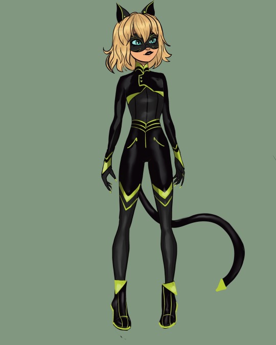
Kitty noir redesign, I had a lot of fun with this one. I changed a lot including her hair, shoes, markings, eye color, mask, lipstick, and general color scheme.
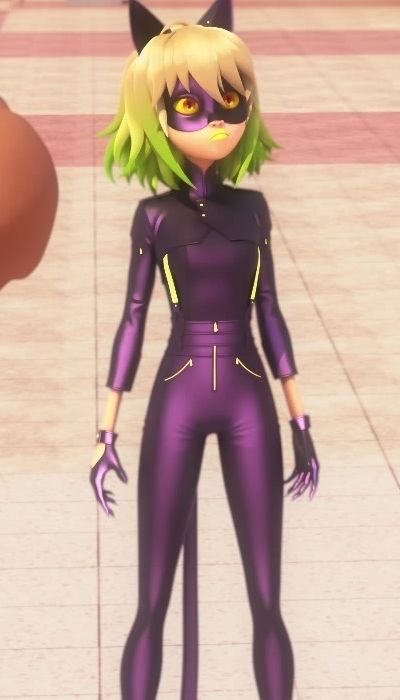
In my opinion the original design was a mess. I don’t know if it was intentional or not but there was a lot going.
Because there was a lot going on in the og design I did make the redesign pretty complicated with a lot of patterns and green accents. I kept her hair cut mostly the same though I took away the green ombré and fixed her bangs a bit. I kept the waist line of the original pants and the little half jacket thing. I changed pretty much everything else.
First off I don’t know why they made her purple but she can’t be black kitty without being black so I made her suit black.
I also didn’t like how this costume broke the precedent they had set of there being no exposed skin. Kitty noir had her ankles wrists and backs of her hands exposed so I changed it to be more like the other suits.
I don’t know why they made her eyes yellow but I felt like they clashed with her hair and skin tone so I made them the same blue color as Zoe’s eyes.
I added some stripe details to her mask added more green ( as opposed to yellow I don’t know why they made her accents yellow ) to the overall design and gave her green claws. I figured adding so much more green would set her apart from chat noir and lady noir.
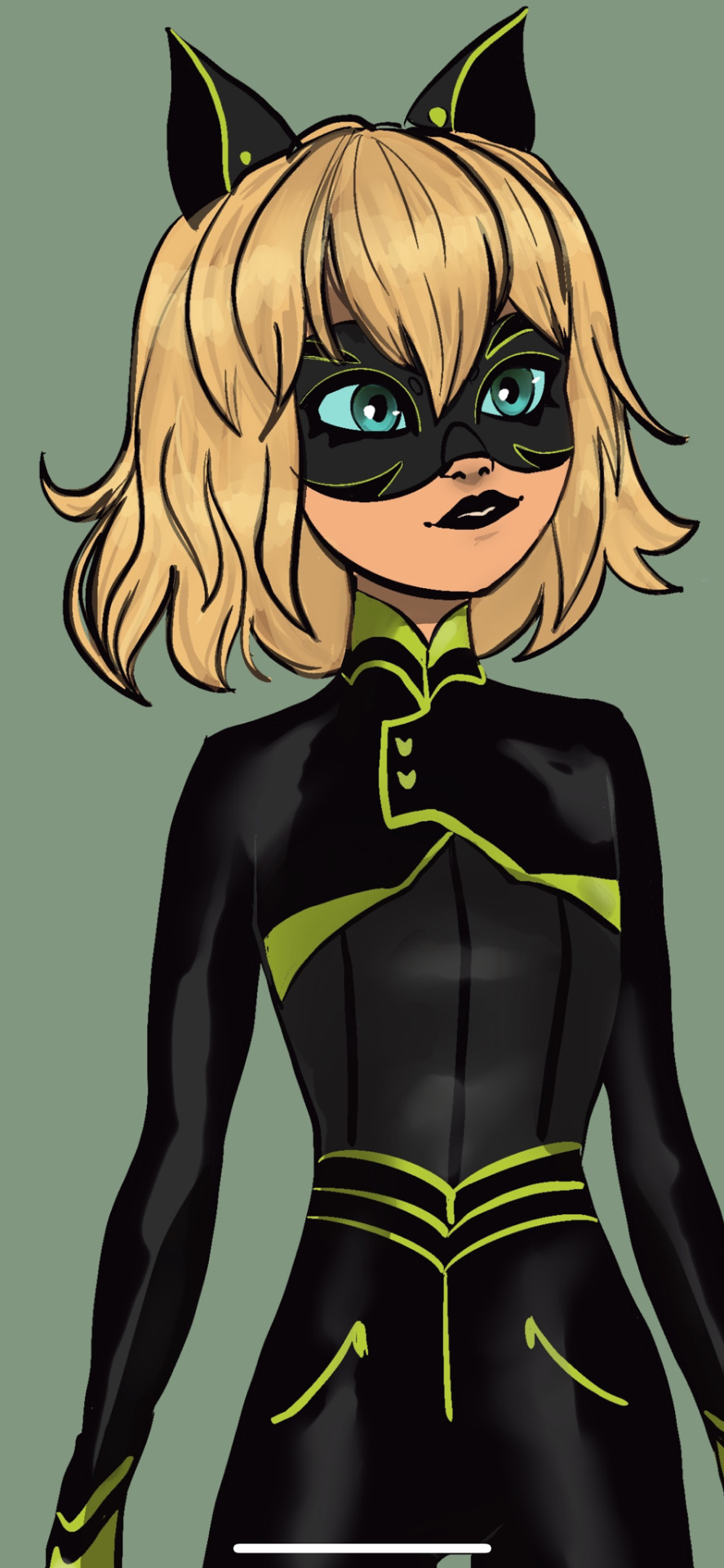
Finally I gave her black lipstick because that neon yellow green color was the part I most disliked about her design ( though the show does consistently give characters awful lip colors). Since I think they were trying to be alternative or something with the yellow green color I figured black would also be alternative and also more cohesive and readable.
Anyway I feel like the black cat miraculous is one of the easiest to design for and they made so many interesting decisions for Zoe. Especially with the color scheme which was pretty far from the established black cat color scheme.
#miraculous redesign#mlb fanart#miraculous ladybug#miraculous ladybug redesign#black cat miraculous#kitty noire#kitty noir#zoe bourgeois#plagg#miraculous lb#scarabella#scarabella and kitty noir#kwami swap
315 notes
·
View notes
Text
I was going through my art folder on my phone and realized how far I've come with how I draw Shay (and her different forms).
Way back in 2021 I drew her for the first time. She effectively came from a dream I had, where I lived her life in one night. But the struggle was I never actually really saw what Shay/I looked like in the dream. I knew what I was, who I was, but not what I looked like, beyond my hands. One of the most spectacular dreams I've ever had, by the way.
So early on when I was streaming, I decided to take a crack at drawing the dragon woman I'd been in the dream. I couldn't even really remember my/her name, although with help from my friends it came to me.
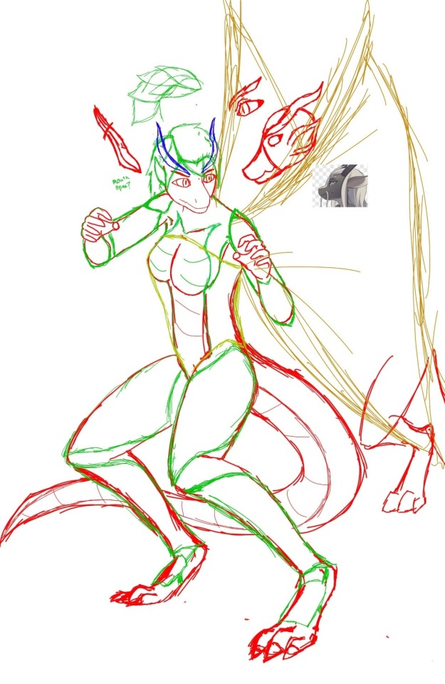
The first sketch was... Rough, at best. I had no clue how to draw an anthro creature, which Shay effectively was. I used multiple references to even sorta rough out what I wanted, and the result was not spectacular. But it was a start.
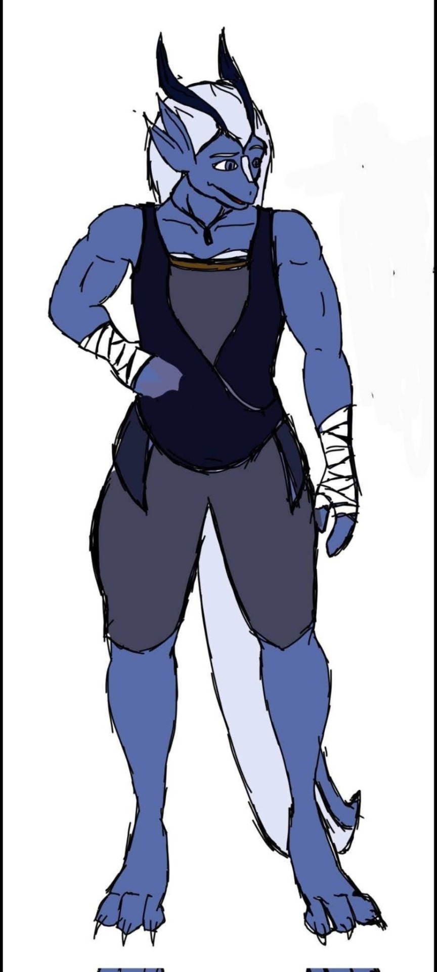
Then I was memeing with my friends about our D&D characters. I fully intended to RP as Shay when we began a campaign. It led to the version above - the first proper drawing where I was mostly happy with her overall design.
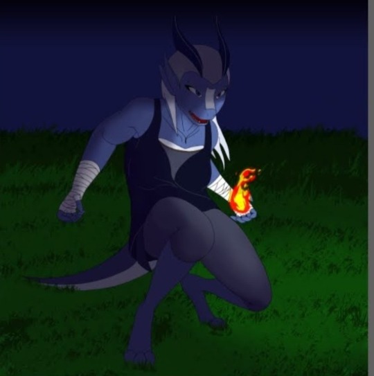
Late 2021 and I tried to push myself a little further, although I still didn't know what I was doing.

Art block hit me like a truck for a few months. When I finally managed to get drawing again, the results were initially really, really bad. But it wasn't too long and I drew what would end up being a far more finalized version of her design, the template for many future works. She was a more agile figure than her design sketch. I adjusted her horns to make more sense anatomically, and to fit better with her hair.
And also I drew abs on her.
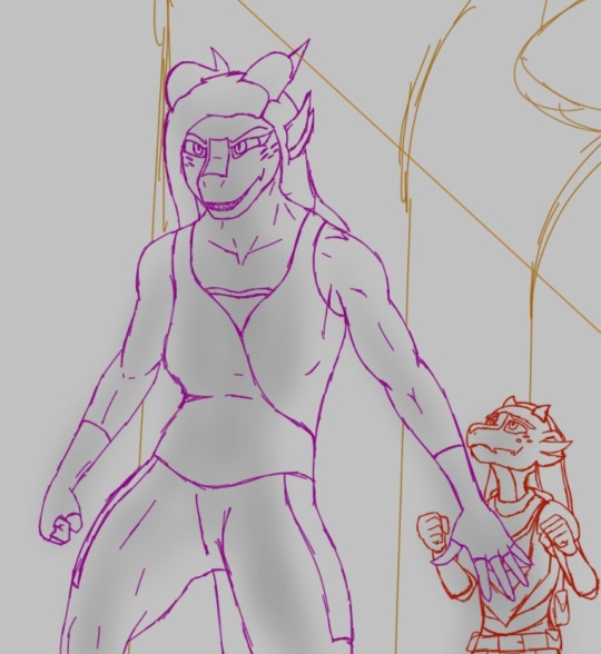
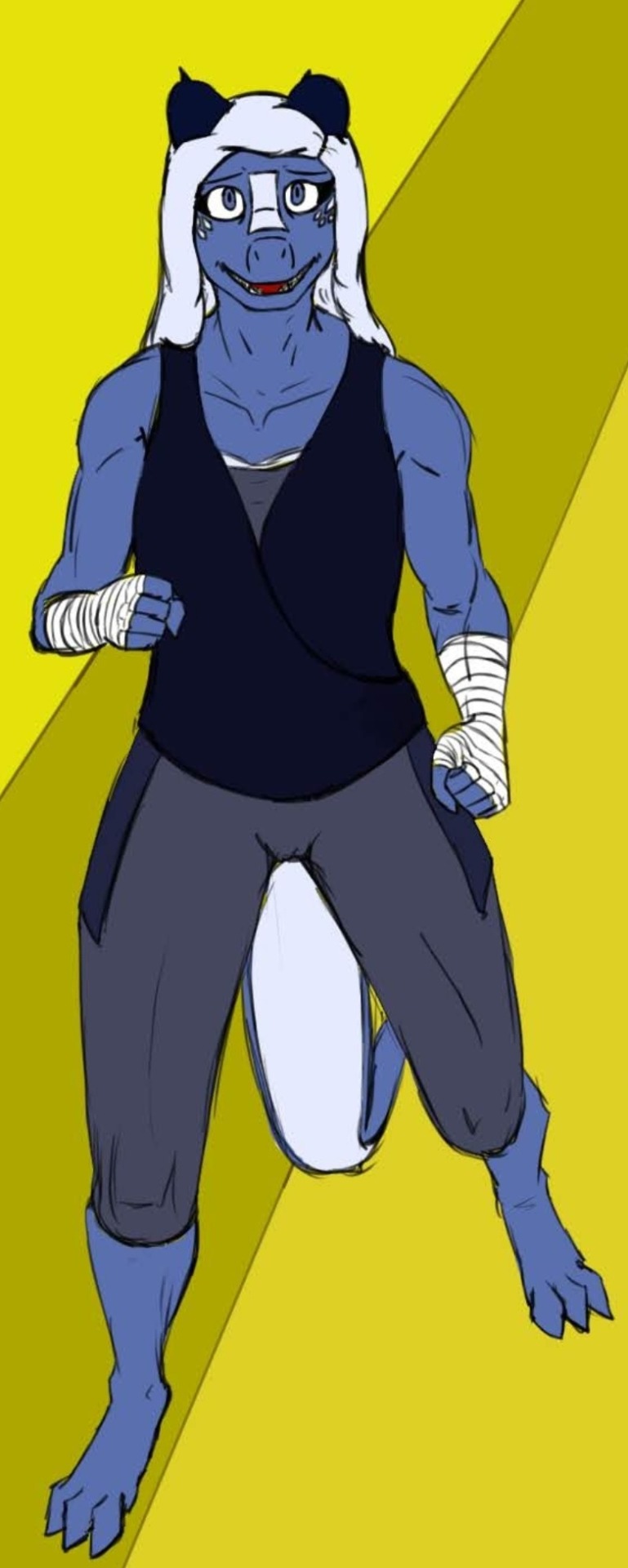
Then there were several more drawings. I touched on alternate versions, put her in some fun situations as self indulgence, tried to experiment with difficult poses. There was a lot of struggle, as I still couldn't quite get her head shape consistent.
Then I found some new resources, and on a whim I drew what's becoming my favorite alternate version of her: Shayaa.
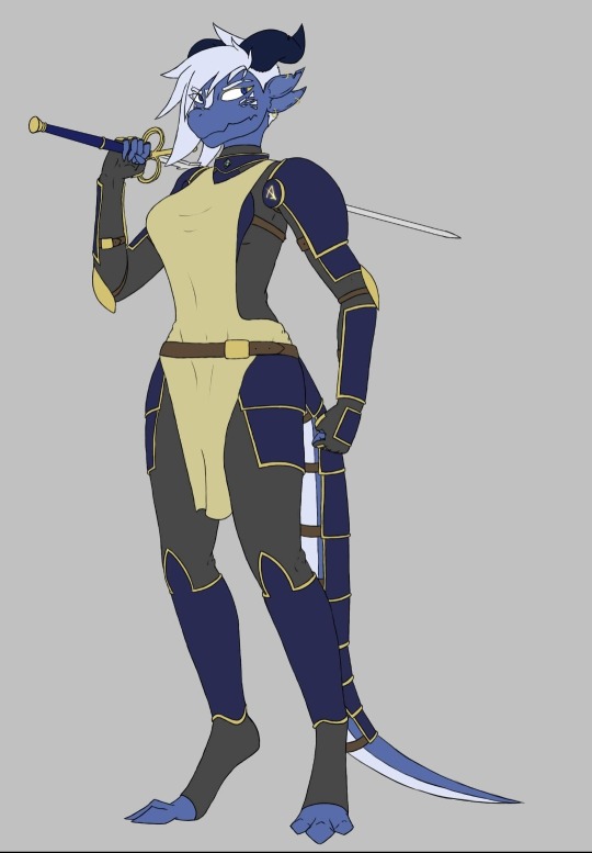
(Flat color iteration shown)
Shayaa was born out of two thoughts. I wanted a version of Shay that was a little thicc, and I wanted a version where she hadn't been abandoned. This ended up with her in armor, and was a leap forward in terms of quality and some design cues. The softer snout, more defined mouth, and thicker horns ended up really helping me draw her more consistently.
I was worried that it was one of those cases where I went beyond my actual ability and wouldn't be able to replicate it, but I was mostly wrong.

I decided I wanted to adjust "prime" Shay's design a bit, to improve her visibly aging and to widen the gap between her and Shayaa to emphasize their differences. I thinned her up a bit, made her muscles more lean, and rounded her features to make her appear more youthful - she's in her early 20s at the start of Godbreaker, but I saw her design as more in her late 20s or early 30s. She was always intended to be more lean than I'd drawn her, but skill issue. I also kinda hated parts of her default outfit, they seemed off and weren't the easiest to draw.
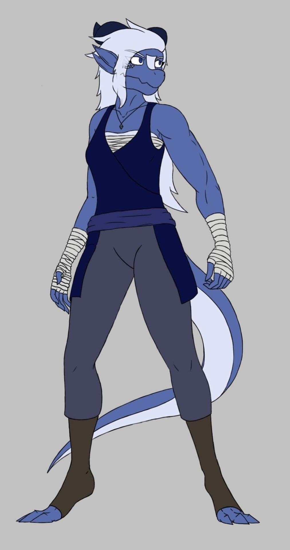
And now? I'm pretty satisfied with her design. She looks younger and more lean, and ideally a little less "civilized." Her hair got spikier to make it easier for me to draw - I suck at floofy hair. She's still pretty big, at 6'7" tall, but she doesn't look like a brick house anymore (nothing wrong with that, I love brick houses, she was just not intended to be that).
But yeah. Going through the old art, a lot of which I can't add to this post, it really hit home to me how much in such a relatively short time she's changed since the first real sketch, how much I've changed...
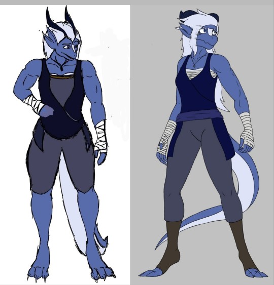
...And how much has stayed the same.
Aaaand to not end on any sort of deep moment, holy shit her old feet were HUGE.
31 notes
·
View notes
Note
HELLO ren i am finally here to yap your ear off about 'rose colored shotglasses,' one of my fanfic ideas that i'm thiiiis close to filing the serial numbers off of and making 100% original.
SO it's about three kids growing up in a small, isolated rural town, each in a shitty toxic home environment. there's spencer (he/him), whose parents are both extremely physically abusive to the; jack (he/him), who's been in foster care since he was 6 and hasn't had a consistent, stable home for even longer; and sabine (she/her, later she/they), whose parents are *there* but also not, and basically have expected her to fend for herself for years and offered her literally no support or care.
the trio became friends when they were younger and have stuck together for years and years as they grew up, deciding that if no one *else* is gonna take care of them, then they'll have to take care of each other--whatever it takes. and eventually, they run away together, escaping their shitty families and starting a life together.
and they eventually end up in a polyamorous relationship as adults <3 and they own a bar. and also spencer kills people sometimes and sabine helps occasionally, but mainly if they feel like jack's being threatened, so they think it's fine. jack is aware of it and chooses not to stop them because he likes being protected. i've also been heavily debating adding some supernatural/fantasy elements, but we'll see on that i suppose fjdjdhhd
there's a Lot that happens and i have a whole timeline for the story worked out in my brain, but mostly so far i've written little vignettes and snapshots of their lives and i wanna share summaries for some of em, and then one i wanna write but haven't yet.
house of cards - when the trio is in high school, spencer's father tries to kill him and nearly succeeds. jack and sabine find him in the aftermath. (this is what the excerpt i posted is from)
old-fashioned nightmare - told from the perspective of a guy who tries to pick an adult jack up at a bar, and learns the hard way that jack's boyfriend spencer doesn't like to share with strangers.
the world doesn't owe you a cent - sabine and spencer have a chat during high school. spencer is in love with sabine's boyfriend, jack. they figure out how to handle it.
and then i don't have a title for this one, but i think it'd be fun to write a story about the first year the trio owns the bar, told through yelp reviews the bar receives in that time.
and then i wanted to share some picrews of them (at least right now. if/when i decide to just make them ocs i'll probably change their designs up fjdjd)


in order: spencer, jack, sabine
HELLOOOOOOO THANK U FOR THE RAMBLE *eats*
i like this a lot!! tbh i’m a huge supporter of take those characters they’re yours now so LIKEEEEE i think you should do it 👀👀
7 notes
·
View notes
Note
GAY ROBITSSS. tell us the Bass information
HIIIIIHIHIHIHI did you ever notice that even though purple is barely in bass' design at all hes associated with the color? this is most likely because hes always seen with treble! that, plus a lot of purple effects and auras are used in his sprites, as well as super/treble boost bass being purple. curiously, no one seems to associate bass with the color yellow, which is actually featured quite heavily in his design. and lastly on this color scheme conversation, bass' color scheme can be rather inconsistent. while most of the time the blue gems on his armor are, well, blue, they will occasionally be made more purple, as well as his usually red eyes sometimes being depicted as pink. the specific shades of black and yellow used in his design also change, but never the purple in his facial markings. that always seems to be the same. his skin tone has also changed occasionally, going from the same as rock's to slightly more tan. a good example of this "alternate color scheme" for bass is his illustrations from mega man & bass (which are my personal favorites. if i ever need to use an image of bass chances are i am grabbing one of those. what can i say, i love bass with pink eyes.)
during the release of mega man: battle & chase, certain infocards about characters were released! while these are generally not considered canon, bass' card had his birthday listed as april 10th. which is a pun! because april 10th is written in japan as 4/10 - four-ten. which sounds like forte. very silly i think. generally, bass' birthday is more accepted as march 24th, which is the release date of mega man 7 (bass' debut game.)
bass' moveset in rockman & forte influenced bass.exe's abilities in mega man battle network! which is very fun for me :) due to battle network being an inherently different game from the classic series, it's not the most obvious, but bass.exe's signature ability (other than copyability, of course) is rapid fire, which was added to bass' moveset in rockman & forte to differentiate his playstyle from mega man's.
final bass fact of the day: he's slightly taller than rock (you can notice this pretty easily by looking at his mega man 7 sprites), but from mega man 8 onward, he's consistently drawn and animated as being hunched over to be the same height as rock. this is because he was first made playable in mega man 8's versus mode (which sucks. don't worry about it) and thus, had to be the same height as rock so the collision and hitboxes would be the same for both of them. bass' hunched over posture is the most noticeable in his rockman & forte sprites, as they actually have an animation for him settling into this posture from his natural height.
3 notes
·
View notes
Text

art challenge i wanted to try !!
ft. the evolution of my gordon design.
one of my favorite artists, sapgoon, came up with this little challenge. i thought it would be super fun to try to imitate my old art styles- not only that, but it was also surprisingly easy. i guess they're still a part of me after all this time.
have you guessed my favorite character to draw yet?
i will go a little in depth about them under the cut !!
2017 (perhaps it should be 2018, but it's the same style for that, so whatever.)
-very dull colors, same face syndrome, completely black lineart, messy black/dark purple shading, extremely shaky fingers and little to no care for consistency. this is quite literally my very first art style, as 2017 is when i first began drawing digital art.
as you may know, however, hlvrai did not exist in 2017, so i never actually drew gordon like this. i just drew what i think i wouldve drawn back then, if hlvrai had existed.
2020
- this is the art style i had when i initially learned about hlvrai's existence! same face syndrome is still there, but i get a little bit better with colors and my hands finally stopped shaking. im not a fan of the design i gave him back then (i really couldnt make sense of the hev suit at all), but every artist has their ups and downs.
2021/22
- i begin to get confident and find my own art style, trying to overcome the same face syndrome and learning a little bit about color theory. its a very messy style, and its the first time i began keeping my hlvrai designs consistent through all my drawings.
2023
-present time !! im... not sure what happened. i definitely improved a lot of aspects, but i don't wanna jinx anything. just look at it! wow.
looking back i realize hlvrai has been very important for my art journey, encouraging me to push myself out of my comfort zone multiple times. and though i just began posting my art again recently, i hope i continue getting better and better in the future !!
2023.08.12
#hlvrai#hlvrai gordon#hlvrai fanart#art improvement#sapgoon#art challenge#i can never escape. never escape#deep down i am still in 2017
30 notes
·
View notes
Text
OHHH MY GOD THE WAY MY ASS FORGOT TO POST ABT THIS
Meet Spider-Mortis
(He/Him)
He used to be just a regular Spider-Man before his doc ock fucked up ans bombed the damn world. In the wreckage of the ruins he rose up to become a kind of Robin Hood figure, stealing from the rich in their bunkers hoarding resources to give to the survivors.
For his design I wanted to take a more apocalyptic fashion statement with the classic Spider-Man suit color and design, but also make it feel more mature, like he is going through an actual apocalypse. His color pallet consists of blues, reds, and desaturated greens for his clothes

I gave him two different logos, one a skull with spider legs coming out from it, and the other a radioactive symbol with the spider legs aswell. I decided to put the skull ver on his suit, and use the radioactive one for clothing accents (and also on his bag, not currently drawn)
I also gave him a gas mask because it’s just.. cool (and I like making everything harder for myself)
(⚠️slight gore both written and drawn ahead⚠️)
Now for his villains,
the ones I’ve already drawn are his doc ock and also vulture.
First, Doc Ock
Doc Ock was actually what inspired me to make this, after watching Tobey Maguire’s Spider-Man I had a realization about how actually terrifying it could be if the chip thingy failed. Imagine if he ended up just being a corpse piloted by a bunch of robotic arms. That, is exactly what this doc ock is.
Because of his proximity to the blast, he pretty much died instantly, layers of flesh being the only thing left behind other then his robotic arms, who quickly gained control of his body afterwards. I’m not exactly sure how I want this character to act, whether it’ll just be a slight nuisance, or an actual villain I’m not quite sure.

I quite like my idea for his Vulture.
(She/They)
I Imagine her being some kind of anti-villain. They want the complete abolishment of the upper class, and could careless if all the humans left died as long as the rich died along with them. They tend to leave behind most the supplies they come across unless they really need them, the only thing she takes is the lives in the area.
I had a lot of fun with her character design. One of the things I had fun figuring out is how I could keep that aspect of femininity while also keeping it realistic for the apocalyptic environment. I went through a lot of different versions, experimenting with corsets for bust support, and different kinds of skirts etc before coming to my final design (possibly not final design)
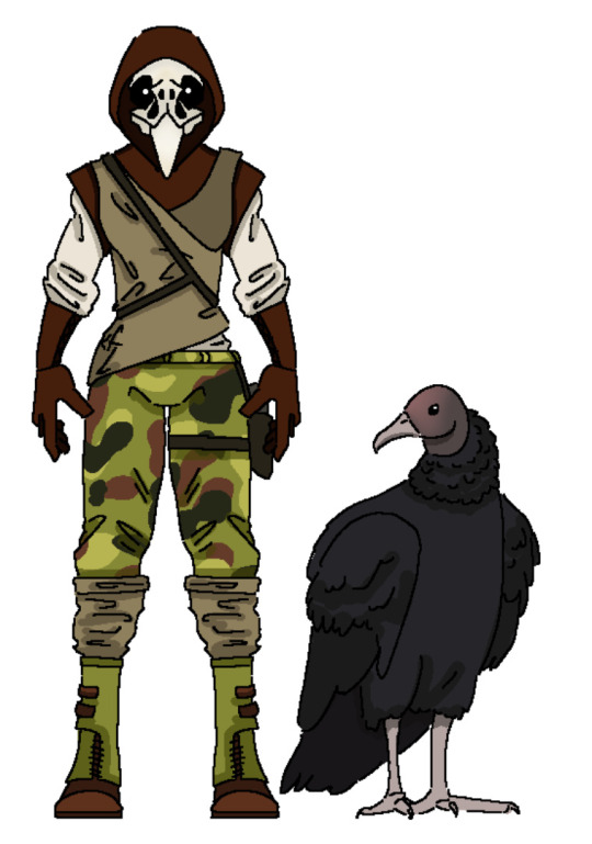
I gave them a more lighter color pallet, using brighter greens and browns. I have a bit of an obsession with camo patterns and I thought it would fit with her character perfectly so i gave them camo pants. I also took the boot design straight from Pinterest. (Guilty as charged.)
I added beige leg warmers to match with her top, which I’m not exactly sure how I’d explain it. Kinda like a wrap top? With a strap over stop of it. I gave them this kind of leather cape hood combo, and put it overtop of the bird skull mask (based off a vulture) I gave her. Underneath that she has a white, button up shirt, with the sleeves tucked into gloves, which I modeled after bird handling gloves.
Now here comes the part I love the most. I spend a lot of time researching vultures, and I am in love with the idea that she has a flock of vultures that just follow her where she goes. The idea that they leave behind enough bodies to where the vultures know if they follow them they’ll get food is fucking badass.
Like seriously. Imagine accidentally stumbling upon her camp and you look up and there’s just a kettle (the name of a group of vultures) of vultures watching your every move looking at you like they want to pluck your eyes out.
I also have a few ideas for some other villains
Deadpool (I think it would be quite funny in a setting where everyone is heavily dressed to avoid radiation and injury he’s just in the most revealing slutty outfit known to man)
Kraven, which I could possibly pair up with Vulture for an arc
The lizard, which could quite literally just be a radiated alligator
I’ve considered adding a black cat
Maybe some spin on vemon?
Let me know if you have any ideas I fucking love imput
#across the spiderverse#spider man: across the spider verse#atsv#spidersona#spiderverse oc#oc#character design#world building#digital art
12 notes
·
View notes
Text
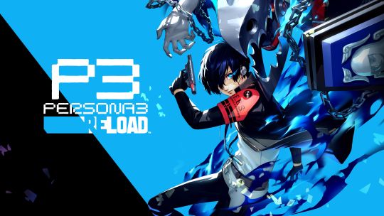
Persona 3 Reload.
This is a remake of the 2006 classic. I played it way back then... But don't remember much. I don't think i played it right too.
Did you know? This was revealed accidentally through an altus moment. Somebody on the social team accidentally posted the trailer on instagram early. That verbal lashing was probably inhumane.
You're back in the shoes of Persona 3's iconic protagonist, navigating a refreshed world harboring a dark secret. Almost everything's the same, but some things are different, and some things are new.
For one, the voice cast. The main stars of the show have returned, with new voices. A lot of people with ties to the original game weren't too happy with these choices (i dont think theyd be happy with any lol) but i really like them. Aleks Le, Alejandro Saab, Allegra Clark and Zeno Robinson stuck out to me the most. My god did Zeno put on a GENERATIONAL performance as Junpei. He breathed new life into the character. I can't imagine anyone else voicing him now.
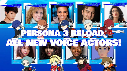
I recognize Allegra Clark from three houses. She did a good job as Mitsuru. Alejando Saab's take on Akihiko was not what most were expecting. With the time i've spent with the character, i think it's perfect. Aleks is on a special run right now. he killed it as Makoto.
Still on the topic of voice actors, many of the original voice cast actually are still involved in this project. They've returned to voice some of the adult characters.
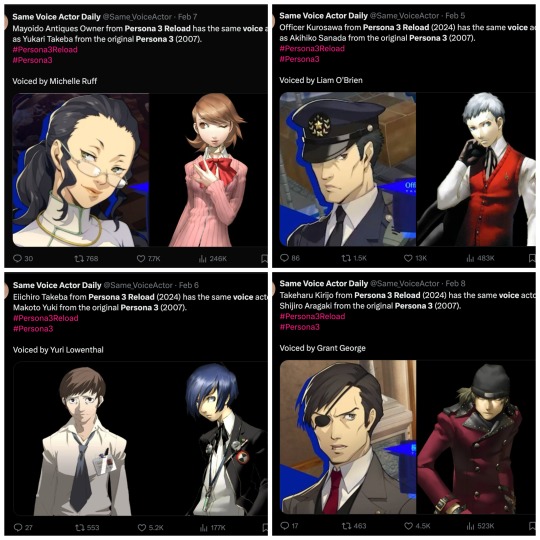
This is a really cool show of respect to the first voice cast imo. There's something a bit poetic about this. But i can't really put it into words properly. Someone better at this kind of thing could do so.
This is a remake. And by god it's a good example of one. Everything's been remade from the ground up to today's standards. The UI is AMAZING. It consistently impressed me up until the final act. Atlus has convinced me that good UI is an art, and they have all the masters in their studio. The environments, the character portraits, the music, the everything. The PS2 version looks cute in comparison.
Something that seems to be lost in production is the more somber and relaxed color schemes that the environments had in some of the overworlds. A lot of people didn't like this, but i did. The brighter color schemes used in the school really helped to sell that seaside setting that the school is located in far better than the original. Have you ever been to a (good looking) sea? They did a good job conveying the look.
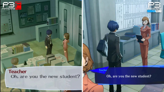
No longer limited by technology, the environments are far more lively. People that don't really get in your way litter the school hallways, Paulownia Mall is packed and the stations are full with activity.
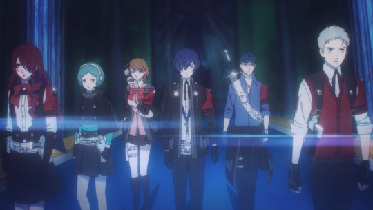
Battles got a huge overhaul, with a banger new battle theme. Alongside party members getting fundamental changes, the entire cast got brand new battle uniforms. I guess going through all of what they were going through in just their school uniforms seemed a bit too much. All of them were designed to their strengths and personality. (Why give junpei a jacket if he's just gonna tie it around his waist...?) They're really good. And it's a solid upgrade that puts them in league with the phantom thieves's looks with me.

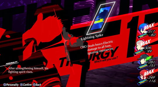
to boot, a new ability came with these uniforms. Theurgy. In game, it's explained as a special cartridge that the gang can load into their evokers when ready. They're pretty much fusion spells. Everyone gets one, and they all have their own animations that play when used. Persona 5's baton pass also makes a return, now known as "shifting". I made some great plays off of it.
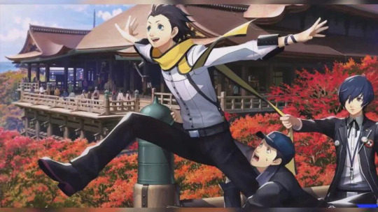
The story's the same, told through a new look, new console and new voices. It's just as good now as it was back then. The message still remains. I'm glad this was on game pass. I had fun going back to Tatsumi Port Island, seeing these faces again. My favorite bit of the game was the november school trip.
2 notes
·
View notes
Text
Time Skip (Except Leo) ROTMNT AU Character Sheets


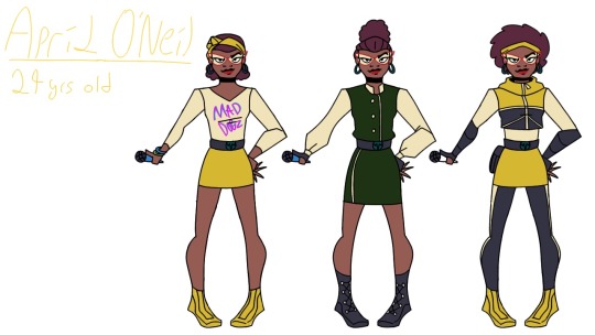
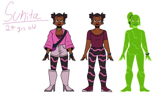
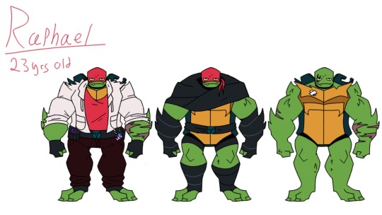
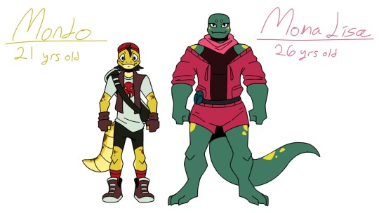

I present to you the first batch of reference sheets for my upcoming time skip au!
Now, I know it's not the most original concept, but as I have yet to see a complete one, and I had ideas, I decided to take a crack at it
This is the project I have decided I wish to complete first out of my many, many others, and will (most likely) be a fic later on.
I'II go into more detail on their designs later in individual posts, but for now the general thing is that I wanted each member who knew Leo to have his blue somewhere in their design, along with the same colored gloves and belts with the T-emblem.
I also have added both Mondo and Mona into this AU cuz I want them to have more friends their age besides the human trio.
Hope you enjoy the designs, and I'll be back with individual posts for everyone (hopefully) soon.
The next batch will consist of: Leo, Splinter, Draxum, the Casey's, Mayhem, and Hueso Jr.
After that I'll have a batch for Usagi and his pals, and then a final one with the villains and EPF crew.
So, I have a lot of designing to go, but it has been very fun
#rotmnt#riseoftheteenagemutantninjaturtles#rotmntfanart#rotmntart#riseoftheteenagemutantninjaturtlesart#riseoftheteenagemutantninjaturtlesfanart#rotmntau#rotmnttimeskipau#timeskipau#characterdesign#characterdesigns#charactersheet#digitalart#art#artwork#tmnt#tmntau#teenagemutantninjaturtles#tmntart#tmntartwork
14 notes
·
View notes
Text
I tried fucking with AI generation in Bing just to make the Oz Squad and here's what happened.
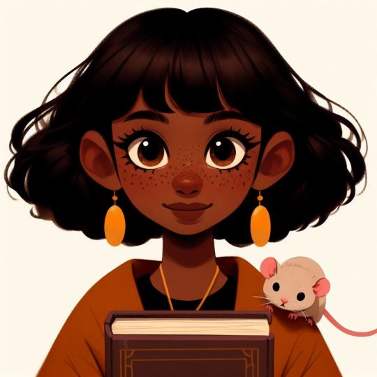
Ozymandias. Tried versions with giving her yellow hair but it looked Bad. It just made an awkward Karen-esque haircut on a little girl. All versions ended up making her look much younger than she really is. It's hard to describe the exact shape of her face in AI, so she ended up looking pretty generic. She consistently resembled the protagonist kid from "Home".
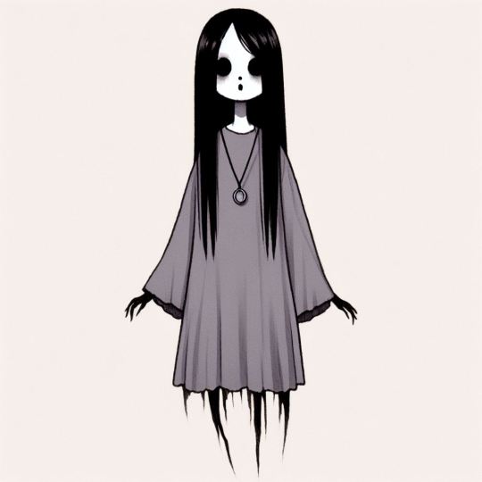
Liadan. Finer details got missed pretty hard (unsurprisingly) and it couldn't seem to decide what to do with her spine in a lot of generations. As with Ozy, all the images made her look rather young. Overall not terrible, but lacking the details that make her design distinct, especially the shape and length of her hair.

Su. Her features are pretty typical of a cute little round faced kid with brightly colored hair, so there isn't much to miss in her design. Fairly spot-on. I actually really liked the details in the stripes on her sweater, and I had been looking for ways to add some more detail to Su's design. I might actually borrow that element and incorporate it.
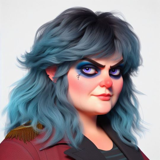
Rapscallion. Results were pretty mixed, but to my surprise, she was consistently fat and had a square-shaped face, and she consistently looked older. This one is unique in that this AI generation actually helped me to decide on *what* particular shade I would want to make her hair most times. While it would be in character for Raps to shift the color of her hair at her fancy, before I had it as a hydrangea blue. I like this faded teal, emerald green color better, and this is a detail I want to keep.
And finally---
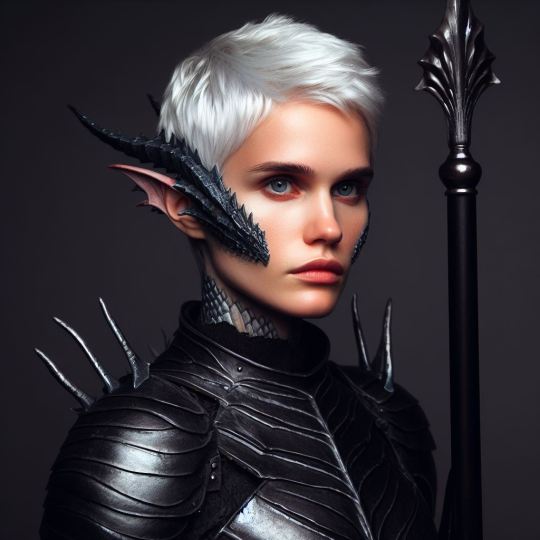
Unsurprisingly, Svanhilda had NO good results. I tried so hard to give her dark skin. Even when I described her has "a black woman" in the prompt, it threw white skinned results at me. Most results were too feminine, too pale, didn't lean heavily enough into the scales, and in general were just a very solid indicator for why AI generated art is a very poor stand-in for a human artist/character designer. Svanhilda again suffers from looking too damn young--she's actually supposed to be the oldest one in the group, and not in the way of 'being half-dragon means you age slower', either.
in conclusion...
AI generation is a useful tool for finding some semblance of shape for your ideas--and on occassion, if can surprise you with a few touches you might not have ever thought of on your own--but it's no way to make finished art, and it's certainly no way to maintain stylistic consistency between different images. Fun to fuck around with, but ultimately it's a novelty. And like...no shit.
Bonus AI generated Trawler, which again is pretty cool but will probably never replicate the real design I have for them.
5 notes
·
View notes
Text
Sacrificial Princess and the King of Beasts #1 - The Sacrifice and the Night of the Ritual

Screenplay: Seishi Minakami Storyboard: Satou Masako Episode Director: Ken'ichi Nishida Chief Animation Direction: Shin`ya Hasegawa Animation Director: Kasano Atsushi, Maehara Kaoru, Nagata Yuka, Tsuzuki Yukako
After what feels like an eternity, Sacrificial Princess and the King of Beasts have finally arrived. I was initially concerned about the animation quality and the challenge of fitting 15 volumes into 24 episodes, but the show has had a very strong start. As a huge fan of Sacrificial Princess and the King of Beasts, which is perhaps one of my favorite shoujo manga of all time, I was thrilled to see that the artwork and paint-like aesthetic were even more beautiful than what was shown in the PV. Additionally, the animation is much smoother than what was suggested by the PVs, which makes me question the shot selection in those videos. Nonetheless, I am extremely grateful for the show's quality thus far.
While I did admittedly doubt the show's debut at first glance of the PV and had concerns about the number of episodes the show would be adapted into, I think anyone can attest to the fact that I am a big fan of Chiaki Kon. I believe she is a very talented director if not one of the most talented at J.C. Staff currently working today. Many of the faults in a lot of her work honestly are not directly related to her, such as The Way of the Househusband or Gokudolls, many of which relied on producer input on the animation direction.
People tend to forget her works on Golden Time, Higurashi, or the various times she's worked on Sailor Moon or Precure. She consistently brings a fun vibe to the show. A lot of the cute expressions on Sailor Moon episodes she's boarded comes directly from her. So expect to see that when she does board her own episode. And talking about Golden Time, this show has the same designer as Golden Time in Shin'ya Hasegawa, and his designs really bring out the best in the characters. The manga covers have always had a paint finish to them, with very unique eyes and the way things are shaded overall. I think his rendition of the characters in this anime adaptation is really splendid. They're pretty when they need to be, threatening when they need to be, and look quite cute when they need to be. It's a great way to, I guess you can say, "anime-ize" the art style for a more general audience.


The episode was storyboarded by Satou, who has a great focus on eyes. The artwork for this show is often cute with a very pretty aesthetic, so when they do close-ups of certain characters with dead eyes, it's genuinely haunting as a contrast. The decision to change the tone of colors in those scenes, perhaps thanks to Nishida (whom I'm not familiar with), contributed greatly to this effect. It feels cold, in contrast to the warmth that Sariphi and Leonhart exude.
Now to the actual story portion, the pacing so far feels just right for a series like this, it gets the whole set up right away in the first episode, without really feeling like it's rushing it, and establish the tone shifts that you can expect from the show throughout. Sariphi and Leonhart's relationships remain cute in the anime and I hope to see the development of them that I've read in the manga continue to be seen in the anime as time goes on.
Image dump down below as always:


12 notes
·
View notes
Photo
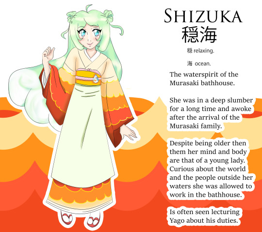
Shizuka the Water Spirit of the Murasaki Bathhouse
Yes, I am not dead! I finally managed to draw something after ages. Gotta say sorry:i had to take care of my health. I had a surgery in November and been recovering from it since. Also, my job and new baby nephew kept me pretty busy. Soooo let’s get to this new squishy! Created her for @lumilasi Bathhouse crew. Bio of her and links to the Bathhouse crew down below.
The mentioned characters like Kouka, Kuromoya, Kiryo & Yago are hers. Here are theirs Bios for you to read ;)
https://www.tumblr.com/lumilasi/702448204349898752/jeebus-crispy-my-computer-has-been-lagging-bad-for?source=share
https://www.tumblr.com/lumilasi/703443322958708736/this-started-out-as-a-potential-li-for-kuromoya?source=share
BIO
Ages: Unknown. She’s considered in her early twenties among her kind, but has existed far longer in human years.
Love interests: none currently (aka i gotta ask my pal lol)
Friends: Kouka Kuromoya Murasaki & Kiryo Toushi, Jurou Hasegawa/Araknos & his family, Gouken Shura & Shika, Yago
Personality summary:
Shizuka is a curious and friendly young woman. Still learning about the world outside her waters, she can easily be tricked and is somewhat of an airhead at times. She works hard and tries her best to make the guests feel comfortable. She is often seen trying to remind Yago to behave in front of their guests
Being type:
Shizuka is a water spirit. She was born a long time ago but remainded asleep for the majority of her existence, up until the Soul eater trio’s arrival. As a water spirit, she can control the surrounding water. She can also change the temperature, color and scent of the water at will. If she is sad, the water tends to rise. She can also feel if someone falls into her waters and is in danger of drowning. Outside her own waters, her powers only consist of her water bending. She also has to take some of the water with her if she wants to travel.
Role:
To learn more about the people and world outside her waters, she started to work as a staff member of the Murasaki Bathhouse. She is often tasked with serving tea and sweets, as well as to change the water color or scent for special guests or occasions.
Fun facts:
As typical for her kind as a lot of spirit beings, physical appearance ages slower than humans.
She loves sweets and in her spare time she is often trying to make some herself. Sometimes her attempts fail though
She is very good at sculpting figurines out of sugar, though.
The water drop obi brooch was a gift from Kiryo, and she treasures it a lot.
When she learns something new, she tends to tell everyone about it.
She refers to Kouka as mistress, and Kiryo & Kuromoya as master
Yago is referred to as young master.
She loves koifish and goldfish.
Her favorite food is Unadon (It consists of a donburi type large bowl filled with steamed white rice, and topped with fillets of eel (unagi) grilled in a style known as kabayaki, similar to teriyaki. The fillets are glazed with a sweetened soy-based sauce, called tare and caramelized, preferably over charcoal fire.)
Her favorite dessert is strawberry daifuku
She thinks Yago smells like strawberries and likes the scent a lot.
My Fun facts:
Her hair as in the end of it has a wave like design.
She has sea foam green hair
I gave her sea foam green hair because many hot springs have like this beautiful green water.
I gave her big eyes to make her look more curious and young.
Her name means relaxing ocean
Edit: i changed her buns to look less like some random balls on her head to a more natural looking one :)
#my art#my OC#my squishy#squishy#shizuka#Bath house crew#yago#Yago the Chimera#Kouka Murasaki#kouka#Kuromoya Murasaki#kuromoya#kiryo#kiryo toushi#water spirit#water#hot spirng#bath house#she is a squishy
6 notes
·
View notes