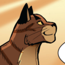
#got inspired to do a board
Text
[alutegra/alucard x integra, hellsing]
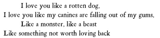

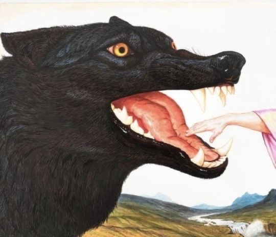
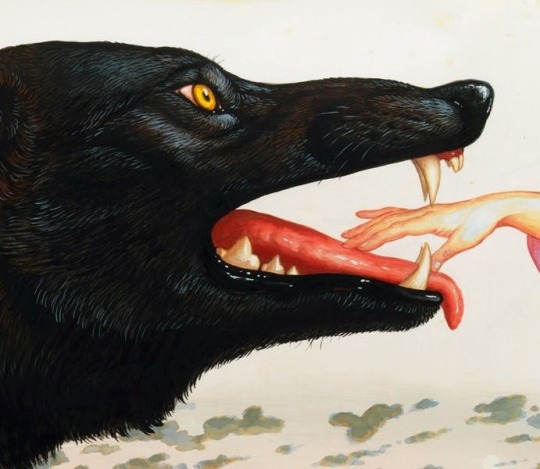

He loves me like a dog
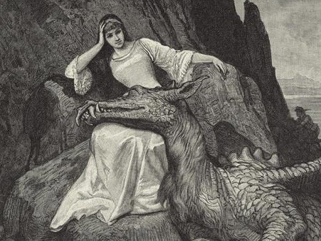
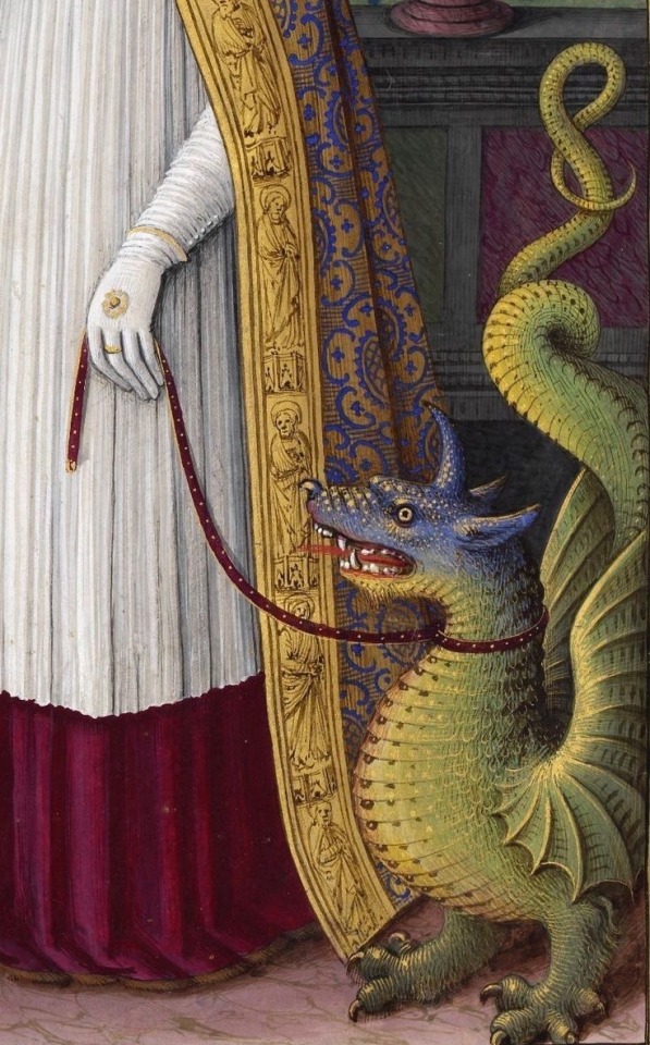
#alutegra#hellsing#got inspired to do a board#alucard x integra#the caption is a lyrics from alex g’s song sarah#she loves me like a dog#i changed the pronoun#what with the 10 photos limit i thought they updated it up to 30#fifth image is from the collection: fetching is your dior#sixth image is dragon resting its head on the lap of a woman by artist anton robert leinweber#ninth image is saint margaret and the dragon#tenth image is the painting saint lifardus by jean bourdichon#quote#dog#dragon
168 notes
·
View notes
Note
You should be a childrens' book illustrator! Your style would be so perfect for that I think! Really unique :D
While I don’t know any children’s literature writers, I *was* commissioned to do illustrations for a medical journal article!
#ask#non-mdzs#This whimsy apparently pairs well with university level reading material.#It is a wild concept to consider! But it *is* reality! I am really doing this! What a twist!#The research is incredible and I'm happy to draw for a beloved friend and good cause B*)#I've definitely got some kidlit illustrators on my inspiration board - I think they do readability and expressiveness well!#Watercolour-like styles also seem rather common so it's probably where the association also comes through#Regardless of my musings! This was a very sweet thing to say; thank you kindly B*)
257 notes
·
View notes
Text
⟡ metalocalypse × nathan charm by alienhunk .


x x x . x x x . x x x
#hevstims.gif#metalocalypse#dethklok#nathan explosion#gifs#my gifs#i just got this charm in the mail and i needed to do a board inspired by it#the stars are cause the clasp is a star which i found SUPER CUUTE#stims#stimboard#red stim#fire stim#eyestrain#bright colors#guitar stim#water stim#explosion stim#metalocalypse stimboard
40 notes
·
View notes
Note
I just finished botl and have moved on to tlo and I have to say your ethan drawings are everything to me because I love that silly little guy sm
ETHAN IS EVERYTHING im glad the propaganda is working
#ethan design truly hit me like divine inspiration#MOSTLY#bit of design backstory for you: making ethan blond (ish) was actually for a specific purpose#i was thinking of my silena and luke designs and ethan all next to each other and went 'oh they all have black hair'#so really i made ethan blond for more differentiation#also to put a new spin on his design which everyone already knows i like doing#ethan has such a specific style to me also#thats barely based in any canon and more headcanon/interpretation#ive got lots of character clothing boards HAHA#tldr: i love ethan#and his character is too interesting to relegate him to a few mentions like rick riordan does#simon says#asks
30 notes
·
View notes
Text


Jacket!!!! Ye olde varsity I got at the very beginning of my transition thinking "Oh fuck yes I am going to pass so hard in this" and. Well. It never worked I just have never passed a day in my life I don't think 😔 Eventually it just became a beloved test subject and has since gone through a bit of a transition itself LMFAOO
Some Notes:
> A lot of the decorations are taken from old backpacks I loved dearly that got absolutely fucking destroyed by the weight of all the shit I'd lug around in highschool LMFAO (sketchbook, diary, all kinds of notebooks...). Never had the heart to get rid of them. Specifically: The pink zippers, the holographic pockets, the glow in the dark stars, and the holo angel wings!
> The pink/blue checkers are from a small decorative quilt I thrifted years ago, I wouldn't be surprised if it was handmade (it's super soft material, btw! Important LMAO). I only took out one line of squares, I plan on stitching the rest of it back together (haven't done it yet though LMFAO). The reason for this was to upsize the jacket, so I can button it without it clinging. The pockets were added for funsies ESP cause it lined up very well and aren't really practical LMFAO (BUT YOU CAN PUT THINGS IN THEM! If you want!! 🎉🎉🎉)
> The patches (esp the name/pronouns one) were the first additions actually. Eventually more and more things were added, but I will say all the pins on the opposite side of the patches were haphazardly placed for a concert I VERY BADLY wanted to look good for LMFAOO (that's when the stars were added too! Fighting for my life on the car ride over speedrunning sewing and trying not to throw up about it AHAKHSKSHDK)
> Spike placement may be odd and I'd like to add more, but also I do frequently still carry around big heavy backpacks so I have to take that into consideration. Which is also why the wings have been bolted on. Those motherfuckers are NOT going anywhere LMFAO (has a really cool visual effect too!!)
> The material of the jacket itself (sort of a swishy windbreaker fabric) IS ABSOLUTE ASS TO WORK WITH. BY THE FUCKING WAY. IN CASE YOU WERE WONDERING. I would NOT recommend it to anybody ESPECIALLY someone who is just starting to fuck around and find out. I literally am just sticking it out bc of the sentimental value this fucker has to me 😭😭😭
This jacket was my first plunge into customization and punk fashion, I didn't have a plan and still don't have one (and I think it kind of shows lmfao). I do worry that it's too soft and cutesy. Kind of the whole point for me, when it came to leaning heavy into punk, was to feel sharper, like I had some bite to me. I might be getting closer, but I think I'm still just kind of a silly guy LMAO. But, I do think in a way, esp as my first project, it represents me well -- where I started, what I loved before the beginning, what I tried desperately to be, what I still wish for, reuniting with the things I loved and embracing them in a brand new context. It's still an ongoing project too! So maybe as I keep growing, it'll grow alongside me, maybe finding that grit I've been striving for along the way.
#the big concert was mcr. btw. and cause it was a stadium no one got to see the glowy stars anyway LMFAOOOOO#for that concert i desperately wanted to have a big piece inspired by house of wolves on the back.#but i have never been able to get it right.#but like. it is actually my favorite mcr song. i REALLY wanted to do something transgender w it too.#like tell me i'm a bad man. i AM a bad man. bad man in the context of the song AND bad man as in. in the eyes of the observer.#i am just doing it poorly. on purpose. fuck with me about it!!!!!#also 'tell me i'm an angel' would compliment the wings as well#but as an artist i find i am way better at cartoons/characters than literally anything else.#ask me to do something cool w fonts/words beyond simply being legible and i'll throw up and cry.#also something i don't want to say outright but feel okay sharing in the tags is Why punk is so important to me#is cause i am just. so sensitive. i always have been.#but in a world that is actively becoming more hostile to exist in as a very visibly queer person#AND as a noticably autistic person too know like i think i have gotten to the point where people notice Something about me#(which. is good. bc autistic masking absolutely fucking ruined me so fucking bad.)#i need to get stronger. tougher. sharper. more dangerous. to exist as i am and to do so so boldy#i need to have the bite to back it up. i still feel like a prey animal but i have teeth i have claws.#going back to my church even for a moment has made me 10% eviler also. inspiring me to be the thing they fear.#so i think once i've rested i'm gonna go back to the drawing board for that transgender house of wolves backpiece.#diy punk#my projects
24 notes
·
View notes
Text
Oh my, how sweet! Resident darling of this dark and spooky little cul-de-sac wants to go trick 'r treat with you. Just beware, neighbor... not all the residents are as friendly as he is. 😈
Little quick redesign of Imp Wally inspired by @killertoons design, since my old design just wasn't as cute and I personally feel I've gotten better at drawing Wally! I had to of course add Home, or rather Monster House inspired home and I had a lot of fun experimenting with a more detailed background in a doodle that turned into a thought out sketch. My reference actually, was this piece of Sam merch I WANT SO BAD......
#SAM TRICK R TREAT MY BELOVED#and I already have seen a lot of people jump onboard a halloween AU when I was writing the draft in like september X'D#I was also inspired by the one comic someone did of like. all the neighbors getting changed into monsters#there's a lot of other similar ones I've seen on tiktok too#but to save my pride I'm gonna say I flushed mine out because it has more of a story hehe X'D#I have a whole pinterest board dedicated to this thang!!!#I might draw a full sketch of barnaby too maybe.#next to poppy he's got of my fave design concept sketches#and fun fact! I finished this the day of friday the 13th and later would be the surprise update we go to the welcome home site!!! :D#pretty lucky if I say so!#also clown wasn't kidding this puppet series would be a horror project after all BECAUSE WHO ELSE JUMPED AT THE BOO TO YOU STORY#WHY IS THERE A NARRATOR WUH-#WHY DO THEY H E A R THE NARRATOR-#Pawz Draws! 🐾🖌️✏️#welcome home puppet show#wally darling#welcome home fanart#welcome home au#Haunted Home AU#Imp Wally#Halloween#traditional art#traditional drawing#cute art
7 notes
·
View notes
Text
it's always quite interesting to me that most agents adhere to the "Nine" protocol of being excellent in most/all fields listed during the story (assassination, infiltration, deception, seduction) which of course are benchmarks for being a Cipher, but I rarely ever see ones that aren't good at everything across the board, so I tend to imagine the general Nine as one who is good, even great at every part of espionage as an all-arounder but not a master of all trades. Which fits the idea that your career is just taking off, and you fit the highest marks professionally without being a sheer outlier-- just right to be the best at everything but missing true specialization that wouldn't guarantee an onslaught of steady missions or being transferred to another division. Then there's the fact that your character is rewarded constantly by Keeper or others if you stay within that neutral space, so it reinforces that idea of by-the-book but loose enough to be flexible method.
#swtor#imperial agent#ooc#I've also seen a few who do specialize but mostly medics#which is already outstanding for a mere field medic to be doing all of this lol#this is what inspired most of eight actually#while he can be argued is also good around the board it's only because it's part of the kill#if there's something *else* unrelated he's no good at it#unless he can watch someone do it and then copy their muscle memory#but I made him purely all points in assassination for this reason#everything else he got his butt whipped into acceptable parameters for by his mentor#and don't even start on that spy charisma. he already sees what people say outside their words so he gets rather blunt#honestly i wanted to see how far an agent who could only kill but was so good at it could go#and well...he got really fucking far LOL#this also results in him having really random skills that make almost no sense but were part of doing something to get closer to a target
11 notes
·
View notes
Text
Shower good. 👍👍👍
In bed now. Considering making a hot bowl of instant noodles ...
#sucktacular sucks#man i wish i had chicken wings so bad...#id go comatose for realsies after tho and ive got stuff to do later jfjsnfn#also listening to my angsty teen music and just mm 💕💕#RED i know youre singing about Jesus and stuff but Not To Me youre not. 💕💕💕#christian rock didnt need to go so hard#but they did and its so hopeless romantic my existence is nothing without you -core#my only regret in life is i never did a Beyond Birthday x L Lawliet slide show/amv yo any RED music#or even The Birthday Massacre#and thats really sad#i failed myself#(<- saying jokingly)#but if i ever do make a new video i def wanna do one for RED or TBM or even Breaking Benjamin#one day perhaps#i dont think ill use fan art unless its painstakingly sourced and i ask the artists permission#but i can def see myself trying to do some kind of still image slide show with my own art#but id have to story board that out and draw it all and thats. so much...#but man i was really inspired by reggi's collab#anyway
4 notes
·
View notes
Text
//
#made a Pinterest board with 2023 inspirations and now that I feel somewhat delusional I feel calmer as well#nothing worked today and I got so mad but pretty pictures helped although in a year it will probably be more upsetting to see that nothing#changed lol#do you have any goals or intentions for the year btw
5 notes
·
View notes
Text
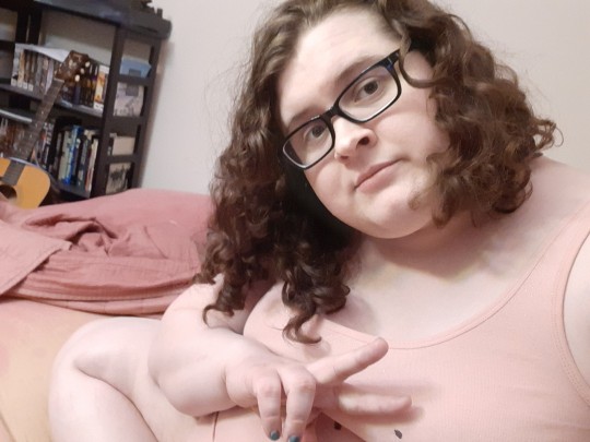
Been a bit since i posted a selfie. Have girls & curls
Til there's a limit to how many tags you can have on a single post. I guess that makes sense but how am i to ramble in the tags now with only 30 tags???
#well only one girl but yknow#I'm about to head to bed for tonight#ended up spending my night basically just chilling on tumblr clearing out my likes lol#made a chili tonight that turned out decent enough#my mini painting projects continue to go well#i noticed a stain in my sink looks like a sandile so that amused me#uhhh what else has been happening with me#excited to do board games with friends this weekend#finally got a therapy appointment on the books after months of searching and waiting#been continuing to think a lot about stuff like relationships and sex and stuff lately#went to visit my ex and hang out last weekend but it kinda went from just being a hangout and chat thing to a sex thing#and that was super uncomfortable#like i didn't necessarily not like it for a bit but i wasn't really that into it and the whole time it felt like i was just putting on a...#... performance for their enjoyment rather than really enjoying the acts we performed any myself#i appreciate they stopped when i did finally openly express my discomfort of course but i think i was uncomfortable long before then#been watching a lot of horror focused YouTube vids lately#(i am absolutely not good with horror)#its kinda nice to see horror content where it's through a filter where someone else is summarizing and analyzing it#though that still unnerves me frequently cause i am just that bad with horror#but it's giving good inspiration for some possible stuff for a monster of the week campaign im gonna try running soon#I've been so depressed lately (and burnt out my friend claims) that i had to stop DMing (one of my oldest pasttimes) for like three months#but I'm hoping I'm on an upswing#and while part of me thinks that maybe I'm just done DMing - like i got out the stories i wanted to tell and there's no more fuel left -#i feel like i owe it to myself and to my regular group to at least TRY again#even if i fail horribly#so we're gonna finally try running motw for the first time#i dunno i think that's all the big news stories from ya girl that are fit to print#eri blogs life#i hope y'all are doing well too btw#the world is a big and scary place at times but there's so much beauty in it and i really hope y'all are finding that beauty
2 notes
·
View notes
Note
Hello! I was wondering if you’d be willing to take commissions someday 👀. No pressure tho! I just love your art so much
The short answer: "not at the moment, but it is very possible in the future'!
The slightly longer answer: I would have to figure out a good pricing and payment system! PD-MDZS is also where most of my free time goes, so until my life settles down a bit, I would be on the slow side to complete them.
#Ask#Even longer answer: I technically do - but it's been people I know irl asking and handing me physical money/bank transfers.#I'm working on one right now but the tricky part with pricing is that they want the physical copy of it - which is different to online comm#Fun fact: I have gotten a fair amount of commissions from a local hobbiest quilting club.#They show me their pintrest inspiration board and tell me size specifications and I draw out patterns on parchment paper.#I am probably being undervalued by a group of 50-60 year old women but they call me handsome and say I'm doing a good job so...#There was also someone a while back who asked about a tattoo design and I was *so* enthusiastic but I just got too busy to commit.#I truly do appreciate people asking - It is *extremely* flattering that you like my art enough to want to commission something!#I will re-examine my situation in a few months! Someday really is the keyword here; I think I'd have a lot of fun with it!#(All the money would go back into buying more artbooks and supplies too! What a dream!)#Through this blog I've gotten to know a few people who do commissions for a living who I will probably pester for pricing advice#Time really is the only barrier for me right now B*(
64 notes
·
View notes
Text

A videogame about a cat who fishes up the horrors of the deep. Concept title: 'Fish With Teeth', feat. Wester the cat
#idk how to draw but the stuff at the bottom is inspired by the void tendrils from Hollow Knight fyi#I wanna figure out how to do pixel art so I can do something similar to the OneShot graphics that'd be nice. Sprites + Cutscene styles are#a cool combo. I also cannot code. Only language I ever coded movement in was Visual Basic and that was *years* ago + pretty much consisted#of copying off a board. Any other language experience has been more about making the computer do math problems or finding code that#makes text appear letter-by-letter like it does in games. There was more googling than actual instruction in that class.#My brother is doing coding rn but none of my projects ever really worked in the end and I've got too much brainfog#for projects in general these days letalone making a game. Wanted to sketch the idea anyways cuz I could sorta see a character in my head#and I was bored.#ghostprince posts#ghostprince art#art#digital art#sketch#cat#fishing#I guess#Envisioning a NITW-style logo too btw#...ngl I think 'The Dark Below' by DarthPeezy permanently changed how my brain works. I should go read it again.
5 notes
·
View notes
Text
ive already done a deep dive (essay) into c!Tom im super tempted to go into my headcanon of the dynamics of c!Tucker and c!Sonja’s as Mianite’s two champions and how symbolically/elemental wise i feel like Sonja is the storm, and Tucker is the sun
#something something the sun after the storm is favored in convention#magic being associated with lightning#the weight of the golden child/champion represnted by like sunlight; upholder of order how the sun dictates life#sonja and the juxtapostion of rainstorms destroying and creating#theres also a cool irony because of their palettes#mostly its cause of the hcs and the aesthetic boards and its inspiring me to want to do more character work for them#since ive developed them for the origins Au kight as well fuss with the canon versions#i also drew c!Sonja for an octobernite this week and it got me thinking Big#im embersduo (jordan and sonja) truthing too bc of the astro ads and. yeah#lafakiwi talks#verdigris musings
4 notes
·
View notes
Text
goodness gracious where are all your horrifying horror fans when you need a sounding board (taps feet impatiently)
#dismies ramblings#the answer is bein very sweepy (n dats ok. love you guys if you see this post)#i just need a sounding board because#ive been reworking how i do my horror bits in this trauma-horror narrative and like.#twell the crux of the plot is that its explicitly a DREAM thing. all stuff is based around dreaming.#and i wanna play on that#...but for one. i dont dream#and for 2: i dont want it to just be dark shadowy figures & silent hill monsters#because thats easy and overdone#but m/c's trauma also specifically revolves around some body contortion and fetuses and babies and stuff. so like.#how do you make that palatable enough that it isnt egregious without making it corny and cliche. and also make it flow like a dream#lately ive been looking at sleep disorders (particularly fatal insomnia) for reference but...#the horror in dreaming itself is stumping me. HELP.#hi if anyone got this far. please god send suggestions OR JUST cool media/instances in stories youve seen for inspiration. i hit a roadblock
0 notes
Text
Everyone gets “The 90s” look wrong and I hate it
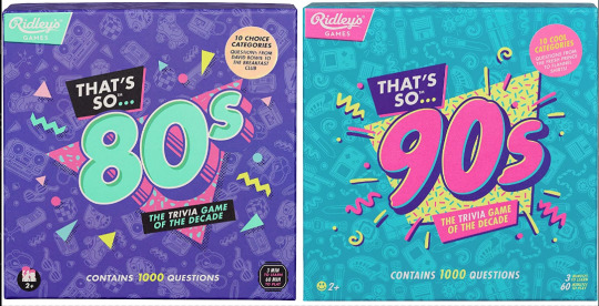
Couple years ago I saw these two board games at the store back to back. Well, not saw them per se, but ya know. Spied them out of the corner of my eye. And for a moment without reading the text, I couldn’t tell you which was which decade at first. Funny. Either they were in a rush to get these out the door or they wanted their throwback trivia game boxes to look uniform. I didn’t think too much of it.
Only, from then on I started seeing it MORE. Every time someone markets a 90s or 80s throwback...

Goddammit they’re identical! What??! How did we let this happen? As a 90s survivor and a designer, this drives me up a wall.
Look, I know I’m late to the party to complain about “the 90s look” when we’re just starting to get sick of the Y2K nostalgia train. But c’mon, the 90s were not The 80s: Part Two™
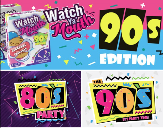
Trust me when I say that we weren’t all wearing neon trapezoids up until the year 2000. The 90s look being peddled is so specific to the tail end of the 80s and an early early part of the 90s - a part of the 90s when it wouldn’t stop being the 80s. This is Memphis design being conflated with the wrong decade.

Keep reading for a long ass graphic design history lesson and pictures of old soda and fast food.
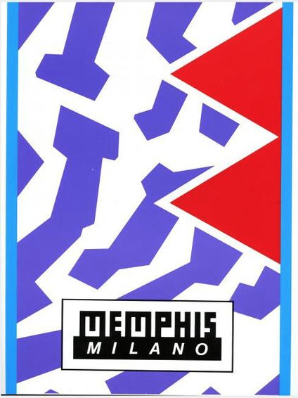
Specifically, the look is Memphis Milano, self-named by the Italian design house Memphis Group. Starting in the early to mid 80s, they made all sorts of furniture, fabrics and sculptures that were like a Piet Mondrian grid painting under heavy radiation. Their whole deal was defying the standards of existing industrial design up to that point on purpose. Chairs had weird arches, bookcases would be in strange alien colors, unusual materials like plastic or elastic were used in place of metal or wood, that sorta thing.
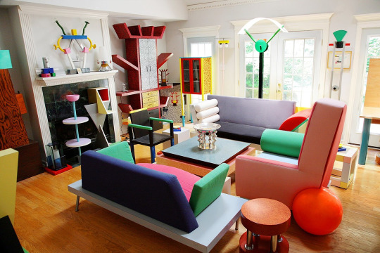
Memphis quickly became the signature look for the decade. You can tell something’s influenced by Memphis design from it’s telltale trademarks:
Clashing, neon colors.
Use of diametric shapes.
Contrasting patterns like zebra print stripes, confetti squiggles and checkerboards.
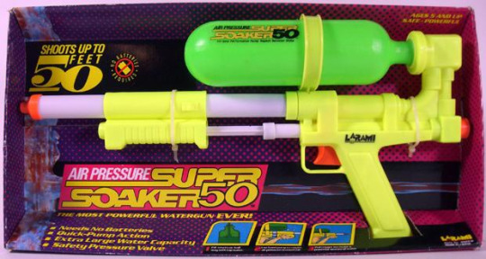
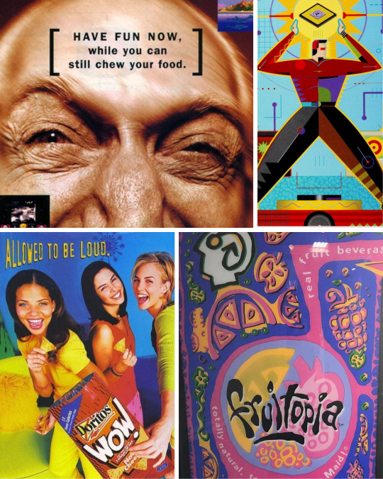
It wasn’t long before Memphis Milano-inspired design was everywhere in 80s pop culture:

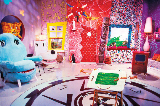
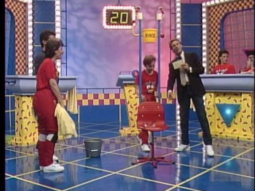


It was a special time, yes.
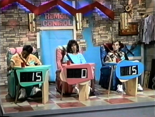
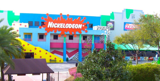
I was a kindergartener at the tail end of the 80s, so I knew Memphis mostly through the lens of kids media. Toys, clothes, games, tv shows used it like candy colored catnip. Cable channel Nickelodeon more or less adopted the Memphis aesthetic as their signature in-house style and practically built a monument to it at a Florida theme park:
I think this is why folks mistake what decade Memphis is representative of - 90s staples like Nick, Saved By The Bell, Fresh Prince - they all stayed around much longer than the design trend’s expiration date.


Couple that notion with the fact that companies are slow followers to design trends. Something gets popular and they want to get on the bandwagon? Gotta wait for the ink to dry, gotta wait for the production molds to be made. It would take a few years for them to completely work Memphis outta their system.
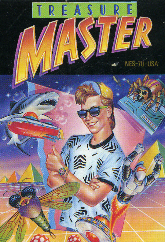
Now, this is not to say Memphis is bad! Personally I’m a fan of the aesthetic, if my neon-drenched artwork wasn’t a tip-off already. But it is a trend, and trends never last forever.
So what took the Memphis Milano look down for good? This part’s up for debate, but I personally think it had something to do with this dude:
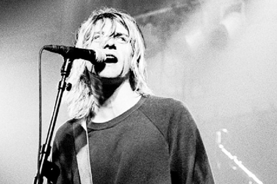
It’s that grunge music from Seattle that’s so popular with the kids these days dontchaknow.
Once Smells Like Teen Spirit hit in 1991, the Nirvana tone drove the rest of the decade. Clean geometry became weathered, grainy and organic. Bright neon pastels became more bold. Bubblegum pop music sounded fake and manufactured. Attitude and apathy was authentic. Whatever.
Things got grungy. Things got grimy. Olestra was invented.
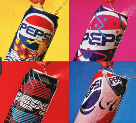
I think the best way to visualize this transition is how Cherry Coke entered the decade and how it left it:
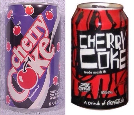
1992 Memphis on the left, 1998 grunge junkie on the right. Fitting that the 90s would end with a design that looked like Darth Maul’s lungs.
Okay, so what should 90s retro design look like?
Continue on to PART TWO! Spoilers: No VHS filters or vaporwave needed, but maybe bring an antacid.
16K notes
·
View notes
Text
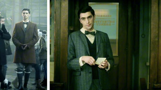
since edwin is very closed off, except for when he’s with his best friend, charles, costume designer kelli dunsmore reflected his buttoned-up mentality through his bespoke suit, complete with bowtie and collar. edwin’s outfit, along with charles’ period garb, were designed to help them stand out more in modern day port townsend. “i knew edwin would, because no one dresses like that now,” says dunsmore.
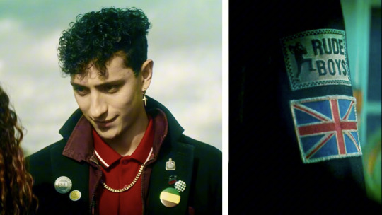
dunsmore wanted everything about charles to feel “a little bit cool and underground,” from his union jack and the who bull’s-eye patches to his checkerboard pins. his little cross earring and chain on the outside of his shirt are also meant to be homages to the ’80s.
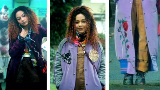
in the show, crystal’s hero color is purple, which you’ll notice in her velvet coat and long silk letterman jacket, which dunsmore thought of as a psychic cloak with hand-embroidered patches, including the wilting rose of england.
her brown trench coat represents an explosion of everything going on in her mind. dunsmore decided the scribbled words and drawings are a result of crystal writing all over it to express her inner turmoil. there are even lyrics on there from the song she’s listening to on the tube when she meets the dead boys.
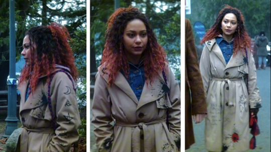
david’s connection with crystal seeps into her wardrobe, too. since david wears a flower shirt, dunsmore’s team hand-painted flowers onto crystal’s black boots. and niko is wearing a dark sweater with flowers on it when we first meet her, as an homage to crystal. the costume department also drew the same rune pattern the dead boys use to exorcise david in episode 1 onto crystal’s trench coat and on the tab of her wool bomber jacket. “so she’s always got some sort of protection,” says dunmore.
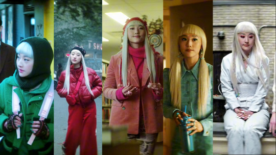
every color niko wears is inspired by what’s happening in that episode, from the green post-sprite exodus to blue when she’s feeling sad. niko only wears a white look, with nods to her japanese heritage, in the finale as a reset. the charms on her obi belt represent the colors she’s worn all season.
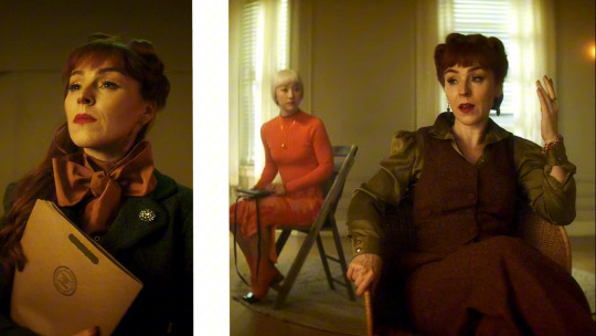
night nurse is someone who’s in control all the time and likes things to be in their proper place. dunsmore looked to vivienne westwood for inspiration, since everything in night nurse’s world is a bit exaggerated. (by the way, niko’s orange monochromatic look is a nod to her scenes with night nurse and night nurse’s red hair.)
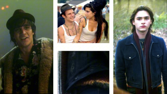
since david is a demon, he finds a london boy that looks cool enough for crystal to find attractive. that meant dunsmore dressing him in a shearling jacket you’d find in “all the guy ritchie movies,” black pants and creeper shoes. the costumer’s mood board for “david the d” featured radiohead and amy winehouse and her husband blake, who often wore hats similar to the one you see david wearing in the show.
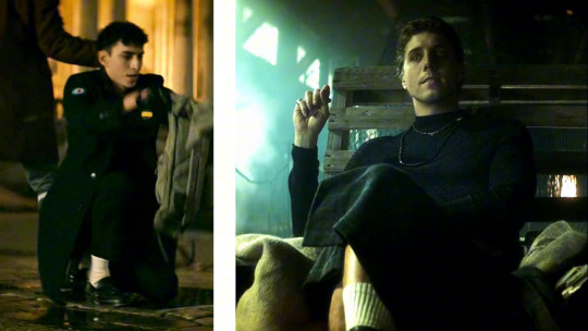
pay close attention to monty’s leather jacket and you just might spot an inlaid crow feather or two.
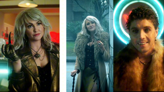
it’s not only esther who wears clothes with a gilt, old-gold color — cat king and night nurse also do as a nod to their villainy. (esther and cat king also have similar fur coats.) amidst her beauty, dunsmore wanted esther to be a little rough around the edges. she wears a cuff around her hand that’s adorned with a snake and a ring with teeth all around it to represent the teeth she’s collecting from all the little girls. her eye necklace is meant to be her witch pendant.
mischievous as ever, cat king has (cat) eyes everywhere and is aware of edwin’s affection for charles. so he wears charles’ socks the first time he meets edwin.
#well this is a very long post with an analysis of each character's costumes#charles rowland#dead boy detectives#edwin paine#edwin payne#niko sasaki#crystal palace#monty the crow#esther finch#night nurse#george rexstrew#jayden revri#payneland#painland
2K notes
·
View notes
Last Seen Blogs
thegublerdiaries
Requests Open!!
onlyhereforpdfs
dumb brambleclaw enjoyer

leamichela--malboutonniere
Siempre..esHoy
almostdeath
Adam Ignis

gohan-note
Gohan-Note