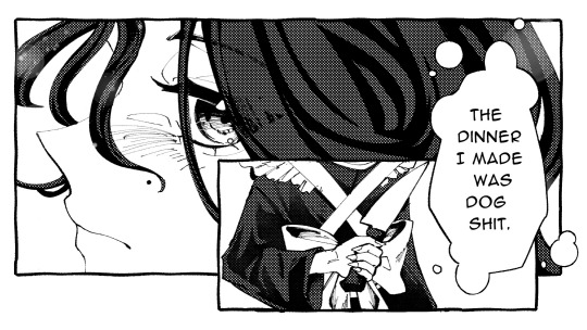
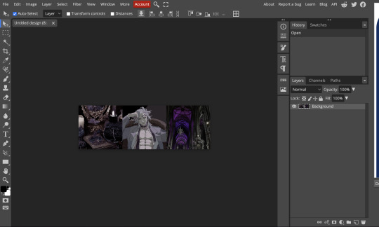
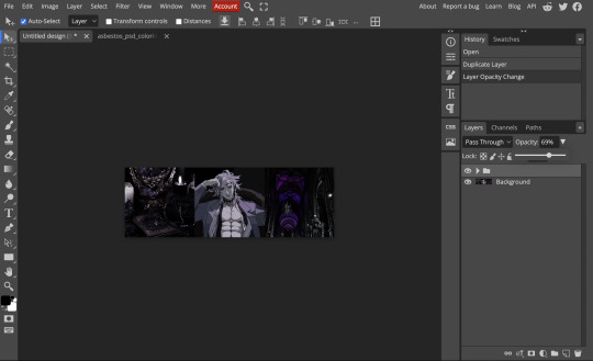
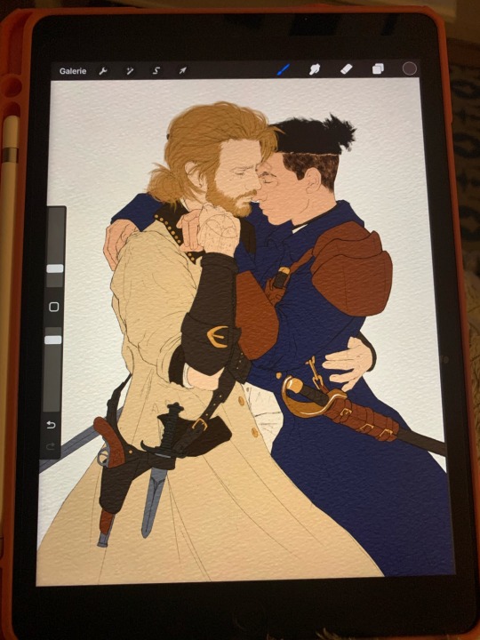
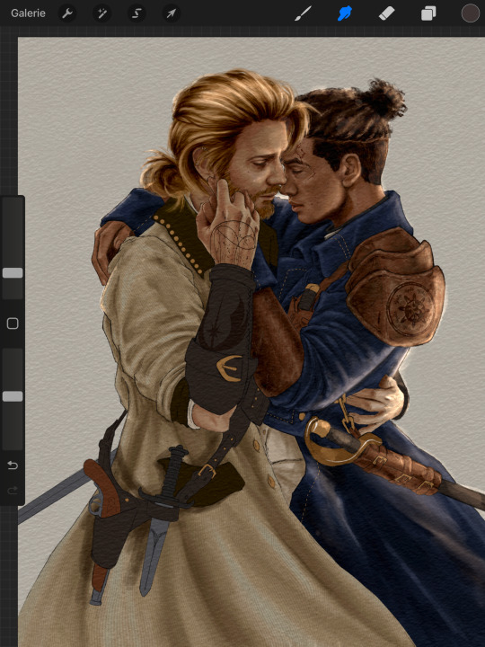
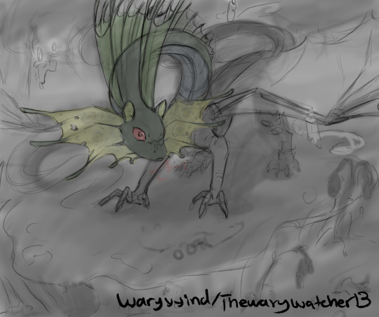
#going to have to adjust the opacity down more i think
Explore tagged Tumblr posts
Visit Tumblr Blog
Explore Tumblr blogs with no restrictions, modern design and the best experience.
Last Seen Tumblr Blogs


Fun Fact
US Tumblr user growth rate is estimated to slow down to 4.1%.
Note
hiii milkyyyy! u’ve been popping out so many manga pages and i’m just so amazed?? i’ve been wanting to get back to manga drawing so can i ask for some tips? like what’s your process and how do you decide the screen tones/sfx/effects/speechbubbles to use? the latter is something i’m struggling with 😭
tyyy 💕
Hi Yudi, thanks for dropping by!
General note: One thing I’ve learned about trying to go for a more manga-esque style is that there’s really no particular way to do it, and EVERY artist does it differently. Everything I do here is a blend of my own style and things from JP artists I admire! However, the most important thing is that panels aren’t meant to be masterpieces but to convey information and get the dialogue going.
This process will be CSP oriented. I’ve made a mini screen tone tutorial (and how to turn on Layer Property) but I did not talk about my own settings ^^ You’re free to do any resolution you want, though I stick to drawing on a B4 template for fun (and imagine that one day my stuff can get published /j). I hope this helps, as I’m still trying to figure my own style and set limits on the details too.
[Process]
Script + Thumbnail
I used to wing stuff for one-pagers, but now I’ve found that scripting and thumbnailing has made my process so much faster. (Omg it’s almost like people make drafts for a reason- @ me cause I hate planning)
There’s no standards of a comic script, and each publisher has their own format. My usual scripts don’t separate pages, since I leave that to the thumbnailing once I do dialogue placement. If trying to imagine panels without seeing them overwhelming, at least get the dialogue down.
The B4 thumbnail template I use is pretty darn big, so it also doubles as the sketching stage. Once the thumbnails are done, I transfer them (screenshot) to a comic file on CSP. Once the set up is done, I do speech bubbles + dialogue first, insert the frames, then get to the line art. Since I don’t think anyone is actually gonna print their works, you’re free to trim your canvas however you want to post online 🫡
Speech Bubbles
Any speech bubble can work and will eventually blend in as the viewer is reading, but I have a vendetta against super flat/digital-looking ones. I made a custom brush for a textured speech bubble pen with line width by adjusting its taper and changing the brush shape. Published manga are a different story, but I like the more organic polygonal bubble shapes from indie artists-
For different shapes and situation… Squares - Narration, Flash/Urchin - Character thoughts/internal monologue, Hexagon - Phone call/text (not a concrete rule but a common pattern)
You can also add emanata (sparkles/symbols) on the bubbles for flairs as you see fit.
Screen tone (Please read the linked mini-tutorial above)
I split my tones into two folders. One specifically for black, and greys.
I first fill in all black areas, the duplicate them. The top layer will be the shadows (remains pure black), and the bottom layer is set to [Opacity 75%] and turned into a screen tone layer with a [frequency of 45-50] (It must always be at a lower frequency than the greys). To add texture, I use a grainy brush to erase bits of pure black on a mask. To show light on the screen tone layer, I use gradient erase on a mask.
For the greys, I split them into three tones (dark grey, medium grey, light grey) all in the same folder so they don’t overlap and it’s easier to fix. I use a [frequency of 75] or any number higher than the screen tone in the black layer. Overall, tones can be as simple and complex as you want, but it’s best to save more detailed tones for important panels. (Planning to change this as I’ve realized how big the B4 canvas actually is, and the frequency doesn’t need to be so high- The size of screen tone is a preference. This example was done on a smaller canvas, so higher frequencies still look less pixelated/small.)
Emanata/SFX
Special effects is whatever the situation calls for! It can to make a blank canvas feel more dynamic, to evoke certain emotions, hint/foreshadow. It’s best used sparingly on important panels you think would be the most important… but how do you get those effects?
THE CLIP STUDIO ASSETS STORE- Or draw/download your own depending on the program (You have no idea- ever since I downloaded too, I can’t unsee them in other works of artists I like 😭) Not used in the example but these are my essentials- You can also find a lot of gems if you straight up search “manga” and see the most popular assets.
Another good place to find comic fonts in general is blambot.com (?). They have quite a bit of free, personal use fonts if you ever need flavour text when italics or bold isn’t enough. (Current font used is Anime Ace 3 Regular BB).
Happy creating and feel free to ask if anything was unclear ^^
28 notes
·
View notes
Text
The bisexual painter !
HI! joining the chaos, I'm the bisexual painter! I will be making posts bisexual!
I am bi myself, and use they/them pronouns :)
asks should be open most of the time unless I'm away from a computer for a long period of time or there's too many asks.
Other painters:
@painting-red @the-orange-painter @the-yellow-painter @the-green-painter @the-teal-painter @the-blue-painter @the-purple-painter @the-magenta-painter @the-white-painter @the-gray-painter @the-rainbow-painter @the-glitter-painter @the-void-painter @the-pastel-painter @the-high-saturation-painter @the-inverted-painter @the-neon-painter
@the-random-painter @the-mystery-painter
@the-pride-painter @the-lesbian-painter @the-pan-painter @the-aroace-painter @the-trans-painter @the-agender-painter @the-gay-painter @the-xenogender-painter
@the-icy-painter @the-stormy-painter @the-firey-painter
@the-sad-painter
@the-mew-painter @the-hoppip-painter @the-mewtwo-painter
@the-weezer-painter @the-pixel-painter @the-doodle-painter @the-chaotic-doodle-painter @the-scribbles-painter @the-omori-painter @the-howling-painter @happy-little-painter @the-not-painter @the-bird-painter @the-duck-painter @the-scaly-painter @the-deep-fry-painter @the-sus-painter @thecroissantpainter @raidpainter @the-collage-painter @the-gumball-painter @the-pony-painter @the-ghost-painter @the-space-painter @the-music-painter @the-anomaly-painter
deleted(or soon to be deleted) painters: @the-pink-painter @the-bazzow-painter
Feel free to ask to be added I probably missed someone :3
if you’re a painter dm the blue painter if you want to join the discord!
Tags:
#the bisexual painter- general tag for every post!
#bisexual posts - posts I've painted!
#bisexual asks - asks I've answered
#the bi thoughts- not bisexualed stuff
#bi paint rp - roleplay with other painters! :)
this post has been turned bisexual!

#the bisexual painter#bisexual posts#the bi thoughts#going to have to adjust the opacity down more i think#sorry dark mode users the blue doesn't come out as well#coloured text#colored text#55 painters huh#theres so many of us#painters are kind of by category#aparrently there’s a 50 tag limit#but as far as i’m aware it’s still tagging 55+#so the 50 tag limit doesn’t apply to me ig??????#idk#its weird#it’s not the same on other blogs either just this one
38 notes
·
View notes
Text
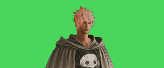
FF14 Battle Portrait Tutorial
For the past few weeks I was trying to find a way to recreate the battle portrait from FF14 as there was a few characters that I want to see in that style but don't officially have one yet. I think I got it down more or less (see image below) so I thought it's a good time to share what I did.

First of all, I made a few files that would help make life a little easier. They can be grabbed here .
Note: I did use Reshade to do a bit of work at the screenshot stage to help speed up the process but the same effect can be recreated in Photoshop with a vanilla screenshot. There are a lot of tutorials on how to do comic/cartoon effect in photoshop and those would make good bases to work off of.
Step 1: Take the screenshot with the PortraitBase Shader on. I usually take two screenshots. One with "Comic" on and one with it turned off. This is so that I have more to work with if needed.

Step 2: Drag all the screenshots into photoshop and remove the background. In photoshop, arrange the layer so that the screenshot with the Comic lines visible is on top of the one with the effect off.
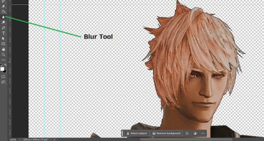
Step 3: Duplicate the the layer with the "comic" effect and apply Blur->Gaussian blur (radius 0.5)
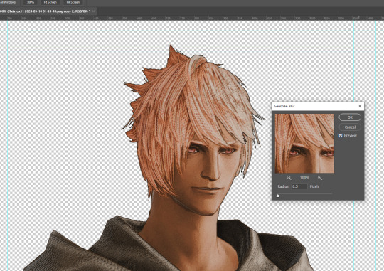
Step 4: Take a look at the hair. In Eric's case, It still doesn't look blur enough to me so I used the blur tool and blurred it a bit more
Step 5: Create a new layer above the layer in the previous step and use the brush tool to start outlining the edges. Where to outline is up to you but the idea is to make edges defined so that it looks more like a drawing.

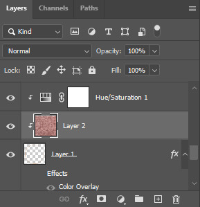
Step 6: Duplicate the outline layer and then hide that layer. Step 7: Merge everything under the outline layer. Step 8: Drag and drop the "Texture.png" into the project and Clip it to your character layer. Set the blending of the texture to "soft light". Step 9: Drag and drop the "stroke Texture.png" into the project and Clip it to your character layer. Adjust the size till you are happy then set the blending to "overlay". Step 10: Adjust the opacity settings of both texture layers until it looks good to you.
Step 11: Click on your character layer and go to image->Adjustments->Hue/Saturation (note: you will see I dragged in the official Hades portrait as a point of reference to work off of). Adjust the saturation till you are happy.
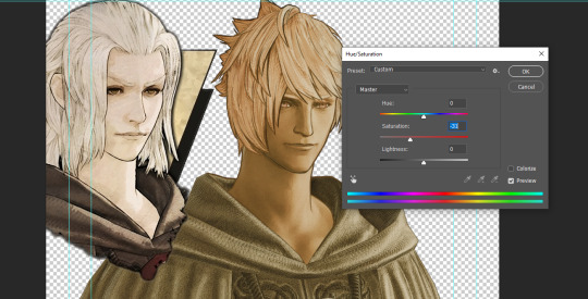
Step 12: Go to image->Adjustments->Color Balance and adjust the color till you are happy. In this example, since Eric is also wearing the Sophist robe, I tried to match that color to Hades' Sophist robe color.
Step 13: Once you are happy, drag the "Template.png" into the project and scale that to the size you want. Make sure it is completely covering the character. If it's not, you can just use paint more of it with the brush tool to extend it till it covers everything.

Step 14: Hide the "template.png" layer and select your character layer. Use the magic wand tool to select the outside of the character.
Step 15: With the selection still selected, click on the "Template.png" layer and press delete on your keyboard. You should now be left with a blank in the shape of your character.

Step 16: Drag the"Template.png" layer to be below your character layer. Then click on your character layer and clip it.
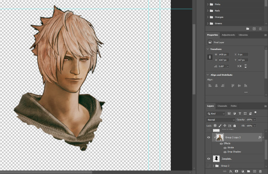
Step 17: Click on the "Template.png" layer and add a 2px stroke and shadow to it.
Step 18: Drag "Back_Deco.png" into the project and place it behind your character. Scale it till you are happy with it.
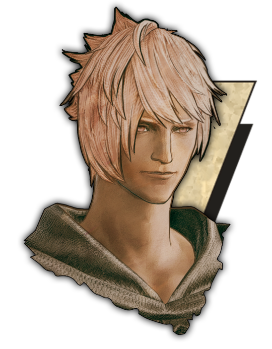
And that's it! Now you can recreate portraits for any NPCs that you want (in theory). A lot of it is also fine tuning to what you want but this should at least give you a decent base to work off of :)
971 notes
·
View notes
Text
…make a psd look interesting?
aka, how to fuck up a psd no glue no borax. have you ever looked at your psd and gone, damn, this shit doesn’t fuck? happens to the best of us. here are easy ways to spice up your psds so you don’t end up with the editor equivalent of communion bread
for example purposes, i made a simplistic psd to test these methods on. they should work with most psds, but, as always, fuck around and find out on your own for best results <3
i. threshold + gradient map
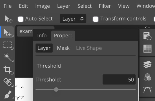
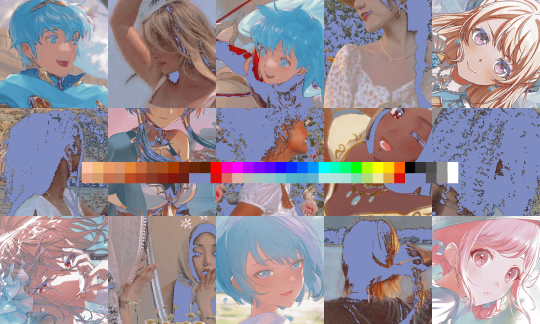
this one is an easy way to add specific colors to your psds. step one: add a threshold layer, and adjust it your liking. typically, i set mine to somewhere between 60-40. if you’re making a psd to work on dark skintones, you may want to set it even lower, but if you’re working with, say, pjsk characters, you can go pretty high
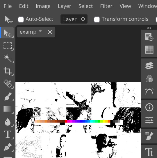
wow flashbang. you can see on my example behind that it doesn’t work super well on irl pictures, and my pjsk images don’t have threshold at all lol. next thing you want to do is set the blending mode of your threshold layer to either multiply or darken—they’re basically the same thing
(psst, if you want to know more about blending modes, check out this post!)
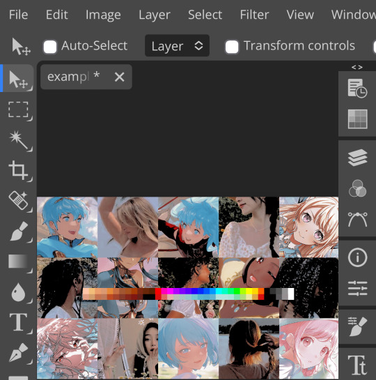
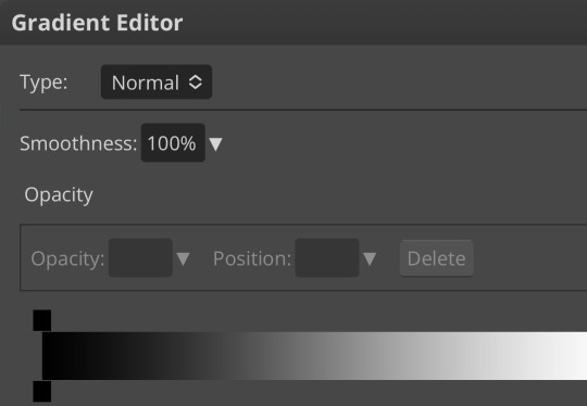
waow crunchy! but still boring right? still boring. not to worry, here’s the fun part: add a gradient map layer, tap it, and go to the slidey icon on the side, which’ll bring up a page like this:
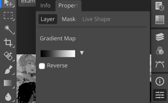
click the gradient in the middle there to edit it. once in, edit the black color to be at about 80-90%, and then change the white color to whatever you like. edit out, and tap the little square next to the text that says “reverse” which should make your gradient look more or less like this:
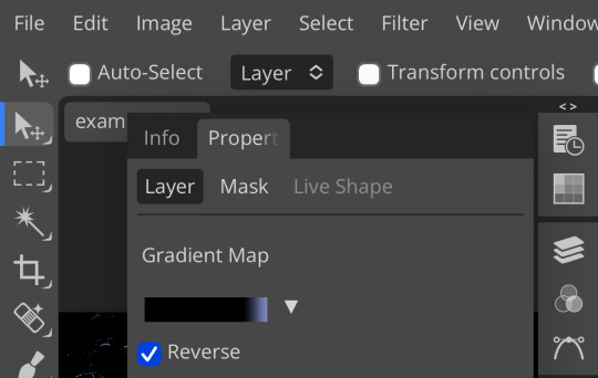
then change the blending mode on your gradient map to ‘screen’ which’ll axe all the black and just leave your color. now your image looks like this:
boy howdy, isn’t that fucked up! it is more interesting, but if you don’t want to be looking at that abomination, change your color in your gradient map to be darker, which’ll give you something more along the lines of:

…which is much more reasonable. this is a fun way to add color to your shadows slash lineart, and can be a quick and easy way to make a psd look less flat.
ii. noise gradient map
some of you may be thinking, but, canarysage, what the fuck is a noise gradient map? to which i reply: you’re boring. let me show you.
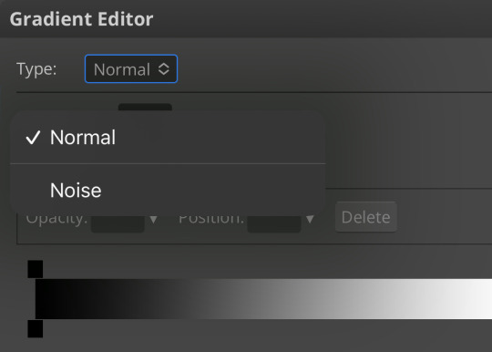
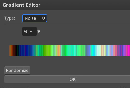
kinda fucked up, right? well, that’s the goal. unfortunately, there isn’t a way to directly edit a gradient map, but you can just click that little button that says ‘randomize’ a couple times until you get something you like! you can also mess with the percentages but i don’t do that because it looks weird

boy howdy, that’s weird looking. not to worry, though. once again, our best friend blending mode is going to come in handy
i typically go to soft light and set the opacity to about 20-30%, but, as with anything, feel free to mess around and do whatever you want. luminosity is also a fun setting for noise gradient maps, just make sure to crank the opacity way down for the sake of my eyes

wow, much better! you can see that the gradient map added a bit of purple coloring and a funky little texture. super cool! thank you, gradient map!
iii. channel mixer
i already have a post on channel mixer and i’m not rewriting all that so if you don’t know how channel mixer works check that shit out but the tl;dr is: ideally, all your channels should add up to 100 (including negative numbers) but that rule can be broken if it looks cool enough. capiche?
iv. color lookup
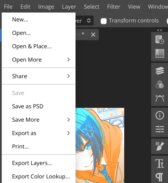
photopea has a few default color lookups that are pretty easy to use, but i have a couple of presets that i like to add if i’m feeling stuck. to make your own color lookup, open up a psd, and go to file > export color lookup
then save it and open it from your files. when you open a color lookup layer, you’ll see an arrow next to the text saying LUTs—click that and your new color lookup should be there
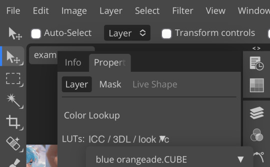
once you tap that, you’ll get a compressed version of your psd added to your folder. it’ll look something like this:
holy orange and blue, batman. luckily, you can apply blending modes to color lookups just like any other layer—mess around with them until it looks how you want!
waow much more reasonable! i set this one on color and about 55% opacity, but that is really dependent on what your color lookup looks like and how you want your psd to look. remember, there’s no right way to do things!
an additional note: if you want to, you can save the psd you’re working on as a color lookup instead. if it looks too simple or just isn’t turning out how you want, that’s a good way to incorporate it later :3 just follow the same steps as above!
v. no shame in starting over
if you’ve added and taken away, duplicated and removed, fucked around and found out, and your psd still isn’t how you want: it’s alright to just axe it. the edit police aren’t gonna kill you for it, i promise. if you’re worried about wanting it later, just save it as a psd and come back when your brain is refreshed ¯\_(ツ)_/¯
psd-making isn’t an exact art, so, obviously, there’s no real simple solution to making it look how you want. you just have to mess with it and see what you’ve got. these are just my methods of making my psds less blagh, but, obviously, my editing is moderately more deranged than your average editor.
…so that’s how you do it.
98 notes
·
View notes
Text
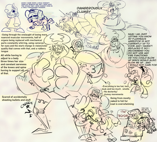
they forgot to make the punk hazard body swap stuff about franky Specifically . for me
[ID: Doodle page revolving around Nami being body swapped into Franky's body and Franky being body swapped into Chopper. The main drawing is of Nami in Franky's body, eyes wide and worried, mouth agape and drooling as she timidly raises her hands up in front of her chest. Her knees are bent and are creaking. Multiple instances of "click" are written around her hands as well. A speech bubble containing only Nami's head making the same frightened expression is drawn over her head. A wall of text on the left reads: "-Going through the onslaught of losing more nuanced muscular movements, half of organs being replaced with mechanical parts constantly whirring, using cameras for eyes and the stark change in vision/color quality that comes with that, and a rubbery tongue. All while having to adjust to a body three times her size and constant soreness of the knees and spine having to support all of that. Scared of accidentally shooting bullets and stuff". Right next to her is Franky in Chopper's body, who is sweating profusely and looking down with a frustrated expression as he frantically waves his right arm. His other hoof is covering his left ear. A speech bubble of Franky's head making the same angry expression appears above his head. He is not wearing Chopper's helmet hat nor his shirt, just his backpack and shorts. Text to the right of him reads: "-Everything is too hot, too loud, and too much . smells. -No dexterity/clumsy movements. Going from mostly naked to full fur coat is overwhelming". In the top left hand corner is a small doodle of Chopper in Sanji's body. He's just standing there with one large eye staring off into space with a cat like mouth, frowning slightly. To the right is a doodle of Franky as Chopper walking on all fours in brain point. His eyes are wide and unfocused as he sweats profusely. He's thinking: "gosh i sure hope a hole doesn't open up beneath me and i drop into the ocean that i now cannot swim in. a truly frightening thought." as someone beneath the ground under him starts to saw a circle around where he's standing. There is a secret low opacity clip art of Wade from Garfield behind him. In the top right hand corner is a sketch of Nami as Franky swinging her left arm into the back of Luffy's head on accident while she's talking. She's looking towards the viewer, talking about something, and looks serious. She is oblivious to accidentally hitting Luffy. Luffy's body stays static but his neck is stretching out a bit as his head rubber bands to the side. He's clenching his teeth and one of his eyes has an X in it while the other has a swirl. "Donk" is written right above. This drawing is captioned: "Dangerously clumsy". Underneath is a drawing of Franky as Chopper talking to Nami as Franky. Franky is looking up at Nami and is saying: "Nami i am just letting you know my flashback arrestor is not currently up to code and i haven't replaced it so i recommend you do not use any fire functions or you could blow up which would also blow me up . and i would not care for that". Nami starts sweating and goes wall eyed in panic, mouth agape. And finally in the bottom right hand corner is a doodle of Robin sitting down while Franky in Chopper's body nuzzles up against her right shoulder like a cat would on all fours. He's looking up at her, smiling and wagging his tail, and says: "You can pet me if you'd like". Robin grips him by the abdomen with her right arm while lightly pushing him away with her other arm. She's looking forward and not at him, and looks upset. She responds: "Stop talking." in a red horror type font. None of the drawings are colored in and are drawn over an abstract background comprised mostly of shades of pale yellow and pink. /END ID]
#EDIT: i fixed the typos in one of the dialogues . i drew all this late at night n stuff i was tired i didnt see them#one piece#2024#described#franky#chopper#sanji#luffy#nami#fonts used: anime ace 2.0 and bahnshrift semibold condensed#nico robin
91 notes
·
View notes
Note
Hello ! I saw your fanart, and I absolutely adore it ! Can I ask how you manage to give that rice paper texture to it ? I looked for transparent textures on the internet and I kinda lost my mind doing so haha ;;
Is it a brush maybe...?
Thank you in advance ! 🌸
Hi, I'm so glad you like the art! I've done the rice paper texture a couple different ways, usually involving layers in Photoshop with transparencies applied. Here's what I did for this one:
I used this free rice paper image, which I found online a while ago:

I dropped the rice paper image onto a new layer on top of everything else. Since I wanted the fibers to be smaller (and also wanted the final image to be high resolution), I shrunk the rice paper image down and then duplicated it and made a big patchwork that covered the image.

(I think I made the copies smaller than this originally, but this is just to demonstrate the process I used.)
I flipped the copies around here and there to create more variation in the final texture.
When the patchwork covered the image, I merged all the separate rice paper copies onto one layer.

The patchwork wasn't exactly seamless, which was fine because I wasn't going for uniformity.
I used the spot healing brush tool and clicked and dragged it all over the seams and other parts of the patchwork to smooth it out and randomize the texture.

(What I ended up with was a bit less "bumpy"-looking than this example, probably because I copied the rice paper image at a smaller size.)
I then... pretty much just screwed around with the rice paper layer's darkness, transparency type, and opacity until I found a combination that looked right. No two texture/artwork situations are alike, so I end up experimenting a lot.
In the end, I had two rice paper layers, one with a "soft light" transparency at 85% opacity and one on top of it with a "color burn" transparency at 50%. I put them inside a layer group and then adjusted a little further by bringing the group's opacity down to 55%:

It looks like I also darkened the texture itself at one point, probably by duplicating the original layer, applying a "multiply" transparency to the new one, and then merging them again. In any case, it got darker, and unfortunately I don't recall exactly how. :p
My goal was to make the texture evident but still subtle, and to keep it from interfering too much with the colors underneath it, and I pretty much just kept tweaking things until I had that look.
In short, my best advice is to find an image that looks more or less like the texture you're going for, drop it into Photoshop on top of your artwork, modify it in whatever way will bring it closer to the result you want, and then experiment with layer transparencies until it looks right. I usually end up with one layer that lightens the colors and another layer that darkens them, which helps bring out the fibers without making everything else too dark.
(Another trick that sometimes works is to invert the colors on the texture to make the overall texture darker. This can give you some more cool options for experimenting with transparencies. Here's an inverted version of the texture above, which I've used in a couple other pieces:)

I really hope that's helpful. Have fun! :)
30 notes
·
View notes
Note
How did you find/make your aesthetic profiles of the gods in your book?
i was gonna link you to my guide that i posted a long time ago, but i realized how old it was and that it was lacking some details...... 💀
so i'm gonna do a new one that hopefully helps a bit more!!!!
websites used: pinterest, tumblr, canva, deviantart, & photopea!
first off, i find the pictures from sites like pinterest and tumblr. the color schemes of each pic need to be somewhat close to each other (but it doesn't always have to be like that depending on the psd you'll be using later on)
i'm gonna use hades for example. this is the first pic i find of him lol:
the most dominant color here is purple, with some tinted ivory from his skin, and brown in the background, so the next few pics i find should have somewhat similar colors too, or they should at least be purple cuz it's the most frequent color here
here are the next few photos i found:
they don't look perfect, but we can always individually tweak the colors and shades later
i download the photos and then i go to canva. the site provides you with templates that you can use but since i only got three pics, i chose the "email header" option.
(for those wondering which template i used for the bigger ones you see in the first chapter with percy and the yans, i don't use a template. i just use "custom size" and type in "800 x 800 px")
go to the sidebar, click "elements" then scroll down for "grids" and then find the one with 3 parts. i reduced the spacing between the photos to zero.
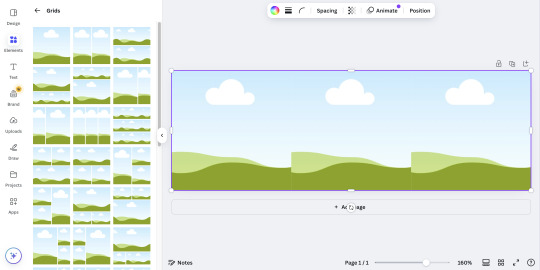
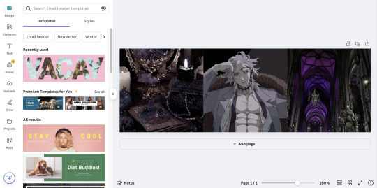
then i upload all 3 photos and put them in the squares. because they're not exactly the closest in color schemes, i individually edit them until i'm satisfied.
canva provides filters that you can use, but i always find it best to toggle with the adjustments like brightness, contrast, saturation, etc.
here's what i ended up with so far:
again, not exactly perfect, but whatever
now that i'm done, i go up to "share", select "download", and increase the size by 1.5 (that's 900 x 300 px). idk why, but for some reason, the quality looks better when you enlarge the size before download.
once that's done, i download the whole thing.
(keep the file type as "png" btw)
then i go over to photopea and upload my graphic. it'll look like this:
in another tab (not the photopea tab, but like... the actual tab of whatever browser ur using), i can find a bunch of psd colorings in deviantart. since i want one that's specifically purple, i just search up "psd coloring purple"
and i get all this:
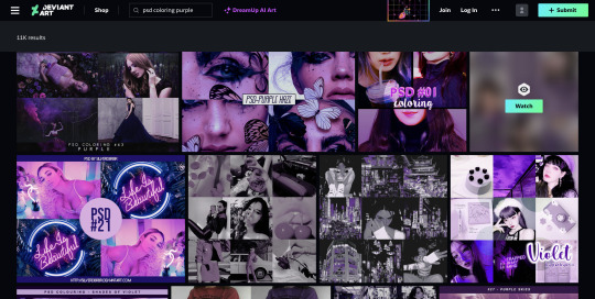
i pick whichever one i think might look best and download it.
then i head back to photopea.
at the top, click on "file" and the new psd you just downloaded, and it'll show up in a new tab.
stay on that tab, go up to "layer" -> "layer into" and select the first tab where the graphic's at. this applies the psd coloring onto ur graphic.
over at the side, there's something called "opacity: ___%" you can toggle with that if the psd is too overwhelming, so you can lessen it by dragging it down if you need to.
once you're satisfied, click "file" -> "export as" -> "png" and it'll be downloaded.
and that's pretty much it!
THIS CAN BE A LONG PROCESS THOUGH! literally in every step, you might end up going back and changing stuff.
for example, i do not like the right photo that i selected. the purple is too bold compared to the purple shades in the left and center photo. i'd probably go aaaalll the way back to the earlier steps by returning to pinterest to find a better photo
or maybe you don't like the psd you picked. if that's the case, delete the photopea tabs and redo the above steps with a different psd.
it can be a bit annoying if ur the perfectionist type and have to go back again and again 😅
but anyway, psd coloring's are great. i'm looking back at the og versions of all the graphics i made (og as in, before i applied the psd colorings) and they're soooo different from the finished pieces
21 notes
·
View notes
Text

OOH okay, so i'm at work so a lot of this is gonna have to be word of mouth but i'll do my best w the tips
as far as i can tell, a lot of what people reference as "soft" in my art boils down to looseness in forms and color choices, so lets go from there
》 probably my biggest tip is not beating your sketch to death. i typically only sketch once or twice before lining, 3 times if im not sure or need some minor adjustments. the less i sketch, the looser my lines
》 my liner and painter are the same brush! its a round brush w a canvas texture turned up to 80% texture density and. i think it was 70% mix? its a v simple brush. i found it for free on clip studio's library

》 my lines and color are on different layers. BUT. the paint layer starts as bg and undertones, and then i lower line opacity to 50-80% before the rest of the painting. like this 👇


》 i'll paint on one layer most of the time! ofc this means i need to adjust skin tone based on undertone. so i usually paint in undertone, pick the Exact color i want for skin, then lightly paint over a small patch so that the undertone comes thru the skin color how i want. then i'll color pick it and go abt coloring the rest in. this means i get the undertone automatically in my paint without having to do a seperate layer. p much the entire painting is done this way, ie choosing an exact blush color 》 painting a light patch over the skin 》 color pick and color in
if this is a little difficult bc of the complexity of undertone, then i'll paint the skin color as an overlay, adjust it as needed, and merge the layers so it's back to being one layer of color. ie, i did halsin's undertone p complex so i painted his skin on a "darken" overlay and merged it down, then color picked as needed from there
》 another thing, i dont use darker shades of skin tone for my shading! in fact, i kinda just do what i want. i pick whatever color fits my piece (blue, pink, purple, etc), and then do the same light patch 》 color pick steps for general shading


even my more "realistic" painting uses a navy blue for my shade! just evened out by mixing with the skin tone

29 notes
·
View notes
Note
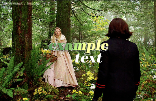
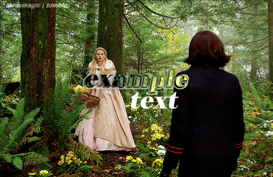
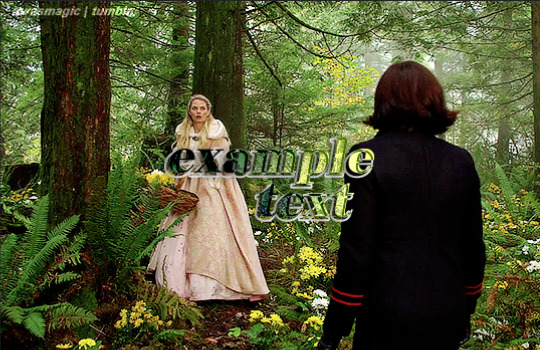
Hi, i love Regina gifset especially the text
https://www.tumblr.com/itwasmagic/749567705846251520/i-am-what-i-am-cause-you-trained-me?source=share
would you please post a tutoria for making this text with those colors?
hi! thank you so much, I've never been asked to do a tutorial before 🥹🥹 this is pretty easy but i overexplain things so if it doesn't make sense just let me know!
&& please let me know if this worked ok for you!
*assuming whoever is reading this already knows how to make a gif in photoshop*
I'm pretty sure I used the font Elephant for this set that you linked.
tl;dr if you have a lot of photoshop/text editing knowledge already: create a layer of text > duplicate it > select the bottom layer > go to blending options > add a stroke > ok that > set the layer fill to 0% > reposition the layer a couple of nudges to one side and a couple of nudges down > select the top text layer > go to blending options > add a drop shadow > add a gradient > ok that > set the top layer to difference > enjoy <3
if you want a more in depth tutorial with screenshots:
add your text to your gif with whichever font, size and placement you like
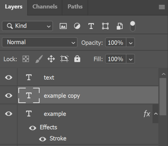
make sure the first text layer you want to edit is selected and press ctrl+J to create a copy of the layer (or right click > duplicate layer... > ok)
select the first text layer again

double click the layer (or right click > blending options), tick the stroke box and use these settings:
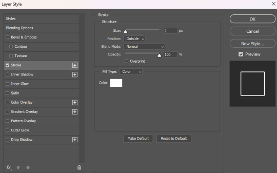
press ok
change the fill to 0% (leave the opacity at 100% because you still want the layer itself with the stroke/outline to be opaque but you want the text colour/filled in part of the layer to be transparent)

make sure the 'move' tool is selected

use the arrow keys on your keyboard to move the text layer with the stroke (i did 3 to the left and 3 down but do whatever works with your chosen font and size (edit: i think i moved it a few nudges right for the original set rather than left just make it up as you go along with me jfngkf)). it should look like this:

select the duplicated layer you made above the first one
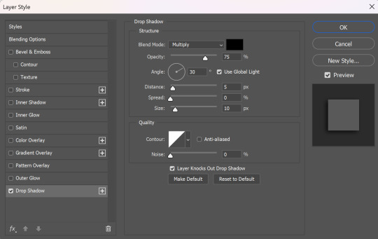
double click the layer (or right click > blending options) and tick the box for drop shadow. I pretty much always use these settings:
then tick the box to add a gradient overlay, it doesn't matter which colours or angle you use, you can play around and adjust it to whatever makes sense with your gif, so if you think the gradient would look better horizontal or vertical or at a different angle, just change the number of degrees it's at until you like it.

click the coloured box next to the option that says 'Gradient:' and this box should pop up:

to change the colours click the little coloured box under the gradient bar you want to change then the box underneath called 'Color:' should light up for you to click on, then either pick a colour or paste in the hex code

for the colours in the set you linked i used #9fb552 for the lighter green and #2f4f2b for the darker green then press ok
if you want to adjust the colour fade, you can drag the coloured squares along the bar or click somewhere just under the gradient bar to add another colour (you could add a third colour or another shade of the same colour, play around until you like how it looks! you can always go back into it at the end and keep adjusting once you can see how the whole thing looks put together.)
ok everything when you have it how you want it, then your text should look like this:
now change the blending on that same layer to 'difference'

the text should now look like this:
*note, the colours may change when they're blended differently, so like i said earlier you can go back and play around with the colours or shade you picked until they match your gif
if you have another text layer you want to look the same rather than repeating all of the steps, duplicate that one too, use the move tool to reposition the lower layer again and right click > copy layer style > right click > paste layer style on the corresponding layers


now when you play your gif, the text should look like this:

and you're done!
#answered#anonymous#userssam: tutorial#gifmaking#resource#tutorial#gif tutorial#text effect tutorial#text tutorial#photoshop tutorial
49 notes
·
View notes
Note
Hey, I was wondering if you have a brush recommendation for CSP brushes for Lineart with good line weight? I'm trying to improve the weight of my lines, but I'm having a hard time finding brushes with the flexibility I'm looking for
That's a good question. There are all sorts of ways line weight is used and the right brush is different for each genre and style of drawing, I'd say.
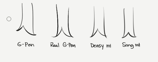
To start: A lot of my lineart brushes are adjusted with slightly LESS brush size dynamics because I always felt like the original default CSP brushes (like the Mapping Pen and G-Pen) gave an unrealistic and uncontrollable amount just based on the their pressure settings.
Some people do use them well for specific styles, so they're not inherently bad. But I definitely think they're not friendly to beginners or people who just wanna pick up a pen and go draw rather than obsess over the precise way they're pushing down on their pen.
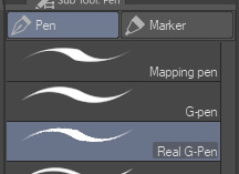
More recent versions of Clip Studio Paint actually came with some new default brushes, including "Real G-Pen", which had pressure settings that felt more right to me. But it's a little noisy so its uses are a bit more specific.
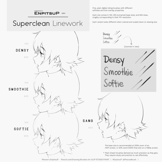
I have a brush set included with EnpitsuP called Superclean Linework. Those are the ones I designed as cleanup brushes for anime-ish looking art. They come in several flavors: Densy, Softie, Smoothy, Sang. I varied them based on how I saw different artists preferred their lines: a bit on the sharp side? Slightly blurry? With a little bit of opacity fade? A little more line variation? Among these, Sang has the largest amount of size response.
Ultimately, it may be a little bit of both a subjective experience and depend on what your hand/tablet/driver settings/style preferences are like. If you're having trouble finding a brush for this purpose, I think you should hone in on if you're not finding the right brush because every brush seemed too difficult to control, or you can't seem to get results you like, or you can't find one with a feel that matches the physical tool you're used to.
I think it's also worth noting that some artist's styles also rely a lot on them just changing their brush size setting depending on what part they're drawing. So you may end up needing a brush that has less pressure-size variation than you expect. My recommendation is always to look very closely when learning from someone else's linework example. Try to achieve it yourself side-by-side and see where it doesn't quite match up and ask yourself why. Or ask others why.
Of course, there are a bunch of other "lineweighty" brushes too outside of this genre of mostly-thin lineart.

#clip studio#clip studio paint#pharanbrush#clip studio brush#clipstudiopaint#clip studio paint brushes#EnpitsuP#KrupukP#csp brushes
82 notes
·
View notes
Text
Progress Shots For My Entertainment
A Journey
A few people have mentioned how they like getting WIP pics of a drawing I’m working on and see it go through all five stages of grief whilst I slowly go insane. So how about I do all that but in a post?
Behold! Pirate Dancing.

It came to me upon a dream and ballroom-esque pirate music. But I really, really wanted these two specifically to dance and I begged @elwenyere to let me. She agreed 💜
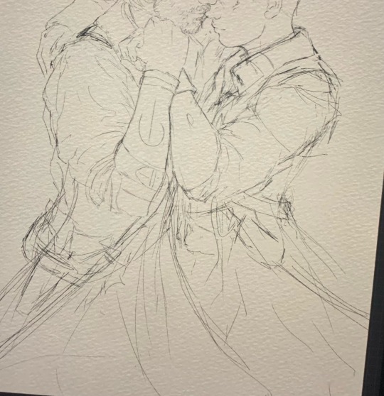
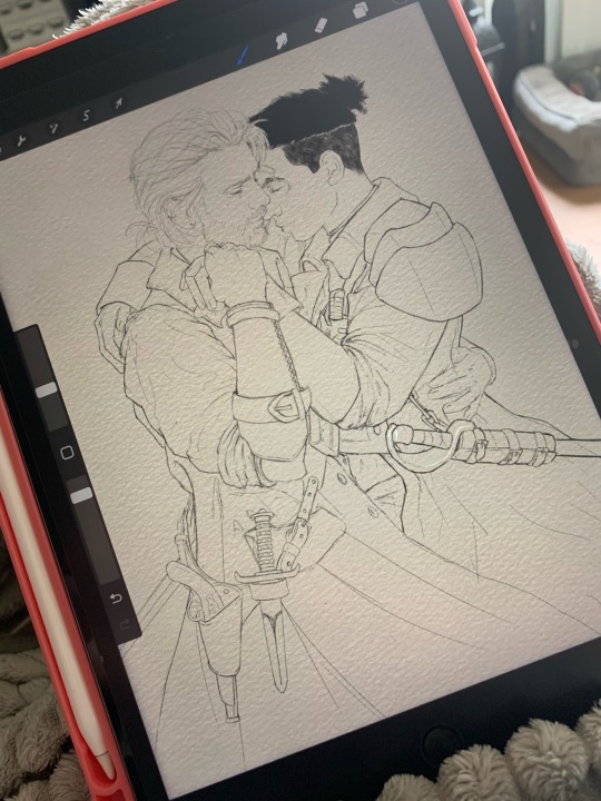
Like everyone else, I start out with the messiest sketch and proudly show it off in hopes it goes on the fridge. Subsequently in step 35664338 I clean up the sketch to something coherent, though the lineart barely makes it to the very end. It’s a mix of part of the art and helping guides for where goes what.
Followed by more tedious work of choosing flat colors. Which is the worst. I wrangle with layers so connecting flat colors aren’t on the same layer. Everything goes into alpha lock, just like the rest of my sanity.
Then the fun starts.
Hair 😍

It’s the first thing I shade. I gotta have the hair down before shading faces. It somehow does not work vice versa for me. Faces absolutely have to be next. If they’re not to my liking, the whole work stalls. Cody’s face in this gave me so much grief. He went through five or six similar iterations before I settled - and was satisfied - with the version that’s in the finished work.
The rest of the shading is me bullheading through it piece by piece, cursing myself for being anal retentive. Especially the leather and leather embossing was… there was so much leather. The look is achieved by a brush that’s called “Old Metal”. Personally I don’t think it looks like old metal but it’s fantastic for leather. I have a few darker and lighter shades and I use the brush in different sizes and opacities to wrangle a leather look out of the flat mid-tone base. The symbol of the embossing is on a separate layer above the flat color, with the mode set to multiply and layer opacity anywhere between 15 to 30%.
Once I get all of that done, I play around in post-production. I throw effects at it, adjust color temperature and saturation. I enhance light reflections on metal. Lighten up places that suddenly look too dark, darken parts that suddenly look too light. Post-production is very much the stage where I really choose an overall vibe. Which is why I send WIPs through post to get a feel of what I should work towards during shading.

And get new perspectives on a work. :P
#my wips#I went through my trash to get all the WIP pics#just for you 🫶#frost explains her carpal tunnel round 2#the reason why it’s mostly actual pics taken in my phone#is that screenshots on the iPad are regularly too large for discord
177 notes
·
View notes
Note
What brushes do you currently use?
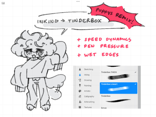
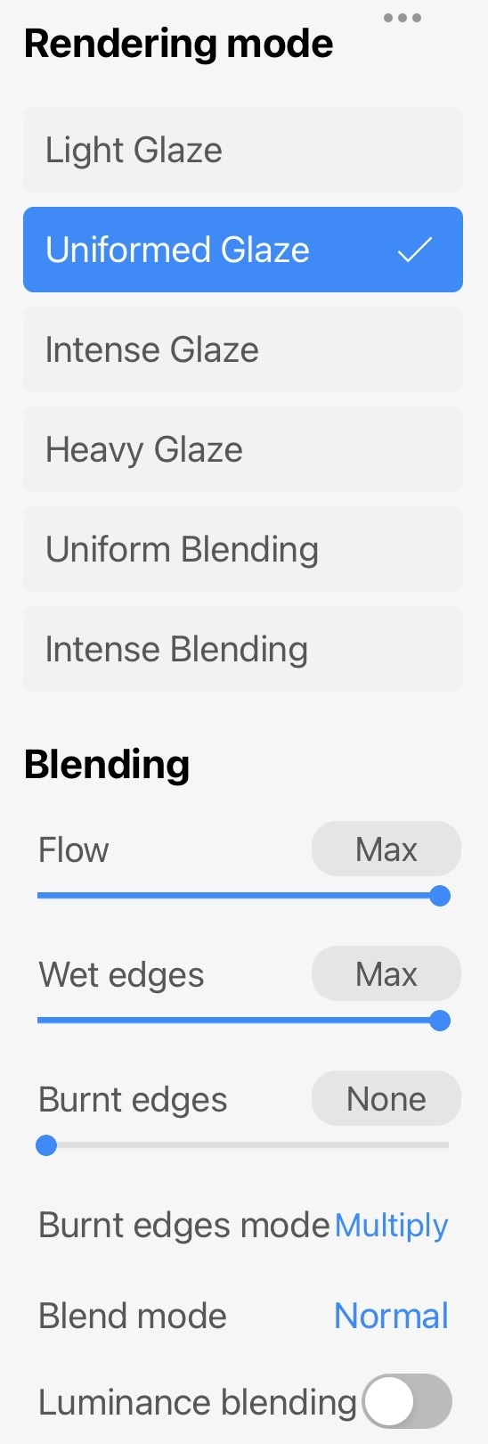
right now, im using a customized version of tinderbox in procreate!! ive included some pictures and details under the cut ^_^
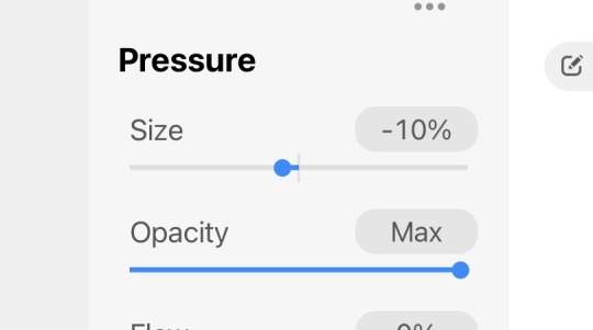
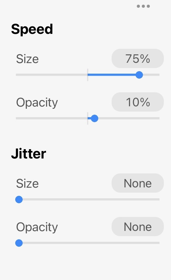
i draw with long strokes, so i've changed the speed size and opacity to match it. making the size 75% makes it thin out with fast movements and thicken with slow movements. similarly, it becomes more transparent with fast movements
jitter has been removed to make the brush look cleaner, although i'm still playing around with it so that might change
pen pressure has been edited so strokes become thin with hard touches and thick with light touches; i have a habit of pressing down when i draw lol. opacity is also turned up to the max
blending is kept the same, i just changed the flow and added maximum wet edges
id also recommend going into preferences and adjusting pressure sensitivity based on how you draw; in my case, i turned up the sensitivity so it responds to my strokes better since i draw really fast, but honestly its up to you. also helps to add stabilization since high sensitivity also catches jittery movements.
hope this helps!! please let me know what you think <3
#ive gotten this ask so many times i cant keep up with how often i change my brushes @_@#i think i really like this brush though since i finally figured out how to toggle speed and pressure properly to fit my hand#ill add this to my pinned and carrd#i draw really fast long strokes so its always bothered me that it felt like my brush wasnt responding as quickly and i thought it was#the stabilization.. procreate also has a guide for brush settings!!!#ask#answered#brushes#yapping
57 notes
·
View notes
Text
Dergtober 25-28
Day 26: Queen, featuring a return of my very first drawing with clan leader Rhea. I liked the idea of that drawing but not how it was going, so I spent some time adjusting the angles and proportions and I like it much better now. Still not still on the tail position, but I can keep fiddling with that.
Day 27: Rot, featuring Nikodeme, one of my plague-iest dragons and about as close as they get to a monster. He's seen the worst the Wastelands have to offer and it molded him into a scared and distrustful creature. I had high ambitions for this one, and aside from the head and smaller fans I just couldn't get the posing to work within a reasonable amount of time. At this point I'd generally just drop the opacity on everything and redraw it from scratch, moving the old head back on if it still fits in.

Day 29: Game, featuring Serin, a master of sinister games and another semi-monstrous dragon. Serin is a powerful illusionist who traps dragons and other beings in maze-like mindscapes. His games don’t generally have casualties, but he can sure make someone think they’ve taken a life-threatening injury. He’s careful that his victims don’t see his real face, making it difficult to even figure out that a single dragon is behind the games. The Grotto would certainly hunt him down if he got on their radar, and with the combined skills of their more powerful mages they’d stand a decent chance of succeeding. What they’d do with him probably depends on why he’s doing this (something I haven’t decided myself), and I could see them managing an uneasy truce if circumstances are such that he ends up helping them with one of their more serious enemies. I had high ambitions for this one too, with very dim lighting and an illusory maze coming toward to viewer, but the hour I had for this wasn't quite enough to rough everything in.
#digital art#flight rising#flightrising#flight rising art#dragon art#frfanart#fr dragon art#dergtober#dergtober 2024#inktober variant#queen#rot#game
15 notes
·
View notes
Note
hi, this edit is cool, would you please tell me how do you make the circle shape and text like that in the second gif?
https://mikelogan.tumblr.com/post/727834848573669376/forgiveness-is-warm-like-a-tear-on-a-cheek-think
hi!! i'm so sorry this took me so long to answer, but i've hardly been on my desktop for the last couple months and haven't been giffing. finally getting around to this and thank you for the kind words!

in this tutorial, i'll show you what i did as well as another way to achieve the same effect:
once you've made your gif and colored it the way you want, you can get the circle effect one of two ways. i'll show you how i did it first and then a more "normal" way lol
i actually had this circle texture laying around and for whatever reason, i decided to use that. so i popped that onto the canvas and used ctrl+T to center it both vertically and horizontally
then i used a glitter texture over the top of the circle layer and applied a clipping mask so that the glitter only shows up on the circle and not the entire gif. to do this, make sure your glitter (or whatever texture you decide to use) layer is ABOVE the circle and then right-click on the glitter layer and select "create clipping mask." you should see this lil arrow on the layer now:
as a quick note about textures/overlays: chances are that if you just google "glitter texture png" or something similar, you'll find tons, but the png portion is important because pngs have transparent backgrounds. this wouldn't work if the circle texture was a jpeg because its background is not transparent and the overlaying of the glitter texture would appear on every pixel, basically just taking the shape of the entire jpeg rather than just the circle.
i have a resources (basically anything downloadable, from overlays to actions to psds) tag on my gifmaking sideblog as well as one specifically for textures and overlays. i also utilize the websites freepik, pngegg, and pngwing for pngs (especially freepik).
to make the glitter layer the same pink/purple color i used, i ended up using a hue/saturation layer above it and also applied a clipping mask to that layer so it only affected the glitter layer. this step is totally optional depending on the coloring you're going for. you might be happy with the glitter texture exactly as it is. you could also skip the hue/saturation layer and instead apply a color overlay to the glitter layer, select the color you want, and set it to screen or another similar blending mode. to do this, double-click on the glitter layer, select color overlay from the menu, choose whatever color you want, make sure the opacity is set to 100%, and adjust the blend mode to whatever you think looks best.
the "normal" way to do the circle would just be to use the ellipse tool (right-click on the rectangle tool and choose ellipse) and input your desired dimensions. to get a perfect circle, the width and height have to be the same as one another. then you'd continue on with the rest of the process.
for the text, create your main text layer. these were my settings for a 540px canvas:
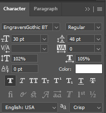
i also added a drop shadow to the layers with these settings (double-click the text layer to bring up this menu):

then i duplicated the text layer 6 times. select the first duplicated layer (the second line), use ctrl+T and your arrow keys (i only used the down arrow) to move the text down the desired amount of space. i made sure i moved each line down exactly 25 pixels, which is equal to 25 presses of the down arrow. i just think it looks nice when they're equally spaced. with each subsequent layer, i just dropped the opacity.
starting with the original text layer, i used: 100% -> 80% -> 60% -> 40% -> 20% -> 10% -> 5%, but this was just my personal preference.
anyway, that's pretty much it! but if you have any additional questions on this tutorial or any other set, just send me a message and i'll do my best to get to it much quicker than this one 💙
24 notes
·
View notes
Note
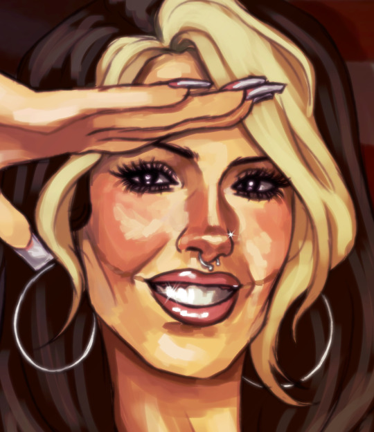
Your lighting and rendering in all your drawings is top tier dawg how do you do the flash photography effect😭
thank u first of all !!!!!
second of all, honestly i think a lot of it just has to do with how exactly you color the skin and stuff. i always look at photos for coloring reference actually, because cameras and surroundings can make the skin look different if that makes sense. with digital cameras, it makes the skin look very bright and airbrushed, but the flash of the camera also focuses on certain areas. i find that since the face is usually the center of attention, the face and neck are sometimes lighter than the rest of the body (since that’s where the camera is probably pointed, thus lighting it up more). so i try and keep that in mind, and add more shading to the skin in parts where i know the flash wouldn’t be hitting as directly. skin is also very shiny, people are oily, so don’t be afraid to add some harsh highlights around oily areas (i find this is usually the face and chest). same with hair, eyes, and mouth, it helps to just know which areas of the body are glossier than others, and use harsher highlights on those.
with how i do things, sometimes i like to color pick from reference pictures while also using the aforementioned method to actually color. sometimes ill literally just type digital cam photo into pinterest, and then find someone with a similar skin tone to the character, in a similar environment as the drawing. then you just have to apply your knowledge and know which colors to take, and where to put them back down.
one more small coloring note, shadows with digital cameras are usually very small, but they can be harsh. don’t add too much shading to areas you know are getting a lot of light, because there’s a big flash that’s brightening everything up. instead i’d say to just add thin, dark shadows around those areas. also, keep in mind what angle the camera is shooting from, and that’s the angle the shadows should be going in. the drawing below is kind of what i mean, but the environment this photo is hypothetically being taken in is very dark, so the shadows are much harsher than they’d be in a lighter room.

another thing i do along with paying close attention to the coloring, is just making things kinda blurry. recently what ive been doing is duplicating the sketch layer (which i use as lineart), blurring it as much as i see fit, coloring it anywhere from purple to red (it depends), and just turning that into a multiply layer and adjusting the opacity as i see fit. sometimes what i also do is once the whole thing is done and the layers are all together, i duplicate the whole drawing, blur that, and then turn that into a soft light layer and lower the opacity. it depends on what your drawing looks like, so it looks better with some things than others. anything that works with your process that makes things look “dreamy,” probably does the same thing !
only the first one is meant to look like it’s off a digital camera lol, but if you look close at these drawings, you can sorta see what i mean.
26 notes
·
View notes
Note
Seeing your art on my dash literally nakes my month oh my god so beautiful and stylish!!!
Idk if you've discussed this, but how do you find such cohesive and vibrant color palettes for big pieces?
Oh wow got to ask the hard questions huh. Lol I don't think I've talking about this. Becuase it's hard to articulate. A lot of what I do in art is just trial and error. I don't have a set formula or pretext color palettes for each mood or setting (tho I really should would save me a lot of time)
I mainly mess around with a ton of color layers in Photoshop on various blending modes at various opacity levels add in adjustment layers (mostly Selective Color) and play around with the values of the file and I let my artist intuition lead me to the atmosphere I'm trying to portray.
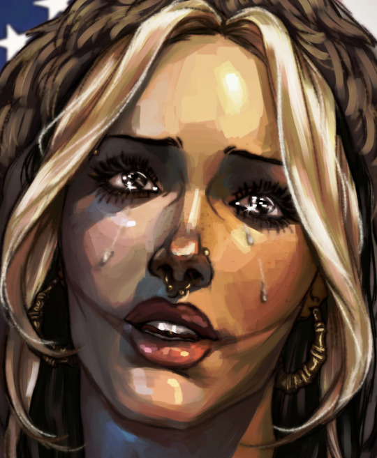
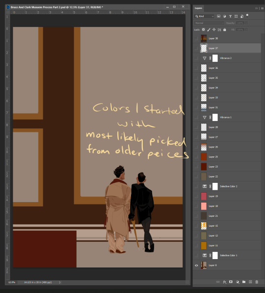
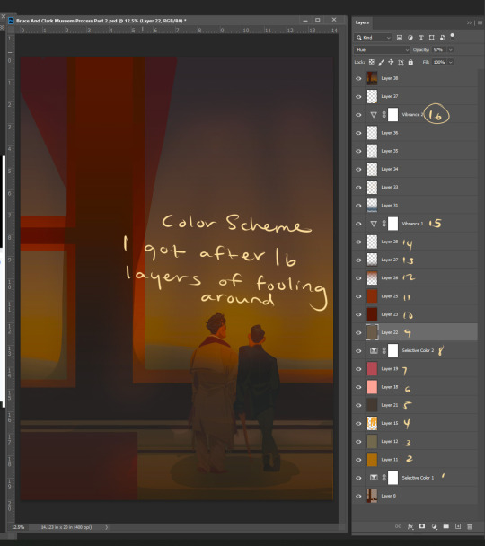
Here's a snapshot of just how many I used to get to the base color scheme for my Mueasume picture. ( and I used more later on in the piece.)
But I know that doesn't help you so here are some tips.
Know your mood and your setting for your piece (Time, Weather, Indoor Outdoor, Sad, Happy, Angry, etc.)
Learn the color language for each mood and setting Pintrest is great for this. Make some boards.
If your colors are not cohesive and you working digitally make a new layer Fill that layer with whatever color is the main mood of your piece (red for anger blue for sad etc.) and set that layer to like 50% opacity and then just go down the list of your layer options until you find something you like.
You can repeat this step with other layers and become the basket case like me and also have 20+ layers in your file lol.
You could add a color fill layer set it to Hue, flatten the image, then cut that whole image revert back to before you made the color fill layer paste your monochrome picture on top of your original piece, and then play with the monochrome layer on different layer settings and opacity
And if you have the option to use Selective Color do it and play with the sliders. The ability to tone down a hue in each value is a game changer.
You can also use Hue and Saturation tho you need a light hand if you're going to play with this setting.
I hope some of this help and I'm sorry if it wasn't clear feel free to send me another ask or message me through the chat feature and I can try to clarify.
82 notes
·
View notes