#genshin critical
Explore tagged Tumblr posts
Visit Tumblr Blog
Explore Tumblr blogs with no restrictions, modern design and the best experience.
Last Seen Tumblr Blogs


Fun Fact
Tumblr has been providing a Korean-language service since 2013.
Text
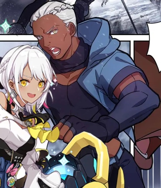
Natlan Characters

#and no one is surprised#only fanartists editors and modders can save this game#genshin#genshin impact#gnshn#natlan#genshin natlan#natlan genshin#genshin impact natlan#natlan genshin impact#anti genshin impact#genshin critical#genshin impact critical#gi
103 notes
·
View notes
Text
108 notes
·
View notes
Text
the problem with natlan / sumeru
warning: long post
──────────────────
to preface this i’d like to say that i’m in no ways an expert in the topics present, i’m just an autistic dumbass with too much time on his hands who enjoys a bit of research — i’m in no way, shape or form trying to belittle players who are excited for the update, by all means i hope you enjoy it, i’m just trying to give criticism.
you can enjoy/play a game while criticising it simultaneously.
when it comes to the topic of racial diversity and a company like hoyoverse that’s based in china, there’s quite a lot of political baggage that comes along with it. while i’ll try my best to go over that, i’m afraid i can only give a very limited eastern european perspective on it and i’ll certainly get things wrong or misinterpret things — if you’d like a more thorough view on the politics, please go read the post made by @zeichannnnn (hope you don’t mind the tag my love)
firstly, i’ll be going over general misconceptions, ridiculous excuses and or stereotypes that i’ve seen commonly come up in this conversation.
any and all screenshots will have usernames cut off for privacy, i want to maintain a civilised discussion and not cause argument.
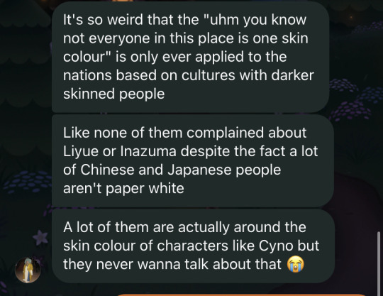
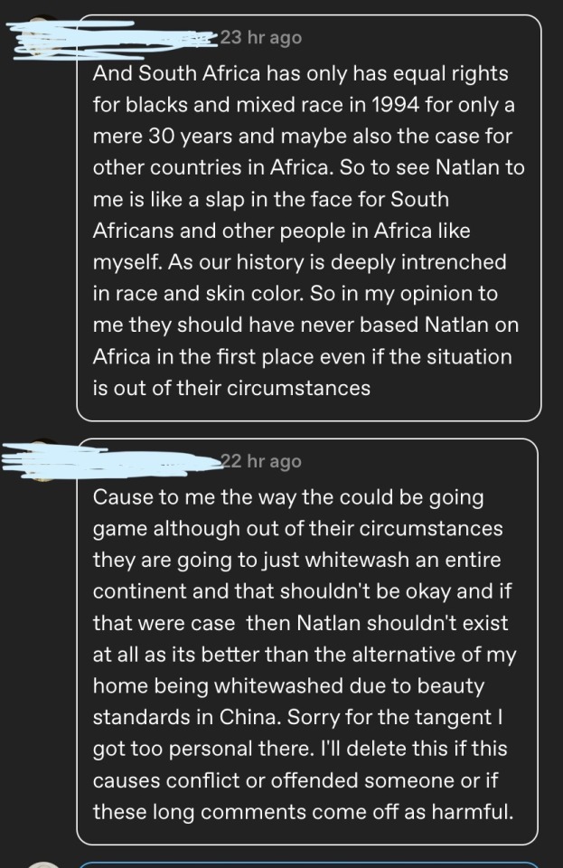
a lot of my critiques are more so towards the attitude the fandom has when it comes to this argument and their blatant colourism. as my friend above says, no one ever complained about characters in liyue/inazuma being paper white despite the fact realistically, no one in EA is that colour naturally. this of course stems from the beauty standards but that’s a discussion for later on.
the point is that if say a nation like liyue, had the same skin colour as a character like xinyan (who hails from liyue and has a liyue name) people would undoubtedly be upset. so why is it that when in terms of nations that are based off countries with a darker skin colour variety, complaining about the characters being white is seen as a problem?
culture isn’t defined by racial diversity, but when you’re monetising off the representation of different countries cultures, the very least you can do is show the actual diversity within said culture instead of slapping a cultural name on a white model (cue that one picture of the egyptian dude who looks like a plain american).
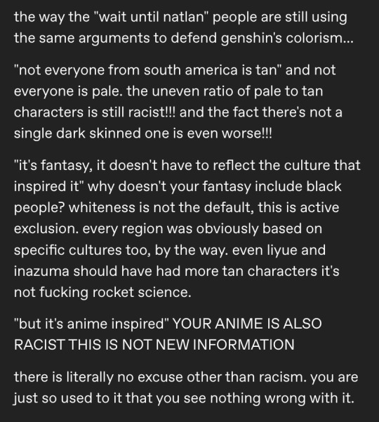
the idea that because it’s fantasy or anime, having black characters is surreal or improbable is rooted in white supremacy’s hold over unfair beauty standards as well as just the general consensus that black people are less desirable in media. which is completely false.
characters like dehya have proven that a character’s race is irrelevant when it comes to likeness, given the fact the chinese community ended up donating to charities because of said characters story.
the reason why the lightly toasted characters appear tan to you is because the rest of the cast is so horrifically pale (nahida’s hex code is #FFF7F1, cyno’s is #EEC6A6 which when placed next to each other may look like a big difference, but in reality the colours are on the same side of the colour wheel only a few spaces apart).
hoyoverse does in fact use culture as a mere aesthetic and costume to plant on white models. that is NOT to say they misrepresent culture entirely: this post goes over how hoyoverse is perfectly capable of doing impressive research to bring forth forgotten or unknown bits of culture.
even aside from the problems with racial diversity, the character design department has been known to completely fail when it comes to accurate representation. from the sexualisation of the kimono in characters like raiden shogun (which even the eastern part of the fandom have been upset about) to the character of yunjin where the chinese player based believed she was more like a lolita inspired caricature than a real depiction. they don’t understand how to mingle tradition with modernism.
in all fairness, it is difficult — and i will praise the game for making natlan much more technologically advanced and vibrant than people were expecting because having the one nation that’s based off africa and indigenous people be a wasteland would’ve ultimately been a problem. personally, i even love the slight mashup of “tribes” and the pokémon esque aesthetic — its new, and a smart way to bring two things together.
same thing cannot be said for how hyv ignores the fact darker people of colour are also significant when it comes to the building of culture.
please read over these that go more into depth about problems:
natlan being an amalgamation of three separate countries/cultures.
misrepresenting both continents natlan’s based from
another thing that’s always bothered me is the excuses people used in sumeru about the presentation of characters that were based off real people; specifically, kusanali.
yes, she’s based off a hindu moon goddess who’s described as pale and sure that could’ve been the reason she’s nearly the colour white — but how come candace, who’s based off kandake, a fully black woman, is presented as being slightly tan? you can’t pick and choose what you represent and honestly the idea that nahida’s character is supposed to be a depiction of the moon goddess is disrespect to the goddess herself (please go look at a singular picture of her and you’ll understand the utter tragedy).
hoyoverse also has a bit of a history with both whitewashing their slightly tan characters (nekomiya from zoneless zen zero, arlan from honkai star rail etc) but i think one of their biggest proofs of disrespect comes to carole pepper from hi3.
now, this is not at all me saying you can’t present female characters as very muscular — no. in fact, i would’ve loved if characters like beidou had a similar sort of build. but out of all the characters you could’ve chosen to give this to, you chose a black woman.
would this be a problem if it continued with other characters? not really. the issue lies within the fact the ONLY mother in game who’s presented as buff and “masculine looking” is a black woman — something that’s quite literally a stereotype against black women who are regarded as “naturally less feminine” than white women.
eastern beauty standards
the assertion that eastern beauty standards prevent the inclusion of black characters in video games is not only invalid but also reflects deeper issues of bias and systemic exclusion in the gaming industry. this argument is flawed for several reasons, including the diversity of beauty standards in eastern cultures, the global nature of the gaming market, and the responsibility of creators to reflect and promote inclusivity.
to claim that eastern beauty standards universally exclude black characters oversimplifies and homogenizes the diverse beauty ideals present in countries like japan, south korea, and china. these cultures are not monolithic and have their own histories and contemporary movements that embrace a variety of appearances.
creators in the gaming industry have a responsibility to reflect the diversity of the real world and promote inclusivity. video games are a powerful medium that can shape perceptions, challenge stereotypes, and foster empathy. by including black characters, game developers can contribute to a more inclusive and equitable society. this requires intentionality and a commitment to representation that goes beyond mere tokenism. the argument that eastern beauty standards prevent such inclusion suggests a lack of willingness to challenge existing norms and expand the narrative possibilities within games. hoyoverse have themselves stated in their mission statement that their goal is to show inclusivity.
that’s not to say it’s not clear that china’s beauty standards have unfortunately affected the gaming market: but for a game that brandishes itself on localising itself for a global audience (meaning, outside of its region), it’s a poor excuse. those standards aren’t universal and shouldn’t be used as gateway into designing.
once again, i am NOT at all very well versed in politics especially one that’s overseas (well, next door neighbour in a way) so i definitely will misinterpret or misunderstand things unintentionally and if i do, i’m really sorry.
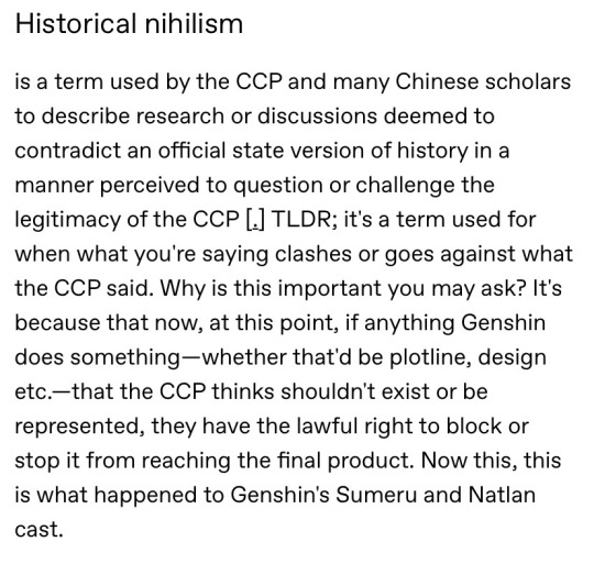
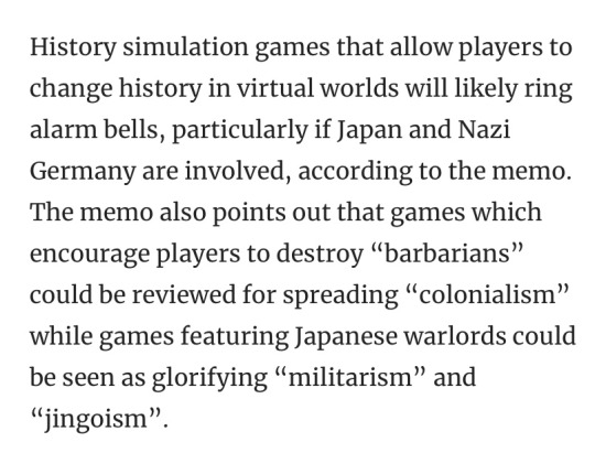
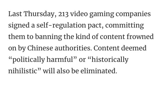
historical nihilism to me doesn’t relate to black people, just actual story events (hence why hoyoverse had to put a warning label for fontaine that the events presented didn’t represent that of the real world and any similarities were mere coincidence). black people existing isn’t regarded as “politically harmful” neither is it an extraordinary idea — it’s just another group of people.
although, the CCP has a MASSIVE history about their demonisation and hatred of black people therefore, even without the idea that the censorship stems from something like historical nihilism, it’s likely something to do with individual prejudice.
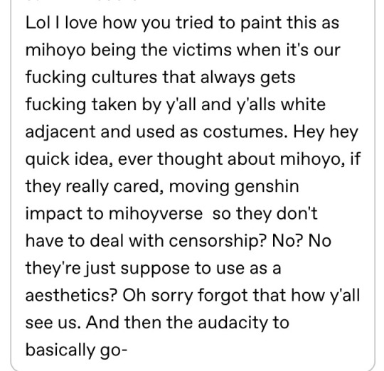
politically, i can semi-understand why hoyoverse is in a tight space for racial diversity. but that doesn’t mean i’m willing to baby a company that profits billions worth of profit from other cultures that they misrepresent and i’m even less inclined to hold the hands of hoyoverse dickriders who believe people complain about race just solely to whine. it’s a real systemic issue, and one that’s prevalent in a multitude of games aside from genshin.
people from the cultures presented are rightfully upset and they shouldn’t be told to just “accept”mediocrity. it’s their culture and identities being ridiculed, it’s their identities being profited from for the sake of aesthetics for a game that preaches inclusivity to the people that are willing to ignore its prejudice.
hell, even as a polish person, just thinking about what they’ll do with snezhnaya upsets me even if it’s not racially based — once again, the media emphasises the idea that eastern europe / slavic culture is purely russia meanwhile they steal little things from all of the surrounding countries in eastern europe (won’t forget the fact they changed that password thing in sumeru from “ravioli” to “pierogi”).
──────────────────
TL;DR hoyoverse uses other people’s cultures and identities as an aesthetic and proceeds to profit off of it while misrepresenting the sample of people they chose to depict and while a political argument can be made in this regard, ultimately the backlash from people rightfully feeling unjustified in the lack of racial diversity is what amplifies these colourist attitudes: and while hoyoverse has seemingly much more legal repercussions to commit to their idea of diversity, the fandom has no excuse for their disregard of different identities.

also just a funny thing my friend and i did to show just how white these characters are lol
“ blackwashing “ versus “ whitewashing “
i feel like i need to add this little section too because i know there will be a lot of people that draw or reimagine the characters in a variety of different skin tones, and i know a lot of people will be upset (usually it’s just the lowlife weebs who cry at the thought of a black woman being in the same room as them).
historically, media, including video games and anime, have predominantly featured pale-skinned characters, often neglecting the representation of people of color. this lack of diversity reinforces a narrow view of beauty and heroism, contributing to the systemic exclusion of non-white individuals. blackwashing helps to rectify these historical imbalances by providing a broader spectrum of racial representation. it challenges the default assumption that characters must be pale-skinned and introduces audiences to a more inclusive range of appearances.
representation matters profoundly in media. seeing characters that reflect one's own identity can have significant positive effects on self-esteem and cultural pride. blackwashing creates opportunities for black audiences to see themselves in roles and narratives traditionally dominated by pale-skinned characters.
critics (once again, youtube creators and tiktok lmao) of blackwashing often argue that it disrespects original character designs or cultural contexts. however, the impact of changing a character's skin tone is minimal compared to the harm caused by whitewashing. whitewashing often erases the cultural significance of non-white characters, perpetuating stereotypes and denying the rich diversity of the source material. blackwashing, in contrast, does not erase cultural identities but rather enhances the inclusivity of the media. it provides a more diverse and representative depiction without detracting from the character's original essence or storyline.
in addition, usually when a character is black in fantasy media or even just an anime/game with a lore based story, it’s because their race is significant to who they are (i.e tiana from princess and the frog who faces racial discrimination — without her being a person of colour, this storyline and the events that follow wouldn’t make sense).
──────────────────
i’m sorry for such a long and probably nonsensical rant, but this has bothered me into absolute oblivion especially the community’s response to the uproar of people who rightfully critique and are upset by the company.
#i won’t entertain mediocrity no matter the excuse#sorry for the long post i got a headache while writing it 😢#genshin#genshin impact#gi#genshin natlan#natlan#genshin critical
312 notes
·
View notes
Text
I stopped playing genshin awhile back less out of protest and more out of disappointment and frustration towards the game, so know that what I’m about to say is not an attack on genshin players because I too was there for a long time. I’m a strong believer in that all media— even the most highly regarded— will have issues and simply enjoying said media does not reflect on your values so long as you can recognize when something about it could be better. In general fandom bashing to me is a pointless endeavor that only hurts people’s feelings and is ALWAYS hypocritical because maybe you don’t like one thing that you deem bad but I can guarantee, right now, you also like something that has made mistakes.
With all that being said it makes me very frustrated when genshin fans act as if the only issue with the designs is the fact that they’re white. It misses the point. Sure, they would be better if they weren’t paper white, definitely a step in the right direction but genshin is beyond help. Natlan was just the final tipping point. At its core, genshin’s designs have fundamental issues. The colorism is the most obvious, but the lack of body diversity is also an issue. Not to mention the lack of hair texture or features, the way they homogenize culture, the stealing random cultural names or elements with no consideration for their origins, the orientalism, the age issue, and the sheer fact that their shape language/character design principles are just bad from a design standpoint. (I wrote a mini-essay on that part alone.) The list goes on.
Perfect example: I saw the new cow-girl design they released and she’s slightly wider than their other models, not even mid-size, but by genshin standards that’s fat and her defining trait is how much she eats, she’s literally a cow and one of her attacks is to accidentally sit on her opponent. Not to mention the fact that it’s supposed to be a stumble into a fall while in a tiny skirt which makes it feel suspiciously like fetish content. Fully sums up my entire point that genshin has fundamental problems with its characters.
There are plenty of people who speak out but there’s a very prevalent narrative amongst the fandom that (whether intentional or not) implies everything would be fixed if they just made them not white. And it irks me, because at this point it feels willfully obtuse. Again it’s fine to play the game, to enjoy it and interact with genshin content like you would any other fandom space but there’s a hypocrisy to the people who believe they’re speaking out by editing the skin tone and maybe adding some freckles. This is a nuanced thing. It’s about how the work is created. If you are simply an artist drawing a character with some of your headcanons that’s not an issue, it’s not even a statement really, it’s just artistic interpretation. What I’m specifically referring to is when people make edits/artwork with the intent of “fixing genshin” and the only thing that changes is skin tone.
To truly fix genshin’s designs you would have to start from scratch. And yknow what? Character designing for cultures we’re not apart of is really fucking hard and that’s why they have teams of people working on them. It’s a thin line to balance. As individuals it’s not really our responsibility to fix them but if you do walk into that territory (aka making art or edits with the intention of fixing), you do now hold some of that responsibility. I’ve seen several artists fall into this trap where they go in with pure intentions of trying to help but quickly find out how complicated it is, not only to design a good looking character, but one that respectfully includes real cultural elements (that they aren’t familiar with) and it goes poorly. Again this is why these projects have teams of people as well as diversity coordinators.
And I think the key aspect that makes designing for genshin really hard is that they will always be limited by being a fantasy setting that is almost entirely based on real world cultures. No matter the intention this type of world building makes it extremely easy to fall into offensive streotypes, because you aren’t just showcasing a real life culture, you have to take the additional step in making it into something new. We run into the issue of diluting real world cultures down to aesthetics or implying things for the purpose of narrative, among many other challenges. Inherently by making that leap into the second step we are in muddy waters. Even shows like ATLA—which are held in high regard for their integration of real world culture into their fantasy world building— still have issues (which is also a fascinating conversation but not on topic).
Suffice to say it’s really hard to do. But with the access to resources that Hoyoverse has, it’s ridiculous that these compounding issues continue to persist.
#just some reflection#almost scared to tag bc ik fans don’t like to hear criticism#just know the real enemy isn’t the fans it’s the company#genshin#txt
78 notes
·
View notes
Text


One of the biggest problems with genshins character design is the fact that they reuse the same base models for everything, which means that with the shorter male model, there is NO WAY to differentiate based of physically if the character is a child or not. So especially in cases where the lore doesn't give any solid hints towards it, leads to people debating and fighting if the character is a minor or not

Like this is genuinely fucking ridiculous. I'm not a lore expert, if there's a character I used as an example here that's actually an adult or child, then that just proves my point that you cannot tell.
PLEASE NOTE THAT I AM NOT AN EXPERT ON THIS, I AM A SELF TAUGHT ARTIST JUDGING THIS
#my posts#genshin impact#Genshin impact rant#rant#genshin critical#Another problem with gorou that I didn't go into to not make the post too long#is that despite being a army general#He is built like a fucking stick he is frail looking as all hell#not even a twunk#Isn't he an archer why does his arms look like they'd snap in two
71 notes
·
View notes
Text
THANK YOU! Absolutely! So glad I'm not alone feeling that way!
Genshin Vent
1. There’s a way to deal with child protagonists in adventure stories. Either go with it or actually address it. Genshin does not commit to either and it’s immersion breaking. This would all be solved if the traveler and their sibling were adults but they decided to make them kids. It keeps reminding you all the time that these are kids, particularly with comments about how they’re too young to drink (apparently they’re 15). They don’t allow for underage drinking but never comment on the traveler fighting constantly. Adult characters like Lisa can sound like they’re flirting with the traveler which is really uncomfortable. Where are their parents? Are they orphans or can their parents not dimension hop? Who let them do this in the first place? No one brings it up. Characters ages are relevant but not logical. It’s bizarre that the only line the adult characters will not let the children cross is underage drinking. Not that I want the kids to do underage drinking I just want the game to be consistent.
2. The game was already unrealistically and overwhelming white/pale before it decided to whitewash Sumeru, which is obviously based on southeast Asia and Africa (India and Egypt in particular). It’s not just rascist but colourist. They have made the brown people not only scarce but as pale as possible with barely any variety in tones.
3. I don’t like how Paimon struggles with names and is dismissive of food only in Sumeru - she eats slime but African food is too much for her? It’s gross and has racist undertones.
4. The disability representation - despite this being a pretty combative world the characters live in - is aggressively lacking. Which makes the world unrealistic and boring. Collei’s Elazar could have been some great representation but it of course get’s cured (which you could see from a mile away).
5. I hate that the women’s breasts bounce when they breath. Nearly half of players are women you do not need to pander to straight men only (I say straight men because I think most queer women still prefer fem characters to have a bit more dignity than this outside of porn).
6. I just wish we knew about the protagonists more, what was their home planet like? Have they realm jumped before? Why are they so chill about it?
7. Dori is a Turkish stereotype, most cultures that aren���t white have harmful stereotypes around being greedy so maybe just don’t. Especially since she’s the only Turkish based character.
8. Eula’s quest is bonkers. I can’t tell if the writers are self-aware that she’s being classist or not. Because they seem to frame it like people are just prejudiced because of her family. But she’s the one who is unsolicited calling them plebs for no reason. You’re meant to be training to talk her uppity uncle, shouldn’t we be talking to the townsfolk like they’re royalty then? It makes it seem like she deserves her treatment, especially with her threatening to fight everyone.
9. Kuki Shinobu is my least favourite character. She calls Itto - a character that I read as ADHD - “crazy” and belittles him. Her outfit is also my least favourite. She’s meant to be this strict lawyer, no nonsense figure yet she’s in a tacky crop top and booty shorts. Jean and Sara both have outfits that show their authority and seriousness so why not her? I get that she wants freedom but otherwise her outfit does not fit her at all.
10. I wish Takuya the blue oni was a member of the Arataki gang. Or even a playable character.
11. The government of Mondstaht makes no sense. It’s meant to be all about freedom. However, it’s essentially a police state ruled by a nepotism general. It should be a form of anarchy.
12. Diona makes me so uncomfortable. Who let a twelve year old enter a bar, let alone work there? Is she staying up all night? Why can’t she just be an adult teetotaler. It makes her dad seem irresponsible that his drinking upsets his daughter a lot and he does nothing about it and that he lets her bartend. Which would be fine if anyone addressed that or tried to help them. It’s just uncomfortable as is. Like an adult with a dead beat dad is sad but fine. But a child with a dead beat dad makes everyone around her look bad and irresponsible. Which seems to be a big Genshin issue to me. It creates lore that it’s not prepared or ill equipped to fully explore.
13. Big tell not show problem. Especially with Kokomi.
14. I hate that the closest we get to a plus size main character is that Ganyu used to be larger and now stringently watches what she eats. She even comes across like she has an eating disorder sometimes. Genshin characters can look and act very similar, so not only would it be nice representation if she was plus size but it would help differentiate characters as well.
15. Paimon does not need to comment every time you fish. Once every few goes is fine. She also doesn’t need to re-explain what an NPC just said.
16. Having to go and pray at statues to change your power as the MC was fine in like Mondstaht when you’d mainly just have the torch and totem puzzles. But now that every five seconds I have to switch to anemo for sand, fire or water for flowers, fire for the lightning rocks, dendro for the flowers that shoot dendro teleportation sigils and more I want to be able to scroll and switch power for the MC as long as I’m not in combat. Like I hate running over to the wolf boss in Mondstaht just to realize that I should teleport over to Inazuma to be electro and run all the way back.
17. More outfits, especially for the MC. It is SO annoying that Ayaka offers us a new outfit and we have to turn her down it feels like the developers are laughing at me. Also, Ayaka and Ayako should at least have matching pastoral outfits.
18. I’m SO SICK of the male characters getting to be more clothed than the female characters on average. Also give some of the women flat shoes. I get having impractical clothes for flavour but sometimes it actively does not suit a character and makes them look incompetent. Like Ningguang suits heals she’s high society but Beido does not. It doesn’t suit her personality and she lives on a wet, slippery ship so it’s even less practical than just a regular fighter.
19. If they had more diversity the characters would look more interesting. Sometimes I feel like they add excessive and bizarre elements to the character’s designs to differentiate them instead of just having more shades of skin colour, different hair types (like curly, wavy or coily hair), physical disabilities, scars, or body size differences. Like Childe’s teacher looks like a discount Eula with a busier, uglier leotard and nice boots and gloves as the only saving grace.
20. Buying two things from the teapot traveling salesman at someone else’s place is a stupid thing to tick off in Battle Pass. Who buys from the salesman that much let alone from someone else’s place? He has hardly any stuff and no variety. Fish for twenty fish or something like that would be way better.
21. More of the furnishings for the tea kettle house should be indoor as well as outdoor. It’s bizarre that little things in particular can’t be inside like the Statue of Her Excellency. Red Kitsune Doll, or Storm braver ship would all fit really well inside the mansion.
22. Hate the water diaper you get while swimming. It looks SO dumb and it’s so bizarre because Genshin is the one that puts most of the women in skimpy clothes so why are they trying to preserve the character’s dignity now? To look all the way up a mountain to see how far you have left you almost have to get an upskirt angle. It is baked into the game that certain characters do not get to preserve their modesty, so why this?
23. Important limited timed events should be character quests you can play later. They can have less rewards as a trade off. But it’s BS that if I go for a trip in the woods I could miss out on important plot in Genshin that I could only find on YouTube not even in it’s complete form on Genshin’s page. Like what do new players think when they play and theirs limited time avents in areas they can’t even reach yet???
24. There are so many characters to keep track of I would love them to have less names. Like Childe being Childe and Tartaglia. There are so many irrelevant details and characters and it’s a lot to keep track of especially since only through replaying a game does everything sink in for me. But I’d never do that here. What am I meant to do replay the same limited time event twice immediately at the same time, farm for level up items a million more times????? No.
25. The lore is so much work. Between the manga, character texts, and overly wordy dialogue it’s too much. Edit things better.
26. If there’s important NPCs PLEASE give them them a unique look! Otherwise they all blend together. Even the human adeptus’ at the latest lantern rite were boring looking and they were gods.
27. Why is Paimon not a big deal? Apparently stories of fairies exist because people call her one but it seems she’s the only real one. Can you imagine if a fairy just suddenly existed and no one was curious or surprised about it. It’s so bizarre.
28. The traveler should be a celebrity by now. Charlotte should have been begging us for an interview from day one. We’ve literally changed the landscape. We have fought dragons, know gods, fought gods, lit up mountains and giant glowing trees in the sky. We should have a MUCH bigger reputation by now. Sure a few people comment on us. We can’t compete in the Pankration ring because of our reputation but people should be TERRIFIED of us. Not even gods can use more than one element. We are half way to being a god. It’s just weird to be not that big a deal to most people. And then the characters that are obsessed with us, like Ayaka, it’s not about what we’ve done it’s romance coded who we are stuff.
29. God I wish Watasumi Island never made peace with the rest of Inazuma. Hoyoverse should go back and add more to the Inazuma main quest in general they rushed it SO MUCH. Like the puppet should not be allowed to exist anymore or if it’s alive now like Scaramouch it should have to step down. Love Ei, but one traumatizing god is enough.
34 notes
·
View notes
Text
Why the fuck are there roller skates, dubstep, stage lighting, an LED screen, and all kinds of modern technology in Xilonen's trailer??? I thought Fontaine had the most advanced technology next to Schneznaya and arguably Sumeru, and every instance of high-end technology we have seen leaned more towards machinations with gears, magic, alchemy, essentially fantasy styled sci-fi???
The disrespect towards Native American and African cultures is enough to piss me off already, but it even goes against Genshin's own consistency with its fantastical world design..and for what? Just so you can have this...pop and gamer aesthetic???
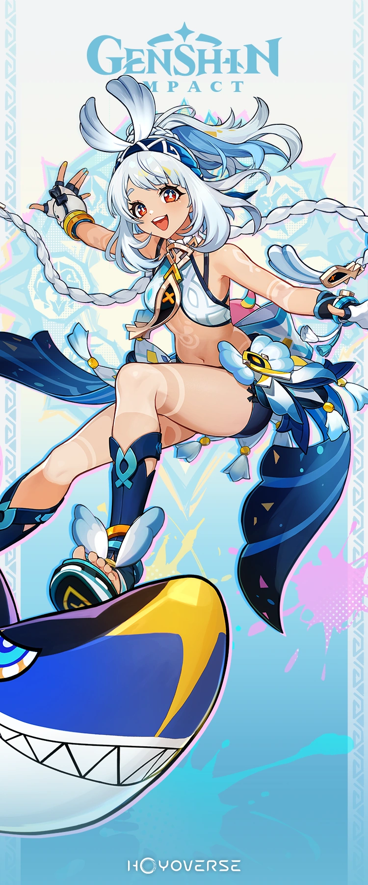
Just look at these two bubbly and optimistic characters for me okay
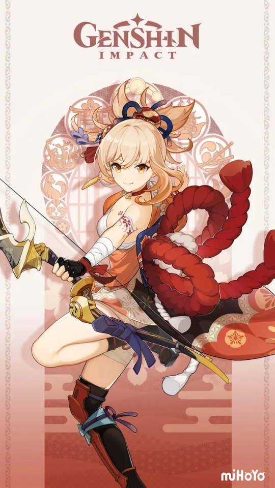
Yoimiya's design isn't the most respectful and accurate representation of a Japanese firework craftsman, but at least you can damn tell she is Japanese. The large ribbons, hair accessories, tassels, leg covering, tattoo design, shoe style, and fabric patterns all allude to this (I apologize for not knowing the exact terminologies for these, this needs further research).
Then there's Mualani who has...what? Please do correct me if I am wrong here, but her character must be inspired by the real Mualani, a Hawaiian Chiefess. Additionally, her tribe's specialty is in tourism and vacationing, which further leads into the idea that she and her tribe are based off of Hawaii despite the known issues regarding Hawaii and tourism (if there are any good sources that summarize the issue, please do lmk).
I am not too familiar with Hawaiian culture, but there really is nothing about her design that reads as Hawaiian, or even just traditional, to me. What about a 2 piece swimsuit with bows and tails, a bow + braids + ponytail hair style, combat gloves (?), and an entire neon shark, is Hawaiian???
The characters, their designs, and their trailers, are just so culturally disconnected from their real life counterpart that it's even disconnected to Genshin's own world building and design. How the fuck is the fashion trend in Natlan denim pants. I feel like the only parts of Natlan that feel like Genshin Impact and culturally inspired are the in-game music and landscapes (God bless Hoyo-mix and the world designers).
#xilonens music in particular pisses me off.#she could possibly break my entire theory that dubstep in music is meant to represent otherworldly power#actually- the fact that the some of Natlan is like this bugs me#it could either be a legit disrespect to their culture by just not having the traditional music as it is#Or it could be the best use of musical foreshadowing this game has ever seen. which would be fucking bonkers and awesome#I have a separate post abt the use of music- particularly orchestra and dubstep#xilonen's visuals n music for her demo is just. wtf man idc if it sounds good it doesnt sound culturally and worldbuilding grounded at all#anyways thats my fucking rant for today#i am so goddamn pissed that they just wont fucking respect these cultures to the point it ruins their own quality#its really damn stupid#fontaine was genshins best designs...then they dropped this next#absolutely fell off#even with the whole technology thing- fontaine with their research and gears and all its so cool#then natlan has vtuber avatars- turntables- led screens- you get the point.#fucking ridiculous#evelynpr genshin#genshin#genshin impact#Im sorry I finally make a genshin post again#and it is this negative...im really sorry#genshin critical#natlan#xilonen#mualani#yoimiya
68 notes
·
View notes
Text
the downgrade in genshin impact’s character designs as the game has gone on is something that should be studied im not kidding.


#genshin impact#genshin#genshin critical#genshin impact critical#<- in case this post casts an evil spell that alerts the horde that I don’t like this game anymore
39 notes
·
View notes
Text
just saw someone say the natlan cast are family and all very close to a degree we haven't seen since mondstadt...like okay idk how you reached such an incorrect conclusion but you do you i guess?
#genshin impact#genshin critical#natlan critical#the only relationships between the natlan cast were mualani-kachina and citlali-ororon#MAYBE xilonen-mavuika but it felt so insincere to me...probably bc mavuika in general feels insincere#kinich was constantly off-screen#iansan is lacking#chasca has no ties to the rest of the cast#xilonen also. even though she made a few of their equipment (like chasca's gun) this stuff isn't acknowledged in universe except for#mavuika's bike and it doesn't feel like she's close to anyone either#kachina-mualani was good. no complaints there#citlali-ororon was also nice. but i do feel like it took a bit too much space in the AQ specifically#mavuika knows everyone and is on good terms with them but the only one she's remotely close to is xilonen. maybe citlali#like idk to me natlan feels more like acquaintances or people on good terms with each other more than anything#it's like a group project in school#natlan
25 notes
·
View notes
Text
I just remembered how bad genshin poc representation is and decided to redo something I did a year ago where I compared my skin color to candance and it was very similar.
I've realized that I, a white person, would be considered a black character in genshin impact

My arms are darker than my face because of tan and the light, but also darker than all genshin characters shadows 💀
20 notes
·
View notes
Text
Kind of gave genshin a break for a few months, but I think the people who thought they lightened the Natlan characters' skin were onto something.

Here's Mualani. Her clothes and hair are pretty cute, but you have to look closely to even tell that she has tribal markings on her skin at all. Which is *weird*- the character designers at Hoyoverse are usually pretty good at making sure that their characters have enough contrast that you can appreciate every detail in their design, but Mualani has markings that barely contrast with her pale skin. If she was intended to be light skinned, why weren't her markings darker/colored?

Here's Kachina for comparison, who if I'm being charitable I can believe was meant to be either white or lighter skinned. Her markings are light, yes, but they're colored in a way that actually contrasts enough with her skin that you can see them at all. Pretty cringe of hoyoverse to cave to the racists this badly

They know how to make dark skin npcs so why did they clearly whitewash the playable characters? these npcs are even darker than a lot of the Sumeru npcs
#before anyone says anything#no i am not spending money on genshin#or honkai star rail#i dont think they deserve my money for fucking up the character designs this badly#genshin critical#hoyoverse#hoyoverse critical#natlan#kachina#kachina genshin#genshin kachina#mualani#mualani genshin#genshin mualani#genshin impact
37 notes
·
View notes
Text
Can't wait to go to Natlan in genshin and be flashbanged by all em white people
#genshin impact#natlan#“wait for natlan for dark skinned characters”#*blinding white light approaches*#genshin critical
40 notes
·
View notes
Text
colourism aside, natlan’s designs just suck. (character design overview)
───────────────
as stated, even if we ignore the blatant racism in the designs, fundamentally—they are still absolute trash. i’m by no means a master character design, it’s just a nice side hobby to get my creative brain flowing, but i think that goes to show just how poor the intent behind these characters is.
warnings: long post, i’m not a professional character designer, i may get things incorrect about certain cultures, you are allowed to like these characters!! idgaf!!
to preface, i also have a problem with most designs in genshin ESPECIALLY inazuma and sumeru, but natlan’s designs are just so horrid it genuinely pissed me off.
overall, natlan’s designs aren’t at all up to the quality standard of any other nation. using the excuse that it’s because they have a different culture/style isn’t valid when you look at fontaine/liyue designs (places with two succinctly different cultures, but stunning overall designs). most of these characters are boring: no creativity, colours that clash with the skin tone, lack of depth and actual intent/personality—it, ironically, has no character. the entire purpose of character’s design is to ‘show don’t tell’. scars tell a story, colours used are imbued with symbols, shape of silhouette can tell a personality—and even something as simple as a glimmer in the eyes is a super common trope to show if a character is unstable. natlan designs lack all of it.
the reason i put emphasis on the name origins of these characters is because: A. natlan (like most nations) doesn’t have one specific point of reference, with every character being an amalgamation of different countries and cultures so it’d be unfair of me to generalise, B. hyv uses real life culture in designs, if they didn’t, the characters in liyue would NOT have any cn hairpins, qipaos, symbols, talismans (same with inazuma and kimonos), these choices ARE relevant in game and real life and are used to inspire design concepts.
we’ll start with the least egregious ones down to the ones i want to shred.
KACHINA
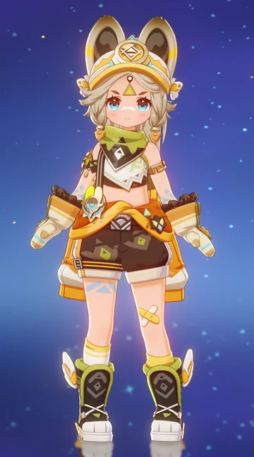
THE POSITIVE:
- her character is based off an american pika and i can definitely see it in the design just from the ears and the cute chubby face + large eyes (makes her look more docile and cute).
- kachina’s name is derived from puebloans (native americans in the southwestern united states). from my research, kachina’s design has at least faint resemblance to the typical clothing attire used by puebloans (the array of patterns and symbols prevalent throughout her design).
- it may not be 1:1, but to me, that’s a sign of good character design. when referencing a culture, specifically in a game like genshin where these cultures are meant to be “inspiration” and not replicas (which is a whole other technical debate), using elements from a culture’s fashion as the foundation and then building on it with your own ideas is generally, a positive.
- i really like her silhouette, it’s not too clunky or plain, and generally i can get some pretty good hints as to the basis of her character. the over-exaggerated big gloves are a huge part of her character due to her tribe (they’re kinda at the centre of her design, showing how it’s a significant part of her). the symmetry in her outline may represent her stubbornness or cleanliness, while the little hints of asymmetry on places like her knees/arms can reflect her youth and child-like nature: thus painting a character that may be striving to be more mature than she actually is.
- the colour dynamics are also very cohesive and representative of her tribe. in design we use the 60-30-10 rule (which can change depending on amount of colours used), where your main colour needs to be dominant, while the third must be an accent colour. i think this is done quite well with kachina, the main colour is the deep brown and orange, with accents of green and even smaller accents of blue. something i really liked was how well these colours were balanced with this rule while keeping the aesthetic of the patterns.
THE NEGATIVE:
- i don’t have too many complains about her, she is a four star and they tend to be much plainier than five stars and i am very conscious of that in my critiques—one big one is just that i wish they attempted to interpret more elements from the indigenous culture to her design.
IFA

THE POSITIVES:
- immediately what stood out to me without even having to read about his character were the scar on his forearm and the label pinned on his white coat. IMMEDIATELY my brain went: some sort of doctor, probably a vet.
- his silhouette is quite clean and gives a good enough idea of his character: someone who seems confident but isn’t arrogant or loud, perhaps even polite.
- the back patterns and materials on his trenchcoat/cape thing are a good reference to his clan especially with the feathery appearance—it’s not too obvious, perhaps indicating he prefers working as an individual rather than a group.
- his colour scheme is balanced and the tones used can be commonly found in the natlan environments, could be an indicator of his strong connection to nature.
THE NEGATIVES:
- ifa’s name has origins in the religion of the yoruba people (of west africa). in the yoruba pantheon, ifá, also known as orunmila, is the god of wisdom, knowledge, and divination, and is considered the messenger between the human world and the divine realm. now our ifa uh…yeah he doesn’t really have any resemblance to the yoruba culture, like at all LMAO—really wish they added at least SOMETHING (at the least, accessories / more clear patterns).
- i don’t like the fact they made him a cowboy. it’s really strange and out of character (/out of the design concept that they were clearly going for) and also completely out of sorts with the entire design of natlan. seriously, what kinda fucking relevance do cowboys have in this nation?? i don’t know if hyv just thinks anything with the word american must = cowboys or if they ran out of design choices for him but it’s bizarre.
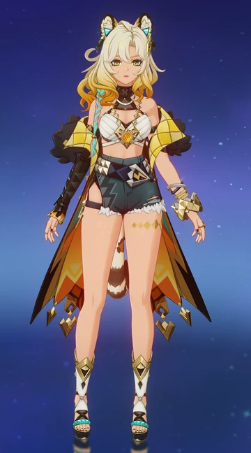
MUALANI
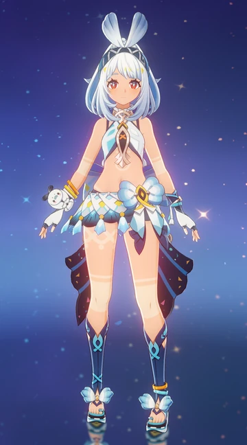
THE POSITIVES:
- her design uses a little of bubbly shapes! she has no hard straight edges or lines, everything is very curved and fun—a usual indicator of a character that’s light-hearted, comedic and jubilant. not only that, but a lot of the carved areas in her clothing have shapes resembling fish which all rolls back to her tribe.
- from her namesake, mualani’s name has origins in hawaii, but her specific origins can be traced to indigenous polynesians. their cultures are very varied and unique, but if we were to take pieces from their fashion, i’d say the closest we can get to a direct reference is mualani’s skirt (patterns and colour reminiscent of lavalavac or pa'u skirts)
THE NEGATIVES:
- i really wish they added more elements from polynesian culture to her design (i feel like this is a phrase i’ll be repeating consistently LMAO), but even something as simple as adding recoloured hibiscus flowers to keep in with her colour scheme but accentuate the culture would’ve made a big difference.
- now i did imply that i wouldn’t talk about race and focus on designs, but in this case, her skin is genuinely one of the biggest factors pulling back her entire concept. she SHOULD be so much more tan. not even due to the fact polynesians aren’t THAT pale, but because of her markings. they are extremely awkward with her skin tone because they barely stand out almost like they’re implying she’s ashamed of them—which is not at all mualani’s personality!! she has so much pride and joy for her tribe it’s extremely weird for her markings to be so far in the background.
KINICH
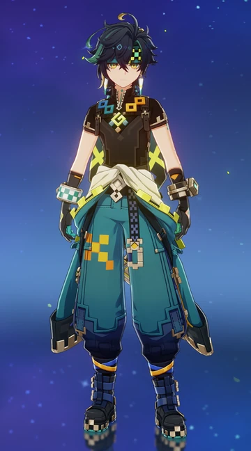
THE POSITIVES:
- kinich’s name refers to the maya sun god and assumes to mean sun-eyed, so i’ll give them credit: he has gorgeous yellow eyes reminiscent of sunlight. his design consists of a lot of jagged patterns, which i think nicely correlates to typical mayan styles while remaining pretty succinct to kinich’s tribe. his necklace piece vaguely resembles common jewellery for warriors/kings (particularly nice homage to his name as it’s typically associated with gods).
- this one’s a positive and a negative but his colour palette is very coherent and follows the typical design structure…but it’s also extremely boring. i’m not saying every character need to have a distinctly different colour scheme and style but it has to be at least different enough where me colour picking won’t result in the exact same colours (…he’s literally a xiao redesign).
THE NEGATIVES:
- his shape language is slightly awkward. while there’s a lot of hard, sharp edges to show how he’s tough or has a callous exterior, the silhouette of his character is too soft and bubbly at the bottom. maybe it’s intentional to show how he doesn’t care how he’s perceived, but it’s still inconsistent with the rest of the design.
- once again; this is both a negative and positive, but his retro-gamer style pisses me off at face value. on the surface, it lacks relevance in his character. he’s not a gamer, he has no elements in his personality to indicate he’s a gamer (if anything, he has the exact opposing qualities, he’s not competitive, he’s not mean or gruff etc), it’s odd. BUT, i have read some people relate these retro patterns to mayan mosaics and architecture, and when i did further research i think it was actually absolutely excellent symbolism. super subtle (maybe a little TOO subtle, and should’ve been used more consistently throughout all designs) but super interesting.
IANSAN
THE POSITIVES:
- from my research, iansan’s name relates to both the yoruba religion and candomblé, she’s a blend of brazilian and nigerian influence. i think the closest reference in her design is her necklace that is reminiscent of indigenous brazilian necklaces + the use of feathers in her design are a subtle homage to brazilian culture.
- iansan’s design has a coherent and clear colour scheme, the brightest being the dominant colour and then little sprays of a contrasting purple/indigo (with the smallest speckles of green).
- i love the consistent asymmetry, the white skull atop her head balances with the white armour piece on her knee which directly contrasts the plainness on her right leg, it adds interest in her general shape while maintaining structural balance.
THE NEGATIVES:
- her design doesn’t really have intent. it’s like they created a design for an initial scrapped concept of natlan and forgot they needed to give her a personality. i don’t think anyone would’ve known she was a trainer without searching it up / being told. maybe aside from the bandana and her crop top, there’s nothing telling in her design that gives her character.
- another main issue; her character design doesn’t give you a good of what she’s like or who she is, at a surface level it’s quite pretty and matches the aesthetic of natlan, but it doesn’t give enough depth to iansan as an individual.
- overall silhouette is also pretty unimpressive, i understand she’s a four star but she should have at least more idiosyncrasies within her design, or even exaggerated features to make her design stand out.
CITLALI
THE POSITIVES:
- “citlali” is derived from the nahuatl (aztec) word for “star”. i can see that in her design she does have at least a few aztec influences from the two braided front locks, and a more modern spin on a female cueitl, i also like the little sash holding the skirt, its very clunky but i think it looks great with how minimal and tight the top of her design looks.
- her colour scheme is great and i adore it, it follows the traditional design rule and maintains a normal balance BUT i really would’ve loved for a bit more detail of either dark blue or yellow to contrast and break from all the pink-purple hues.
- everything in her shape language screams “leave me alone”, it’s all very jagged, consisting of a lot of triangles (typically used with villains but in this case i think it’s a reference to her sharp intellect or energy, perfect for a shaman).
- positive and negative; i like the asymmetry at the bottom with her left leg being shown and then her right hip having a slight cut in the fabric however it was a super unnecessary choice that i just damn well know was chosen for nefarious reasons (i’ve played these games before hyv.)
THE NEGATIVES:
- she is straight up just another version of a lolibait tsundere. i’m sorry it’s hard to keep personal bias out of this but COME ON?! she’s supposedly a “granny”, meanwhile she has a shorter female model, looks childish and has no elements in her character to help infer she has lived a long time. it’s lazy design with a really intriguing concept. once again, no character. with a name that holds so much power and weight, i would expect so much more. she deserved to be a five star (and a revamp of her personality). nothing in her character screams shaman!! maybe the accessories at the top of her head?? but everything else is super plain, like a background character that got too much attention in the writing.
- her silhouette is extremely rigid, and again, this can be a design choice in some cases, could reflect in this case how she’s closed off from people, but even so, there should be more exaggeration or emphasis in her design to make this choice seem more intentional or at least interesting, because right now, she’s just a box with scribbles on it for detail.
XILONEN
THE POSITIVES
- i found a great reddit post of someone fully going over the influences in xilonen’s design that was absolutely great from a cultural perspective! it fully divulges the aztec and mayan mythology and culture embedded in her design.
- i like the shape language used, all the harsh triangular cuts presenting someone who’s quick, strategic, to the point—with all of that broken up by the sudden fluffiness of her coat, maybe indicating she’s not as harsh as she may first appear.
THE NEGATIVES:
- now while i don’t want to discredit all the wonderful subtle details in her design as referenced in the thread…xilonen’s design as a whole is extremely low effort. if you told me she was a four star, i would honestly believe you.
- look me in the eyes and tell me that without the story you could have guessed that’s she supposed to be a blacksmith, because you can’t. i’m not saying every character needs to have their career/job at the centre of their design…but when it’s not even vaguely hinted at, it’s extremely disappointing.
- her design and job gave the perfect opportunity to add cool and intriguing metallic details or even burns to her skin, i understand she’s also meant to be “laidback” but “laidback” doesn’t mean the design has to be sloppy, the half-off jacket was already enough of a clue that she’s relaxed.
- the belt especially is disappointing because it’s such an easy design fix; she likes details but doesn’t care about other’s opinion, this could’ve been the perfect placement to add little details in the metal to things she’s interested in (skating/dj shit whatever).
- the asymmetry also fails in this design, the unnecessary cut in her way too tight and tiny shorts clashes with the fact the large chunk of hair is also laid on the side (another easy fix…switch one of the two around!!). the design is very unbalanced in its proportions, i don’t understand why one arm is smooth and sleek while the other is clunky and jewelled.
- PLEASE. FOR THE LOVE OF GOD. SOMEONE GIVE HER PANTS.
MAVUIKA
THE POSITIVES:
- her name is a reference to the māori fire deity. she’s the pyro archon. uhm yeah.
- her hair is a cool sun shape i guess and uh…she’s got…some patterns that look like the sun and shit.
THE NEGATIVES:
- i genuinely think hoyoverse rewrote the entire story, lore and concept of natlan 3 days before the release because there’s no way that they thought this was a plausible design for the archon of WAR. first off, her motorcycle chick aesthetic. nonsensical, doesn’t fit in with the lore of the game, nor even the shown transportation methods in natlan. if the pyro archon is just a normal person or whatever, we should be seeing motorbikes more commonly. i just know she fucking stinks too, latex in the heat of natlan? musty as hell.
- there’s utterly no interest in her silhouette or shapes…and that’s not even more exaggerating. the most interest in her design is how her sleeves puff out at the ends and the tech accessories she has attached to her boots. i hate the fact her zipper goes all the way down to her kitty. there ain’t no need for that. not only is it a dumbass design choice aesthetically, functionally that shit must hurt.
- while the colours are cohesive and follow the general rule, they are super uninteresting with the secondary and tertiary tones used in a way that doesn’t enhance the design, it feels more like a colouring book than detail.
- absolutely no part of her design would tell you that she holds the authority over a nation known for its history of war and freedom. not even a battle scar to present her fighting abilities, no special markings or tattoos—things which are VERY common symbolisms in māori culture!! this could’ve easily been enhanced just by adding archon specific elements in her tattoos. you don’t even have to dial back the fanservice if you’re that desperate, let a little cleavage out and draw a whole map of markings!! just do something!!!
CHASCA
THE POSITIVES:
- there’s feathers in her design and she’s from the flower-feather clan, i guess that’s a decent enough recall to her tribe.
- i like the symmetry in her design from the hat and the back of her tattered cape it’s cohesive, and all the small details from the accessories and metals is actually quite catching to look at, i sincerely wished this was repeated in the entire outfit.
THE NEGATIVES:
- i don’t understand why she’s some sort of elf. has this ever even been established as a proper race?? why are there elves in this nation?? does it have any relevance to her character?? or her abilities and knowledge?
- the colours are actually hideous even with the 60/30/10 rule. every hue is super desaturated and dull your eyes don’t actually know what you’re supposed to focus on so instead your attention is cast to the random fucking leg that’s just fully bare and out compared to her weird latex legging. this isn’t even good symmetry wise because… this naked/latex portion is repeated in the top half of her outfit with the arms. it’s all extremely awkward and misplaced like they had several references and just drew over all of them.
- the top is decent but super bare and dull, there’s practically no interest in the shape or material, it all feels like the default filter on dress to impress or gacha life.
- back on the symmetry, all her design weight is fixed on the left side of the design (right, if you’re imagining it as the picture above), there’s no interest in the silhouette, it’s very unimpressive and insignificant to the point where the only sole point of interest in her design is the hat because of its exaggerated appearance from the rest of the flatness.
- can you tell that despite being named after an incan goddess, her design has absolutely no bearing fashion resemblance to the amerindians? who would’ve guessed!
ORORON
THE POSITIVES:
- FINALLY!! A CHARACTER WITH VISUAL MARKINGS AND TATTOOS!!! who knew it would take this long (hint it was me)
- his entire silhouette is outline with sharp, jagged edges, reflecting a harsh demeanour, especially the back cape(?) thing which has no curve, just a sharp point—an image of someone cutthroat and dangerous. with the way he has his hoodie up it can be assumed he wishes to remain mysterious or secretive.
- colour scheme is cohesive but once again, incredibly boring and unimaginative. they finally learnt that the other side of the colour wheel exists but then lost all their design abilities in the process.
THE NEGATIVES:
- his overall silhouette outline is hideous. there’s no break in the design everything just goes down in a harsh fat rectangle. it’s way too top heavy with no accessories or anything significant at the bottom to balance all the clutter from the scarf hoodie thing.
- i don’t even think i need to mention how poor it is to butcher the name of a yoruba god and make him a furry of all things—think that more or less speaks for itself.
- no part of his design gives the impression of someone who would “tend to vegetables” and i know that sounds dumb, but what i mean is that they clearly stuck with one concept (making him some tough emo copy paste) without thinking of the whole other archetype they intended to add: someone who’s lighthearted and gentle. you can absolutely have both in a design, i’m not saying tough people are incapable of gentleness, but there’s nothing in his design to make you stop and consider that he isn’t a gruff asshole.
- ripped jeans. right. let’s ignore the beaming temperature in natlan for now—who in the design department sat down and thought, “yeah dude this is absolutely fire!!! 🔥🔥🔥”. he looks like the gacha demon alpha wolf hybrid oc i made when i was 13.
VARESA
THE POSITIVES:
- her design’s colour palette is digestible.
THE NEGATIVES:
- apparently she’s meant to be based off luchadora wrestlers but don’t piss me off. the only singular element that vaguely resembles the attire in the wrestling style is the top and just maybe the accessories on her skirt.
- someone save me who the fuck decided to give this girl temu leg warmers. LEG WARMERS. IN THE NATION OF FIRE AND WAR? characters who fight and are killers or whatever have every right to be cute and aesthetic or whatever, like bitch i love mizuki kaminade!! but this girl ain’t her.
- she has such potential but instead of going fully down the cool wrestler route and giving her these muscles and sick details and patterns…we get horny incel slop where people think her having thicker thighs and big boobs means she’s chubby.
- also?? 😭 CHUBBY? ya’ll gotta be ragebaiting because there’s no way i’m seeing people call this a revolutionary moment. she is the same size as every other godforsaken female character in game, her thighs are just bigger. that’s pure fetish content (i’ve already seen the weird milking jokes about her let’s be real, they knew what they were doing).
- the design is very 2020 gacha oc coded.
- the design is both asymmetrical and symmetrical which sometimes can look good but realistically, with the way it’s done here she just looks like someone’s first attempt at profesional design (you are failing).
- this was the perfect opportunity to give her some sort of cow print markings, but no, boring white slop. they’re happy giving her random kawaii bandaids though! >//<
- her silhouette is both cluttered and plain, all the little baubles hanging off her distract you but then when you try and look deeper at the actual outfit you find nothing but ugly egg-white coloured ariana grande sleeves and the shortest miniskirt known to man. it’s a mess, and not even a satisfying one to look at.
- there are absolutely no creative liberties taken with her as a cow either i’m convinced they just looked up the most popular cow ocs (or borderline hentai) and decided to mash it together with a sprinkle of sugar before serving us absolute bollocks. the only way they could save this character is by giving her the most fucking manly voice known to man then i’d change my entire mind. for now she’s a low tier hentai caricature for the dweebs.
#i’m the number 1 varesa hater till i die#genshin#genshin impact#gi#genshin critical#genshin natlan#kachina#genshin ifa#mualani#kinich#iansan#citlali#xilonen#mavuika#murata#chasca#ororon#varesa#genshin designs#natlan#gi xilonen#gi citlali#gi kinich#gi mavuika
14 notes
·
View notes
Text
Warning: Genshin Leak
Lanya (also known as Madame Ping and Streetward Rambler) will be released as a playable character in version 5.4. She is a 5* Polearm Girl.
5.4 will be the Lantern Rite patch and will also see the release of a new 4* Catalyst Girl.
Okay, I have many complaints about this but let's go slow
First of all! Why is her name Lanya? Her human name is already (something) PING, why not keep it? Why not go to something similar?
Second, why her? We KNOW they are going to transform her into a young girl, and I think that takes away from her character. Madame Ping whole identity is being an old lady that guides young girls. She has taken YaoYao, Yanfei and Xiangli under her wing, they call her grandma! Wouldn't ot be weird to just make her a young woman now? One that looks around their age? And yeah, maybe they will keep the way she speaks, but isn't that too similar to Faruzan and Chasca? They are also elders that look way too young
Third, she's and old woman and lives with this body because of GRIEF, her life tells a beautiful story about love and how losing someone can take a toll on you. She loved Guizhong so much that upon her death, she took a form of an elderly woman. And wasn't that a great metaphor about grief, how much it affects you and your body, and how it can make you feel like time is slower without them?
Fourth, WHY PING? It's the year of the snake, then why oh why, focus on Ping? And not Baizhu, Changsheng, Chenyu Vale or the goddess of dreams?
I don't understand why they keep doing this, it took them years to release Baizhu, when they do, they make him connected to Chenyu Vale and the chasm, and then they just.. don't use him? Not even when Chenyu Vale, his HOME, where his drip marketing focus on, released. He hasn't been in a single event, and when we finally reach the year of the snake, they focus on Ping, a character that no one asked for to be playable (unless she was old)
This feels like a disservice to fans, to the characters and to their own game. There's is a lot to unravel about Baizhu, he has connections to a lot of things, a lot of people, he's very mysterious, and tricky. We haven't seen him or Changsheng in Chenyu Vale or talking to the adeptus there, we haven't seen him talking to ANYONE beside Qiqi and the traveler (and I guess Yelan that one time?), he hasn't visited any nation, didn't make appearances in events after becoming playable, there are parts of his story that just feel empty or untold, and he's a great character! Her legitimately a great person, a good person, plus Changsheng is super funny, he has devoted followers, especially in Asia, so why not let him have the spotlight for a few seconds? Why ignore him that much?
Honestly, my only hope rn is that he will appear alongside Pantalone

#Genshin#genshin impact#Genshin complaint#anti genshin impact#genshin critical#madame ping#baizhu#dr baizhu#genshin analysis#faruzan#chasca#liyue#chenyu vale#adeptus#hoyoverse#lantern rite#year of the snake
32 notes
·
View notes
Text
society if citlali actually looked like an old woman:

#genshin impact#citlali#genshin critical#please waiter no more tsundere waifu teenage-looking adult characters#society would also look like this if faruzan + xianyun were old ladies
22 notes
·
View notes
Text
i talked about this on another account (a non-genshin related account) but the way that culture in genshin is handled is absolutely awful in my opinion.
clearly, the devs for genshin/hoyo do not respect black, indigenous, and west asian cultures. we get this clearly demonstrated with both natlan and sumeru.
natlan has three different ethnic groups (broadly). african (specifically more northern, it seems), polynesian, and latin american. that means it's two completely different countries, as well as one region. technically, it could make sense with polynesia and latin america, but... for the most part... probably not africa included? unless you were interested in exploring like, the complex dynamic of afro-latino culture. which. likely not. (if you want more research on WHY it could make sense to have latin american - polynesian cross, check these sources: x x x x - all of these are relatively about the same content. dna crossing. if you want to ask me about how i, personally, would've wanted to execute natlan in this regard you can shoot me an ask).
sumeru is... well. we do see aspects of zoroastrianism iirc - west asia has a hodgepodge of religions, honestly, with having an incorporation of our very well-known abrahamic religions (judaism, islam, and christianity). but as i said, there's zoroastrianism. yet, most of sumeru's religious references tend towards vedicism, buddhism, so on so forth. which... is interesting. if it had clear influences from a lot of west asian culture (and north african, specifically egyptian), then why didn't it have much focus on zoroastrianism? why would we incorporate south asia for seemingly no reason outside of grouping so so many ethnic groupds together.
this might surprise you all, but inazuma is.. pretty interesting. i've had a few opinions on this, given the fact that i am japanese. inazuma is depicted as a pretty dictator-esque nation, as well as being isolationist. its ruler is horrible and the such - i genuinely believe that this might have been some bias on the devs' parts. given the fact that, well... china has historically had multiple dictatorships and was also isolationist, much like japan. i understand depictions of china given laws in china, so yeah, sure, but... throwing the japanese-based nation under the bus was pretty interesting. they didn't need to do that at all, and there could've been an interesting storyline without this at all.
mondstadt. god, no one thinks about mondstadt in this regard, but mondstadt is the only nation that pretty much has zero places named with the language its culture is based on, other than its own city name. even sumeru has this - albeit some names do come from sanskrit words (kinda... complicated? most of it derives from sanskrit, though, or egyptian in the desert). whispering woods, starfell lake, brightcrown mountains. all of that. even its characters - many of them don't have german names! (jean gunnhildr, diluc ragvindr) i understand that scandinavian and german do have incredibly similar roots, but... still.
like, no matter what hoyo does, it seems that the only culture that they really "respect" is their own. no matter how much research they do - and believe me, there is a lot they've done! listen to a lot of the music, you'll notice they incorporate a lot of traditional musical instruments.
and yet... when executing it? it comes out quite terribly?
and then, even with their liyue characters - there's plenty of characters where it'd make so much more sense if they were dark skin (ex: yaoyao). and yet.... they aren't? some of them are paper pale
i'm just saying. genshin is riddled with flaws.
and don't even get me started on just... their general character design.
#hayae shouts#original#genshin impact#natlan#genshin critical#tagged natlan just because. my fucking god
50 notes
·
View notes