#genre - graphic novel
Explore tagged Tumblr posts
Text
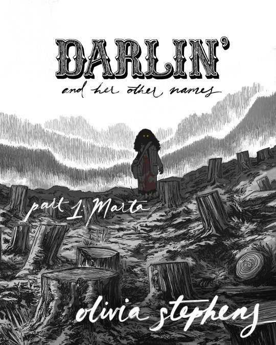
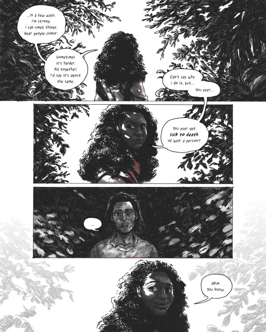


DARLIN’ AND HER OTHER NAMES, PART 1: MARTA
The first installment of my new werewolf-western-horror-romance comic is available now on gumroad and itch.io!
www.darlincomic.com
90 pages, mature readers only.
DARLIN’ is intended for mature audiences. This comic contains elements which some readers may find distressing, including:
murder, gun violence, animal cruelty and animal death, blood, gore, body injury/horror, nudity, and language.
Please proceed mindfully.
Title designs by Binglin Hu.
(Thank you to friends, family, patrons and readers for your patience and support during the making of Part 1!
I also want to give my immense thanks to Tin House, Mineral School Artist Residency, Artist Trust and MacDowell for providing time, space and support during various stages of Part 1’s progress. It means the world to receive validation for this weird little self-published project.)
#darlin' and her other names#darlin#comics#graphic novel#indie#self publishing#comic#werewolf#werewolves#cryptid#horror#western#romance#genre fiction#webcomic#indie comics
1K notes
·
View notes
Text
We need more horror romance—and I don’t mean dark romance, or gothic romance, or romance with a twinge of horror. I mean horror with romance. I want the two to be so deeply and disturbingly intertwined that you’re not sure where one ends and the other begins.
#horror#horror graphic novels#horror gothic#dark romance#american horror story#ahs#dark fic#dead dove enjoyer#dead dove blog#dead dove do not eat#phycological horror#hannibal#writers on tumblr#writeblr#writing community#creative writing#writing inspiration#writerscommunity#romance writing#writing#horror romance#horror films#horror community#horror movies#horror genre#ahs fandom
66 notes
·
View notes
Text

152 notes
·
View notes
Text
Paleolithic Media Catalogue
Hello everyone :) Short story first: When I began brainstorming for my prehistoric story, I started wondering what other prehistoric fiction there is out there. I was not familiar with it and have not seen much. That's when I started my grand literature review and began a search for what fiction exist out there. I wanted to know what kinds of stories are being made with this time period. What are the common themes or recurring ideas (I found lots of humans and dinosaurs works. And time travel). Since I've had a growing collection on my computer, I decided I should keep on enlarging it and put it online. It's nowhere near complete. I'll slowly keep accumulating the collection as I find more. I only have fiction books and comics right now. I still need to work on the film section.
You can access the blog here!
***
As for where I am in my reading, the one's I've finished reading are Earth's Children series (book 1-4. Dropped it afterwards lol. I made a post on with fanart) Dance of the Tiger and it's sequel Singletusk (They were good! I'll upload my review on the blog), and Sisters of the Wolf (It was ok!). I got my hands on The Inheritors and excited to start reading it. I REALLY want to read the Shiva trilogy, but I found no PDF online... and it's out of print :( There is certainly old copies on ebay. And I want to read Chronicles of Ancient Darkness. There seem to be lots of good books out there.
#For whomever might find it useful... I'm doing this#I actually found another huge catalogue by an awesome person called Stephen Trussel#However their site has not been updated since 2016#I've linked their site on my blog when referencing the ENG translation for 'paris before man'#I'll make a paragraph dedicated to that site too#This has gone beyond my initial literature review lol#But for someone writing in this genre.. I've got to get to know it well#Because If I do end up publishing it I KNOW for sure it will be set up against other prehistoric fiction#mainly earth's children series#LITERALLY every book I checked had people in the reviews comparing it to Auel's series. Like it's the blueprint of prehistoric fiction#Like it's 'The Lord of the Rings' of its' genre.#and since it's a graphic novel maybe it will be compared to other comics?? Which I haven't found a lot YET#Emmanuel Roudier's work looks SO GOOD#I say looks because it's in French and I can't read French#I'm tempted to try translating it with what little French I learnt from public school and actually learn French in the process#Mezolith is great but it's not a full story. Just small snippets/short stories#Same with Tiger Lung. It's great. Also very very short. I recommend both.#I have not read the mangas yet. I read the first few chapters of Grashros and it's 100% Shounen stuff so far lol
53 notes
·
View notes
Text
hey 👋🏻 what are your favourite shorter stories (novellas, novelettes, short fiction in general), ideally under 150 pages?
i really really want to get into reading frequently—but more importantly, consistently—again, and i have been told that shorter books can ease you back into it bc you usually get through them more quickly
#i know we're not in the Age of the Novella but maybe you have some recommendations#i guess graphic novels could also work?#not to diminish the medium#but you know what i mean#also i don't have specific genre preferences
16 notes
·
View notes
Text
All I need is chocolate and season two of dead boy detectives
#dbda#dead boy detectives#netflix you can’t think you can fill the urban fantasy genre only with the umbrella academy so you either give us at least 3 seasons or#or you’ll give us the raven cycle tv show#actually both would be good but I have priorities first and since I have BOOKS about my girl blue and her boys its the baby ghosts’ turn#I love me some graphic novels but I read them in like two hours and then there’s no more like ever and I need good stuff to never end
24 notes
·
View notes
Text
Saying that media, literature, and artwork isn't political is anti-intellectual ideology meant to silence minorities and artists.
#hot take#truth#real talk#artwork#politics#comic books#marvel comics#marvel fandom#comic book movies#graphic novels#books#books and movies#tv and film#horror genre#leftist#anti intellectualism
65 notes
·
View notes
Text
If the posting hasn’t been enough: vvhy don’t vve all listen to Skyjacks. VVouldn’t it be lovely if vve took the time to listen to the 18th-century alt history folkloric fantasy tale inspired by the music of the Decembrists and the card game Illimat, worked on by a variety of freelancers including Patrick Rothfuss, heavily influenced by Terry Pratchett’s novels (specifically Tiffany Aching). I can make guides. I can make writeups and summaries. Join us in the skydome.
#it’s an interesting fantasy work that explores some lesser-investigated corners of the genre.#I am this close to harassing my coworker about it but she’s non-Anglo and prefers to have audiobooks be in a different language so I can’t#when eventually it gets adapted into an acclaimed graphic novel and translated. then.
7 notes
·
View notes
Text
#poll#polls#tumblr polls#augmented polls#books#book genres#genres#fantasy#horror#thriller#action adventure#dystopian#graphic novel#sci fi#nonfiction
19 notes
·
View notes
Text
@ Goodreads Choice Awards: Why is there a romantasy category but no category for graphic novels?? Or kids books?? Or poetry??
#fuming!!!#why are the smutty dragons more important than GORGEOUS graphic novels???#glad romantasy is getting people reading#(also glad it's separated from the fantasy category)#but there are other genres too!!#goodreads#goodreads choice awards#books#booklr#bookish#reading
27 notes
·
View notes
Text
Happy 2024!
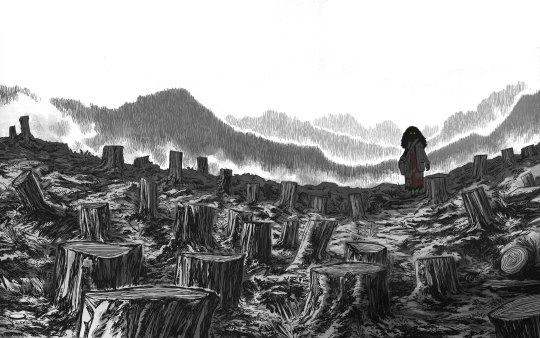
A new year has started so I wanted to give a quick primer to newer followers about my Patreon offerings and how you can support my ongoing comic, DARLIN’ AND HER OTHER NAMES...

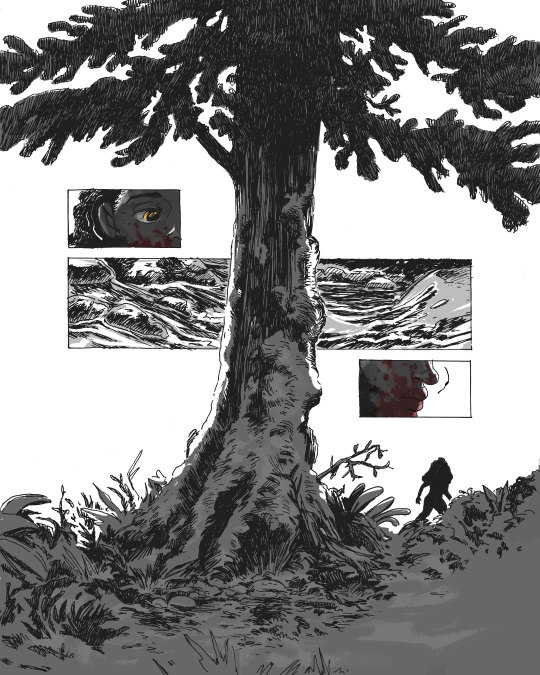
DARLIN’ AND HER OTHER NAMES is a werewolf-western-horror-romance comic set in 1881. The story follows two strangers who meet in a moment of mutual desperation and forge a vengeful partnership. The first installment, Part 1: Marta, was self-published online in March 2023. Since then, DARLIN’ has won an Ignatz Award and I’ve been bowled over by folks’ enthusiasm for the comic!
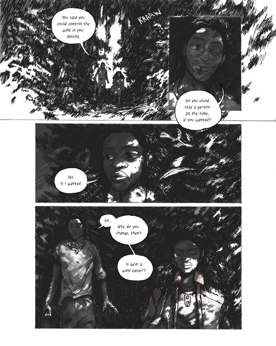

At the end of the day, DARLIN’ is a passion project created in my free time and it relies on reader support to continue. In addition to helping me dedicate more time to DARLIN’, pledging to my Patreon includes perks!

For $1+ a month, you receive access to:
Weekly process posts about progress on DARLIN’ and various other projects
50% off discount code on all PDFs
For $5+ a month, you *also* receive access to:
100% off discount code on all PDFs
Weekly “Director’s Commentary” posts: I serialize Part 1 of DARLIN' a page or two at a time alongside my notes, reflections, challenges, and influences for each specific page/scene. It’s a chance to dive even deeper into the nitty gritty of my process. I’ve unlocked the very first Director’s Commentary post for the public as an example: https://www.patreon.com/posts/part-1-marta-000-87167548
I’m excited to keep making comics independently this year. But the amount of time I’ll be able to pursue them depends largely on the support of readers, so consider pledging if you want to see more DARLIN’ (and other weird comics) from me in the future!
And even if you aren’t able to pledge, it’s always massively helpful to share posts and tell your friends about indie work that you love, especially in our current social media nightmare.
Thank you! Every bit truly helps.
#darlin' and her other names#darlin#comics#graphic novel#indie#self publishing#comic#werewolf#werewolves#cryptid#horror#western#romance#genre fiction#webcomic#indie comics#comic art#original character#original art#my art#artists on tumblr#oc#halloween#paranormal romance#fountain pen#ink#digtal art#traditional art#black artists on tumblr#art
45 notes
·
View notes
Text
recent google searches: how to gently explain to booktokkers that i don't disregard their fravorite "smut" bc i'm a prude, but bc it's bad writing
#i WILL die on fanfiction hill#but the POINT (one of them) of fanfiction is the MISSING SCENES#you know why the graphic spirk sex scenes weren't shown? why ron and hermione didn't funk nasty on page?#bc aside from genre and general media conventions it's not pertinent!!#so when you hand me AU r*ylo fic that's 25% graphic sex [that's not to my taste] in a 'original novel' mustache#i who have never watched star wars nor care ever to am just. I Don't Want These.meme#i CAN list books with graphic sex that i appreciate and enjoy and that would not be the same book without those scenes#none of them is a mainstream romance novel#see why boyfriend material is my favorite book atm: a romance that chunky and there's not even a solid sex scene. it's character dev babey!#thoughts#to clarify: i need to google this bc obv this is not. Gentle.
20 notes
·
View notes
Text
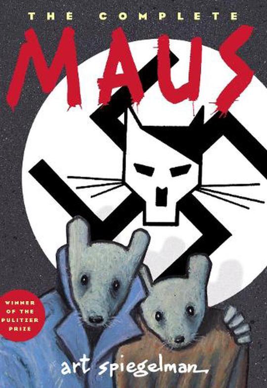
The Pulitzer Prize-winning Maus tells the story of Vladek Spiegelman, a Jewish survivor of Hitler’s Europe, and his son, a cartoonist coming to terms with his father’s story. Maus approaches the unspeakable through the diminutive. Its form, the cartoon (the Nazis are cats, the Jews mice), shocks us out of any lingering sense of familiarity and succeeds in “drawing us closer to the bleak heart of the Holocaust” (The New York Times).

100 notes
·
View notes
Text
People hating on each other for what books they like to read is wild, what are you proving, not your own intelligence that is for sure
#i have mutiple translations of the iliad acotar every riley sager book and the adventure zone series on mg shelves#and it was all enjoyable#i dont care about your classics degree or that you think romantasy books are boring or graphic novels suck#i like books#i enjoy stories#ive very rarely met a book i didnt like#and even then it hust wasnt for me#and that stretched over several genres#those same books have changed people's lives#calm down about madeline miller and manga and smut and kitschy mystery thrillers#no one cares how hardcore you are#especially me#mo moans#also do not ever think you deserve to speak down to me for enjoying something genuinely#your dislike isnt that youre smarter or better its that youre a boring asshole that cant shut up
5 notes
·
View notes
Text
do u guys have book recs 🧍♂️ finally getting out of my reading slump but still mostly rereading.. would love to crack a fresh book open
#i love autofiction & short story collections & memoirs & weird horror & Weird Horror the genre & poetry :)) and graphic novels sometimes.#basically anything goes rn pleaseee
23 notes
·
View notes
Text
Book Cover Design 101: What Makes Up A Cover
So, I promised at one point to talk covers, specifically book covers and what makes a good book cover. And I realized that to talk covers, I need to make a few things clear and that means understanding some basic concepts/terms.
This is going to be long since it's more complex than you think. I also ramble a lot. LOL.
To go over the terminology and the basics, I'll use covers that are currently bestsellers on Amazon that I've screen-capped. Here's some of the important terms/concepts:
Font - This should be self explanatory. There are four kinds of fonts that are generally used: Serif, Sans Serif, Script, and Unusual. Script and Unusual can be Serif or Sans Serif. And font choice is really important in conveying genre and readability.
Image - Also self explanatory. The image can be made up of several images stitched together, various effects, gradients, vectors, and it can be illustrated or photographed or a combo.

This is the current cover for Loretta Chase's Steamy Historical Regency Romance "Lord Perfect". It's a pretty standard clinch cover. (Called clinch because one character, typically the dominant male, is clutching the other. This is also true in LGBTQIA+ covers.) The coding is spot on... Let me break it down:
I'm going to talk font first.
The LIME arrow points to the testimonial/endorsement. In this instance, it's a generic author endorsement by Julia Quinn... the author of the Bridgerton series (and another big name HistRom author). Publishers, especially trad pub, love these because they think that readers will read books if one of their favorite authors endorses that author. Julia Quinn also writes steamy historical regency romance, so if she's endorsing the author, they likely write the same genre. This text is in black in a simple serif font. This text is the least legible because it's the least important.
The RED arrow points to the author name. For this book, it's the largest bit of font on the cover. That's because Loretta Chase has a large following and HistRom readers are nothing if not devoted to their favorite authors. This is often true across all genres. The larger the author name, the bigger deal they or their publisher think they are. The author text is also in a SLIGHTLY different color than the title or the brag. This is because the cover designer chose to have all of the important text on the bottom of the cover (Viable choice), but they want people to know which is which. The author name is in a slightly swishy serif font and each letter is capitalized with the L of Loretta and the C of Chase in a larger font size. There's also a drop shadow under it. This is the most legible because it is what the publisher deemed the most important.
The YELLOW arrow points to the brag. This is where the author lists their most important achievement. Did they make the USA Today bestseller list (the easiest of the major paper lists)? Then, you'll see that. New York Times (Super hard for Romance since many of their partner stores don't sell Romance)? Then you'll see that. Bestseller with no listing? That means they cracked the top 100 in their category on Amazon (or another site... but Amazon is most likely). International Bestseller with no listing? That means they cracked both the U.S. bestseller charts and at least one of the other country stores (again this is likely on Amazon). Some people only put bestseller on their brag if they reach number one in their category. But it is absolutely not consistent. If they list a book/series title, that's because it is trying to appeal to readers of that book/series. The brag is in a simple serif font (probably the same as the endorsement), but in white and larger because it's more important.
The MAGENTA arrow points to the title. It is in a simple script font and as the title, it's the second largest font on the cover. It also has a drop shadow to make it stand out. For some reason, it's not perfectly centered... No clue why, likely a mistake or a crop from the paperback version (the dimensions are different for ebook and paperback). Script fonts are really common in romance, especially historical romance.
On to the image itself.
The AQUA arrow points to the characters. They are models who have been to a photo shoot. This is a photorealistic cover, although in past years they were actually painted. And even today, many designers will run the photo through a program to add a paintbrush effect. They're dressed in sort of historical clothing... as is very common for trad-pub it's pseudo historical. (In a former life I was a costumer.) It is very likely that the woman actually wore a white dress and the color has been added by the cover designer. I am 90% certain that I've seen both models before, especially the male. I don't think it's the fat-phobic dude, but it could be. The fact that the clothing is partially off hints at the steamy nature of the contents within--the color of her dress adds to this too. For some characters, you'll get headswaps. If it's done right, you won't notice.
The BLUE arrows point to the background. This is a little complex, so let me break it down... There are at least Three, although I think Four images that are stitched together to form the background. The Roses, the Stairs, the Building, and the Fence that runs into the building. There MAY be an additional image above the fence of some trees. But I'm not totally sure because of the effects. The background is telling a hint of the story and also playing into Historical Romance Tropes. The color appears to be a gradient that's slapped over the stitched background - possibly two... The Red again hints at the steamy nature. And, if this is part of a series, it's likely that each book in the series will have its own signature color for the cover. There's also a paint stroke effect that is most noticeable over the arch fence thing. That stroke effect does double duty. It draws your eye to the characters and it also hides/obstructs the stitching on the background.
Let's move on to a different cover. This time I've chosen a serial killer/police procedural (Think "Criminal Minds") that has been put out by a medium press publisher.

Starting with the font. As a note, none of the fonts have a drop shadow or outline to them. And they appear to be all the same sans serif font, I think.
The MAGENTA points to the title. You are a LOT more likely to see sans serif fonts in Mystery than you are in Romance. The font color matches the color of the character's coat. As well as the series title & number. There's a small cloudy overlay to the text that hints at the fog of mystery. On this book, the title is the most important thing.
The RED arrow points to the author's name. Note how it's smaller than the title, but it also stands out. This is the second most important thing.
The LIME arrow points to the Series title and Number. This is so readers of the series know where they are. Third most.
The YELLOW arrow points to the hook/flavor text/tagline. This a little tidbit to try to reel in readers, or at least get them to go on and read the summary/blurb. Fourth most.
The WHITE arrow points to the self endorsement. Apparently the author couldn't even mine her reviews for an endorsement, let alone a publication, blogger, or another author. This is more common in smaller press or indie pub. I'm putting my money on the publisher, though. This is also the least important element on the cover.
On to the image.
The AQUA arrow points to the character. Based on the other covers in the series, this is probably the main character... D.I. Lottie Parker. It's incredibly common in mystery to show the lead in either silhouette or from behind. This is because publishers want the reader to be able to insert themselves into the detective role. (It's also why so many YA covers do the same, JSYK.) The only colors on the cover are on the character. Their coat and their hair. That's it. Monochromatic is also common in Mystery/thriller. (And Erotica, but that's another post).
The BLUE arrow points to the background. There are at least five images stitched together... And I'm fairly certain that I've got at least two of them from various stock photo sites. The birds are one layer, the tree limbs at the top another, the clouds that overlay are yet another, the house is its own thing, then there's the dock. It's possible that the hills in the background are another image, but that seems like a lot of work. (There's a ton of dock in lake photos out there.)
So now you should have a good idea what makes up a cover.
I've got more to say on this, but this post has gotten long enough. I told you I'm long winded. LOL
#cover design#book covers#graphic design#cover shorthand#what makes up book cover#long post#discussion of book genres#romance novels#mystery
142 notes
·
View notes