#gamesdesign
Explore tagged Tumblr posts
Text
Concept

Here's a concept I made for a Mario style 1UP powerup
2 notes
·
View notes
Text
Justice Deity
Another addition to my deity project! This is a Justice Deity. I definitely wanted him to look almost like an executioner, with medieval inspiration for the armour.
I really enjoyed playing around with a more painterly style and not worry so much about blending everything together to look super smooth!

6 notes
·
View notes
Text
Illustration progress update #2 - Justice Deity
This post is a combination of multiple separate days of work.
After getting the outline prepared for the character, I put down some flat colour and chose the colours I wanted to work with. (Image 1)

I wanted to try to use a looser style and stick to just one layer for the colour and detail, it was definitely a challenge but I was able to work much faster and still show the idea of the character well. (Image 2)

I added some blood splatters onto the axe head to make it more interesting and show the idea of an executioner a bit better. (Image 3)

I created a dark blue layer set to Overlay and put at 50% to make the armour look better, I also used some red on a Soft Light layer at 70% so make some of the lighter red areas stand out more. (Image 4 + Image 5)


I added another Soft Light layer at 50% specifically for the red glow coming through the helmet. (Image 6)

To finish off, I did some work on the background and lighting. I painted a fog like effect behind the character and using a dark gradient added some shadow. (Image 7 + Image 8)


Next I added in a gradient Hard Light at 50% and a Soft Light at 40%. I really wanted it to look as though light was coming through from the top left of the piece, almost like it was coming through a ceiling. To finish that effect I added a final gradient set on Overlay at 20%. (Image 9 + Image 10 + Image 11)


Then it was time to clean-up and merge the layers together. Giving the final result.

It was definitely challenging to work on this piece and finish it without blending everything so it looks smooth, but it was good to experiment with a different style.
#illustration#characterdesign#art#painting#photoshop#digitalart#gamesdesign#university#xb3992#artist#gamedesign
3 notes
·
View notes
Text
It’s been a while but we are still up and running and if you haven’t been able to see our updates.. then here we are
The Dark After Dawn: Basic set is heading towards release to introduce you all to our world of Mystical chaos!
A new website has brought us, our merch, information pages and updates all on one place that’s easier to manage. www.darkaftergames.myshopify.com so Take a little look around.

And then come and say hey!
#ttrpgrising#ttrpgsolidarity#horror#ttrpg#ttrpg community#ttrpg design#ttrpg memes#gamesdesign#designer#indie ttrpg#ttrpgfamily
1 note
·
View note
Text
Finishing the resubmission - Part 4
Yesterday and today I finished up on documentation and on creating renders for the models, I also did a design video explaining my design process and a show reel to showcase the game.
Below are the renders for the game world.


Below are all of my renders for the models I made and textures.


I have also included the show reel in this post.
With all of my documentation ready and files checked and submitted, that is the end of this project. I am really happy with the improvements I have made.
1 note
·
View note
Text

Help i'm stuck in the playing sawayama solitaire dimension, I had things to do
#also if this continues even more solitaire variants are going to fall from the gamesdesigns hat and i don't know if we need that#thats what the people want right#more solitaire variants#because everyone is playing solitaire in 2024#im so hip and cool and with it#thats what marketing is all about baby#I've already done an SCP-inspired one also because of course this crossover makes sense#im very happy with the layout actually
0 notes
Text

Love doing character poses. Especially with a fun concept. Here are a few from a game I worked on some years ago. Everyone did great work on that project and it was great to see what others came up with. We each had scenes to work on for the game. These are just a few of the poses for characters that were mostly extras in that scene.
#mikecressy#artists on tumblr#artwork#illustration#drawing#art#redpencil#characters#gameconceptart#wizardofoz#gamesdesigns#munchkins
0 notes
Text
instagram
Os primeiros games de #xboxone a gente nunca esquece!!!
#Tbt#videogames#games#gamesbrasil#gamesbr#gamestagram#gamesretro#gamesretrô#gamesroom#gamesnight#playgames#jogadorgamer#jogosretro#tutorialgames#gamer#jogagame#gamesdesign#gametime#picoftheday#sigodevolta#followmeandfollowback#picoftheday📷#picofthedays#instapicoftheday#instagood#alphavilleearredores#barueri#sp#Instagram
5 notes
·
View notes
Photo


Year 2 Core Project 1 - Week 1 - Flat Shaded
Blog Homework: Upload Flat Shaded ‘tasty meal ‘ images on your blog. Can be painted by hand / digitally or Vertex Painted in Maya.’
Being stuck inside i decided for this project i would make it slightly fun going for food i miss having, such as a KFC :) i was looking through a couple images and found this image and thought it had a lot of variety in colour which would make it more fun. I started by doing a outline of the picture then bit by bit was adding more and more detail as the images progress. I think when i get time in the future i will model this and vertex paint it for the optional work as i didnt have maya set up at this time :) Final outcome in the next post :)
2 notes
·
View notes
Photo

My light house :)
2 notes
·
View notes
Photo

How many bugs can you find in the code? 👀 #gamedev #TwistedArk #mobilegames #indiedev #gamesdesign #endlessrunner #unity https://www.instagram.com/p/CAF0SiQF7xt/?igshid=ghj90nk3y873
1 note
·
View note
Text
My Creative Journal
- - - My Contact/Info Links - - -
- - - My Journal of Thoughts - - -
Here is where I’ve decided to upload my research & development blogs, creative blogs, etc. throughout my ‘post-uni’ life: [Uni blogs are further down].
+ C# Programming (Unity)
#xyz#heather.r.g.norman#roselollipop#roselollipop.artist#generalist#gamesdev#artist#gamesdevelopment#gamesdesign#animation#digital art#gamesprogramming#gamesaudio#audio#music#creativejournal
1 note
·
View note
Text
3D Model Renders!
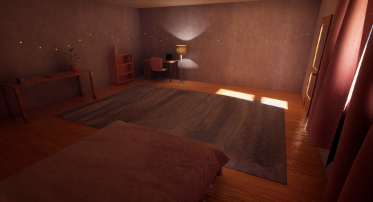
I realised that I never posted the finished renders of the game I made! So here are those renders, as I have mentioned before I modelled and textured everything here. I think that the textures being done in watercolour first was a good idea and I am pretty happy with how it turned out!


#unrealengine#ue5#maya#photoshop#texturing#modelling#watercolour#painting#gamesdesign#gamedesign#artist
0 notes
Text
Illustration progress update #1 - Loyalty Deity
This post is a combination of multiple days of work.
For the next project I wanted to do a god based on 'Loyalty', I began by looking through Pinterest for inspiration of concepts that could work for my idea.
Next I started to explore my ideas, I thought a lot about dogs when I imagined loyalty. I started on some sketches.


Next I worked on the outline, I went through 3 versions of the outline to create one that worked well.


I then laid out some base colours and painted in different shades for lighter and darker parts.


Next I wanted to create a background of stone tiles on both the floor and the wall, almost like the deity is on a bridge.


I worked on some shading and lighting for the background to make it look more interesting.

Next I added some detail to the character, and reworked his body slightly and his face.

To add some contrast I drew in some harsh outline shapes around the armour.

I added some colour and shine to the armour before creating a Multiply layer to add some more shadow to areas.


Below is an image of the finished piece, I am glad I finished another piece before the deadline. He is definitely a much more fun deity!

#university#illustration#characterdesign#photoshop#xb3992#digitalart#gamedesign#gamesdesign#artist#painting
0 notes
Photo

# Red Saturday afternoon October 2019 Matthew Randle #red #saturday #portraiture #art #digitalart #gamesdesign #drawing #art #matthewfrancisrandle #opart #contemporarydrawing #yellow #artistsoninstagram #artontumblr (at London, United Kingdom) https://www.instagram.com/p/B32Sj-nlrSc/?igshid=7j63i1tlkbe8
#red#saturday#portraiture#art#digitalart#gamesdesign#drawing#matthewfrancisrandle#opart#contemporarydrawing#yellow#artistsoninstagram#artontumblr
6 notes
·
View notes
Text
Finishing the resubmission - Part 3
I am going to break down some changes to blueprints as well as new blueprints created during this post.
Starting off with the curtain blueprints.
While I am sure there probably is a more efficient way of blueprinting here, I am an artist and very much a beginner to blueprinting. Though I feel like I managed to achieve what I set out to do.

The last half of this blueprint has remained pretty much unchanged. The only difference past the timeline section is that I decreased the amount the curtain would shrink as it moves slightly so it wouldn't become too small. And of course there is now 4 separate timelines and transforms to reflect the change in 4 total interactable items rather than 2.
One of the changes I made initially was to remove the box trigger, I wasn't sure at first how to make it so items would update without having to walk through a box trigger but a classmate advised using event tick which works so much better. With this, the curtains will automatically begin to open when each condition is met.

I also applied this change to the other curtain BP, the switch actor BP for the plant and the new switch actor BP for the sketchbook.
Due to new items being interactable I also had to set the curtains to check for a variety of combinations. As an example, for the curtain to open further when the player interacts with two objects, any combination of the four objects should work. To make this work I set up several 'AND' statements feeding into an 'OR' this way any combination of items will open the curtain further providing there is at least two of them.

I repeated a similar process for the part requiring 3 items to be collected and all 4.
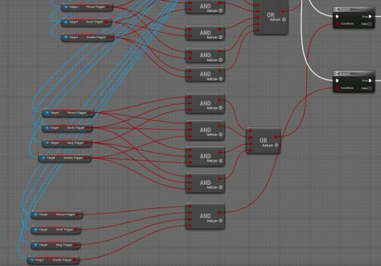
Following on from the branches I added a Do Once function to prevent the game trying to run through everything each time an item is interacted with.

The second curtain BP is laid out in the same way, the difference only being in the direction that it moves away as it opens.

The BP for the plant to update has seen the same sort of changes. Replacing the box trigger to an event tick and making sure that every combination of items works to update the plant. Finally adding in the Do Once to prevent any issues with the game running and checking every part each time an item is interacted with.

The sketchbook is similar to the plant, but with fewer changes. The sketchbook has 3 different materials that show the painting on the front growing over time.
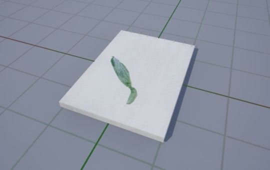
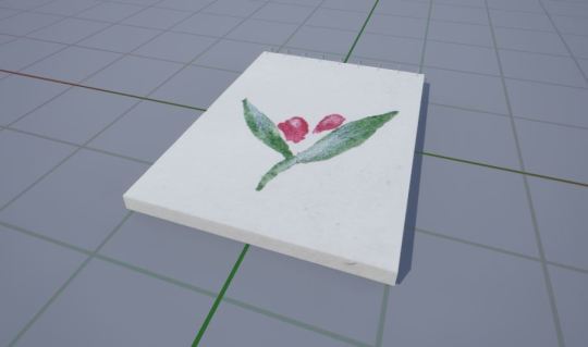
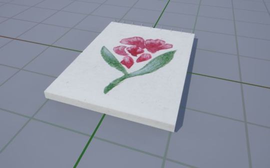
I created the textures by doing 3 separate paintings of the flower growing then importing the watercolour paintings to be textures before setting a material for each.
Unlike the plant there are less changes to this item as there are only 3 versions. So the blueprint was a little simpler than the previous one.

Finally I created an ico file for the game icon to tie everything together just by cropping my plant painting on Photoshop and using a converter online to switch the file type from png to ico.

I think that concludes all of the changes I have made to this project. Next steps will be updating documentation, potentially making a new show reel to showcase the game in its current form and uploading the project.
Everything is packaged and works fine after a few fixes to some minor issues.
I also plan to get renders of all of my furniture I have modelled with the materials applied. I will include these in the next post once documentation and submission is complete.
0 notes