#galleryyuhself/Bruce Cayonne
Explore tagged Tumblr posts
Text


Galleryyuhself - Bruce Cayonne's striking typography takes centre stage for the fete's coming in grappe.
#galleryyuhself/Bruce Cayonne#galleryyuhself/poster design#galleryyuhself/Soca Posters#galleryyuhself/typography#tumblr/Bruce Cayonne#tumblr/posters#carnival posters#Kabuki poster for 2024#Bruce Cayonne#Typography design#typography#poster design#Trinidad and Tobago Carnival 2024
1 note
·
View note
Text
Bruce's cloth

Galleryyuhself - The latest from Bruce Cayonne and in his own words - I had these images of my work printed on this fabric through a partnership of Multi Plot Europe and Moving School in Kassel, Germany last year, as part of Documenta15. My wife (seen in pic) converted a piece of it into the pants she's wearing and I have fell in love with the outcome. I see a the beginning of a clothing brand.
Galleryyuhself - Looking forward to the clothing line Bruce!
#galleryyuhself/Bruce Cayonne#galleryyuhself/typography design#galleryyuhself/textiles#tumblr/Bruce Cayonne#Bruce Cayonne#typography#typography in fashion#textiles and type#lettering
0 notes
Text

Galleryyuhself - Bruce Cayonne celebrates his birthday the typography way.
Update

#galleryyuhself/typography#galleryyuhself/bruce cayonne#galleryyuhself/upcoming events#tumblr/lettering#tumblr/bruce cayonne#bruce cayonne#lettering#posters
0 notes
Photo

Galleryyuhself - Bruce Cayonne extends his reach - 12ft x 8ft billboard on a road in Grenada.
#galleryyuhself/Bruce Cayonne#galleryyuhself/graphic design#galleryyuhself/sign painting#galleryyuhself/Trinidad and Tobago#tumblr/Bruce Cayonne#Bruce Cayonne#typography#lettering#signage#tumblr/billboard signage#Grenada#advertising
0 notes
Photo

~Galleryyuhself~ From the Facebook page of a friend. I am loving this typography heavy work of Bruce Cayonne in this Trinbago-centric eco friendly looking hat.
#Galleryyuhself/Bruce Cayonne#Galleryyuhself/Typography/Trinidad and Tobago#Galleryyuhself/colour and typography#Bruce Catonne#Typography#lettering#stylist#hats.#keeping cool
3 notes
·
View notes
Photo


~Galleryyuhself~ The continuing evolution of Bruce Cayonne’s work.
The bright colors and sans serif brush script is a major part of Mr.Cayonne’s technique. He is now expanding his style to include straighter typography, punchier graphics and even 3D effects.
#Galleryyuhself/Bruce Cayonne#Galleryyuhself/Typography#Galleryyuhself/Signage#Bruce Cayonne#Typography#signage#color#lettering#dimension.#sketching#underline#rainbow tones#graphics
2 notes
·
View notes
Photo
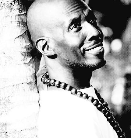
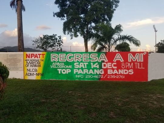
~Galleryyuhself~ Do enjoy an interview that was put together with the Graphic Artist Bruce Cayonne on his history and working process.
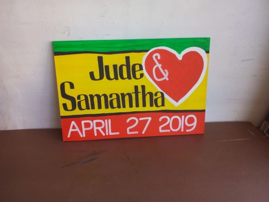
GY1. Tell me about your childhood experiences that led to you making signs.
Q.1 As a child growing up my experience was seeped in creativity. My dad was a joiner by trade, and he was a very creative person that was always making wooden toys and crafts . My home looked more like a museum with wall hangings and furniture made by him. I loved colors as a child so I spent a lot of time drawing and colouring.
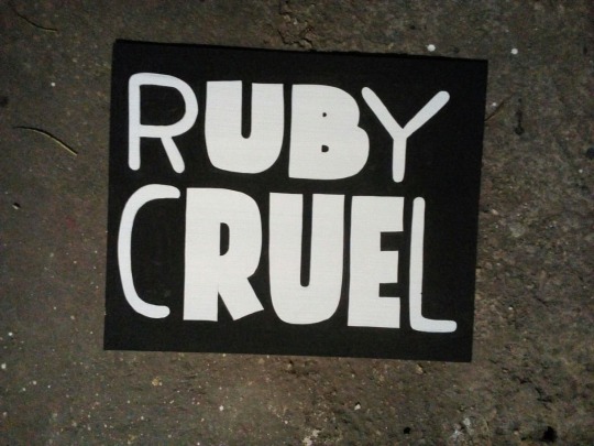
GY2. Did anyone influence your typography? A Teacher, a mentor?
Q.2 I can't say my typography was influenced by any one in particular. However I was always drawn to bold heavy types and that's evident in my body of work. I often found myself creating my own fonts, as it became difficult to find one that bowled me over.
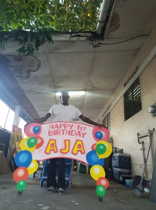
GY3. How did you start your career and when?
Q.3 After spending a few years in fabric painting I signed up for Applied Arts classes in 1988. The classes had an element of sign painting which landed me a job the following year as an inhouse sign painter in the marketing department of a large Company. Even though it was my first real job, it lacked the excitement I was looking for. So after one year I was jobless and on my own ever since. In 1992 I formed part of a team that decided to throw a party that I was entrusted with the duty of advertising. The posters and banners I painted caught the eye of other promoters who started seeking my talent and thus began my career.

GY4. Did you apprentice or did you start on your own?
Q.4 At eighteen years old I didn't know much sign painters, but I was eager to learn, as I had fallen head over heels in love with the art form. I sought out and found one. I was disappointed that I wasn't accepted as an apprentice even though I offered to work without pay. I was unmotivated to continue looking and made a decision to do it on my own. I became good enough to be hired three years later in 1989 to paint billboards for a Company, advertising their products.

GY5. What have been some of your best and worst experiences and can you share some images.
Q.5 When trying to pull out my best and worst experiences from my 30 years in my craft, it becomes a difficult task because there are so many. In reflection my proudest moment would have to be when I was featured in an international art magazine. And I am probably living my worst experience within this pandemic, as it has severely impacted upon my income together uncertainty.
#Galleryyuhself/Bruce Cayonne#Galleryyuhself/Master Sign Painter#Galleryyuhself/Professional Designers at work#style#typography#careers#Bruce Cayonne#Sign Painting as Art#Sign Painting#colour and design
2 notes
·
View notes
Photo


~Galleryyuhself~ When someone’s work is so well known that you have no memory of anything else, then that is a successful Artist. Bruce Cayonne’s signage has been gracing streets of Trinidad and Tobago light poles forever. He has elevated party signage to an art form. This month galleryyuhself honors his great style.
#galleryyuhself/Bruce Cayonne#galleryyuhself/signage#galleryyuhself/poster design#posters#parties#signage#Bruce Cayonne#typography#signs.#typographic design#Trinidad and Tobago
1 note
·
View note
Photo


~Galleryyuhself~ The Typography of Bruce Cayonne,
#Galleryyuhself/Bruce Cayonne#Galleryyuhself/typography#Galleryyuhself/Type style#Bruce Cayonne#typography#lettering#colour#pop#Style
1 note
·
View note
Photo

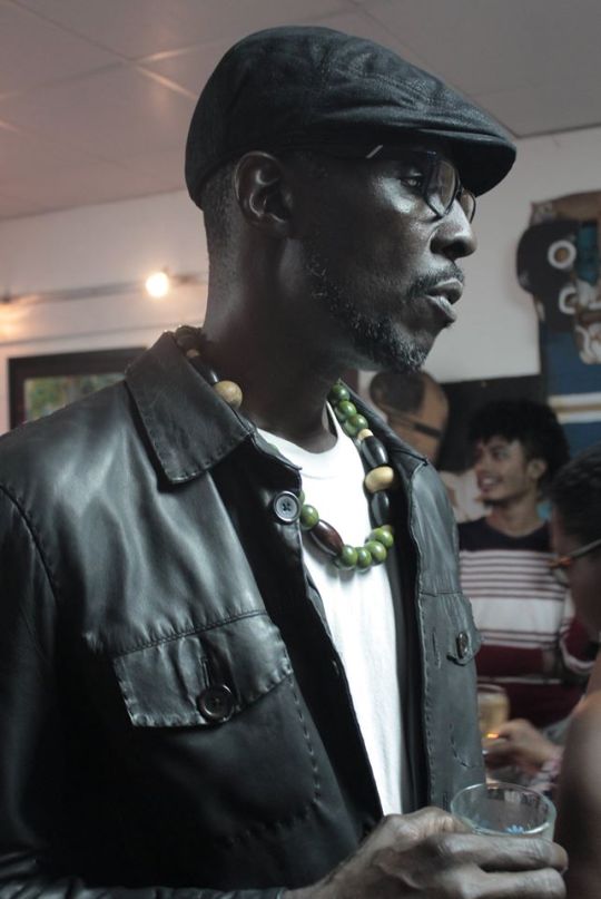
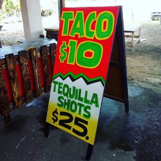
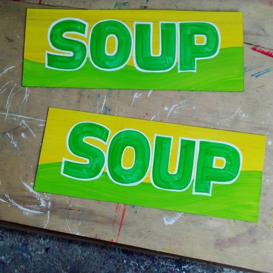
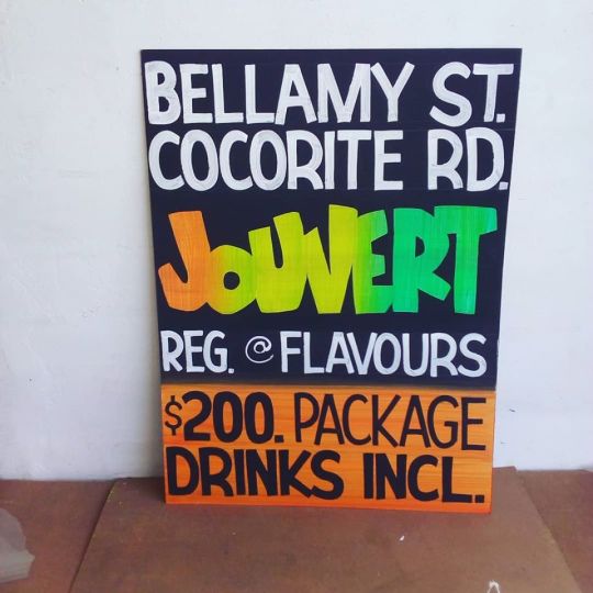
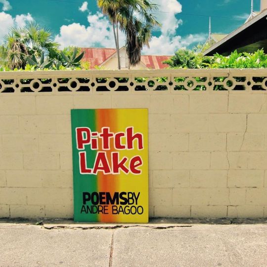
~Galleryyuhself~ No one can deny the indomitable typographic style of Bruce Cayonne. He is single handedly making graphic design a natural part of our social landscape.
#Galleryyuhself/Bruce Cayonne#Galleryyuhself/sign painting#galleryyuhself/typography#Andree Bagoo book cover design#Trinidad and Tobago sign painting#sign design#painted signage#bruce cayonne#typography in Trinidad#graphic design#lettering#style#fete ticket#power of typography#typographic styles
3 notes
·
View notes
Quote
Even though I've been doing this for so many years, it still feels good to know that people take note of, and appreciate my work. Sometimes a lot of effort is put into some pieces, so it's satisfying when it is impacting positively on someone.
Bruce Cayonne
#Galleryyuhself/quotes#Galleryyuhself/notes#galleryyuhself/Bruce Cayonne#typography#signage#sign painting#lettering
0 notes
Photo
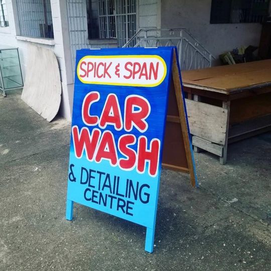
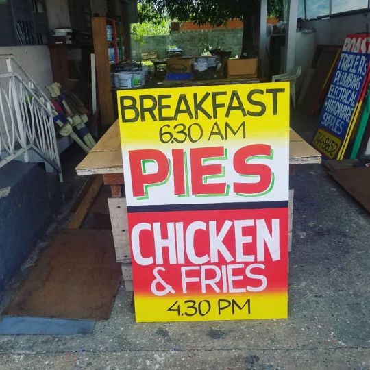
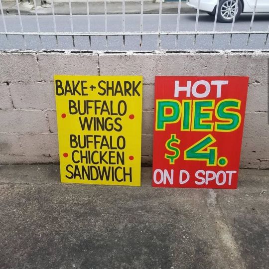
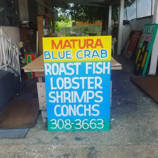
~Galleryyuhself~ The Graphic Designer Christon Chen posted this on his Facebook page today. Bruce Cayonne being featured on POW WOW Worldwide. (GY) His use of typography is basically a trademark in Trinidad and Tobago.
The hand painted signs of @iamthesignman. He has been painting signs for businesses in Trinidad and Tobago for 30 years. Locals say that he has helped to give local DJs, music, and culture a voice. // Via @notsirk.• As a mural festival and arts organization, we are constantly on the search for Black artists worldwide. We are committed to doing the work to amplify Black artist voices. We are committed to educating ourselves and unlearning systems that oppress Black artists in our communities.
#Galleryyuhself/Bruce Cayonne#Galleryyuhself/typography design in Trinidad and Tobago#Galleryyuhself/sign painting#typography#sign painting#bruce Cayonne#christon chen#lettering#signage#literacy#pow wow worldwide#blacklives matter#social distance#wear a mask
0 notes
Photo


~Galleryyuhself~ A wonderful eye catching project for a worthy cause.
*********************************************************************
PINK PEPPER SPRAY Part Deux of Trois - Part One was removed Wednesday morning by Port of Spain City Corporation. Great job if all the signs in the city were removed as well. Our public servant friend was instructed to remove the embarrassing message facing the parliament. The signs are not rubbish and are actually worth money.
DESIGN - The grommets were carefully placed to reference the letter "V" for violence vagina/vulva/uterus shape/victim, connected by yarn and embellished by feathers suggesting flight and Carnival. The signs are secured by red/black/white zipties (national colours).
The gesture of symbolically exposing the genitalia of our fallen angels facing government is similar to "raising your skirt" to your leaders and says NOT GOOD ENOUGH and more (see shelanagig, Euro version of jammette).
Finally, I take no offence but please do not blame us, the male artists, for not saving the signs - this is what happens to them. I remind my dear feminist friends that you may go dig them up and continue the protest or hire Bruce Cayonne to replicate or produce other designs - the options are many. AND stay tuned for Part Trois, SPLOOSH, the open source home made pepper spray dispenser for mothers who are making their own sauce while waiting on government and authorities.Please add the new gender based violence victims names to the empty sign. @iamthesignman
#Galleryyuhself/Protest posters#galleryyuhself/pepper spray requests from the public/Stop violence against women#galleryyuhself/Trinidad and Tobago/Graphic Design#Bruce Cayonne/Michael Lee Poy#Posters#Protest Posters#protest#feminist#feminism#violence against women#pink pepper spray#symbolism#typography
3 notes
·
View notes