#Typography design
Explore tagged Tumblr posts
Visit Tumblr Blog
Explore Tumblr blogs with no restrictions, modern design and the best experience.
Last Seen Tumblr Blogs


Fun Fact
There were a total of 171.5 billion posts on Tumblr in 2019.
Text

BONUS: if you ever wondered what it would look like if you wrote "WHAT?" 616 times (and then some) by hand, here it is:

(if you like this, grab it here in my shop!)
#digital drawing#tw: flashing lights#digital art#illustration#artists on tumblr#digital illustration#graphic design#graphic art#typography#relatable#relatable art#animated gif#gif#simple animation#typography design#typography art#handwritten#lettering#retro aesthetic#retro
126 notes
·
View notes
Text
Thursday, October 19.
Typography.
It appears that #typography is trending today. We know not how, or why. But we won't argue. What is clear is that there are a whole lot of y'all—millions, even—who understand that it is not just what you say that matters, but how it is said. So say it. Say it well, and say it with style. White space is your weapon. Be exact in your spacing. Choose your font wisely.
#today on tumblr#typography#typografie#font#font design#font matters#font size#writing#graphic design#design#typeface#lettering#white space#type#creative writing#writblr#typography design#typography art#typo#art#writer
363 notes
·
View notes
Text


👿📖
#bendy#bendy and the dark revival#batdr ink demon#ink demon#bendy fanart#bendy ink demon#bendy demon#the illusion of living#joey drew#typography#typography design#graphic design#book cover#book cover design#bendy art#bendy fan art#bendy and the ink machine#batim
68 notes
·
View notes
Text

35 notes
·
View notes
Text

Men Beer Design Casual T-shirt
#tshirt #casualtshirt #tshirtdesign #tshirtprinting #outfit #menstshirt #menfashion #fashion #style #cloth #dress #fashionontumblr
#outfit#fashion#typography#tshirt#menstyle#men tshirt#tshirt design#men fashion#casual outfit#fashion on tumblr#clothing#dress#typography design
8 notes
·
View notes
Text


Poster design and mood board for Will Woods Song Marsha, Thankk You for the Dialectic but I Need You to Leave off of the Normal Album.
#art#my art#artists on tumblr#digital art#typography design#design#digital design#digital aritst#graphic design#will wood#will wood and the tapeworms#will wood art#the normal album#wwattw#wwatt fanart#moodboard#music#music poster#music moodboard
32 notes
·
View notes
Text
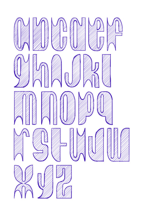
#typography#typography design#typeface#graphic design#lettering#font design#designed by me#debbie van cauwenberghe
28 notes
·
View notes
Text
How I did it in After Effects under the cut.
(instagram)
Used path animation for morphing, so I don't really know what I can add to that. Maybe I should record my screen while doing that.
Anyway that cool retro TV effect can be achieved by stacking these effects on Adjustment layer over the whole project:
Posterize time - 12;
Roughen Edges - Border - 2; Edge Sharpness 5; Fractal Influence 1; Scale - 100; Complexity 2;
Turbulent Displace - Amount 2; Size 100; Complexity 1;
Turbulent Displace 2 - Amount 30; Size 2; Complexity 2;
Gaussian Blur - Blurriness 8;
Sharpen - Amount 100;
Quick Chromatic Aberration 3 (free plugin) - Distort Aberrate 1% (Under 'Stylistic');
Noise HLS Auto - Grain; Lightness 5%; Grain size 2;
Animated changing colors by adding Gradient Ramp effect on the letter.
I also used wiggle(12,2) expression on the letters Position so it would kind of jitter around as things do in old TV tapes.
Oh, and of course some moving texture over the top (under Adjustment layer).
#art#drawing#illustration#artists on tumblr#artwork#animation#2d#2d animation#2d art#motion graphics tutorial#motion design#motion graphics#typography#text animation#type animation#typography design#typography art#typography animation#learning animation#2d artwork#retro aesthetic#retro style#mograph#digital animation#artists#digital art#digital illustration#digital drawing#digital painting
15 notes
·
View notes
Text
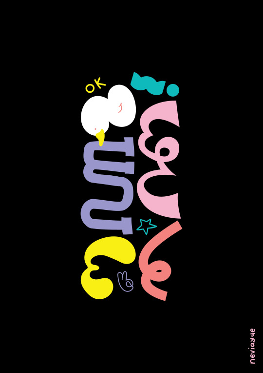
ok | By Nevi Ayu E.
The fourth of my monthly Aksara Jawa Typography Poster project! I wrote o-ke (okay) but put it sidewards, so you need to tilt your head to the left to read it... or not lol. I've seen a lot of designers use this typography technique of having different styles for each letters and reaaaally wanted to try it too, so here it is! The left column reads 'o' and the right one reads 'ke' and ends with an '!'.
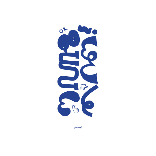
#poster design#poster art#posters#typography poster#typography design#typeface design#aksara jawa#javanese script#ok#okay
3 notes
·
View notes
Photo

| typeface by Marta Przeciszewska |
45 notes
·
View notes
Text

>:D
8 notes
·
View notes
Text
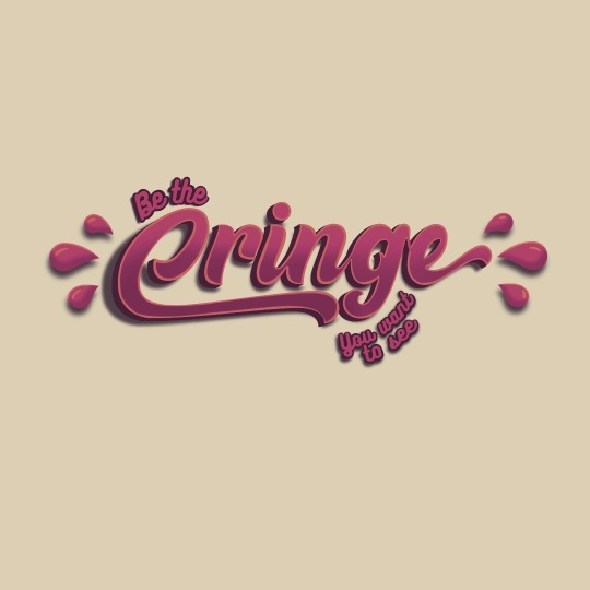


✨ be the cringe you want to see ✨
I’ve been wanting to work on graphic design and typography lately so this is what I made today,
I will probably use this for stickers or badges at some point, I think it came out pretty good!
#typography#graphic design#graphic design is my passion#i am cringe but i am free#cringe culture is dead#cringe culture is stupid#cringecore#i am cringe and i am free#cringe is dead#cringe but free#my art#graphic design practise#typography design#be the cringe you want to see#be the cringe you want to see in the world
16 notes
·
View notes
Text

Typography T-Shirt Design
4 notes
·
View notes
Text
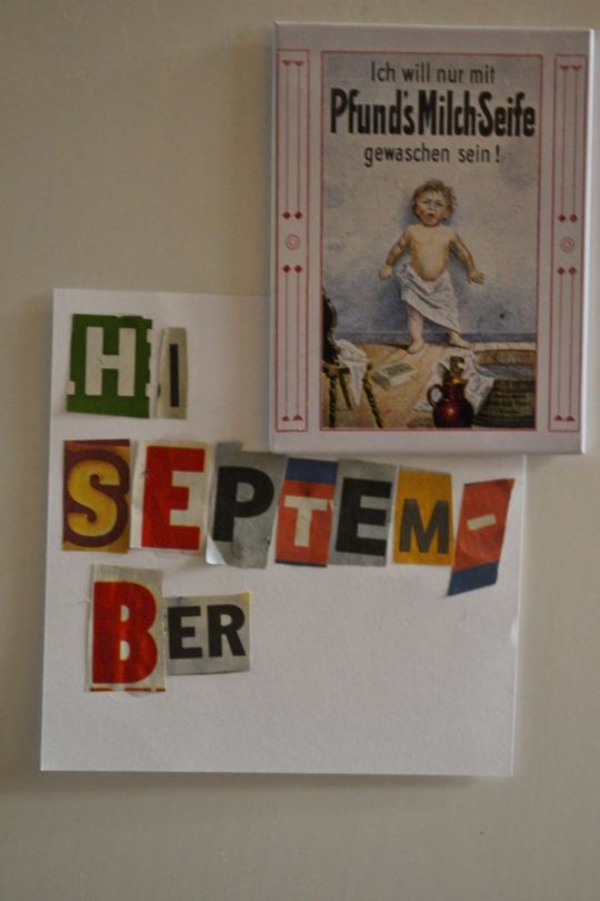
Hi September
#design#designer#anti instagram#art#my artwork#my work#my art#original my work#graphic design#art by me#typography design#typography#hi september#lettering#letters#art project#content creator#gabber artist#artist#artwork
5 notes
·
View notes
Text

26 notes
·
View notes
Text
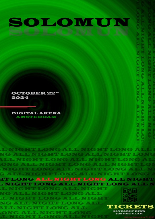
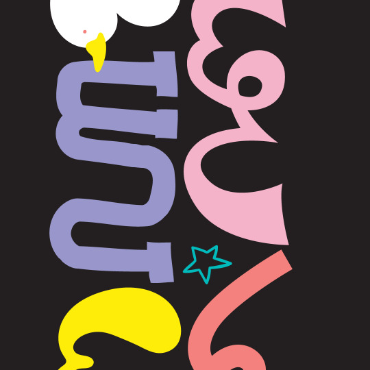
all night long .
#typography#typography design#poster#digital art#DesignInnovation#DigitalArtistry#CreativePixels#DigitalMasterpiece#DesignRevolution#PixelPerfection#DigitalCanvas#DesignInspiration#VisualStorytelling#DigitalImagination#DesignsOfTheFuture#GraphicGenius#ModernAesthetics#DigitalDreamscape#CreativeCoding#DesignDynamics#PixelPower#VibrantVisuals#TechTouchedArt#DigitalDesignTrends
3 notes
·
View notes