#frank newbould
Explore tagged Tumblr posts
Text

"Tighten Your Grip!"
by Frank Newbould (1887-1951)
364 notes
·
View notes
Text

Poster for the Daily Mail's Ideal Home Exhibition (now Show) at the Olympia exhibition centre in London (1928). Artwork and design by Frank Newbould.
#vintage poster#1920s#Frank Newbould#ideal home exhibition#london#olympia#rainbow#home#house#british#exhibition
46 notes
·
View notes
Text
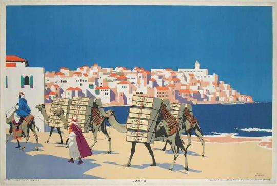
Jaffa, palestine
1929
#Jaffa#1929#يافا#فلسطين#genocide#ethnic cleansing#Frank Newbould#postcard#cartoon#free gaza#free palestine#vintage#Black and White#quotes#inspirational quotes#life quotes#Rachel#corrie#gif#Illustration#tumblr#WoW#mp100#hannibal#dungeon meshi#art#artist#NEWS#updates#Palestine
20 notes
·
View notes
Text

Holland via Hull-Rotterdam
Cheapest route from Scotland & North of England
~ Frank Newbould (British, 1887-1951), circa 1928
1 note
·
View note
Text

'Buy Jaffa Oranges'. Frank Newbould. 1929.
20 notes
·
View notes
Photo
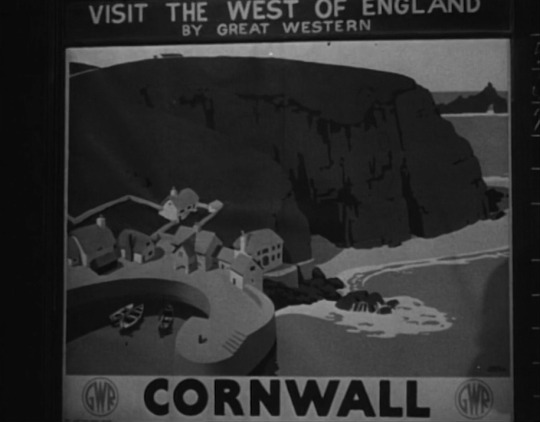
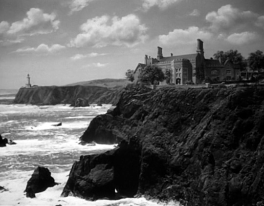
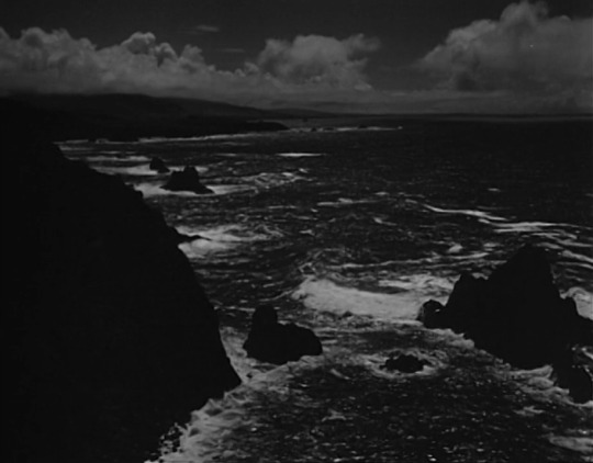
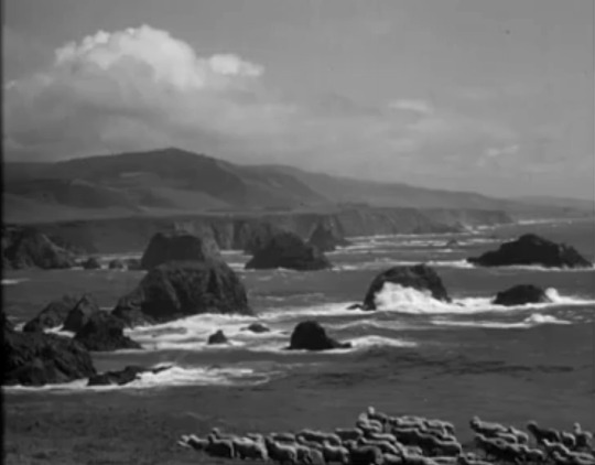
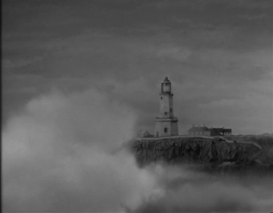

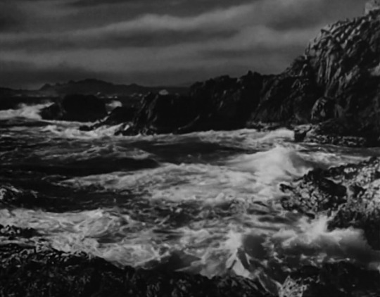
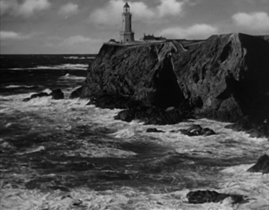
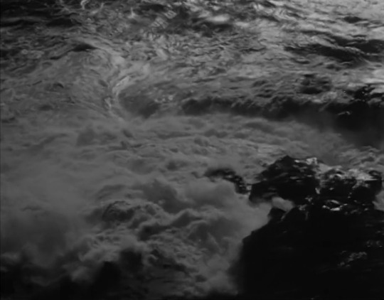
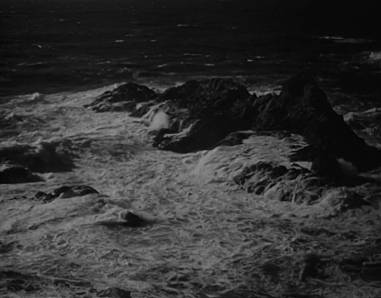
The Cornish Coast in The Sign of the Ram (1948)
Shot at Lizard Point, Cornwall, England (+ some compositing of the house and lighthouse)
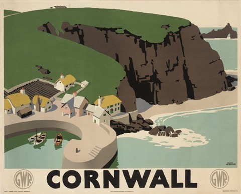
In the establishing shots at the start of the film, Sherida Binyon’s (Phyllis Thaxter) arrival by train to “The Cornish Riviera” is suggested by shots of a fictional rail station called Tremerrion. This sequence includes a real Great Western Railway poster painted by Frank Newbould, which was used to advertise the route from London’s Paddington station to Cornwall. The poster was apparently in use from 1923-1947. Amazingly, this sequence does not have a single shot of a train!
I appreciate the cheekiness of introducing the film’s setting with an idyllic painting of a quaint fishing village shielded by cliffs when that is so far from what The Sign of the Ram depicts.
Here’s the poster in color:
This particular poster isn’t included on the National Railway Museum’s website, but there are a lot of other wonderful posters featured in their online collection.
#The Sign of the Ram#1940s#john sturges#1948#film noir#classic film#classic movies#Cornwall#great western railway#trains#poster art#travel posters#travel poster#cornish coast#frank newbould#National Railway Museum
85 notes
·
View notes
Photo


‘Your Britain - Fight For It Now’ by Frank Newbould
135 notes
·
View notes
Photo

With only a couple of days left to visit the 2019 version, here’s how Frank Newbould enticed visitors in the 1930s.
#london#ideal home#olympia#frank newbould#1930s#poster#graphic design#graphic art#illustration#typography
29 notes
·
View notes
Photo

Eastern Scotland, vintage travel poster for London and North Eastern Railway (LNER) and London, Midland and Scottish railway (LMS) showing Royal Deeside, ca. 1930s. Artwork by Frank Newbould (1887-1950).
#scotland#eastern scotland#lner#lms#frank newbould#vintage poster#railway poster#travel poster#vintage travel poster#vintage railway poster#deeside#royal deeside
8 notes
·
View notes
Text
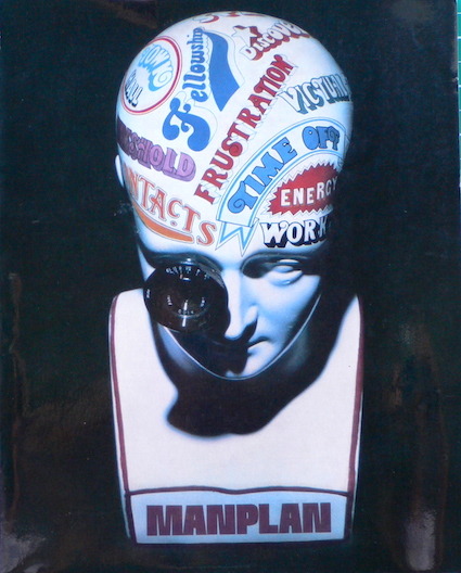
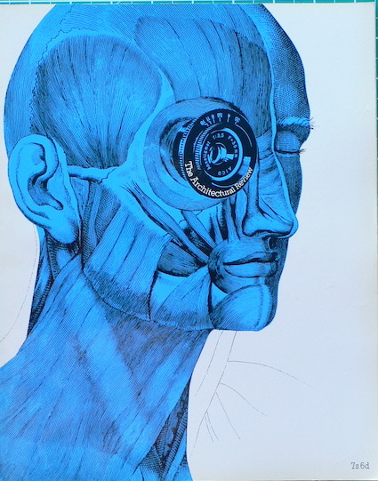
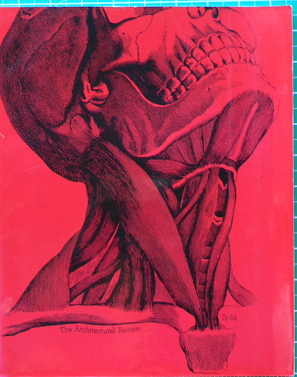
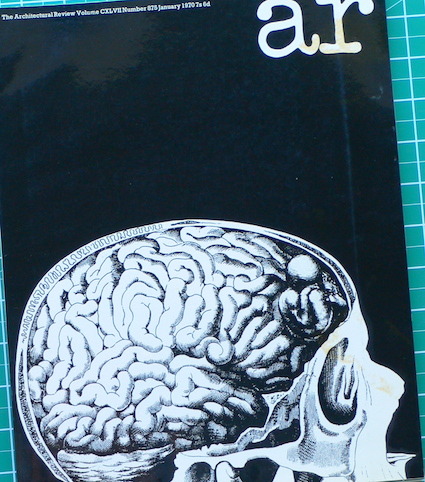
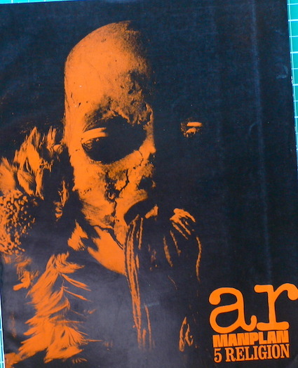
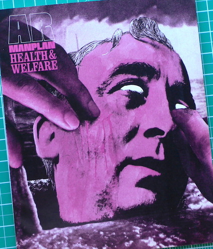
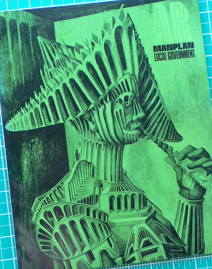
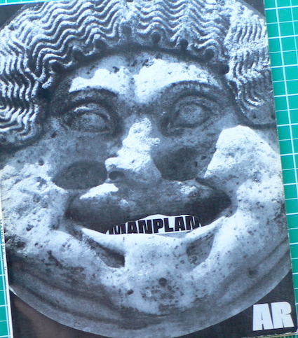
ManPlan • Architectural Review • 1969/1970
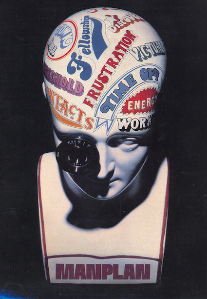
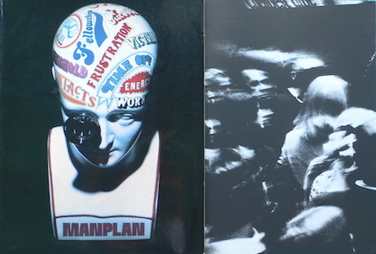
In 1969, the Architectural Review published a sequence of eight issues which explored the themes of urban design framed from a humanist perspective - this was called Manplan...
I’m not sure if I saw these magazines back then, I would have been about 12 years old. I was definitely aware of something exciting happening. I saw it being built, locally, in the new Surrey University campus at Stag Hill, Guildford, with its new buildings by Maguire and Murray etc. And in the new shops and advertising of the life-style revolution of the late 1960s.
These issues of the Architectural Review combine my interests in architecture and graphic design as an expression of progressive and humanist modernism. The explicit structural critique of the profession also reminds me of Godard’s investigations into the politics of combining words and images, and sounds. Quite a lot of Manplan, looks like stills from Weekend (1967).
I’ve posted before about Picture Post’s Plan for Britain (1941)
https://paulrennie.rennart.co.uk/post/115027493435/a-plan-for-britain-o-ww2-o-1941
and about the ABCA posters designed by Abram Games and Frank Newbould
https://paulrennie.rennart.co.uk/post/664582609165336576/abca-ww2-posters-1942
and here is something I wrote previously for the 20C Society about the typographic style of the Festival of Britain (1951)
https://www.are.na/block/3162649
Architectural Review
The Architectural Review is a landmark in the history of graphic design, for over a century the most influential journal of record for a profession whose methods have always been, essentially, graphic. Before the advent of the computer, sketches and annotated drawings were the principal means of expression and communication for architects – at the drawing board and working with colleagues, the industry and their clients. In its interests and obsessions, the Review combined the inclinations of a gentleman amateur with an intellectual’s curiosity for the new – a process that its editors described in 1947 as “hacking its own way up the ice-slope of modern experience.” For many years – particularly during the period from the 1930s to the late 1960s – the magazine’s typography and layout were a brilliant reflection of its many-sided and paradoxical attitudes and interests.
Richard Hollis #eyemagazine 28
Manplan 1969
They may have been a circulation disaster, but The Architectural Review’s special ‘Manplan’ issues, which began in 1969, stand as a perverse triumph of editorial conception and design. Like the concrete buildings of the period, the approach was uncompromising. The magazine * (to the horror of some of its senior staff) turned its back on large-format heroic photography of buildings, and embraced a grainy, 35mm black-and-white reportage aesthetic where people were as important as places. The rather lofty aim of the series was to ‘redefine’ architecture and planning for the 1970s: Manplan 1 set out to document ‘frustration’ in British society.
From the AR’s office in Victoria’s Queen Anne’s Gate, editor Tim Rock and designers Michael Reid and Peter Baistow behaved as though they were the British embodiment of Life magazine, driven on by the Review’s Directing Editor and part-owner H. de C. Hastings. The best contemporary photographers were commissioned (Patrick Ward, Ian Berry, Tony Ray-Jones) and an army of photographic printers was kept busy producing 15 x 12 inch black and white prints.
Manplan 1 is a relentless document. It tells its story through pictures, with just a line of Rockwell text marching across each spread and some extended captions. There are full-page pictures, double-page spread pictures and extra-wide gatefold pictures. Small images sit framed in a sea of black. It’s a tactile experience, too: Harrisons, the magazine’s printers, used a special matt-black ink to make the printed photographs look even more dense and dramatic. The Architectural Review’s Manplan 1 is a reminder of a time when magazines lived dangerously.
Simon Esterson + Peter Baistow #eyemagazine 54
The eight issues of Manplan
#01 Frustration 09/69 AR871
#02 Society is its Contact 10/69 AR872
#03 Town Workshop 11/69 AR873
#04 The Continuing Community 01/70 AR875
#05 Religion 03/70 AR877
#06 Health and Welfare 05/70 AR879
#07 Local Government 07/70 AR881
#08 Housing 09/70 AR883
Notes
Architectural Review, 1969, Manplan editorial
https://www.architectural-review.com/archive/manplan-archive/manplan-frustration
Richard Hollis, Eye Magazine 28, Building a Graphic Language
https://www.eyemagazine.com/feature/article/building-a-graphic-language
9 notes
·
View notes
Photo

NEWBOULD, Frank. Vienna via Harwich, c. 1920s. by Halloween HJB https://flic.kr/p/2mvgdYU
38 notes
·
View notes
Photo

Vintage poster for railroad travel to Norwich, England. Illustrated by Frank Newbould, 1930. "Norwich, on the London & North Eastern Railways of England & Scotland: The Cathedral Route."
Buy Norwich, The Cathedral Route poster | Vintage Travel Posters
#vintagraph#vintage poster#vintage#retro print#1930s#church#cathedral#england travel#vintage travel#1930s travel#travel poster
20 notes
·
View notes
Text
Frank Newbould • Your Britain • ABCA • 1942

This is a famous WW2 poster, designed by Frank Newbould and published by ABCA.
Army Bureau of Current Affairs
During WW2, Newbould worked as a colleague of Abram Games. Games was the official poster designer to the war office and was responsible for the graphic communications aimed at army servicemen and women. As the war progressed, there was an ever-increasing need for effective graphic communication. Newbould was appointed to assist Games in 1942.
During 1942, Games and Newbould each produced posters for the Army Bureau of Current Affairs (ABCA) under the title of Your Britain, Fight for it Now. ABCA had been established to provide a forum in which officers and men could discuss the political, practical and philosophical meanings of the war with a view to providing a sophisticated form of motivational focus.
Accordingly, Games chose the progressive themes of housing, health and education. Newbould worked around the themes of landscape and people as understood through place and tradition. His posters showed the South Downs, Salisbury Cathedral, village life and the fun fair.
I was lucky enough to purchase a set of ABCA posters from Abram Games himself. I’ve had the various Frank Newbould posters over the years too. I’ve just found the South Downs image, above.
Frank Newbould
Frank Newbould was a commercial artist and poster designer who made substantial contributions to the development of British advertising art during the 1920s and 1930s.
Newbould was born in Bradford on the 24th September 1887. He was the only child of John Matthew West and Sarah Ellen (Robinson) Newbould. His father was a successful chemist and pharmacist in the town. Frank was expected to follow in his father’s footsteps. The direction of Frank’s career changed course with his discovery of the original, bold and exciting poster designs of the Beggarstaff Brothers at the end of the 1890s.
The Beggarstaff Brothers were the artists William Nicholson and James Pryde working in commercial partnership. They were also family, as James was the brother of William’s wife Mabel.
At the end of the 1890s, they proposed a form of radical simplification in poster design based on paper cut-outs and the stencil shapes of provincial jobbing sign-writers.
The visual simplifications evident in their poster designs provided for a dramatic and exciting contrast to the over-elaboration of the prevailing styles. The Beggarstaff designs were, however, too radical for the tastes of most commercial advertising agents and their proposals remained, for the most, unrealised. However, their designs were especially influential in Germany and Britain.
In Germany, the dramatic simplification of the Beggarstaff designs was closely followed by the emergence of the sachplakat or object poster during the first decade of the 20C. This provided for a simple over-sized and hand-drawn image of the product with brand name, all rendered in few colours. This type of advertising was applied to a wide variety of consumer products from shoes, to lamp bulbs, spark plugs and typewriters. The most significant artist associated with this style of poster design was Lucien Bernhard.
In Britain, the influence of the Beggarstaff Brother designs took longer to manifest itself and did so in a more complex way. The flat-colour work of poster designers at the end of the 19C (Dudley Hardy for example) was mostly influenced by the legacy of Japanese woodcut prints and a taste for sophisticated aestheticism. In relation to the pictorial poster in Britain, these influences were, peculiarly, most clearly seen in the large-format railway poster.
Frank Newbould attended Bradford School of Art before gaining employment in the offices of a local printer. In 1919 he moved to London to establish himself as a poster designer. He married (Marion) Jane, daughter of the Rev G W Thomson, on the 24th March, 1919.
London and North Eastern Railway
The Railways (Grouping) Act, 1921, provided for the consolidation of over 120 railway companies into four large geographical groups. By far the largest of these was the London Midland and Scottish Railway. The railway provided services between London and Liverpool, and up to Glasgow and beyond.
Railway grouping provided for competition between east-coast and west-coast mainlines to Scotland. The London and North Eastern Railway, serving Edinburgh, was quick to recruit a number of exceptional poster designers to promote its services.
William Teasdale was the advertising manager of the LNER. Acting on behalf of the railway company, Teasdale was an important patron during the 1920s and 1930s. Teasdale was conscious of the full the scale and scope of the railway organisation and was adept at identifying themes and images that could become identified with the service provided. The patronage of Teasdale, and his successor Cecil Dandridge was, from the start, recognised as progressive, enlightened and effective.
In 1926, Teasdale invited his five most prominent poster designers to work exclusively for the railway. In addition, Teasdale guaranteed an annual level of fee income for each of the artists. The five artists were Tom Purvis, Austin Cooper, Fred Taylor, Frank Mason and Frank Newbould. Newbould was initially contracted to produce 5 posters per year for a fee of 500GBP. This was less than the contracts given to Purvis and Taylor.
Newbould was able to work in the tradition of flat-colour simplification and to position himself somewhere between Tom Purvis and Fred Taylor. Taylor’s themes were mostly architectural, whilst Purvis produced designs that were equally decorative and dramatic.
Teasdale and Dandridge were careful to allow each of these artists to develop their own distinctive style. In general Newbould produced designs for the Yorkshire coat and its resorts. His designs were distinguished by the bold use of flat colour and for a surrealistic sense of humour.
In addition to his work for the LNER, Newbould also designed posters for London Underground and for the Ideal Home Exhibition.
Frank Newbould died on 25th December, 1951. His wife, Jane, pre-deceased him in 1947.
Here’s a link to something I posted for Poster House in NYC...
https://posterhouse.org/blog/railway-posters-from-britain-1923-1939/
and here is the National Army Museum page about Abram Games and the ABCA posters
https://www.nam.ac.uk/explore/abram-games-abca-and-fight-post-war-change
These ABCA posters show the world that I was born into over sixty years ago. I’ve always loved these images.
Bibliography
Cole B & Durack R (1992) Railway Posters 1923-1947 London, Laurence King
1 note
·
View note
Text

'Cutting Bananas In Jamaica'. Frank Newbould. 1930.
32 notes
·
View notes


