#for some of the images show in the screencap
Explore tagged Tumblr posts
Text
Image description:
Image 1: 3 screenshots
Screenshots 1 and 2:
The Cradle [@/TheCradleMedia] tweeted on Nov 2
Al Akhbar:
• Washington and the US Embassy in Lebanon did not allow Iraqi Airways to land at Beirut airport and establish an air bridge to provide aid for the displaced, insisting that the aid must pass through Jordan for inspection first.
• Washington also threatened to sanction Middle East Airlines (MEA) if i transported wounded patients from the Israeli pager attacks, on 16 and 17 September, on its flights to receive treatment abroad.
• The US Embassy in Lebanon also reportedly receives a list of all passenger names traveling through Beirut airport from the International Air Transport Association (IATA).
-
Ryan Grim (@/ryangrim) quote retweeted this: U.S. is enforcing a siege on Lebanon
-
3rd screenshot is a tweet from Al Jazeera English (@/AJEnglish). A screencap of a video of people standing on a rubble is captioned:
Israeli attack on Lebanon's Almat kills 23, including seven children
-
Image 2:
Screenshot of a tweet from Christiane Amanpour (@/amanpour)
"We have been through a lot, but this event was the worst thing we ever experienced."
A new CNN investigation examines the damage to Lebanese hospitals from Israeli air strikes, as Israel says it is targeting Hezbollah.
@/tamaraqiblawi reports.
-
Below is a screencap of a news broadcast showing a Lebanese city at night. It’s captioned ‘Middle East Crisis: Lebanese hospitals in line of fire as IDF targets Hezbollah’
-
End of image description.
-
Image description are helpful for blind people, those who struggle with visual processing, people who don’t speak the language of any text in the image - or in situations like this!
Also- the Zionist occupation army purposefully disables Palestinians - and bombing people like this causes a lot of issues, including visual issues! It’s a good habit to develop the revolutionary discipline of going against the settler colonialist logics and including disabled people in the body politic as much as we all can.
It’s not too late to start adding alt text and image descriptions. I only started this year! See my ‘image descriptions’ tag for info! I reblogged some pointers from tumblr users who need image descriptions.
🫶🏾🇱🇧🇵🇸 [heart hands emoji, Lebanon and Palestine flags]
The Biden/Harris administration is enforcing a siege on Lebanon as Israel continues to bomb and wipe out villages.


The Israelis have been airstriking Dhahiya, Southern Beirut nonstop all day today, exceeding 10 major strikes on random buildings with no end in sight. Evacuation orders were covering the entire neighborhood.
3K notes
·
View notes
Text
Mitsuhito Tsuji liked the post shouting out him liking all the Kazurei posts!

This is both very cute and amusing. Makes me happy to see!
#Buddy Daddies#Kazurei#Mitsuhito Tsuji#lmao#I love this tho#BD spoilers#Buddy Daddies spoilers#for some of the images show in the screencap
125 notes
·
View notes
Text

“Ten years of jazz and five years of tap have taught me to save my smiles for when they count.”
“So do I get one for helping you get through your next math test?”
“When I ace it.”
#degrassiedit#toby isaacs#holly j sinclair#my edit#my edits#my screencaps#degrassi#degrassi the next generation#they had an interesting dynamic#while I liked seeing Toby show some character growth and not just date her for the sake of having a girlfriend and obviously he had every#*right to be upset at how she treated him all cause of upholding her image but also I wish there dynamic could have been explored further
6 notes
·
View notes
Text

Watcher coming for our job by listing the episode locations /j
Our Travel Season map is in progress, and will have separate layers for food and cultural stops, as voted by you! The map will be shared once Travel Season has finished airing on YouTube so we don't spoil any of the locations.
#travel season#wiki posts#wiki maps#honestly the hardest map we've ever made#had to reverse google image search some screencaps from the show#still haven't found the specific GS25 from ep 3 so that might not make the list
3 notes
·
View notes
Text
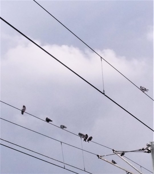
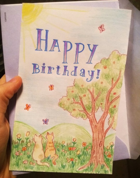
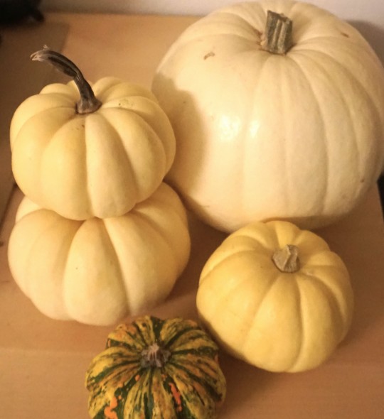
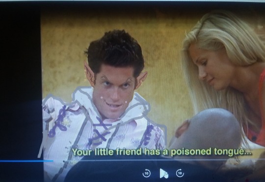
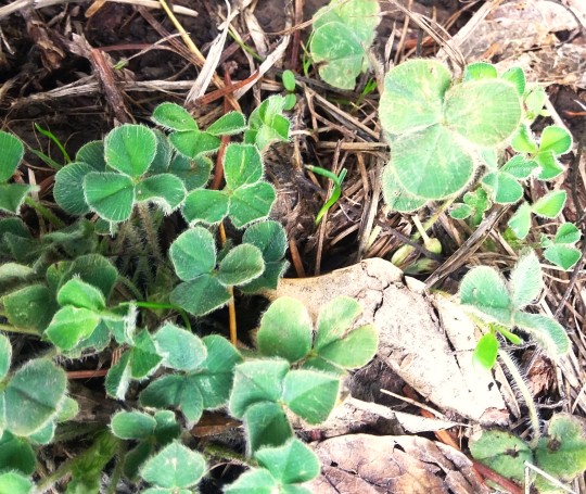
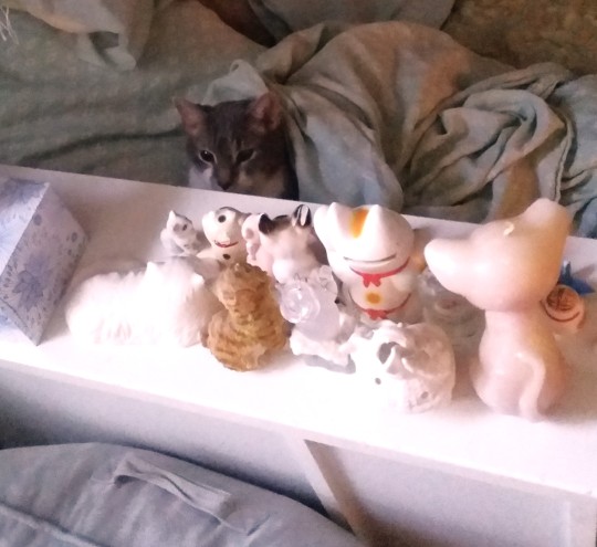
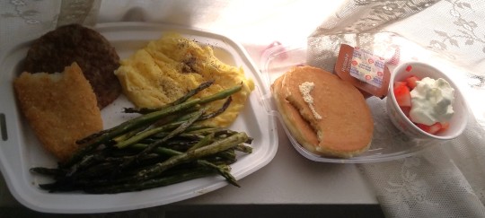
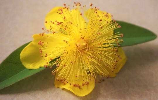
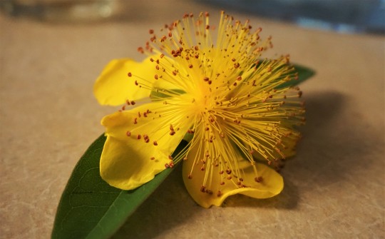
Various images of things
#image commentary in tags once again since they don't allow captions anymore and I feel weird using the alt text for that --#1. PIBBINS.... cheering clapping hooting hollering glorious applause everytime I see a pigeon in public#2. Birthday card that I drew for someone. .. kittys...#3. 2023's annual haul of tiny white pumpkins.. i get at least one white pumpkin every year around fall when they have pumpkins in stores#because I just love the color and texture ... bright white and smooth and cold and round.. kind of like a volleyball or something#4. A brief adventure into watching big brother (only earlier seasons of course as I hate all reality shows post like 2013 or something when#they became overly focused on social media and overproduced memeable phrases more.. like even though ALL reality shows have always#been extremely fake and annoying and mindless it's like..... newer stuff seems A Different Kind Of Fake or something) since whenever#I'm sick sometimes I find weird mindless things like that to watch (that one time I had bronchitis I watched all of Flavor of Love in my#half awake illness stupor and now everytime I heat up canned minestrone soup (mostly all I ate that week) I think of flavor flav since#thats just a weird brain connection I have now lol) ANYWAY.. I was sick and watched like 2 seasons of this and then thought it was too#uninteresting and obnoxious to continue (more like 1 and a half since I skipped the rest of one once only boring people were left) BUT this#one guy had a very mischevious looking face and he also said a few things (like the above captioned speech) that sounded like dialogue#some fantasy character would say.. so I took a screencap of him and edited him into a mischevious wizard i guess.?? idk I was sick lol#~your little friend has a poisoned tongue~ is just a very unexpectedly serious sounding wording for some random normal#frat dude looking guy to say while casually chatting on a reality tv show in like 2008 or whenever that was filmed lol#5. FLUFFY CLOVERS!! I'd never seen them be furry and soft before?? inchresting..#6. Noodle sitting in bed with the cat figurines looming above him... the council of kittys...#7. McDonald's full breakfast platter + asparagus + strawberries & cream (also of course this is old and I am now boycotting mcdonalds etc)#i try to group the images somewhat consistently like.. winter stuff with winter stuff or summer stuff with summer stuff#but I have so many random pictrues floating around on my computer that I never post that sometimes some are not organized or just#thrown into a set because there's nowhere else for them. Like the pigeon picture is from like 3 years ago for example lol#8 & 9 - I think I've posted these before but I just find them very interesting looking flowers. whenever they happen to be blooming#I'll pick up a few when I'm out on walks or etc. ... poof ball looking things#photo diary
6 notes
·
View notes
Text
“The SpongeBob team is putting in all these crazy faces just to try and make new memes, and that clearly hasn’t worked! There hasn’t been any memes of note since ‘Little Yellow Book’!”
SpongeBob after “Little Yellow Book”:
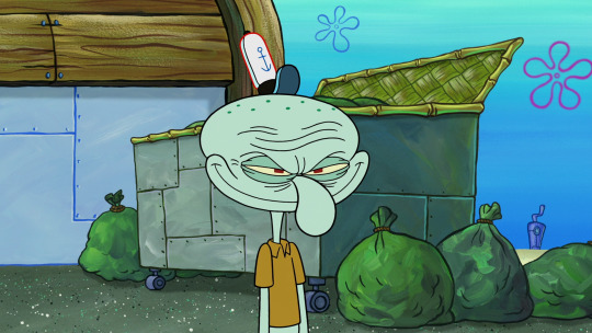


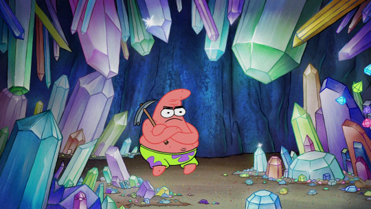
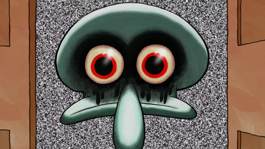
#Going Jellyfishing#SBSP#Screencaps#Memes#Inspired by a YouTuber who said that the LATEST SpongeBob meme was ‘Mocking SpongeBob’ from ‘Little Yellow Book’.#I really wish I was joking. I really do. But I’m not. He well and truly said this with his whole chest.🤦♀️#My guy - have you even been paying attention lately? That is nowhere near the latest successful meme to come out of this show.#And even then - who’s to say that all memes have to involve a crazy face? Some memes came out as a result of acts of absurdity...#... like Mr. Krabs washing his boat in a rather skimpy get-up in ‘Burst Your Bubble’.#And dear God am I sick and tired of the ‘exaggerated expressions bad’ argument. The animators don’t really use them...#... as much as you think they do. They still save the more extreme ones for moments of extreme emotion...#... or major comedic segments. Besides I’d rather have characters express ‘too much’ instead of not enough. Especially after...#... the stiff snooze fest that was Seasons 6 through 8. That’s just me though.🤷♀️#Anyways there HAVE been successful memes since ‘Little Yellow Book’ and these images are proof of that. End of discussion.✌
11 notes
·
View notes
Text
Good Animated Omens - Behind the Scenes


Here's a behind-the-scenes look at the walk cycles I animated of Aziraphale and Crowley (original post here).
I'll reiterate that the character designs are @lookitsstevie's creation! I made builds in Toonboom Harmony based on their designs, and then animated the builds.
Long post under the cut, organized into four parts. Feel free to jump around or just click through the images and gifs to get an idea of the gist. (At least take a look at Part IV, where you'll see a version of Aziraphale without his jacket and a closeup of Crowley's torso!)
Hopefully this is interesting even if you don't know the first thing about animation. It's not a step-by-step-from-scratch tutorial, but it might give animators some ideas to think about when trying this software!
I'm happy to answer questions about what I cover here - comments, DM's, or ask-box questions are all fine by me. If you like any of the new gifs and want to reblog it on its own, I can make new posts for those upon request! (I'd prefer you don't reupload them, but if you do please at least credit me with a tag to my account - thank you!!)
Part I: The interface and some basics

Above is a screencap of the software interface.
In the centre is the Camera window, where all the drawing and animating is done.
To the left, the Node View. It's a representation of how the pieces and layers that make the characters are grouped and connected to each other, which is what makes a character "build". Every piece in this window is called a node, and there are different types. Light blue "drawing nodes" contain the drawings themselves. Each drawing node usually has a green "peg" attached; the peg is used to move and rotate the drawing piece; you set a pivot point on each peg. Light grey nodes are groups that have more nodes within, and dark blue nodes are added effects (eg masks, the blur for the halo, etc).
Below, the Timeline - it's where keyframes are set and tweened. The red square dots indicate there is a new keyframe on a particular frame; the white dots indicate keyframes are on layers nested somewhere under the topmost visible layer. All the pieces of the characters can be found in the timeline and correspond to the pieces that exist in the Node View (and Camera). Typically you work with a collapsed view of the build layers in the timeline, which allows you to set keyframes on multiple layers at once.
To the right, a few tabs in this window - Tool Properties, Colour Palettes, and, shown on top here, the Library. The library is where you store your builds, so that you can bring in a fresh copy when animating a new scene. This library tab also has the Drawing Substitution window, which shows thumbnails of every drawing contained in a drawing node when that node is selected.
A second of animation is 24 frames long. Finished animation will often have keyframes on every second frame with the tweens removed, to help simulate the look and feel of traditional animation - this is known as animating "on twos", and saved time, money and paper in the old days. If you leave the tweens on, and/or have keyframes on every frame, the animation is "on ones".
My walks are on twos - it's the look I prefer.
When I say "tween" I'm specifically referring to the software feature that will automatically calculate and interpolate the path between two different poses/keys of a peg. An inbetween could be the result of using a tween, a new drawing, or both. On twos, an inbetween will look the same as any other keyframe on the timeline when you're finished - its relevance as a concept is during the process, not the end result.
Quality animation is achieved via a combination of moving/tweening pre-existing drawings using their pegs, and adding new drawings as hand-drawn inbetweens when needed. Toonboom Harmony also has nodes called "deformers": they offer a way to tween the shape of a drawing without needing to redraw inside the drawing node. (Part IV has the explanation for which pieces I used them for, and why.)
Part II: Navigating the builds

This is what their default poses with no animation look like.
Animation using builds is sometimes colloquially referred to as "puppet-style animation" because the way you can connect body parts to each other feels like making and handling a 2D digital puppet: you can connect a hand to a forearm so that they can move as a unit, and you can connect that unit to an upper arm to move the whole arm as a unit, and that arm gets connected to the torso, and so on.
When you want to connect two pieces, like a hand to a forearm, then you create another peg in the Node View and attach the two body parts together under that new peg. The screencaps below show the nodes that make up Aziraphale's and Crowley's entire builds inside their respective groups:


Things got a bit sloppy ... It looks extremely complicated, but once it's set up, you don't have to think about it too much when you're animating!
And I've zoomed in on the nodes that make their arms so you can see how there are pegs on top of pegs (all the green nodes), with wires connecting everything:


As I explained in Part I, new drawings are added and contained within a body part's drawing node (the light blue ones under the green ones), and the Drawing Substitution window is where you can see all the drawings that exist in a particular node. In the timeline, you set keyframes for moving the pegs, and you also choose which frame the new drawings will appear when applicable. You might have a lot of drawings stored in the nodes, but only what you set to appear in the timeline will be visible in the final animation.
You can select a body part in the camera view, and then find the corresponding layer in the Timeline or the Node View by pressing the "o" keyboard shortcut. If you select a body part by clicking on it, and then press the "b" keyboard shortcut, you will jump up to the next peg it's connected to. You can hide and unhide pieces using "d" and "a" respectively.


In the first capture above, I'm showing that the arm pieces can be moved separately or together, and you can see how the pegs in the Node View light up when I select them in the Camera window (hiding them turns them red). In the second capture, I pop down to the timeline to step back and forth between the poses - the light grey row (it appears between the rows of red dots) represents the hand's drawing node in the timeline.
Part III: Summary of animation process
In my head I imagined how their walks would differ from each other - Aziraphale bouncier but with very straight posture and limited arm movement, vs Crowley slinking and swaggering all over.
I also knew that I wanted the animation to look good for both a walking-on-the-spot version, and as a version walking across the screen (both versions are at the top of the post!).
Then I started doing some rough animation.
I set aside my finished builds for the roughs. For each character, I made a few drawing nodes and two pegs; a peg for the up-and-down upper body motion, which I tweened, and a peg for moving them across the screen. The legs and arms are drawing substitutions.
With these extremely rudimentary rough "builds", I worked out - how many frames long the walks would be, - how far the characters would move across the screen each step, - how much the upper bodies would move up and down, and - the key drawings of the legs and feet.
I didn't worry about animating clothing, hair, or Azi's arms in the rough stage. For those elements, the drawings would be spaced really close together and would be easier to figure out with tweens. (Note: this rudimentary setup would be sufficient if you want to clean up and inbetween characters by hand frame-by-frame instead of making full builds; my preference is build animation because the process is more fun for me)


Then I started working with the finished builds, using the roughs as a guide, and established the broadest motions first: the up-and-down motion in the upper bodies (I set a keyframe at the lowest point, a keyframe at the highest point, then tweened between them) and how far they'd travel across the screen. Then the feet were done.
I went back and forth between viewing them walking on the spot and walking across the screen to make sure that both versions worked. I also made sure they crossed the same amount of ground relative to each other.
After those crucial parts, I moved on to animating their arms, hair, torsos, clothing details, and finishing the legs, not necessarily in that order. I simulated twisting/rotating their torsos in 3d space by moving their waistcoats and lapels.
The first gif switches back and forth between versions (imagine a background scrolling by when they walk on the spot). The second gif is an example of bad "footslip" - they're moving at different speeds, and if you pay attention to their feet, Aziraphale appears to slip on ice while Crowley appears to slide forward on skates.


"You go too fast for me, Crowley!"
Part IV: Extras and details
Here is a version of Aziraphale's walk without his jacket, and a closeup of Crowley so you can see his swaying hips better:


One of the cool things about animating with builds is they lend themselves well to small modifications; the jacketless version took all of five minutes to make.
I'd be remiss not to include a close-up of Aziraphale's hair, the real star of the animation :) (Crowley's hair is also animated but I purposefully kept it understated since it's a much different texture.) And a closeup image of Crowley's snake tattoo:


The biggest unit for both of them are their upper bodies, which includes their pelvises. The up-and-down motion is only on one peg instead of on every single piece, which is handy because it means I can hide just that part of the animation when I want to work on the clothing details:


During the process of animation, I am often hiding then unhiding pieces like this so I can see what I'm doing.
Their clothing ended up being a lot of separate pieces, which I kept adding during animation rather than before, as it was hard to predict everything I needed. Their clothing also incorporates cutters (aka masks), and deformers (see explanation in Part I). In the next set of gifs the deformers show up as green outlines with handles and get turned on and off.
Aziraphale's torso functions as a mask for his clothing. The shape of his torso subtly changes via deformer. His lapels and waistcoat have V shapes that are masks/cutters (they cut a V shape out of those pieces); the same pieces that make the cutters also are used for the black lines of those V shapes via a special layering setup. The main shapes of his lapels are animated with deformers, and you can see how far beyond his torso shape they extend when I turn on the deformers in the second gif.


Deformers work best for shapes that change a little bit, and/or slowly. The minor shape changes in his and Crowley's clothes ended up being a great use case for deformers, because they pretty much tweened perfectly.


The reason I didn't use them on Aziraphale's legs was because those shapes change significantly between keys; I predicted I'd have to re-adjust every frame of a tweened deformer, so I drew the inbetweens by hand (halfway through, I realized I probably should have used them after all, but I was in too deep by then; hand drawing was fun though!). Deformers worked well on his bottom jacket:


Crowley's pelvis is layered above and below his thigh pieces and has a deformer. Also take a look at all the drawing substitutions for his hands:


And lastly the deformers on the hair:


Epilogue
I'm hoping the gifs all play at the same speed for everyone as they play for me. Hopefully the demo gifs are at least watchable, if not super clear... (I'll listen to feedback on the presentation of the information, for if I do similar posts in future!) Don't hesitate to ask questions about anything I covered, or about any details you noticed that I didn't elaborate on!
ko-fi.com/marieanimate
I'm shy about mentioning it, but I set up a Ko-fi account in case this post compels anyone to leave a small "tip" (but reblogging and sharing is just as good)!
Thanks for reading, and have a nice day!
#2d animation#animation#animated gif#walk cycle#toon boom harmony#toonboom animation#good omens#good omens fanart#ineffable husbands#aziraphale#crowley#crowley and aziraphale#aziracrow#animation process
898 notes
·
View notes
Text


Doing some screencapping and oooo, Michael's microexpressions in this scene are something else.
Top image is when the Metatron is talking about him getting his job back. Bottom image is when the Metatron dares to take Crowley's name in his mouth. He knows it's a backhanded threat to Crowley, that Crowley is being used to leverage him.
Aziraphale goes from soft mode to the subtle rigidity of guardian mode. The mobility in his expressions shut down. His eyes fix on the Metatron, his lips purse, and he is absolutely still.
We've seen it before:


And they very very specifically did not show Aziraphale's face when the Metatron said he could return Crowley to angel status. I feel this is a very important moment that we specifically didn't see.
The entire structuring of the final 15 is very much Aziraphale saying "he said" but there's a lot going very deliberately unsaid. There's the unspoken sword over Crowley raised when the Metatron brings him into the conversation. There's the looming threat of the Second Coming, which wouldn't necessarily sound bad to anyone who wasn't familiar with the works of St. John of Patmos.
Our angel is about to go off-the-chain feral and I cannot wait. You do not make someone like Aziraphale a guardian and tell him to protect the world and the people on it and then threaten that world and those people. He gave away his sacred weapon and lied to God's face about it in his first months on earth. He's had 6000 years of escalation building and it's a-coming.
224 notes
·
View notes
Text
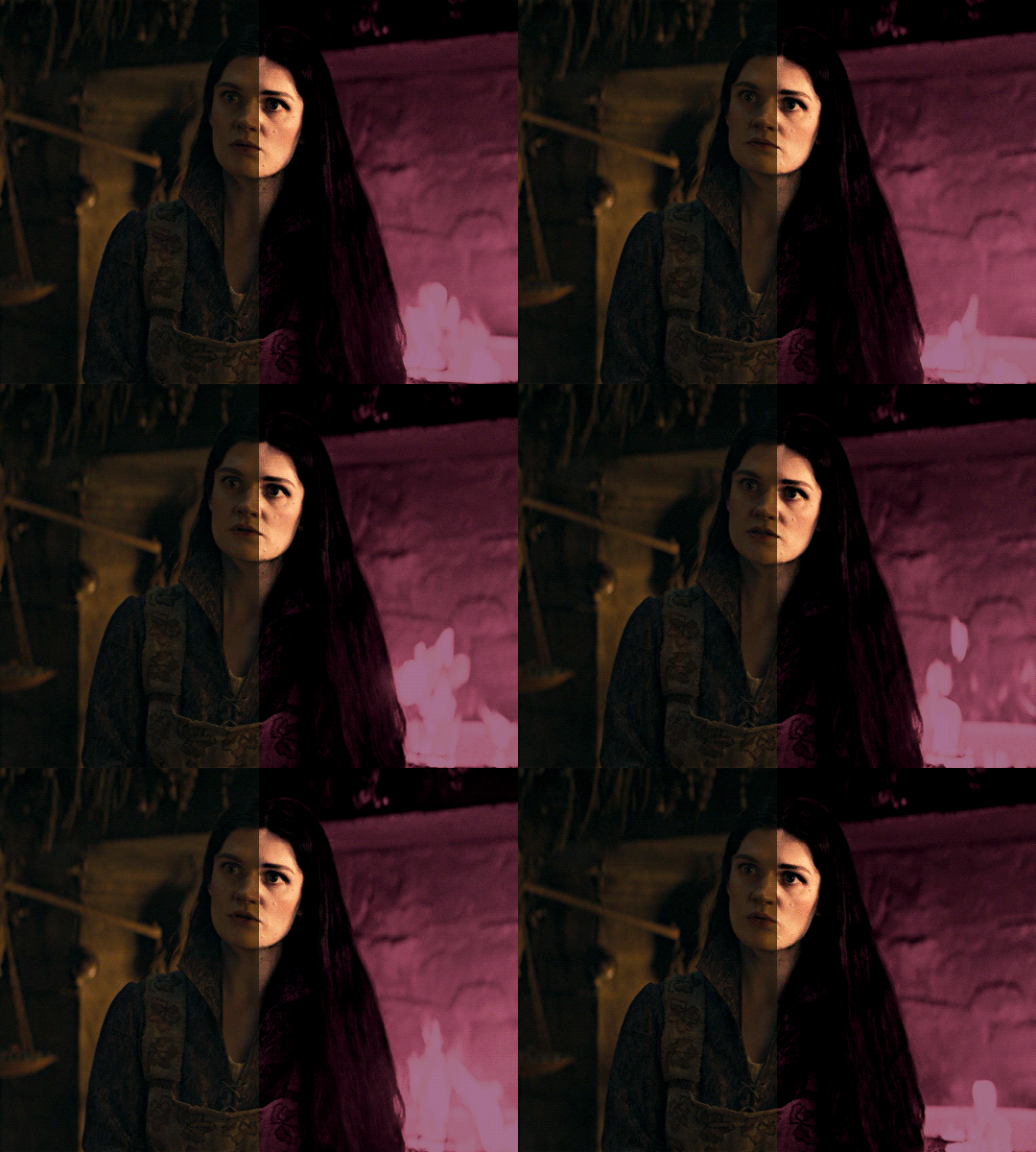
i was asked by @matthew-macfadyens for a colouring tutorial, so here we go ! i've been making gifs for almost 4 years now and finally feel comfortable and confident in my skills to make a full tutorial on my colouring process. there are so many different ways people colour gifs, and there's no wrong way, this is just how i do it ! i learned to gif by reading so many tutorials and picking and choosing what works for me, so hopefully this can help someone out !
if this tutorial helps you, please considering supporting me ! buy me coffee ♡

TUTORIAL UNDER THE CUT
what you'll need: - photoshop ( i use ps cc 2023 & frame timeline ) - basic ps knowledge ( how to make gifs, how to sharpen gifs, general understanding of adjustment layers, layer masks and blending modes ) - a whole lot of patience
helpful resources:
the beginner's guide to channel mixer by @aubrey-plaza
giffing 101 by @cillianmurphy
gif making for beginners by @hayaosmiyazaki
colouring yellow-tinted shots by @ajusnice
becca's mega colouring tutorial by @nataliescatorccio
@usergif

PART ONE: BASE COLOURING
- step 1: curves - step 2: exposure - step 3: colour balance - step 4: selective colour - step 5: levels - step 6: brightness / contrast - step 7: gradient map
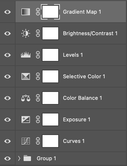
okay so, before we get started, this tutorial is for colouring only. at this point, i've already gotten my screencaps, imported them into photoshop, made the actual gif & sharpened the gif. the above image includes what my typical adjustment layer stack looks like !
STEP ONE: CURVES
a lot of people do the majority of their heavy lifting in curves...i'm not one of those people. i've never gotten the hang of curves and haven't been able to fully taken advantage of everything it can offer. i use curves to mainly brighten up my gif and to start my process.
i use the "auto" button in the curves function - this automatically corrects the curves for your gif ( mainly the brightness / contrast )
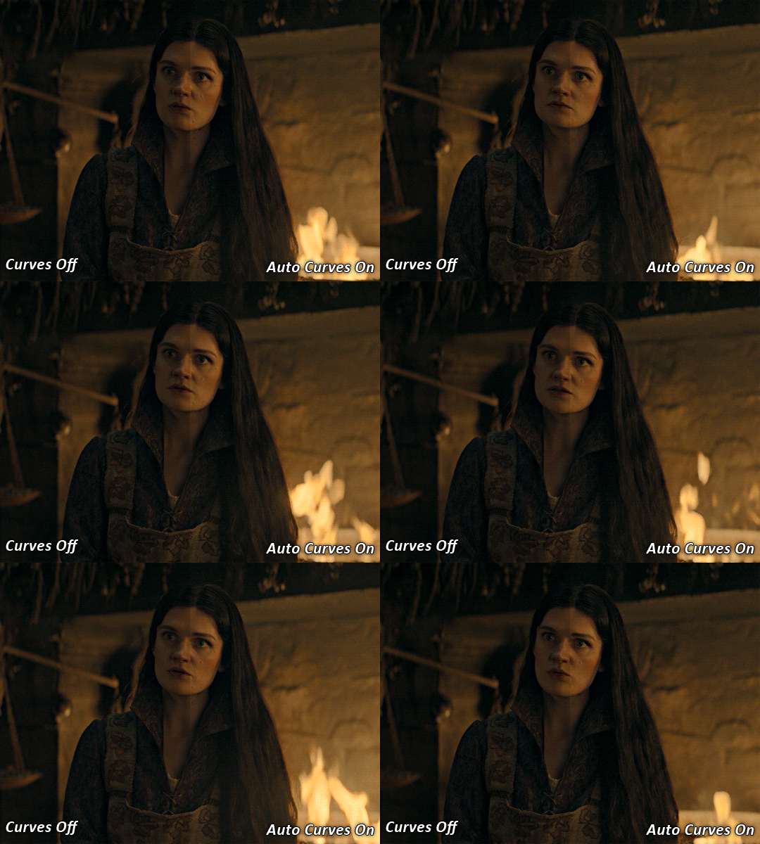
you can see that the auto curves has brightened up the gif and evened out the brightness/contrast. i just find this gives a better starting point for the colouring process.
STEP TWO: EXPOSURE
this step is for, you guessed it, brightening the gif more and evening out the contrast and blacks. i don't have any real rules for doing this, the amount i highten the exposure and contrast is different based on the scene and the show, however, i tend to stay around +1 on both exposure and gamma correction.
exposure effects the brightness of the gif and gamma correction effects the blacks and contrast. this step also effects the saturation of the gif, so it's important not to go too crazy. i often end up coming back to this step every now and again to adjust and fiddle with it.
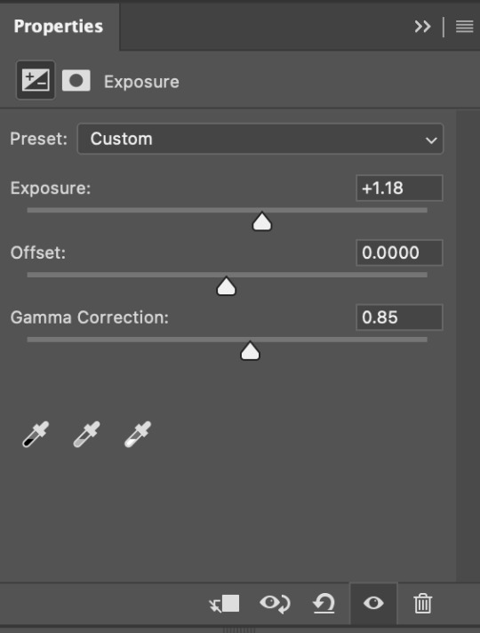
for this gif, i put the exposure at +1.18 and the gamma correction at 0.85
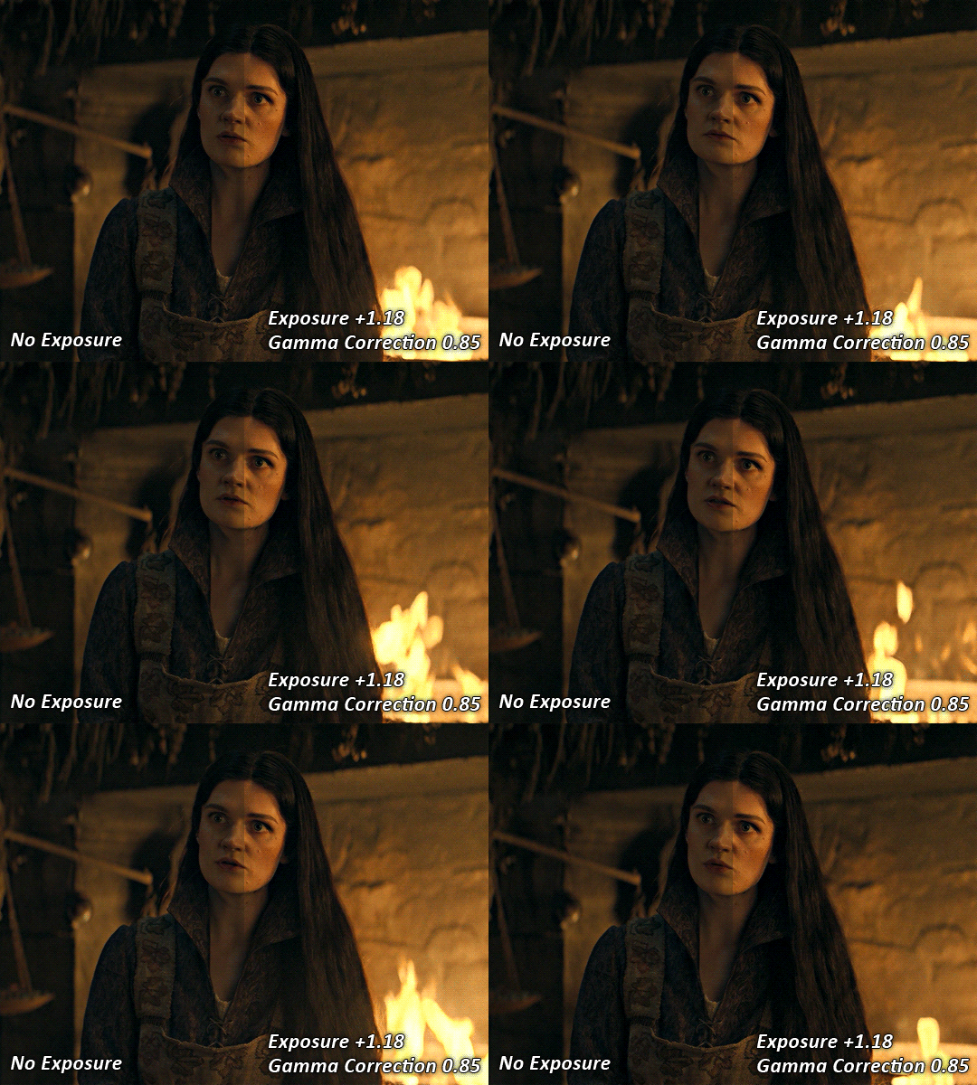
you can see this step serves to add some more brightness and contrast - it also adds some more saturation, that we don't always want, but don't worry, that's what the next steps are for !
STEP THREE: COLOUR BALANCE
i use this step to do a lot of my heavy lifting - i'm a whore for colour balance. this serves to even out the colours and help neutralize the colours for an easier canvas. it's important to understand the basics of colour theory for this, i recommend checking out the channel mixer tutorial i listed above, because a lot of those steps applies to colour balance.
essentially, there's three separate profiles to edit on - highlights, midtones and shadows. in each profile, you have 3 colour sliders. the top one is your cyan to red, middle is magenta to green, and bottom is yellow to blue. the colouring of the scene will decide where to move your sliders.
for example: if your original scene has a cyan tint to it, you'll want to pull your slider to the right, towards the red to help neutralize the cyan. if your scene has a green tint, you'll want to pull it left towards the magenta. as you move the sliders, you'll notice that sometimes it brings out other colours you don't necessarily need, you can adjust the other sliders to help neutralize further.
i always do my main correction in the midtones profile.
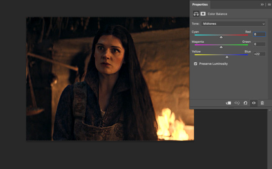
since this scene has a heavy yellow tint, my first step was to adjust the bottom slider. i pulled the slider to the right towards blue at +22. you can see this helped get rid of a lot of the yellow, but adding in the blue warmed up the reds and made it more saturated.
to help with this, i pulled the top slider left towards cyan to help neutralize that red.

i pulled the top slider to -28 and you can see this cut out that heavy saturation and redness. it's looking a lot better, but now it's a little too green for my liking. this is where that middle slider comes in!
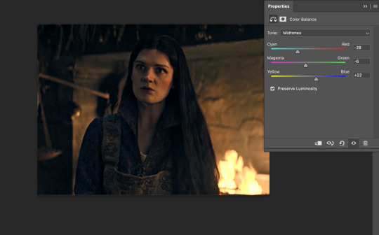
i pulled the middle slider to -6 towards the magenta to help counteract the green that came in. ( i ended up going back in and adjusting the bottom slider to +10 instead, as it was a little to blue )
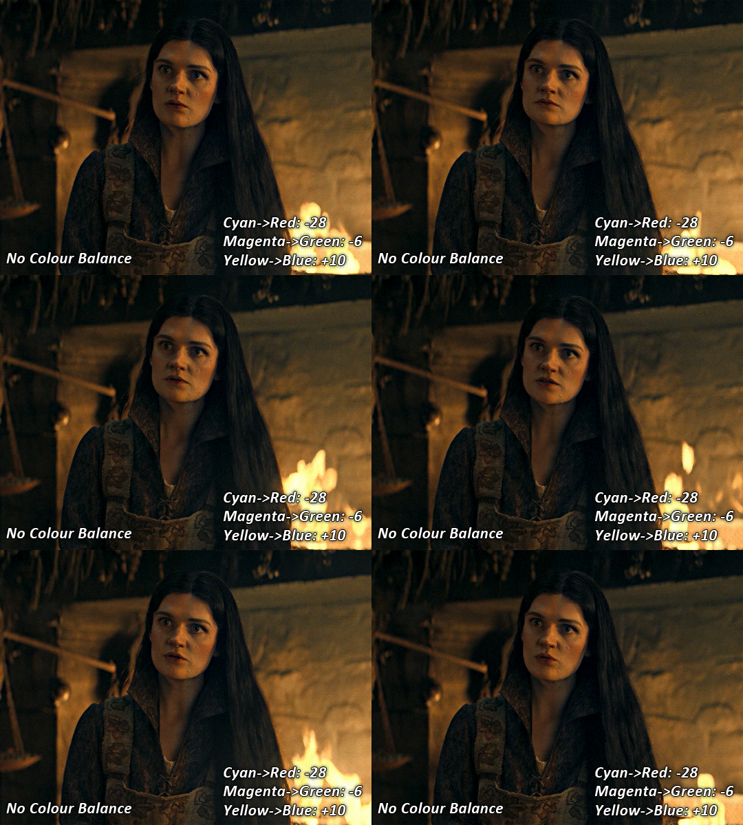
you can see this step really did the heavy lifting, helping to neutralize the canvas so that it's easier to work with...but it's not quite perfect yet!
STEP FOUR: SELECTIVE COLOUR
a lot of the same principles around colour theory apply to selective colour! this is where i go to adjust the colours according to what my colour palette is. for this gif, the overall colour is going to be purple, so i'll adjust the individual colours with that in mind.
i only ever adjust my red, yellow, white and black profiles! sometimes i'll do the other colours, but that's only for tweaking the final colour. i normally don't touch them at all.
ps: you'll notice i prefer a cooler toned gif, and almost always go for a more magenta looking red/yellow.
i always start with my yellows:

in the yellow profile, i pull my cyan towards the left to -38 (this helps eliminate the green in the yellows) and my yellow slider to the left to -27 (this cools down the yellows. i top it off by adjusting my magenta slider to -10, to help lower the saturation of the yellows.
you'll notice this step got rid of most of the green undertones - that's because the green was nested inside the yellows, so by taking out a lot of the cyan and yellow, you're left with a warmer yellow as opposed to a cooler yellow.

next i go on to my reds. this step will mainly effect the alys's skin tone, but i'm going to do pretty much the same as above but with much less dramatic of a change. lowering your colours in your red profile too much can lead to a very saturated gif, which is not what i'm going for.
i pulled my cyan slider to -19, magenta to -9 and yellow to -15. you can see this helped add some more cooler tones to the reds.
the next profiles are your white and black profiles. i use white to brighten the lightest parts of the gif. no rhyme or reason here, i just pull the black slider towards the left...usually around -25. for the black profile, i always move the black slider towards the right. anywhere from +3 to +8, depending on the gif. for this gif, i did +8. this darkens the blacks and, in my opinion, helps the gif pop!
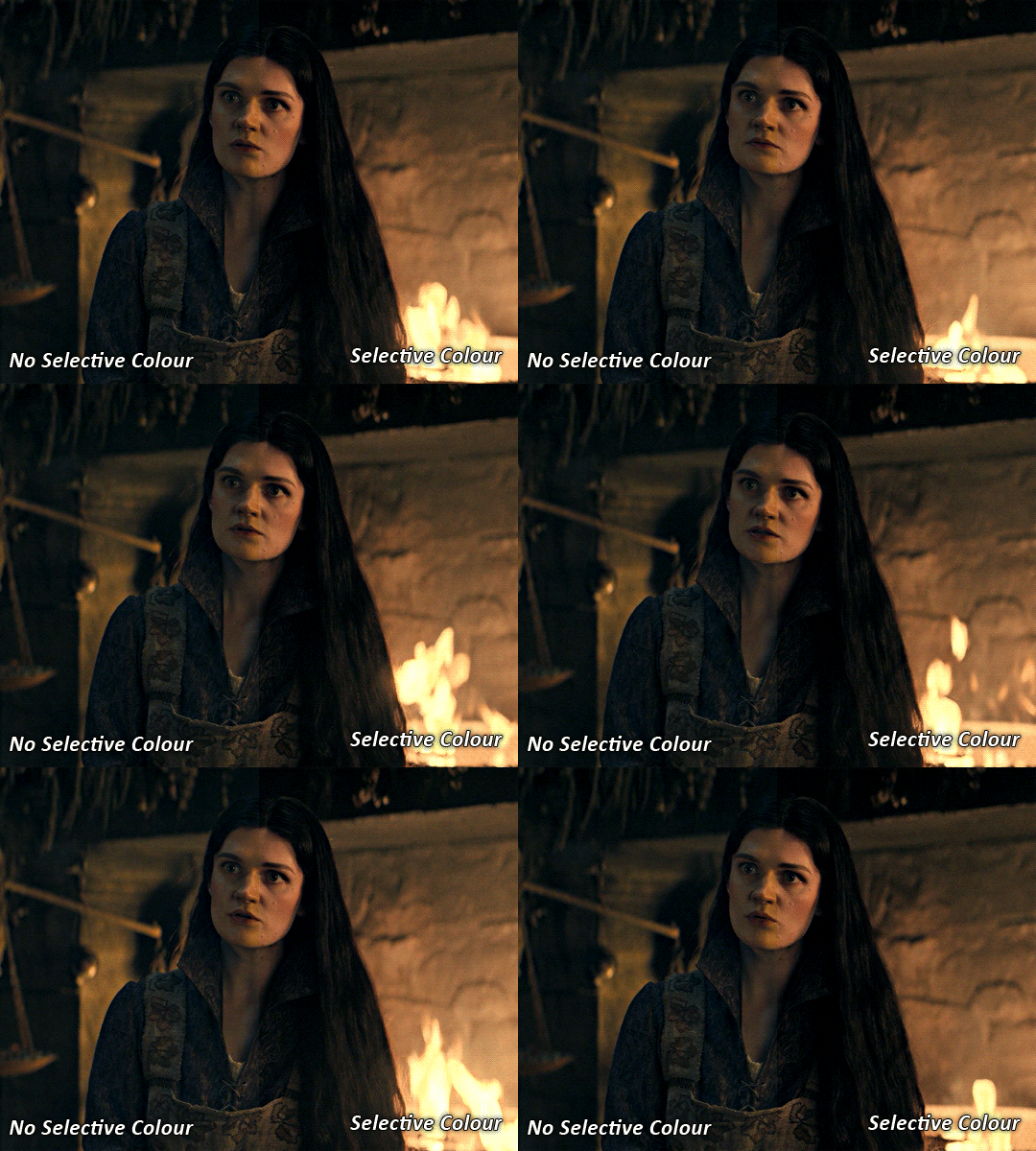
you can see this step got rid of the yellow tint, gave the gif a more neutral look and adjusted the reds to better compliment a purple colour scheme !
STEP FIVE: LEVELS
this adjustment has three toggles - i'm not 100% sure what each toggle really does, i just know that by pulling the leftmost toggle to the right, it darkens your gif, and pulling the rightmost toggle to the left brightens your gif.

this step is so hard to explain, but really i just pull the toggles around until it looks good...sorry !
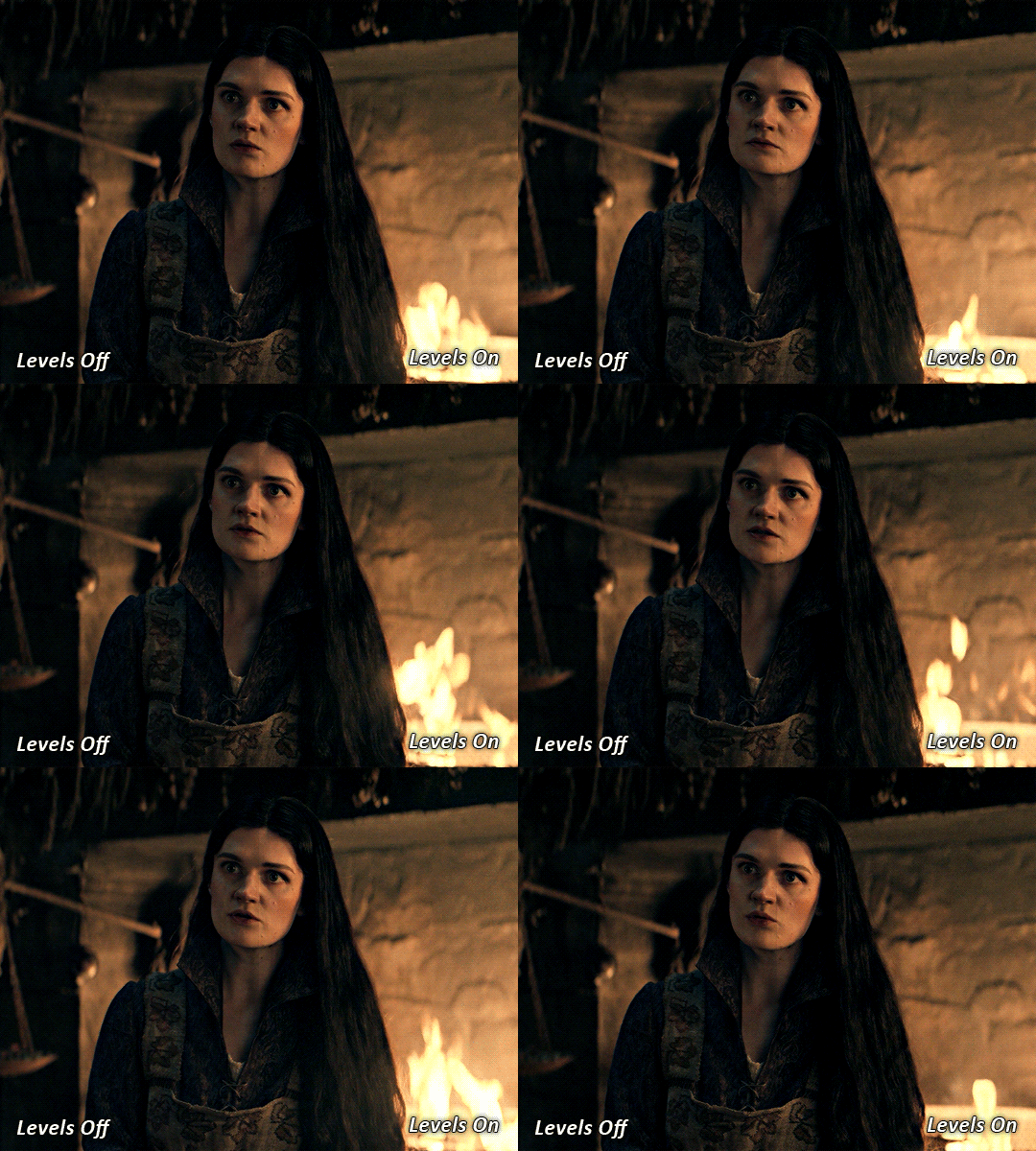
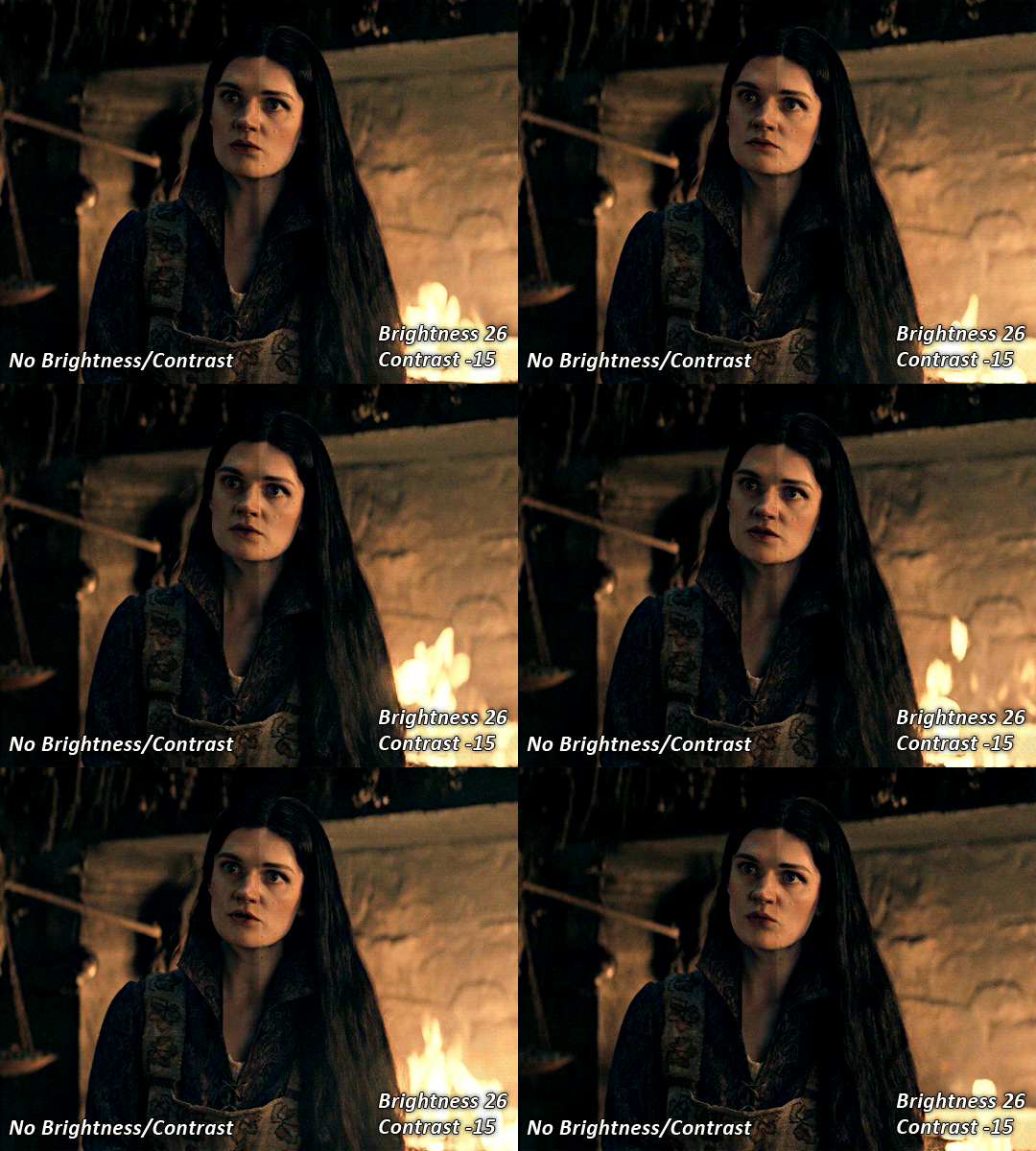
STEP SIX: BRIGHTNESS / CONTRAST
this step is exactly what it says on the tin...it brightens your gif. this step is based on your scene and personal preference, there's no real guide to it.
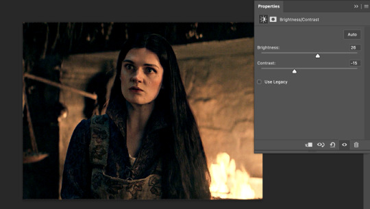
i always pull my brightness slider to the right ( brighter ) and my contrast slider to the left ( less contrast ).
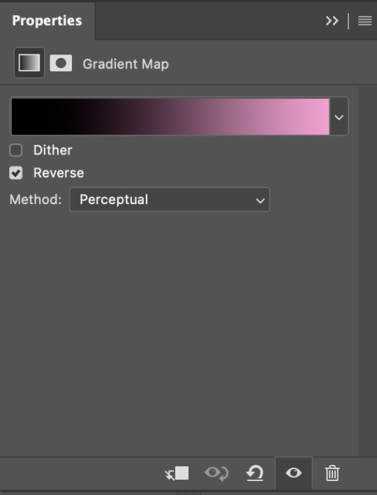
STEP SEVEN: GRADIENT MAP
this last step is something i learned from @nataliescatorccio ! i add a gradient map to the top of my stack, and choose a lighter colour of what i want my overall gif to be. in this case, i used a very light purple!
i then set the blending mode to "soft light" and lower the opacity to anywhere from 20-30%. for this gif, i did 30%
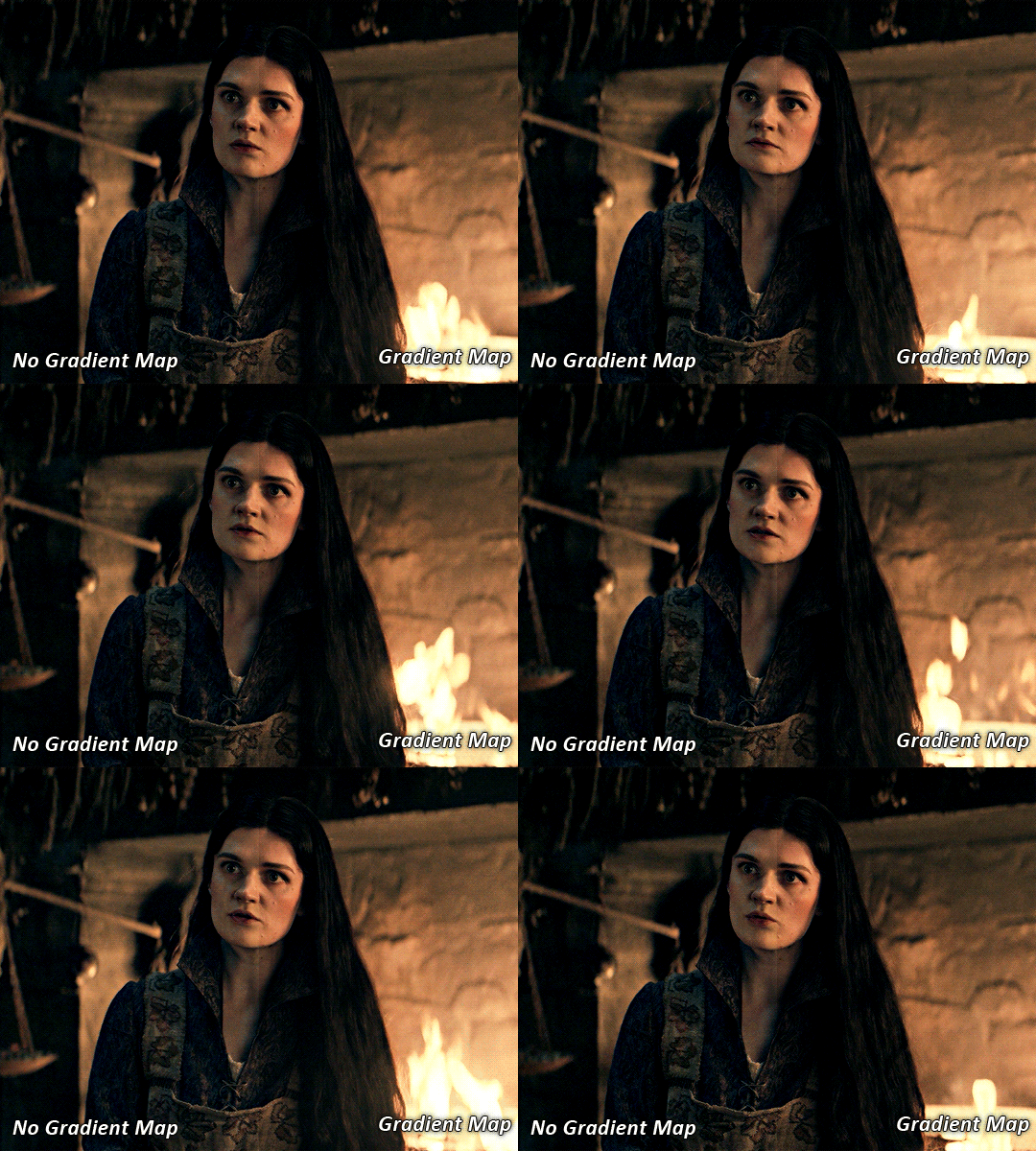
this step will help make your colour pop once you do your main colouring!

PART TWO: PAINTING & COLOURING
- step 1: layer 1 - step 2: layer 2 - step 3: layer 3 - step 4: final touches
okay, so my actual colouring process is based in 3 layers. for this gif, i'm using a deep purple/mauve colour !
STEP ONE: LAYER ONE
between your brightness/contrast and gradient map layers, add another blank layer. change the blending mode of this layer to "colour" and set the opacity to 40%.
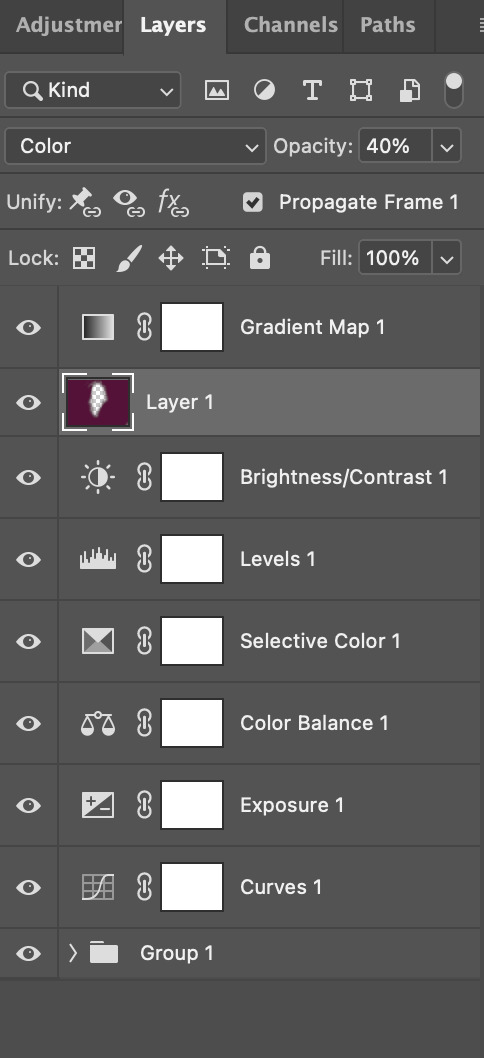
then, using a soft round brush with an opacity of 100% ( size of the brush is your preference, i typically use around 108 ), colour the parts of the gif you want coloured !

you can see this helps us get the canvas to a more uniform purple colour!
STEP TWO: LAYER TWO
for layer two we're going to do the exact same thing. add a layer above your previous, set to "colour" at 40%. we're going to go over the same areas!
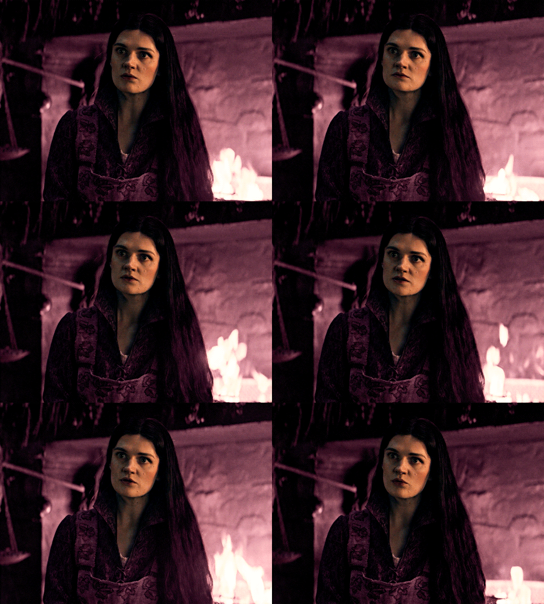
you can see this helped get the purple so much more vibrant and closer to what our final colour is going to be!
STEP THREE: LAYER THREE
for our final layer, add another layer above the previous 2, set your blending mode to "multiply" and your opacity to anything from 60%-100%. for this gif, i did 60% !
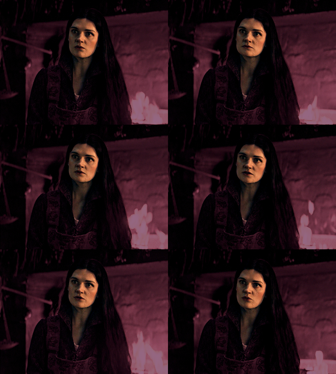
now, our colouring is pretty much done but you can see that, now that our colour is down, alys's face is still a little too blue/green/yellow for the background purple. the next step, we're going to adjust and add final touches!
STEP FOUR: FINAL TOUCHES
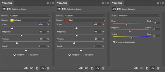
at this point, i went back into my selective colour layer and adjusted my yellows & reds and went back into my colour balance layer to adjust everything overall.

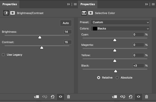
at this point, i'm going to go in and add some adjustments layers above everything - i usually add some brightness/contrast, and a selective colour layer to darken the blacks.
which brings us to our final result:
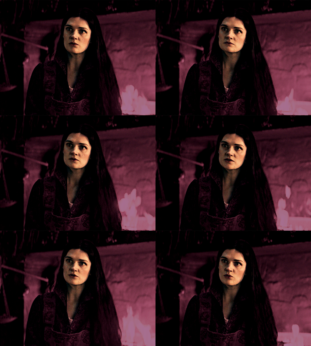
#usergif#dailyresources#pscentral#ps tutorial#tutorial#coloring tutorial#allresources#userbecca#tusermich#userjoelle#ughmerlin#mialook#*tutorial#**
174 notes
·
View notes
Text
A Quick Review Of Helluva Shorts #4: Chupacabras
Hey everyone, helluva bored critical here to give a review of the newest HB short; CHUPACABRAS. I'll do my best to cover the plot, the goods and the bads, and to give my two cents.

First off, the composition of the title card is a bit awkward; the flashy text of "CHUPACABRAS" reminiscent of Mexican culture clash with the duller tones of the background, making it less appealing. If a different screencap was chosen, such as this:

I think the text would've fit better.
However, the plot premise is pretty good, let me talk about that if you haven't seen it yet; I.M.P. head out to kill a client, but they're surrounded by a hoard of goats and they try to clear 'em out. The client, Gerardo, wakes due to the ruckus, and Blitz is captured and mistaken for a chupacabra.
Note: the folklore of the chupacabra originates from Puerto Rico, though sightings of it have spread to Mexico and other parts of Latin America. Mexicans do know about chupacabra, but it's commonly misinterpreted as being of Mexican origin.

In Mexico, if I'm not mistaken, the chupacabra looks similar to a mangy coyote. Blitz is wearing more goat-like rags, which isn't entirely accurate.
Anyways, Gerardo has taken Blitz's gun and crystal, so he's unable to break out of his sitch.

The D.H.O.R.K.S., getting word of a "chupacabra" in Tijuana, head to Gerardo's display, where he's chargin' 100 pesos per view. The agent duo gets into a funny squabble about payment, and the tiny black goat that you see in the image above, meanwhile, heads over to Blitz. Blitz bribes it with a nice slice of cheese to help him out.

Gerardo is close to shooting up the D.H.O.R.K.S with Blitz's gun, but since it's demonic, it burns his hand and leads to an improbably catastrophe bullet ricochet that kills him.

The goat retrieves Blitz's crystal; Blitz and the D.H.O.R.K.S. make a hasty escape, and the episode ends with the small goat beginning its Cult of the Lamb arc :).

What was good:
Moxxie and Blitz's interaction at the beginning is a good joke, it got a chuckle out of me:
"I want to say these are Earth goats, sir." "I don't care how great they are, they are In. My. Way!"
The Hispanic voice actors did an awesome job.
The music is energetic and fun.
D.H.O.R.K.S. and Gerardo's interaction is well-executed, it was my favorite joke of the short.
Blitz's escape is well-animated and he looks like a rascal.
Background jokes, such as Agent #1's badge saying "Insert Text Here".
The art of the final shot, where the goat is ruling over its disciples in a candle-lit shed, has great composition and lighting. Whichever artists created this shot, you executed it damn well.
Along with this, the shot of Gerardo's house is beautiful.
The beginning frenzy was entertaining. I liked the shot of Blitz shooting like a madman:

What could've improved:
Millie had no lines in this short, despite being present in it. I wish she did; being a farm girl, she could've had some quick commentary 'bout the place or interact with Moxxie a bit.
Blitz's swearing in this short can drag on a bit. He's a crude imp, but some of the jokes just got the punchline of a swear. They could be crafted better.
As mentioned in the beginning, the title card could use some work.
Also mentioned, how the chupacabra is represented isn't accurate. I'm no expert though; if you're reading this and wanna counter me, I'm alright with that.
Other comments/opinions:
The pesos ain't exactly accurate, but they get the main idea across.
I ain't a fan of HB humor to be honest, but I won't fault you if you like it.
I.M.P. missions are starting to get restricted to shorts, which I'm not a particular fan of either. The show was originally advertised as a hitman dark comedy, but its main plot has changed to something that I can no longer be invested in.
I appreciate the background team and the music composer, Alexander Arntzen. I'm a big sucker for art.
Overall rating: 6/10 or 7/10. Nothing too spectacular, but it's pretty cool! Let me know what you thought of the short in the comments.
83 notes
·
View notes
Text
1-b social media pfps
monoma: photo he once managed to take of bakugo tripping over something. yes he gets threats over it, no he will not change it ever
setsuna: changes hers frequently, most of the time it's her newest cool selfie. sometimes the chosen pictures feature one or more of her geckos
tsuburaba: also changes his pfp all the time but in his case it's a dumb blurry selfie on monday, random cursed image on thursday and a dumb blurry picture of something else (sometimes also featuring his hand doing a thumbs up) on sunday
yui: just a solid color (im thinking peach or pastel pink) and it's been that way since forever
honenuki: somewhat poor quality picture of his cat that he finds endearing. it's also been that for a really long time. worth noting that his cat is incredibly ugly
shishida: it's not the exact same picture that's on his school ID but it could as well be
rin: originally he had no pfp and just went with the default. tsuburaba really hated that for some reason and kept pestering him to change it so eventually he added a hat to it bc he didn't know what picture to choose (tsub was pleased)
kinoko: fairly recent mirror selfie with a pink overlay and a bunch of cute effects added. her phone covers her face in the picture and the focus is on her frilly dress
reiko: pretty #aesthetic black and white portrait of herself taken by someone else
ibara: either a selfie taken from an awkward angle, boomer-uncle-on-facebook-style, or a bible quote image with a sunset background taken from the internet (too small to read)
tetsutetsu: cropped picture of himself with his friends taken in rather poor lighting. it is more on less centered on him but someone who doesn't know him could still have trouble telling which person is supposed to be him.
kendo: epic motorcycle pic (not her own </3)
kaibara: a nature photo he took once and liked a lot. he originally intended to change it every time he took a new favorite but ended up getting used to the first one he ever set his pfp as and hasnt changed it since
pony: cycles between selfies, picrews loosely based on herself, random pretty photos she takes (usually of the sky) and screencaps of her anime faves
awase: old photo of his dog, may he rest in peace
manga: goku
kuroiro: either a picture of himself wearing his favorite outfit with his face cropped off, or just solid black. can't decide
kamakiri: stick bug :)
shoda: slightly old pic of himself taken by someone else, zoomed out so it shows about half of his body. outfit and surroundings are nothing extraordinary but the picture has an inexplicably cool aura.
bondo: photo of a pretty flower. he's also never changed it
#bnha#class 1b#monoma neito#setsuna tokage#kosei tsuburaba#yui kodai#juzo honenuki#jurota shishida#hiryu rin#kinoko komori#reiko yanagi#ibara shiozaki#tetsutetsu tetsutetsu#itsuka kendo#sen kaibara#pony tsunotori#yosetsu awase#manga fukidashi#shihai kuroiro#togaru kamakiri#nirengeki shoda#kojiro bondo#PHEW#tikto's headcanons#the original idea for monomas was that the picture was taken by kaibara buuut yknow what#just because he likes taking pictures doesn't mean he took that one.#he's got better things to photograph than bakugo falling on his ass#still thanks to my friends for giving me this idea bc i was stumped lmao#by social media here i mostly mean like. whatever messaging app they use? line?#other social media i think arent something that everyone in the class would have
55 notes
·
View notes
Text
Lacey's Petshop Theory/Analysis (So Far)
So Lacey's Petshop dropped a couple of hours ago, and here's my thoughts so far after watching the video twice and doing some rough transcriptions.

Illegible text transcriptions HERE.
Warnings for disturbing imagery, abuse, blood, and animal death. Also spoilers.
So here's my overall takeaway from this entry:
There are two stories going on. The story of Lacey, who represents Rocio Yani (Lacey Game's cofounder), and the story of how the games came to be. They're very heavily connected, but not everything we're shown in the Lacey games is exactly what happened to Rocio.
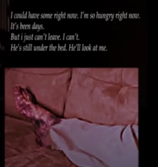
In Lacey's Petshop, Lacey's uncle kills her dog. After years of abuse from him and him killing this one bit of happiness she has in her life, she kills him. She hides his remains under the bed, and is afraid to leave the room after this.
Lacey seems to be a sort of stand-in for Rocio, who has clearly suffered similar abuse. There are two directions that Rocio's connection to the "bad versions" of the Lacey games could go: they were vent pieces to she could express her trauma, or she is literally connected to the games, living out a 2000s-esque life while her trauma seeps through in the bad endings.
Now, for further explanations.
I think it's pretty evident that Lacey's uncle killed her dog. With how she constantly mentions him "taking her angel away", and how the dog's face appears while a mutilated leg/bloody eye flash on screen.
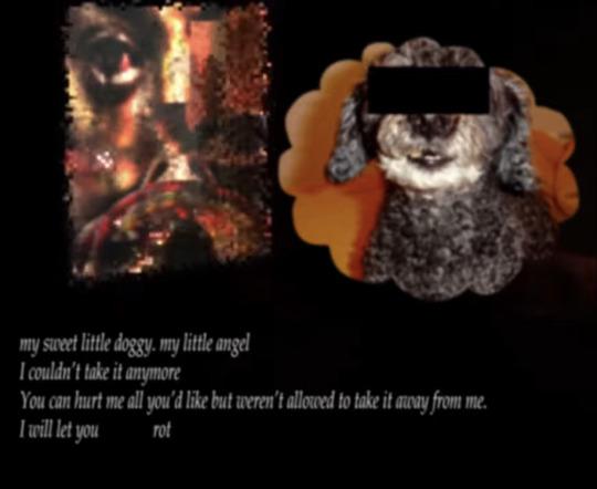

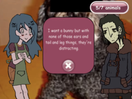
The motifs connecting the image of the dog to animal death and distress go even further:

I believe that Lacey killed her uncle after this mostly due to how images of a mangled/rotting foot and a bloody eye when she is talking about how "he is still under the bed" and that she "can't leave"

The lines about her not being able to leave also could imply some sort of guilt. The mirror scene could also reinforce this, since she sees horribly distorted versions of herself.
I also don't think every game is a direct representation of her trauma, since the timeline get a little messy if they are. Especially Lacey's Wardrobe. That's the one that sticks out as different from Lacey's Diner and Lacey's Petshop, which both focus on the abuse from her uncle. Both Lacey's Diner and Petshop do both show that she killed him, with in Lacey's diner she is cooking him and her trauma into the food and serving it to others (a representation of what what is doing with the games, maybe?"
BONUS NOTE: After you click the... substance on the left, it shows this image, which features Rocio's name.
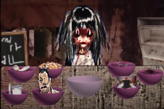

As for what's happening in the real world. I'm actually going to go with the theory that Rocio is literally connected to the game as Lacey, and that's why there's bad endings that didn't used to be there. Everyone in the story remembers how they used to play Lacey games, and never seem to remember anything disturbing. But now that Rocio is connected to the game, her trauma is infecting it.
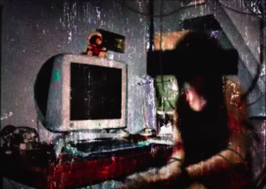
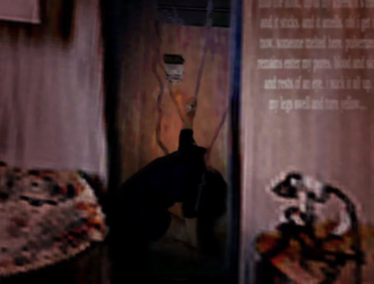
I think that her being connected to the wires is more literal than some may take it.
Forming a bit of a timeline, Laceygames.com / Yaniasogames started in 2004, and from the interview with Grace Asop confirms that they parted ways in 2010. This means that the "infections" were more recent, which is why no one has been discovering them until now.

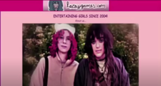
Lacey / Rosio just wanted to have a normal life, so she connected herself to 2000s-esque flash games to make that a reality. But her past traumas ended up seeping into those games, creating the grotesque imagery that we now know.
I think that's all I have so far. Here are my favorite screencaps from this episode that I didn't get to use:
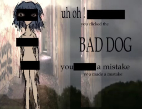
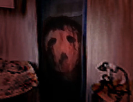

If anyone has any comments, ideas, or additions, please add them! This series has brought me back into the analog horror community, and it's really fun to discuss!
#lacey's flash games#lacey flash games#lacey games#lacey's petshop#lacey's pet shop#lacey's diner#lacey's wardrobe
473 notes
·
View notes
Text

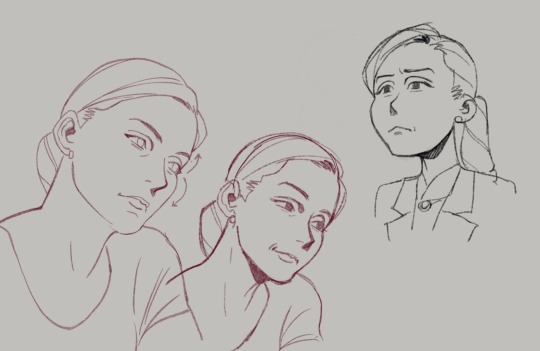
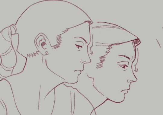
Some studies when I was watching BCS for the first time. I really enjoy getting a good likeness, not just because it helps with recognizability of the fanart but also because it's a really fun challenge. Some tips on how I approach this:
You can see how I work through Kim and Jimmy's faces here: First I trace directly over screencaps from the show, focusing on marking the distance of each feature and its placement on their head shapes. How close is the brow to the eye, nose from the middle of the mouth, etc.
After tracing it out, I do some freehand sketches relying more on the shapes and proportions I've mapped out. The little arrows I've drawn next to some of the faces help me remember to keep note of the way certain lines or shapes curve into others. These are great things to exaggerate, because when you keep these things accurate and intact, the illusion of likeness comes through.
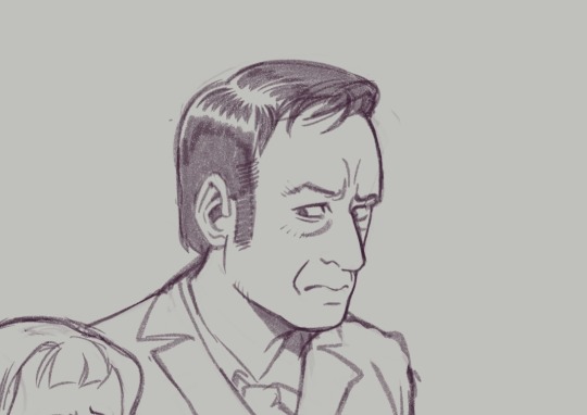
Whether you actively recognize it or not, your brain is always making connections to the negative space relationships between features almost as much as the shapes and positions of the features themselves.
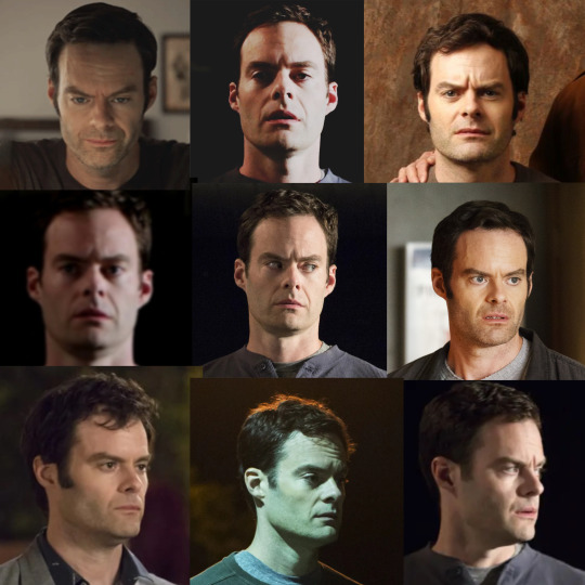

Another thing I like to do is collect much more detailed, organized reference of the character I'm drawing and figure out the harmonies of the face. This is kind of a bastardized and oversimplified Reilly method, where I'll draw straight lines connecting each feature of the face to build landmarks. You can see me working though that here, with Barry.
I started figuring out his head shape, but I also found that the midpoint of his furrowed brow creates a triangle shape with the shape of his nose down to the edges of his mouth. Keeping this shape consistent, even in simplified/stylistic depictions of the character, means he will always be a little recognizable, because the part of your brain that knows what Barry looks like connects with that existing shape.
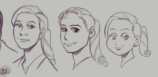
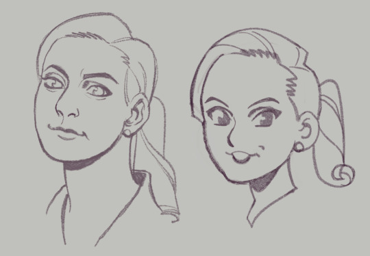
Playing with those abstractions can help you experiment with how you want a character to look. Don't worry if they don't look perfect. That's the fun of study. Here are a handful of Kimmies, each varying in % of likeness (and degrees of success), but all keeping some key points of her "design". You can see where I start to play with features, removing some things, tinkering with others.
Another little note...since we view these people through cameras, different focal lengths can affect the way their features are proportioned (take a look at the perceived width and height of Hader's enormous fucking head in the upper right corner compared to the adjacent images, for example)–– so this is a good way to keep that in check when you're doing studies. As always, this isn't drawing law. Draw fanart however you please, and feel free to discard all of this information! This is simply my approach, and it is fun for ME!
Thanks for reading.
This post brought to you by my Patrons, who saw this first on July 4 2023.
657 notes
·
View notes
Text
The Twitter Mess is Suspicious
So going through all the information that has been sent and shared with me today about Lou's twitter post I'm fairly sure it was a hacking. Obviously, we can't know either way and it's likely never going to be publicly addressed but that seems to be where it's pointing to.
I will say there is a lot of information out there that seems to just be made up so I'm only talking about what I have been able to confirm.
We know last night that Lou's twitter account followed an anti-BuckTommy, Buddie stan who had previously posted the old Instagram posts. His account also tweeted a random screencap of an Instragram profile that had an abliest joke about blind children in it. Shortly after the tweet was deleted and Lou's account blocked them. All of this was confirmed with by the owner of the twitter account his account responded two. I do not think the owner of that account has anything to do with the hacking because he seems equally confused by this behavior.
The first reason I think this is fake is because the account followed the anti-account. Which would make little to no sense for Lou to do. However, if you wanted to make sure that account saw and screencapped the response and shared it to their decent size following? Replying and following tracks.
The response is weird for two main reasons. The first being the fact that it's an ableist joke. The tweet was responding to criticism of Lou's previous posts. Even the account holder pointed out that this was a strange, strange way to respond. It wasn't an insult, it wasn't a response, it was a joke. If this was Lou responding to the criticism, you would think it would be more direct.
The second reason this response is weird is because it's a screencap of a profile on Instagram that has zero followers and no posts. The joke wasn't even a post, it was their profile message. To me, this seemed like someone was trying to replicated the style of early 2010s meme culture that was a lot of screencaps which include posts, usernames, etc. instead of just the actual image but wasn't around for it so they didn't fully understand it. People weren't screencapping profile messages, they would just screencap a post they wanted to share to make it their own that showed up on their feed. So this seems like a failed replica to me.
The quick deleting and blocking of anti-Bucktommy fans makes sense if this was a hacking. Lou is a verified account and I'm not sure how long he has been. But this means either he got verified because he's an actor (which proves he owns the account) or he pays for it (which is easy to prove by providing your credit card number to customer service). Either way, he was likely able to get it back pretty quickly, deleted the post in question and blocked people.
I know a lot of people are saying he would have said if it was a hacking but I disagree on that. To start with, it would have simply brought more attention to this and there truthfully doesn't seem to be a lot of traction around this. Second, if he did apologize it would draw attention to the original instagram posts (which are now deleted) and that wouldn't be good PR. So likely this just won't get mentioned moving forward.
Other weird thing I noted is both the anti-BuckTommy user and the screencapped acccount both have similar Chuu/Cuuh in their username. Which does make me think there might be some other options for what happened but I don't have enough information on that at the moment to express those.
Overall, I don't think this is the major issue that some people are making it out to be. I'm leaning towards hacking but there are a few other options. None of which are these awful, horrible things that some antis are making them out to be.
Until I get more information I'm opting not to give this anymore attention. It isn't picking up traction and it likely won't and most people will have probably moved on in another day or so.
If you have more information please reach out and share it with me.
119 notes
·
View notes
Text
The Ineffable Detective Agency Presents: The Main Bookshop Clock's Hands are BACKWARDS and Other Revelations!
(Good Omens Season 2, Episode 1)
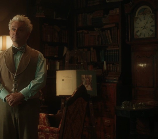
We can't trust the way we've been reading the bookshop clock next to Aziraphale's desk, because the Hands are Reversed* for some (or all?) of the season!!
Plus a Time/Clock Disruption shortly before the double half miracle!
And possibly another Time/Clock Disruption when Gabriel first arrives at the bookshop! Did Gabriel (or whatever he had in the box) cause the hands to reverse?!
And more questions about Gabriel and what Other Thing might be going down in the up!
*Sound unbelievable? To us - @meatballlady and @embracing-the-ineffable at our new @ineffable-detective-agency - too, but let us share our proof:
Welcome to our Ineffable Detective Agency! We've been doing some digging the past few weeks; among our research has been recording each sighting of in-universe timestamps - Crowley's watch, Nina's phone, Maggie's watch, Aziraphale's clocks, and more! Our main findings are summarized here (if you're looking at a reblog, you can check for updates on the most recent version, here), with detailed screenshots below.
Main Findings - Episode 1:
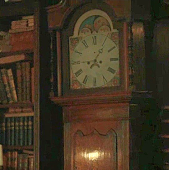
Aziraphale's main bookshop clock next to his desk is frowning for Reasons! Maybe this is one: during most or all of episode 1, the minute hand is the one with the wider arrow, and the hour hand is the thin long one. (Proof is in the very next section, and it changes everything we think we know about reading that clock!)
Edit - New Finding! There may have been a time/clock disruption when Gabriel first arrived at the bookshop, which could have CAUSED the hands to reverse.
There's ALSO a big time/clock disruption when Gabriel appears at the top of the stairs, after the apology dance and before the double-half-miracle. Perhaps the clock's ability to show the time accurately is disrupted by something like a powerful 25-Lazarii miracle?
Shax and Crowley initially discuss something "going down in the up", far sooner than when Gabriel shows up in the bookshop. ("my arms were aching 'cause I had to carry that box for so long....")
Shax later tells Crowley that the previously-discussed trouble involves Gabriel, and even that conversation next to the Bentley (at 10:35 or 11:35) was well before Gabriel arrived at the bookshop (at 4:20, no matter how you read the clock's hands; screenshot below). Is there some OTHER trouble in heaven that started before Gabriel left?
Or, if Gabriel's arrival caused a time/clock disruption, perhaps Aziraphale forgave Maggie's rent at 11:23 and Gabriel arrived shortly after, which lines up more neatly with Crowley's 10:35 or 11:35 phone call/conversation with Shax.
This all might mean the time jump (or clock disruption) after The Kiss is different than we thought. (Yes, we know Neil is misdirecting everyone about there being a time jump at all by calling it a "continuity error"; he's performing magic for us, and we're still in the middle of his act! His misdirection is part of the trick!) The times are still weird in the last episode, whether you read them the typical way or the new, reversed way that we're suggesting, and we're still working on getting clearer images. Stay tuned - or help us research!
Quick sidenote: If anyone would like to verify our work or join in future sleuthing (ESPECIALLY IF YOU CAN VIEW/ SCREENCAP IN 4K), we would be very grateful!!
Now, let's talk about the clock hands.
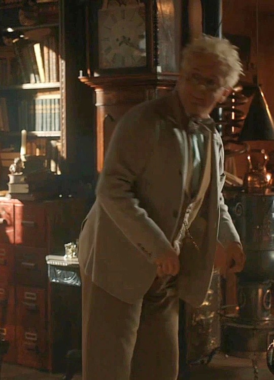
Typically, in typical clocks all over the typical world, the hand with the big wide arrow is for the hours, and the thin long hand points to the minutes. But the main bookshop clock next to Aziraphale's desk is frowning, so who knows what it's doing? Here's the A-B-C sequence from episode 1 that convinced us to read the hands in reverse:
A) Jim shows up naked, knocks, and Azi stops his music with a dramatic groan. Both clock hands point to 4, so this should be 4:20 no matter what hand is for the minutes:
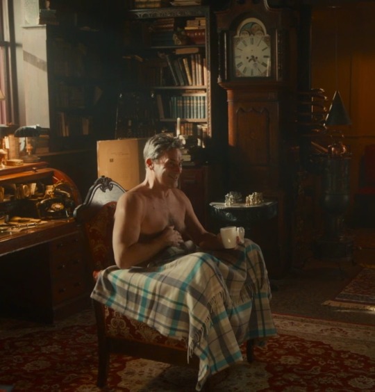
B) Jim tries hot chocolate when the wide arrow hand has traveled just past the 5. This is either 4:26 (reversed) or 5:20 (typical):
C) Aziraphale opens the box, and Gabriel says "I love you". It's now 4:30 (reversed) or a misaligned 6:20 (typical):
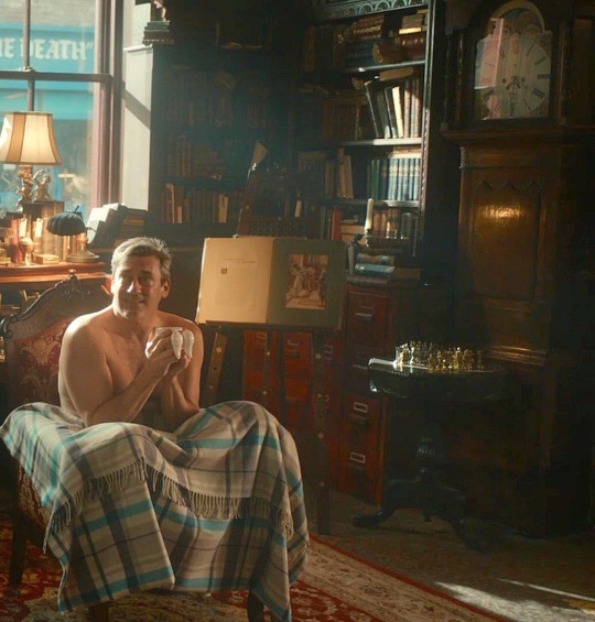
Ok, the sequence of A) Jim arrives, B) Jim drinks hot chocolate, C) Jim says "I love you", fills about 6 minutes of onscreen time. If we assume A-B-C makes more sense as 4:20-4:26-4:30 than 4:20-5:20-6:20, that means the wide arrow hand is sweeping across the minutes and NOT indicating hours!
Those three time points are also bookended by the moments Azi reads Maggie's note and forgives her rent, and later, Crowley's discovery of Jim in the bookshop:
As Azi reads Maggie's note, let's play "spot the clock":
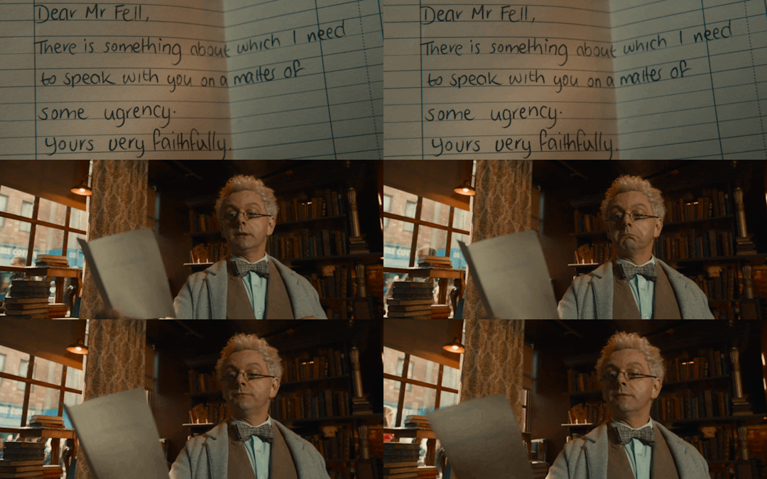
Did you see it?! Yep, we catch a tiny glimpse of the clock through a space in the bookshelf, in what might be the most cleverly concealed but clearly deliberate bit of staging in the entire season (!!). If you've been thinking that we're looking too closely at little unimportant details that don't matter, the way the clock is so carefully made visible here - and in focus - strongly suggests to us that this is important:

It looks like 3:58 (reversed) or 11:20 (typical); given that Azi is interrupted while listening to his 21 minutes of Shostakovich at 4:20, it would make sense that he read the note at 3:58. That means the wide arrow hand is reversed, pointing at the minutes there, too.
[ Edit: BUT, there's also this moment, when Maggie's rent is forgiven; her watch shows 11:23 or possibly a reversed 4:57 (turn it the way Maggie would read it):
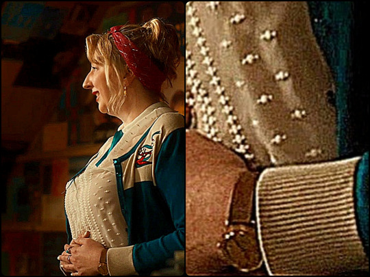
So one more possibility is that the bookshop clock hands were typical when the episode started, Azi read the note at 11:20, and forgave Maggie's rent at 11:23. Then when Gabriel showed up, the bookshop clock jumped ahead to 4:20 and its hands reversed!? ]
Later, Crowley meets Aziraphale at the coffeeshop, then they return to the bookshop. Right after "I. Am. Dusting." - there's the OTHER bookshop clock on the west side of the building. It's hard to see, possibly 5? That could fit with Azi and Crowley meeting at the coffeeshop sometime shortly after 4:30pm.
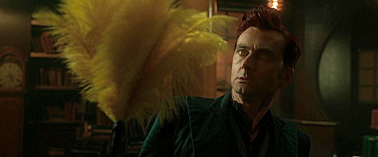
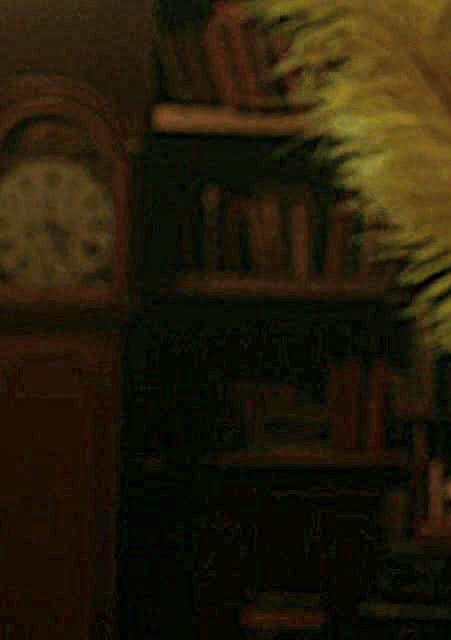
So, if we continue reading the main bookshop clock in reverse, let's see what else happens in episode 1:
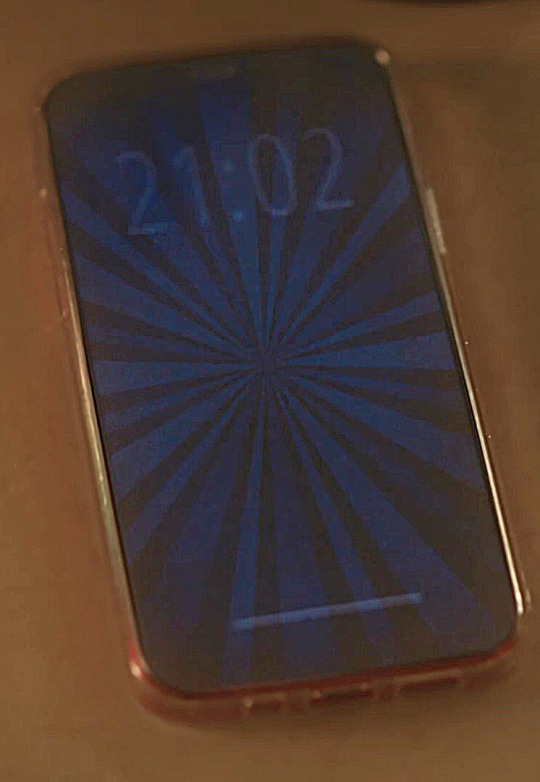
Maggie and Nina, trapped in the coffee shop, are freed by Crowley. Just before Nina's phone starts receiving messages, it reads 21:02 (ie, 9:02pm):
During the apology dance, the clock behind Aziraphale says 9:06 (remember! read the hands in reverse!) This makes sense, if Nina's phone said 9:02 a few minutes earlier:
The clock behind Crowley (the one on the west side of the bookshop) says 9:02 or a misaligned 11:45; if its wider arrow hand points to hours like a typical clock, and not like the sad reversed clock next to the desk, then it could be reading 9:02, possibly a few minutes slower than the desk clock:
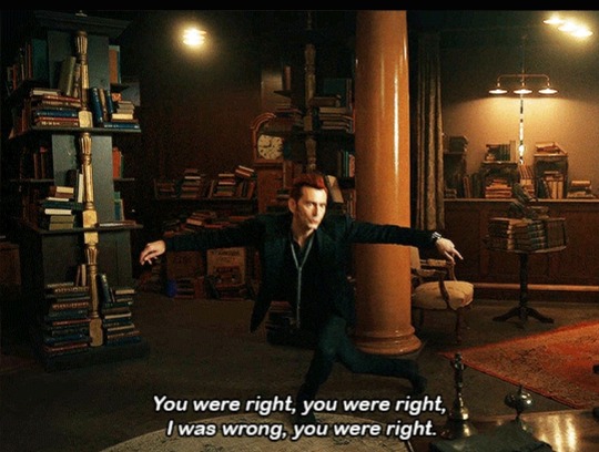
Then Jim appears at the top of the stairs and nothing makes sense; the sad clock next to the desk looks like it says 12:40 - a forward jump of 3 hours and 36 minutes!! (Alternatively, it says 8:02, which means it went backwards by an hour! Either way, it's weird, and we'd love a better picture if you can get one!):

And the clock still shows the same time after the miracle, just before the episode ends:
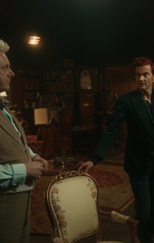
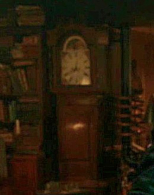
As episode 1 ends, we certainly have even more questions. Did time jump when Gabriel first arrived?! And again, after the apology dance? Or were there whole scenes or conversations that we didn't see? Or did time actually jump forwards or backwards in that moment? Or was the main bookshop clock's ability to accurately show the time interrupted by something like Gabriel's arrival with the mysterious contents of his box, and again by a powerful 25-Lazarii miracle before the double-half-miracle??!
There are 5 episodes to go! Will our sad bookshop clock consistently tell time with reversed hands for the rest of the season? Maybe! Is it becoming untethered from Actual Time as it reacts to the Eldritch forces around it? Possibly!
And what about our other findings? What ELSE is going on in Heaven? Where did Gabriel go after he left, and how long did that take? How long does the elevator ride last? Why was his box heavy, and what was inside?
Stay tuned for the details as we collect them! We'll add links to new posts here, so check the latest version for any updates! And please get in touch with @meatballlady or @embracing-the-ineffable if you would like to help with sleuthing, including getting better resolution screencaps of clocks and all the tiny watches!
Be well, fellow ineffables! Solve Clues and share your findings!
PS: There's a huge list of Clues and metas, here!
#good omens meta#good omens analysis#Ineffable Detective Agency#Ineffable discontinuity#good omens timeline#Good omens clocks#Good omens mystery#good omens clues#Clues with a capital C#good omens screencaps#good omens spoilers#good omens season 2#good omens 2#timey wimey#renew good omens#aziraphale#crowley#good omens gabriel#good omens
249 notes
·
View notes
Note
I hope you don’t mind asking but you consistently have some of the best 911 gifs. How are your gifs so sharp? And the coloring so good? Could you do a little tutorial about your giffing?
omg thank you!!! this gets pretty long so i’m putting the tutorial under the cut
so firstly, i use kmplayer to screencap. the most important part though is the quality of the episode you have. you always want to work with 1080p, and my file is around 2gb. that is how my gifs always turn out ‘the best’ as you say 🤗 of course, colouring and sharpening help a lot, but if you don’t have a good download, your gifs can be helped but won’t be the best possible.
this is the gif i’m making having only been cropped and sharpened. i’m gonna show you how i make a gif and my colouring process (which, for this one, is admittedly pretty short and simple compared to what i usually do.) as you can see, it’s dark and pixelated and doesn’t look that appealing, no matter how handsome they both are.

also, i forgot to screenshot this before i started but the screenshot below shows the action i use to basically get all my screencaps organised to make one gif. this is after you’ve got the screencaps into photoshop in a stack.
i can’t find the original post with the action, and i’m not sure how to share it on this post… but if it’s not that important in the scheme of this post, there are many other posts out there with actions you’ll be able to easily find and download.
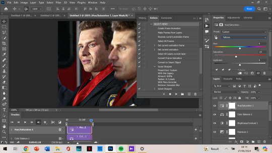
anyways. so this is gonna go through the process of making a gif assuming you’ve done the process of importing the frames and sharpening. (i would normally cut out my taskbar but there are so many screenshots, it would take foreverrrr)
the next step would be cropping. this is the original:
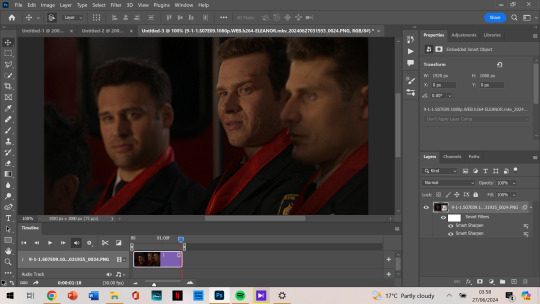
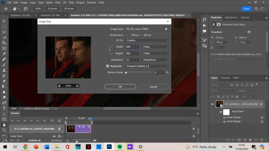
and i’m doing a 540 x 500 gif. i like mine to be bigger so i can only get the person/people i want in the gif (sorry eddie) but sometimes if i want that it’ll be smaller, usually 540 x 400.
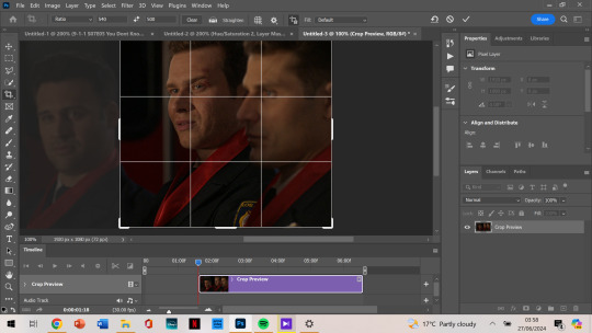
anyways, i crop from the edge and make it a little smaller so i don’t get the white border around it. and then i move the gif away from the top and right edge of the gif just by 3-5 pixels. which i already did here and then zoomed in:
next, image size. i honestly didn’t know about cropping it and then using image size for a few months when i started giffing (i don’t even know what i did back then not knowing that.)
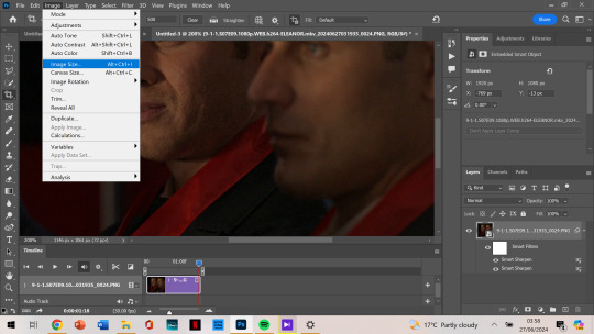
then as you can see, it’s 540 x 500. if you’ve cropped it to the size you want beforehand, it’ll be automatically those dimensions.
next, we’re finally starting on colouring. i always tend to start with curves and use the middle brush on the left. the top one you use to make it darker, and the bottom you find the whitest point on the gif to make it a lot brighter. but i find the middle one colour corrects too, so it’s not too bright or dark, and is less yellow or whatever colours you don’t want.
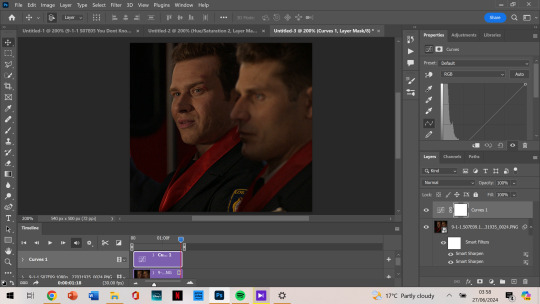
it depends on where you click to get this result, i’m not sure how to explain what i do but i just click all over and try to get the yellows off and the skin colour to look generally the same as what they have. most of the time, if i get this accurate enough, the rest of the colouring process is just to brighten up the gif.
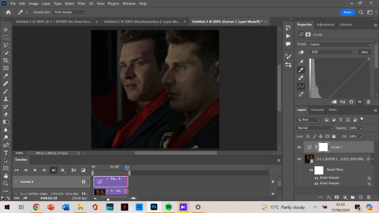
so, then after i got my desired result, we’re brightening it up because you can’t really see them all that well. i use brightness/contrast but i tend to use exposure the most.
as you can see, i am at +2.78 exposure which is crazy high (imo). but as that and the curves layer did a lot of the work for me, i mostly have the colouring i want.
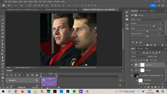
although i think it could be a little lighter, so i add a new layer of brightness and contrast this time. i don’t brighten it all that much after that. i want to make it so that either one of their faces aren’t shining, and with too much of the exposure, it can make that happen.

next, i notice that tommy is kinda green/yellow, so i want to fix that up and make him more natural. i go to colour balance for that this time. most of the time i go to selective colour -> yellow or red, depending on how much i want to change. with selective colour, it gives you a few options in shades: cyan, magenta, yellow and black to alter, all for your specific colour.
meanwhile, colour balance changes the whole thing. since i wouldn’t mind that in this instance, i just go with colour balance.

tommy is looking less yellow and green, but still, he’s not where i want him to be. (plus oliver’s scruff area is naturally ginger so it shows up as yellow, and i want to decrease that a little.) so i go to hue/saturation, choose yellow, and decrease it a little more.
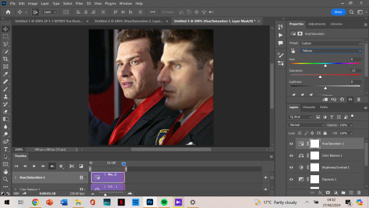
now, after this, i messed around with selective colour as i mentioned earlier and with the colour yellow and red specifically. but after comparing where i was at before, vs with those selective colour layers, i just liked that previous one more. so my last layer is the hue/saturation one. and i’m done colouring!
next, i go to my trusty camera raw filter to make them stand out more and be a little crispier.
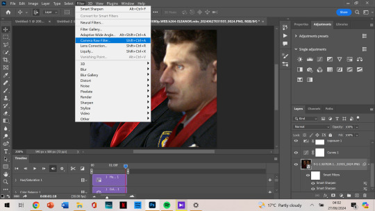
i tend to stick to + 10 up to 30, somewhere in that range. sometimes the texture and clarity match, sometimes they don’t. it’s all up to you, but for this one, i knew it would end up a little too crispy so i didn’t go too high.
i also like to add some grain so that it’s less pixelated (it admittedly annoys me a lot when it’s got those visible square pixels all over.) i never go higher than 5 in grain, it does the job well.
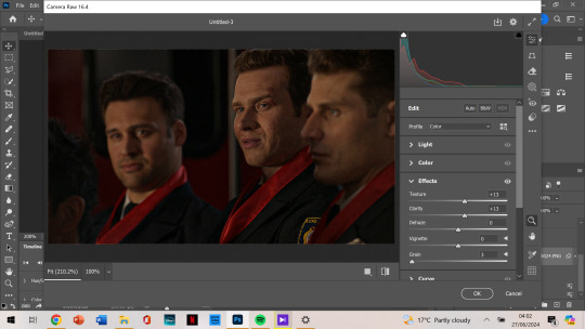
after that, i’m finished with my gif!

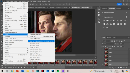
next, we want to export the gif.
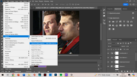
as you can see, the gif is less than 10mb, is set to loop for forever, and is made with selective diffusion. admittedly, i don’t think about that setting that much, but sometimes if it’s a lower quality gif, i’ll change it to selective/adaptive pattern instead. but that’s not relevant here.
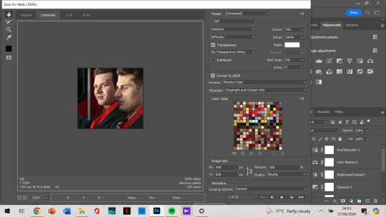
after that, we open our gif that we just made into photoshop again. this time we want to select all frames:
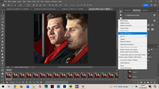
and change the frame delay so it’s not as jumpy. for some reason, it automatically changes so that they alternate in frames from 0.03 to 0.07, but i want them all to be 0.05.
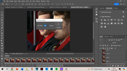
now that’s the last step and you just export the gif again!
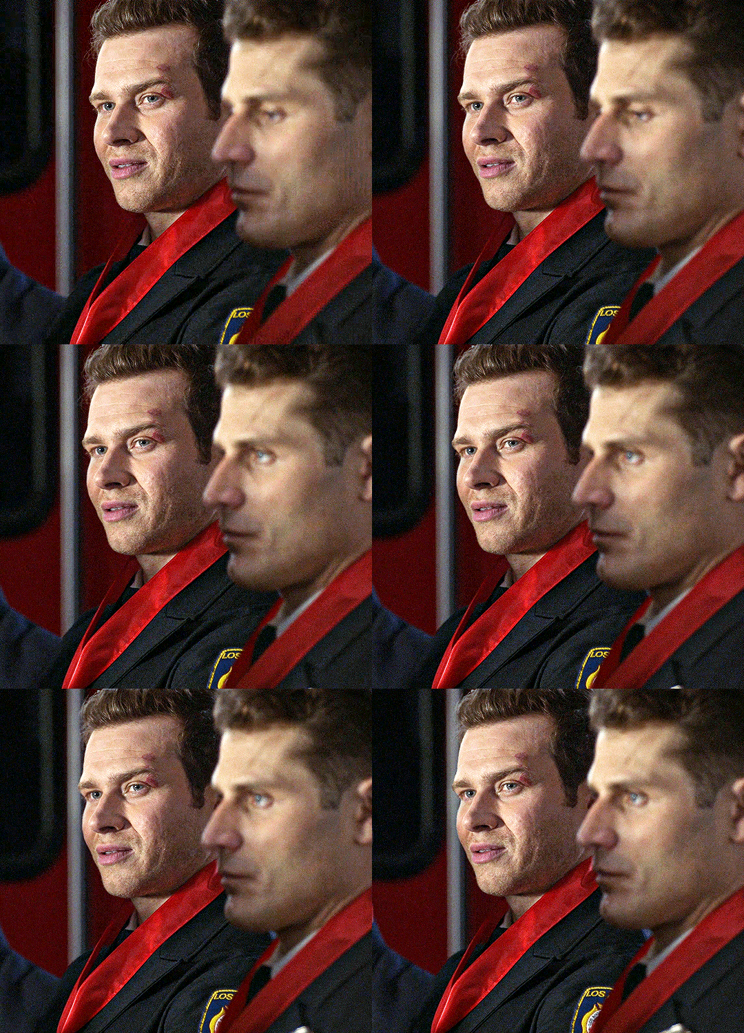
this is the final gif!!!
i hope this was easy to understand! thank you for the kind words, and for asking me about my process because i’ve honestly always wanted to make a tutorial. if you have any more questions, or want to see my process colouring something more difficult to work with, let me know! 🫶
88 notes
·
View notes