#filtering on tumblr is super effective
Explore tagged Tumblr posts
Visit Tumblr Blog
Explore Tumblr blogs with no restrictions, modern design and the best experience.
Last Seen Tumblr Blogs


Fun Fact
Tumblr has 411 employees.
Note
Hello there!
I've been a huge fan of your art of Seb and Clora here on Tumblr for quite some time now. Maybe a year? Idk time is weird aksbjs. Anyway, I'm an artist myself, and I was just wondering, put simply, whats your art process? Like how you shade and color and stuff.
Anyway, have a nice day! And uh- sorry if this is awkward sksbdn.
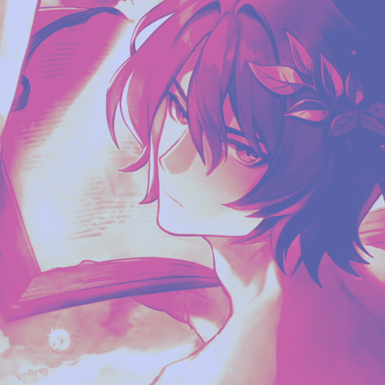
DAMN youve basically been here since day 1 THANK YOUU😭 im glad you like my stuff!! and ur not awkward at all!!🥹💖💖 and i actually posted a timelapse of my process on twitter not that long ago, so ill post it here as well!
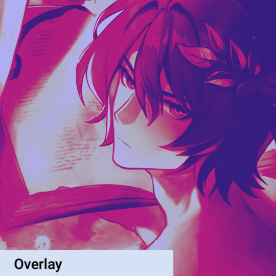
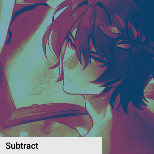
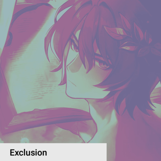
as you can see seb takes me the longest LMAOO hes such a menace for me to draw still...and i dont even think seeing my process helps since its just so much trial and error and warping until it looks right BAHAHA (this is from like a month ago and i ALREADY think seb looks off here too 💀) but my process is super simple, i just colour and cell shade on multiply and then i add a grain texture on soft light 10% at the end. i dont rly do anything fancy for colouring, bc i used to over-render my art and make it really complicated, but now im a fan of just having it look kinda...flat? if that makes sense LOL. i like it aesthetically AND its also easier. OH also something i add to the end of almost all my pieces is this auto-action from clip studio assets which basically adjusts the hue/saturation/brightness. here's an example of what the original flat colours look like vs. when i add this filter:

even if you dont have clip studio the same effect could be achieved with just manually tweaking with the hue/saturation levels afterwards, but i like this filter just cuz its easy and makes the colours more how i like them HOPE THIS HELPS💖💖
#ALSO UNRELATED TO THIS ASK BUT NEXT CHAP WONT BE OUT TOMORROW SORRY probably tuesday at this rate🙇♀️#i forgor that not only do i have to write this long ass chap but also editing these long ass chaps takes a while too#ask#one of the first asks i ever got was asking for a timelapse but i didnt even know how to do that back then#i just recently turned on my timelapse feature in clip studio LMAO its cool#i have another one on my twitter that i didnt post here too maybe ill post it her eventually
236 notes
·
View notes
Text
Stranger Things March Mating Madness posting season starts tomorrow!
Here are a couple last minute Q&A reminders for those planning to participate in a creative capacity:
Q: Is there a hashtag I can use for posting to socials, such as X, Bsky, or Tumblr?
A: Yes, please use #STMMM25 on all platforms!
Q: Is there anything else I should include when posting to socials?
A: Tagging the official event accounts is super helpful to the mods. Also, including the day/prompt on your post gives more context.
***DDDNE content requires additional CW/TWs to appropriately warn others.
Q: I’m planning on posting to AO3. What can I do to connect my work to the event?
A: Here is the link to the official STMMM25 AO3 collection where you can add your works. Don’t forget to use tags and tell others what day/prompt you’re posting for!
Q: I’m just hearing about this event and I want to join! Where can I find the rules and prompts list?
A: Welcome! Here are the links to everything you need to know! (Rules & Prompts)
Q: I’m not going to be able to post on the actual prompt day. What should I do?
A: Post it whenever! Prompt days are a loose guideline for those who enjoy deadlines, but we’d rather you post late/early than be discouraged from posting at all!
Q: I’m offended by something that someone else posted for the event.
A: Cool. Get a diary. This event is open to everyone 18+ and DD content is allowed (with appropriate tagging). Use your filters/mutes/blocks effectively and deal with it yourself. Don’t ruin the fun!
If you have other questions we haven’t answered yet, you are welcome to DM any of the official event accounts or comment below and we’ll do our best to get you a prompt response!
-happy mating season from your knotty mods!
#stranger things march mating madness#STMMM25#stranger things#stranger things event#omegaverse#a/b/o#steddie#steddie omegaverse#harringrove#ronance#buckingham#mungrove#questions
34 notes
·
View notes
Text
Gonna pull back the veil a bit on my process if anyone is curious. My main goal here is to inspire people as I’ve been inspired. I take my art very seriously and get super deep with it. All the positive feedback on tumblr has been very motivating. I have so many things I want to make for you even though I am a very busy person.
I animate frames in clip studio but don’t use the timeline feature because it sucks. I save the frames individually and arrange them in a timeline in after effects. Pretty standard digital stuff. I would animate on cels if I were any more insane than I already am.
I was actually inspired by @sundaysplayzone’s art because I was convinced they were actually converting their drawings to VHS. And I wanted to do the same since I had the equipment and experience. But funnily enough I was wrong, they use digital filters that tricked even me. They really understand how to get that look just right. It’s very impressive! Not a lot of people can do that.
Here is my setup:
1. Crappy Amazon HDMI to composite downscaler (my weakest link, hoping to replace this with black magic design sdi to analog box) I set my monitor to 640x480 and play the animation as well as a test pattern for color correction later.
2. Recording to Sony VCR. (I’m wanting to do an S-VHS setup eventually but the quality increase might not be worth it) I monitor the recording on a CRT TV. I also need to get better tapes to record to. Supposedly those make a big difference.
3. Output VCR recording to a RetroTink gaming upscaler. It takes care of deinterlacing very well and has much better colors than the Amazon upscaler I was using before. It’s a very expensive but versatile piece of equipment.
4. Record on OBS then clean up in after effects again. I record at 29.97fps because I believe this plays better with deinterlacing but I’m not an expert.
All this to completely destroy all the details I labored over. It’s a weird feeling knowing you won’t see the drinks on the table in the background behind all the analog fuzz. Maybe there’s some significance in that. But I hope I convincingly made my furry baddie OC look like a show from the 90s. Might mix it up and make something gay later. Stay tuned.
25 notes
·
View notes
Note
Hello!! First your Tumblr and edits are so gorgeous! Second I was wondering if you were willing to share how you did the second gif of this edit please? Have a great day! (Or night)
https://www.tumblr.com/thereigning-lorelai/713794704750362624/usergif-1-year-celebrationshuffle-challenge?source=share
hi nonny, thanks for the nice words! really appreciated. ♥️ so, you're looking for this grid effect:

you're starting off with two gifs. i'd recommend choosing scenes that are not too close up because otherwise they'll overlap too much and you won't be able to delete enough parts to make the most of this effect.
so, here's my base gif that i just did in black and white with some minor purple brush strokes set to screen:

i then chose my second gif and coloured it with a purple gradient map and a purple colour fill set to multiply. the colouring of the gifs is entirely up to you and what you think looks best. so here's my second gif, still without the grid:
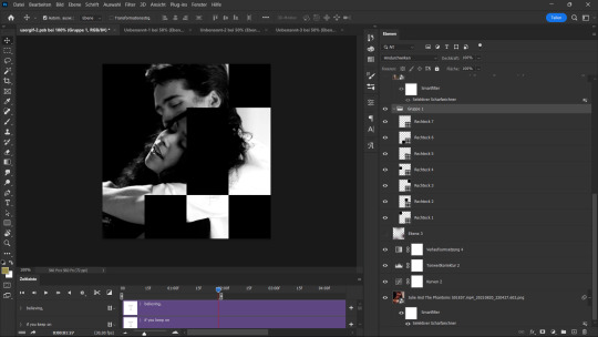
this is where the fun part starts - the grid layout. i created that with a new guide layout. this is a super neat tool in photoshop that helps you align shapes or selections on your image. the guide lines basically float over it and help you set up symmetric shapes or layouts. you can define how many columns and rows you want to have and then photoshop creates the guide layout for you. for this gif i chose 4 columns and 4 rows:

with this set up, i started creating the rectangles to make the purple gif visible on top of the black and white one. this is my final layout for my shapes:
you can move around the shapes to your liking and what works best with your gifs. i didn't want to cover too much of my base gif but also tried to make their faces in the top gif all be in the gif as much as possible.
this step is just a lot of moving around your shapes and seeing what looks good tbh.
i then grouped my shapes and clipped my top gif (including all layers for the colouring) to my shapes group:

looking good so far. the only thing missing are the lines for the grid. this is where your guide layout comes in again. i just reopened it and then traced the guide lines with my line tool to create the white grid overlay:
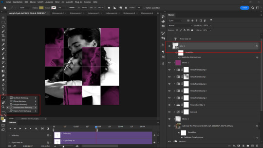
(for editing purposes i turned all of the line layers into a single smart object at the end. this is why you only see one layer for all the lines in this screenshot.)
finally, i used a gaussian blur (0,5 px radius, 100% fill for the filter, 40% fill for the overall layer) on the smart layer to make the lines a little bit smoother and softer looking. this is totally optional and again, up to what looks best to you.
added some text et voilà:
#asks#kind nonnies#usergif#*tutorial#hope this helps nonny#if you have any further questions just let me know#i'm not the best at explaining especially because i think my way won't be the most efficient or even logical#but that's how i did it and i think it's fairly easy to achieve
362 notes
·
View notes
Text
Note , I plan on remaking this .
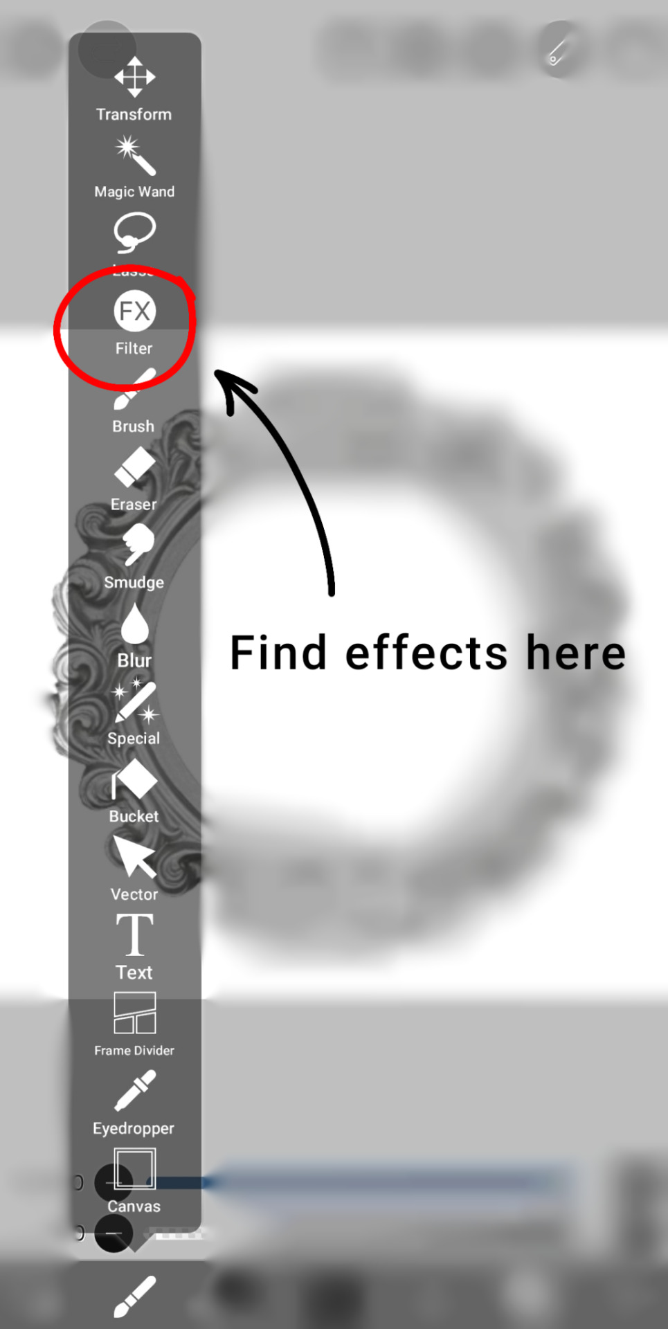
Here's that tutorial a lot of you were asking for ^ ^ I do everything on Ibispaintx as of right now, which means everything you'll need is free! I've provided all of the effects and knickknacks I use on there (Tutorial below cut)
Before anything else, here's this website. It'll remove (simple) backgrounds from just about any image for you, no pay required
-
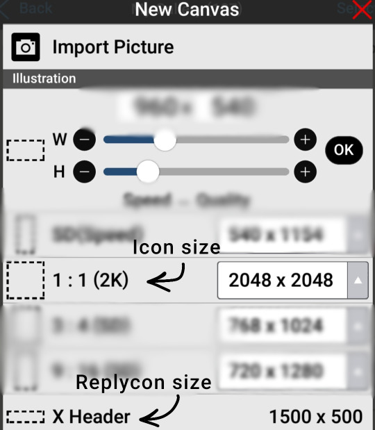
Tumblr banner size 1664x936
Tumblr icon size 2048x2048
Tumblr replycon size 1500x500
-
This part is pretty self explanatory I think. Get on Ibis and test out some of the filters shown here to get comfortable with how they work! Layering the outer stroke effect is my savior
-
The following section is for how I do my coloring. I start off with a color, darken & lighten layer and add from there!
Layer types such as overlay can create a huge difference in how your coloring turns out in the end. Here is a few examples of that, with the 1st image just being the base layers shown above
-
And honestly that's about it. Websites like Pinterest can be super helpful for resources, search keywords like rentry or carrd along with whatever you're looking for so better results show :3 @c0ldhues Ok bye
75 notes
·
View notes
Note
Even as a pale, white, petite, always pink, and female myself which seems like all they seem to insert into these fics…. I freaking HATE reading that in a x reader fic. Because all I see then is those basic asș AI generated girls who all look the same, it becomes a joke. And the stupid description of pale snow skin and everything being pink, and I do mean EVERYTHING is freaking vomit inducing. We’re all asking for the bare freaking minimum.
1. Tag properly (Keep to who the main people are, side people not needed. That can be added to the author notes.) The goal is not to flood tags and having people endlessly scroll.
2. x Reader - No actual descriptions of what this person/character may look like (I would also say if the description of the clothes aren’t important to the scene, that can be left out. This might just be a me thing. Why the F are these people always just wearing a T-shirt, leggings, and a freaking messy bun… 🫤 cozy but EVERY SINGLE TIME! )
3. x OC / x Named OC - Go ham! Do all the descriptions, outfits, etc. No one should bother you then since you let them know in advance. It’s even super cool if you give an advance notice of what said character will look like.
4. Please edit your stuff. Even if you’re a beginner (nothing wrong with that, everyone starts somewhere) edit as best as you can. Storyboarding is so great too, to help remember things and look back.
5. PLEASE PUT YOUR AGE ON YOUR TUMBLR!!!! Especially if you write mature content!!!!!
We’re all well aware (like that racist POS, who I hope you blocked said..) that anyone can do what they want and how they want, but if you want people to read your stuff and start engaging then going about it in a smart way will do you wonders!! I think decline started once the cesspool of Twitter started coming here. People have become straight up asșholes on here. You can feel the shift. I miss old tumblr and even AO3 isn’t the same (and I refuse to ever go on wattpad… the horror ☠️).
Oh, I love you. Tens across the board with everything you said, and thank you so much for expressing solidarity with your opinion. You're amazing.
It didn't even occur to me that sometimes even white individuals can't relate to this content because not all of them identify as women, or look like the women who are often displayed or described in this content, which is very much catered to a pretty, perfect, docile, very much so male gaze esque ideology.
I really really agree with the shift. I could write a whole paper on this, but since Twitter has merged with us, I've seen a rise in dub-con/infantilization/overall inconsiderate culture. And I know it's out of left field, but I truly think this is all connected.
Almost all of the content now is not only incredibly drenched with smut, but also flooded with unhealthy dynamics where women are not only heavily degraded and taken advantage of, but made to fit this very, I had to say it, child-like dynamic. I mean, I had to block an author the other day because in the tags it literally said "sexualization of the word kiddo and I don't give a fuck."
All this to say, this archetype that more fanfics are leaning towards, submissive and cutsie, often fit this ideal of innocence and purity that people of color have never been included in.
And we're beginning to see this level of exclusion more and more. Not just in smut.
I get it. Everyone is in to what they are in to, and everyone can filter what they don't like.
But we have to face the fact that there are some serious issues effecting the fanfiction community on this app.
Still never going back to Wattpad, though.
39 notes
·
View notes
Note
Do you perhaps have any resources on a harm reduction approach to disordered eating? it's been tough to find specific of this online and conventional websites only offer "talk to your loved one about what they feel" or either going to the GP. Certainly haven't found resources to help when you are not someone's parent/teacher/etc
the search function on this website is abysmal so i can't find the post but @transmutationisms wrote a very detailed summary of harm reduction tactics for disordered eating!
@librarycards has an entry in the psychiatric survivor zine called "Refuse!" which touches on the themes, as well as going into how to reduce your own fatphobia while still engaging in ED behaviors
Saving Our Own Lives has some chapters on it but i don't find them to be super comprehensive, quite honestly
there is some useful info in this Filter Mag article, as well as some background on why harm reduction is pushed back against in the ED field
Gloria Lucas' nonprofit Nalgona Positivity Pride has this as one of their focuses
while i wouldn't necessarily suggest seeking them out (at least evaluate what is/isn't going to be detrimental for you), the first place i ever encountered harm reduction for anything was in "pro" spaces (don't really want to type it out + get this post flagged). i wouldn't trust any information about nutrition you see in those spaces, but there are often threads about safer purging, specific scenarios, signs of common health effects + how ppl make them more manageable, etc. unfortunately, barring individual blogs on tumblr, these are the only places i can think of that you would be able to ask extremely specific questions + get a serious, non-condescending reply in a timely manner without being banned or reported (you are welcome to ask me specific questions + i can answer based on my personal experiences)
201 notes
·
View notes
Text
welcome to swiftie tumblr here’s a style guide
are you afraid of people making judgements about the way your profile looks but you don't know enough about tumblr to tell what people might judge you about? then this post is for you!
this is mostly gonna apply to specifically swiftie tumblr, and even then like. you’re totally free to present yourself however you want, but these are just the dominant cultural norms
URLS
album and song titles are the most sought after
lyrics are also very popular (the shorter the better)
dashes are considered a bit cringe but slight misspellings or adding an s to words are fine
adding your name to your url will make people go 🫵 twitter user 🫵
PROFILE PICTURES
you should have a pfp chosen before you start following people, otherwise people will go “oh fuck a bot” and automatically block you
pictures of yourself will also make people go 🫵 twitter user 🫵
gradient/one color backgrounds behind a picture of taylor are still very common, but plain pictures of taylor are also a vibe
if they have that one particular pale pink-ish with a bit of grain filter people will go 🫵 twitter user 🫵
displaying your pfp in a circle format on your mobile theme is more common but if you have it square people won’t judge you
BACKGROUND IMAGES
there’s lots of acceptable ways to do this but something unique to tumblr is playing with the border between the background and the rest of your blog
a few years ago it was super popular to add a ripped paper effect to the bottom, and that’s still hanging on
a curved border (either a wave or a bowl shape) is also fairly common
making the picture smaller than the borders has started to gain traction (i started noticing it becoming popular like, mid pandemic)
hiding the pfp from your mobile theme to make your background flow more is super common but the color schemes should still compliment each other
MOBILE THEME
you can use this handy dandy tool to make your background/text color match a color in your background/pfp
i’d say white or black backgrounds are still the most common but i’ve found the colored background with white text to be making a strong comeback
there’s not a ton of judgement about this, as long as it all matches
BLOG TITLE
blog titles can really be whatever but in general keep it short (less that one row)
a short lyric, a word, or an emoji are the most common options
DESCRIPTION
i’ve found getting on a computer and going to yoururl.tumblr.com and clicking on the little painting thing on the top right corner to be the best way to edit text but the mobile app works fine too (unless you’re adding links then you have to go on a computer)
in general 2-3 rows are the most common, and ideally it’s not just one big wall of text
general format is name (this is where you link your caard/about page) / age/age range / pronouns in the top row and a (short) lyric you like in the bottom
another popular format is everything being a lyric and adding links to stuff on important words
if you like to make edits/art/some other type of original content feel free to add a link in your description
you can add links (again only on desktop) like this
MISC BLOG SETUP STUFF
if your likes/following are visible (especially if both are visible) people will go 🫵 twitter user 🫵
some people show their most popular posts, some people don’t, to my knowledge there’s no judgement either way
your pinned post can be whatever you want it to be but it’s super common to have it be a short about/navigation page
most people have a tag they use for personal posts (“name speaks/rambles/etc” is probably the most common) but you don’t have to if you don’t want to
INTERACTIONS WITH OTHER PEOPLE
follow for follows are not super common. it happens (if you follow someone people it’s common for that person to check out your blog but not in any way a guarantee) but for the most part being tumblr mutuals is a higher bar to clear than “oh this person follows me.” if you want to get peoples attention i would recommend this method, but even then the person can chose not to follow you without it being an insult to your character
blocking is more common than it is on twitter and not an insult to your character. repeatedly starting shit with other people will cause your followers to block you. if you want to start a fight with someone just block them instead
feel free to reblog old posts and spam like
while the mechanics and terminology are very similar, in terms of the way they are perceived a tumblr like is not equal to a twitter like, a tumblr reply is not equal to a twitter reply, and a reblog is not equivalent to retweet
likes are generally utilized as a little hello or bookmarks
reblogs are closer to twitter likes than anything else
replies have a fairly unique function in tumblr interactions but i think the closest way to describe it is like a semi-public dm to the op— chances are no one else is going to see it but the op (except if you replied through a reblog, then the reblogger will see it, but the reblogger will still likely read your reply as intended for the op)
if you have a comment put it in the tags. you know those old screenshots of tumblr posts that have a million “oh my god this is so funny”s breaking up the content of the post? that’s widely considered not only cringe but a bit rude now, please don't do that
if you like someone’s tags, reblog from them and say “prev tags”. every few weeks you’ll see someone from a different corner of tumblr say “prev tags is dead!” but on swiftie tumblr prev tags has never died and doesn’t show signs of dying in the near future
@-ing taylor in a post (edit: unless it’s a joke, @-ing taylor as a joke is very funny feel free to do that) will make people go 🫵 twitter user 🫵
again you can present yourself however you want, tumblr is the home of cringe, these are just the dominant cultural norms that i’ve noticed on swiftie tumblr specifically
213 notes
·
View notes
Text
I'm gonna say something super fuckin controversial but please stick with me and engage that reading comprehension Tumblr isn't known for.
I don't hate the idea of generative AI being used in art.
Please hold the anger and read on.
I'm not talking about the slop punched into a prompt line and shit out onto Google to poison our eyes. I know good artists who use AI to create interesting effects within their art and to do surprising things. They aren't just opening being artists, they're very capable and intelligent, using Generative AI the same way I would use filters and specialty brushes in Photoshop.
"But they could do that without Generative AI!"
I could place every pixel I use from a brush pack by hand, too. You aren't coming for my ass. It can be a great tool, no different.
Yes, it absolutely can be used to make lazy fucking slop, but the artists I know spend hours testing effects and iterating and working to get exactly what they want. They're using it as a tool, not a quick fix or a play thing.
I absolutely remember people deriding Photoshop as "not real art". It wasn't even that long ago, babes, when people would complain that "real" art was made "by hand".
My issue with Generative AI is that so so so much of it relies on creating massive slush piles of other people's work that was taken without consent to train the Generative AI.
But did you know you can make and train your own Generative AI? That it can be trained on your own work to build something that you create with it? And those artists doing that are absolutely amazing. But they're being thrown out, baby in the bathwater.
Yes, Generative AI is used to make a lot of slop. A lot of garbage. It's usually trained unethically and badly. It's just an absolute ethical mine field. Sure. No argument. I hate that with a passion. But the technology itself is not a living thing. It's not a person with ethics in and of itself. It's a tool.
And we need to direct our ire at those using it to foist trash into our lives. As with all technology, as with all "technological problems", the issue is ultimately the people using it, not the technology itself.
There are energy concerns with Generative AI, but I would point out that energy consumption of some artists is not the problem, it's the massive corporations who burn enough power to light up Chicago. There are consent issues, but that's on the people scraping the internet, not the people training their own systems for their own use. There are privacy issues, but that's not on the person making art, it's on the assholes faking nudes.
Be angry, be loud, but remember who the enemy is.
6 notes
·
View notes
Note
Your GIFs are so good! I keep looking at them. Would you be willing to give advice on learning how to make good GIFs?
ah thank you so much anon you're so sweet 💙💙 I'm more than happy to help! these are some of the biggest things I can think of at the moment, but if you have specific questions I'd be happy to answer those as well
1. The Download Quality:
2. Cropping:
this is the first thing you need to focus on. always work with 1080p (or 4k if you want but honestly it isn't that huge of a difference unless you're brightening up very dark scenes, super zooming in and doing multiple effects. I personally don't work with 4k at all because I don't have the space or the bandwidth 💀 but if you do go for it!) the bigger the size of the file the better the quality is, I usually go with something around 2-4 GB for shows with 42 min episodes. look for AMZN in the file link, those tend to have the best quality (don't worry too much if you can't find those, god knows I rarely do)
but if you can't find big files, just go for it lol. like for the earlier seasons of 911 I don't have large files because I couldn't find them at the time plus I don't have that much space, so I'm working with files that are less than 1 GB in size. and I've not had any complaints. for visuals, gifs number 3, 4 and 7 are from large files that are around 2.5 GB in size. the rest of the set is all from under 1 GB (those can be difficult to do too much color manipulation and effects with so I don't 100% recommend them unless you can't find anything else. just don't make it the thing that stops you from giffing yk?)
make sure you're following Tumblr's width guidelines when cropping. so 540 if you're planning on putting one single gif in a row. 268 and 268 for two gifs. and 177, 178, 177 if it's three. the closer you crop to the edge the better the quality is. so unless you're trying for a specific effect or wanting to zoom in on something, stick to the edge
3. Sharpening:
sharpening settings make a ton of difference. here are mine
4. Coloring:
each scene is different and you need to experiment with different methods and see what looks good to YOU personally. for me, i usually start with a blank Brightness/Contrast layer with its blending mood set to Screen. sometimes you need to lower the opacity of the layer if the scene is already bright enough (some scenes don't work with this layer so I go for Levels and Curves next. and those are a lifesaver for brightening up a shot and getting rid of the awful filters some shows have. if you want more details on this, this and this tutorials are amazing)
then I go for a black and white Gradient Map set to Soft Light with opacity from 10-25%
from here on out the world is your oyster. experiment with different layers to see what you like. Selective Color and Color Balance are your best friend to make a scene truly pop. one trick I always always use (as long as it works lol) to fix a scene's coloring and make it as neutral as possible is to add a Curves layer right after the Gradient Map, select the middle ink dropper and click on the yellowest parts of the gif. this works by bringing out the color opposite of what you click on, so you click on yellow, it brings out blue. that's why it's important to click on dark rather than bright areas to bring out darker blues and thus make the scene look more neutral. but this part is always experimental with me. I click somewhere on the gif, it doesn't work, I Ctrl+Z and click another part. and again and again until I find the perfect spot. sometimes I have to decrease this layer's opacity (anywhere between 90 and 10) because it sometimes looks way too bland
5. Exporting:
this can all sound overwhelming at first, trust me I know. so try out a method, if it works, perfect. stick with it. until you encounter a scene where it doesn't work or you get used to it and want to try something new, then look for another method, find which you prefer and stick with it. etc. some scenes have me try out every single thing I know to make them look decent. with time you'll get used to these steps and it will come easy to you
here are my settings

that's all I can think of at the moment, if you need anything else, let me know! oh and go to @usergif they have a TON of resources and tutorials that have helped me so much
8 notes
·
View notes
Note
Hi I'm new to Tumblr, completely confused about how to use this app , may I get some help
Hey anon!
Okay so in terms of basic nav, I use the website version exclusively, so hopefully someone who uses it in app form can hop into the reblogs and add onto what I'm saying, but i can still somewhat show you the ropes.
First. Your Dash.
Unlike lots of other social media site, we don't have an algorithm. (Well we kinda do, but unless you enjoy seeing the same three posts for a month ad nauseum, we can agree it doesn't exist.) If you want to see posts on your dash, you have to follow people. Things they reblog will show up in chronological order on your dash. To find people to follow, you can search things you're interested in, and then follow more people if they show up on your dash after getting reblogged by someone you follow.
If you don't like something on your dash, you have a few options. You can unfollow the person who is posting stuff like that (this does not cause drama as most people don't really check who follows/unfollows them, and most keep that information private anyway). You can filter a tag or phrase that you don't like (tag filters are in settings). And lastly you can fully block the person. We are very big about curating our own internet experiences here, with the onus being on the user to decide what they do and don't wanna see - as a result tirades about people are rarely accepted unless it's a particularly extreme situation.
Next. The buttons.
The little "arrow circle" thing is the reblog button. Reblogs are the lifeblood of the site, as without them nothing takes off. If you like a post, you can reblog it, which will make it show up in your blog and put it on the dashboard of the people who follow you. If you have something meaningful to add, you can add it in the main section. If you have inside thoughts that don't really add, you can put it in the tags (tags can be whole sentences, not just individual words).
The "heart" button is likes. These do actually nothing, and function as a half-assed bookmark more than anything.
The little speech bubble thing is the comments section. If you put a comment here it will show up under any version of the post (unlike reblogs which will only show up on your reblog and people who reblog from you. This isn't used very often, but can be useful if you want to comment without spreading the post to others.
Engagement
Asks, if they're polite like yours are, are generally SUPER appreciated. People like talking to each other. People also enjoy playing ask games, where they post a list of numbered (or emoji'd) questions, and you pick one to ask. You can make someone's day by doing those
DMs are a bit more limited. Some people (like myself) don't mind people sliding into their DMs as long as it's appropriate and polite. Other people do mind, so see if they've posted a masterpost somewhere indicating a preference before trying to talk to them this way.
Another thing to remember is that privacy is a big thing here. While some people may share names or ages, it's pretty rare to see pictures or video of people.
Speaking of videos. If you're going to post images or videos, common curtesy is include a text description or transcription so that people can engage with audio off. Most people are here because they like text-based media, and including text-based helps with accessiblity issues.
Last major thing. Make sure to change your profile picture to something other than default. we have a bot problem and you may be insta-blocked by old-timers if you look like a bot. Another thing you can do is in your blog description, write "i'm not a bot" or something to that effect, or a more detailed description if you want to. It doesn't have to be fancy.
Anyway, this is a bit long, hopefully this helps!
7 notes
·
View notes
Note
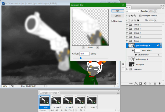
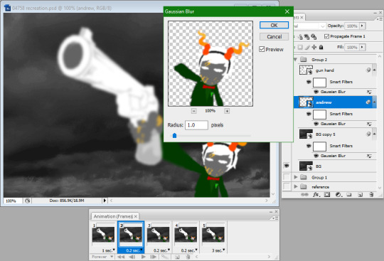
I recently discovered this tumblr and it's been super useful for me since I'm making a fanventure! One thing I'd like to know, though, is how Hussie made the panel on Homestuck page 4801. I find the "gradual shift in focus" very cool and was wondering how the blur effect was done.
Glad you've been finding it useful so far!
For that panel, he used a Gaussian blur filter. Recreating this panel would be fairly straightforward. First, the background and subject would have to be three separate layers: one for the foreground subject, one for the background subject, and one for the actual background.

I've grouped them together as you can see here, and duplicated it four more times. The gun starts off with a strength of 4 pixels, and for each subsequent duplicate layer, the strength of the Gaussian blur filter is reduced by 1 pixel for the foreground element, and increased by 1 pixel for the background element.
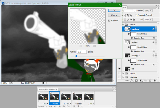
Decreasing foreground element's blur
Increasing background element's blur
I believe the background was done differently, however. Instead of increasing the strength of the blur, Hussie duplicated the background layer on top of the original background, blurred it by 4 pixels, and increased the opacity of the duplicate for each frame of animation.

Here's my recreation:

And here's the original panel:
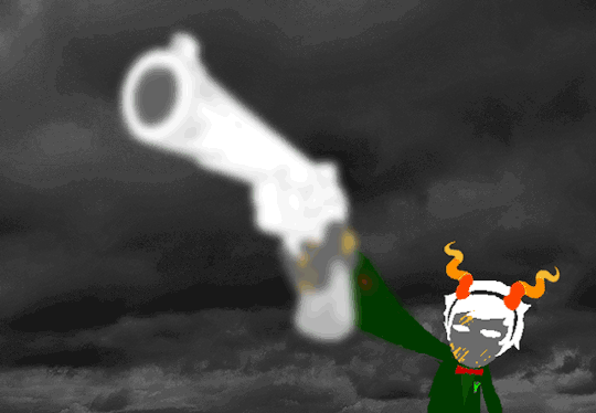
Here's the PSD for my recreation, too. It has information in it that can only be editable in Photoshop, though.
Sorry if I glossed over anything. If you still have any questions, please feel free to leave any follow-up ones!
95 notes
·
View notes
Text

steel towers grow like corals at the edge of the end of the world
detailed process breakdown under the cut:
this is a location from silversea, the (inhales) work-in-progress troika-compatible post-apocalyptic science-fantasy TTRPG slash worldbuilding project i'm developing + running for a few of my friends. i've posted a drawing of this landscape before! someone asked for me to go into my process for digital collage in gimp, so i made sure to document the creation of this piece.
usually i start by gathering a bunch of images from wikimedia commons and by searching on duckduckgo images & filtering for creative commons licensed images. i wanted to start with a surreal landscape that looked more wrong the longer you inspected it, so this time i started by generating a background with commoncanvas (the stable diffusion model trained entirely on creative commons images, more on that here)
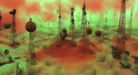
this was the final result. i didn't tweak it too much because i wanted the geometry to look unrealistic and warped. through the upscaling process it lost some of the early cgi look, which was sad, so i'll have to work more on trying to retain that.

interesting tangent: at 20% desert and 80% coral reef, a smooth cone briefly turns into a pyramid.
anyway, i decided i wanted it to look like you were on the edge of this environment, not in the middle, so i made some terrain in blender:
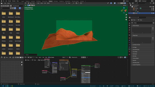
this was just a plane that i subdivided a bunch, pulled some vertices around with proportional editing to make dune shapes, and then decimated the faces to get back to a low poly look. i prefer that method to staying low poly the whole time, i feel as though i have more control over the shape.
the texture is a free tiling sand texture i found online, recolored and scaled down to make it pixelated, and then blended with vertex colors to add a little variation. it's very simple and took me maybe 30 minutes of actual work (the rest of the time spent trying to remember how to use material nodes).

this is the point where i took it into gimp and flipped & scaled the terrain until i liked the composition. i'm not bothered about the shadows not matching up, it just adds to how out of place the surreal terrain looks.

next is color correction, but i forgot to take a screenshot of that before adding the next part. gimp has a little fractal generator hidden in the filters tab, and i used that to make a swirling pattern that i overlaid over the sky, masking it selectively so it looked like it was getting thicker with distance. going for an "annihilation" look to the whole thing.
at this point i'm happy with the image and i go on to post processing. this is the part where tumblr's image compression is not doing me any favors, but oh well. when i make glitch art, there are a bunch of filters that are my favorite, but i don't usually use all of them on an image.
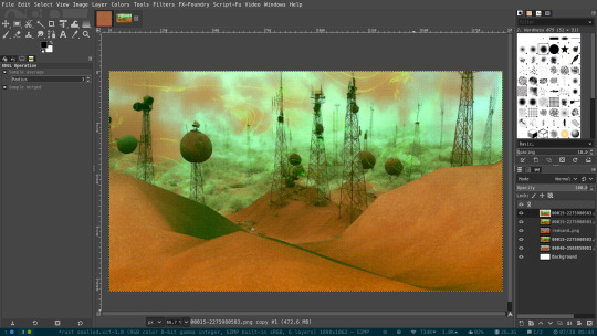
first off, i scale the image to 50%, add dithering (3-4 colors per channel looks nicest to me), then scale back up to the original resolution with no interpolation.
then i add "wind" (under the "distorts" option). it makes a cool pixel-sorted effect. at high levels it looks super cool...


but i keep it pretty subtle for this one.

the "video degradation" effect makes the image either too bright or too dark. i like the lcd screen look though. so i use a mask to turn it into a vignette.
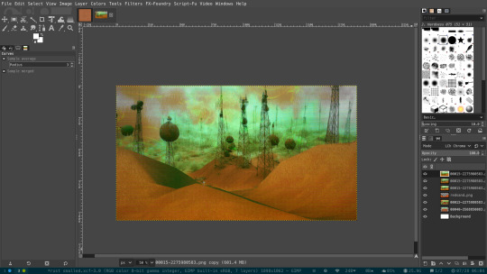
i also added bloom at some point during the process, but i don't remember when. i also took the original image before all the glitch effects and overlaid it with the "chroma" blending mode to bring back some of the color that had been lost.
this was a pretty simple collage, but i didn't want to make the post too long. most of my collages involve a lot of moving things around, testing different compositions and images before i decide on a final product.

this image took like 8 hours to make, for example. most of it was spent perfecting the grainy filter.
other gimp effects i didn't use here but i like include deinterlace (which you can use on a non-interlaced image to add deinterlacing artifacts), sample colorize (lets you use another image as a color source to gradient map onto an image), alien map (can't explain. just use it. move the sliders very slowly if you are sensitive to strobing lights), and value propagation (like a very small radius blur that you can tweak in interesting ways to soften an image without losing graininess or pixelated-ness)
i hope this was helpful/informative!
#silversea#digital collage#glitch art#science fantasy#my art#surreal#behind the scenes#another long ass post... im having fun
15 notes
·
View notes
Note
Shit, this disappoints me. I’m rather new to tumblr so I haven’t seen much of their earlier work. To be honest, I haven’t delved that deep into what styles of ”art” AI is current the best at spitting out either - I try to just avoid it.
I always thought their rendering was exceptional whenever it popped up on my screen, but it didn’t strike me as being obvious AI, at least not compared to other stuff I’ve seen, where people have obviously just taken an existing picture and have AI slap an oil painting/watercolour/whatever effect on it. Sure, the vibrancy of colours and near luminescence felt almost overly polished, but hey, some people are just fantastic at those things, and AI learns from actual people’s similar work too, right?
But now when I went to check, there are things that seem to be obviously AI generated in several pictures, mainly visible in the backgrounds. One weird Christmas tree, for example.
So I guess I’m he dumb one. It makes me sad because there are a couple of pictures I really like, which are not as over-the-top flashy as some of the others, and now I really question all of it.
@killer-laurent
I understand where you're coming from. It’s tough to navigate this situation if you're not familiar with how generative ai art currently looks. But trust me, it’s evolved far beyond basic filters that mimic oil paintings. Ai can now mimic a wide range of styles, often convincingly. That’s exactly why it's so important to listen to artists or those who can spot ai traits at a glance. Of course, it's also crucial to be wary of bad faith accusations, people wrongly accusing legitimate artists of using ai. That absolutely happens. However, the concerns surrounding Killer-Laurent aren't isolated incidents. I'll provide screenshots of the Christmas tree art you mentioned (and a link ) for full context:


As you pointed out, there are some oddities in the tree: objects blend together, melt into one another, or lack structure. This kind of "mistakes", especially along the tree's edges, is typical of ai struggling with complex designs. You see similar artifacts when ai tries to generate characters with intricate clothes/details. Ai ( at the moment ) just doesn’t handle that level of complexity well.
EDIT/UPDATE : It seems very likely that this tree was not ai generated but ran through an oil painting filter on photoshop. I will leave what I wrote intact for transparency but I will add a link here of a newer ask where this was brought up and clarified.
I should also state, before I get further into this part of my response: no, the issue isn’t simply that Killer-Laurent renders well. There are many highly skilled artists out there, and yes, AI does learn from real, talented creators. The real red flag is this: before he adopted his current super polished style, Killer-Laurent had a completely different way of drawing. There was no gradual evolution into this refined look. It just appeared. Suddenly, and without any signs of progression. Here are some examples of his earlier work:


These pieces look to have more hand drawn elements. For instance, Armand has a distinctive curl to his mouth that’s consistently depicted in his art from September and December 2023. Did he trace photographs at any point during these? Or use ai? It's very possible. At this point in time of his art, ai usage may be restricted to backgrounds ( the Christmas tree art was posted during this time period and the trees in the center image look suspicious)
[EDIT/NOTE: Those trees were also likely flittered through photoshop. Again, I am leaving my original statements for transparency but asking you to refer to the previous update for context).
I suspect, poses may be traced for some characters in much of his art during this period. There is a clear struggle with anatomy & fluidity in his art that have uncommon poses. Additionally, some character poses are suspect since he has shown earlier that year (June) to still be tracing photos of models. But that's a separate ( yet connected) issue. Ultimately, I feel these pieces have minimal AI ( if they have any at all.) But also, please note how he renders between these images. Very minimal, very subdued. And not very polished. To be clear: there is absolutely nothing wrong with being at this level in your artistic journey. I'm pointing this out to highlight what his art looks like when it seems he actually had a hand in creating it. And then, just days after that last set of earlier artworks, he posted this:


The first and last images depict huge leaps in both rendering and facial anatomy. Yet, the center piece is more consistent with his older work. This suggests a strange pattern: sudden improvement, a regression, then rapid progress again. Then by the time February arrives, he adopted three entirely new art styles:


Again, major improvements, all within just a few days. Then, four days after the third image, he posted this commission:

The female character’s face is more in line with his earlier style. I’m not sure if ai was used here, but I suspect he was forced to draw her face manually. That familiar curl of the lips, seen on previous art of Armand, appears here again, and it feels distinctly his style. However, the male character below (apologies, I forgot to screenshot the tags before the piece was deleted from his blog) looks different. The face structure is closer to the style found in his more AI suspect works, and it's clearly in a different style altogether. And then just three days later, he drew this:

Then, adopted several new art styles over the rest of the month:


Even his older artwork (below), where it does seem like he had a hand in creating it (maybe just coloring or touching things up), still raises eyebrows. Take this piece of Armand (the first image) as example. Besides the hair looking suspicious, looping into itself unnaturally, it also shares stylistic similarities with a specific style of ai art ( the three i included beside it) like there was an attempt to mimic the rendering style:


Honestly, when people say, "It's obvious he uses ai" all of this is why. The timeline, the abrupt jumps in skill, the lack of consistent style evolution. In the very first images I included here, the ones between September and December, the stylistic jump was more subtle within those 2 months vs the art he has posted later down the line which has abrupt improvements within days of each other. Ai is harder to detect these days. It's starting to look natural and people are tracing/painting over it to avoid detection. But I think there is a very real disconnect that happens when artists start relying on ai. They forget how long it used to take them to produce art organically. Posting schedules, how much workload they take without consequence, and random spikes in progress become very clear tells that their art is suspicious if not entirely disingenuous.
#ai mention#iwtv#killer-laurent#the vampire armand#the vampire chronicles#marius de romanus#vampire chronicles
3 notes
·
View notes
Note
Hi :)) I love your edits and song choices. They always seem really cohesive, like strong theme. I want to make an edit for the first time but I'm kind of overwhelmed by the scope/not sure where to begin. I'm curious if you have any tips for getting into editing, and also wondering what editing software you use. in other words: editing tips?😳
omg editing tips 🫣 under the cut because they got too long 😳lololol
first of all thank you so much :)!! I'm happy to know that you enjoy my edits<3!!!
answering the software question is easy: I recently started using capcut, it's free and I like it a lot! (I used to use clipchamp which has less features, but is maybe a bit more straightforward)
getting ideas is the hard part lol. I think I only have lame answers :/
for normal compilations I usually have a clip (or a few) and a theme/joke/vibe/meme I really want to use and i do some research(search it on Tumblr) or rewatch the videos (or look through the clips I have already saved) to find other moments that follow the same theme. (I try to make them funny, I'm not sure it works, but they are funny to me lol)
for song edits i usually have the song and at least one clip that are already linked in my brain lol like rush by Troye Sivan and the poppers jokes, they just go together lol. sometimes I read the lyrics and try to remember or search for clips that work with them. idk it's something that just clicks in my head lol. this sounds so 💀💀💀 I'm sorry lolol.
so idk the only advice I have is:
1.if you're using a song, working on it first makes things so much easier (cut it/choose the parts you want/read the lyrics) and then add the clips
2.adjust the audio levels (even if there's no song) (especially if you're using clips from dystopia daily lol it's super quiet for some reason)
3.try to build some kind of database of clips, so you don't have to go back and rewatch the videos a million times to find a 2 seconds clip (speaking from experience) (save them or make a list idk) (also I screen record and don't download, I know someone from another fandom that says that screen recording is bad but personally i never had any issues w it lol)
4.follow your heart, follow your brain, look at the software's filters, transitions, effects and sounds and text and use them all lol. I think ultimately most people have their own style and their own humour and sensibility. there's no right or wrong, so try to find what works for you, what you find funny or pretty or interesting, you know? it's kind of a bad answer but that's all I can think about, you need to find what you enjoy first and then build on it
I'm sure phil was better at giving editing tips lmao, but I hope this helped in some way! I never get to talk about editing, so my thoughts are all over the place lol.
let me know when you start posting or if you need help with the software!
6 notes
·
View notes
Note
Can you tell some fun facts about your oc void?
yes!!!!
ive said it before but void is actually a nickname their real name is ansta. they have no memory of this however & use void as their real name & vi as a nickname now. online they go by just the letter v
their natural hair color is actually a red brown & their eyes more of a purple but they thought that's severely uncool so when they were younger they would just use their ability every day to change it to the black blue color scheme. the incident in high school set off their ability to such an extent it's permanent now however. if they were to have children it would reflect there as well. my guy really got so upset they accidentally altered their own gene pool.
piggybacking off that they're actually one of the strongest psychics i have in universe right now. they're also in one of the worst mental states of all of them as well so its a net zero. they have no self confidence to be able to use it on command like that. even when they did have control over it their changes with it were intentionally temporary, but they have the skills & power to alter things permanently whether they know & believe that or not.
the star mark under their eye is not one of things they chose to look cool thats just a. mole? birthmark? something. they were born with it. the fact they end up obsessed with the deity of space is a coincidence (quite literally. i made void before i even had the vaguest idea of ryuusei)
they have a black rose tattoo on their left shoulder. it has no particularly deep meaning to them they just thought perhaps getting a tattoo would make them feel something. they're utterly indifferent to it now.
contrary to what u may expect considering they neglect themself a lot, they actually dont like clutter so their house is pretty tidy. its a run down previously abandoned house in the middle of the woods so its a bit dingy & has vines on it & a few cracks here & there but they keep it neat & relatively clean. (narrow 2 story house, the kitchen is white/yellow tile flooring the rest is wood)
they run an online tumblr-equivalent fan blog for the space deity ryuusei. they take photos of them and add filters & effects like sparkles or flower crowns etc. they have a decent following but no real friends from it. ryuusei does find out about it after they become friends with void but they dont mind they think its silly. voids embarrassed about it tho. also doesnt stop them from uploading more. the blog itself has the black & neon blue color scheme but the edits themselves often stray from it, pink & purple being common.
they take paid online surveys to get money. they really dont leave their house very often unless they 1) absolutely need something Now Immediately from the store or 2) are feeling super down. there's a cliffside not far from their house they like to go there at night & look at the stars when they dont want to think anymore or are breaking down.
they are absolutely the type of person to walk past a faulty/loud machine (air conditioner for example) & mistake the noise for music
they have glow in the dark star stickers on their ceiling
#asks#auxe4#i could go on perhaps but i feel like thats a lot for now#if theres something in particular ur wondering about feel free to ask#hold on im checking toyhouse bc i forgot if i added their hight or not when the fuck did i give them a birthday#december 13th is void day apparently. today i learned.#ik cherry has a birthday & meringue has a birthday i cannot for the life of me remember giving anyone else a birthday#cherrys sept 18 i think?? meringue is jan 21#but this isnt about them sorry
5 notes
·
View notes