#experimental jetset
Text
Books On Books Collection - Experimental Jetset
Automatically Arranged Alphabets (2015)
Automatically Arranged Alphabets (2015)Experimental JetsetStaple-stitched “zine” with screenprinted silver cover. H180 x W160 mm. 24 pages. Acquired from the Newbridge Project, 18 September 2022.Photos: Books On Books Collection.
On their website, the studio posted an automated gif of this typographic experiment involving software-generated compositions…

View On WordPress
0 notes
Text

From: Please Make This Look Nice: The Graphic Design Process as an Act of Drawing, Curated by Peter Ahlberg, The Drawing Center, New York, NY, February 19 – March 20, 2016 [Photo: Cathy Carver]
Design, lecture, and micro-exhibit participants include: Anthony Carhuayo, Erik Carter, Delcan & Company [Pablo Delcan + Jocelyn Tsaih], Stephen Doyle, Elliott Earls, Claudine Eriksson, Experimental Jetset [Erwin Brinkers, Danny van den Dungen + Marieke Stolk], John Gall, Carin Goldberg, Minkoo Kang, Ian Keliher, Eric Ku, Margot Laborde, Sue Lee, The Herb Lubalin Study Center for Design & Typography, AJ Mapes, Alex Merto, Joe Newton, Paul Sahre, Paula Scher, Small Stuff [Dinah Fried, Joe Marianek + Brenda Wu], Alex Stikeleather, Alexander Tochilovsky, Sally Thurer, Jan Wilker, Zipeng Zhu, and ZutAlors! [Frank DeRose + Brendan Griffiths]
#graphic design#drawing#visual writing#pattern#structure#exhibition#exhibit design#peter ahlberg#the drawing center#cathy carver#2010s#geometry
37 notes
·
View notes
Text
Helvetica - Thoughts & Review:
Would I use Helvetica as a designer?
Here's the thing, if I was looking to bash out a design really quick, that instantly looks clean, modern, easy to read, and will blend in with the city surroundings (ie; not likely to clash with anything), while still looking like quality design, this is a great go-to.
Another great point about Helvetica; is its 'neutral-ness'. If you are wanting the subject matter of what you are trying to covey to speak for itself, and stand out on its own, then this typeface is definitely your friend. It will not overshadow the material...
However, because of its success, and for the reasons above, it's literally EVERYWHERE. The world is saturated with it, and it's almost used without any deep thought to its design language anymore. I think I'd try and steer clear of it, unless I use it as a deliberate choice, or switch up the layout/look of it on the medium so that it is a bit more unique, and less 'boring'. Much like the 'Experimental Jetset' approach...I believe that brands these days are looking to stand out more, and are attempting to steer us through a specific brand experience & identity, and stand apart in a saturated marketplace. Helvetica might not be the best way forwards if you're looking to be unique.
Quote of the Day from Erik Spiekerman:
"A real typeface needs rhythm, needs contrast, it comes from handwriting....Helvetica hasn't got any of that"
So why is it so popular then?
"Helvetica has become one of those defaults that, partly because of the proliferation of the computer, which is now twenty years, it was the default on the Apple Macintosh, and then the Windows, and a clone version was created called Arial...It has become like the air. It's there, you have to breathe it, it's everywhere."
6 notes
·
View notes
Text

I drew a ridiculous cartoon of Harrowhark Nonagesimus Making A Point At John Gaius. (Not pictured: God saying "am I... am I being 'trolled'. who taught her about T-posing to assert dominance".)
This whole thing started with the idea of a T-shirt like Experimental Jetset's "John& Paul& Ringo& George." shirts, only with the names of the aspirants from the nine Houses. And also I forgot where the ampersands went. Oh well.
(@tazmuir you should sell a T-shirt like this though.)
Drawn in Procreate for iPad.
#the locked tomb#ridiculous#cartoon#harrowhark nonagesimus#gideon the ninth spoilers#strictly speaking
7 notes
·
View notes
Text

Incoming second blog of a VR project I worked on.
This was also made by the same great team I was with before. After Blade Ballet was published we began working on a secret VR title back in 2018. VR was big, and we were playing lots of VR games that were being produced at that time. Many were experimental demos so we were eager to dip our toes into some fun concepts.
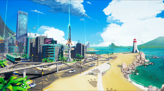
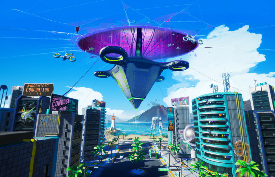
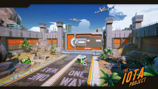

We still loved the idea of a 'jetset' styled robot dystopia. This time with it being placed in sci-fi Miami. Citizens in this world are so normalized to giant robots constantly invading the city that they complain when picked up. An alien robot race invades to consistently cause comically evil trouble, and you are tasked as one of the robot pilots hired to defend the city which is dealing with their nuisance.
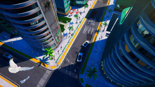

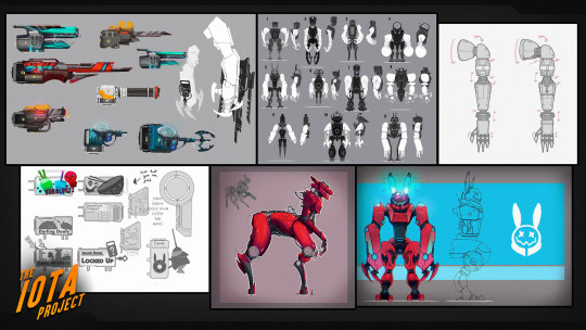
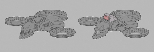
A lot of my work revolved around the visual development once more. We were trying to make sure that the design of the human made structures and robots looked 'human' and brutalist. While the alien civilization needed to look like it had a foreign technology to it. A lot of the sketches above were based on the alien robots, and some of the alien gun designs.
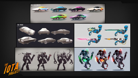

I also worked on a bit of the human made robots and cars. We knew that VR takes a lot of CPU/GPU, so many of our Miami structures and cars needed to be simple in design. The aliens got more love to make them feel more intimidating.
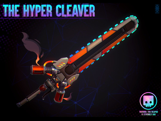
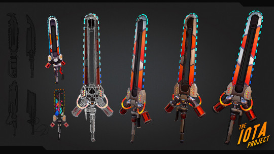

Later on, I began concepting and making the 3D assets for the item pick ups in the game. We had a lot of fun items we wanted to explore but for the demo we had to keep it basic. The chainsaw sword was clearly our fav, but we also liked the idea of our health item being a radioactive looking robot cake.
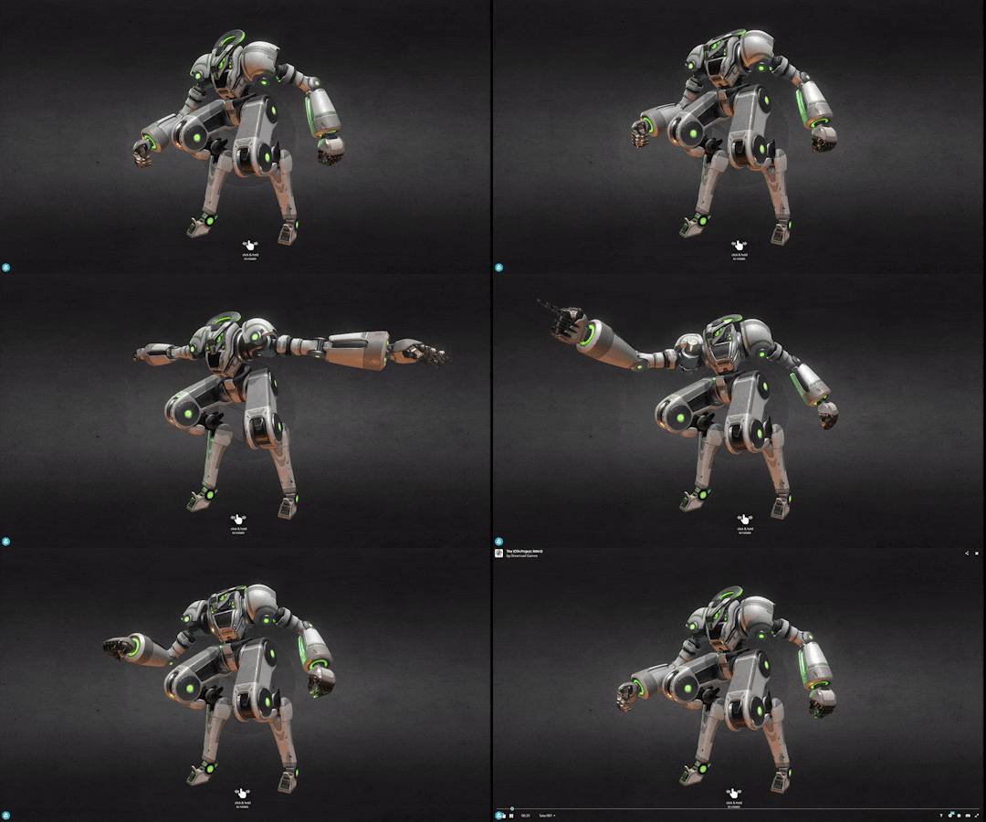
This demo only made it to it's infancy. Even though we had a bigger publisher interested in funding us. Our company dissolved from internal struggles before we could show more of it. I regret still to this day that we were only 3 months away from showing a true demo. Fate sadly had other plans.
--
If anyone is still reading this far, thank you. Hopefully I gave you some insights to smaller game development pipelines.
#visual development#game dev#indiedev#game design#indie game#indiegamedev#devlog#game development#indiegameart#indie games#gamedevelopment#gamedev#indie game art#digitalartwork#digital 3d#digitalart#robot art#no ai art#support human artists#made by human#unreal engine#ue4#ue5#gaming#robot fighting#mecha#robots
10 notes
·
View notes
Text

Superstructures - Experimental Jetset
2 notes
·
View notes
Text
Ampersand Fedi
I wrote a quick post about the "Ampersand Fedi" shirt I designed. #100DaysToOffload
You’ve almost certainly seen those t-shirts and posters with the “ampersand” style of lists of names – these originated back in 2001 via Experimental Jetset’s design of the names of the members of The Beatles.
I had this idea that I’d love a shirt like that, with the names of the Fediverse platforms I use most often (referring back to my post about moving PeerTube instances, you’ll know I use…
0 notes
Text


WK 1 InDesign Exploration - Pepeha
Left: learning a few basic techniques on InDesign, I went ahead and made a reiteration of a line from my Pepeha - I whanau mai ahau Tamaki Makaurau. I noticed that a pattern has been formed through the duplicating of this line which resemble traditional patterns from my culture.
Right: I've taken inspiration from the conventions of Experimental Jetset with their minimalistic listing style. I've put emphasis on my name to identify the family I hail from. I like that although this is quite simple, the use of repeating the text kind of breaks that "listing" style.
What to try next: try and find conventions and styles that could emphasise or express the text I'm designing. Maybe even look at conceptual designs.
0 notes
Text
Week 1: My Pepeha

My Pepeha design is my first time using InDesign so I have a lot to learn. I have chosen a listing type of layout inspired by the Experimental Jetset that was shown in class. This means you can read just the Maori version or the English version, as well as both languages coming together and reading them as one. I have enlarged the words that mean the most to me, from where I grew up to where my ancestors are from. Because this is very new to me I started with something simple. But next time I would like to find typefaces that work well together and enhance the words.
0 notes
Text

From: Please Make This Look Nice: The Graphic Design Process as an Act of Drawing, Curated by Peter Ahlberg, The Drawing Center, New York, NY, February 19 – March 20, 2016 [Photo: Cathy Carver]

Design, lecture, and micro-exhibit participants include: Anthony Carhuayo, Erik Carter, Delcan & Company [Pablo Delcan + Jocelyn Tsaih], Stephen Doyle, Elliott Earls, Claudine Eriksson, Experimental Jetset [Erwin Brinkers, Danny van den Dungen + Marieke Stolk], John Gall, Carin Goldberg, Minkoo Kang, Ian Keliher, Eric Ku, Margot Laborde, Sue Lee, The Herb Lubalin Study Center for Design & Typography, AJ Mapes, Alex Merto, Joe Newton, Paul Sahre, Paula Scher, Small Stuff [Dinah Fried, Joe Marianek + Brenda Wu], Alex Stikeleather, Alexander Tochilovsky, Sally Thurer, Jan Wilker, Zipeng Zhu, and ZutAlors! [Frank DeRose + Brendan Griffiths]
#graphic design#typography#exhibition#exhibit design#peter ahlberg#the drawing center#cathy carver#2010s
29 notes
·
View notes
Text


1 - not sure but the outer edge printing is insane
2 - Experimental Jetset with like 4 different unbound nested stocks. So fucking sick I love books so much man
1 note
·
View note
Text
Exhibition layout research
My tutor referred me to hese two websites, they were great use when it came to visualising my exhibition layout, It gave me many ideas that I couldn't have possibly thought
0 notes
Text


From my tutorial, I looked into works by Wim Crowell and Experimental Jetset. I realised that sometimes less is more and using the space in my designs is as important as the designs themselves.
1 note
·
View note

