Don't wanna be here? Send us removal request.
Text
Final piece


This is my final outcome, both of the prints came out as expected. I am excited to have both ready for the exhibition, and I am super proud to hand in a project that is both deep to me and educational. During my FMP I learned many skills which I will be using in the future to make a self initiated project.
0 notes
Text
Evaluation
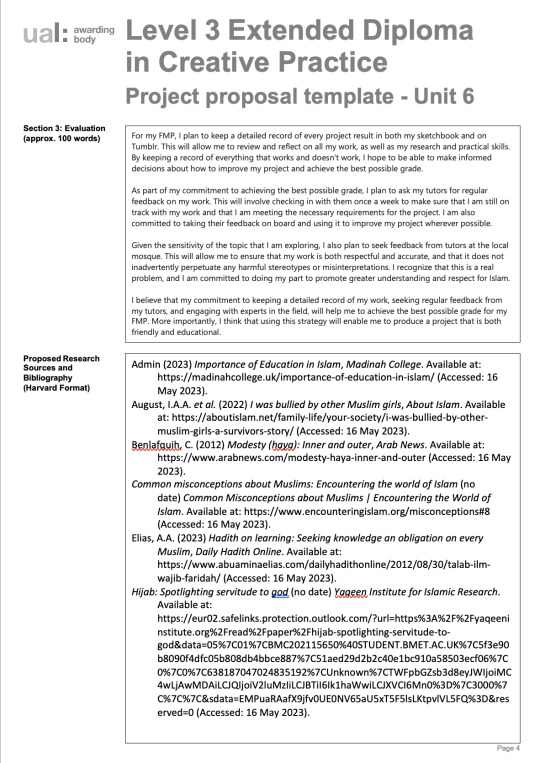
I chose to focus on the topic of Islam because I believe that it's important to raise awareness about the religion and combat islamophobia. Unfortunately, many people have a distorted view of Islam, which can lead to prejudice and discrimination. The media often contributes to this problem by portraying a negative image of the religion that doesn't accurately represent its followers. That's why I've decided to take it upon myself to educate people about Islam. By sharing my knowledge, I hope to promote greater understanding and respect for all religions. I'm committed to creating a more inclusive and diverse society, and I believe that educating people about Islam is an important step in that direction. I knew that covering the topic of Islam would be challenging, but what I was most concerned about was the possibility of spreading false information. That's why I made sure to double-check everything I researched and took into account to ensure that I wasn't perpetuating any misconceptions or stereotypes. I wanted to be sure that I was sharing accurate information with others and promoting greater understanding and respect for all religions. By being diligent in my research and fact-checking, I'm confident that I'm doing my part to combat islamophobia and promote greater awareness about Islam. When designing my FMP, I made sure to take several ethical considerations into account. First and foremost, I wanted to ensure that I was not perpetuating any negative stereotypes or misconceptions about Islam. To do this, I conducted thorough research and fact-checking to ensure that all the information I presented was accurate and respectful. I also made sure to include my perspectives in each misconception to provide a well-rounded view of the religion. I also took several cultural considerations into account. I wanted to ensure that my project was culturally sensitive and respectful of Islamic traditions and customs. I consulted with several tutors and muslim to ensure that I was presenting an accurate and nuanced view of the religion. I also made sure to include information about the diverse cultural practices and traditions within the Muslim community to provide a more comprehensive understanding of the religion. Finally, I made sure to take several sustainability considerations into account when designing my project. I wanted to ensure that the project was environmentally friendly and sustainable. I used sustainable and eco-friendly print services for my newspaper and wall price.
My initial thought when choosing a theme for my project were to find a real issue and make a change with my design. Choosing the theme of religion was a tough decision because it could be challenging to create something that is ethically and emotionally correct, in the same way I also felt obligated to choose the theme religion specifically Islam because there is so many misconceptions about it and I wanted to somewhat create a slight change. I had many final outcome ideas but choosing to create a newspaper was the most logical because I would be able to fully express how I feel in a way that is informing the audience. At the beginning of the project I knew that there were many misconceptions about Islam but thought the project I learnt that those misconceptions are being taught, they teach their kids from early on and that made me even more passionate about this project. The teaching system and the media are both responsible for not teaching the right Islam and that makes kids grow up with the wrong idea of Islam. I believe that my initial intentions and the final outcome align, I created a project that was both personal and educational and was able to print out everything that's was planned. My project is strictly type base, I felt as though if I added any pictures or illustrations it will take all the credit away from the main purpose.
During my FMP, I used a variety of research methods to better understand the topic. I began with primary observations, at my pitch presentation I asked with Muslims and non-Muslims to let me know what they'll want to see in my newspaper, which helped me to understand the misconceptions surrounding Islam. I also conducted experiments and initial material developments to explore different design concepts and techniques, for example traditional art. It allowed me experience how art first came about and gave me ideas on how I can showcase my final piece. In addition to primary research, I conducted secondary research on ethical, social, and cultural aspects of the topic. I found websites such as Yaqeen institute, that explains the misconception in a beautiful way, they focus on teaching people the real teachings of islam. The Propaganda Remix Project influenced my practical skills, they allowed me to show my work in a friendly aggressive way, opposite to the media. These ideas and methods supported and nourished my development by providing me with a more well-rounded understanding of the topic. By approaching the project from a variety of angles, I was able to create a more thoughtful and informed final outcome.
Throughout my project, I explored, adapted, and developed a variety of specialist practical processes and skills. I found these skills to be very appropriate to the development of my project, as they allowed me to create a successful final product that addressed an important issue. One of the art styles I explored was typography, which I enjoyed because it allowed me to create meaningful art that conveyed my message in a simple but interesting way. I also enjoyed exploring different layouts, as these elements helped me to create a cohesive and visually appealing final product. I found the specialist processes and skills that I selected to be very effective. I was able to create a successful project that addressed an important issue. It was great to see how the skills I learned could be applied to a real-world project, and I feel confident that I could use these skills in the future to create other successful projects.
I'm glad to hear that I had a clear vision for the theme of my FMP. It was tough to determine the best outcome for my project, but seeking feedback from others was really helpful. I think it's a great idea to get a different perspective and refine my ideas. It was discouraging to hear that my initial idea wasn't going to be taken seriously, but I know that feedback is an important part of the creative process and can help me create a better final product. I understand that creativity takes time and it's okay to experiment and try different things until I find what works best. I'm proud that I was able to overcome these challenges and create an outcome that I'm happy with. I think it's important to remember that the creative process is not always straightforward, but the end result is always worth it. During my project, I encountered several significant challenges that I had to overcome in order to progress. One of the biggest challenges I faced was finding a way to convey my message in a way that was both visually appealing and informative. I experimented with several different art styles and layouts, but I found that some of them were not as effective as I had hoped. However, I was able to learn from these challenges and ultimately create a final product that I was proud of. Another challenge I encountered was the technical aspect of printing the newspaper. I had never printed a newspaper before, so I had to do a lot of research to figure out the best way to do it. I also encountered some technical issues along the way, such as formatting issues and color discrepancies. However, I was able to adapt to these challenges and ultimately create a final product that looked great and conveyed my message effectively. I think that my ability to adapt to unforeseen practical and technical problems was one of my strengths during this project. I was able to stay focused and motivated even when things didn't go as planned, and I was able to find creative solutions to the challenges I encountered. Several factors influenced my ability to solve problems effectively and appropriately. One of the most important factors was my willingness to teach people Islam in a different light. I was not afraid to experiment with different art styles and techniques, and I was willing to do the research necessary to figure out how to print a newspaper. Additionally, I was able to stay organized and focused throughout the project, which helped me to stay on track and overcome any challenges that arose.
For my final outcome, I decided to print a newspaper and wall i about the misconceptions about Islam. I felt that there were a lot of negative stereotypes and misunderstandings about Islam in the media, and I wanted to do my part to help combat these misconceptions. I felt that a newspaper would be a great way to visually communicate my message and help people understand the truth about Islam. I chose to print my project in a newspaper because I felt that this would be a great way to reach a wide audience. I wanted to make sure that as many people as possible saw my project and had the opportunity to learn something new about Islam. I felt that a newspaper was a great way to do this because it's a source that many people still read and trust. I think that my final outcome relates to my audience in a few different ways. First, I think that it helps to educate people about Islam and dispel some of the negative stereotypes that they may have heard. I think that this is really important because there's a lot of misinformation out there about Islam, and it's important for people to have accurate information. Second, I think that my final outcome helps to promote understanding and empathy. By showing people the truth about Islam, I hope that they will be more understanding of Muslims and more willing to empathize with them. I think that this is really important, especially in today's world where there is so much division and hate. Thirdly, I created the newspaper so I can specifically targeted the same audience that the media targets when spreading lies about Islam. I felt that this was really important because I wanted to reach the people who are most likely to believe these negative stereotypes and misconceptions. I felt that by targeting this audience, I could help to change some minds and help people see the truth about Islam.
When creating my project and final outcome, I chose to adopt a few different strategies to help me effectively communicate my ideas. First and foremost, I chose to use typography in my project to visually communicate my message. I felt that this was an effective way to get my message across because it allowed me to use bold text and to convey my ideas.I chose to print my project in a newspaper because I wanted to reach a wide audience and educate them about Islam. I felt that this was an effective way to communicate my message because newspapers are still widely read and trusted. I believe that this was a smart approach to combat negative stereotypes and misconceptions surrounding Islam. I believe that these strategies are very appropriate to my developing professional practice. As a graphic designer, it's important to be able to effectively communicate ideas and messages to a wide audience. By using printing in a newspaper, I was able to do just that. In terms of how effective I've been in communicating my ideas, I think that my project has been quite successful. I've received a lot of positive feedback from people who have seen it, and have the opportunity to educate a lot of people about Islam and combat some of the negative stereotypes and misconceptions that are out there.
When I started my final project, I was interested in creating a piece that would showcase Islam in a different light. I wanted to create something that would be visually appealing and thought-provoking, while also conveying an important message about the need for greater understanding and empathy. Throughout the development of my project, I tried to stay focused on these aims and objectives, constantly revising and refining my work to ensure that it was effective in meeting these goals. I spent a lot of time researching and writing my articles that would go on each page, and I worked hard to translate this information into a visually compelling design. I feel that I was quite successful in reflecting on my developing work and progress against these targets. I was able to create a piece that was both visually striking and intellectually engaging, and I was able to convey a powerful message about the importance of understanding and empathy in our increasingly diverse world.
In the end, I was thrilled to have the opportunity to print my newspaper, where it could be seen by a wide audience and have a real impact on the way people think about Islam and the Muslim community. I hope that my work will continue to inspire others to think critically about the media and the messages it conveys, and to work towards greater understanding and acceptance of all people, regardless of their background or beliefs.
0 notes
Text
Poster plan + sketches


Experiments:


In this practice is the poster sketches and some outcomes, I used adobe illustrator and photoshop to create some of these. I experimented with different colours and styles to go for the perfect option, I decided to go for the last option because I felt it was best suited to my newspaper style and my typography theme overall. This practice was helpful for my FMP, it allowed me to make myself many options so I am able to decide from many and make the best choice.
0 notes
Text
Ethics + Sustainability
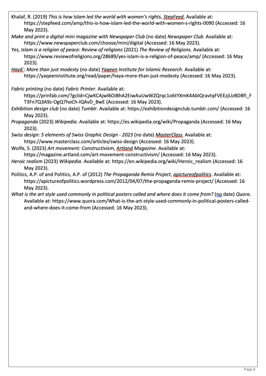
Before Starting to print my final pieces I wanted to make sure that the source I was getting it from was sustainable and environmental friendly.
The newspaper club:


The newspaper club is a brand that focuses heavily on sustainable products, the specific paper i've gotten has been approved by two big companies those being EU Evolabel and FSC Certified, meaning that the forest is being managed in a way that preserves biological diversity and benefits the lives of local people and workers, while ensuring it sustains economic viability.
Print Fab:


Print fab is also a print company that focuses on sustainability, The only thing that I didn't not like about their como is that they do not recycle their waste. That would not affect me in anyway because I am only buying one thing and it's a one time thing. They focus highly in Ink and being sustainable in that way, witch is important because my price uses lots of ink. Their Ink is ECO passport certified this means that they have been checked to make sure that they have been made in a humane way, without harming anyone in the process
0 notes
Text
Credibility Check on newspaper research
Yaquen institute was my main source of information when it came to creating my articles,


I decided to use yaqeen institute because I've known about it for years and has been teaching me about islam in a soft spoken way. Their founder is Omar Sulaiman and he is known for his kind words and acts, that's why I decided to take information from them.
0 notes
Text
Islamic Relief Posters


This poster where advised from my tutor, I feel as though these posters make u feel guilty and self conscious because you are not donating and contributing to the corse. The poster are not bad looking because it's meant to be kept corporate and straight forward.
0 notes
Text
Newspaper feedback
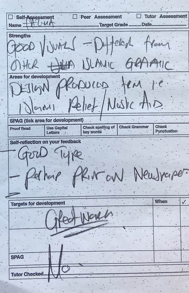
This is the feedback I've received from my last years tutor about my work, he gave me research I can look to and complimented my work.
0 notes
Text
Analysing front and back pages


When coming up with the front and back page of the newspaper, I had to come up with something that when you see it, it encourages you to pick it up and read it. I wanted it to give a nice first impression with the viewer so they are able to start reading it with pure heart. I experimented with some and analysed what work well and what didn't. I knew I wanted the back to say breaking news that filled the whole page, so when it came to deciding what I wanted in the front page it was difficult.
1st picture: I liked the design of the front page and it resembled a lot of a newspaper, but I didn't choose this because it didn't align with the nice first impression. I felt like it was contradicting everything that I was saying inside the newspaper, the tone didn't match at all.
2nd picture: I is similar to the 1st picture but for this one I took the feedback form my peers and removed the border and just keep it type base, and I didn't like that outcome as well it felt like there was something missing and it wasn't keeping the consistent style like the back page, I realised the problem i the tone used and that any design I make, it'll still take me back to the tone and language.
3rd picture: My tutor gave me feedback and helped mr get this outcome, it was the outcome I was looking for and aligned with the motive. This design worked well because it gave that nice first impression with the viewers and aligned well with the language of the newspaper. As well as it kept the consistency with the back page.
Overall doing this practice made me realise that when it comes to design, it'll will have to keep the consistent style and language for it to work.
0 notes
Text
Page layout


These are some designs I experimented with for this page, I feel like both suit, I decided to go for the last one as that is what looks more like a newspaper page.
0 notes
Text
EXPERIMENTING WITH DIFFERENT LOGOS


When designing my front page I had to experiment with different logos so that I can choose the best possible answer. I decided to go for the last option as I feel that is what suits it best.
0 notes
Text


For my exhibition layout I had to create a mock up of my book holder, I added measurements so I know how big I want it. I used cardboard, scissors in a pencil. It was very helpful to visualise how the book holder will look when made.
0 notes
Text
Article Feedback


After writing my article I asked both my sister and tutor to give me feedback so I can improve and refine the article, these are some on the feedback I collected and refined, I was helpful to get feedback back from someone who is Muslim and someone who isn't because I am able to see what I am missing and what what I can add so that is educational.
0 notes
Text
Newspaper Logo plan

These are some rough sketches I did for the newspaper logo, I wanted to keep the logo minimalistic and simple so it can fit the theme, the logo also needed to be readable so I decided it to be type base only. I also when online and researched some typefaces that are best suited and wrote them down so I can experiment with them. I did this logos to add it to my old newspaper front cover, but I then swapped it with bold text. Even though the logo didn't go to plan it was a nice test to my skills and practice to develop my skills.
0 notes
Text
NEWSPAPER PAGES PLAN


When making a newspaper I had to sketch some page design so that it is easier when it came to the design proses, I experiments with some designs so I can come up with the best possible outcomes. Some worked and some didn't put this whole practice is so I can get better with my skills and to produce a high standard newspaper.
0 notes
Text
ANALYSING A NEWS PAPER

Before starting to sketch and design my newspaper, I needed to do some research on how a newspaper is actually later out so I can get an idea of how a newspaper is. I analysed the layout and how everything is positioned, it was very helpful because now I know how I can layout and get my newspaper to look like the real thing.
0 notes
Text
Exhibition Layout plan

This is a rough sketch of how I want my exhibitor to look, the book stand will be on a plinth.
0 notes
